Codrops has a very nice article on CSS Shapes from Tania Rascia. You might know shape-outside is for redefining the area by which text is floated around that element, allowing for some interesting design opportunities. But there are a couple of genuine CSS tricks in here:
Float shape-outside elements both right and left to get text to flow between them.
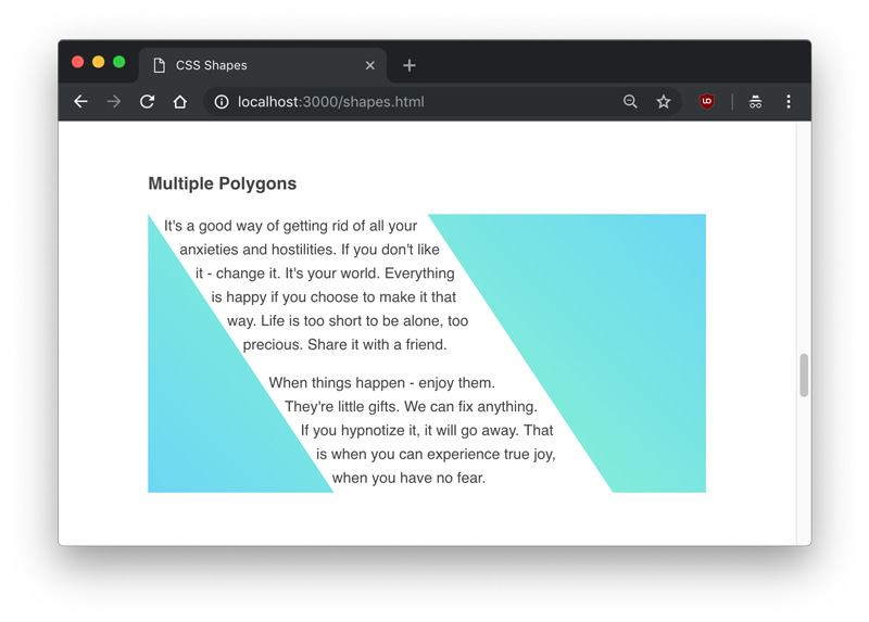
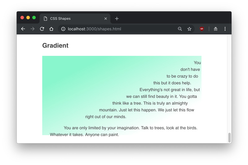
You can set shape-outside to take an image and use shape-image-threshold to adjust where the text flows, meaning you could even use a gradient!
Shapes are in the water recently, as Heydon Pickering recently published a short video on using them. He also covers things like clip-path and canvas and such:
When we talk about CSS shapes, it’s almost like we’re talking about values moreso than properties. What I mean is that the value functions like polygon(), circle(), ellipse(), offset(), path(), etc. are more representative of “CSS shapes” than the properties they are applied to. Multiple properties take them, like shape-outside, clip-path, and offset-path.
You know how some sites and web apps have that neat native feel when transitioning between two pages or views? Sarah Drasner has shown some good examples and even a Vue library to boot.
These animations are the type of features that can turn a good user experience into a great one. But to achieve this in a React stack, it is necessary to couple crucial parts in your application: the routing logic and the animation tooling.
Let’s start with animations. We’ll be building with React, and there are great options out there for us to leverage. Notably, the react-transition-group is the official package that handles elements entering and leaving the DOM. Let’s explore some relatively straightforward patterns we can apply, even to existing components.
Transitions using react-transition-group
First, let’s get familiar with the react-transition-group library to examine how we can use it for elements entering and leaving the DOM.
Single components transitions
As a simple example of a use case, we can try to animate a modal or dialog — you know, the type of element that benefits from animations that allow it enter and leave smoothly.
A dialog component might look something like this:
Notice we are using the isOpen prop to determine whether the component is rendered or not. Thanks to the simplicity of the recently modified API provided by react-transition-group module, we can add a CSS-based transition to this component without much overhead.
First thing we need is to wrap the entire component in another TransitionGroup component. Inside, we keep the prop to mount or unmount the dialog, which we are wrapping in a CSSTransition.
Every time isOpen is modified, a sequence of class names changes will happen in the dialog’s root element.
If we set the classNames prop to "fade", then fade-enter will be added immediately before the element mounts and then fade-enter-active when the transition kicks off. We should see fade-enter-done when the transition finishes, based on the timeout that was set. Exactly the same will happen with the exit class name group at the time the element is about to unmount.
This way, we can simply define a set of CSS rules to declare our transitions.
If we want to orchestrate more complex animations using a JavaScript library, then we can use the Transition component instead.
This component doesn’t do anything for us like the CSSTransition did, but it does expose hooks on each transition cycle. We can pass methods to each hook to run calculations and animations.
Each hook passes the node to the callback as a first argument — this gives control for any mutation we want when the element mounts or unmounts.
Routing
The React ecosystem offers plenty of router options. I’m gonna use react-router-dom since it’s the most popular choice and because most React developers are familiar with the syntax.
Let’s start with a basic route definition:
import React, { Component } from 'react'
import { BrowserRouter, Switch, Route } from 'react-router-dom'
import Home from '../views/Home'
import Author from '../views/Author'
import About from '../views/About'
import Nav from '../components/Nav'

class App extends Component {
  render() {
    return (
      <BrowserRouter>
        <div className="app">
          <Switch>
            <Route exact path="/" component={Home}/>
            <Route path="/author" component={Author} />
            <Route path="/about" component={About} />
          </Switch>
        </div>
      </BrowserRouter>
    )
  }
}
We want three routes in this application: home, author and about.
The BrowserRouter component handles the browser’s history updates, while Switch decides which Route element to render depending on the path prop. Here’s that without any transitions:
Don’t worry, we’ll be adding in page transitions as we go.
Oil and water
While both react-transition-group and react-router-dom are great and handy packages for their intended uses, mixing them together can break their functionality.
For example, the Switch component in react-router-dom expects direct Route children and the TransitionGroup components in react-transition-group expect CSSTransition or Transition components to be direct children of it too. So, we’re unable to wrap them the way we did earlier.
We also cannot toggle views with the same boolean approach as before since it’s handled internally by the react-router-dom logic.
React keys to the rescue
Although the solution might not be as clean as our previous examples, it is possible to use the libraries together. The first thing we need to do is to move our routes declaration to a render prop.
Nothing has changed as far as functionality. The difference is that we are now in control of what gets rendered every time the location in the browser changes.
Also, react-router-dom provides a unique key in the location object every time this happens.
In case you are not familiar with them, React keys identify elements in the virtual DOM tree. Most times, we don’t need to indicate them since React will detect which part of the DOM should change and then patch it.
Constantly changing the key of an element — even when its children or props haven’t been modified — will force React to remove it from the DOM and remount it. This helps us emulate the boolean toggle approach we had before and it’s important for us here because we can place a single Transition element and reuse it for all of our view transitions, allowing us to mix routing and transition components.
Inside the animation function
Once the transition hooks are called on each location change, we can run a method and use any animation library to build more complex scenes for our transitions.
Our play function will build a GreenSock timeline here depending on the pathname, and we can set as many transitions as we want for each different routes.
Once the timeline is built for the current pathname, we play it.
Each timeline method digs into the DOM nodes of the view and animates them. You can use other animation libraries instead of GreenSock, but the important detail is that we build the timeline beforehand so that our main play method can decide which one should run for each route.
Success!
I’ve used this approach on lots of projects, and though it doesn’t present obvious performance issues for inner navigations, I did notice a concurrency issue between the browser’s initial DOM tree build and the first route animation. This caused a visual lag on the animation for the first load of the application.
To make sure animations are smooth in each stage of the application, there’s one last thing we can do.
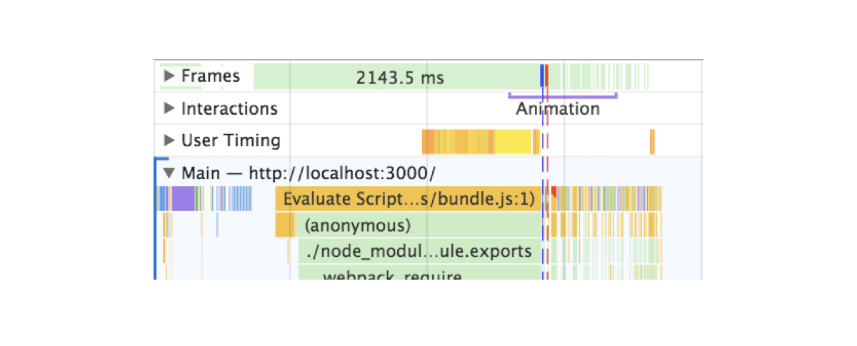
Profiling the initial load
Here’s what I found when auditing the application in Chrome DevTools after a hard refresh:
You can see two lines: one blue and one red. Blue represents the load event and red the DOMContentLoaded. Both intersect the execution of the initial animations.
These lines are indicating that elements are animating while the browser hasn’t yet finished building the entire DOM tree or it’s parsing resources. Animations account for big performance hits. If we want anything else to happen, we’d have to wait for the browser to be ready with these heavy and important tasks before running our transitions.
After trying a lot of different approaches, the solution that actually worked was to move the animation after these events — simple as that. The issue is that we can’t rely on event listeners.
If for some reason, the event occurs before we declare the listener, the callback we pass will never run and this could lead to our animations never happening and an empty view.
Since this is a concurrency and asynchronous issue, I decided to rely on promises, but then the question became: how can promises and event listeners be used together?
By creating a promise that gets resolved when the event takes place. That’s how.
window.loadPromise = new Promise(resolve => {
  window.addEventListener(‘DOMContentLoaded', resolve)
})
We can put this in the document head or just before the script tag that loads the application bundle. This will make sure the event never happens before the Promise is created.
Plus, doing this allows us to use the globally exposed loadPromise to any animation in our application. Let’s say that we don’t only want to animate the entry view but a cookie banner or the header of the application. We can simply call each of these animations after the promise has resolved using then along with our transitions.
window.loadPromise.then(() => timeline.play())
This approach is reusable across the entire codebase, eliminating the issue that would result when an event gets resolved before the animations run. It will defer them until the browser DOMContentLoaded event has passed.
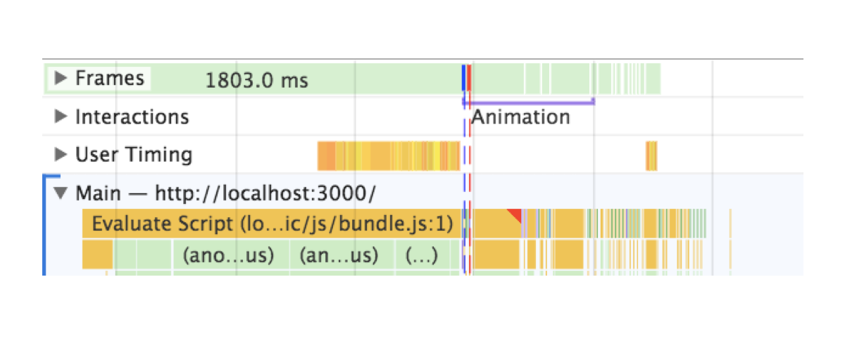
See now that the animation is not kicking off until the red line appears.
The difference is not only on the profiling report — it actually solves an issue we had in a real project.
Wrapping up
In order to act as reminders, I created a list of tips for me that you might find useful as you dig into view transitions in a project:
When an animation is happening nothing else should be happening. Run animations after all resources, fetching and business logic have completed.
No animation is better than crappy animations If you can’t achieve a good animation, then removing it is a fair sacrifice. The content is more important and showing it is the priority until a good animation solution is in place.
Test on slower and older devices. They will make it easier for you to catch spots with weak performance.
Profile and base your improvements in metrics. Instead of guessing as you go, like I did, see if you can spot where frames are being dropped or if something looks off and attack that issue first.
That’s it! Best of luck with animating view transitions. Please post a comment if this sparked any questions or if you have used transitions in your app that you’d like to share!
I think it’s safe to say that Ethan Marcotte’s Responsive Web Design was a welcome revelation for web developers the world over. It triggered a whole new wave of design thinking and wonderful new front-end techniques. The reign of the oft-despised m dot websites was also over. In the same era and almost as influential was Luke Wroblewski’s Mobile First methodology — a solid improvement that built upon Marcotte’s impressive foundations.
These techniques are at the bedrock of most web developers lives, and they’ve served us well, but alas, times change, and developers constantly iterate. As we increase the efficiency of our methods and the project requirements become more complex, new frustrations emerge.
The Journey To Generic First
I can’t pinpoint exactly what made me change the way I write my CSS because it was really a natural progression for me that happened almost subconsciously. Looking back, I think it was more of a by-product of the development environment I was working in. The team I worked with had a nice SCSS workflow going on with a nifty little mixin for easily adding breakpoints within our CSS declarations. You probably use a similar technique.
This wonderful little SCSS mixin suddenly made it easy to write super granular media queries. Take a hypothetical biography block that looks a little something like this:
Fig.1.Typical mobile first with cascading media queries
This works nicely — I’ve written a lot of CSS like this in the past. However, one day it dawned upon me that overwriting CSS declarations as the device width increased just didn’t make sense. Why declare a CSS property for it only to be overwritten in the following declaration?
This is what lead me to begin writing compartmentalized media queries as opposed to the more common approach of media queries that cascade upwards (or downwards) like the example in Fig.1.
Instead of writing media queries that cascade upwards with increases in screen size, I began creating targeted media queries that would encapsulate styles at desired screen widths. The media query mixin would really come into its own here. Now my SCSS media queries are starting to look like this:
Fig.2.An example of compartmentalized media queries
This new approach just felt more intuitive to me, it cut down on having to reset styles from the previous breakpoint, and it was making the CSS easier to read. More importantly, it was making the media queries self-documenting in a more significant way.
I still wasn’t 100% happy with the above though, It seemed like there was still a major issue to overcome.
The Problem With Mobile First
The issue with mobile first is that by definition you will most likely have to override mobile-first styles in subsequent media-queries. This feels like a bit of an anti-pattern.
So — to me — the answer was obvious: let’s take the idea of media query compartmentalization to its logical conclusion — we will also compartmentalize the mobile specific styles into their very own media queries. I know, I know, this goes against the common convention we’ve learned over the years. “Mobile First” is so ubiquitous that it’s usually one of the “skills” questions a hiring manager will ask. So surely any alternative must be wrong, shouldn’t it? This is usually the part where people shake their heads at me whilst uttering mobile first over and over.
Okay, so we’re going to break through the mobile first dogma and compartmentalize all our styles into the relevant media queries. What we’re now left with is pure generic styles declared on a CSS selector, with all other device specific styles encapsulated in media queries that only apply to the relevant screen dimensions. We now have Generic First CSS:
Yes, there are slightly more media queries, however, I see this as a benefit, any developer can now looks at this CSS and see exactly what styles are applied at each and every screen size without the cognitive overhead of having to pick apart media-query specificity.
This can be great for people unfamiliar with the code base or even the future you!
When Not To Compartmentalize
There are still times when media query compartmentalization is a burden, and in some cases a good old >= media query is fine. Remember, all we’re trying to do is avoid property overwrites.
Dev Tool Bliss
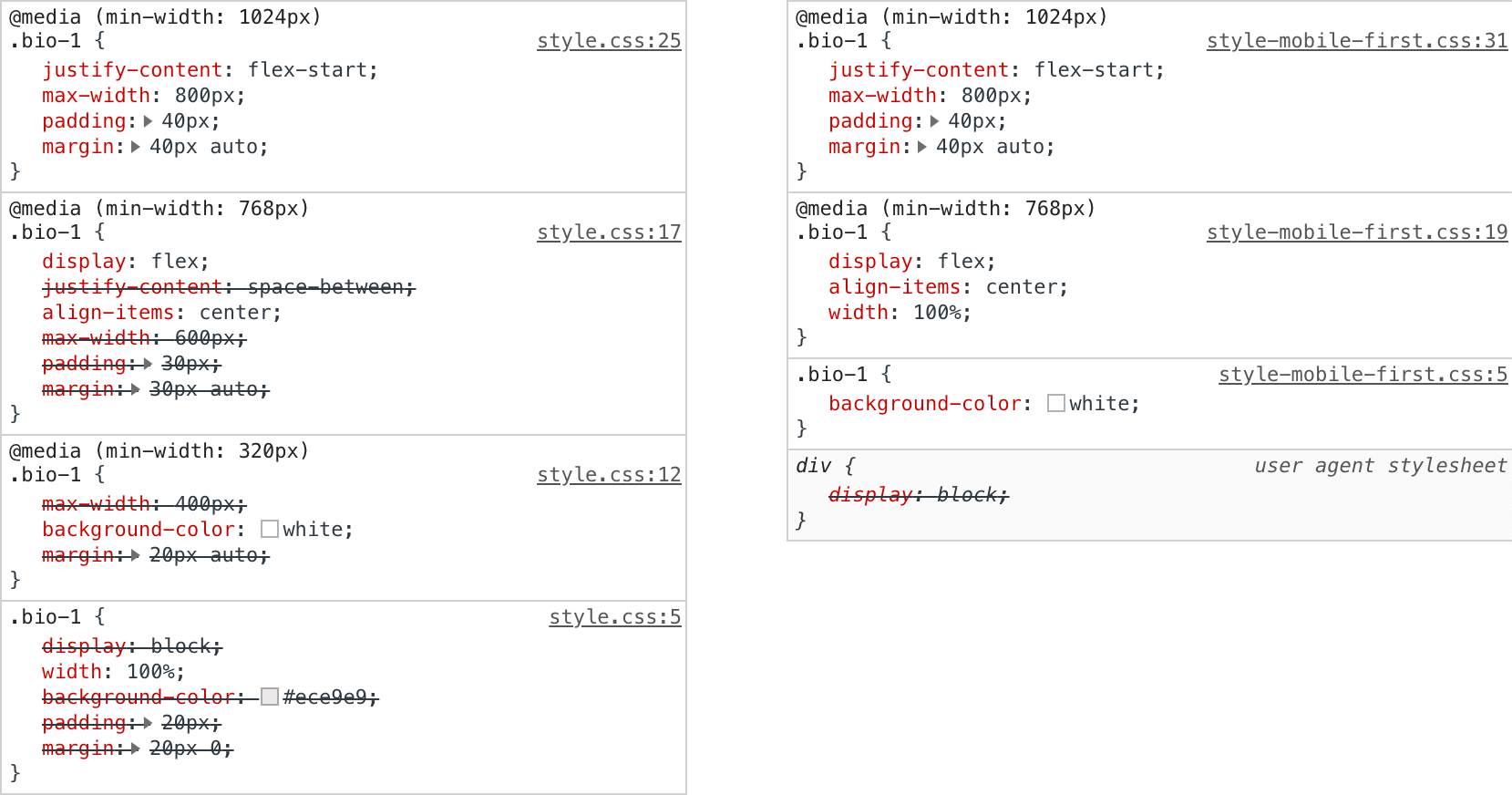
One major unintended consequence of writing compartmentalized Generic First CSS is the experience you will get from your developer tools style panel. Without the media query cascade, you will now have a clearer overview of which styles are applied — You won’t have a style panel full of struck-out declarations from overwritten media query rules — The noise is gone! This — for me — is one of the biggest benefits of the Generic First CSS technique. It brings a little extra sanity to the CSS debugging experience, and this is worth its weight in gold. Thank me later.
Fig.4. How generic first, compartmentalized css can help bring joy and sanity to your dev console. (Large preview)
Performance Implications
So all these Generic First CSS benefits are starting to sound pretty good, but I think there is one last key question that I think needs to be addressed. It’s on the subject of performance optimization. Now I don’t know for certain yet, but I have an inkling that fully compartmentalized media queries may have a slight performance benefit.
Browsers perform a rendering task called computed style calculation. It’s the browsers way of calculating which styles need to be applied to an element at any given moment. This task is always performed on initial page load, but it can also be performed if page content changes or if other browser actions take place. Any boost you can give to the speed of the process is going to be great for initial page load, and it could have a compound effect on the lifecycle of your websites pages.
So going back to generic first CSS: Are there any performance issues related to the browser having to work out the CSS specificity of a multitude of cascading media queries?
To answer that, I’ve devised a test case that can be used to measure any speed benefits or indeed drawbacks.
The Test Case
The test case is comprised of a basic HTML page that outputs a “bio” block 5000 times, the markup is the same for each block, but the classes are slightly different (numeric differentiator), the CSS for this block is also outputted 5000 times, with class names being the only thing to differ. The outputted CSS is piped through a tool called CSS MQPacker, this helps dramatically reduce file size of CSS that uses a lot of inline media queries by combining all the separate instances of a specific media query into one — It’s a great tool that will probably benefit most modern CSS codebases — I’ve used it as a standalone cli tool via a npm task in the test projects package.json, you can also use it as a postcss plugin, which is nice and convenient!
The first test case is a mobile-first cascading media queries example, the second test case is a generic first compartmentalized variant of the CSS. The CSS for these cases is a little verbose and could probably be written in much more concise terms, but it really just serves as a rough example to test the argument.
The test was run 20 times for each CSS variation in desktop Google Chrome v70, not a massive set of data, but enough to give me a rough idea of a performance gain/loss.
The test metrics I have chosen to use are:
Overall page load time A basic metric to check page load time using the Performance API markers in the the start of the and very end of
The Recalculate Style Time from within the dev tools performance pane.
The Overall Page Rendering Time from within the dev tools performance pane.
Fig.5. The key metric being measured is “Recalculate Style”. (Large preview)
Results Table (all times in milliseconds)
Mobile First
Generic First
Load time
Calculate styles
Total render time
Load time
Calculate styles
Total render time
1135
565.7
1953
1196
536.9
2012
1176
563.5
1936
1116
506.9
1929
1118
563.1
1863
1148
514.4
1853
1174
568.3
1929
1124
507.1
1868
1204
577.2
1924
1115
518.4
1854
1155
554.7
1991
1177
540.8
1905
1112
554.5
1912
1111
504.3
1886
1110
557.9
1854
1104
505.3
1954
1106
544.5
1895
1148
525.4
1881
1162
559.8
1920
1095
508.9
1941
1146
545.9
1897
1115
504.4
1968
1168
566.3
1882
1112
519.8
1861
1105
542.7
1978
1121
515.7
1905
1123
566.6
1970
1090
510.7
1820
1106
514.5
1956
1127
515.2
1986
1135
575.7
1869
1130
504.2
1882
1164
545.6
2450
1169
525.6
1934
1144
565
1894
1092
516
1822
1115
554.5
1955
1091
508.9
1986
1133
554.8
2572
1001
504.5
1812
AVG
1139.55
557.04
1980
1119.1
514.67
1903.15
Mobile First
Load time
Calculate styles
Total render time
1135
565.7
1953
1118
563.1
1863
1174
568.3
1929
1112
554.5
1912
1105
542.7
1978
1106
514.5
1956
1164
545.6
2450
1115
554.5
1955
Generic First
Load time
Calculate styles
Total render time
1196
536.9
2012
1148
514.4
1853
1124
507.1
1868
1111
504.3
1886
1121
515.7
1905
1127
515.2
1986
1169
525.6
1934
1091
508.9
1986
Fig.6.20 test runs measuring key load/render metrics of mobile first vs generic first CSS.
From my admittedly small dataset, it does seem like my initial suspicion may be correct. On average, I see the Style Recalculation task take 42ms less time which is a 7.6% speed increase, and therefore the overall rendering time also decreases. The difference isn’t mind-blowing, but it is an improvement. I don’t think the dataset is big enough to be 100% conclusive and the test case is a little unrealistic, but I’m very glad not to be seeing a performance degradation.
I would be very interested to see the generic first methodology applied to a real-world existing codebase that has been written in the mobile-first way — the before after metrics would be much more realistic to everyday practice.
And if anyone has suggestions on how to automate this test over a broader set of iterations, please let me know in the comments! I’d imagine there must be a tool that can do this.
Conclusion
To recap on the benefits of this new development methodology…
CSS that does exactly as intended, no second guessing;
Self-documenting media-queries;
A better dev tools experience;
Pages that render faster.
I’d like to think I’m not the only person espousing the writing of CSS in this style. If you have already adopted the generic first mindset, hurray! But if not, I think you’ll really like the benefits it brings. I’ve personally benefited greatly from the uncluttered dev tools experience, which in itself will be a huge positive to a lot of devs. the self-documenting nature of this way of writing your media-queries will also have benefits to yourself and the wider team (if you have one). And finally, these benefits won’t cost you anything in performance terms, and in fact have been shown to have marginal speed gains!
Final Word
Like all development methodologies, it may not be for everyone, but I’ve fallen into Generic First CSS quite naturally, I now see it as a valuable way of working that gives me all the benefits of mobile first with some positive new additions that make the tough job of front-end development that little be easier.
Resources
Test Case Repo
If you’d like to fire up the test case and give it a go yourself, you can find it on GitHub, I’d love to see some reports from others.
As you all know that website designing is not an easy job to do as it encompasses different skills and disciplines in the production and maintenance of websites.
While different areas of web design include webpage layout, content production, and graphic design.
Basically, websites are created using a markup language like HTML and web designers build web pages using HTML tags that define the content and metadata of each page. While the layout and appearance of the elements within a webpage are typically defined using CSS. Today, every website includes a combination of HTML and CSS that defines how each page will appear in a browser like Couponobox.
Couponobox is basically a site which offers coupons and voucher codes for all sorts of online stores. However, HTML and CSS are used to design the look and feel of a website but you still need to add images to your website separately. Therefore, graphic design may overlap with web design as graphic designers often create images that can be used on the website.
However, adding images will surely add a look and feel to the website but it might take time and can even go outside the budget. Have a look at these few steps will not only save your time but will save your money as well.
Have Your Content Ready
Content is the main aspect for any website and If you are looking for ways to save time and money on your website designing then make an outline of the content and write it down for each page. While having your content and outline ready will save you a generous amount of time. Also, if you have a very limited budget for your website then try to write your web content all by yourself.
Make List of Features For the Website
Firstly, you need to make lists of things that you want to include on your website. Some of these features may include a contact page, information about your service, and a good clean structure.
While some other things that you need to note down in your list might include a slider image on the homepage, mobile responsive design and a content management system to update your content. These things are great to have on your website but can only be added when you have a bigger budget for it.
Have Your Images Ready
Researching and purchasing your own image is another way to save some bucks and will surely save some of your time. Looking for images that compliment your content is of those of things that most web design company will take time to research about it.
If you are writing your own contents then there are many online sites where you can get images from sites like Istockphoto.com related to your content.
Research About It
Here research means look for websites that function in the way you want or is visually presented in a way that you like. Moreover, this will inspire your web designer and will give them a brief idea to define the scope of your project. It will also help to educate you on what breaks a budget.
Choose the Right Approach
If you are tight on budget then you could opt for WordPress websites with a customized theme. After that, you might think that your website looks similar to other websites that have limited functions but most WordPress themes are made to be customized. So, you just need to fill in the details and pictures to make it work.
Although, if you could spend some money and get premium access to the WordPress then your web designers will have full freedom to customize the website as per your requirements.
Select Upgrades
In order to customize your website and make it stand out then, you can add some upgrades and add-ons to your project. These are the things that will enhance the visitor experience and will truly add to the production quality of each project.
You can also save some cash by choosing worthwhile upgrades. Moreover, some web designs use custom photography and video wallpapers to entice your visitors. Although, finding a photographer and videographer isn’t really an upgrade but it is necessary.
However, your relationship with a photographer is also valuable for effective social media and online advertising.
Anticipate Expenses
You can’t redo your web design without redoing other things. For instance, replacing all the appliances in your kitchen will won’t work if you leave it next to faded, crusty, counter tops and cabinet made for a different set. So, it is always recommended to all at once for the best results.
Time is Money
you might have read that time is money means extra meetings and phone calls will take time. So it is best to avoid disrupting other marketing and business activities.
You and your staff will need to learn new processes to manage the new website.
Accept Subscription Fees
Today’s new web designs include components that work on software licenses and subscriptions that you need to pay on a monthly or yearly basis to keep your website running.
Spend Wisely
Auditing your website will not only help you to select the right approach for your web design project but will also identify the urgent issues that you need to spend on before anything else can move forward.
While there will be chances then you will need to prioritize your website security and stability. This is done because your website is also susceptible to malware and hacking just like your computer and mobile devices.
However, the best way to harden your website security is to keep your website’s operating system up to date. Also, keep the themes and plugins up to date as well. So, if everything fails or your site gets hacked, you still got backup of your data to restore it.
Conclusion
So, these are some of the points with which you can not only save time and money but can also attract huge number of visitors to your site.
Running low on content ideas? User-generated content (UGC) is becoming a more and more popular means of filling company websites. When used correctly, it can actually end up adding a near endless, high-quality stream of relevant content for your business to use.
Of course, figuring out the right way to incorporate user-generated content into your site or blog can be a real challenge. It has to be done in a way that engages your audience while subtly marketing your business to the masses without feeling redundant, staged, or all over the place.
a near endless, high-quality stream of relevant content for your business
These ideas can help you think up some unique ways to utilize UGC in a way that works for your brand.
1. Make An Effort to Be Authentic
When encouraging your audience to produce content that markets your brand, the first step in achieving success is being authentic in your outreach and engagement.
Social media is by far one of the biggest sources of user-generated content, and authenticity is definitely lacking on many social channels. So, in an effort to truly touch your audience and foster the production of quality content related to your brand, you need to go the extra mile.
Interacting with your audience is the first step to incentivizing them to interact even more. This means liking their comments and responding to them. Next is discovering the content users are already creating that’s associated with your brand and leaving a like and comment to encourage them to make more.
For proof and inspiration, look to just about any strong brand and you’ll see this interaction. Brands behind popular YouTube channels are especially catching on to the importance of this engagement.
Brands ranging from SnowboardProCamp (under 350,000 subscribers) all the way up to channels like Good Mythical Morning (with over 14,000,000 subscribers) use the same practices of pinning, liking, and responding to positive comments.
Authenticity should be the foundation of your content marketing efforts. The goal is to make your brand “personable” and you have to establish that tone and connection before you can start explicitly asking users to generate content for you.
2. Reward Your Top Contributors
While you may not be stealing the attention of Instagram’s biggest influencers just yet, you will incentivize users to generate more content around your brand if you highlight the rewards they’ll receive in return.
you will incentivize users to generate more content around your brand if you highlight the rewards they’ll receive
Saying the best posts about your latest product will be featured on your page and, in general, just showing interaction with the content that users are taking the time to post about your brand will help you encourage future contributions.
Giveaways and hashtag competitions also go pretty far when it comes to encouraging more user-generated content, so don’t shy away from them. Plenty of successful examples of social media giveaways exist out there.
The photo contest run by Man of Steel is a great example, getting millions of people to submit pictures and vote on submissions for some excellent user-generated content. They picked one winner every week, which was just enough to keep things interesting while the whole contest proved extremely lucrative.
3. Create New Hashtags
The start of this method involves creating a unique, easy-to-remember hashtag for your brand that can be used all over. Encouraging its use can get people in on the conversation and help you track the content your users are generating with greater ease.
The next step is actually creating hashtags centered around specific events, like a workshop your business is running or a product launch that you’re working on building hype about.
Again, the reason to use hashtags is so that you can more easily track what users are saying and you can then engage with those who have joined the discussion, thus encouraging them to post even more content so more people can discover your brand or event.
Fitness guru Cassey Ho uses this method all the time on her Instagram, @Blogilates. From promoting her new app and exercise routines (#poppilates) to her exclusive line of activewear (#popflex), she has built an empire for herself since starting only a few years ago, now reaching millions every day.
4. Give Enthusiasts Early Access
When it comes to building hype for a new release, there is perhaps no better way to do it than to give your brand’s top ambassadors a sneak peek.
Not only will this give you a headstart with some positive feedback and perhaps even a testimonial that can be used for marketing, it will also allow first-hand use of the product to reach the masses before launch day.
This technique is employed by brands big and small, but game makers are particularly on top of this method, giving some key influencers in the gaming industry early access to new releases in order to spread the word and build excitement for them when they go on sale.
5. Incentivize Your Best Clients to Testify
Customer stories (which used to go by the boring name of “case studies”) are ultra-sharable and, luckily for you, oh-so-easy to create in today’s world of smartphones and social media.
Customer stories are ultra-sharable and, luckily for you, oh-so-easy to create
Kajabi is one of the best examples by far of this method. Top users of the e-Course creation platform were given a super sharp, branded t-shirt and asked to get on video and explain how Kajabi has helped them.
The hashtag #KajabiHero accompanies story submissions and those that get featured have a real incentive: Kajabi will link back to the user’s own website, which helps to promote the e-Course they have created.
6. Create Customer-Centric Events
Whether online or offline, customer-centric events can help your brand take things to a new level. From a Twitter chat to an interactive webinar or even a promotion at a local tradeshow, these engaging events get customers to connect to your brand in a whole new way.
They also open the door to repurposing content, gathering feedback, and even creating a photo op that leads to additional UGC that your brand can utilize in more marketing efforts.
James Pollard from The Advisor Coach gives countless examples of how he runs customer appreciation events in the realm of financial advising, but any industry can benefit from a customer party that fosters engagement, loyalty, and ultimately leads to some fantastic promotional content.
7. Find New Ways to Collaborate
Looking to involve user-generated content more often? The possibilities are simply endless.
From asking for feedback and ideas to creating weekly round-up posts and digests, it’s easy to start taking advantage of the great things your users are already saying.
A couple prime examples to look to for inspiration include the gear manufacturer Burton, whose product pages feature pictures from real-world users, to the social media marketing platform Buffer, which is always featuring engaging (yet often random) photos from its own followers in a very effective manner.
With the except of some form elements, you’ve just set a font on every bit of text on a site! Nice! That’s probably what you were trying to do, because of the probably hundreds of elements all over your site, setting that font-family every time would be tedious and error-prone.
CSS is global by nature. On purpose!
I like how David Khourshid put it:
You ever stop and think about why CSS has a global scope? Maybe we want to use consistent typography, colors, sizing, spacing, layout, transitions, etc. and have our websites & apps feel like one cohesive unit?
Love the cascade, the cascade is your friend.
And yet. The global nature of CSS is perhaps the most-pointed-at anti-feature of CSS. Some people really don’t like it. We all know it’s very easy to write a single CSS rule that has implications all over a site, breaking things you really didn’t want to break.
Two CSS properties walk into a bar.
A barstool in a completely different bar falls over.
Scoped styles aren’t the only reason there is such interest and adoption in the landscape of tools that is CSS-in-JS, but it’s a big one. There are loads of sites that don’t directly author any CSS at all — even preprocessed styles — and go for a JavaScript library instead where styles are authored quite literally in JavaScript. There is a playground demonstrating the syntax of the various options. Here’s how styled-components works:
import React from 'react';
import styled from 'styled-components';

const Container = styled.main`
  display: flex;
  flex-direction: column;
  min-height: 100%;
  width: 100%;
  background-color: #f6f9fc;
`;

export default function Login() {
  return (
    <Container>
      ... Some stuff ....
    </Container>
  );
}
There are literally dozens of options, each doing things a bit differently while offering slightly different syntaxes and features. Vue even offers scoped CSS directly in .vue files:
Unfortunately, never quite made it as a native web platform feature. There is shadow DOM, though, where a style block can be injected in a template and those styles will be isolated from the rest of the page:
let myElement = document.querySelector('.my-element');

let shadow = myElement.attachShadow({
  mode: 'closed'
});
shadow.innerHTML = `
  <style>
    p {
      color: red;
    }
  </style>

  <p>Element with Shadow DOM</p>
`;
No styles will leak into or out of that shadow DOM boundary. That’s pretty cool for people seeking this kind of isolation, but it could be tricky. You’d likely have to architect the CSS to have certain global styles that can be imported with the shadow DOM’d web component so it can achieve some styling cohesion in your site. Personally, I wish it was possible to make the shadow DOM one-way permeable: styles can leak in, but styles defined inside can’t leak out.
CSS-in-JS stuff is only one way to scope styles. There are actually two sides to the spectrum. You could call CSS-in-JS total isolation, whereas you could author CSS directly with total abstraction:
Total abstraction might come from a project, like Tachyons, that gives you a fixed set of class names to use for styling (Tailwind is like a configurable version of that), or a programmatic tool (like Atomizer) that turns specially named HTML class attributes into a stylesheet with exactly what it needs.
Even adhering 100% to BEM across your entire site could be considered total CSS isolation, solving the problems that the global scope may bring.
When we write styles, we will always make a choice. Is this a global style? Am I, on purpose, leaking this style across the entire site? Or, am I writing CSS that is specific to this component? CSS will be split in half between these two. Component-specific styles will be scoped and bundled with the component and used as needed.
Best of both worlds, that.
Anyway, it’s tricky.
The problem is not CSS in JS.
It is CSS’s global scope.
Solve the global scope, and CSS in JS will follow.
(I don’t know if “follow” means disappear, being fully accepted, or getting a major overhaul.)
(For that matter, I don’t know what “solving the global scope” means.)
Such a fragmented ecosystem was far from appealing. Which one should you pick, (if any)?
Contributing to Javascript fatigue — you need at most one. Also feel free to not learn any.
GitHub stars are one useful metric:
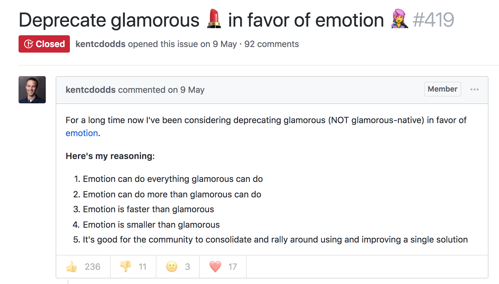
However, GitHub stars say nothing about a project’s *trajectory* *—* perhaps they were accumulated long ago and the repo has since fallen out of favor or is no longer maintained. Glamor has plenty of open issues, and hasn’t seen a commit in over a year. Its author advises:
…it mostly works, I’m not going to do any major changes… if you need something more modern, I’d recommend emotion, it mostly matches glamor’s api, and is actively maintained.
The similarly named Glamorous was recently deprecated with its author also recommending users switch to Emotion:
At the time, Emotion had some features that Styled Components didn’t. Since then, Styled Components has made some big announcements.
Styled Components sells itself as the CSS-in-JS library for people that *like* CSS. Styled Components gained popularity by utilizing tagged template literals — allowing developers to *just write CSS* in the same syntax they already know, but inside JavaScript files. While this has proven popular, some developers prefer to [write styles as JavaScript objects. Emotion offered flexibility — developers could choose how to write their styles. Styled Components eventually followed suit.
styled-components v3.3.0 is out with first-class object support! ?
Lots of people have been asking for this, your wishes have been heard! Shoutout to @probablyup for taking care of this release.
The rival CSS-in-JS libraries have stolen from each other until landing upon the same feature set and the same syntax — Emotion and Styled Components have an almost identical API. What once felt like a total mess of competing methodologies and libraries now feels somewhat stable. Even if CSS-in-JS hasn’t standardized on a dependency, it now has standardized a way of doing things — they’re just implemented differently:
Internally, quite a bit. SC has a lot of complexity around organizing style tag order. Re css prop: SC requires Babel plugin and uses the entire SC custom component creation. Emotion will skip the custom component if it can and just renders the element with the className directly
Styled Components is by far the most popular CSS-in-JS library, but Emotion has seen a rapid increase in usage.
Both are used by some major companies. Styled Components are utilized by plenty of large companies, including Bloomberg, Atlassian, Reddit, Target, BBC News, The Huffington Post, Coinbase, Patreon, Vogue, Ticketmaster, Lego, InVision and Autodesk just to name a few.
Emotion boasts fewer recognizable names, but has been recently adopted by the New York Times.
Great article about the launch of our new Story designs on the NYT today. It mentions our Shared Components initiative – would have been impossible without Emotion / CSS-in-JS. Absolute game-changer. Living in the future. https://t.co/pZLDJjsbEr
While these libraries certainly do seem to be most popular amongst React users, they can be used with other frameworks. While they seem to have converged on the same features at last, it’s difficult to say whether this is the end point of CSS-in-JS, or whether we’ll see a continued evolution from here.
I just read a nicely put together story about WooCommerce over on the CodeinWP blog. WooCommerce started life as WooThemes, sort of a “premium themes” business started by just a couple of fellas who had never even met in person. Two years and a few employees later they launch WooCommerce, and 2 years after that it hits a million downloads. A major success story, to be sure, but a collaborative and remote-work based one that wasn’t exactly overnight. Another 2 years and Automattic picks them up and the WooThemes part is spun down.
Now we’re 3-4 years into WooCommerce being an Automattic project and it’s looking at nearly 60 million downloads, 4 million of which are active. A number they are saying is about 30% of all eCommerce on the web. Daaaaang. I’ve used WooCommerce a number of times and it always does a great job for me.
Text adventures were one of the first forms of digital role-playing games out there, back when games had no graphics and all you had was your own imagination and the description you read on the black screen of your CRT monitor.
If we want to get nostalgic, maybe the name Colossal Cave Adventure (or just Adventure, as it was originally named) rings a bell. That was the very first text adventure game ever made.
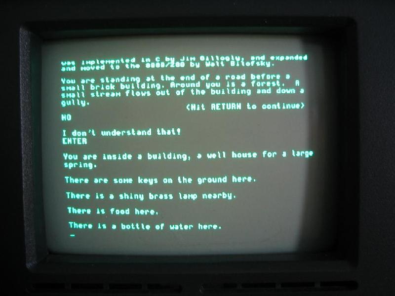
A picture of an actual text adventure from back in the day. (Large preview)
The image above is how you’d actually see the game, a far cry from our current top AAA adventure games. That being said, they were fun to play and would steal hundreds of hours of your time, as you sat in front of that text, alone, trying to figure out how to beat it.
Understandably so, text adventures have been replaced over the years by games that present better visuals (although, one could argue that a lot of them have sacrificed story for graphics) and, especially in the past few years, the increasing ability to collaborate with other friends and play together. This particular feature is one that the original text adventures lacked, and one that I want to bring back in this article.
Our Goal
The whole point of this endeavour, as you have probably guessed by now from the title of this article, is to create a text adventure engine that allows you to share the adventure with friends, enabling you to collaborate with them similarly to how you would during a Dungeons & Dragons game (in which, just like with the good ol’ text adventures, there are no graphics to look at).
In creating the engine, the chat server and the client is quite a lot of work. In this article, I’ll be showing you the design phase, explaining things like the architecture behind the engine, how the client will interact with the servers, and what the rules of this game will be.
Just to give you some visual aid of what this is going to look like, here is my goal:
General wireframe for the final UI of the game client (Large preview)
That is our goal. Once we get there, you’ll have screenshots instead of quick and dirty mockups. So, let’s get down with the process. The first thing we’ll cover is the design of the whole thing. Then, we’ll cover the most relevant tools I’ll be using to code this. Finally, I’ll show you some of the most relevant bits of code (with a link to the full repository, of course).
Hopefully, by the end, you’ll find yourself creating new text adventures to try them out with friends!
Design Phase
For the design phase, I’m going to cover our overall blueprint. I’ll try my best not to bore you to death, but at the same time, I think it’s important to show some of the behind-the-scenes stuff that needs to happen before laying down your first line of code.
The four components I want to cover here with a decent amount of detail are:
The engine
This is going to be the main game server. The game rules will be implemented here, and it’ll provide a technologically agnostic interface for any type of client to consume. We’ll implement a terminal client, but you could do the same with a web browser client or any other type you’d like.
The chat server
Because it’s complex enough to have its own article, this service is also going to have its own module. The chat server will take care of letting players communicate with each other during the game.
The client
As stated earlier, this will be a terminal client, one that, ideally, will look similar to the mockup from earlier. It will make use of the services provided by both the engine and the chat server.
Games (JSON files)
Finally, I’ll go over the definition of the actual games. The whole point of this is to create an engine that can run any game, as long as your game file complies with the engine’s requirements. So, even though this will not require coding, I’ll explain how I’ll structure the adventure files in order to write our own adventures in the future.
The Engine
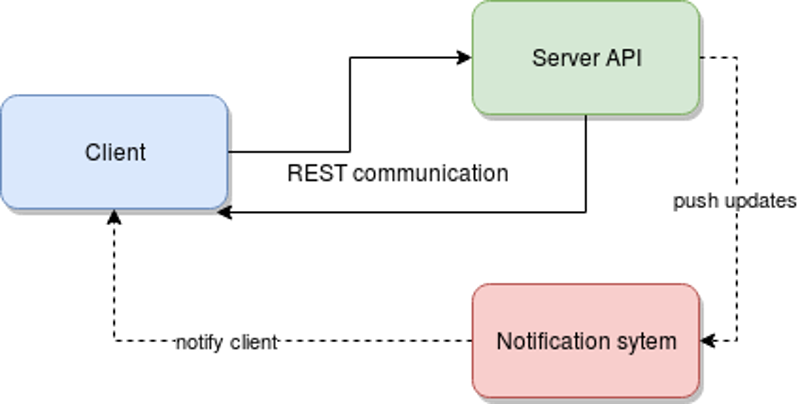
The game engine, or game server, will be a REST API and will provide all of the required functionality.
I went for a REST API simply because — for this type of game — the delay added by HTTP and its asynchronous nature will not cause any trouble. We will, however, have to go a different route for the chat server. But before we start defining endpoints for our API, we need to define what the engine will be capable of. So, let’s get to it.
Feature
Description
Join a game
A player will be able to join a game by specifying the game’s ID.
Create a new game
A player can also create a new game instance. The engine should return an ID, so that others can use it to join.
Return scene
This feature should return the current scene where the party is located. Basically, it’ll return the description, with all of the associated information (possible actions, objects in it, etc.).
Interact with scene
This is going to be one of the most complex ones, because it will take a command from the client and perform that action — things like move, push, take, look, read, to name just a few.
Check inventory
Although this is a way to interact with the game, it does not directly relate to the scene. So, checking the inventory for each player will be considered a different action.
A Word About Movement
We need a way to measure distances in the game because moving through the adventure is one of the core actions a player can take. We will be using this number as a measure of time, just to simplify the gameplay. Measuring time with an actual clock might not be the best, considering these type of games have turn-based actions, such as combat. Instead, we’ll use distance to measure time (meaning that a distance of 8 will require more time to traverse than one of 2, thus allowing us to do things like add effects to players that last for a set amount of “distance points”).
Another important aspect to consider about movement is that we’re not playing alone. For simplicity’s sake, the engine will not let players split the party (although that could be an interesting improvement for the future). The initial version of this module will only let everyone move wherever the majority of the party decides. So, moving will have to be done by consensus, meaning that every move action will wait for the majority of the party to request it before taking place.
Combat
Combat is another very important aspect of these types of games, and one that we’ll have to consider adding to our engine; otherwise, we’ll end up missing on some of the fun.
This is not something that needs to be reinvented, to be honest. Turn-based party combat has been around for decades, so we’ll just implement a version of that mechanic. We’ll be mixing it up with the Dungeons & Dragons concept of “initiative”, rolling a random number in order to keep the combat a bit more dynamic.
In other words, the order in which everyone involved in a fight gets to pick their action will be randomized, and that includes the enemies.
Finally (although I’ll go over this in more detail below), you’ll have items that you can pick up with a set “damage” number. These are the items you’ll be able to use during combat; anything that doesn’t have that property will cause 0 damage to your enemies. We’ll probably add a message when you try to use those objects to fight, so that you know that what you’re trying to do makes no sense.
Client-Server Interaction
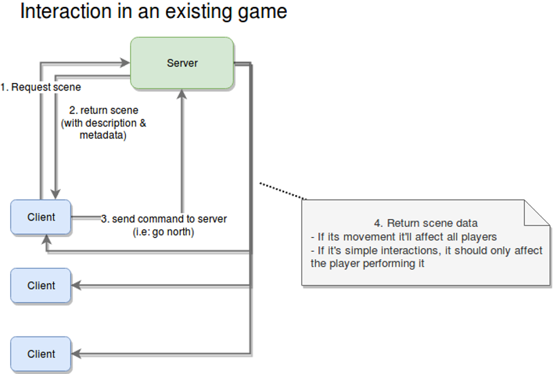
Let’s see now how a given client would interact with our server using the previously defined functionality (not thinking about endpoints yet, but we’ll get there in a sec):
The initial interaction between the client and the server (from the point of view of the server) is the start of a new game, and the steps for it are as follows:
Create a new game.
The client requests the creation of a new game from the server.
Create chat room.
Although the name doesn’t specify it, the server is not just creating a chatroom in the chat server, but also setting up everything it needs in order to allow a set of players to play through an adventure.
Return game’s meta data.
Once the game has been created by the server and the chat room is in place for the players, the client will need that information for subsequent requests. This will mostly be a set of IDs the clients can use to identify themselves and the current game they want to join (more on that in a second).
Manually share game ID.
This step will have to be done by the players themselves. We could come up with some sort of sharing mechanism, but I will leave that on the wish list for future improvements.
Join the game.
This one is pretty straightforward. Ince everyone has the game ID, they’ll join the adventure using their client applications.
Join their chat room.
Finally, the players’ client apps will use the game’s metadata to join their adventure’s chat room. This is the last step required pre-game. Once this is all done, then the players are ready to start adventuring!
Once the prerequisites have all been met, players can start playing the adventure, sharing their thoughts through the party chat, and advancing the story. The diagram above shows the four steps required for that.
The following steps will run as part of the game loop, meaning that they will be repeated constantly until the game ends.
Request scene.
The client app will request the metadata for the current scene. This is the first step in every iteration of the loop.
Return the meta data.
The server will, in turn, send back the metadata for the current scene. This information will include things like a general description, the objects found inside it, and how they relate to each other.
Send command.
This is where the fun begins. This is the main input from the player. It’ll contain the action they want to perform and, optionally, the target of that action (for example, blow candle, grab rock, and so on).
Return the reaction to the command sent.
This could simply be step two, but for clarity, I added it as an extra step. The main difference is that step two could be considered the beginning of this loop, whereas this one takes into account that you’re already playing, and, thus, the server needs to understand who this action is going to affect (either a single player or all players).
As an extra step, although not really part of the flow, the server will notify clients about status updates that are relevant to them.
The reason for this extra recurring step is because of the updates a player can receive from the actions of other players. Recall the requirement for moving from one place to another; as I said before, once the majority of the players have chosen a direction, then all players will move (no input from all players is required).
The interesting bit here is that HTTP (we’ve already mentioned that the server is going to be a REST API) does not allow for this type of behavior. So, our options are:
perform polling every X amount of seconds from the client,
use some sort of notification system that works in parallel with the client-server connection.
In my experience, I tend to prefer option 2. In fact, I would (and will for this article) use Redis for this kind of behavior.
The following diagram demonstrates the dependencies between services.
Interactions between an client app and the game engine (Large preview)
The Chat Server
I will leave the details of the design of this module for the development phase (which is not a part of this article). That being said, there are things we can decide.
One thing we can define is the set of the restrictions for the server, which will simplify our work down the line. And if we play our cards right, we might end up with a service that provides a robust interface, thus allowing us to, eventually, extend or even change the implementation to provide fewer restrictions without affecting the game at all.
There will be only one room per party.
We will not let subgroups be created. This goes hand in hand with not letting the party split. Maybe once we implement that enhancement, allowing for subgroup and custom chat room creation would be a good idea.
There will be no private messages.
This is purely for simplification purposes, but having a group chat is already good enough; we don’t need private messages right now. Remember that whenever you’re working on your minimum viable product, try to avoid going down the rabbit hole of unnecessary features; it’s a dangerous path and one that is hard to get out of.
We will not persist messages.
In other words, if you leave the party, you’ll lose the messages. This will hugely simplify our task, because we won’t have to deal with any type of data storage, nor will we have to waste time deciding on the best data structure to store and recover old messages. It’ll all live in memory, and it will stay there for as long as the chat room is active. Once it’s closed, we’ll simply say goodbye to them!
Communication will be done over sockets.
Sadly, our client will have to handle a double communication channel: a RESTful one for the game engine and a socket for the chat server. This might increase the complexity of the client a bit, but at the same time, it will use the best methods of communication for every module. (There is no real point in forcing REST on our chat server or forcing sockets on our game server. That approach would increase the complexity of the server-side code, which is the one also handling the business logic, so let’s focus on that side for now.)
That’s it for the chat server. After all, it will not be complex, at least not initially. There is more to do when it’s time to start coding it, but for this article, it is more than enough information.
The Client
This is the final module that requires coding, and it is going to be our dumbest one of the lot. As a rule of thumb, I prefer to have my clients dumb and my servers smart. That way, creating new clients for the server becomes much easier.
Just so we’re on the same page, here is the high-level architecture that we should end up with.
Final high level architecture of the entire development (Large preview)
Our simple ClI client will not implement anything very complex. In fact, the most complicated bit we’ll have to tackle is the actual UI, because it’s a text-based interface.
That being said, the functionality that the client application will have to implement is as follows:
Create a new game.
Because I want to keep things as simple as possible, this will only be done through the CLI interface. The actual UI will only be used after joining a game, which brings us to the next point.
Join an existing game.
Given the game’s code returned from the previous point, players can use it to join in. Again, this is something you should be able to do without a UI, so this functionality will be part of the process required to start using the text UI.
Parse game definition files.
We’ll discuss these in a bit, but the client should be able to understand these files in order to know what to show and know how to use that data.
Interact with the adventure.
Basically, this gives the player the ability to interact with the environment described at any given time.
Maintain an inventory for each player.
Each instance of the client will contain an in-memory list of items. This list is going to be backed up.
Support chat.
The client app needs to also connect to the chat server and log the user into the party’s chat room.
More on the client’s internal structure and design later. In the meantime, let’s finish the design stage with the last bit of preparation: the game files.
The Game: JSON Files
This is where it gets interesting because up to now, I’ve covered basic microservices definitions. Some of them might speak REST, and others might work with sockets, but in essence, they’re all the same: You define them, you code them, and they provide a service.
For this particular component, I’m not planning on coding anything, yet we need to design it. Basically, we’re implementing a sort of protocol for defining our game, the scenes inside it and everything inside them.
If you think about it, a text adventure is, at its core, basically a set of rooms connected to each other, and inside them are “things” you can interact with, all tied together with a, hopefully, decent story. Now, our engine will not take care of that last part; that part will be up to you. But for the rest, there is hope.
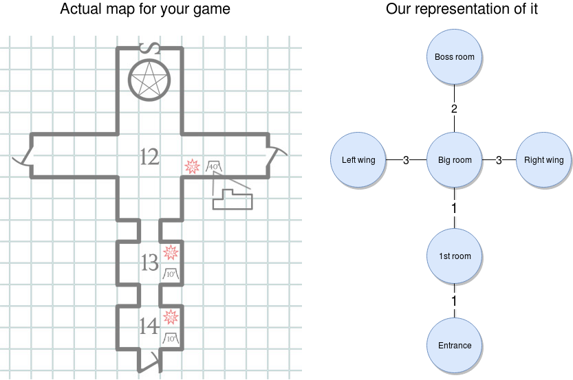
Now, going back to the set of interconnected rooms, that to me sounds like a graph, and if we also add the concept of distance or movement speed that I mentioned earlier, we have a weighted graph. And that is just a set of nodes that have a weight (or just a number — don’t worry about what it’s called) that represents that path between them. Here is a visual (I love learning by seeing, so just look at the image, OK?):
That’s a weighted graph — that’s it. And I’m sure you’ve already figured it out, but for the sake of completeness, let me show you how you would go about it once our engine is ready.
Once you start setting up the adventure, you’ll create your map (like you see on the left of the image below). And then you’ll translate that into a weighted graph, as you can see on the right of the image. Our engine will be able to pick it up and let you walk through it in the right order.
With the weighted graph above, we can make sure players can’t go from the entrance all the way to the left wing. They would have to go through the nodes in between those two, and doing so will consume time, which we can measure using the weight from the connections.
Now, onto the “fun” part. Let’s see how the graph would look like in JSON format. Bear with me here; this JSON will contain a lot of information, but I’ll go through as much of it as I can:
{
    "graph": [
            { "id": "entrance", "name": "Entrance", "north": { "node": "1stroom", "distance": 1 } },
     { "id": "1st room", "name": "1st Room", "south": {"node": "entrance", "distance": 1} , "north": { "node": "bigroom", "distance": 1} } ,
     { "id": "bigroom",
       "name": "Big room",
       "south": { "node": "1stroom", "distance": 1},
       "north": { "node": "bossroom", "distance": 2},
       "east":  { "node": "rightwing", "distance": 3} ,
       "west":  { "node": "leftwing", "distance": 3}
     },
     { "id": "bossroom", "name": "Boss room", "south": {"node": "bigroom", "distance": 2} }
     { "id": "leftwing", "name": "Left Wing", "east": {"node": "bigroom", "distance": 3} }
     { "id": "rightwing", "name": "Right Wing", "west": { "node": "bigroom", "distance": 3 } }
    ],
    "game": {
     "win-condition": {
       "source": "finalboss",
       "condition": {
         "type": "comparison",
         "left": "hp",
         "right": "0",
         "symbol": "
                 { "action": "throw", "target": "chair"} //throw
               ],
               "destination": "inventory",
               "damage": 2
             }
           ]
         }
       ]
     },
     "bigroom": {
       "description": {
         "default": "You've reached the big room. On every wall are torches lighting every corner. The walls are painted white, and the ceiling is tall and filled with painted white stars on a black background. There is a gateway on either side and a big, wooden double door in front of you."
       },
       "exits": {
         "north": { "id": "bossdoor",  "name": "Big double door", "status": "locked", "details": "A aig, wooden double door. It seems like something big usually comes through here."}
       },
       "items": []
     },
     "leftwing": {
       "description": {
         "default": "Another dark room. It doesn't look like it's that big, but you can't really tell what's inside. You do, however, smell rotten meat somewhere inside.",
         "conditionals": {
           "has light":  "You appear to have found the kitchen. There are tables full of meat everywhere, and a big knife sticking out of what appears to be the head of a cow."
         }
       },
       "items": [
         { "id": "bigknife", "name": "Big knife", "destination": "inventory", "damage": 10}
       ]
     },
     "rightwing": {
       "description": {
         "default": "This appear to be some sort of office. There is a wooden desk in the middle, torches lighting every wall, and a single key resting on top of the desk."
       },
       "items": [
         {     "id": "key",
           "name": "Golden key",
           "details": "A small golden key. What use could you have for it?",
           "destination": "inventory",
           "triggers": [{
             "action": "use", //use  on north exit (contextual)
             "target": {
               "room": "bigroom",
               "exit": "north"
             },
             "effect": {
               "statusUpdate": "unlocked",
               "target": {
                 "room": "bigroom",
                 "exit": "north"
               }
             }
           }
         ]
         }
       ]
     },
     "bossroom": {
       "description": {
         "default": "You appear to have reached the end of the dungeon. There are no exits other than the one you just came in through. The only other thing that bothers you is the hulking giant looking like it's going to kill you, standing about 10 feet from you."
       },
       "npcs": [
         {
           "id": "finalboss",
           "name": "Hulking Ogre",
           "details": "A huge, green, muscular giant with a single eye in the middle of his forehead. It doesn't just look bad, it also smells like hell.",
           "stats":  {
             "hp": 10,
             "damage": 3
           }
         }
       ]
     }
    }
}
I know it looks like a lot, but if you boil it down to a simple description of the game, you have a dungeon comprising six rooms, each one interconnected with others, as shown in the diagram above.
Your task is to move through it and explore it. You’ll find there are two different places where you can find a weapon (either in the kitchen or in the dark room, by breaking the chair). You will also be confronted with a locked door; so, once you find the key (located inside the office-like room), you’ll be able to open it and fight the boss with whatever weapon you’ve collected.
You will either win by killing it or lose by getting killed by it.
Let’s now get into a more detailed overview of the entire JSON structure and its three sections.
Graph
This one will contain the relationship between the nodes. Basically, this section directly translates into the graph we looked at before.
The structure for this section is pretty straightforward. It’s a list of nodes, where every node comprises the following attributes:
an ID that uniquely identifies the node among all others in the game;
a name, which is basically a human-readable version of the ID;
a set of links to the other nodes. This is evidenced by the existence of four possible keys: north”, south, east, and west. We could eventually add further directions by adding combinations of these four. Every link contains the ID of the related node and the distance (or weight) of that relation.
Game
This section will contain the general settings and conditions. In particular, in the example above, this section contains the win and lose conditions. In other words, with those two conditions, we’ll let the engine know when the game can end.
To keep things simple, I’ve added just two conditions:
you either win by killing the boss,
or lose by getting killed.
Rooms
Here is where most of the 163 lines come from, and it is the most complex of the sections. This is where we’ll describe all of the rooms in our adventure and everything inside them.
There will be a key for every room, using the ID we defined before. And every room will have a description, a list of items, a list of exits (or doors) and a list of non-playable characters (NPCs). Out of those properties, the only one that should be mandatory is the description, because that one is required for the engine to let you know what you’re seeing. The rest of them will only be there if there is something to show.
Let’s look into what these properties can do for our game.
The Description
This item is not as simple as one might think, because your view of a room can change depending on different circumstances. If, for example, you look at the description of the first room, you’ll notice that, by default, you can’t see anything, unless of course, you have a lit torch with you.
So, picking up items and using them might trigger global conditions that will affect other parts of the game.
The Items
These represent all the things” you can find inside a room. Every item shares the same ID and name that the nodes in the graph section had.
They will also have a “destination” property, which indicates where that item should be stored, once picked up. This is relevant because you will be able to have only one item in your hands, whereas you’ll be able to have as many as you’d like in your inventory.
Finally, some of these items might trigger other actions or status updates, depending on what the player decides to do with them. One example of this are the lit torches from the entrance. If you grab one of them, you’ll trigger a status update in the game, which in turn will make the game show you a different description of the next room.
Items can also have “subitems”, which come into play once the original item gets destroyed (through the “break” action, for example). An item can be broken down into several ones, and that is defined in the “subitems” element.
Essentially, this element is just an array of new items, one that also contains the set of actions that can trigger their creation. This basically opens up the possibility to create different subitems based on the actions you perform on the original item.
Finally, some items will have a “damage” property. So, if you use an item to hit an NPC, that value will be used to subtract life from them.
The Exits
This is simply a set of properties indicating the direction of the exit and the properties of it (a description, in case you want to inspect it, its name and, in some cases, its status).
Exits are a separate entity from items because the engine will need to understand if you can actually traverse them based on their status. Exits that are locked will not let you go through them unless you work out how to change their status to unlocked.
The NPCs
Finally, NPCs will be part of another list. They are basically items with statistics that the engine will use to understand how each one should behave. The ones we’ve defined in our example are “hp”, which stands for health points, and “damage”, which, just like the weapons, is the number that each hit will subtract from the player’s health.
That is it for the dungeon I created. It is a lot, yes, and in the future I might consider creating a level editor of sorts, to simplify the creation of the JSON files. But for now, that won’t be necessary.
In case you haven’t realized it yet, the main benefit of having our game defined in a file like this is that we’ll be able to switch JSON files like you did cartridges back in the Super Nintendo era. Just load up a new file and start a new adventure. Easy!
Closing Thoughts
Thanks for reading thus far. I hope you’ve enjoyed the design process I go through to bring an idea to life. Remember, though, that I’m making this up as I go, so we might realize later that something we defined today isn’t going to work, in which case we’ll have to backtrack and fix it.
I’m sure there are a ton of ways to improve the ideas presented here and to make one hell of an engine. But that would require a lot more words than I can put into an article without making it boring for everyone, so we’ll leave it at that for now.
If marketers and businesses expect to compete and gain market share in the digital space, they have to stay ahead of the curve.
This means taking note of new trends and even going so far as to adopt the most promising ones.
Now that we’re approaching 2019, it is time to evaluate the digital marketing trends that are gaining the most traction – the ones that have the most potential to change aspects of the digital marketing landscape as we know it.
1. Chatbots
Chatbots are the forefront of the digital marketing discussion.
What makes them different from fleeting trends of the past, however, is that they are poised to completely revolutionize the way businesses market their business – and for good.
Chatbots are nothing more than software that uses artificial intelligence (AI) to communicate with customers. Customers can have real-time conversations with chatbots who are programmed to respond in a conversational and even personalized way.
Add to the fact that chatbots can have their own name and avatar, they are virtually indistinguishable from humans themselves.
If the best marketing is cantered around problem solving, what makes chatbots particularly powerful is the fact thatthey offer a direct line of communication between the problem and the solution, which inevitably leads to more sales.
Chatbots can ask the customer pointed questions about their particular tastes and then offer up the best possible solution. From there, the chatbot can be programmed to answer additional questions and overcome any objections.
The chatbot can even track purchase history, which businesses can then use to make offers at the right time. Pizza Hut, for example, does exactly this. They will send you timely deals from within Facebook Messenger (you can also order a pizza as well).
Of course, marketing doesn’t just end with the completed transaction. Chatbots provide a direct customer service line where customers can get prompt answers in real-time, day or night.
The fundamental way in which people search online is changing. Much of this has to do with the fact that a large proportion of people are now making use of voice assistants like Apple’s Siri to directly ask questions instead of actually manually typing questions in their keyboard.
This has meant that queries are also becoming much more conversational in nature.
You can also see the rise in voice search through the increasingly popularity of voice assistants like Amazon’s Alexa and Google Home as well.
Simply put, the rise in voice search is going to change the way marketers approach both content and SEO. To plan for the rise in voice search, marketers and businesses will need to do some of the following:
Focus on long-tail keywords given that searches are more conversational (and question-based)
Create FAQs (that also includes those long-tail keywords)
Prioritize local SEO; a large number of local searches are voice-based, which means that marketers and businesses should make sure that they are following the best practices when it comes to local SEO. Also ensure that you claim your Google My Business listing and that you optimize your listing as well
3. Programmatic Advertising
Programmatic advertising has been talked about for nearly 5 years, but it has only been in the last year or so that it has become a particularly hot topic.
According to eMarketer, 84% of digital display ads will be programmatic by 2019. In other words, it is worth paying attention to.
If you’re not familiar with programmatic advertising, it uses artificial intelligence to automate the process of buying ads, a process which typically involves a lot of manual work. This saves both time and money.
However, programmatic advertising also uses artificial intelligence to determine which companies will offer the best return on investment. It will also monitor ad spend.
In this way, programmatic advertising takes out much of the guesswork of campaigns of the past while increasing efficiency and saving costs all at once.
4. Visual Search
Not only is search moving in a more voice-based direction as you saw above, but it is also moving in visual directions as well. In fact, 27% of all searches are searches for images.
Visual search is quickly taking over various shopping areas as well. And it’s not hard to see why. With visual search, you can take a picture of a guitar you saw in a magazine and then find versions of that guitar online.
As you can see, this search behavior would immediately place someone higher up in the conversion funnel than a text-based search.
The biggest companies in the world, including both Google and Microsoft, are both investing in visual search with Google Lens being one such example.
Visual search will clearly have a lot of implications for the retail industry, but incorporating visual search into your strategy is something that nearly all businesses will need to begin thinking seriously about.
The Takeaway
Chatbots, voice search, programmatic advertising and visual search all promise to be much more than passing trends. They will either completely shake up the digital marketing space or at least be around for a long while.
Put another way, the future of digital marketing trends are worth evolving with.
