For many designers, Photoshop is the number one tool for editing images, but for many other designers, Photoshop is an expensive, bloated, and inefficient tool.
In the last few years, the number of apps coming to market and taking a bite out of Photoshop’s fanbase has grown. Photoshop has so many built-in features that few apps can match them all. But few designers need them all. The key to finding a good alternative to Photoshop is finding an app that matches what you want to use Photoshop for.
Today, we’re going to look at the best alternatives to Photoshop for 2019, for a variety of purposes. If you haven’t thought about switching tools for a while, then you might be surprised by what’s available.
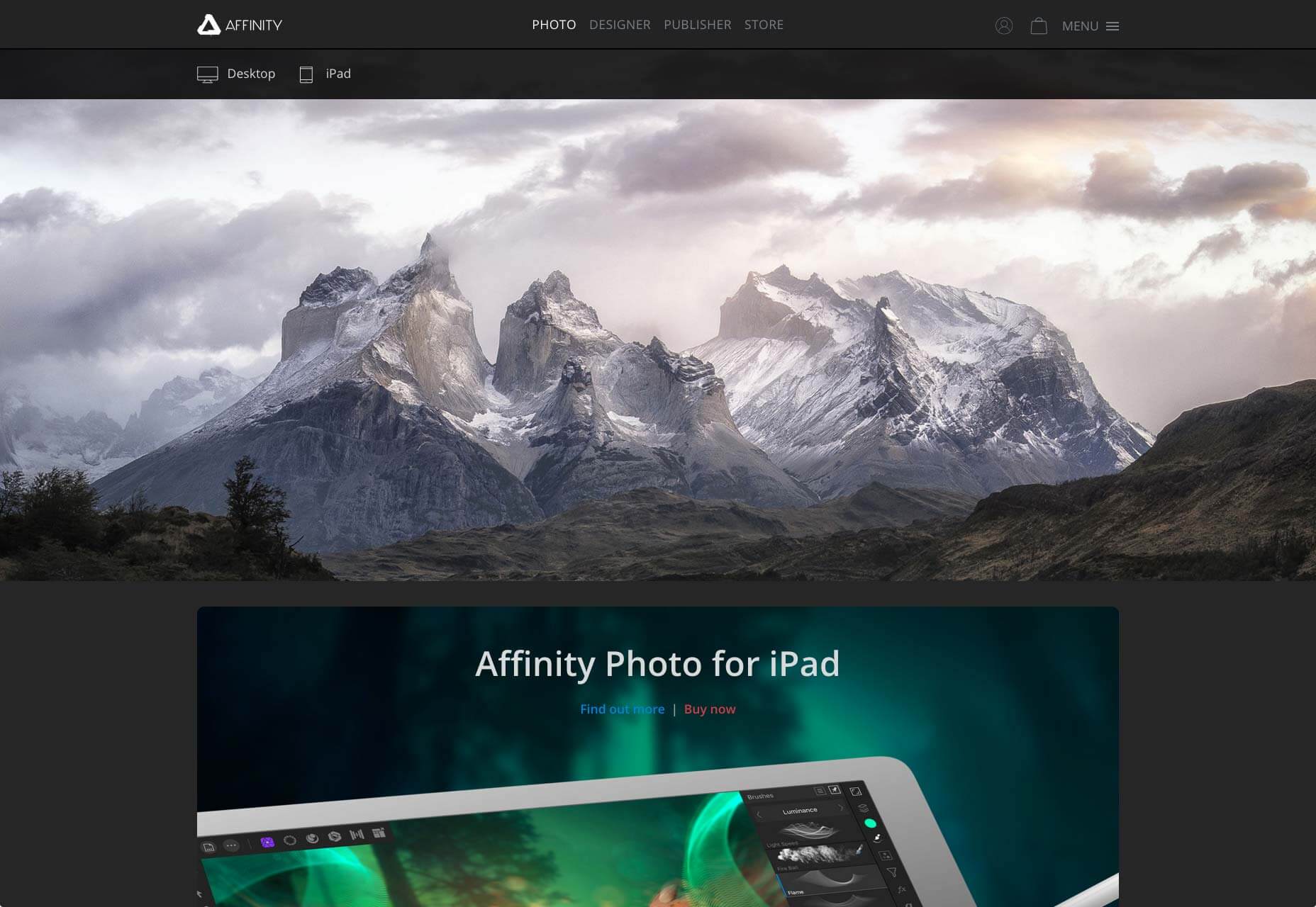
Affinity Photo
Mac & Windows. $49.99 (one-time fee)
Perfect for: Image editing
Affinity Photo is one of the highest rated image editing apps on the market. Its UI will be familiar to anyone who’s used Photoshop in the past, but it is much faster. In fact, Affinity Photo is so performant that designers who are used to Photoshop often report missing the changes that are applied to the artwork, because they expected to see a progress bar ticking across the screen.
Affinity Photo is the professional’s choice of image editor. If you’re currently using Photoshop to edit photos, then Affinity Photo is the streamlined, full-featured app that you’re looking for.
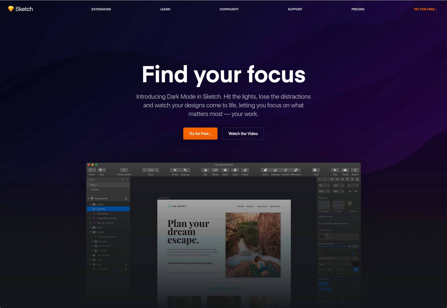
Sketch
Mac only. $99.99 (annual subscription)
Perfect for: UI Designers
The best known, and original challenger for Photoshop’s crown is Sketch. Despite not being aimed at photo editing, Sketch has absorbed thousands of ex-Photoshoppers by focusing on user interface design tools.
If you’re using Photoshop to design layouts, then Sketch is the Photoshop alternative you’re looking for. On the other hand, if you’re keen on pushing pixels around, then Sketch might not be for you. Sketch is for designers working with vectors, but if you’re able to restrict your editing to basic actions like adjusting hues, saturation, brightness, or scale, then Sketch could be a good choice.
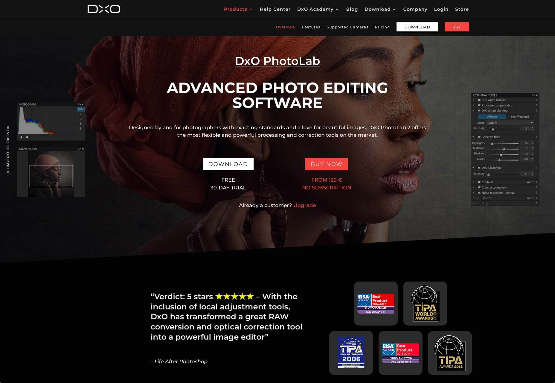
PhotoLab
Mac & Windows. €129 (approx $145) (one-time fee)
Perfect for: Photo editing
With so many Photoshop alternatives focusing on design, it’s a relief to uncover an application that’s aimed at editing photos. Little known, but multi-award winning application PhotoLab rivals or even beats Photoshop for its precision editing capabilities and correction tools.
PhotoLab includes optical corrections, and industry-leading denoising technology freeing you up to shoot at night, in low-light conditions, or with high ISO values, and still end up with a sweet looking image. Everything from optical correction to selections can be switched from automatic to manual. If you’re someone who values complete control over the tiniest details in your images, then you’ll want to check out PhotoLab.
Pixlr X
Mac, Windows, & Linux. $0
Perfect for: Quick edits
Pixlr is always on the top of any list of free Photoshop alternatives, but the old Pixlr has been deprecated (owing to the fact that it was built with Adobe Flash).
New for 2019 is Pixlr X, a next generation photo editor that works in the browser, enabling photo editing in the same carefully designed interface on any device. And because it works in the browser, it’s compatible with Mac, Windows, & Linux.
Pixlr X has tons of features that are great for bloggers, and marketers. You can even edit photos directly within Dropbox. Professional photographers used to tools like PhotoLab may find it a little lacking, but if you just need to make some fast edits, it’s an app to keep bookmarked.
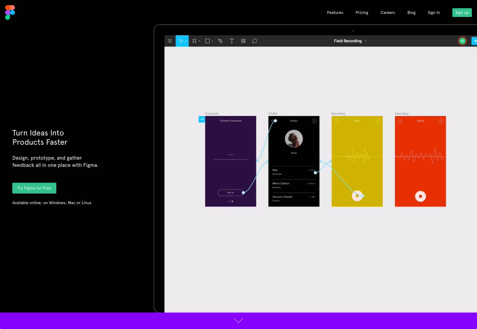
Figma
Mac, Windows, & Linux. From $12 (monthly subscription)
Perfect for: Collaborative design
One of the most innovative applications on this list is Figma. Figma is less of an image editor than a design application, but if Sketch qualifies, then so does Figma. Figma offers pro UI design just like Sketch, but Figma also provides prototyping and collaborative design.
There’s a free plan, but if you want to collaborate with more than one other person, then you need the Professional subscription. All design work takes place in the browser instead of a desktop app, and you can see the other person’s input playing out live on screen.
If you’re looking for a Photoshop alternative that improves your workflow with others, you’ll find Figma to be a great choice.
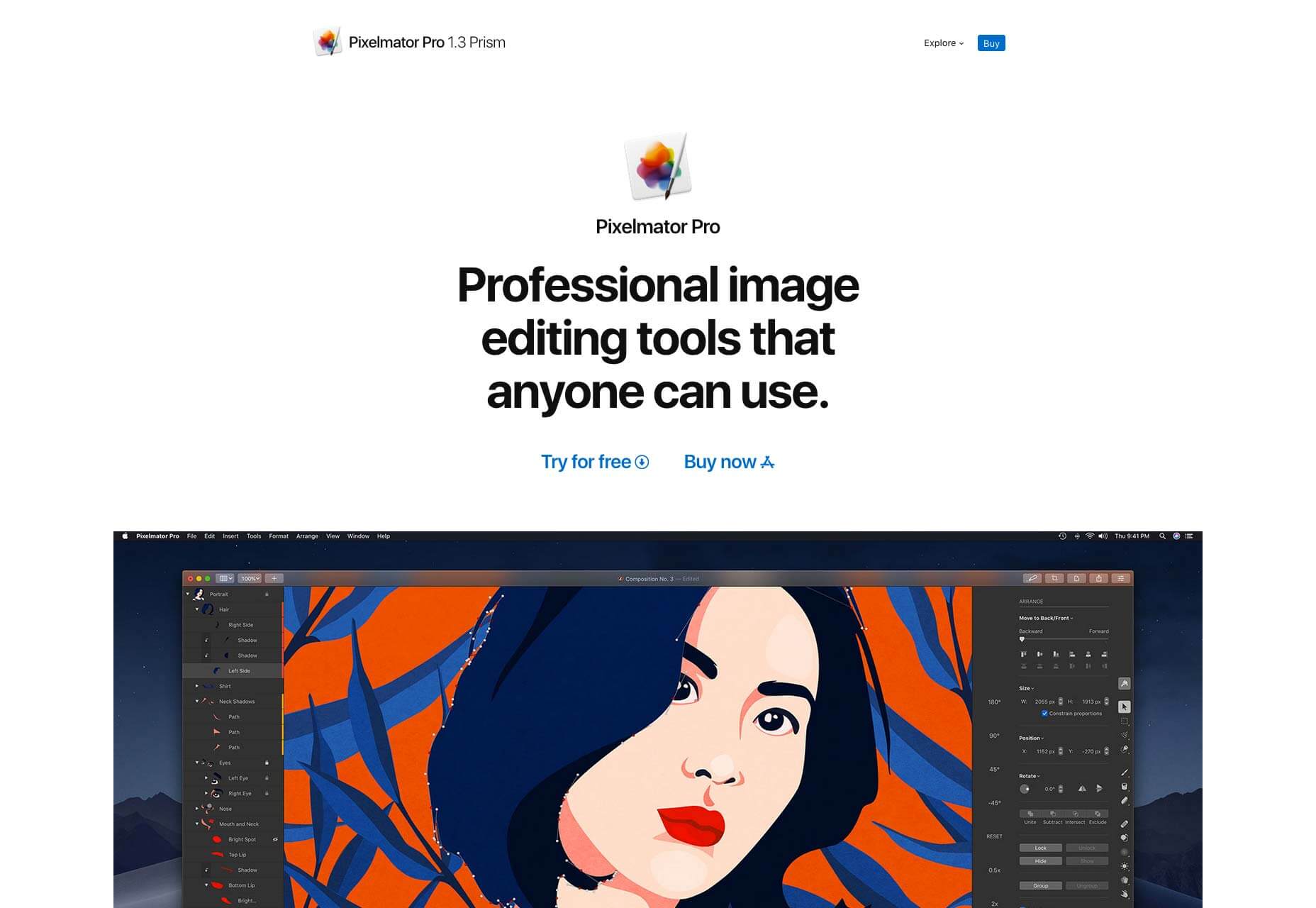
Pixelmator Pro
Mac only. $39.99 (one-time fee)
Perfect for: Plugin fans
One of the newest tools on the market, Pixelmator Pro is one of the most feature-rich apps on this list. Layer-based, and non-destructive, it’s a really easy app to get creative with. If you’ve built up a large collection of Photoshop brushes or actions over the years, then Pixelmator Pro might be the app you’re looking for because it comes pre-installed with lots of brushes, textures, and effects.
Pixelmator Pro is still in the early stages of its lifecycle, but it already looks like a mature application. It’s even found space for machine learning and touch bar support, to make your image editing more intuitive.
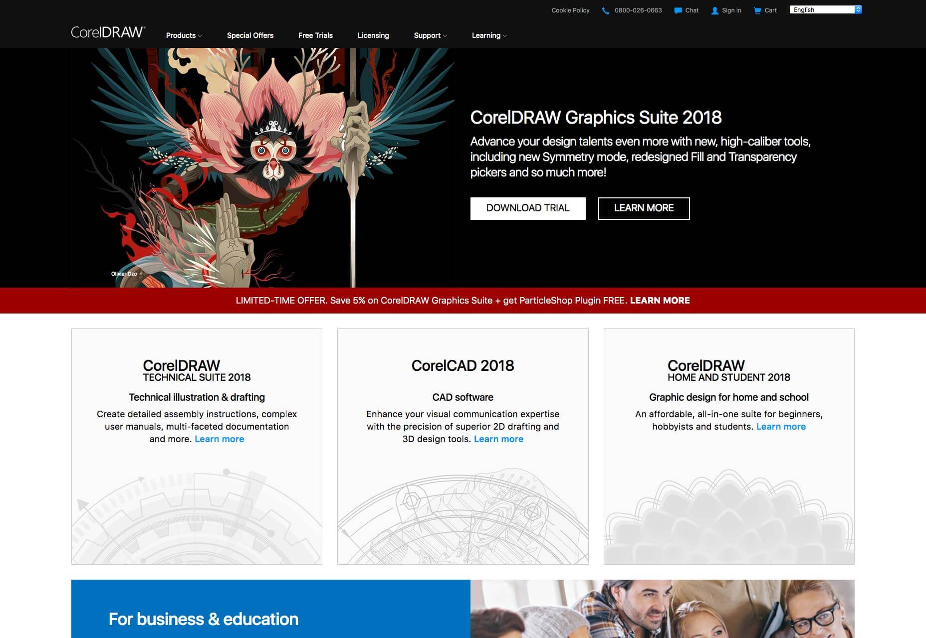
PHOTO-PAINT
Windows only. $599.99 (one-time fee) or $199.99 (annual subscription)
Perfect for: Windows users
PHOTO-PAINT is the photo editing component in Corel’s CorelDRAW Graphics Suite. It’s one of the more expensive options on this list. You also get a whole lot more than just a photo editor, CorelDRAW is less an alternative to Photoshop than to the whole of Adobe Creative Cloud. It’s a big investment, but there’s a free trial if you’d like to try before you buy.
PHOTO-PAINT is one of the few professional options that is only available on Windows, and it’s ideal for anyone that is looking a premium alternative to Photoshop, and doesn’t work on Mac.
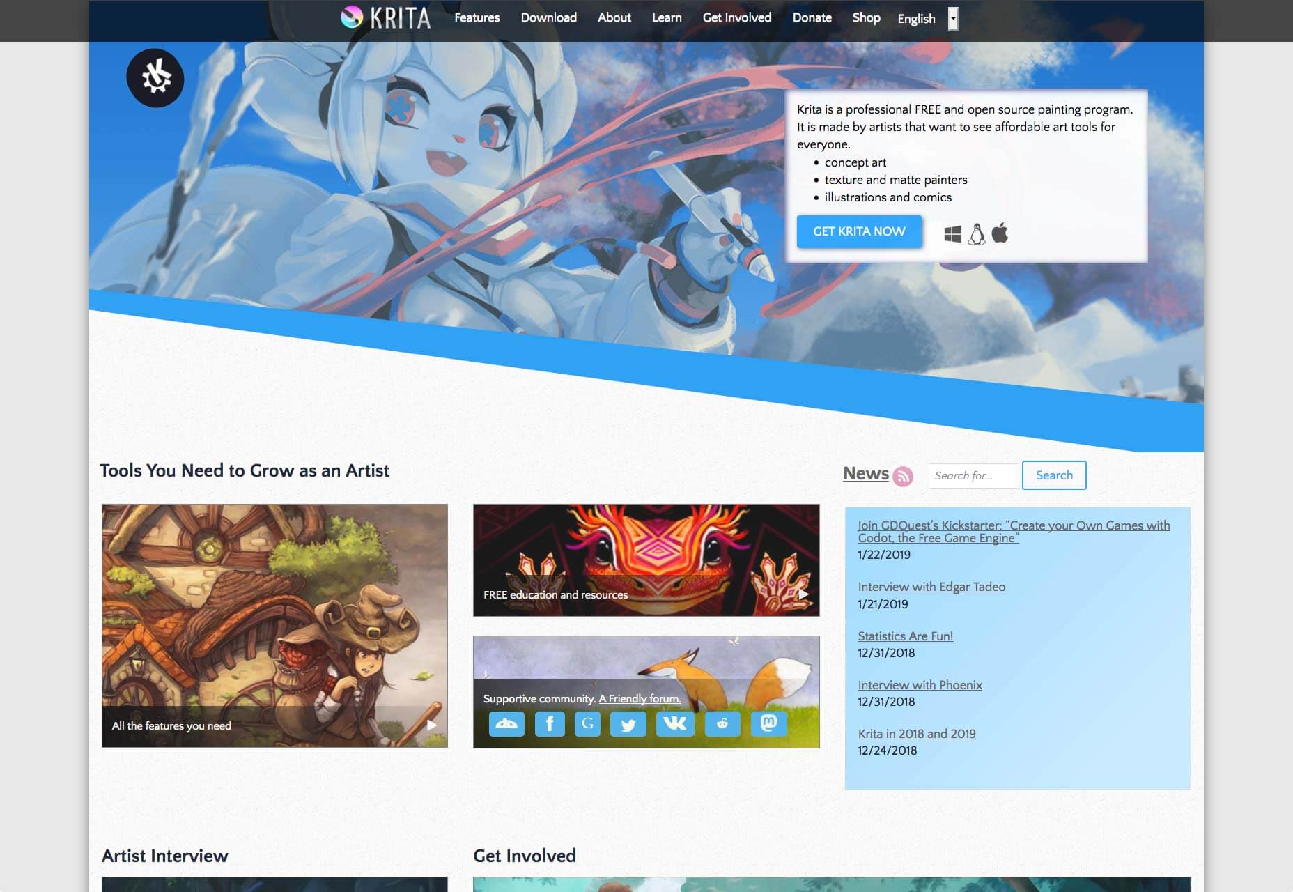
Krita
Mac, Windows, & Linux. $0
Perfect for: Digital painters
One of the tools most commonly recommended as a direct replacement for Photoshop is Krita. Its UI is very similar to Photoshop’s, with a familiar set of tools. If you’re trying to ween yourself off Photoshop, Krita is an smart alternative.
Where Krita beats other free apps is with support for drawing tablets. If you treat Photoshop as a digital canvas for creating original artwork, then Krita could be the replacement you’re looking for. It even supports the WEBP format, making it a serious contender for web designers too.
GIMP
Mac, Windows, & Linux. $0
Perfect for: Budget-conscious designers
GIMP (which stands for GNU Image Manipulation Program) is a free, image editor. Using GIMP feels like using a version of Photoshop from 15 years ago. Compared to some of the apps on this list there’s a lot of functionality missing, but GIMP is open source, so if you can code you can add any feature you want.
If you’re thinking of allocating your budget to something like Sketch or Pixelmator Pro, but you still need a good photo editing application, then GIMP could be the answer you’re looking for.
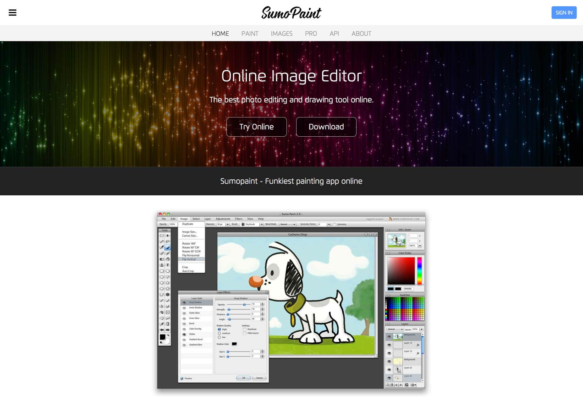
SumoPaint
Mac, Windows, & Linux. $0
Perfect for: Newbies
If you’re new to the world of image editing, then you may never have tried Photoshop, in which case, an app like SumoPaint is just perfect for you.
SumoPaint is a popular, free app, that boasts over 30 million users worldwide and was selected by Google’s edu platform as a featured application for Chrome Books. The UI is very similar to older versions of Photoshop, so it’s a great tool for getting into photo editing.
If you hadn’t seen it, Heydon posted a rather clever flexbox layout pattern that, in a sense, mimics what you could do with a container query by forcing an element to stack at a certain container width. I was particularly interested, as I was fighting a little layout situation at the time I saw this and thought it could be a solution. Let’s take a peak.
“Ad Double” Units
I have these little advertising units on the design of this site. I can and do insert them into a variety of places on the site. Sometimes they are in a column like this:
Ad doubles appearing in a column of content
Sometimes I put them in a place that is more like a full-width environment:
Ad doubles going wide.
And sometimes they go in a multi-column layout that is created by a flexible CSS grid.
Ad doubles in a grid layout that changes column numbers at will.
So, really, they could be just about any width.
But there is a point at which I’d like the ads to stack. They don’t work side by side anymore when they get squished in a narrow column, so I’d like to have them go over/under instead of left/right.
I don’t care how wide the screen is, I care about the space these go in
I caught myself writing media queries to make these ads flop from side by side to stacked. I’d “fix” it in one place only to break it in another because that same media query doesn’t work in another context. I needed a damn container query!
This is the beauty of Heydon’s albatross technique. The point at which I want them to break is about 560px, so that’s what I set out to use.
The transition
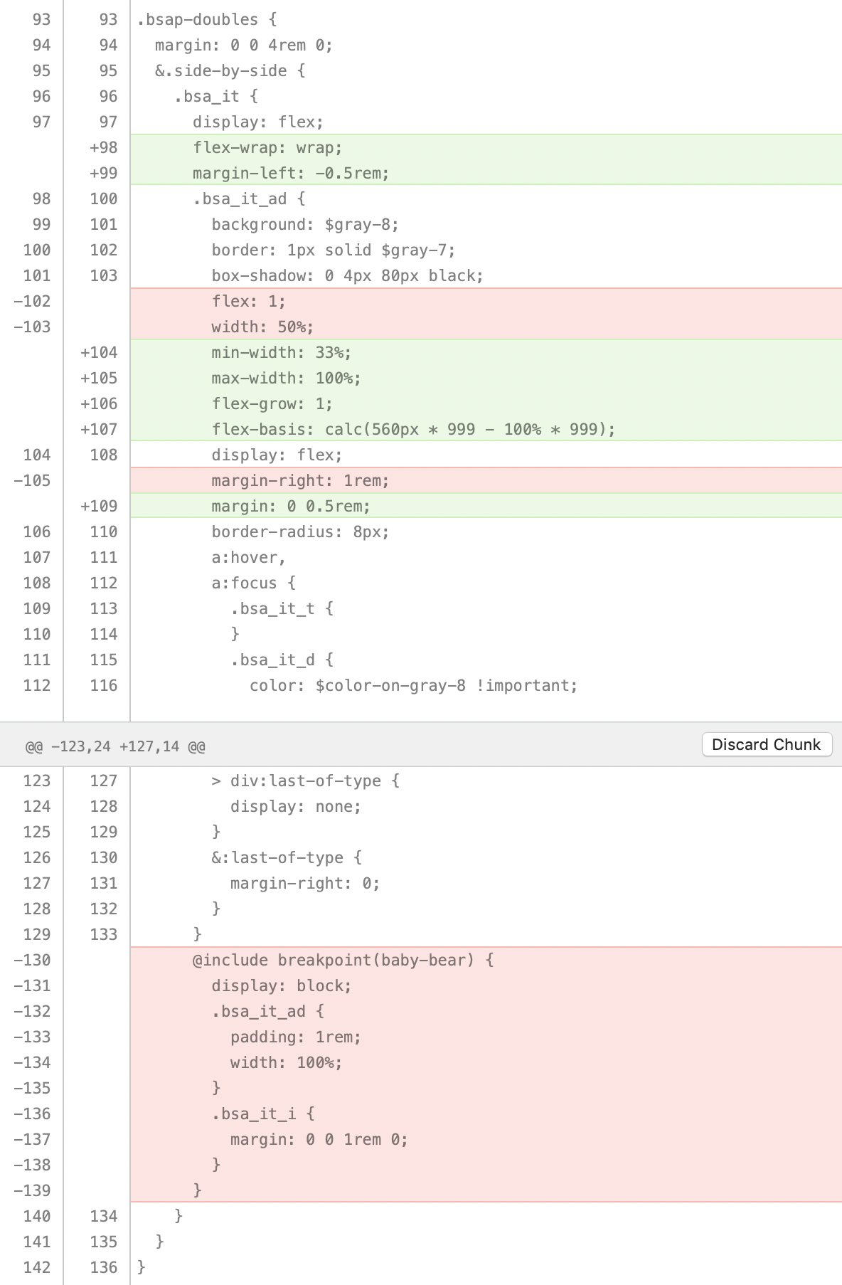
I was already using flexbox to lay out these Ad Doubles, so the only changes were to make it wrap them, put in the fancy 4-property albatross magic, and adjust the margin handling so that it doesn’t need a media query to reset itself.
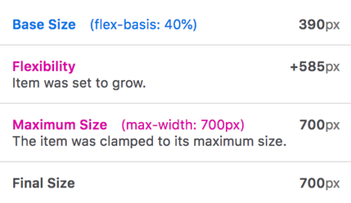
The coolest part, to me, is how it shows you the way an individual flex item arrives at the size it’s being rendered. As we well know, this can get a bit wacky, as lots of things can affect it like flex-basis, flex-grow, flex-shrink, max-width, min-width, etc.
I recently wrote about why we should be working on retiring unnecessary design elements instead of adding more stuff to websites in this mobile-first world. And it got me thinking:
What about marketing? Is there even such a thing as mobile-first marketing?
In short, I believe so.
I’m going to examine the key areas of marketing that stem from the websites we build. Then, zero in on the ways in which designers should adjust these marketing strategies for mobile-friendly and mobile-first audiences.
How Web Designers Can Contribute To Mobile-First Marketing
There are typically three kinds of marketing strategies businesses utilize:
Content marketing
Email marketing
Social media marketing
Similar to how we view web design through a mobile-first lens, a similar process must occur when designing marketing strategies going forward. That means not being afraid to toss out design or even text elements for the mobile experience. It also means taking tried-and-true marketing techniques and compressing them down so they’re more easily digestible for audiences on mobile.
Here are some things to consider as a web designer:
Content Marketing
Traditionally, content marketing has been synonymous with blogging. But, in recent years, this kind of marketing encompasses a much wider range of content creation as consumers demand information more quickly and conveniently than ever before. Many of these blog alternatives (like vlogs and podcasts) do well on mobile. They are easier to get ahold of on these devices and can be consumed at the user’s convenience wherever and whenever they please.
Regardless of the type of content you produce, there are certain ways it should be designed for the mobile-first audience.
Remove Sidebar Elements
To start, you need to ditch those cumbersome sidebar elements (something I talked about in my previous post). I like Airbnb‘s example of this:
The Airbnb mobile blog greatly simplifies the sidebar. (Image source: Airbnb) (Large preview)
As you can see, the bottom of the post isn’t bogged down in a bunch of unnecessary sidebar widgets for mobile users to scroll through. There’s a link to related articles and that’s it.
This enables mobile users to really focus on the content before them and to absorb the message without a bunch of other distractions around.
Use Captivating Visuals For Longer Posts
If you have to write longer pages or posts (which isn’t necessarily a bad thing), make sure you include unique and captivating visuals throughout. Also, make sure they don’t overwhelm the screen.
The Guardian uses a unique illustration for its featured image. (Image source: The Guardian) (Large preview)
The featured image for the blog post is a custom-drawn illustration. If that didn’t impress readers enough, the matching illustrations placed at regular intervals throughout the post should:
The Guardian uses custom illustrations throughout its article. (Image source: The Guardian) (Large preview)
When your mobile site is as content-driven as The Guardian’s, you need to rely heavily on the visual component to support the story on the page. If videos or podcasts can’t completely replace a lengthy post, make sure images can aptly tell a story on their own as well as provide real support to the narrative told on the page.
“Design” The Text
For text-based content marketing, the structure and formatting of it are going to be a big deal.
What’s so surprising about this example is that it comes from a very well-known bookstore in the United States. You would think that a business that deals in the written word would take greater care in designing the words on its web pages.
There are a number of problems with the design. For starters, a supporting image has been included next to each of the books included in the roundup, but they’re small and don’t fit well beside the text. Then, you have the text itself which uses justified alignment. This introduces a bunch of awkward white space which makes the text difficult to read.
The big takeaway here is to take time to design the text on the page as much as you do the visuals. If visitors can’t read the content easily, your marketing will be ineffective.
Break Up Lengthy Text
It’s also important to be mindful of the length of the content on your pages. Take a look at this post from the Pitchfork website:
A Pitchfork blog post has no paragraph breaks. (Image source: Pitchfork) (Large preview)
Most of the paragraphs in this write-up look like this. Overly long sentences. Run-on paragraphs. You can’t even see an end to the paragraph in many cases.
Even if you’re not the writer of the content, find ways to break it up for the mobile user. Realistically, desktop websites should have a maximum limit of 3 or 4 lines for paragraphs. On mobile, let’s set that limit to 5 or 6. This ensures readers won’t become overwhelmed with content that seemingly has no end in sight.
I would suggest using the Smashing Magazine website for inspiration when designing the structure and length of marketing content:
Smashing Magazine includes notes about posts and callouts to ease the mobile reading experience. (Image source: Smashing Magazine) (Large preview)
The top of each article includes a number of callouts that quickly summarize what you’re about to read. This sets expectations properly.
This example demonstrates how Smashing Magazine has taken the time to properly design the text on the page. A header tag is present. Hyperlinked text stands out well. Text is properly sized for mobile. It also flows naturally from left-to-right with a ragged edge which makes for easier reading. And it’s intercepted by an image/poll.
It might not seem like a big deal on desktop to lay out five or six paragraphs one after the other, but do take a minute to hop over to mobile and see how that translates to the smaller screen. You may be surprised at how much readability differs between the on-site experiences.
Keep Mobile Users Engaged
Getting people to convert on mobile isn’t easy.
But it’s not impossible to get around those traditionally low conversion rates. First, you need to acknowledge that mobile users have shorter attention spans. Check out this blog post from The Home Depot:
The Home Depot includes ever-present CTAs on the blog. (Image source: Home Depot) (Large preview)
This post serves as an inspirational tutorial for readers, providing them with ideas on how to remodel their own bathroom at home.
But notice the “Shop This Project” bar that sits along the bottom of the post. This is a fantastic idea. Rather than hope that mobile readers will be willing to read the entire post and click the links on their own, the Home Depot has made this nice and easy. This says:
“Hey, this is a great idea if you’re looking to remodel your home… but we get it if you’re short on time. Here are all the materials you need to do it on your own!”
It plays into the idea that the mobile user wants information to be succinct and convenient and also doesn’t have the time to ingest long pages of content — no matter how helpful they may be.
The Home Depot has another great example of how to keep mobile users with limited attention spans engaged:
In the above example, you can see the Home Depot has made its images Pinnable. Why is this great? It’s because it embraces the multichannel experience.
Remember; we’re designing websites to be mobile-first, not mobile-all-encompassing.
Chances are good that the majority of your website visitors will start on mobile. It’s your job to ensure that one of two things happens:
If the journey ends on mobile, it ends with a conversion.
or
If the user doesn’t convert on mobile, you’ve provided them with a clear pathway to convert at a later time and from another device.
That’s what the Home Depot has done here by including “Pin It” buttons. Mobile users can save those images (and the links to the posts) to Pinterest for later. Then, when they’re ready to work on that home renovation project, they can open their laptop or tablet and pull up that cool-looking photo and supporting article to guide them through it.
Email Marketing
Without a doubt, email marketing is one of the most effective ways to get in front of a mobile audience and compel them to convert. A report from just a few years ago showed that 80% of respondents believed email marketing to be the key driver in terms of consumer acquisition and retention.
Although email marketing is highly effective in attracting quality customers, you have to be careful with it on mobile. Mobile users don’t think or act the same way as desktop users, as evidenced by the research around micro-moments.
That’s why, when it comes to designing email campaigns and newsletters for clients, you must keep the following tips in mind:
Keep It Simple
Unless your email subscriber list is expecting lengthy messages on a regular basis (and there’s a good reason for it), it’s best to keep email communications simple. That’s why we build websites – so that marketing messages can remain short and to the point and then link out to provide more information.
Here is an example from Chase of a message that went a little overboard:
An email marketing message from Chase. (Image source: Chase) (Large preview)
First of all, the message is a little misleading. It talks about the top tools you’re about to discover to manage your Chase account. However, the points broken out below it are nothing more than features included in the mobile app.
Another problem we have is the unevenly distributed text. When you design anything for the web, there should be symmetry. But it’s clear here that the copywriter and designer did not work together to craft the message.
Finally, there’s the linking issue. The goal of this message is to motivate Chase customers to download and use the mobile app. And, yet, there are two links to the Chase website that compete with the two app store links at the bottom.
Overall, there’s just too much going on in the design and message of this email. Chase would’ve been better off simplifying it with an eye-catching graphic and pushing traffic to the website to learn more and download the app from there.
Use Images
While I understand why some marketers think it’s a good idea to write email copy to look like messages people receive from others they know, I don’t think it’s a great idea on mobile.
When I receive messages that look like this (i.e. plain text, no images, free-standing links), my gut reaction is:
This is spam.
It’s not that this email is difficult to read. And, in all fairness, I should have been expecting it since I had signed up for a webinar. While it’s great that the message mostly fits within one screenful of my mobile device, I’m left seriously wanting.
If you intend to impress me with a webinar, why have you made the email such a lackluster experience?
This is a great argument for why images are helpful in convincing mobile email users to stop and read your marketing communication.
Even if images don’t make sense for the message, you should design a professional, branded template that clients can use to skin all messages. This helps guide users to the content framed within it. It also gives marketing messages a consistent and instantly recognizable look.
Make Sure They Can Read the Text
Earlier last year, I explored the role typography played in the mobile user experience. What’s not surprising at all is the fact that the size of the font can seriously hinder the reading experience. Let me show you a couple of examples that demonstrate this point in the context of email:
This is a marketing communication I received from Freelancers Union. I enjoy reading their blog, but I’ve never been a fan of the blog roundup newsletters:
Some of the text is readable, for sure. “Today on Freelancers Union” as well as the title of the excerpt are both legible from where I’m sitting. The rest of the message, however, is quite problematic.
By my count, there are five different font sizes used in this message, not to mention varying styles and colors of hyperlinks included. When I see these messages in my inbox, I know now not to bother with trying to read them. I just go straight to the titles under “Excerpts”. I suspect I’m not the only one who does this.
A Zendesk email falls short on typography. (Image source: Zendesk) (Large preview)
There’s a lot that’s wrong here.
For starters, the headline creates confusion. I thought the message was from Zendesk and, yet, the headline is all about Gartner and a superfluous report name I don’t recognize (at least I think it’s a report?). If there’s a Zendesk connection, it should be in the header. Even if there isn’t, the header should clearly explain why I should keep reading.
Then, there’s the issue of reading. Why the heck is the headline banner so big and the rest of the message in a font face that’s way too small for mobile? It’s almost as if they didn’t want anyone to read the rest.
Also, if we were to look at the hierarchy of the page, why didn’t the report button get more real estate? In terms of taking action on the page, that should be the primary target, but the design would not have you believe that’s the case.
Bottom line: size matters on mobile. If you’re not yet testing your mobile email marketing messages before sending them, do it now.
Tell the Story with an Image
Now that I’ve spent all that time sharing examples of poorly designed mobile newsletters, I want to show you one that’s done quite well.
Sweet Frog uses little text and a captivating image in email. (Image source: Sweet Frog) (Large preview)
I think the only gripe I have with this message is that the image didn’t come before the text. Otherwise, I think it’s well done.
The image looks great on mobile. It’s well-sized, well-designed, colorful and provides the message in as concise a manner as possible.
The designer has done a nice job with the text as well. The paragraph isn’t too long. Plus, all-caps is a good way to draw mobile users’ attention to the key part of the message. In other words, CONVERT HERE.
Send Relevant Emails
When we looked at the key micro-moments that take place on mobile, we focused on how users are looking to take quick and precise actions. When you craft an email marketing message for those users, you better make sure to keep those in mind as well.
One example I’m particularly fond of is this one from Hotels.com:
Although there are a few distractors in the email template I’d like to see gone, I really do appreciate how pointed the message is. Hotels.com spells out in the subject line exactly what I’m going to get: 10% off.
Then, using a strong color and impossible-to-miss font, it quickly reiterates that all they want from me at this moment is to share a 10% off coupon. And with a blue button, just a couple paces below it, I can quickly grab my coupon code and explore their offers.
This is absolutely perfect. If you’re paying close attention to what users search for and end up doing when they’re on mobile, you should be able to craft messages like these with ease.
Look for ways to serve up a quick action like:
Use this coupon.
Watch this quick video.
Join us this weekend.
Etc.
The more you know about your audience and the things you can do to make them take immediate action, the more effective your mobile email marketing will be.
Social Media Marketing
Social media marketing has always been a kind of bite-sized form of marketing. Because of the limited amounts of space available within posts and the emphasis on communicating through videos and images, social media has always provided us with a more succinct and quick way to reach others.
That said, some people still haven’t figured out how to master it.
This is why I’m encouraging you as a web designer to step in and help. Here’s why:
Choose Images Wisely
If you think about the space available on a mobile screen, images and videos on social media are going to comprise a good majority of it. That’s why it’s critical to choose your visual content well.
The video in the top post is a great example of social media visuals done well. The video is beautifully shot and matches the branding of the company sharing it. It’s clear that great care was put into this piece of video marketing.
Then, you have this example also from the Lyft Twitter page:
Lyft’s co-founder shares a photo on Twitter. (Image source: Lyft) (Large preview)
User-generated content can be a wonderful thing for a brand, especially if your company is young and your capacity to create content is somewhat limited. But Lyft is not a new company.
While I appreciate the co-founder’s efforts to show himself driving people around, his photos stand out like a sore thumb in the feed. In the case of this image, the lighting is poor, and many of the passengers get lost in the background. In other photos he’s shared and that Lyft has retweeted, everyone is out-of-focus.
Now, we could just chalk this up to: “Well, he’s not a professional photographer. We shouldn’t expected that much from him.” There’s just one problem with that:
Walt Disney World‘s Instagram feed is mostly comprised of photos and videos taken by visitors of the amusement park. The above example is one of them. And, yet, WDW takes good care in sharing photos that shed the best light on its brand.
As a general rule, whether you’re uploading your own photos, sharing them from others or designing them by hand, make sure you’re okay with them representing your brand. If they’re more appropriate for sharing on a personal account, leave them to the founder of the company to stick them on his or her feed. Keep your professional mobile feeds full of impressive content.
Consider The Space
Although social media typically limits the amount of space one can use to share a post, there are some channels where these limits have been stretched. When considering the “space” your post takes, be sure to go beyond just the physical dimensions of the image or text.
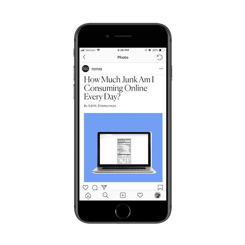
This is a post from New York Magazine’s Instagram feed. What I like about this is that they’ve designed the image to include the title, byline and featured image similar to how it would appear on the website’s news feed. That attention to things like consistency from the website to social media is fantastic.
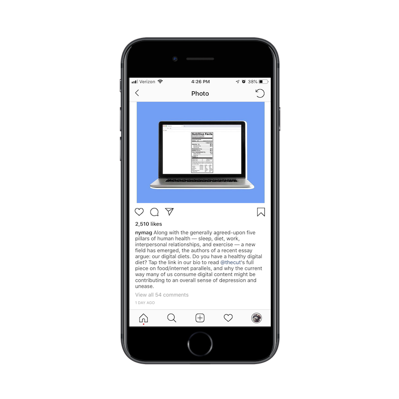
This is the caption you’ll find beneath the image.
Here’s the thing: we already know that this post is promoting a new article on the website. The title is incredibly clear what the post is about and the featured image drives the point home.
There’s no reason to make Instagram users stop scrolling through their news feed to read this lengthy description. It’s just a waste of space and energy at this point. The post could’ve just as easily said:
“Do you have an unhealthy diet? Click the link in our bio to find out about this dangerous trend.”
Another reason why you need to be conscious of space is this:
Instagram now has this feature for businesses where they can aggregate a bunch of their post links in one place. This is great considering it was difficult to share content in the past years since links weren’t clickable.
That said, this is yet another step New York Magazine readers have to take to get to that unhealthy eating post. Pay attention to how much work you’re asking mobile readers to do and determine whether or not the payoff is really worth it.
Use Hashtags (and Wisely)
There are certain social media channels where hashtags aren’t really needed and could potentially add friction where you don’t want any. I would say that Facebook and LinkedIn are two such examples of channels where you don’t need them.
That said, as a brand using social media for the purposes of marketing, you’re going to want to use hashtags (#) and handles (@) when crafting posts on places like Instagram, Pinterest, and Twitter. Content can be difficult to find on these channels without them, which is why you can’t afford to go without as Zaftig’s has done here:
Zaftig’s social media post without hashtags. (Image source: Zaftig’s) (Large preview)
Zaftig’s is one of my favorite restaurants in Boston. It also happens to be a lot of other people’s favorite restaurant as there’s almost always a wait whenever you go. So, I’m surprised to see such an underwhelming post on Instagram.
The photo is great. It reminds me of the many delicious meals I had here. But why no hashtags? A photo like this and a restaurant with such a great reputation in Boston should be able to leverage hashtags to bolster their reputation and extend their reach.
As someone who follows food inspiration Instagram pages, I can tell you I find new places to eat all the time with hashtags as simple as #breakfast. This is a huge missed opportunity for them.
On the other hand, it is possible to go overboard with hashtags on social media.
In this example, you can see that there are too many hashtags throughout. This is problematic for a couple reasons:
Hashtags are like links in that they stand out from the surrounding text. When they’re included in the middle of a post, it disrupts the reading flow.
These particular hashtags aren’t really click-worthy. I would also suggest they don’t add any value to the post. Again, they’re more a distraction than anything.
As a designer, I’d ask you to look at hashtags and handles similar to how you would a CTA on a website. You know they’re going to stand out from the rest of the text, so make them worth the social media users’ time to look at. If their reason for being isn’t to click, at least infuse them with some of the brand personality.
If there’s no value in hashtagging a word or string of words in a post, don’t do it.
Format Your Posts
Blog posts and emails aren’t the only things where attention to formatting and balance matters. Although an empty message box on Twitter or Facebook might make you want to just type and type and type away, there’s more you can do to enhance the readability of your posts. I’d argue that proper formatting also makes your posts more attractive to the eye.
If you want more mobile users to stop and take a look at what you’ve posted, take a page out of Dr. Bronner‘s book:
Okay, so the image itself is attention-grabbing, so this company gets major kudos for that.
But have a look at how the post itself is structured.
There’s a one-line sentence that introduces the promotion, topped off with a cute emoji. Emojis are to social media what icons are to websites. Don’t be afraid to use them, especially if your target audience is millennial or Gen-Z.
Then, you have a numbered list! Twitter and other social channels might not make this as easy to write out as a word processor, but so what? Look at how nice that looks? When compared to most posts that usually follow the tired paragraph format, this is sure to stand out and get mobile users to take a look.
Wrapping Up
If you’ve been entrusted to make critical design choices for your clients’ websites, then it’s time to leverage that trust and move into marketing with them.
While the design piece might not be as time- or labor-intensive as what you’d do on websites, online marketing is an ongoing thing. This could open up a new, steady income stream if you can demonstrate your knowledge and expertise in designing for marketing just as well as you did for the web.
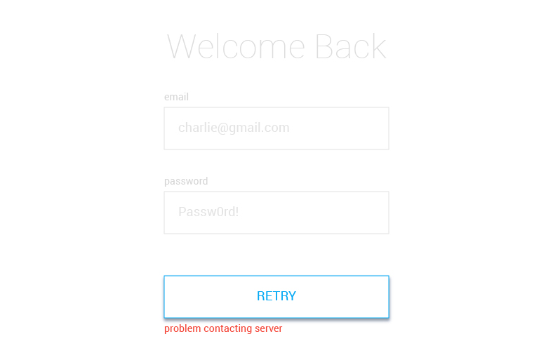
To make a sign in form with good UX requires UI state management, meaning we’d like to minimize the cognitive load to complete it and reduce the number of required user actions while making an intuitive experience. Think about it: even a relatively simple email and password sign in form needs to handle a number of different states, like empty fields, errors, password requirements, loading and success.
Thankfully, state management is what React was made for and I was able to create a sign in form with it using an approach that features XState, a JavaScript state management library using finite machines.
State management? Finite machines? We’re going to walk through these concepts together while putting together a solid sign in form.
Jumping ahead, here’s what we’re going to build together:
First, let’s set up
We’ll need a few tools before getting started. Here’s what to grab:
We already mentioned that XState is a state management JavaScript library. Its approach uses finite state machines which makes it ideal for this sort of project. For example:
It is a thoroughly tried and tested approach to state management. Finite state machines have been around for 30+ years.
The machine config is the core of XState. It is a statechart and it will define the logic of our form. I have broken it down into the following parts, which we’ll go over one by one.
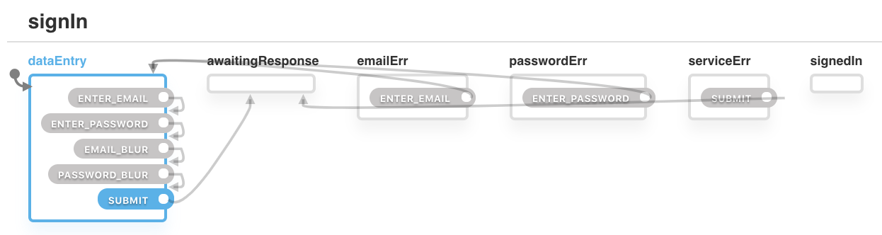
1. The States
We need a way to control what to show, hide, enable and disable. We will control this using named-states, which include:
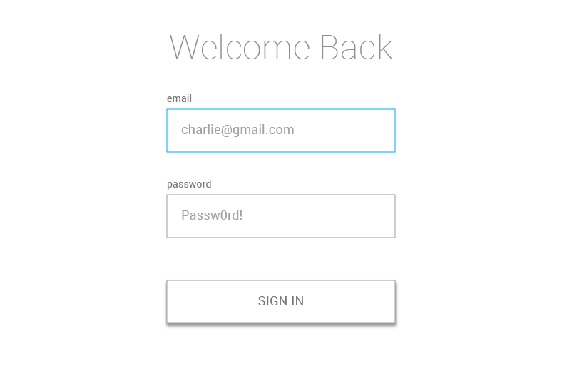
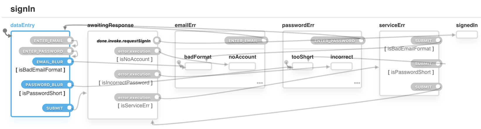
dataEntry: This is the state when the user can enter an email and password into the provided fields. We can consider this the default state. The current field will be highlighted in blue.
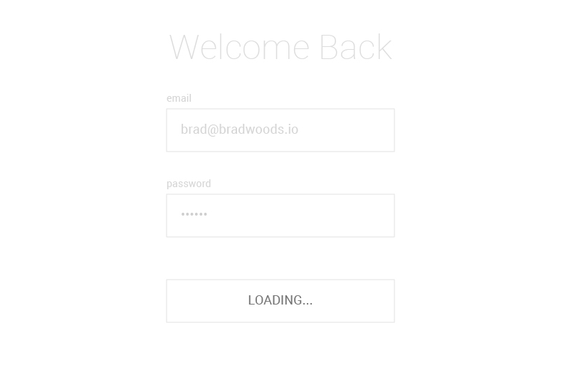
awaitingResponse: This is after the browser makes a request to the authentication service and we are waiting for the response. We’ll disable the form and replace the button with a loading indicator when the form is in this state.
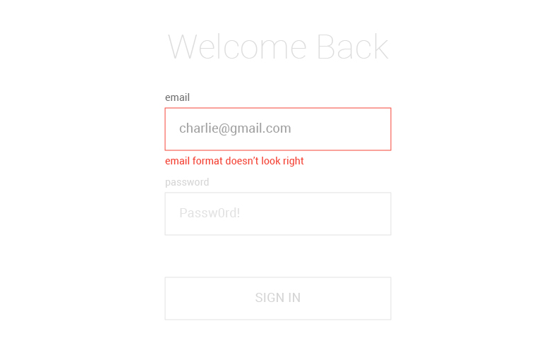
emailErr: Whoops! This state is thrown when there is a problem with the email address the user has entered. We’ll highlight that field, display the error, and disable the other field and button.
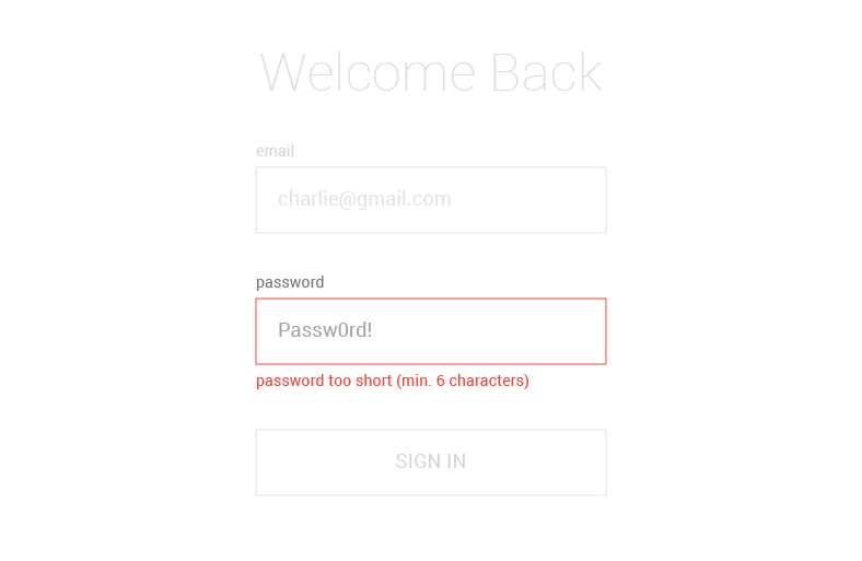
passwordErr: This is another error state, this time when there is a problem with the password the user has entered. Like the previous error, we’ll highlight the field, display the error, and disable the rest of the form.
serviceErr: We reach this state when we are unable contact the authentication service, preventing the submitted data to be checked. We’ll display an error along with a “Retry” button to re-attempt a service connection.
signedIn: Success! This is when the user has successfully authenticated and proceeds past the sign in form. Normally, this would take the user to some view, but we’ll simply confirm authentication since we’re focusing solely on the form.
See the machinConfig.js file in the SignIn directory? Crack that open so we can define our states. We list them as properties of a states object. We also need to define an initial state, which mentioned earlier, will be the dataEntry state, allowing the user to enter data into the form fields.
Each part of this article will show the code of machineConfig.js along with a diagram produced from the code using XState’s visualizer.
2. The Transitions
Now that we have defined our states, we need to define how to change from one state to another and, in XState, we do that with a type of event called a transition. We define transitions within each state. For example, If the ENTER_EMAIL transition is triggered when we’re in the emailErr state, then the system will move to state dataEntry.
Note that nothing would happen if a different type of transition was triggered (such as ENTER_PASSWORD) while in the emailErr state. Only transitions that are defined within the state are valid.
When a transition has no target, it is an external (by default) self-transition. When triggered, the state will exit and re-enter itself. As an example, the machine will change from dataEntry back to dataEntry when the ENTER_EMAIL transition is triggered.
Here’s how that is defined:
dataEntry: {
  on: {
    ENTER_EMAIL: {}
  }
}
Sounds weird, I know, but we’ll explain it a little later. Here’s the machineConfig.js file so far.
We need a way to save what the user enters into the input fields. We can do that in XState with context, which is an object within the machine that enables us to store data. So, we’ll need to define that in our file as well.
Email and password are both empty strings by default. When the user enters their email or password, this is where we’ll store it.
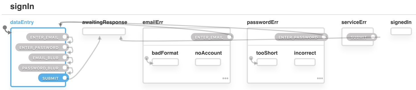
We will need a way to be more specific about our errors. Instead of simply telling the user there is an email error, we need to tell them what kind of error happened. Perhaps it’s email with the wrong format or there is no account linked to the entered email — we should let the user know so there’s no guessing. This is where we can use hierarchical states which are essentially state machines within state machines. So, instead of having a emailErr state, we can add sub-states, such as emailErr.badFormat or emailErr.noAccount.
For the emailErr state, we have defined two sub-states: badFormat and noAccount. This means the machine can no longer only be in the emailErr state; it would be either in the emailErr.badFormat state or the emailErr.noAccount state and having them parsed out allows us to provide more context to the user in the form of unique messaging in each sub-state.
When the user blurs an input or clicks submit, we need to check if the email and/or password are valid. If even one of those values is in a bad format, we need to prompt the user to change it. Guards allows us to transition to a state depending on those types of conditions.
Here, we’re using the EMAIL_BLUR transition to change the state to emailErr.badFormat only if the condition isBadEmailFormat returns true. We are doing a similar thing to PASSWORD_BLUR.
We’re also changing the SUBMIT transition’s value to an array of objects with a target and condition property. When the SUBMIT transition is triggered, the machine will go through each of the conditions, from first to last, and change the state of the first condition that returns true. For example, if isBadEmailFormat returns true, the machine will change to state emailErr.badFormat. However, if isBadEmailFormat returns false, the machine will move to the next condition statement and check if it returns true.
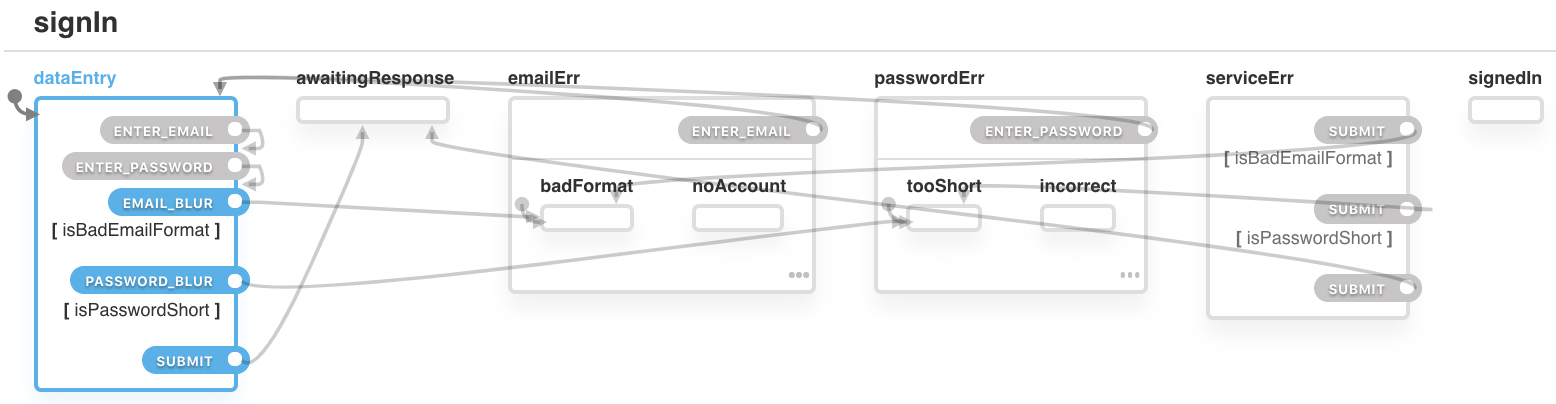
All of the work we’ve done so far would be for nought if we didn’t make a request to an authentication service. The result of what’s entered and submitted to the form will inform many of the states we defined. So, invoking that request should result in one of two states:
Transition to the signedIn state if it returns successfully, or
transition to one of our error states if it fails.
The invoke method allows us to declare a promise and transition to different states, depending on what that promise returns. The src property takes a function that has two parameters: context and event (but we’re only using context here). We return a promise (our authentication request) with the values of email and password from the context. If the promise returns successfully, we will transition to the state defined in the onDone property. If an error is returned, we will transition to the state defined in the onError property.
const machineConfig = {
  ...
  states: {
    ...
    // We're in a state of waiting for a response
    awaitingResponse: {
      // Make a call to the authentication service
      invoke: {
        src: 'requestSignIn',
        // If successful, move to the signedIn state
        onDone: {
          target: 'signedIn'
        },
        // If email input is unsuccessful, move to the emailErr.noAccount sub-state
        onError: [
          {
            cond: 'isNoAccount',
            target: 'emailErr.noAccount'
          },
          {
            // If password input is unsuccessful, move to the passwordErr.incorrect sub-state
            cond: 'isIncorrectPassword',
            target: 'passwordErr.incorrect'
          },
          {
            // If the service itself cannot be reached, move to the serviceErr state
            cond: 'isServiceErr',
            target: 'serviceErr'
          }
        ]
      },
    },
    ...
7. Actions
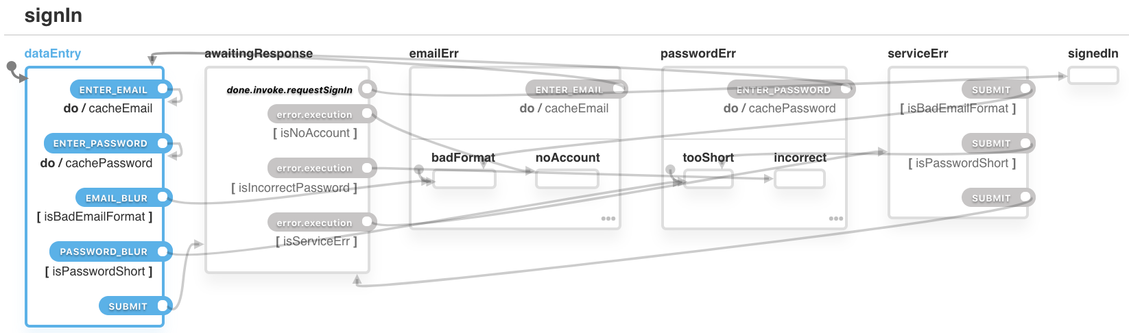
We need a way to save what the user enters into the email and password fields. Actions enable side effects to be triggered when a transition occurs. Below, we have defined an action (cacheEmail) within the ENTER_EMAIL transition of the dataEntry state. This means if the machine is in dataEntry and the transition ENTER_EMAIL is triggered, the action cacheEmail will also be triggered.
const machineConfig = {
  ...
  states: {
    ...
    // On submit, target the two fields
    dataEntry: {
      on: {
        ENTER_EMAIL: {
          actions: 'cacheEmail'
        },
        ENTER_PASSWORD: {
          actions: 'cachePassword'
        },
      },
      ...
    },
    // If there's an email error on that field, trigger email cache action
    emailErr: {
      on: {
        ENTER_EMAIL: {
          actions: 'cacheEmail',
          ...
        }
      }
    },
    // If there's a password error on that field, trigger password cache action
    passwordErr: {
      on: {
        ENTER_PASSWORD: {
          actions: 'cachePassword',
          ...
        }
      }
    },
    ...
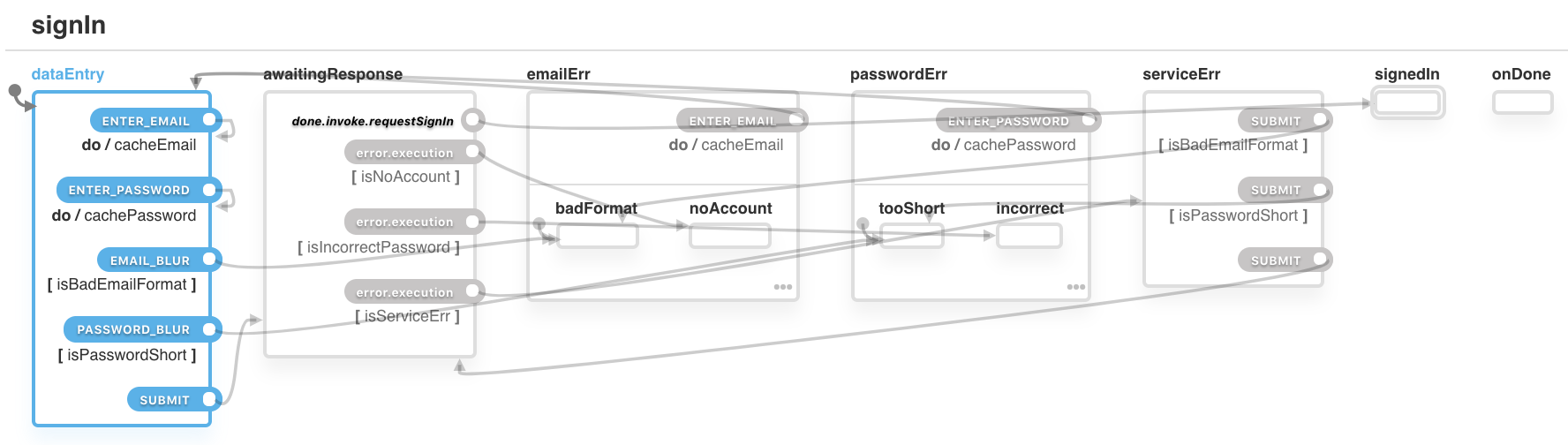
8. Final State
We need to way to indicate if the user has successfully authenticated and, depending on the result, trigger the next stage of the user journey. Two things are required for this:
We declare that one of the states is the final state, and
define an onDone property that can trigger actions when that final state is reached.
Within the signedIn state, we add type: final. We also add an onDone property with action onAuthentication. Now, when the state signedIn is reached, the action onAuthentication will be triggered and the machine will be done (no longer executable).
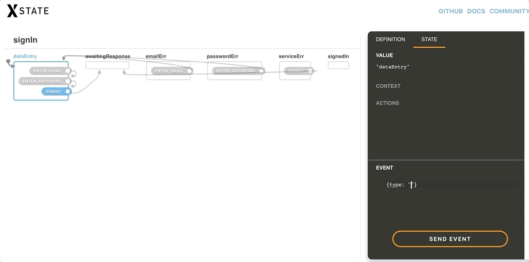
A great feature of XState is that the machine configuration is completely independent of the actual implementation. This means we can test it now and get confidence with what we’ve made before connecting it to the UI and backend service. We can copy and paste the machine config file into XState’s visualizer and get a auto-generated statechart diagram that not only outlines all the defined states with arrows that illustrate how they’re all connected, but allows us to interact with the chart as well. This is built-in testing!
Connecting the machine to a React component
Now that we’ve written our statechart, it’s time to connect it to our UI and backend service. An XState machine options object allows us to map strings we declared in the config to functions.
We’ll begin by defining a React class component with three refs:
We declared the following actions in our machine config:
focusEmailInput
focusPasswordInput
focusSubmitBtn
cacheEmail
cachePassword
onAuthentication
Actions are mapped in the machine config’s actions property. Each function takes two arguments: context (ctx) and event (evt).
focusEmailInput and focusPasswordInput are pretty straightforward, however, there is a bug. These elements are being focused when coming from a disabled state. The function to focus these elements is firing right before the elements are re-enabled. The delay function gets around that.
cacheEmail and cachePassword need to update the context. To do this, we use the assign function (provided by XState). Whatever is returned by the assign function is added to our context. In our case, it is reading the input’s value from the event object and then adding that value to the context’s email or password. From there property.assign is added to the context. Again, in our case, it is reading the input’s value from the event object and adding that value to the context’s email or password property.
We declared the following guards in our machine config:
isBadEmailFormat
isPasswordShort
isNoAccount
isIncorrectPassword
isServiceErr
Guards are mapped in the machine configuration’s guards property. The isBadEmailFormat and isPasswordShort guards make use of the context to read the email and password entered by the user then pass them on to the appropriate functions. isNowAccount, isIncorrectPassword and isServiceErr make use of the event object to read what kind of error was returned from the call to the authentication service.
We declared the following service in our machine configuration (within our invoke definition): requestSignIn.
Services are mapped in the machine configuration’s services property. In this case, the function is a promise and is passed to the email password from the context.
Now that we have our machine config and options at the ready, we can create the actual machine! In order to use XState in a real world scenario, that requires an interpreter. react-xstate-js is an interpreter that connects React with XState using the render props approach. (Full disclosure, I developed this library.) It takes two props — config and options — and returns an XState service and state object.
// SignIn/index.jsx
...
import { Machine } from 'react-xstate-js'
import machineConfig from './machineConfig'

class SignIn extends Component {
  ...
  render() {
    <Machine config={machineConfig} options={this.machineOptions}>
      {({ service, state }) => null}
    </Machine>
  }
}
Let’s make the UI!
OK, we have a functional machine but the user needs to see the form in order to use it. That means it’s time to create the markup for the UI component. There are two things we need to do to communicate with our machine:
1. Read the state
To determine what state we are in, we can use the state’s matches method and return a boolean. For example: state.matches('dataEntry').
2. Fire a transition
To fire a transition, we use the service’s send method. It takes an object with the transitions type we want to trigger as well as any other key and value pairs we want in the evt object. For example: service.send({ type: 'SUBMIT' }).
And there you have it. A sign in form that has a great user experience controlled by XState. Not only were we able to create a form a user can interact with, we also put a lot of thought into the many states and types of interactions that’s need to be considered, which is a good exercise for any piece of functionality that would go into a component.
Hit up the comments form if there’s something that doesn’t make sense or if there’s something else you think might need to be considered in the form. Would love to hear your thoughts!
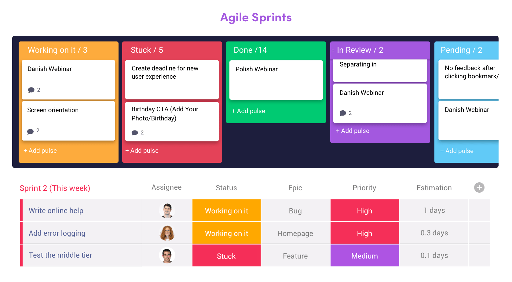
Front-end development relies on organization and solid communication. Whether you’re part of a team that builds large-scale sites or you’re flying solo with a handful of quality clients, there are many pieces and steps to get a project from start to finish. And that’s not just limited to the development phase of a project, either. Think about sales proposals, estimates, sign-offs, and approvals among many other things. There’s a lot that goes into even what we might consider a routine web project.
Think of monday.com as a universal team management tool. It’s the part of a project stack that keeps the people on your team connected so that, no matter what, everyone is in the loop and on the same wavelength during the lifecycle of a project. You probably already know how invaluable that level of connectedness is because it promotes both happy team members and happy clients. Everyone wins!
Sure, monday.com can help define milestones and tasks like other project management platforms. That’s a given. Where monday.com really shines, though, is the level of transparency it offers to stakeholders and developers alike, while encouraging complete team participation in a way that’s actually fun. Yes, fun. That’s something you don’t always think about when project management comes to mind, right?
So, forget the whiteboards, conference rooms, and confusing email chains. monday.com embraces and promotes a collaborative workspace that’s ideal for in-house and remote teams alike, ensuring that tasks are completed, time is tracked, communication is streamlined and that deadlines are ultimately met. We’re talking about a full suite of features that includes:
Clear visualizations of a project’s milestones
Tasks that are easy to create and assign
Centralized files that are easy for anyone (or the right people) to access
Tons of integrations, including Slack Google Calendar, Dropbox, Trello, Jira and many, many more
A news feed that helps anyone get quickly caught up with a project’s activity
Detailed charts and reports that are handy for project managers and stakeholders
Time tracking that’s easy and non-invasive
Tools to help communicate with clients inside of the project
Easy access to the platform, whether from a web browser or mobile and desktop apps
We could really go on and on but the best way to see and get all of the benefits that monday.com offers is to try it out for yourself. Get started today with a free trial.
It was inevitable that the web would support the display of data in a tabular format. HTML tables present tabular data in a semantic and structurally appropriate manner. However, the default styles on HTML tables are not exactly the most aesthetically pleasing thing you’ve ever seen. Depending on the desired visual design, some effort was required on the CSS front to prettify those tables. A decade ago, an article with the “Top 10 CSS Table Designs” was published on Smashing Magazine, and it still continues to get a lot of traffic to this day.
The web has evolved a lot over the past decade, and it’s more convenient than ever to make your site or application adapt to the viewport it is viewed in. That being said, we have to continue to make considered design choices that do not compromise on accessibility. Since tables don’t seem to be falling out of favor anytime soon, let’s see how tables can be created on the web in 2019.
CSS-Only Options
If your dataset isn’t that large, and features like pagination and sorting are not necessary, then consider a JavaScript-free option. You can get some pretty nice results that work well on a whole gamut of screen sizes without the added weight of a large library.
Unfortunately, without the help of JavaScript for some DOM manipulation on the accessibility front, we only have a handful of CSS-only options. But for small data sets, they are often sufficient.
Option 1: Do Nothing
We’re going to start off with a low-effort scenario. If your data fits in a table with only a few columns and lots of rows, then such a table is pretty much mobile-ready to begin with.
A table with a few columns and many rows displayed on narrow and wide screens (Large preview)
The issue you’d have is probably having too much room on wider screens, so it might be advisable to “cap” the maximum width of the table with a max-width while letting it shrink as necessary on a narrow screen.
This sort of a pattern works best if your data itself isn’t lines and lines of text. If they are numeric, or short phrases, you can probably get away with not doing much.
Option 2: Style The Scroll
David Bushell wrote up his technique for responsive tables back in 2012, which involved invoking overflow and allowing users to scroll to see more data. One could argue that this isn’t exactly a responsive solution, but technically, the container is responding to the width of the viewport.
When styling tables, allow users to scroll to see more data. (Large preview)
Let’s look at the “basic” overflow first. Imagine me using air-quotes around basic, because the styling for the scrolling shadows is anything but. Still, in this instance, “basic” refers to the fact that the table does not transform in any way.
This technique for doing scrolling shadows comes from Roma Komarov and Lea Verou riffing off each other’s ideas to create magic. It hinges on using multiple gradients (linear and radial) as background images on the containing element, and using background-attachment: local to position the background relative to its contents.
What’s nice about this technique is that for browsers that don’t support scrolling shadows, you can still scroll the table as per normal. It doesn’t break the layout at all.
Another scrolling option would be to flip the table headers from a row configuration to a column configuration, while applying a horizontal scroll onto the
element’s contents. This technique leverages Flexbox behavior to transform the table’s rows into columns.
By applying display: flex to the table, it makes the
and
both flex children, which are by default laid out next to each other on the same flex line.
We also make the
element a flex container, thus making all the
elements within it flex children laid out in a single flex line as well. Lastly, every table cell has to have their display set to block instead of the default table-cell.
The advantage of this technique is that the headers are always in view, like a fixed header effect, so users don’t lose context as they scroll through the columns of data. One thing to take note of is that this technique results in a discrepancy of the visual and source order, and this makes things slightly unintuitive.
Sprinkle On Some JavaScript
As mentioned earlier, layout options that involving morphing the table by modifying display values sometimes have negative implications for accessibility, which require some minor DOM manipulation to rectify.
In addition, there are a number of user experience tips when it comes to designing data tables from Andrew Coyle, including features like pagination, sorting, filtering, and so on (features that do require some JavaScript to enable).
If you’re working with a relatively simpler dataset, perhaps you would like to write your own functions for some of these features.
Rows To Blocks, With Accessibility Fix
As far as I know of, this responsive data table technique came about from the CSS-Tricks article “Responsive Data Tables” by Chris Coyier back in 2011. It has since been adapted and expanded upon by many others.
The gist of this technique is to make use of a media query to switch the display property of the table element and its children to block on a narrow viewport.
On a narrow screen, the table headers are visually hidden, but still exist in the accessibility tree. By applying data attributes to the table cells, we can then display labels for the data via CSS, while keeping the content of the label in the HTML. Please refer to the CodePen below for how the mark-up and styles look like:
The original method applies a width on the pseudo-element displaying the label text, but that means you’d need to know the amount of space your label needed to begin with. The above example uses a slightly different approach, whereby the label and data are each on opposite sides of their containing block.
We can achieve such an effect via auto-margins in a flex formatting context. If we set the display property for each
element to flex, because pseudo-elements generate boxes as if they were immediate children of their originating element, they become flex children of the
.
After that, it’s a matter of setting margin-right: auto on the pseudo-element to push the cell’s content to the far end edge of the cell.
Another approach doing the narrow viewport layout is using a combination of Grid and display: contents. Please note that display: contents in supporting browsers has issues with accessibility at the moment, and this method shouldn’t be used in production until those bugs are fixed.
But maybe you’re reading this after those bugs have been resolved, in that case, here’s an alternative layout option.
element is set to display: contents. Only the immediate children of a grid container participate in a grid formatting context; in this case, it’s the
element.
When display: contents is applied to the
, it gets “replaced” by its contents, in this case, the pseudo-element and the within the
become the grid children instead.
What I like about this approach is the ability to use max-content to size the column of pseudo-elements, ensuring that the column will always be the width of the longest label, without us having to manually assign a width value for it.
In future, when the sizing values of min-content, max-content and fit-content (covered by the CSS Intrinsic & Extrinsic Sizing Module Level 3) are supported as general width and height values, we’ll have even more options for laying things out.
The downside to this approach is you do need that additional or
around the content in your table cell if it didn’t have one already, otherwise, there’d be no way to apply styles to it.
Simple Pagination
This example shows a basic pagination implementation that was modified off this CodePen by Gjore Milevski to paginate on table rows instead of divs. It is an extension of the “style the scroll” example discussed in the previous section.
From a layout perspective, Flexbox comes in very handy for positioning the pagination elements across various viewport sizes. Different project designs will have different requirements, but the versatility of Flexbox should allow you to cater for these differences accordingly.
In this case, the pagination is centred on the page and above the table. The controls for navigating backward and forward are placed on either side of the page indicators on wider screens, but all four appear above the page indicators on narrow screens.
We can do this by levaraging the order property. Visual reordering of content should always be done with consideration because this property does not change the source order — only how it appears on screens.
Simple Sorting
This example shows a basic sorting implementation modified off this code snippet by Peter Noble to cater for both text and numerals:
It would be useful to have some sort of indicator of which column is currently being sorted and in what order. We can do that with the addition of CSS classes which can then be styled however you want. In this case, the indicator symbols are pseudo-elements that are toggled when the target header is clicked.
Simple Search
This example is a basic filtering functionality that iterates through all the textual content of each table cell and applies a CSS class to hide all rows that do not match the search input field.
Such an implementation is relatively naive, and if your use case calls for it, it might make sense to search per column instead. In that scenario, it might be a good idea to have each input field as part of the table in their respective columns.
Let A Library Handle It
The above JavaScript snippets serve to demonstrate how tables with larger amounts of data can be enhanced to make life easier for users of those tables. But with really large datasets, it might probably make sense to use an existing library to manage your large tables.
The column toggle pattern is one whereby non-essential columns are hidden on smaller screens. Normally, I’m not a fan of hiding content simply because the viewport is narrow, but this approach by Maggie Costello Wachs of Filament Group resolves that qualm of mine by providing a drop-down menu which allows users to toggle the hidden columns back into view.
The above article was published back in 2011, but Filament Group has since developed a full suite of responsive table plugins known as Tablesaw, which includes features like sorting, row selection, internationalization and so on.
The column toggle feature in TableSaw also no longer depends on jQuery, unlike the examples from the original article. Tablesaw is one of the only libraries I could find that does not have a dependency on jQuery at the moment.
Wrapping Up
There is a myriad of table design patterns out there, and which approach you pick depends heavily on the type of data you have and the target audience for that data. At the end of the day, tables are a method for the organization and presentation of data. It is important to figure out which information matters most to your users and decide on an approach that best serves their needs.
If a picture is worth a thousand words, a lot of photographers aren’t getting paid enough. When a writer actually manages to build a business for themselves…well let’s just say we do okay. Most of us don’t get rich, but we do okay. WDD and others are good to me. I’ve been lucky enough that I’ve been able to sell my words online, and make a living from it.
I recently re-designed my online writer’s portfolio (well, I’m still iterating), and it’s gotten me to think real hard about that: selling words online. Almost any other product can be sold with imagery, and some of them pretty much couldn’t be sold without some photos in the equation. But words? Words can be sold with just words; though images are often included.
I thought it could be useful to other designers and writers out there to see how some of the successful writers do it, so I went looking for examples. Here they are.
Note: I’m more interested in their strategy than I am in the originality or technical side of their site design, so this isn’t much of a web design showcase. You will see more than a few themes in here.
Nicole Fenton
Nicole Fenton seems to believe as much as I do that, ideally, words should sell themselves. Typography is the clear focus of the layout, with only a couple of light stylistic flourishes by way of distraction.
The sales strategy follows the design: less is more. There are perhaps four whole paragraphs on the entire site that you could classify as “sales copy”, and the rest just shows off her work.
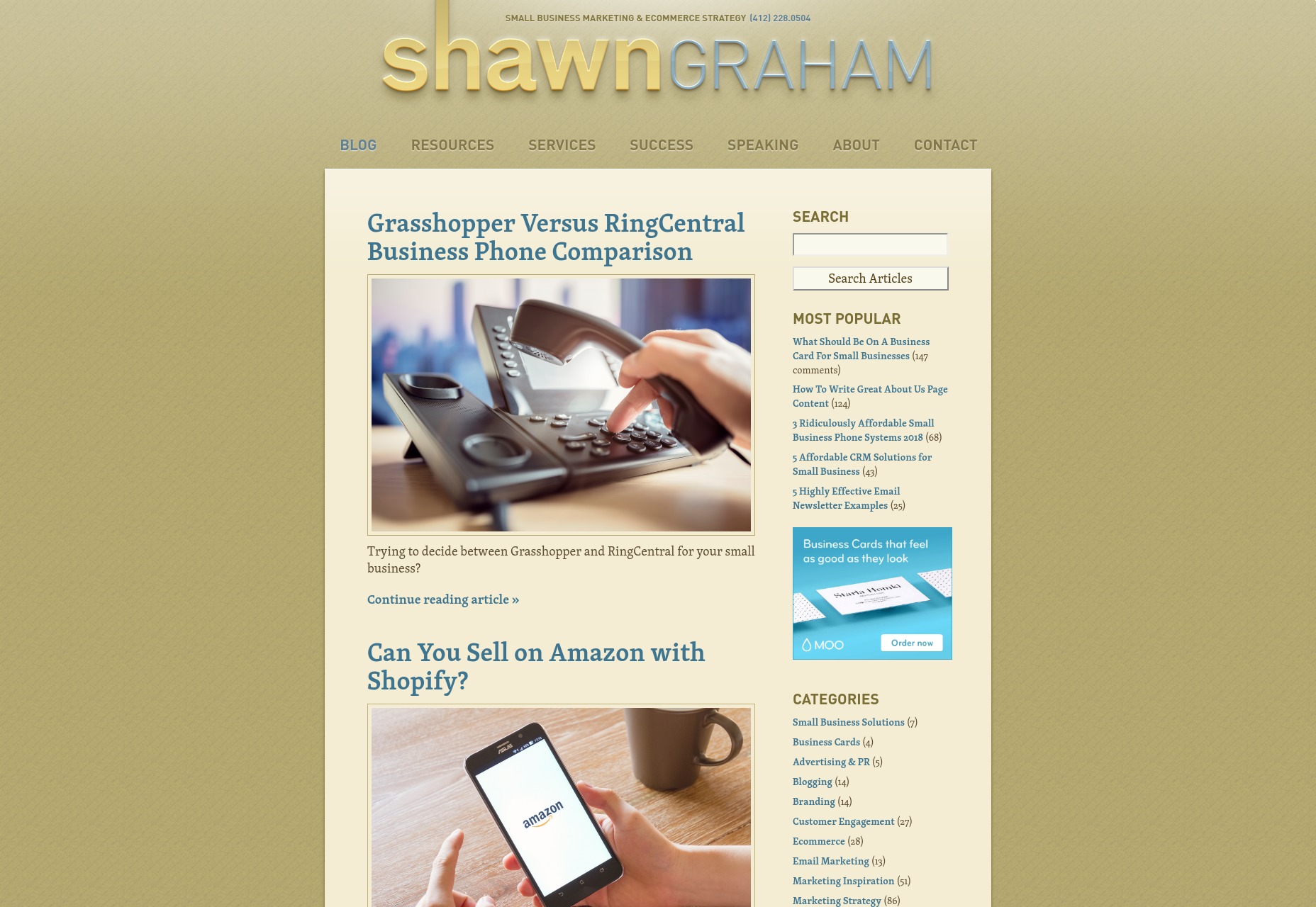
Shawn Graham
Shawn Graham’s site, on the other hand, will remind you of every marketer who ever annoyed you, and it probably works for him. The design looks like a WordPress theme, with a logo ripped straight from Web 2.0 (the design style, not the social networking).
The strategy is a classic: the blog. It’s filled with helpful advice about a variety of marketing-related topics, and strives to educate its users while showing off Shawn’s expertise.
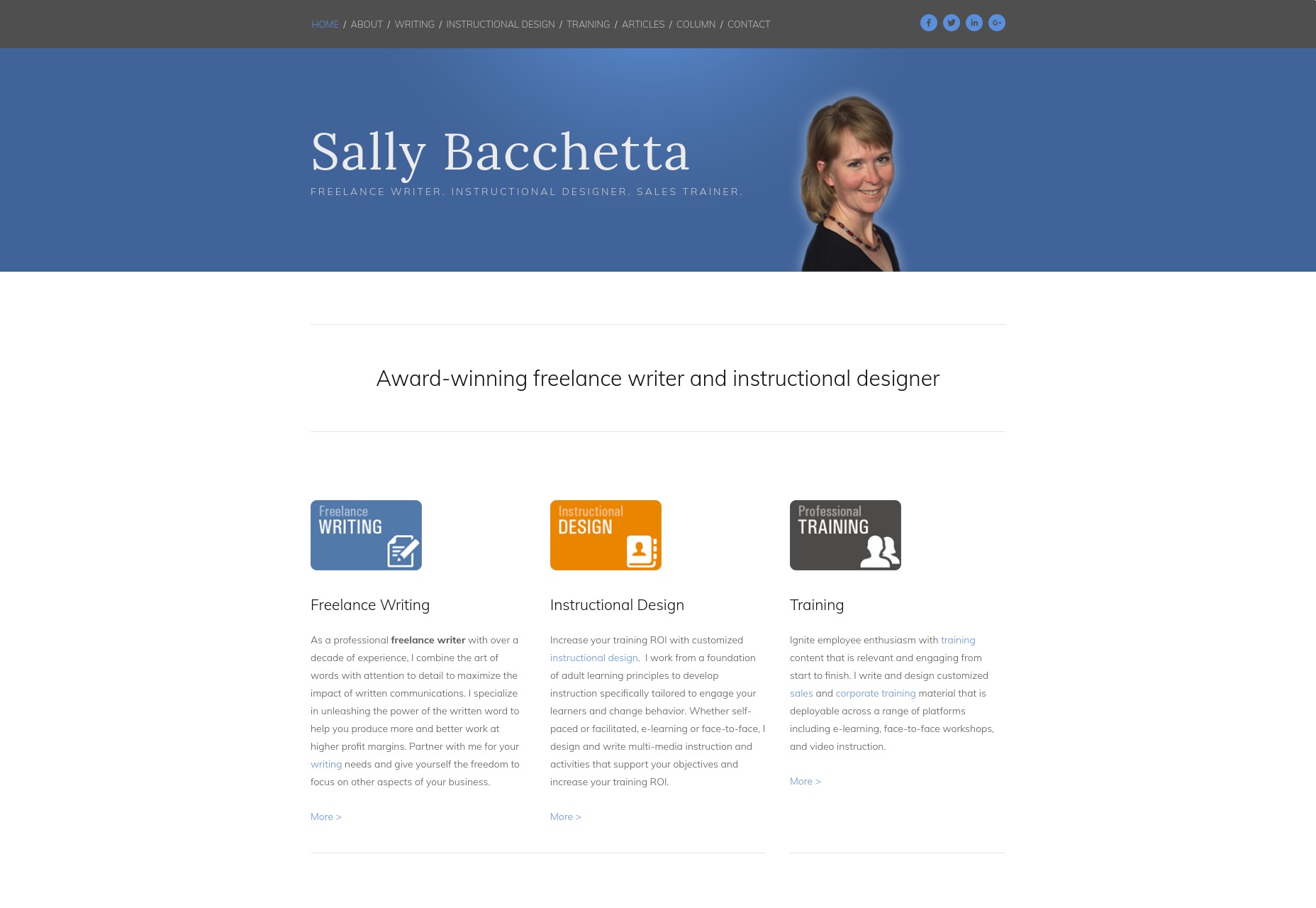
Sally Bacchetta
Sally Bacchetta’s site looks as corporate as they come, right down to the cut-out picture of her with the faint white glow around the edges. It could not possibly look any more plain and businesslike.
This actually is the idea, here. She writes and designs instructional and training materials for corporate clients, and so both the site’s design and her copy reflect this unerringly. It might look dull to some, but it will look comfortable and familiar to her ideal clients.
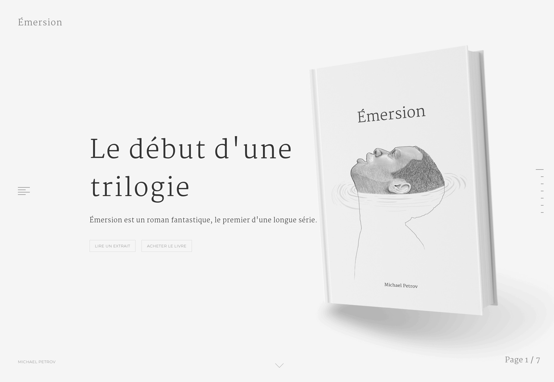
Michael Petrov
Michael Petrov’s site is quite minimalist, but makes use of heavy, and almost heavy-handed animation. At this point, though, that’s par for the course with portfolio-style sites, and we’ll see that style leak from the web design industry to every other industry where making an online portfolio might be appropriate.
Now I can’t read French, but imagery is clearly a part of the sales process, here. It’s all custom illustration with light animation, so it’s designed to fit the theme of the author’s work, and many of the illustrations seem to be paired with a quote. It seems the book being promoted is itself a fusion of both literary and visual art, so the site follows its lead.
Clare Barry
Clare Barry’s site is built with Squarespace, so it looks predictably modern, clean, and generally pleasing to the eye. There’s decent typography, a solid grid-based layout, everything you’d expect.
Clare Barry, it seems, has opted for a fairly classic approach: sell via personality. Where many sites on this list have a picture of the author somewhere, this one puts her front and center, smiling for the world to see.
Much of her work seems to stem from her own experience, and deals with personal issues like work/life balance, burnout, and wellbeing. Personal subject matter means you have to put some effort into selling the person, so it makes sense, and she hired a good photographer.
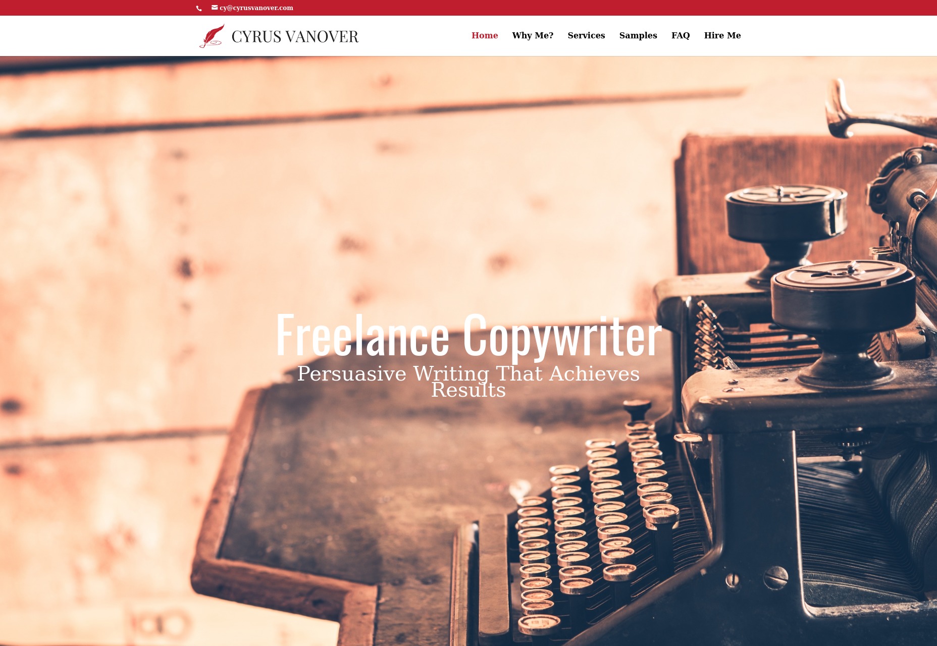
Cyrus Vanover
Cyrus Vanover’s site is built with Divi, and is very clearly targeted at fairly traditional clients. The design itself isn’t going to blow any minds, but it’s clearly designed to make you start reading, already.
You see, the idea here is to show you how persuasive the author’s writing is by exposing you to that persuasiveness first hand. I wouldn’t call it a hard sell so much as simply putting the proof out where you can see it. The writing samples are almost incidental: the portfolio site is the portfolio piece.
Kristi Hines
Kristi Hines’ writing portfolio uses a pre-made WordPress theme that has a flair for the dramatic. There’s the color palette that makes full use of almost-harsh contrast, combined with a clean and modern style. Even so, it’s nice and readable.
The sales tactics used are actually a bit of a hybrid system. There’s the blog, the “what-I-do” copy, and so on. But the home page really doubles down on the social proof. There are prominently featured testimonials, a huge collection of famous brands she’s worked for, the works. She’s not just a writer, she’s a social marketer, and she can prove it.
She’s also a photographer, and she includes her photos on her site, though I don’t think that’s a part of the service. Just an interesting tidbit.
Having clear, crisp images and graphics have never been more important for organizations around the globe. Whether you’re selling consumer goods or SaaS products, a high-quality image on your website or in your marketing materials will attract customers and tell your company’s story in a visually pleasing way.
But getting the perfect image can be tricky, especially when you’re first getting started.
A great online photo editor that checks all the boxes, but doesn’t break the bank, is Fotor. Trusted by 200+ million users worldwide, Fotor is known for editing photos, creating designs, and making collages. In addition to its main product offering, Fotor also has an array of perks, such as photo effects, portrait retouching, and more.
Fotor offers users a free version of its product, which is uncommon in the photo editing world where overpriced software is the norm. Besides the attractive price point, Fotor gives its users access to tons of different features, so teams can reach any of their photo editing goals. Having access to a variety of features gives teams creative control and allows them to get more done with less. Better yet, Fotor is incredibly easy to use even if you have zero technical knowledge.
If you’re crunched for time, Fotor also conveniently offers a collection of templates. Users can choose from categories, such as social media, business cards, logos, email headers, postcards, gift certificates, resumes, flyers, and more.
Like we mentioned earlier, Fotor has a free plan that individuals can use. There are a few features not included in the free plan, so if a user wants to upgrade, they can easily do so for only $39.99 per year. It’s great for professionals on a budget who want to get top-notch results.
When you create an account with Fotor, you’ll have access to video tutorials that clearly show how to easily and efficiently edit a photo, craft a design, create a collage, and more. You can also download your finished images as a JPG or PNG; choose to make them public for all to see, or share them on social media.
Additionally, you can download the wonderful images you create in a PDF format. To learn more about how to edit a PDF and make your Fotor photos fit into the document beautifully, you can check out JotForm PDF Editor.
Fotor supports every major mobile and desktop platform from Android to IOS, and it’s streamlined with a number of social media channels. Make sure to give it a try today.
Minimalism is the new fad that doesn’t seem to be going away anytime soon. It’s easy to read and you can get many cool and unique fonts from it. However, some designs call for a fancy design. Sometimes you just need to raise your pinky and feel fancy. For that reason, here are 10 fancy fonts for the super fancy designs.
10. Kelium
Kelium is a great example of a fancy, cursive style typeface in brush font. It’s unique, extravagant, but still easy to read. Perfect for something like wedding invitations!
9. Leviafan
Leviafan is perfect for just about any occasion that needs the fancy meter bumped up a little bit. Use it in logos, business cards, or even a casual invitation.
8. Taahira
Taahira is a handmade font that really grabs your attention. It really brings the warmth of a handwritten note. This would be perfect for a multitude of creative projects.
7. Bhatoshine
Bhatoshine is a fancy and formal typeface. You can use this one anywhere and bring a very upscale feel to your design.
6. Ulyssa
Ulyssa font uses a loopy, handwritten form to get the point across. It gives a very bohemian feel, but still stays fancy.
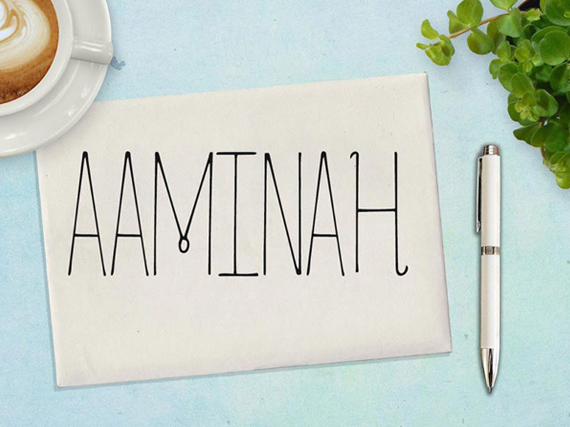
5. Aaminah
Aaminah borders the line of minimalist and fancy. It maintains straight and uniform lines, but it adds a fancy flare with the unique curls.
4. Adora Bouton
Adora looks like the type of font you would use in a love letter. It’s big, dramatic, and makes any project it’s used in look infinitely more fancy.
3. Alayna
Alayna was designed with heart shapes in mind. The ends of a few letters give that warm charm that a hand-drawn heart would.
2. Aejeong
Aejeong is a fresh and clean typeface that gives that handwritten flare. The font itself is in all caps, and can be used in multiple occasions.
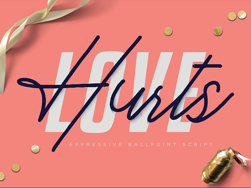
1. Love Hurts
The love hurts font is perfect for all of your fancy needs. It’s fancy, but not over-the-top fancy. It can be used for anything from wedding invitations, to elegant company logos.
Whether it’s a business card or the face of your business, there will always be a need to that fancy flare. Bring out your inner monocle wearing, champaign drinking, “Driver, please take me to the penthouse” self.
Which one was your favorite? Let use know in the comments below, and don’t forget, pinky up!
Every December the color categorizing company Pantone nominates one of its colors as a hue for the next 12 months. The act is intended to create positivity around messages such as the environment, gender equality, and current affairs. But the color for 2019 has raised hackles in some quarters.
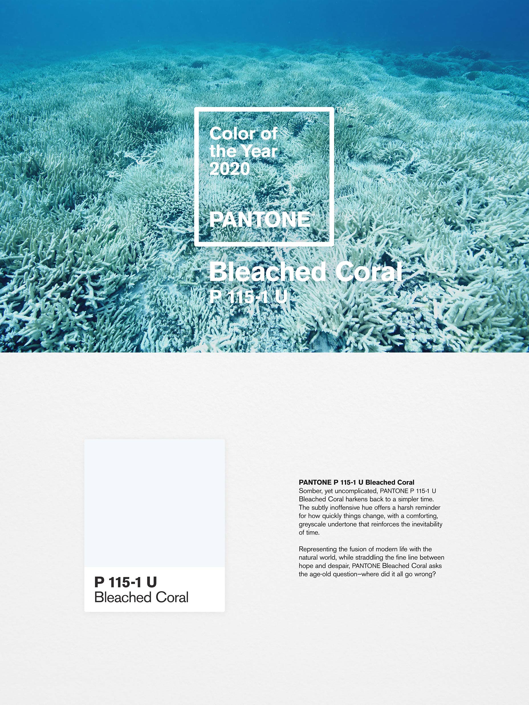
2019’s official color is named Living Coral, and it’s a nice idealized shade of red coral under blue water.
The controversy, according to Jack and Huei—a Melbourne-based design agency—is that Pantone’s choice glosses over the devastation being inflicted on coral by climate change. The agency, run by Jack Railton-Woodcock and Huei Yin Wong, is particularly concerned with the loss of coral around their native Australia, not least the decline of the Great Barrier Reef. The duo describe Pantone’s choice as “tone-deaf, and downright irresponsible”.
Not satisfied with simply boycotting Pantone’s choice for 2019, the pair set about subverting the decision with their proposed color for next year:
It’s the responsibility of all of us, creative or otherwise, to find creative solutions to big problems, and right now there aren’t many problems facing humanity that are bigger than climate change.
Jack and Huei searched through their Pantone swatches to uncover #F0F6F7, a very pale blue that matches the color of the skeletal stems of coral that are revealed as coral is killed off in a process known as bleaching. Then they dubbed the hue Bleached Coral, and hijacked Pantone’s branding to propose the color for next year’s selection:
This is an issue we care about deeply and we think the creative industry has an opportunity to bring this global issue from the depths of the ocean to the surface of our screens.
Pantone’s announcement at the end of 2018, was seen by many as a blinkered decision. Jack and Huei’s guerrilla design protest is part of a wider trend of designers using their craft to tackle serious social issues. It’s unlikely that Pantone will embrace this suggestion, but the trend for an ethical, politicized design world is set to continue long into 2020.


