Organic impact on Facebook seems to be a continual challenge in recent years. When we talk about organic impact, we mean those people who see what you post on your facebook wall or on the business page, on a case-by-case basis. Well, Facebook algorithms increasingly limit this impact.
This is logical if we think about how much content is produced on a daily basis. It is normal that if we have 5000 friends, we can not see what everyone posts. We typically only see a select few posts, from a few people that we interact with regularly.
However, when we have an online business and promote it on Facebook, the organic impact is extremely important. Each of us wants our audience to be as broad as possible. We want to expose our products to as many people as possible.
Now, you may be asking, “If Facebook limits our reach, how can all this be possible?” Fear not, and read on:
3 tricks to increase organic impact on Facebook
For more organic impact there are a few small tricks you can do. Let’s break it down:
Post more videos
Statistically speaking, more videos means more interactions. If you really think about it, it makes a lot of sense. The video format provides easy sharing of quality content. Even if someone isn’t on your page, they may end up seeing something from your brand that has been shared, as long as it’s worthy of being shared.
According to a study by Harvard Business Review, users who are exposed to video content are twice as attracted and more attached to the company that distributes them compared to companies that distribute basic content: simple text and a few images.
Another positive for distributing videos is the amount of varied content that can come out of them. You can use videos for a lot of things: presentation video, unboxing products (user-generated video – it also greatly contributes to the credibility of the company). You can also post short product advertisements, internal videos, training sessions, sessions, interviews, testimonials, etc.
Create dialogue and answer questions
Facebook allows you to post questions on the home page. Use this feature to engage other users. These questions are seen by Facebook as a way of engaging people in discussions, therefore, they have priority at the top of the page
Facebook has a unique way of bringing people together. In a way, it’s the perfect platform to make your customers feel comfortable to ask these questions and get the answers they’ve been looking for.
Bringing your business to where most people feel most comfortable (social media) it provides a comfortable environment for you and them to discuss more about your product.
The secret? Engage with your customers. In most cases, it’s even worth it to have a team member dedicated to social media interaction completely.
Use the power of groups
If Facebook does not help you get an organic impact, make yourself a place in the sea of ??posts on your fans wall. Use group posts. For example, are you launching a new product? Post a video about it on your business page, encourage people to tell you what they like about this new product, and then share the post with interest groups.
Moreover, you can encourage your employees to share their page posts on your personal page. This will multiply the overall page audience by 5% of each of your employees’ list of friends.
The perfect mix between organic and paid impact – the ideal promotion solution
How can you find the perfect mix between organic impact and impact paid by ads?
Facebook Ads provides quite a few helpful numbers. They allow you to track performance pretty easily, actually. With this information, start up an impact campaign. Use the same budget on both organic and paid traffic promotion. After you’ve gathered enough data, compare the two, and find the balance.
The goal is to answer this question: How much does it cost (time/money) to grow organically up to 10% extra impact after every month vs. how much would it cost me to bring that 10% + impact through a paid campaign? Is it worth my time and my efforts to keep on increasing the organic impact or could I invest to get better and faster results?
You will find the mix between organic and paid by testing different variants. One month, you can try growing just organically. And the month, you can try to see how much money you have to spend to achieve the same results. After that, you can simultaneously try organic and paid growth.
It’s really nothing tricky, but that’s how you estimate growth and impact. It takes time, sure, but it’s worth it!
How can you determine the perfect balance?
After taking the organic route for 6 months – 12 months, compare the results and see how much the site’s impact rate has increased (how many visits in analytics). Then you take the keywords that you’ve focused on organic promotion (the products you’ve shared, the keywords used in SEO campaigns), make an Adwords keyword plan with those words, and see what impact you could get using a Google Ads ad using those same words. Keep in mind, these will be paid ads, so keep track of costs at all times.
How big is the organic impact relative to what you might get from the ad? How much did it cost you to get that organic impact, in relation to the cost of advertising? Using that information, ask yourself if it’s worth the paid advertisement cost. If you can get the same results, and spend less money using organic searches, it’s probably within your best interests to take the organic route.
The conclusion
There are quite a few little tricks here and there to help increase your impact on Facebook, but these are the most widely used, and arguably the most effective. The best mindset to have when going into Facebook advertising is to be ready for a change. Algorithms change, and so do people. You have to be ready to change up your strategies at any moment and adapt them when they aren’t working like you want them to.
There is a lot to like about Gaddafi Rusli’s ICONSVG.
It provides inline , which is the most generically useful way to deliver them, and probably how they should be used anyway. Each icon is a tiny amount of SVG and I’d bet they were all hand-golfed.
They are all stroke-based, so they can be beefed up or slimmed down as needed.
The stroke-linecap and stroke-linejoin properties can be adjusted, which presents an opportunity to make their edges sharper or more rounded. I often find icons that are close to what I want, but the weight isn’t right or the edges are either too sharp or too round. This quick and easy configuration is awesome.
Any overflow value other than visible and no height is the enemy of child elements with position: sticky;. It’s like that element is ready to stick when the parent scrolls, but it never does because the height is unconstrained. Adding a fixed height can solve the issue, but that’s not always desirable.
Dannie Vinther digs into a way of dealing with that. The end result is avoiding that situation all together by removing the element that wants to be sticky from the element that needs an overflow. But as soon as you do that, the elements no longer scroll together since they aren’t siblings. The use case here is a table with sticky headers on vertical scrolling and allowing for horizontal scrolling as well. Dannie uses a script to sync the scroll positions.
CSS custom properties (a.k.a. CSS variables) are becoming more and more popular. They finally reached decent browser support and are slowly making their way into various production environments. The popularity of custom properties shouldn’t come as a surprise, because they can be really helpful in numerous use cases, including managing color palettes, customizing components, and theming. But CSS variables can also be really helpful when it comes to responsive design.
Article Series:
Defining Variables and Breakpoints (This Post)
Building a Flexible Grid System (Coming Tomorrow!)
It’s a common scenario in such a case to change some sizes and dimensions depending on the viewport’s width. One way to accomplish this is by using media queries:
Such an approach gives us an easy way to control CSS properties on different screen sizes. However, it may be hard to maintain as the complexity of a project grows. When using media queries, keeping code readable and DRY at the same time quite often turns out to be challenging.
The most common challenges when scaling this pattern include:
Repeated selectors: Apart from bloating code with multiple declarations, it also makes future refactoring more difficult, e.g. every time a class name changes it requires remembering to update it in multiple places.
Repeated properties: Notice that when overwriting CSS rules within media queries, it requires repeating the entire declaration (e.g. font-size: 3rem;) even though it’s just the value (3rem) that actually changes.
Repeated media queries: To keep responsive styles contextual, it’s a common practice to include the same media queries in multiple places, close to the styles they override. Unfortunately, it not only makes code heavier, but also might make breakpoints much harder to maintain. On the other hand, keeping all responsive styles in one place, away from their original declarations, may be very confusing: we end up with multiple references to the same elements sitting in completely different places.
We can argue that repeated declarations and queries shouldn’t be such a big deal with proper file compression enabled, at least as long as we’re referring to performance. We can also merge multiple queries and optimize your code with post-processing tools. But wouldn’t it be easier to avoid these issues altogether?
There’s a lot of ways to avoid the issues listed above. One of them, that we will explore in this article, is to use CSS custom properties.
Using CSS variables for property values
There are plenty of amazing articles on the web explaining the concept of CSS custom properties. If you haven’t got chance to get familiar with them yet, I would recommend starting with one of the beginner articles on this topic such as this awesome piece by Serg Hospodarets as we are not going to get into details of the basic usage in this article.
The most common way of utilizing CSS custom properties in responsive design is to use variables to store values that change inside of media queries. To accomplish this, declare a variable that holds a value that is supposed to change, and then reassign it inside of a media query:
Assigning variables to the :root selector is not always a good idea. Same as in JavaScript, having many global variables is considered a bad practice. In real life, try to declare the custom properties in the scope they will actually be used.
This way, we are avoiding multiple rules of the .foo class. We are also separating the logic (changing values) from the actual designs (CSS declarations). Adapting this approach in our example from above gives us the following CSS:
Notice that the use of variables in shorthand properties (e.g. padding, margin or font) allow some very interesting repercussions. As custom properties may hold almost any value (more on this later), even an empty string, it’s unclear how the value of a shorthand property will be separated out into longhand properties that are used in the cascade later. For example, the auto used in the margin property above may turn out to be a top-and-bottom margin, a left-and-right margin, a top margin, a right margin, a bottom margin or a left margin — it all depends on the values of the custom properties around.
It’s questionable whether the code looks cleaner than the one from the previous example, but on a larger scale, it’s definitely more maintainable. Let’s try to simplify this code a bit now.
Notice that some values are repeated here. What if we try to merge duplicate variables together? Let’s consider the following alteration:
It looks cleaner but is it actually better? Not necessarily. For the sake of flexibility and readability, this may not be the right solution in every case. We definitely shouldn’t merge some variables just because they accidentally turned out to hold the same values. Sometimes, as long as we’re doing this as a part of a well thought out system, it may help us simplify things and preserve consistency across the project. However, in other cases, such a manner may quickly prove to be confusing and problematic. Now, let’s take a look at yet another way we can approach this code.
Using CSS variables as multipliers
CSS custom properties are a fairly new feature to the modern web. One of the other awesome features that rolled out in the last years is the calc() function. It lets us perform real math operations in live CSS. In terms of the browser support, it’s supported in all browsers that support CSS custom properties.
calc() tends to play very nicely with CSS variables, making them even more powerful. This means we can both use calc() inside custom properties and custom properties inside calc()!
For example, the following CSS is perfectly valid:
Why does this matter to us and our responsive designs? It means that we can use a calc() function to alter CSS custom properties inside media queries. Let’s say we have a padding that should have a value of 5px on mobile and 10px on desktop. Instead of declaring this property two times, we can assign a variable to it and multiply it by two on larger screens:
Looks fine, however all the values (--padding, calc(--padding * 2)) are away from their declaration (padding). The syntax may also be pretty confusing with two different padding variables (--padding and --foo-padding) and an unclear relationship between them.
To make things a bit clearer, let’s try to code it the other way around:
This way, we accomplished the same computed output with much cleaner code! So, instead of using a variable for an initial value of the property (1rem), a variable was used to store a multiplier (1 on small screens and 2 on larger screens). It also allows us to use the --multiplier variable in other declarations. Let’s apply this technique to paddings and margins in our previous snippet:
You may have noticed that 3 / 2 is not a valid CSS value at all. Why does it not cause an error then? The reason is that the syntax for CSS variables is extremely forgiving, which means almost anything can be assigned to a variable, even if it’s not a valid CSS value for any existing CSS property. Declared CSS custom properties are left almost entirely un-evaluated until they are computed by a user agent in certain declarations. So, once a variable is used in a value of some property, this value will turn valid or invalid at the computed-value time.
Oh, and another note about that last note: in case you’re wondering, I used a value of 3 / 2 simply to make a point. In real life, it would make more sense to write 1.5 instead to make the code more readable.
Now, let’s take a look at the finished live example combining everything that we discussed above:
Again, I would never advocate for combining calc() with custom properties to make the code more concise as a general rule. But I can definitely imagine scenarios in which it helps to keep code more organized and maintainable. This approach also allows the weight of CSS to be significantly reduced, when it’s used wisely.
In terms of readability, we can consider it more readable once the underlying rule is understood. It helps to explain the logic and relations between values. On the other hand, some may see it as less readable, because it’s tough to instantly read what a property holds as a value without first doing the math. Also, using too many variables and calc() functions at once may unnecessarily obscure code and make it harder to understand, especially for juniors and front-end developers who are not focused on CSS.
Conclusion
Summing up, there’s a lot of ways to use CSS custom properties in responsive design, definitely not limited to the examples shown above. CSS variables can be used simply to separate the values from the designs. They can also be taken a step further and be combined with some math. None of the presented approaches is better nor worse than the others. The sensibility of using them depends on the case and context.
Now that you know how CSS custom properties can be used in responsive design, I hope you will find a way to introduce them in your own workflow. Next up, we’re going to look at approaches for using them in reusable components and modules, so stay tuned for the next post tomorrow!
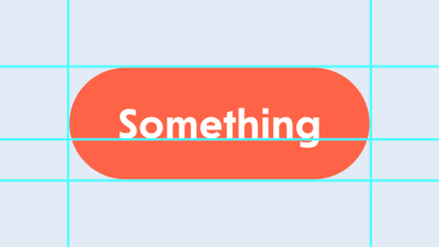
Let’s say you have a part of an interface that the user clicks and something happens. Sounds like a button to me, but let’s call it a “clicky thing” for now. I know, you’re confident that it’s a button too: It’s rounded and stands out with a nice tomato color, asking to be interacted with. But let’s think about it for a moment. It’ll save time in the long run, I promise.
What if the text in this clicky thing was “Read more”, and clicking it led the user to an article on another page? Hmm. And what if there was a blue underlined word, “Close”, that closes the popup dialog? Is it a link just because it’s blue and underlined? Of course not.
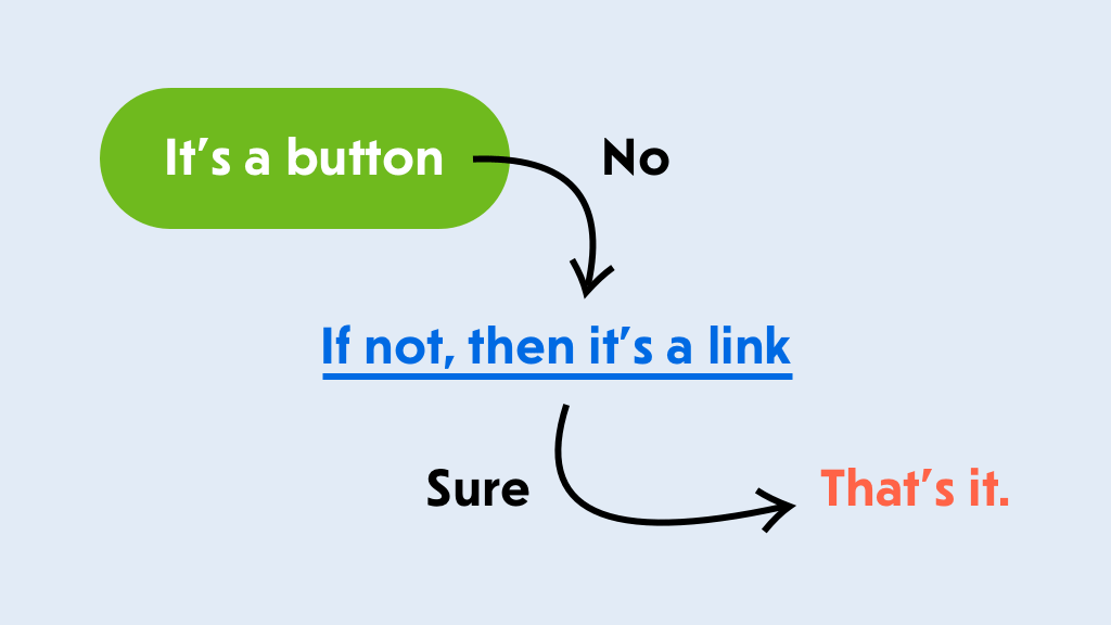
Whoa! It seems like there’s no way to tell if it’s a link or a button just by looking at it. That’s crazy! We need to understand what this thing does before choosing the right element. But what if we don’t know what it does just yet or are simply confused? Well, there’s a handy flow chart for us:
A scientific flow chart for choosing the right element (Large preview)
It’s a button.
If not, then it’s a link.
That’s it.
So, is everything a button? No, but you can always start with a button for almost any element that can be clicked or interacted with in a similar way. And if it’s lacking something, like navigation to another page, use a link instead. And no, a pointer is not a reason to make it . We have cursor: pointer for that.
Don’t forget to provide focus styles. (Large preview)
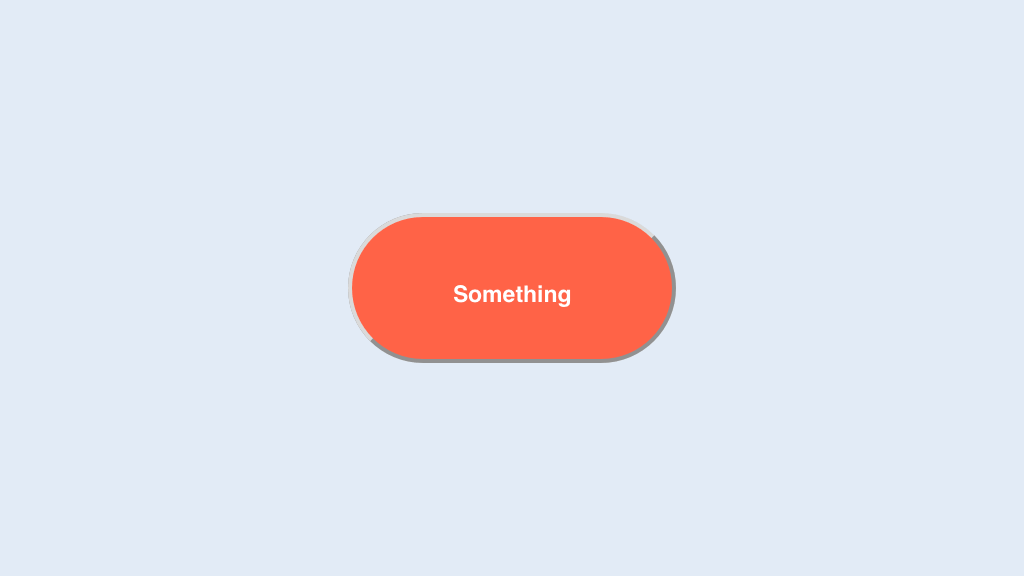
All right, it’s a button — we agree on that. Let’s put it in our template and style it according to the design: some padding, rounding, a tomato fill, white text, and even some focus styles. Oh, that’s so nice of you.
That didn’t take long. You wanted to build it quickly and grab some lunch because you’re hungry. Ok, let’s see how it looks and get going.
Sometimes the browser is not your best friend. (Large preview)
Oh my god! Something is wrong with the browser. Why is this button so ugly? The text is tiny, even though we have explicitly set the body to 16px, and even the font-family is wrong. The rounded border with a silly pseudo-shadow is so retro that it’s not even a trend yet.
Ahh, it’s the browser’s default styling. You need to carefully undo it or even add Normalize.css or Reset.css… or you could just use a
and forget about it. Isn’t solving problems quickly what they pay you for? You’re hungry and this isn’t helping at all. But you’re a professional: Pull yourself together and think.
What’s the difference between a and a
anyway? A built-in is an interactive element, meaning that it can be interacted with. That’s deep. You can click it, you can focus on it using a keyboard, and it also conveys an accessible button role to screen readers, making it possible for users to understand that it’s a button.
Impressive! You’re not only aware of HTML’s element, but you also know a thing or two about ARIA and screen-reader support. You might have even tried VoiceOver or NVDA to test how accessible your interfaces are.
So, you’ve decided to do a trick. You won’t mess with the browser’s styling, and you’ll make the element look like a proper interactive button for users who might need it. That’s smart!
Now it not only looks right, but it’s focusable via the keyboard thanks to the tabindex="0" attribute, and screen readers will treat it as a proper button because you have wisely added role="button" to it. Git commit && push then! There are some additional tasks for this thing, but we’re done with the styling. What could possibly go wrong? Time for lunch. Great, let’s go!
An hour later…
That was a nice lunch! Let’s get back to our clicky thing. We need to complete some tasks before moving on. Let’s see… We need to call a doSomething function once the button is clicked, and there should be a way to disable the button so that it’s not clickable. Sounds easy. Let’s add an event listener to this button:
Done. The user can now click it with a mouse on the desktop and tap it with a finger on a touchscreen. A click event will fire reliably, and you’ll see a lot of Something! in your console. What’s the next task?
Hold on! We need to make sure it works the same for keyboard users. Because we have this tabindex="0" on the button, it can be focused, and once it’s focused, users should be able to press the space bar or “Enter” key to trigger whatever we have attached.
So, we need to attach another event listener to catch all keyups, and we’ll trigger our function only for certain keys. Thank God that touch devices are smart enough to convert all taps into clicks; otherwise, we’d have to attach a bunch of touch events, too.
Phew! Now our clicky thing is fully accessible from the keyboard. I’m so proud of you! And JavaScript is truly magical — what would we do without it?
All right, what’s the last task: “The button should have a disabled state that changes its look and behavior to something numb.” Numb? I guess that means something gray and not responsive to interaction. OK, let’s add a state in the style sheet using BEM naming.
That looks comfortably numb to me. Whenever the button needs to be disabled, we’ll add the button--disabled modifier to make it gray. But it’s not numb enough yet: It can still be focused and triggered both by a pointer and from the keyboard.
Darn, this is getting tricky.
Not only that, but the button shouldn’t be accessible in the tab order, meaning that the tabindex attribute should not be there. And we need to check whether the button has the disabled state and then stop triggering our function. Also, this modifier could be applied dynamically. While it’s not a problem for CSS to match elements with selectors on the fly and apply styles, we might need some sort of mutation observer to trigger other changes for this button.
I know, right? We thought this would be a simple little button that triggers a function and has a disabled state. We’ve tried to make it right with accessibility and all that stuff, and now we’re deep in this rabbit hole.
Let’s grab some takeaway food. We won’t be home for dinner by the time we finish and properly test this. Bloody W3C! Why don’t they try to make our lives easier? As if they care about us!
As the matter of fact, they do…
Let’s take a few steps back before jumping into this mess. Why don’t we try to do these things using the element? It’s got some useful tricks up its sleeve, not just the browser’s ugly styles. Oh, and don’t forget type="button" — you don’t want the popup’s “Close” button to accidentally submit the form, because type="submit" is the default value.
Apparently, when the is focused and the space bar or “Enter” key is pressed, it will trigger the click event, just as mobile devices do when they get taps, pats, licks or whatever else they’re capable of receiving today. One event listener fewer in our code! Nice.
// A click is enough!
button.addEventListener('click', doSomething);
As for the disabled state, the disabled attribute is available for the element, as well as for all form elements, including
Typography, color and distinct layouts are all elements that contribute to any design project. They are also elements of design that can trend over time.
That’s exactly what we are seeing this month as bold design elements are just the things that are making certain website designs come to the forefront. Here’s what’s trending in design in this month.
Bold Serifs
Big, thick lettering can draw attention and tell a story. And that’s just what designers are doing with the use of more bold, thick serifs in projects.
Thicker letterforms are a good choice for reverse typography or in situations where there is a lot going on to compete with the words. The challenge is that bold typography can be a little overwhelming when there’s a lot of it to read.
So, you have to balance viewability with readability.
When picking a bold serif, look for something that’s a mid-range weight and not overly thick. Look for letters with a more round shape; not too tall or condensed either, to encourage reading.
While many the examples below are focused on bold serifs only, the best advice is to pair them with a less heavy option as well. (Maybe mix and match the bold and regular weights of a typeface.)
Some users will equate bold type in the same manner as all caps, assuming that it is screaming at them. You can avoid this by using bold serifs with purpose for just a few key words or phrases and balance other screen elements so that it’s not a weighty aesthetic.
While this can be a somewhat tricky trend to use, you can see from the examples below that it can work rather nicely. There’s nothing wrong with going bold when it contributes to the overall meaning and content in the rest of the design.
Red Text and Accents
It’s like I blinked and red text and accents were suddenly everywhere.
This is an accent color choice that was wildly popular at one time and quickly faded out of fashion about the time flat and material colors emerged. (Brighter reds clashed with all the other bright color options.)
But red is back.
This color choice is interesting because it is so attention-grabbing. It can also create quite an emotional bond with users. Just be aware that people can really like red or really hate it; there’s not a lot of middle ground when it comes to a color that’s connected to passion, love, anger and fear.
In each of the examples below, red is the thing that draws you into the design.
With the interactive Adidas website for Footlocker, red elements tell you where to click and engage with the game. The colors seem to “lift” right off of the movie-style video playing in the background.
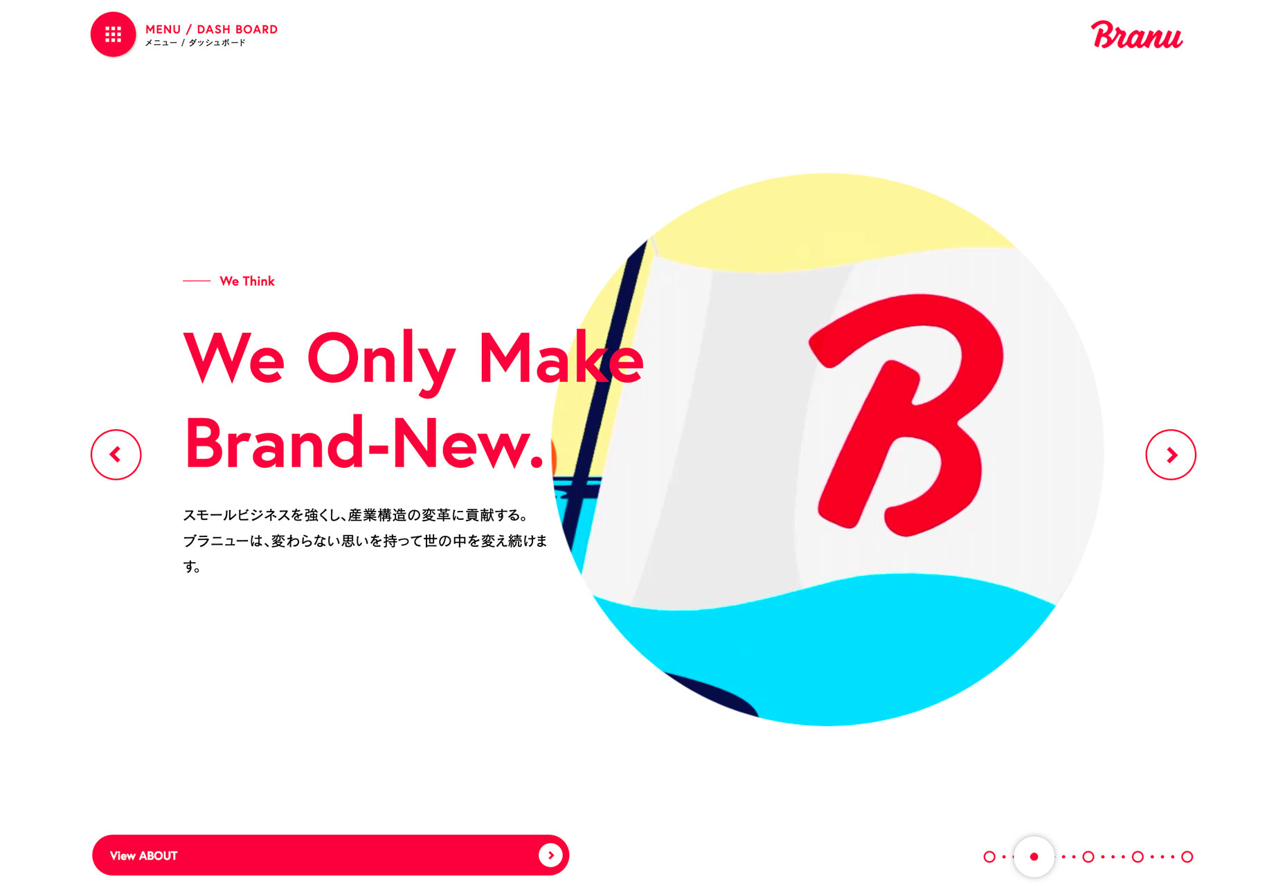
Branu uses red lettering to draw you in. On a stark white background with a simple video element, it’s just sharp enough to make you stop and look.
Finally, the conference website uses red to give you the information you need over a loop of b-roll in the background. The color helps you find the event dates quickly and pinpoints a key element in the main navigation.
While all three shades of red are a bit different, they aren’t that far apart on the color spectrum. Use of red is bright and saturated. It’s the hue you think of first and that toddlers first learn to color with. (There’s no softening this color trend right now.)
More Split Screens
At a glance split screens aren’t new. We’ve been talking about – and loving on – this website design trend for a while now. And this is one concept that seems to keep getting better with time.
The latest iterations of split screen designs are more aesthetic than stacked for responsive functionality (although that’s a distinct bonus).
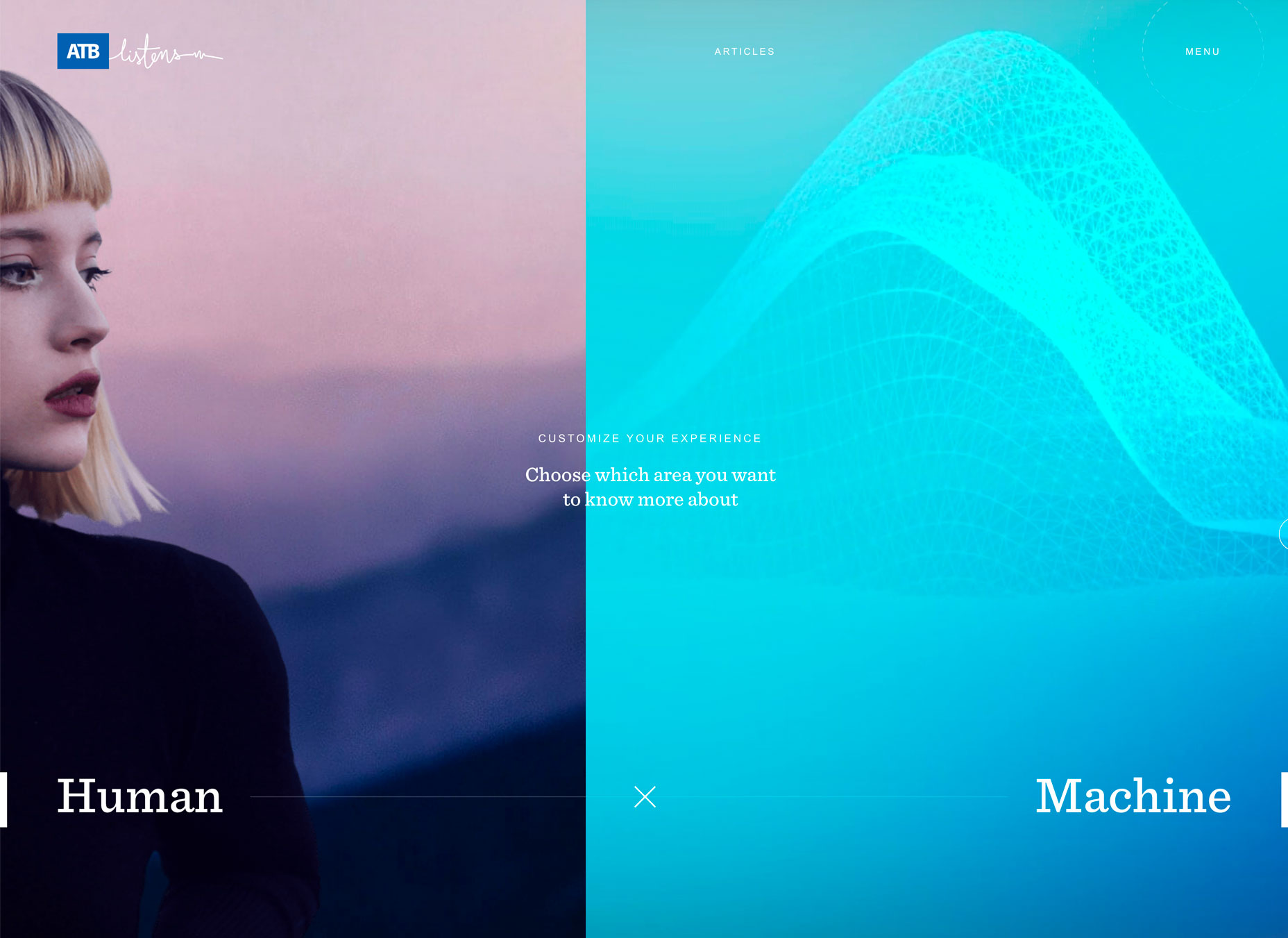
Split screens aren’t stuck in perfectly symmetrical patterns either. None of the examples below features a perfect split – unless it is part of another element. Both ATB and Yusuf Ozturk’s sites feature animations within the split screen so that the screen elements actually shift to highlight content or interactivity.
ATB use hover action to move the screen left and right as users choose which path to take with the design. It’s a clever way to connect the human or machine learning experience.
Ozturk’s site opens with a center split screen with a brain in the middle; hover actions revel design on one side of the brain and development on the other to showcase what’s you’ll find in the portfolio site. The animation is clean and sharp, and you can actually get caught playing with it for a while.
VM Consulting has a more traditionally designed split screen but uses the right side as a giant navigation menu. The heavy blue side paired with the lighter navigation is brilliantly balanced and easy to understand. (The color palette helps make this design shine as well.)
Conclusion
Are these design trends just right or too bold for your projects? While I love everything about split screen designs, I’m not 100 percent convinced when it comes to thick serifs and red accents. (These just seem to need more sparing use to me.) What do you think? Let’s start a conversation.
What trends are you loving (or hating) right now? I’d love to see some of the websites that you are fascinated with. Drop me a link on Twitter; I’d love to hear from you.
Every week users submit a lot of interesting stuff on our sister site Webdesigner News, highlighting great content from around the web that can be of interest to web designers.
The best way to keep track of all the great stories and news being posted is simply to check out the Webdesigner News site, however, in case you missed some here’s a quick and useful compilation of the most popular designer news that we curated from the past week.
Note that this is only a very small selection of the links that were posted, so don’t miss out and subscribe to our newsletter and follow the site daily for all the news.
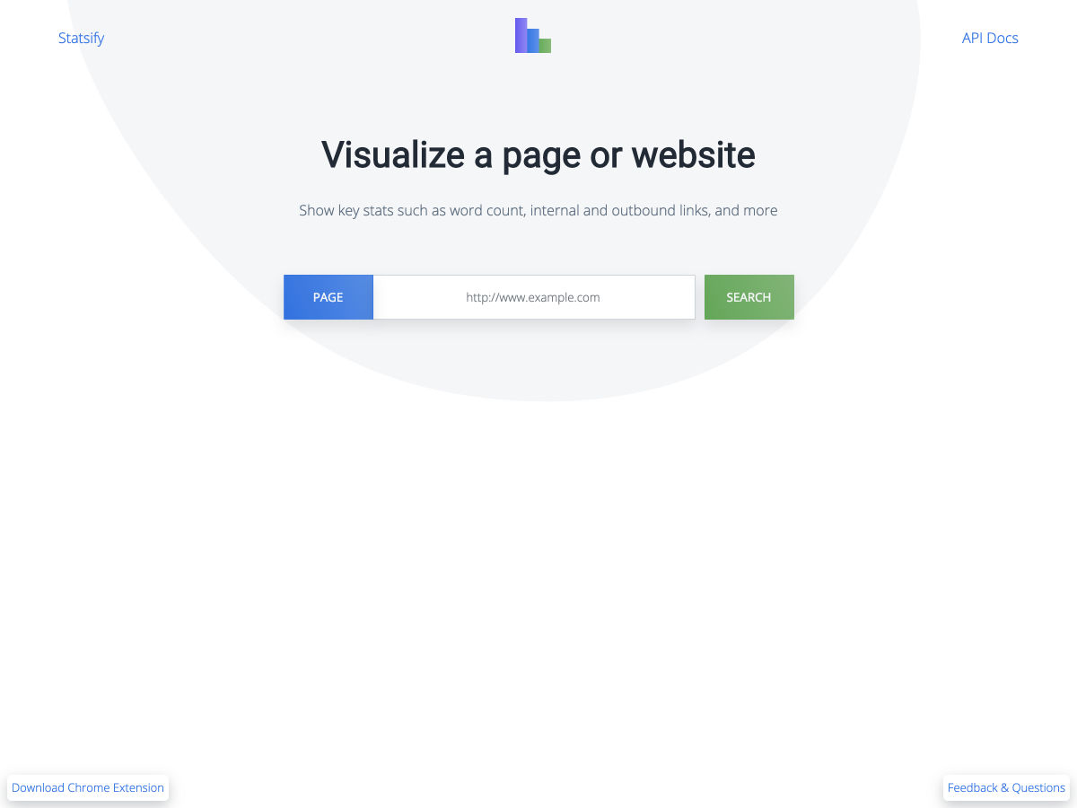
Visualize a Website
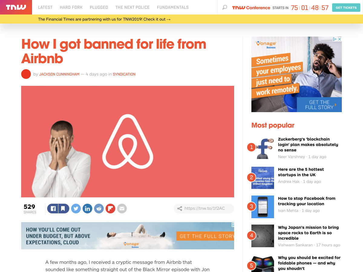
How I Got Banned for Life from AirBnB
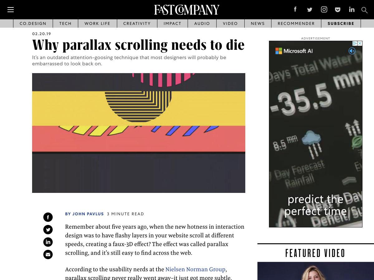
Why Parallax Scrolling Needs to Die
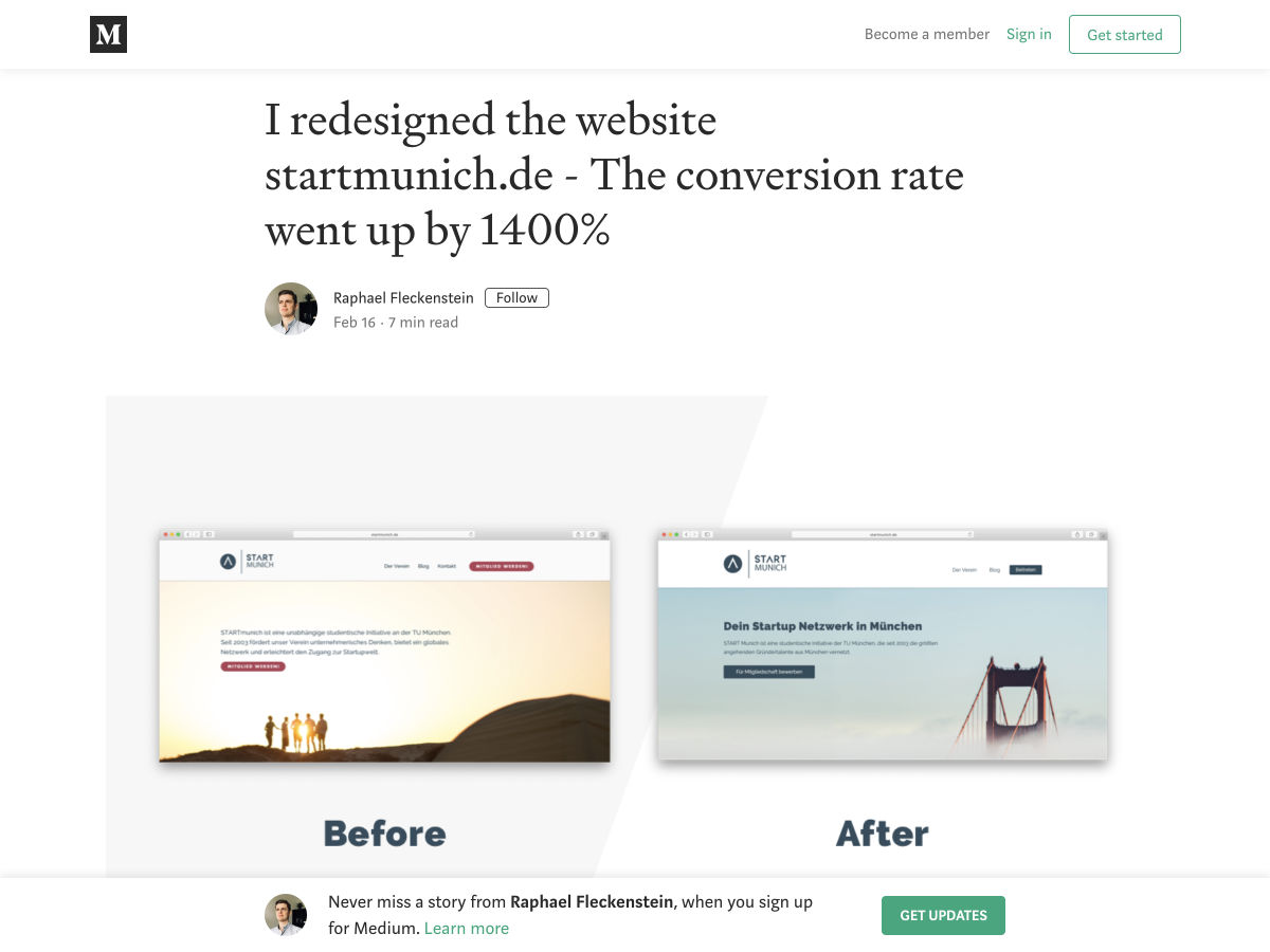
I Redesigned the Website Startmunich.de – The Conversion Rate Went up by 1.400%
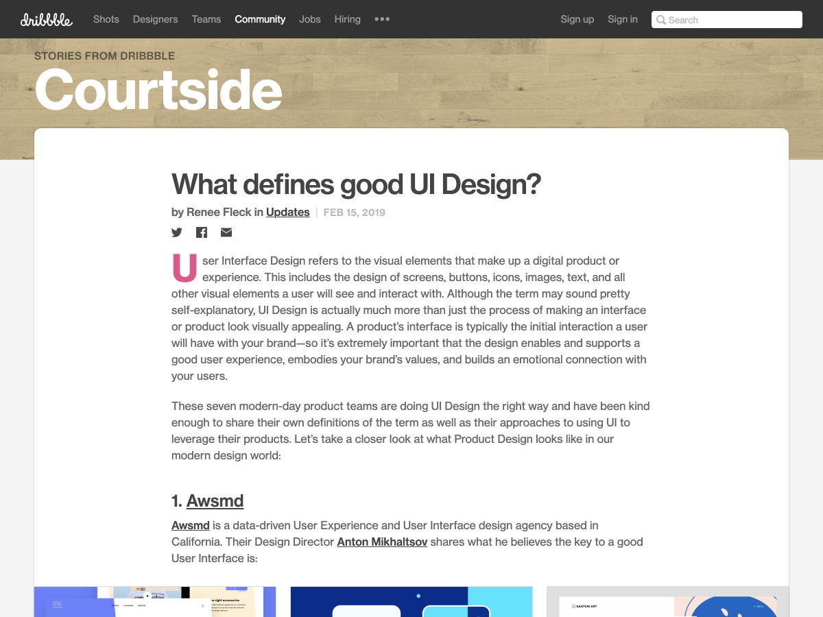
What Defines Good UI Design?
5 Alternatives to Material Design
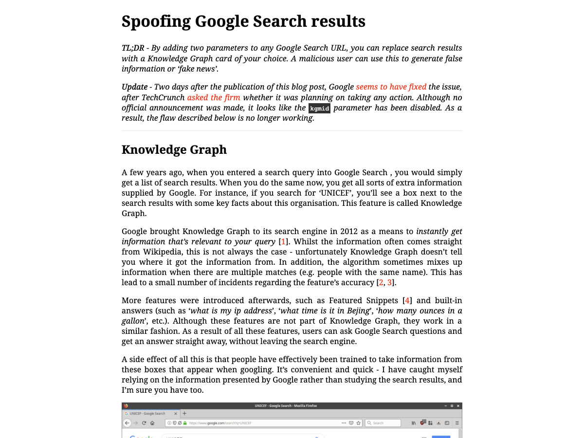
Spoofing Google Search Results
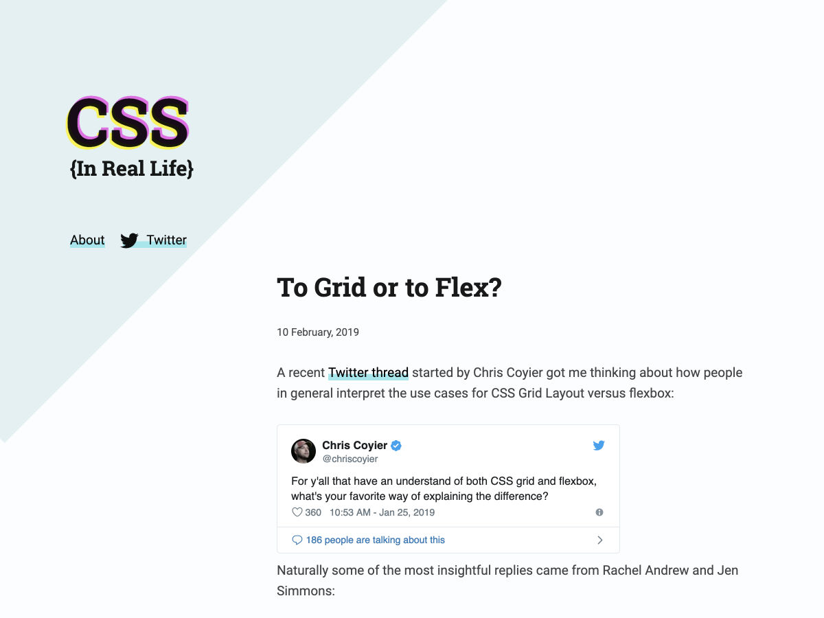
To Grid or to Flex?
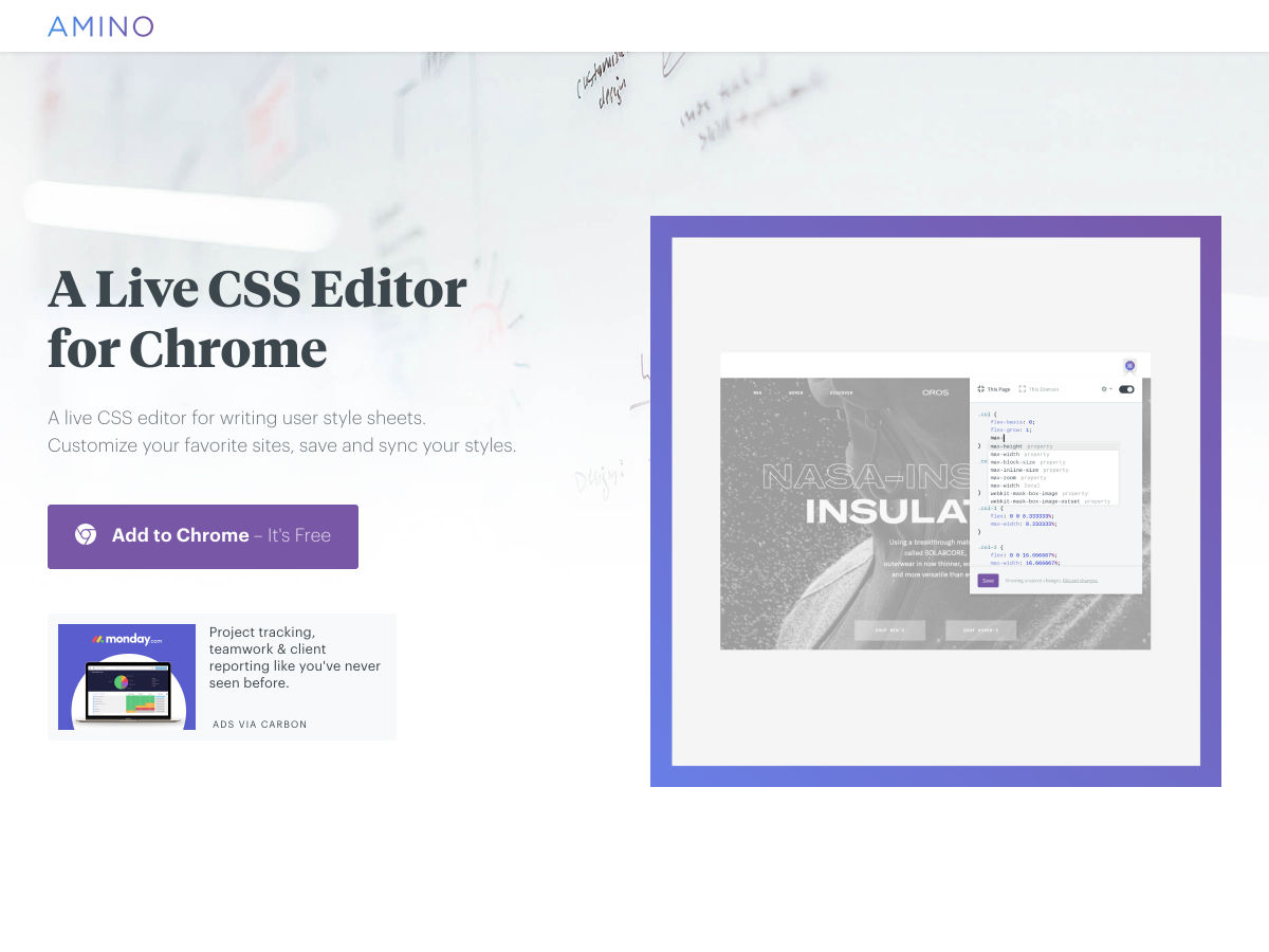
Amino: Live CSS Editor for Chrome
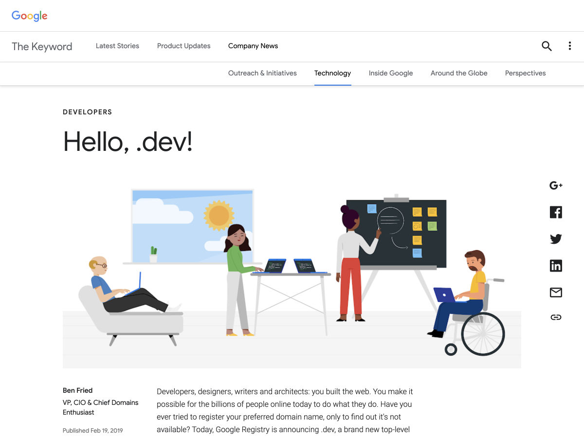
First .dev Domains Go Live
Site Design: Peak
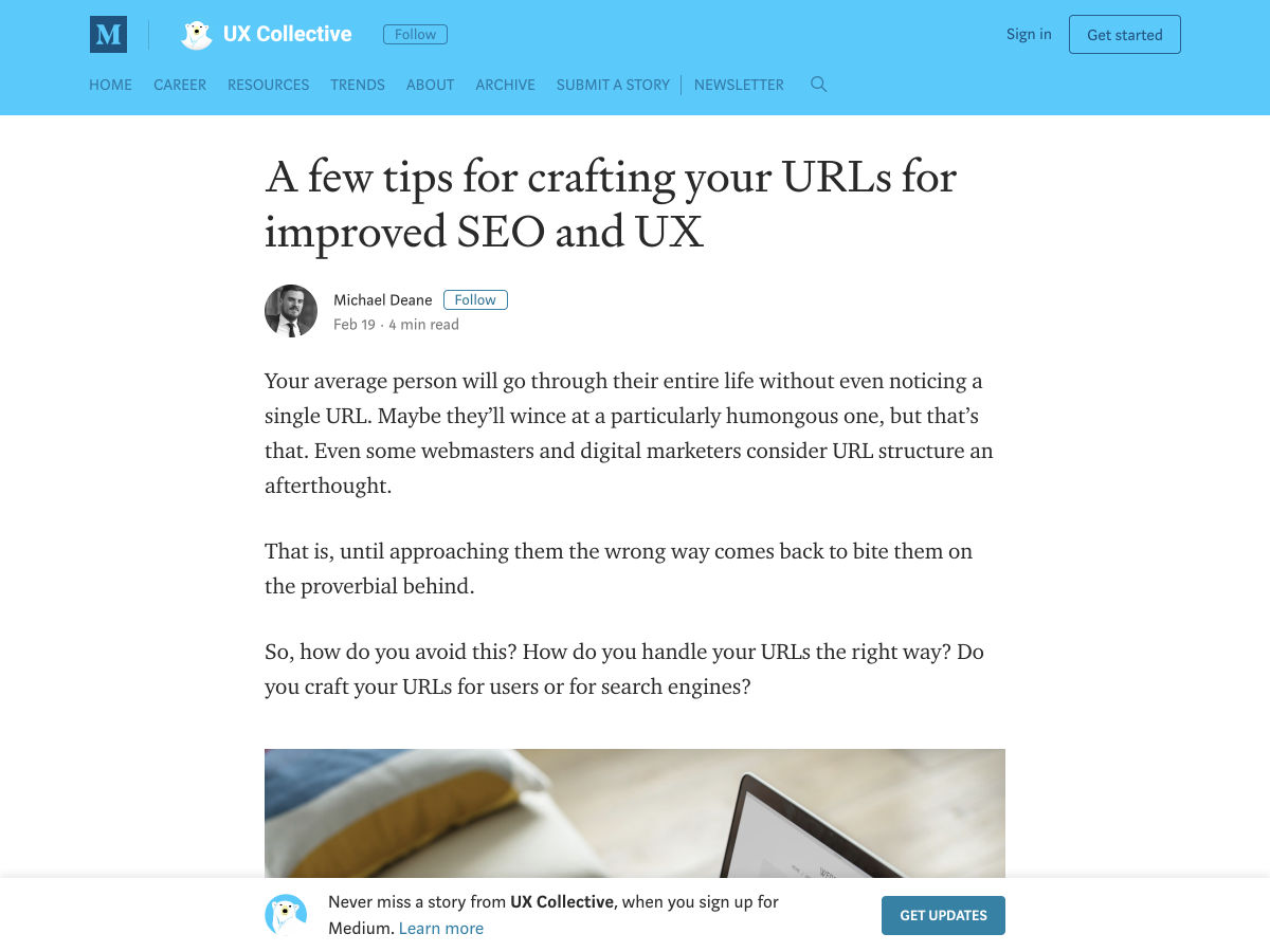
A Few Tips for Crafting your URLs for Improved SEO and UX
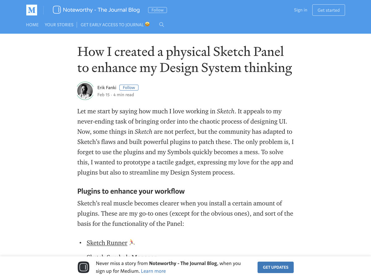
I Built a Physical Sketch Panel
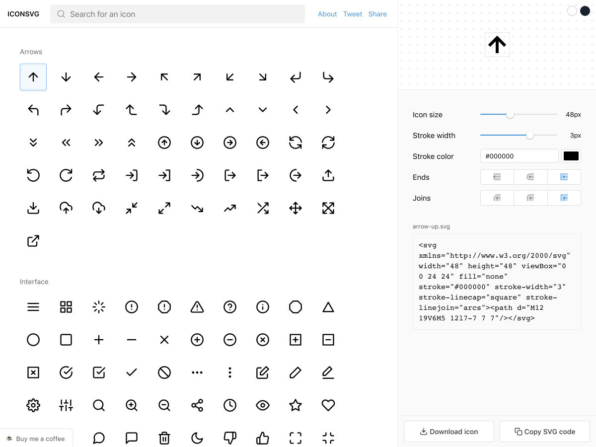
I Made a Tool to Customise & Generate Common SVG Icons
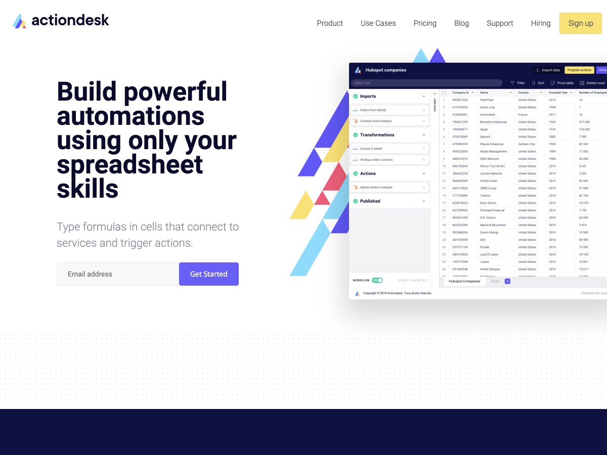
Actiondesk: Workflow Automation
Web Usability: Importance of Fold in Web Design
Don’t Burn my Eyes. Mysterious Experiences. Dark Mode UI
The 5 Principles of Good Experience Design
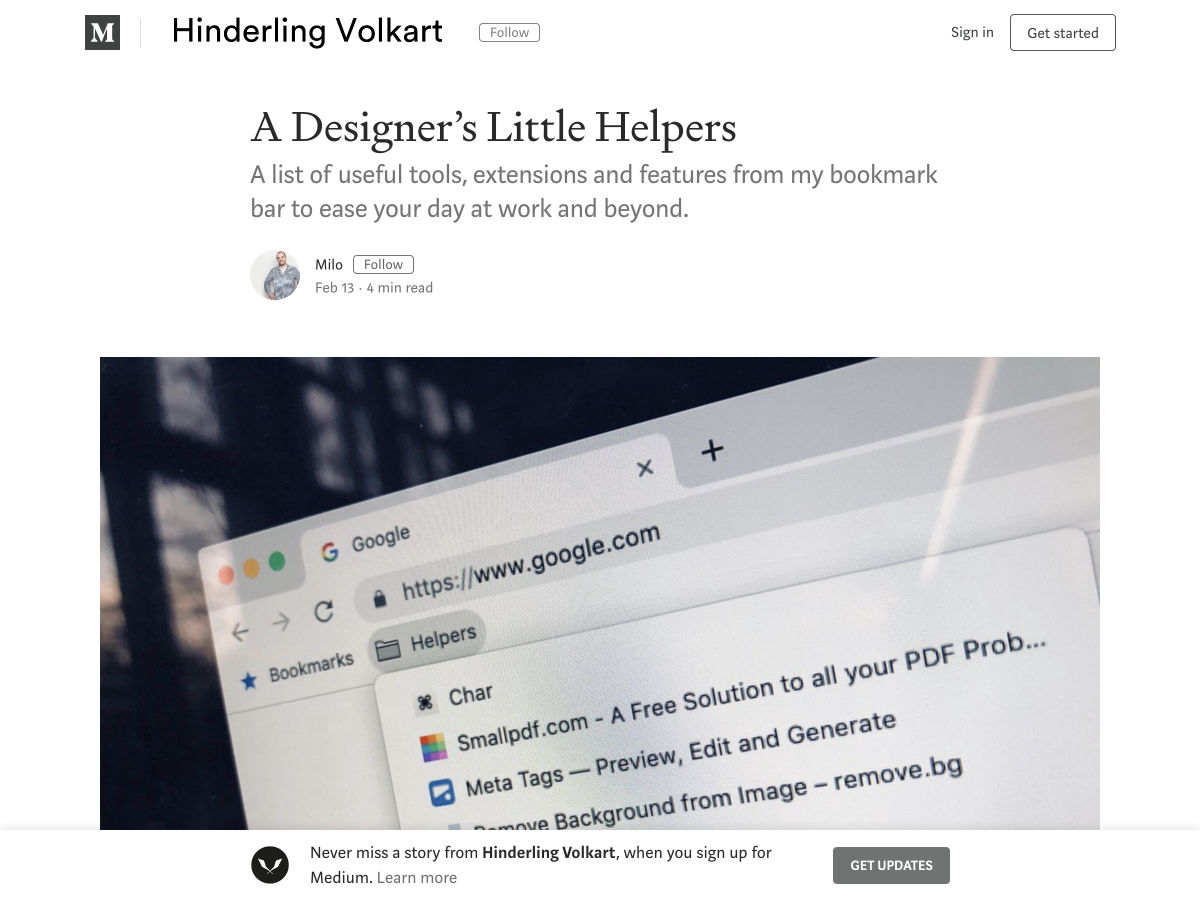
A Designer’s Little Helpers
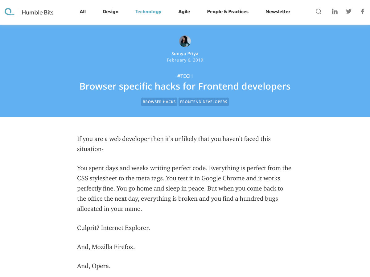
Browser-specific Hacks for Frontend Developers
The First Five Years: How to Stop Feeling like a Failure
Building the Wrong Product — 9 Antipatterns You Should Avoid
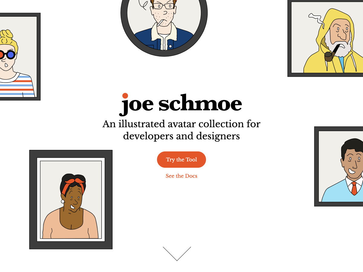
An Illustrated Avatar Collection for Developers and Designers
Museum of Failure
Frontiers of Design
Want more? No problem! Keep track of top design news from around the web with Webdesigner News.
Violet Peña has shared her recommendations for using CSS Grid. They basically boil down to these high-level points:
Use names instead of numbers for setting up our grid columns.
fr should be our flexible unit of choice.
We don’t really need a grid system anymore.
Although this is all great advice and Violet provides a few examples to support her recommendations, I particularly like what she has to say about learning CSS Grid:
“Learning” CSS Grid requires developing working knowledge of many new properties that don’t just describe one aspect of appearance or behavior, but feed into a completely new layout system. This system includes around 18 properties which use paradigms and syntax rarely (or never) seen anywhere else in the CSS spec.
This means that CSS Grid has a pretty high skill floor — a developer needs to learn and internalize lots of new information in order to be effective with it. Once you’re above that skill floor, Grid is an amazing ally in layout creation. Below that skill floor, Grid is an encumbrance. You wonder why you’re bothering to use it at all, since it seems to require lots of additional work for little reward.
In this post, I want to help you overcome that skill floor by showing you the most effective ways to leverage the Grid spec.
Also this post reminded me that, although I’m not sure why, I tend to avoid naming my grid columns up. Like in this bit of code that Violet walks us through:
Now we can use the sidebar or content names when we define our grid-column like this:
.content {
  grid-column: content;
}
I really like that! It seems super easy to read and if we wanted to change the size of our .content, class then it only requires going back to where the grid is defined in the first place. Anyway, I’ll be sure to name my grid columns from here on out.
Web animation is one of the factors that can strongly enhance your website’s look and feel. Sadly, unlike mobile apps, there aren’t as many websites using animation to their benefit as you would think. We don’t want to count yours among those, so this article is for you and anyone else looking for ways to use animation for a better user experience! Specifically, we’re going to learn how to make web interactions delightful using CSS animations.
Before we move ahead, it’s worth mentioning that I’m going to assume you have at least some familiarity with modern front-end frameworks and a basic understanding of CSS animations. If you don’t, then no fear! CSS-Tricks has a great guides on React and Vue, as well as a thorough almanac post on the CSSanimation property.
Good? OK, let’s talk about why we’d want to use animation in the first place and cover some baseline information about CSS animations.
Why would we to animate anything?
We could probably do an entire post on this topic alone. Oh, wait! Sarah Drasner already did that and her points are both poignant and compelling.
But, to sum things up based on my own experiences:
Animations enhance the way users interact with an interface. For example, smart animations can reduce cognitive load by giving users better context between page transitions.
They can provide clear cues to users, like where we want them to focus attention.
Animations serve as another design pattern in and of themselves, helping users to get emotionally attached to and engage with the interface.
Another benefit of using animations is that they can create a perception that a site or app loads faster than it actually does.
A couple of house rules with animations
Have you ever bumped into a site that animates all the things? Wow, those can be jarring. So, here’s a couple of things to avoid when working with animations so our app doesn’t fall into the same boat:
Avoid animating CSS properties other than transform and opacity. If other properties have to be animated, like width or height, then make sure there aren’t a lot of layout changes happening at the same time. There’s actually a cost to animations and you can see exactly how much by referring to CSS Triggers.
Also, just because animations can create perceived performance gains, there’s actually a point of diminishing return when it comes to using them. Animating too many elements at the same time may result in decreased performance.
Now we can get our hands dirty with some code!
Let’s build a music app
We’re going to build the music app we looked at earlier, which is inspired by Aurélien Salomon’s Dribbble shot. I chose this example so that we can focus on animations, not only within a component, but also between different routes. We’ll build this app using Vue and create animations using vanilla (i.e. no framework) CSS.
Animations should go hand-in-hand with UI development. Creating UI before defining their movement is likely to cost much more time. In this case, the Dribbble shot provides that scope for us.
Let’s start with the development.
Step 1: Spin up the app locally
First things first. We need to set up a new Vue project. Again, we’re assuming some base-level understanding of Vue here, so please check out the Learning Vue guide for more info on setting up.
We need a couple of dependencies for our work, notably vue-router for transitioning between views and sass-loader so we can write in Sass and compile to CSS. Here’s a detailed tutorial on using routes and Sass can be installed by pointing the command line at the project directory and using npm install -D sass-loader node-sass.
We have what we need!
Step 2: Setting up routes
For creating routes, we’re first going to create two bare minimum components — Artists.vue and Tracks.vue. We’ll drop a new file in the src folder called router.js and add routes for these components as:
import Vue from 'vue'
import Router from 'vue-router'
import Artists from './components/Artists.vue'
import Tracks from './components/Tracks.vue'

Vue.use(Router)
export default new Router({
	mode: 'history',
	routes: [
		{
			path: '/',
			name: 'artists',
			component: Artists
		},
		{
			path: '/:id',
			name: 'tracks',
			component: Tracks
		}
	]
})
Import router.js into the main.js and inject it to the Vue instance. Lastly, replace the content of your App.vue by .
Step 3: Create the components and content for the music app
We need two components that we’ll transition between with animation. Those are going to be:
Artists.vue: a grid of artists
Tracks.vue: An artist image with a back button
If you wanna jump ahead a bit, here are some assets to work with:
When all is said and done, the two views will come out to something like this:
Artists.vue (left) and Tracks.vue (right)
Step 4: Animate!
Here we are, the part we’ve really wanted to get to all this time. The most important animation in the app is transitioning from Artists to Tracks when clicking on an artist. It should feel seamless where clicking on an artist image puts that image in focus while transitioning from one view into the next. This is exactly the type of animation that we rarely see in apps but can drastically reduce cognitive load for users.
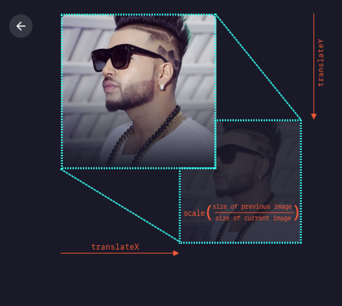
To make sure we’re all on the same page, we’re going to refer to the first image in the sequence as the “previous” image and the second one as the “current” image. Getting the effect down is relatively easy as long as we know the dimensions and position of the previous image in the transition. We can animate the current image by transforming it as per previous image.
The formula that I’m using is transform: translate(x, y) scale(n), where n is equal to the size of previous image divided by the size of current image. Note that we can use a static value of n since the dimensions are fixed for all the images. For example, the image size in the Artists view is 190x190 and 240x240 in the Tracks view. Thus, we can replace n by 190/240 = 0.791. That means the transform value becomes translate(x, y) scale(0.791) in our equation.
Animating from Artists to Tracks
Next thing is to find x and y. We can get these values though click event in the Artists view as:
…and then send these values to the Tracks view, all while switching the route. Since we aren’t using any state management library, the two components will communicate via their parent component, which is the top level component, App.vue. In App.vue, let’s create a method that switches the route and sends the image info as params.
Since we have received the position and ID of the image in Tracks, we have all the required data to show and animate it. We’ll first fetch artist information (specifically the name and image URL) using artist ID.
To animate the image, we need to calculate the transform value from the image’s starting position. To set the transform value, I’m using CSS custom properties, which can be done with CSS-in-JS techniques as well. Note that the image’s position that we received through props will be relative to window. Therefore we’ll have to subtract some fixed offset caused by the padding of the container
We’ll use this value to create a keyframe animation to move the image:
@keyframes move-image {
	from {
		transform: var(--translate);
	}
}
This gets assigned to the CSS animation:
.image {
	animation: move-image 0.6s;
}
…and it will animate the image from this transform value to its original position on component load.
Transitioning from Artists to Tracks
We can use the same technique when going the opposite direction, Tracks to Artists. As we already have the clicked image’s position stored in the parent component, we can pass it to props for Artists as well.
Transitioning from Tracks to Artists
Step 5: Show the tracks!
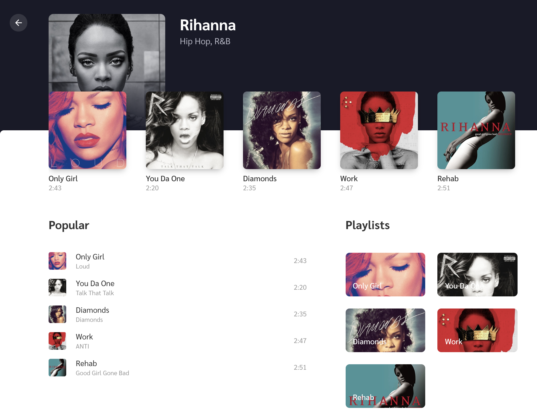
It’s great that we can now move between our two views seamlessly, but the Tracks view is pretty sparse at the moment. So let’s add the track list for the selected artist.
We’ll create an empty white box and a new keyframe to slide it upwards on page load. Then we’ll add three subsections to it: Recent Tracks, Popular Tracks, and Playlist. Again, if you want to jump ahead, feel free to either reference or copy the final code from the repo.
The Tracks view with content
Recent Tracks is the row of thumbnails just below the artist image where each thumbnail includes the track name and track length below it. Since we’re covering animations here, we’ll create a scale-up animation, where the image starts invisible (opacity: 0) and a little smaller than it’s natural size (scale(0.7)), then is revealed (opacity: 1 )and scales up to its natural size (transform: none).
The Popular Tracks list and Playlist sit side-by-side below the Recent Tracks, where Popular tracks takes up most of the space. We can slide them up a bit on initial view with another set of keyframes:
To make the animation feel more natural, we’ll create a stagger effect so the Recent Tracks lead a little ahead of the Popular Tracks and Playlist using an incremental animation delay to each item.
@for $i from 1 to 5 {
	&:nth-child(#{$i + 1}) {
		animation-delay: #{$i * 0.05}s;
	}
}
The code above is basically looking for each child element, then adding a 0.05 second delay to each element it finds. So, for example, the first child gets a 0.05 second delay, the second child gets a 0.10 second delay and so on.
Check out how nice and natural this all looks:
Bonus: micro-interactions!
One of the fun things about working with animations is thinking through the small details because they’re what tie things together and add delight to the user experience. We call these micro-interactions and they serve a good purpose by providing visual feedback when an action is performed.
Depending on the complexity of the animations, we might need a library like anime.js or GSAP. This example is pretty straightforward, so we can accomplish everything we need by writing some CSS.
First micro-interaction: The volume icon
Let’s first get a volume icon in SVG format (Noun Project and Material Design are good sources). On click, we’ll animate-in and out its path element to show the level of volume. For this, we’ll create a method which switches its CSS class according to the volume level.
Do you like it when you click on Twitter’s heart button? That’s because it feels unique and special by the way it animates on click. We’ll make something similar but real quick. For this, we first get an SVG heart icon and add it to the the markup. Then we’ll add a bouncy animation to it that’s triggered on click.
Another fun thing we can do is add other small heart icons around it with random sizes and positions. Ideally, we’d add a few absolute-positioned HTML elements that a heart as the background. Let’s Arrange each of them as below by setting their left and bottom values.
We’ll also include a fade away effect so the icons appear to dissolve as they move upward by adding a keyframe animation on the same click event.
That’s all! I hope you find all this motivating to try animations on your own websites and projects.
While writing this, I also wanted to expand on the fundamental animation principles we glossed over earlier because I believe that they help choose animation durations, and avoid non-meaningful animations. That’s important to discuss because doing animations correctly is better than doing them at all. But this sounds like a whole another topic to be covered in a future article.
WordPress was born fifteen years ago, and because it has historically preserved backwards compatibility, newer versions of its code couldn’t make full use of the latest capabilities offered by the newer versions of PHP. While the latest version of PHP is 7.3.2, WordPress still offers support up to PHP 5.2.4.
But those days will soon be over! WordPress will be upgrading its minimum PHP version support, bumping up to PHP 5.6 in April 2019, and PHP 7 in December 2019 (if everything goes according to plan). We can then finally start using PHP’s imperative programming capabilities without fear of breaking our clients’ sites. Hurray!
Because WordPress’ fifteen years of functional code have influenced how developers have built with WordPress, our sites, themes and plugins may be littered with less-than-optimal code that can gladly receive an upgrade.
This article is composed of two parts:
Most relevant new features
Further features have been added to PHP versions 5.3, 5.4, 5.5, 5.6 and 7.0 (notice that there is no PHP 6) and we’ll explore the most relevant ones.
Building better software
We’ll take a closer look through these features and how they are able to help us build better software.
Let’s start by exploring PHP’s “new” features.
Classes, OOP, SOLID And Design Patterns
Classes and objects were added to PHP 5, so WordPress already makes use of these features, however, not very extensively or comprehensively: The paradigm of coding in WordPress is mostly functional programming (performing computations by calling functions devoid of application state) instead of object-oriented programming (OOP) (performing computations by manipulating objects’ state). Hence I also describe classes and objects and how to use them through OOP.
OOP is ideal for producing modular applications: Classes allow the creation of components, each of which can implement a specific functionality and interact with other components, and can provide customization through its encapsulated properties and inheritance, enabling a high degree of code reusability. As a consequence, the application is cheaper to test and maintain, since individual features can be isolated from the application and dealt with on their own; there is also a boost of productivity since the developer can use already-developed components and avoid reinventing the wheel for each application.
A class has properties and functions, which can be given visibility by usingprivate (accessible only from within the defining class), protected (accessible from within the defining class and its ancestor and inheriting classes) and public (accessible from everywhere). From within a function, we can access the class’ properties by prepending their names with $this->:
class Person {

  protected $name;

  public function __construct($name) {
    $this->name = $name;
  }

  public function getIntroduction() {
    return sprintf(
      __('My name is %s'),
      $this->name
    );
  }
}
A class is instantiated into an object through the new keyword, after which we can access its properties and functions through ->:
$person = new Person('Pedro');
echo $person->getIntroduction();
// This prints "My name is Pedro"
An inheriting class can override the public and protected functions from its ancestor classes, and access the ancestor functions by prepending them with parent:::
class WorkerPerson extends Person {

  protected $occupation;

  public function __construct($name, $occupation) {

    parent::__construct($name);
    $this->occupation = $occupation;
  }

  public function getIntroduction() {
    return sprintf(
      __('%s and my occupation is %s'),
      parent::getIntroduction(),
      $this->occupation
    );
  }
}

$worker = new WorkerPerson('Pedro', 'web development');
echo $worker->getIntroduction();
// This prints "My name is Pedro and my occupation is web development"
A method can be made abstract, meaning that it must be implemented by an inheriting class. A class containing an abstract method must be made abstract itself, meaning that it cannot instantiated; only the class implementing the abstract method can be instantiated:
abstract class Person {

  abstract public function getName();

  public function getIntroduction() {
    return sprintf(
      __('My name is %s'),
      $this->getName()
    );
  }
}
// Person cannot be instantiated

class Manuel extends Person {

  public function getName() {
    return 'Manuel';
  }
}

// Manuel can be instantiated
$manuel = new Manuel();
Classes can also define static methods and properties, which live under the class itself and not under an instantiation of the class as an object. These are accessed through self:: from within the class, and through the name of the class + :: from outside it:
class Factory {

  protected static $instances = [];
  public static function registerInstance($handle, $instance) {
    self::$instances[$handle] = $instance;
  }
  public static function getInstance($handle) {
    return self::$instances[$handle];
  }
}

$engine = Factory::getInstance('Engine');
To make the most out of OOP, we can use the SOLID principles to establish a sound yet easily customizable foundation for the application, and design patterns to solve specific problems in a tried-and-tested way. Design patterns are standardized and well documented, enabling developers to understand how different components in the application relate to each other, and provide a way to structure the application in an orderly fashion which helps avoid the use of global variables (such as global $wpdb) that pollute the global environment.
Namespaces
Namespaces were added to PHP 5.3, hence they are currently missing altogether from the WordPress core.
Namespaces allow organizing the codebase structurally to avoid conflicts when different items have the same name — in a fashion similar to operating system directories which allow to have different files with the same name as long as they are stored in different directories. Namespaces do the same encapsulation trick for PHP items (such as classes, traits, and interfaces) avoiding collisions when different items have the same name by placing them on different namespaces.
Namespaces are a must when interacting with third-party libraries since we can’t control how their items will be named, leading to potential collisions when using standard names such as “File”, “Logger” or “Uploader” for our items. Moreover, even within a single project, namespaces prevent class names from becoming extremely long as to avoid clashes with other classes, which could result in names such as “MyProject_Controller_FileUpload”.
Namespaces are defined using the keyword namespace (placed on the line immediately after the opening <?php) and can span several levels or subnamespaces (similar to having several subdirectories where placing a file), which are separated using a :
<?php
namespace CoolSoftImageResizerControllers;

class ImageUpload {

}
To access the above class, we need to fully qualify its name including its namespace (and starting with ):
$imageUpload = new CoolSoftImageResizerControllersImageUpload();
Or we can also import the class into the current context, after which we can reference the class by its name directly:
use CoolSoftImageResizerControllersImageUpload;
$imageUpload = new ImageUpload();
By naming namespaces following established conventions, we can get additional benefits. For instance, by following the PHP Standards Recommendation PSR-4, the application can use Composer’s autoloading mechanism for loading files, thus decreasing complexity and adding frictionless interoperability among dependencies. This convention establishes to include the vendor name (e.g. the company’s name) as the top subnamespace, optionally followed by the package name, and only then followed by an internal structure in which each subnamespace corresponds to a directory with the same name. The result maps 1 to 1 the physical location of the file in the drive with the namespace of the element defined in the file.
Traits
Traits were added to PHP 5.4, hence they are currently missing altogether from the WordPress core.
PHP supports single inheritance, so a subclass is derived from a single parent class, and not from multiple ones. Hence, classes that do not extend from one another can’t reuse code through class inheritance. Traits is a mechanism that enables horizontal composition of behavior, making it possible to reuse code among classes which live in different class hierarchies.
A trait is similar to a class, however, it can’t be instantiated on its own. Instead, the code defined inside a trait can be thought of as being “copied and pasted” into the composing class on compilation time.
A trait is defined using the trait keyword, after which it can be imported to any class through the use keyword. In the example below, two completely unrelated classes Person and Shop can reuse the same code through a trait Addressable:
trait Addressable {

  protected $address;

  public function getAddress() {
    return $this->address;
  }

  public function setAddress($address) {
    $this->address = $address;
  }
}

class Person {

  use Addressable;
}

class Shop {

  use Addressable;
}

$person = new Person('Juan Carlos');
$person->setAddress('Obelisco, Buenos Aires');
A class can also compose more than one trait:
trait Exportable {

  public class exportToCSV($filename) {
    // Iterate all properties and export them to a CSV file
  }
}

class Person {

  use Addressable, Exportable;
}
Interfaces were added to PHP 5, so WordPress already makes use of this feature, however, extremely sparingly: the core includes less than ten interfaces in total!
Interfaces allow creating code which specifies which methods must be implemented, yet without having to define how these methods are actually implemented. They are useful for defining contracts among components, which leads to better modularity and maintainability of the application: A class implementing an interface can be a black box of code, and as long as the signatures of the functions in the interface do not change, the code can be upgraded at will without producing breaking changes, which can help prevent the accumulation of technical debt. In addition, they can help reduce vendor lock-in, by allowing to swap the implementation of some interface to that of a different vendor. As a consequence, it is imperative to code the application against interfaces instead of implementations (and defining which are the actual implementations through dependency injection).
Interfaces are defined using the interface keyword, and must list down just the signature of its methods (i.e. without having their contents defined), which must have visibility public (by default, adding no visibility keyword also makes it public):
interface FileStorage {

  function save($filename, $contents);
  function readContents($filename);
}
A class defines that it implements the interface through the implements keyword:
class LocalDriveFileStorage implements FileStorage {

  function save($filename, $contents) {
    // Implement logic
  }
  function readContents($filename) {
    // Implement logic
  }
}
A class can implement more than one interface, separating them with ,:
interface AWSService {
  function getRegion();
}

class S3FileStorage implements FileStorage, AWSService {

  function save($filename, $contents) {
    // Implement logic
  }
  function readContents($filename) {
    // Implement logic
  }
  function getRegion() {
    return 'us-east-1';
  }
}
Since an interface declares the intent of what a component is supposed to do, it is extremely important to name interfaces appropriately.
Closures
Closures were added to PHP 5.3, hence they are currently missing altogether from the WordPress core.
Closures is a mechanism for implementing anonymous functions, which helps declutter the global namespace from single-use (or seldom-used) functions. Technically speaking, closures are instances of class Closure, however, in practice, we can most likely be blissfully unaware of this fact without any harm.
Before closures, whenever passing a function as an argument to another function, we had to define the function in advance and pass its name as the argument:
function duplicate($price) {
  return $price*2;
}
$touristPrices = array_map('duplicate', $localPrices);
With closures, an anonymous (i.e. without a name) function can already be passed directly as a parameter:
Generators were added to PHP 5.5, hence they are currently missing altogether from the WordPress core.
Generators provide an easy way to implement simple iterators. A generator allows to write code that uses foreach to iterate over a set of data without needing to build an array in memory. A generator function is the same as a normal function, except that instead of returning once, it can yield as many times as it needs to in order to provide the values to be iterated over.
function xrange($start, $limit, $step = 1) {
    for ($i = $start; $i
Argument And Return Type Declarations
Different argument type declarations were introduced in different versions of PHP: WordPress is already able to declare interfaces and arrays (which it does not: I barely found one instance of a function declaring an array as parameter in core, and no interfaces), and will soon be able to declare callables (added in PHP 5.4) and scalar types: bool, float, int and string (added in PHP 7.0). Return type declarations were added to PHP 7.0.
Argument type declarations allow functions to declare of what specific type must an argument be. The validation is executed at call time, throwing an exception if the type of the argument is not the declared one. Return type declarations are the same concept, however, they specify the type of value that will be returned from the function. Type declarations are useful to make the intent of the function easier to understand and to avoid runtime errors from receiving or returning an unexpected type.
The argument type is declared before the argument variable name, and the return type is declared after the arguments, preceded by ::
function foo(boolean $bar): int {

}
Scalar argument type declarations have two options: coercive and strict. In coercive mode, if the wrong type is passed as a parameter, it will be converted to the right type. For example, a function that is given an integer for a parameter that expects a string will get a variable of type string. In strict mode, only a variable of the exact type of declaration will be accepted.
Coercive mode is the default. To enable strict mode, we must add a declare statement used with the strict_types declaration:
declare(strict_types=1);
function foo(boolean $bar) {

}
New Syntax And Operators
WordPress can already identify variable-length argument lists through function func_num_args. Starting from PHP 5.6, we can use the ... token to denote that the function accepts a variable number of arguments, and these arguments will be passed into the given variable as an array:
function sum(...$numbers) {
  $sum = 0;
  foreach ($numbers as $number) {
    $sum += $number;
  }
  return $sum;
}
Starting from PHP 5.6, constants can involve scalar expressions involving numeric and string literals instead of just static values, and also arrays:
const SUM = 37 + 2; // A scalar expression
const LETTERS = ['a', 'b', 'c']; // An array
Starting from PHP 7.0, arrays can also be defined using define:
The Null coalescing operator ?? is syntactic sugar for the common case of needing to use a ternary in conjunction with isset(). It returns its first operand if it exists and is not NULL; otherwise, it returns its second operand.
$username = $_GET['user'] ?? 'nobody';
// This is equivalent to:
// $username = isset($_GET['user']) ? $_GET['user'] : 'nobody';
The Spaceship operator is used for comparing two expressions, returning -1, 0 or 1 when the first operand is respectively less than, equal to, or greater than the second operand.
These are the most important new features added to PHP spanning versions 5.3 to 7.0. The list of the additional new features, not listed in this article, can be obtained by browsing PHP’s documentation on migrating from version to version.
Next, we analyze how we can make the most out of all these new features, and from recent trends in web development, to produce better software.
PHP Standards Recommendations
The PHP Standards Recommendations was created by a group of PHP developers from popular frameworks and libraries, attempting to establish conventions so that different projects can be integrated more seamlessly and different teams can work better with each other. The recommendations are not static: existing recommendations may be deprecated and newer ones created to take their place, and new ones are released on an ongoing basis.
The current recommendations are the following:
Group
Recommendation
Description
Coding Styles Standardized formatting reduces the cognitive friction when reading code from other authors
All of these components are published in Packagist, a repository of public PHP packages, and can be easily added to any PHP project through Composer, an extremely popular dependency manager for PHP.
WordPress should be part of such a virtuous development cycle. Unfortunately, the WordPress core itself is not built using components (as evidenced by the almost total absence of interfaces) and, moreover, it doesn’t even have the composer.json file required to enable installing WordPress through Composer. This is because the WordPress community hasn’t agreed whether WordPress is a site’s dependency (in which case installing it through Composer would be justified) or if it is the site itself (in which case Composer may not be the right tool for the job).
In my opinion, if we are to expect WordPress to stay relevant for the next fifteen years (at least WordPress as a backend CMS), then WordPress must be recognized as a site’s dependency and made available for installation through Composer. The reason is very simple: with barely a single command in the terminal, Composer enables to declare and install a project’s dependencies from the thousands of packages published in Packagist, making it possible to create extremely-powerful PHP applications in no time, and developers love working this way. If WordPress doesn’t adapt to this model, it may lose the support from the development community and fall into oblivion, as much as FTP fell out of favor after the introduction of Git-based deployments.
I would argue that the release of Gutenberg already demonstrates that WordPress is a site dependency and not the site itself: Gutenberg treats WordPress as a headless CMS, and can operate with other backend systems too, as Drupal Gutenberg exemplifies. Hence, Gutenberg makes it clear that the CMS powering a site can be swappable, hence it should be treated as a dependency. Moreover, Gutenberg itself is intended to be based on JavaScript components released through npm (as explained by core committer Adam Silverstein), so if the WordPress client is expected to manage its JavaScript packages through the npm package manager, then why not extend this logic to the backend in order to manage PHP dependencies through Composer?
Now the good news: There is no need to wait for this issue to be resolved since it is already possible to treat WordPress as a site’s dependency and install it through Composer. John P. Bloch has mirrored WordPress core in Git, added a composer.json file, and released it in Packagist, and Roots’ Bedrock provides a package to install WordPress with a customized folder structure with support for modern development tools and an enhanced security. And themes and plugins are covered too; as long as they have been listed on the WordPress theme and plugin directories, they are available under WordPress Packagist.
As a consequence, it is a sensible option to create WordPress code not thinking in terms of themes and plugins, but thinking in terms of components, making them available through Packagist to be used by any PHP project, and additionally packaged and released as themes and plugins for the specific use of WordPress. If the component needs to interact with WordPress APIs, then these APIs can be abstracted behind an interface which, if the need arises, can be implemented for other CMSs too.
Adding A Template Engine To Improve The View Layer
If we follow through the recommendation of thinking and coding in components, and treat WordPress as a site’s dependency other than the site itself, then our projects can break free from the boundaries imposed by WordPress and import ideas and tools taken from other frameworks.
Rendering HTML content on the server-side is a case in point, which is done through plain PHP templates. This view layer can be enhanced through template engines Twig (by Symfony) and Blade (by Laravel), which provide a very concise syntax and powerful features that give it an advantage over plain PHP templates. In particular, Gutenberg’s dynamic blocks can easily benefit from these template engines, since their process to render the block’s HTML on the server-side is decoupled from WordPress’ template hierarchy architecture.
Architect The Application For The General Use
Coding against interfaces, and thinking in terms of components, allows us to architect an application for general use and customize it for the specific use that we need to deliver, instead of coding just for the specific use for each project we have. Even though this approach is more costly in the short term (it involves extra work), it pays off in the long term when additional projects can be delivered with lower efforts from just customizing a general-use application.
For this approach to be effective, the following considerations must be taken into account:
Avoid Fixed Dependencies (As Much As Possible)
jQuery and Bootstrap (or Foundation, or ) could’ve been considered must-haves a few years ago, however, they have been steadily losing ground against vanilla JS and newer native CSS features. Hence, a general-use project coded five years ago which depended on these libraries may not be suitable nowadays anymore. Hence, as a general rule of thumb, the lower the amount of fixed dependencies on third-party libraries, the more up-to-date it will prove to be for the long term.
Progressive Enhancement Of Functionalities
WordPress is a full-blown CMS system which includes user management, hence support for user management is included out of the box. However, not every WordPress site requires user management. Hence, our application should take this into account, and work optimally on each scenario: support user management whenever required, but do not load the corresponding assets whenever it is not. This approach can also work gradually: Say that a client requires to implement a Contact us form but has no budget, so we code it using a free plugin with limited features, and another client has the budget to buy the license from a commercial plugin offering better features. Then, we can code our functionality to default to a very basic functionality, and increasingly use the features from whichever is the most-capable plugin available in the system.
Continuous Code And Documentation Review
By periodically reviewing our previously-written code and its documentation, we can validate if it is either up-to-date concerning new conventions and technologies and, if it is not, take measures to upgrade it before the technical debt becomes too expensive to overcome and we need to code it all over again from scratch.
Attempt To Minimize Problems But Be Prepared When They Happen
No software is ever 100% perfect: the bugs are always there, we just haven’t found them yet. As such, we need to make sure that, once the problems arise, they are easy to fix.
Make It Simple
Complex software cannot be maintained in the long term: Not just because other team members may not understand it, but also because the person who coded it may not understand his/her own complex code a few years down the road. So producing simple software must be a priority, more since only simple software can be correct and fast.
Failing On Compile Time Is Better Than On Runtime
If a piece of code can be validated against errors at either compile time or runtime time, then we should prioritize the compile time solution, so the error can arise and be dealt with in the development stage and before the application reaches production. For instance, both const and define are used for defining constants, however, whereas const is validated at compile time, define is validated at runtime. So, whenever possible, using const is preferable over define.
Following this recommendation, hooking WordPress functions contained in classes can be enhanced by passing the actual class as a parameter instead of a string with the class name. In the example below, if class Foo is renamed, whereas the second hook will produce a compilation error, the first hook will fail on runtime, hence the second hook is better:
class Foo {
  public static function bar() {

  }
}

add_action('init', ['Foo', 'bar']); // Not so good
add_action('init', [Foo::class, 'bar']); // Much better
For the same reason as above, we should avoid using global variables (such as global $wpdb): these not only pollute the global context and are not easy to track where they originate from, but also, if they get renamed, the error will be produced on runtime. As a solution, we can use a Dependency Injection Container to obtain an instance of the required object.
Dealing With Errors/Exceptions
We can create an architecture of Exception objects, so that the application can react appropriately according to each particular problem, to either recover from it whenever possible or show a helpful error message to the user whenever not, and in general to log the error for the admin to fix the problem. And always protect your users from the white screen of death: All uncaught Errors and Exceptions can be intercepted through function set_exception_handler to print a non-scary error message on screen.
Adopt Build Tools
Build tools can save a lot of time by automating tasks which are very tedious to execute manually. WordPress doesn’t offer integration with any specific build tool, so the task of incorporating these to the project will fall entirely on the developer.
There are different tools for accomplishing different purposes. For instance, there are build tools to execute tasks for compressing and resizing images, minifying JS and CSS files, and copying files to a directory for producing a release, such as Webpack, Grunt and Gulp; other tools help create the scaffolding of a project, which is helpful for producing the folder structure for our themes or plugins, such as Yeoman. Indeed, with so many tools around, browsing articles comparing the different available tools will help find the most suitable one for our needs.
In some cases, though, there are no build tools that can achieve exactly what our project needs, so we may need to code our own build tool as an extension to the project itself. For instance, I have done this to generate the service-worker.js file to add support for Service Workers in WordPress.
Conclusion
Due to its strong emphasis on keeping backwards compatibility, extended even up to PHP 5.2.4, WordPress has not been able to benefit from the latest features added to PHP, and this fact has made WordPress become a not-very-exciting platform to code for among many developers.
Fortunately, these gloomy days may soon be over, and WordPress may become a shiny and exciting platform to code for once again: The requirement of PHP 7.0+ starting in December 2019 will make plenty of PHP features available, enabling developers to produce more powerful and more performant software. In this article, we reviewed the most important newly-available PHP features and how to make the most out of them.
The recent release of Gutenberg could be a sign of the good times to come: even if Gutenberg itself has not been fully accepted by the community, at least it demonstrates a willingness to incorporate the latest technologies (such as React and Webpack) into the core. This turn of events makes me wonder: If the frontend can get such a makeover, why not extend it to the backend? Once WordPress requires at least PHP 7.0, the upgrade to modern tools and methodologies can accelerate: As much as npm became the JavaScript package manager of choice, why not making Composer become the official PHP dependency manager? If blocks are the new unit for building sites in the frontend, why not use PHP components as the unit for incorporating functionalities into the backend? And finally, if Gutenberg treats WordPress as a swappable backend CMS, why not already recognize that WordPress is a site dependency and not the site itself? I’ll leave these open questions for you to reflect upon and ponder about.


