Archive

Archive for April, 2019

Kerning in Typography, everything you need to know

April 24th, 2019 No comments

In order for messages to be clearly transmitted, many factors play an important role. Depending on the type of communication, factors such as stuttering, poor grammar, bad alignment of letters, incorrect use of punctuation marks, mumbling, and others set apart unclear and clear messages. In oral speech, diction, proper intonation, a calm tempo of spoken words, the intensity of the voice are all skills that anyone who wants to be a good communicator has to achieve. In written speech, readable caligraphy, correct alignment of letters, words, sentences, and paragraphs, will make any text accessible to the reader.

Why are all these important? Designers have a major responsibility to make the latter type of communication possible without any obstacle. There are a few notions any designer should be familiar and able to work with: Kerning, Leading, and Tracking.

What is Kerning?

Kerning: Definition

Kerning is the stylistic process that made you read the first word of this sentence “KERNING” and not “KEMING”. You’ve probably already guessed it. Kerning is the act of adjusting the space between two letters in order to avoid the irregular flow of the words and to improve legibility.

Kerning: Meaning

Back in the good old days, people used to use

Read More at Kerning in Typography, everything you need to know
Categories: Designing, Others Tags:

That Time I Tried Browsing the Web Without CSS

April 24th, 2019 No comments
tags rather than getting lost as CSS backgrounds.

A WebAIM survey from 2018 reported that 12.5% of users who rely on any sort of assisted technology browse the web with custom stylesheets, which can include doing away with every CSS declaration across a site. And, if we’re talking about slow internet connections, ditching CSS could be one way to consume content faster. There’s also the chance that CSS is disabled for reasons outside our immediate control, like when a server has hiccups of fails to load assets.

As an experiment, I used five websites and a web app without CSS, and this post will cover my experiences. It wound up being a rather eye-opening adventure for me personally, but has also informed me professionally as a developer in ways I hope you’ll see as well.

But first, here’s how to disable CSS

You’re absolutely welcome to live vicariously through me in the form of this post. But for those of you who are feeling up to the task and want to experience a style-less web, here’s how to disable CSS in various browsers:

  • Chrome: There’s actually no setting in Chrome to disable CSS, so we have to resort to an extension, like disable-HTML.
  • Firefox: View > Page Style > No Style
  • Safari: Safari > Preferences... > Show Develop menu in menu bar. Then go to the Develop dropdown and select the “Disable Styles” option.
  • Opera: Like Chrome, we need an extension, and Web Developer fits the bill.
  • Internet Explorer 11: View > Style > No style

I couldn’t find a documented way to disable CSS in Edge, but we can remove CSS from it and any other browser programmatically via the CSS Object Model API in the DevTools console:

var d = document;

for (var s in S = d.styleSheets)
    S[s].disabled = true;

for (var i in I = d.querySelectorAll("[style]"))
    I[i].style = "";

The first loop disables all external and internal styles (in and ), and the second eliminates any inline styles. The caveat here, however, is that elements can still dynamically be given new inline styles. To instantly erase them, the best workaround is adding a timer. Something like this:

(f = function(){
    // Remove CSS
    ...

    setTimeout(f, 20);
})();

Alternatively, there are text-only browsers — such as the ancient Lynx — but expect to be living without video, images (including SVGs), and JavaScript.

Through the style-less looking glass…

For each site I surfed without CSS — Amazon, DuckDuckGo, GitHub, Stack Overflow, Wikipedia and contrast checker called Hex Naw — I’ll share my first impressions and put some suggestions out there that might help with the experience.

Get ready, because things might get a bit… appalling. ?


Website 1: Amazon.com
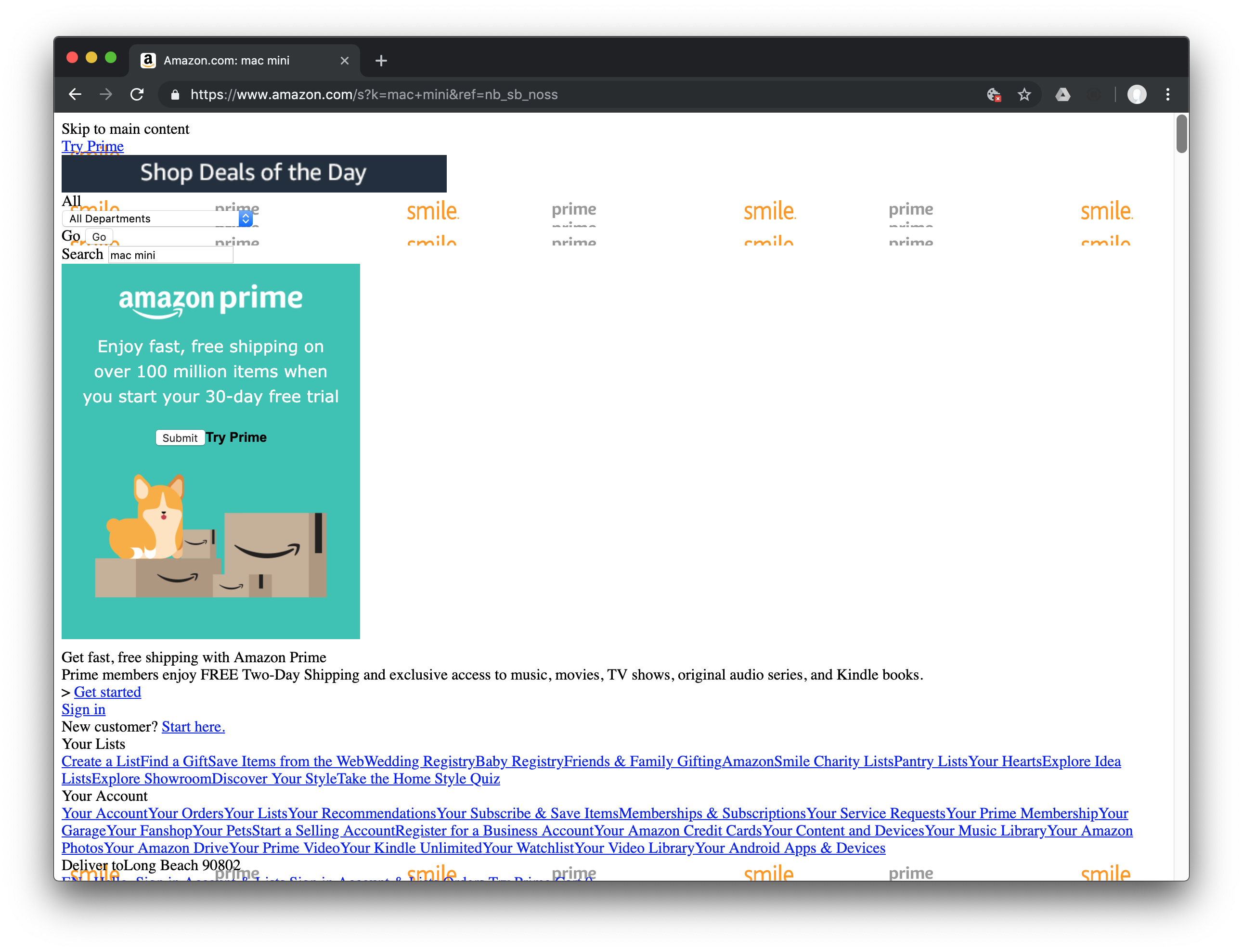
The Amazon.com homepage with and without CSS

CSS is what gives every website its design. Websites sure aren’t very fun and friendly without it! I’ve read about somebody going a week without JavaScript and how the experience resulted in websites that were faster, though certain aspects of them would not function as expected.

But CSS. Turning off CSS while browsing the web wouldn’t exactly make the web far less usable… right? Or, like JavaScript, would some features not work as expected? Out of curiosity, I decided to give it a whirl and rip the CSS flesh off the HTML skeleton while browsing a few sites.

Why, you might ask? Are there any non-masochistic reasons for turning off CSS? Heydon Pickering once tweeted that disabling CSS is a good way to check some accessibility standards:

  1. Common elements like headings, lists, and form controls are semantic and still look good.
  2. A visual hierarchy is still established with default styles.
  3. The content can still be read in a logical order.
  4. Images still exist as tags rather than getting lost as CSS backgrounds.

A WebAIM survey from 2018 reported that 12.5% of users who rely on any sort of assisted technology browse the web with custom stylesheets, which can include doing away with every CSS declaration across a site. And, if we’re talking about slow internet connections, ditching CSS could be one way to consume content faster. There’s also the chance that CSS is disabled for reasons outside our immediate control, like when a server has hiccups of fails to load assets.

As an experiment, I used five websites and a web app without CSS, and this post will cover my experiences. It wound up being a rather eye-opening adventure for me personally, but has also informed me professionally as a developer in ways I hope you’ll see as well.

But first, here’s how to disable CSS

You’re absolutely welcome to live vicariously through me in the form of this post. But for those of you who are feeling up to the task and want to experience a style-less web, here’s how to disable CSS in various browsers:

  • Chrome: There’s actually no setting in Chrome to disable CSS, so we have to resort to an extension, like disable-HTML.
  • Firefox: View > Page Style > No Style
  • Safari: Safari > Preferences... > Show Develop menu in menu bar. Then go to the Develop dropdown and select the “Disable Styles” option.
  • Opera: Like Chrome, we need an extension, and Web Developer fits the bill.
  • Internet Explorer 11: View > Style > No style

I couldn’t find a documented way to disable CSS in Edge, but we can remove CSS from it and any other browser programmatically via the CSS Object Model API in the DevTools console:

var d = document;

for (var s in S = d.styleSheets)
    S[s].disabled = true;

for (var i in I = d.querySelectorAll("[style]"))
    I[i].style = "";

The first loop disables all external and internal styles (in and ), and the second eliminates any inline styles. The caveat here, however, is that elements can still dynamically be given new inline styles. To instantly erase them, the best workaround is adding a timer. Something like this:

(f = function(){
    // Remove CSS
    ...

    setTimeout(f, 20);
})();

Alternatively, there are text-only browsers — such as the ancient Lynx — but expect to be living without video, images (including SVGs), and JavaScript.

Through the style-less looking glass…

For each site I surfed without CSS — Amazon, DuckDuckGo, GitHub, Stack Overflow, Wikipedia and contrast checker called Hex Naw — I’ll share my first impressions and put some suggestions out there that might help with the experience.

Get ready, because things might get a bit… appalling. ?


Website 1: Amazon.com
The Amazon.com homepage with and without CSS
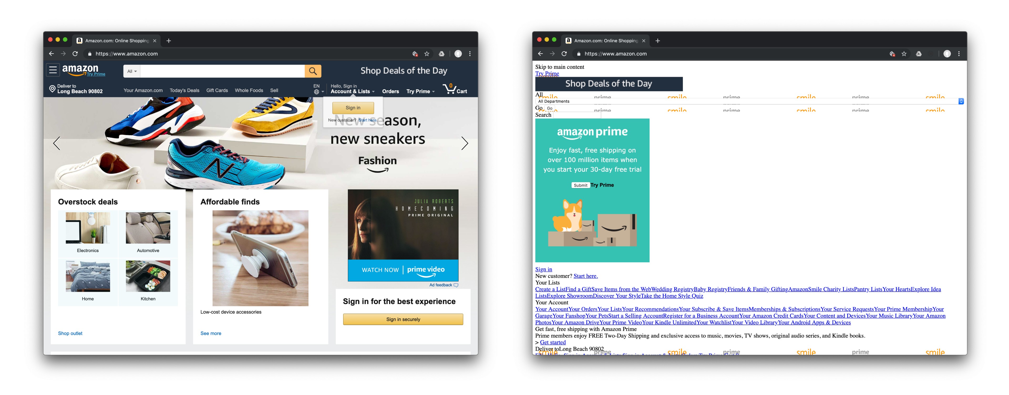
The Amazon.com homepage with CSS (left) and without CSS (right).

There’s no real need for an introduction here. Not only is Amazon a household staple for so many of us, it also powers a huge chunk of the web, thanks to their ubiquitous Amazon Web Services platform.

There’s a vast number of things going on here, so I’ll explore the style-less stuff that gets in my path while finding a product and pretending to purchase it.

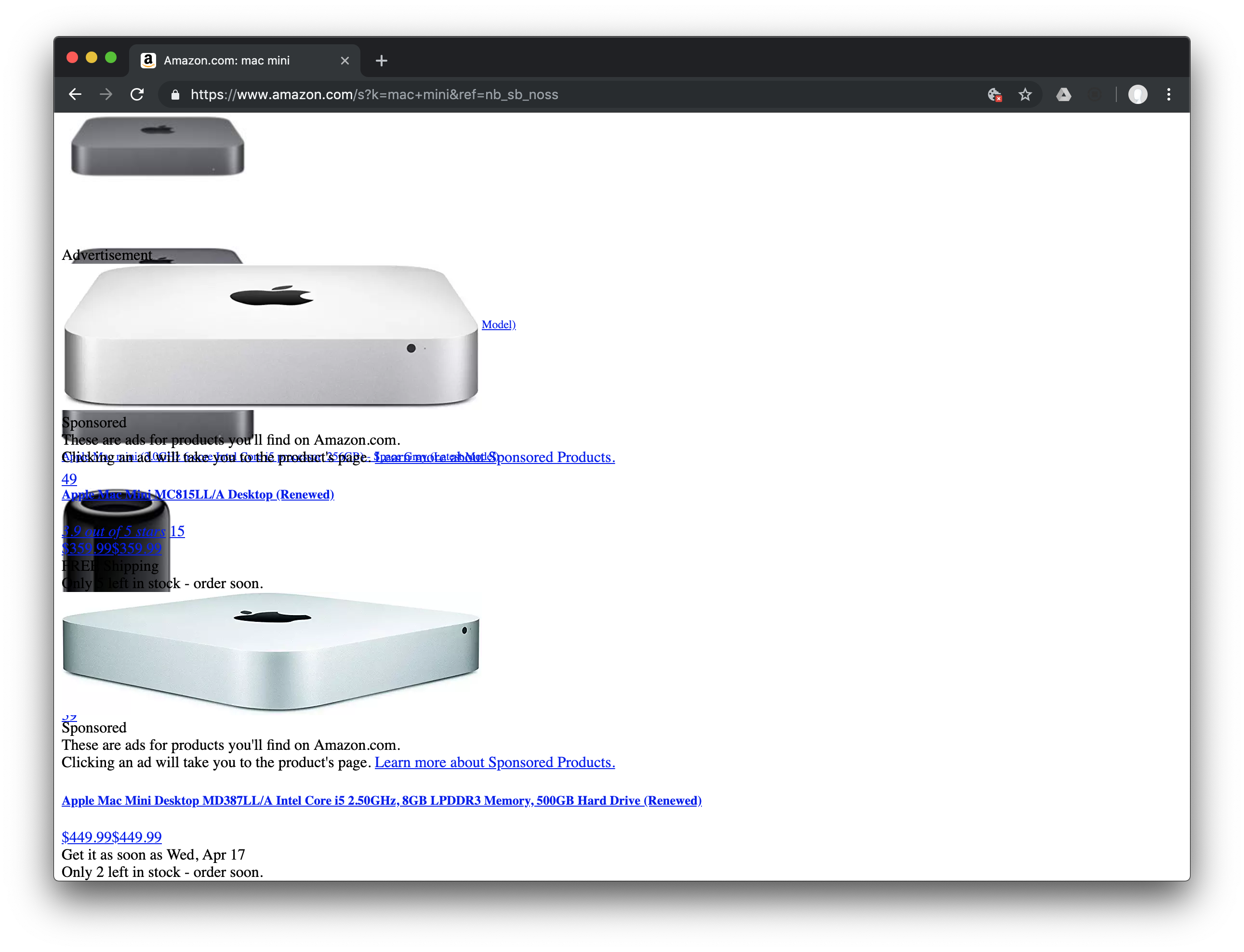
The Amazon.com results for a “mac mini” search query
The Amazon.com results for a “mac mini” search query.

On the homepage, I immediately see a sprite sheet used by the site. It’s really in place of where the logo could be, thus making it tough to know whether or not those images are intended to be there. Each sprite contains multiple versions of the logo, and even if I could see the “Amazon” word mark in it, it’s surprisingly that it’s not the global home link. If you’re curious where the home link really is, it’s this structure of spans where the logo is served up as background image… in CSS:
<a href="/ref=nav_logo" class="nav-logo-link" aria-label="Amazon" tabindex="6">
  <span class="nav-sprite nav-logo-base"></span>
  <span class="nav-sprite nav-logo-ext"></span>
  <span class="nav-sprite nav-logo-locale"></span>
</a>

The next problem that arises is that the “Skip to main content” link doesn’t look like a typical skip link, yet it works like one. It turns out to be an element without an href, and JavaScript (yes, I did leave that enabled) is used to mimic anchor functionality.

When I start a search, I have to look further below the “Get started” link to see the suggestions. Under the “Your Lists” and “Your Account” items, it becomes difficult to tell the links apart. They appear all strung together as if they were one super long mega link. I believe it would have been more effective to use a semantic unordered list in this scenario to maintain a sense of hierarchy.

Under all those search suggestions, however, the account and navigation links are easier to read since they’re separated by some space.

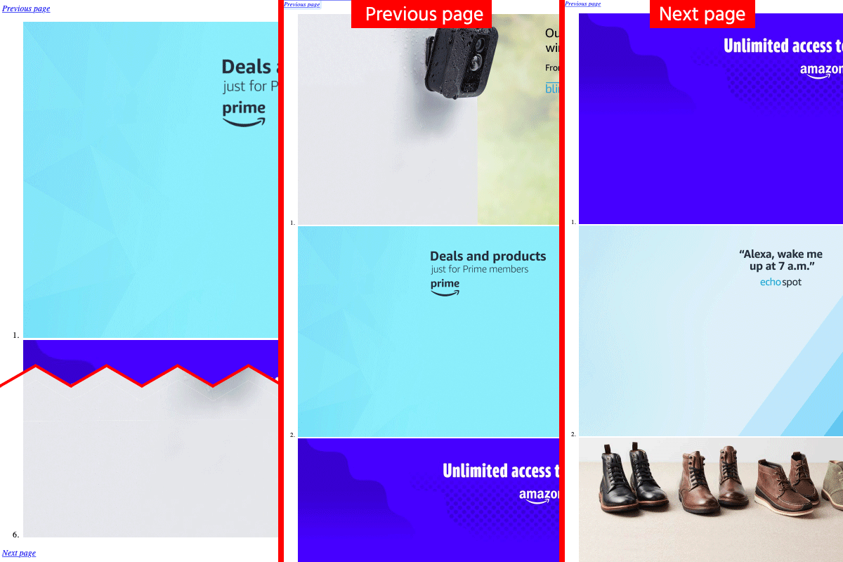
Interestingly, the carousel lower down the page is still somewhat functional. If I click the “Previous page” or “Next page” options, the order of the images is changed. However, hopping between those options required me to scroll.

A split view of the carousel on the amazon.com homepage. First is initial state, second shows previous page on top, and third shows next page on top.
The carousel appears with its pages stack on top of another. The previous or next page shows up on top.

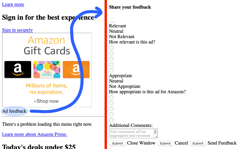
Skipping down a bit further, there’s an advertisement element. It contains an “Ad feedback” string that looks static just like what we saw with the “Skip to main content” link earlier. Well, I clicked it anyway and it revealed a form for sharing feedback on the advertisement relevance.

Blue curvy arrow showing destination to ad feedback form when clicking Ad Feedback text under ad
To make the call to action clearer, “Ad feedback” should be a link or button.

You may have missed it, but there’s a blank button above the two groups of form labels and the radios buttons are out of place. The structure is confusing because I don’t know which labels belong to which radio buttons. I mean, I guess I could assume that the first label goes with the first radio input, but that’s exactly what it is: a guess.

What’s also confusing is that there are Submit buttons between the “Close Window,” “Cancel,” and “Send Feedback” options at the bottom of the form. If I press any of these, I’m taken back to the ad. Now, suppose I were blind and using a screen reader to navigate this same part, even with the presence of CSS. I would be told “Submit, button” for two of the buttons and would therefore have zero clue what to do without guessing. It’s another good reminder about the importance of semantics when handling markup (button labels in this case) and being mindful of how much reliance is placed on JavaScript to override web defaults.

Doing a search — let’s say for “Mac Minis” — I can still access and understand the product ratings since they are displayed as text (instead of the tooltips they are otherwise) in place of stars. This is a good example of using a solid textual fallback when an image is used as visual content, but is served as a background image in CSS.

Messy results page displaying sponsored products on top of normal products
The page required me to scroll a while to get to the actual search results. Notice that ginormous overlay of a sponsored product.

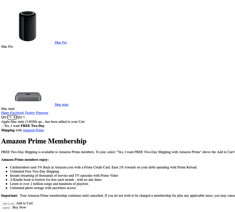
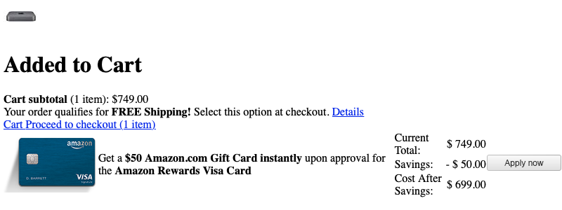
Having chosen the Mac Mini with Intel Core i3, I’m greeted by other Mac products above the product I’ve selected and have to navigate beyond them to select the quantity I want to purchase.

Part of product page showing Amazon Prime membership info
The product page displays Amazon Prime membership info slapped between the quantity selection and purchase buttons.

Scroll down, and an “Add to Cart” button is displayed next to a label bearing the same content. That’s redundant and probably unnecessary since a

Website 2: DuckDuckGo
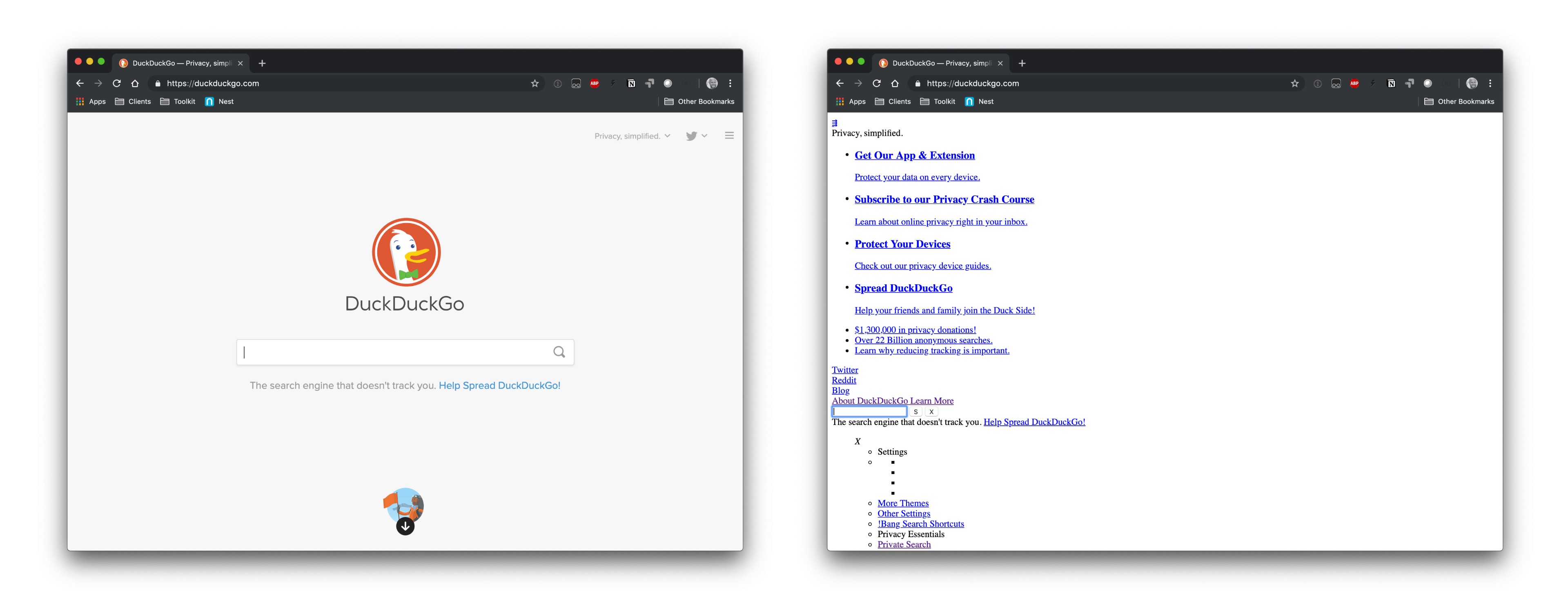
The DuckDuckGo homepage with and without CSS
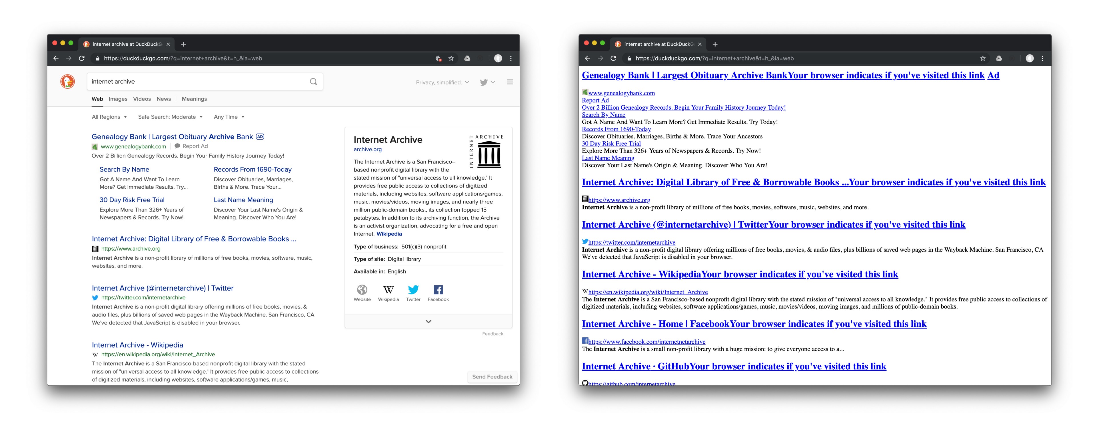
The DuckDuckGo homepage with CSS (left) and without CSS (right).

Have you used DuckDuckGo before? I assume many folks reading CSS-Tricks have, but for those who may be hearing of it for the first time, it’s an alternative to Google search with an emphasis on user privacy.

So, getting started with this is a little misleading because the DuckDuckGo homepage is super simple. Not much can go wrong there, right? Well, it’s a little more involved than that since we’re dealing with search results, content hierarchy and relevance once we get into making search queries.

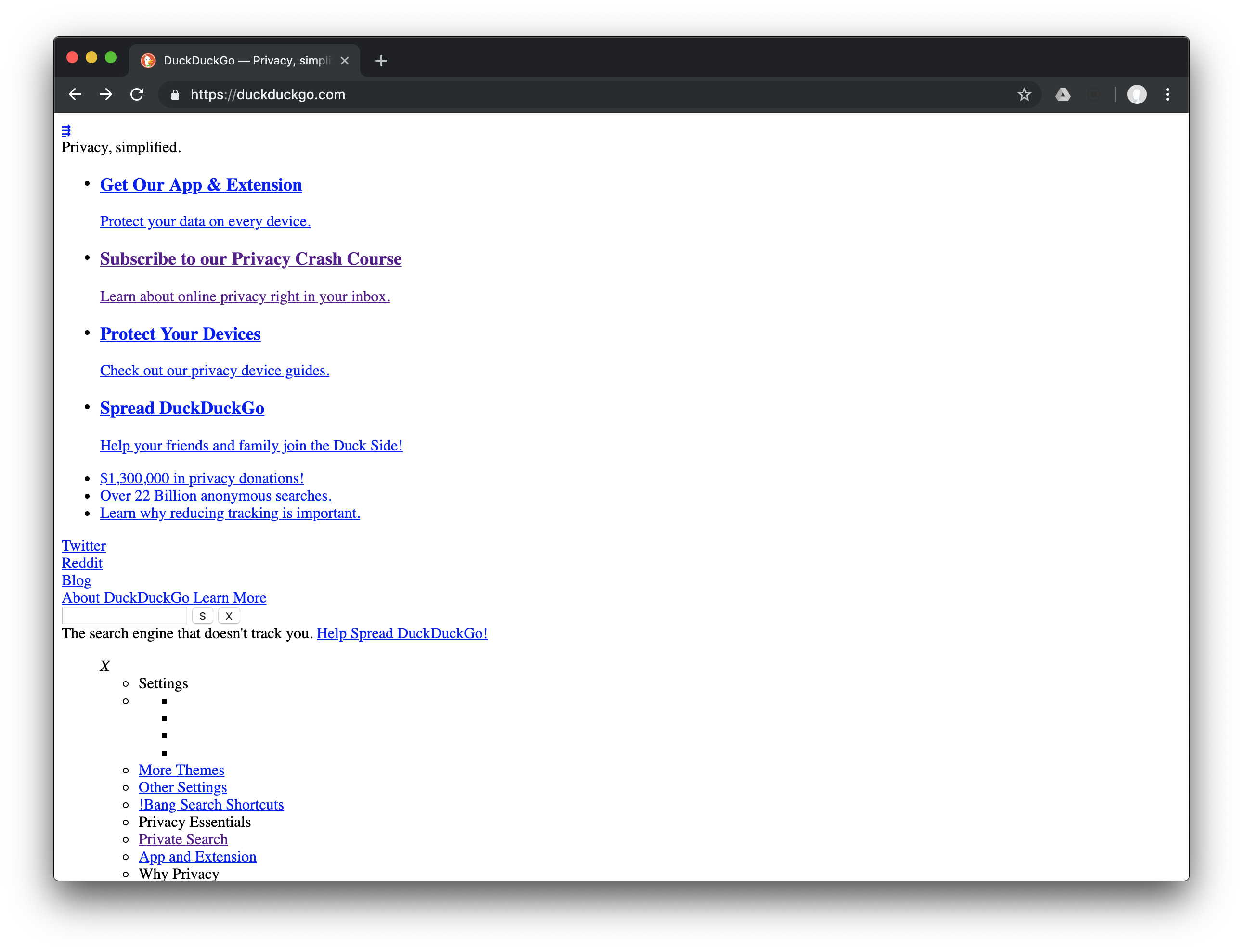
Top of DuckDuckGo homepage

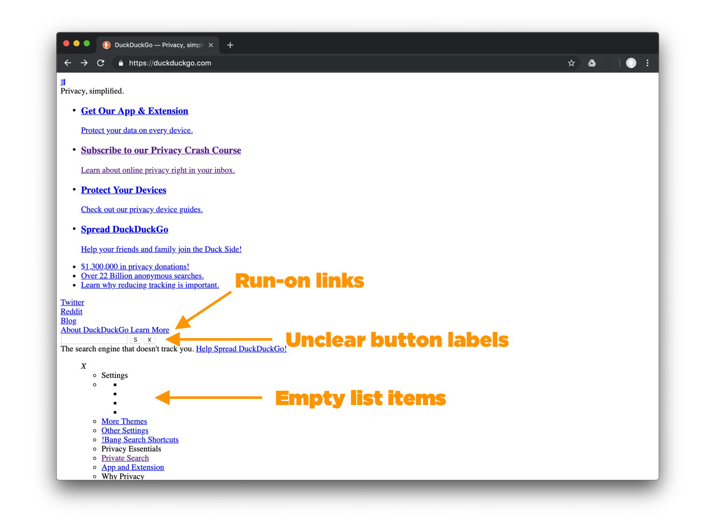
Right off the bat, what I’m greeted with is a lot more content than I would have expected for such a simple lander. At it’s not totally clear what website this is by scanning the website. The first mention of the product name is the fourth item in the first unordered list and it’s a call to action to “Spread DuckDuckGo.” The logo is totally missing, which obviously means it’s used as a background… in CSS.

Speaking of that unordered list, I assume what I’m seeing belongs in the header, and there’s no skip navigation. We have a triple arrow icon (is that a mobile menu or a menu to hide the least important items, or something else?), followed by privacy-related content, social media links, something that looks like one link but is actually two links for “About DuckDuckGo” and “Learn More.”

Finally, toward the very bottom is where the primary use case for the site actually comes up: the search bar. I assume the “S” label means “Search” and the “X” label is shorthand to clear the search field.

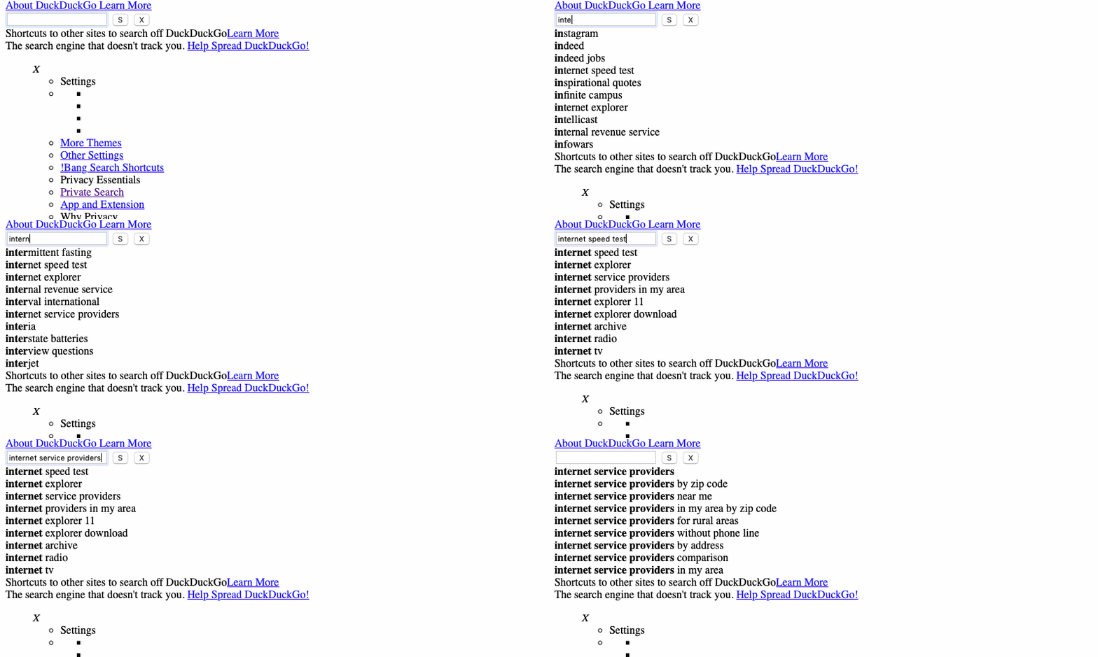
Alright, onto performing a search. It’s super cool that I can still see auto-suggestions and use the up and down arrow keys to highlight each one. Clearing the field though, the suggestions don’t disappear until after I refresh the page.

Performing a search and checking out the auto-suggestions
Performing a search and checking out the auto-suggestions.

Everything in the Settings menu are items in a list including what should be headings — “Settings,” “Privacy Essentials,” “Why Privacy,” “Who We Are,” and “Keep in Touch.” These are very likely part of a mobile men if CSS was enabled, perhaps triggered by that triple arrow link thing at the top. In that menu, I see four blank bullet points between “Settings” and “More Themes.”

Orange arrows pointing to run-on links, unclear button labels, and empty list items
The DuckDuckGo homepage exposed a few glaring usability issues right off the bat.

Coming here as a new user, I have no idea what those empty list items are, but the bullets I highlighted in the screenshot above are actually the theme buttons. To clarify the intent, some fallback text would be helpful, and these should be radio or normal buttons instead of list items (considering their functionality).

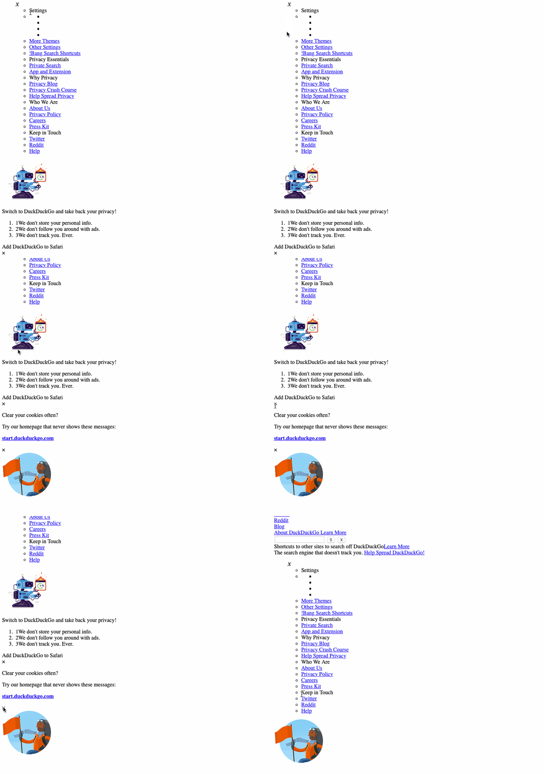
Every block of content with an “X” — including the “Settings” — cannot be dismissed; however, clicking the “X” above an image of a hiker image does cause a chunk of content to clear off the screen — thanks to JavaScript still being enabled. What I really find awkward is the redundant numeration in the ordered list under “Switch to DuckDuckGo…” We see this:

1. 1We don't store your personal info
2. 2We don't follow you around with ads
3. 3We don't track you. Ever.

Looks like some mixed use case of semantic markup with some other way to display list item numbers.

Clicking each X to find that only the third has functionality
The third “X” down has functionality.

There’s a colossal amount of white space under the hiker image until the first

element. Assuming they’re either links or buttons, clicking every instance of “Add DuckDuckGo to [browser]” does nothing. Each section’s illustration causes some unnecessary horizontal scrolling, which is a common issue we’ll see in the other sites we look at.

Scrolling through white space between hiker image and first-level heading
Scrolling through white space between hiker image and first-level heading. Wheee!

After those sections, there’s a blank box and I have no idea what it is.

A blank box at the bottom of the page
A blank box that appears to have no purpose.

I cracked open DevTools and it turns out to be a element in an that holds only JavaScript for something related to POST requests. It might as well be one of those elements we should leave alone.

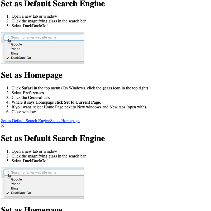
Following that, I see two repeated instances of “Set as Default Search Engine” wrapped around a “Set as Homepage” section.

Instructions in Safari to set the search engine as your default or your homepage
The instructions in Safari to set the search engine as your default or your homepage. Instructions may differ from one browser to another.

These must have been the instructions that popped up when I clicked the “Add DuckDuckGo…” actions, but it shows the impact hiding and showing content can have when we’re dealing with straight markup. Instead of repeating content, the corresponding links or buttons should point to one instance. That would cut the redundancy here.

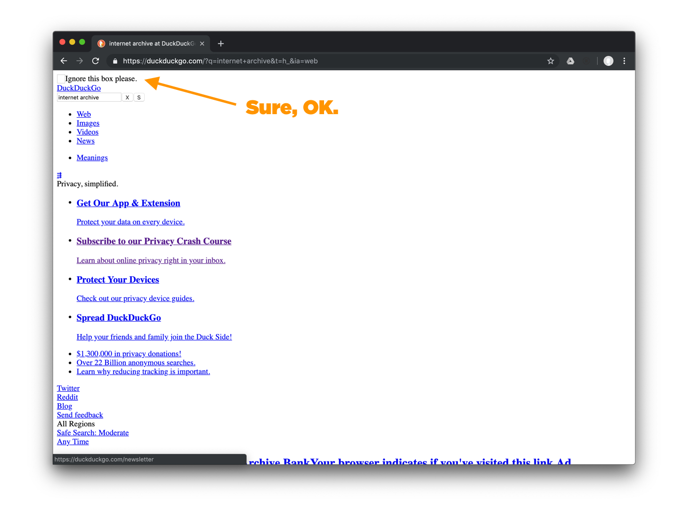
OK, time to finally get into search. The first thing I see in the search results is an empty box with an instruction to ignore the box. Okey-dokey then.

Orange arrow pointing at a tiny box on the search results page saying “Sure, OK.”
DuckDuckGo wants me to ignore a box.

Moving on, did you see that DuckDuckGo link? That must be the logo, and I wonder why this was not on the homepage. Seems like low-hanging fruit for improvement.

The search bar still functions normally with the exception of the “S” and “X” buttons that have swapped places from where they were on the homepage.

Onto the search results. I could easily distinguish one result from another. What I found quite unnecessary, yet funny, is that the “Your browser indicates if you’ve visited this link” messaging that’s located at the end of each page title. That would be super annoying from a screen reading perspective. Imagine hearing that repeated at the end of every page title. That messaging is there to be displayed alongside checkmarks that contain tooltips that hold that messaging. But, with CSS disabled, well, no checkmarks and no tooltips. As a result, all I get is an extra long heading.

Comparison of search results page with and without CSS. Extra text appears next to titles in the non-CSS version.
Search results on DuckDuckGo are still well structured with CSS disabled, but notice the messaging that is appended to each result title.

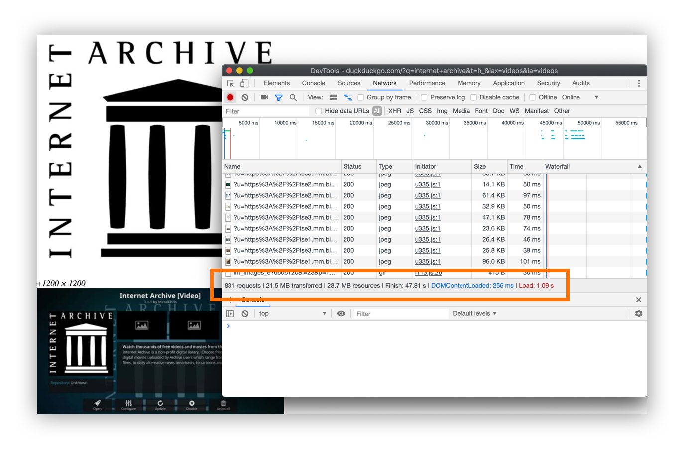
The navigation bar that is normally displayed as tabs to filter by different types of results (e.g. Images) seems to do nothing at this point because it’s hard to tell that they are filters without styling. But if I click on the Images filter, the image results are actually loaded lower down onto the page, piled right on top of the Web results, and the page becomes mega long as a result. Oh, and you might think that scrolling all the way back up (and it’s a long way up) then clicking another filter, say Videos, would replace the images, but that simply inserts video thumbnail images below the images making an already mega long page a super mega long page. Imagine the page weight of all those assets!

Well, you don’t have to. According to DevTools, images alone account for 831 requests and a total weight of 23.7 MB. Hefty!

Orange outline box encircling feedback on requests and total image weight in DevTools
The real kicker is that it’s not immediately clear that all those images have loaded visually.

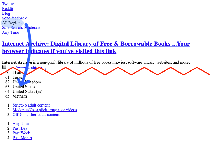
The last couple of items are worth noting. Clicking the “Send feedback” link apparently does nothing. Maybe that triggered a modal with CSS? And, although the “All Regions” link does not resemble a link and I could’ve easily ignored it, I was curious enough to click it and was taken to an anchor point of a list of countries. The last two links just made their corresponding contents appear under the list country options.

Blue arrow showing destination to list of regions after clicking All Regions
The “All Regions” option is secretly acting as an anchor.

There’s a lot going on here and there are clearly opportunities for improvement. For example, there are calls to action that display as normal text that should be either be links or buttons instead. Also, we’d think the performance of a site would get better with CSS disabled, but all those loaded assets in the search results are prohibitive. That said, the search experience isn’t painful at all… that is, unless you’re digging into images or videos while doing it.

? What the Site Does Well ? What the Site Can Improve
Search is consistent and works with or without CSS. A “skip” link for would help with keyboard browsing.
The content hierarchy makes content easy to read and search results a clean experience. Non-link items in the “Settings” menu should be headings for separate unordered lists so there is a clear hierarchy for how the options are grouped.
Good use of a homepage link at the top of the search results page. Some content is either duplicated or repeated because the site relies on conditionally showing and hiding content.
Make sure that all calls to action render as links instead of plain text.
Use a fallback solution to filter the types of search results to prevent items stacking and help control hefty page weight.

Website 3: GitHub
The GitHub homepage with and without CSS
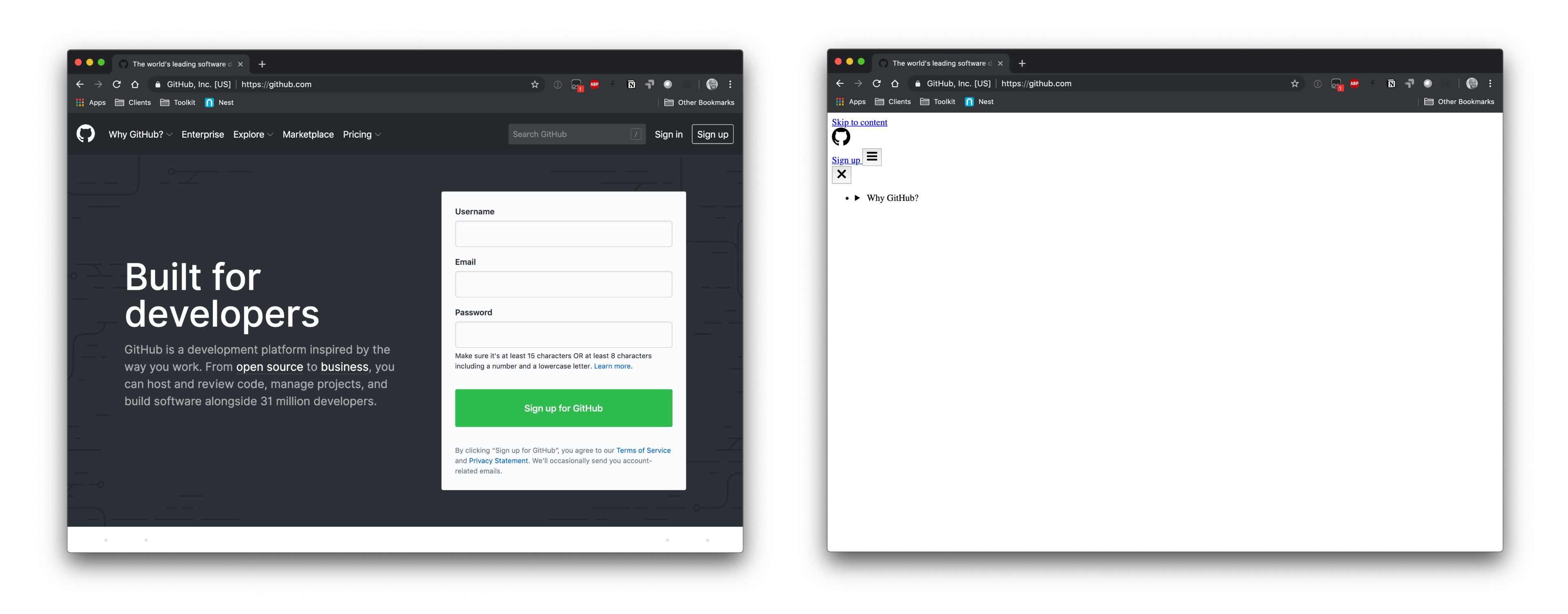
The GitHub homepage with CSS (left) and without CSS (right).

Hey, here’s a site many of us are well familiar with! Well, many of us are used to being logged into it all the time, but I’m going to surf it while logged out.

Already, there’s a skip link (yay). There’s also a mobile navigation icon that I expect will do nothing, and am proven right when I try.

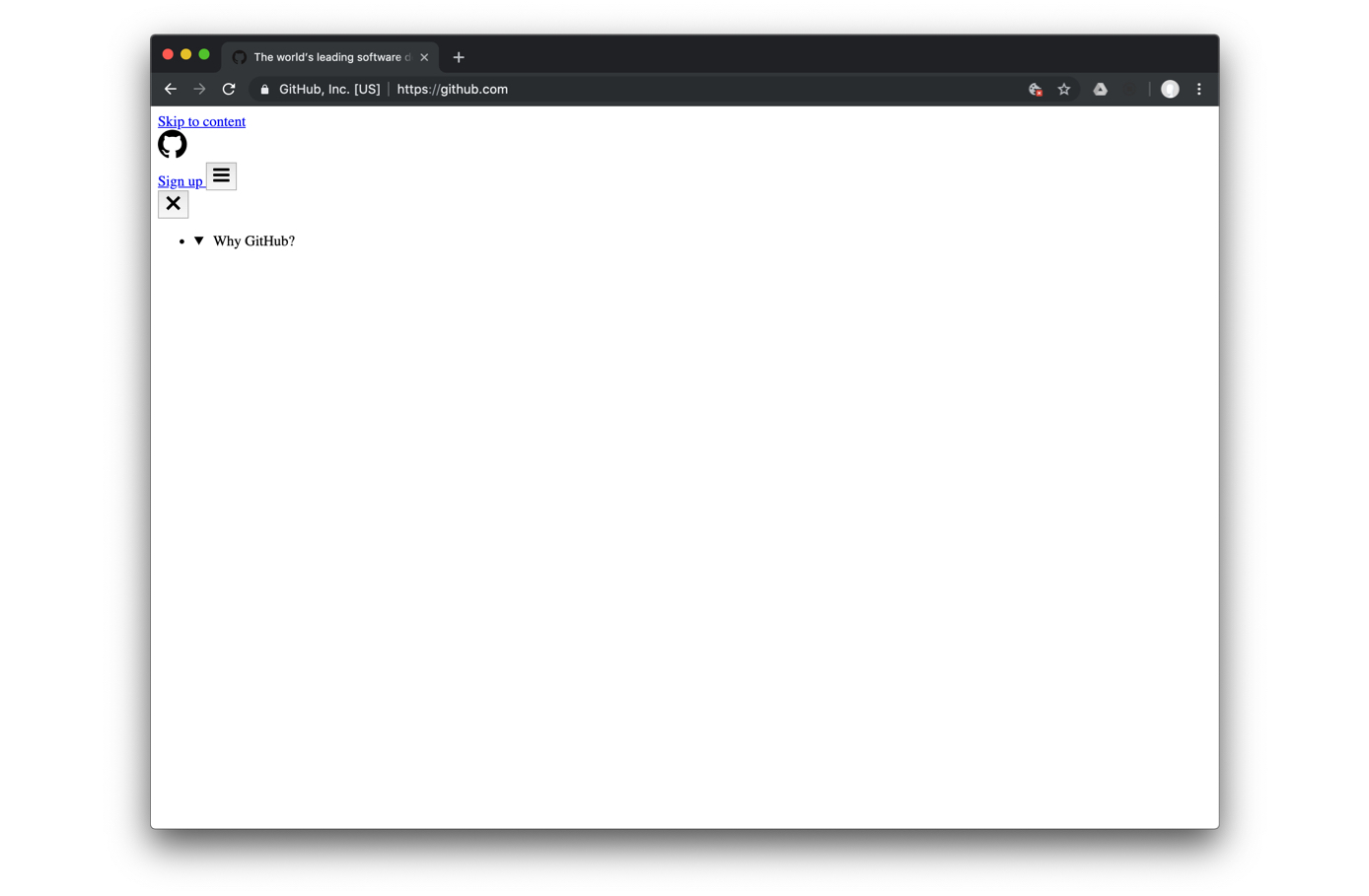
Wide gap after Why GitHub? dropdown
That big gap of white? It’s an SVG icon with a white fill, according to DevTools.

Between some of the navigation items, there are unnecessarily giant gaps. If you click on these, they still function as dropdown menus. They are

and

elements… but something feels semantically wrong. It is nice that the menu items are actually unordered list items and that native browser functionality can still take place by using a semantic way to expand content. But that SVG icon messes with me.

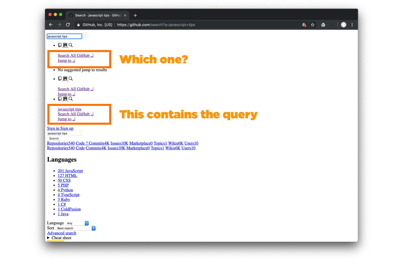
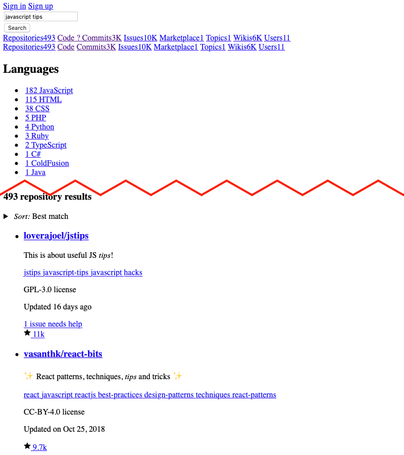
Before typing anything into the field, I see three instances of “Search All GitHub” and “Jump to” links. I have no idea which to click, but if I do a search, the keyword shows up in the third group.

Orange outline boxes around groups of search links
There is no clear connection between the search input and the three groups of links.

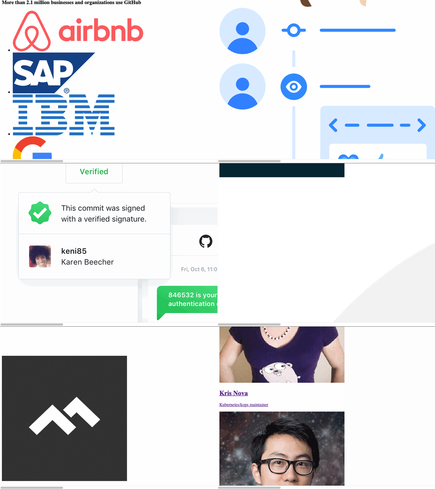
Everything else on the homepage seems fine except for a number of overly large images horizontally overflowing the window.

Scrolling down to see large images overflowing the browser window
Scrolling down to see large images overflowing the browser window.

Let’s go back to the search bar and navigate to any repo we can find. Right under the Search button, we have two nearly identical secondary navigation bars that return the repository counts, code, commits, and other meta. Without looking at the source, I have no clue what the purpose is for having two of these.

Search results for a “javascript tips” query.

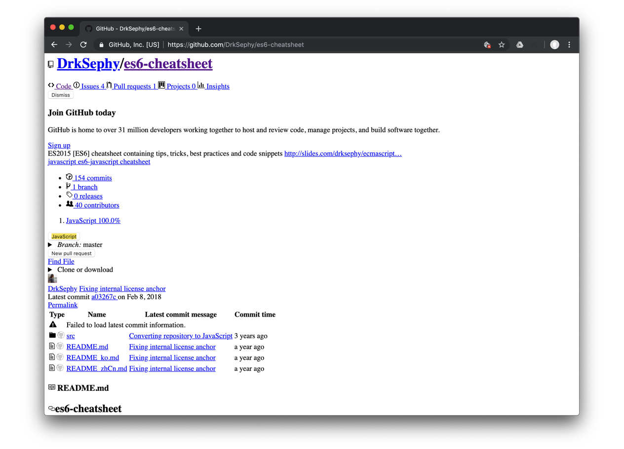
Repository pages still have an easy-to-follow structure and a logical hierarchy for the most part. While logged out and having my cache cleared before coming, the “Dismiss” button for the “Join GitHub today” block still performs as I’d expect. Like we saw earlier on Amazon, the tag links are difficult to tell apart because they run together as a single line.

A repository page in a logged out state.

The next two buttons — “JavaScript” and “New Pull Request” — don’t seem to do anything when I click them. I’d imagine the pull request button should be disabled while viewing as a guest since, unless it’s intended to take a user to a log in screen first… but even that doesn’t feel right. Turns out that the button is indeed disabled when CSS is active, though. Then the rest of the page is fairly easy to understand.

If you’re here mainly for managing, contributing to, or checking out repositories, you won’t face a whole lot of friction since the hierarchy plays out well. You’ll experience pretty much the same elsewhere, whether you’re looking at pull requests, issues, or individual files. Most of the hurdles live in less prominent pages on the site.

? What the Site Does Well ? What the Site Can Improve
The hierarchy and structure of many pages are really easy to follow and make logical sense. Use the height and width attributes on elements and SVGs to prevent them from blowing up.
Most of the SVG icons embedded on the page are appropriately sized. Watch for empty list items.
Nice use of a skip link in the header. Ensure that button labels use full words.
Make sure links have whitespace or line breaks between them to prevent run-ons.
Website 4: Hex Naw
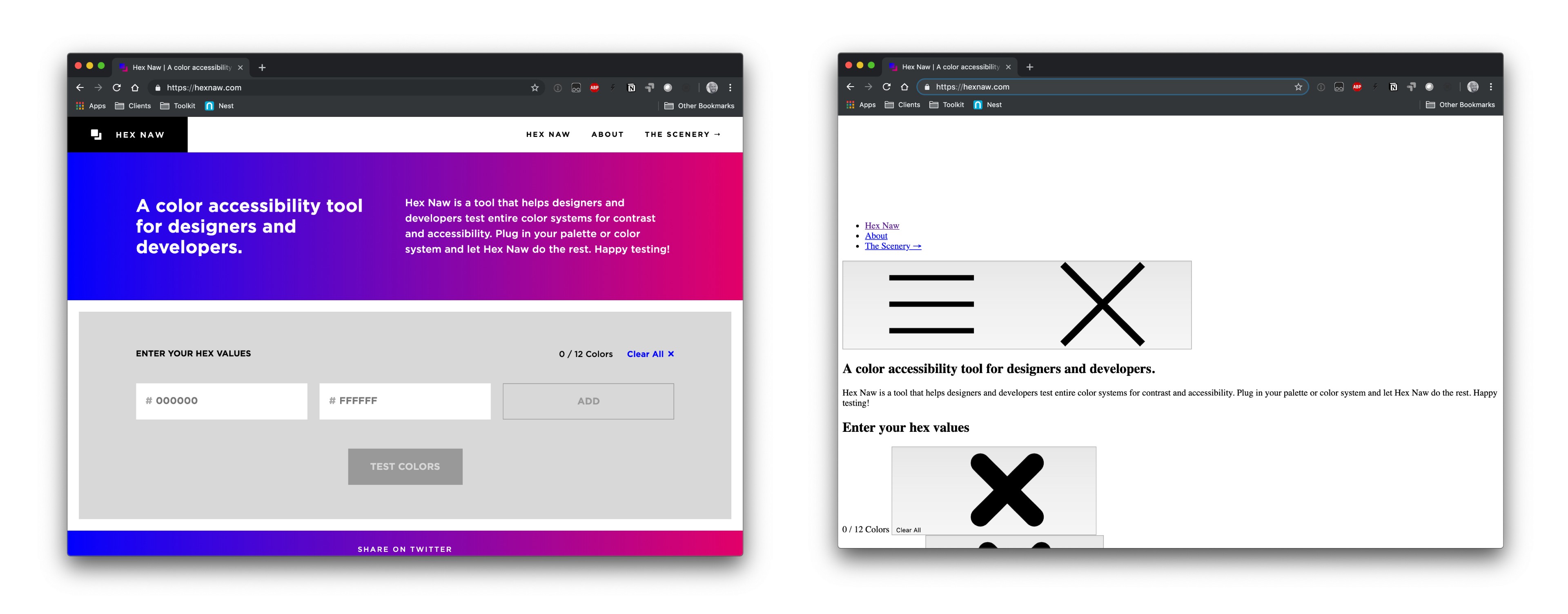
The Hex Naw tool with and without CSS
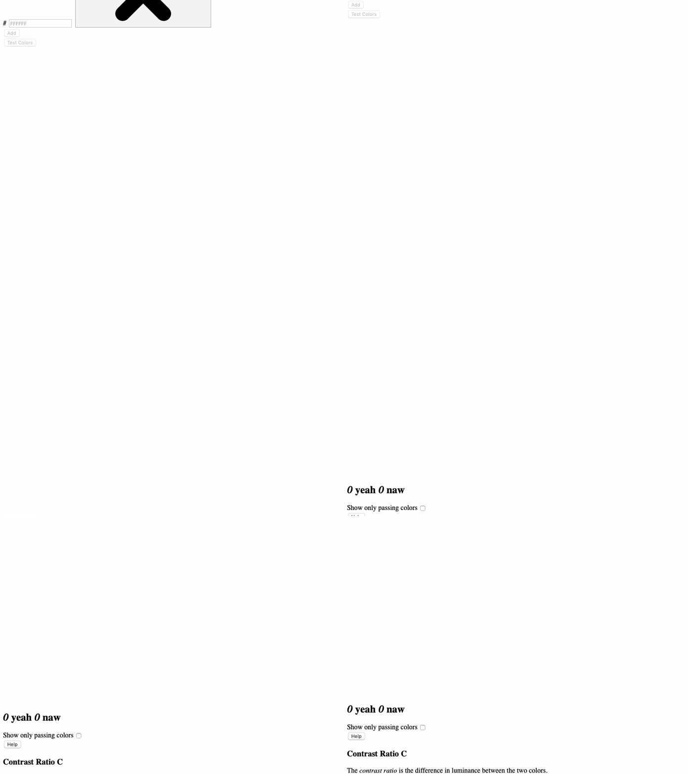
The Hex Naw homepage with CSS (left) and without CSS (right).

This next site is an online tool I use often to check color contrasts for accessibility. And for a site that is so big on color, there’ s probably a lot happening here with CSS, so it should get interesting.

There’s immediately a large amount of space above the navigation and no skip links. The hamburger and close buttons for the mobile layout and “X” buttons next to each color to test are oversized.

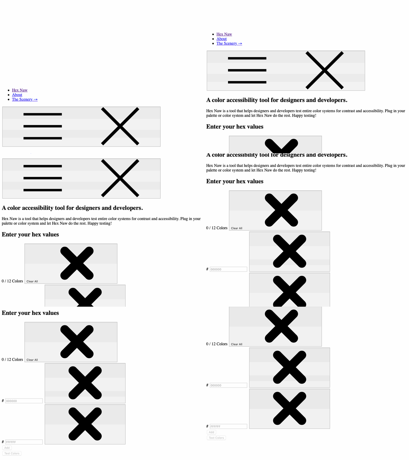
Scrolling to find missing skip links and excessive space above the navigtion
We’re missing skip links and there is excessive space above the navigation.

Oh, and check out this giant gap between the “Test Colors” button and the next section of content.

Scrolling to show large gap between Test Colors button and “yeah” and “naw” counters
It would be nice to close this gap so the “yeah” and “naw” counters are visible in the test.

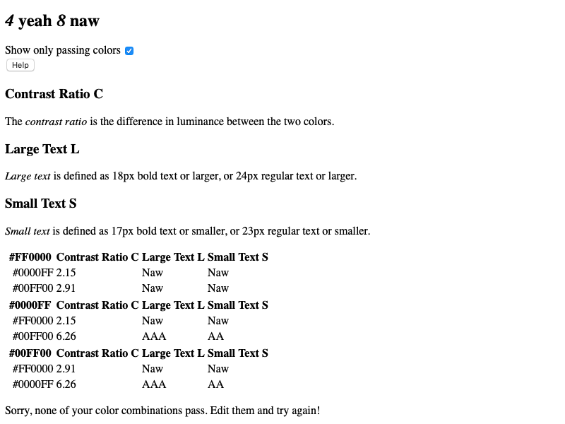
One of the many nice features of this site is a checkbox that allows you to see only the colors that passed the test, rather than viewing all of the tested colors. Unfortunately, that button does nothing with CSS disabled. However, I can still see which colors work and get the definitions for contrast ratio, large text, and small text directly in the result table.

Test result section showing “Show passing colors” checked, legend for C, L, and S letters, table of results, and feedback for all failed colors

Hiding and showing the terms is probably what the button does with CSS. The bummer is that I won’t know the purpose of those single letters (e.g. S and R) after the table headers. It’s also both ironic and confusing to see that message for all failing colors after the table because, well, there are passing colors in this list. What could be done is have hide it by default but conditionally inject it later if all the colors in a single test fail.

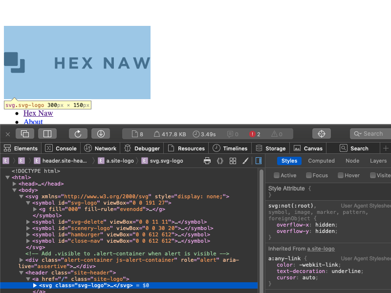
Pulling out DevTools, it turns out some of the white space at the top is the Hex Naw logo as a SVG file. The space above that is associated with other SVG symbols used for the page. By using a default color of black for the logo, this would help reduce some of the space. I made that quick change in DevTools and it makes a noticeable difference.

Hex Naw logo colored black and highlighted in DevTools
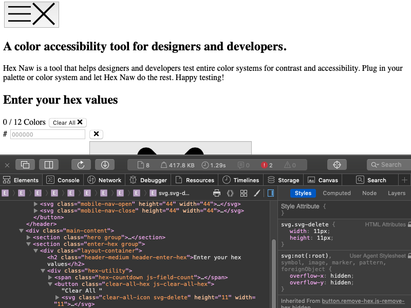
The size of the mobile menu and “X” icons can easily be reduced and be proportional to their viewBox attributes.
The menu and X icons given a width and height of 44 pixels using the attributes
Here’s one way to reduce the size of the mobile menu and “X” icons.

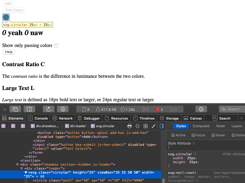
The second gap of space is caused by an SVG loader that appears while calculating color contrasts. This could be helped by specifying a much smaller, yet proportional, width and height exactly like the mobile menu and “X” icons.

SVG loader icon resized to 25px by 25px
I was able to reveal and resize the SVG loader icon in DevTools.

Adding an initial width and height to each SVG would definitely reduce the need to scroll. This is also what we can do to fix the gaps we saw in GitHub’s navigation as well.

Ultimately, Hex Naw remains pretty useful without CSS. I can still test colors, get passing and failing color results, and navigate around the page. It’s just too bad I wasn’t able to work with actual colors and had to work around those extra large SVG icons.

? What the Site Does Well ? What the Site Can Improve
The site maintains good content hierarchy throughout the site. SVGs should be use a fallback fill color and use the height and width attributes.
All of the elements are written semantically. Feedback for all failing colors could be dynamically added and removed to prevent awkward messaging.
The tests themselves function properly with the exception of being able to show or hide information. Consider an alternative way to display color for the values being tested, like table cells with the background color attribute.
Website 5: Stack Overflow
The Stack Overflow homepage with and without CSS
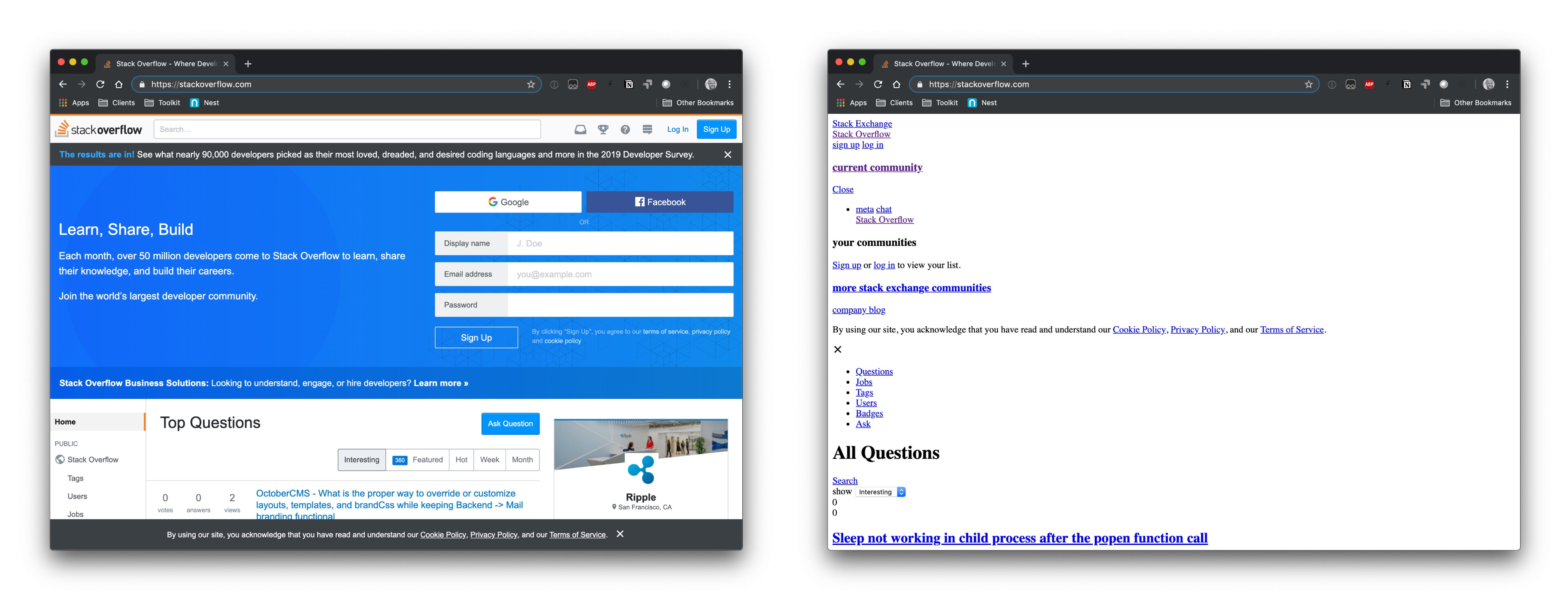
The Stack Overflow homepage with CSS (left) and without CSS (right).

Like GitHub, Stack Overflow is one of those resources that many (if not most) of us keep in our back pocket because it helps find whether someone has already asked a development question and the answers to them.

On the page to ask a question, I see a bunch of blank bullet points above the main