Nothing incorrect or invalid there at all. It has two classes. In CSS, both of these will apply:
.module { }
.p-2 { }
const div = document.querySelector("div");
console.log(div.classList.contains("module")); // true
console.log(div.classList.contains("p-3"));    // false
But what about grouping them? All we have here is a space-separated string. Maybe that’s fine. But maybe we can make things more clear!
Years ago, Harry Roberts talked about grouping them. He wrapped groups of classes in square brackets:
<div class="[ foo foo--bar ] [ baz baz--foo ]">
The example class names above are totally abstract just to demonstrate the grouping. Imagine they are like primary names and variations as one group, then utility classes as another group:
Those square brackets? Meaningless. Those are there to visually represent the groups to us developers. Technically, they are also classes, so if some sadist wrote .[ {}, it would do stuff in your CSS. But that’s so unlikely that, hopefully, the clarity from the groups outweighs it and is more helpful.
That example above groups the primary name and a variation in one group and some example utility classes in another group.
I’m not necessarily recommending that approach. They are simply groups of classes that you might have.
Here’s the same style of grouping, with different groups:
That example has a single primary name, utility classes with different naming styles, and a third group for JavaScript specific selectors.
Harry wound up shunning this approach a few years ago, saying that the look of it was just too weird for the variety of people and teams he worked with. It caused enough confusion that the benefits of grouped classes weren’t worth it. He suggested line breaks instead:
That seems similarly clear to me. The line breaks in HTML are totally fine. Plus, the browser will have no trouble with that and JSX is generally written with lots of line breaks in HTML anyway because of how much extra stuff is plopped onto elements in there, like event handlers and props.
Perhaps we combine the ideas of line breaks as separators and identified groups… with emojis!
Weird, but fun. Emojis are totally valid there. Like the square brackets, they could also do things if someone wrote a class name for them, but that’s generally unlikely and something for a team to talk about.
Another thing I’ve seen used is data-* attributes for groups instead of classes, like…
You can still select and style based on attributes in both CSS and JavaScript, so it’s functional, though slightly less convenient because of the awkward selectors like [data-js="js-hook-1"] and lack of convenient APIs like classList.
How about you? Do you have any other clever ideas for class name groups?
You’ve been scouring the web for upcoming events. You’ve subscribed to Developer Avocados and you’ve bookmarked conferences.css-tricks.com. And now you’ve found a call for proposals (CFP) that you can’t wait to enter. You quickly fill out the online form and your pinky races towards the Enter button…
Stop. Take a deep breath. And move slowly away from the keyboard.
As a conference organizer, I’ve gone through hundreds — if not thousands — of speaking proposals. While many are excellent, there are always a bunch that show a profound misunderstanding of the event, audience, and duties of a speaker. These are the ones that immediately get dumped onto the “No Thanks” list on my Trello board. And, as a regular speaker, I’ve learned more than a few things about getting proposals accepted.
While there’s no magic bullet for fast tracking your talk, there are a number of habits you can develop and questions you can ask yourself before hitting “submit” to improve your chances of getting invited to events. If you’re a fan of checklists, I’ve put one together to guide you through the process of submitting a proposal.
The first thing before submitting a proposal is to research the heck out of the event.
There are a ton of events out there, each with its own unique audience and vibe. Some are big, some are small; some have huge budgets and some are bootstrapped and brand new. Your first task as a potential speaker is to learn as much as you can about the event to make sure that you’re a good fit for it and the audience. There are a few ways to do this.
First, check out the website to get a feel for the event. See when and where it is, check out past years (if there are any), and read every last bit of copy on the site. A few things to keep an eye out for: an FAQ page, a CFP page, info about sponsorships or speaking opportunities, lists of past speakers, and a hashtag. The event hashtag is important, as that will allow you to check out hype and past attendee experiences on Twitter, as well to as get a sense of excitement about the upcoming event. If there isn’t a hashtag, or all of the comments about the event are terrible, then perhaps it’s time to move on to the next CFP.
Next, do a search on YouTube, Speaker Deck, SlideShare, and Notist for past talks and slide decks. These will give you a great idea of what to expect at the event and what kinds of talks go over well with the audience.
After you’ve completed a first pass of research, it’s time to answer some key questions:
When and where is the event?
Who’s organizing it?
Do they have a code of conduct?
Do they value diversity and inclusion?
Are they looking for specific topics or proposals?
Do they cover travel/hotel?
Do they pay speakers?
Most importantly: who is their audience?
You may not be able to find an answer to all of these, but try your hardest. Feel free to reach out to organizers — most are happy to answer questions for potential speakers, and the more you know, the better you’ll be able to determine whether or not you’re a good fit for their event.
Add focus your idea
After you’ve done your research, it’s time to focus in on your proposal idea. Chances are good that you’re hunting around for events with a talk idea already in mind, but even so, you should take a few steps to make it’s as compelling for organizers as possible.
The main question you want to answer when developing a talk idea is, “What will attendees get out of my session?” This is where knowing about the audience and event — all of that research — pays off.
Far too many would-be speakers submit proposals for the wrong reasons. Many think of events as marketing and sales opportunities for their business. Others are looking to make a name for themselves so they can start charging on the speakers circuit. But the best talks come from sharing personal experiences, challenges, and solutions to problems you’ve experienced in your own work.
By researching the audience, you can determine what’s likely to be important to them. You get a feel for their challenges and interests, and you can think more deeply about how your experiences and skills can best serve them. Try to forget about the actual organizers and making a pitch to them, and instead focus all of your energy on clearly communicating how attendees’ lives and work will be improved after they sit in on your session.
A great exercise is to list out the key things attendees would take away from your talk. Try to focus on 3-5 things that people can put to work when they get back home. Making them as actionable as possible is a fantastic idea. While some proposals are all about inspiration, wrapping practical advice into inspirational examples is an excellent way to make that inspiration stick in people’s minds.
Another suggestion is to run your idea by colleagues, friends, or your partner. Put together a two-minute summary, stand up in front of them, and give them the ol’ elevator pitch. Not only will this force you to add a clear focus to your idea, but it’ll let you know if you’re ready to get up on stage in front of strangers. If you can’t give a short talk in a few minutes now, then you should probably sit back down and prepare some more before answering that call for proposals.
Craft your proposal into something worth reading
Finally, it’s time to craft your proposal and get it ready to submit.
Most CFPs consist of an online form. They can range from a few questions to multiple pages of inputs, but you’ll be filling something out for organizers to review. Although some speakers are able to fly through the forms and quickly hit “Submit,” I’d recommend prepping your CFPs outside of the form first.
Open up a text file or make a note in your app of choice on one side of your screen and the CFP form on the other. Go through each field in the form and write down your response in your notes. Putting together a rough draft outside of the form gives you the opportunity to think through your answers and edit them until they clearly reflect your focused idea and the value for attendees. What’s better is that you can take that note and share it with someone you trust and respect. Gather feedback from them and use it to further refine your proposal.
A lot of CFP ask for supporting materials. These can be videos showing that you are a clear communicator, links to your website or social media accounts showing your personal interests, or even slides from previous talks. Instead of fumbling around and potentially timing out the CFPs form (and having to start all over), collect all of those materials in your note or a folder on your computer. If you’re a seasoned speaker, make sure you curate your materials to show your best and most recent talks.
Submit and wait
OK. You’ve done the research. You’ve focused your idea. You’ve even drafted the answers to the CFP, pitched the idea to your partner in the kitchen, and collected feedback from a co-worker or two. It’s time to scratch that itch and submit your proposal.
Go back to the CFP form, open up your notes and resources, and start copying and pasting. Take your time to work through the form and triple-check that you’ve filled everything out. Attach any supporting materials (seriously, how many times have we all sent an email that says “See attached file” without actually attaching anything?) and take a deep breath. Scroll to the top and read through every response as many times as you need to before you feel comfortable submitting.
Now, press “Submit.” Do a little celebration, take another deep breath, and move on with your life.
It can take a long time for organizers to process submissions and figure out an agenda. Try to be patient. It’s tempting to email organizers and ask about the status of your proposal, but resist the urge. Organizers are extraordinarily busy — with the conference and their full-time jobs — and should be left to review proposals instead of fielding emails from impatient potential speakers.
A good organizer will get back to you when they’re ready and let you know the status of your submission — good or bad. If they don’t, chances are the event wasn’t that great to begin with. The key thing is to try to forget about your submission as much as possible (while still keeping the event on your calendar, just in case) and focus on more important things. Not only will this ease your anxiety but you’ll be in for a wonderful surprise when your proposal is accepted.
Speaking at events can be incredibly rewarding. Sure, it’s massively time-consuming and, depending on your disposition, extremely stressful, but it’s an excellent way to build connections and help others in the industry. While you could start spamming every event with proposals, your chances of being invited to speak all hinge on the amount of preparation you put into your submission. Taking the time to make sure you’re a good fit for an event, that you understand the audience, and that you have a focus and are able to clearly communicate your idea will up the odds of you standing onstage, clicking through slides, and (hopefully) solving some problems for the folks that paid to be there.
I’m definitely not the first person to write about answering CFPs. There are a ton of good tips out there for crafting the perfect proposal. Here are a few of my favorites:
Welcome to our roundup of the best new sites to be launched (or relaunched with significant updates) in the last four weeks.
After last month’s flirtation with monochrome, this month’s set of sites return to the overriding trend of 2019: color. Huge images are still popular, and parallax is still finding its way into our scrolling experiences. Enjoy!
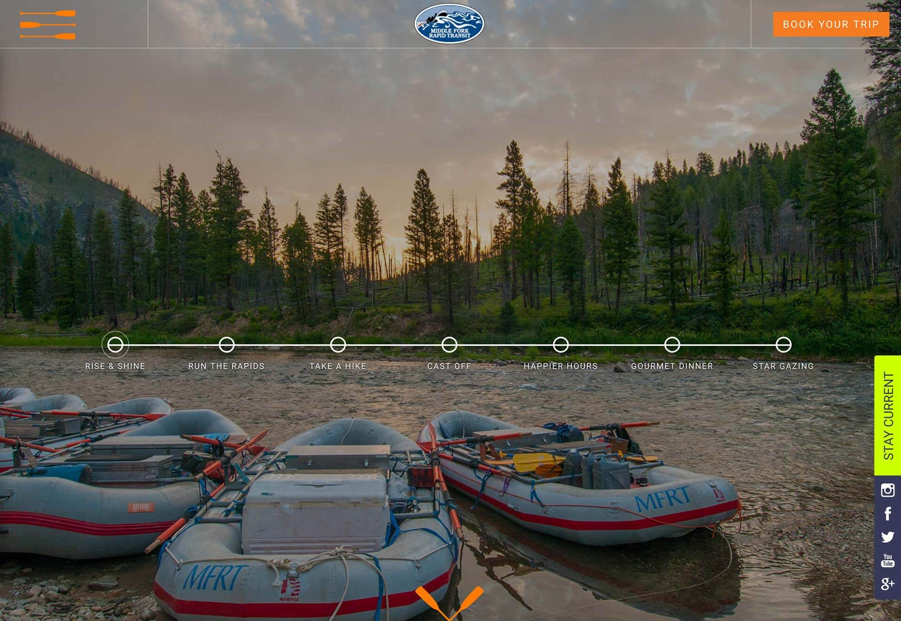
Middle Fork Rapid Transit
Middle Fork Rapid Transit is an adventure vacation company that transports you over 100 miles down the Middle Fork river in Idaho. Its site packs in as much as one of its trips, and there’s tons of little details to get you fired up; I love the animated raft, and the grub looks amazing.
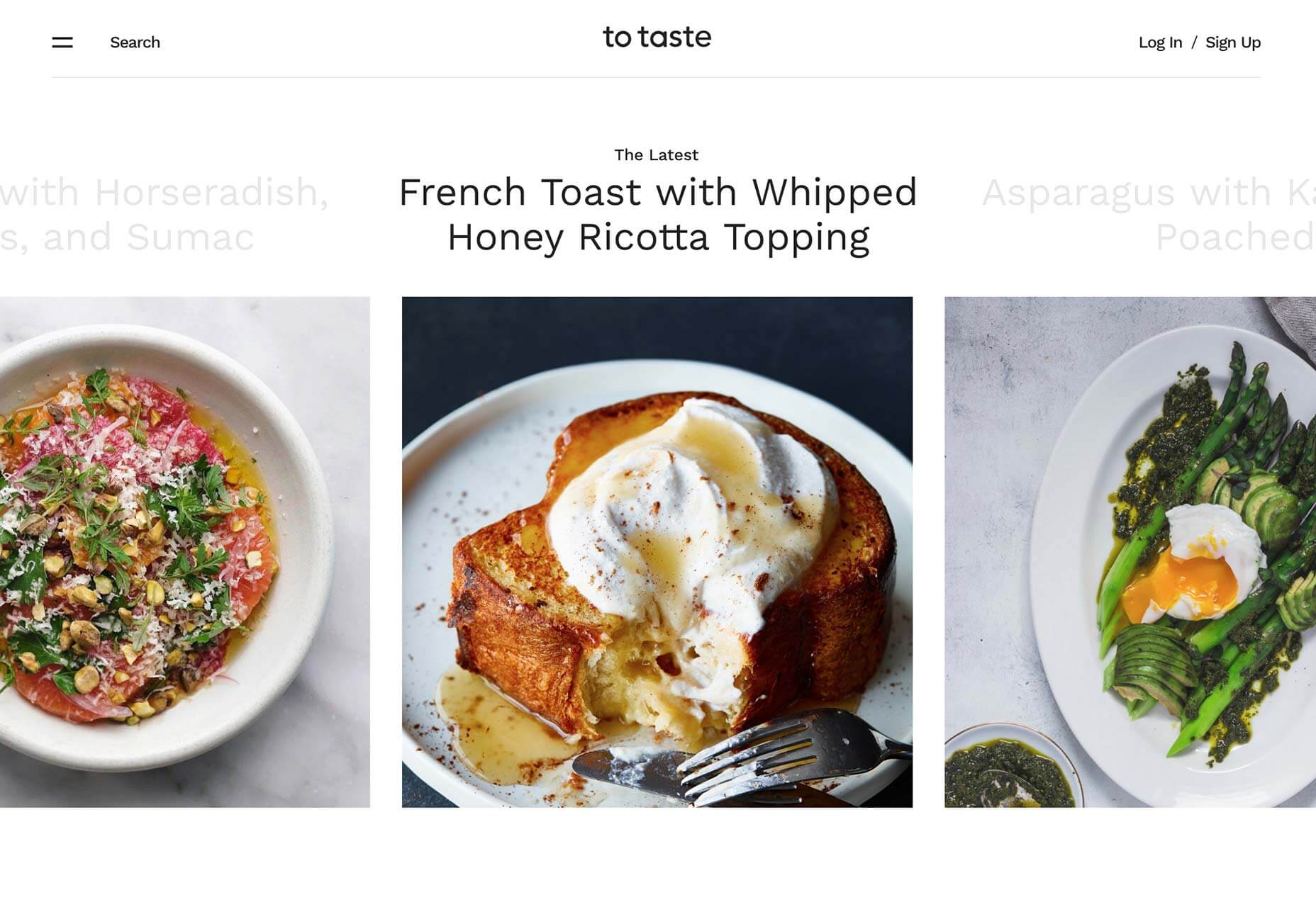
To Taste
To Taste is my favorite recipe site of the moment. Packed with food ideas for every occasion and palette, the simple site is laid out perfectly for browsing, and choosing something to make is a culinary treat. What really makes it, as with all food sites, is the mouth-watering photography.
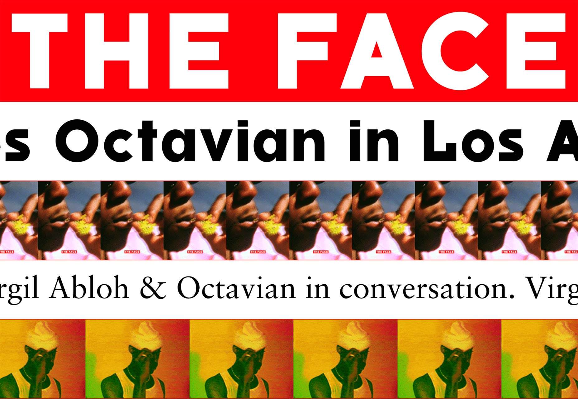
The Face
Style bible The Face returned from oblivion this month, with a new team behind the iconic publication. Its site opens as daringly as you’d expect, before slowing to a more traditional, and more usable blog format.
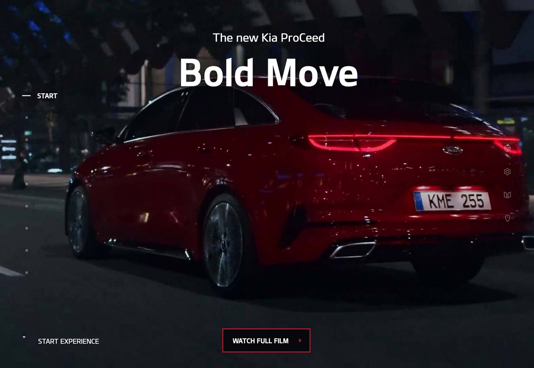
Kia ProCeed
The site for the new Kia ProCeed is precisely the type of site we used to build back in the day. With interactive video, a unique navigation system based on established design patterns, and carefully designed usability, it’s an enticing experience.
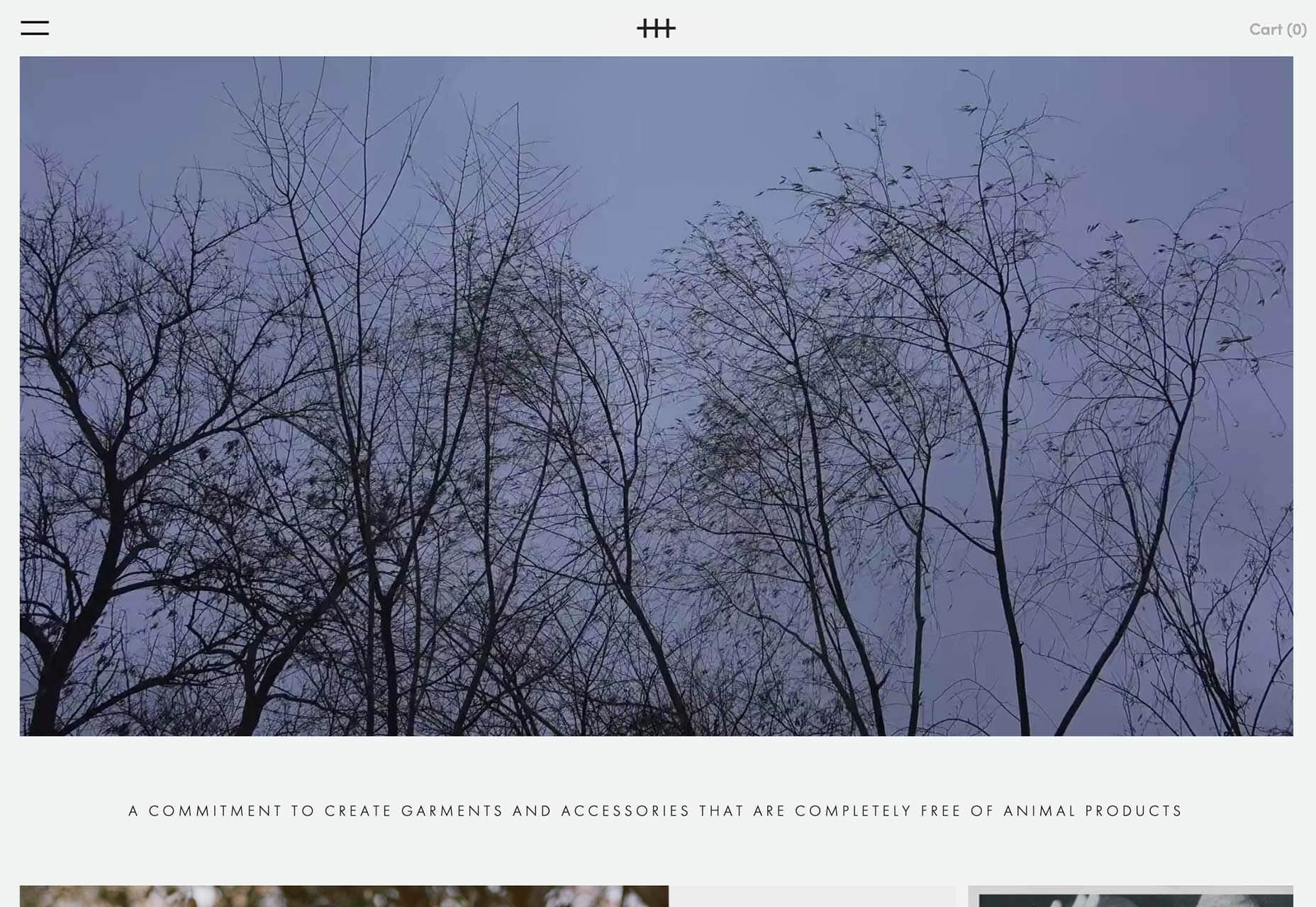
Hiraeth
Co-founded by Rooney Mara, Hiraeth is a fashion label that produces desirable clothes free from any animal product. Its elegant site exudes quality with generous white space, and an almost Scandinavian minimalism, matching the garments perfectly.
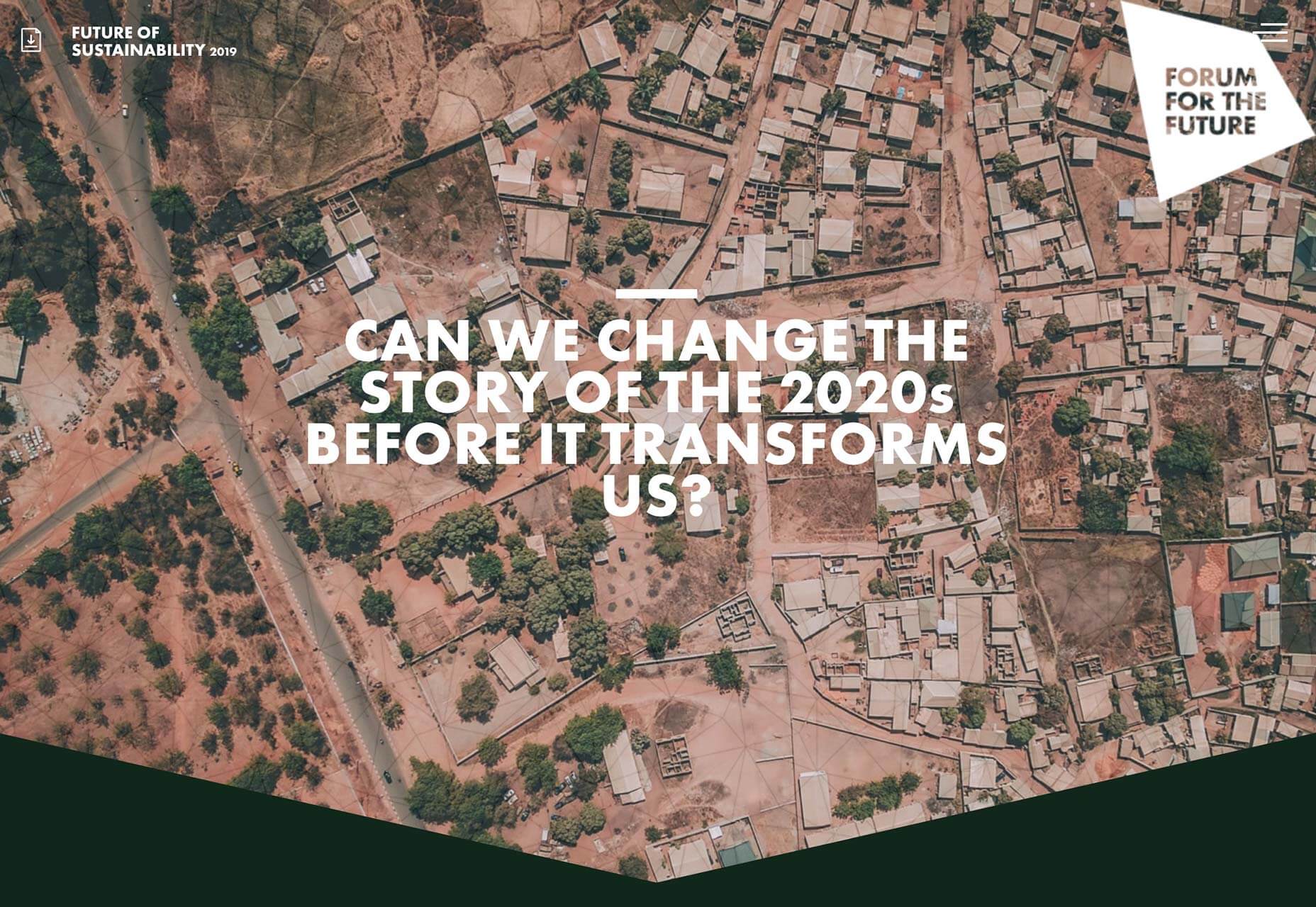
Future of Sustainability
According to some estimates, we have just 12 years until we face not just climate change, but climate breakdown. Future of Sustainability wants to inspire you to change the 2020s, before it’s too late. It communicates a complex, and difficult message engagingly.
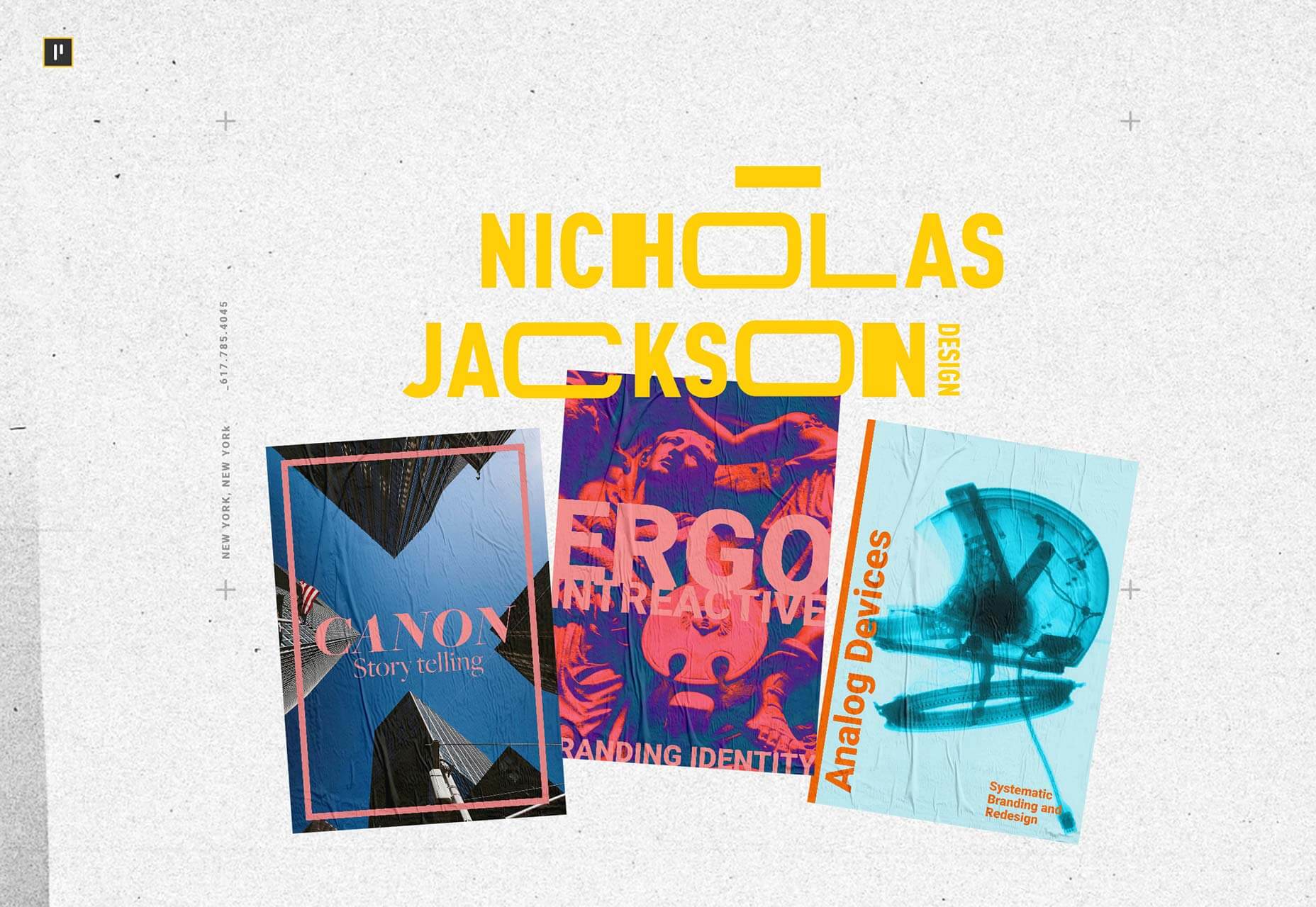
Nicholas Jackson
Nicholas Jackson is a New York based designer and art director. His portfolio site is a bold, confident expression of the work he loves to do for clients including Canon, The Wall Street Journal, The NY times, and Siemens.
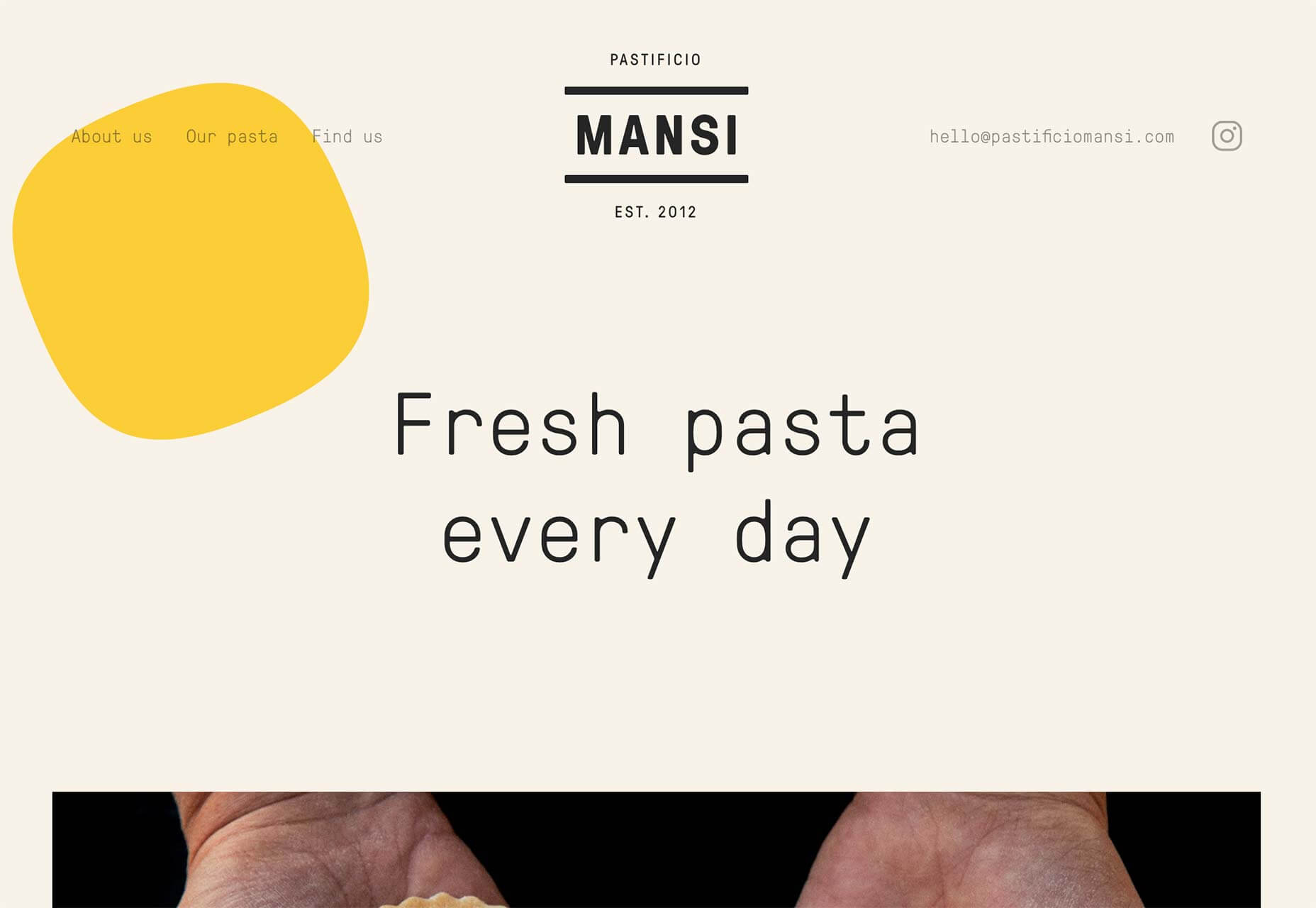
Mansi
Mansi makes some of the best pasta this side of Naples, and it has an equally delicious website. Dotted throughout the site are pasta shapes, some of them animated, making Mansi’s site the most appropriate exponent of the blob trend I’ve seen to date.
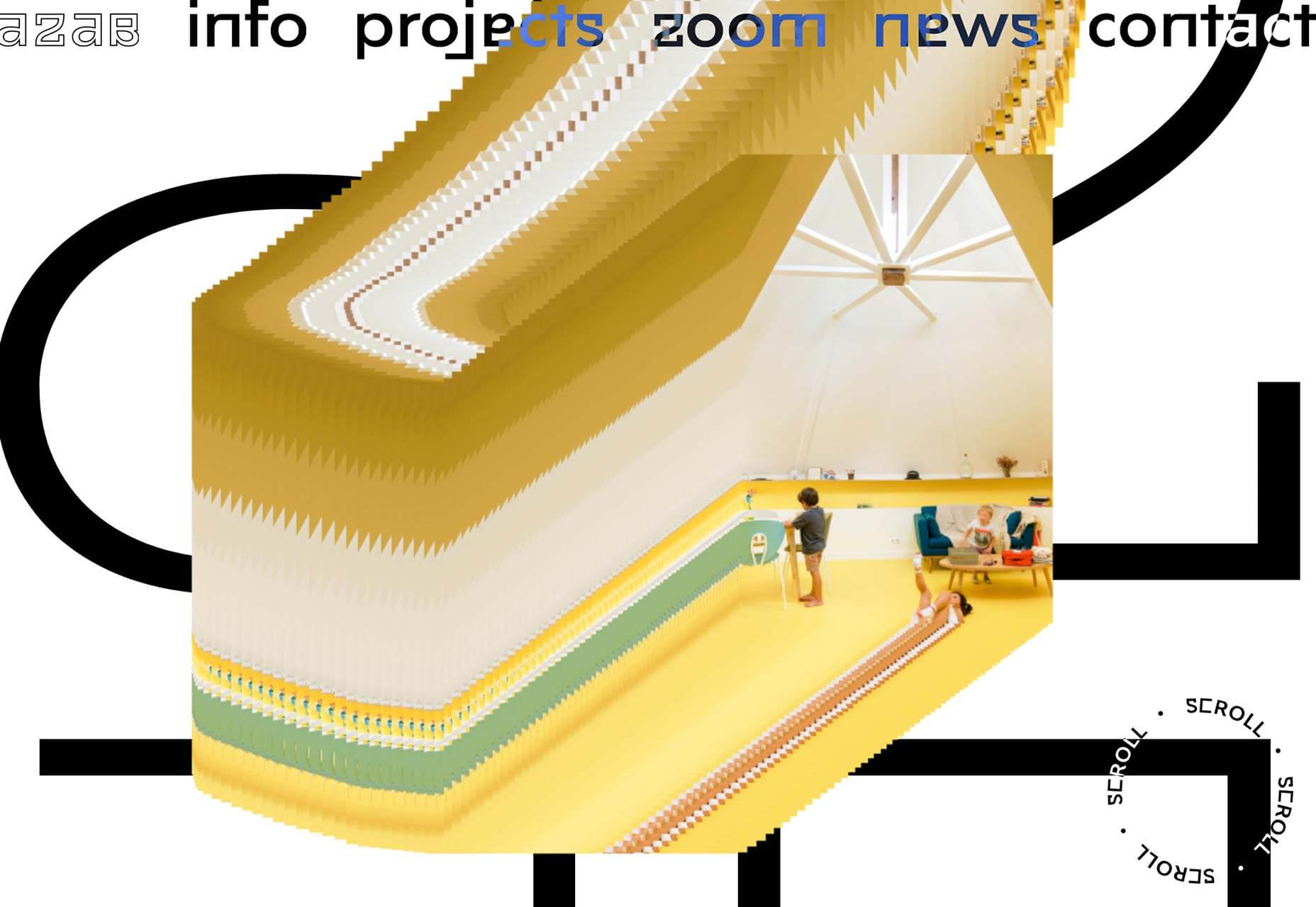
Azab
Azab is an architecture firm with a love of mouse trails. Despite most designers abandoning them more than a decade ago, Azab’s site is built entirely around the path of your mouse on the screen. It’s surprisingly compelling.
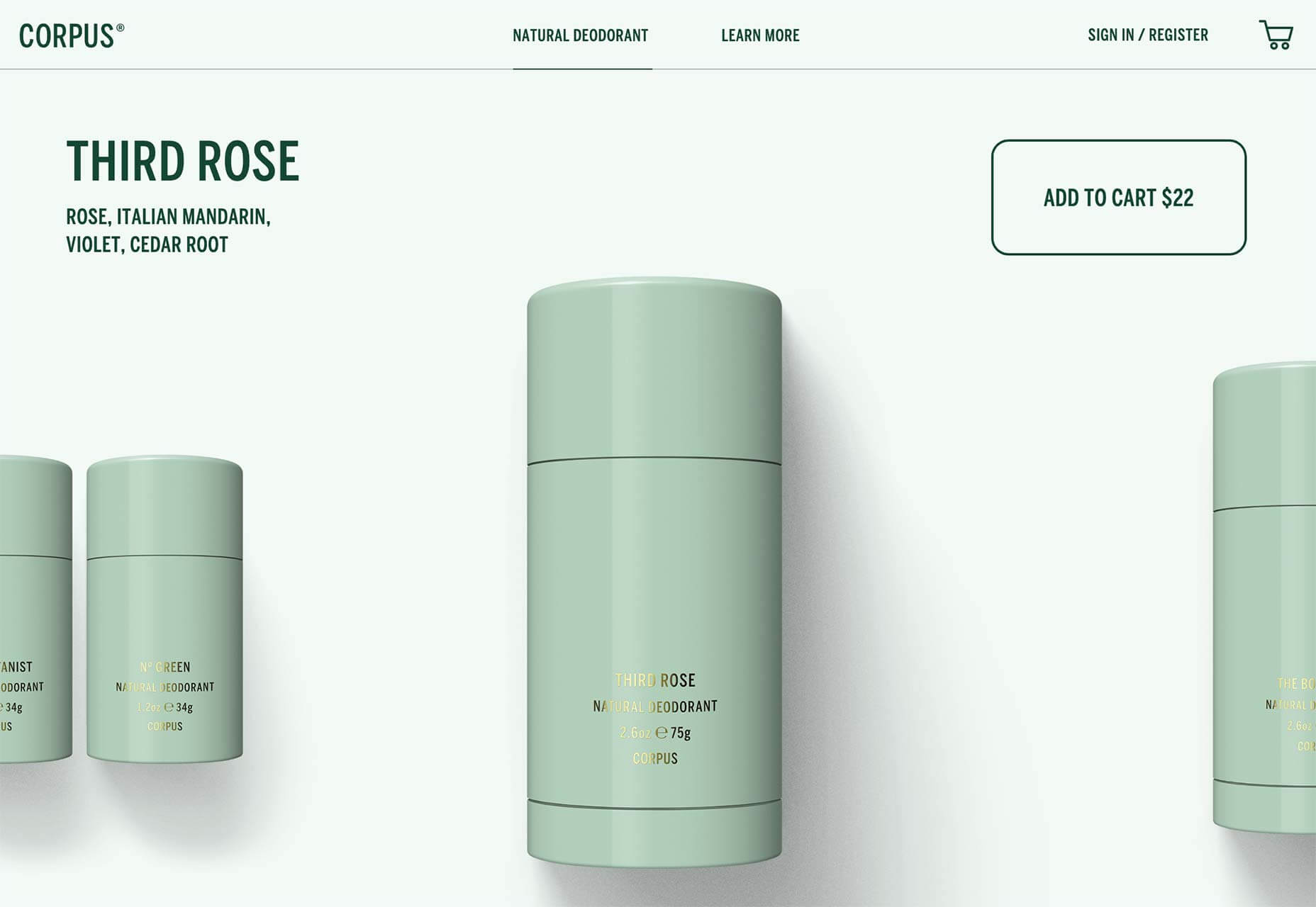
Corpus
Corpus is an all-natural, all-vegan company producing deodorants that don’t harm you, or the planet. Its site intriguingly turns a standard e-commerce layout on its head, by presenting products up front, and the traditional hero video, down below.
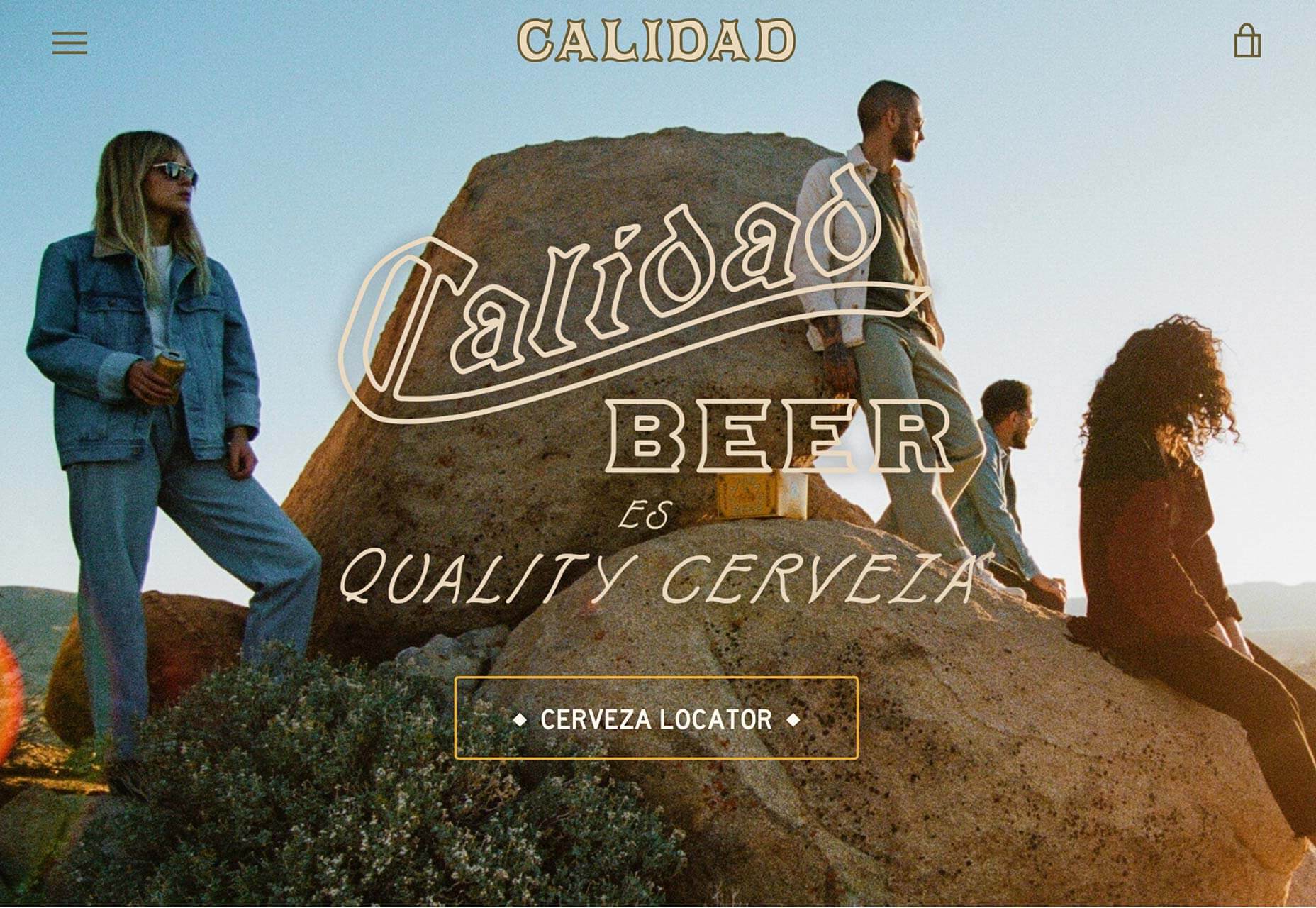
Calidad Beer
Calidad Beer is a Mexican-style beer, brewed in California. With Levis-worthy art direction, and brand appropriate animation, its site is ideal for an unknown company trying to tap into a saturated market. Constantly reinforced, the brand identity is key here.
DEMO
The Design in Motion Festival, or DEMO for short, takes place in Amsterdam in November, when 80 screens in the central train station will showcase the best motion design work. The site itself features beautiful interactive lettering that Saul Bass would be proud of.
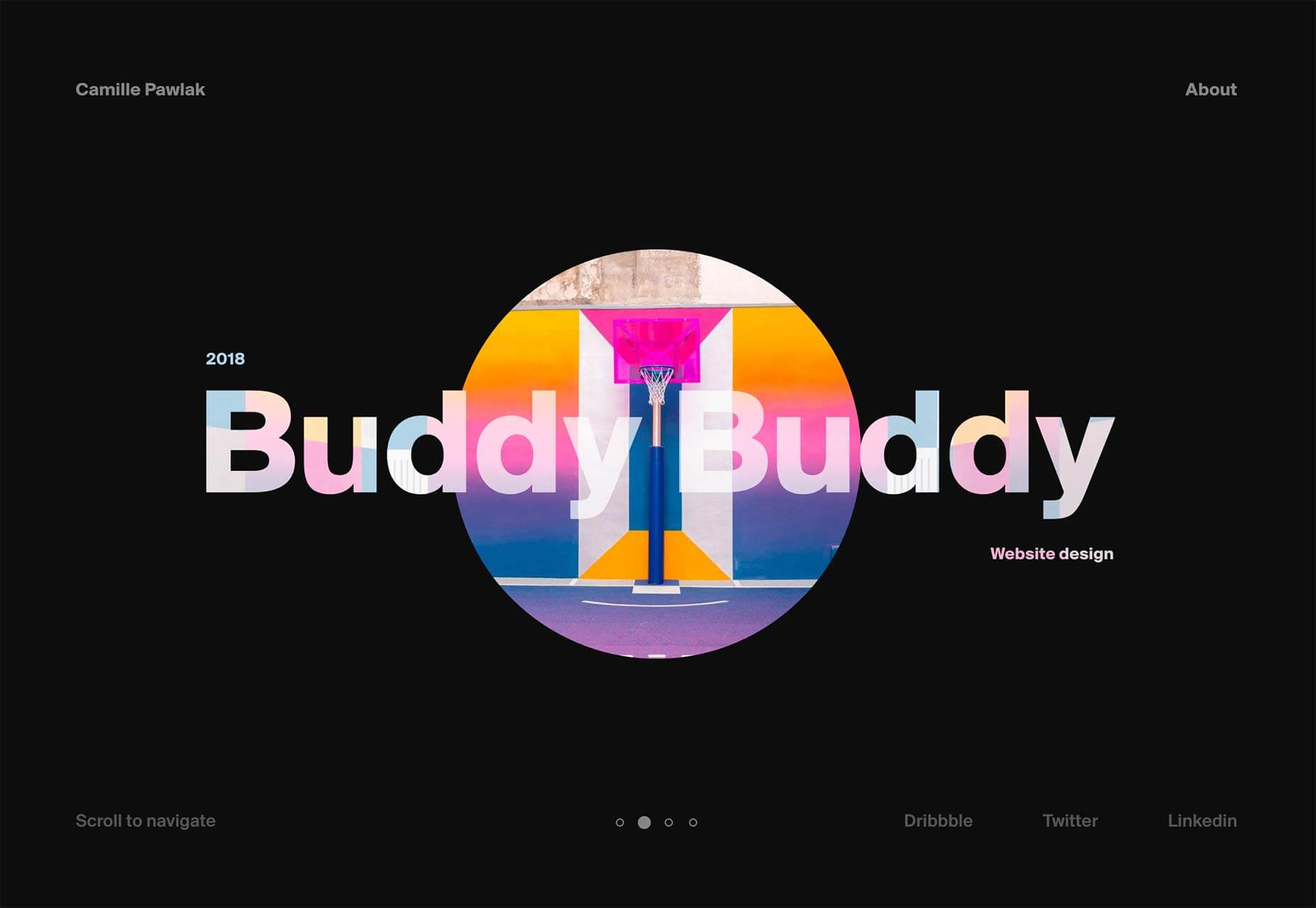
Camille Pawlak
The online portfolio of Camille Pawlak is based around a beautiful central animation that rotates as it transforms into the next project. It’s a simple, but elegant way to navigate between projects, and the work that she’s showcasing is excellent too.
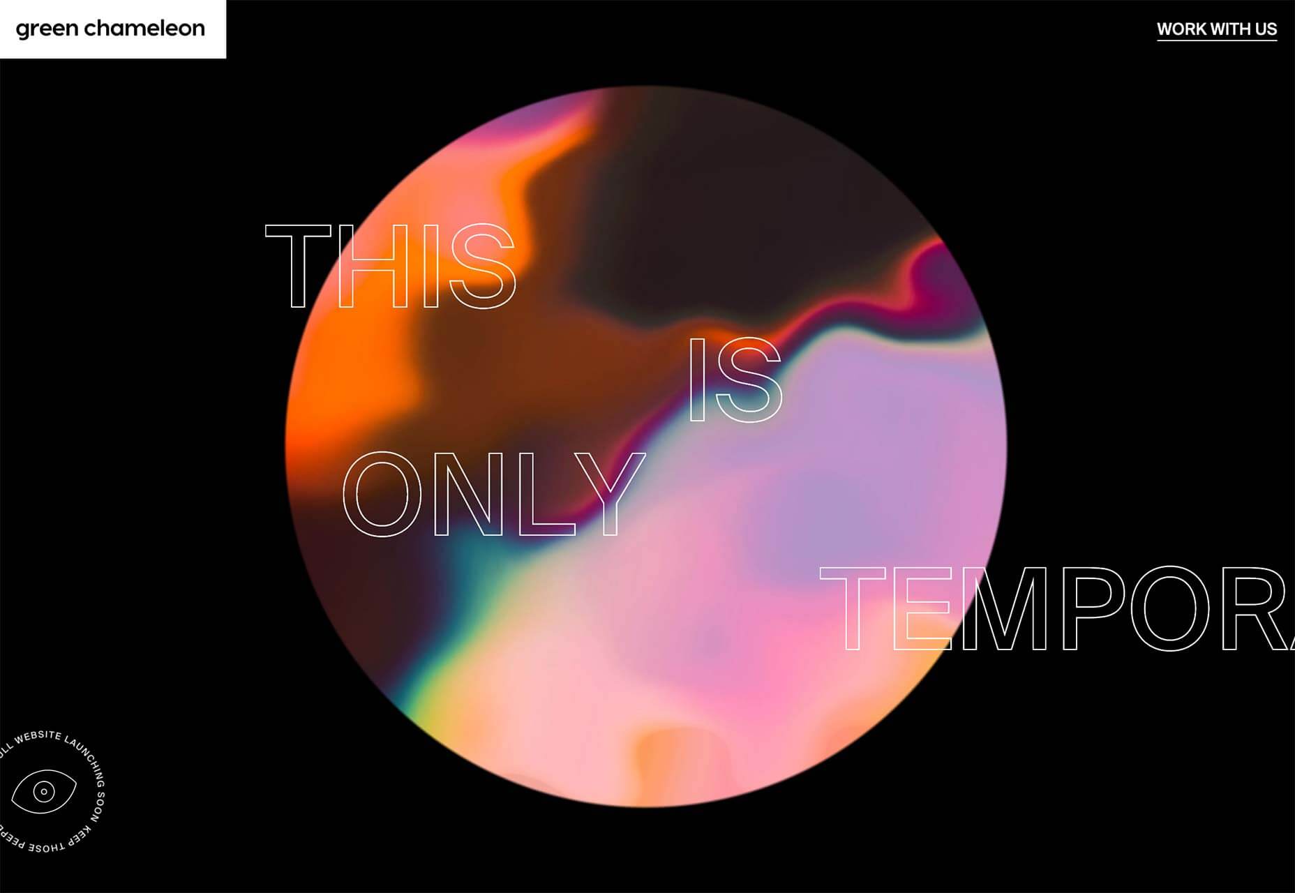
Green Chameleon
Green Chameleon’s site is only temporary, with a full website redesign on the horizon. But with a portfolio like this, packed with parallax effects, and dead simple navigation, I think the Bristol agency should stick with what it’s got.
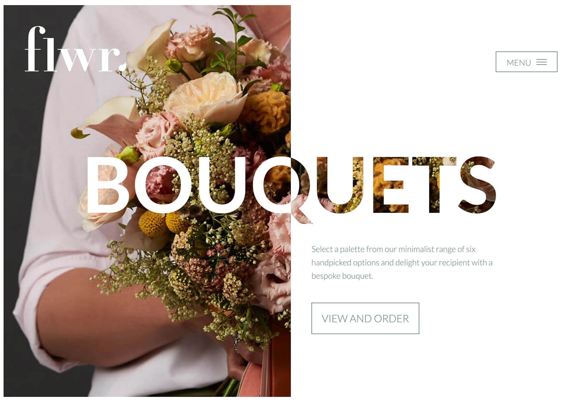
Flwr
Flwr is a New Zealand based florist with a modern approach. Its site uses text to mask its beautiful photography, creating an intriguing and inviting mini-site. It even embraces the split-screen trend to great effect.
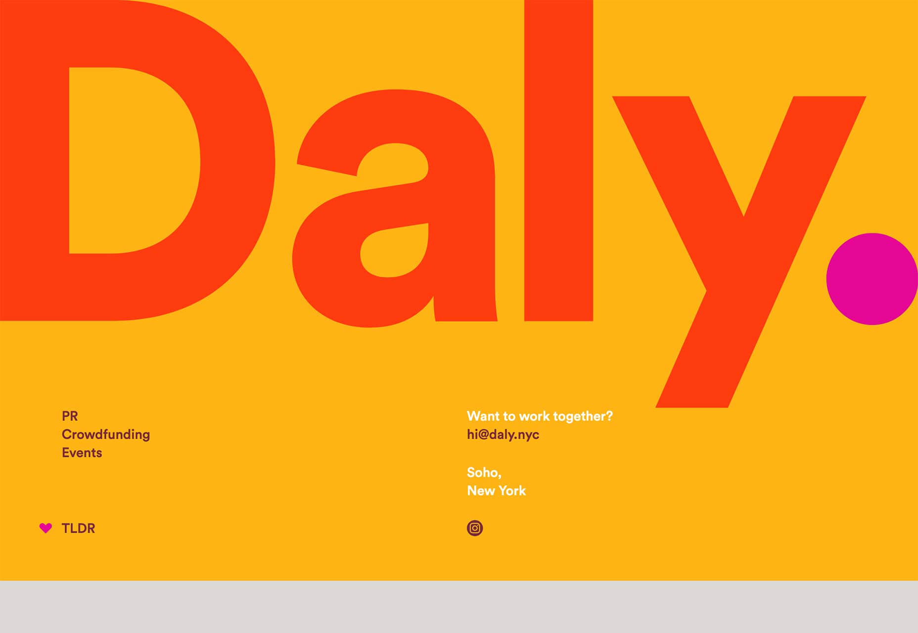
Daly
Daly is a PR agency founded by Alex Daly, from her contacts built helping some of the world’s most successful crowdfund campaigns reach their targets. Its site is bold, colorful, and fun. The period after its name isn’t new, but I love the way it follows you down the page as you scroll.
Pacto Navio
When the finest Cuban rum is introduced to French wine making traditions, you get Pacto Navio. The rum, distilled near Havana, is served by a beautifully art directed site, featuring brand illustrations, and a distinctly Caribbean feeling.
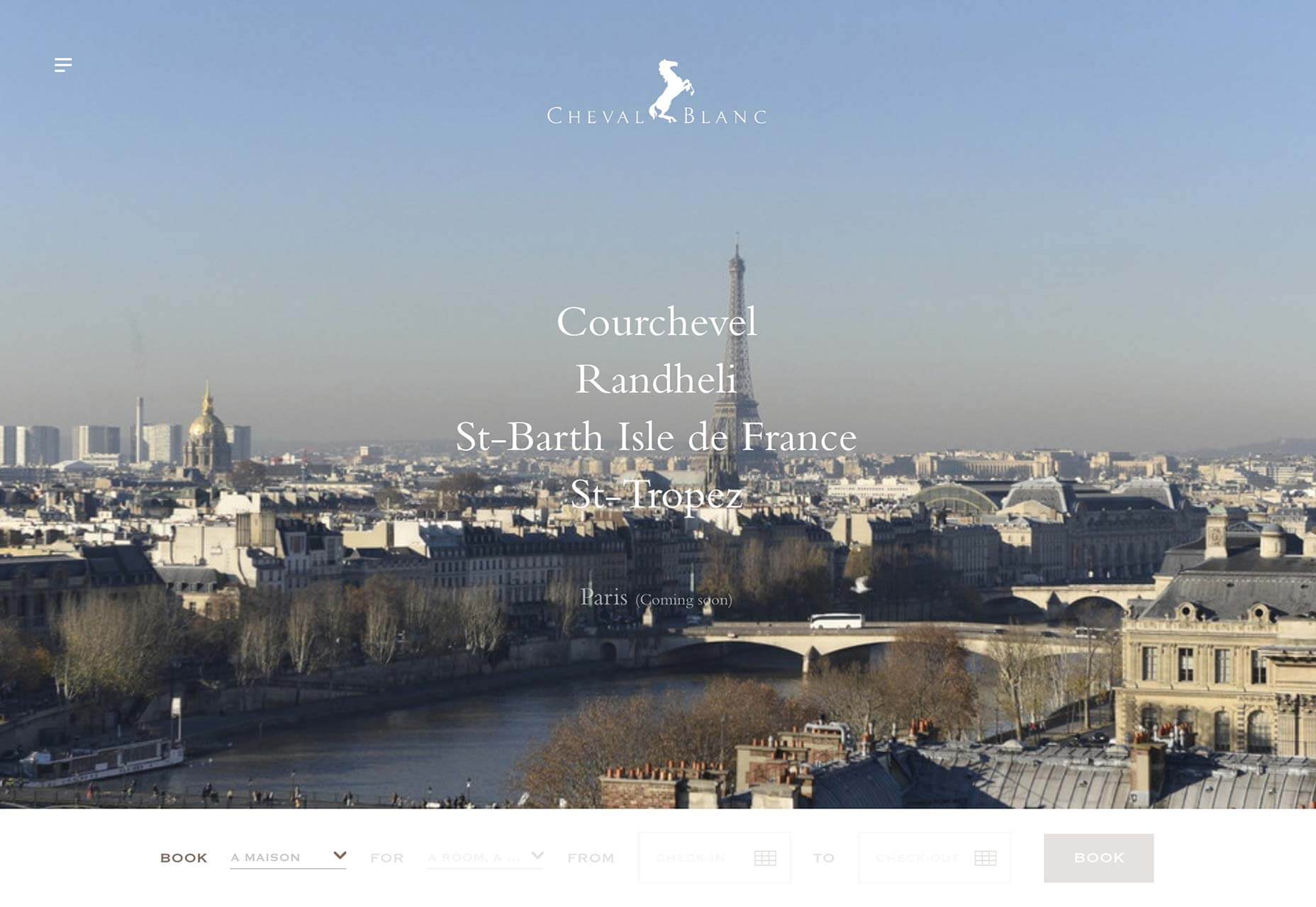
Cheval Blanc
The French have a reputation for refined hospitality, and that trend is reflected in their love of sophisticated web sites. The site for Cheval Blanc is no exception, with a just-right level of parallax scrolling and refined typography.
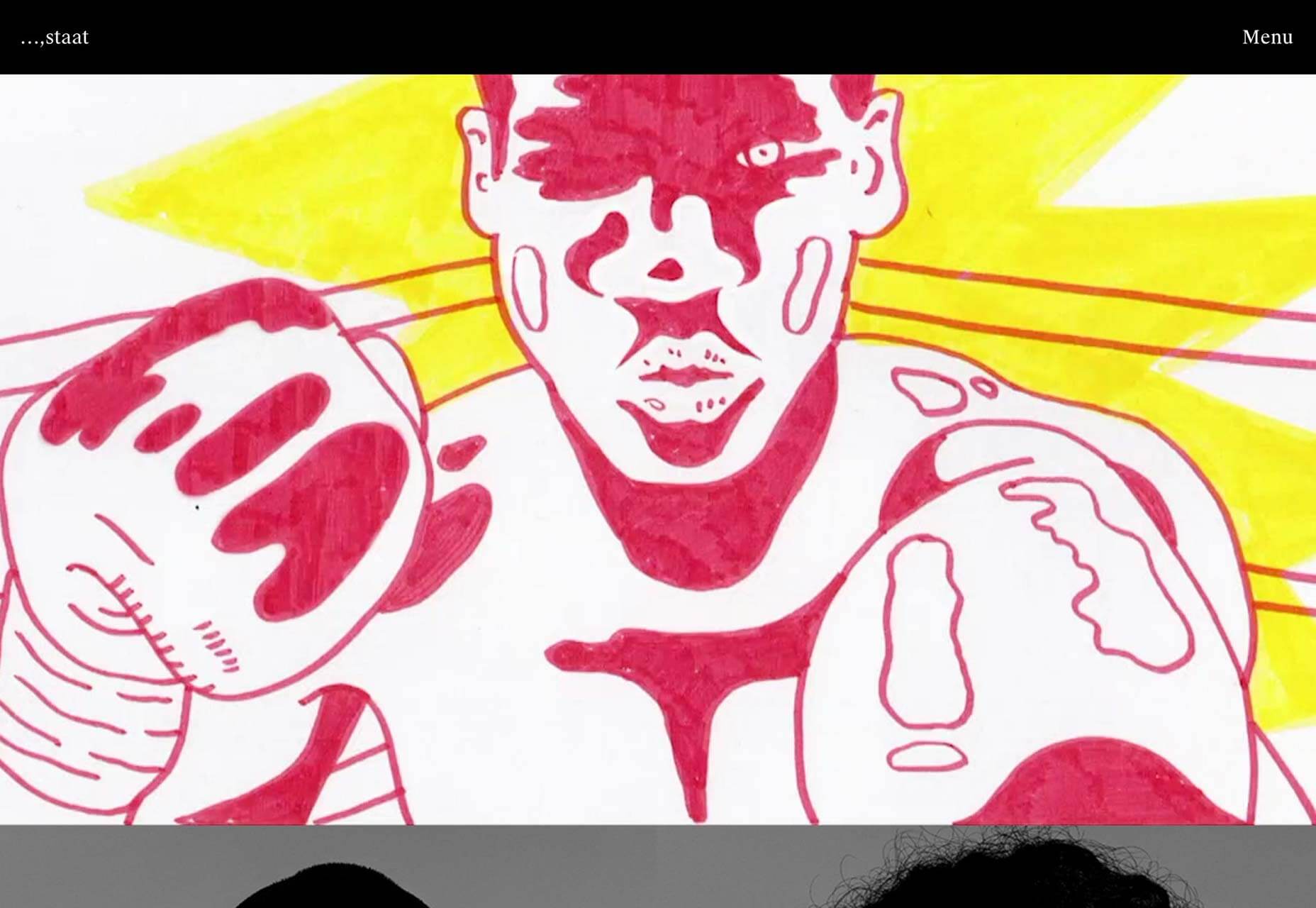
Staat
Staat is a design agency specializing in event design for some of the world’s best known names. Its site features video case studies of its work, and the site itself takes a step backwards and allows the portfolio to shine.
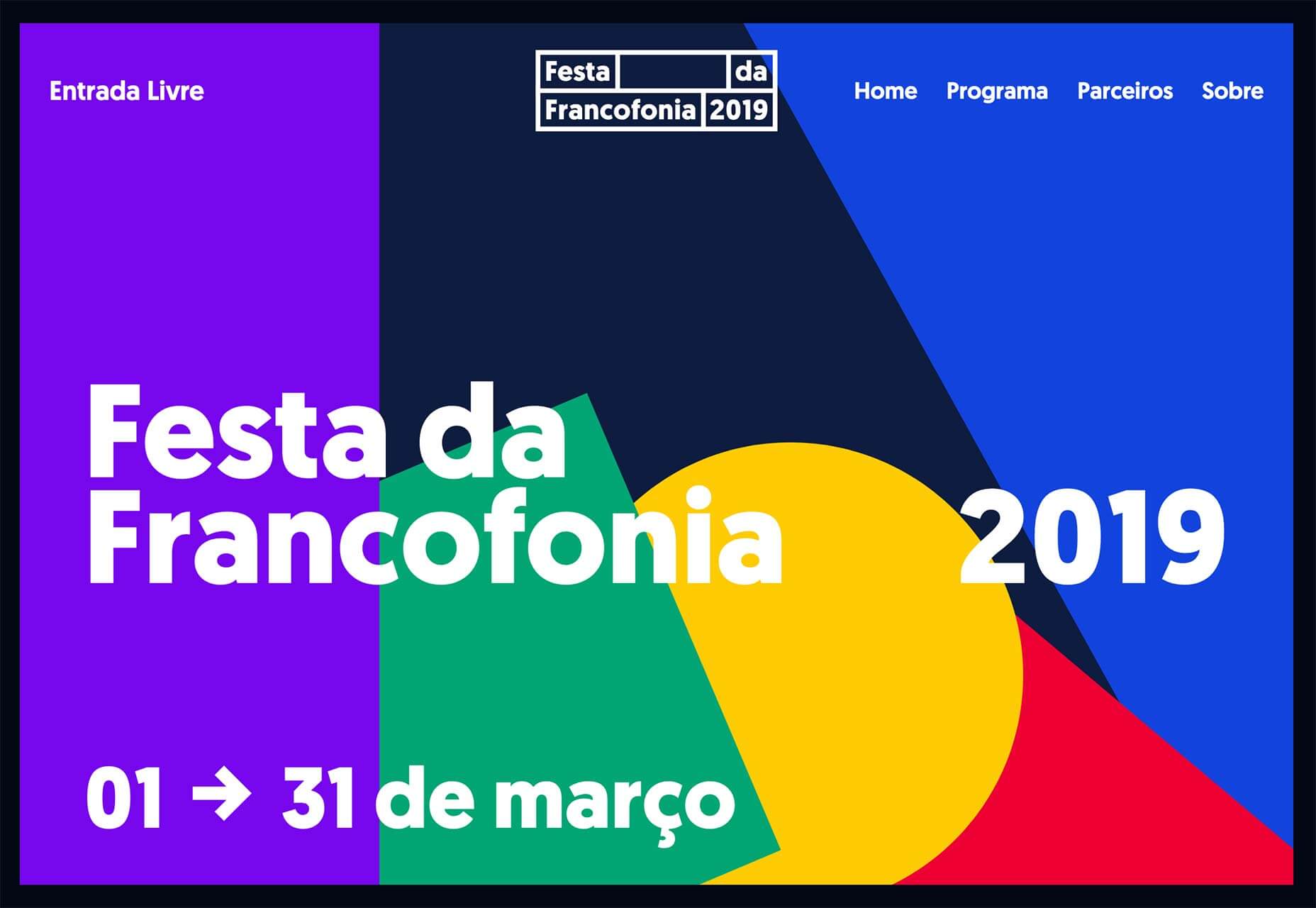
Festa da Francofonia 2019
The 2019 festival for Francophones, is a festival celebrating the 220 million people worldwide who speak the French language. Celebrated from Morocco to Canada, the event’s site is a colorful, international feeling affair, appropriate for a multi-cultural event.
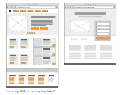
There is a huge difference between a website (which can generate leads) and a lead capture page (which is only supposed to generate leads).
Websites tell visitors:
This is all of the stuff we can do for you. Have a look around and let us know when you’re ready to spend some money!
Lead capture pages, instead, tell visitors:
We have this one super valuable thing we want to give you for free. Share your name, email address and maybe a couple of other details and we’ll hand it straight over!
There’s also a significant difference in how the two are designed.
Unbounce has a nice side-by-side comparison that shows this difference in design between the two:
Unbounce contrasts the design of a web page with a lead capture page. (Source: Unbounce) (Large preview)
The only problem with this is that it depicts the design from a traditional desktop perspective. Just as you would consider the differences in conversion between a desktop and mobile website, you have to do the same for their landing pages.
In the following post, I’m going to give you some points to think about as you design lead capture pages for mobile audiences. I’ve also analyzed a number of landing pages on mobile so you can see how the design criteria may change based on what you’re promoting and who you’re trying to promote it to.
The Difference Between A Website And Lead Capture Page
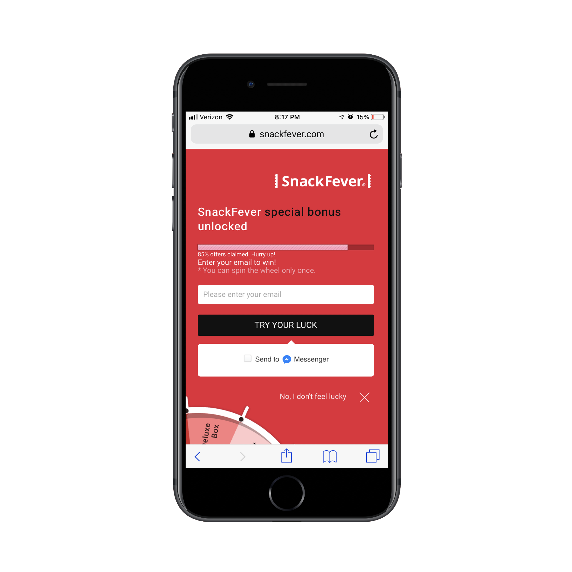
Technically, this is a lead capture pop-up. However, on mobile, SnackFever has turned this into a full page design (which is a much better choice).
This is a pretty awesome example of why you should be designing different experiences for different devices.
You can see that this is much more succinct and easy to stay engaged with as it has a singular purpose. The goal here is to capture that lead ASAP. This is not designed to give them room to walk around the site and ponder other decisions.
This is exactly why you should be building lead capture pages away from the website. It doesn’t matter what kind of lead generation you’re using to lure visitors there:
eBooks, white papers and other custom reports
Courses or webinars
Checklists
Calculator or quiz results
Discounts or coupons
Demos or consultations
Free trials
By moving potential leads over to a distraction-free landing page full of highly targeted messaging and visuals, you can improve your chances of converting them into leads. It might not be a purchase, but you’ve helped them take that first step.
Design Tips For Lead Capture Pages On Mobile
Before you do anything else, I’d urge you to take a look at your website’s Google Analytics data. Specifically, go to Audience > Mobile > Overview and look for this:
This is the average amount of time your mobile visitors spend on your website.
This data point will be helpful in determining, realistically, how long you have to capture and hold the attention of your mobile visitors.
An even better way of doing this is to go to Behavior > Site Content > All Pages. Then, set the Secondary Dimension to Mobile (including Tablet) and click on the new dimension filter so that the “Yes” values go to the top:
This lets you see how individual pages perform in terms of time on page with mobile visitors.
Look closely at any pages that have a strong and singular CTA, like a dedicated service or product page. You can use those times as an average benchmark for how long mobile visitors will stay engaged with a page that’s similarly structured (like your lead capture page).
Now that you have an idea of what your mobile visitors’ threshold is, you’ll be better prepared to design a lead capture page for mobile. The only thing is, though, it’s not that cut-and-dried.
I wish it were as easy to say:
Write a headline under 10 words.
Write a memorable description under 100 words.
Add a form.
Design an eye-catching button.
You’re done.
Instead, you’ll have to think dynamically about how your lead capture page will best convert visitors to it.
Here are the various things to consider as you design each part of your mobile landing page:
#1: Navigation
The navigation menu is a critical part of any website. It allows visitors to move around the site with ease while also gaining a better understanding of all that’s available within the walls of it.
But lead capture pages don’t exist within a website’s navigation. Visitors, instead, encounter promotional links or buttons on web pages, in emails, on social media and via paid ads in search. Upon clicking, they’re taken to a landing page that’s reminiscent of the website, but has a unique style of its own.
Now, the question is:
Should your lead capture page include the main website’s navigation atop it?
If the goal of a lead capture page is to capture leads, then it should have just one clickable call-to-action, right? Wouldn’t logic dictate that a navigation menu with links to other pages would serve as too much of a distraction? And what about the brand logo? After all, any other links will send the signal:
“Hey, it’s okay if you want to abandon this page.”
Instead of saying:
“We weren’t kidding. Look at how amazing this offer is. Scroll down and claim yours now.”
I’d say that the navigation should only be included when the website is already successfully converting visitors into paying customers/subscribers/members/readers. If the lead gen is merely there as a bonus element, then it’s not a big deal if visitors want to backtrack to the site.
The logo should be fine to keep as it’s more of a branding element than a competing link in this context though. Take, for instance, this sweepstakes giveaway on the Martha Stewart website:
In general, if you need this lead gen offer to truly be a vehicle to grow your email list, the navigation should not be there. Nor should other competing links that draw them away from conversion.
#2: Copy
All of the usual rules for typography in mobile web design apply here — that includes size, spacing, color and font face. All of the rules you’d adhere to in terms of formatting a page for mobile apply as well. For example:
Very succinct headlines;
Short and punchy paragraphs;
Bulleted or numbered lists to describe points quickly;
Header tags to break up large swaths of text;
Bolding, italics, hyperlinks and other stylized text to call attention to key areas.
What about the amount of copy on the page though? Typically, the answer for mobile is:
Write only as much copy as you need to.
That is indeed the case with mobile lead capture pages… but there’s a catch.
Some lead gens are easier to “sell”, which means you shouldn’t need much more than the following to get people to convert:
A short and descriptive headline;
A paragraph explaining why the lead gen is so valuable;
Three to five bullets breaking out the benefits;
A short form asking for the basics: name, email and maybe a phone number.
A brightly colored and personally worded call-to-action button.
There are other cases where the lead gen offer requires more convincing. Or when the brand behind it decides to use the page’s copy as a way to qualify leads. You’ll see this a lot if the lead gen is something that requires an investment of time on the part of the brand. For instance:
Product demos
Consultations or audits
Webinars (sometimes)
In these cases, it makes more sense to write a lengthy lead capture page. Even then, I go back and forth on this because I’m just not sure that’s the smartest move for mobile visitors. So, what I’m going to suggest is this:
If you’re building a lead capture page for a well-established brand that’s known for overly-long pages and whose leads are valued at over $1,000 each, a super lengthy lead capture page is fine.
If you’re building a lead capture page for a newish brand that simply wants to grow their email list fast, don’t make visitors wait to convert.
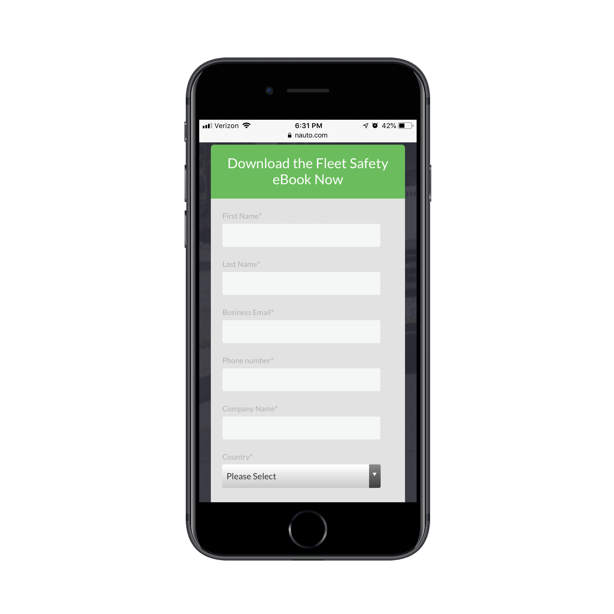
Get a look at this landing page from Nauto for a free eBook:
It could’ve been as simple as that. However, Nauto continues on with more copy after the CTA:
Nauto includes additional copy after its lead capture form. (Source: Nauto) (Large preview)
What’s interesting here is that this part of the page essentially rewrites the intro at the top of the page. My guess is that they did this to strengthen the SEO of the page with a longer word count and a reiteration of the main keywords.
Either that or they found that visitors weren’t immediately filling out the form and needed a little more encouragement. That would explain why a couple more scrolls down take you through a closer look at the content of the eBook as well as another link to download it (which just returns you to the form):
Nauto includes another CTA for the lead capture form. (Source: Nauto) (Large preview)
Clearly, you can still write a whole bunch of copy after the lead gen form, so long as there’s a good reason for it.
#3: Lead Capture Form
Nick Babich has a great piece on how to design forms for mobile. Although the guide pertains more to e-commerce checkout forms, the same basic principles apply here, too.
There are a number of other factors you should consider when designing forms to capture leads on a dedicated landing page.
Where should you place the form?
I’ve mostly answered that question in the above point about copy. But, if we want to be more specific, the lead capture form should always appear within no more than three swipes on mobile.
Realistically, the initial glance at a lead capture page should be an engaging visual element and headline. The next swipe down (if needed) should be an explainer paragraph and short list of benefits. Then, you should take them right to the form.
This is an example from GoToMeeting‘s eBook lead capture page:
They’ve truncated all of those key intro elements into the top header design.
Can you write the labels differently?
No, labels should never be tampered with, especially on mobile. Keep them clear and to the point. Name. Email. Business. # of employees. Etc.
What you can and should do differently, though, is to create more engaging form titles and CTAs. Or you can encapsulate the form within brightly-colored borders.
The whole point of this page is to convert visitors on a single element. While you can’t play with the field labels, you can increase their engagement with the outlier text and design.
How many fields should you include?
The answer to this is always “only the ones that are necessary”. However, you don’t want to go too far towards the simple side if the purpose of the lead gen is to qualify leads.
If all you’re doing is growing an email list, sure, Name and Email will suffice. If your goal is to provide something of value to the people who really need it and, later, follow up and start them on the sales journey, the lead capture form needs to be longer.
Here’s another look at the GoToMeeting landing page:
You can tell right away they’re not trying to give this eBook out to any and everyone. This is for a specific kind of business and they’re likely going to filter the leads they receive from it based on job title and country, too.
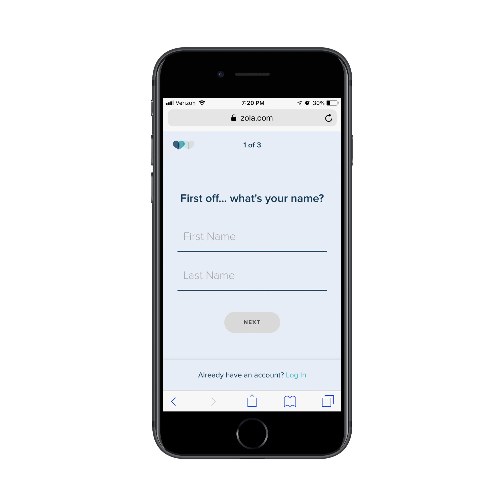
Don’t feel as though this is only something you can use for B2B websites either. Get a look at this custom wedding checklist lead capture form from Zola:
The first page of Zola’s lead capture form. (Source: Zola) (Large preview)
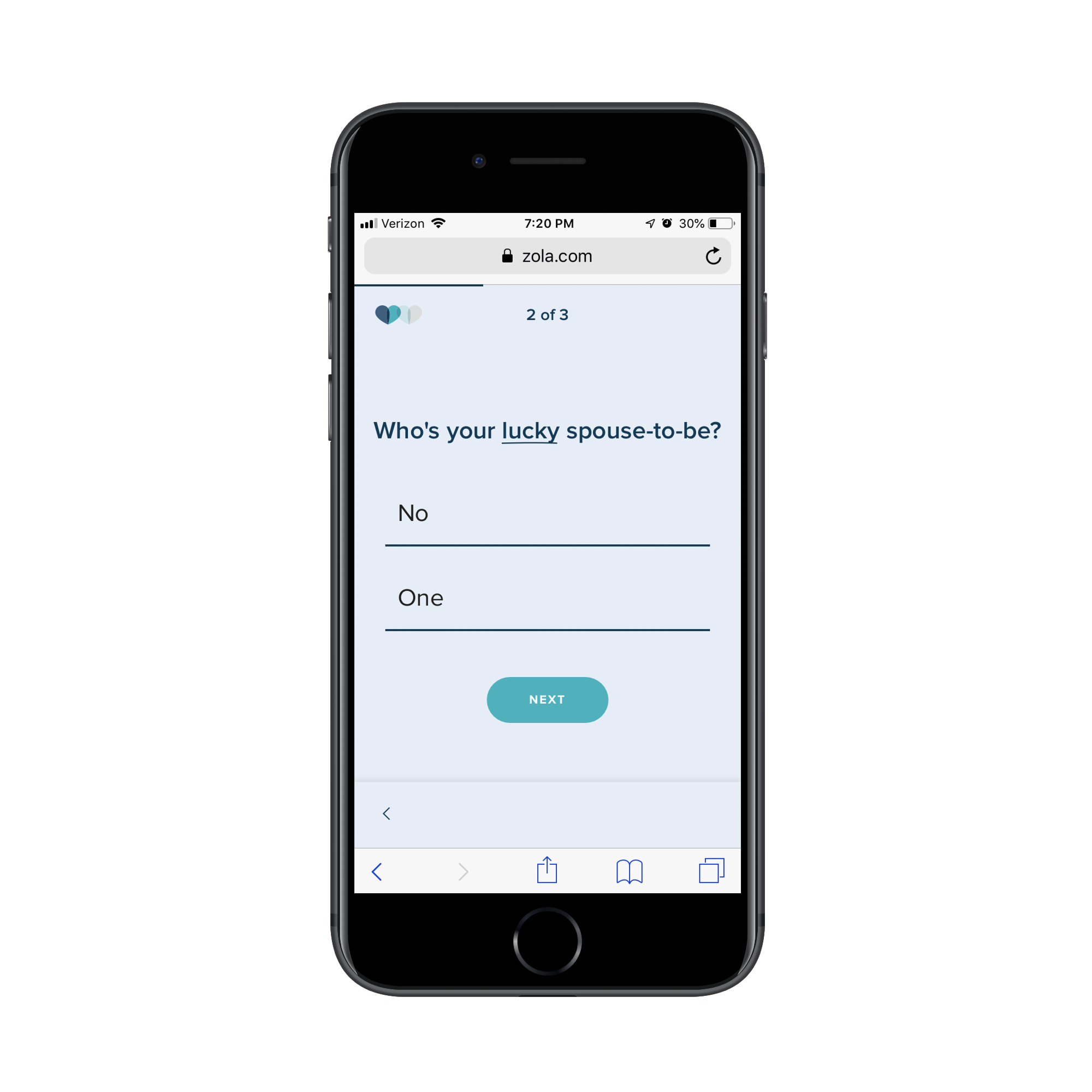
The first page of the form asks for your name. The second page of the form asks for your spouse-to-be’s name:
The second page of Zola’s lead capture form. (Source: Zola) (Large preview)
The final question then asks for your scheduled or tentative wedding day:
The third page of Zola’s lead capture form. (Source: Zola) (Large preview)
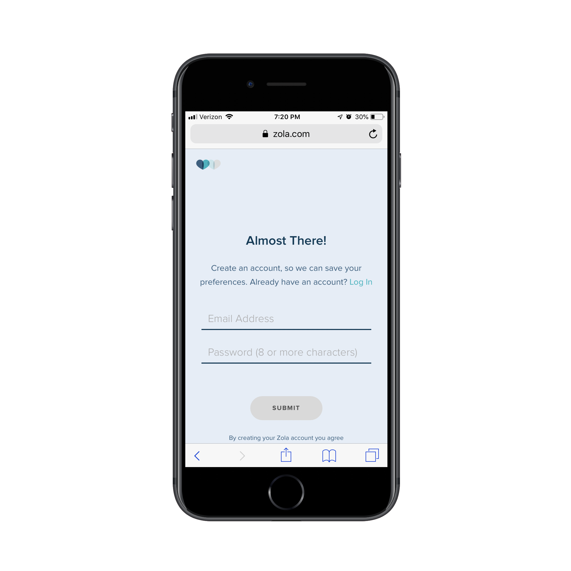
On the final page, Zola let’s you know that you can receive your custom wedding checklist if you’re willing to create an account:
Zola requires an email address and password before sending the custom checklist. (Source: Zola) (Large preview)
It’s a simple enough series of questions, but also not the kind you would find on most lead capture forms. So, don’t be afraid to break outside the norm if it improves the value of the lead gen offer for the visitor and helps your client collect better data on their leads.
#4: Trust Marks
Trust marks are often used around mobile e-commerce checkout forms. That makes a lot of sense since the goal is to make mobile visitors comfortable enough to buy something from their smartphones.
But are trust marks necessary for lead capture pages?
I think this boils down to what kind of lead gen you’re giving away and what kind of communication you intend to have with the lead after they’ve filled out the form.
Take the SnackFever example above. It’s a fun little game they’ve put on their site that exchanges a discount for an email address. There’s no reason for SnackFever to put a Norton Security or SSL trust mark next to the form. It’s very low stakes.
But when the lead gen’s value is dependent on the knowledge and skills of the company behind it, it’s very important to include trust marks on the page.
In this case, you want to demonstrate that there are satisfied customers (not leads) who are willing to vouch for the capabilities and prowess of the company. If you can leverage well-known brand logos and flattering testimonials from individuals, your landing page will more effectively capture the right kinds of leads (i.e. the ones willing to enter the sales funnel after they get their lead gen).
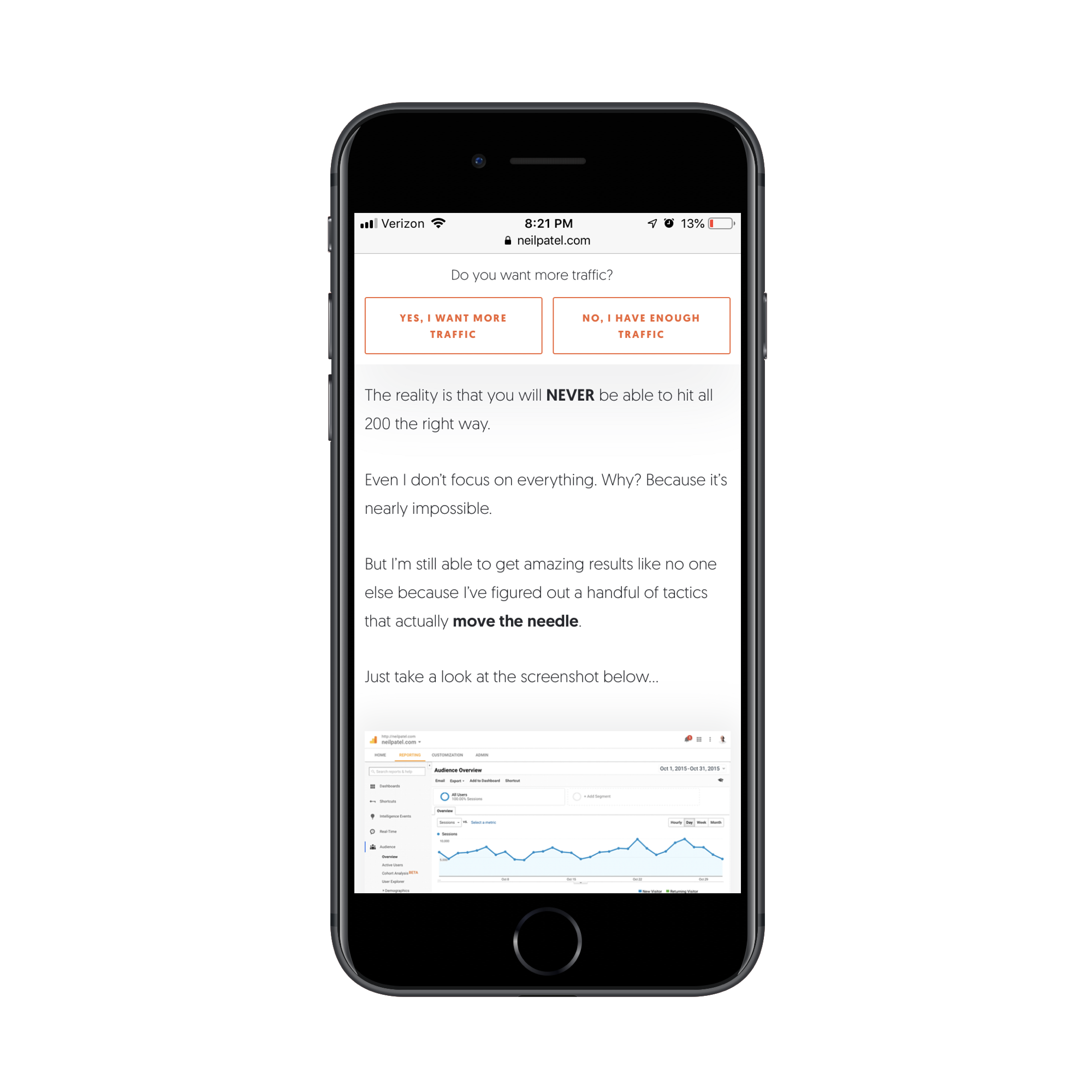
It’s no surprise that someone like Neil Patel would leverage these kinds of trust marks — he has a lot of high-profile and satisfied customers. It would be silly not to include them on his lead capture page.
This is the top of his “Yes, I Want More Traffic” lead capture page:
It goes on and on like this for about a dozen scrolls. (As I mentioned before, if you’re known for writing overly long content on your site, you can get away with this.)
Neil Patel provides valuable data to demonstrate the value of his offer. (Source: Neil Patel) (Large preview)
Eventually, he gets to a point where he lets others tell the visitor why they should pursue this offer. The first block of trust marks come in the form of short quotes and logos from well-known companies:
Neil Patel shows off his high-profile clients and quotes they’ve provided about him. (Source: Neil Patel) (Large preview)
The next section puts the spotlight on “smaller” clients that are willing to divulge what kinds of impressive results Neil has gotten for them:
Neil Patel includes data-driven testimonials from other clients. (Source: Neil Patel) (Large preview)
While I wouldn’t suggest the length or style of this page for your clients, I do think there’s a great lesson to be taken away here in terms of leveraging the words and reputations of a satisfied client base to build trust.
#5: Footer
While I have a hard time justifying the use of a navigation on a lead capture page, I actually do think a footer is a good idea. That said, I don’t think it should be the same as your website’s footer. Again, we want to avoid any design element stuffed full of links that can distract from the goal of the page.
Instead, you should use the footer to further establish trust with leads. Terms of Use, Privacy Policy, and other data management policy pages belong here.
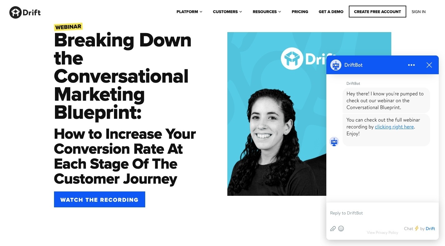
I’m including this final example from Drift because, well, it’s the most unique lead capture “page” I’ve encountered thus far — and because the footer is as simple as they come.
This page promotes Drift’s upcoming and previous webinars:
If you attempt to “Watch the Recording” of an old webinar, it’s fair to assume that Drift is going to want to capture your email address. However, Drift is in the business of developing conversational marketing tools for business. While they could’ve created a conversational landing page (sort of like what Zola did with its form above), it went a different route:
Drift’s chatbot asks visitors for their email address to get to the webinar. (Source: Drift) (Large preview)
Visitors interested in the webinar lead gen are taken to a DriftBot page. It’s very simple in design (as any chat interface should be) and includes the simplest of footers. While Drift’s link is there, the only other competition for attention is the “Privacy Policy” and it’s clear that Drift wants that to be an afterthought based on the font color choice.
One more thing I want to note about this example is that if you were to go through these same steps on the desktop website, DriftBot doesn’t ask you for an email address. It simply gives you a link:
Drift’s desktop chatbot doesn’t ask for an email address. (Source: Drift) (Large preview)
This is further proof that you should be designing different experiences based on the expected outcomes on each device. In this case, they probably have data that shows that desktop visitors watch the webinar right away while mobile visitors wait until they’re on a larger-screened device.
Wrapping Up
While adhering to basic mobile design principles is the best thing to do when designing something new for your clients, be mindful of the purpose of the new element or page too.
As you can see in many of the examples above, there’s a stark difference between the kinds of lead gen offers your clients may want to share with visitors.
The simpler exchanges (e.g. give me your email/get this checklist) don’t require much deviation from the designs of other mobile web pages. More high stakes exchanges (e.g. give me your information/get a custom quote, consult or demo) may require some non-mobile-friendly design techniques.
I would suggest you do your research, see how long you can realistically hold your visitors’ attention on mobile and design it. Then, start A/B testing your design to experiment with form construction, page length, and so on. You may be surprised at what your mobile visitors will go for if the lead gen offer is juicy enough.
Every week users submit a lot of interesting stuff on our sister site Webdesigner News, highlighting great content from around the web that can be of interest to web designers.
The best way to keep track of all the great stories and news being posted is simply to check out the Webdesigner News site, however, in case you missed some here’s a quick and useful compilation of the most popular designer news that we curated from the past week.
Note that this is only a very small selection of the links that were posted, so don’t miss out and subscribe to our newsletter and follow the site daily for all the news.
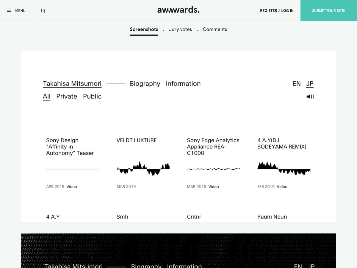
Site Design: Takahisa Mitsumori
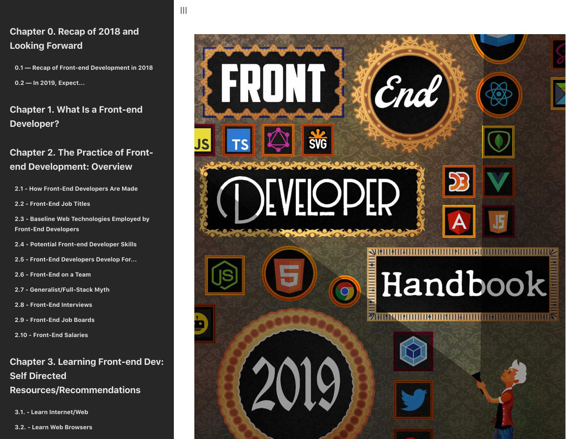
Front-end Developer Handbook 2019
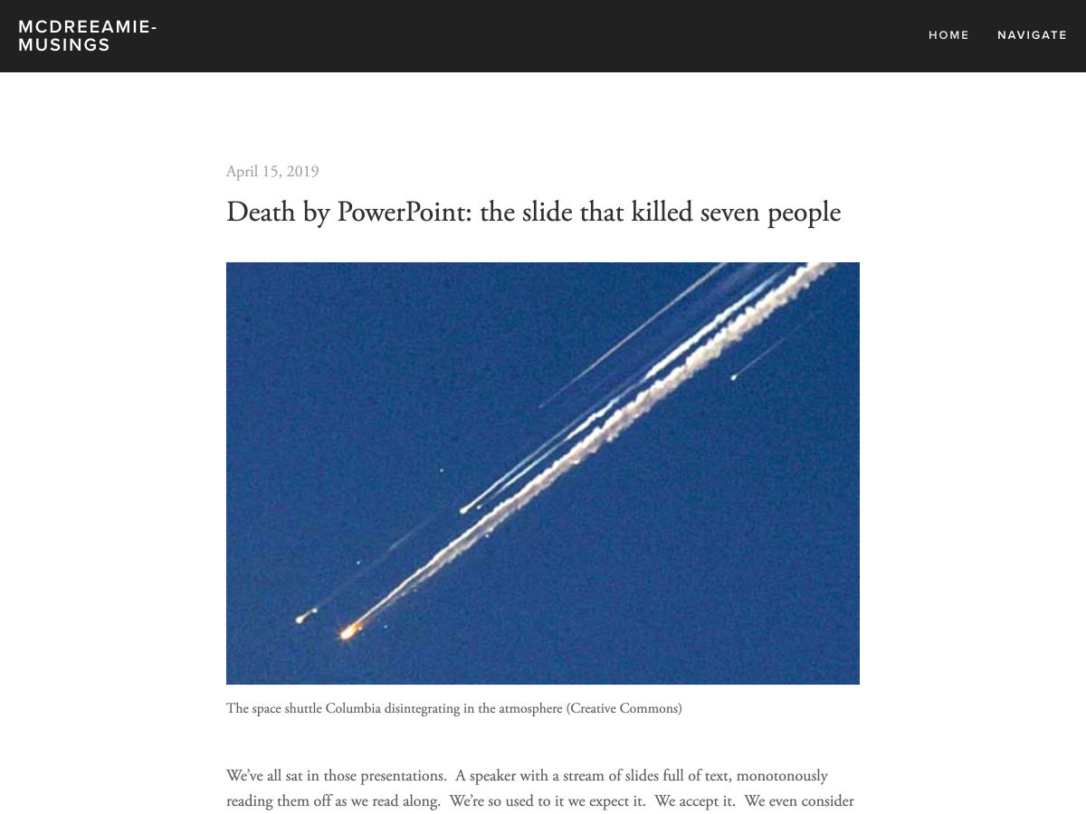
Death by PowerPoint: The Slide that Killed Seven People
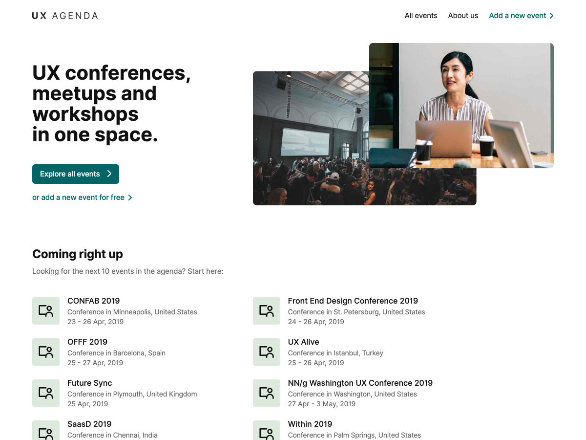
UX Agenda – UX Conferences, Meetups and Workshops in One Space
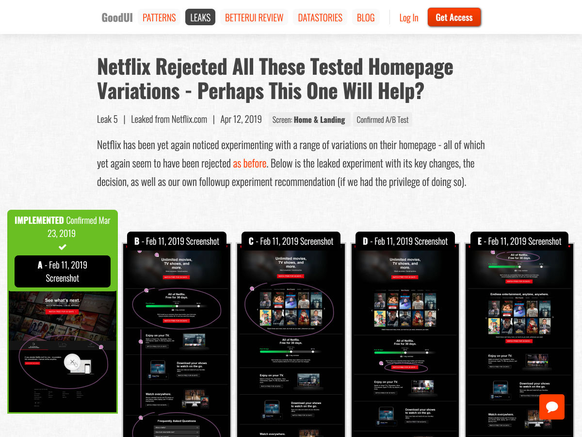
Netflix Rejected all these A/B Tested Homepage Variations
Long-form Websites and Typography
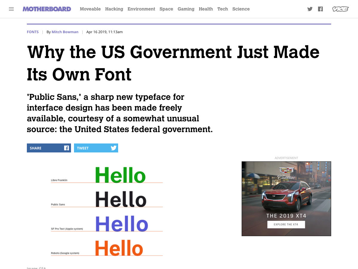
Why the US Government Just Made its own Font
New Logo for Ontario
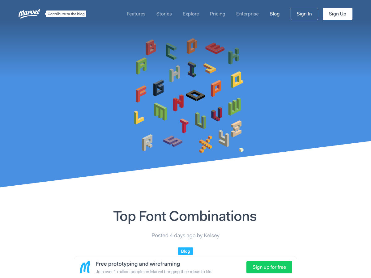
Top Font Combinations
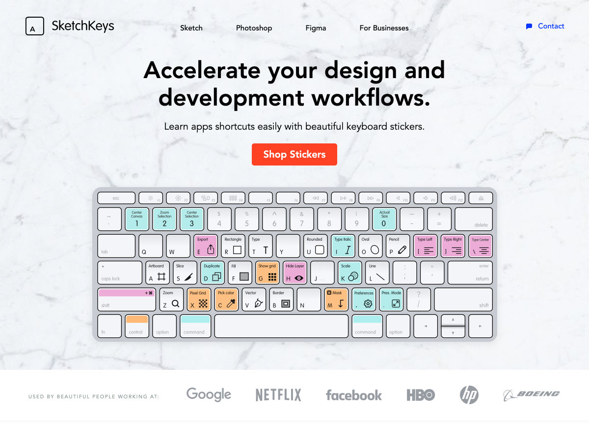
Keyboard Stickers
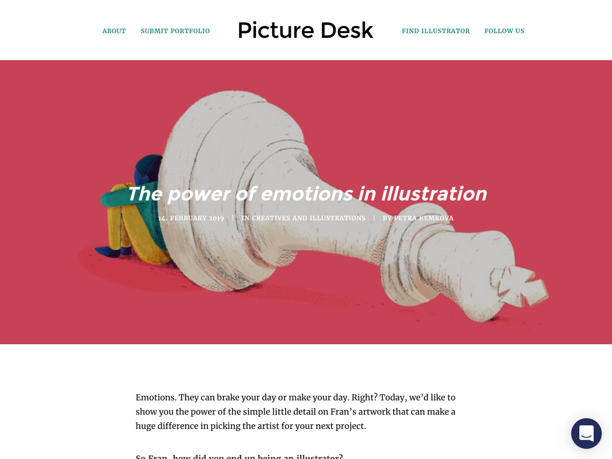
The Power of Emotions in Illustration
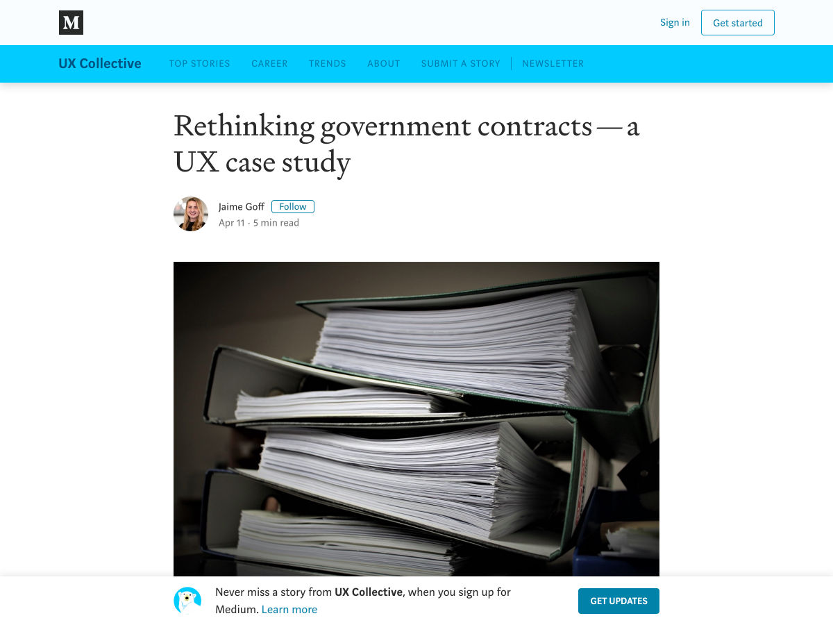
Rethinking Government Contracts – a UX Case Study
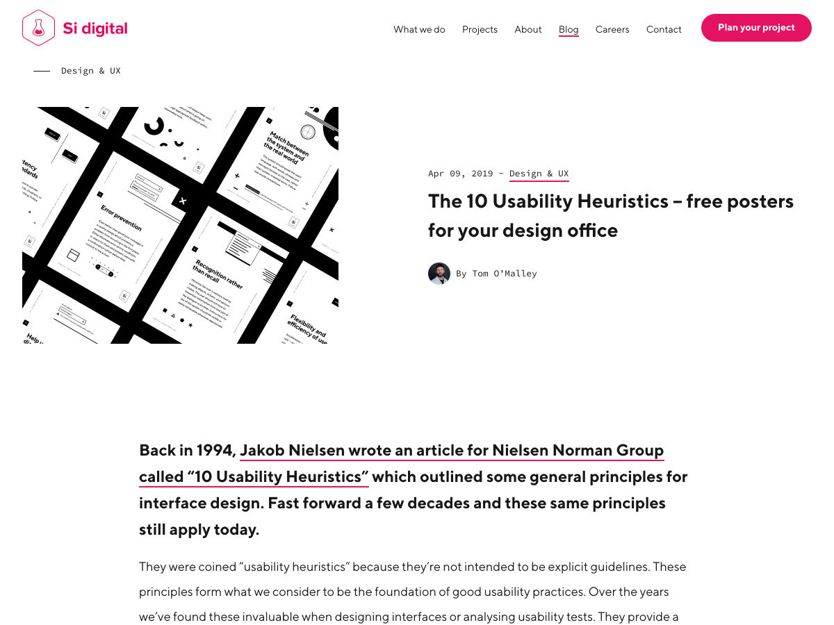
The 10 Usability Heuristics – Free Posters for your Design Office
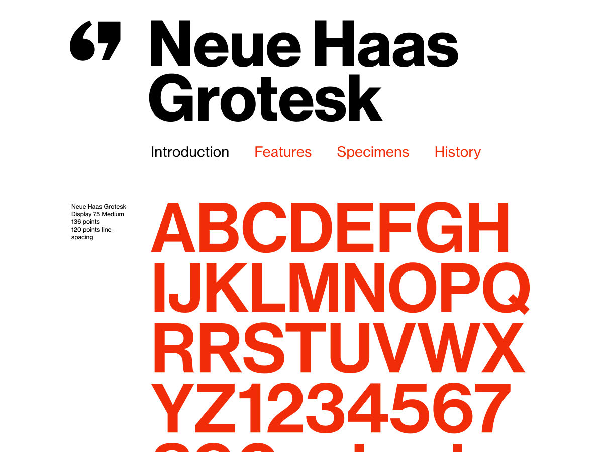
Neue Haas Grotesk, the Other New ‘Helvetica’
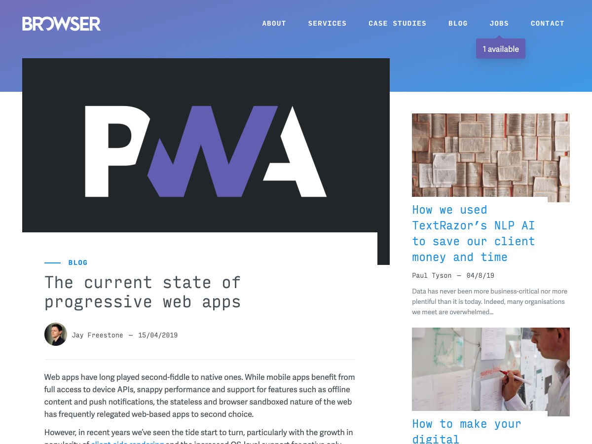
The Current State of Progressive Web Apps
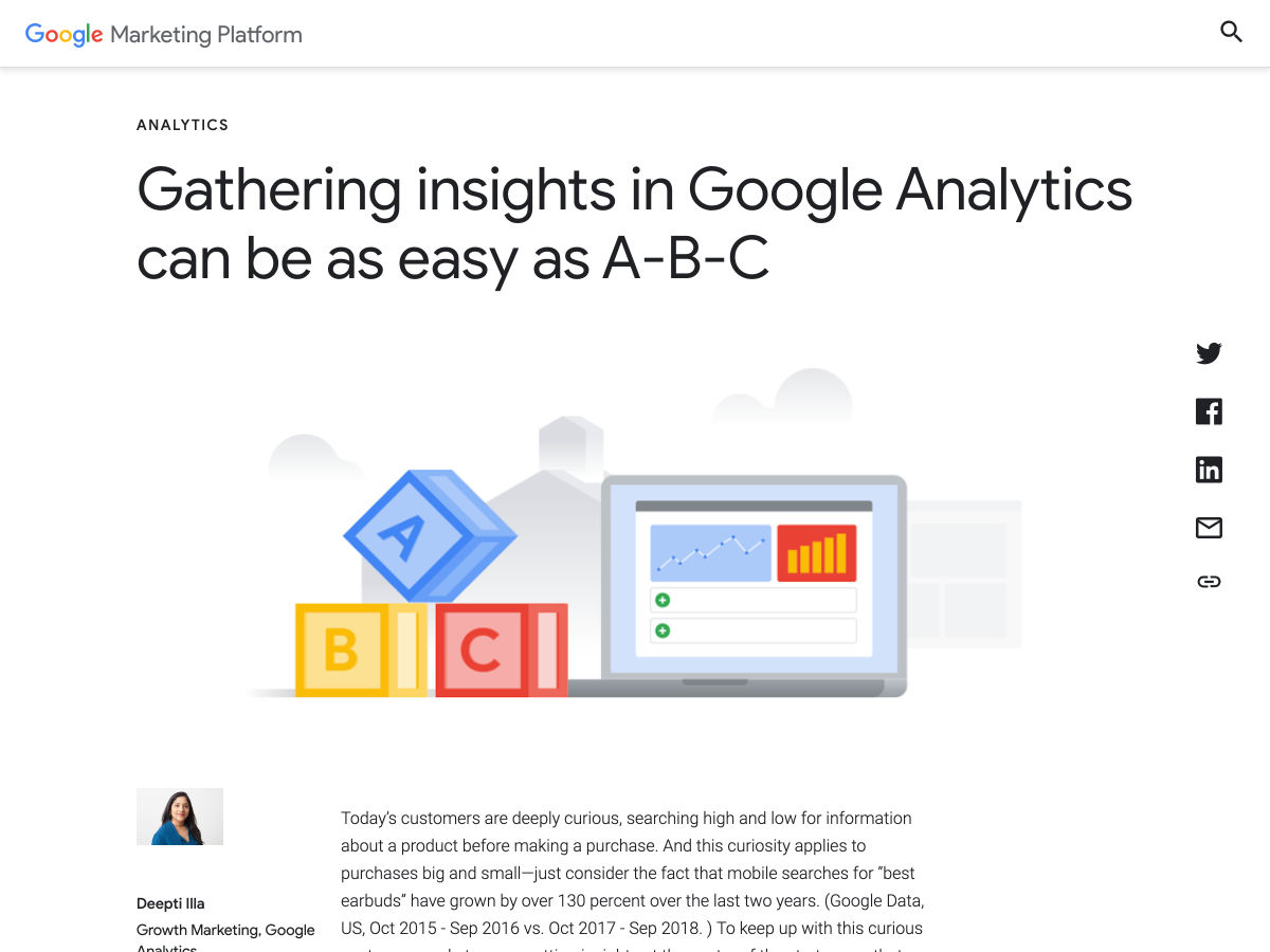
Gathering Insights in Google Analytics Can Be as Easy as A-B-C
The Psychology of Pricing
Insights from Designing One Graph a Hundred Times
Ways to Add Perspective in Design
Helvetica Now
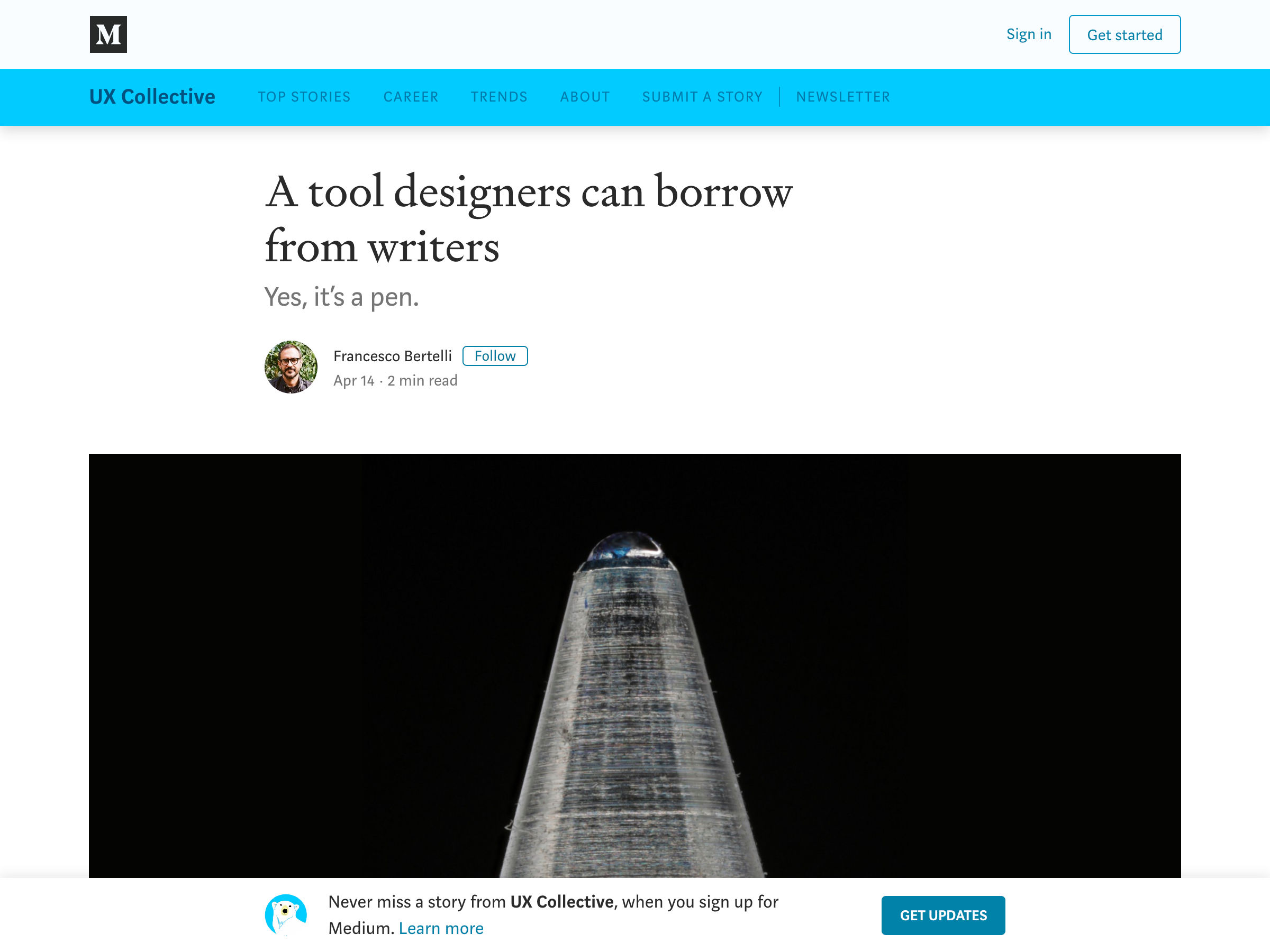
A Tool Designers Can Borrow from Writers
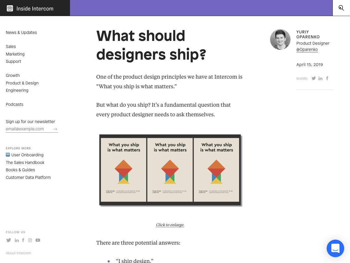
What Should Designers Ship?
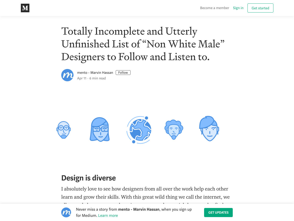
Totally Incomplete and Utterly Unfinished List of Non White Male Designers to Follow and Listen To.
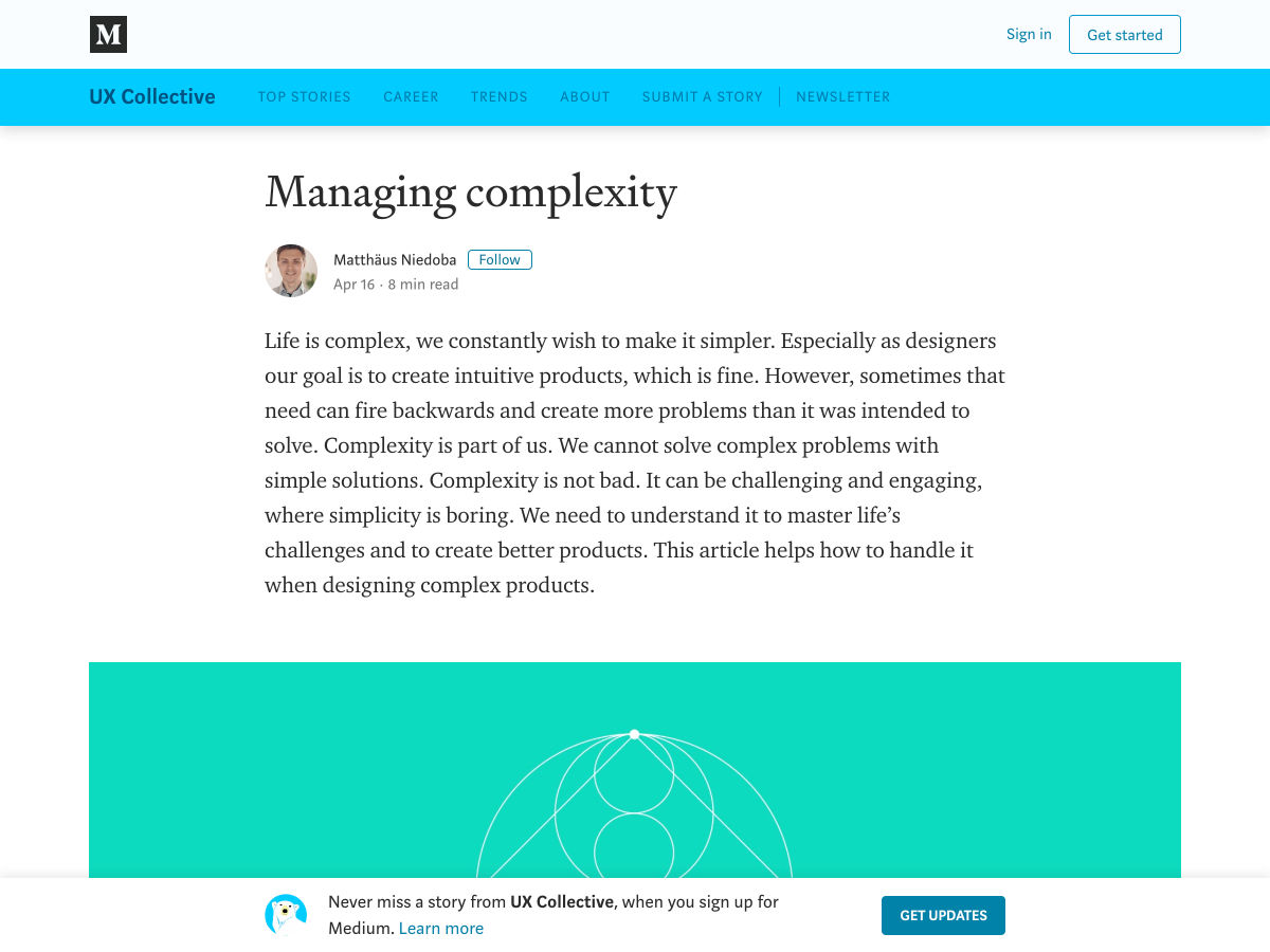
Managing Complexity
Information Architecture: Building Bridges
Want more? No problem! Keep track of top design news from around the web with Webdesigner News.
Scott O’Hara recently published “Inclusively Hidden,” a nice walkthrough of the different ways to hide things on the web. Nothing is ever cut and dry when it comes to the web! What complicates this is that hidden begs the question: hidden for whom? Different answers to that have different solutions:
Hidden for everyone?display: none; or visibility: hidden; or the hidden attribute. (But watch out for that hidden attribute, says Monica Dinculescu.)
Hidden visually, but present for assistive tech? A .screen-reader-only class with a smattering of properties to do the job correctly.
Hidden for assistive tech, but not visually? The aria-hidden="true" attribute/value.
It’s worth grokking all this because it’s is a perfect example of why HTML and CSS is not some easy bolt-on skill for front-end web development. This is critical stuff that isn’t done as correctly as it should be.
As I write this, I’m freshly back from Smashing Conf in San Francisco. Sara Soueidan had a wonderful talk that covered some “hiding things” situations that are even less intuitive than what we might be accustomed to seeing.
One thing she covered was the inert attribute and how it can be used to skip interactive elements from keyboard tabbing. It can even be used on a parent element, nullifying everything inside it. I understood that part, but not entirely why it’s useful since it seems like you might as well use display: none; if an element is hidden and the elements inside aren’t meant to be in focus. But I’m sure it’s my lack of understanding, so I’m looking forward to Sara’s video to come out so I can re-watch it. It had to do with maintaining a non-awkward tabbing order.
Another thing Sara covered is that some folks who use assistive technology also tend to explore touch screens with haptics, moving about the page with their fingers looking for interactive elements. If you, say, replace a native checkbox with a styled checkbox, it’s possible to do that in a way thats mostly accessible by using a real checkbox that you hide and replace with a graphic, but Sara demoed how you can resize the checkbox over the top of the replacement and hide visually with opacity: 0; — that ensures someone can still find the element by touch. That doesn’t seem to be the default way this kind of thing is taught or built, so it’s great to see Sara calling it out. Yet another example of HTML and CSS being nuanced and tricky languages.
We could use that skill to build some tabs, right? Right.
We got this.
Say we have this changing classes ability in our skillset now and we need to build a tabbed interface. If we just add a little more code that deals with click handlers, we could probably wire up some simple tabs, like this:
Totally functional tabs. I might pat myself on the back a little here. See how I used those anchor links to create jump links between the link and the tabbed section? That’s mighty semantic, don’t you think? The tabs are accessible with a keyboard, have focus styles, and can be activated with the Return key.
Did we win? Case closed? Perfect tabs?
Nothing is ever so easy, is it?
One issue here is that we didn’t do anything special with keyboard handling, which tabbed interfaces may require. Heydon Pickering wrote about this:
Unlike a same-page link, a tab does not move the user to the associated section/panel of content. It just reveals the content visually. This is advantageous to sighted users (including sighted screen reader users) who wish to flit between different sections without having to wade back up the page each time they want to choose a new one.
This comes with an unfortunate side effect: If the user wishes to move to a section by keyboard and interact with its internal content, they have to step through any tabs to the right of the current tab, which are in focus order.
Turns out there is a whole checklist of other behavioral things tabs interfaces can and should be doing. In Heydon’s explanation, the Tab key actually acts as a way to jump from the tab itself to the content related to that tab, actually moving the focus. Shift+Tab brings them back. Then the arrow keys are used to change tabs. All this requires more JavaScript and even some HTML to allow for the focus state… plus a sprinkle of aria-* attributes which I lack the expertise to explain you why they are important at all.
So the question becomes: are our class-changing skills actually a detriment to the web because they don’t account for things like this? Is doing things with whatever basic tools we have a net loss for web accessibility? I dunno. Too big of a question for my little brain. It’s interesting to consider, though.
Part of it comes down to muscle memory.
If we learn to code tabs like that first demo there, we’ll tend to reach for that over and over so long as nobody bites our fingers off for doing it. I coded that demo in about three minutes because I’ve done it so many times. Creating those tabs is certainly part of my muscle memory.
There is plenty of talk about JavaScript frameworks being a scourge across the web because they seem to be ushering in an era of worst-in-class accessibility. But what if your muscle memory for building tabs was reaching for a pre-built tabs UI that brings along all the right functionality and left styling largely to you?
That’s what Reach UI tabs are (which assumes we’re working with React…).
I’m not telling you to go out and switch your projects to React so you can get some free tabs, but React is already massive. If good patterns like this become the defacto choice, then it’s possible that the effect is a net gain on accessibility. Seems possible to me, anyway. It might just stop me from poorly hand-coding a tabbed interface for the 359th time.
PWA (Progressive Web Apps) have been with us for some time now. Yet, each time I try explaining it to clients, the same question pops up: “Will my users be able to install the app using app stores?” The answer has traditionally been no, but this changed with Chrome 72 which shipped a new feature called TWA (Trusted Web Activities).
Trusted Web Activities are a new way to integrate your web-app content such as your PWA with yourAndroid app using a protocol based on Custom Tabs.
In this article, I will use Netguru’s existing PWA (Wordguru) and explain step-by-step what needs to be done to make the application available and ready to be installed straight from the Google Play app store.
Some of the things we cover here may sound silly to any Android Developers out there, but this article is written from the perspective of a front-end developer, particularly one who has never used Android Studio or created an Android Application. Also, please do note that a lot of what we’re covering here is still extremely experimental since it’s limited to Chrome 72.
Step 1: Set up a Trusted Web Activity
Setting up a TWA doesn’t require you to write any Java code, but you will need to have Android Studio. If you’ve developed iOS or Mac software before, this is a lot like Xcode in that it provides a nice development environment designed to streamline Android development. So, grab that and meet me back here.
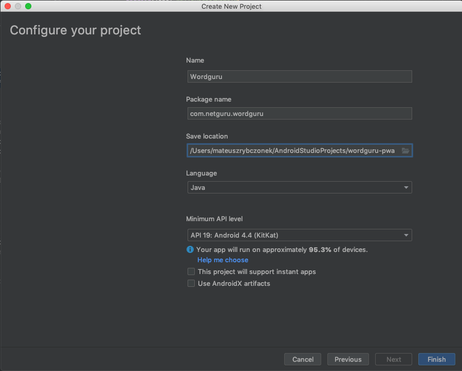
Create a new TWA project in Android Studio
Did you get Android Studio? Well, I can’t actually hear or see you, so I’ll assume you did. Go ahead and crack it open, then click on “Start a new Android Studio project.” From there, let’s choose the “Add No Activity” option, which allows us to configure the project.
The configuration is fairly straightforward, but it’s always good to know what is what:
Name The name of the application (but I bet you knew that).
Package name: An identifier for Android applications on the Play Store. It must be unique, so I suggest using the URL of the PWA in reverse order (e.g. com.netguru.wordguru).
Save location: Where the project will exist locally.
Language: This allows us to select a specific code language, but there’s no need for that since our app is already, you know, written. We can leave this at Java, which is the default selection.
Minimum API level: This is the version of the Android API we’re working with and is required by the support library (which we’ll cover next). Let’s use API 19.
There are few checkboxes below these options. Those are irrelevant for us here, so leave them all unchecked, then move on to Finish.
Add TWA Support Library
A support library is required for TWAs. The good news is that we only need to modify two files to fill that requirement and the both live in the same project directory: Gradle Scripts. Both are named build.gradle, but we can distinguish which is which by looking at the description in the parenthesis.
There’s a Git package manager called JitPack that’s made specifically for Android apps. It’s pretty robust, but the bottom line is that it makes publishing our web app a breeze. It is a paid service, but I’d say it’s worth the cost if this is your first time getting something into the Google Play store.
Editor Note: This isn’t a sponsored plug for JitPack. It’s worth calling out because this post is assuming little-to-no familiarity with Android Apps or submitting apps to Google Play and it has less friction for managing an Android App repo that connects directly to the store. That said, it’s totally not a requirement.
Once you’re in JitPack, let’s connect our project to it. Open up that build.gradle (Project: Wordguru) file we just looked at and tell it to look at JitPack for the app repository:
There are also variables called manifestPlaceholders that we’ll cover in the next section. For now, let’s add the following to define where the app is hosted, the default URL and the app name:
Every Android app has an Android App Manifest (AndroidManifest.xml) which provides essential details about the app, like the operating system it’s tied to, package information, device compatibility, and many other things that help Google Play display the app’s requirements.
The thing we’re really concerned with here is Activity (). This is what implements the user interface and is required for the “Activities” in “Trusted Web Activities.”
Funny enough, we selected the “Add No Activity” option when setting up our project in Android Studio and that’s because our manifest is empty and contains only the application tag.
Let’s start by opening up the manfifest file. We’ll replace the existing package name with our own application ID and the label with the value from the manifestPlaceholders variables we defined in the previous section.
Then, we’re going to actually add the TWA activity by adding an tag inside the tag.
And that, my friends, is Step 1. Let’s move on to Step 2.
Step 2: Verify the relationship between the website and the app
TWAs require a connection between the Android application and the PWA. To do that, we use Digital Asset Links.
The connection must be set on both ends, where TWA is the application and PWA is the website.
To establish that connection we need to modify our manifestPlaceholders again. This time, we need to add an extra element called assetStatements that keeps the information about our PWA.
Now, we need to add a new meta-data tag to our application tag. This will inform the Android application that we want to establish the connection with the application specified in the manifestPlaceholders.
That’s it! we just established the application to website relationship. Now let’s jump into the conversion of website to application.
To establish the connection in the opposite direction, we need to create a .json file that will be available in the app’s /.well-known/assetlinks.json path. The file can be created using a generator that’s built into Android Studio. See, I told you Android Studio helps streamline Android development!
We need three values to generate the file:
Hosting site domain: This is our PWA URL (e.g. https://wordguru.netguru.com/).
App package name: This is our TWA package name (e.g. com.netguru.wordguru).
App package fingerprint (SHA256): This is a unique cryptographic hash that is generated based on Google Play Store keystore.
We already have first and second value. We can get the last one using Android Studio.
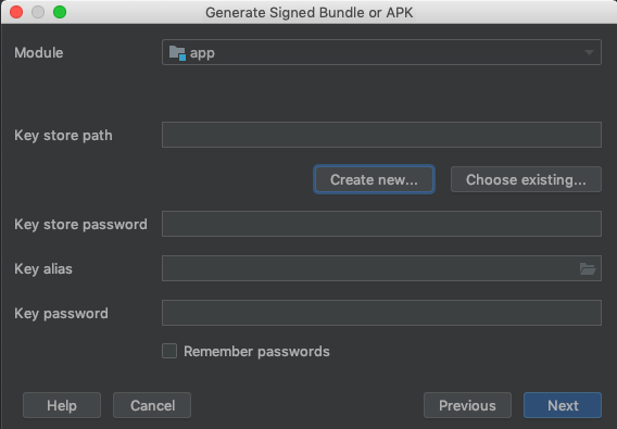
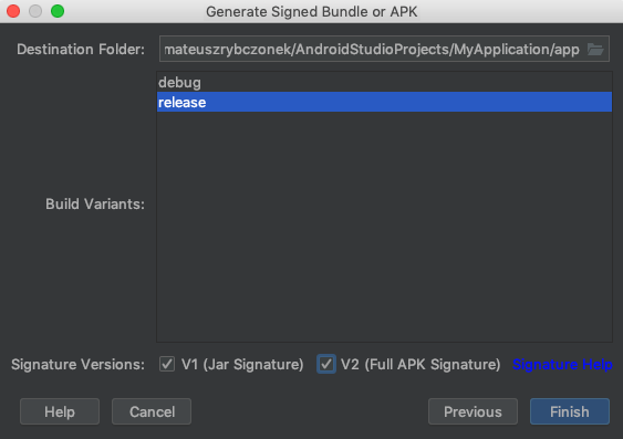
First we need to generate signed APK. In the Android Studio go to: Build ? Generate Signed Bundle or APK ? APK.
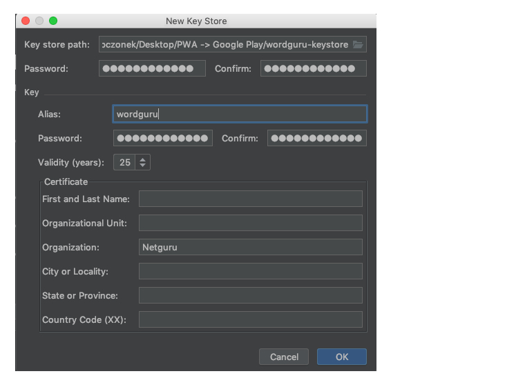
Next, use the existing keystore, if you already have one. If you need one, go to “Create new…” first.
Then let’s fill out the form. Be sure to remember the credentials as those are what the application will be signed with and they confirm your ownership of the application.
This will create a keystore file that is required to generate the app package fingerprint (SHA256). This file is extremely important as it is works as a proof that you are the owner of the application. If this file is lost, you will not be able to do any further updates to your application in the store.
Next up, let’s select type of bundle. In this case, we’re choosing “release” because it gives us a production bundle. We also need to check the signature versions.
This will generate our APK that will be used later to create a release in Google Play store. After creating our keystore, we can use it to generate required app package fingerprint (the SHA256).
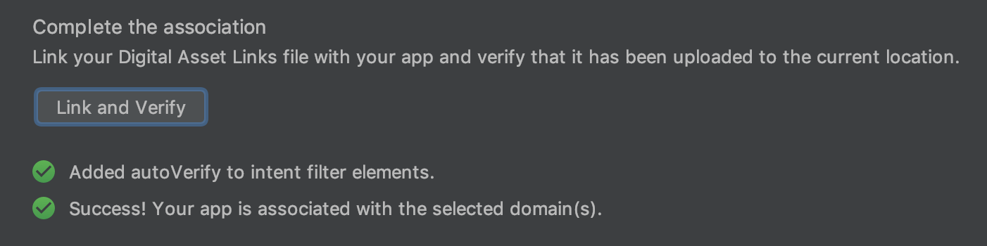
Let’s head back to Android Studio, and go to Tools ? App Links Assistant. This will open a sidebar that shows the steps that are required to create a relationship between the application and website. We want to go to Step 3, “Declare Website Association” and fill in required data: Site domain and Application ID. Then, select the keystore file generated in the previous step.
After filling the form press “Generate Digital Asset Links file” which will generate our assetlinks.json file. If we open that up, it should look something like this:
This is the file we need to make available in our app’s /.well-known/assetlinks.json path. I will not describe how to make it available on that path as it is too project-specific and outside the scope of this article.
We can test the relationship by clicking on the “Link and Verify” button. If all goes well, we get a confirmation with “Success!”
Yay! We’ve established a two-way relationship between our Android application and our PWA. It’s all downhill from here, so let’s drive it home.
Step 3: Get required assets
Google Play requires a few assets to make sure the app is presented nicely in the store. Specifically, here’s what we need:
App Icons: We need a variety of sizes, including 48×48, 72×72, 96×96, 144×144, 192×192… or we can use an adaptive icon.
High-res Icon: This is a 512×512 PNG image that is used throughout the store.
Feature Graphic: This is a 1024×500 JPG or 24-bit PNG (no alpha) banner that Google Play uses on the app details view.
Screenshots: Google Play will use these to show off different views of the app that users can check out prior to downloading it.
Let’s go to the last step and finally push our app to the store.
Using the APK that we generated earlier (which is located in the AndroidStudioProjects directory), we need to go to the Google Play console to publish our application. I will not describe the process of publishing an application in the store as the wizard makes it pretty straightforward and we are provided step-by-step guidance throughout the process.
It may take few hours for the application to be reviewed and approved, but when it is, it will finally appear in the store.
If you can’t find the APK, you can create a new one by going to Build ? Generate signed bundle / APK ? Build APK, passing our existing keystore file and filling the alias and password that we used when we generated the keystore. After the APK is generated, a notice should appear and you can get to the file by clicking on the “Locate” link.
Congrats, your app is in Google Play!
That’s it! We just pushed our PWA to the Google Play store. The process is not as intuitive as we would like it to be, but still, with a bit of effort it is definitely doable, and believe me, it gives that great filling at the end when you see your app displayed in the wild.
It is worth pointing out that this feature is still very much early phase and I would consider it experimental for some time. I would not recommend going with a production release of your application for now because this only works with Chrome 72 and above — any version before that will be able to install the app, but the app itself will crash instantly which is not the best user experience.
Also, the official release of custom-tabs-client does not support TWA yet. If you were wondering why we used raw GitHub link instead of the official library release, well, that’s why.
Are you one of those who strives to get the desired conversion rate out of your website and unable to figure out what’s wrong?
Well, your website’s design and optimization could be the actual culprit!
No matter whether you are relying on the top-notch marketing tactics; a glitch in the overall design and user experience could affect user engagement. It is mandatory for a developer to ensure adequate stability and design that contributes to better user engagement if one needs to generate organic leads.
Dive in here to get the detailed information regarding the biggest blunders that should be avoided to enhance the conversion rate of your website.
Hidden Navigation
There could be nothing worse than a website whose navigation isn’t easily visible to the users! We are currently in an era where time is everything and everyone demands services at a blink of an eye. This the common designing mistake that can annoy the users and would surely compel them to leave the website without a second thought.
What can be more frustrating when you are not able to find a menu on a website when you are expecting quick services? You would probably leave the page at once and would find some relevant website for your purpose. This may seem a minor issue from a user perspective but search engines recognize it instantly and enhance the bounce rate of the website.
The increased bounce rate won’t let your website rank in the top searches of any search engine like Google as per their protocols. One needs to ensure that users stay on their website along with the fact that there are adequate returning users. When you are trying to build your website, it is crucial for you to check the following aspects related to navigation:
Make sure it is visible on the landing page so that the user can navigate to the desired services or information without any hassle.
The navigation bar should be adequately highlighted so that the user can identify it quickly.
Make sure you provide the list of pages in the order of their decreasing preferences (for users). This means you have to put the pages in the front that are most likely to be searched by the users.
No Responsiveness
You just simply cannot imagine a website in 2019 without a responsive design. You have to update your facts regarding the users that are relying on smartphones and mobile devices such as tabs, which have now crossed 75 percent of the total internet users in the world! This simply implies that you should first choose a responsive design and then work on any other aspect.
It would be really tough for you to generate leads through a website that is solely designed by keeping in mind the desktop users. Imagine you get a reference or a company’s details that offer adequate services as required by you and open their website on your phone and get unaligned text and layout. Sounds annoying, isn’t it? Well, in this scenario, anyone would leave the website with a negative impact on their mind.
So, who’s responsible for this situation? Undeniably, a non-mobile-friendly website design! If you are not targeting the mobile audience, you would probably lag behind your competitors. As per the recent survey, the ones that are emphasizing more on the mobile-friendly design are able to generate organic leads and thus have a higher conversion rate as compared to the ones that don’t.
Here are the key points to consider while developing a responsive design:
Make sure to prefer a responsive theme if you are developing your website in WordPress, which would hardly require many efforts.
Do check your website on different devices once it is developed using the right optimizing strategies.
Ensure that the responsiveness of your website is stable when you alter the website with the integration of the plugin.
Wrong Positioning of Ads
One cannot deny the fact that advertisements are crucial for a blog or a website that is about to start a revenue model. But you have to give a pause to your cravings for the revenue and analyze the exact position to apply the advertisement to engage users.
Most of the users find these ads annoying, which is again a strong reason for them to leave the website. According to the Google Ads experts, the positioning of the Ads plays a major role in deciding the revenue as well as the user retention rate on a website. If you are not sure about the correct positioning of an advertisement on your website, it is strongly recommended to consult an expert for the same.
A lot of video tutorials are available online that can guide you appropriately when it comes to placing an advertisement on your website without annoying the users.
Inadequate Contact Information Form
What if your users aren’t able to fill the contact us form on your website? You probably won’t get leads and no one would ever wish to miss a client just because of this silly mistake! One need to understand that the more compact the contact us form would be, the more it would be easy for the user to fill the same.
Avoid adding unnecessary details for the users that eat a lot of time while they need to fill an inquiry form. The form should be simple and should only demand the necessary details such as contact number and email so that you can get back to them regarding their inquiries.
Apart from this, you should ensure that your contact form should be visible on every page of your website in a way that it can be easily accessed whenever the user wishes to.
Inadequate Use of Content
Last but undeniably not the least, the content on your website should be adequate enough to engage users with the ability to convey the message clearly. Most of the websites out there aren’t able to depict their services properly, which is perhaps the reason why you also need to focus on the quality and relevancy of the content.
You have to place the content that shouts loud about your services in a way that it satisfies the user that they are in the right place. This would lend a hand in getting organic leads without struggling and relying on worthless techniques. You can go through the tutorials regarding the utilization of the content for enhanced user engagement.
These are some common web designing mistakes that one should avoid so as to get the right conversion rate and increase their business revenues.
We are currently living in an era that is facing constant digitalization. Most consumers are brought towards brands solely through digital media and content.
One such form of digital content that is gaining great prominence is video. Surely content is king but static visuals and text-based content do not work anymore. If your intention is to provide value to your customers and strengthen your presence at the same time then you would have to rely on animated video content.
Social networking and video streaming platforms are aplenty but YouTube is leading the competition as of now. Various digital marketing techniques and platforms are available but YouTube has become an integral part of online advertising so marketers, strategists, and animators should know its value.
Understanding the popularity of YouTube
According to Statista, YouTube currently has over 1.5 million users on a global scale. That is surely not a minor number as this user count is expected to increase to 1.86 billion any time soon. This fact suggests how a video-streaming platform can easily become a core hub for digital marketing.
The expected gross revenue generated from YouTube in 2018 was 20.4 billion U.S. dollars. This conveys that YouTube can even become a lucrative source for revenue generation. If you are aiming to build an online presence for yourself then here are some major video trends that you can make the most out of on your YouTube channel.
Live Streaming
Some live-streaming platforms were solely meant for streaming video games and Twitch has been widely used for it. However, social media sites and apps now have the option of live streaming as well. Facebook Live focuses on a wide range of topics and content but YouTube still has more power over both these platforms. Some of the most viewed videos are already on YouTube but no one could comprehend that the Royal Wedding live stream could secure 11.2 million views. Since YouTube is all about subscription count and quality content, you might not gain views on live-streams if you are a business but it can still bring a significant and positive impression on your presence.
Viral Internet Challenges
Social media is filled with internet challenges on a monthly basis. Some challenges are made only for virality and are uploaded usually on YouTube. Most of these fun viral challenges are uploaded on YouTube and social media profiles but one can bring the depth of social wellness into these challenges as well. The ice bucket challenge, in particular, was meant for fundraising and it became a global phenomenon. Popular YouTubers, influencers, social workers and celebrities took part in this challenge and as a result, it became a huge success.
Training and eLearning Videos
Content on YouTube is not limited to only the entertainment domain. eLearning content has gained popularity on online platforms and YouTube has a major role in it. Since live action videos for learning purposes can be costly, you could resort to using an animated video explainer. This notion would bring more and more people towards your audience since animated videos are engaging and interesting to watch. With short length videos, less time would be consumed and a greater quantity of people would prefer viewing your content.
Unboxing Videos
Unboxing and haul videos are somewhat similar. Such video content has been around on YouTube for a while but now unboxing videos have taken a shift towards being lucrative for marketing purposes. As the name suggests, the camera’s focus is on the package or product that is going to be unboxed and then reviewed. It is more of a review video but the anticipation such content builds has made it famous among several YouTube users. Popular subscription-based boxes such as Loot Crate, Ipsy and Boxycharm are mainly a part of unboxing videos.
Shopping Videos
Shopping and haul videos are typically popular among bloggers and influencers. This trend of haul videos might not be relatively recent but such content is also a part of the trending videos on YouTube. While this specific content style can be opted by anyone, it is still on the rise amidst popular and emerging influential bloggers. Since female bloggers contribute to haul videos often, an approximate of 40% of people who view such content purchase the products and items displayed in the video. However, retail brands are now reaching out to YouTube influencers to highlight the products they are offering.
Gaming Channels
This domain is somewhat limited to a smaller audience but a few platforms already exist for streaming and uploading games. While both YouTube and Twitch have the option to monetize content, what visible benefit does it have for marketers and brands? The popularity of online games and console games will probably never decrease. If a brand or company wants to market electronic goods and products for gaming, they would certainly need someone to showcase the products online. That is exactly where the role of YouTube comes into play as that specific brand could reach out to its customer through the existing famous gaming channels.
Celebrity Channels
Quite a few Hollywood celebrities have joined YouTube recently. Each celebrity has a different focus on video content. Some make vlogs to connect with fans, while some showcase their product launches. These celebrities also resort to social media platforms but YouTube is a prominent platform for those who want to keep their focus on quality videos. However, how does it benefit marketers? Marketers are able to form an association with both online influencers and celebrities at once. If a business or marketer shares a viral post or video made by a celebrity then as a result, it would capture user attention on a greater scale.
Virtual Reality Videos
The application of virtual reality technology has spread among several different types of industries. From gaming videos to building shopping experiences, virtual reality can be found almost everywhere. However, nobody expected that VR technology would benefit the real estate business. Virtual reality videos and walkthroughs are being used for architectural visualization of the interior and exterior of properties. Since VR is more than 3D visuals, the viewers can interact and engage with the surroundings before making a purchase decision.
Conclusion
The upsurge in the fame of video content seems almost uncanny. The types of digital content are emerging slowly and YouTube has played a visible role in the notion of digital marketing done solely through videos. Innovational and interesting ideas for digital media and content are unceasing. No matter what medium or platform you have chosen, the video will always yield you the results you are looking to get.
The probability of securing a position in the top trending category on YouTube is not a far-off reality. Instead, if you make use of the right strategy and marketing approach, you will acquire visibility and recognition in no time. Now is not the time to fret but it is the moment to make the most out of YouTube.

