Welcome to our monthly roundup of the freshest web designs, released (or rereleased with significant updates) in the last four weeks.
This month’s selection eschews popular trends in favor of intelligent design that supports brand identity. As always, scrolling plays a big role, but parallax is less dominant than it normally is. Across the board, designers are opting for the less obvious choice, which gives us a rich variety to indulge in. Enjoy!
Playdate
The gaming world is awash with excitement over Playdate, a handheld gaming system due to launch in early 2020. This site does a wonderful job of focusing on the single CTA, and the copy does an awesome job of being exited about the product.
Studio Brave
It’s always a brave decision to open your site with fullscreen video, but in this case it works well—mainly because the work on show is of such a high caliber. Normally custom cursors are a turn off, but this one is fabulous.
40075
40075 is an interactive experience designed to help you discover exciting musical artists from around the globe. Artists profiled include Songhoy Blues, and Gily Yalo. It’s a great way to uncover music you might not have heard yet.
Plein
The site for Plein exudes simplicity, cleanliness, and wellbeing. Selling an innovative range of vitamin films that offer everything from alertness, to an improved immune system, the site is an excellent way to sell an intangible product.
Under
I’ve always been a sucker for a clever logotype, and the mark for Under, the Norwegian underwater restaurant, is one of the best. The site itself exudes the quality of Scandinavian design, proving that it’s simplicity that sells luxury.
Oas
The website for self-proclaimed “Swedish Resort Brand” Oas, does an incredible job of telling the brand’s story, helping it to stand out in a saturated market as one of the labels to watch. Nothing says vacation like palm tree print flip-flops.
Contrast Visuals
Contrast Visuals’ site takes a minimal approach to presenting its portfolio. There’s the simple menu toggling between “work” and “info”, and a native scroll through a very impressive client list of video and film work. Plus I love the animated logo.
Usual
Remember when we all laughed at the idea of brutalism being a thing? Welcome to Usual, a new approach to drinking wine that allows you to purchase single-glass sized bottles via an unusually modernist site for a luxury item.
Sonos
There’s a certain aesthetic, championed by Apple Music, Spotify, and others, that Sonos captures perfectly with its site. When you’re not a leading player in a market, perfecting an established style and making it your own is a superb tactic.
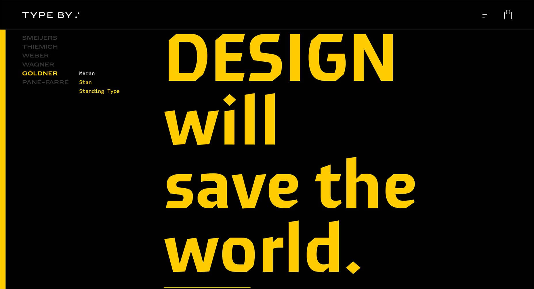
Type By
What designer doesn’t love a type-only site. It’s particularly easy when you’re a type foundry, but you still have to keep users engaged. This site for Type By, works entirely on tap and scroll, but there is something about it that is very compelling.
Golden Hum
Golden Hum is an LA-based sound design agency. Their site is a little difficult to navigate, but keep at it and you’ll be rewarded with some exquisite soundscapes all backed up with some incredible visuals.
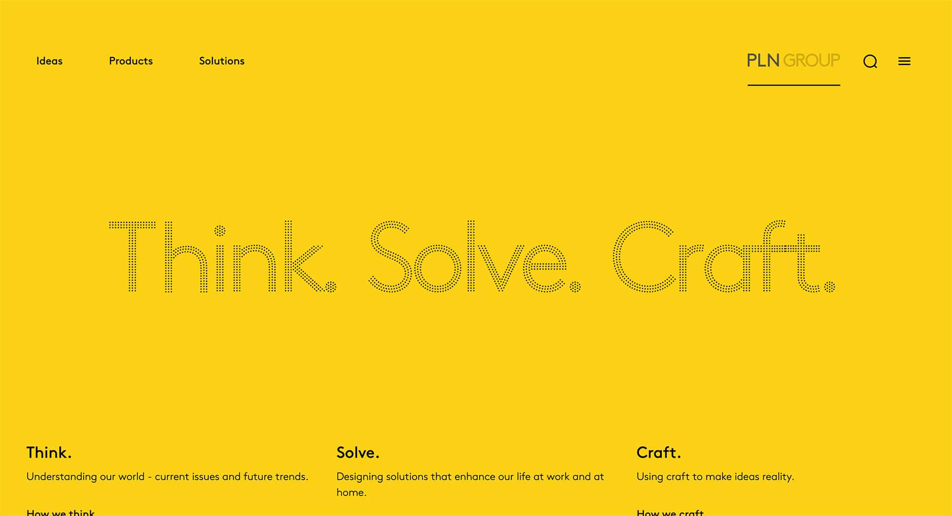
PLN Group
The marketing of the PLN Group is a little too PR-speak for many people’s tastes, but there’s a great sense of style about their site, which manages to be both young and interesting, while still mirroring the corporate culture they’re pitching to.
Freakshow Maskerade
There seems to be a trend among newer wines to reject the luxury label and embrace the kind of marketing normally reserved for spirits. Freakshow has developed its own app allowing you to filter your selfies as characters from its labels.
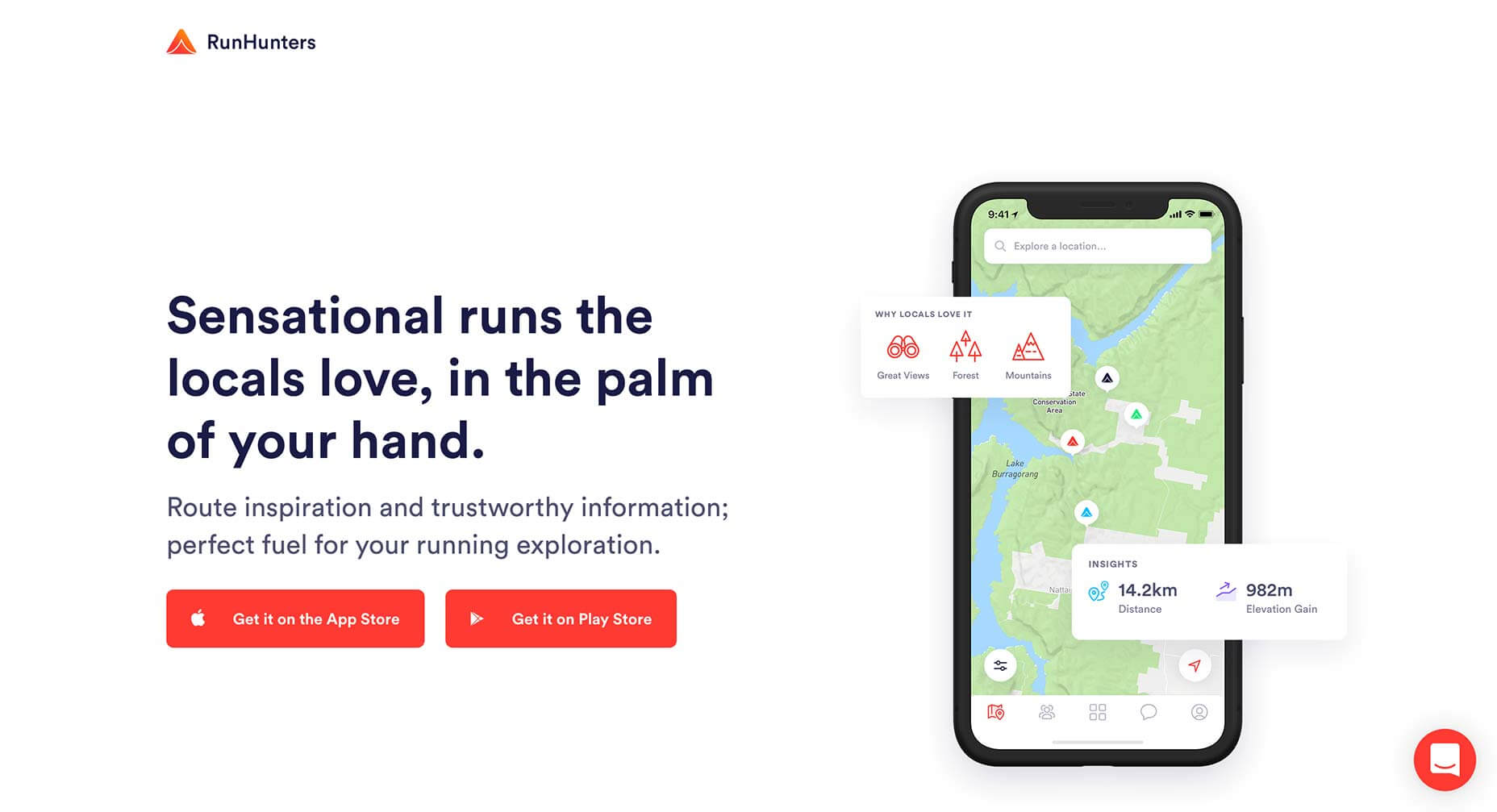
RunHunters
RunHunters is a running app that’s all about exploring new areas, breaking out of your usual routine, and the site reinforces that message by breaking the UI out of the app screens. It’s been done many times, but rarely as effectively.
Keus
Sideways scrolling is a much-maligned approach, but it would be difficult to object to the way it is used on Keus’ site. This site manages to achieve what all good ecommerce sites aim for, an enjoyable way to browse.
Isabel
Isabel is a bar in Denver, Colorado. The site is super-grid orientated, but what’s really eye-catching is the use of blackletter for the branding. Seriously, any site that contributes to reclaiming blackletter is worth 5 minutes of your time.
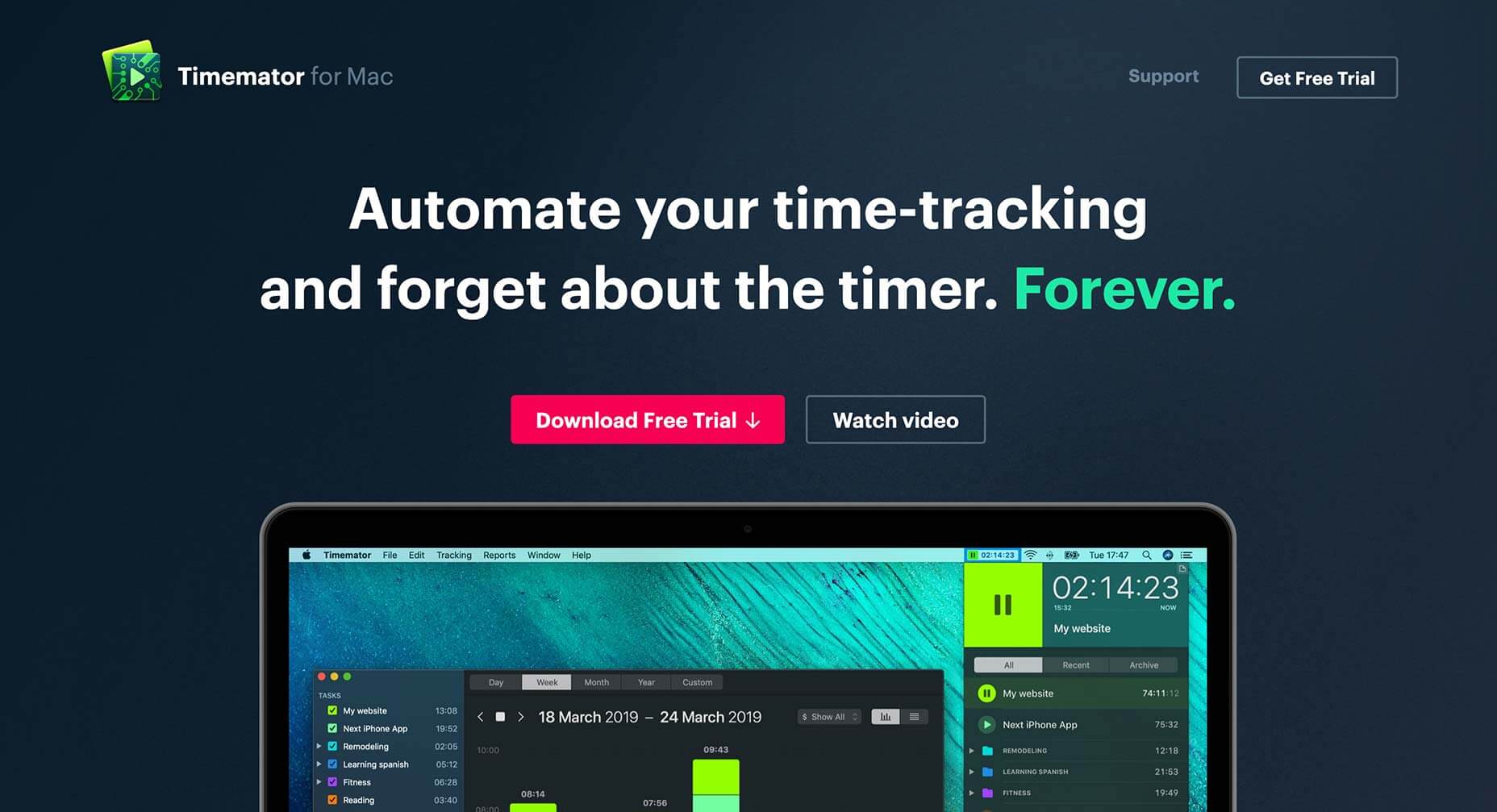
Timemator
Timemator is an auto-time tracking tool for keeping a record of what you’re working on at any time. Its dark-themed site reminds us of various design apps and for this reason it perfectly pitches itself to its target customers, design professionals.
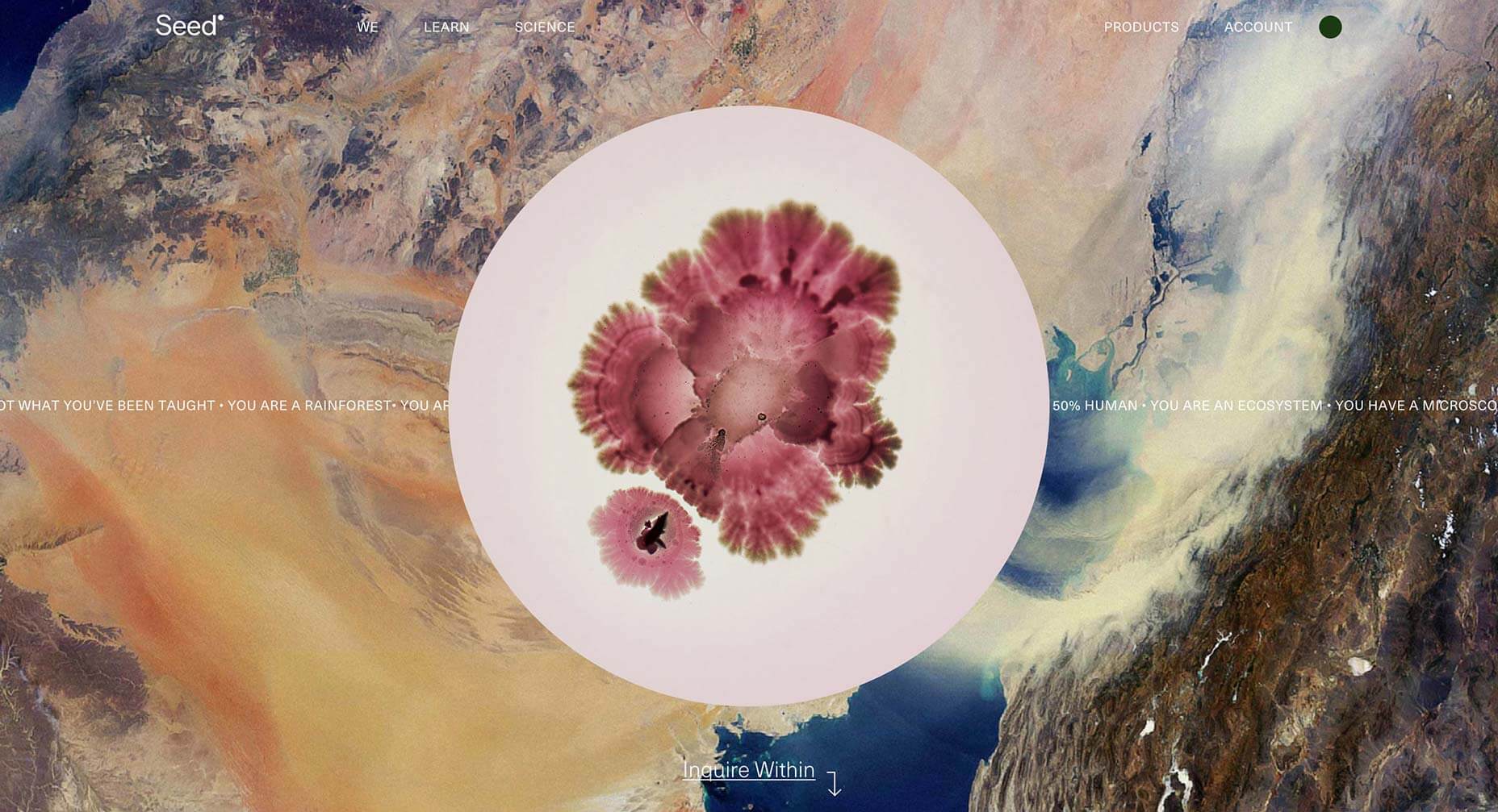
Seed
The attention grabbing aspect of Seed is the juxtaposition of micro- and macro-photography, but what’s really engaging is the story being told of the ecosystem that each of our bodies is made up of. It’s a positive, and enticing message.
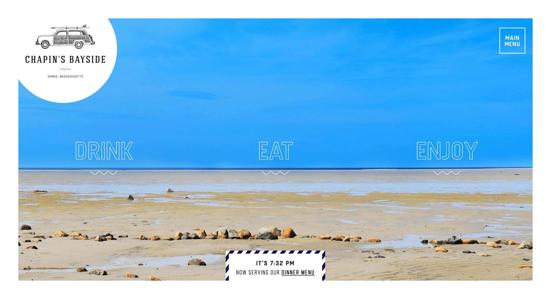
Chapin’s Bayside
This simple site for a restaurant and bar in Dennis, Masschusetts, is packed with lovely details, like the subtle animation on the menu items, and the page transitions. It’s an understated piece of excellent design.
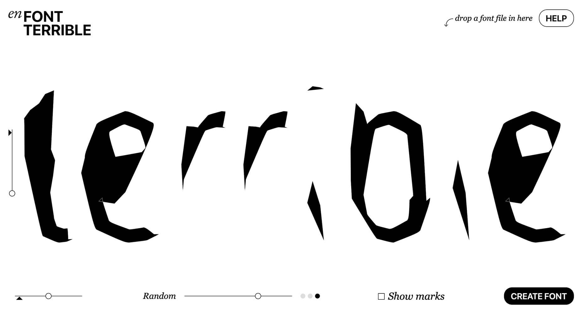
En Font Terrible
Back when the web was young, designers put up pointless sites, that presented interesting but ultimately useless ideas. It was fun. Harking back to that era is En Font Terrible, a site that will auto-generate a font you’ll never use.
Every week users submit a lot of interesting stuff on our sister site Webdesigner News, highlighting great content from around the web that can be of interest to web designers.
The best way to keep track of all the great stories and news being posted is simply to check out the Webdesigner News site, however, in case you missed some here’s a quick and useful compilation of the most popular designer news that we curated from the past week.
Note that this is only a very small selection of the links that were posted, so don’t miss out and subscribe to our newsletter and follow the site daily for all the news.
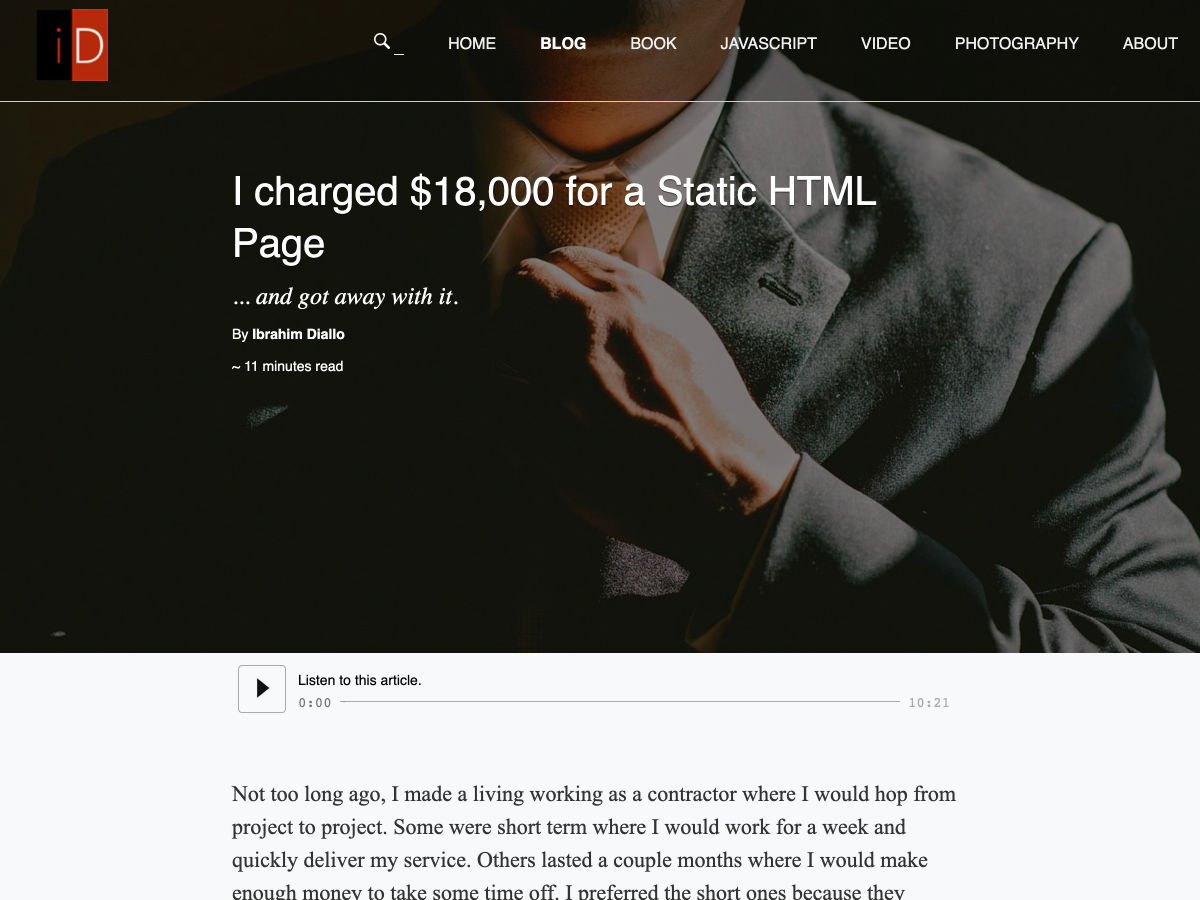
I Charged $18,000 for a Static HTML Page
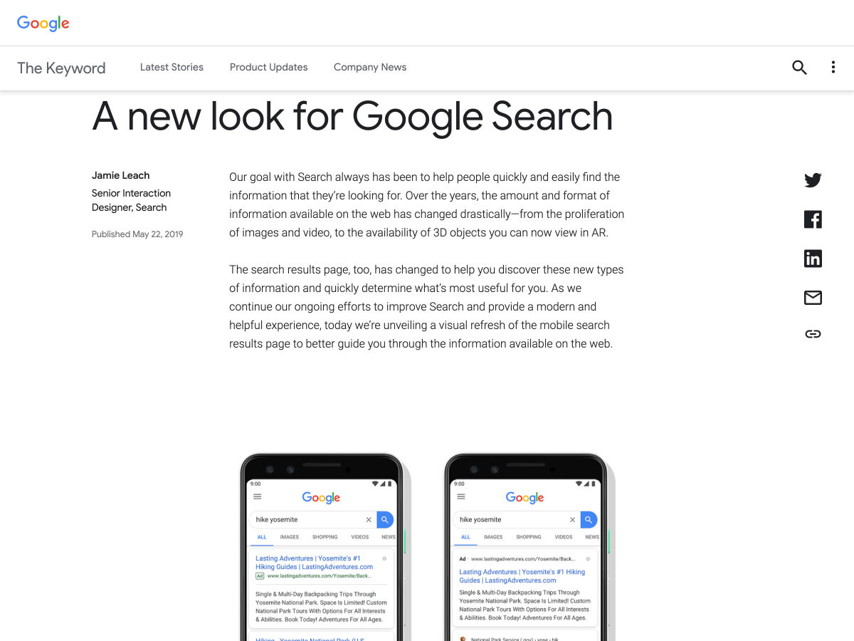
A New Look for Google Search
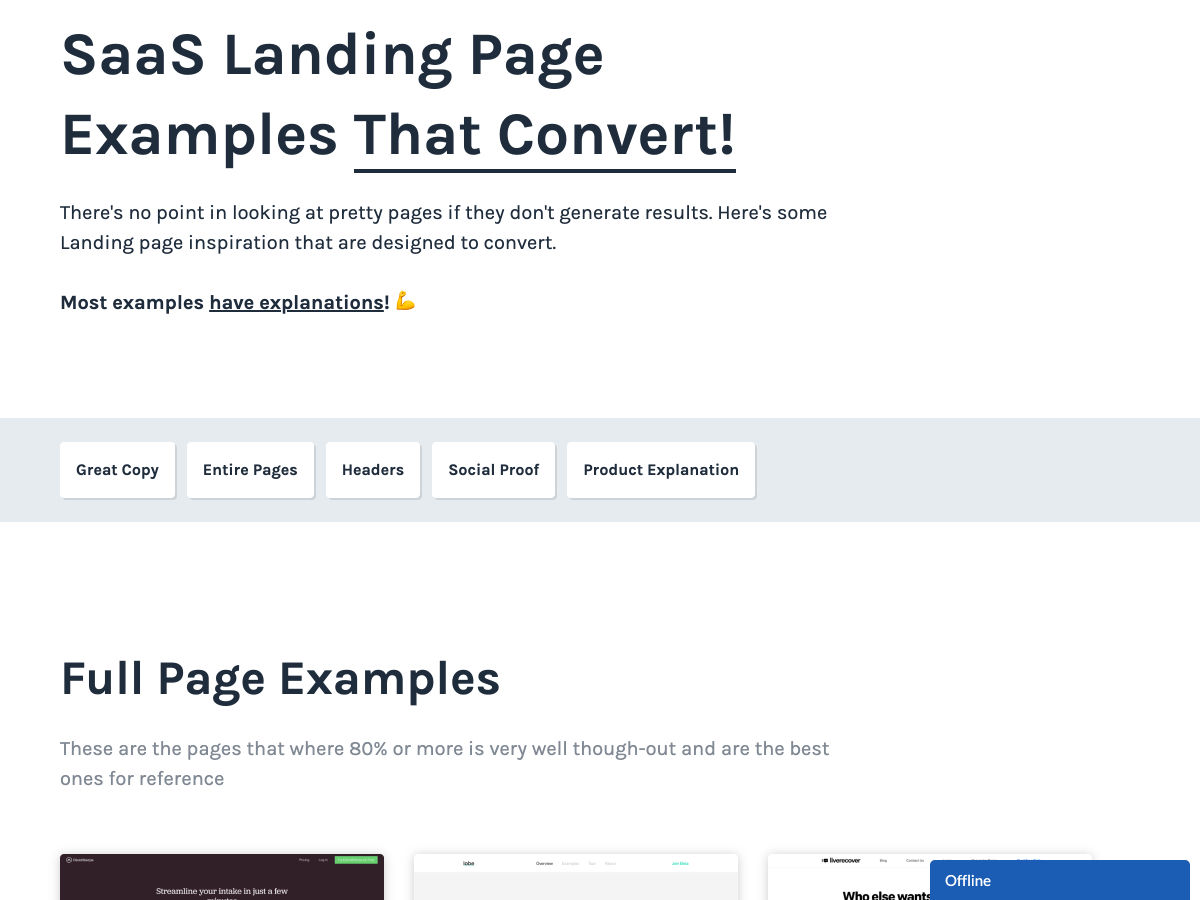
Landing Page Inspiration
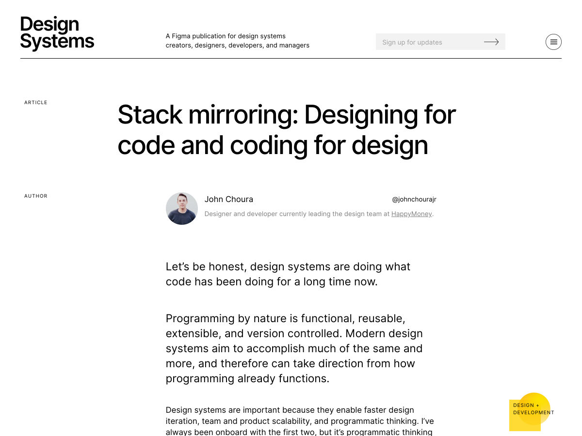
Designing for Code and Coding for Design
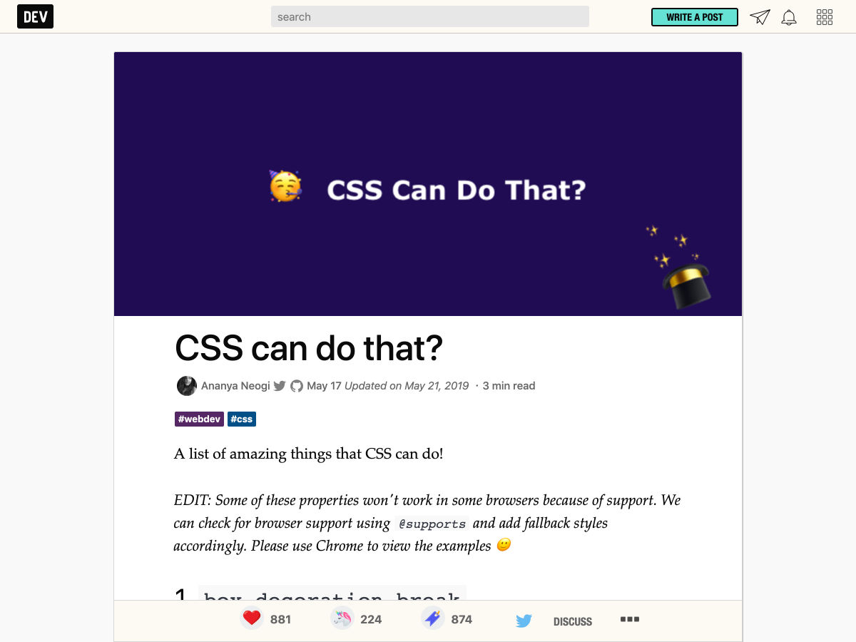
CSS Can do That?
Things I Wish I Knew Before I Started Web Development
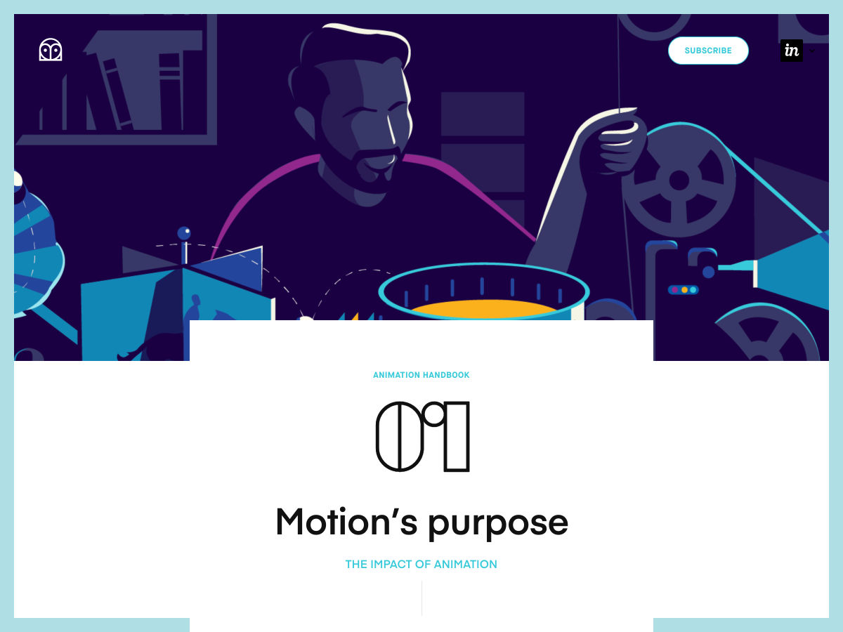
Animation Handbook
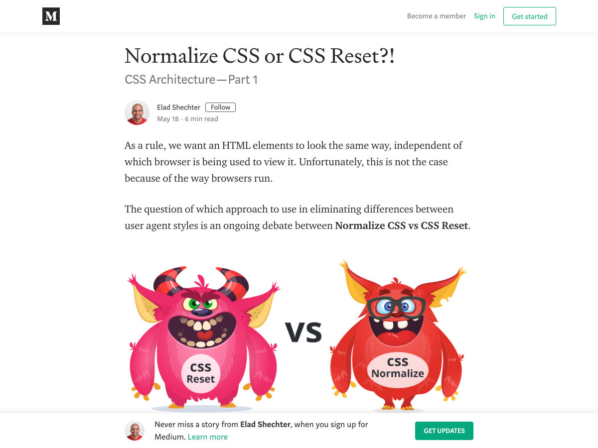
Normalize CSS or CSS Reset?!
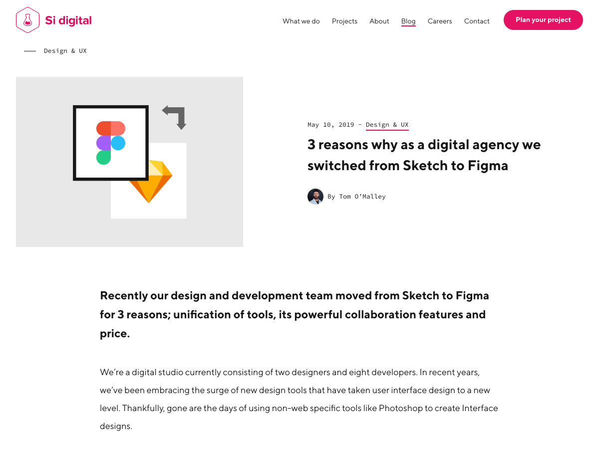
3 Reasons Why as a Digital Agency We Switched from Sketch to Figma
My Git Workflow
Meet the All-new Typography.com
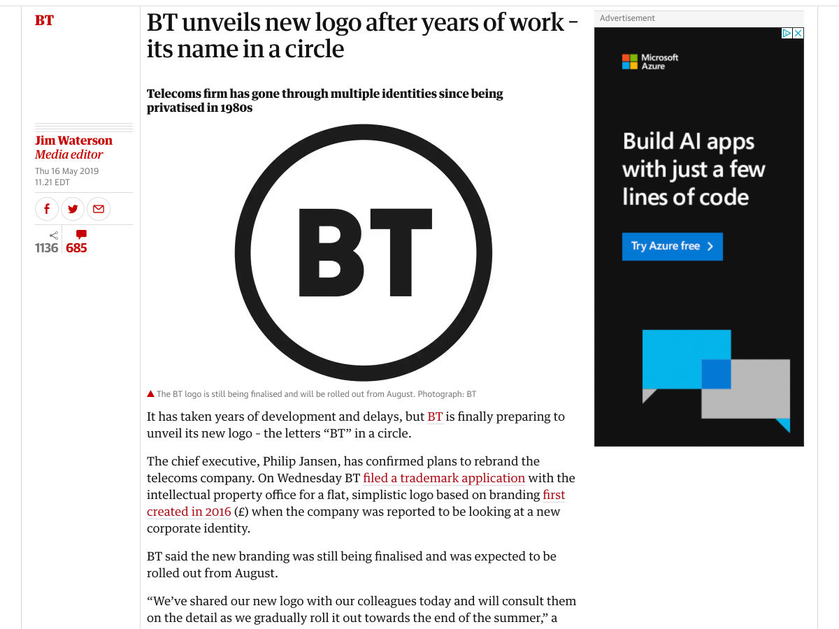
BT Unveils New Logo After 3 Years of Work
Front-End Documentation, Style Guides and the Rise of MDX
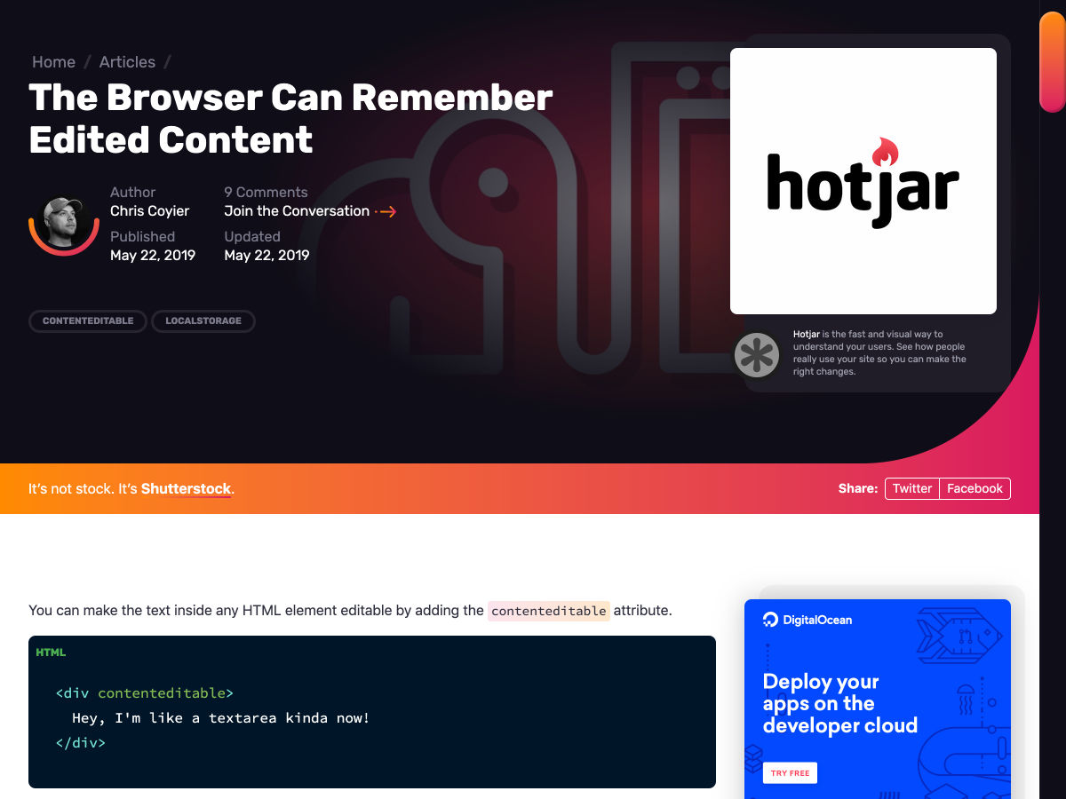
The Browser Can Remember Edited Content
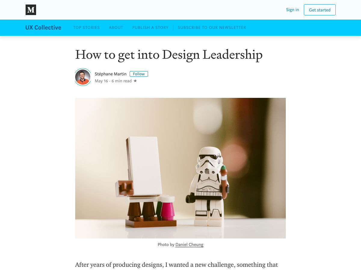
How to Get into Design Leadership
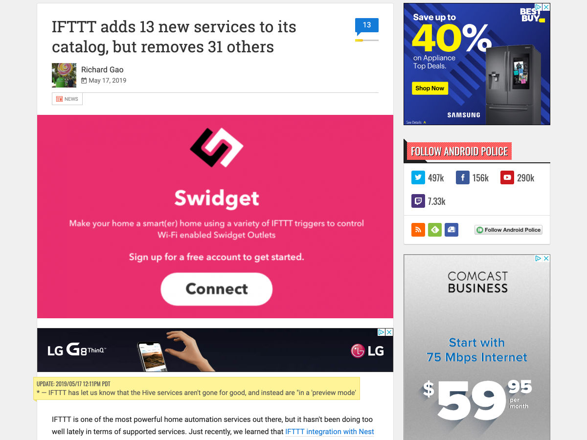
IFTTT Adds 13 New Services to its Catalog, but Removes 31 Others
Augmented Reality for Art
Random Colors
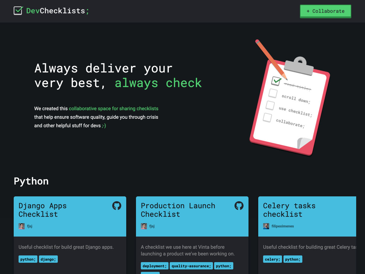
A Collection of Dev Checklists
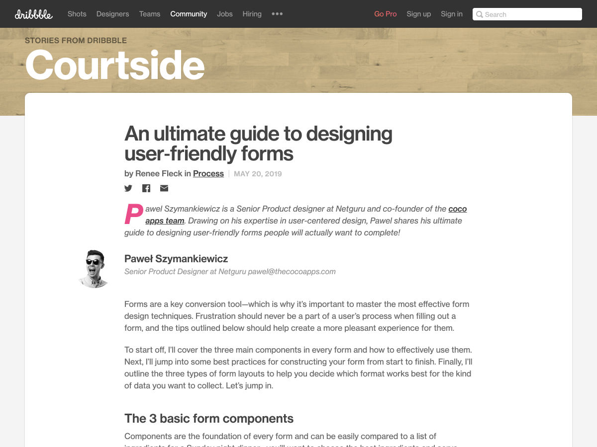
An Ultimate Guide to Designing User-friendly Forms
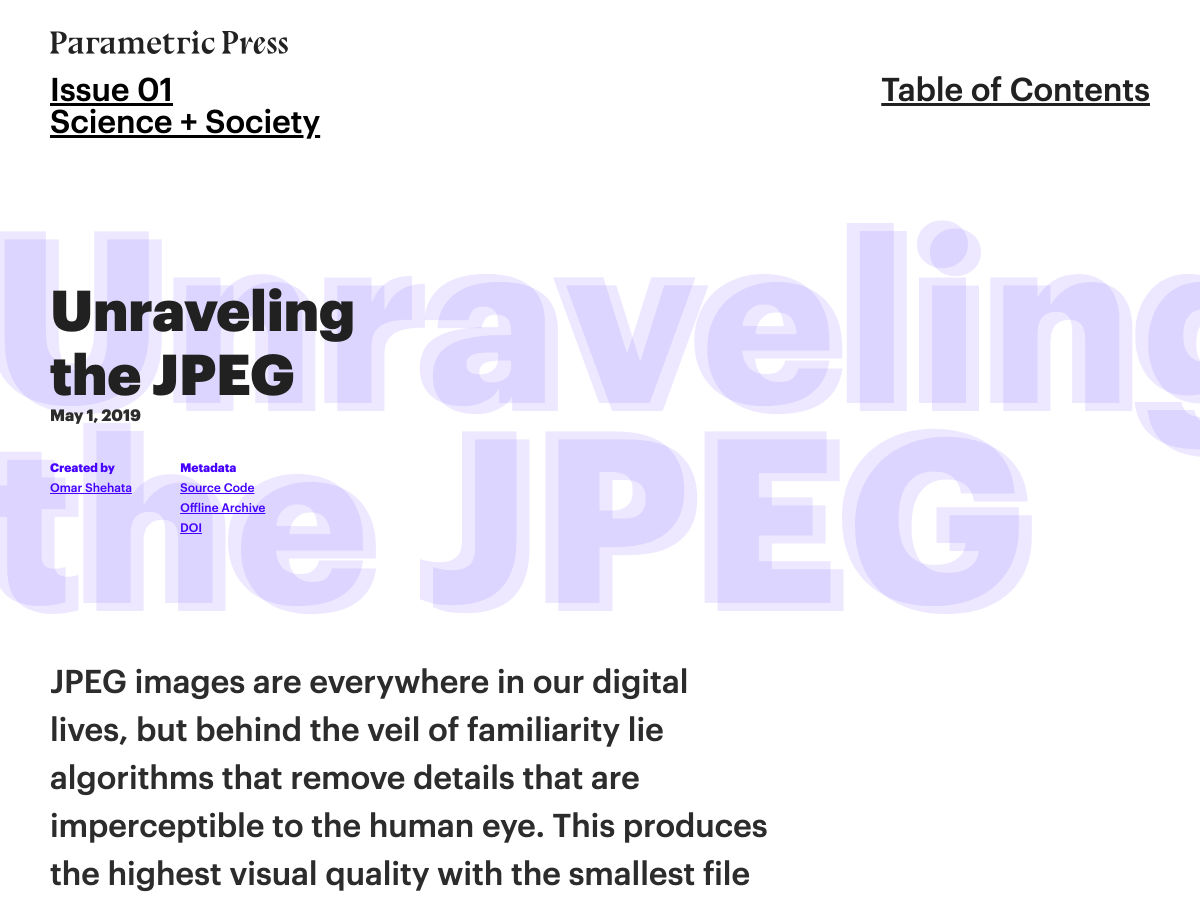
Unraveling the JPEG
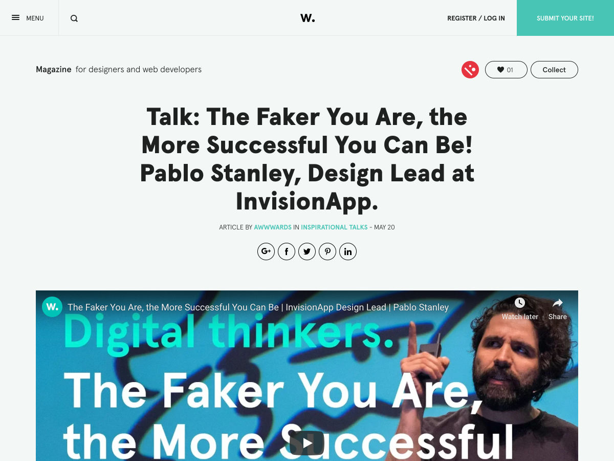
Talk: The Faker You Are, the More Successful You Can Be!
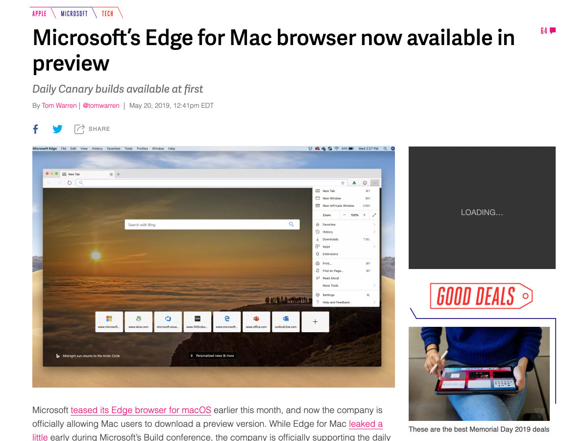
Microsoft’s Edge for Mac Browser Now Available in Preview
Watch Out for these Phrases Designed to Trap Freelancers
HTML Emails 101 for Web Developers
Want more? No problem! Keep track of top design news from around the web with Webdesigner News.
The professional designers that have chosen these next classic fonts have different opinions on what makes a font stay up to date, even decades after it was created. While some might not look classic to you, they all feature elements that are a trend today and will always be a trend. The font is the frame of any text, you see it and read it, but the font can distract you from the main idea if not chosen with care. This is where classic fonts come into play. Their purpose is to keep the reader’s focus where it should be: on the meaning of the text.
Classic Fonts, due to their simple aspect, are used more than any other categories of fonts. They are versatile and easy to incorporate into any project that is oriented towards offering information. This should not stop you from using them in other types of projects. They have the power to offer a logo, a business card, a packaging, a. o., an unforgettable look. Simple doesn’t mean mediocre, therefore, a simple font can and will always stand out in the crowd.
Our designers at Web Design Ledger have carefully gathered 40 of the Best Classic Fonts so that you can use this resource your own benefit. We have to mention that some of the fonts below are free classic fonts, and some are paid. Let’s get started.
CLASSIC SERIF FONTS
Each classic serif font features sleek lines, delicate serifs, and elegant details. Therefore, they are perfect if used as headers as they create a great visual effect. Such fonts are imposing, yet elegant, authoritative but not strident. Moreover, they have a gentle personality, not as strong as the script classic fonts, for instance. Here are some great ways you can use classic serif fonts: on magazine covers, newspaper headlines, disc packaging, urban companies logo, billboard texts, and others.
The classic sans serif fonts look a little bit more technical than the romantic serif fonts, but still very versatile and unique. However, Sans Serif fonts do have a more modern aspect that will always be a trend. A sans serif font will never steal the attention from the text, but will remain neutral. Therefore, the reader will be given the opportunity to form a personal opinion. Here are some great ways you can use classic sans serif fonts: in books, instruction brochures, minimalist designs, packaging, official letters and documents, movie titles.
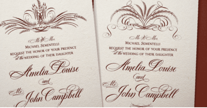
Classic Vintage Fonts are a trend now more than ever. They give any project a natural touch, an old-school vibe, while still keeping the text stylish. Classic Vintage Fonts are associated with photography and many photographers seem to use them for their logos. Moreover, these fonts have a warm, homey voice, giving any graphics project a charming aspect. Here are some of the best ways you can use them: amazing in packing of any kind, logos and business cards for businesses that deal with people directly, fiction book covers, wedding invitations, and others.
Because most Classic Cursive Fonts are handwritten, they have the most humane looks. The cursive font will always be your ally when you want to transmit emotions, feelings, attitudes, states of being through text. Classic Cursive Fonts have the ability to empower words, therefore they feature a strong personality. While the range of projects you can use script font is rather narrow, there are plenty of options to choose from. You can use classic cursive fonts in the packaging of personal, even intimate products, intimate invitations, love letters, history-related projects, posters, stamps, tags for elegant clothing, and others.
All four categories of classic fonts that we mentioned above should feature in every designer’s tool kit. Consider then a one-time investment because they will stay classic forever.
We hope that you enjoyed the list above and that you found what you were looking for. We know that there are hundreds and thousands of cool classic fonts that we could’ve added to this list. But for now, we leave you with these hoping that you will visit our blog again soon.
I work for Supercool, a fast-moving design agency that makes custom built sites for arts clients, powered by the off-the-shelf system, Craft CMS; it’s high-spec graphic design with relatively demanding typography and art direction. Over the past few months we’ve been moving to CSS grid. We’re transitioning slowly, allowing ourselves to discover new paradigms and design methods, instead of simply porting old habits to a new syntax.
So far, we’ve developed a number of really useful strategies for keeping track of the layout. I’ve written a couple of surprisingly nifty mixins, using named areas and templates, and we’ve hit upon some basic conventions to create highly readable code. I thought it would be valuable to walk through a fully-developed production implementation of a single major component using grid, digging in to some of the design questions it throws up and steering you away from some pitfalls we’ve encountered. CSS grid is a large spec, with lots of possible approaches and lots of right ways to do things, but at some point you have to lock down your method and get it live.
I’m expecting some basic familiarity with CSS, Sass, BEM, and some interest in the task of prototyping fully-realized, accessible, custom frameworks with 50+ components from Sketch or Photoshop-type documents on a tight timeline (say, a week).
First, let’s identify and separate out the design into distinct coding tasks and plan how we’ll approach them:
Type: The designer has already defined a type system.
Colors: First, we build a theme model and then include that in the partial.
Content: What elements are in this block? What are its variations? This is where our BEM mixin comes in.
Layout: This is how the content is placed in the block. You might want to skip directly to this.
Conventions: This is exactly how we choose to write all the above. There are many right answers in CSS, so what is important is that we all just agree to a convention, the rules of the road. This really comes first, but for the sake of this article, we’ll conclude here.
Type system
We use utility classes (e.g. h-text--h1, h-text--badge) for type styles. There may be a hundred type styles in a project. We export those styles from Sketch right into our Patternlab using Typex. That’s a whole other article on its own, so let’s just stipulate type as handled. We won’t bring type into our component partial.
Theming is a few tiny mixins dropped in, so we ideally won’t see a ton of color rules in our partial. We store them all together in a _themer.scss partial in our “Mixins and Models” library, so we can be sure to follow the design system of the site. This way, when someone comes back to the build later on, they have a key reference partial describing the design and branding rules. When building and maintaining numerous sites in broadly the same market — but each all with different brand spec — you’ve gotta make sure you don’t mix up one brand with another! So, much like type, we abstract the color rules away from the partial. In essence, we’re really only looking at layout (as much as possible) in our _header.scss file.
Given that we agree the convention to always theme using our mixin, this is how it would be included on an element:
@include var($property, $value);
Then we’ll set a theme model, of how colors work on this particular site and apply that theme to a component with:
@include theme;
Here’s the sample theme model we’re going to use with this page header. It’s super simple.
We’re pairing a color with black or white. We depend on a contrast rule and flip them for emphasis, maybe on events, like hover, or a highlighted call to action. This is all we need to do to make that happen and now we have a document of how color should really work on this site. We can go to and check against if we need to debug or expand the UI.
We also want to prep inheritance to help us, so let’s identify some helpful conventions:
Using this theme model, we might generate any number of themes, perhaps storing them as utility classes, or looping over a list of modifiers inside a component, or just allowing the user to set variables right on the block in the CMS. When IE 11 drops below 1% in our stats, we can do much more with variables, but this is enough for our current purposes.
Let’s not get side-tracked. What about grid?!
Content components
Grid lets us describe exactly what content we have in each partial in a new way. It’s really a game changer for design agencies building new UI for every project and we’re discovering new (and fun) applications for it as we explore.
To give context: we customize each interface for our clients, with custom fields made to suit their specific needs and their content model, using Craft CMS. We have internal tools that pull in events from ticketing APIs and create entries from that data, which may then be edited and expanded (or created entirely) in the CMS. The client can fill in or edit named fields in permanent page regions, and also add in whole designed, branded content blocks into the layout of each page as they build them.
There’s a lot of UI. The clients have a lot of control over content and we have a lot of control over the HTML, so we can ensure a high standard of accessible, semantic code on the page. We develop the content model together during discovery and then turn ’em loose on content creation. They add what they want and we ensure that it works and always looks right. Better than right! Super. (Sorry! :P)
Accessible, logical HTML is my jam. At minimum, I require a green accessibility score on Lighthouse score for my projects. (Who am I kidding, I want that delicious 100!) Core paths and pages are tested with a couple of screen readers, the keyboard tab, keyboard navigation), low vision simulators, dasher, voice access and binary switch. (I also work for Robots and Cake so this is a big part of my development.) I add giant clickable phone numbers and email addresses to pages over and over. I just want to get people where they are going.
I’ve been concerned about the way content can be re-ordered with grid (and flexbox, for that matter). Having gone through a few builds now, I actually think grid can help us with this problem. With CSS Grid, there’s no reason to move around HTML in service to the layout. We can go back to thinking about the whole document as a logical, linear sequence as our first concern.
Branding vs. Performance vs. Maintenance
Arts venues require high-spec graphic design, unified across print and web, and have constantly changing materials (e.g. programs, brochures, tickets, posters, microsites, etc.) they need to get out to their audiences, including contractual marketing obligations that must be met. As you can imagine, we have a lot of high quality large images we have to prioritize and typically come with strong print-led branding. That means we may be serving around fifteen custom fonts (including weight variations, display faces, etc.) and complex CSS to the page as well. We have to keep ourselves as lean as we can. We are shipping CSS that’s around 20 KB nano Gzipped at the moment but I’m working on reducing it further.
However, we do keep the grid area names full length by setting reduce identifiers to false in our PostCSS task. It’s vastly more useful to have the layout maps available in DevTools than it is to save those few bytes. For maintenance, self-documentation, and the sake of your future self who is debugging this site without repo access on a delayed train in Sowerby Bridge: keep the maps.
Code health
The way to balance all these competing needs is to articulate and agree on conventions so that there’s less to fix in testing and so that solved problems stay solved. We examine all the components we build and make sure they always start with a heading, that links go places, and buttons trigger actions, that countable objects are delivered as a list and preceded by a landmark heading, that navs are
Šime posts regular content for web developers on webplatform.news.
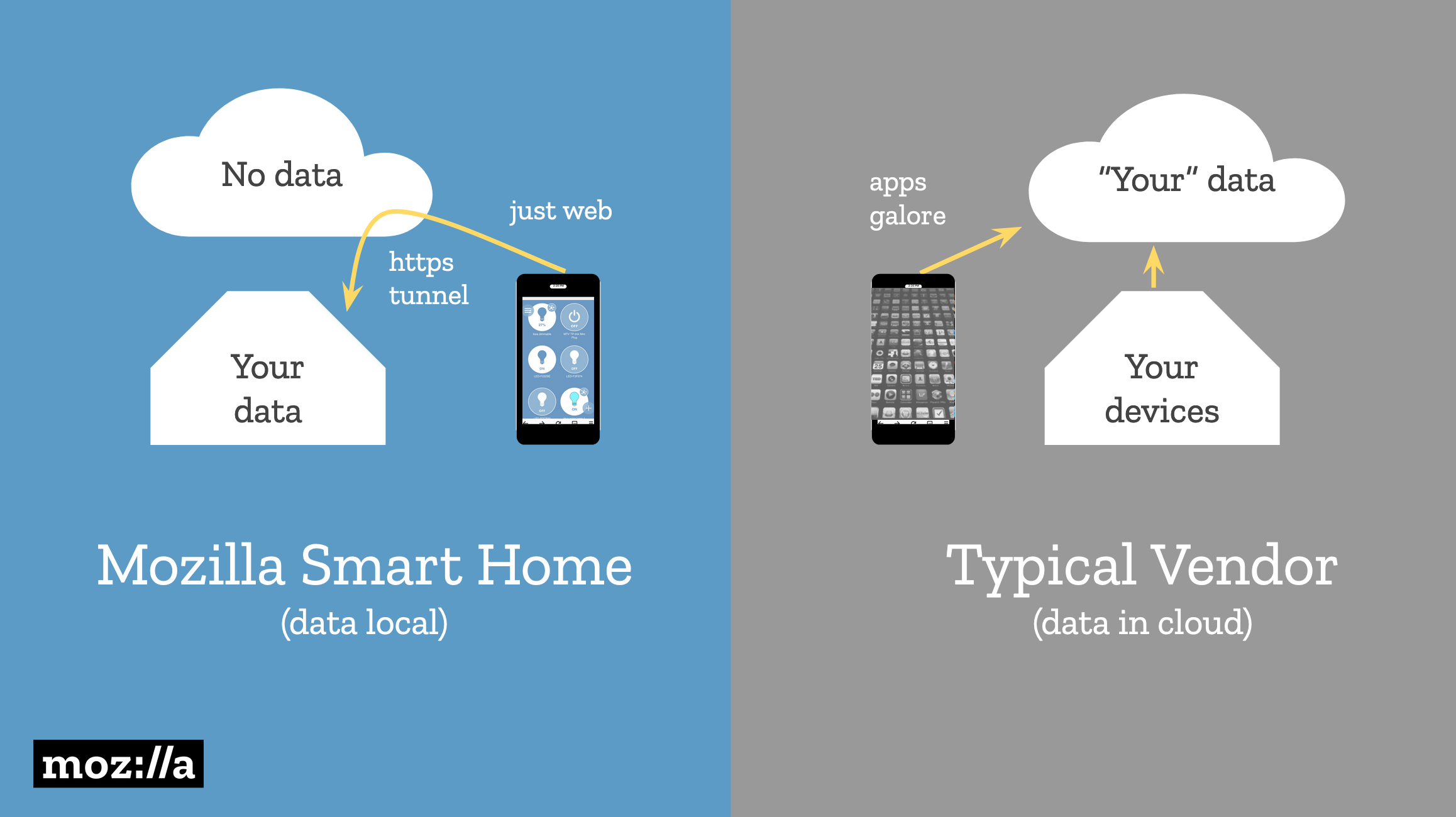
Mozilla WebThings provides complete privacy for user data
If you, like many we surveyed, are also concerned about the security & privacy of you smart home check out @MozillaIoT‘s decentralized, open source solution for keeping your smarthome devices at bay—or learn more dropping by our Bay Area Maker Faire booth! https://t.co/rUcYpjBySH
Josephine Lau: Smart home companies require that users’ data goes through their servers, which means that people are giving up their privacy for the convenience of a smart home device (e.g., smart light bulb).
We’ve learned that people are concerned about the privacy of their smart home data. And yet, when there’s no alternative, they feel the need to trade away their privacy for convenience.
Mozilla WebThings is an alternative approach to the Internet of Things that stores user data in the user’s home. Devices can be controlled locally via a web interface, and the data is tunneled through a private HTTPS connection.
A diagram showing how Mozilla doesn’t store user data in the cloud, unlike smart home vendors.
An Internet Explorer mode is coming to Edge
Still have questions on the recently announced IE mode? Our very own Fred Pullen has all the answers. Check out his in-depth breakdown on how the new IE mode works, and the benefits it will bring to our enterprise community once it goes live.https://t.co/RgewXGC1G2
Fred Pullen: The next version of Edge will include an Internet Explorer mode for backward compatibility with legacy websites. Edge will also for the first time be available on older versions of Windows (including Windows 7 and 8.1).
By introducing Internet Explorer mode, we’re effectively blurring the lines between the browsers. From an end-user standpoint, it seems like a single browser. … You can use IE mode to limit the sites that instantiate Internet Explorer just to the sites that you approved.
Navigating from one page to another in a client-side web app provides no feedback by default in virtually all popular routing solutions across the client-side ecosystem.
Their goal is to make Ember’s router more accessible and screen reader friendly.
Read the last section (“Intrinsic and extrinsic sizing”). All three columns have the size 1fr but the middle one is wider because of its content. This can be prevented by using the size minmax(0, 1fr) instead.
Instead of loading from top to bottom, progressive images appear blurry at first and become sharper as more data loads.
The benefits of progressive rendering are unique to JPEG (supported in all browsers) and JPEG 2000 (supported in Safari). GIF and PNG have interlaced modes, but these modes come at a cost of worse compression. WebP doesn’t even support progressive rendering at all. This creates a dilemma: WebP is usually 20%-30% smaller than a JPEG of equivalent quality, but progressive JPEG appears to load 50% faster.
Today, we are going to take a look at what happens when we use display: grid and how we might use the new subgrid value of grid-template-columns and grid-template-rows to allow for grids all the way down through our markup, which relate to each other.
This article is part of a series that look at various aspects of the CSS display property, and is a follow-on to the first two articles:
CSS Grid Layout is switched on by using display: grid. If you have read the first article in this series, you will know that what this single value property actually means is display: block grid. We get a block level box which is defined as a grid container, with direct children that are grid items and participate in grid layout.
If you take a look at the display specification, you will see that in the table that defines all of the different values for display. The words grid container are linked to the definition of a grid container in the Grid Specification. Therefore, to find out what this actually means we need to go look there. When we do, we get some useful clarification of the behavior of a grid container.
A grid container is said to establish a Grid Formatting Context which is similar to a Block Formatting Context (BFC). I’ve written an extensive guide to the Block Formatting Context. In that article you will discover two things about a BFC that are the same for a grid formatting context. Floats do not intrude into the grid container, and the margins on the container do not collapse with those of the contents.
There are differences, however, only once we get inside the grid container. The children of a grid container and not participating in block and inline layout, they are grid items and therefore participating in grid layout. This means that a few things we are used to in block and inline layout do not hold true.
If any item in the layout is floated or cleared, the float and clear properties do not have an effect once the item becomes a grid item. The vertical-align property has no effect, and the ::first-letter and ::first-line pseudo-elements cannot be used.
The fact that an item cannot be both floated and a grid item is helpful in terms of creating fallbacks. When creating a fallback for browsers which do not support grid using floats (when grid is supported), you don’t need to do anything special: the float is overwritten.
I outline this approach in my article on supporting browsers without grid. There are situations where the behavior has turned out to be problematic, although these issues could be solved by using another part of CSS as described in this post unpacking an issue with grid and floats, “Editorial Layouts, Exclusions, and CSS Grid”.
With all that said, if we do nothing else than change the value of display to grid, we won’t see much of a difference to our layout. The direct children are grid items, however, by default we end up with a one-column grid. A grid always has one column and one row. The rest of the rows that we can see after doing this are implicit rows, i.e. rows created to hold the content.
When we create a grid container with no columns, we get a one column grid. (Large preview)
We can start to form something that looks more like a grid to us by giving the property grid-template-columns a value. The property takes a track listing as a value; if I give it three 1fr tracks, we now find ourselves with a three-column grid, and using the gap property gives me spacing between those cards.
We now have something that looks to us like a grid:
We define some column tracks and a gap to get an obvious grid layout (Large preview)
Each of the grid items in our example has children of its own. The cards have headers and footers and an area for the main content of the card. These children are grid items, but their children have returned to block and inline layout. The header, content area and footer do not do any grid like things. This is because when we change the value of display to grid, it doesn’t inherit but instead only the children become grid items; their children return to block layout.
Nesting Grids
If a card has more content than the other cards, the cards in that row get taller. The initial value of align-items for grid items is stretch. Our cards stretch to full height. The items inside, however, are in normal block and inline flow and so they don’t stretch magically to fill the card. (This is why in the image above you can see that the cards with less content have a gap at the bottom.)
If we wanted them to (in order to make that footer always sit at the bottom), we could make our grid item a grid, too. In this case, a single-column grid is all we need. We can then define row tracks, giving the area into which the div with a class of content sits, a track size of 1fr. This causes it to take up all of the available space in the container, and will push the footer to the bottom of the card.
You can do this nesting of grids as much as you need. I don’t really think of it as nesting since we’re not creating nested tables here, and we are usually using the structural HTML elements already in place. We are just changing the value of display one level at a time to what is most appropriate for the children of that element. That might be flex layout or grid layout, but most often it will be block and inline layout. In that case, we don’t need to do anything because that is what happens by default.
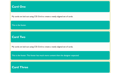
Lining Up The Headers And Footers
As we have now seen, if we want a set of cards laid out on a grid, and we want them to display as tall as the tallest card, and we want the footers pushed to the bottom of the card, we need very little CSS. The layout CSS for the above example is as follows:
What if we want the background color on the headers and footers to line up though? Each card is a grid item, but the headers and footers are in the grid on the item. They have no relationship to each other and so we can’t line them up. Here it would be nice if we could somehow inherit the grid through the children.
If we could define a grid on the parent which had three rows, then place the cards across these three rows and have the header, content and footer each sit in one of the rows. That way, each header would be in the same row, and therefore if one header got taller, the whole row would get taller.
We don’t have a good solution to that in browsers today, but it is on the way. The subgrid feature of CSS Grid Layout Level 2 will enable this exact pattern. You will be able to create a grid on the parent and then selectively opt the rows and/or columns to use that grid, rather than define a new grid on the child element which is completely independent of that grid.
Note that the examples which follow only work at the time of writing in Firefox Nightly. The subgrid value ofgrid-template-columnsandgrid-template-rowsis a new feature and part of Level 2 of the CSS Grid Specification. To try out this feature, download a copy of Firefox Nightly.
You can see how this works in the images below. In the first image, I have created three row tracks on the parent and spanned the card across them. With the Firefox Grid Inspector highlighting the grid, you can see that the rows of the parent don’t relate to the rows used by the children.
Inspecting the grid with the Firefox Grid Inspector shows the elements are not displaying in the tracks of the parent. (Large preview)
If, instead of defining three rows on the child, I use the subgrid value for grid-template-rows, the card now uses those rows on the parent. You can see how the two are now aligned and therefore the headers and footers align as well:
Using subgrid each part of the card goes into its own track (Large preview)
What we are doing here with subgrid isn’t a new value of display. The item which is a subgrid is a grid container itself, as we have set display: grid on it. The grid items are behaving as grid items normally do. This is regular grid layout — no different from the original nested grid except that (instead of the item having its own row track sizing) it is using the tracks of the parent.
This is the nice thing about subgrid; there isn’t a whole lot to learn if you already know how to use grid layout. You can read about the rest of the details in my previous post here on Smashing Magazine, “CSS Grid Level 2: Here Comes Subgrid”.
Yesterday (23rd May 2019), subgrid landed in Firefox Nightly, so we have a testable implementation of the subgrid value of grid-template-columns and grid-template-rows. Please do grab a copy of Nightly and try this out. With a copy of Nightly, you can see the final example working in this CodePen:
See if you can think up other use cases that are solved by having the subgrid feature, or perhaps things which you think are missing. While a feature is only available in a Nightly browser, that’s the time where it is possible to make changes to the spec if some issue are discovered. So, do a favor to your future web developing self and try out features like this in order that you can help contribute to the web platform and make things better.
If you think you have found a bug in the Firefox implementation, you can take a look at the main implementation bug on Bugzilla which links to related issues in the Depends on section. If you can’t see your issue, create as a simple a reduced test case as possible and raise the bug. If you think that subgrid should do something in order to solve a use case, and that is something not detailed in the specification, you can raise an issue on the CSS Working Group GitHub for a potential enhancement.
What About display: contents?
If you have been following along, you might think that display: contents (as described in the previous article about display) might solve the problems that subgrid seeks to solve — that of allowing indirect children to participate in a grid layout. That isn’t the case, and our example of cards is a perfect way to demonstrate the difference.
If, instead of making our card a grid layout with display: grid, we removed the box using display: contents, we would get this result in this next CodePen. (Try removing the display: contents line from the rules for .card to see the difference.)
In this example, the box of the card has been removed and so the header, content and footer directly participate in grid layout and are autoplaced across the grid. This wasn’t what we wanted at all! The contents value of display will be really helpful once the accessibility issues in browsers mentioned in my last article are dealt with, however, it solves different problems to the one that we are exploring.
More Reading And Examples
I’ve been creating a number of examples and demos to help everyone understand subgrid. You can try those out at the links below:
For websites running on WordPress, there’s a myriad of plugins that can ramp up their SEO ranking and enhance organic traffic. But with more than 50,000 WordPress plugins available in the official directory, it becomes quite daunting to choose the most suitable plugin for managing your SEO.
Today, we‘re going to look at the top three plugin options, and explain why they’re essential to boosting your SERPs.
1. Yoast SEO
One of the most popular WordPress plugins is Yoast SEO. It has gained immense popularity owing to its huge range of features that allow the user to optimize their site for both search engine bots and humans as well.
Yoast SEO is so popular because it is easy to use, and gives you control over the optimization and readability of your content. As a result, you don’t have to write for Google, or any other search engine, you can just write for humans and still end up with content that ranks better.
Yoast SEO’s main features include:
Submit an XML sitemap to help Google and Bing index your site;
Set the focus keyword for your content;
Edit the snippet of text that is displayed on search results alongside your title;
Shows you how to optimize your site by providing suggestions;
Adds canonical tags to ensure there’s no duplication of content;
Allows you to control breadcrumbs on your site;
Allows multiple focus keywords;
Monitor the number of inbound and outbound links;
Integration with the Google Search Console;
A readability score to help you improve your content.
There is also a premium version of Yoast, predictably named Yoast SEO Premium, available for $89 per month. It’s expensive, but includes features that benefit video SEO and WooCommerce SEO, so if you’re running a profitable ecommerce business it’s worth considering.
2. Google XML Sitemap
An XML sitemap helps search engines index your website, by listing the URLs of all of your content, as well as their likelihood to need indexing. Google XML Sitemap generates this important file for you.
The main benefit of Google XML Sitemap is that you can update your file regularly, which is important if you have lots of fresh content to add frequently. It also ensures that you don’t make any mistakes, which could damage your ranking.
Google XML Sitemap has been around for almost a decade, and is one of the most widely installed plugins. Once installed, it can take care of all of the work for you. It’s recommended that you use XML Sitemap as soon as you start publishing with WordPress. (You’ll need to use the Google Search Console to submit the URL of the sitemap itself.)
3. W3 Total Cache
An important aspect for every marketer is website speed. The reason being that a slow website, leads to a high abandon rate. With dwindling attention spans, users simply won’t tolerate a slow site. Ultimately a high abandon rate means a downgrading of your search engine ranking, so it’s vital you keep your site fast.
W3 Total Cache Plugin allows a website to scale, and avoids crashes even when there’s a massive influx of traffic. It enhances both user experience, and SEO by reducing download time and improving performance with the help of a CDN (content delivery network).
For a marketer or business owner hoping to build organic traffic, this plugin is essential. Leading web hosts such as Page.ly, Synthesis, Dream Host, Media Temple, GoDaddy, and Hostgator recommend W3 Total Cache.
The main features of W3 Total Cache are:
A 10x improvement in overall website performance (tested with Google Page Speed and WebPagetest);
Repeat pages views instantly thanks to caching;
Pages render faster;
Visitors spend more time on your site;
The server performs better, especially at times of high-traffic;
Approximately an 80% reduction in bandwidth through minification of resources;
Compatibility with shared hosting, virtual private servers, and dedicated servers;
Transparent CDN management;
Support for Accelerated Mobile Pages;
SSL compatibility;
Option to use cache-control for browser caching, future expire headers, and entity tags;
Access to caching statistics to provide insight into website performance.
There is also a pro version of W3 Total Cache, offering a fragment caching module, exclusive extensions, and full site CDN mirroring. It is expensive at $99 per year, but worthwhile if that is within your budget.
Bonus Tips to Enhance Search Engine Ranking
For novice marketers, the All-in-One SEO Pack lets you optimize WordPress sites for search engines without any additional effort. It generates meta tags and optimizes titles automatically. Those just starting out can simply focus on content and let this plugin take care of the rest.
Images make content much more attractive. SEO Optimized Images is a great plugin that dynamically adds search engine-friendly alt and title attributes to any images you add. This in turn will benefit your search ranking and lead to more visitors.
Simple URLs allows you to manage all the links on your website by using custom post types and 301 redirects, tracking outbound links from your site.
Broken links will damage your ranking. The Broken Link Checker runs through all of your posts, comments, and other content and notifies you of any dead or broken link. You can then edit the links from the plugin’s page instead of updating ever post manually.
Wrapping Up
Whether you’re a newbie or an expert, these simple to use plugins can be invaluable in driving organic traffic to your site. Avoid adding too many plugins, which will slow down your site, and stick to these tried and tested solutions to take care of the vast majority of your needs.
When your organization or business is putting on a workshop, it can be challenging to advertise and fill up the seats that you have to offer.
For that reason, it’s important that you approach this from a few angles: technology, marketing, and other forms of communication.
If you’re worried about filling up your next workshop, or simply want to exceed your last attendance numbers, we’ve compiled this helpful guide on how best to approach this. We will discuss:
Online registration
Integrated payments
Communication
Targeted groups
Incentives
Goals
Are you ready to dive into these expert strategies and jam-pack your next workshop hall? Let’s get started!
1. Allow online registration.
Everything seems easier with the internet, doesn’t it? Registering for a workshop is no exception. By offering online registration and getting rid of those paper forms, you’re likely to get more registrants simply due to the convenience of signing up and paying all in one place.
Allowing online registration also has other benefits, such as:
Generating rosters within minutes
Receiving applications and registrations on time (no more forms getting lost in the mail!)
Automatically compiling applicant information
Beyond these benefits, look for registration software that allows users to do group registration. Group registration lets one user register multiple people quickly, and can get you a higher number of paying attendees!
Convenience is key when it comes to filling seats in your workshop. If you offer online registration, you’ll get more attendees, more on-time registrations, and happier users.
2. Use integrated payments.
When your workshop charges a registration fee, it’s important to make that process as secure as possible. How can you accomplish this? By investing in registration software that offers integrated payments!
For instance, Regpack offers software that integrates the payment process into the overall registration process. This means:
Security is number one. You don’t have to worry about payment data being compromised due to the presence of a detailed security system.
You’ll gain your registrants’ trust. Rather than directing users to a third-party payment site, your registration form will embed directly into your website and payments will occur during this process. Users won’t have to worry about mailing a check or being rerouted to PayPal, for example.
Your registrants can choose their payment plan. If you’re offering a series of workshops, for instance, your registrants can choose the payment plan they want to follow, and then an autobilling system will make sure they comply.
You’ll easily track payments. You can create and run payment reports any time you want, which will make your accounting process easier.
By using software that integrates with your payment process, you’ll instill trust in your registrants and make them more likely to sign up for and pay to attend your workshop. If you want to fill those seats, it’s essential that you make the payment process both convenient and secure.
3. Communicate.
If you want to fill up your workshop seats, it’s important that you communicate with your potential attendees. This means highlighting standouts of the course your business or organization is teaching and offering as much information as you can.
Consider these tips for communication:
Focus on marketing. Create a newsletter to send out to users in your CRM if you use one. Through this avenue, you can send out your agenda to entice those who haven’t registered yet. Encourage them to bring along friends, family, and colleagues, as well.
Take to social media. Create or update your social media pages on the platforms that your potential attendees are using. You can post your agenda here and use it to advertise your other workshops if you’re doing a series.
Follow up. Follow up on payments and send reminders for any outstanding registration tasks. This can easily be done if you use the right software that automates this process.
Part of putting on a workshop means demonstrating the value you’ll bring to those who attend. Talk about the problem you’re going to solve and the other benefits associated with attending your workshop. If you openly communicate through several avenues and give people a good idea of what your program is about, you’ll be able to increase your overall attendance.
If you’re looking for a specific registration software solution, check out this list of the top event management software providers.
4. Choose a target group.
Going along with communication, it’s important that you reach out to the right people. This means you should directly target your marketing efforts to people who are in similar industries and would directly benefit from your workshop.
Follow these steps to ensure you target the right groups:
Create a sign-up form on your organization’s website. Separate from your registration form, you can offer forms that allow people to sign up for your newsletter or other updates on your website. With this information, you can ensure you’re contacting the right people about your workshop.
Collect information. Ask for information about your website visitors’ field of work so you can determine if your workshop (and future sessions) will be relevant to them. Ask for basic contact information, as well, but don’t ask for too much! Otherwise, they may abandon the sign-up form.
Leverage your information. Once you’ve begun collecting information, begin segmenting your supporters into groups within your CRM according to certain demographics such as age, occupation, and location. Use this information to send out updates about your workshops when the instructors are in their city or when you think the program may be something relevant to their line of work, for example.
To represent your organization or business well, you should focus on acquiring new attendees, who could, in turn, become regular supporters or customers. Swoop offers a comprehensive article on customer acquisition, which can be applied to the process of moving your registrants through the conversion funnel. Start with sparking their awareness, educating them, and then moving them through the process to the point where they register for your workshop.
5. Offer incentives for early registration.
Everyone loves an incentive! Give your registrants a reason to sign up early. By offering incentives, you’ll be more likely to fill seats and maybe even end up with a waitlist if word spreads quickly!
Try out these strategies for incentives:
General discounts. Offer a coupon code for a discount if attendees register early. Invest in registration software that allows you to create and trigger discounts automatically. A system that automates discounts for you is great because those discounts can trigger according to the registrant time (if they register by a certain date) or if they register more than a certain number of people. This will remove the headache of calculating discounts and also encourage people to sign up quicker, especially if they were on the fence.
Bring someone free. Offer a free spot for a companion to the first 10 or so people who sign up. You may give up 10 free seats, but you’ll also forge more connections with people who may not have come otherwise. They might even register for a future workshop because of it!
Be sure to think about what incentivizes people to sign up for events and workshops. If your workshop is part of a larger fundraiser for a nonprofit organization, for example, simply offering to educate participants about your cause is a step you should take to encourage them to attend. This is one of several steps you can take in terms of fundraising, but it applies elsewhere, too.
Once you’ve figured out your incentives, you’ll be on your way to using creative and effective tactics to attract people to your program.
6. Set a goal and track it.
Ultimately, you want to fill your workshop seats. It’s a good idea, in that case, to come up with a few metrics to measure your success. By setting a goal and tracking it, you’ll know where your efforts are lacking and where you’re excelling.
Consider the following when setting your goals:
Determine your attendance goal. One of the first steps in planning an event or program means determining your attendance goals. How many people do you hope will register and attend? From there, you’ll be able to start tracking this metric.
Take advantage of reporting features. Use registration software that offers dynamic reporting tools. Get the information you need quickly by viewing your roster and exporting reports. This will keep you on track and allow you to see in real time how many people have registered and figure out if you need to increase your marketing efforts.
Continue to follow up. If anyone has started their registration but left the form midway through or needs to pay their remaining balance, be sure to follow up with them, whether you do this proactively on your own or this is triggered automatically through your software. It’s important that the message is personalized to the recipient, as well.
By setting a goal and holding yourself accountable, you’ll be more motivated to reach the benchmark you’ve set up for yourself. Fill up your workshop seats by keeping up with your numbers and staying organized. The rest will speak for itself!
From using the right software to putting forth a lot of marketing efforts, there are several ways to expertly fill your workshop seats. Keep in mind that there are a lot of alternatives and competitors when it comes to the type of software you should use. Be sure you choose to invest in the one that’s right for your event and/or organization.
From there, you’ll be on your way to a packed and successful program!
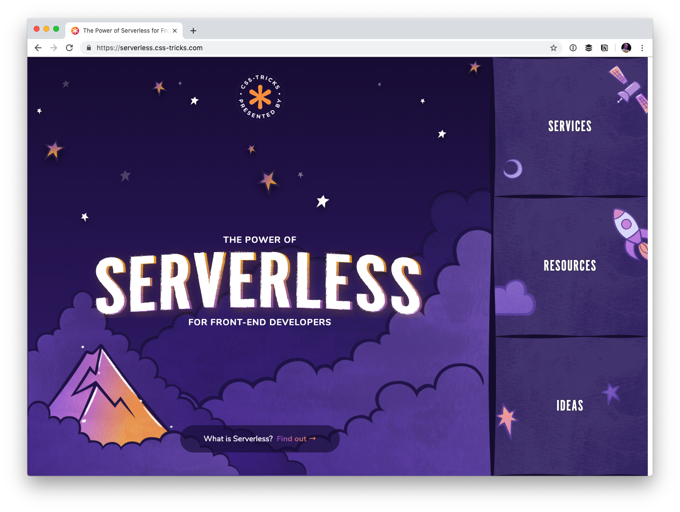
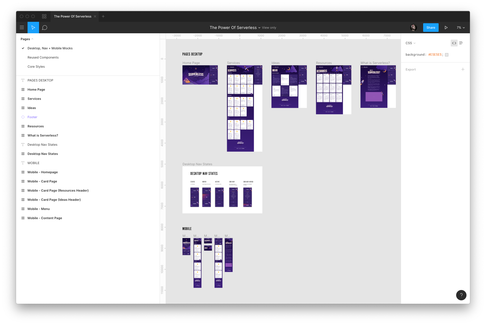
I created a website called The Power of Serverless for Front-End Developers over at thepowerofserverless.info a little while back while I was learning about that whole idea. I know a little more now but still have an endless amount to learn. Still, I felt like it was time to revamp that site a bit.
For one thing, just like our little conferences website, the new site is a subdomain of this very site:
The whole idea behind the serverless buzzword is a pretty big deal. Rather than maintaining your own servers, which you already buy from some other company, you architect your app such that everything is run on commoditized servers you access on-demand instead.
Hosting becomes static, which is rife with advantages. Just look at Netlify who offer blazing-fast static hosting and innovate around the developer experience. The bits you still need back-end services for run in cloud functions that are cheap and efficient.
But you still need to know how to string it all together. Who do you use to process forms? Where do you store the data? What can I use for user authentication? What content management systems are available in this world? That’s what this site is all about! I’d like the site to be able to explain the concept and offer resources, but more importantly, be a directory to the slew of services out there that make up this new serverless world.
The site also features a section containing ideas that might help you figure out how you might use serverless technology. Perhaps you’ll even take a spin making a serverless site.
Design by Kylie Timpani and illustration by Geri Coady
Kylie Timpani (yes, the same Kylie who worked on the v17 design of this site!) did all the visual design for this project.
If anything looks off or weird, blame my poor implementation of their work. I’m still making my way through checklists of improvements as we speak. Sometimes you just gotta launch things and improve as you go.
Everything is on GitHub and contributions are welcome
I’d appreciate any help cleaning up copy, adding services, making it more accessible… really anything you think would improve the site. Feel free to link up your own work, although I tend to find that contributions are stronger when you are propping up someone else rather than yourself. It’s ultimately my call whether your pull request is accepted. That might be subjective sometimes.
Before doing anything dramatic, probably best to talk it out by emailing me or opening an issue. There’s already a handful of issues in there.
I suspect companies that exist in this space will be interested in being represented in here somewhere, and I’m cool with that. Go for it. Perhaps we can open up some kind of sponsorship opportunities as well.
Creating with components: A good idea
I went with Gatsby for this project. A little site like this (a couple of pages of static content) deserves to be rendered entirely server-side. Gatsby does that, even though you work entirely in React, which is generally thought of as a client-side technology. Next.js and react-static are similar in spirit.
I purposely wanted to work in JavaScript because I feel like JavaScript has been doing the best job around the idea of architecting sites in components. Sure, you could sling some partials and pass local variables in Rails partials or Nunjucks includes, but it’s a far cry from the versatility you get in a framework like React, Vue or Angular that are designing entirely to help build components for the front end.
The fact that these JavaScript frameworks are getting first-class server-side rendering stories is big. Plus, after the site’s initial render, the site “hydrates” and you end up getting that SPA feel anyway… fantastic. Yet another thing that shows how a JavaScript-focused front-end developer is getting more and more powerful.
As an aside: I don’t have much experience with more complicated content data structures and JAMstack sites. I suspect once you’ve gone past this “little simple cards of data” structure, you might be beyond what front-matter Markdown files are best suited toward and need to get into a more full-fledged CMS situation, hopefully with a GraphQL endpoint to get whatever you need. Ripe space, for sure.
Digital design technology waits on no one. It’s forever changing, and web designers are forever having to seek ways to keep up with it. If there are any “evergreen” tools and resources that keep pace with the latest trends they are few. Except for upgrades and updates, of course.
The latest tools, apps, and resources can cope with the latest design trends. They are not difficult to come by. There is, in fact, an embarrassment of riches. So many that finding the right ones can actually be a challenge in itself.
Not all of them are top-of-the-line of course, and the best of the bunch is what you want and deserve. To help you out, we’ve put in place this nice little collection of top tools, apps, and resources. They’ll individually or collectively make your job easier. They help you keep up with the times and maintain a competitive edge.
Elementor is a prime example of a WordPress website building tool that can do so many things and do them so much better than its competitors. Aside from its website design capabilities, businesses look to Elementor because of the way it can speed up design workflow processes and at the same time produce a maximum ROI.
If you can visualize it, you can build it if you have this premium web-building tool at your fingertips. Limitations and constraints that are common to many WordPress themes simply don’t exist with Elementor. Thanks to a powerful drag and drop editor, a ton of useful widgets, and hundreds of templates, you can produce an attractive, professional-looking page in minutes and a complete website within hours.
Since Elementor can be used with virtually any theme and any plugin it gives you almost unlimited flexibility. The user interface is a pleasure to work with, and several features like the Pop Up builder and Hover and Scroll animations allow you to do things that you once would have assigned to a developer.
AND CO from Fiverr is an invoicing software that saves you time so you can focus on growing your business. Its automated system helps you stay on top of your cash flow by reminding you when it’s time to send invoices, notifying you when they are viewed by a client, and letting you know when they are past due. With AND CO you can accept online payments by credit card, check, ACH, or PayPal and have the payments automatically deposited in your bank account.
AND CO also features a time tracking system which integrates smoothly with your invoicing, so that invoices can automatically be created based on the hours you’ve tracked at the end of a project, at specified project milestones, or periodically for customers or clients that are on a subscription basis. Relevant files or documents can be attached to invoices if you wish. With additional features like expense tracking, proposals, contracts, and task management, AND CO is the one app you need to run your freelance business.
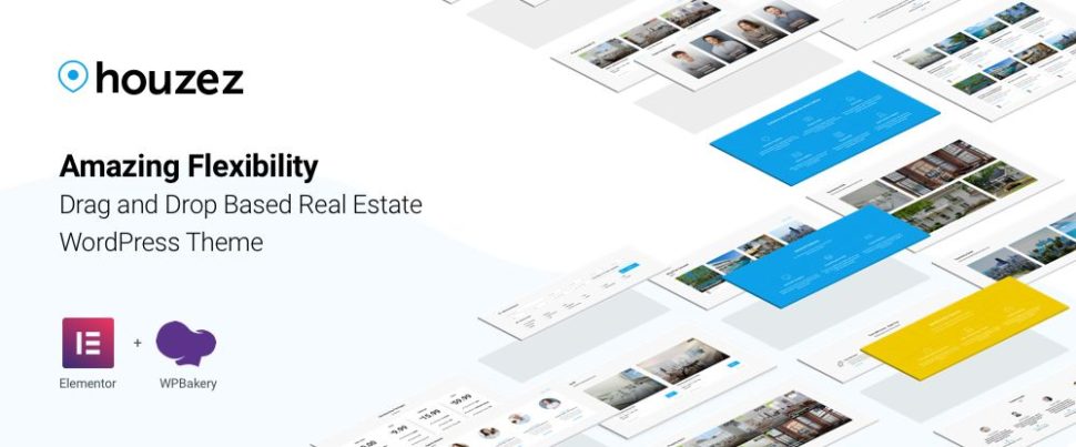
Given its many advanced features, most users are led to believe that everything needed to conduct business is already included in this real estate application. The Houzez design team apparently thought otherwise as, based on user feedback, they have recently added a host of new options and features designed to give realtors and real estate agencies extended capabilities and greater flexibility.
The old favorites like the listings options, advanced search capabilities, and the property management system are still there. More listings options and formats have been added together with listings sorting by data, price, and property location, property status, and luxury home and special property showings scheduling.
Houzez is extremely easy to use and can be customized to fit an agencies business model and brand.
Businesses that rely heavily on customers booking appointments will like the time and money they can be saved with this powerful and award-winning plugin. Amelia automates the entire booking process. It takes appointments 24/7, matches them with employee availability, takes care of cancellations and changes, sends out reminders, and even accepts online payments.
More than 2,000 signed up for Amelia within 6 months after the launch date and gave it an average of 4.85+ user rating.
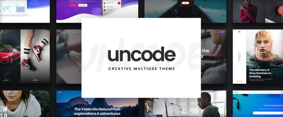
Uncode has all the functionality you need to build a breathtaking portfolio to showcase your work. You don’t need to create a design from scratch, although you can create your own template if you wish.
The best way to see what Uncode can do for you is to visit the website and view the showcase of user-created websites. You’ll see why this creative multiuse theme is a top all time ThemeForest best-seller with more than 50,000 sales.
TheGem’s customers and Envato will tell you, and ThemeForest will agree, that this amazing multipurpose theme is capable of producing the most creative and beautiful designs you’ll find anywhere. Loading times are exceptionally fast, page speed scores are equally impressive, and customers particularly like TheGem’s 100% flexibility and 100% simplicity.
As far as customer satisfaction and support are concerned, TheGem scores 100% for these as well. The best product performance coupled with the best customer experience is hard to beat.
Because Mobirise is an offline tool you’re not tied down to a specific platform or host during your website building activities. You’ll have total control over your website’s design, and because Mobirise is drag and drop it’s easy to use. Mobirise is 100% free to use for both commercial and personal uses.
There are plenty of website blocks, templates, and themes to work with and thanks to Google Amp and Bootstrap 4 your sites will be crazy-fast.
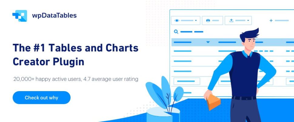
The wpDataTables plugin offers an all-in-one solution for summarizing data by means of interactive, responsive, and easily editable tables and charts. It doesn’t matter if the amount of data is small or huge, or if the data itself is quite complex. wpDataTables is, in fact, the only table and chart-producing tool of its kind that can easily manage MS SQL, MySQL, and PostgreSQL database information.
Tables and charts are fully customizable, and key data can be color-coded or highlighted.
A bundle of 38,000 premium, royalty-free icons and illustrations is a nice resource to have handy. Roundicons’ bundle is the world’s largest and you can download it for a one-time fee.
The fee includes additional icons and illustrations that are added to the bundle monthly. A commercial use license comes with the bundle. Use coupon code “GETBIG” to receive a 20% discount.
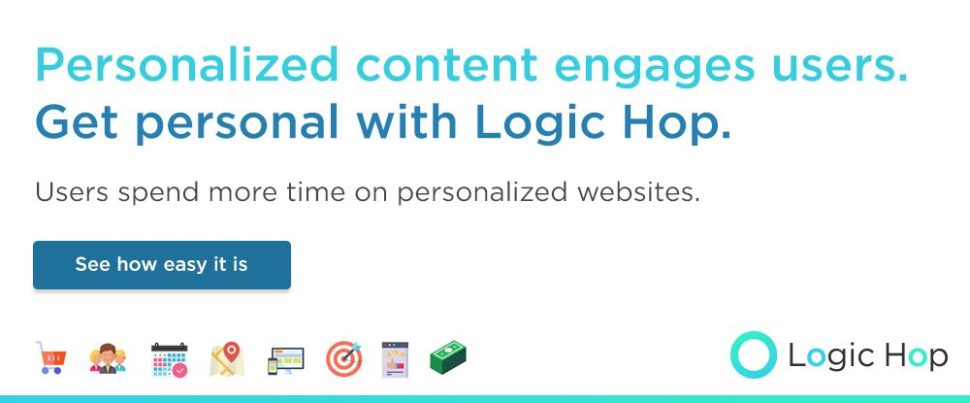
One of the toughest challenges facing web designers is to personalize their message to a particular audience or audiences. Logic Hop overcomes this challenge by enabling you to provide targeted content to your audiences using display ad and pay per click results, social media posts, and actions visitors take on your site.
Personalized websites perform 200% better on average. Logic Hop can make that happen for you.
The 8b website builder is new, fast, fresh, and futuristic. 8b is also super simple to work with, and you can create beautiful, high-performance websites on your work or home desktop, or on your mobile device when on the go. 8b is free at the moment, a good reason to try it out.
16 slick starter templates and a large selection of website sections are there to help you get any project off to a quick start.
At one time or another you may have come across a font you’d really like to use but had no way of identifying it and had to look for something else. WhatFontIs.com’s automatic AI system will search its database of 550,000 commercial and free fonts and identify that elusive font in seconds.
All that’s required of you is to submit an image (a string of letters is suggested).
This advanced prototyping tool was created to support web and mobile app design. In addition to enabling people to build high-quality, high-fidelity prototypes, Savah features a built-in design workflow and approval system making it a great tool to have for promoting and supporting team and cross-team collaboration.
Savah prototypes can be automatically synced with Dropbox, Google and Sketch App. Check the monthly plan prices. Note that a 30% discount is given on annual plan purchases.
Reducing the number of support tickets saves time and money and makes customers happier – if you go about it right. With HelpJet, you can build a knowledge base that enables customers to quickly find answers to common questions rather than having to stand in line for an answer.
A customer that can get a good answer right away is always going to be a happier customer. You can easily customize HelpJet to fit your brand.
Launching your new website “the Goodie way” simply involves working directly with the developer. All you need to do is provide the details of the design you want and the Goodie folks will produce a high-performance website consisting of squeaky-clean code at a special $999 price.
This can be a perfect deal for owners of small businesses in need of a carefully coded website.
Conclusion
While it’s highly unlikely you’ll need all 15 tools and resources there just might be one, if not two or three you could put to good use immediately. It could be a website building tool that makes it easier for you to keep up with the latest design trends, and with your competition.
Maybe it’s a chart-building plugin that enables you to present data in ways you never could before, or a bundle of a gazillion icons and illustrations.


