You can have the best open source project in the world but, if it doesn’t have good documentation, chances are it’ll never take off. In the office, good documentation could save you having to repeatedly answer the same questions. Documentation ensures that people can figure out how things work if key employees decide to leave the company or change roles. Well documented coding guidelines help bring consistency to a codebase.
If you’re writing long-form text, Markdown is clearly a great alternative to authoring HTML. Sometimes though, Markdown syntax isn’t enough. It’s always been possible to write straight HTML inside of Markdown documents. This includes custom elements so, if you’re building a design system with native web components, it’s easy to incorporate them inside your text-based documentation. If you’re working with React (or any other framework that speaks JSX, like Preact or Vue), you can do the same thing by using MDX.
This article is a broad overview of the tools available for writing documentation and for building style guides. Not all the tools listed here make use of MDX but it’s increasingly being incorporated into documentation tooling.
What is MDX?
A .mdx file has exactly the same syntax as a regular Markdown file, but lets you import interactive JSX components and embed them within your content. Support for Vue components is in alpha. It’s easy to get MDX set up with Create React App. There are MDX plugins for Next.js and Gatsby. The forthcoming version two release of Docusaurus will also come with built-in support.
Writing documentation with Docusaurus
Docusaurus is made by Facebook and used by every Facebook open source project, apart from React. It’s also used by many major open source projects outside of Facebook, including Redux, Prettier, Gulp and Babel.
Projects making use of Docusaurus.
You can use Docusaurus to document anything — it isn’t front-end specific. Docusaurus uses React under the hood, but you don’t have to know that framework to make use of it. It’ll take your Markdown files and turn them into a nicely-structured, well-formatted and readable documentation site, with a nice design right out of the box.
The Redux site shows the typical Docusaurus layout
Sites created with Docusaurus can also include a Markdown-based blog. Prism.js is included by default for zero-setup syntax highlighting. While relatively new, Docusaurus has proven popular, being voted the number one new tool of 2018 on StackShare.
Other options for written content
Docusaurus specifically caters to building documentation. Of course, there are a million and one ways to make a website — so you could roll your own solution with any back-end language, CMS, or static site generator.
The documentation sites for React, IBM’s design system, Apollo and Ghost CMS use Gatsby, for example — a generic static site generator often used for blogs. If you work with the Vue framework, VuePress is becoming a popular option. MkDocs is an open source static site generator for creating documentation, written in Python and configured with a single YAML file. GitBook is a popular paid product that’s free for open-source and non-profit teams. If you’re building internal documentation and want something easy, the reading experience on GitHub itself isn’t half bad, so you could just commit some Markdown files and leave it at that.
Documenting components: Docz, Storybook and Styleguidist
Style guides, design systems, pattern libraries — whatever you want to call them — have become a hugely popular area of concern in the last decade. What’s really made the difference in turning them from vanity projects into useful tools isn’t the pontificating of thought leaders but the emergence of component-driven frameworks, like React, and the tools mentioned here.
Storybook, Docz and Styleguidist all do much the same thing: display interactive UI components and document their API. A project may have dozens or even hundreds of components to keep track of — all with a variety to states and styles. If you want components to be reused, people have to know that they exist. We aid discoverability when we catalog components. A style guide gives an easily searchable and scannable overview of all your UI components. This helps to maintain visual consistency and avoid duplicating work.
These tools provide a convenient way to review different states. It can be difficult to reproduce every state of a component in the context of a real application. Rather than needing to click through an actual app, developing a component in isolation can be helpful. Hard-to-reach states (like a loading state, for example) can be mocked.
Dan Green wrote a nice synopsis of the benefits of using Storybook, but it applies equally to Docz and Styleguidist:
“Storybook has made it really easy for designers who code to collaborate with engineers. By working in storybook they don’t need to get a whole environment running (docker container, etc). For Wave, we have many important components that are only visible in the middle of a process that is short lived and time consuming to reproduce (i.e. a loading screen that only shows while a user is having their payment account set up). Before Storybook, we didn’t have a good way to work on these components and were forced to temporary hacks in order to make them visible. Now, with Storybook we have an isolated place to easily work on them, which has the bonus feature of being easily accessible for designers and PMs. It also makes it really easy for us to show off these states in sprint demos.”
– Dan Green, Wave Financial
As well as visualizing different states side-by-side and listing props, its often helpful to have written content about a component — whether its explaining the design rationale, use-cases, or describing the results of user-testing. Markdown is easy enough for *anybody* to learn — ideally a style guide should be a joint resource for designers and developers that both disciplines contribute to. Docz, Styleguidist and Storybook all offer a way to seamlessly intermingle Markdown with the components themselves.
Docz
Currently, Docz is a React-only project, but is working on support for Preact, Vue and web components. Docz is the newest of the three tools, but has already amounted over 14,000+ stars on GitHub. It is, to my mind, the easiest solution to work with. Docz provides two components — and . These are imported and used directly in .mdx files.
import { Playground, Props } from "docz";
import Button from "../src/Button";

## You can _write_ **markdown**
### You can import and use components

<Button>click</Button>
You can wrap your own React components with to create the equivalent of an embedded CodePen or CodeSandbox — a view of your component alongside editable code.
<Playground>
  <Button>click</Button>
</Playground>
will show all the available props for a given React component, default values, and whether the prop is required.
<Props of={Button} />
I personally find this MDX-based approach the simplest to understand and the easiest to work with.
Just like with Docz, examples are written using Markdown syntax. Styleguidist uses Markdown code blocks (triple backticks) in regular .md files rather than MDX:
Code blocks in Markdown usually just show the code. With Styleguidist, any code block with a language tag of js, jsx or javascript will be rendered as a React component along with the code. Just like with Docz, the code is editable — you can change props and instantly see the result.
Styleguidist will automatically create a table of props from either PropTypes, Flow or Typescript declarations.
Styleguidist currently supports React and Vue.
Storybook
Storybook markets itself as “a development environment for UI components.” Rather than writing examples of components inside Markdown or MDX files, you write *stories* inside Javascript files. A *story* documents a particular state of a component. A component might have stories for a loading state and a disabled state, for example.
Storybook is less straightforward to use than Styleguidist and Docz. At over 36,000 GitHub stars though, it’s the most popular option. It’s an open source project with 657 contributors and a full-time maintainer. It is used by, among others, Airbnb, Algolia, Atlassian, Lyft, and Salesforce. Storybook supports more frameworks than any other offering — React, React Native, Vue, Angular, Mithril, Ember, Riot, Svelte and plain HTML are all supported.
Writing documentation about components currently requires addons. In a future release, Storybook is taking inspiration from Docz and adopting MDX.
# Button

Some _notes_ about your button written with **markdown syntax**.

<Story name="disabled">
  <Button disabled>lorem ipsum</Button>
</Story>
Storybook’s new Docs feature is being rolled out incrementally over the next couple of months and looks set to be a big step forward.
Do you use @storybookjs for component docs or design systems? You’re gonna love DocBlocks: ? Drop into MDX ? Modular and composable ? Compatible w/ @gatsbyjs, #nextjs, etc
The benefits of pattern libraries have been extolled at nauseating length in a million Medium articles. When done well, they aid visual consistency and facilitate the creation of cohesive products. Of course, none of these tools can magic up a design system. That takes careful thought about both design and CSS. But when it comes time to communicate that system to the rest of an organization, Docz, Storybook and Styleguidist are all great options.
Implementing a validation library isn’t all that hard. Neither is adding all of those extra features that make your validation library much better than the rest.
This article will continue implementing the validation library we started implementing in the previous part of this article series. These are the features that are going to take us from a simple proof of concept to an actual usable library!
Since we’re validating on all change events, we’re showing the user error messages way too early for a good user experience. There are a few ways we can mitigate this.
The first solution is simply providing the submitted flag as a returned property of the useValidation hook. This way, we can check whether or not the form is submitted before showing an error message. The downside here is that our “show error code” gets a bit longer:
Another approach is to provide a second set of errors (let’s call them submittedErrors), which is an empty object if submitted is false, and the errors object if it’s true. We can implement it like this:
This way, we can simply destructure out the type of errors that we want to show. We could, of course, do this at the call site as well — but by providing it here, we’re implementing it once instead of inside all consumers.
A lot of people want to be shown an error once they leave a certain field. We can add support for this, by tracking which fields have been “blurred” (navigated away from), and returning an object blurredErrors, similar to the submittedErrors above.
The implementation requires us to handle a new action type — blur, which will be updating a new state object called blurred:
const initialState = {
  values: {},
  errors: {},
  blurred: {},
  submitted: false,
};

function validationReducer(state, action) {
  switch (action.type) {
    // as before
    case 'blur':
      const blurred = {
        ...state.blurred,
        [action.payload]: true
      };
      return { ...state, blurred };
    default:
      throw new Error('Unknown action type');
  }
}
When we dispatch the blur action, we create a new property in the blurred state object with the field name as a key, indicating that that field has been blurred.
The next step is adding an onBlur prop to our getFieldProps function, that dispatches this action when applicable:
getFieldProps: fieldName => ({
  // as before
  onBlur: () => {
    dispatch({ type: 'blur', payload: fieldName });
  },
}),
Finally, we need to provide the blurredErrors from our useValidation hook so that we can show the errors only when needed.
const blurredErrors = useMemo(() => {
    const returnValue = {};
    for (let fieldName in state.errors) {
      returnValue[fieldName] = state.blurred[fieldName]
        ? state.errors[fieldName]
        : null;
    }
    return returnValue;
  }, [state.errors, state.blurred]);
return {
  // as before
  blurredErrors,
};
Here, we create a memoized function that figures out which errors to show based on whether or not the field has been blurred. We recalculate this set of errors whenever the errors or blurred objects change. You can read more about the useMemo hook in the documentation.
Our useValidation component is now returning three sets of errors — most of which will look the same at some point in time. Instead of going down this route, we’re going to let the user specify in the config when they want the errors in their form to show up.
Our new option — showErrors — will accept either “submit” (the default), “always” or “blur”. We can add more options later, if we need to.
function getErrors(state, config) {
  if (config.showErrors === 'always') {
    return state.errors;
  }
  if (config.showErrors === 'blur') {
    return Object.entries(state.blurred)
      .filter(([, blurred]) => blurred)
      .reduce((acc, [name]) => ({ ...acc, [name]: state.errors[name] }), {});
  }
  return state.submitted ? state.errors : {};
}
const useValidation = config => {
  // as before
  const errors = useMemo(
    () => getErrors(state, config),
    [state, config]
  );

  return {
    errors,
    // as before
  };
};
Since the error handling code started to take most of our space, we’re refactoring it out into its own function. If you don’t follow the Object.entries and .reduce stuff — that’s fine — it’s a rewrite of the for...in code in the last section.
If we required onBlur or instant validation, we could specify the showError prop in our useValidation configuration object.
const config = {
  // as before
  showErrors: 'blur',
};
const { getFormProps, getFieldProps, errors } = useValidation(config);
// errors would now only include the ones that have been blurred
“Note that I’m now assuming that each form will want to show errors the same way (always on submit, always on blur, etc). That might be true for most applications, but probably not for all. Being aware of your assumptions is a huge part of creating your API.”
Allow For Cross-Validation
A really powerful feature of a validation library is to allow for cross-validation — that is, to base one field’s validation on another field’s value.
To allow this, we need to make our custom hook accept a function instead of an object. This function will be called with the current field values. Implementing it is actually only three lines of code!
function useValidation(config) {
  const [state, dispatch] = useReducer(...);
  if (typeof config === 'function') {
    config = config(state.values);
  }
}
To use this feature, we can simply pass a function that returns the configuration object to useValidation:
const { getFieldProps } = useValidation(fields => ({
  password: {
    isRequired: { message: 'Please fill out the password' },
  },
  repeatPassword: {
    isRequired: { message: 'Please fill out the password one more time' },
    isEqual: { value: fields.password, message: 'Your passwords don't match' }
  }
}));
Here, we use the value of fields.password to make sure two password fields contain the same input (which is terrible user experience, but that’s for another blog post).
See CodeSandbox demo that doesn’t let the username and the password be the same value.
Add Some Accessibility Wins
A neat thing to do when you’re in charge of the props of a field is to add the correct aria-tags by default. This will help screen readers with explaining your form.
A very simple improvement is to add aria-invalid="true" if the field has an error. Let’s implement that:
const useValidation = config => {
  // as before
  return {
    // as before
    getFieldProps: fieldName => ({
      // as before
      'aria-invalid': String(!!errors[fieldName]),
    }),
  }
};
That’s one added line of code, and a much better user experience for screen reader users.
You might wonder about why we write String(!!state.errors[fieldName])? state.errors[fieldName] is a string, and the double negation operator gives us a boolean (and not just a truthy or falsy value). However, the aria-invalid property should be a string (it can also read “grammar” or “spelling”, in addition to “true” or “false”), so we need to coerce that boolean into its string equivalent.
There are still a few more tweaks we could do to improve accessibility, but this seems like a fair start.
Shorthand Validation Message Syntax
Most of the validators in the calidators package (and most other validators, I assume) only require an error message. Wouldn’t it be nice if we could just pass that string instead of an object with a message property containing that string?
Let’s implement that in our validateField function:
function validateField(fieldValue = '', fieldConfig, allFieldValues) {
  for (let validatorName in fieldConfig) {
    let validatorConfig = fieldConfig[validatorName];
    if (typeof validatorConfig === 'string') {
      validatorConfig = { message: validatorConfig };
    }
    const configuredValidator = validators[validatorName](validatorConfig);
    const errorMessage = configuredValidator(fieldValue);

    if (errorMessage) {
      return errorMessage;
    }
  }
  return null;
}
This way, we can rewrite our validation config like so:
const config = {
  username: {
    isRequired: 'The username is required',
    isEmail: 'The username should be a valid email address',
  },
};
Much cleaner!
Initial Field Values
Sometimes, we need to validate a form that’s already filled out. Our custom hook doesn’t support that yet — so let’s get to it!
Initial field values will be specified in the config for each field, in the property initialValue. If it’s not specified, it defaults to an empty string.
We’re going to create a function getInitialState, which will create the initial state of our reducer for us.
We go through all fields, check if they have an initialValue property, and set the initial value accordingly. Then we run those initial values through the validators and calculate the initial errors as well. We return the initial state object, which can then be passed to our useReducer hook.
Since we’re introducing a non-validator prop into the fields config, we need to skip it when we validate our fields. To do that, we change our validateField function:
function validateField(fieldValue = '', fieldConfig) {
  const specialProps = ['initialValue'];
  for (let validatorName in fieldConfig) {
    if (specialProps.includes(validatorName)) {
      continue;
    }
    // as before
  }
}
As we keep on adding more features like this, we can add them to our specialProps array.
Word-of-mouth marketing is one of the best ways to get new business — and high-quality business at that. But unless you’re focused on a very small space where everyone knows each other, it can be hard to get your clients to refer you to others on their own.
That’s why you need to be willing to ask clients for testimonials and online reviews.
Look, consumers are smart. They know that anyone can build a website for their business and claim that they’re the best in their space. “We build websites that get you results” isn’t going to mean anything to prospective clients unless you have proof of those results.
That’s where client testimonials and reviews come into play. You’re going to let the words of former clients and proof of their satisfaction and results speak on your behalf.
How to Ask Clients for Testimonials and Reviews
As a web designer, it would greatly benefit you to collect as many client testimonials as you can for your website. And, beyond that, to start encouraging clients to leave positive reviews for you on Google.
Think about it like this:
consumers need to read about 10 online reviews before they can trust a business
Prospective clients are taking a big risk when they hire a designer to build their website. If they don’t know you, have never heard of your business, and don’t know anyone who’s used your services, how can they trust that you’ll design a great website for them?
Bright Local conducted a Local Consumer Review Survey a couple years back and found that consumers need to read about 10 online reviews before they can trust a business.
That’s because client reviews and testimonials are valuable. They give prospective clients a sense for what it’s like to work with you and what they can realistically expect to get out of the relationship.
For example, you can see here the level of detail included in this testimonial for BA Creative:
Then, you have to think about what happens when reviews come into a channel like Google and are assigned a star rating. That could be really great for standing out in search results amongst the competition. For instance, here is a search I did for “web designer London”:
Above the organic search results is this map snippet that highlights the most popular and well-reviewed results that match the search. Imagine what that would do for your business’s visibility.
That said, you can’t just expect former clients to start shouting to anyone who will listen: “This designer was amazing to work with and, thanks to the website he/she built for me, I now make 25% more in sales every month!”
It’s just not going to happen that way. You’re going to have to ask them for testimonials and reviews.
Here’s what you can do:
1. Create a Google My Business Page
According to the Bright Local survey, 86% of consumers are actively looking for and reading reviews for local businesses. So, if you have a physical address or P.O. box you’re comfortable associating with your business, you should create a Google My Business page. It’s completely free and takes no more than a few minutes to set up your business profile.
This is the only way your business listing will show up in Google search results, like this one for Ted Angel Design:
It’s also how you get your listing to show up in Maps results:
If you don’t have an address you can work with, Google won’t be an option. However, you can set yourself up with a Facebook page as Ted Angel has (Yelp will only work with an address, too):
Google loves to see positive customer reviews on platforms like these, so anything you can do to collect those reviews and get good star ratings will help you in search results.
Just make sure to monitor the reviews and respond to them, too. 89% of consumers surveyed by Bright Local said that they not only read reviews, but they look at the businesses’ responses to them, too.
2. Send an Offboarding Survey
In your client offboarding process, you should have a step where you follow up 30 to 60 days after the project ends. Why not put a link to a questionnaire in that email, asking them for feedback on the experience?
By putting it out there like that, you’re not pressuring them to say something good about you on the spot. Instead, you’re giving them a valid reason to share their positive sentiments. And, if they don’t, consider this a great opportunity to collect criticisms and improve your business.
Now, if you’re not comfortable combing through their response and asking if you can use their statement as a testimonial, that’s okay. Instead, make the last slide of the questionnaire say something like:
“It was an absolute pleasure working with you and I’m glad I had a hand in helping you create the perfect website for your business. If you were happy with the experience, I’d greatly appreciate it if you’d leave a review on my Google page so other business owners like yourself can find my services when they need them!”
Stay positive, don’t sound desperate, and leave it up to them to take action.
3. Add a Link in Your Email Signature
Chances are good that the bulk of your communication with clients is through email. So, why not put something in your email signature about leaving a review?
Your email signature is always a good place to leave small notes, reminding prospects and clients of things they should check out or next steps they should take. An invitation to leave a review would fit right in.
4. Write a Testimonial for Them
In the past, I would ask clients at the end of a job if they’d be comfortable writing a testimonial that I could share with prospective clients. However, I found that most of them were reluctant to do so — not because they secretly hated my work, but because they were too busy to do so. What was nice, though, was that many of those clients asked me to just write it for them. That’s when I decided to change my approach.
These days, when I conduct offboarding calls and final training with clients, I listen closely to what they say. If they are really happy with the experience and what they got in the end, they’re bound to say something about it to me. Or they’ll email me later on, with their thanks and kind words.
If they do, I jot it down on a notepad. Then, I turn the quote into a testimonial and email it to them later in the day:
“I’m so happy to hear how well the project worked out for you. I was wondering if you’d let me publish a testimonial from you with a link back to your website? It would really help me get more clients like yourself!
I know you’re busy, so I took the time to write this up from our call/email earlier:
[Include testimonial here.]
If you’re happy with it, please let me know. Feel free to tweak it if you have something else to say!”
If you know that they were happy with the website you built and you’ve taken the time to summarize their thoughts into a concise testimonial so they don’t have to, why wouldn’t they say “yes”? Plus, they’ll get a free backlink to their new website, which is a fantastic bonus.
Wrap-Up
Don’t forget to make sure that the rest of your website is prepared to sell on your behalf. By publishing an impressive portfolio and sharing other trust marks from your clientele (past and present), you can more easily and quickly convince prospects to work with you over the competition.
The Internet has become a serious threat to our privacy. — Jeff Chester of the Center for Digital Democracy
Your online profile is being sold on the web. It’s kind of crazy and it’s not harmless. — Sharon Goott Nissim of the Electronic Privacy Information Center
There are no limits to what types of information can be collected, how long it can be retained, with whom it can be shared or how it can be used. — Susan Grant of the Consumer Federation of America
While there’s been talk of introducing a “Do Not Track” program into U.S. legislation, the EU is the first one to actually take steps to make the Internet a safer place for consumers.
With these initiatives holding businesses accountable for the information they track and use online, web developers have to add another thing to their list of requirements when building a website:
The protection of user privacy.
In this post, we’re going to look at:
Where we currently stand with GDPR,
What changes we’ve seen on the web as a result,
What’s coming down the line with ePR,
And take a look CookiePro Cookie Consent tool that helps web developers make their websites compliant now.
GDPR: Where Are We Now?
With the one-year anniversary of GDPR upon us, now is a great time to talk about what the updated legislation has done for online privacy.
GDPR Recap
It’s not like the EU didn’t have privacy directives in place before. As Heather Burns explained in a Smashing Magazine article last year:
All of the existing principles from the original Directive stay with us under GDPR. What GDPR adds is new definitions and requirements to reflect changes in technology which simply did not exist in the dialup era. It also tightens up requirements for transparency, disclosure and, process: lessons learned from 23 years of experience.
One other key change that comes with moving from the previous privacy directive to this privacy regulation is that it’s now consistently implemented across all EU states. This makes it easier for businesses to implement digital privacy policies and for governing bodies to enforce them since there’s no longer any question of what one country has done with the implementation of the law. It’s the same for all.
What’s more, there are clearer guidelines for web developers that are responsible for implementing a privacy solution and notice on their clients’ websites.
Has GDPR Led to Any Changes in How Websites Handle Data?
It seems as though many companies are struggling to get compliant with GDPR, based on a test done by Talend in the summer of 2018. They sent data requests to over a hundred companies to see which ones would provide the requested information, per the new GDPR guidelines.
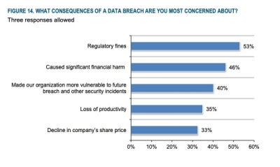
Here is what they found:
Only 35% of EU-based companies complied with the requests while 50% outside of the EU did.
Only 24% of retail companies responded (which is alarming considering the kind of data they collect from consumers).
Finance companies seemed to be the most compliant; still, only 50% responded.
65% of companies took over 10 days to respond, with the average response time being 21 days.
What Talend suggests, then, is that digital services (e.g. SaaS, mobile apps, e-commerce) are more likely to fall in line with GDPR compliance. It’s the other companies — those that didn’t start as digital companies or who have older legacy systems — that are struggling to get onboard.
Regardless of what actions have been taken by businesses, they know they must do it.
A 2018 report published by McDermott Will & Emery and Ponemon Institute showed that, despite businesses’ inability to be compliant, they were scared of what would happen if they were found not to be:
Those that said they feared financial repercussions were right to do so. The GDPR assesses fines based on how severe the infringement is:
Lower level offenses result in fines of up to €10 million or 2% of the the revenue made in the prior fiscal year.
Upper level offenses result in fines of up to €20 million or 4%.
Some high-profile cases of fines have already popped up in the news, too.
Google received a €50 million penalty for committing a number of violations.
Mainly, the issue taken with Google is that it buries its privacy policies and consent so deep that most consumers never find it. What’s more, a lot of their privacy policies are ambiguous or unclear, which leads users to “Accept” without really understanding what they’re accepting.
Facebook is another company we shouldn’t be too surprised to see in GDPR’s crosshairs.
Their penalty was only for £500,000. That’s because the fine was assessed for grievances issued between 2007 and 2014 — before GDPR went into place. It’ll be interesting to see if Facebook changes its privacy policies in light of the much larger sum of money they’ll owe when another inevitable breach occurs.
In June of 2018, there were 1,700 reports of companies in violation of GDPR. Now, the average is roughly 400 a month. Even so, Eckersley estimates that there will be double the amount of reports in 2019 than there were in previous years (36,000 vs. 18,000).
So, not only are the governing bodies willing to penalize businesses for failure to comply. It seems that consumers are fed up enough (and empowered!) to report more of these violations now.
Let’s Talk About ePR For A Second
The ePrivacy Regulation has not yet become law, but it’s expected to soon enough. That’s because both GDPR and ePR were drafted to work together to update the old Data Protection Directive.
Although they’re separately defined, it’s best to think of ePR as an enhancement of GDPR. So, not only do businesses have to take care with data collected from individuals, the ePR says that they have to be careful with protecting the identity of individuals, too.
As such, when the ePR rolls out, all digital communications between business and consumer will be protected. That includes:
Skype chats
Facebook messages
VoiP calls
Email marketing
Push notifications
And more.
If a consumer has not expressly given permission for a business to contact them, the ePR will prohibit them from doing so. In fact, the ePR will take it a step further and give more control to consumers when it comes to cookies management.
Rather than display a pop-up consent notice that asks “Is it okay if we use cookies to store your data?”, consumers will decide what happens through their browser settings.
However, we’re not at that point yet, which means it’s your job to get that notice up on your website and to make sure you’re being responsible with how their data is collected, stored and used.
What Web Developers Need To Do To Protect Visitor Privacy
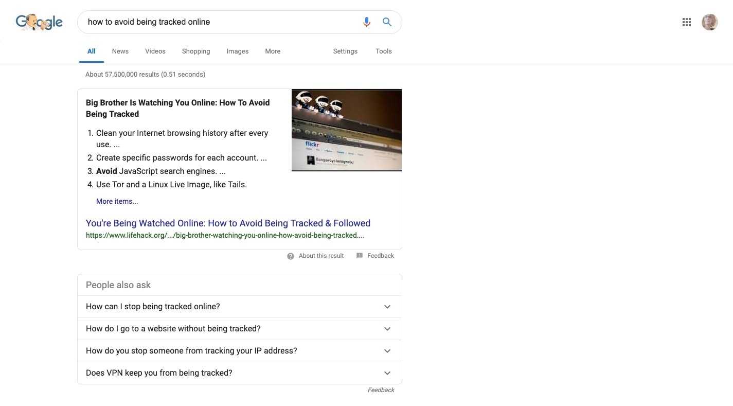
Do a search for “How to Avoid Being Tracked Online”:
Search for “How to Avoid Being Tracked Online” on Google. (Source: Google) (Large preview)
There are over 57 million pages that appear in Google’s search results. Do similar keyword searches and you’ll also find endless pages and forum submissions where consumers express serious concerns over the information gathered about them online, wanting to know how to “stop cookies”.
Clearly, this is a matter that keeps consumers up at night.
The GDPR should be your motivation to go above and beyond in putting their minds at ease.
While you probably won’t have a hand in the actual data management or usage of data within the business, you can at least help your clients get their websites in order. And, if you already did this when GDPR initially was enacted, now would be a good time to revisit what you did and make sure their websites are still in compliance.
Just make sure that your client is safely handling visitor data and protecting their privacy before providing any sort of privacy consent statement. Those statements and their acceptance of them are worthless if the business isn’t actually fulfilling its promise.
Once that part of the compliance piece is in place, here’s what you need to do about cookies:
1. Understand How Cookies Work
Websites allow businesses to gather lots of data from visitors. Contact forms collect info on leads. eCommerce gateways accept methods of payment. And then there are cookies:
Cookies are pieces of data, normally stored in text files, that websites place on visitors’ computers to store a range of information, usually specific to that visitor — or rather the device they are using to view the site — like the browser or mobile phone.
There are some that collect bare-bones details that are necessary to provide visitors with the best experience. Like preserving a logged-in session as visitors move from page to page. Or not displaying a pop-up after a visitor dismissed it on a recent visit.
There are other cookies, usually from third-party tracking services, that pry deeper. These are the ones that track and later target visitors for the purposes of marketing and advertising.
Regardless of where the cookies come from or what purpose they serve, the fact of the matter is, consumers are being tracked. And, until recently, websites didn’t have to inform them when that took place or how much of their data was stored.
2. Don’t Use Cookies That Are Irrelevant
There’s no getting around the usage of cookies. Without them, you wouldn’t have access to analytics that tell you who’s visiting your website, where they come from and what they’re doing while they’re there. You also wouldn’t be able to serve up personalized content or notifications to keep their experience with the site feeling fresh.
That said, do you even know what kinds of cookies your website uses right now?
Before you go implementing your own cookie consent notice for visitors, make sure you understand what exactly it is you’re collecting from them.
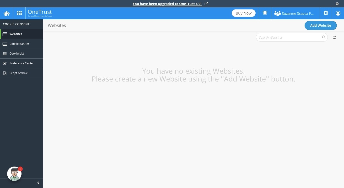
Go to the CookiePro website and run a free scan on your client’s site:
After you enter your URL and start the scan, you’ll be asked to provide just a few details about yourself and the company. The scan will start and you’ll receive a notice that says you’ll receive your free report within 24 hours.
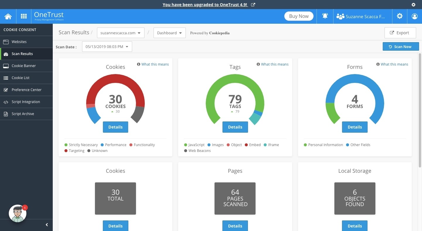
Just to give you an idea of what you might see, here are the report results I received:
CookiePro runs a scan on all data collection elements and trackers. (Source: Cookie Consent) (Large preview)
As you can see, CookiePro does more than just tell me how many or which cookies my website has. It also includes forms that are gathering data from visitors as well as tags.
Be sure to review your report carefully. If you’re tracking data that’s completely unnecessary and unjustified for a website of this nature to get ahold of, that needs to change ASAP. Why put your clients’ business at risk and compromise visitor trust if you’re gathering data that has no reason to be in their hands?
CookiePro’s cookies report tells you what purpose they serve and where they come from. (Source: Cookie Consent) (Large preview)
Note: if you sign up for an account with CookiePro, you can run your own cookie audit from within the tool (which is part of the next step).
3. Provide Transparency About Cookie Usage
GDPR isn’t trying to discourage businesses from using cookies on their websites or other marketing channels. What it’s doing, instead, is encouraging them to be transparent about what’s happening with data and then be responsible with it once they have it.
So, once you know what sort of cookies you’re using and data you’re handling, it’s time to inform your visitors about this cookie usage.
Keep in mind that this shouldn’t just be served to EU-based visitors. While those are the only ones protected under the regulation, what could it hurt to let everyone know that their data and identity are protected when they’re on your website? The rest of the world will (hopefully) follow, so why not be proactive and get consent from everyone now?
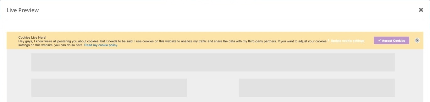
To provide transparency, a simple entry notice is all you need to display to visitors.
This is an example of a cookies notice found on the Debenhams website. (Source: Debenhams) (Large preview)
As you can see, it’s not as simple as asking visitors to “Accept” or “Reject” cookies. They’re also given the option to manage them.
To add your own cookies entry banner and advanced options, use CookiePro’s Cookie Consent tool.
Signup is easy — if you start with the free plan, it takes just a few seconds to sign up. Within an hour, you’ll receive your login credentials to get started.
Before you can create your cookie consent banner, though, you must add your website to the tool and run a scan on it. (You may have already completed that in the prior step).
When the scan is complete, you can start creating your cookie banner:
By publishing a cookie consent banner to your website, you’re taking the first big step to ensuring that visitors know that their data and identity is being protected.
In our research, the vast majority of users willingly provide consent without reading the cookie notice at all. The reason is obvious and understandable: many customers expect that a website ‘probably wouldn’t work or the content wouldn’t be accessible otherwise.’ Of course, that’s not necessarily true, but users can’t know for sure unless they try it out. In reality, though, nobody wants to play ping-pong with the cookie consent prompt and so they click the consent away by choosing the most obvious option: ‘OK.’
While ePR will eventually rid of us of this issue, you can do something about it now — and that’s to design your cookie consent form to stand out.
A word of caution: be careful with using pop-ups on a mobile website. Although consent forms are one of the exceptions to Google’s penalty against entry pop-ups, you still don’t want to compromise the visitor experience all for the sake of being GDPR compliant.
As such, you might be better off using a cookie banner at the top or bottom of the site and then designing it really stand out.
What’s nice about CookiePro is that you can customize everything, so it really is yours to do with as you like. For example, here is one I designed:
And you get to decide how the banner will function if or when visitors engage with it.
5. Educate Visitors on Cookies
In addition to giving your cookie consent banner a unique look, use it as a tool to educate visitors on what cookies are and why you’re even using them. That’s what the Cookie Settings area is for.
With Cookie Consent, you can inform visitors about the different types of cookies that are used on the website. They then have the choice to toggle different ones on or off based on their comfort level.
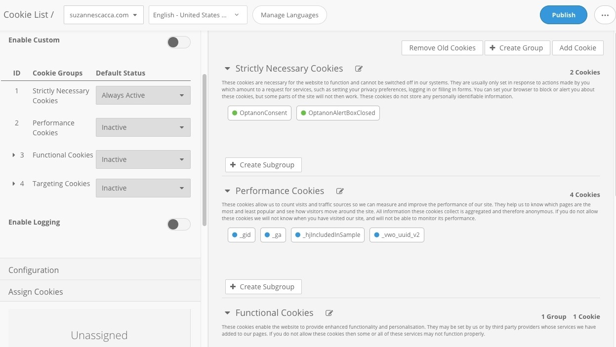
That’s what’s so nice about CookiePro taking care of the cookie scan for you. That way, you know what kinds of cookies you actually have in place. All you have to do, then, is go to your Cookie List and choose which descriptions you want to display to visitors:
CookiePro lets you educate visitors about cookies used on the site. (Source: Cookie Consent) (Large preview)
Just make sure you explain the importance of the most basic of cookies (“strictly necessary” and “performance) and why you recommend they leave them on. The rest you can provide explanations for in the hopes that their response will be, “Okay, yeah, I’d definitely like a personalized experience on this site.” If not, the choice is theirs to toggle off/on which kinds of cookies they want to be shown. And the Cookie Consent tool can help.
In other words, a cookie consent bar is not some superficial attempt to get consent. You’re trying to help them understand what cookies do and give them the power to influence their on-site experience.
Wrapping Up
There’s a lot we have to be thankful for with the Internet. It closes geographic gaps. It presents new opportunities for doing business. It enables consumers to buy pretty much anything they want with just a few clicks.
But as the Internet matures, the ways in which we build and use websites become more complex. And not just complex, but risky too.
GDPR and ePR have been a long time coming. As websites gather more data on consumers that can then be used by third parties or to follow them to other websites, web developers need to take a more active role in abiding by the new regulations while also putting visitors’ minds at ease. Starting with a cookie consent banner.
You can make the text inside any HTML element editable by adding the contenteditable attribute.
<div contenteditable>
  Hey, I'm like a textarea kinda now!
</div>
I wouldn’t say there are wheelbarrows full of use-cases for that, but it’s neat. One possible use might be an in-progress design in which editing the content from the design itself is useful either for you, or for someone else (a client?) who needs to change the text.
So, great, contenteditable. Now someone can click into the text and edit it.
There is nothing permanent about those changes. Refresh the page, look in another browser or whatever. Those edits are gone.
Say you wanted to do a little better job and make the changes persistent. You aren’t trying to build a CMS here, or save the data through an authenticated connection to a database or anything. You just wanna make the edits to the text are maintained if the page refreshes.
One way is to chuck the data from the text changes you make into localStorage.
When text is edited (on blur of the element), save the data to localStorage using a namespace and the
ID of the element as the key.
When the page loads, look through localStorage and see if there are any keys that match elements on the page and, if so, replace the content.
const editables = document.querySelectorAll("[contenteditable]");

// save edits
editables.forEach(el => {
  el.addEventListener("blur", () => {
    localStorage.setItem("dataStorage-" + el.id, el.innerHTML);
  })
});

// once on load
for (var key in localStorage) {
  if (key.includes("dataStorage-")) {
    const id = key.replace("dataStorage-","");
    document.querySelector("#" + id).innerHTML = localStorage.getItem(key);
  }
}
I can guess what you are thinking: another React testing library? So many have already been covered here on CSS-Tricks (heck, I’ve already posted one covering Jest and Enzyme) so aren’t there already enough options to go around?
But react-testing-library is not just another testing library. It’s a testing library, yes, but one that’s built with one fundamental principle that separates it from the rest.
The more your tests resemble the way your software is used, the more confidence they can give you.
It tries to address tests for how a user will use your application. In fact, it’s done in such a way that tests won’t break even when you refactor components. And I know that’s something we’ve all run into at some point in our React journey.
We’re going to spend some time writing tests together using react-testing-library for a light to-do application I built. You can clone the repo locally:
In case you’re wondering why Jest is in there, we’re using it for assertion. Create a folder called __test__ inside the src directory and create a new file called App.test.js.
Taking snapshots
Snapshot tests keep a record of tests that have been performed on a tested component as a way to visually see what’s changes between changes.
When we first run this test, we take the first snapshot of how the component looks. As such, the first test is bound to pass because, well, there’s no other snapshot to compare it to that would indicate something failed. It only fails when we make a new change to the component by adding a new element, class, component, or text. Adding something that was not there when the snapshot was either created or last updated.
The snapshot test will be the first test we will be writing here. Let’s open the App.test.js file and make it look like this:
This imports the necessary packages we are using to write and run the tests. render is used to display the component we want to test. We make use of cleanup to clear things out after each test runs — as you can see with the afterEach(cleanup) line.
Using asFragment, we get a DocumentFragment of the rendered component. Then we expect it to match the snapshot that had been created.
Let’s run the test to see what happens:
## yarn
yarn test

## npm
npm test
As we now know, a snapshot of the component gets created in a new folder called __snapshots__ inside the __tests__ directory if this is our first test. We actually get a file called App.test.js.snap in there that will look like this:
Our app includes two to-do items that display by default the first time the app runs. We want to make sure that they do, in fact, show up by default on the first app run so, to test this, we have to target the unordered list (
) and check the length. We expect the length to be equal to two — the number of items.
We’re making use of getByTestId in that snippet to extract the test IDs from the App component. We then set todoList to target the todos-ul element. That’s what should return as two.
Using what we’ve learned so far, see if you can write a test to assert that a user can enter values in the input field. Here are the things you’ll want to do:
Get the input field
Set a value for the input field
Trigger a change event
Assert that the input field has its value as the one you set for it in Step 2
Don’t peek at my answer below! Take as much time as you need.
Still going? Great! I’ll go grab some coffee and be right back.
Mmm, coffee. ??
Oh, you’re done! You rock. Let’s compare answers. Mine looks like this:
Using getByTestId, I am able to extract the test IDs in the application. Then I create a variable which is set to the string Learn React, and make it the value of the input field. Next, I obtain the input field using its test ID and fire the change event after setting the value of the input field. With that done, I assert that the value of the input field is indeed Learn React.
Does that check out with your answer? Leave a comment if you have another way of going about it!
Next, let’s test that we can add a new to-do item. We’ll need to get the input field, the button for adding new items and the unordered list because those are all of the elements needed to create an new item.
We set a value for the input field and then trigger a button click to add the task. We’re able to do this by obtaining the button using getByText — by triggering a click event on the DOM element with the text Add Task, we should be able to add a new to-do item.
Let’s assert that the number of children (list items) in unordered list element is equal to three. This assumes that the default tasks are still in tact.
That said, this is just one testing resource for React. There are others, of course, but hopefully this is one you’re interested in trying out now that you’ve seen a bit of it but use what’s best for your project, of course.
When WordPress 5 was released, I was excited about making use of the Gutenberg editor to create custom blocks, as posts on my personal blog had a couple of features I could turn into a block, making it easier to set up my content. It was definitely a cool thing to have, yet it still felt quite bloated.
Around the same time, I started reading more and more about static site generators and the JAMstack (this article by Chris Ferdinandi convinced me). With personal side projects, you can kind of dismiss a wide variety of issues, but as a professional, you have to ensure you output the best quality possible. Performance, security and accessibility become the first things to think about. You can definitely optimize WordPress to be pretty fast, but faster than a static site on a CDN that doesn’t need to query the database nor generate your page every time? Not so easy.
I thought that I could put this into practice with a personal project of mine to learn and then be able to use this for professional projects, and maybe some of you would like to know how, too. In this article, I will go over how I made the transition from WordPress to a specific static site generator named Hugo.
Hugo is built in Go, which is a pretty fast and easy to use language once you get used to the syntax, which I will explain. It all compiles locally so you can preview your site right on your computer. The project will then be saved to a private repository. Additionally, I will walk you through how to host it on Netlify, and save your images on a Git LFS (Large File Storage). Finally, we’ll have a look at how we can set up a content management system to add posts and images (similar to the WordPress backend) with Netlify CMS.
Note that all of this is absolutely free, which is pretty amazing if you ask me (although you’ll have to pay extra if you use up all your LFS storage or if your site traffic is intense). Also, I am writing this from a Bitbucket user point of view, running on a Mac. Some steps might be slightly different but you should be able to follow along, no matter what setup you use.
You’ll need to be somewhat comfortable with HTML, CSS, JS, Git and the command terminal. Having a few notions with templating languages such as Liquid could be useful as well, but we will review Hugo’s templates to get you started. I will, nonetheless, provide as many details as possible!
I know it sounds like a lot, and before I started looking into this, it was for me, too. I will try to make this transition as smooth as possible for you by breaking down the steps. It’s not very difficult to find all the resources, but there was a bit of guesswork involved on my part, going from one documentation to the next.
Note: If you have trouble with some of these, please let me know in the comments and I’ll try to help, but please note this is destined to be applied to a simple, static blog that doesn’t have a dozen widgets or comments (you can set that up later), and not a company site or personal portfolio. You undoubtedly could, though, but for the sake of simplicity, I’ll stick to a simple, static blog.
Prerequisites
Before we do anything, let’s create a project folder where everything from our tools to our local repository is going to reside. I’ll call it “WP2Hugo” (feel free to call it anything you want).
This tutorial will make use of a few command line tools such as npm and Git. If you don’t have them already, install those on your machine:
First off, we’ll need to export your content from WordPress: posts, pages, and uploads. There are a few tools available that Hugo mentions but personally, only one of them worked: blog2md. This one works by running a JavaScript file with Node.js in your command terminal. It takes the XML files exported by WordPress, and outputs Markdown files with the right structure, converting your HTML to Markdown and adding what is called the Front Matter, which is a way to format metadata at the start of each file.
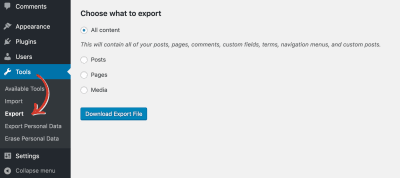
Go to your WordPress admin, and open the Tools menu, Export submenu. You can export what you want from there. I’ll refer to the exported file as YOUR-WP-EXPORT.xml.
You can select exactly what data you want to export from your WordPress blog.
Inside our WP2Hugo folder, I recommend creating a new folder named blog2md in which you’ll place the files from the blog2md tool, as well as your XML export from WordPress (YOUR-WP-EXPORT.xml). Also, create a new folder in there called out where your Markdown posts will go. Then, open up your command terminal, and navigate with the cd command to your newly created “blog2md” folder (or type cd with a space and drag the folder into the terminal).
You can now run the following commands to get your posts:
npm install
node index.js w YOUR-WP-EXPORT.xml out
Look into the /WP2Hugo/blog2md/out directory to check whether all of your posts (and potential pages) are there. If so, you might notice there’s something about comments in the documentation: I had a comment-free blog so I didn’t need them to be carried through but Hugo does offer several options for comments. If you had any comments on WordPress, you can export them for later re-implementation with a specialized service like Disqus.
If you’re familiar enough with JS, you can tweak the index.js file to change how your post files will come out by editing the wordpressImport function. You may want to capture the featured image, remove the permalink, change the date format, or set the type (if you have posts and pages). You’ll have to adapt it to your needs, but know that the loop (posts.forEach(function(post){ ... })) runs through all the posts from the export, so you can check for the XML content of each post in that loop and customize your Front Matter.
Additionally, if you need to update URLs contained in your posts (in my case, I wanted to make image links relative instead of absolute) or the date formatting, this is a good time to do so, but don’t lose sleep over it. Many text editors offer bulk editing so you can plug in a regular expression and make the changes you want across your files. Also, you can run the blog2md script as many times as needed, as it will overwrite any previously existing files in the output folder.
Once you have your exported Markdown files, your content is ready. The next step is to get your WordPress theme ready to work in Hugo.
2. Preparing Your Blog Design
My blog had a typical layout with a header, a navigation bar, content and sidebar, and a footer — quite simple to set up. Instead of copying pieces of my WordPress theme, I rebuilt it all from scratch to ensure there was no superfluous styles or useless markup. This is a good time to implement new CSS techniques (pssst… Grid is pretty awesome!) and set up a more consistent naming strategy (something like CSS Wizardry’s guidelines). You can do what you want, but remember we’re trying to optimize our blog, so it’s good to review what you had and decide if it’s still worth keeping.
Start by breaking down your blog into parts so you can clearly see what goes where. This will help you structure your markup and your styles. By the way, Hugo has the built-in ability to compile Sass to CSS, so feel free to break up those styles into smaller files as much as you want!
Alternatively, you can completely bypass this step for now, and style your blog as you go when your Hugo site is set up. I had the basic markup in place and preferred an iterative approach to styles. It’s also a good way to see what works and what doesn’t.
3. Setting Up A New Repository
Now that that is out of the way, we need to set up a repository. I’m going to assume you will want to create a new repository for this, which is going to be a great opportunity to use Git LFS (Large File System). The reason I advise to do this now is that implementing Git LFS when you already have hundreds of images is not as smooth. I’ve done it, but it was a headache you’re likely to want to avoid. This will also provide other benefits down the road with Netlify.
While I’ll be doing all this via Bitbucket and their proprietary Git GUI, Sourcetree, you can absolutely do this with GitHub and GitLab and their own desktop tools. You can also do it directly in the command terminal, but I like to automate and simplify the process as much as I can, reducing the risk of making silly mistakes.
When you’ve created your new repository on the Git platform of your choice, create an empty folder inside your local project folder (WP2Hugo), e.g. hugorepo, then open up your command terminal or Git GUI tool and initialize your local Git repository; then, link it to the remote repository (you can usually find the exact command to use on the newly created remote repository).
I’d recommend creating a dev (or stage) branch so that your main branch is strictly used for production deployments. It’ll also limit new builds to be generated only when you’re done with a potential series of changes. Creating a branch can be done locally or on your repository’s remote webpage.
How to create a new branch on GitHub, GitLab and Bitbucket. (Large preview)
GitHub makes it easy to create a branch by clicking the branch switcher and typing a new name. On GitLab, you need to open the “Plus” dropdown to access the option. Bitbucket requires you to open the “Plus” menu on the left to open the slide-out menu and click “Create a branch” in the “Get to work” section.
4. Activating Git LFS (Optional)
Git Large File System is a Git feature that allows you to save large files in a more efficient way, such as Photoshop documents, ZIP archives and, in our case, images. Since images can need versioning but are not exactly code, it makes sense to store them differently from regular text files. The way it works is by storing the image on a remote server, and the file in your repository will be a text file which contains a pointer to that remote resource.
Alas, it’s not an option you just click to enable. You must set up your repository to activate LFS and this requires some work locally. With Git installed, you need to install a Git-LFS extension:
git lfs install
If, like me, that command didn’t work for you, try the Homebrew alternative (for macOS or Linux):
brew install git-lfs
Once that’s done, you’ll have to specify which files to track in your repository. I will host all of the images I uploaded in WordPress’s /upload folder in an identically-named folder on my Hugo setup, except that this folder will be inside a /static folder (which will resolves to the root once compiled). Decide on your folder structure, and track your files inside:
git lfs track "static/uploads/*"
This will track any file inside the /static/uploads folder. You can also use the following:
git lfs track "*.jpg"
This will track any and all JPG files in your repository. You can mix and match to only track JPGs in a certain folder, for example.
With that in place, you can commit your LFS configuration files to your repository and push that to your remote repository. The next time you locally commit a file that matches the LFS tracking configuration, it will be “converted” to an LFS resource. If working on a development branch, merge this commit into your main branch.
Let’s now take a look at Netlify.
5. Creating The Site On Netlify
At this point, your repository is set up, so you can go ahead and create an account on Netlify. You can even log in with your GitHub, GitLab or Bitbucket account if you like. Once on the dashboard, click the “New site from Git” button in the top right-hand corner, and create your new Netlify site.
Note: You can leave all the options at their default values for now.
Select your Git provider: this will open a pop-up window to authenticate you. When that is done, the window will close and you’ll see a list of repositories on that Git provider you have access to. Select your freshly created repo and continue. You’ll be asked a few things, most of which you can just leave by default as all the options are editable later on.
For now, in the Site Settings, click “Change site name” and name your site anything you want — I’ll go with chris-smashing-hugo-blog. We will now be able to access the site via chris-smashing-hugo-blog.netlify.com: a beautiful 404 page!
6. Preparing For Netlify Large Media (Optional)
If you set up Git LFS and plan on using Netlify, you’ll want to follow these steps. It’s a bit more convoluted but definitely worth it: it’ll enable you to set query strings on image URLs that will be automatically transformed.
Let’s say you have a link to portrait.jpg which is an image that’s 900×1600 pixels. With Netlify Large Media, you can call the file portrait.jpg?nf_resize=fit&w=420, which will proportionally scale it. If you define both w and h, and set nf_resize=smartcrop, it’ll resize by cropping to focus on the point of interest of the image (as determined by a fancy algorithm, a.k.a. robot brain magic!). I find this to be a great way to have thumbnails like the ones WordPress generates, without needing several files for an image on my repository.
If this sounds appealing to you, let’s set it up!
The first step is installing Netlify’s command-line interface (CLI) via npm:
npm install netlify-cli -g
If it worked, running the command netlify should result in info about the tool.
You’ll then need to make sure you are in your local repository folder (that I named “hugorepo” earlier), and execute:
netlify login
Authorize the token. Next, we’ll have to install the Netlify Large Media plugin. Run:
There should be a command line shown at the end of the resulting message that you must copy (which should look like /Users/YOURNAME/.netlify/helper/path.bash.inc on Mac) — run it. Note that Keychain might ask you for your machine’s administrator password on macOS.
The next step is to link Netlify:
netlify link
You can provide your site name here (I provided the chris-smashing-hugo-blog name I gave it earlier). With this in place, you just need to set up the Large Media feature by executing the following:
netlify lm:setup
Commit these new changes to your local repository, and push them to the remote development branch. I had a few errors with Sourcetree and Keychain along the lines of git "credential-netlify" is not a git command. If that’s your case, try to manually push with these commands:
git add -A
git commit -m "Set up Netlify Large media"
git push
brew tap netlify/git-credential-netlify
brew install git-credential-netlify
Try pushing your commit through now (either with your GUI or command terminal): it should work!
Note: If you change your Netlify password, runnetlify logoutandnetlify loginagain.
You might ask: “All this, and we still haven’t even initialized our Hugo build?” Yes, I know, it took a while but all the preparations for the transition are done. We can now get our Hugo blog set up!
7. Setting Up Hugo On Your Computer
You’ll first need to install Hugo on your computer with any of the provided options. I’ll be using Homebrew but Windows users can use Scoop or Chocolatey, or download a package directly.
brew install hugo
You’ll then need to create a new Hugo site but it won’t like setting it up in a non-empty folder. First option: you can create it in a new folder and move its contents to the local repository folder:
hugo new site your_temporary_folder
Second option: you can force it to install in your local repository with a flag, just make sure you’re running that in the right folder:
hugo new site . --force
You now have a Hugo site, which you can spin up with this command:
hugo server
You’ll get a local preview on localhost. Sadly, you have no content and no theme of your own. Not to worry, we’ll get that set up really soon!
Let’s first have a look at the configuration file (config.toml in my case): let’s set up the blog’s name and base URL (this must match the URL on your Netlify dashboard):
title = "Chris' Smashing Hugo Blog"
baseURL = "https://chris-smashing-hugo-blog.netlify.com"
This link will be overwritten while you develop locally, so you shouldn’t run into 404 errors.
Let’s give Hugo our exported articles in Markdown format. They should be sitting in the /WP2Hugo/blog2md/out folder from the first step. In the Hugo folder (a.k.a. the local repository directory), access the content folder and create a subfolder named posts. Place your Markdown files in there, and then let’s get a theme set up.
8. Creating Your Custom Theme
For this step, I recommend downloading the Saito boilerplate, which is a theme with all the partials you’ll need to get started (and no styles) — a very useful starting point. You could, of course, look at this collection of ready-made themes for Hugo if you want to skip over this part of the process. It’s all up to you!
From the local repository folder, clone the theme into themes/saito:
You can rename this folder to anything you want, such as cool-theme. You’ll have to tell your Hugo configuration which theme you want to use by editing your config.toml/yaml/json file. Edit the theme value to saito, or cool-theme, or whatever your theme’s folder name is. Your preview should now show your blog’s title along with a copyright line. It’s a start, right?
Open the theme’s layout/partials/home.html file and edit it to display your content, limiting to the five first items which are of type posts (inside the content/posts/ folder), with range, first and where:
All operations in Hugo are defined inside delimiters: double curly braces (e.g. {{ .Title }}), which should feel familiar if you’ve done a bit of templating before. If you haven’t, think of it as a way to execute operations or inject values at a specific point in your markup. For blocks, they end with the {{ end }} tag, for all operations aside from shortcodes.
Themes have a layout folder which contains the pieces of the layout. The _default folder will be Hugo’s starting point, baseof.html being (you guessed it!) the base of your layout. It will call each component, called “partials” (more on this on Hugo’s documentation about Partial Template), similar to how you would use include in PHP, which you may have already seen in your WordPress theme. Partials can call other partials — just don’t make it an infinite loop.
You can call a partial with {{ partial "file.html" . }} syntax. The partial section is pretty straightforward, but the two other ones might need explaining. You might expect to have to write partials/file.html but since all partials are to be in the partials” folder, Hugo can find that folder just fine. Of course, you can create subfolders inside the “partials” folder if you need more organization.
You may have noticed a stray dot: this is the context you’re passing to your partial. If you had a menu partial, and a list of links and labels, you could pass that list into the partial so that it could only access to that list, and nothing else. I’ll talk more about this elusive dot in the next section.
Your baseof.html file is a shell that calls all the various partials needed to render your blog layout. It should have minimal HTML and lots of partials:
The {{ block "main" . }}{{ end }} line is different because it is a block that is defined with a template based on the content of the current page (homepage, single post page, etc.) with {{ define "main" }}.
Stylesheets
In your theme, create a folder named assets in which we will place a css folder. It will contain our SCSS files, or a trusty ol’ CSS file. Now, there should be a css.html file in the partials folder (which gets called by head.html). To convert Sass/SCSS to CSS, and minify the stylesheet, we would use this series of functions (using the Hugo Pipes syntax instead of wrapping the functions around each other):
As a bonus — since I struggled to find a straight answer — if you want to use Autoprefixer, Hugo also implements PostCSS. You can add an extra pipe function between toCSS and minify on the first line, like so:
And presto! From Sass to prefixed, minified CSS. The “fingerprint” pipe function is to make sure the filename is unique, like style.c66e6096bdc14c2d3a737cff95b85ad89c99b9d1.min.css. If you change the stylesheet, the fingerprint changes, so the filename is different, and thus, you get an effective cache busting solution.
9. Notes On The Hugo Syntax
I want to make sure you understand “the Dot”, which is how Hugo scopes variables (or in my own words, provides a contextual reference) that you will be using in your templates.
The Dot And Scoping
The Dot is like a top-level variable that you can use in any template or shortcode, but its value is scoped to its context. The Dot’s value in a top-level template like baseof.html is different from the value inside loop blocks or with blocks.
Let’s say this is in our template in our head.html partial:
{{ with .Site.Title }}{{ . }}{{ end }}
Even though we are running this in the main scope, the Dot’s value changes based on context, which is .Site.Title in this case. So, to print the value, you only need to write . instead of re-typing the variable name again. This confused me at first but you get used to it really quick, and it helps with reducing redundancy since you only name the variable once. If something doesn’t work, it’s usually because you’re trying to call a top-level variable inside a scoped block.
So how do you use the top-level scope inside a scoped block? Well, let’s say you want to check for one value but use another. You can use $ which will always be the top-level scope:
{{ with .Site.Params.InfoEnglish }}{{ $.Site.Params.DescriptionEnglish }}{{ end }}
Inside our condition, the scope is .Site.Params.InfoEnglish but we can still access values outside of it with $, where intuitively using .Site.Params.DescriptionEnglish would not work because it would attempt to resolve to .Site.Params.InfoEnglish.Site.Params.DescriptionEnglish, throwing an error.
Custom Variables
You can assign variables by using the following syntax:
{{ $customvar := "custom value" }}
The variable name must start with $ and the assignment operator must be := if it’s the first time it’s being assigned, = otherwise like so:
{{ $customvar = "updated value" }}
The problem you might run into is that this won’t transpire out of the scope, which brings me to my next point.
Scratch
The Scratch functionality allows you to assign values that are available in all contexts. Say you have a list of movies in a movies.json file:
[
    {
        "name": "The Room",
        "rating": 4
    },
    {
        "name": "Back to the Future",
        "rating": 10
    },
    {
        "name": "The Artist",
        "rating": 7
    }
]
Now, you want to iterate over the file’s contents and store your favorite one to use later. This is where Scratch comes into play:
{{ .Scratch.Set "favouriteMovie" "None" }}{{ /* Optional, just to get you to see the difference syntax based on the scope */ }}

{{ range .Site.Data.movies }}
        {{ if ge .rating 10 }}
            {{ /* We must use .Scratch prefixed with a $, because the scope is .Site.Data.movies, at the current index of the loop */ }}
            {{ $.Scratch.Set "favouriteMovie" .name }}
        {{ end }}
{{ end }}
[...]
My favourite movie is {{ .Scratch.Get "favouriteMovie" }}
<!-- Expected output => My favourite movie is Back to the Future -->
With Scratch, we can extract a value from inside the loop and use it anywhere. As your theme gets more and more complex, you will probably find yourself reaching for Scratch.
Note: This is merely an example as this loop can be optimized to output this result without Scratch, but this should give you a better understanding of how it works.
Conditionals
The syntax for conditionals is a bit different from what you’d expect — from a JavaScript or PHP perspective. There are, in essence, functions which take two arguments (parenthesis optional if you call the values directly):
{{ if eq .Site.LanguageCode "en-us" }}Welcome!{{ end }}
If you’re as picky about the output as I am, you might notice some undesired blank lines. This is because Hugo will parse your markup as is, leaving blank lines around conditionals that were not met, for example.
Let’s say we have this hypothetical partial:
{{ if eq .Site.LanguageCode "en-us" }}
<p>Welcome to my blog!</p>
{{ end }}
<img src="/uploads/portrait.jpg" alt="Blog Author">
If the site’s language code is not en-us, this will be the HTML output (note the three empty lines before the image tag):
Hugo provides a syntax to address this with a hyphen beside the curly braces on the inside of the delimiter. {{- will trim the whitespace before the braces, and -}} will trim the whitespace after the braces. You can use either or both at the same time, but just make sure there is a space between the hyphen and the operation inside of the delimiter.
As such, if your template contains the following:
{{- if eq .Site.LanguageCode "en-us" -}}
<p>Welcome to my blog!</p>
{{- end -}}
<img src="/uploads/portrait.jpg" alt="Blog Author">
…then the markup will result in this (with no empty lines):
This can be helpful for other situations like elements with display: inline-block that should not have whitespace between them. Conversely, if you want to make sure each element is on its own line in the markup (e.g. in a {{ range }} loop), you’ll have to carefully place your hyphens to avoid “greedy” whitespace trimming.
The example above would output the following if the site’s language code matches “en-us” (no more line breaks between the p and img tags):
<p>Welcome to my blog!</p><img src="/uploads/portrait.jpg" alt="Blog Author">
10. Content And Data
Your content is stored as Markdown files, but you can use HTML, too. Hugo will render it properly when building your site.
Your homepage will call the _default/list.html layout, which might look like this:
Now we have a basic list of our articles, which you can style as you wish! The number of articles per page is defined in the configuration file, with paginate = 5 (in TOML).
You might be utterly confused as I was by the date formatting in Hugo. Each time the unit is mapped out to a number (first month, second day, third hour, etc.) made a lot more sense to me once I saw the visual explanation below that the Go language documentation provides — which is kind of weird, but kind of smart, too!
 Jan 2 15:04:05 2006 MST
=> 1 2  3  4  5    6  -7
Now all that’s left to do is to display your post on a single page. You can edit the post.html partial to customize your article’s layout:
If you’d like to customize the URL, update your configuration file by adding a [permalinks] option (TOML), which in this case will make the URLs look like my-blog.com/post-slug/:
[permalinks]
    posts = ":filename/"
If you want to generate an RSS feed of your content (because RSS is awesome), add the following in your site configuration file (Saito’s default template will display the appropriate tags in head.html if these options are detected):
But what if you had some sort of content outside of a post? That’s where data templates comes in: you can create JSON files and extract their data to create your menu or an element in your sidebar. YAML and TOML are also options but less readable with complex data (e.g. nested objects). You could, of course, set this in your site’s configuration file, but it is — to me — a bit less easy to navigate and less forgiving.
Let’s create a list of “cool sites” that you may want to show in your sidebar — with a link and a label for each site as an array in JSON:
You can save this file in your repository root, or your theme root, inside a data folder, such as /data/coolsites.json. Then, in your sidebar.html partial, you can iterate over it with range using .Site.Data.coolsites:
<h3>Cool Sites:</h3>
<ul>
{{ range .Site.Data.coolsites.coolsites }}
    <li><a href="{{ .link }}">{{ .label }}</a></li>
{{ end }}
</ul>
This is very useful for any kind of custom data you want to iterate over. I used it to create a Google Fonts list for my theme, which categories the posts can be in, authors (with bio, avatar and homepage link), which menus to show and in which order. You can really do a lot with this, and it is pretty straightforward.
A final thought on data and such: anything you put in your Hugo /static folder will be available on the root (/) on the live build. The same goes for the theme folder.
11. Deploying On Netlify
So you’re done, or maybe you just want to see what kind of magic Netlify operates? Sounds good to me, as long as your local Hugo server doesn’t return an error.
Commit your changes and push them to your remote development branch (dev). Head over to Netlify next, and access your site’s settings. You will see an option for “Build & deploy”. We’re going to need to change a couple of things here.
First, in the “Build settings” section, make sure “Build command” is set to hugo and that “Publish directory” is set to public (the default that is recommended you keep on your Hugo config file);
Next, in the “Deploy contexts” section, set “Production branch” to your main branch in your repository. I also suggest your “Branch deploys” to be set to “Deploy only the production branch”;
Finally, in the “Environment variables” section, edit the variables and click “New variable”. We’re going to set the Hugo environment to 0.53 with the following pair: set key to HUGO_VERSION and value to 0.53.
Now head on over to your remote repository and merge your development branch into your main branch: this will be the hook that will deploy your updated blog (this can be customized but the default is reasonable to me).
Back to your Netlify dashboard, your site’s “Production deploys” should have some new activity. If everything went right, this should process and resolve to a “Published” label. Clicking the deploy item will open an overview with a log of the operations. Up top, you will see “Preview deploy”. Go on, click it — you deserve it. It’s alive!
12. Setting Up A Custom Domain
Having the URL as my-super-site.netlify.com isn’t to your taste, and you already own my-super-site.com? I get it. Let’s change that!
Head over to your domain registrar and go to your domain’s DNS settings. Here, you’ll have to create a new entry: you can either set an ALIAS/CNAME record that points to my-super-site.netlify.com, or set an A record that points your domain to Netlify’s load balancer, which is 104.198.14.52 at the time of writing.
When that’s done, head over to your site’s dashboard on Netlify and click “Domain settings”, where you’ll see “Add custom domain”. Enter your domain name to verify it.
You can also manage your domains via your dashboard in the Domains tab. The interface feels less confusing on this page, but maybe it will help make more sense of your DNS settings as it did for me.
Note: Netlify can also handle everything for you if you want to buy a domain through them. It’s easier but it’s an extra cost.
After you’ve set up your custom domain, in “Domain settings”, scroll down to the “HTTPS” section and enable the SSL/TLS certificate. It might take a few minutes but it will grant you a free certificate: your domain now runs on HTTPS.
13. Editing Content On Netlify CMS
If you want to edit your articles, upload images and change your blog settings like you’d do on WordPress’ back-end interface, you can use Netlify CMS which has a pretty good tutorial available. It’s a single file that will handle everything for you (and it is generator-agnostic: it will work with Jekyll, Eleventy, and so on).
You just need to upload two files in a folder:
the CMS (a single HTML file);
a config file (a YAML file).
The latter will hold all the settings of your particular site.
Go to your Hugo root’s /static folder and create a new folder which you will access via my-super-site.com/FOLDER_NAME (I will call mine admin). Inside this admin folder, create an index.html file by copying the markup provided by Netlify CMS:
<!doctype html>
<html>
<head>
    <meta charset="utf-8" />
    <meta name="viewport" content="width=device-width, initial-scale=1.0" />
    <title>Content Manager</title>
</head>
<body>
<!-- Include the script that builds the page and powers Netlify CMS -->
    <script src="https://unpkg.com/netlify-cms@^2.0.0/dist/netlify-cms.js"></script>
</body>
</html>
The other file you’ll need to create is the configuration file: config.yml. It will allow you to define your site’s settings (name, URL, etc.) so that you can set up what your posts’ front matter should contain, as well as how your data files (if any) should be editable. It’s a bit more complex to set up, but that doesn’t mean it isn’t easy.
If you’re using GitHub or GitLab, start your config.yml file with:
backend:
    name: git-gateway
    branch: dev # Branch to update (optional; defaults to master)
If you’re using Bitbucket, it’s a bit different:
backend:
    name: bitbucket
    repo: your-username/your-hugorepo
    branch: dev # Branch to update (optional; defaults to master)
Then, for our uploads, we’ll have to tell the CMS where to store them:
media_folder: "static/images/uploads" # Media files will be stored in the repo under static/images/uploads
public_folder: "/images/uploads" # The src attribute for uploaded media will begin with /images/uploads
When you create a new post, the CMS will generate the slug for the filename which you can customize with three options:
slug:
    encoding: "ascii" # You can also use "unicode" for non-Latin
    clean_accents: true # Removes diacritics from characters like é or å
    sanitize_replacement: "-" # Replace unsafe characters with this string
Finally, you’ll need to define how the data in your posts is structured. I will also define how the data file coolsites is structured — just in case I want to add another site to the list. These are set with the collections object which will definitely be the most verbose one, along with a nice handful of options you can read more about here.
collections:
    - name: "articles" # Used in routes, e.g., /admin/collections/blog
        label: "Articles" # Used in the Netlify CMS user interface
        folder: "content/posts" # The path to the folder where the posts are stored, usually content/posts for Hugo
        create: true # Allow users to create new documents in this collection
        slug: "{{slug}}" # Filename template, e.g., post-title.md
        fields: # The fields for each document, usually in front matter
            - {label: "Title", name: "title", widget: "string", required: true}
            - {label: "Draft", name: "draft", widget: "boolean", default: true }
            - {label: "Type", name: "type", widget: "hidden", default: "post" }
            - {label: "Publish Date", name: "date", widget: "date", format: "YYYY-MM-DD"}
            - {label: "Featured Image", name: "featuredimage", widget: "image"}
            - {label: "Author", name: "author", widget: "string"}
            - {label: "Body", name: "body", widget: "markdown"}
    - name: 'coolsites'
            label: 'Cool Sites'
            file: 'data/coolsites.json'
            description: 'Website to check out'
            fields:
                - name: coolsites
                    label: Sites
                    label_singular: 'Site'
                    widget: list
                    fields:
                        - { label: 'Site URL', name: 'link', widget: 'string', hint: 'https://…' }
                        - { label: 'Site Name', name: 'label', widget: 'string' }
Note: You can read more about how to configure individual fields in the Netlify CMS Widgets documentation which goes over each type of widget and how to use them — especially useful for date formats.
Authentication
The last thing we need to do is to ensure only authorized users can access the backend! Using your Git provider’s authentication is an easy way to go about this.
Head over to your Netlify site and click the “Settings” tab. Then go to “Access control” which is the last link in the menu on the left side. Here, you can configure OAuth to run via GitHub, GitLab or Bitbucket by providing a key and a secret value defined for your user account (not in the repository). You’ll want to use the same Git provider as the one your repo is saved on.
GitHub
Go to your “Settings” page on GitHub (click your avatar to reveal the menu), and access “Developer Settings”. Click “Register a new application” and provide the required values:
a name, such as “Netlify CMS for my super blog”;
a homepage URL, the link to your Netlify site;
a description, if you feel like it;
the application callback URL, which must be “https://api.netlify.com/auth/done”.
Save, and you’ll see your Client ID and Client Secret. Provide them to Netlify’s Access Control.
GitLab
Click your avatar to access the Settings page, and click “Applications” in the “User Settings” menu on the left. You’ll see a form to add a new application. Provide the following information:
a name, such as “Netlify CMS for my super blog”;
a redirect URI, which must be “https://api.netlify.com/auth/done”;
the scopes that should be checked are:
api
read_user
read_repository
write_repository
read_registry
Saving your application will give you your Application ID and Secret, that you can now enter on Netlify’s Access Control.
Bitbucket
Head over to your user account settings (click your avatar, then “Bitbucket settings”). Under “Access Management”, click “OAth”. In the “OAuth consumers” section, click “Add consumer”. You can leave most things at their default values except for these:
a name, such as “Netlify CMS for my super blog”;
a callback URL, which must be “https://api.netlify.com/auth/done”;
the permissions that should be checked are:
Account: Email, Read, Write
Repositories: Read, Write, Admin
Pull Requests: Read, Write
Webhooks: Read and write
After saving, you can access your key and secret, which you can then provide back on Netlify’s Access Control.
After providing the tokens, go to Netlify, and find the Site Settings. Head to “Identity” and enable the feature. You can now add an External Provider: select your Git provider and click on “Enable”.
In case you need additional details, Netlify CMS has an authentication guide you can read.
You can now access your Netlify site’s backend and edit content. Every edit is a commit on your repo, in the branch specified in your configuration file. If you kept your main branch as the target for Netlify CMS, each time you save, it will run a new build. More convenient, but not as clean with “in-between states”.
Having it save on a dev branch allows you to have finer control on when you want to run a new build. This is especially important if your blog has a lot of content and requires a longer build time. Either way will work; it’s just a matter of how you want to run your blog.
Also, please note that Git LFS is something you installed locally, so images uploaded via Netlify CMS will be “normal”. If you pull in your remote branch locally, the images should be converted to LFS, which you can then commit and push to your remote branch. Also, Netlify CMS does currently not support LFS so the image will not be displayed in the CMS, but they will show up on your final build.
What a ride! In this tutorial, you’ve learned how to export your WordPress post to Markdown files, create a new repository, set up Git LFS, host a site on Netlify, generate a Hugo site, create your own theme and edit the content with Netlify CMS. Not too bad!
What’s next? Well, you could experiment with your Hugo setup and read more about the various tools Hugo offers — there are many that I didn’t cover for the sake of brevity.
Finding a modern font is not always an easy job. Simply googling “modern fonts” doesn’t mean you will be given a font that meets your expectations. Why? Because fonts, like fashion, go through a rotating process. That means that many times vintage fonts are seen as modern fonts, and recently created fonts will eventually lose their flair. There are some fonts, though, that seem to never die. Professional designers use them on a daily basis and that says a lot. Some of the modern fonts listed below are edgy, sleek, minimalist, and some are classy and versatile. They all have a strong personality, so pay close attention when choosing any of the following fonts for your projects.
We divided the fonts into two big categories: Serif Fonts and Sans Serif Fonts. Within these two categories, you will find two subcategories which are: clean fonts and script fonts. All fonts have been chosen by WDL’s professional designers. We hope that you will enjoy the list below just as much as we do.
40 Best Free Modern Fonts Picked by Professional Designers
Kaylar is a new font that is a little bit too precise to be a script font and a little bit too fancy to not be a script font. But we gotta admit, it can be a pretty sweet addition to any packaging.
Komoda can kill or bring to life a message. This pretentious font might be quite hard to read for some, so pay close attention to the projects you want to choose it for.
With this cute handwritten modern font, we close up our list of Best Modern Fonts Picked by Professional Designers. We’d love to hear which font draws your attention best and if we managed to help you choose a font for your project. We wish you tons of productive creativity,
I was asked this recently by a fellow developer who was at the same web tech conference I was at. This developer had met a lot of new people who literally introduced themselves as full-stack developers sort of the way Bob Vance, Vance Refrigeration would on The Office, but it was Tony Frank, Full-Stack Developer instead.
I suspect the developer asking the question taken from the title of this post already knew the basic idea of what people mean by “full-stack developer,” but was wondering what the heck it’s all about. There was a tone in the question. A tone that suggested this person isn’t exactly in love with the term.
[Chris]: I’m a lifelong Mac user. Ever since our family upgraded from a Commodore 128 to an Apple Macintosh Performa 636 (CD) when I was in middle school, I’ve never owned or worked on anything other than a Mac. I’m pretty dedicated to running a clean, fast, optimized, safe, and organized machine. If I was a woodworker, my truck would probably be a mess, but my shop would probably be in perfect shape. Organized pegboard of tools, swept floor, and sharp tools.
If it seems off to see a review of this Mac software seems here on a web development blog, it shouldn’t. Keeping a clean machine makes sure we can do out job without anything getting in the way. Just look up what Abraham Lincoln had to say about sharpening axes.
I really like CleanMyMac X. I’ve used it for years and years, and it is my primary tool for helping me keep a clean shop.
Nicely designed UI, wouldn’t you say?
The cornerstone of CleanMyMac X is to regularly run a scan of your whole system and follow its recommendations for what to clean up. The scan only takes a few minutes, even on my machine, which is pretty loaded with files including god-knows how many node_modules folders and such. Plus, it provides an alert once it finishes.
Then you get a bit of an overview of things CleanMyMac X can help you with, and away you go.
Give it another few minutes to do its thing, and a boatload of the heavy lifting will be done for you.
Clearing up hard drive space is one of CleanMyMac X’s superpowers
If you haven’t run it in a while (particularly on your first-ever run), you’re going to be clearing many, many gigabytes of unused junk off your system. That’s a lot of space, making this tool a godsend if you’re dealing with space issues on your hard drive, as I certainly have.
But what I’ve found is that tracking down big and old files is the best way to clear up space. They have a feature that literally does exactly that, which helps me track down giant files that I have zero use for anymore. I find stuff like enormous log files, old SQL dumps I don’t need any more, original media recordings that have already been backed up. That kind of thing.
The new Space Lens feature is great to helps you visualize the biggest hoarders on your system. It helped me discover that the largest offenders on my system were recordings for CodePen Radio, which could easily be removed from my system with no harm.
Dropbox has a “selective sync” feature that allows me to keep some files backed up, but not keep them locally on my Mac. CleanMyMac X gives me hints on the best directories to use for certain files.
Nuking applications correctly
I used to rely on a little tool called AppZapper to delete apps, because it had this neat feature where it would entirely clean up after the app. Not only would the app be gone, but any files strewn across the entire system that relate to that app as well, of which there might be a dozen… or more.
I don’t need that anymore because CleanMyMac X does this automatically! Say I’m cleaning out my Applications folder and find an app that I just don’t use whatsoever. I can simply drag that application to the trash. CleanMyMac X will notice that I did that and help me delete it correctly.
Popping over to the app, I can see exactly what it’s doing:
Saving myself from a restart
I can’t quite explain why, but sometimes my machine feels bogged down. It runs slowly and every task seems to take forever. The dreaded Mac beachball seems to happen for even the simplest of things. Maybe it’s because of how many different development environments I spin up and down, coupled with the fact that I only restart once a week… if that. Who knows.
Restarting usually does make for a snappier machine, but sometimes I really want to avoid it. Like, when I’m in the middle of some long-running task, or I’m trying to complete a thought, or I only have 30 minutes left in my work day and I want to use them to do work. I’ve found the reason for the slowness usually has to do with my RAM usage peaking out, and amazingly, CleanMyMac X has a one-click solution for that right in the handy-dandy menu bar app:
This machine that I’m writing on and that I just took that screenshot with is brand-spanking new. I went with 32 GB of RAM because my old machine came with 16 GB and had these RAM issues constantly. In that screenshot above, you can see I’m using 23 GB of RAM just sitting here hardly doing anything other than typing up this blog post. ?. But I can get a lot of that back after “freeing up” RAM.
CleanMyMac X will even remind me of low RAM, among other things, and help you prevent that from causing bigger issues.
I find CleanMyMax X pretty dang reliable and valuable. I’m grateful for that since trust is paramount with an application like this. I’m not just going to let any app scour my hard drive, delete files and have this general kind of access. I wouldn’t want to be in a position where I really needed an app like this right away and had to choose something without being able to lean on years of trust.
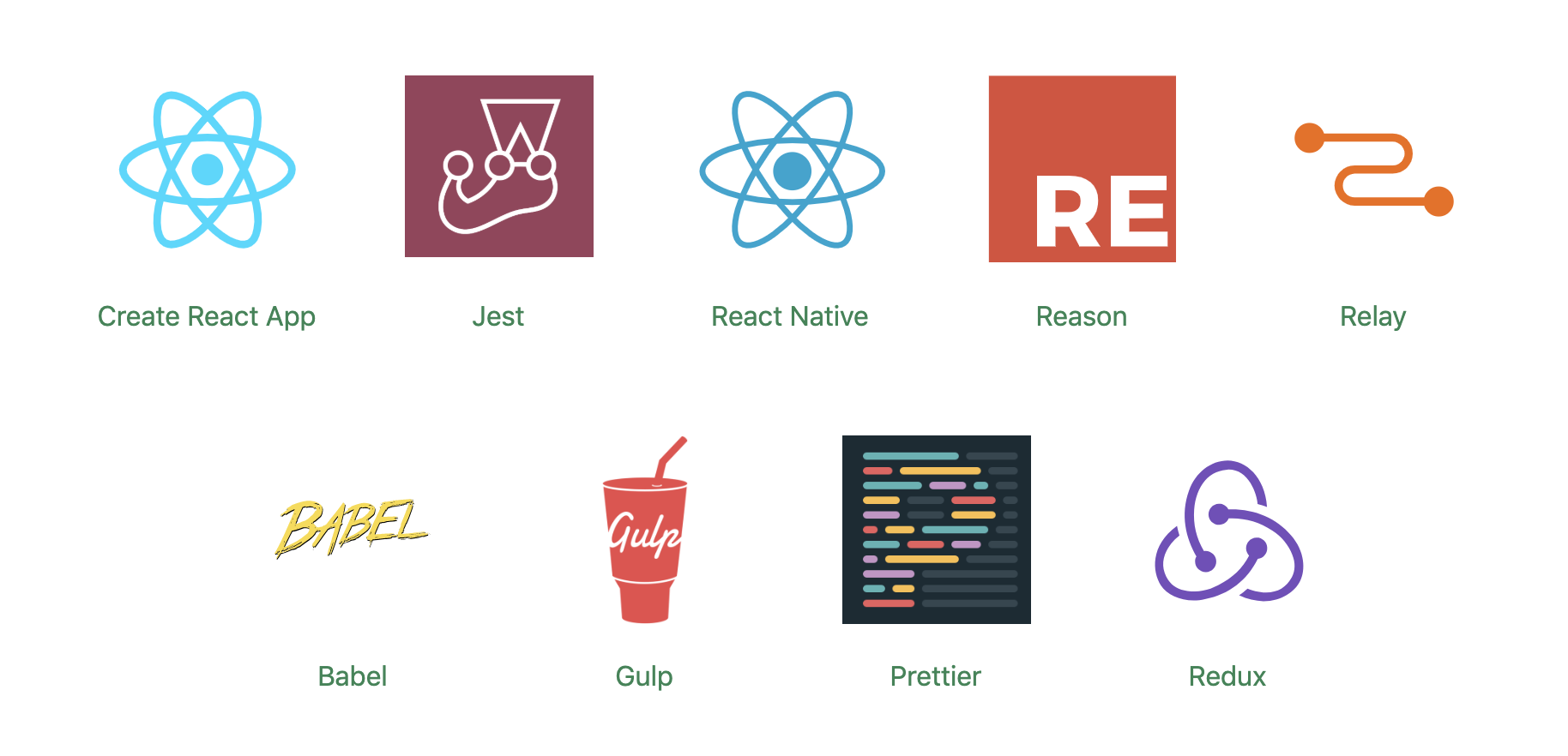
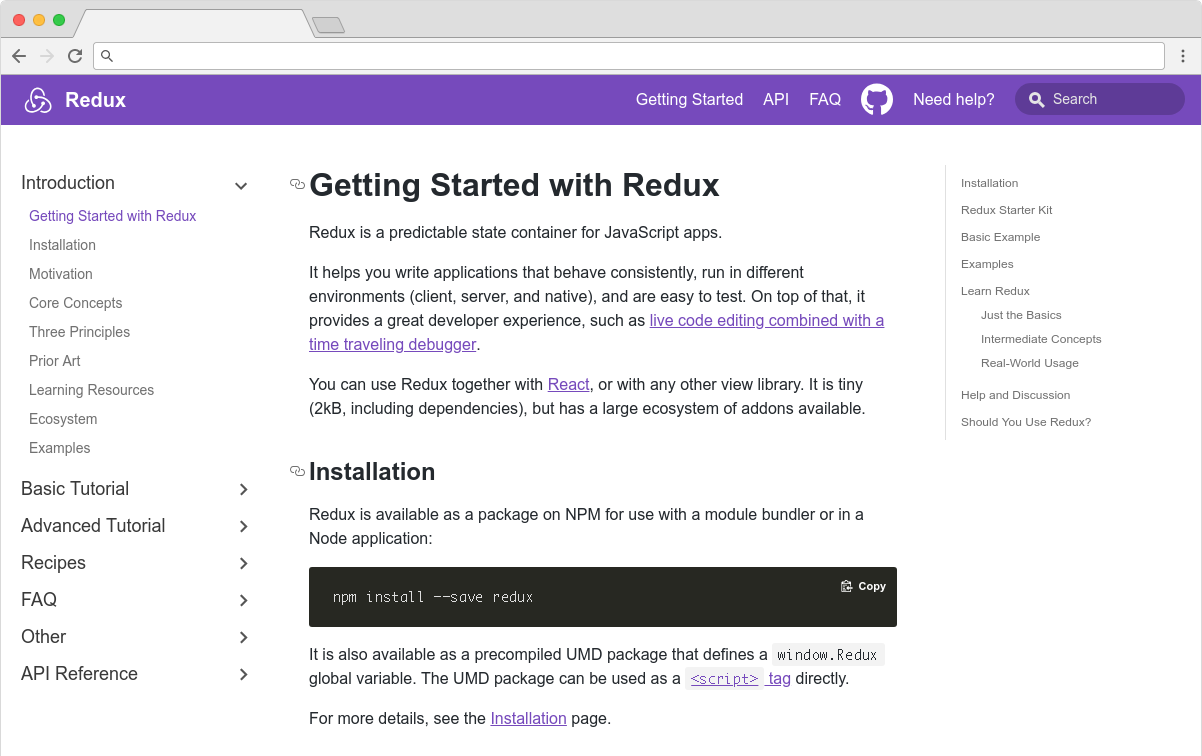
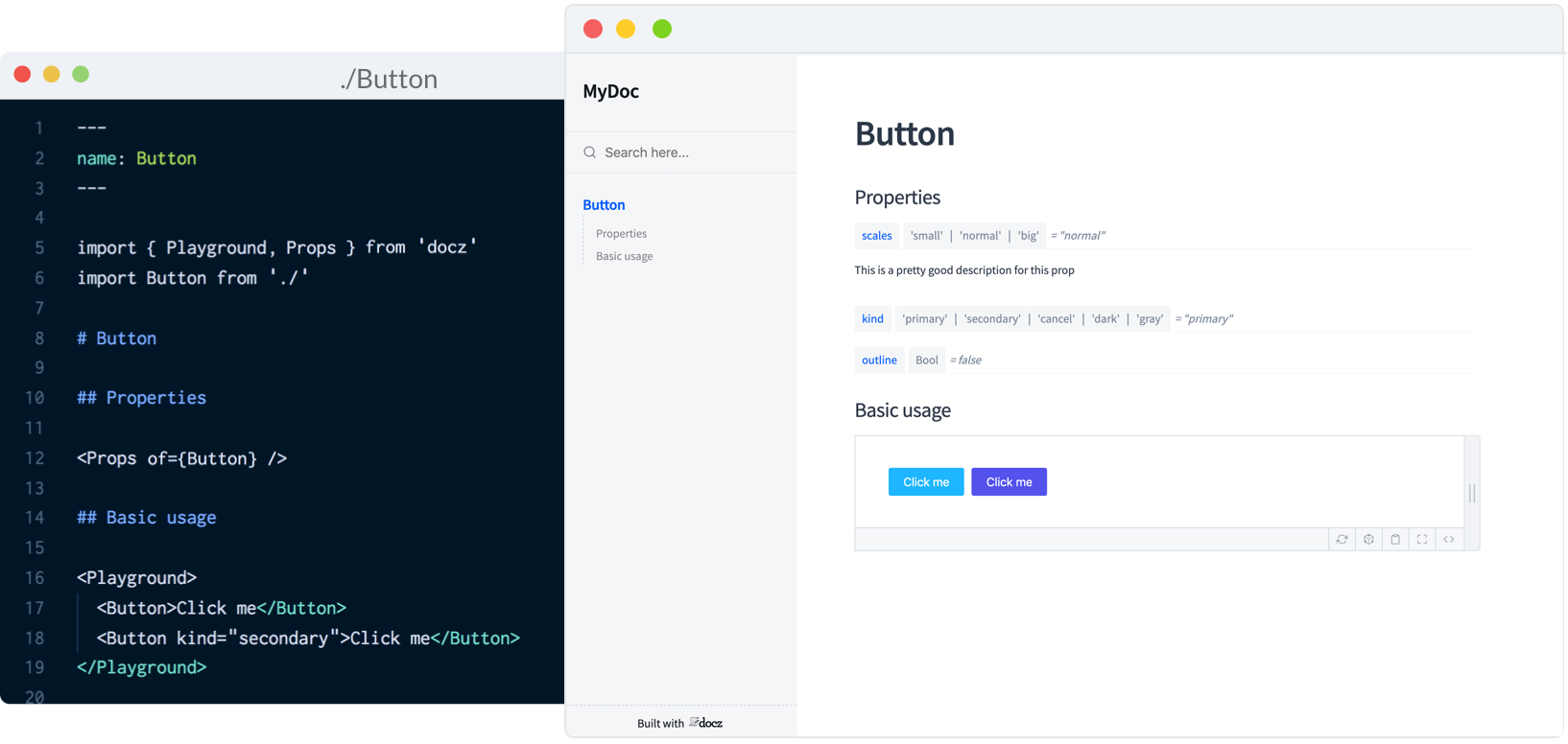
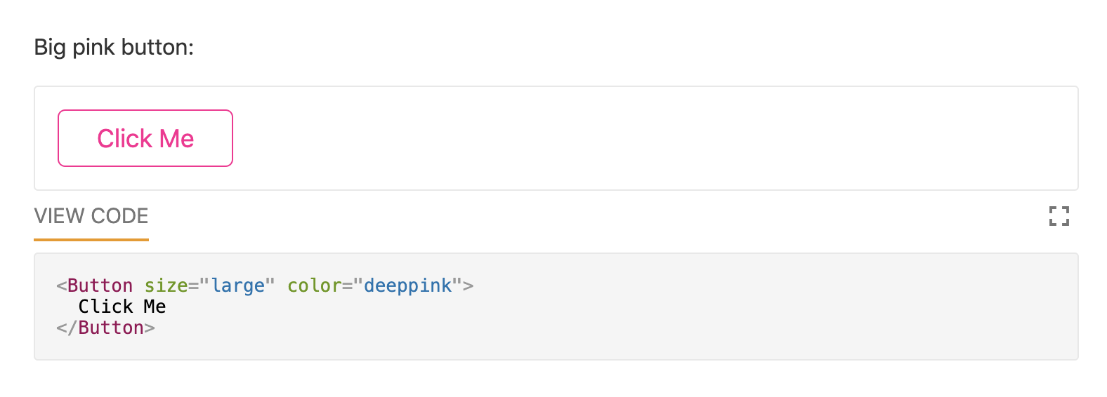
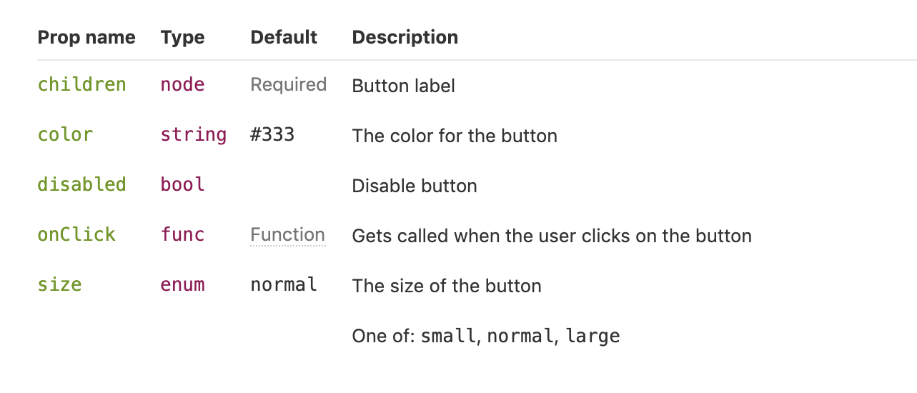

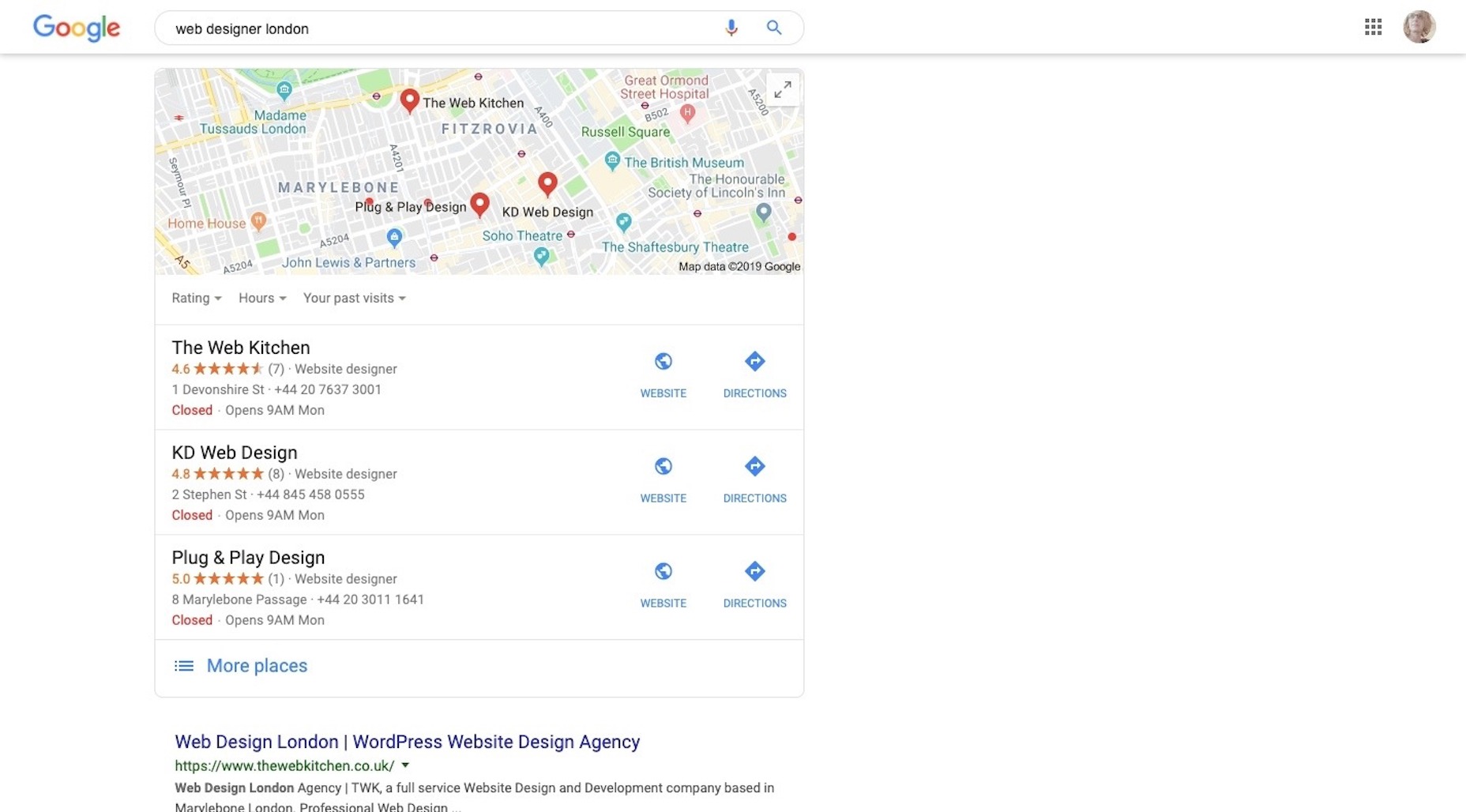
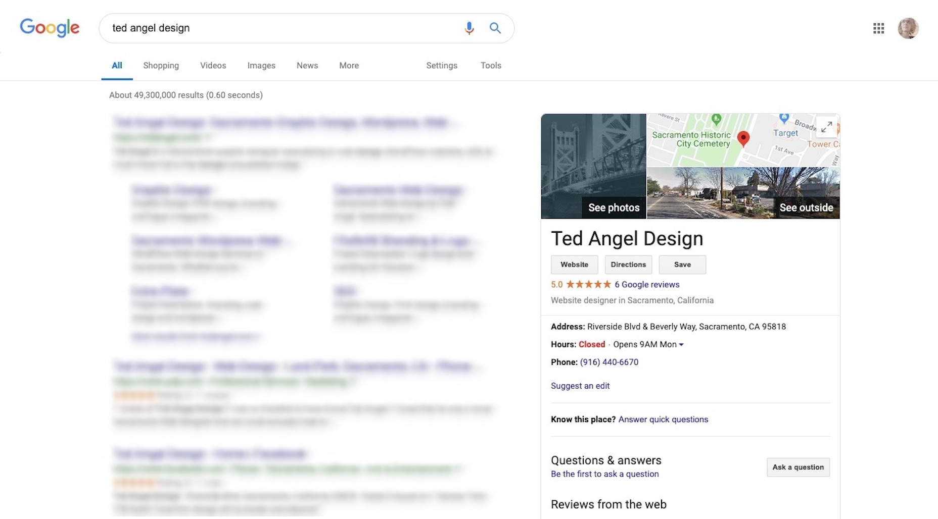
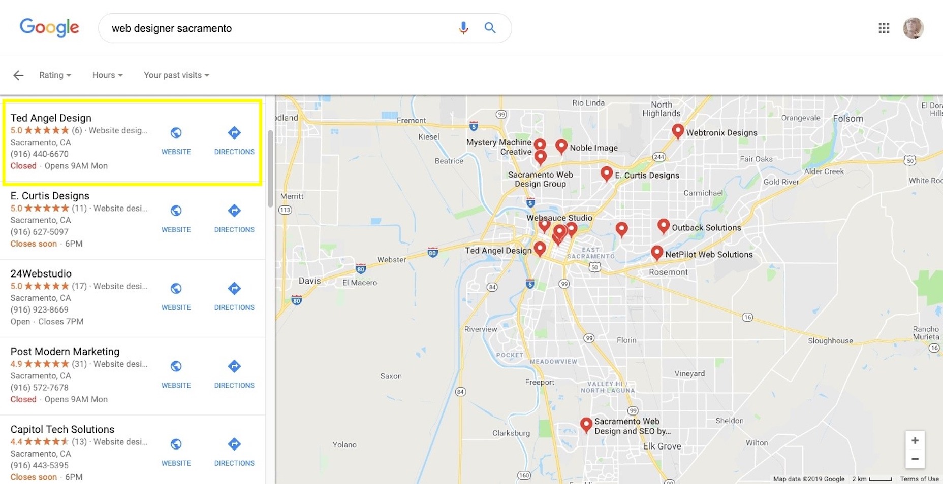
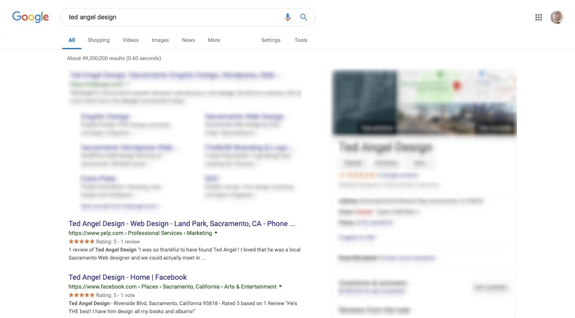
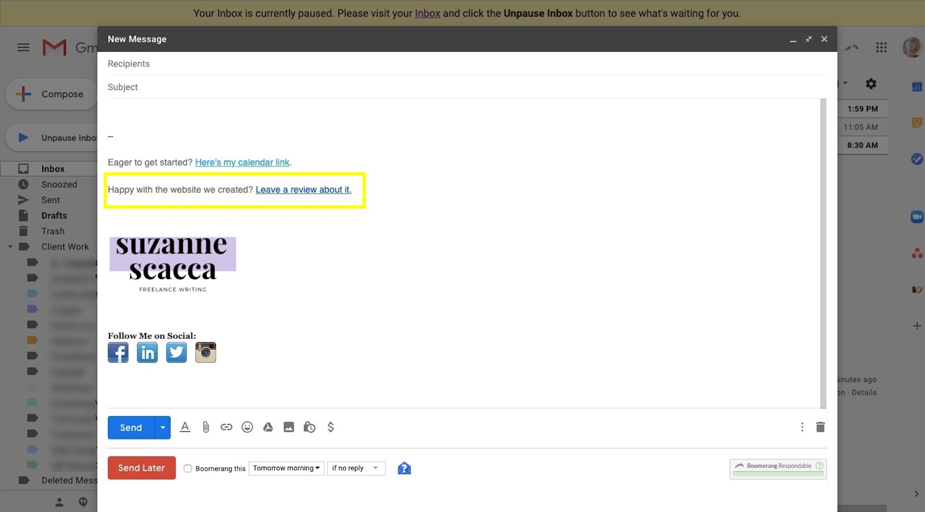