Is your email marketing campaign effective? Even if you’ve had success with email marketing in the past, your strategy might no longer be effective in 2019. We all know that email is evolving.
This year, there’s expected to be over 5.6 billion email accounts. That’s almost the entire human population on Earth.
With that in mind, you need an email marketing strategy that’s designed for the entire customer journey or lifecycle. Lifecycle marketing is about influencing user behavior so they know, like, and trust you. More importantly, those users will be willing to make a purchase, recommend your brand, and purchase again in the future. If you want to have a digital transformation strategy, you need to know the right emails to send. In this guide, we’ll share what you need to create an effective lifecycle email marketing campaign in 2019 as long as some strategies and examples.
Email Marketing Lifecycle Breakdown
First, let’s take a closer look at what we mean by lifecylce. A customer “lifecycle” is exactly what it sounds like. It’s the critical points customers take along their journey from the first introduction to becoming a dedicated customer. Here are some of those key points you’re likely to recognize:
First time visitor to your website
Browses website for key products or blog posts
Visits website for a second time
Adds product to a cart or considers making a purchase, leaves again
Returns a third time
Makes their first purchase
Returns to the website in the future to make an additional purchase
Leaves a positive review or recommends the product/service to others
While each industry and brand will have their own unique customer journey, in general, lifecycle campaigns have all of the following elements:
Welcome email
Brand or product information
Discount or nudge to purchase
Last chance for discount/deal
Request for review
Now, let’s look into what each of these types of emails is referring to as well as some successful examples of businesses that use these emails themselves.
1. Welcome Email
The welcome email is a chance to introduce yourself to your email subscribers. How do you get users to signup in the first place? Most people start with some kind of freebie, also known as a lead magnet. This could be a free download or even a discount. Welcome emails generate 4x more opens than regular emails, so this is not something to be overlooked.
To see an example of this, let’s look at Chick-fil-a, a well-known fast food restaurant. Once you sign up for their rewards program, you get a welcome email like the one below. This is a successful welcome email because it’s friendly and it makes it clear the value users get from being a part of this program.
2. Product Information
Now, your customers know a bit about your brand and what you’re about. It’s time to fill in those gaps that are getting in the way of them making a sale. They might have pain points that need to be addressed or common questions. This is the time to direct them to your top products, blog posts, customer reviews, and more.
Let’s look at the Chick-fil-a example again. In their informative email, they let customers know how to make the most out of their rewards program. While they’re not pushing any salesy language, they are encouraging users to learn more about all of the benefits of this new rewards program in a constructive way.
3. Nudge to Purchase
It’s time to start selling. Now that users know more about your brand, they might be ready to make a purchase. This is the time to show off your best products and deals and try to nudge a sale.
In this example below, Burrow, an online furniture retailer, encourages users to make a purchase for this limited-time sale. The discount won’t last long, so customers should hurry up to make a purchase while supplies last. This urgency is key when encouraging users to act fast.
4. Final Sale
Sometimes, users need a bit more nurturing to make a purchase. Depending on your audience, this might mean a follow-up discount code or even just more information. Remember, even if you don’t convert these users right now, you can still retarget them down the road.
For the first example, let’s look at a discount offered by Alien Valley, a creative design resource platform. After nurturing leads with informative how-to guides, they attempt to seal the deal with big savings.
In another example, see how Buzzsprout, an online podcast host, offers an informative seminar for users who might be on the fence about purchasing their hosting package. They’re offering the value that will help move users closer to making a purchase.
5. Follow Up Reviews
Last but not least, don’t be afraid to follow up after a sale has been made. You want your customers to leave positive feedback, and you want an opportunity to remedy the solution if things didn’t go over well with your customers. Most importantly, you want to give customers an opportunity to speak out about their positive experience with your brand.
Finally, let’s look at Valvoline, a car service center. After a user visits for an oil change, they send a follow-up email requesting instant feedback. From there, users are reminded of their recent service and offered a discount if they complete a short survey.
How Effective Are Your Lifecycle Emails?
This breakdown of the different lifecycle emails will help you understand any gaps in your own email strategy. Knowing when to send the right emails is the first part of the process. From there, you need to anticipate customer needs to always be ready with value and service.
If you haven’t yet created an email marketing strategy, let this guide shape your first steps. You have nothing to lose and so much to gain, so get started today.
Rachel Andrew’s talk at CSSconf is wonderful because it digs into one of the most exciting changes that’s coming soon to a browser near you: subgrid! That’s a change to the CSS Grid spec that allows for much greater flexibility for our visual designs. Subgrid allows us to set one grid on an entire page and let child elements use that very same grid tracks.
The reason why I’m very excited is because this solves one of the most annoying visual layout issues that I’ve come across since becoming a web developer, and if that sounds bonkers and/or wonderful to you, then make sure to check out Rachel’s talk because she does a much better job of describing this than I possibly could:
WordPress released their anticipated over to the post editor, nicknamed Gutenberg, which is also referred to as the block editor. It transforms a WordPress post into a collection of blocks that you can add, edit, remove and re-order in the layout. Before the official release, Gutenberg was available as a plugin and, during that time, I was interested in learning how to create custom blocks for the editor. I was able to learn a lot about Gutenberg that I decided to put together a course that discusses almost everything you need to know to develop blocks for Gutenberg.
In this article, we will discuss metaboxes and metafields in WordPress. Specifically, we’ll cover how to replace the old PHP metaboxes in Gutenberg and extend Gutenberg’s sidebar to add a React component that will be used to manipulate the metadata using the global JavaScript Redux-like stores. Note that metadata in Gutenberg can also be manipulated using blocks. And both ways are discussed in my course, however, in this article I am going to focus on managing metadata in the sidebar since I believe this method will be used more often.
This article assumes some familiarity with ReactJS and Redux. Gutenberg relies heavily on these technologies to render UI and manage state. You can also check out the CSS-Tricks guide to learning Gutenberg for an intro to some of the concepts we’ll cover here.
The block editor interface
Gutenberg is a React application
At its core, Gutenberg is a ReactJS application. Everything you see in the editor is rendered using a React component. The post title, the content area that contains the blocks, the toolbar at the top and the right sidebar are all React components. Data or application states in this React application are stored in centralized JavaScript objects, or “stores.” These stores are managed by WordPress’ data module. This module shares a lot of core principles with Redux. So, concepts like stores, reducers, actions, action creators, etc., also exist in this module. I will sometimes refer to these stores as “Redux-like” stores.
These stores do not only store any data about the current post, like the post content (the blocks), the post title, and the selected categories, but it also stores global information about a WordPress website, like all the categories, tags, posts, attachments and so on. In addition to that, UI state information like,”is the sidebar opened or closed?” are also stored in these global stores. One of the jobs of the “data module” is to retrieve data from these stores and also change data in the stores. Since these stores are global and can be used by multiple React components changing data in any store will be reflected in any Gutenberg UI part (including blocks) that uses this piece of data.
Once a post is saved, the WordPress REST API will be used to update the post using the data stored in these global stores. So the post title, the content, categories etc., that are stored in these global stores will be sent as payload in the WP REST API endpoint that updates the post. And thus if we are able to manipulate data in these stores, once the user clicks save, the data that we manipulated will be stored in the database by the API without us having to do anything.
One of the things that is not managed by these global stores in Gutenberg is metadata. If you have some metafields that you used to manage using a metabox in the pre-Gutenberg “classic” editor, those will not be stored and manipulated using the global Redux-like stores by default. However, we can opt-in to manage metadata using JavaScript and the Redux-like stores. Although those old PHP metaboxes will still appear in Gutenberg, WordPress recommends porting these PHP metaboxes to another approach that uses the global stores and React components. And this will ensure a more unified and consistent experience. You can read more about problems that could occur by using PHP metaboxes in Gutenberg.
So before we start, let’s take a look at the Redux-like stores in Gutenberg and how to use them.
Retrieving and changing data in Gutenberg’s Redux-like stores
We now know that the Gutenberg page is managed using these Redux-like stores. We have some default “core” stores that are defined by WordPress. Additionally, we can also define our own stores if we have some data that we would like to share between multiple blocks or even between blocks and other UI elements in the Gutenberg page, like the sidebar. Creating your own stores is also discussed in my course and you can read about it in the official docs. However, in this article we will focus on how to use the existing stores. Using the existing stores lets us manipulate metadata; therefore we will not need to create any custom stores.
In order to access these stores, make sure you have the latest WordPress version with Gutenberg active and edit any post or page. Then, open your browser console an type the following statement:
wp.data.select('core/editor').getBlocks()
You should get something like this:
Let’s break this down. First, we access the wp.data module which (as we discussed) is responsible for managing the Redux-like stores. This module will be available inside the global wp variable if you have Gutenberg in your WordPress installation. Then, inside this module, we call a function called select. This function receives a store name as an argument and returns all the selectors for this store. A selector is a term used by the data module and it simply means a function that gets some data from the store. So, in our example, we accessed the core/editor store, and this will return a bunch of functions that can be used to get data from this store. One of these functions is getBlocks() which we called above. This function will return an array of objects where each object represents a block in your current post. So depending on how many blocks you have in your post, this array will change.
As we’ve seen, we accessed a store called core/editor. This store contains information about the current post that you are editing. We’ve also seen how to get the blocks in the current post but we can also get a lot of other stuff. We can get the title of the current post, the current post ID, the current post post type and pretty much everything else we might need.
But in the example above, we were only able to retrieve data. What if we want to change data? Let’s take a look at another selector in the ‘core/editor’ store. Let’s run this selector in our browser console:
This should return the title of the post currently being edited:
Great! Now what if we want to change the title using the data module? Instead of calling select(), we can call dispatch() which will also receive a store name and return some actions that you can dispatch. If you are familiar with Redux, terms like “actions” and “dispatch” will sound familiar to you. If this sounds new to you, all you need to know is that dispatching a certain action simply means changing some data in a store. In our case, we want to change the post title in the store, so we can call this function:
wp.data.dispatch('core/editor').editPost({title: 'My new title'})
Now take a look at the post title in the editor — it will be changed accordingly!
That’s how we can manipulate any piece of data in the Gutenberg interface. Wan retrieve the data using selectors and change that data using actions. Any change will be reflected in any part of the UI that uses this data.
There are, of course, other stores in Gutenberg that you can checkout on this page. So, let’s take a quick look at a couple of more stores before we move on.
The stores that you will use the most are the core/editor which we just looked at, and the core store. Unlike core/editor, the core store contains information, not only about the currently edited post, but also about the whole WordPress website in general. So, for instance, we can get all the authors on the website using:
wp.data.select('core').getAuthors()
We can also get some posts from the website like so:
Make sure to run this twice if the first result was null. Some selectors like this one will send an API call first to get your post. That means the the returned value will initially be null until the API request is fulfilled:
Let’s look at one more store: edit-post. This store is responsible for the UI information in the actual editor. For example, we can have selectors that check if the sidebar is currently open:
This will return true if the sidebar is opened. But try closing the sidebar, run this function again, and it should return false.
We can also open and close the sidebar by dispatching actions in this store. Having the sidebar open and running this action in the browser console, the sidebar should be closed:
You will unlikely need to use this store, but it’s good to know that this is what Gutenberg does when you click on the sidebar icon to close it.
There are some more stores that you might need to take a look at. The core/notices store, for instance, could be useful. This can help you display error, warning and success messages in the Gutenberg page. You can also check all the other stores here.
Try to play around with these stores in your browser until you feel comfortable using them. After that, we can see how to use them in real code outside the browser.
Let’s setup a WordPress plugin to add a Gutenberg sidebar
Now that we know how to use the Redux-like stores in Gutenberg, the next step is to add a React sidebar component in the editor. This React component will be connected to the core/editor store and it will have some input that, when changed, will dispatch some action that will manipulate metadata — like the way we manipulated the post title earlier. But to do that, we need to create a WordPress plugin that holds our code.
Let’s create a new folder inside wp-content/plugins directory of the WordPress installation. I am going to call it gutenberg-sidebar. Inside this folder, let’s create the entry point for our plugin. The entry point is the PHP file that will be run when activating your plugin. It can be called index.php or plugin.php. We’re going to use plugin.php for this example and put some information about the plugin at the top as well as add some code that avoids direct access:
You should find your plugin on the Plugins screen in the WordPress admin. Click on “Activate” in order for the code to run.
As you might imagine, we will write a lot of JavaScript and React from this point, forward. And in order to code React components easily we will need to use JSX. And JSX is not valid JavaScript that can run in your browser, it needs to be converted into plain JavaScript. We might also need to use ESNext features and import statements for importing and exporting modules.
And these features will not work on all browsers, so it’s better to transform our code into old ES5 JavaScript. Thankfully, there are a lot of tools that can help us achieve that. A famous one is webpack. webpack, however, is a big topic in itself and it won’t fit the scope of this article. Therefore, we are going to use another tool that WordPress provides which is @wordpress/scripts. By installing this package, we will get a recommended webpack configuration without having to do anything in webpack ourselves. Personally, I recommend that you learn webpack and try to do the configuration yourself. This will help you understand what’s going on and give you more control. You can find a lot of resources online and it’s also discussed in my course. But for now, let’s install the WordPress webpack configuration tool.
Change to your plugin folder in Terminal:
cd path/to/your/theme/folder
Next, we need to initialize npm in that folder in order to install @wordpress/scripts. This can be done by running this command:
npm init
This command will ask you some questions like the package name, version, license, etc. You can keep hitting Enter and leave the default values. You should have a package.json file in your folder and we can start installing npm packages. Let’s install @wordpress/scripts by running the following command:
npm install @wordpress/scripts --save-dev
This package will expose a CLI called wp-scripts which you can use in your npm scripts. There are different commands that you can run. We will focus on the build and start commands for now. The build script will transform your files so that they are minified and ready for production. Your source code's entry point is configured in src/index.js and the transformed output will be at build/index.js. Similarly, the start script will transform your code in src/index.js to build/index.js, however, this time, the code will not be minified to save time and memory — the command will also watch for changes in your files and re-build your files every time something is changed. The start command is suitable to be used for development while the build command is for production. To use these commands, we will replace the scripts key in the package.json file which will look something like this if you used the default options when we initialized npm.
Change this:
"scripts": {
  "test": "echo "Error: no test specified" && exit 1"
},
Now we can run npm start and npm run build to start development or build files, respectively.
Let's create a new folder in the plugin's root called src and add an index.js file in it. We can see it things are working by sprinkling in a little JavaScript. We'll try an alert.
Now run npm start in Terminal. You should find the build folder created with the compiled index.js and also sourcemap files. In addition to that, you will notice that the build/index.js file is not minified and webpack will be watching for changes. Try changing the src/index.js file and save again. The build/index.js file will re-generated:
If you stop the watch (Ctrl + C ) in Terminal and run npm run build, the build/index.js file should now be minified.
Now that we have our JavaScript bundle, we need to enqueue this file in the Gutenberg editor. To do that we can use the hoo enqueue_block_editor_assets which will insure that the files are enqueued only in the Gutenberg page and not in other wp-admin pages where it isn't needed.
We can enqueue our file like so in plugin.php:
// Note that it's a best practice to prefix function names (e.g. myprefix)
function myprefix_enqueue_assets() {
  wp_enqueue_script(
    'myprefix-gutenberg-sidebar',
    plugins_url( 'build/index.js', __FILE__ )
  );
}
add_action( 'enqueue_block_editor_assets', 'myprefix_enqueue_assets' );
Visit the Gutenberg page. If all is well, you should get an alert, thanks to what we added to src/index.js earlier.
Fantastic! We're ready to write some JavaScript code, so let's get started!
Importing WordPress JavaScript packages
In order to add some content to the existing Gutenberg sidebar or create a new blank sidebar, we need to register a Gutenberg JavaScript plugin — and in order to do that, we need to use some functions and components from packages provided by WordPress: wp-plugins, wp-edit-post and wp-i18n. These packages will be available in the wp global variable in the browser as wp.plugins, wp.editPost and wp.i18n.
We can import the functions that we need into src/index.js. Specifically, those functions are: registerPlugin and PluginSidebar.
It's worth noting that we need to make sure that we have these files as dependencies when we enqueue our JavaScript file in order to make sure that our index.js file will be loaded after the wp-plugins, wp-edit-posts and wp-i18n packages. Let's add those to plugin.php:
Notice that I added wp-element in there as a dependency. I did that because we will write some React components using JSX. Typically, we'd import the entire React library when making React components. However, wp-element is an abstraction layer atop React so we never have to install or import React directly. Instead, we use wp-element as a global variable.
These packages are also available as npm packages. Instead of importing functions from the global wp variable (which will only be available in the browser that your code editor knows nothing about), we can simply install these packages using npm and import them in our file. These WordPress packages are usually prefixed with @wordpress.
import { registerPlugin } from "@wordpress/plugins";
import { PluginSidebar } from "@wordpress/edit-post";
import { __ } from "@wordpress/i18n";
The advantage of importing the packages this way is that your text editor knows what @wordpress/edit-post and @wordpress/plugins are and it can autocomplete functions and components for you — unlike importing from wp.plugins and wp.editPost which will only be available in the browser while the text editor has no clue what wp is.
Your text editor can autocomplete component names for you.
You might also think that importing these packages in your bundle will increase your bundle size, but there's no worries there. The webpack config file that comes with @wordpress/scripts is instructed to skip bundling these @wordpress packages and depend of the wp global variable instead. As a result, the final bundle will not actually contain the various packages, but reference them via the wp variable.
Great! so I am going to stick to importing packages using npm in this article, but you are totally welcome to import from the global wp variable if you prefer. Let's now use the functions that we imported!
Registering a Gutenberg Plugin
In order to add a new custom sidebar in Gutenberg, we first need to register a plugin — and that's what the registerPlugin function that we imported will do. As a first argument, registerPlugin will receive a unique slug for this plugin. We can have an array of options as a second argument. Among these options, we can have an icon name (from the dashicons library) and a render function. This render function can return some components from the wp-edit-post package. In our case. we imported the PluginSidebar component from wp-edit-post and created a sidebar in the Gutenberg editor by returning this component in the render function. I also added PluginSidebar inside a React fragment since we can add other components in the render function as well. Also, the __ function imported from wp-i18n will be used so we can translate any string that we output:
You should now have a new icon beside the cog icon in the Gutenberg editor screen. This smiley icon will toggle our new sidebar which will have whatever content we have inside the PluginSidebar component:
If you were to click on that star icon beside the sidebar title, the sidebar smiley icon will be removed from the top toolbar. Therefore, we need to add another way to access our sidebar in case the user un-stars it from the top toolbar, and to do that, we can import a new component from wp-edit-post called PluginSidebarMoreMenuItem. So, let's modify out import statement:
import { PluginSidebar, PluginSidebarMoreMenuItem } from "@wordpress/edit-post";
The PluginSidebarMoreMenuItem will allow us to add an item in the Gutenberg menu that you can toggle using the three dots icon at the top-right of the page. We want to modify our plugin to include this component. We need to give PluginSidebar a name prop and give PluginSidebarMoreMenuItem a target prop with the same value:
In the menu now, we will have a "Meta Options" item with our smiley icon. This new item should toggle our custom sidebar since they are linked using the name and the target props:
Great! Now we have a new space in our Gutenberg page. We can replace the "some content" text in PluginSidebar and add some React components of our own!
Also, let's make sure to check the edit-post package documentation. This package contains a lot of other components that you can add in your plugin. These components can allow you to extend the existing default sidebar and add your own components in it. Also, we can find components that allow us to add items in the Gutenberg top-right menu and also for the blocks menu.
Handling metadata in the classic editor
Let's take a quick look at how we used to manage metadata in the classic editor using metaboxes. First, install and activate the classic editor plugin in order to switch back to the classic editor. Then, add some code that will add a metabox in the editor page. This metabox will manage a custom field that we'll call _myprefix_text_metafield. This metafield will just be a text field that accepts HTML markup. You can add this code in plugin.php or put it in a separate file and include it plugin.php:
Rendering an HTML input using the myprefix_post_options_metabox_html function
Controlling the metafield, called _myprefix_text_metafield
Using the save_post action hook to get the HTML input value and update the field using update_post_meta.
If you have the classic editor plugin installed, then you should see the metafield in the post editor:
Note that the field is prefixed with an underscore (_myprefix_text_metafield) which prevents it from being edited using the custom fields metabox that comes standard in WordPress. We add this underscore because we intend to manage the field ourselves and because it allows us to hide it from the standard Custom Fields section of the editor.
Now that we have a way to manage the field in the classic editor, let's go ahead and deactivate the classic editor plugin and switch back to Gutenberg. The metabox will still appear in Gutenberg. However, as we discussed earlier, WordPress recommends porting this PHP-based metabox using a JavaScript approach.
That's what we will do in the rest of the article. Now that we know how to use the Redux-like stores to manipulate data and how to add some React content in the sidebar, we can finally create a React component that will manipulate our metafield and add it in the sidebar of the Gutenberg editor.
We don't want to completely get rid of the PHP-based field because it's still helpful in the event that we need to use the classic editor for some reason. So, we're going to hide the field when Gutenberg is active and show it when the classic editor is active. We can do that by updating the myprefix_add_meta_box function to use the __back_compat_meta_box option:
Let's move on to creating the React component that manages the metadata.
Getting and setting metadata using JavaScript
We have seen how to get the post title and how to change it using the wp-data module. Let's take a look at how to do the same for custom fields. To get metafields, we can call the save selector getEditedPostAttribute. But this time we will pass it a value of meta instead of title.
Once that's done, test it out in the browser console:
As you will see, this function will return an empty array, although we are sure that we have a custom field called _myprefix_text_metafield that we are managing using the classic editor. To make custom fields manageable using the data module, we first have to register the field in the plugin.php.
Make sure to set the show_in_rest option to true. WordPress will fetch the fields using the WP REST API. That means, we need to enable the show_in_rest option to expose it.
Run the console test again and we will have an object with all of our custom fields returned.
Amazing! We are able to get our custom field value, so now let's take a look at how can we change the value in the store. We can dispatch the editPost action in the core/editor store and pass it an object with a meta key, which will be another object with the fields that we need to update:
Now try running the getEditedPostAttribute selector again and the value should be updated to new value.
If you try saving a post after updating the field using Redux, you will get an error. And if you take a look at the Network tab in DevTools, you will find that the error is returned from the wp-json/wp/v2/posts/{id} REST endpoint that says that we are not allowed to update _myprefix_text_metafield.
This because WordPress treats any field that is prefixed with an underscore as a private value that cannot be updated using the REST API. We can, however, specify an auth_callback option that will allow updating this field using the REST API when it returns true as long as the editor is capable of editing posts. We can also add the sanitize_text_field function to sanitize the value before saving to the database:
Does the new value show up in the console? If so, great! Now we know how to get and set the meta field value using Redux and we are ready to create a react component in the sidebar to do that.
Creating a React component to manage the custom fields
What we need to do next is create a React component that contains a text field that is controlled by the value of the metafield in the Redux store. It should have the value of the meta field...and hey, we already know how to get that! We can create the component in a separate file and then import it index.js. However I am simply going to create directly in index.js since we're dealing with a very small example.
Again, we're only working with a single text field, so let's import a component provided by a WordPress package called @wordpress/components. This package contains a lot of reusable components that are Gutenberg-ready without us having to write them from scratch. It's a good idea to use components from this package in order to be consistent with the rest of the Gutenberg UI.
First, let's install this package:
npm install --save @wordpress/components
We'll import TextControl and PanelBody at the top of index.js to fetch the two components we need from the package:
import { PanelBody, TextControl } from "@wordpress/components";
Now let's create our component. I am going to create a React functional component and call it PluginMetaFields, but you can use a class component if you'd prefer that.
PanelBody takes title, icon and initialOpen props. Title and icon are pretty self-explanatory. initialOpen puts the panel in an open/expanded state by default. Inside the panel, we have TextControl. which receives a label and a value for the input. As you can see in the snippet above, we get the value from the global store by accessing the _myprefix_text_metafield field from the object returned by wp.data.select('core/editor').getEditedPostAttribute('meta').
Notice that we are now depending on @wordpress/components and use wp.data. We must add these packages as dependencies when we enqueue our file in plugin.php:
This should should give you a "Meta Options" panel that contains a "Meta Fields" title, a pin icon, and a text input with a "Test Meta" label and default value of "new value."
Nothing will happen when you type into the text input because we are not yet handling updating the field. We'll do that next, however, we first need to take care of another problem. Try to run editPost in the DevTools console again, but with a new value:
wp.data.dispatch('core/editor').editPost({meta: {_myprefix_text_metafield: 'a newer value'}})
You will notice that the value in the text field will not update to the new value. That's the problem. We need the field to be controlled by the value in the Redux store, but we don't see that reflected in the component. What's up with that?
If you have used Redux with React before, then you probably know that we need to use a higher order component called connect in order to use Redux store values in a React component. The same goes for React components in Gutenberg — we have to use some higher order component to connect our component with the Redux-like store. Unfortunately, we are unable to simply call wp.data.select directly as we did before. This higher order component lives in the wp.data global variable which is also available as an npm package called @wordpress.data. So let's install it to help us solve the issue.
npm install --save @wordpress/data
The higher order component we need is called withSelect, so let's import it in index.js.
import { withSelect } from "@wordpress/data";
Remember that we already added wp-data as a dependency in wp_enqueue_script, so we can just use it by wrapping our component with it, like so:
Here, we're overriding our PluginMetaFields component and assigning it the same component, now wrapped with the withSelect higher order component. withSelect will receive a function as an argument. This function will receive the select function (which we used to access wp.data.select) and it should return an object. Each key in this object will be injected as a prop in the component (similar to connect in Redux). withSelect will return a function that we can pass it the component (PluginMetaFields) again as seen above. So, by having this higher order component, we now get text_metafield as a prop in the component, and whenever the meta value in the redux store is updated, the prop will also get updated — thus, the component will update since components update whenever a prop is changed.
If you now try and run editPost with a new meta value in your browser, the value of the text field in the sidebar should also be updated accordingly!
So far, so good. Now we know how to connect our React components with our Redux-like stores. We are now left with updating the meta value in the store whenever we type in the text field.
Dispatching actions in React components
We now need to dispatch the editPost action whenever we type into the text field. Similar to wp.data.select, we also should not call wp.data.dispatch directly in our component like so:
// Do not do this
<TextControl
    value={props.text_metafield}
    label={__("Text Meta", "textdomain")}
    onChange={(value) => wp.data.dispatch('core/editor').editPost({meta: {_myprefix_text_metafield: value}})
    }
/>
We will instead wrap our component with another higher order component from the @wordpress.data package called withDispatch. We've gotta import that, again, in plugin.js:
import { withSelect, withDispatch } from "@wordpress/data";
In order to use it, we can wrap our component — which is already wrapped with withSelect and again with withDispatch — like so:
You can check out yet another WordPress package called @wordpress/compose. It makes using multiple high order components a bit cleaner for use in a single component. But I will leave that to you to try out for the sake of keeping our example simple.
withDispatch is similar to withSelect in that it will receive a function that has the dispatch function as an argument. That allows us to return an object from this function that contains functions that will be available inside the component's props. I went about this by creating a function with an arbitrary name (onMetaFieldChange) that will receive a value, dispatch the editPost action, and set the meta value in the Redux store to the value received in the function's argument. We can call this function in the component and pass it the value of the text field inside the onChange callback:
Confirm everything is working fine by opening the custom sidebar in the WordPress post editor, updating the field, saving the post and then refreshing the page to make sure the value is saved in the database!
Let's add a color picker
It should be clear now that can we update a meta field using JavaScript, but we've only looked at simple text field so far. The @wordpress/components library provides a lot of very useful components, including dropdowns, checkboxes, radio buttons, and so on. Let's level up and conclude this tutorial by taking a look at how we can use the color picker component that's included in the library.
You probably know what to do. First, we, import this component in index.js:
import { PanelBody, TextControl, ColorPicker } from "@wordpress/components";
Now, instead of registering a new custom field, let's aim for simplicity and assume that this color picker will be controlled by the same _myprefix_text_metafield field we worked with earlier. We can use the ColorPicker component inside our PanelBody and it will be very similar to what we saw with TextControl, but the prop names will be slightly different. We have a color prop instead of value and onChangeComplete instead on onChange. Also, onChangeComplete will receive a color object that contains some information about the chosen color. This object will have a hex property we can use to store the color value in the _myprefix_text_metafield field.
We should now have a color picker in our sidebar, and since it's controlling the same meta field as the TextControl component, our old text field should update whenever we pick a new color.
That's a wrap!
If you have reached this far in the article, then congratulations! I hope you enjoyed it. Make sure to check out my course if you want to learn more about Gutenberg and custom blocks. You can also find the final code for this article over at GitHub.
Who needs a project manager? You’re an organized person who can keep track of your own work, right?
Wrong.
Well, wrong if you’re part of a team. The thing about being self-organized is that it’s related to project management but not synonymous with it. Case in point: what happens if your project relies on someone else’s involvement? Sure you’re organized, but can you always say the same about your co-workers? Chances are you need something to keep everyone in sync so that a project stays on course.
monday.com is project management, but with a human touch. Sure, there’s task lists, assignments, milestones, due dates, and such like you would expect from any project management tool. That’s a given. That said, monday.com takes things up a notch by stripping away the barriers that prevent team members from collaborating with one another. For example, monday.com includes real-time messaging, file sharing, reporting, and a slew of other features that bridge the gaps between people and tasks so that everyone has purview into the progress of a project. Plus, it’s so pretty to look at.
There’s so much more than meets the eye because monday.com goes beyond project management. There’s resource management that ensures you have the right tools for a project, forecasting to affirm the prospect of a business opportunity, and even client management services. Seriously, your team and perhaps company can lean into monday.com and get a ton of use out of it.
You know what to do from here. Give monday.com a try. There’s a free 14-day trial and we’re sure you’ll find it to be so useful that you’ll want to stick with it well beyond.
We love pushing the boundaries on the web, and so we’ve decided to try something new. You probably have heard of JAMstack — the new web stack based on JavaScript, APIs, and Markup — but what does it mean for your workflow and when does it make sense in your projects?
As a part of our Smashing Membership, we run Smashing TV, a series of live webinars, every week. No fluff — just practical, actionable webinars with a live Q&A, run by well-respected practitioners from the industry. Indeed, the Smashing TV schedule looks pretty dense already, and it’s free for Smashing Members, along with recordings — obviously.
We’ve kindly asked Phil Hawksworth to run a webinar explaining what JAMStack actually means and when it makes sense, as well as how it affects tooling and front-end architecture. The one hour-long webinar is now available as well. We couldn’t be happier to welcome Phil to co-MC our upcoming SmashingConf Toronto (June 25-26) and run JAMStack_conf London, which we co-organize on July 9-10 this year as well. So, let’s get into it!
Phil Hawksworth: Excellent, okay, well let’s get into it then. Just by way of a very quick hello, I mean I’ve said hello already, Scott’s given me a nice introduction. But yes, I currently work at Netlify, I work in the developer experience team there. We are hopefully going to have plenty of time for Q&A but, as Scott mentioned, if you don’t get a chance to ask questions there, or if you just rather, you can ping them directly at me on Twitter, so my Twitter handle is my names, it’s Phil Hawksworth, so any time you can certainly ask me questions about JAMstack or indeed anything on Twitter.
Phil Hawksworth: But I want to start today just by kind of going back in time a little bit to this quote which really resonates very, very strongly with me. This is a quote from the wonderful Aaron Schwartz who, of course, contributed so much to the Creative Commons and the open web and he wrote this on his blog way back in 2002, and he said, “I care about not having to maintain cranky AOL server, Postgres and Oracle installs.” AOL server, I had to look up to remind myself was an open source web server at the time.
Phil Hawksworth: But this chimes really strongly with me. I also don’t want to be maintaining infrastructure to keep a blog alive, and that’s what he was talking about. And it was in this blog post on his own blog and it was titled “Bake, Don’t Fry”. He was picking on a term that someone who’d built a CMS recently had started to use, and he kind of popularized this term about baking (Bake, Don’t Fry); what he’s talking about there is pre-rendering rather than rendering on demand, so baking the content ahead of time, rather than frying it on demand when people come and ask for it — getting things away from request time and into kind of build time.
Phil Hawksworth: And when we’re talking about pre-rendering and rendering, what we mean by that is we’re talking about generating markup. I feel a bit self-conscious sometimes talking about kind of server render or isomorphic rendering or lots of these kind of buzzwordy terms; I got called out a few years ago at a conference, Frontiers Conference in Amsterdam when I was talking about rendering on the server and someone said to me, “You mean generating HTML? Just something that outputs HTML?” And that’s, of course, what I mean.
Phil Hawksworth: But all of this kind of goes a long way towards simplifying the stack. When we think about the stack that we serve websites from; I’m all about trying to simplify things, I’m super keen on trying to simplify the stack. And that’s kind of at heart of this thing called “JAMstack” and I want to try and explain this a little bit. The “JAM” in JAMstack stands for JavaScript, APIs and Markup. But that’s not enough really to help us understand what it means — what on earth does that really mean?
Phil Hawksworth: Well, what I want to try and do in the next half hour or so, is I want to kind of expand on that definition and give more of a description of what JAMstack is. I want to talk a bit about the impact and the implications of JAMstack, and, you know, think about what that can give us as to why we might choose it. Along the way, I’m going to try to mention some of the tools and services that will be useful, and hopefully, I’ll wrap up with some resources that you might want to dig into and perhaps mention some first steps to get you under way.
Phil Hawksworth: So, that’s the plan for the next half-hour. But, I want to, kind of, come back to this notion about simplifying the stack, because, hopefully, people who join this or have come to watch this video later on, maybe you’ve got a notion of what JAMstack is, or maybe it’s a completely new term, and you’re just curious. But, ultimately, there are a lot of stacks out there, already. There are lots of ways that you can deliver a website. It feels like we’ve been building different types of infrastructure for a really long time, whether that’s a LAMP stack or the MAMP stack, or the — I don’t know — the MEAN stack. There’s a bunch of them floating by on the screen here. There are lots and lots of them.
Phil Hawksworth: So, why on earth would we need another one? Well, JAMstack is, as I mentioned, is JavaScript/API/Markup, but if we try and be a tiny bit more descriptive, JAMstack is intended to be a modern architecture, to help create fast and secure sites and dynamic apps with JavaScript/APIs and pre-rendered markup, served without web servers, and it’s this last point which is, kind of, something that sets it apart and maybe, makes it a little bit more, kind of, interesting and unusual.
Phil Hawksworth: This notion of serving something without web servers, that sounds either magical or ridiculous, and hopefully, we’ll figure out what along the way. But to try and shed some light over this and describe it in a little bit more detail, it’s sometimes useful to compare it to what we might think of as a traditional stack, or a traditional way of serving things on the web. So, let’s do that just for a second. Let’s just walkthrough, perhaps, what a request might look like as it gets serviced in a traditional stack.
Phil Hawksworth: So, in this scenario, we got someone opening up a web browser and making a request to see a page. And maybe that request hits a CDN, but probably, more likely, it hit some other infrastructure that we are hosting — as the people who own this site. Maybe we tried to make sure that this is going to scale under lots of load because we, obviously, want a very popular and successful sight. So, perhaps we got a load balancer, that has some logic in it, which will service that request to one of a number of web servers that we’ve provisioned and configured and deployed to. There might be a number of those servers.
Phil Hawksworth: And those servers will execute some logic to say, “Okay, here’s our template, we need to populate that with some data.” We might get our data from one of a number of database servers that will perform some logic to look up some data, return that to the web server, create a view that we then pass back through the load balancer. Perhaps, along the way, calling off to CDN, stashing some assets in the CDN, and I should clarify, a CDN is a Content Delivery Network, so a network of machines distributed around the Internet to try and get request service as close to possible to the user and add things, like caching.
Phil Hawksworth: So, we might stash some assets there, and ultimately, return a view into the browser, into the eyeballs of the user, who gets to then experience the site that we built. So, obviously, that’s, either, an oversimplification or a very general view of how we might service a request in a traditional stack. If we compare that to the JAMstack, which is servicing things in a slightly different way, this is how it might look.
Phil Hawksworth: So, again, same scenario, we’re starting in a web browser. We’re making a request for a view of the page, and that page is already in a CDN. It serves statically from there, so it’s returned to the user, into the browser, and we’re done. So, obviously, a very simplified view, but straight away, you can start to see the differences here in terms of complexity. In terms of places that we need to manage code, deeply code, all of those different things. So, for me, one of the core attributes one of a JAMstack, is that it means that you’re building a site that’s capable of being served directly from a CDN, or even from a static file server. CDN is something that we might want to put in place to handle load, but ultimately, this could be served directly from any kind of static file server, kind of static hosting infrastructure.
Phil Hawksworth: JAMstack, kind of, offers an opportunity to reduce complexity. Just comparing those two parts of the diagram that we’ll come back to a few times, over the course of the next half hour, you can see that it’s an opportunity to reduce complexity and reduce risk. And so, it means that we can start to enjoy some of the benefits of serving static assets, and I’m going to talk about what those are a little bit later on. But you might be looking at this and thinking, “Well, great, but isn’t this just the new name for static websites?” That’s a reasonable thing to level at me when I’m saying, “We’re going to serve things statically.”
Phil Hawksworth: But I want to come back to that. I want to talk about that a little bit more, but first of all, I want to, kind of, talk about this notion of stacks and what on earth is a stack, anyway? And I think of a stack as the layers of technology, which deliver your website or application. And we’re not talking about the build pipeline, or the development process, but certainly the way we serve sites can have a big impact on how we develop and how we deploy things, and so on.
Phil Hawksworth: But here, we’re talking about the technology stack, the layers of technology, that actually deliver your website and your application to the users. So, let’s do another little comparison. Let’s talk about the LAMP stack for a second.
Phil Hawksworth: The LAMP stack, you may remember, is made up of an apache web server, for doing things like the HCP routing and the serving of static assets. PHP, for some pre-processing, so pretty hyper-text processing; applying the logic, maybe building the views for the templates and what have you. And has some access to your data, by my NISQL, and then LINUX is the operating system that sits beneath all of that, keeps that all breathing. We can wrap that up together notionally as this web server. And we may have many of these servers, kind of, sitting together to serve a website.
Phil Hawksworth: That’s a, kind of, traditional look at the LAMP stack, and if we compare that to the JAMstack, well, here, there’s a critical change. Here, we’re actually moving up level, rather than thinking about the operating system and thinking about how we run the logic to deliver a website. Here we’re making an assumption that we’re going to be serving these things statically. So, we’re doing the ACP routing, and the serving of assets from a static server. That can be reasonably done. We got very good at this, over the years, building ways to deliver static websites, or static assets.
Phil Hawksworth: This might be a CDN, and again, we’ll talk about that in a moment. But the area of interest for us, is happening more in the browser. So, here, this is where our markup is delivered and is parsed. This is where JavaScript can execute, and this is happening in the browser. In many ways, the browser has become the runtime for the modern web. Rather than having the runtime in the server infrastructure, itself, now we’ve moved that up a level, closer to the user, and into the browser.
Phil Hawksworth: When it comes to accessing data, well, that’s happening through, possibly, external APIs, making calls via JavaScripts to these external APIs to get server access, or we can think APIs as the browser APIs, being able to interact with JavaScript with capabilities right there in your browser.
Phil Hawksworth: Either way, the key here about the JAMstack is that, we’re talking about things that are pre-rendered: they’re served statically and then, they maybe progressively enhanced in the browser to make use of browser APIs, JavaScripts, and what have you.
Phil Hawksworth: So, let’s just do this little side-by-side comparison here. Again, I just want to kind of reiterate that the JAMstack has moved up a level to the browser. And if we see the two sides of this diagram, with the LAMP stack on the left and effectively, the JAMstack on the right, you might even think that, well, even when we were building things with the LAMP stack, we’re still outputting mark-up. We’re still outputting JavaScript. We might still be accessing APIs. So, in many ways, the JAMstack is almost like a subset of what we were building before.
Phil Hawksworth: I used to sometimes talk about JAMstack as the assured stack, because it’s assures a set of tools and technologies that we need to deliver a site. But, either way, it’s a much simplified way of delivering a site that, kind of, does away with the need for things to execute and perform logic at the server at request time.
Phil Hawksworth: So, this can do a lot of things. This can, kind of, simplify deployments and again, I’m going to call back to this diagram from time-to-time. If we think about how we deploy our code and our site, for every deploy, from the very first one, through the whole development lifecycle, all the way through the life of the website. On the traditional stack, we might be having to change the logic and the content for every box on that diagram.
Phil Hawksworth: Whereas, in the JAMstack, when we’re talking about deploying, we’re talking at getting things to the CDN, getting things to the static server, and that’s what the deployment entails. The build, the kind of logic that runs the build — that can run anywhere. That doesn’t need to run in the same environment that’s hosting the web server. In fact, it doesn’t! It starts the key to the JAMstack. We put the separation at what happens at request time, serving these static assets, versus what happens at build time, which can be your logic that you run to build and then to the deployment.
Phil Hawksworth: So, this kind of decoupling is a key thing, and I’m going to come back to that later on. We’ve got very good at serving static files, and getting things to a CDN or getting things to the file system (the file server) is somewhere that we’ve seen huge, kind of, advancement over the last few years. There are a lot of tools and processes, now, that can help us do this really well. Just to call out a few services that can serve static assets well and give workflows to getting your build to that environment, they’re the usual suspects that you might imagine the big clouds infrastructure providers, like Azure, AWS, and Google Cloud.
Phil Hawksworth: But then, there are others. So, the top one on the right is a service called Surge, which has been around for a few years. It allows you to run a command in your build environment and deploy your assets through to their hosting environment. Netlify, the next one down, is where I work and we do very much the same thing but we have different automation as well. I could go into it another time. And the one on the bottom, another static hosting environment site, called Now.
Phil Hawksworth: So, there’s a bunch of different options for doing this, and all of these spaces provide different tooling for getting to the CDN, as quickly as possible. Getting your sites deployed in the most seamless way that we can. And they all have something in common where they’re building on the principal of running something locally. I often think of a static site generator as something that we might run in a build which when we run that, it takes things like content and templates and maybe, data from different services and it outputs something which can be served statically.
Phil Hawksworth: We can preview that locally in our static server. Something that is kind of simple to do on any local development environment, and then the process of deploying that is getting that to the hosting environment and ideally, out to a CDN in order to get, kind of, scale. So, with that kind of foundation laid out, I want to address a bit of a common misconception when it comes to JAMstack sites. And I didn’t do myself any favors by opening this up as describing JAMstack sites as being JavaScript, APIs, and Markup. Because the common misconception is that every JAMstack site has to be JavaScript and APIs, and Markup, but this kind of thing that we’ve overlooked is that we don’t have to use all three — every one one of these is, kind of, optional. We can use as much, or as little of these as we like. In the same way that a LAMP stack site wouldn’t necessarily need to be hitting a data base. Now, I’ve built things in the past that are served by an apache server, on a Linux machine, and I’ve been using PHP, but I haven’t been hitting a database and I wouldn’t start to rename a stack necessarily for that.
Phil Hawksworth: So, if we think about what is a JAMstack site, then it could be a bunch of different things. It might be something that’s built out with a static site generator, like Jekyll, pulling content from YAML files to build a site that has no JavaScript, doesn’t hit APIs at all, and we serve it on something, like GitHub Pages. Or, that would be a JAMstack site. Or maybe we’re using a static site generator, like Gatsby, which is, rather in a Ruby environment for Jekyll, now this is a JavaScript static site generator built in the React ecosystem.
Phil Hawksworth: That might be pulling content again, and it’s organizing Markdown files. It might be enriching that with calls to APIs, GraphQL’s APIs. It might be doing things in the browser, like doing JavaScript hydration of populating templates right there in the browser. And it might be served on Amazon S3. Is that a JAMStack site? Yeah, absolutely!
Phil Hawksworth: Moving on to a different static site generator, Hugo, which is built with Go! Again, we might be organizing content in Markdown files, adding interactions in the browser using JavaScript. Maybe not calling any external APIs and maybe hosting that on Google Cloud. Is it JAMstack? Absolutely! You see, I’m building to a theme here. Using something like Nuxt, another static site generator, now built in the View ecosystem. Maybe that’s pulling content from different adjacent files? Again, we might be using JavaScript interactions in the browser, perhaps calling APIs to do things like e-Commerce, serving it another static site. Another hosting infrastructure like Netlify, is it a JAMstack? Yes, it is!
Phil Hawksworth: But we might even go, you know, go off to this side end of the scale, as well. And think about a handmade, progressive web app that we’ve built artisanally, hand-rolled, JavaScript that we built ourselves. We’re packaging it up with webpack. We’re maybe using JavaScript web tokens and calling out to APIs to do authentication, interacting with different browser APIs, hosting it on Azure. Yes, that’s JAMstack as well!
Phil Hawksworth: And, you know, all of these things, and many more, can be considered JAMstack, because they all share one attribute in common and that is none of them are served with an origin server. None of them have to hit a server that performs logic at request time. These are being served as static assets, and then enriched with JavaScript and calls to APIs, afterwards.
Phil Hawksworth: So, again, I just want to reiterate that a JAMstack means it’s capable of being served directly from the CDN. So, I want to just call out some of the impacts and implications of this, because why would we want to do this? Well, the first notion is about security, and we’ve got a greatly reduced surface area for attack, here. If we think about (coming back to this old diagram again), the places where we might have to deal with an attack, we have to secure things like the load balancer, the webservers, the database servers. All of these things, we have to make sure aren’t able to be penetrated by any kind of an attack and, indeed, the CDN.
Phil Hawksworth: If the more pieces we can take out of this puzzle, the fewer places that can be attacked and the fewer places we have to secure. Having few moving parts to attack is really very valuable. At Netlify, we operate our own CDNs, so we get the luxury of being able to monitor the traffic that comes across it, and even though all of the sites hosted on Netlify, all of the JAMstack sites that you might imagine, none of them have a WordPress admin page on them because it’s completely decoupled. There is no WordPress admin, but we see a huge volume of traffic, probing for things like WP Admin, looking for ways in, looking for attack vectors.
Phil Hawksworth: I really love some of the things that Kent C. Dodds has done. I don’t know if you are familiar with the React community, you’ve probably encountered Kent C. Dodds in the past. He doesn’t use WordPress, but he still routes this URL, the WPAdmin. I think he used to route it through to a Rick Roll video on YouTube. He’s certainly been trolling people who have gone probing for it. But, the point is, by decoupling things in that way and, kind of, moving things that happen, build time from what happens in request time, we can just drastically reduce our exposure. We’ve got no moving parts at request time. The moving parts are all completely decoupled at build time. Potentially, on completely, well, necessarily on completely different infrastructure.
Phil Hawksworth: This, of course, also has an impact on performance, as well. Going back to our old friend here, the places we might want to try and improve performance across the stack here, when there’s logic that needs to be executed at these different places. The way that this often happens in traditional stacks is, they start to add layers, add static layers, in order to improve performance. So, in other words, try and find ways that we can start to behave as if it’s static. Not have to perform that logic at each level of the stack in order to speed things up. So, we’re starting to introduce things like caching all over the infrastructure and obvious places we might find to do that is in the web server, rather than perform that logic, we want to serve something immediately without performing that logic.
Phil Hawksworth: So, it’s kind of like a step towards, kind of, being pseudo-static. Likewise in database servers, we want to add caching layers to cache-com queries. Even in the low balance, the whole CDN, you can think of as a cache. But on the traditional stack, we need to figure out how to manage that cache, because not everything will be cached. So, there’s going to some logic about. What needs to be dynamically populated versus what can be cached. And the JAMstack model, everything is cached. Everything is cached from the point that the deployment is done, so we can think about it completely differently.
Phil Hawksworth: This, then, starts to, kind of, hint through to scaling, as well. And by scale, I’m talking about, how do we handle large loads of traffic? Traditional stacks will start to add infrastructure in order to scale. So, yes, to caching. We’re starting to put in place in our traditional stack. That will help — to a degree. What typically happens is, in order to handle large loads of traffic, we’ll start expanding the infrastructure and starting to add more servers, more pieces to handle these requests, costing these things out and estimating the load is a big overhead and it can be a headache for anyone doing technical architecture. It certainly was for me, which is why I was starting to lean much more towards doing the JAMstack approach where I just know that everything is served from the CDN, which is designed by default to handle scale, to handle performance right out of the gate.
Phil Hawksworth: So, I also want to give a nod to developer experience, and the impact this can have there. Now, developer experience should never be seen as something which trumps user experience, but I believe that a good developer experience can reduce friction, can allow for developers to do a much better job of building up to great user experiences!
Phil Hawksworth: So, when we think about where the developer experience lives, and where the areas of concern for a developer are here: well, in a traditional stack, we might need to think about how we get the code to all of these different parts of the infrastructure, and how they all play together. In the JAMstack world, really, what we’re talking about is this box here at the bottom. You know, how do we ran the build and them, how do we automate a deployment to get something served in the first place? And the nice thing is, that in the JAMstack model, what you do in that build is completely up to you.
Phil Hawksworth: That’s a really well-defined problem space, because ultimately, you’re trying to build something you can serve directly from a CDN. You want to pre-render something, using whatever tools you like: whether it’s a static site generator built in Ruby or Python or JavaScript or Go or PHP, you have the freedom to make that choice. And so, that can create a much nicer environment for you to work in. And also, it creates an opportunity to have real developer confidence because a real attribute of JAMstack sites is that they can be much more easily served as immutable and atomic deployment.
Phil Hawksworth: And I want to, kind of, jump away from the slides just for a moment, to describe what that means, because an immutable deployment and an atomic deployment can… (that can just sound a little bit like marketing speak) but what I’m going to do, is I’m going to jump into my browser. Now … actually, I’m going to go back for a second. Let me… just do this.
Phil Hawksworth: Here we are. This will be easier. Jumping right into the page. Now, Scott, you will tell me, Scott, if you can’t see my browser, I’m hoping. Now, assuming everyone can see my browser.
Scott: Everything looks good.
Phil Hawksworth: Excellent! Thank you very much!
Phil Hawksworth: So, what I’m doing here, is I’m using Netlify as an example, as an example of the service. But, this is an attribute which is common to sites that can be hosted, statically. So, when we talk about an immutable deployment, what we mean is, that rather each deployment of code having to touch lots of different parts of the infrastructure, and change lots of things, here we’re not mutating the state of the site on the server. We’re creating an entirely new instance of the site for every deployment that’s happened. And we can do that because the site is a collection of static assets.
Phil Hawksworth: Here, I’m looking at the deployment that have happened from my own website. I’ll give you a treat. There you are, that’s what it looks like. It’s just a blog, it doesn’t look like anything particularly remarkable or exciting. It’s a statically generated blog, but what I have here is every deployment that’s ever happened, lives on in perpetuity, because it’s a collection of static assets that are served from a CDN. Now, I could go back as far as my history can carry me and go and look at the site, as it was back in… when was this? This was August, 2016. And by virtue of it being a set of static assets, we’re able to host this on its own URL that lives on in perpetuity and if I even wanted to, I could decide to go in and publish that deployment.
Phil Hawksworth: So, now, anyone’s who’s looking at my website, if I go back to my website here, if I refresh that page, now that’s being served directly from the CDN with the assets that were there before. Now, I can navigate around again. Here, you can see. Look, I was banging on about this, I was using these terrible terms like isomorphic rendering and talking about the JAMstack back in 2016. So, this is now what’s being served live on my site. Again, because there are mutual deployments that just live on forever. I’m going to just put my own, kind of, peace of mind, I’m going to — is this the first page? Yeah. I’m going to go back to my latest deployment. I’ll have to shut again, and get me back into the real world. Let me just make sure this is okay.
Phil Hawksworth: Okay! Great! So, then now, this is back to serving my previous version, or my latest version of the site. I’ll hop back to keynote. So, this is possible because things are immutable and atomic. The atomic part of that means, again, that the deployment is completely contained. So, you never get the point where some of the assets are available on the web server, but some of them won’t. Only when everything is there in context and everything is there, complete, do we toggle the serving of the site to the new version. Again, this is the kind of thing you can do much more easily if you’re building things out as a JAMstack site that serves directly from the CDN as a bunch of assets.
Phil Hawksworth: I noticed that my timer has reset, after going back and forward from keynote, so I think I have about six or seven minutes left. Tell me, Scott, if—
Scott: So, yeah, we’re still good for about ten minutes.
Phil Hawksworth: Ten minutes? Okay, wonderful!
Scott: There’s no rush.
Phil Hawksworth: Thank you, that should be good!
Phil Hawksworth: So, just switching gear a tiny bit and talking about APIs and services (since APIs is part of JAMstack), the kind of services that we then might be able to use is mostly JAMstack. You know, we might be using services that we built in-house, or we might be using bought-services. There are lots of different providers who can do things for us, and that’s because that’s their expertise. Through APIs, we might be pulling in content from content management systems as a service, and there’s a bunch of different providers for this, who specialize in giving a great content management experience and then, exposing the content through API, so you used to be able to pull them in.
Phil Hawksworth: Likewise, there are different ways that you can serve assets. People like Cloudary are great at this, for doing image optimization, serving assets directly to your sites, again, through APIs. Or what about e-Commerce? You know, there are places like Stripe or Snipcart that can provide us API, so that we don’t have to build these services ourselves and get into the very complex issues that come with trying to build an e-Commerce engine. Likewise, identity, from people like Auth0 who are using Oauth. There are lots of services that are available and we can consume these things through APIs, either in the browser or at build time, or sometimes, a combination of both.
Phil Hawksworth: Now, some people might think, “Well, that’s fine, but I don’t want to give the keys to the kingdom away. I don’t want to risk giving these services over to external providers,” and to that, I say, well, you know, vendors who provide a single service really depend on its success. If there’s a company that’s core business, or entire business, is in building-out an e-Commerce engine, an e-Commerce service for you, they’re doing that for all of their clients, all of their customers, so they really depend on its success and they have the specialist skills to do that.
Phil Hawksworth: So, that kind of de-risks it from you a great deal. Especially when you start to factor in the fact that you can have your technical and service-level contracts to give you that extra security. But it’s not all about bought services, it’s also about services you can build yourselves. Now, there’s a number of ways that this can happen, but sometimes, you absolutely need a little bit of logic on the server. And so far, I’ve just been talking about taking the server out of the equation. So, how do we do that?
Phil Hawksworth: Well, this is where serverless can really come to the rescue. Serverless and JAMstack, they just fit together really beautifully. And when I’m talking about serverless, I’m talking about no functions as a service. I know that serverless can be a bit of a loaded term, but here, I’m talking about functions as a service. Because functions as a service can start to enable a real micro-services architecture. Using things like AWS Lambda or Google Cloud functions or similar functions as a service, can allow you to build out server infrastructure without a server. Now, you can start deploying JavaScript logic to something that just runs on demand.
Phil Hawksworth: And that means, you can start supplementing some of these other services with, maybe, very targeted small services you build yourselves that can run the serverless functions. These kind of smaller services are easier to reason about, understand, build out and they create much greater agility. I want to just mention a few examples and results from JAMstack sites. I’m not going to go down the server list avenue too much, right now. We can, maybe, come back to that in the questions. I really just kind of want to switch gear and, thinking about time a little bit, talk about some examples and results.
Phil Hawksworth: Because there are some types of sites that lend themselves in a very obvious way to a JAMstack site. Things like the documentation for React, or Vuejs, those [inaudible 00:32:40], pre-rendered JAMstacks sites. As do sites for large companies, such as Citrix, this is a great example of Citrix multi-language documentation. You can actually view the video from the JAMstack conference that happened in New York, where Beth Pollock had worked on this project, talked about the change that went on in that project. From building on traditional, non-enterprised infrastructure to a JAMstack approach and building with Jekyll, which is not necessarily the fastest generating static site generator, but still, they saw a huge improvement.
Phil Hawksworth: Beth talked about the turnaround time for updates went from weeks to minutes. Maybe people are kind of frowning at the idea of weeks for updates to sites, but sometimes in big complex infrastructure, with lots of stakeholders and lots of moving parts, this really is the situation we’re often finding ourselves in. Beth also talked about estimating the annual cost savings for this move to a JAMstack site. To get the site running properly, estimated their savings of around 65%. That’s huge kind of savings. Changing gear to a slightly different type of site, something a little closer to home, Smashing Magazine itself is a JAMstack site, which might be a little bit surprising, because on one hand, yes, there’s lots of articles and it’s also content, which is published regularly, but not every minute of the day, for sure.
Phil Hawksworth: So, that might lend itself, perhaps, for something that’s pre-generated, but of course, there’s also a membership area and an event section, and a job board, and e-Commerce, and all of these things. This is all possible on the JAMstack because not only are we pre-rendering, but we’re also enriching things with JavaScript and the front end to call out to APIs, which let some of these things happen. The project that I think I saw Vitaly arrive in the call, so that’s going to be good, we might be able to come back to this in a few minutes.
Phil Hawksworth: But the project that migrated, Smashing Magazine onto a JAMstack approach, I believe, simplified the number of platforms from five, effectively down to one. And I’m using Vitaly’s words directly here: Vitaly talked about having some caching issues, trying to make the site go quickly, using probably every single WordPress caching plug-in out there, and goodness knows, there are a few of them! So, Smashing Magazine saw an improvement in performance, time to first load went from 800 milliseconds to 80 milliseconds. Again, I’m simplifying the infrastructure that served the site up in the first place. So, it’s kind of interesting to see the performance gains that can happen there.
Phil Hawksworth: Another totally different type of site. This is from the Google Chrome team, who built this out to demonstrate at Google I/O this year. This very much feels like an application. This is Minesweeper in a browser. I apologize if you’re watching me play this. I’m not playing it while talking to you; I recorded this sometime ago and it’s agony to see how terrible I seem to be at Minesweeper while trying to record. That’s not a mine, that can’t be!
Phil Hawksworth: Anyway, we’ll move on.
Phil Hawksworth: The point of that is, this is something that feels very much more like an app, and it was built in a way to be very responsible about the way it used JavaScript. The payload to interactive was 25KB. This progressively would download and use other resources along the way, but it meant that the time to interact was under five seconds on a very slow 3G network. So, you can be very responsible with the way you use JavaScript and still package up JavaScript, as part of the experience for a JAMstack site.
Phil Hawksworth: So, I’m kind of mindful of time. We’re almost out of time, so what is the JAMstack? Well, it’s kind of where we started from. JAMstack sites are rendered in advance: they’re not dependent on an origin server (that’s kind of key), and they may be progressively enhanced in the browser with JavaScript. But as we’ve shown, you don’t have to use JavaScript at all. You might just be serving that statically, ready to go, without that. It’s an option available to you.
Phil Hawksworth: This key tenant, I think of, JAMstack sites is they’re served without web service. They’re pre-rendered and done in advance.
Phil Hawksworth: If you’re interested in more, it’s already been mentioned a little bit, there is a conference in London in July — July 9th and 10th. The speakers are going to be talking about all kinds of things to do with performance in the browser, things that you can do in the browser, results of building on the JAMstack and things to do with serverless.
Phil Hawksworth: There’s also a bunch of links in this deck that I will share, after this presentation, including various bits and pieces to do with static site generation, things like headless CMS, the jamstack.org site itself, and a great set of resources on a website called “The New Dynamic” which is just always full of latest information on JAMstack. We’re out of time, so I’ll wrap it up there, and then head back across to questions. So, thanks very much for joining and I’d love to take questions.
Scott: Thanks, Phil. That was amazing, thank you. You made me feel quite old when you pulled up the Minesweeper reference, so—
Phil Hawksworth: (laughs) Yeah, I can’t take any credit for that, but it’s kind of fascinating to see that as well.
Scott: So, I do think Vitaly is here.
Vitaly: Yes, always in the back.
Phil Hawksworth: I see Vitaly’s smiling face.
Vitaly: Hello everyone!
Phil Hawksworth: So, I’m going to hand it over to Vitaly for the Q&A, because I seem to have a bit of a lag on my end, so I don’t want to hold you guys up. Vitaly, I’ll hand it over to you.
Scott: Okay. Thanks, Scott.
Vitaly: Thanks, Scott.
Vitaly: Hello—
Vitaly: Oh, no, I’m back. Hello everyone. Now Scott is back but Phil is gone.
Scott: I’m still here! Still waiting for everything.
Vitaly: Phil is talking. Aw, Phil, I’ve been missing you! I haven’t seen you, for what, for days, now? It’s like, “How unbelievable!” Phil, I have questions!
Vitaly: So, yeah. It’s been interesting for us, actually, to move from WordPress to JAMstack — it was quite a journey. It was quite a project, and the remaining moving parts and all. So, it was actually quite an undertaking. So, I’m wondering, though, what would you say, like if we look at the state of things and if we look in the complexes, itself, that applications have. Especially if you might deal with a lot of legacy, imagine you have to deal with five platforms, maybe seven platforms here, and different things. Maybe, you have an old legacy project in Ruby, you have something lying on PHP, and it’s all kind of connected, but in a hacky way. Right? It might seem like an incredible effort to move to JAMstack. So, what would be the first step?
Scott: So … I mean, I think you’re absolutely right, first of all. Re-platforming any site is a big effort, for sure. Particularly if there’s lots of legacy. Now, the thing that I think is kind of interesting is an approach that I’ve seen getting more popular, is in identifying attributes of the site, parts of the site, that might lend themself more immediately to being pre-generated and served statically than others. You don’t necessarily have to everything as a big bang. You don’t have to do the entire experience in one go. So, one of the examples I shared, kind of, briefly was the Citrix documentations site.
Scott: They didn’t migrate all of Citrix.com across to being JAMstack. They identified a particular part that made sense to be pre-rendered, and they built that part out. And then, what they did was they started to put routing in front of all the requests that would come into their infrastructure. So, it would say, “Okay, well, if it’s in this part of the past the domain, either in the sub-domain or maybe, through to a path, route that through something which is static, then the rest of it, pass that through to the rest of the infrastructure.
Scott: And I’ve seen that happen, time and time again, where with some intelligent redirects, which, thankfully, is something that you can do reasonably simply on the JAMstack. You can start to put fairly expressive redirect engines in front of the site. It means that you can pass things through just that section of the site that you tried to take on as a JAMstack project. So, choosing something and focusing on that first, rather than trying to do a big bang, where you do all of the legacy and migration in one. I think that’s key, because, yeah, trying to do everything at once is pretty tough.
Vitaly: It’s interesting, because just, I think, two days, maybe even today, Chris Coyier wrote an article renaming JAMstack to SHAMstack where, essentially, it’s all about JavaScript in which we need think about steady coasting, because JavaScript could be hosted steadily as well. And it’s interesting, because he was saying exactly that. He actually — when we think about JAMstack, very often, we kind of tend to stay in camps. It’s either, fully rendered and it lives a static-thing. Somewhere there, in a box and it’s served from a city and that’s it, or it’s fully-expressive and reactive and everything you ever wanted. And actually, he was really right about a few things, like identifying some of the things that you can off-load, to aesthetic-side, generated assets, so to say, to that area.
Vitaly: And, JAMstackify, if you might, say some of the fragments of your architecture. Well, that’s a new term, I’m just going to coin, right there! JAMstackify.
Phil Hawksworth: I’m going to register the domain quickly, before anybody else.
Phil Hawksworth: And it’s a nice approach. I think, it kind of makes my eye twitch a little bit when I hear that Chris Coyier has been redubbing it the SHAMstack, because it makes it sound like he thinks it’s a shambles. But I know that he’s really talking about static-hosting and markup, which I—
Vitaly: Yes, that’s right.
Phil Hawksworth: I really like, because the term JAMstack can be really misleading, because it’s trying to cover so many different things and the point I was trying to, I probably hammered it many times in that slide, is that it can be all kinds of things. It’s so broad, but the key is pre-rendering and hosting the core of the sites statically. It’s very easy for us to get into religious wars about where it needs to be a React site. It has to be a React app, in order to be a JAMstack site, or it’s a React app, so it can’t be JAMstack. But, really, the crux of it is, whether you use JavaScript or not, whether you’re calling APIs or not, if you pre-render and get things into a static host that can be very performant, that’s the core of JAMstack.
Vitaly: Yes, absolutely.
Phil Hawksworth: We’re very fortunate that browser’s are getting so much more capable, and the APIs that are there within browser’s themselves can allow us to do much more as well. So, that kind of opens the doors even further, but it doesn’t mean that everything that we build as a JAMstack site has to make use of everything. Depending on what we’re trying to deliver, that’s how we should start to choose the tools that we’re playing with to deploy those things.
Vitaly: Absolutely. We have Doran here. Doran, I think I know, Doran. I have a feeling that I know Doran. He’s asking, “Do you expect serverless to be gravitating towards seamless integration with JAMstack from [inaudible 00:44:36]? What is referred to as the A in JAM.
Phil Hawksworth: That’s a great question, because I think, serverless functions are — they just go so well with JAMstack sites, because in many ways, in fact, I think someone once asked me if JAMstack sites are serverless, and so I squirmed about that question, because serverless is such a loaded term. But, in many ways, it’s bang-on because I was talking, time and time again, about there’s no origin server. There’s no server infrastructure for you to manage. In fact, I once wrote a blog post called “Web Serverless,” because the world needs another buzz term, doesn’t it?
Phil Hawksworth: And really, the kind of point of that was, yes, we’re building things without servers. We don’t want to have to manage these servers, and serverless functions, or functions as a service, just fits into that perfectly. So, in the instances that you do need an API that you want to make a request to, where really it’s not sensible for you to make that request directly from the browser. So, for instance, if you’ve got secrets, or keys, in that request, you might not want those requests — that information — ever exposed in the client. But we can certainly proxy those things, and typically, traditionally, what we need to do then, is spin-up a server, have some infrastructure that was effectively doing little more than handling requests, adding security authentication to it and passing those requests on, proxying them back.
Phil Hawksworth: Serverless functions are perfect for that. They’re absolutely ideal for that. So, I sometimes think of serverless functions, or functions of a service, almost as like an escape hatch, where you just need some logic on a server, but you don’t want to have to create an entire infrastructure. And you can do more and more with that, and stipe the development pipelines for, development workflows, for functions as a service is maturing. It’s getting more accessible for JavaScript developers to be able to build these things out. So, yeah, I really think those two things go together very nicely.
Vitaly: All right, that’s a very comprehensive answer. Actually, I attended a talk just recently, where a front-end engineer from Amazon was speaking about serverless and Lamda functions they’re using — I was almost gone. He was always speaking about Docker, and Kubernetes, and all those things, Devox World, I was sitting there, thinking, “How did he end up there. I don’t understand what’s going on!” I had no idea what’s going on.
Phil Hawksworth: Exactly, but the thing is, it used to be the… I was… I accepted that I didn’t understand any of that world, but I didn’t have any desire to, since that was for an entirely different discipline. And that discipline is still really important. You know, people who are designing infrastructure — that’s still really key. But, it just feels, now, that I’m tempted. As someone with a front-end development background, as a JavaScript developer, I’m much more tempted to want to play in that world, because the tools are coming, kind of, closer to me.
Phil Hawksworth: It’s much more likely that I might be able to use some of these things, and deliver things kind of safely, rather than just as an experiment of my own, which is where I used to be dappling. So, it feels like we’re becoming more powerful as web developers, which is exciting to me.
Vitaly: Like Power Rangers, huh?
Vitaly: One thing I do want to ask you, though, and this is actually something we discussed already, maybe, a week ago, but I still wanted to bring it up, because the one thing that you mentioned in the session was the notion of having a stand-alone instance of every single deploy, which is really cool. The question, though, is if you have a large assignment, with tens of thousands of pages, you really don’t want to redeploy every thing, every single time. So, essentially, if you have, like, if you’re mostly using the static side of things. So, we had this idea for a while and I know this is actually something that you brought up last time. The idea of atomic deployments.
Vitaly: Where you actually, literally, were served some sort of div between two different versions of snapshots of the set-up. So, if you say, change the header everywhere, then, of course, every single page has to be redeployed. But if you change, maybe, a component, like let’s say, carousel, that maybe effects only a 1000 pages, then it would make sense to redeploy 15000 pages. But only this 1000. So, can we get there? Is it a magical idea that’s out there, or is it something that’s quite tangible, at this point?
Phil Hawksworth: I think that is, probably, the Holy Grail for static site generators and this kind of model because, certainly, you’ve identified probably the biggest hurdle to overcome. Or the biggest ceiling that you bump into. And that is websites that have many, tens of thousands or hundreds of thousands, or millions of URLs — the notion that the build can become very long. Being able to detect which URL’s will change, based on a code change, is a challenge. It’s not insurmountable, but it’s a big challenge. Understanding what the dependency graph is across your entire site and then, intelligently deploying that — that’s really tough to do.
Phil Hawksworth: Because as you mentioned, a component change might have very far-reaching implications but you — it’s difficult, always, to know how that’s going to work. So, there are a number of static site generators, the projects that are putting some weight behind that challenge, and trying to figure out how they do partial-regeneration and incremental builds. I’m very excited that the prospect that that might get solved day, but at the moment, it’s definitely a big challenge. You can start to do things like try to logically sharred your site, and think about, again, kind of similar to the migration issue. Well, this section I know is independent in terms of its, kind of, some of the assets that it uses, or the type of content that lives there, so I can deploy them individually.
Phil Hawksworth: But that’s not ideal to me. That’s not really the perfect scenario. One of the approaches that I’ve explored a little bit, just as a proof of concept, is thinking about how you do things, like, making intelligent use of 404s. So, for instance, a big use case for very large signs, maybe news sites is, when they need a URL when a breaking news story happens, they need to be first to get it deploy out there. They need to get a URL up there. Things like the BBC News, you’ll see that the news story will arrive on the website, and then overtime, they’ll add to it, incrementally, but getting there first is key. So, having a build that takes 10 minutes, 20 minutes, whatever it’s going to be, that could be a problem.
Phil Hawksworth: But, if they’re content is abstracted and maybe used to have been called from an API. I mentioned content management systems that are abstracted, like Contentful, or Sanity, or a bunch of those. Anything that has a content API changes to that content structure that will trigger a build and we’ll go through the run, but the other thing that could happen is that, well, if you publish your URL for that, and then publicize that URL, even if the build hasn’t run, if someone hicks that URL, if the first stop on its 404 is instead of saying, “We haven’t got it,” is actually to hit that API directly, then, you can say, “Well, the build hasn’t finished to populate that yet, but I can do it in the client.” I can go directly to the API, get that, populate it in the client.
Vitaly: Hmm, interesting.
Phil Hawksworth: So, even while the build is still happening, you can start populating those things. And then, once the build’s finished, of course it wouldn’t hit a 404. You would hit that statically running page. So, there are techniques and there are strategies to tackle it, but still, it’s a very long, rambling answer, I’m sorry, but my conclusion is, yeah, that’s a challenge. Fingers crossed we’ll get better strategies.
Vitaly: Yeah, that’s great. So, I’m wondering, so, at this point, we really aren’t thinking, not just what the performance in terms of the content delivering, but those in performance in terms of the build speed. Like building deployment. So, this is also something that we’ve been looking into for, quite a bit of time now, as well.
Vitaly: One more thing I wanted to ask you. So, this is interesting, like this technique that you mentioned. How do you learn about this? This is just something people tend to publish on their own blogs or, is it some medium or is there a central repository where you can get some sort of case studios, of how JAMstack—how companies moved while unloading, or have failed to move to JAMstack.
Phil Hawksworth: So, it’s kind of maturing this landscape a little bit, at the moment. I mean, some of these examples, I think, I’m in a very fortunate position, I work somewhere that I’m in a role that I’m playing with the toys, coming up with interesting ways to use it and start experimenting with them. So, these proofs of concepts are, kind of, things that I get to experiment with and try to address these challenges. But the, I kind of mentioned earlier, a case study that was shown at the JAMstack conference in New York, and certainly, events like that, we’re starting to see best practices or industry practices and industry approaches being talked about at those kind of events. And certainly, I want to see more and work on more case studies to get in places like on Smashing Magazines, so that we can share this information much more readily.
Phil Hawksworth: I think, large companies and the enterprise space, is gradually adopting JAMstack, in different places, in different ways, but the world is still sloped to get out there, so I think, each time a company adopts it and shares their experience, we all get to learn from that. But I really want to see more and more of these case studies get published, so that we can lean particularly about how these kind of challenges are overcome.
Vitaly: Alright, so, then, maybe just the last question from me, because I always like to read questions. So, the JAMstack land, if you could change something, maybe there is something that you desperately would love to see, beyond deployments. Anything else that would be really making you very happy? That would make your day? What would that be? What’s on your wishlist, for JAMstack?
Phil Hawksworth: What a question. I mean, had we not talked about incremental builds, that would be—
Vitaly: We did. That’s too late, now. This card has been passed, already. We need something else.
Phil Hawksworth: So—
Vitaly: What I mean, like on a platform, if you looked at the back platform, there are so many exciting things happening. We have Houdini, we have web components coming, and everything, since you could be changing the entire landscape of all the right components. On the other side, we have all this magical, fancy world with SS NGS, and, of course, obviously, we also have single-page applications and all. What are you most excited about?
Phil Hawksworth: I’m going to be obtuse here, because there is so much stuff that’s going on, it’s exciting, and there is so many new capabilities that you can make use of in the browser. The thing that I really get excited about is people showing restraint (laughs) and as I said, dull answer, but I love seeing great executions that are done with restraint, in a thoughtful — about the wider audience. It’s really good fun, and gratifying to build with the shiniest new JavaScript library or the new browser API that does, I don’t know, scratch and sniff capabilities in the browser, which we desperately need, any day now.
Phil Hawksworth: But I really like seeing things that I know are going to work in many, many places. They’re going to be really performant, are going to be sympathetic to the browsers that exist — not just on the desks of CEOs and CTOs who got the snazzy toys, but also people who have got much lower-powered devices, or they’ve got challenging network conditions and those kinds of things. I like seeing interesting experiences, and rich experiences, delivered in a way that are sympathetic to the platform, and kind of, compassionate for the wider audience, because I think the web reaches much further than us, the developers, who build things for it. And I get excited by seeing interesting things done, in ways that reach more people.
Phil Hawksworth: That’s probably not the answer you were necessarily—
Vitaly: Oh, that’s a nice ending. Thank you so much. No, that’s perfect, that really is. All right, I felt everything went good! Thank you so much for being with us! I’m handing out to Scott!
Phil Hawksworth: Great!
Vitaly: I’m just here to play questions and answers. So, thank you so much, Phil! I’m still here, but Scott, the stage is yours, now! Maybe you can share with us what’s coming up next on Smashing TV?
Scott: I will, but first, Phil, I can’t wait to see how the implementation of scratch-and-sniff API work. Sounds very interesting. And, Vitaly, JAMstackify is already taken.
Vitaly: (dejected) Taken?! Can we buy it?
Scott: No, it exists!
Vitaly: Well, that’s too late. I’m always late.
Phil Hawksworth: That’s exciting in its own way.
Vitaly: That’s the story of my life. I’m always late.
Scott: Members coming up next, I believe, Thursday, the 13th, we have my ol’ pa, Zach Leatherman, talking about what he talks about best, which is fonts. So, he’s talking about the Five Y’s of Font Implementations. And then, I’m also very interested in the one we have coming up on the 19th, which is editing video, with JavaScript and CSS, with Eva Faria. So, stay tuned for both of those.
Scott: So, that is again, next Thursday, with Zach Leatherman, and then on the 19th, with Eva, who will be talking about editing video in JavaScript and CSS. So, on that note, Phil, I can’t see you anymore, are you still there?
Phil Hawksworth: I’m here!
Scott: On that note, thank you very much everyone! Also, is anybody in the, kind of, close to Toronto area? Or anybody that’s ever wanted to visit Toronto? We have a conference coming up at the end of June, and there’s still a few tickets left. So, maybe we’ll see some of you there.
Vitaly: Thank you so much, everyone else!
Vitaly: Oh, by the way, just one more thing! Maybe Phil mentioned it, but we also have the JAMstack Conference in London, in July. So, that’s something to watch out for, as well. But I’m signing off and going to get my salad! Not sure what you—
Scott: Okay, goodbye, everybody!
Vitaly: All right, bye-bye, everyone.
That’s A Wrap!
We kindly thank Smashing Members from the very bottom of our hearts for their continuous and kind support — and we can’t wait to host more webinars in the future.
Please do let us know if you find this series of interviews useful, and whom you’d love us to interview, or what topics you’d like us to cover and we’ll get right to it.
Hubspot estimates that a 400-person conference on the level of something like Hustle Con could realistically cost around $20,000 to host, not to mention all the time and coordination that goes into running an event that size.
As you can imagine, conference organizers have to charge outlandish registration fees in order to make an event of that size profitable. What’s more, many of them gate off the most valuable parts of the events (namely, the workshops and other interactive activities), to those who pay more for access to them.
With the high cost to put on a conference and the high cost to attend one, are design conferences worth anyone’s time anymore?
Reasons Why Conferences May Be Declining
Here’s the thing: design and development conferences don’t seem to be in short supply these days. Many of the major players in this space — A List Apart, Smashing Magazine, IBM, Gartner, Adobe — continue to put on annual conferences that attract attendees in big numbers.
But does that mean that design conferences are a good investment of anyone’s time and money, be it the host, speakers, attendees, or sponsors?
There are certainly a number of valid objections people could make:
They’re Expensive
McCrindle and the Melbourne Convention Bureau set out to discover what’s happening with The Future of Business Meetings (i.e. conferences and other professional events). Their report revealed that these were the most commonly reported challenges:
It should come as no surprise to anyone that the cost of these events and the destinations in which they are held take the top three spots.
While some employers may still be inclined to spend marketing dollars on sending employees to professional conferences, this likely isn’t something self-employed designers can afford to do for themselves. Unfortunately, this is a group of professionals that could greatly benefit from the educational and networking opportunities available at conferences.
What’s more, the stuff that would make attending an event like this worth it (e.g. workshops, one-on-one opportunities with guest speakers, etc.) is only available when you pay for upgraded VIP packages.
PowerPoint Sucks
One of the problems with speakers relying on a stack of notecards or a PowerPoint presentation is that they’re committed to the words and graphics before them. Not on engaging with the audience.
We’ve become so accustomed to ingesting content quickly on the web and having brief but often valuable discussions on social media with our peers, that this lecture-like format can feel tedious.
When conference sessions are formatted in such a manner, this can easily leave attendees feeling bored and disconnected. Worse, stack up enough of these sessions back-to-back over the course of an eight-hour day, for multiple days in a row, and they could have a bad case of burnout by the end of it.
I only ever go to marketing conferences to meet new people and listen to their experiences. Those people never include the speakers, who are generally wrapped up in their own world and rarely give in the altruistic sense.
Thackeray isn’t the only one who finds value in spending less time watching the stage. McCrindle survey respondents said they devote less time to keynote speeches and sessions, too:
Instead, it’s their hope that more time will be given to meaningful networking encounters.
It’s Repetitive Information
One of the problems with planning a large conference is that they need to have well-known guest speakers along with a well-formulated schedule to lure in attendees. And if they want to sell a lot of tickets in order to turn a profit, this information has to be made available to the public early.
There are a couple of problems with that…
For starters, conferences end up with many of the same guest speakers who give the same ol’ messages to every crowd they stand before.
Then, there’s the fact that speakers have to plan their topics in advance. When this happens, conferences end up loaded with basic topics that designers could easily get from blogs, vlogs, and podcasts.
If conferences are planned too far ahead, they end up relying too much on “celebrity” speakers than on creating a thought-provoking and future-focused schedule of discussions.
Should You Spend Your Money on a Conference This Year?
There are many reasons why you might feel as though attending a design conference isn’t worth it. Unpaid time away from work. Boring topics. Too many lectures and not enough questions answered.
But there are also many reasons why you should consider attending a design conference regardless of the objections.
Change of Pace – For many of us, solo work environments at home are the norm. Conferences give you a reason to break out of your routine and try learning (and maybe even doing) in a different location.
Networking – While you can certainly “meet” fellow designers and creatives online, nothing beats the experience of talking to your peers over a cup of coffee or a pint.
Build Your Brand – Whether you go to a conference as an attendee, a speaker, or a sponsor, it gives you a new opportunity to get your brand out there.
Exploration / Education – When choosing a conference, the topics covered are likely to be the biggest draw for you. But don’t just use this as an opportunity to re-examine what you know. Explore other fields, other techniques, and other tools.
New Formats – The traditional conference format — with keynote speakers, breakaway sessions, and the occasional break or after party — may not have much of a future. However, new conference formats have a good chance of surviving:
As you can see, many people envision formats that are more convenient, more interactive, and feel more personal. And because many of these won’t rely on an oversized convention space and celebrity speakers, the cost to host and cost to attend should be much lower, too.
But, look, if you’re still feeling wary about the value of conferences, why not join a local professional group instead? They’re convenient, cost-effective, and still give you a chance to learn and mingle with your peers.
It’s fair to say Google Fonts are popular. As of writing, they have been viewed over 29 trillion times across the web and it’s easy to understand why — the collection gives you access to over 900 beautiful fonts you can use on your website for free. Without Google Fonts you would be limited to the handful of “system fonts” installed on your user’s device.
System fonts or ‘Web Safe Fonts’ are the fonts most commonly pre-installed across operating systems. For example, Arial and Georgia are packaged with Windows, macOS and Linux distributions.
Like all good things, Google Fonts do come with a cost. Each font carries a weight that the web browser needs to download before they can be displayed. With the correct setup, the additional load time isn’t noticeable. However, get it wrong and your users could be waiting up to a few seconds before any text is displayed.
Google Fonts Are Already Optimized
The Google Fonts API does more than just provide the font files to the browser, it also performs a smart check to see how it can deliver the files in the most optimized format.
Let’s look at Roboto, GitHub tells us that the regular variant weighs 168kb.
However, if I request the same font variant from the API, I’m provided with this file. Which is only 11kb. How can that be?
When the browser makes a request to the API, Google first checks which file types the browser supports. I’m using the latest version of Chrome, which like most browsers supports WOFF2, so the font is served to me in that highly compressed format.
If I change my user-agent to Internet Explorer 11, I’m served the font in the WOFF format instead.
Finally, if I change my user agent to IE8 then I get the font in the EOT (Embedded OpenType) format.
Google Fonts maintains 30+ optimized variants for each font and automatically detects and delivers the optimal variant for each platform and browser.
This is a great feature of Google Fonts, by checking the user-agent they are able to serve the most performant formats to browsers that support those, while still displaying the fonts consistently on older browsers.
Browser Caching
Another built-in optimization of Google Fonts is browser caching.
Due to the ubiquitous nature of Google Fonts, the browser doesn’t always need to download the full font files. SmashingMagazine, for example, uses a font called ‘Mija’, if this is the first time your browser has seen that font, it will need to download it completely before the text is displayed, but the next time you visit a website using that font, the browser will use the cached version.
As the Google Fonts API becomes more widely used, it is likely visitors to your site or page will already have any Google fonts used in your design in their browser cache.
The Google Fonts browser cache is set to expire after one year unless the cache is cleared sooner.
Note:Mija isn’t a Google Font, but the principles of caching aren’t vendor-specific.
Further Optimization Is Possible
While Google invests great effort in optimizing the delivery of the font files, there are still optimizations you can make in your implementation to reduce the impact on page load times.
1. Limit Font Families
The easiest optimization is to simply use fewer font families. Each font can add up to 400kb to your page weight, multiply that by a few different font families and suddenly your fonts weigh more than your entire page.
I recommend using no more than two fonts, one for headings and another for content is usually sufficient. With the right use of font-size, weight, and color you can achieve a great look with even one font.
Three weights of a single font family (Source Sans Pro). (Large preview)
2. Exclude Variants
Due to the high-quality standard of Google Fonts, many of the font families contain the full spectrum of available font-weights:
Thin (100)
Thin Italic (100i)
Light (300)
Light Italic (300i)
Regular (400)
Regular Italic (400i)
Medium (600)
Medium Italic (600i)
Bold (700)
Bold Italic (700i)
Black (800)
Black Italic (800i)
That’s great for advanced use-cases which might require all 12 variants, but for a regular website, it means downloading all 12 variants when you might only need 3 or 4.
For example, the Roboto font family weighs ~144kb. If however you only use the Regular, Regular Italic and Bold variants, that number comes down to ~36kb. A 75% saving!
The default code for implementing Google Fonts looks like this:
It’s rare that a website will use all variants of a font from Thin (100) to Black (900), the optimal strategy is to specify just the weights you plan to use:
This is especially important when using multiple font families. For example, if you are using Lato for headings, it makes sense to only request the bold variant (and possibly bold italic):
The code snippet we worked with above makes a call to Google’s servers (fonts.googleapis.com), that’s called an HTTP request. Generally speaking, the more HTTP requests your web page needs to make, the longer it will take to load.
If you wanted to load two fonts, you might do something like this:
There is no limit to how many fonts and variants a single request can hold.
4. Resource Hints
Resource hints are a feature supported by modern browsers which can boost website performance. We are going to take a look at two types of resource hint: ‘DNS Prefetching‘ and ‘Preconnect‘.
Note:If a browser doesn’t support a modern feature, it will simply ignore it. So your web page will still load normally.
DNS Prefetching
DNS prefetching allows the browser to start the connection to Google’s Fonts API (fonts.googleapis.com) as soon as the page begins to load. This means that by the time the browser is ready to make a request, some of the work is already done.
To implement DNS prefetching for Google Fonts, you simply add this one-liner to your web pages :
However, if we visit that URL we can see there are three more requests to a different URL, https://fonts.gstatic.com. One additional request for each font variant.
The problem with these additional requests is that the browser won’t begin the processes to make them until the first request to https://fonts.googleapis.com/css is complete. This is where Preconnect comes in.
Preconnect could be described as an enhanced version of prefetch. It is set on the specific URL the browser is going to load. Instead of just performing a DNS lookup, it also completes the TLS negotiation and TCP handshake too.
Just like DNS Prefetching, it can be implemented with one line of code:
Just adding this line of code can reduce your page load time by 100ms. This is made possible by starting the connection alongside the initial request, rather than waiting for it to complete first.
5. Host Fonts Locally
Google Fonts are licensed under a ‘Libre’ or ‘free software’ license, which gives you the freedom to use, change and distribute the fonts without requesting permission. That means you don’t need to use Google’s hosting if you don’t want to — you can self-host the fonts!
All of the fonts files are available on Github. A zip file containing all of the fonts is also available (387MB).
Lastly, there is a helper service that enables you to choose which fonts you want to use, then it provides the files and CSS needed to do so.
There is a downside to hosting fonts locally. When you download the fonts, you are saving them as they are at that moment. If they are improved or updated, you won’t receive those changes. In comparison, when requesting fonts from the Google Fonts API, you are always served the most up-to-date version.
Note the lastModified parameter in the API. The fonts are regularly modified and improved.
6. Font Display
We know that it takes time for the browser to download Google Fonts, but what happens to the text before they are ready? For a long time, the browser would show blank space where the text should be, also known as the “FOIT” (Flash of Invisible Text).
Showing nothing at all can be a jarring experience to the end user, a better experience would be to initially show a system font as a fallback and then “swap” the fonts once they are ready. This is possible using the CSS font-display property.
By adding font-display: swap; to the @font-face declaration, we tell the browser to show the fallback font until the Google Font is available.
In 2019 Google, announced they would add support for font-display: swap. You can begin implementing this right away by adding an extra parameter to the fonts URL:
Obviously, this technique is very specific and only has a few realistic applications. However, if you can use it, it can cut down the font weight by up to 90%.
Note:When using the text parameter, only the “normal” font-weight is loaded by default. To use another weight you must explicitly specify it in the URL.
Disclaimer: This article is mostly satire. I do not think that I am better than you because I once wrote some TypeScript nor do I think that it’s a good thing for us to make web pages bigger. Feel free to misrepresent these views to maximize clicks.
You know, there are a lot of articles out there telling you how to make your page smaller: optimize your images, remove extraneous CSS rules, re-write the whole thing in Dreamweaver using framesets. Look, ?Walmart just reduced their page size by some numbers, give or take.
JavaScript housekeeping:
?? Remove old & duplicate deps ? Replace large deps w/small ones ? Check you aren’t over-polyfilling ? Clean up A/B test configs ?? Code-splitting!
Walmart Grocery did this for their site. 69% smaller JS bundles. 28% faster Time-to-Interactive. pic.twitter.com/3kSp7Ssi35
What we don’t have are enough articles showing you how to increase your page size. In fact, the only article I could find was this one from the Geek Squad which ended up being about making the font size bigger. This is a good start, but I think we can do better.
Put on some weight
Now, why would you want to increase your page size? Isn’t that a not-very-nice thing for people on low bandwidth connections? Well, there are several excellent and in no-way-contrived reasons and here are three of them since things that come in threes are more satisfying.
You have a gigabyte connection and you live in Tennessee so surely everyone else is in better shape than you are.
Browsers do caching, silly. That means that you only have to download the site once. Stop complaining. First world problems.
You don’t care whether or not people ever visit your site because you, “work to live, not live to work.”
If any of those completely relatable reasons resonates with you, I’d like to show you how I increased the size of my CSS by 1,500% — and you can too, with one simple webpack trick.
One weird trick
It all started when I decided to refactor my retirement plan project called The Urlist over to the Bulma CSS framework.
The original incarnation of the site was all hand-rolled and my Sass looked like an episode of Hoarders.
“Burke, you don’t need 13 different .button styles. Why don’t you pick one and we can get rid of these other 12 so you have somewhere to sleep?”
Bulma also includes things like modals that I used third-party Vue components to make.
It also has a hamburger menu because it’s a well-known scientific fact that you cannot have a successful site without a hamburger.
Look,?I don’t make the rules. This is just how business works.
I was quite happy with the result. Bulma styles are sharp, and the layout system is easy to learn. It’s almost as if someone somewhere understands CSS and also doesn’t hate me. That’s just a hard combination to find these days.
After a few weeks of refactoring (during which I would ask myself, “WHAT ARE YOU EVEN DOING MAN?!? THE SITE ALREADY WORKS!”), I finally finished. As a side note, the next time you think about refactoring something, don’t. Just leave it alone. If you don’t leave any technical debt for the next generation, they’re going to be extremely bored and that’s going to be on you.
When I built the project, I noticed something odd: the size of my CSS had gone up pretty significantly. My hand-crafted abomination was only 30KB gzipped and I was up to 260KB after the refactor.
And, to make matters worse, the Vue CLI was lecturing me about it…
Which, of course, I ignored. I don’t take instructions from robots.
What I did instead was deploy it. To production. On the internet. Because I did not spend all of this time refactoring to not deploy it. Yeah, sunk costs and all that, but excuse me if I’m more pragmatic than your poster of logical fallacies. All I’m saying is I came to party and I was not going home without a buzz.
Then I took to Twitter to announce my accomplishment to the ambivalent masses. As one does.
I refactored https://t.co/hgGmemoQeX to Bulma. The whole thing looks cleaner and the styles are drastically simplified. Great work, @jgthms.
Only downside is that my CSS is now pretty big. ~260kb gzipped. Before it was ~30kb. Worth the trade-off? pic.twitter.com/te2DTgknS1
Shortly thereafter, Jeremy Thomas, who created Bulma (and clearly loves Dragon Ball) responded. It was quick, too. It’s like there is a bat signal that goes out whenever a moron tweets.
Nice! It seems your CSS got big because of lots of duplicate styles. For example, “.section.is-medium[data-v-” is in the CSS 13 times, but should only be there once. Same if your search for “.hero[data-v-“. It seems you’ve namespaced the whole of Bulma in each of your component.
Duplicate styles? 13 times? What the heck is a namespace? Is that a ? symbol or a custom Jeremy Thomas logo?
It’s at this moment that I realized that I have no idea what I’m doing.
Put the Sass down and back away slowly
I’ll be the first to admit that I don’t know a lot about CSS, and even Less about Sass. Get it? Less about Sass? Forget it. I don’t want your pity laugh.
When I setup my Vue CLI project to use Bulma, I created a src/styles folder and dropped in a bulma-but-not-all-of-bulma-only-some-of-it.scss file. They say naming things is hard, but I don’t see why.
That file imports the pieces of Bulma that I want to use. It’s Bulma, but not all of it. Only some of it.
Then I imported that file into a custom Sass file which I called… site.scss. I like to keep things simple.
@import "./bulma-but-not-all-of-bulma-only-some-of-it.scss";

html,
body {
  background-color: #f9fafc;
}

// etc...
I wanted to import these files into Vue globally so that I could use them in every component. And I wanted to do it the right way; the canonical way. I think it’s clear from my willingness to deploy 2+ MB of CSS into production that I like to do things the “right way”.
I read this excellent blog post from Sarah Drasner called, “How to import a Sass file into every component in your Vue app.” She shows how to do it by modifying the webpack build process via the vue.config.js file.
What I did not understand is that this imports Sass into every component in a Vue app. You know, like the title of the blog post literally says. This is also how I ended up with a bunch of duplicate styles that had a data-v- attribute selector on them. I have scoped styles to thank for that.
How Vue handles `scoped`
Vue allows you to “scope” styles to a component. This means that a style only affects the component that it’s in, and not the rest of the page. There is no magic browser API that does this. Vue pulls it off by dynamically inserting a data- attribute in both the element and the selector. For example, this:
That dynamic data tag gets added to every child element in the component as well. So every element and every style for this component will have a data-v-2929 on them at runtime.
If you import a Sass file into your component that has actual styles in it, Vue (via webpack) will pull in those styles and “namespace” them with that dynamic data- attribute. The result is that is you include Bulma in your app 13 damn times with a bunch of data-v weirdness in front of it.
But this begs the question: if webpack renders the CSS in every single component, why would you ever want to use the vue.config.js approach? In a word: variables.
The variable sharing problem
You can’t define a Sass variable in one component and reference it from another. That would also be kind of hard to manage since you would be defining and using variables all over the place. Only I would write code like that.
You, on the other hand, would probably put all your variables in a variables.scss file. Each component would then reference that central store of variables. Importing a variables file into every single component is redundant. It’s also excessive. And unnecessary. And long-winded.
This is precisely the problem that Sarah’s article is solving: importing a Sass file into every component in your project.
It’s OK to import something like variables into every component because variables aren’t rendered. If you import 200 variables and only reference one of them, who cares? Those variables don’t exist in the rendered CSS anyway.
Bulma’s variables should be accessible from the components.
What we need is a clever combination of Sarah’s technique, along with a little proprietary knowledge about how Bulma is structured.
Using Bulma with the Vue
We’re going to accomplish this with the least amount of duplication by having three files in the src/styles directory:
variables.scss: This file will be where you pull in Bulma’s variables and override/define your own. Note that you have to include the following three files to get all of Bulma’s variables. And they have to be in this order…
// Your variables customizations go up here

// Include Bulma's variables
@import "bulma/sass/utilities/initial-variables.sass";
@import "bulma/sass/utilities/functions.sass";
@import "bulma/sass/utilities/derived-variables.sass";
bulma-custom.scss: This file is where you pull in the pieces of Bulma that you want. It should reference the variables.scss file.
This makes it so that you can reference any of the Bulma variables or your own from any .vue component.
Now you have the best of both worlds: Bulma is available globally and you still have access to all Bulma variables in every component.
Total size of CSS now? About 1,500% smaller…
Take that, Walmart.
Redemption via PR
In an effort to redeem myself, I’ve submitted a PR to the Bulma docs that walks through how to customize Bulma in a Vue CLI project. It’s an act of contrition for taking to Twitter and making Bulma seem like the problem when really Burke is the problem.
And you would think that by now I would have this figured out: Burke is always the problem.
Ethan Marcotte has written up his process for how to make drop caps accessible for screen readers and browsers alike. All of that is very interesting and I’m sure I’ll use a technique like this in the near future, but the part that made me hop out of my seat is where Ethan notes his experience with design systems at Vox:
Since rolling out our new and improved drop caps, we’ve continued to iterate on them. (Including fixing a number of bugs that I, a professional web designer, introduced.) We’ve also discussed potential changes to the custom styles feature, in order to make it sustainable. But for my money, the real benefit of the work wasn’t the drop caps themselves, but the process that emerged from it.
This is something I’ve been thinking about a lot. The tricky thing to understanding design systems is that the process of creating and maintaining them is just as important than the code it uses. Sure, yes, fixing small things is very important, but the long-lasting improvements to a design system will always be around process. Why is this thing breaking? How long has it been broken for? How do we setup a way to make sure that this problem never pops up again?
Questions about process will always be the most useful questions to ask. The system will reward you for asking.
Many web applications have the requirement of giving the user the ability to download something in PDF format. In the case of applications (such as e-commerce stores), those PDFs have to be created using dynamic data, and be available immediately to the user.
In this article, I’ll explore ways in which we can generate a PDF directly from a web application on the fly. It isn’t a comprehensive list of tools, but instead I am aiming to demonstrate the different approaches. If you have a favorite tool or any experiences of your own to share, please add them to the comments below.
Starting With HTML And CSS
Our web application is likely to be already creating an HTML document using the information that will be added to our PDF. In the case of an invoice, the user might be able to view the information online, then click to download a PDF for their records. You might be creating packing slips; once again, the information is already held within the system. You want to format that in a nice way for download and printing. Therefore, a good place to start would be to consider if it is possible to use that HTML and CSS to generate a PDF version.
CSS does have a specification which deals with CSS for print, and this is the Paged Media module. I have an overview of this specification in my article “Designing For Print With CSS”, and CSS is used by many book publishers for all of their print output. Therefore, as CSS itself has specifications for printed materials, surely we should be able to use it?
The simplest way a user can generate a PDF is via their browser. By choosing to print to PDF rather than a printer, a PDF will be generated. Sadly, this PDF is usually not altogether satisfactory! To start with, it will have the headers and footers which are automatically added when you print something from a webpage. It will also be formatted according to your print stylesheet — assuming you have one.
The problem we run into here is the poor support of the fragmentation specification in browsers; this may mean that the content of your pages breaks in unusual ways. Support for fragmentation is patchy, as I discovered when I researched my article, “Breaking Boxes With CSS Fragmentation”. This means that you may be unable to prevent suboptimal breaking of content, with headers being left as the last item on the page, and so on.
In addition, we have no ability to control the content in the page margin boxes, e.g. adding a header of our choosing to each page or page numbering to show how many pages a complex invoice has. These things are part of the Paged Media spec, but have not been implemented in any browser.
My article “A Guide To The State Of Print Stylesheets In 2018” is still accurate in terms of the type of support that browsers have for printing directly from the browser, using a print stylesheet.
Printing Using Browser Rendering Engines
There are ways to print to PDF using browser rendering engines, without going through the print menu in the browser, and ending up with headers and footers as if you had printed the document. The most popular options in response to my tweet were wkhtmltopdf, and printing using headless Chrome and Puppeteer.
wkhtmltopdf
A solution that was mentioned a number of times on Twitter is a commandline tool called wkhtmltopdf. This tool takes an HTML file or multiple files, along with a stylesheet and turns them into a PDF. It does this by using the WebKit rendering engine.
We use wkhtmltopdf. It’s not perfect, although that was probably user error, but easily good enough for a production application.
Essentially, therefore, this tool does the same thing as printing from the browser, however, you will not get the automatically added headers and footers. On this positive side, if you have a working print stylesheet for your content then it should also nicely output to PDF using this tool, and so a simple layout may well print very nicely.
Unfortunately, however, you will still run into the same problems as when printing directly from the web browser in terms of lack of support for the Paged Media specification and fragmentation properties, as you are still printing using a browser rendering engine. There are some flags that you can pass into wkhtmltopdf in order to add back some of the missing features that you would have by default using the Paged Media specification. However, this does require some extra work on top of writing good HTML and CSS.
However once again you are limited by browser support for Paged Media and fragmentation. There are some options which can be passed into the page.pdf() function. As with wkhtmltopdf, these add in some of the functionality that would be possible from CSS should there be browser support.
It may well be that one of these solutions will do all that you need, however, if you find that you are fighting something of a battle, it is probable that you are hitting the limits of what is possible with current browser rendering engines, and will need to look for a better solution.
JavaScript Polyfills For Paged Media
There are a few attempts to essentially reproduce the Paged Media specification in the browser using JavaScript — essentially creating a Paged Media Polyfill. This could give you Paged Media support when using Puppeteer. Take a look at paged.js and Vivliostyle.
Yes. For simple docs, like course certificates, we can use Chrome, which has minimal @?page support. For anything else, we use PrinceXML or the paged.js polyfill in Chrome. Here’s a WIP proof-of-concept using paged.js for books: https://t.co/AZ9fO94PT2
If you want to stay with an HTML and CSS solution then you need to look to a User Agent (UA) designed for printing from HTML and CSS, which has an API for generating the PDF from your files. These User Agents implement the Paged Media specification and have far better support for the CSS Fragmentation properties; this will give you greater control over the output. Leading choices include:
A print UA will format documents using CSS — just as a web browser does. As with browser support for CSS, you need to check the documentation of these UAs to find out what they support. For example, Prince (which I am most familiar with) supports Flexbox but not CSS Grid Layout at the time of writing. When sending your pages to the tool that you are using, typically this would be with a specific stylesheet for print. As with a regular print stylesheet, the CSS you use on your site will not all be appropriate for the PDF version.
Creating a stylesheet for these tools is very similar to creating a regular print stylesheet, making the kind of decisions in terms of what to display or hide, perhaps using a different font size or colors. You would then be able to take advantage of the features in the Paged Media specification, adding footnotes, page numbers, and so on.
In terms of using these tools from your web application, you would need to install them on your server (having bought a license to do so, of course). The main problem with these tools is that they are expensive. That said, given the ease with which you can then produce printed documents with them, they may well pay for themselves in developer time saved.
It is possible to use Prince via an API, on a pay per document basis, via a service called DocRaptor. This would certainly be a good place for many applications to start as if it looked as if it would become more cost effective to host your own, the development cost of switching would be minimal.
A free alternative, which is not quite as comprehensive as the above tools but may well achieve the results you need, is WeasyPrint. It doesn’t fully implement all of Paged Media, however, it implements more than a browser engine does. Definitely, one to try!
Other tools which claim to support conversion from HTML and CSS include PDFCrowd, which boldly claims to support HTML5, CSS3 and JavaScript. I couldn’t, however, find any detail on exactly what was supported, and if any of the Paged Media specification was. Also receiving a mention in the responses to my tweet was mPDF.
Moving Away From HTML And CSS
There are a number of other solutions, which move away from using HTML and CSS and require you to create specific output for the tool. A couple of JavaScript contenders are as follows:
Headless browser + saving to PDF was once my first choice but always produced subpar results for anything other than a single page document. We switched over to https://t.co/3o8Ce23F1t for multi-page reports which took quite a lot more effort but well worth it in the end!
Other than the JavaScript-based approaches, which would require you to create a completely different representation of your content for print, the beauty of many of these solutions is that they are interchangeable. If your solution is based on calling a commandline tool, and passing that tool your HTML, CSS, and possibly some JavaScript, it is fairly straightforward to switch between tools.
In the course of writing this article, I also discovered a Python wrapper which can run a number of different tools. (Note that you need to already have the tools themselves installed, however, this could be a good way to test out the various tools on a sample document.)
For support of Paged Media and fragmentation, Prince, Antenna House, and PDFReactor are going to come out top. As commercial products, they also come with support. If you have a budget, complex pages to print to PDF, and your limitation is developer time, then you would most likely find these to be the quickest route to have your PDF creation working well.
However, in many cases, the free tools will work well for you. If your requirements are very straightforward then wkhtmltopdf, or a basic headless Chrome and Puppeteer solution may do the trick. It certainly seemed to work for many of the people who replied to my original tweet.
If you find yourself struggling to get the output you want, however, be aware that it may be a limitation of browser printing, and not anything you are doing wrong. In the case that you would like more Paged Media support, but are not in a position to go for a commercial product, perhaps take a look at WeasyPrint.
I hope this is a useful roundup of the tools available for creating PDFs from your web application. If nothing else, it demonstrates that there are a wide variety of choices, if your initial choice isn’t working well.
Please add your own experiences and suggestions in the comments, this is one of those things that a lot of us end up dealing with, and personal experience shared can be incredibly helpful.
Further Reading
A roundup of the various resources and tools mentioned in this article, along with some other useful resources for working with PDF files from web applications.

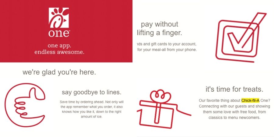
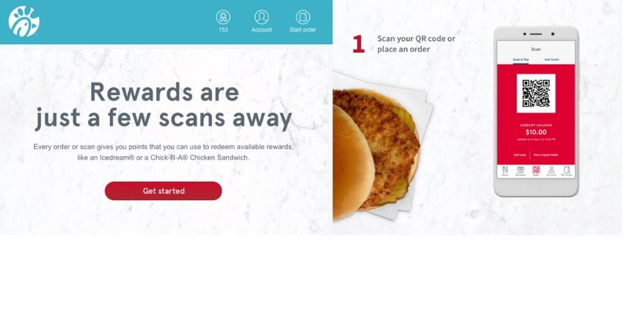


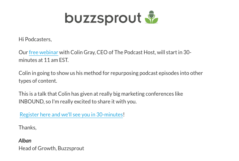
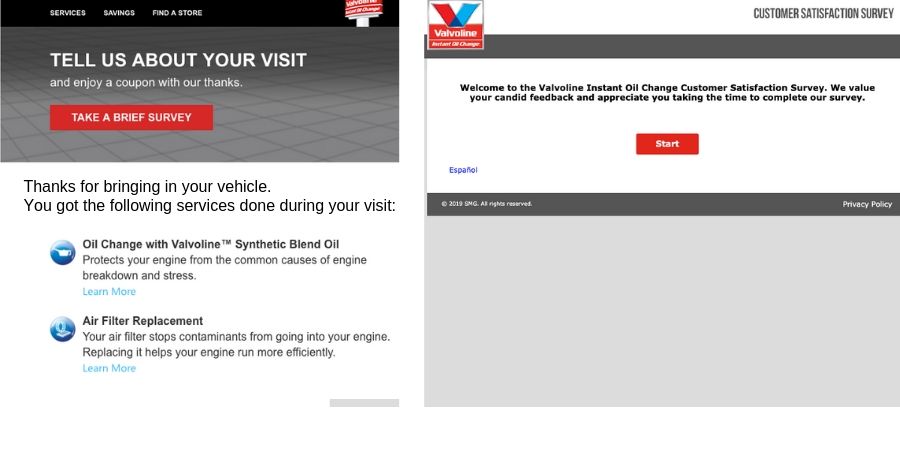
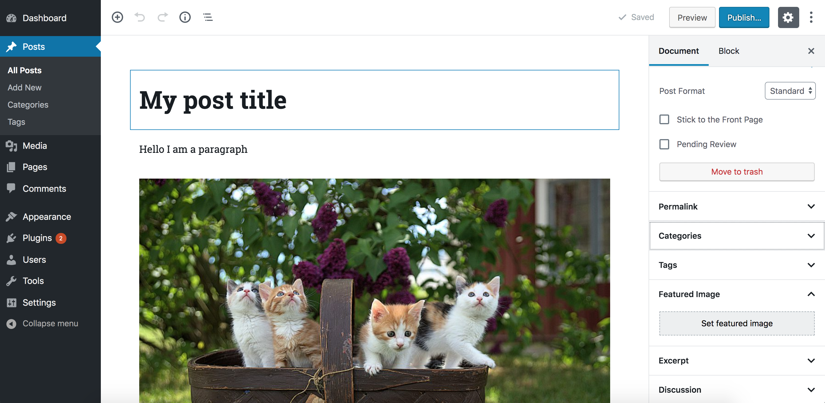
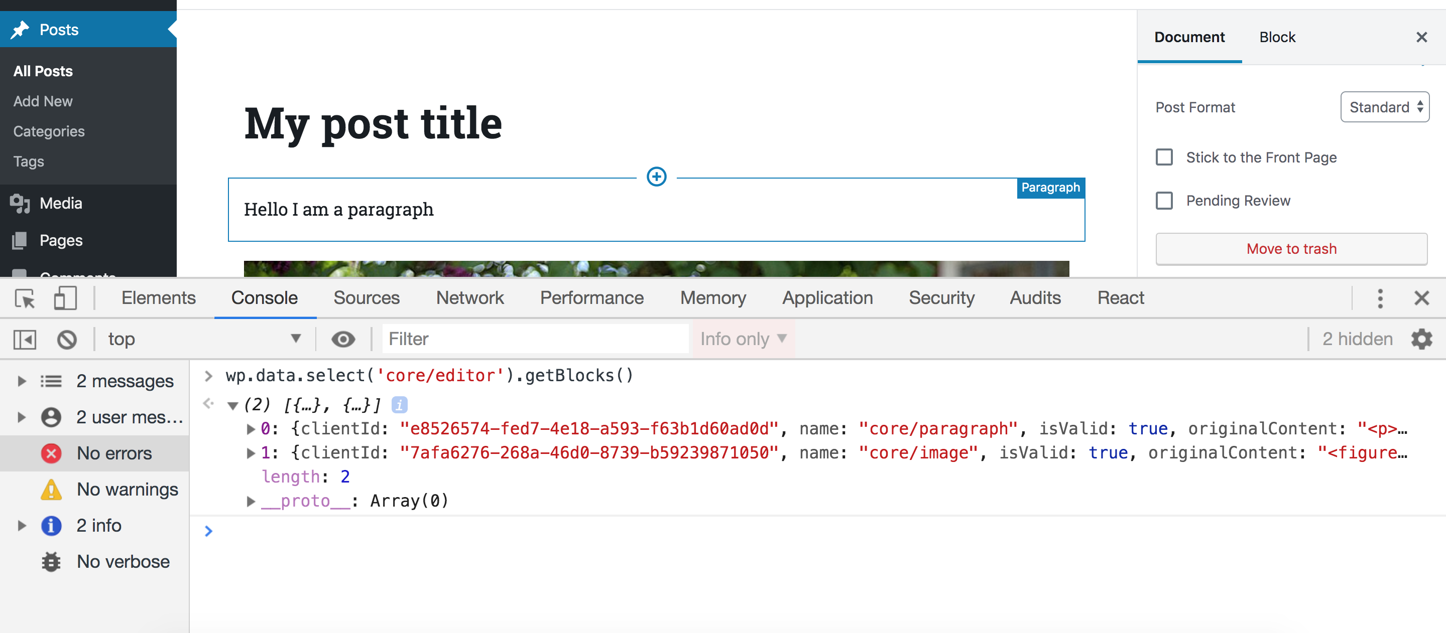

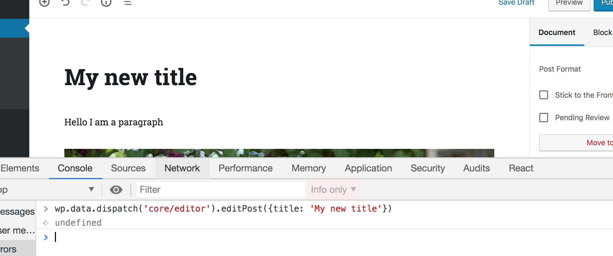
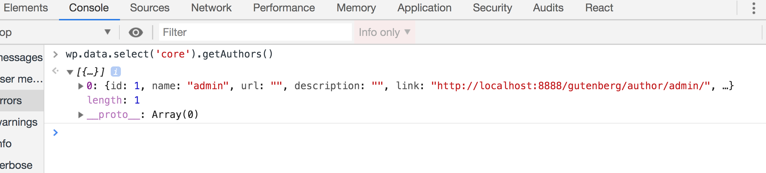
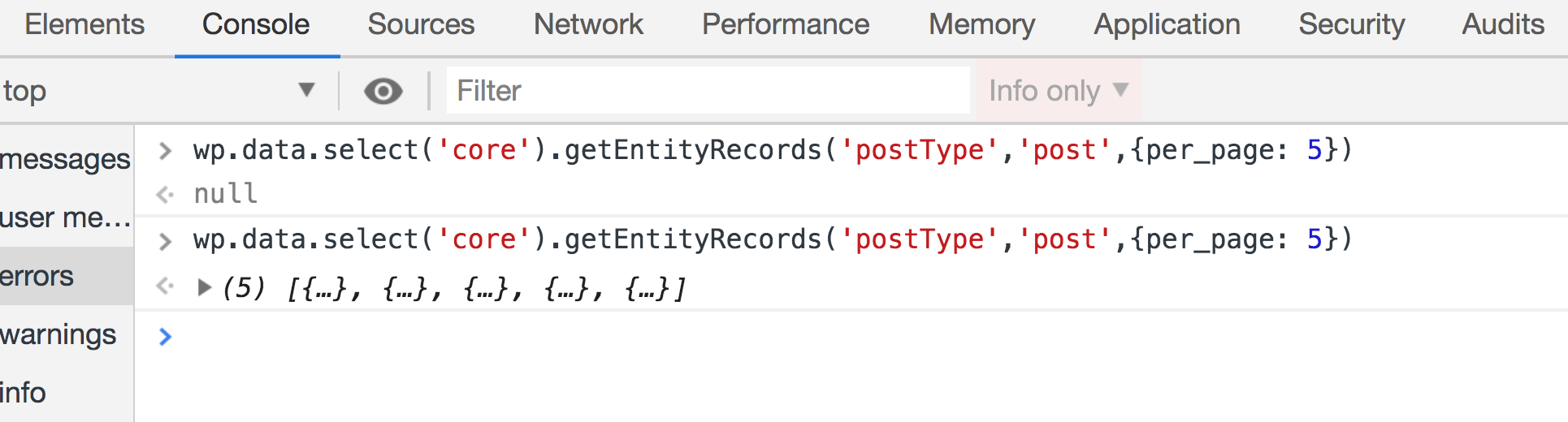
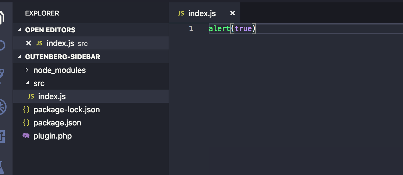
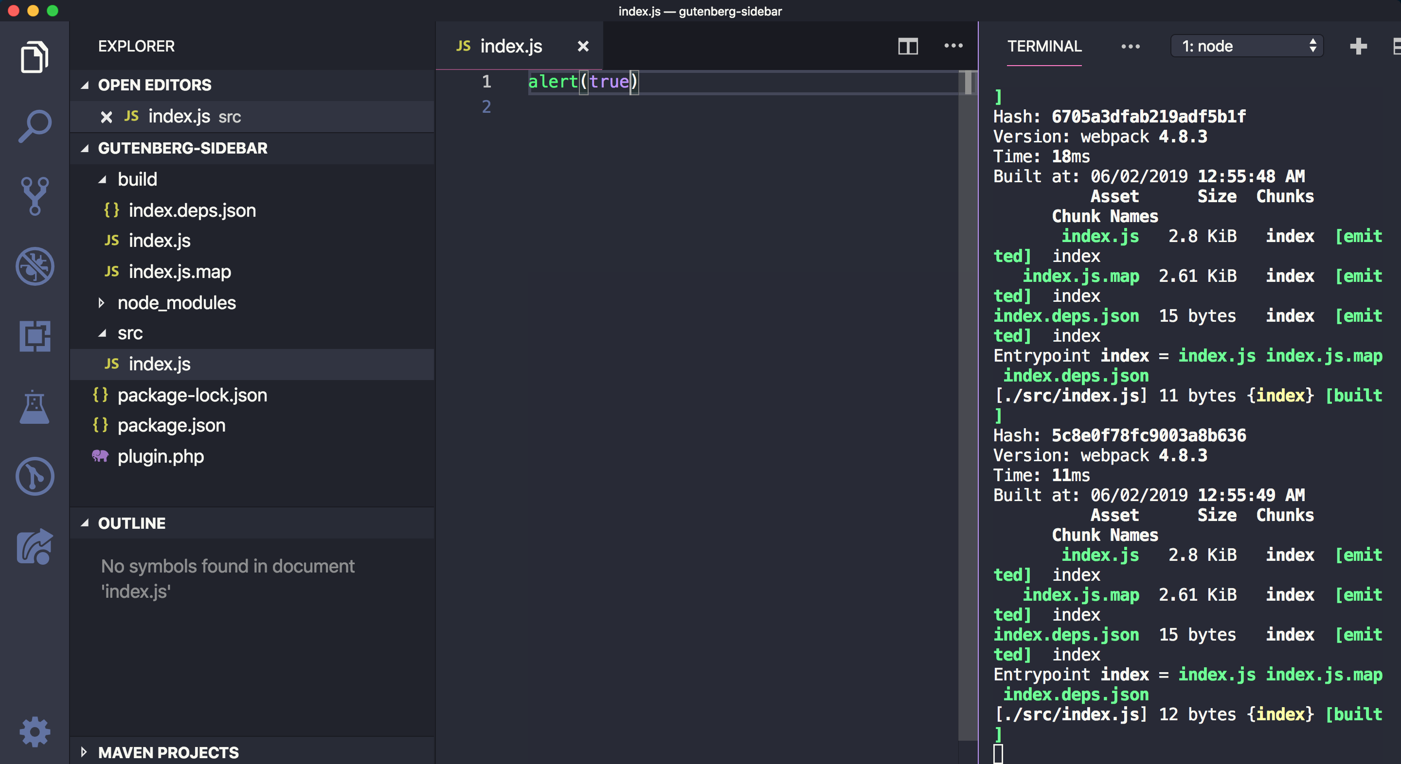
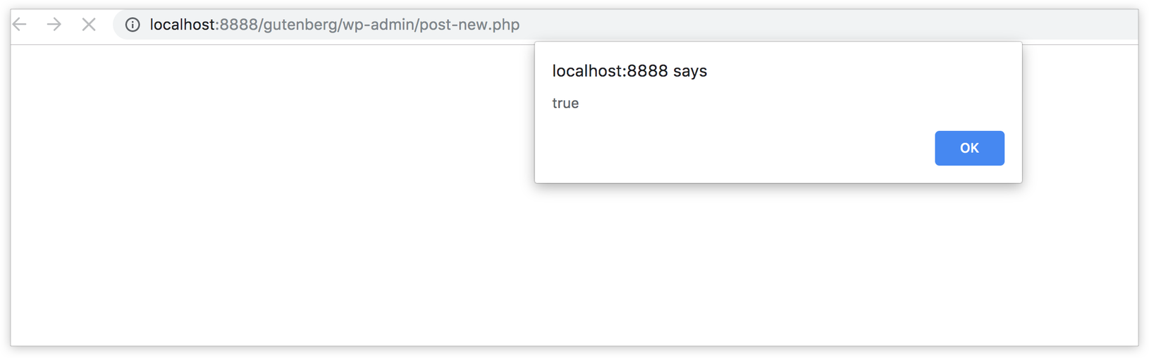
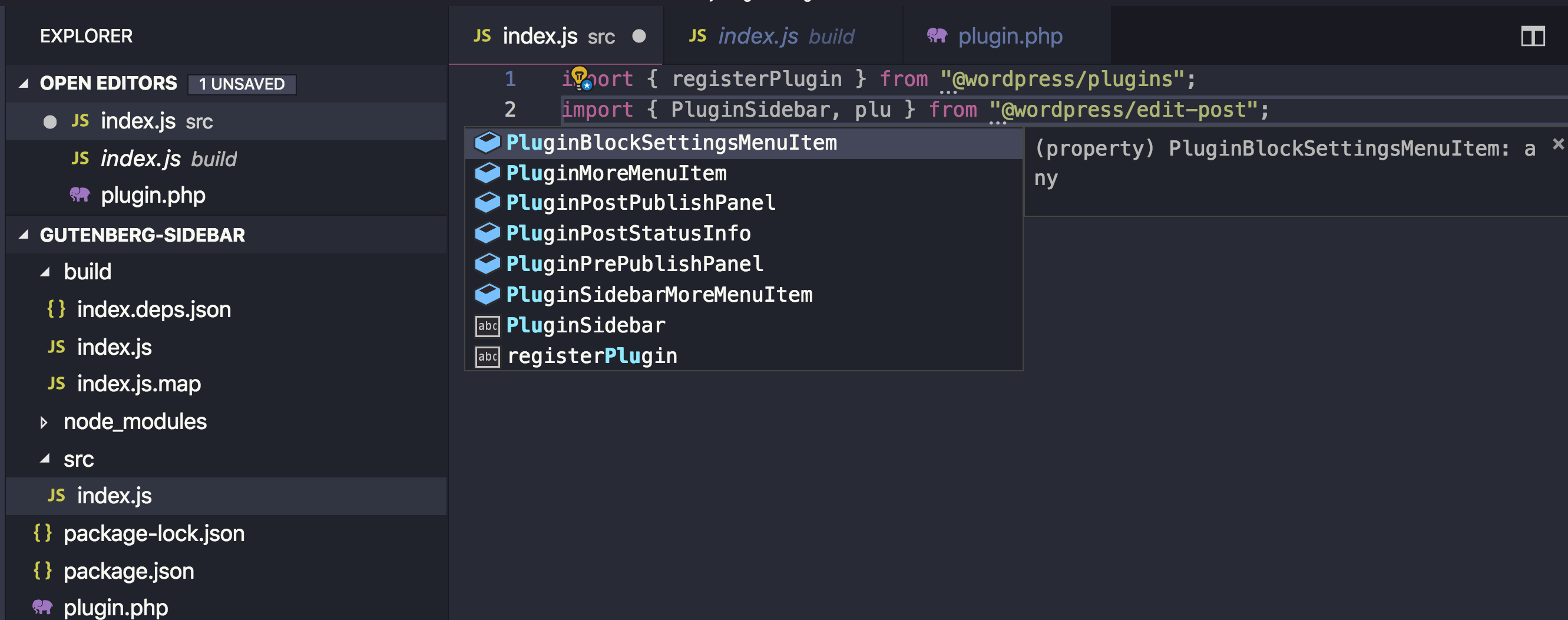
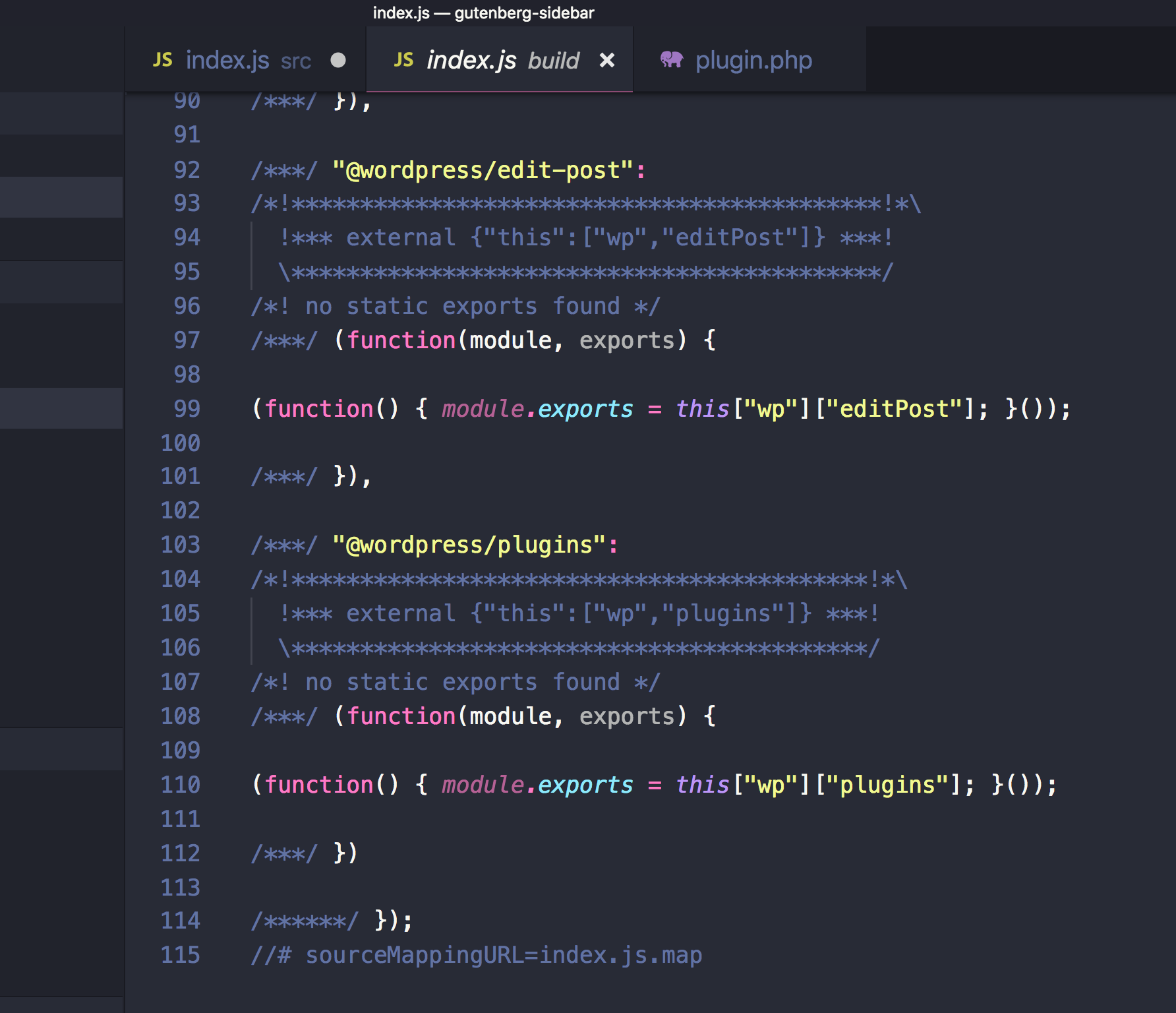
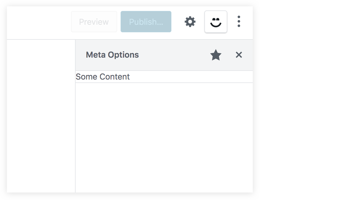
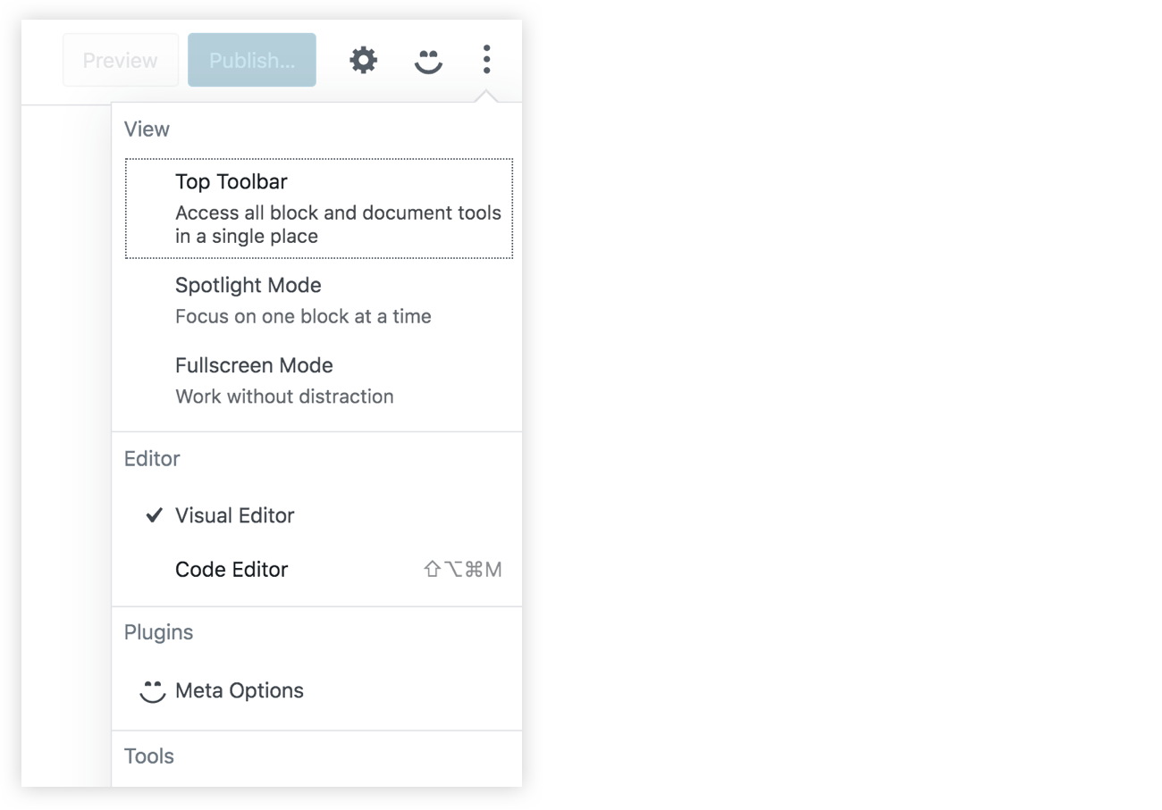
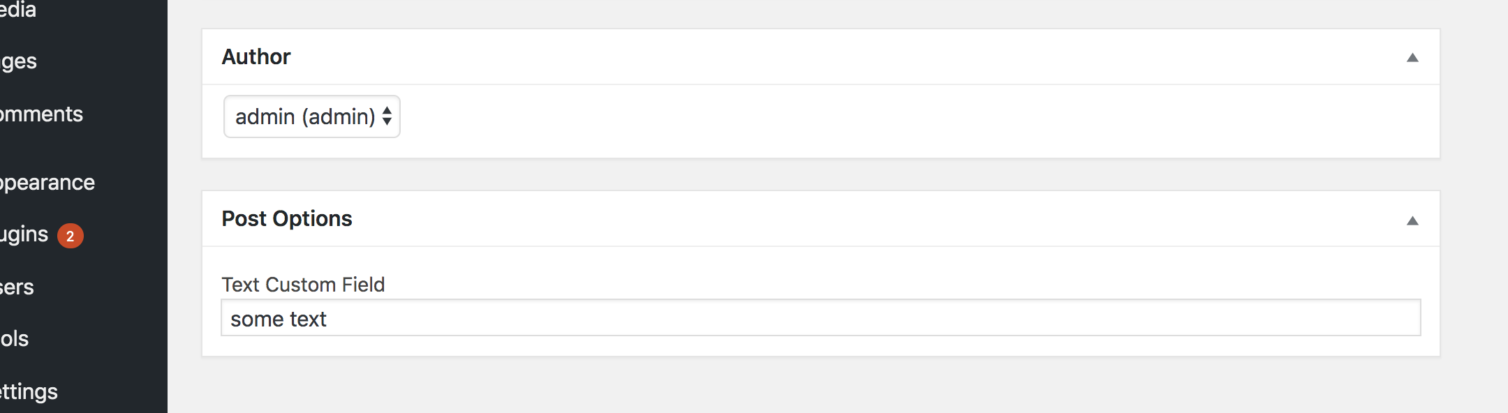

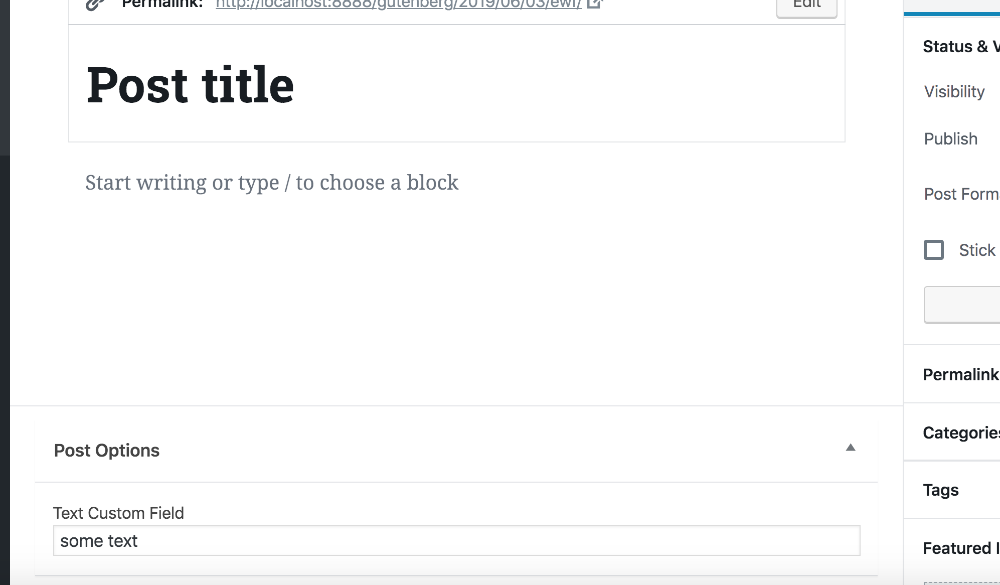
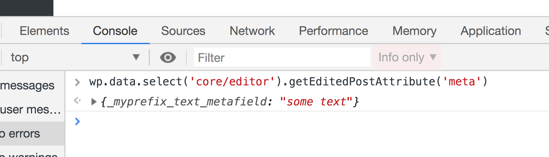
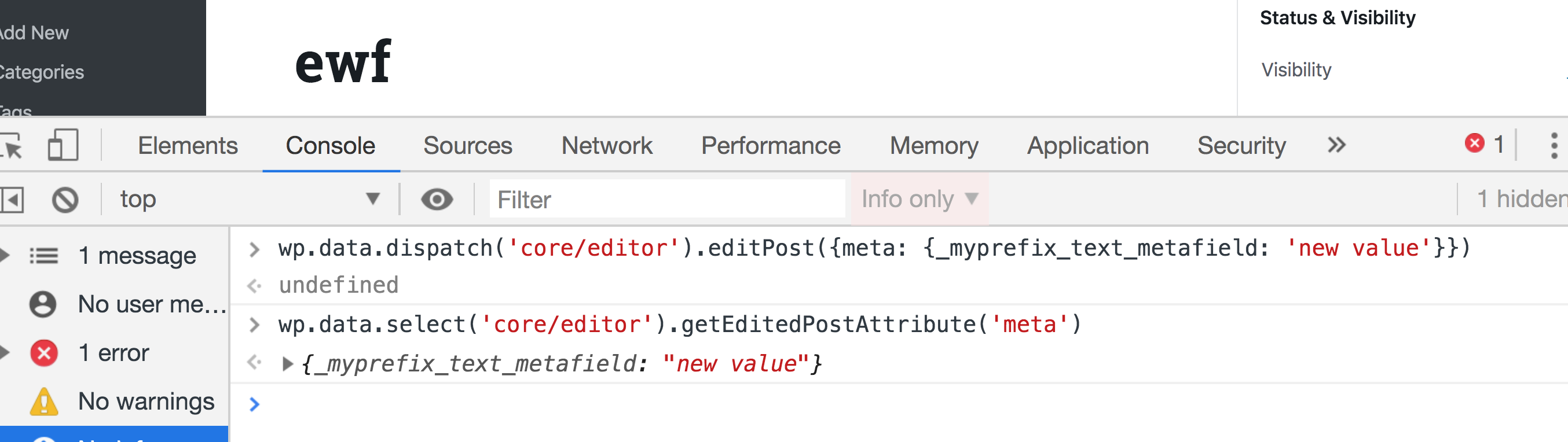
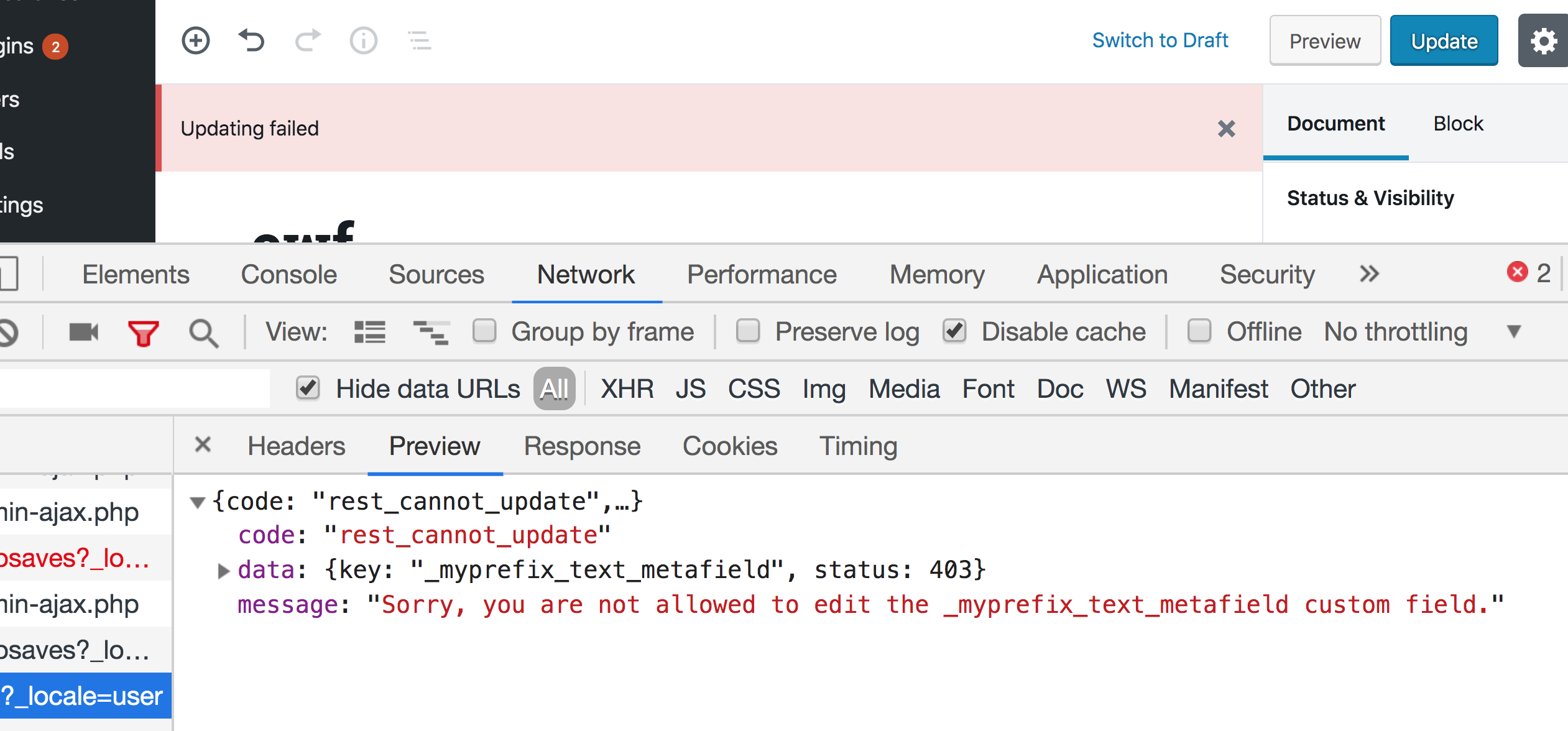
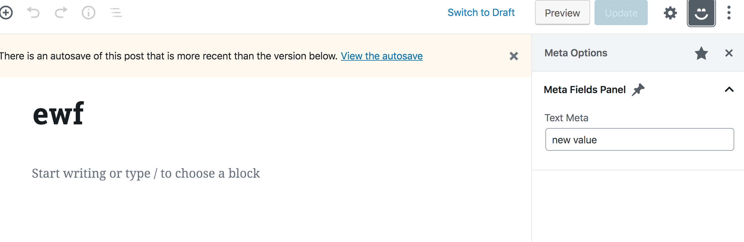
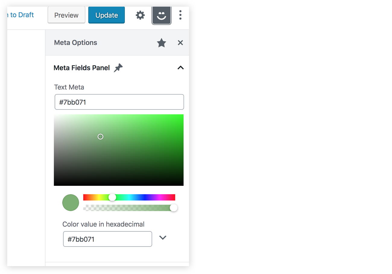
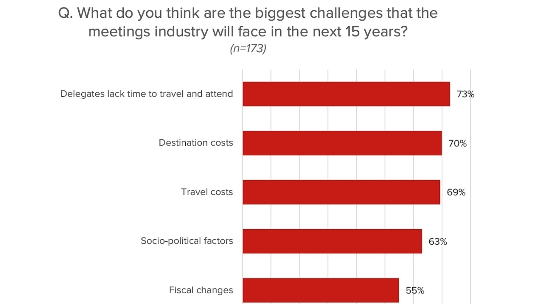
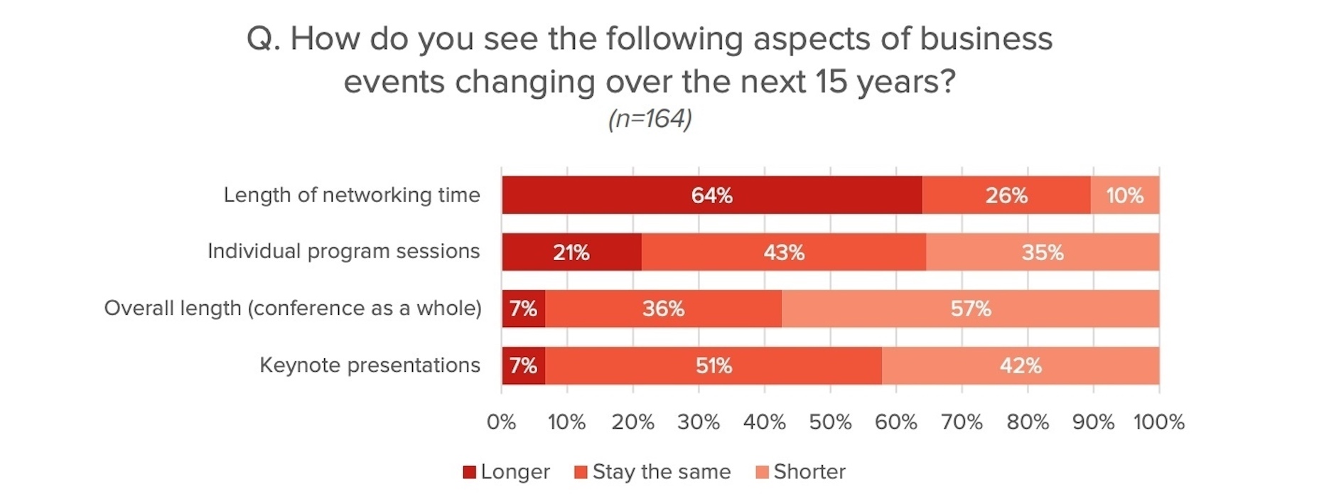
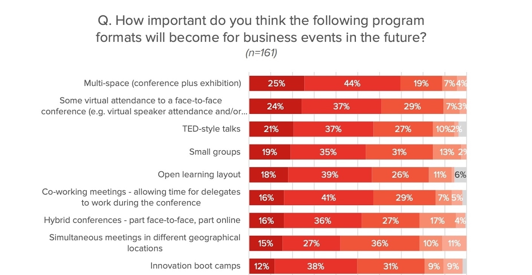