Archive

Archive for June, 2019

The Case For Brand Systems: Aligning Teams Around A Common Story

June 25th, 2019 No comments

The Case For Brand Systems: Aligning Teams Around A Common Story

The Case For Brand Systems: Aligning Teams Around A Common Story

Laura Busche

2019-06-25T15:00:59+02:002019-06-25T14:35:33+00:00

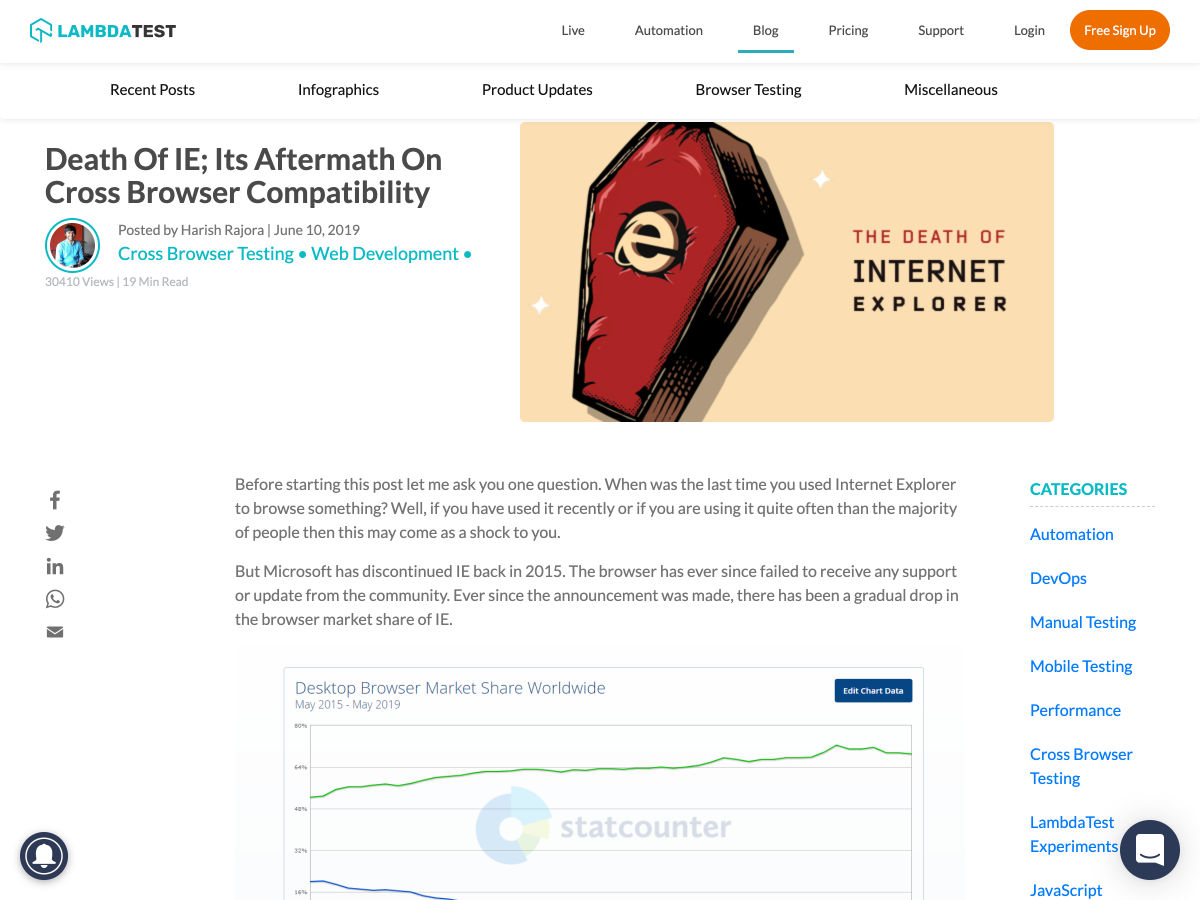
There’s a disconnect. If you’ve been in business for enough time you’ve definitely felt it. Teams are pulling companies in different directions with internal processes and specialized frameworks for absolutely everything. They’re focused on building their “part” of the product, and doing it incredibly well. There’s just one problem: our internal divisions mean nothing to customers.

In customers’ eyes, it’s the same brand replying to their support tickets and explaining something in a modal; the same entity is behind the quality of the product they use and the ads that led them to that product in the first place. To them, there are no compartments, no org charts, no project managers. There is only one brand experience. At the end of the day, customers are not tasting individual ingredients, or grabbing a bite during each stage of preparation, they’re eating the entire meal. At once. In sit-downs that keep getting shorter.

Something is getting lost in the process. Somewhere between our obsession with specializing and our desire to excel at individual roles, we’ve lost perspective of the entire brand experience. We spend our days polishing individual touchpoints, but not enough time zooming out to understand how they come together to shape our customer’s journey. The time for shying away from the word “holistic” is up — it’s the only way customers will ever perceive you. And that is the ultimate inspiration behind Brand Systems, a tool we will explore throughout this article.

What Is A Brand System?

At its core, a Brand System is a shared library that helps define, preserve, and improve the customer’s experience with the brand.

Just like we can’t assume that the sum of quality ingredients will result in a great meal, our individual contributions won’t magically translate into a memorable brand experience for customers. Their brand experiences are blended, multifaceted, and owner-blind. It’s time for the product, design, engineering, marketing, support, and various other functions to establish a single source of truth about the brand that is accessible to, understood, and used by all. That source is a Brand System.

Why Is It Useful? The Benefits Of Building A Brand System

Your brand is the story that customers recall when they think about you. When you document that story, your team can align to live up to and protect those standards consistently. There are multiple benefits to building and maintaining a Brand System:

  • Cohesion
    It helps preserve a uniform presence for the brand.
  • Access
    It empowers teams to apply assets consistently. A common language facilitates collaboration across different functional areas.
  • Flexibility
    This system is in continuous iteration, providing an up-to-date source of truth for the team.
  • Speed
    When your building blocks are readily available, everything is easier to construct. Collaboration is also accelerated as individuals get a fundamental understanding of how others’ work contributes to the brand experience.
  • Ethos
    Documenting the brand’s ethos will motivate the team to preserve, protect, and extend it. That level of care is perceived and appreciated by users.

To accomplish the above most effectively, the Brand System must remain accessible, empowering, holistic, extensible, flexible, and iterative. Let’s take a closer look at each of these traits and some examples of how they can be put in practice.

Accessible

Open to all team members, regardless of their level of technical expertise or direct involvement with each element. Systems that perpetuate divisions within organizations can be visually mesmerizing, but end up fragmenting the brand experience.

Help Scout provides a visual example of what the concepts of illustration scale and grid mean for those who may not be familiar with them. (Large preview)

Empowering

Full of examples that encourage continuous application. Some aspects of the brand experience can be hard to grasp for those who don’t interact with them daily, but a Brand System should empower everyone to recognize what is fundamentally on and off-brand — regardless of the touchpoint involved. Does the company’s support team feel confident about how the brand is visually represented? Does the design team have a general idea of how the brand responds to customers’ requests?

Webflow provides clear examples and instructions to empower different team members to write for the product, even if they’re not used to it. (Large preview)

Holistic

No aspect of the brand’s execution is too foreign to include. Brand Systems surface the tools and frameworks various teams are using to clarify the bigger picture. Too often the customer’s experience appears disjointed because we’ve compartmentalized it. The brand experience “belongs” to marketing, or design, or some kind of executive-level team, so resources like UI components or support scripts are dealt with separately. As the unifying backbone of all business functions, the brand experience informs execution at every level.

For WeWork, physical spaces are a key part of the entire experience. Their brand system includes guidelines in this respect. (Large preview)

Extensible

Individual teams can develop specific subsections within the system to fit their needs. Regardless of how specialized these different areas get, the Brand System remains accessible to all. Team members decide how deeply they want to dive into each element, but the information is readily available.

Atlassian makes use of its Confluence platform to host guidelines related to different parts of the brand experience. Sections have varying levels of access and are regularly maintained by different teams. (Large preview)

Flexible

There can be alternative versions of the Brand System for external audiences, including media and partners. While we’d like the brand experience to unfold in owned channels, the reality is that sometimes customers interact with it through earned channels controlled by third parties. In those cases, a minimized version of the Brand System can help preserve the story, voice, and visual style.

Instagram, for example, offers a special set of guidelines for users broadcasting content about the brand. (Large preview)

Iterative

The Brand System should evolve and be continuously updated over time. To that end, host and serve the content in a way that makes it easy to access and edit as things change.

Salesforce surfaces ongoing updates to its Lightning system in a section called Release Notes. (Large preview)

What Does A Brand System Contain?

Brand Systems solve a fundamental disconnect in teams. Nobody outside of marketing feels empowered to market the product, nobody outside of design feels like they have a solid grasp of the brand’s style guidelines, nobody outside of support feels confident responding to a customer. Sounds familiar? That’s why it’s crucial to build a Brand System that is as all-encompassing and transparent as possible.

While Design Systems are the closest implementation of a resource like this, a Brand System is centered around the brand story, understanding symbols and strategy as necessary layers in its communication. It is informed by product and design teams, but also functional areas like support, marketing, and executive leadership that are key to shaping the entire brand experience. In Brand Systems, visual components are presented in the context of a business model, a company mission, positioning, and other strategic guidelines that must be equally internalized by the team.

Comet, a Design System by Discovery Education. (Large preview)

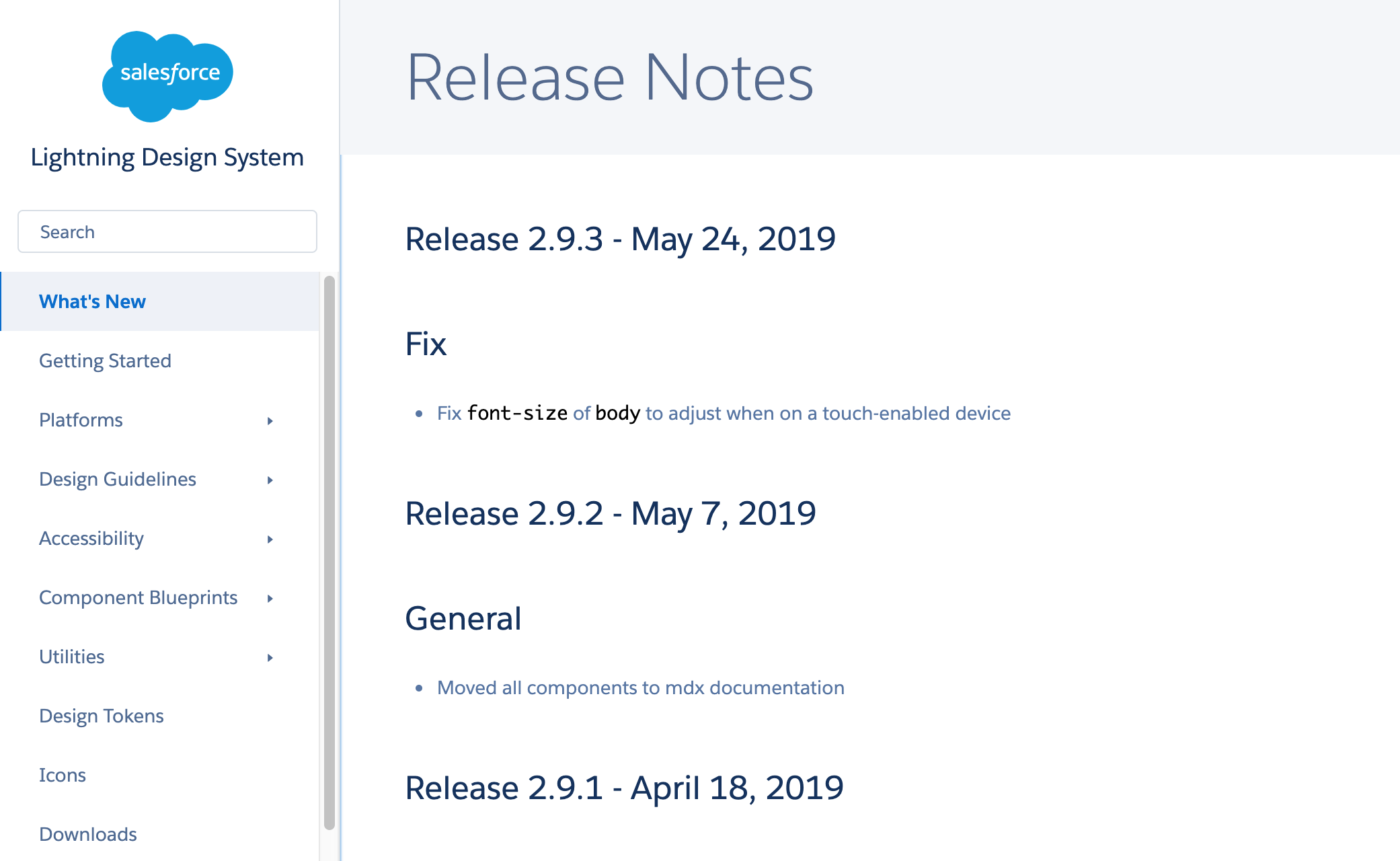
A Brand Style Guide is another commonly used tool to align teams around a set of principles. While useful, these guides focus heavily on marketing and design specifications. Their main objective is to impart a shared visual language for the brand so that it is applied cohesively across the board. That resolves part of the problem but doesn’t reveal how other functional areas contribute to the overall brand experience. Therefore, these guidelines could be considered as part of the larger Brand System.

Brand Guidelines for the Wildlife Conservation Society

Brand Guidelines for the Wildlife Conservation Society (Designed by Pentagram) (Large preview)

That said, these are some of the sections and components you should consider including in your Brand System:
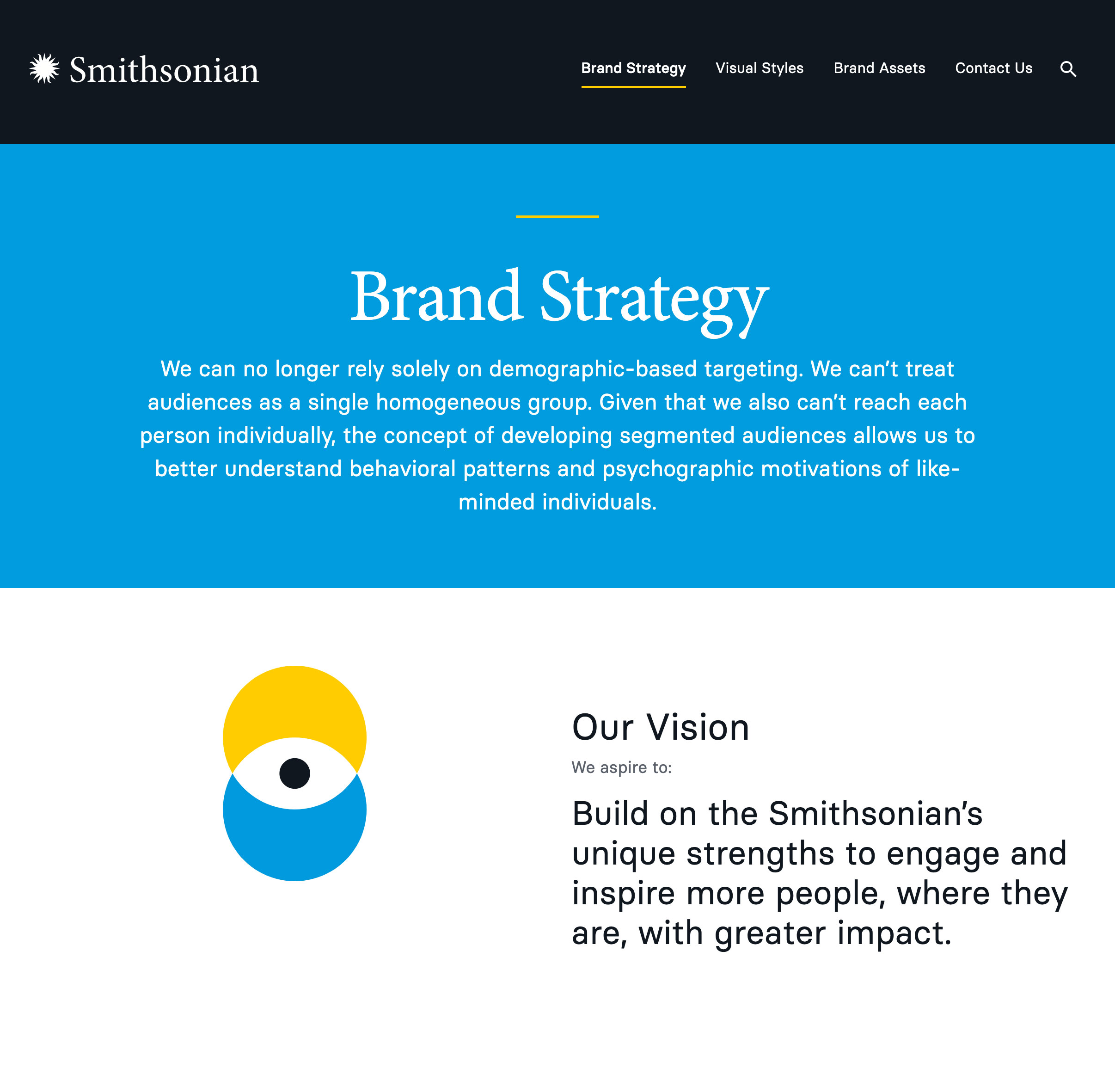
Story

If the brand experience is embroidery, the story is the thread weaving all the touchpoints together. It reveals what has been and will continue to be important, who the brand is trying to serve, and how it plans to do so most effectively. Start your Brand System by answering questions like:

  • What is this brand’s core value proposition?
  • What does its history look like? Include a timeline and key milestones.
  • How do you summarize both of the above in an “About Us” blurb?
  • What are the brand’s core values? What propels this team forward?
  • Who is the audience? Who are the main personas being addressed and what are these individuals trying to get done?

(Large preview)

The Smithsonian Institution included a section called Audience Segments in the strategy section of their branding website. (Large preview)
  • What does their journey with us look like? If known, what is their sentiment towards the brand?
  • What is the brand’s mission as it relates to its target customers? How about the team itself and society at large?
  • How does this business model work, in general terms? (Specifics will be included in the “Strategy” section).
  • Who are the brand’s direct competitors? What sets it apart from them?
  • How does this brand define product/service quality? Are there any values around that?
  • What is the brand’s ultimate vision?
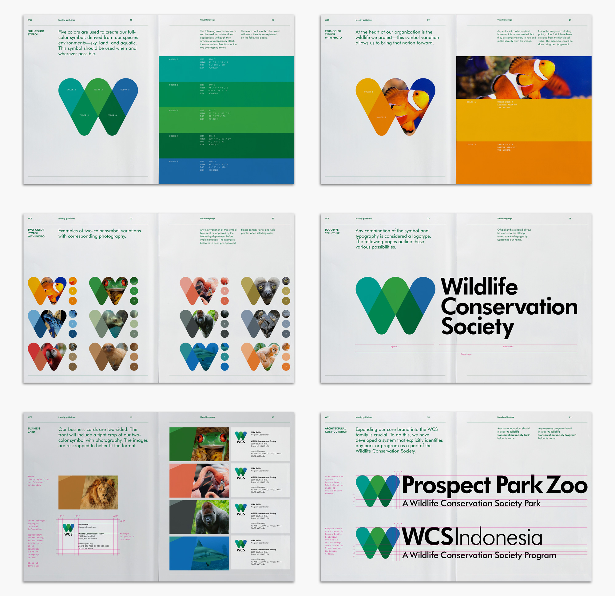
Shopify summarizes the brand’s Product Experience Principles in their Polaris design system. (Large preview)

Symbols

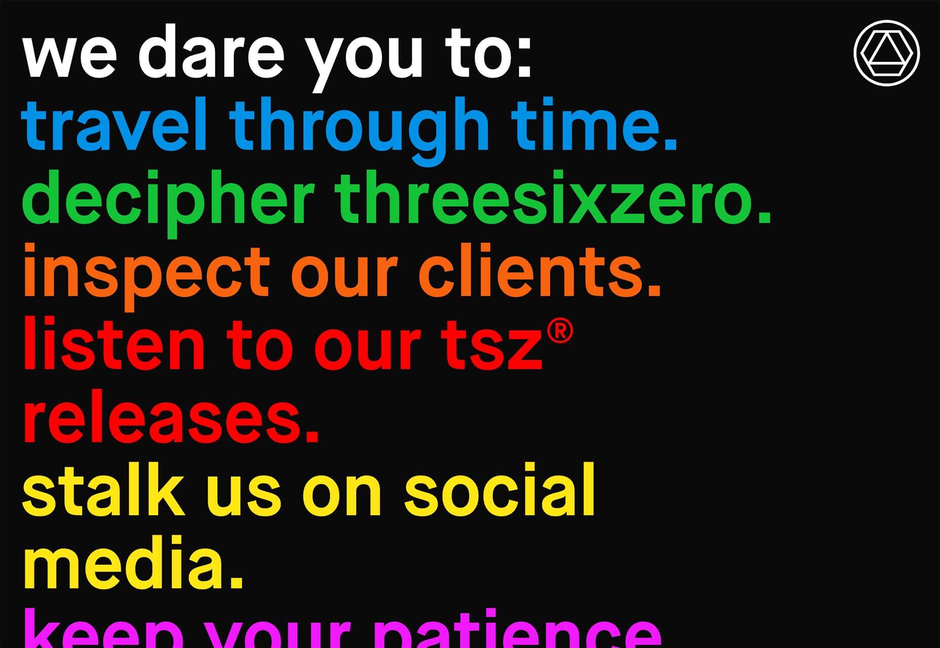
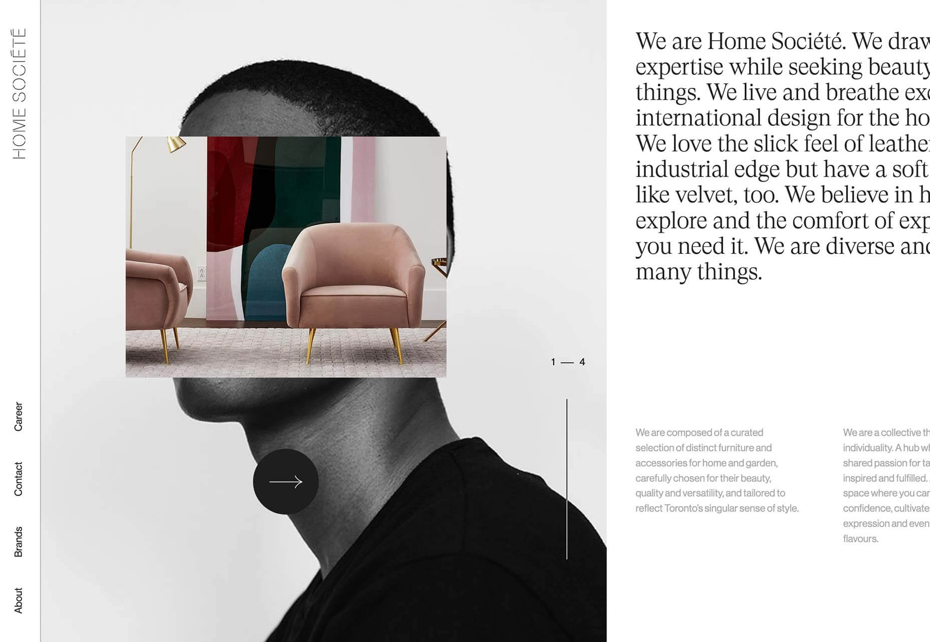
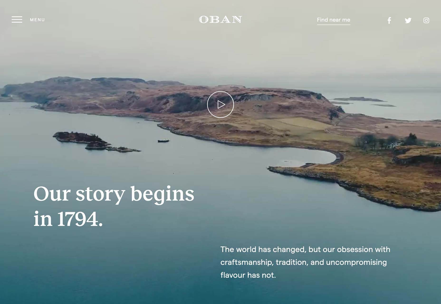
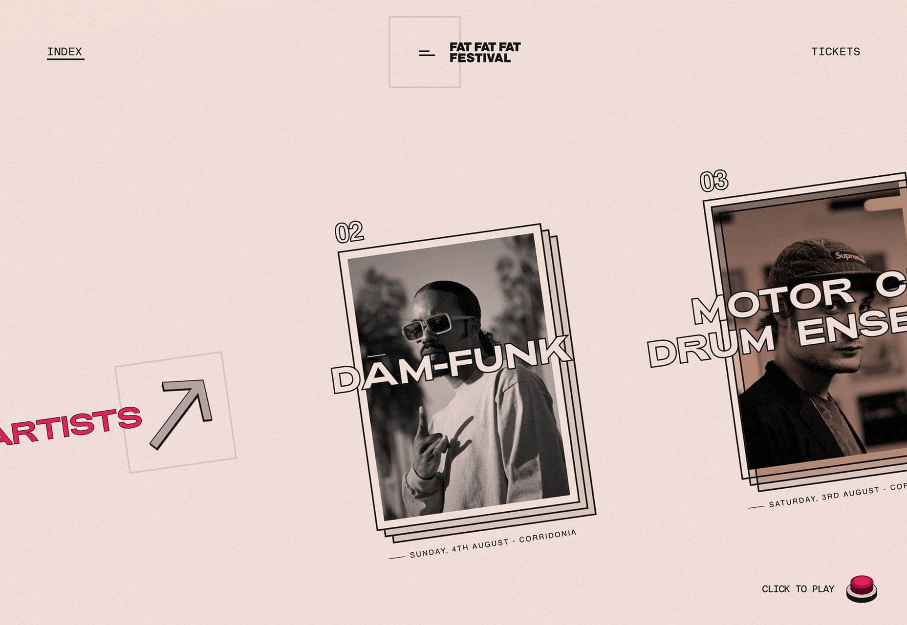
You know what drives the brand and the narrative it brings to the table. This part of the Brand System is about actually representing that. Symbols are sensory: they define what the brand looks, sounds, and feels like. Because they help us convey the story across multiple touchpoints, it’s vital for the entire team to have a grasp of what they stand for and how they can be properly deployed.

Here are some examples of building blocks you’ll want to define in this section:

  • Main and alternative versions of the brand’s logo
  • Color palette
  • Typography scheme
  • Icons, photography, and illustration style
  • Patterns, lines, and textures
  • Layout and spacing
  • Slide deck styling
  • Stationery and merchandising applications
  • Motion & sound, including audiobranding
  • Packaging (if applicable)
  • Scent (if applicable).

For brands built around digital products:

  • User Interface components
  • Interaction patterns
  • Key user views & states
  • User Experience guidelines
  • Code standards
  • Tech stack overview.

IBM includes patterns for common actions like “Next” in its Carbon design system. (Large preview)

Bear in mind that the nature of your product will determine how you complete the section above. A tech-based company might list elements like interaction patterns, but a retail brand might look at aspects like store layout.

Strategy

Once you’ve clarified the brand’s story, and the symbols that will represent it, define how you go about growing it. This part of the Brand System addresses both messaging and method, narrative and tactics.


It’s not enough for the team to be aware of why this brand is being built: the goal is to get everyone familiar with how it is sustained, grown, and communicated.

Just like customer support can feel alienated from the design function, these growth-related tenets are often not surfaced beyond marketing, acquisition, or executive conversations. However, those kinds of strategic ideas do impact customers at every touchpoint. A Brand System is a crash course that makes high-level perspective accessible to all, unlocking innovation across the entire team.

Here are some guiding questions and components to include:

  • How does this brand define success? What growth metric does the team focus on to track performance? (GMV, revenue, EBITDA, sales, etc).
  • What does the conversion funnel look like? How does this brand acquire, activate and retain customers?
    • What is the average Customer Acquisition Cost (CAC)?
    • What is the retention rate?
    • What is the Customer’s Lifetime Value (LTV)?
    • Which channels drive the most revenue? Traffic?
    • Which products and categories drive the most revenue? Traffic?
    • Which of the buyer personas defined in the “Story” section bring the most revenue? Traffic?
  • What are the brand’s key objectives for this year (to be updated)? These are company-wide goals.
  • What initiatives or themes is the team focusing on to meet those objectives this year?
  • How is the team organized to meet those objectives?
  • What channels does this brand use to communicate with its target audience? Name them and specify how big they are in terms of reach and/or traffic.
    • Owned
      • Website, blog, or other web properties
      • Social channels
      • Email
    • Earned
      • Ongoing brand partnerships
      • Referrals
    • Paid
      • Specific ad platforms
      • Influencers
      • Affiliates
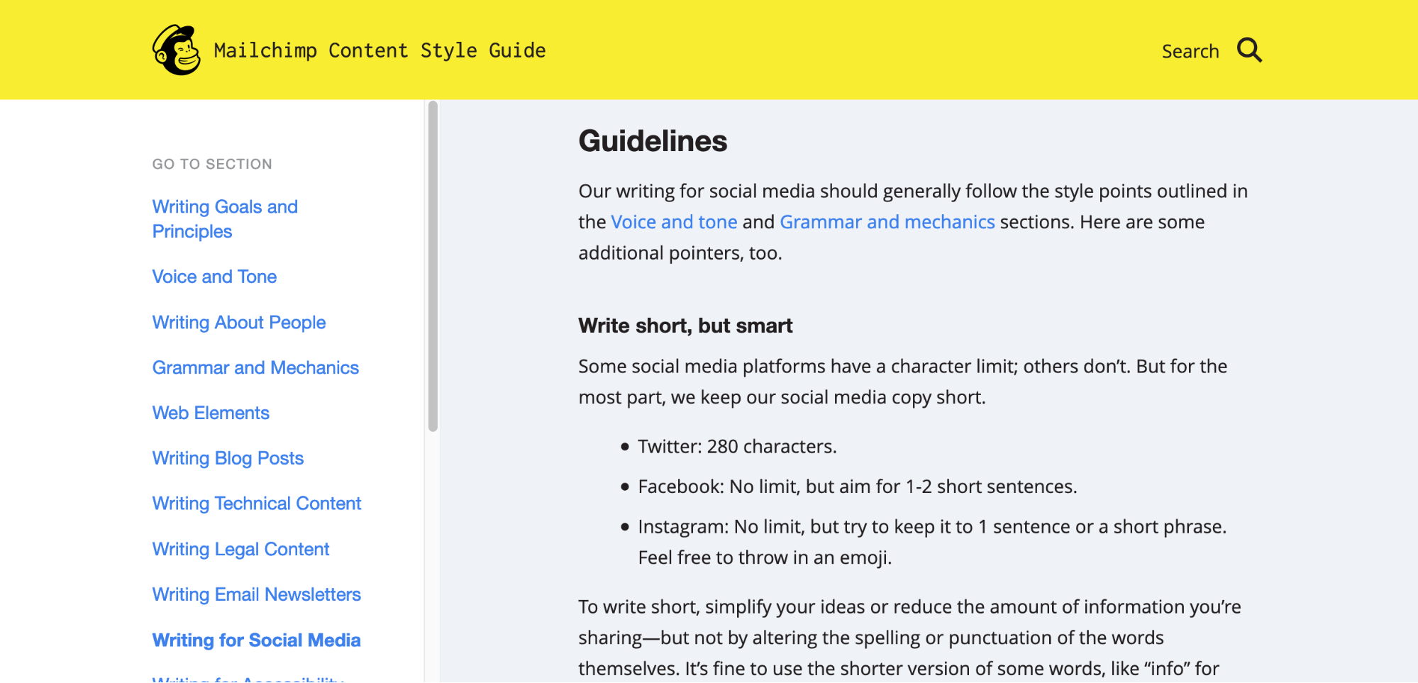
  • What is this brand’s personality like?
  • What defines the brand’s voice? How does it adopt different tones in specific situations?
  • How does the brand’s voice come to life in owned, earned, and paid channels?
    • Company website and landing pages
    • Social channels. Clarify if tone varies
    • Email
    • Ads
    • Sales collateral
    • Press releases
    • Careers page & job sites
  • How does the brand’s voice come to life in the customer’s experience with the product, before, during, and after purchase?
    • Call to action
    • Navigation
    • Promotion
    • Education
    • Success/error
    • Apology/regret
    • Reassurance/support
  • How does the brand’s voice come to life internally (within the team)?
    • Employee handbooks
    • Onboarding process.
  • What topics should this brand aim to be a thought leader at?

UC Berkeley defines the themes and key messages to highlight when speaking to different audiences. (Large preview)
  • Grammar and spelling-wise, does this brand adhere to a specific style manual?
  • What are some common words and expressions users can expect from this brand?

Mailchimp's Content Style Guide

Mailchimp’s Content Style Guide (Source) (Large preview)

How To Get Started With Your Own Brand System

If you’re feeling ready to shape your own Brand System, here are some steps you can take to approach the challenge as a team:

1. Kickoff

Set up a company-wide planning session. If you can’t have everyone attend, make sure there’s someone representing product, design, marketing, support, and the executive team. Lead a conversation with two goals:

  • Brand audit
    How is the brand represented in various contexts? Is there brand debt to account for? Consider the brand’s story, symbols, and strategy.
  • Brand definition
    Discuss how this brand:
    • sounds,
    • looks,
    • speaks,
    • feels,
    • interacts,
    • introduces itself in a few words.

2. Production

After having that open discussion, delegate the various sections described above (Story, Symbols, Strategy) to the teams that interact most closely with each of them. Ask specific individuals to document the brand’s point of view regarding each system component (listed in point 2).

3. Publication

Upload the full Brand System to a central location where it is readily available and editable. Schedule a team-wide presentation to get everyone on the same page.

4. Summary

Condense the main guidelines in a one-page document called Brand-At-a-Glance. Here are some of the key points you could include:

  • Brand mission, vision, and values
  • Visual identity: color palette, main logo versions, type scheme, illustration style
  • About Us blurb.

5. Revision

Establish a periodic cross-functional meeting where the brand is protected and defined. Frequency is up to you and your team. This is also where the Brand System is formally updated, if needed. In my experience, unless this space is scheduled, the revisions simply won’t happen. Time will pass, customers’ needs will change, the brand experience will shift, and there won’t be a common space to document and discuss it all.

Brand Systems: Aligning Teams Around A Common Story

When customers interact with your brand, they’re not aware of what’s going on backstage. And there is no reason they should. All they perceive is the play you’re presenting, the story you’re sharing, and the solution it represents for them. When the individual actors go off script, as great as they might sound solo, the brand experience breaks.

Enter the Brand System: a shared library that defines the brand’s story, symbols, and strategy. In doing so, this tool aligns all actors around the multi-faceted experience customers truly perceive. Within teams, Brand Systems help avoid fragmentation, confusion, and exclusion. Externally, they’re a script to deliver the most compelling brand experience possible — at every touchpoint, every single time.

(ah, yk, il)
Categories: Others Tags:

Render Snarky Comments in Comic Sans

June 24th, 2019 No comments

Hilarious idea by Zach Leatherman. To test if a comment is “snarky” or not, there is an npm package up to the task.

On this site, we generally just delete snarky comments, but I still run a WordPress plugin that allows me to “feature” or “bury” comments. It’s old but it still works fine in the latest WordPress. We use the bury functionality for comments that aren’t rude, snarky, or spam, but also don’t add much to the post. We try to downplay those so they aren’t wasting people’s time scrolling through the threads.

I dig the Comic Sans idea, so I’m gonna give it a shot. ?

Direct Link to ArticlePermalink

The post Render Snarky Comments in Comic Sans appeared first on CSS-Tricks.

Categories: Designing, Others Tags:

Building a Conference Schedule with CSS Grid

June 24th, 2019 No comments
A schedule with 4 tracks of presentations (columns) and 6 times slots. The length of sessions vary, and some talks span multiple tracks.

It’s hard to beat the feeling of finding a perfect use for a new technology. You can read every handy primer under the sun and ooh-and-ahh at flashy demos, but the first time you use it on your own project… that’s when things really click.

I gained a new appreciation for CSS Grid when building a flexible layout for a conference schedule. The needs of the project aligned perfectly with grid’s strengths: a two-dimensional (vertical and horizontal) layout with complex placement of child elements. In the process of building a proof of concept, I found a few techniques that made the code highly readable and outright fun to work with.

The resulting demo included some interesting uses of CSS Grid features and forced me to grapple with some details of grid you don’t run into in every day.

Before we get started, it might be a good idea to keep another tab open with the CSS-Tricks guide to CSS Grid to reference the concepts we cover throughout the post.

Defining our layout requirements

I set out to create the following layout thanks to WordCamp, the hundreds of WordPress-focused conferences that happen around the world each year. These varied events range in size and format, yet all use the same schedule layout tool.

The final layout we’ll build.

I helped schedule a couple WordCamps and styled a WordCamp website, so I knew the shortcomings of the existing HTML table layout. If your schedule didn’t fit in a uniform grid, well…¯_(?)_/¯

Setting out to find a better way, I started by listing the layout requirements:

  • Sessions of variable length (limited to set time increments)
    Imagine back-to-back one-hour talks in three rooms alongside a two-hour workshop in another.
  • Sessions spanning one or more “Tracks”Tracks are usually associated with a specific room in the venue. In the case of my local WordCamp in Seattle, the venue can literally remove a wall to combine two rooms!
  • Schedule can include empty space
    A last-minute cancellation or extra-short session creates gaps in a schedule.
  • Design is easy to customize with CSS
    WordCamp websites allow theming only via CSS.
  • Layout can be automatically generated from CMS content
    Since we’re building a layout from structured session data on thousands of websites, we can’t rely on any HTML or CSS that’s too clever or bespoke.

Getting started: Solid HTML

Before I write any CSS, I always start with rock-solid HTML.

The top-level

will have a class of .schedule and serve as the grid parent. Each unique start time gets its own heading followed by all sessions starting at that time. The markup for each session isn’t very important, but make sure that seeing the layout isn’t required to understand when and where a session happens. (You’ll see why in a moment.)

<h2>Conference Schedule</h2>
<div class="schedule">

  <h3 class="time-slot">8:00am</h3>
  <div class="session session-1 track-1">
    <h4 class="session-title"><a href="#">Session Title</a></h4>
    <span class="session-time">8:00am - 9:00am</span>
    <span class="session-track">Track 1</span>
    <span class="session-presenter">Presenter Name</span>
  </div>
  <!-- Sessions 2, 3, 4 -->

  <h3 class="time-slot">9:00am</h3>
  <div class="session session-5 track-1">
    <h4 class="session-title"><a href="#">Session Title</a></h4>
    <span class="session-time">9:00am - 10:00am</span>
    <span class="session-track">Track 1</span>
    <span class="session-presenter">Presenter Name</span>
  </div>
  <!-- Sessions 6, 7, 8 -->

  <!-- etc... -->

</div> <!-- end .schedule -->

Mobile layout and grid fallback complete!

Adding in a bit of up-to-you CSS to make things pretty, our mobile layout and fallback for browsers that don’t support CSS Grid is already complete!

Here’s how mine looks with the colors I used:

People on phones, zooming in their browsers, or even using Internet Explorer will have no problem finding their favorite sessions at this conference!

Adding the grid layout

Now for the actual CSS Grid part!

My ah-ha moment when building this came from reading Robin’s article here on CSS-Tricks, “Making a Bar Chart with CSS Grid.” TL;DR: One grid row represents 1% of the chart’s height, so a bar spans the same number of rows as the percentage it represents.

.chart {
  display: grid;
  grid-template-rows: repeat(100, 1fr); /* 1 row = 1%! */
}

.fifty-percent-bar {
  grid-row: 51 / 101; /* 101 - 51 = 50 => 50% */
}

That helped me realize that grid is perfect for any layout tied to some regular incremental unit. In the case of a schedule, that unit is time! For this demo, we’ll use increments of 30 minutes, but do whatever makes sense for you. (Just watch out for the Chrome bug that limits Grid layouts to 1000 rows.)

The first version I tried used similar syntax to the bar chart in Robin’s and some basic math to place the sessions. We’re using eight rows because there are eight 30-minute increments between 8 a.m. and 12 p.m. Remember that implicit grid line numbers start at one (not zero), so the grid rows are numbered one through nine.

A 5 row grid with numbered lines, 1-6.
A rudimentary version of a single column schedule with numbered grid lines. (View Demo: Numbered Gridlines vs. Named Gridlines)
.schedule {
  display: grid;
  grid-template-rows: repeat(8, 1fr);
}

.session-1 {
  grid-row: 1 / 3; /* 8am - 9am, 3 - 1 = 2 30-minute increment */
}

.session-2 {
  grid-row: 3 / 6; /* 9am - 10:30am, 6-3 = 3 30-minute increments */
}

The problem with this technique is that placing items on a grid with a lot of rows is very abstract and confusing. (This issue added a ton of complexity to Robin’s bar chart demo, too.)

This is where named grid lines come to the rescue! Instead of relying on grid line numbers, we can give each line a predictable name based on the corresponding time of day.

A 5 row grid with rows named for the time. Example: time-0800
By using named grid lines for the schedule, it becomes much easier to place a session. (View Demo: Numbered Gridlines vs. Named Gridlines)
.schedule {
  display: grid;
  grid-template-rows:
    [time-0800] 1fr
    [time-0830] 1fr
    [time-0900] 1fr
    [time-0930] 1fr;
    /* etc...
        Note: Use 24-hour time for line names */
}

.session-1 {
  grid-row: time-0800 / time-0900;
}

.session-2 {
  grid-row: time-0900 / time-1030;
}

That is gloriously easy to understand. There is no complicated math to figure out how many rows there are before and after a session starts or ends. Even better, we can generate grid line names and session layout styles with information stored in WordPress. Throw a start and end time at the grid, and you’re good to go!

Since the schedule has multiple tracks, we’ll need a column for each one. The tracks work in a similar way to the times, using named track lines for each grid column line. There’s also an extra first column for the start time headings.

.schedule { /* continued */
  grid-template-columns:
    [times] 4em
    [track-1-start] 1fr
    [track-1-end track-2-start] 1fr
    [track-2-end track-3-start] 1fr
    [track-3-end track-4-start] 1fr
    [track-4-end];
}

Here though, we take named grid lines one step further. Each line gets two names: one for the track it starts and one for the track it ends. This isn’t strictly necessary, but it makes the code much clearer, especially when a session spans more than one column.

With the time- and track-based grid lines defined, we can now place any session we want just from knowing it’s time and track!

.session-8 {
  grid-row: time-1030 / time-1100;
  grid-column: track-2-start / track-3-end; /* spanning two tracks! */
}

Putting that all together, we get some lengthy but extremely readable code that is a real joy to work with.

@media screen and (min-width: 700px) {
  .schedule {
    display: grid;
    grid-gap: 1em;
    grid-template-rows:
      [tracks] auto /* Foreshadowing! */
      [time-0800] 1fr
      [time-0830] 1fr
      [time-0900] 1fr
      [time-0930] 1fr
      [time-1000] 1fr
      [time-1030] 1fr
      [time-1100] 1fr
      [time-1130] 1fr
      [time-1200] 1fr;
    grid-template-columns:
      [times] 4em
      [track-1-start] 1fr
      [track-1-end track-2-start] 1fr
      [track-2-end track-3-start] 1fr
      [track-3-end track-4-start] 1fr
      [track-4-end];
  }

  .time-slot {
    grid-column: times;
  }
}
<div class="session session-1 track-1" style="grid-column: track-1; grid-row: time-0800 / time-0900;">
  <!-- details -->
</div>
<div class="session session-2 track-2" style="grid-column: track-2; grid-row: time-0800 / time-0900">
  <!-- details -->
</div>
<!-- etc... -->

The final code uses inline styles for session placement which feels right to me. If you don’t like this and are working with more modern browsers, you could pass the line names to CSS via CSS variables.

Quick note: using fr units versus the auto value for row heights

One detail worth noting is the use of the fr unit for defining row heights.

When using 1fr to determine row heights, all rows have the same height. That height is determined by the content of the tallest row in the schedule. (I had to read the W3C spec for fr to figure this out!) That produces a beautiful schedule where height is proportional to time, but can also lead to a very tall layout.

A grid with 5 rows of equal height. The height matches the tallest row containing 3 lines of text.
Using 1fr produces equal-height rows determined by the tallest row in the grid. (View Demo: Grid row heights 1fr vs auto)

For example, if your schedule grid has 15-minute increments from 7 a.m. to 6 p.m., that’s a total of 48 grid rows. In that case, you probably want to use auto for your row height because the schedule is much more compact with each grid row’s height determined by its content.

A grid with 5 rows of unequal height. Each row contains its content.
Using auto makes each row the height of its content. (View Demo: Grid row heights 1fr vs auto)

A word about accessibility

There are real concerns about the accessibility of certain CSS Grid techniques. Specifically, the ability to change the order of information visually in ways that don’t match the source order causes problems for people using keyboard navigation.

This layout uses that ability to arbitrarily place items on a grid, so some caution is warranted. However, because the heading and source order align with the visualization of start times, this seems like a safe use to me.

If you’re inspired to do something similar, carefully consider accessibility. It makes sense to order information by time in this case, but I can imagine a legitimate case for TAB order to go down columns rather than across rows. (Modifying this demo to do that shouldn’t be too hard!)

Whatever you do, always consider accessibility.

Adding sticky track names

Finally, it’s time to add in the track names that look like table headers at the top of each column. Since a session’s track is already visible, I chose to hide the “headers” from assistive technology with aria-hidden="true".

The track names go in the first grid row, conveniently named “tracks.” As long as you don’t have any weird overflow issues, position: sticky keeps those in view while you scroll.

<span class="track-slot" aria-hidden="true" style="grid-column: track-1;">Track 1</span>
<span class="track-slot" aria-hidden="true" style="grid-column: track-2;">Track 2</span>
<span class="track-slot" aria-hidden="true" style="grid-column: track-3;">Track 3</span>
<span class="track-slot" aria-hidden="true" style="grid-column: track-4;">Track 4</span>
.track-slot {
  display: none; /* only visible with Grid layout */
}

@supports( display:grid ) {
  @media screen and (min-width:700px) {    
    .track-slot {
      grid-row: tracks;
      display: block;
      position: sticky;
      top: 0;
      z-index: 1000;
      background-color: rgba(255,255,255,.9);
    }
  }
}

It’s a slick little finishing touch to the final demo. ?

The result

Here’s how things look with everything we’ve covered put together!

See the Pen
Conference Schedule with CSS Grid
by Mark Root-Wiley (@mrwweb)
on CodePen.

We’re just getting started

This schedule is definitely the most satisfying use of CSS Grid I’ve ever made. I love how “data-driven” and semantic the line naming is, and the accessibility and CMS requirements fit in perfectly without any inconvenience.

The only question left for me is what other types of “data-driven” grids are out there to build? I’ve seen some great calendar layouts and here’s a Monopoly board layout. What about a football field, a timeline, restaurant tables, or theater seats? What else?

The post Building a Conference Schedule with CSS Grid appeared first on CSS-Tricks.

Categories: Designing, Others Tags:

20 Freshest Web Designs, June 2019

June 24th, 2019 No comments

This month’s collection is all about being brave. Brave new ways to employ color, brave new ways to navigate UI, brave new ways to think of web sites. Highlights include cool Jazz, exciting new design agencies, and illustration everywhere. Enjoy!

West Coast Tasmania

This exceptional site for tourism in Western Tasmania gets everything right. The colors and illustrations are tone-perfect, while the enticing photography is alluring to all but the most dedicated of couch potatoes.

Jazz FM Romania

Romania’s Jazz FM does exactly what you’d expect: it hits you right between the eyes with a playful and creative approach. The illustrations are cool, but what really makes this site great is the all-in way they’ve been used.

Sandows

Sandows is one of the market leaders in cold-brew coffee, and its site reflects that with professional UX, and delightful animation. I bet you haven’t seen animated gifs used like this before. It’s a refreshing alternative to fullscreen video.

Stonewall Forever

Stonewall Forever describes itself as a living monument to 50 years of Pride. The generated rainbow features stories from the early days of the LGBTQ rights movement. Tap and drag to move through the rainbow and explore.

Pygar

Pygar is a financial investment company, and its site makes me think they’re braver and more innovative than most. The site’s hamburger menu is an interesting new take, and the next/prev previews in the colored blob create a seamless effect.

Safari Riot

Describing itself as a future-leaning sound and music group belies the fact that Safari Riot’s site is so visually stimulating. Scroll the homepage for a list of recent projects and hover over the bold project titles for a quick video preview.

Frant

The standard — seemingly only — approach to alcohol sales is to take the heritage route. That’s especially true of spirits. Frant takes a radically different direction, with modern, bold, blocks of color that stand out from the rest of the shelf.

Onwards

Onwards is a London-based branding agency. Its site is clean, simple, and easy to use. I would normally deduct points for a hamburger menu on desktop, but as its target market is young startups, they get a pass on that.

Pandora

A creative studio specializing in film and video, Pandora’s site uses split screen scrolling to juxtapose different elements of its portfolio. Scroll up and down to tab through the whole showreel.

Hovercraft

Hovercraft’s site is a delight to behold, with simple animated dots being used to amazing effect to create the illusion of depth and energy. Beyond the first impressions, it’s a well ordered agency site with some excellent case studies.

Precision Run

The indoor bike revolution has taken over the world, and what Peleton did for cycling, Precision Run wants to do for treadmill running. Its site is high-energy, with clever use of low-quality looped video, and bold typography.

Apprvl

Apprvl is a collection of goods, handmade in New York. The site is a typical ecommerce store, with everything exactly where you’d expect it. The difference is the art direction, which transforms simple minimalism into a brand statement.

Tiago Majuelos

These colorful, energetic illustrations are the work of Tiago Majuelos, a Barcelona, Spain-based designer with a client list that includes Pull & Bear, Nike, and New York Times. The site is simple to use, but packed with delight.

threesixzero

threesixzero is a global management company working with some of the biggest names in music and film. Its edgy site starts out enigmatic, but click around a little and the homepage menu will simplify itself.

Strange Light

If you’re a fan of offbeat Canadian literature, then you’ll want to check out Strange Light. The site features some X Files level creepy graphics, all designed to introduce you to the publishing house’s stable of authors.

Home Société

Horizontal scrolling is often distracting, disorientating, and as a result is sometimes frowned on. But not in the case of this interiors site, which combines the lateral movement with an unexpected parallax style effect.

Oban Whisky

Oban Whisky is distilled in the small West Scotland town of Oban. Its site features a combination of superb modern typography, and video-heavy content that focuses on the heritage and traditions of the brand.

FAT FAT FAT Festival

FAT FAT FAT is an Italian music festival taking place in two different venues, from the 2nd to the 4th of August 2019. The site features brutalist animation, low-fi texture, and an addictive diagonal scroll for the artists on the homepage.

The Turner Copperstones

Opening with an intriguing gradient clock, this site for a planned group of townhouses situated in Australia, but inspired by New York, features a subtle grid that juxtaposes artist’s impressions, and the planned materials. I would definitely live here.

The Drive

The Drive is a Brooklyn-based shop and studio with a penchant for brown, which is a color super-difficult to pull off on screen. The caramel type interacting with the photography on the shop pages is brave.

Add Realistic Chalk and Sketch Lettering Effects with Sketch’it – only $5!

Source

Categories: Designing, Others Tags:

What I Learned From Designing AR Apps

June 24th, 2019 No comments
IFLY A380 iOS app design by Gleb Kuznetsov

What I Learned From Designing AR Apps

What I Learned From Designing AR Apps

Gleb Kuznetsov

2019-06-24T12:00:59+02:002019-06-24T19:06:53+00:00

The digital and technological landscape is constantly changing — new products and technologies are popping up every day. Designers have to keep track of what is trending and where creative opportunities are. A great designer has the vision to analyze new technology, identify its potential, and use it to design better products or services.

Among the various technologies that we have today, there’s one that gets a lot of attention: Augmented Reality. Companies like Apple and Google realize the potential of AR and invest significant amounts of resources into this technology. But when it comes to creating an AR experience, many designers find themselves in unfamiliar territory. Does AR require a different kind of UX and design process?

As for me, I’m a big fan of learning-by-doing, and I was lucky enough to work on the Airbus mobile app as well as the Rokid AR glasses OS product design. I’ve established a few practical rules that will help designers to get started creating compelling AR experiences. The rules work both for mobile augmented reality (MAR) and AR glasses experiences.

Rokid Glasses motion design exploration by Gleb Kuznetsov

Glossary

Let’s quickly define the key terms that we will use in the article:

  • Mobile Augmented Reality (MAR) is delivering augmented reality experienced on mobile devices (smartphones and tablets);
  • AR Glasses are a wearable smart display with a see-through viewing an augmented reality experience.

1. Get Buy-In From Stakeholders

Similar to any other project you work for, it is vital that you get support from stakeholders as early in the process as is possible. Despite being buzzed about for years, many stakeholders have never used AR products. As a result, they can question the technology just because they don’t understand the value it delivers. Our objective is to get an agreement from them.

“Why do we want to use AR? What problem does it solve?” are questions that stakeholders ask when they evaluate the design. It’s vital to connect your design decisions to the goals and objectives of the business. Before reaching stakeholders, you need to evaluate your product for AR potential. Here are three areas where AR can bring a lot of value:

  • Business Goals
    Understand the business goals you’re trying to solve for using AR. Stakeholders always appreciate connecting design solutions to the goals of the business. A lot of time business will respond to quantifiable numbers. Thus, be ready to provide an explanation off how your design is intended to help the company make more money or save more money.
  • Helpfulness For Users
    AR will provide a better user experience and make the user journey a lot easier. Stakeholders appreciate technologies that improve the main use of the app. Think about the specific value that AR brings to users.
  • Creativity
    AR is excellent when it comes to creating a more memorable experience and improving the design language of a product. Businesses often have a specific image they are trying to portrait, and product design has to reflect this.

Only when you have a clear answer to the question “Why is this better with AR?”, you will need to share your thoughts with stakeholders. Invest your time in preparing a presentation. Seeing is believing, and you’ll have better chances of buy-in from management when you show a demo for them. The demo should make it clear what are you proposing.

2. Discovery And Ideation

Explore And Use Solutions From Other Fields

No matter what product you design, you have to spend enough time researching the subject. When it comes to designing for AR, look for innovations and successful examples with similar solutions from other industries. For example, when my team was designing audio output for AR glasses, we learned a lot from headphones and speakers on mobile phones.

Design User Journey Using “As A User I Want” Technique

One of the fundamental things you should remember when designing AR experiences is that AR exists outside of the phone or glasses. AR technology is just a medium that people use to receive information. The tasks that users want to accomplish using this technology are what is really important.

“How to define a key feature set and be sure it will be valuable for our users?” is a crucial question you need to answer before designing your product. Since the core idea of user-centered design is to keep the user in the center, your design must be based on the understanding of users, their goals and contexts of use. In other words, we need to embrace the user journey.

When I work on a new project, I use a simple technique “As a [type of user], I want [goal] because [reason].” I put myself in the user’s shoes and think about what will be valuable for them. This technique is handy during brainstorming sessions. Used together with storyboarding, it allows you to explore various scenarios of interaction.

In the article “Designing Tomorrow Today: the Airbus iflyA380 App,” I’ve described in detail the process that my team followed when we created the app. The critical element of the design process was getting into the passenger’s mind, looking for insights into what the best user experience would be before, during and after their flight.

To understand what travelers like and dislike about the travel experience, we held a lot of brainstorming sessions together with Airbus. Those sessions revealed a lot of valuable insights. For example, we found that visiting the cabin (from home) before flying on the A380 was one of the common things users want to do. The app uses augmented reality so people can explore the cabin and virtually visit the upper deck, the cockpit, the lounges?—?wherever they want to go?—?even before boarding the plane.

IFLY A380 iOS app design by Gleb Kuznetsov. (Large preview)

App also accompanies passengers from the beginning to the end of their journey — basically, everything a traveler wants to do with the trip is wrapped up in a single app. Finding your seat is one of the features we implemented. This feature uses AR to show your seat in a plane. As a frequent traveler, I love that feature; you don’t need to search for the place at the time when you enter the cabin, you can do it beforehand — from the comfort of your couch. Users can access this feature right from the boarding pass — by tapping on ‘glass’ icon.

IFLY A380 app users can access the AR feature by tapping on the ‘glass' icon

IFLY A380 app users can access the AR feature by tapping on the ‘glass’ icon. (Large preview)

Narrow Down Use Cases

It might be tempting to use AR to solve a few different problems for users. But in many cases, it’s better to resist this temptation. Why? Because by adding too many features in your product, you make it not only more complex but also more expensive. This rule is even more critical for AR experience that generally requires more effort. It’s always better to start with simple but well-designed AR experience rather than multiple complex but loose designed AR experiences.

Here are two simple rules to follow:

  • Prioritize the problems and focus on the critical ones.
  • Use storyboarding to understand exactly how users will interact with your app.
  • Remember to be realistic. Being realistic means that you need to strike a balance between creativity and technical capabilities.

Use Prototypes To Assess Ideas

When we design traditional apps, we often use static sketches to assess ideas. But this approach won’t work for AR apps.


Understanding whether a particular idea is good or bad cannot be captured from a static sketch; quite often the ideas that look great on paper don’t work in a real-life context.

Thus, we need to interact with a prototype to get this understanding. That’s why it’s essential to get to prototyping state as soon as possible.

It’s important to mention that when I say ‘prototyping state’ I don’t mean a state when you create a polished high-fidelity prototype of your product that looks and work as a real product. What I mean is using a technique of rapid prototyping and building a prototype that helps you experience the interaction. You need to make prototypes really fast — remember that the goal of rapid prototyping is in evaluating your ideas, not in demonstrating your skills as a visual designer.

3. Design

Similar to any other product you design, when you work on AR product, your ultimate goal is to create intuitive, engaging, and clean interface. But it can be challenging since the interface in AR apps accounts both for input and output.

Physical Environment

AR is inherently an environmental medium. That’s why the first step in designing AR experience is defining where the user will be using your app. It’s vital to select the environment up front. And when I say ‘environment’, I mean a physical environment where the user will experience the app — it could be indoors or outdoors.

Here are three crucial moments that you should consider:

  1. How much space users need to experience AR? Users should have a clear understanding of the amount of space they’ll need for your app. Help users understand the ideal conditions for using the app before they start the experience.
  2. Anticipate that people will use your app in environments that aren’t optimal for AR. Most physical environments can have limitations. For example, your app is AR table tennis game but your users might not have a large horizontal surface. In this case, you might want to use a virtual table generated based on your device orientation.
  3. Light estimation is essential. Your app should analyze the environment automatically and provide contextual guidance if the environment is not good enough. If the environment is too dark or too bright for your app, tell the user that they should find a better place to use your app. ARCore and ARKit have a built-in system for light estimation.

When my team designed Airbus i380 mobile AR experience, we took the available physical space into account. Also, we’ve considered the other aspects of interaction, such as the speed at which the user should make decisions. For instance, the user who wants to find her seat during the boarding won’t have too much time.

We sketched the environment (in our case, it was a plane inside and outside) and put AR objects in our sketch. By making our ideas tangible, we got an understanding of how the user will want to interact with our app and how our app will adapt to the constraints of the environment.

AR Realism And AR Objects Aesthetics

After you define the environment and required properties, you will need to design AR objects. One of the goals behind creating AR experience is to blend virtual with real. The objects you design should fit into the environment — people should believe that AR objects are real. That’s why it’s important to render digital content in context with the highest levels of realism.

Here are a few rules to follow:

  • Focus on the level of details and design 3D assets with lifelike textures. I recommend using multi-layer texture model such as PBR (Physically Based Rendering model). Most AR development tools support it, and this is the most cost-effective solution to achieve an advanced degree of detail for your AR objects.
  • Get the lighting right. Lighting is a very crucial factor for creating realism — the wrong light instantly breaks the immersion. Use dynamic lighting, reflect environmental lighting conditions on virtual objects, cast object shadows, and reflections on real-world surfaces to create more realistic objects. Also, your app should react to real-world changing of lighting.
  • Minimize the size of textures. Mobile devices are generally less powerful than desktops. Thus, to let your scene load faster, don’t make textures too large. Strive to use 2k resolution at most.
  • Add visual noise to AR textures. Flat-colored surfaces will look fake to the user’s eye. Textures will appear more lifelike when you introduce rips, pattern disruptions, and other forms of visual noise.
  • Prevent flickering. Update the scene 60 times per second to prevent flickering of AR objects.

Design For Safety And Comfort

AR usually accompanied by the word ‘immersive.’ Creating immersive experience is a great goal, but AR immersion can be dangerous — people can be so immersed in smartphones/glasses, so they forget what is happening around them, and this can cause problems. Users might not notice hazards around them and bump into objects. This phenomenon is known as cognitive tunneling. And it caused a lot of physical traumas.

  • Avoid users from doing anything uncomfortable — for example, physically demanding actions or rapid/expansive motion.
  • Keep the user safe. Avoid situations when users have to walk backward.
  • Avoid long play AR sessions. Users can get fatigued using AR for extended periods. Design stop points and in-app notifications that they should take a break. For instance, if you design an AR game, let users pause or save their progress.

Placement For Virtual Objects

There are two ways of placing virtual objects — on the screen or in the world. Depending on the needs of your project and device capabilities, you can follow either the first or second approach. Generally, virtual elements should be placed in world space if they suppose to act like real objects (e.g., a virtual statue in AR space), and should be placed as an on-screen overlay if they intended to be UI controls or information messages (e.g., notification).

Rokid Glasses

Rokid Glasses. (Large preview)

‘Should every object in AR space be 3D?’ is a common question among designers who work on AR experiences. The answer is no. Not everything in the AR space should be 3D. In fact, in some cases like in-app notifications, it’s preferable to use flat 2D objects because they will be less visually distracting.

Rokid Glasses motion design exploration by Gleb Kuznetsov. (Large preview)

Avoid Using Haptic Feedback

Phone vibrations are frequently used to send feedback in mobile apps. But using the same approach in AR can cause a lot of problems — haptic feedback introduces extra noise and makes the experience less enjoyable (especially for AR Glasses users). In most cases, it’s better to use sound effect for feedback.

Make A Clear Transition Into AR

Both for MAR and AR glass experiences, you should let users know they’re about to transition into AR. Design a transition state. For the ifly380 app, we used an animated transition — a simple animated effect that user sees when taps on the AR mode icon.

Trim all the fat.

Devote as much of the screen as possible to viewing the physical world and your app’s virtual objects:

  • Reduce the total number of interactable elements on the screen available for the user at one moment of time.
  • Avoid placing visible UI controls and text messages in your viewport unless they are necessary for the interaction. A visually clean UI lends itself seamlessly to the immersive experience you’re building.
  • Prevent distractions. Limit the number of times when objects appear on the user screen out of the blue. Anything that appears out of the blue instantly kills realism and make the user focus on the object.

AR Object Manipulation And Delineating Boundaries Between The ‘Augment’ And The ‘Reality’

When it comes to designing a mechanism of interaction with virtual objects, favor direct manipulation for virtual objects — the user should be able to touch an object on the screen and interact with it using standard, familiar gestures, rather than interact with separate visible UI controls.

Also, users should have a clear understanding of what elements they can interact with and what elements are static. Make it easy for users to spot interactive objects and then interact with them by providing visual signifiers for interactive objects. Use glowing outlines or other visual highlights to let users know what’s interactive.

Scan object effect for outdoor MAR by Gleb Kuznetsov
Scan object effect for outdoor MAR by Gleb Kuznetsov. (Large preview)

When the user interacts with an object, you need to communicate that the object is selected visually. Design a selection state — use either highlight the entire object or space underneath it to give the user a clear indication that it’s selected.

Last but not least, follows the rules of physics for objects. Just like real objects, AR objects should react to the real-world environment.

Design For Freedom Of Camera

AR invites movement and motion from the user. One of the significant challenges when designing or AR is giving users the ability to control the camera. When you give users the ability to control the view, they will swing device around in an attempt to find the points of interest. And not all apps are designed to help the user to control the viewfinder.

Google identifies four different ways that a user can move in AR space:

  1. Seated, with hands fixed.
  2. Seated, with hands moving.
  3. Standing still, with hands fixed.
  4. Moving around in a real-world space.

The first three ways are common for mobile AR while the last one is common for AR glasses.

In some cases, MAR users want to rotate the device for ease of use. Don’t interrupt the camera with rotation animation.

Consider Accessibility When Designing AR

As with any other product we design, our goal is to make augmented reality technology accessible for people. Here are a few general recommendations on how to address real-world accessibility issues:

  • Blind users. Visual information is not accessible to blind users. To make AR accessible for blind users, you might want to use audio or haptic feedback to deliver navigation instructions and other important information.
  • Deaf or hard-hearing users. For AR experience that requires voice interaction, you can use visual signals as an input method (also known as speechreading). The app can learn to analyze lip movement and translate this data in commands.

If you’re interested in learning more practical tips on how to create accessible AR apps, consider watching the video talk by Leah Findlater:

Encourage Users To Move

If your experience demands exploration, remind users they can move around. Many users have never experienced a 360-degree virtual environment before, and you need to motivate them to change the position of their device. You can use an interactive object to do that. For example, during I/0 2018, Google used an animated fox for Google Maps that guided users to the target destination.

This AR experience uses an animated bird to guide users

This AR experience uses an animated bird to guide users. (Large preview)

Remember That Animation Is A Designer’s Best Friend

Animation can be multipurpose. First, you can use a combination of visual cues and animation to teach users. For example, the animation of a moving phone around will make it clear what users have to do to initialize the app.

Second, you can use animation to create emotions.


One second of emotion can change the whole reality for people engaging with a product.

Well-designed animated effects help to create a connection between the user and the product — they make the object feel tangible. Even a simple object such as loading indicator can build a bridge of trust between users and the device.

Rokid Alien motion design by Gleb Kuznetsov
Rokid Alien motion design by Gleb Kuznetsov. (Large preview)

A critical moment about animation — after discovering the elements of design and finding design solutions for the animation base, it’s essential to spend enough time on creating a proper animated effect. It took lots of iterations to finish a loading animation that you see above. You have to test every animation to be sure it works for your design and be ready to adjust color, positioning, etc. to give the best effect.

Prototype On The Actual Device

In the interview for Rokid team, Jeshua Nanthakumar mentioned that the most effective AR prototypes are always physical. That’s because when you prototype on the actual device, from the beginning, you make design work well on hardware and software that people actually use. When it comes to unique displays like on the Rokid Glasses, this methodology is especially important. By doing that you’ll ensure your design is implementable.

Motion design language exploration for AR Glasses Rokid by Gleb Kuznetsov
Motion design language exploration for AR Glasses Rokid by Gleb Kuznetsov. (Large preview)

My team was responsible for designing the AR motion design language and loading animation for AR glasses. We decided to use a 3D sphere that will be rotated during the loading and will have nice reflections on its edges. The design of the animated effect took two weeks of hard work of motion designers and it looked gorgeous on high-res monitors of our design team, but the final result wasn’t good enough because the animation caused motion sickness.

Motion sickness often caused by the discrepancies between the motion perceived from the screen of AR Glasses and the actual movement of the user’s head. But in our case, the root cause of the motion sickness was different — since we put a lot of attention in polishing details like shapes, reflections, etc. unintentionally we made users focus on those details while the sphere was moving.

As a result, the motion happened in the periphery, and since humans are more sensitive to the moving objects in the periphery this caused motion sickness. We solved this problem by simplifying the animation. But it’s critical to mention that we won’t be able to find this problem without testing on the actual device.

If we compare the actual procedure of testing of AR apps with traditional GUI apps, it will be evident that testing AR apps require more manual interactions. A person who conducts testing should determine whether the app provides the correct output based on the current context.

Here are a few tips that I have for conducting efficient usability testing sessions:

  • Prepare a physical environment to test in. Try to create real-world conditions for your app — test it with various physical objects, in different scenes with different lighting. But the environment might not be limited to scene and lighting.
  • Don’t try to test everything all at once. Use a technique of chunking. Breaking down a complex flow into smaller pieces and testing them separately is always beneficial.
  • Always record your testing session. Record everything that you see in the AR glass. A session record will be beneficial during discussions with your team.
  • Testing for motion sickness.
  • Share your testing results with developers. Try to mitigate the gap between design and development. Make sure your engineering team knows what problem you face.

Conclusion

Similar to any other new technology, AR comes with many unknowns. Designers who work on AR projects have a role of explorers — they experiment and try various approaches in order to find the one that works best for their product and delivers the value for people who will use it.

Personally, I believe that it’s always great to explore new mediums and find new original ways of solving old problems. We are still at the beginning stages of the new technological revolution — the exciting time when technologies like AR will be an expected part of our daily routines — and it’s our opportunity to create a solid foundation for the future generation of designers.

Smashing Editorial(cc, yk, il)
Categories: Others Tags:

Popular Design News of the Week: June 17, 2019 – June 23, 2019

June 23rd, 2019 No comments

Every week users submit a lot of interesting stuff on our sister site Webdesigner News, highlighting great content from around the web that can be of interest to web designers.

The best way to keep track of all the great stories and news being posted is simply to check out the Webdesigner News site, however, in case you missed some here’s a quick and useful compilation of the most popular designer news that we curated from the past week.

Note that this is only a very small selection of the links that were posted, so don’t miss out and subscribe to our newsletter and follow the site daily for all the news.

Internet has Meltdown Over Facebook’s Libra Logo

How to Section your HTML

Clarity 2.0 Released – Open Source Design System

Facebook Libra

One Designer’s Struggle to Redesign his Website

Building a Web-Based Motion Graphics Editor

Styling in Modern Web Apps

7 Ways to Design Better Forms

Why I Don’t Use Web Components

Birds’ Eye Logos

Introducing: Whimsical Mind Maps

How to Build an Animated CSS Thermometer Chart

Death of IE; its Aftermath on Cross Browser Compatibility

Vivaldi 2.6

Gitting your First Dev Job

Building a Component Library Using Figma

Sustainable Web Manifesto

What are Design Systems and Why do You Need One?

Do Animations Deliver a Better User Experience?

A Complete Guide to Iconography

Adobe has an Ambitious Plan to Help the Public Spot Fake Images

Drop Caps & Design Systems

Thinking Beyond Screens

Optimizing Google Fonts Performance

Baseline Grid

Want more? No problem! Keep track of top design news from around the web with Webdesigner News.

Add Realistic Chalk and Sketch Lettering Effects with Sketch’it – only $5!

Source

Categories: Designing, Others Tags:

Reduced Motion Picture Technique, Take Two

June 21st, 2019 No comments

Did you see that neat technique for using the element with to serve an animated image (or not) based on a prefers-reduced-motion media query?

After we shared that in our newsletter, we got an interesting reply from Michael Gale:

What about folks who love their animated GIFs, but just didn’t want the UI to be zooming all over the place? Are they now forced to make a choice between content and UI?

I thought that was a pretty interesting question.

Also, whenever I see these days, my brain is triggered into WELL WHAT ABOUT MP4?! territory, as I’ve been properly convinced that videos are better-in-all-ways on the web than GIFs. Turns out, some browsers support videos right within the element and, believe it or not, you can write fallbacks for that, with — drumroll, please — for the element as well!

Let’s take a crack at combining all this stuff.

Adding an MP4 source

The easy one is adding an additional with the video. That means we’ll need three source media files:

  1. A fallback non-animated graphic when prefers-reduced-motion is reduce.
  2. An animated GIF as the default.
  3. An MP4 video to replace the GIF, if the fallback is supported.

For example:

<picture>
  <source srcset="static.png" media="(prefers-reduced-motion: reduce)"></source>
  <source srcset="animated.mp4" type="video/mp4">
  <img srcset="animated.gif" alt="animated image" />
</picture>

Under default conditions in Chrome, only the GIF is downloaded and shown:

Chrome DevTools showing only gif downloaded

Under default conditions in Safari, only the MP4 is downloaded and shown:

Safari DevTools showing only mp4 downloaded

If you’ve activated prefers-reduced-motion: reduce in either Chrome or Safari (on my Mac, I go to System Preferences ? Accessibility ? Display ? Reduce Motion), both browsers only download the static PNG file.

Chrome DevTools showing png downloaded

I tested Firefox and it doesn’t seem to work, instead continuing to download the GIF version. Firefox seems to support prefers-reduced-motion, but perhaps it’s just not supported on elements yet? I’m not sure what’s up there.

Wouldn’t it be kinda cool to provide a single animated source and have a tool generate the others from it? I bet you could wire that up with something like Cloudinary.

Adding a toggle to show the animated version

Like Michael Gale mentioned, it seems a pity that you’re entirely locked out from seeing the animated version just because you’ve flipped on a reduced motion toggle.

It should be easy enough to have a

Categories: Designing, Others Tags:

Weekly Platform News: Mozilla’s AV1 Encoder, Samsung One UI CSS, DOM Matches Method

June 21st, 2019 No comments

Šime posts regular content for web developers on webplatform.newshttps://webplatform.news).

In this week’s weekly roundup, Vimeo and Mozilla partner up on a video encoding format, how to bind instructions to to form fields using aria labels, the DOM has a matching function, and Samsung is working on its own CSS library.


Vimeo partners with Mozilla to use their rav1e encoder

Vittorio Giovara: AV1 is a royalty-free video codec designed by the Alliance for Open Media and the the most anticipated successor of H.264. Vimeo is contributing to the development of Mozilla’s AV1 encoder.

In order for AV1 to succeed, there is a need of an encoder like x264, a free and open source encoder, written by the community, for the community, and available to everyone: rav1e. Vimeo believes in what Mozilla is doing.

Use aria-describedby to bind instructions to form fields

Raghavendra Satish Peri: If you provide additional instructions for a form field, use the aria-describedby attribute to bind the instruction to the field. Otherwise, assistive technology users who use the Tab key might miss this information.

<label for="dob">Date of Birth</label>
<input type="text" aria-describedby="dob1" id="dob" />
<span id="dob1">Use DD/MM/YY</span>

Samsung Internet announces One UI CSS

Diego González: Samsung is experimentally developing a CSS library based on its new One UI design language. The library is called One UI CSS and includes styles for common form controls such as buttons, menus, and sliders, as well as other assets (web fonts, SVG icons, polyfills).

Some of the controls present in One UI CSS.

DOM elements have a matches method

Sam Thorogood: You can use the matches method to test if a DOM element has a specific CSS class, attribute or ID value. This method accepts a CSS selector and returns true if the element matches the given selector.

el.classList.has('foo')  /* becomes */ el.matches('.foo');
el.hasAttribute('hello') /* becomes */ el.matches('[hello]');
el.id === 'bar'          /* becomes */ el.matches('#bar');

The post Weekly Platform News: Mozilla’s AV1 Encoder, Samsung One UI CSS, DOM Matches Method appeared first on CSS-Tricks.

Categories: Designing, Others Tags:

Design Your Mobile Emails To Increase On-Site Conversion

June 21st, 2019 No comments
Litmus email opens data

Design Your Mobile Emails To Increase On-Site Conversion

Design Your Mobile Emails To Increase On-Site Conversion

Suzanne Scacca

2019-06-21T13:00:59+02:002019-06-23T14:07:10+00:00

I find it interesting that Google has pushed so hard for web designers to shift from designing primarily for desktop to now designing primarily for mobile. Google’s right… but why only focus on designing websites to appeal to mobile users? After all, Gmail is a leader within the email client ranks, too.

Email can be an incredibly powerful driver of conversions for websites, according to a 2019 report from Barilliance.

On average, emails convert at a rate of 1.48%. That includes all sent emails though — which includes the ones that go unopened as well as the ones that bounce. If you look at emails that are opened by recipients, however, the average conversion rate jumps to 17.75%.

Let’s go even further with this:

Recent data from Litmus reveals that more emails are opened on mobile than on any other device:

Litmus email opens data

Litmus data reveals that 43% of email opens occur on mobile devices. (Source: Litmus) (Large preview)

Many sources even put the average mobile open rate at well over 50%. But whether it’s 43% or 50%+, it’s clear that mobile is most commonly the first device people reach for to check their emails.

Which brings us to the following conclusion:

If users are more likely to open email on mobile and we know that opened emails convert at a higher rate than those that go unopened, wouldn’t it make sense for designers to prioritize the mobile experience when designing emails?

Mobile Email Design Tips to Increase Conversions

Let’s explore what the latest research says about designing emails for mobile users and how that can be used to increase opens, clicks and, later, your website’s conversion rates (on mobile and desktop).

Design the Same Email for Mobile and Desktop

Although email is often ranked as the most effective marketing channel for acquiring and retaining customers, that’s not really an accurate picture of what’s going on.

According to Campaign Monitor, here’s what’s actually happening with mobile email subscribers:

Campaign Monitor mobile CTR data

Campaign Monitor charts the progression from mobile email opens to click-through rate. (Source: Campaign Monitor) (Large preview)

The open rates on mobile are somewhat on par with the Litmus data earlier.

However, it can take multiple opens before the email recipient actually clicks on a link or offer within an email. And guess what? About a third of them make their way over to desktop — where they convert at a higher rate than those that stay on mobile.

As the report states:

Data from nearly 6 million email marketing campaigns suggests the shift to mobile has made it more difficult to get readers to engage with your content, unless you can drive subsequent opens in a different environment.

I’ve reconstructed the graphic above and filled it with the number of people who would take action from an email list of 1,000 recipients:

Campaign Monitor mobile open and click data

An example of how Campaign Monitor’s data translates into real-world numbers. (Source: Campaign Monitor) (Large preview)

At first glance, it looks as though mobile is the clear winner — at least in terms of driving traffic to the website. After the initial mobile open, 32 subscribers go straight to the website. After a few more opens on mobile, 5 more head over there.

Without a breakdown of what the user journey looks like when opened on desktop, though, the calculation of additional clicks you’d get from that portion of the list isn’t so cut-and-dried.

However, let’s assume that Litmus’s estimate of 18% desktop opens is accurate and that Campaign Monitor’s 12.9% click-through rate holds true whether they open the email first on mobile or desktop. I think it’s safe to say that 23 desktop-only email opens can be added to the total.

So, that brings it to:

37 clicks on mobile vs 26 on desktop.

Bottom line: while mobile certainly gets more email subscribers over to a website, the conversion-friendliness of desktop cannot be ignored.

Which is why you don’t want to segment your lists based on device. If you want to maximize the number of conversions you get from a campaign, enable subscribers to seamlessly move from one device to the other as they decide what action to take with your emails.

In other words, design the same exact email for desktop and mobile. But assume that the majority of subscribers will open the email on their mobile device (unless historical data of your campaigns says otherwise). Then, use mobile-first design and marketing tips to create an email that’s suitable for all subscribers, regardless of device.

Factor in Dark Mode When Choosing Your Colors

You don’t want there to be anything that stands in your users’ way when it comes to moving from email to website. That’s why you have to consider how their choice of color and brightness for their mobile screen affects the readability or general appearance of your email design.

There are a number of ways in which this can become an issue.

As we hear more and more about how harmful blue light from our devices can be, it’s no surprise that Dark Mode options are beginning to roll out. While it’s prevalent on desktops right now, it’s mostly in beta for mobile. The same goes for email apps.

That said, smartphone users can hack their own “Dark Mode” of sorts. This type of color inversion can be enabled through the iPhone’s “Accessibility” settings.

Gadget Hacks iPhone 'Dark Mode' hack

Gadget Hacks shows how iPhone users can hack their own ‘Dark Mode’. (Source: Gadget Hacks) (Large preview)

Essentially, what this does is invert all of the colors on the screen from light to dark and vice versa.

Unfortunately, the screenshotting tool on my iPhone won’t allow me to capture the colors exactly as they appear. However, what I can show you is how the inversion tool alters the color of your email design.

This is an email I received from Amtrak last week. It’s pretty standard with its branded color palette and brightly colored notices and CTA buttons:

Amtrak email on Gmail mobile app

What a promotional email from Amtrak looks like on the Gmail mobile app. (Source: Amtrak) (Large preview)

Now, here is what that same email looks like when viewed through my iPhone’s “Smart Invert” setting:

Amtrak email with inverted colors

What a promotional email from Amtrak looks like in Gmail when colors are inverted. (Source: Amtrak) (Large preview)

The clean design of the original with the white font on the deep blue brand colors is gone. Now, there’s a harsh mix of colors and a hard-to-read Amtrak logo in its place.

You can imagine how this kind of inconsistent and disjointed color display would create an off-putting experience for mobile users.

But what do you expect them to do? If they’re struggling with the glare from their mobile device, Dark Mode (or some other brightness adjustment) will make it easier for them to open and read emails in the first place. Even if it means compromising the appearance of the email you so carefully designed.

One bright spot in all this is that the official “Dark Mode” being rolled out to iPhone (and, hopefully, other smartphones) soon won’t alter the look of HTML emails. Only plain-text messages will be affected.

However, it’s important to still be mindful of how the design choices you make may clash with a surrounding black background. Brightly colored backgrounds, in particular, are likely to clash with the surrounding black of your email app.

How do you solve this issue? Unfortunately, you can’t serve different versions of your email to users based on whether they’re viewing it in Dark Mode or otherwise. You’ll just have to rely on your own tests to confirm that potential views in Dark Mode don’t interfere with your design or message.

In addition to the standard testing you do, set your own smartphone up with Dark Mode (or its hack counterpart). Then, run your test email through the filter and see what happens to the colors. It won’t take long to determine what sort of colors you can and cannot design with for email.

Design the Subject Line

The subject line is the very first thing your email subscribers are going to see, whether it shows up as a push notification or they first encounter it in their inbox. What do you think affects their initial decision to click open an email rather than throw it in the Trash or Spam box immediately? Recognizing the Sender will help, but so will the attractiveness of the subject line.

As for how exactly you go about “designing” a subject line, there are a few things to think about. The first is the length.

Marketo conducted a study across 200+ email campaigns and 2 million emails sent to subscribers. Here is what the test revealed about subject line length:

Marketo subject line length test

Marketo tested over 2 million sent emails to determine the ideal subject line length. (Source: Marketo) (Large preview)

Although the 4-word subject line resulted in the highest open rate, it had a poor showing in terms of clicks. It was actually the 7-word subject line that seemed to have struck the perfect balance with subscribers, leading 15.2% of them to open the email and then 10.8% of them to click on it.

While you should still test this with your own email list, it appears that seven words is the ideal length for a subject line.

Next, you have to think about the buzzwords used in the subject line.

To start, keep this list of Yesware’s Spam Trigger Words out of it:

Yesware list of spam-trigger words

Yesware’s analysis and list of the top spam-trigger words. (Source: Yesware) (Large preview)

If you want to increase the chance the email will be opened, read, clicked on and eventually convert on-site, you have to be savvy about which words will appear within the subject line.

What I’d suggest you do is bookmark CoSchedule’s Email Subject Line Tester tool.

CoSchedule email subject line tester

CoSchedule tests and scores your email subject lines with one click. (Source: CoSchedule) (Large preview)

Here’s an example of how CoSchedule analyzes your subject lines and clues you in to what increases and decreases your open rates:

CoSchedule subject line score

The first part of CoSchedule’s subject line analysis and scoring tool. (Source: CoSchedule) (Large preview)

As you can see, CoSchedule tells you which kinds of words increase open rates as well as those that don’t. Do enough of these subject line tests and you should be able to compile a good set of wording guidelines for your writers and marketers.

Further down, you’ll get more insight into what makes for a strongly worded and designed subject line:

CoSchedule subject line recommendations

The second part of CoSchedule’s subject line assessment and recommendations. (Source: CoSchedule) (Large preview)

CoSchedule will provide recommendations on how to shorten or lengthen the character and word counts based on best practices and results.

Finally, at the very bottom of your subject line test you’ll see this:

CoSchedule email client preview

The final part of CoSchedule’s subject line tester includes an email client preview. (Source: CoSchedule) (Large preview)

This gives you (or, rather, your writer) a chance to see how the subject line will appear within the “design” of an email client. It’s not a problem if the words get cut off on mobile. It’s bound to happen. However, you still want everything that does appear to be appealing enough to click on.

Also, don’t forget about dressing up your subject lines with emoji.

When you think about it, emoji in mobile email subject lines make a lot of sense. Text messaging and social media are ripe with them. It’s only natural to use this fun and truncated form of language in email, too.

Campaign Monitor makes a good point about this:

If you replace words with recognizable emoji, you’ll create shorter subject lines for mobile users. Even if it doesn’t shorten your subject line enough to fit on a mobile screen, it’s still an awesome way to make it stand out from the rest of your subscribers’ cluttered inboxes.

The CoSchedule test will actually score you based on how (or if) you used emoji, too:

CoSchedule Emoji Evaluation

CoSchedule suggests that the use of emoji in subject lines will give you an edge. (Source: CoSchedule) (Large preview)

As you can see, CoSchedule considers this a competitive advantage in marketing.

Even just looking at my own email client, my eye is instantly drawn to the subject line from Sephora which contains a “NEW” emoji:

Sephora subject line with emoji

A Sephora email containing an emoji stands out from others in the inbox. (Source: Sephora) (Large preview)

Just be careful with which emoji you use. For starters, emoji are displayed differently from device to device, so it may not have the same effect on some of your subscribers if it’s a more obscure choice.

There’s also the localization aspect to think about. Not every emoji is perceived the same way around the globe. As Day Translations points out, the fire symbol is one that could cause confusion as some countries interpret it as a literal fire whereas some may view it as a symbol for attraction.

That said, emoji have proven to increase both open rates and read rates of emails. Find the right mobile-friendly emoji to include in your subject line and you could effectively increase the number of subscribers who visit your website as a result.

Wrap-Up

There are so many different kinds of emails that go out from websites:

  • Welcome message
  • Post-purchase transaction email
  • Abandoned cart reminder
  • Promotional news
  • Product featurette
  • New content available
  • Account /rewards points
  • And more.

In other words, there are plenty of ways to get in front of email subscribers.

Just remember that the majority of them will first open your email on mobile. And some will reopen it on mobile over and over again until they’re compelled to click on it or trash it. It’s up to you to design the email in a way that motivates them to visit your website and, consequently, convert.

Further Reading on SmashingMag:

(ra, yk, il)
Categories: Others Tags:

How Artificial Intelligence is Transforming the Way WordPress Works

June 21st, 2019 No comments

Gone are the days when Artificial Intelligence (AI) used to be the stuff of science fiction books, movies, and TV shows only.

Today, it has successfully emerged out as a mainstream technology that is being rapidly adopted by businesses around the world to accomplish more in less time and with fewer efforts. In fact, a survey conducted by Constellation reveals that the AI market will have a market size of $100B by 2025.

On the other hand, another report by PwC estimates that the AI market can contribute up to $15.7 trillion to the global economy by 2030.

Thus, now while the AI revolution has already arrived, there’s no turning back and still so much to explore in this domain. However, one area that Artificial Intelligence has a profound impact on is WordPress – the CMS powering more than 32% of the web.

In this blog post, we’ll explore how Artificial Intelligence is transforming WordPress, but before we move forward, let’s get familiar with what Artificial Intelligence actually is and how it is different from Machine Learning (ML)!

What is Artificial Intelligence?

Although the concept of Artificial Intelligence (AI) first came into existence in the year 1956, it has only started to gain momentum in recent few years. The following graphic excellently shows the evolution of Artificial Intelligence since the 1950s.

AI becomes an industry. (1980 – present) Birth of AI (1956) Reality Check (1966 – 1973) Big Dream. Early days ( ) Expectations and Initial enthusiasm (1952 – 1969) Resurgence (1969 – 1979) Renewing with connectionism and AI becomes a science. (1986 – present) 1971: T. Winograd’s Ph.D. thesis (MIT) demonstrated a system that can understand English in a micro-domain (the block world) : PROLOG was developed. 1974: MYCIN was developed by Ted Shortliffe. Expert system for medical diagnosis. Sometimes called the first expert system. – And many other works…

In the early years, as you can see, Artificial Intelligence was all about Expectations and Reality Check, but today, it is a prominent area of computer science that empowers modern programmers to create intelligent machines that learn, operate, and react like human beings in any given situation. The core capabilities that Artificial Intelligence can be programmed for are:

  • Knowledge
  • Reasoning
  • Problem-solving
  • Perception
  • Learning
  • Planning
  • Manipulation

As of right now, Artificial Intelligence revolves around giving computer programs the ability to make decisions and accomplish tasks on their own – without any human intervention. In fact, True AI makes it possible for a computer program to learn from experiences, improve the way it functions, and make wise decisions on the basis of acquired knowledge. And, this all leads to smarter and richer user experience.

While the disruptive nature of AI drives from the speed, precision, and the ability to augment human capabilities, the concept of AI is defined through seven outcomes listed below:

  • Perception
  • Notification
  • Suggestion
  • Automation
  • Prediction
  • Prevention
  • Situational Awareness

There are plenty of examples of Artificial Intelligence in real life, ranging from self-driving cars to self-service kiosks to smart home devices to chatbots – which are a perfect modern day example of AI.

Additionally, a number of websites and applications, such as Facebook, Gmail, and PayPal, today use AI to improve and speed up the user experience. However, most AI examples that we are dealing on the web rely heavily on Machine Learning – a subset of Artificial Intelligence.

Machine Learning: A Quick Overview

Where the term “Artificial Intelligence” refers to human reasoning mimicked in machines, on the other hand, Machine Learning is essentially a data analysis method that computer programs use to learn from experiences, data, and user interests in order to improve AI. Factually, Machine Learning is a branch of Artificial Intelligence.

The main purpose of Machine Learning is to further enhance the Artificial Intelligence by self-learning through user activity and information collection. By giving computers the ability to analyze and learn from a huge amount of data, Machine Learning makes Artificial Intelligence smarter so that it can make more precise decisions based on programmed intelligence. Thus, we can say that Artificial Intelligence and Machine Learning Complement each other.

How Artificial Intelligence Is Transforming WordPress?

When it comes to creating and maintaining a successful WordPress site, there are so many things you need to think about, like Search Engine Optimization (SEO), Spam and Malware Protection, Content Curation, improving the Content, User Experience, and more. Fortunately, many of these tasks can be efficiently handled by Artificial Intelligence to make the management of your WordPress site easier and faster than ever.

Thanks to the open source nature of WordPress! There are hundreds if not thousands of plugins already available to help you equip your WordPress site with Artificial Intelligence and Machine Learning. That being said, let’s take a look at some key areas where you can leverage AI and ML to make your WordPress site smarter, with some appropriate plugins.

Search Engine Optimization (SEO):

SEO is undoubtedly a crucial part of optimizing content for the web. In fact, if you want to drive a huge amount of organic traffic to your WordPress site, you’ll have to optimize it to rank higher on various search engines, like Google, Bing, and Yahoo! While a plugin like Yoast SEO suggests what improvements can be made to your content based on what’s been written, a plugin like WordLift can help you produce richer, more SEO-optimized content using the power of Artificial Intelligence and Machine Learning.

Likewise, you can take advantage of Automatic Alternative Text plugin to automatically generate Alt Text for images on your WordPress site, making them easily accessible to search engines. Some other AI and ML-powered plugins you can use to simplify your SEO efforts are:

  • Qwebmaster AI Auto Tagger: As the name itself explains, this plugin automatically generates tags using your post content.
  • Algorithmia: By installing this plugin and adding your Algorithmia API key, you can use AI algorithms for auto-tagging, image nudity detection, and post summarization.
  • TagBot: Like Qwebmaster, this plugin also uses AI to tags posts with phrases extracted from the post content.
  • Janey AI: Another AI-powered plugin helping content creators easily tag, find beautiful royalty-free stock images, and source references.

Automatic Proofreading:

Using correct spelling, grammar, and word choice is as important as writing valuable, informative, and engaging content. Sometimes even a small mistake changes the entire context of the information you want to convey to your audience. In such a scenario, a tool like After the Deadline proves quite useful to improve the overall readability of your WordPress site’s content.

Earlier available as a standalone WordPress plugin, After the Deadline is now a part of the JetPack plugin suite and uses the power of AI and natural language processing to check spelling, misused words, style, and grammar so you can make your content professional, easy to read, and error-free.

Personalized Recommendations:

If you often use YouTube, you would have noticed that it recommends you different kinds of videos and personalized ads based on the videos you have previously watched. The same kind of functionality you can also add to your WordPress site using Related Posts for WordPress by Bibblio or Kindred Posts plugins, each of which uses cutting-edge AI to recommend the most relevant posts to your readers.

Another handy AI-powered plugin offering the same facility is Recomendo. Not only it allows you to show related content anywhere on your WordPress site but also it is fully compatible with WPML and WooCommerce. Alternatively, you can use either Recombee Recommendation Engine or Simile for WooCommerce to provide better product recommendations for your customers.

Automated Customer Service:

If we talk about the most practical implementation of Artificial Intelligence on the web, it is a Chatbot. These AI-fueled virtual assistants greet visitors/customers around your WordPress site by instantly replying to their queries – even when you’re not online.

Luckily, WordPress also offers several good chatbot plugins to automate customer service. One such plugin is Acobot Lead Generation AI Chatbot that can interact with your website visitors through both text and voice simultaneously. And, if you’re looking for a paid plugin with more features, then WP A.I Assistant would be the perfect choice for you. Other prominent options you might be interested in are:

  • My Chatbot: An AI-powered Chatbot for WordPress powered by Dialogflow.
  • BrainShop AI Chat: This plugin integrates AI chat powered by BrainShop into your WordPress site to increase conversions.
  • IBM Watson Assistant: Install this plugin on your WordPress site and let IBM Watson handle your customers.
  • Instabot: An extremely intelligent chatbot plugin that use the combination of AI and NLP (natural language processing) to turn Conversations in Conversions.
  • The Client Relations Factory: This plugin connects WordPress with a virtual robot platform. Along with providing you with a chatbox, The Client Relations Factory also offers an animated character that can interact with your customers on its own.

Apart from that, you can also use Facebook Messenger in combination with popular chatbots, such as Manychat, It’s Alive, and Chatfuel, to provide automated customer service on your WordPress site. Finally, you can try Landbot.io, which allows you to create AI-based conversational landing pages and can even be integrated as a pop-up chatbot with your site.

Spam and Malware Detection and Protection:

Protecting their sites against malware and spam has always been a challenge for WordPress users. Thankfully, the CMS offers a pre-installed plugin, named Akismet Anti-Spam, which uses both Artificial Intelligence and Machine Learning to detect and protect your site against spam comments.

And, if you suspect that your WordPress website has been hacked or blacklisted by search engines, you can try the Quttera Web Malware Scanner plugin that uses the power of AI, ML, and Cloud computing to scan your site for malware, spyware, trojans, worms, and many other kinds of threats. Also, it is fully capable to tell you the reasons why your site landed on Google’s blacklist. Just to be clear, this plugin doesn’t protect your WordPress site from getting affected.

Sentiment Analysis:

As the name itself explains, Sentiment Analysis is a technique using which you can analyze the emotional impact of your content on your visitors. By connecting with IBM Watson, the Watsonfinds WordPress plugin analyzes your content to offer you insights about what kind of emotions (Sadness, Joy, Disgust, Fear, and Anger ) your content will evoke in your readers. Using the provided insights, you can then further fine-tune your content to convey your intended message. Here is a video explaining how to use Watsonfinds for WordPress.

Automated Podcasts:

Audio is quickly becoming the new trend and therefore empowering your WordPress site with Audio capabilities makes sense in every manner. If you’re looking for a WordPress plugin to convert your blog posts into Audio, you should give Speechkit a try. Using Artificial Intelligence, this plugin adds text-to-speech capabilities to your WordPress site in seconds. Alternatively, you can use Amazon AI Plugin for WordPress that creates an audio version of your pages and posts using Amazon Polly.

Content Curation:

Content curation is a great way to engage your readers with relevant and interesting content from around the web. Additionally, it also helps you fill up the gap in your editorial calendar when you’re running out of ideas. Thanks to MyCurator Content Curation, which is a cloud-based and AI-driven WordPress plugin designed to help you discover interesting content in your niche based on the relevance score.

Another similar plugin you can consider is Primal for WordPress. Using Machine Learning, this amazing plugin delivers users with the most relevant and engaging content based on their interests.

Language Translation:

If your WordPress site doesn’t have multilingual capabilities, you can take advantage of the AI-driven Google Language Translator to get your website’s content easily translated into multiple languages. Using the Google Neural Machine Translation (GNMT) system, this wonderful plugin delivers users the highest quality translations.

Effortless Search:

Do you want to integrate Google like did you mean search functionality to your WordPress site? Did you mean by ServerLin is a plugin that shows relevant suggestions to users when they type misspelled words. As an option, you can also try this plugin which has the same name as the previous plugin. This plugin not only offers users the results that are contextually closest to the query they typed but also makes your 404 pages more user-friendly by offering relevant recommendations to your users.

Automated Pricing:

If you’re an eCommerce site owner, you’d definitely like to get the maximum profit out of your store. Optimus Price is an AI-fueled WordPress plugin that can increase your profits by up to 10% through demand prediction and dynamic pricing. With Artificial Intelligence, this fabulous plugin automatically optimizes the supply chain and generates the prices that can maximize profits for every single product.

Learn More About Your Customers:

When it comes to analytics, Google Analytics is used by most of the WordPress site owners. However, there is an AI-powered option, called AFS Analytics, available for WordPress which uses big data to offer deeper, fact-based insights about your customers. And, the best thing about this plugin is that it also recovers ‘not provided’ keywords using AI.

Enhance the Overall eCommerce Experience:

Finally, you can enhance the overall user experience of your WordPress-powered eCommerce store using Artificial Intelligence and Machine Learning. There are several WordPress plugins you can try:

  • Woocommerce Customer Reviews: Applying the power of Artificial Intelligence, this plugin analyzes your customers’ reviews using IBM Watson Tone Analyzer and warns you if a review needs an urgent reply and moderation.
  • WooCommerce Darwin Pricing Integration: Compete with your local retailers by creating geo-targeted, customized offers based on data collected by Darwin Pricing.
  • AIWIS: Turn your simple visitors into valuable customers through this powerful AI website interactive system.

Also, if you have further questions you can find me on iPraxa – A WordPress Development Company or through my LinkedIn page.

Categories: Others Tags: