It’s a cool little effect. The default link style has an underline (which is a good idea) and then on :hover you see the underline essentially thicken up turning into almost what it would have looked liked if you used a background-color on the link instead.
Here’s an example of the effect on the Superfriendly site:
A journey:
The Superfriendly site does it with box-shadow. Turning box-shadow: inset 0 -0.07em 0 #0078d6; into box-shadow: inset 0 -0.85em 0 #a2d5fe; with a transition. Andres Cuervo ported that idea to a Pen. (I forked it to fix the “start offset” idea that was broken-seeming to me on the original).
You might be tempted to draw the line with a pseudo-element that’s, say, absolutely positioned within the relatively positioned link. Then you animate its height or scaleY or something. Here’s that kind of idea. Your enemy here is going to be links that break onto new lines, which box-shadow seems to handle more elegantly.
Another idea would be using linear-gradient with hard color stops to kinda “fake” the drawing of a line that’s positioned to look like an underline. Then the gradient can be animated to cover the element on hover, probably by moving its background-position. Here’s that kind of idea and another example we wrote up a little while back. This handles line breaks nicer than the previous method.
The default text-decoration: underline; has a distinct advantage these days: text-decoration-skip-ink! It has become the default behavior for links to have the underlines deftly skip around the decenders in text, making for much nicer looking underlines than any of these techniques (also: borders) can pull off. There are properties that are somewhat new that you may not be aware of that give you more control over the underline that we have traditionally had, like text-decoration-color. But there is more, like thickness and offset, that make this effect possible! Miriam Suzanne has a demo of exactly this, which only works in Firefox Nightly at the moment, but should be making the rounds soon enough.
Summary: If you need to do this effect right now in the most browsers you can, the box-shadow technique is probably best. If it’s just an enhancement that can wait a bit, using text-decoration-thickness / text-decoration-offset / text-decoration-color with a transition is a better option for aesthetics, control, and being able to understand the code at first glance.
You might be seeing the term JAMstack popping up more and more frequently. I’ve been a fan of it as an approach for some time.
One of the principles of JAMstack is that of pre-rendering. In other words, it generates your site into a collection of static assets in advance, so that it can be served to your visitors with maximum speed and minimum overhead from a CDN or other optimized static hosting environment.
But if we are going to pre-generate our sites ahead of time, how do we make them feel dynamic? How do we build sites that need to change often? How do we work with things like user generated content?
As it happens, this can be a great use case for serverless functions. JAMstack and serverless are the best of friends. They complement each other wonderfully.
In this article, we’ll look at a pattern of using serverless functions as a fallback for pre-generated pages in a site that is comprised almost entirely of user generated content. We’ll use a technique of optimistic URL routing where the 404 page is a serverless function to add serverless rendering on the fly.
Buzzwordy? Perhaps. Effective? Most certainly!
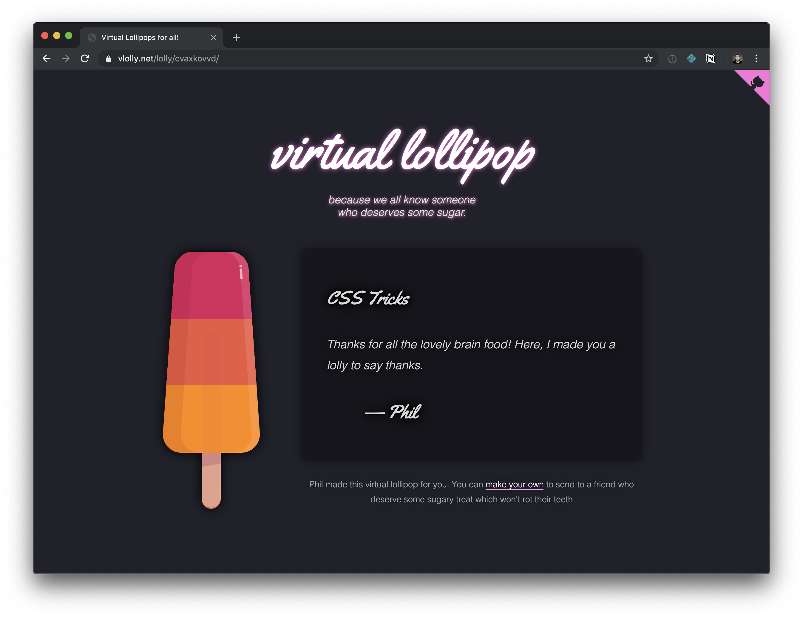
You can go and have a play with the demo site to help you imagine this use case. But only if you promise to come back.
The idea behind this little example site is that it lets you create a nice, happy message and virtual pick-me-up to send to a friend. You can write a message, customize a lollipop (or a popsicle, for my American friends) and get a URL to share with your intended recipient. And just like that, you’ve brightened up their day. What’s not to love?
Traditionally, we’d build this site using some server-side scripting to handle the form submissions, add new lollies (our user generated content) to a database and generate a unique URL. Then we’d use some more server-side logic to parse requests for these pages, query the database to get the data needed to populate a page view, render it with a suitable template, and return it to the user.
That all seems logical.
But how much will it cost to scale?
Technical architects and tech leads often get this question when scoping a project. They need to plan, pay for, and provision enough horsepower in case of success.
This virtual lollipop site is no mere trinket. This thing is going to make me a gazillionaire due to all the positive messages we all want to send each other! Traffic levels are going to spike as the word gets out. I had better have a good strategy of ensuring that the servers can handle the hefty load. I might add some caching layers, some load balancers, and I’ll design my database and database servers to be able to share the load without groaning from the demand to make and serve all these lollies.
Except… I don’t know how to do that stuff.
And I don’t know how much it would cost to add that infrastructure and keep it all humming. It’s complicated.
This is why I love to simplify my hosting by pre-rendering as much as I can.
Serving static pages is significantly simpler and cheaper than serving pages dynamically from a web server which needs to perform some logic to generate views on demand for every visitor.
Since we are working with lots of user generated content, it still makes sense to use a database, but I’m not going to manage that myself. Instead, I’ll choose one of the many database options available as a service. And I’ll talk to it via its APIs.
In this case, I selected Fauna to use as my data store. Fauna has a nice API for stashing and querying data. It is a no-SQL flavored data store and gives me just what I need.
Critically, Fauna have made an entire business out of providing database services. They have the deep domain knowledge that I’ll never have. By using a database-as-a-service provider, I just inherited an expert data service team for my project, complete with high availability infrastructure, capacity and compliance peace of mind, skilled support engineers, and rich documentation.
Such are the advantages of using a third-party service like this rather than rolling your own.
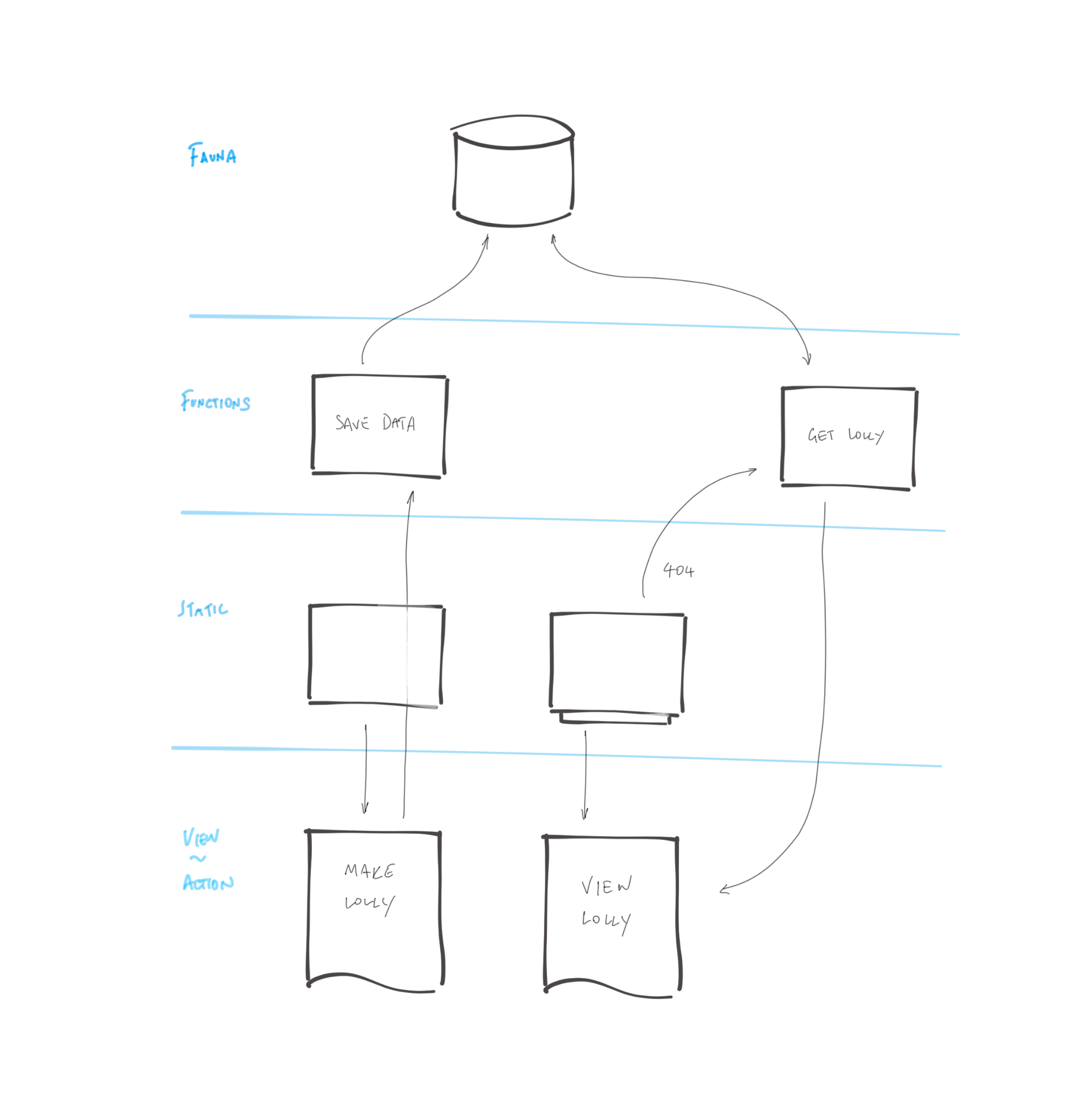
Architecture TL;DR
I often find myself doodling the logical flow of things when I’m working on a proof of concept. Here’s my doodle for this site:
And a little explanation:
A user creates a new lollipop by completing a regular old HTML form.
The new content is saved in a database, and its submission triggers a new site generation and deployment.
Once the site deployment is complete, the new lollipop will be available on a unique URL. It will be a static page served very rapidly from the CDN with no dependency on a database query or a server.
Until the site generation is complete, any new lollipops will not be available as static pages. Unsuccessful requests for lollipop pages fall back to a page which dynamically generates the lollipop page by querying the database API on the fly.
This kind of approach, which first assumes static/pre-generated assets, only then falling back to a dynamic render when a static view is not available was usefully described by Markus Schork of Unilever as “Static First” which I rather like.
You want to dig in a little further, and explore the implementation of this example? OK, I’ll explain in some more details:
Getting data from the database to generate each page
Posting data to a database API with a serverless function
Triggering a full site re-generation
Rendering on demand when pages are yet to be generated
Generating pages from a database
In a moment, we’ll talk about how we post data into the database, but first, let’s assume that there are some entries in the database already. We are going to want to generate a site which includes a page for each and every one of those.
Static site generators are great at this. They chomp through data, apply it to templates, and output HTML files ready to be served. We could use any generator for this example. I chose Eleventy due to it’s relative simplicity and the speed of its site generation.
To feed Eleventy some data, we have a number of options. One is to give it some JavaScript which returns structured data. This is perfect for querying a database API.
// Set up a connection with the Fauna database.
// Use an environment variable to authenticate
// and get access to the database.
const faunadb = require('faunadb');
const q = faunadb.query;
const client = new faunadb.Client({
  secret: process.env.FAUNADB_SERVER_SECRET
});

module.exports = () => {
  return new Promise((resolve, reject) => {
    // get the most recent 100,000 entries (for the sake of our example)
    client.query(
      q.Paginate(q.Match(q.Ref("indexes/all_lollies")),{size:100000})
    ).then((response) => {
      // get all data for each entry
      const lollies = response.data;
      const getAllDataQuery = lollies.map((ref) => {
        return q.Get(ref);
      });
      return client.query(getAllDataQuery).then((ret) => {
        // send the data back to Eleventy for use in the site build
        resolve(ret);
      });
    }).catch((error) => {
      console.log("error", error);
      reject(error);
    });
  })
}
I named this file lollies.js which will make all the data it returns available to Eleventy in a collection called lollies.
We can now use that data in our templates. If you’d like to see the code which takes that and generates a page for each item, you can see it in the code repository.
Submitting and storing data without a server
When we create a new lolly page we need to capture user content in the database so that it can be used to populate a page at a given URL in the future. For this, we are using a traditional HTML form which posts data to a suitable form handler.
The form looks something like this (or see the full code in the repo):
<form name="new-lolly" action="/new" method="POST">

  <!-- Default "flavors": 3 bands of colors with color pickers -->
  <input type="color" id="flavourTop" name="flavourTop" value="#d52358" />
  <input type="color" id="flavourMiddle" name="flavourMiddle" value="#e95946" />
  <input type="color" id="flavourBottom" name="flavourBottom" value="#deaa43" />

  <!-- Message fields -->
  <label for="recipientName">To</label>
  <input type="text" id="recipientName" name="recipientName" />

  <label for="message">Say something nice</label>
  <textarea name="message" id="message" cols="30" rows="10"></textarea>

  <label for="sendersName">From</label>
  <input type="text" id="sendersName" name="sendersName" />

  <!-- A descriptive submit button -->
  <input type="submit" value="Freeze this lolly and get a link">

</form>
We have no web servers in our hosting scenario, so we will need to devise somewhere to handle the HTTP posts being submitted from this form. This is a perfect use case for a serverless function. I’m using Netlify Functions for this. You could use AWS Lambda, Google Cloud, or Azure Functions if you prefer, but I like the simplicity of the workflow with Netlify Functions, and the fact that this will keep my serverless API and my UI all together in one code repository.
It is good practice to avoid leaking back-end implementation details into your front-end. A clear separation helps to keep things more portable and tidy. Take a look at the action attribute of the form element above. It posts data to a path on my site called /new which doesn’t really hint at what service this will be talking to.
We can use redirects to route that to any service we like. I’ll send it to a serverless function which I’ll be provisioning as part of this project, but it could easily be customized to send the data elsewhere if we wished. Netlify gives us a simple and highly optimized redirects engine which directs our traffic out at the CDN level, so users are very quickly routed to the correct place.
The redirect rule below (which lives in my project’s netlify.toml file) will proxy requests to /new through to a serverless function hosted by Netlify Functions called newLolly.js.
# resolve the "new" URL to a function
[[redirects]]
  from = "/new"
  to = "/.netlify/functions/newLolly"
  status = 200
redirects the user to the newly created page so that they can see the result.
First, we’ll require the various utilities we’ll need to parse the form data, connect to the Fauna database and create readably short unique IDs for new lollies.
const faunadb = require('faunadb');          // For accessing FaunaDB
const shortid = require('shortid');          // Generate short unique URLs
const querystring = require('querystring');  // Help us parse the form data

// First we set up a new connection with our database.
// An environment variable helps us connect securely
// to the correct database.
const q = faunadb.query
const client = new faunadb.Client({
  secret: process.env.FAUNADB_SERVER_SECRET
})
Now we’ll add some code to the handle requests to the serverless function. The handler function will parse the request to get the data we need from the form submission, then generate a unique ID for the new lolly, and then create it as a new record in the database.
// Handle requests to our serverless function
exports.handler = (event, context, callback) => {

  // get the form data
  const data = querystring.parse(event.body);
  // add a unique path id. And make a note of it - we'll send the user to it later
  const uniquePath = shortid.generate();
  data.lollyPath = uniquePath;

  // assemble the data ready to send to our database
  const lolly = {
    data: data
  };

  // Create the lolly entry in the fauna db
  client.query(q.Create(q.Ref('classes/lollies'), lolly))
    .then((response) => {
      // Success! Redirect the user to the unique URL for this new lolly page
      return callback(null, {
        statusCode: 302,
        headers: {
          Location: `/lolly/${uniquePath}`,
        }
      });
    }).catch((error) => {
      console.log('error', error);
      // Error! Return the error with statusCode 400
      return callback(null, {
        statusCode: 400,
        body: JSON.stringify(error)
      });
    });

}
Let’s check our progress. We have a way to create new lolly pages in the database. And we’ve got an automated build which generates a page for every one of our lollies.
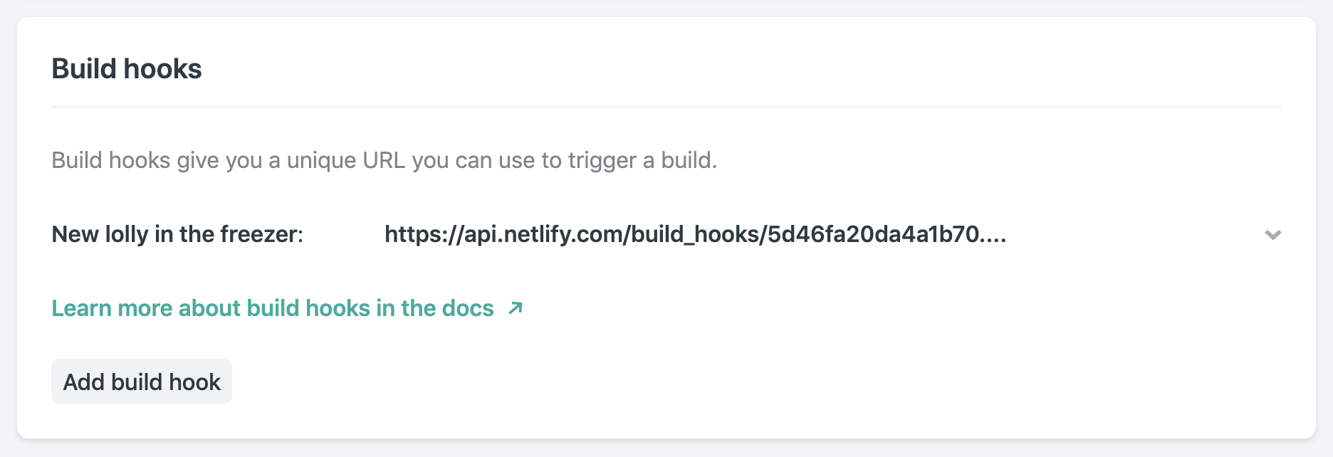
To ensure that there is a complete set of pre-generated pages for every lolly, we should trigger a rebuild whenever a new one is successfully added to the database. That is delightfully simple to do. Our build is already automated thanks to our static site generator. We just need a way to trigger it. With Netlify, we can define as many build hooks as we like. They are webhooks which will rebuild and deploy our site of they receive an HTTP POST request. Here’s the one I created in the site’s admin console in Netlify:
Netlify build hook
To regenerate the site, including a page for each lolly recorded in the database, we can make an HTTP POST request to this build hook as soon as we have saved our new data to the database.
This is the code to do that:
const axios = require('axios'); // Simplify making HTTP POST requests

// Trigger a new build to freeze this lolly forever
axios.post('https://api.netlify.com/build_hooks/5d46fa20da4a1b70XXXXXXXXX')
.then(function (response) {
  // Report back in the serverless function's logs
  console.log(response);
})
.catch(function (error) {
  // Describe any errors in the serverless function's logs
  console.log(error);
});
You can see it in context, added to the success handler for the database insertion in the full code.
This is all great if we are happy to wait for the build and deployment to complete before we share the URL of our new lolly with its intended recipient. But we are not a patient lot, and when we get that nice new URL for the lolly we just created, we’ll want to share it right away.
Sadly, if we hit that URL before the site has finished regenerating to include the new page, we’ll get a 404. But happily, we can use that 404 to our advantage.
Optimistic URL routing and serverless fallbacks
With custom 404 routing, we can choose to send every failed request for a lolly page to a page which will can look for the lolly data directly in the database. We could do that in with client-side JavaScript if we wanted, but even better would be to generate a ready-to-view page dynamically from a serverless function.
Here’s how:
Firstly, we need to tell all those hopeful requests for a lolly page that come back empty to go instead to our serverless function. We do that with another rule in our Netlify redirects configuration:
# unfound lollies should proxy to the API directly
[[redirects]]
  from = "/lolly/*"
  to = "/.netlify/functions/showLolly?id=:splat"
  status = 302
This rule will only be applied if the request for a lolly page did not find a static page ready to be served. It creates a temporary redirect (HTTP 302) to our serverless function, which looks something like this:
const faunadb = require('faunadb');                  // For accessing FaunaDB
const pageTemplate = require('./lollyTemplate.js');  // A JS template litereal

// setup and auth the Fauna DB client
const q = faunadb.query;
const client = new faunadb.Client({
  secret: process.env.FAUNADB_SERVER_SECRET
});

exports.handler = (event, context, callback) => {

  // get the lolly ID from the request
  const path = event.queryStringParameters.id.replace("/", "");

  // find the lolly data in the DB
  client.query(
    q.Get(q.Match(q.Index("lolly_by_path"), path))
  ).then((response) => {
    // if found return a view
    return callback(null, {
      statusCode: 200,
      body: pageTemplate(response.data)
    });

  }).catch((error) => {
    // not found or an error, send the sad user to the generic error page
    console.log('Error:', error);
    return callback(null, {
      body: JSON.stringify(error),
      statusCode: 301,
      headers: {
        Location: `/melted/index.html`,
      }
    });
  });
}
If a request for any other page (not within the /lolly/ path of the site) should 404, we won’t send that request to our serverless function to check for a lolly. We can just send the user directly to a 404 page. Our netlify.toml config lets us define as many level of 404 routing as we’d like, by adding fallback rules further down in the file. The first successful match in the file will be honored.
# unfound lollies should proxy to the API directly
[[redirects]]
  from = "/lolly/*"
  to = "/.netlify/functions/showLolly?id=:splat"
  status = 302

# Real 404s can just go directly here:
[[redirects]]
  from = "/*"
  to = "/melted/index.html"
  status = 404
And we’re done! We’ve now got a site which is static first, and which will try to render content on the fly with a serverless function if a URL has not yet been generated as a static file.
Pretty snappy!
Supporting larger scale
Our technique of triggering a build to regenerate the lollipop pages every single time a new entry is created might not be optimal forever. While it’s true that the automation of the build means it is trivial to redeploy the site, we might want to start throttling and optimizing things when we start to get very popular. (Which can only be a matter of time, right?)
That’s fine. Here are a couple of things to consider when we have very many pages to create, and more frequent additions to the database:
Instead of triggering a rebuild for each new entry, we could rebuild the site as a scheduled job. Perhaps this could happen once an hour or once a day.
If building once per day, we might decide to only generate the pages for new lollies submitted in the last day, and cache the pages generated each day for future use. This kind of logic in the build would help us support massive numbers of lolly pages without the build getting prohibitively long. But I’ll not go into intra-build caching here. If you are curious, you could ask about it over in the Netlify Community forum.
By combining both static, pre-generated assets, with serverless fallbacks which give dynamic rendering, we can satisfy a surprisingly broad set of use cases — all while avoiding the need to provision and maintain lots of dynamic infrastructure.
What other use cases might you be able to satisfy with this “static first” approach?
I hosted a JAMstack roundtable discussion at Web Unleashed this past weekend. Just a few random notes from that experience.
I was surprised at first that there really is confusion that the “M” in Jamstack stands for “Markdown” (the language that compiles to HTML) rather than “Markup” (the “M” in HTML, sometimes used interchangeably with HTML). It came up as legit confusion. Answer: Markdown isn’t required for JAMstack. The confusion comes from the idea that Markdown often goes hand-in-hand with static site generators which go hand-in-hand with JAMstack.
It occurred to me for the first time that every single site that is hosted on Netlify or GitHub Pages or an S3 bucket (“static hosting”) is JAMstack. SHAMstack, indeed! :). The static hosting (SH) part of JAMstack is, perhaps, the most important aspect.
A website that is a single index.html file with
and a bundle of JavaScript that client-site renders the rest of everything can be JAMstack. Assuming the data it needs is either baked in or coming from an API on some other server that isn’t the one that hosts that index.html file, it’s JAMstack.
There is a difference between technically JAMstack and spiritually JAMstack. The above is perhaps more technically and less spiritually. The latter wants you to pre-render more of the site than nothing.
Pre-rendering is nice because: it’s fast, it can be CDN-hosted, it’s secure, and it’s SEO-friendly. A lot of frameworks give it to you as part of what they do, so you might as well take advantage. Pre-rendering doesn’t mean static, JavaScript can still load and get fancy.
There is no denying that Static Site Generators and JAMstack are BFF. But JAMstack wants you to think bigger. What if you can’t render everything because you have 50,000 product pages and generation is too slow or otherwise impractical? No problem, you can prerender other pages but just a shell for the product pages and hit an API for product page data as needed. What if some pages just absolutely can’t be statically hosted? No problem, you can proxy the ones that can to a static server and leave the rest alone. Want to go all-in on the static hosting, but need servers for certain functionality? Consider serverless functions, which are sort of like the backend spiritual partner to static hosting.
People really want to know why. Why bother with this stuff at all? If you can build a site that does all the stuff you need with WordPress, why not just do that? I ended up defending my usage of WordPress from a feature perspective. If I had unlimited time and a fresh slate, even if I stay on WordPress as the CMS, I think I would likely head down a road of at least doing some pre-rendering if not totally de-coupling and building my own front-end and just using the data via APIs. But perhaps the most compelling answers to why come down to speed, security, and resiliency, all of which come along for the ride immediately when you go JAMstack. It provides a hell of a foundation to build on.
It’s very easy to start a business these days. But succeeding in that business is another story. There are just too many people who want to escape the 9-to-5, do something with their big idea and make a better life for themselves in the process. I totally applaud that.
However, it’s not practical to think that the idea will sell itself. Consumers need to be given some reason to trust that their money (or time) will be well spent. And when a business or product is new, the best way to gain this trust is by getting clients, customers and others to vouch for you.
That said, is it possible to go overboard with testimonials, reviews, case studies, client logos and other forms of social proof? And is there a wrong way to build social proof into a mobile website or PWA?
Yes and yes!
When Too Much Social Proof Is A Bad Thing
I was working on the copy for a new website earlier this year. My client told me that the design team had prepared a wireframe for the home page and wanted me to use that as a framework for the copy. Normally, I would be stoked. When I work as a writer, I want to stay in writer mode and not have to worry about layout and design suggestions.
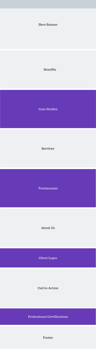
The only problem was that the home page they wanted was littered with social proof and trust marks. It would’ve looked like this (note: the purple boxes contain social proof):
A sample wireframe of a home page with too much social proof. (Source: Canva) (Large preview)
In reviewing the wireframe, I had a number of gripes. For starters, it was way too long, especially for mobile visitors.
Secondly, there was too much social proof. I know that seems counterintuitive. After all, isn’t it better to have more customer validation? I think in some cases that’s correct. Like with product reviews.
BrightLocal’s consumer review survey says that consumers want to see 40 review before believing a business’s start rating. (Source: BrightLocal) (Large preview)
Even then, consumers aren’t looking for a perfect score. As you can see here, only 9% of respondents need a business to have a perfect rating or review in order to buy something from them:
BrightLocal survey respondents prefer to see a minimum of 3- or 4-star ratings instead of 5. (Source: BrightLocal) (Large preview)
And I can tell you why that’s the case.
I used to write product reviews. One of the things I’d do when assessing the quality of a product (before making my own judgments) was to look at what online reviewers — professional reviewers and customers — had to say about it. And let me tell you… there are tons of fake reviews out there.
They’re not always easy to spot on their own. However, if you look at enough reviews at once, you’ll start to notice that they all use the same verbiage. That usually means the company paid them to leave the review or gave family, friends and employees pre-written reviews to drop.
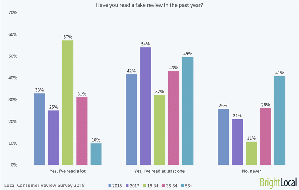
I’m not the only one who’s noticed this trend either. BrightLocal’s respondents have as well:
33% of BrightLocal respondents have seen lots of fake reviews while 42% have seen at least one. (Source: BrightLocal) (Large preview)
Only 26% of respondents said they hadn’t come across a fake review while 42% had seen at least one in the last year and 33% had seen a lot.
When it comes to things like testimonials and case studies, I think consumers are growing just as weary about the truthfulness of the praise.
TrustRadius surveyed B2B buyers on the subject of online reviews vs. case studies. This is what it found:
TrustRadius asked respondents to assess their feelings on customer reviews vs. case studies (Source: TrustRadius) (Large preview)
It makes sense why consumers don’t feel as though case studies are all that authentic, trustworthy or balanced. Case studies are written by the companies themselves, so of course they’re only going to share a flattering portrait of the business or product.
Having worked in the digital marketing space for a number of years, I can tell you that many customer testimonials aren’t always genuine either. That’s why businesses need need to stop worrying about how much social proof they have and start paying more attention to the truthfulness and quality of what they’re sharing with visitors.
The point I’m trying to make isn’t that we should ditch social proof. It’s an important part of the decision-making process for consumers. But just because it can affect their decision, it doesn’t mean that repeatedly bashing them over the head with it will work either. If your website and its messaging can’t seal the deal, a bunch of logos and quotes meant to convince them to buy won’t either.
What you need to focus on when building social proof into a mobile site or PWA is quality over quantity. Sure, you might want to highlight the sheer quantity of reviews that have been gathered on a product, but in terms of space on your website? With social proof, less is more.
Tips For Building Social Proof Into A Mobile Website Or PWA
You don’t have a lot of room to spare on mobile and you don’t want to make your visitors dig and dig to find the important details. So, while you do need social proof to help sell the business and its product, you need to do so wisely.
That means giving your content room to shine and strategically enhancing it with social proof when it makes the most sense to do so.
Consolidate Social Proof on the Home Page
I know how hard it can be to convince people to work with you or buy from you when your business is new. That’s especially the case when you’re entering a field that’s already dominated by well-known and well-reviewed companies.
However, rather than make your home page longer than it needs to be — for desktop or mobile visitors — why not consolidate the strongest social proof you have and put it in one section?
What’s neat about this option is that you can get creative with how you mix and match your social proof.
Customer Reviews + Trust Seals
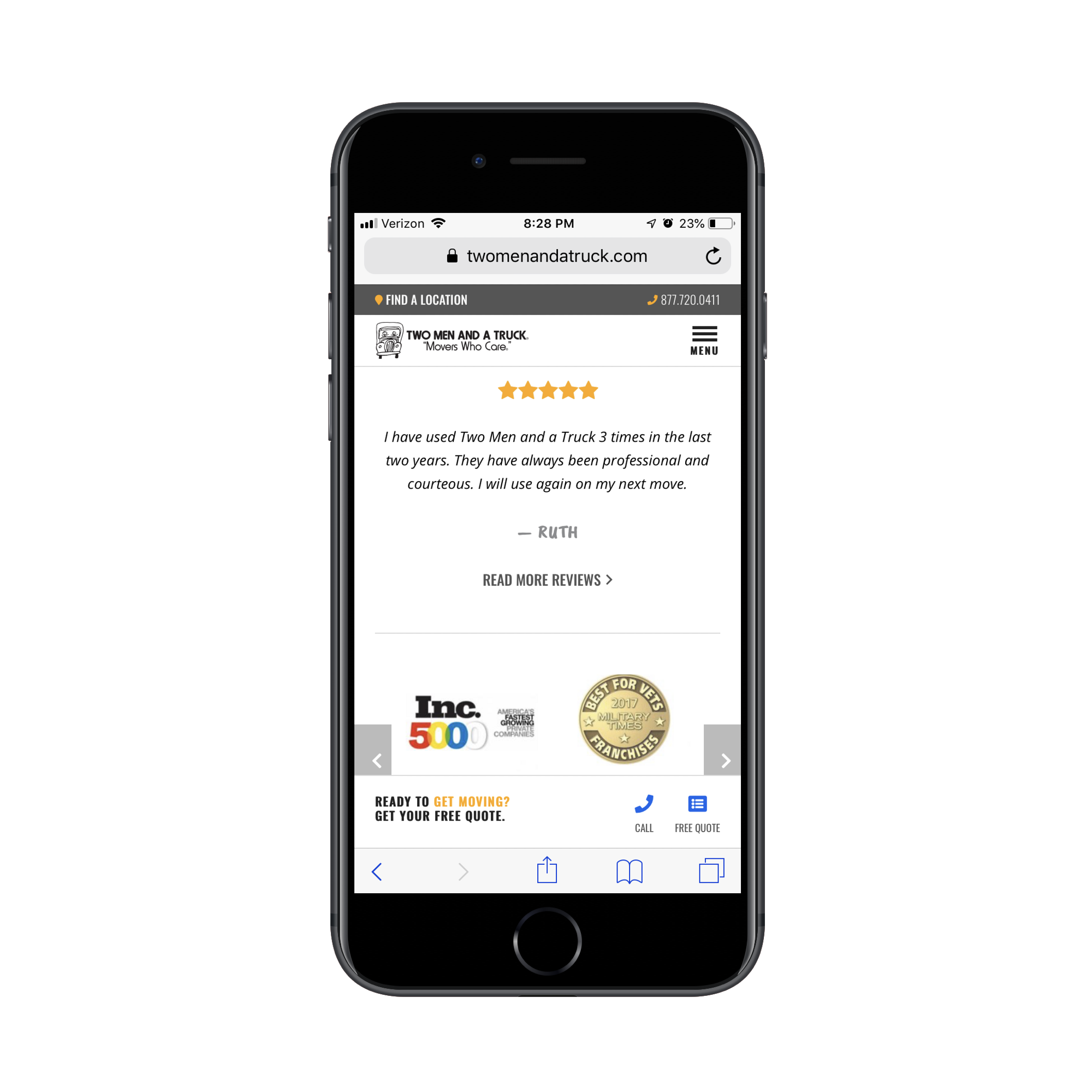
Two Men and a Truck is the kind of company that needs customer testimonials. It’s the only way they’re going to effectively convince new customers to trust them to enter their home and carefully transport their belongings from one location to another.
Local movers Two Men and a Truck stack a testimonial on top of trust seals on the home page. (Source: Two Men and a Truck) (Large preview)
Rather than bog down their home page with testimonials, Two Men and a Truck use one especially positive review and a number of professional trust seals to close the deal in one fell swoop.
Google Reviews + Facebook Reviews
Another way to consolidate social proof on the home page is by aggregating reviews from other platforms as the website of Drs. Rubinstein and Ducoff does:
The home page of Drs. Rubinstein and Ducoff shows off the latest reviews from Google and Facebook along with an average star rating across all platforms. (Source: Drs. Rubinstein and Ducoff) (Large preview)
This is a tiny section — it doesn’t even fill the entire screen — and yet it packs a lot of punch.
First, you have the total number of reviews and average star rating shown at the top. Remember that survey from BrightLocal? This is the kind of thing that would go a long way in convincing new patients to sign up. There’s a good amount of reviews to go on and the average rating seems realistic.
Also, because these reviews come from Google and Facebook, they’re connected to real people’s profiles. Plus, the date is included in the Google review.
Unlike testimonials which are just a quote and a person’s name (if we’re lucky), this is a quote, a star rating and the date it was published. This way, prospective patients don’t have to wonder how long ago it was that Drs. Rubinstein and Ducoff received these reviews.
Twitter + App Store Reviews + Awards
You’ll find another creative example of consolidated social proof on the Pocket website.
Pocket uses Twitter, the Google App Store, the Google Play Store Webby Awards as trust marks. (Source: Pocket) (Large preview)
Even though Pocket is free to use, that’s not necessarily enough to convince someone to try a new piece of software — especially if you want them to download it as a mobile app.
Rather than rely on faceless testimonials, though, Pocket has chosen to show off some convincing and verifiable social proof:
A quote from a Twitter user with a healthy follower base,
The actual rating of its app on both apps stores,
The number of times it’s won a Webby award.
It’s a unique patchwork of social proof which is sure to stand out from the traditional quote block many websites use to promote their products.
Make It Sticky
One of the great things about making the move to a PWA is you can use app-like elements like a sticky bar to show off important information to visitors. If it makes sense to do so, you could even put some social proof there.
Google Reviews Widget
There’s been a big surge in independent mattress companies in recent years. Tuft & Needle. Loom & Leaf. Saatva. They all seem to promise the same thing — a better quality memory foam mattress at a steal of a price — so it’s got to be hard for consumers to choose between them.
One way to make this differentiation is with Google Reviews.
On the desktop website for Lull, the home page reviews callout is tucked into the bottom-left corner.
Lull shares Google customer reviews in a widget on its desktop website. (Source: Lull) (Large preview)
It’s almost too small to notice the reviews with so much more to take in on the home page. That’s a good thing though. The social proof is always present without being overwhelming.
What’s interesting to note, though, is that the mobile counterpart doesn’t show any Google reviews on the home page. It’s not until someone gets to the Mattress page where they’re able to see what other customers have said.
Lull shares Google customer reviews in a sticky bar on its PWA. (Source: Lull) (Large preview)
In this particular screenshot, you can see that the Mattress page on the PWA has a section promoting the product’s reviews. However, even when visitors scroll past that section, the sticky bar continues to remind them about the quantity and quality of reviews the mattress has received on Google.
CTA Banner
Another type of website this sticky social proof would be useful for would be one in hospitality. For example, this website for the Hyatt Regency San Antonio:
Visitors see the number of TripAdvisor reviews and star ratings when they first enter the Suites page. When they scroll downwards, the sticky bar stays in place just long enough (about one full scroll) for visitors to realize, “Cool. It’ll be there if or when I’m ready to do more research.”
What’s nice about how this particular sticky bar is designed is that the reviews are part of the conversion bar. It’s kind of like saying, “Want to book your trip, but feeling nervous about it? Here’s one last thing to look at before you make up your mind!”
Create a Dedicated Page for Social Proof
If you’re not building a PWA or you have too much social proof to show off in a small space, create a dedicated page for it. This is a great option, too, if you plan to share something other than just testimonials or reviews.
Testimonials/Reviews
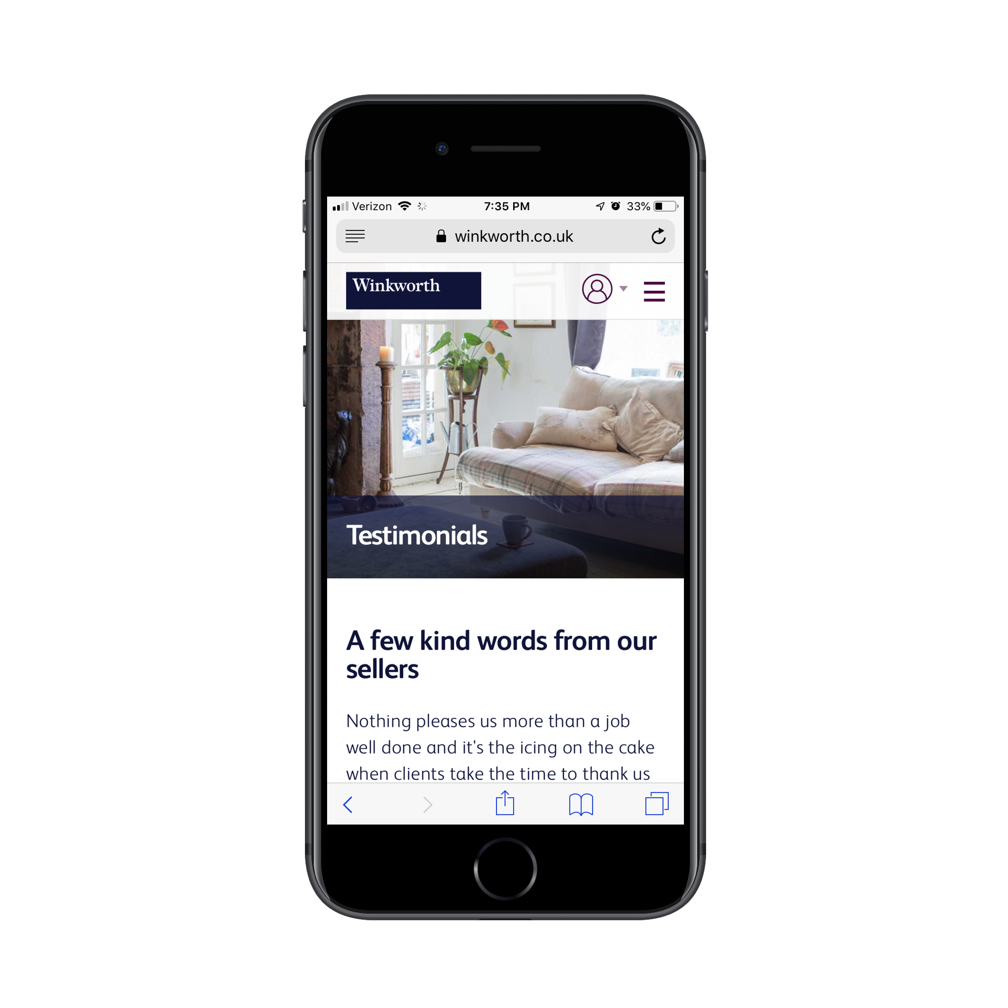
Winkworth is an estate agency in the UK. Testimonials are a useful way to convince other sellers and lessors to work with the agency. Yet, the home page doesn’t have any. Instead, the company has chosen to place them on a Testimonials page.
The Winkworth estate agency keeps its home page free of testimonials and instead places them on a dedicated page. (Source: Winkworth) (Large preview)
It’s not as though this page is just a throwaway of every positive thing people have said. The testimonials look like they’ve been hand-picked by Winkworth, especially the longer ones that contain more details about the experience and the people they worked with.
An example of some of the hand-picked testimonials Winkworth has gathered for its Testimonials page. (Source: Winkworth) (Large preview)
Each testimonial includes the person’s name as well as which Winkworth location they’re referring to. This way, visitors can learn more about the experience at specific locations instead of just hearing how great Winkworth is as a whole.
Case Studies
It’s not just testimonials that could use their own page. Case studies shouldn’t clutter up the home page either.
While Bang Marketing promotes its case studies with a promotional banner on the home page, that’s all you hear of it there. They save their customers’ stories for individual pages like this one:
Each case study page is minimally designed, but captures all of the information needed to tell the story.
First, there’s a video from the client explaining what Bang Marketing was able to do for them. Then, there’s a brief description of what the team worked on. Finally, high-quality images provide visitors with a look at the resulting product.
This is a much more effective way to share case studies than placing a barrage of portfolio images all over the home page.
Press
There are two ways to handle the Press section of a website. The company could publish its own press releases or it can share information about where it’s been featured in the press.
While the former is useful for sharing company news and wins with visitors, it’s just too self-promotional and won’t help much with conversion. The latter option could really make a big impact though.
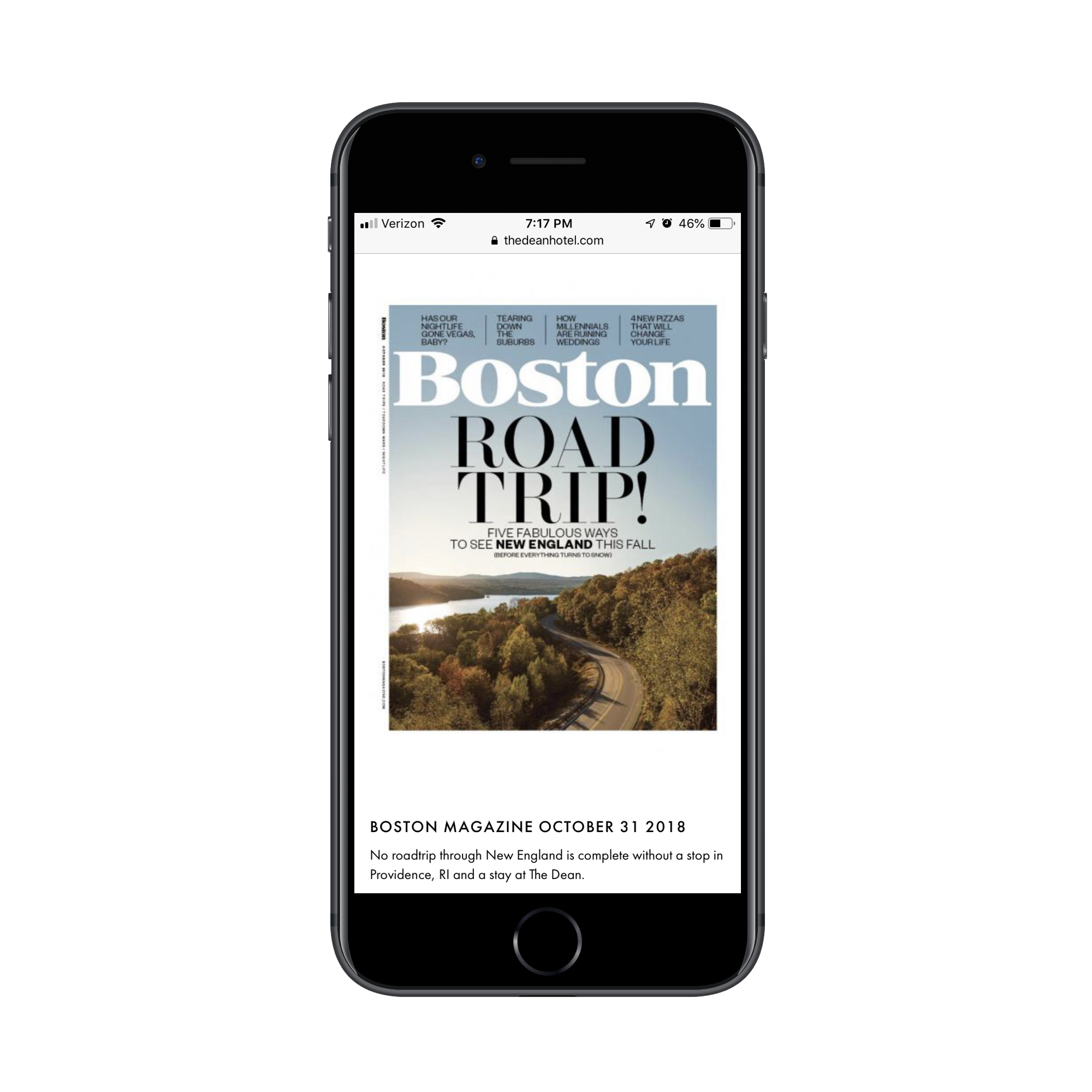
This, for instance, is what visitors will find on the About & Press page for The Dean Hotel:
The Dean Hotel includes magazine covers and article screenshots as social proof on its website. (Source: The Dean Hotel) (Large preview)
After a short intro of the hotel, the rest of the page is covered in magazine covers and article screenshots that go back as far as 2013. Visitors can click through to read each of the articles, too.
This is a unique way for a website of any type to share social proof with visitors.
If your client happens to have a bunch of positive press and never-ending hype surrounding its brand, try to leverage that on the site. Plus, by including screenshots from the articles themselves, you get another opportunity to show off the product (or, in this case, the hotel and its rooms).
Wrapping Up
Consumers have become very savvy when it comes to marketing and sales online. That’s not to say that they don’t fall for it — usually, when it’s done genuinely and with transparency. However, we’re at a point where a brand saying, “We’re the best! Trust us! Buy from us!”, doesn’t usually cut it. They need more validation than that.
At the end of the day, your mobile website or PWA needs social proof to convince visitors to convert.
That said, be careful with how you build social proof into the site, especially on the home page. You don’t have time or space to waste, so don’t create something unnecessarily bulky just so you can show off how many testimonials, reviews, case studies, client logos high-profile partnerships you have. This is about quality over quantity, so make it count.
While there aren’t as many new tools out there to play with right now, the ones available are a lot of fun. From tools to help speed up workflows and manage productivity, to creative gamification and funky typefaces, these new tools for designers will make you want to stick to your desk.
Here’s what new for designers this month.
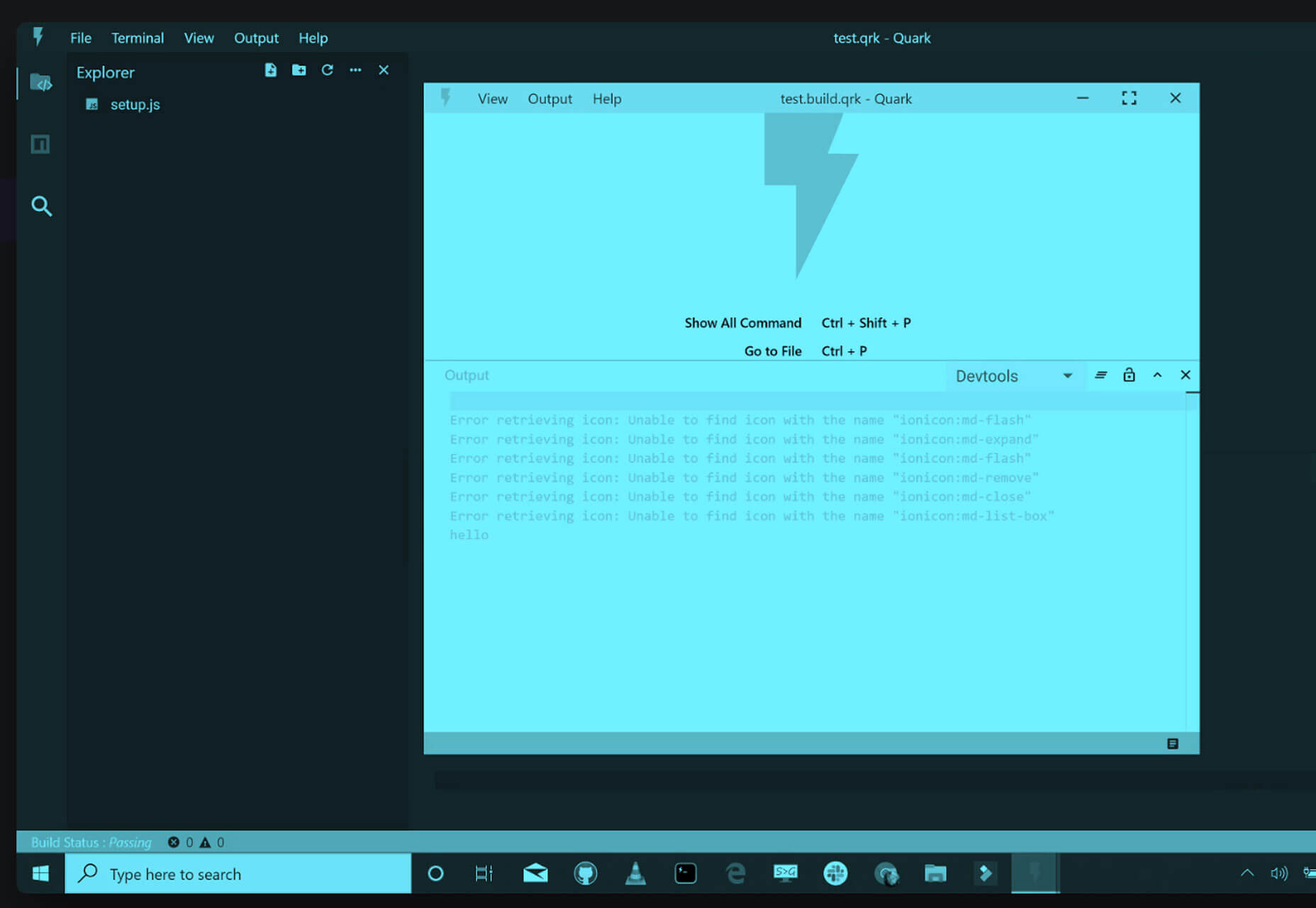
Quark
Quark might not be exactly what you are thinking if you have roots in print design. This Quark, in beta, is designed to help you create projects in HTML, CSS, and JavaScript with native app capabilities. The interface is made for rapid development and prototyping so you can create apps fast.
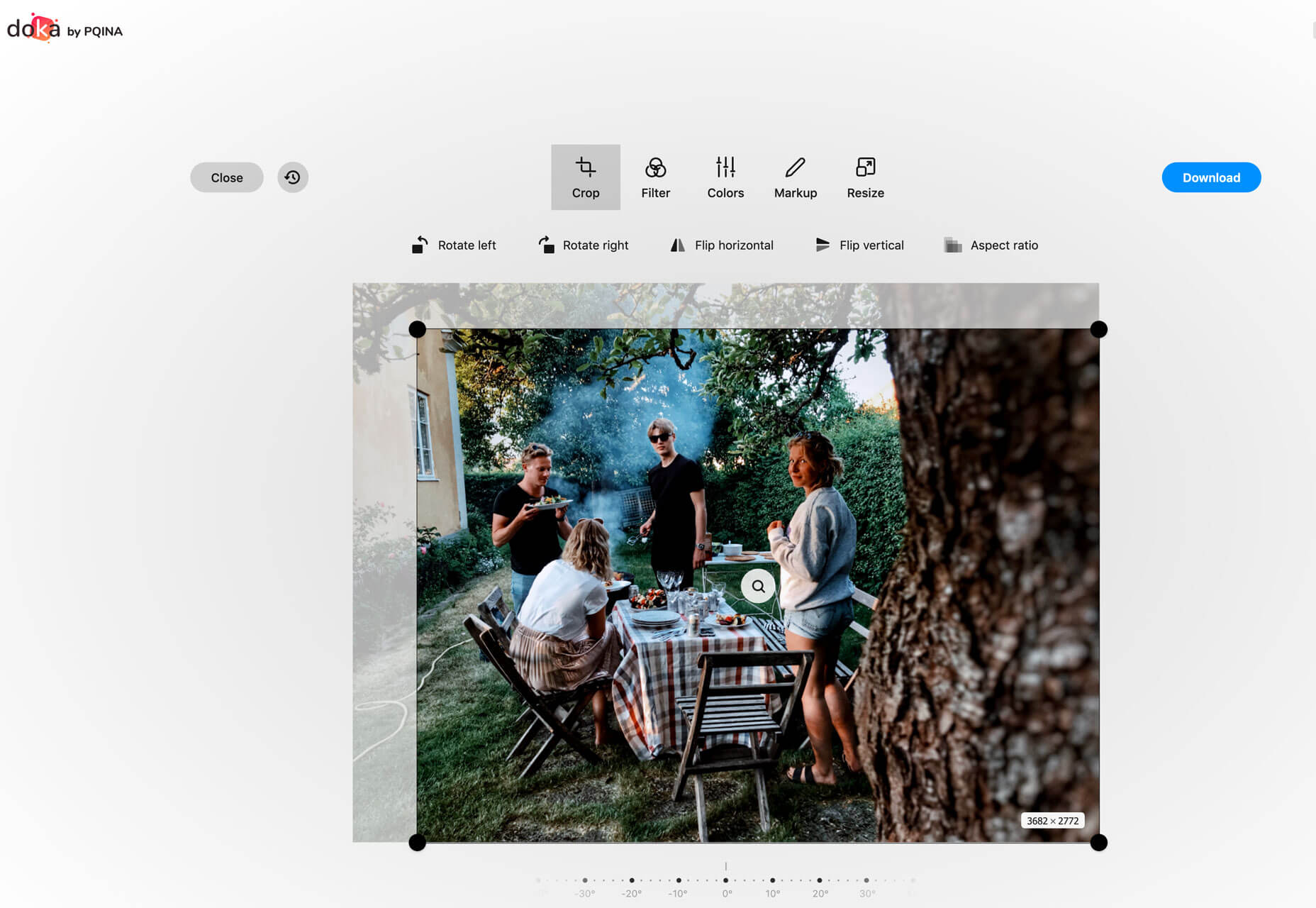
Doka
Doka is an in-browser photo editor. You can perform all kinds of basic photos edits with this free tool, including cropping and resizing (even by aspect ratio). There are even a few simple filters. Get your photo ready to go and download it for use in projects. It’s one of the best simple photo editing tools out there.
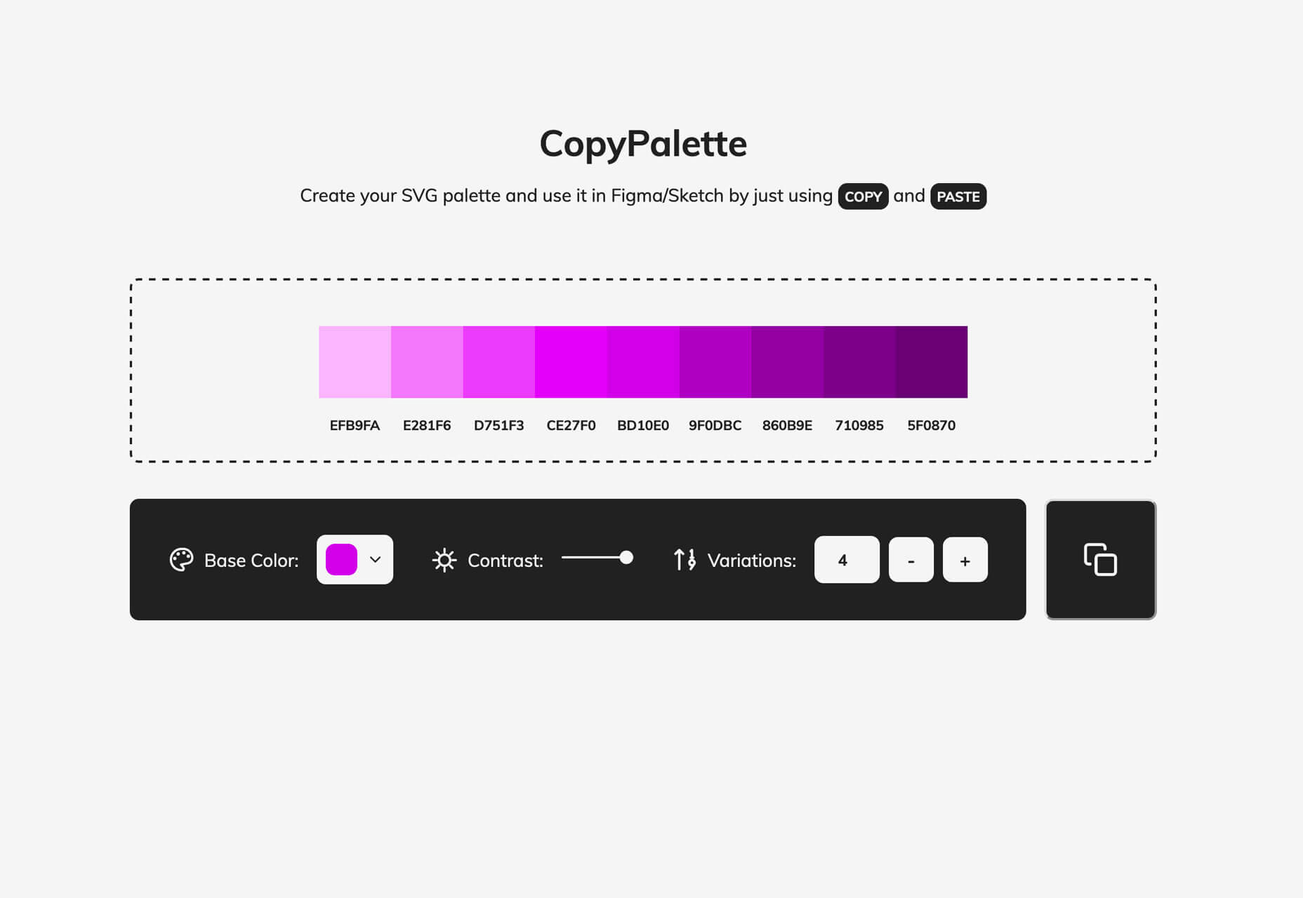
Copy Palette
Copy Palette will help you create the most elegant monochromatic palettes. Pick a base color, number of variations and adjust the contrast on the way to making an SVG palette that you can use in Figma or Sketch with a simple copy and paste.
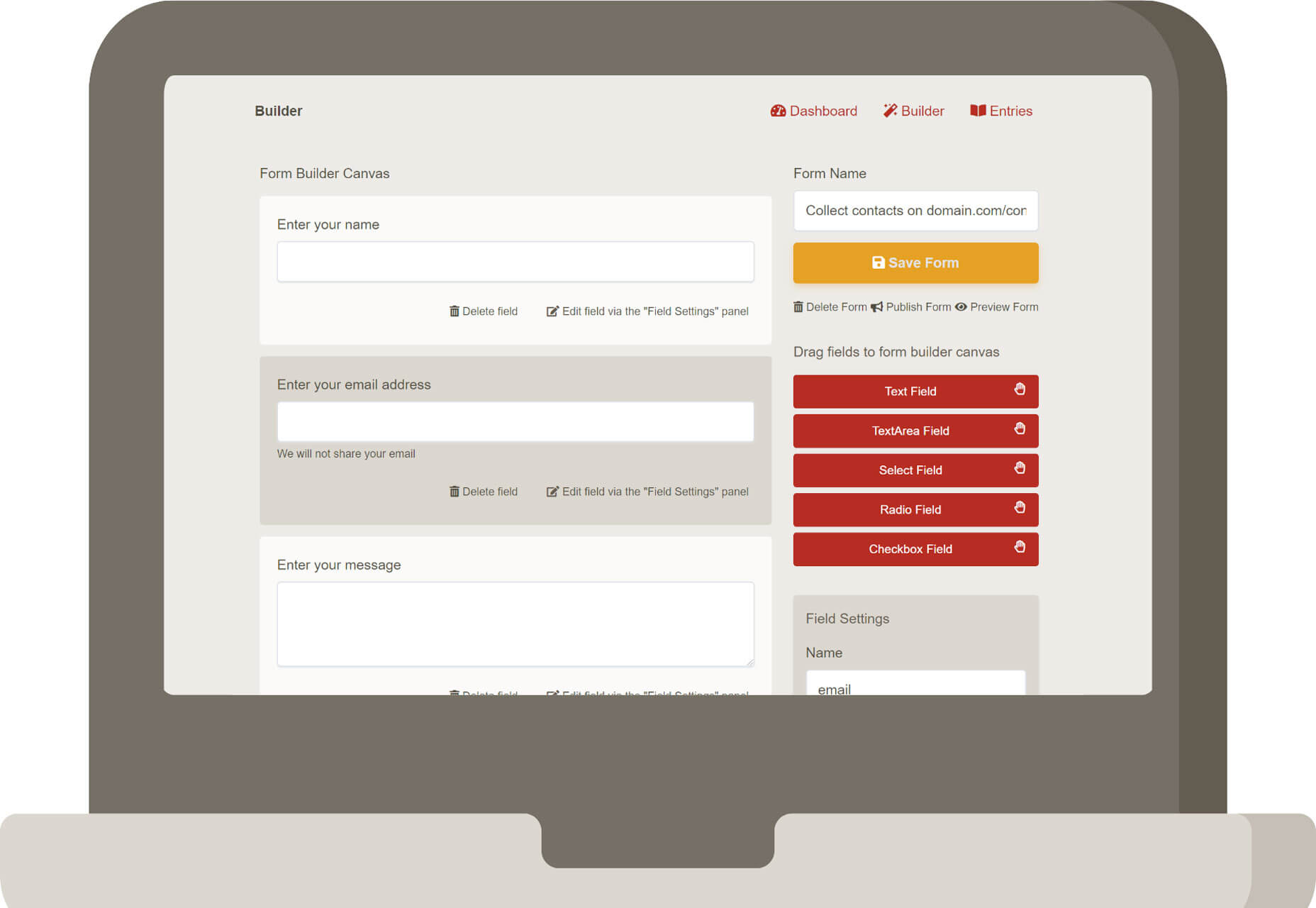
Summit Form
Summit Form is a drag and drop online form builder. Embed forms on your website or link through social media or email. It’s easy to use and there’s no coding if you want to build forms with ease. (This is a paid tool, but it is fairly low cost.)
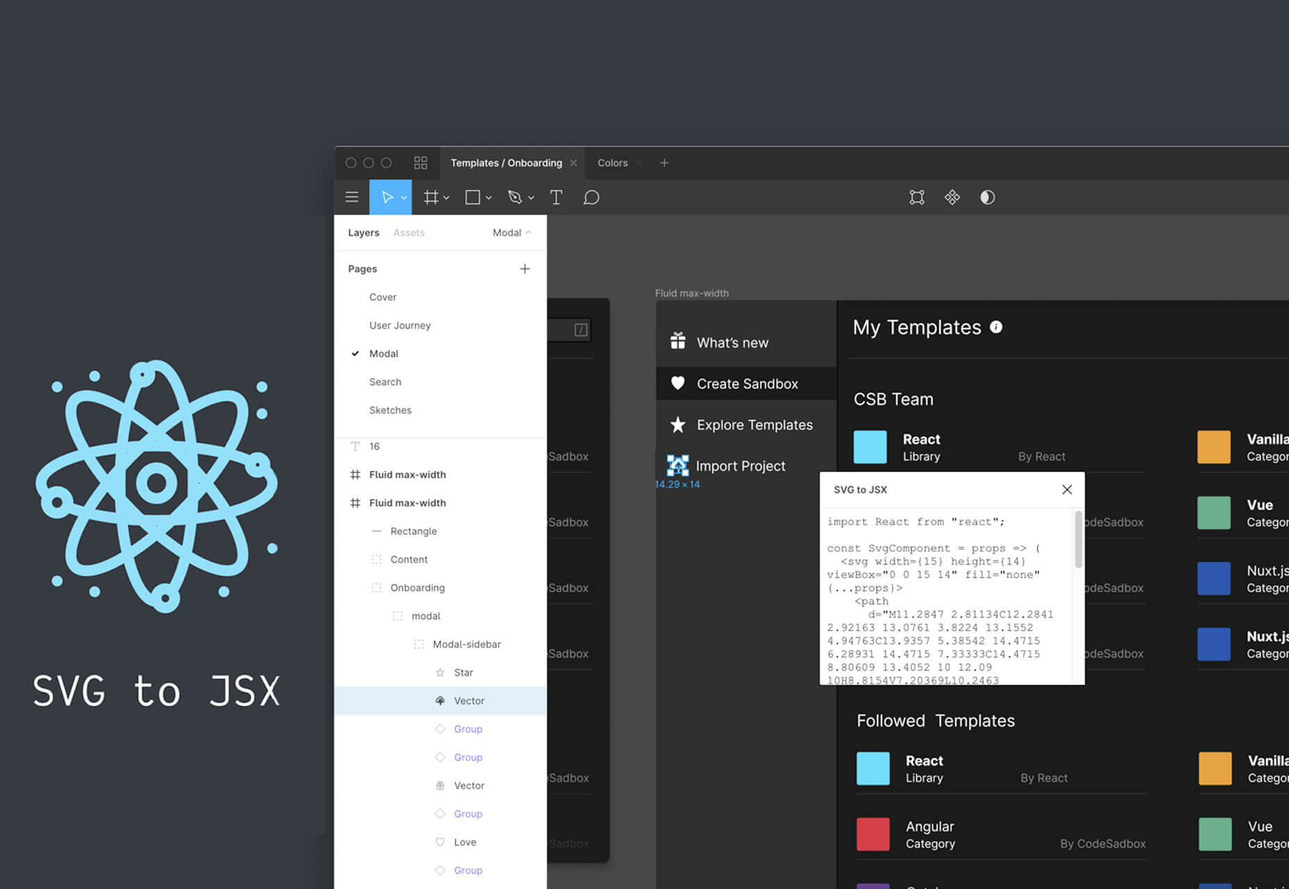
SVG to JSX
SVG to JSX is a plugin that lets you copy SVG code as a react component for use in Figma. And it’s as simple as a right-click.
Tiler
Tiler combines small images to create a large image masterpiece. What’s different about this tool is mosaic squares aren’t just square. You can adjust shapes and size to suit your needs. Options include circles, lines, waves, cross stitches, legos, minecraft blocks, paper clips, letters, and more.
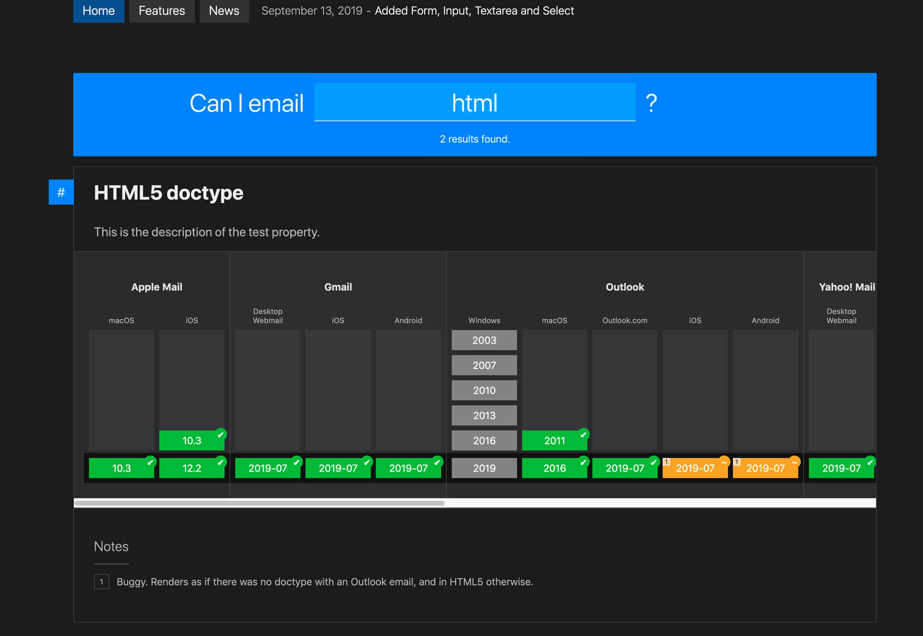
Can I Email?
Can I Email? Is one of those tools you don’t know how much you need it, until you use it. Fill in what you want to know into the “can I email” field at the top of the screen to see what elements are supported by which email clients.
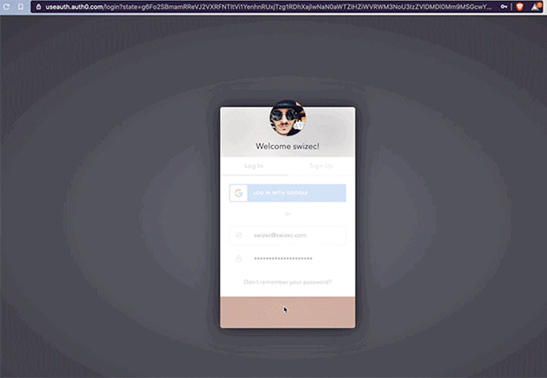
UseAuth
UseAuth is a simple method of adding authentication to a React app. (Mostly because it takes care of everything for you.) It uses an AuthProvider component for configuration and shares states between components, including users, login forms, and redirects.
Fragments iOS Wireframe Kit
Fragments is an iOS wireframe kit for Sketch that you can use for mobile app development. It includes 370 layouts in 10 categories based on nested symbols and layer styles. Test it out with the free version – 25 ready-made screens – before committing to the full kit.
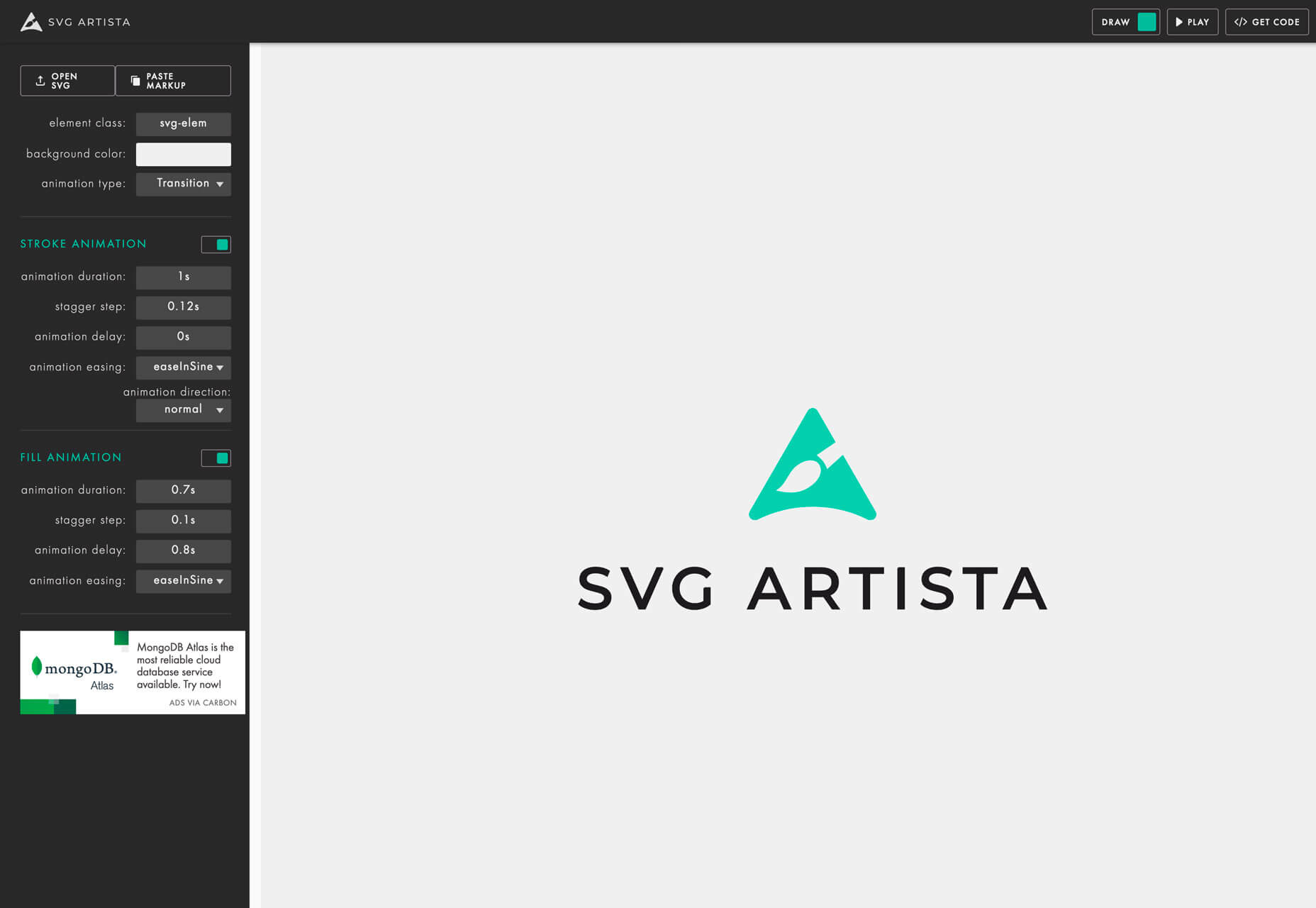
SVG Artista
SVG Artista simplifies the process of making an SVG animation. It was born out of the animation for animista.net. It animates the stroke and fill properties of SVG images with plain CSS and works best with paths, lines, circles, and polygon elements. This isn’t a full animation tool, but does work for quick elements.
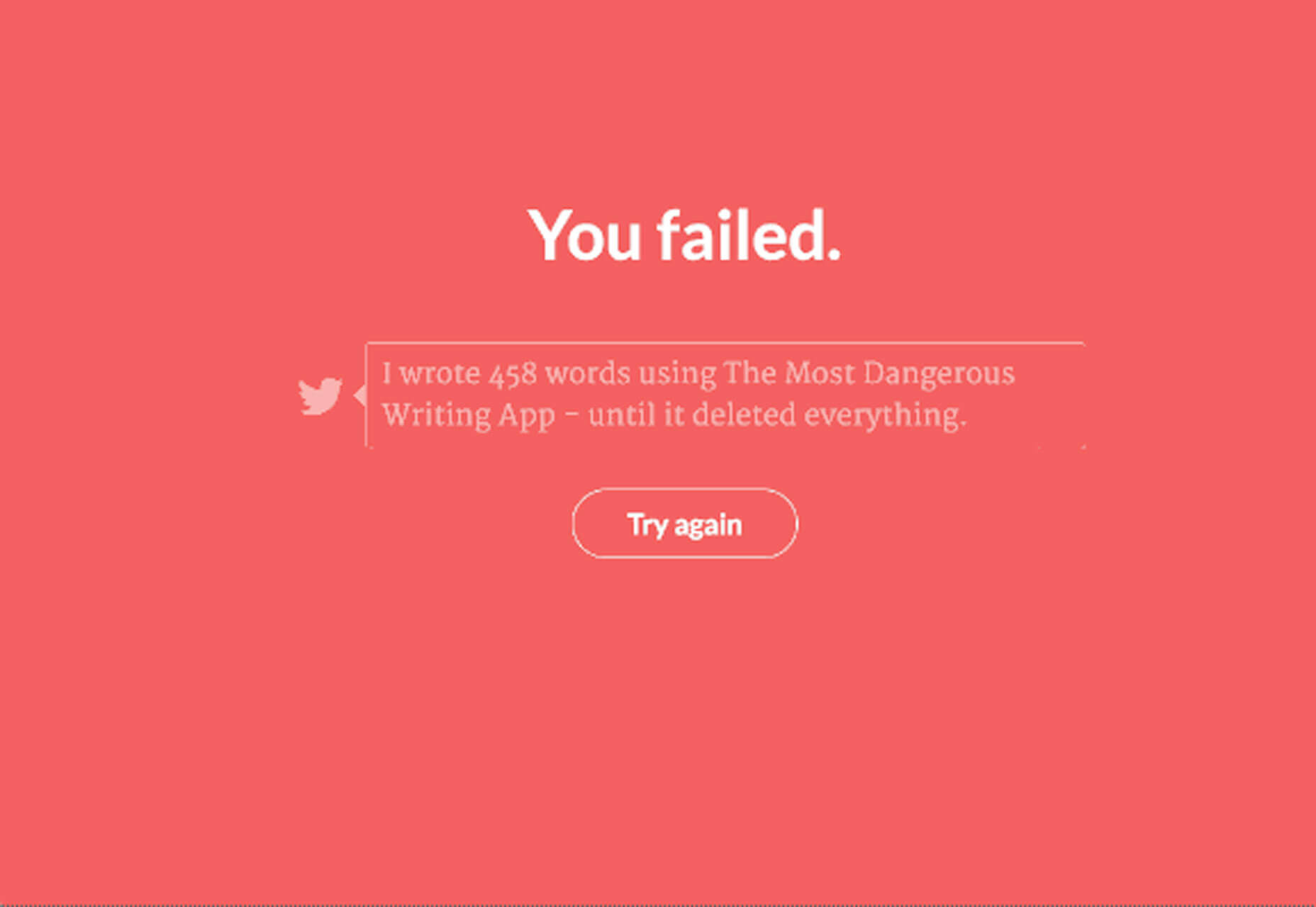
The Most Dangerous Writing App
The Most Dangerous Writing App is a game that deletes your content if you get out of the flow, literally. Stop writing for more than 5 seconds and you lose all your progress. It sounds scary but is an interesting creative tool.
Abstract Illustrations
Abstract Illustrations is a collection of one-line vectors that you can use in projects. It’s a trending style that you can find in a lot of projects right now.
Day/Night Ambient Animation
Have you ever wanted to change your page content or aesthetic based on light level? Using the Ambient Light API, Many Moore shows you how. It works using the #enable-generic-sensor-extra-classes flag in chrome://flags.
Chart.xkcd
Chart.xkcd is a tool that lets you create hand-drawn style charts. All you need to use it is the script included in your website with a SVG node to render the chart. This tool makes your charts quirky and anything but boring.
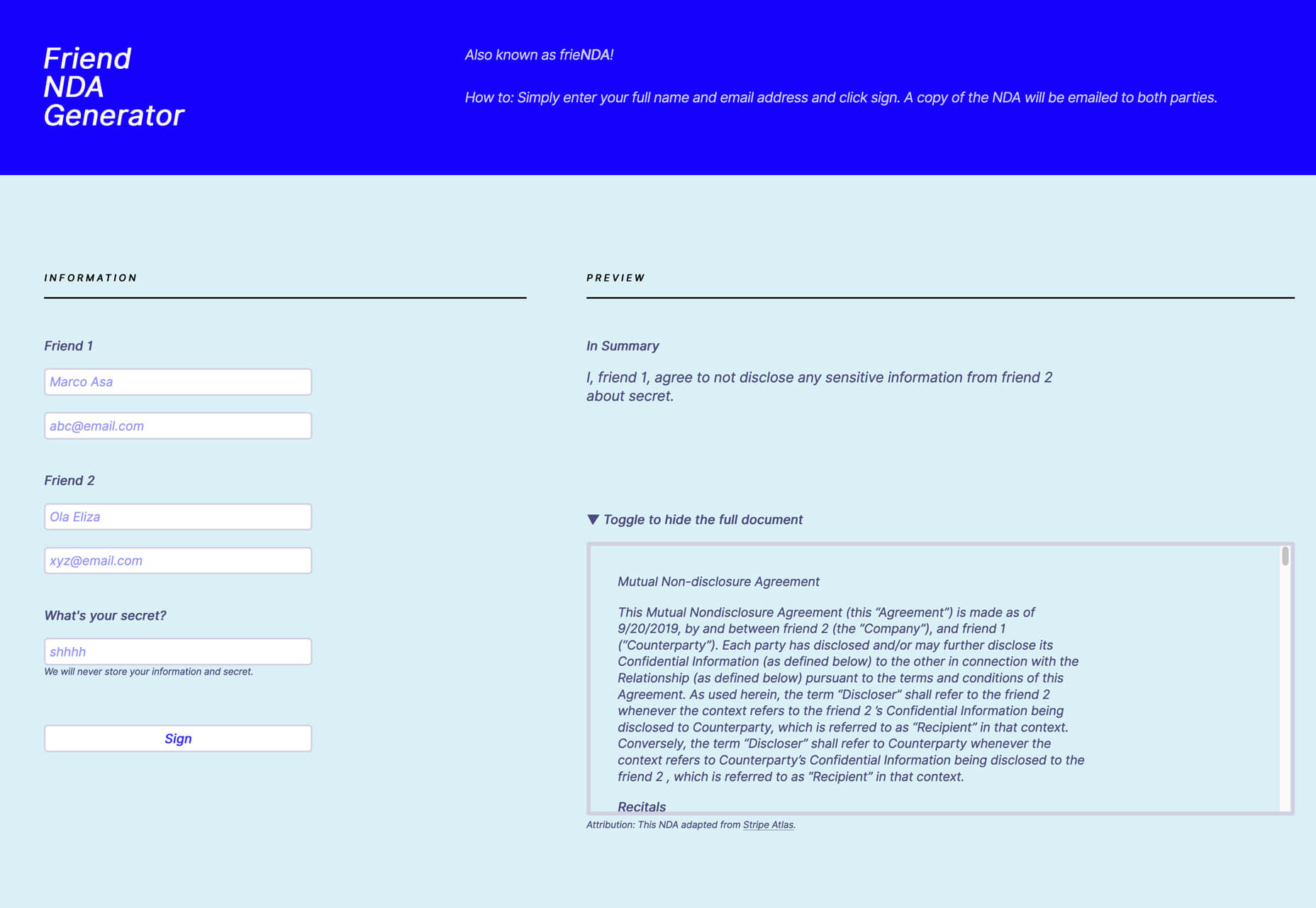
Friend NDA Generator
Friend NDA Generator or frieNDA is a silly little tool that creates a non-disclosure agreement between friends so you can really share secrets. Sadly, this might be a necessary tool in the digital age.
Flying Pages
Flying Pages is a WordPress plugin that helps preload pages before a user clicks so they will seem to load faster and more instantly. It uses a tiny bit of JavaScript and preloads when the browser becomes idle. Plus, it’s designed not to crash due to too many preloads.
Terms and Conditions Generator
Terms and Conditions Generator can help you create a professional document with clauses and legalize for your website or app. Use it to help protect your interests and content. The tool is scalable for everything from simple blogs to e-commerce and works in 100-plus countries.
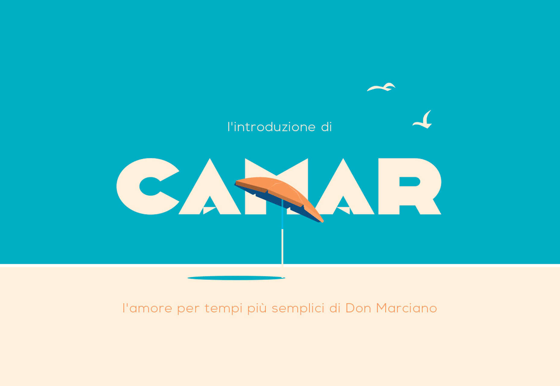
Camar
Camar is an art-deco style vintage typeface for display use. The font includes all uppercase characters, numbers, and punctuation with a funky feel.
Florista
Florista is an elegant script with clean lines and interesting optional tails. It includes upper- and lowercase letters.
Fox Cavalier
Fox Cavalier is a futuristic slab serif that can make for interesting display use. It contains only uppercase letterforms.
Leon Sans
Leon Sans is a cool geometric sans serif that’s entirely made from code. You can change weight dynamically or create custom font animations or effects in the Canva element of HTML 5. It’s a pretty cool example of creative coding.
Sporter
Sporter evokes feelings of the fall (American) football season with cool block letters that resemble what you’d see on a jersey. It includes all uppercase letters.
For a lot of people, the first thing they think of when they hear the names of big companies is their logo. In truth, the logo is probably the biggest marketing decision you can make. It might sound simple, but there are quite a few things you need to keep in mind when designing a logo of your own. So without further ado, let’s talk about the basics behind designing your own logo.
Why do you need a logo?
Ideally, you’ll want to hire a professional to create your logo, but that doesn’t mean you shouldn’t bring some ideas of your own to the table. In fact, it’s best that you have a pretty good idea of what you want before the big design meeting.
But let’s say that you want to go through most, if not all of this process by yourself. Where do you even begin? You need to start this journey off by understanding why you need the logo.
Your logo is an extension of your brand. It’s important that it represents you. That can be hard to do in a single picture, but that’s why this takes time.
Pick something that scales as a favicon
A favicon is that little image that sits in the address bar when a tab is opened. It’s a small detail, but it’s very crucial.
The reason it’s so crucial is because those big, fancy, and incredibly detailed images will look absolutely terrible as a favicon. This is something that a lot of people don’t think about because they generally regard a big and fancy logo as perfect.
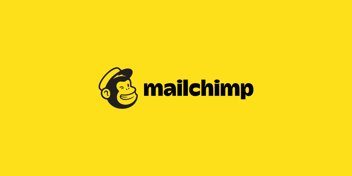
One of my favorite examples of a favicon is that of Mailchimp.
This logo is simple, yes, but it still manages to capture the brand perfectly. Now, if you pay attention, you’ll notice that the main focus of the logo (the chimp) is its own entity. That makes it very easy to scale as a favicon. Just like this:
This is the Mailchimp favicon. They definitely couldn’t have put the entire logo in the address tab, and they knew that. So, they went into the logo design process with that in mind, and came out with this.
Test multiple colors
Speaking of being scalable, you want to make sure the logo looks good on multiple backgrounds in multiple colors. If you don’t you could end up having to redo this entire process when something as simple as a WordPress theme change comes up.
As unusual and controversial as the Slack logo has been here lately, we all have to admit that it works well with multiple colors. Of course, the logo itself has a variety of colors in it, but that really only helps it.
The Slack logo can be seen around the world with all sorts of background and font colors. It’s an iconic logo, so it was important that they got all the design elements right.
Be consistent with the brand
A logo means nothing if it doesn’t embody the brand. This is especially important for startups that are looking to get their name out there.
I don’t think I need to go into this too much, but we definitely need to mention it here. Every tiny little detail is crucial. They have to match the brand’s story, their tone of voice, and their mission.
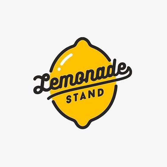
So, for example, the choice of font is a big one. If you run a SaaS company, you probably don’t want to use a script font. Something like that makes much for sense for a small town candle shop.
Something like this classy lemonade stand logo is perfect. It’s simple, it will scale well as a favicon, and it’s on brand. The colors work well and the font stands out, but it’s not over the top.
Make your logo easy to incorporate into your brand
This point sort of goes along to the one above, but it deserves its own mention. That being said, even if your logo is on brand, it doesn’t mean that it will be easy to incorporate into the rest of your brand.
What do I mean by that? Well, looks aren’t always everything. Even if you logo looks great and embodies your brand, it might not be easy to use. Yes, there is such a thing as a logo that is too detailed to use.
A logo should not be so complicated that it takes more than a few seconds for someone to recognize what it is. If it’s simple and straightforward, it will be easy to incorporate into your brand anywhere.
Other tips to follow
There are tons of tips to take into consideration here. But, whether you’re designing it yourself or paying someone else to do it, there are some that are pretty fundamental. So, in addition to the ones above, here are some quick tips that you should consider:
Pick a style and stick to it
Just like a good party, a logo has a theme. This is a combination of all the elements. From the typography to the colors, everything should be perfectly thought out and implemented with a purpose. Each element needs to pay respect to the others.
Keep constant communication with the designer
If you choose to hire someone, you have to keep constant communication with them. In the design world, you build off of your own ideas. So if the designer gets one tiny detail wrong, then the entire logo can be off in the end.
Stay inspired
You are designing the face of your company. If you lack inspiration in the project, you should stop and brainstorm a bit. Or, if you really can’t handle it anymore, step away for a bit. Nothing is worse than rushed work in design, so don’t make your logo suffer.
Get a lot of opinions
You’re not designing this logo for your own personal use. This logo will be seen by a lot of people, so get a lot of opinions. Show it off to colleagues, friends, family, or even random strangers. The more input you can get, the better your logo will come out.
Be yourself
This is probably the most important rule in design, so we’ll end here. Being yourself is what got you to the place where you can design your own logo in the first place. Don’t fall into the norms of the industry that you’re in. Be unique!
Every week users submit a lot of interesting stuff on our sister site Webdesigner News, highlighting great content from around the web that can be of interest to web designers.
The best way to keep track of all the great stories and news being posted is simply to check out the Webdesigner News site, however, in case you missed some here’s a quick and useful compilation of the most popular designer news that we curated from the past week.
Note that this is only a very small selection of the links that were posted, so don’t miss out and subscribe to our newsletter and follow the site daily for all the news.
Don’t Make the Same Design Fail as the Chicago Bulls Logo
15 Unique Website Layouts
Where to Put Buttons on Forms
Free Collection of Amazing PNG Images
5 Soft Skills Every Product Designer Should Master
Microsoft’s New Font for Devs is Very Aesthetically Pleasing (and Free)
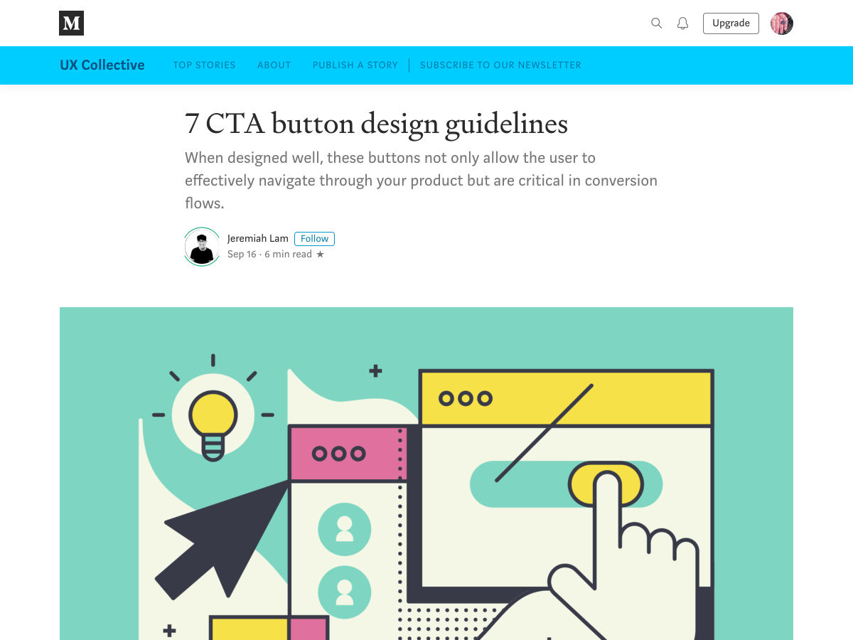
7 CTA Button Design Guidelines
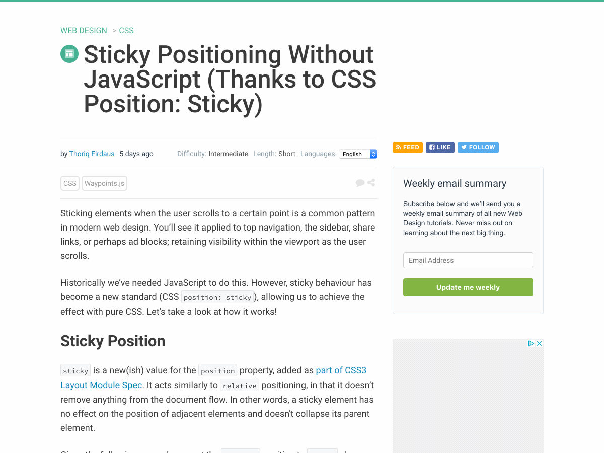
Sticky Positioning with Nothing but CSS (Thanks to CSS Position: Sticky)
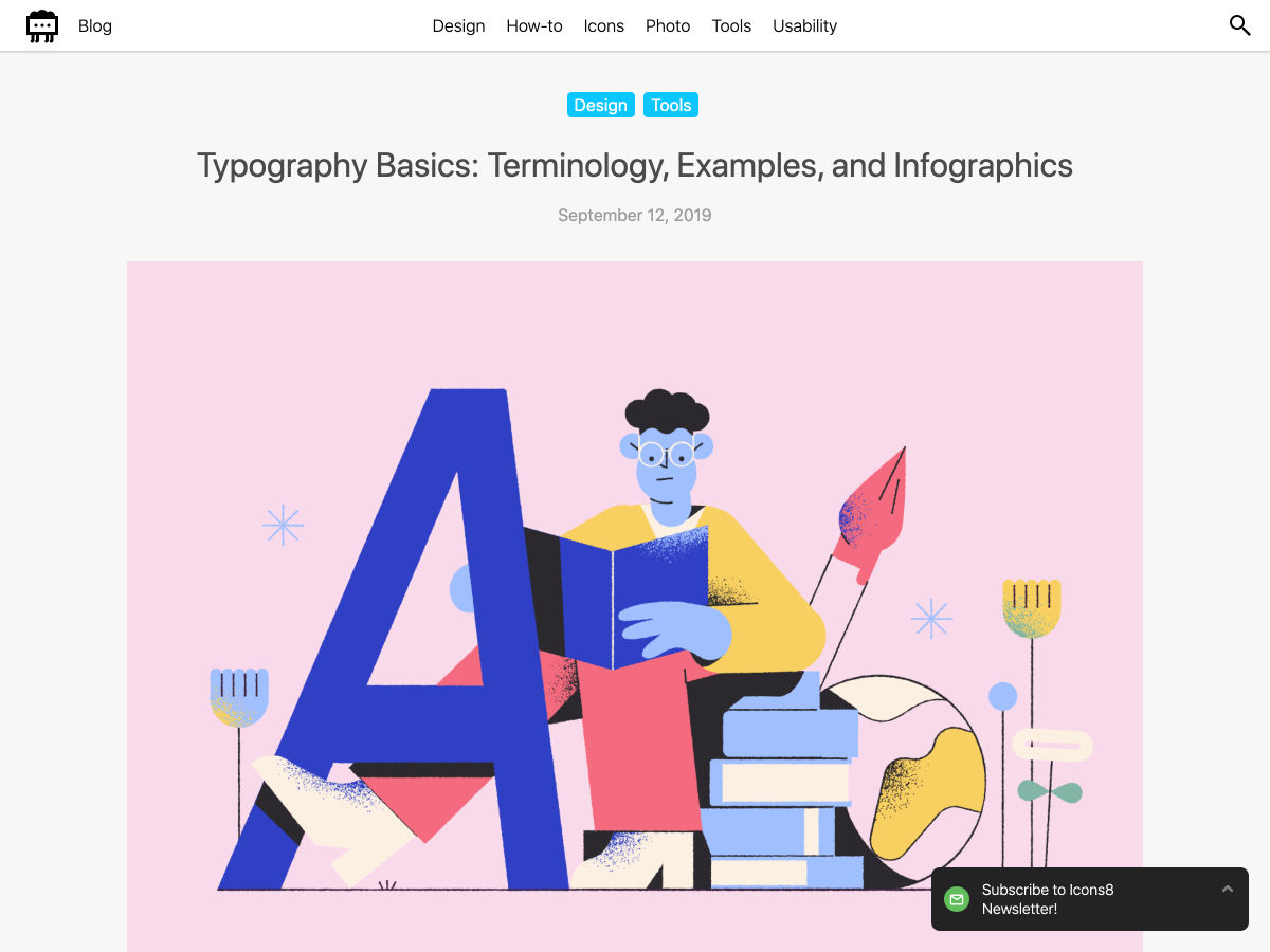
Typography Basics: Terminology, Examples, And Infographics
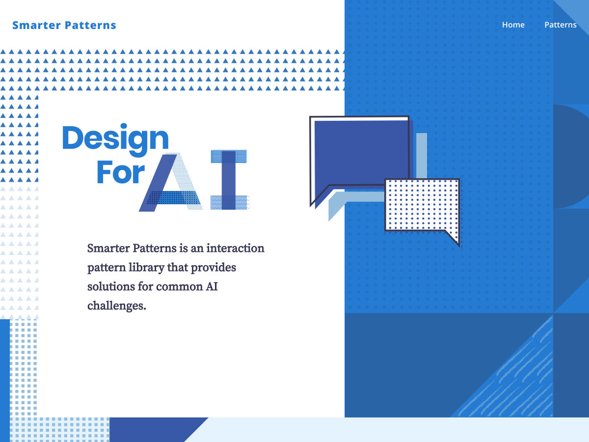
AI UI Pattern Library
Inconsistent Behavior Among Browsers When Clicking on Buttons
(Why) Some HTML is “Optional”
A Love Letter to Personal Websites
Augmented-UI
Dark Mode – Working with Color Systems
‘Intent’ Should Be Every Marketer’s #1 Obsession
Four Tips from my First Year as a UX Developer
UX Design — Question Everything
This Typeface Hides a Secret in Plain Sight. And that’s the Point
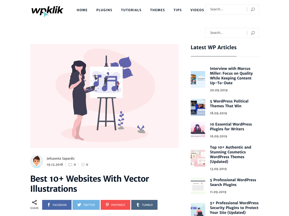
10 Best Sites for Vector Illustrations
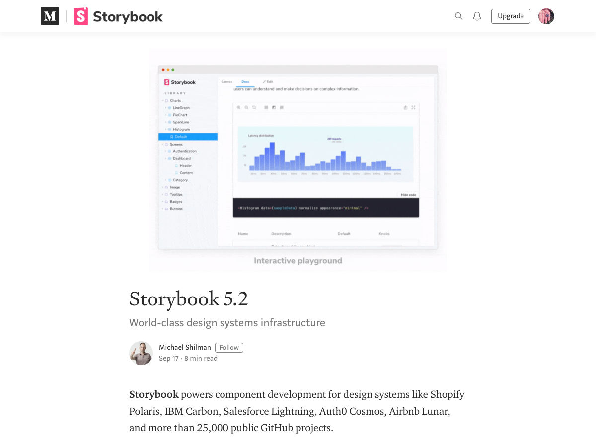
Storybook 5.2
To do Better Work, Change your Environment
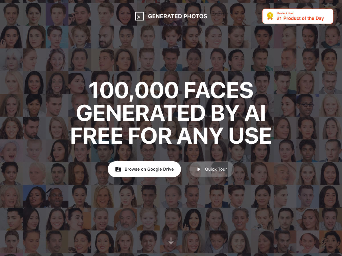
100,000 AI-Generated Faces – Free to Use!
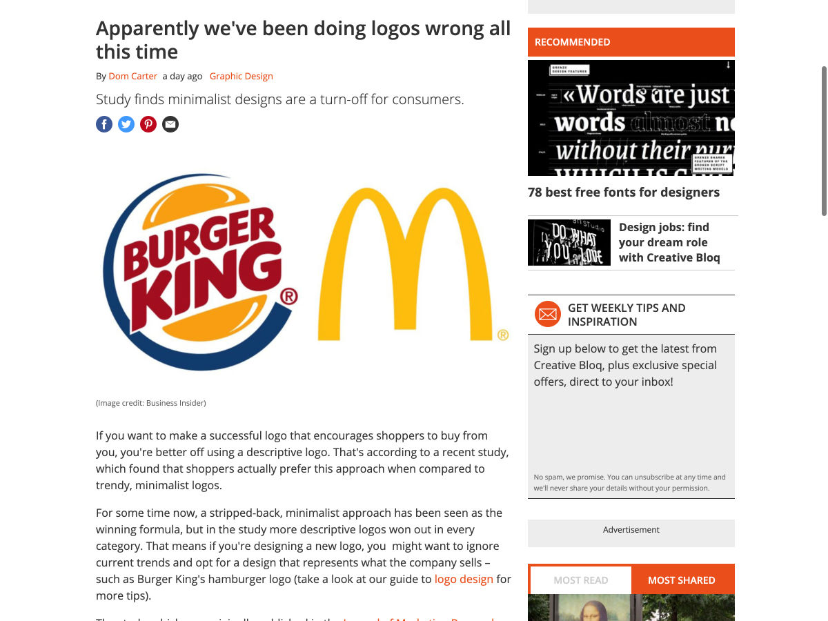
Apparently We’ve been Doing Logos Wrong all this Time
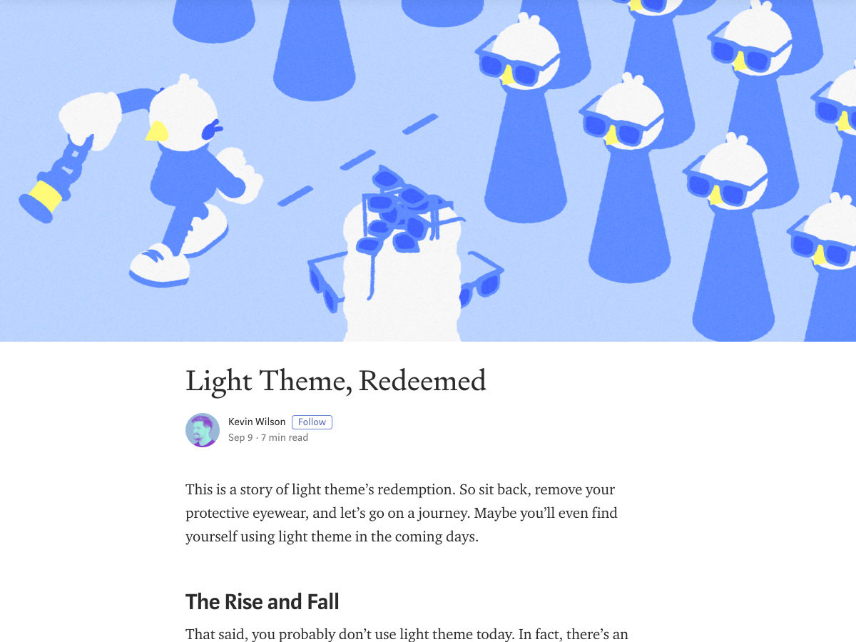
Light Theme, Redeemed
Want more? No problem! Keep track of top design news from around the web with Webdesigner News.
There’s been a ton of great stuff flying around about variable fonts lately (our tag has loads of stuff as well). I thought I’d round up all the new stuff I hadn’t seen before.
Speaking of Google Fonts, Recursive is pretty lovely and will be coming to Google Fonts. It even has a little playground for its variable possibilities.
The annual release of the new default WordPress theme (“TwentyTwenty”) will be done by Anders Norén. It’ll be a rejigger of Chaplin and be all ready to have cool Gutenberg blocks. The font will be Inter, which is lovely and, of course, a variable font. The screenshots look great.
Here’ a nice demo of a slider UI where the active slide has beefy thick font that animates to a thin variant on non-active slides. I still love the look of animating font weight, like this Marvin Visions site and Michelle Barker’s Breathing.
There is something about variable fonts that gets people in a weird mood (just look at Mandy Michael’s demos). But usually, the experiments are still typographic in nature. Not so with Typearture, where the demos are planes and cars and trucks and pigs and all sorts of weird stuff that is blowing minds. Like this galloping horse!
Remember that Wakamai Fondue (the best name ever for a site) is great at unearthing the technical possibilities of a variable font.
Visual demo of variable fonts interpolated in WebGL.
Grammato has a pretty bold proclamation of being a next-generation of typography. Not handwritten or a handwriting-font, but a handwriting-esque font that leverages variables fonts to somehow do its thing. Not sure I totally get it, but the site is nice.
Saved the most fun font for last: This Man This Monster from COMICRAFT is super cool looking and has unusual variable font variables: Bite, Chew, and Wonk (as opposed to the normal stuff you see, like weight and slant).
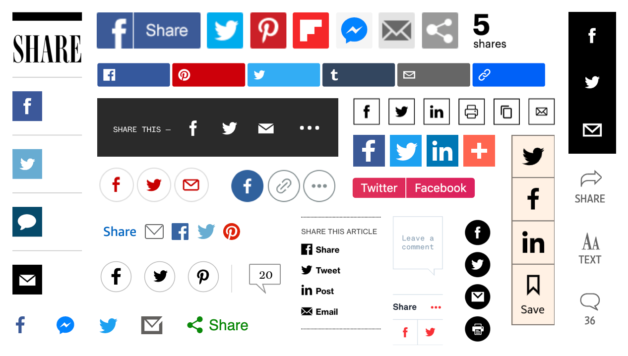
From trashy clickbait sites to the most august of publications, share buttons have long been ubiquitous across the web. And yet it is arguable that these buttons aren’t needed. All mobile browsers — Firefox, Edge, Safari, Chrome, Opera Mini, UC Browser, Samsung Internet — make it easy to share content directly from their native platforms. They all feature a built-in button to bring up a “share sheet” — a native dialog for sharing content. You can also highlight text to share an excerpt along with the link.
The ubiquitous share button, as seen at the BBC, Wired, BuzzFeed, PBS, The Wall Street Journal and elsewhere.
Given that users can share by default, are custom buttons taking up unnecessary space and potentially distracting users from more important actions? And do people actually use them?
A (unscientific) poll of 12,500 CSS-Tricks readers found that 60% of its readers never used custom share buttons. That was in 2014 and native methods for sharing have only improved since then. A more recent poll from Smashing Magazine found much the same thing.
How often do you use social sharing buttons on your mobile device?
Users come with varying technological proficiency. Not everybody knows their way around there own mobile phone or browser meaning some users would struggle to find the native share button. It’s also worth thinking about what happens on desktop. Desktop browsers generally (with Safari as one exception) offer no built-in sharing functionality — users are left to copy and paste the link into their social network of choice.
Some data suggests that clickthrough rates are relatively low. However, clickthrough rates aren’t the best metric. For technically savvy users aware of how to share without assistance, the buttons can still act as a prompt — a visual reminder to share the content. Regardless of how the link is ultimately shared, a custom share button can still provide a cue, or a little nudge to elicit the share. For this reason, measuring click rates on the buttons themselves may not be entirely fair — people may see the button, feel encouraged to share the content, but then use the browsers built-in share button. A better metric would be whether shares increase after the addition of share buttons, regardless of how they’re shared.
We’ve established that having a share button is probably useful. Websites have traditionally featured separate buttons for two or three of the most popular social networks. With a new-ish API, we can do better. While browser support is currently limited to Chrome for Android and Safari, those two browsers alone make up the vast majority of web traffic.
The Web Share API
The Web Share API offers a simple way to bring up a share sheet — the native bit of UI that’s used for sharing. Rather than offering a standard list of popular social networks to share to (which the user may or may not be a member of), the options of the share sheet are catered to the individual. Only applications they have installed on their phone will be shown. Rather than a uniform list, the user will be shown only the option to share on networks they actually use — whether that be Twitter and Facebook or something more esoteric.
Not showing the user irrelevant networks is obviously a good thing. Unfortunately, this is counterbalanced by the fact that some users visit social media websites rather than downloading them as apps. If you use twitter.com, for example, but haven’t installed the Twitter application natively, then Twitter will not be listed as a sharing option. Currently, only native apps are listed but PWAs will be supported in the future.
The API requires user interaction (such as a button click as shown in the above code) to bring up the share sheet. This means you can’t do something obnoxious like bring up the share sheet on page load.
The text might be a short excerpt or a summation of the page. The title is used when sharing via email but will be ignored when sharing to social networks.
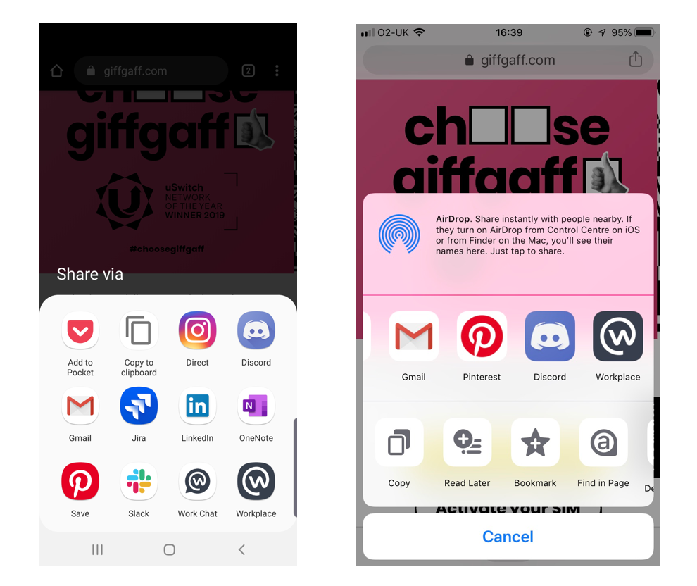
Native sharesheet dialog on Android (left) and iOS (right). The apps listed here are dependent on which apps you have installed on your device.
Sharing on desktop
While we are pretty happy with the Web Share API for mobile, its implementation for desktop is currently limited to Safari and leaves a lot to be desired. (Chrome is planning to ship support eventually, but there is no clear timescale).
The provided options — Mail, Message, Airdrop, Notes, Reminders — omit social networks. Native apps for Twitter and Facebook are common on phones, but rare on other devices.
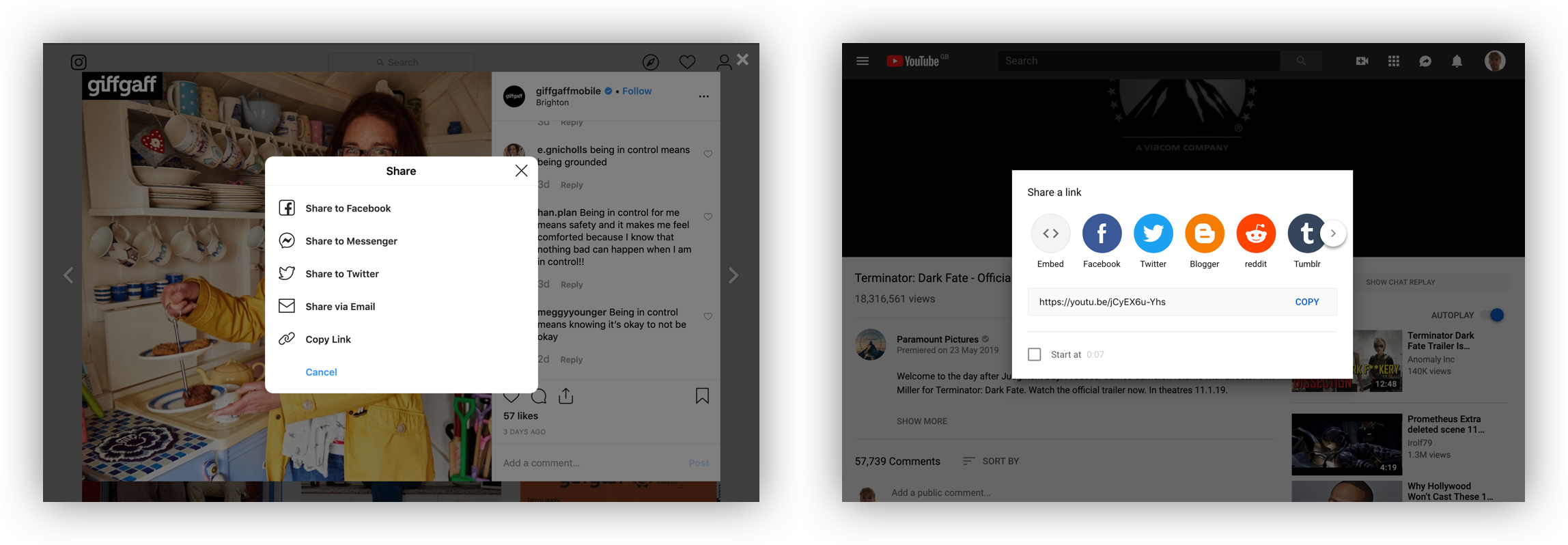
Instead of relying on the Web Share API for desktop, its relatively common to have a generic share button that opens a modal that offers more multiple sharing options. This is the approach adopted by YouTube, Instagram and Pinterest, among others.
Instagram (left) compared to YouTube (right)
Facebook and Twitter account for the vast majority of sharing online, so offering an exhaustive list of social networks to choose from doesn’t feel necessary. (An option for Instagram would be ideal, but it is currently not technically possible to share to Instagram from a website.) It is also relatively common to include an email option. For anyone using a web-based email client like gmail.com or outlook.com rather than the operating system’s default email application, this is problematic.
Many people make use of web-based email client’s gmail.com or outlook.com. A share-by-email button will open the operating system’s default email application. Users will be greeted by a prompt to set this up, which is far more effort than simply copy and pasting the URL. It is therefore advisable to omit the email option and instead include a button to copy the link to the clipboard, which is only infinitesimally easier than doing a copy in the address bar with the keyboard.
A prompt to set up the default email application on Mac
Prompting the user to set up an application they never use is far more effort than simply copy and pasting a URL into my preferred email client.
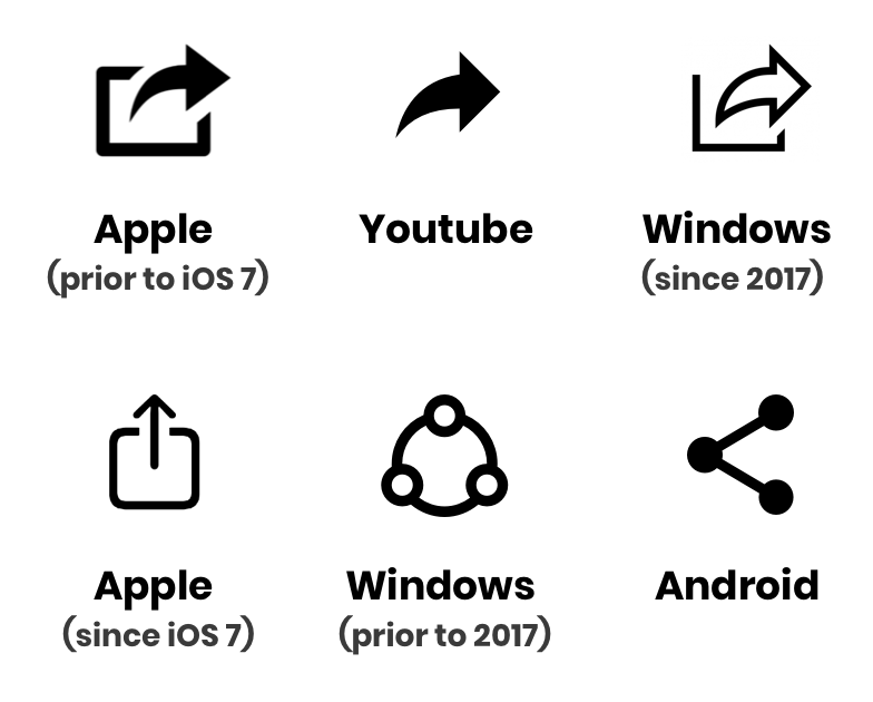
Choosing a share icon
There have been plenty of other share icons over the years.
There is no universal standardized share icon — far from it. While the Android symbol might not be recognizable to long-term iPhone users, the iOS icon is problematic. It is identical to the download icon — but with the arrow in the opposite direction, which would imply uploading, not sharing.
Where I work at giffgaff, we polled 69 of our colleagues on whether they recognized the current iOS icon or the current Android icon as representing sharing. The Android icon was an overwhelming winner with 58 votes. While our sample did include iPhone users, some long-term iPhone users may not be familiar with this symbol (even though it has been adopted by some websites). Then there is the forward arrow, an icon that was abandoned by Apple, but adopted elsewhere. Reminiscent of the icon for forwarding an email, this symbol has been made recognizable by its usage on youtube.com. The icon was adopted by Microsoft in 2017 after A/B testing found a high level of familiarity.
It’s also possible to take a contextual approach. Twitter will change the icon used depending on the platform of the user. This approach is also taken by the icon library Ionicons.
Android (left) and Mac/iOS (right)
Given the lack of a universally understood icon, this seems like a good approach. Alternatively, make sure to include a label alongside the icon to really spell things out to the user.
“Expando Rows” is a concept where multiple related rows in a
are collapsed until you open them. You’d call that “progressive disclosure” in interaction design parlance.
After all these years on CSS-Tricks, I have a little better eye for what the accessibility concerns of a design/interactivity feature are. I’m not entirely sure how I would have approached this problem myself, but there is a good chance that whatever I would have tried wouldn’t have hit the bullseye with accessibility.
That’s why I’m extra happy when someone like Adrian Roselli tackles problems like this, because the accessibility is handled right up front (see the videos in all the major screen readers).


