Frankenstein Migration: Framework-Agnostic Approach (Part 1)

Frankenstein Migration: Framework-Agnostic Approach (Part 1)
Denys Mishunov2019-09-26T12:30:59+02:002019-09-26T21:07:23+00:00
Migration, according to Oxford Learner’s Dictionary, is “the slow or gradual movement of something from one place to another.” This term describes many things and phenomena in our world — both with positive and negative tint. In software development, the word “migration,” when we need to upgrade or change technology in a project, usually falls under the latter case, unfortunately.
“Good,” “Fast,” “Cheap”. We used to pick only two in many situations when we need to make a choice either in development, in business, or in life in general. Typically, front-end migration, which is the main subject of this article, does not allow even that: “cheap” is out of reach for any migration, and you have to pick either “good” or “fast.” However, you cannot have both. Typically.

In an attempt of breaking the stereotypes, this article suggests a not-so-typical approach to framework-independent migration of front-end applications: the “Frankenstein Migration.” This approach allows us to combine “good” and “fast” while keeping the costs of migration at bay.
It’s not a silver bullet, nonetheless. Instead, I like to think about it as a small migration revolution. And like any other revolution, this approach might have side-effects, issues, and people full of energy to claim that this is not going to work even before they try.
We will certainly get to the potential issues of this approach further in the article, but bear with me and, maybe, you will still find one or two ideas useful for your next migration.
Furthermore, the same approach that we are going to discuss can be used for a broader range of tasks that are not directly related to migration:
- Combining different bits of your application, written in different frameworks. It could be useful for rapid prototyping, bootstrapping, and even production-ready experiments.
- Decoupling different features of your application in order to be able to deploy without re-building the whole application. Maybe even set your core features on the more frequent release cycle. It can be useful in large projects. In particular, those running through CI/CD every time you push things into
master(that might take very long) and helps to save time on feature releases. - This approach might even allow you to have flexible hiring policy: you could hire smart developers even if they do not work with the framework of your project just yet. Developers can keep using tools and frameworks they are comfortable with and bring value to your company from day 1 (especially valuable in startups) while learning how your project works and picking the framework of your choice.
Nevertheless, this article is all about migration and before we dive deep into the dark waters of Frankenstein Migration, let’s see where we are with those “good” and “fast” migration alternatives to be aware of their strong as well as weak sides.
“Good” Migration: Complete Re-Write
Usually, complete re-write is considered to be a better way of migrating your applications in terms of quality. It makes sense: you’re writing your application from scratch, and hence, you can bring all of your experience and wisdom from current implementation into the new one right from the beginning, not as an afterthought. It is a big plus for this type of migration. However, there is a not-so-obvious problem with complete re-write.
To achieve this quality, you need time. Sometimes, a lot of time. Alternatively, many developers dedicated exclusively to re-write. Not every company can afford these options. Because of this, the most suitable scenario for this type of migration is either a small/personal project without a need for developing new features all the time or the project that is not mission-critical for your business.
To give you a perspective of time: once, I’ve been to a complete re-write of an application that took two years. Still, during all this time, the old project with all of its bugs was up and running. Nobody wanted to touch it and, instead, concentrated on the “new and shiny” one. Typically.
As a summary for this type of migration:
PROS:
- Resulting quality.
CONS:
- The time required to get that quality to the end-user;
- The amount of work to be done during complete re-write is overwhelming, making it hard to estimate the time and resources required for this type of migration upfront.
Those who plan to migrate but cannot afford complete re-write due to time or resource constraints might want to look at the next migration type.
“Fast” Migration: Gradual Migration
Contrary to complete re-write, gradual migration does not require you to wait for the complete migration. Instead, you migrate application bit-by-bit and make those new bits available to your users as soon as they are ready. Calling this type of migration “fast” is a bit of a stretch, of course, if we talk about the whole application, but separate features clearly can be delivered to the users much faster. Though, let’s give gradual migration unbiased pros and cons as well:
PROS:
- When it comes to delivering separate application portions to the end-user, gradual migration is indeed faster than complete re-write since we don’t need to wait for the whole application to be re-written.
- By delivering new, migrated bits gradually, we get feedback on them (from the end-users) as we go. It allows us to catch bugs and issues faster and in a more isolated manner, comparing to complete re-write, where we deploy the migrated application as a whole and might overlook some smaller issues or bugs.
To better understand problems of gradual migration, try installing React in parallel with Vue in the same project as in Vue-to-React migration. I believe you have to truly enjoy digging configurations and solving console errors to enjoy this process. However, we don’t even need to get that deep. Let’s consider the following legacy example:

Here, we are integrating a Vue component into a Vanilla JS application as in potential Vanilla-to-Vue migration scenario. CSS Modules are responsible for the styling of the Vue component and provide proper scope for your components. As you can see, however, even though styling for the Vue component tells the subheader to be green, it is entirely off, and the example presents as many as four (but there are really many more) trivial ways of breaking component’s styling.
Also, other global styles getting into this Vue component can extend the look of our component entirely and, even though it might be seen as a feature in some projects, makes things hard to predict, maintain and is not necessarily what we want. This example reveals the most common and hard-to-tackle problem of gradual migration: the “Cascade” part of CSS can easily break components.
This artificially simplified example also reveals several other big problems related to gradual migration:
- Because we’re combining two different systems, the result might turn out very cluttered: we have to support two different systems with their dependencies, requirements, and opinions simultaneously in the same project. Different frameworks might require the same dependencies, but in different versions that result in version conflicts.
- Since the integrated application (Vue in our case) is rendered in the main DOM tree, global scope in JavaScript is conflicts-prone: both systems might want to manipulate DOM nodes that do not belong to them.
- Furthermore, let me repeat this, as we are going to get to this point several times in this article: Because of the global nature of this integration, CSS overflows from one system to another without much control, polluting the global scope the same way JavaScript does.
To fix these issues (or at least to keep them at bay) we need to implement workarounds, hacks and implement development style for the whole team to follow. It all leads to lower, compromised-driven, result quality after gradual migration. It’s also harder to maintain such a project than that after complete re-write.
Both of the existing options have limitations and constraints, but we still have to pick one if migration is required. However, should this choice be as painful? Wouldn’t it be great to combine the best parts of both somehow, while minimizing the negative side-effects? Is it possible at all?
Let me introduce Frankenstein Migration to you.
Frankenstein Migration. Part1: Theory
This part of the series answers what Frankenstein Migration is. We are going to find out how it is different from other migration types. Also, most importantly, we are going to dive into the theory of technologies and approaches that make this type of migration even possible.
Why “Frankenstein”?
The name comes from the way the approach works. In essence, it provides a roadmap for two or more applications, written in entirely different frameworks, to work as one solid well-orchestrated body. Just like Victor Frankenstein built his monster in Mary Shelley’s book “Frankenstein; or, The Modern Prometheus”.

Keep in mind that recently different people and organizations independently have explored the problem of combining different frameworks in the same project: Micro Frontends, Allegro Tech, etc. Frankenstein Migration, however, is an independent, structured approach to migration in the first place.
There are two fundamental technologies/approaches in the heart of Frankenstein Migration:
Microservices Architecture
The main idea behind microservices (contrary to monolithic architecture) is that you architect your application with the help of isolated and independent services dedicated to one particular small job.
I’ll repeat the things you need to keep in mind:
- “independent”
- “one job”

In an application, such services get connected into a communicational network that can get new services added/removed/replaced easily at any time, and that’s what we call “microservices.” This flexible approach is well-established and widely-adopted by back-end and server architects. However, can we have real microservices on the frontend?
Let’s take a look at the main features of service in such architecture:
- Small in size,
- Bounded by contexts,
- Built and released with automated processes,
- Autonomously developed, and
- Independently deployable.
The first three points are not a problem for front-end technologies. Pretty much all of the modern frameworks and libraries provide one or another type of abstraction to satisfy these three requirements. However, independence of services for both development and deployment has always been a problem for front-end technologies. Even in the landscape of modern frameworks that provide a paradigm of a component (like React or Vue), those components are usually still very dependent on the system and cannot be autonomous or independent from the framework that initialized them. You can always fall back to iframe, of course, and get this level of independence. However, let’s find a better — not so radical — alternative.
There is one type of component that gets close to this level of independence, and that is Web Components. So this is the second building block of Frankenstein Migration.
Web Components
People say that it’s enough to mention “Web Components” to start a fight nowadays. People like Rich Harris even write blog posts about why they don’t use Web Components. However, the purpose of this article is not to convince you that Web Components are useful or to initiate a hot debate on the topic. Web Components is not a make-everything-OK tool. As with any other tool, there might be limitations and possible side effects.
Serhii Kulykov provides a series of better-grounded articles on the subject and also curates a “Web Components the Right Way” repository in which you can find much more information for general Web Components discussion. However, when it comes to Frankenstein Migration, Web Components prove to be a very suitable instrument.
Let’s take a quick look at the main elements of Web Components that make them suitable candidates for closing gaps in microservices adoption by the frontend:
In particular, Shadow DOM is the tool capable of fixing the issues we typically meet in gradual migration and provides an actual encapsulation mechanism for component’s CSS. Previously, we mentioned that maintaining a cascade of CSS is problematic when we try to use components written with different frameworks or libraries side-by-side in the global scope.
Now, let’s see how Shadow DOM solves this problem.
CSS Scoping vs. Encapsulation. The Shadow DOM style
The encapsulation mechanism of Shadow DOM is essential for understanding as it’s different from how popular tools like CSS Modules or scoped attribute in Vue work. These tools provide scoping for styles, defined in a component, without breaking global styles and other components. However, they don’t protect components from global styles leaking into the component (the very problem of cascade discussed above) and hence, potentially breaking your components.
At the same time, styles defined within Shadow DOM are not only scoped to the current component but are also protected from global styles that don’t have explicit access to the internals of Shadow DOM no matter the specificity. To see it in action, take a look at the updated example:
Here, we moved styles out of the Vue component, straight into the Shadow DOM and that’s what’s happening (automatic though) when you set up your Vue components to work within Shadow DOM. This example shows that Shadow DOM provides a mechanism for genuinely independent components that can be used in any context (library, framework) while preserving the look and functionality of these components.
Now let’s talk through the main concepts and steps of Frankenstein Migration to see how exactly microservices and Web Components help us in the migration of front-end applications.
Let’s assume you have a project that you want to migrate to another framework.

It doesn’t matter what framework/library we migrate away from and what framework/library we want to get to; the principle and steps are the same for more or less any tool you pick (some generic exceptions are mentioned further in the article). That’s why Frankenstein Migration is called the “framework-agnostic” approach.
Now, where do we start?
- Identify Microservices
- Allow Host-to-Alien Access
- Write An Alien Component
- Write Web Component Wrapper Around Alien Service
- Replace Host Service With Web Component
- Rinse And Repeat
- Switch To Alien
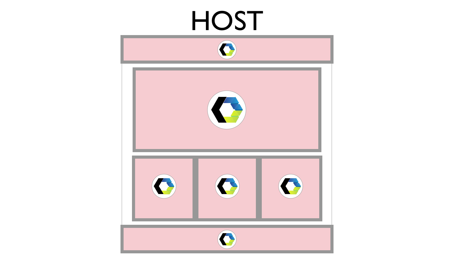
1. Identify Microservices
It is the core step, essential for the whole process’ success or failure. So we should dive more in-depth here.
Technically, we have to split our existing application into microservices virtually. It is an entirely subjective process though and doesn’t have a “correct” answer. However, what does it mean in practice then?
By “virtually” I mean that in general, you don’t need to change your existing application physically: it’s enough to have structure settled in any form even if only on paper.
We have to have a clear split in our current application into services that are:
- Independent;
- Dedicated to one small job.
An input field for adding new items to a database could be an example of a service: it’s dedicated to one particular job (adding new items) and does the job without dependency on any other service. Alternatively, the whole listing of items already added to the database: it’s trivial in functionality and, again, doesn’t depend on other components for listing items. It doesn’t sound too complicated, I believe, but that might be a deceptive feeling.
Let’s start with the easy parts: If a framework in your current project is based on a concept of “component” (React, Vue), you probably already have a reasonable basis for this type of migration. You can treat every component of your application as a separate service in a microservices architecture.
If your project currently is on a legacy basis (e.g. such as jQuery), you should turn on your imagination and think through how you would like to structure your application, following microservices’ principles of independence and one-job per service.

Refactor If Needed
I hate my ability to repeat things multiple times, but in this case, it makes much sense: be sure that your services (or components, or containers, or whatever you prefer to call your building blocks) do not depend on other services. Otherwise, both of the services should be treated as one — for the sake of independence and isolation.
A simple test to make sure your service is appropriately independent: Remove HTML for your component/service from the Host and reload the application. If there are no JS errors in the console and the remaining part of the application works as expected, the service in question is most probably independent enough from the rest of the application.
To give you a better explanation, let’s consider the following, artificially simplified, legacy example:
index.html
<form id="form">
  <input id="inputTodo" type="text" placeholder="New Todo"/>
  <button type="submit">Add Todo</button>
</form>

<ul id="listing" class="d-none"></ul>
index.js
const form = document.getElementById("form");
form.addEventListener("submit", ev => {
  ev.preventDefault();
  const listing = document.getElementById("listing");
  const input = document.getElementById("inputTodo");
  const newEntry = document.createElement("li");
  newEntry.innerHTML = input.value;
  input.value = "";
  listing.prepend(newEntry);
  listing.classList.remove("d-none");
});
Here, #form expects #listing to be present in the markup as its submit handler updates the listing directly. Hence these two depend on each other, and we cannot split them into separate services: they are parts of the same job and help each other to serve the same purpose.
However, as a possibly better alternative, we could refactor this code to make the two components independent from each other and satisfy the requirement of independence:
index.js
function notifyAboutNewItem(ev) {
  ev.preventDefault();
  const input = document.getElementById("inputTodo");
  const event = new CustomEvent("new-todo", { detail: { val: input.value } });
  document.dispatchEvent(event);
  input.value = "";
}
function updateList(ev) {
  const listing = document.getElementById("listing");
  const newEntry = document.createElement("li");
  newEntry.innerHTML = ev.detail.val;
  listing.prepend(newEntry);
  listing.classList.remove("d-none");
}

document.getElementById("form").addEventListener("submit", notifyAboutNewItem);
document.addEventListener("new-todo", updateList);
Now, our #form and #listing components do not communicate with each other directly, but through the DOM event (it can be a state management or any other storing mechanism with notification instead): when a new item is added, notifyAboutNewItem() dispatches an event, while we subscribe #listing to listen to this event. Now any component can dispatch this event. Moreover, any component can listen to it: our components became independent from each other, and hence we can treat them separately in our migration.
Too Small For A Service?
Another thing to keep in mind: when splitting your application with already-existing components (like React or Vue) into services, some of your components might be too small for a proper service. It’s not to say they cannot be small, because nothing stops you from structuring your application as atomic as you wish, but most of the simple re-usable UI components (like the form button or input field in the previous example) are better included in broader services for the sake of minimizing work for you.
On a larger scale, you can approach Step #1 as chaotic as you wish. You don’t need to start Frankenstein Migration with the global plan: you can start with just one element of your application. For example, split some complex
becomes one single service. It doesn’t matter much; any structure is better than heavy, hard-to-maintain monolithic application. However, I would suggest being careful with the too granular approach — it’s boring and doesn’t give you many benefits in this case.
My rule of thumb: you get the best flow of process with services that can be migrated and pushed into production in one week. If it takes less, then your services are a tad too small. If it takes longer, you might be trying to chew too many large pieces, so it’s better to split those. However, it all depends on your capacity and your project’s needs.
After virtually splitting your current application into services, we’re ready to move on to the next step.
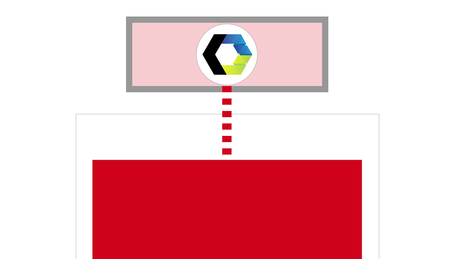
2. Allow Host-to-Alien Access
This should come as absolutely unclear title, of course. Neither have we discussed what is Host nor have we mentioned Alien yet. So let’s clear these out first.
We have mentioned that services in our current application should be independent. However, this is not the only place where we strive for independence. Contrary to the typical gradual migration approach, where we put everything in the same pot and develop new components alongside the old ones, Frankenstein Migration requires us to develop new components outside of the current application.
Bear with me.
Further, in the article, we are going to use word Host to refer to the current application, written with the framework we’re about to migrate away from. At the same time, the new application, written with the framework we are migrating to will be called Alien, as it injects its services into Host at some point.

Yes, we do not treat Alien as just a set of components, but as a proper application that we build over time. Technically, both Host and Alien should be two completely different applications written with any framework you want, with own dependencies, bundling tools, and so on. It is essential to avoid typical problems of gradual migration, however, there is a significant additional benefit to this approach. By keeping Host and Alien independent, we get both systems deployable anytime — should we need this at some point of migration.
There are several ways you can organize Host and Alien:
- Different domains or IP addresses;
- Different folders on your server;
- git submodules;
- And so on.
The primary condition for any scenario you pick, though, is that the Host should have access to Alien’s assets. So, if you choose to work with different domains, you have to take a look at setting up CORS for your Alien domain. If you decide to organize it as simple as different folders on your server, make sure resources from Host’s folder have access to Alien’s folder. If you go with git submodule, before adding Alien as a submodule of your Host, make sure you read the documentation and know how it works: it’s not as hard as it may sound.

After you have set up your applications and provided access from Host to Alien, things go quite straightforward.
3. Write An Alien Component
The title should be self-explanatory, I believe. At this point, we have:
- A clear overview of the services in our Host application,
- Set up application basis for Alien, and
- Allowed access to Alien’s assets from Host.
Now it’s time to pick a Host service we want to migrate first and re-write this service in Alien application, using the new framework. Keep in mind: we do not wait for the whole application to be re-written as in “complete re-write.” Instead, we migrate bit-by-bit as in gradual migration.
The next, practical part of the article will contain more details of actual tips on how to write your Alien component for easier integration. However, for now, you might have a question:
If Alien and Host are entirely different systems, how on Earth are we supposed to integrate our newly-written Alien service into Host?
Here is where we get to the second building block of the approach: the Web Components.
4. Write Web Component Wrapper Around Alien Service
The Web Component wrapper is the core of our integration part. Before I cover more on this, there are a couple of things to keep in mind:
- First of all, you are free to pick any abstraction layer you want for your Web Component. You can pick lit-element, Stencil, or really anything that gives you Web Components at the end. However, the Web Components that we need for Frankenstein Migration are so pure (they are just the wrappers and nothing more) that I think using an abstraction layer for this is overkill.
- Secondly, your Web Component wrapper lives on the Host’s side. So, based on the needs and requirements of your Host, you have to decide for yourself whether or not you need to polyfill Web Components. Just check the support for two technologies that we are going to rely upon:
- Shadow DOM, and
- Custom Elements.
The support for both is quite similar, and with Edge switching to Chromium in version 75, native support for Web Components in browsers is very impressive. Nevertheless, should you need the polyfills to run your Web Components in IE11, for example, take a look at the stable polyfill.
The main functions of our Web Component wrapper:
- Setting up a boilerplate for a new Custom Element with Shadow DOM;
- Importing our Alien component;
- Rendering Alien component within Shadow DOM of the wrapper;
- Importing relevant styles and putting them in the Shadow DOM together with the Alien component itself (only if required by the Alien component).
As a sneak-preview of how such component can feel like, take a look at the very basic example of importing a React component (HeaderApp) into Web Component wrapper (frankenstein-header-wrapper):
import React from "../../react/node_modules/react";
import ReactDOM from "../../react/node_modules/react-dom";
import HeaderApp from "../../react/src/components/Header";

class FrankensteinWrapper extends HTMLElement {
  connectedCallback() {
    const mountPoint = document.createElement("div");
    this.attachShadow({ mode: "open" }).appendChild(mountPoint);
    ReactDOM.render(, mountPoint);
  }
}
customElements.define("frankenstein-header-wrapper", FrankensteinWrapper);Note: Take a closer look at the imports. We do not install React in our Host but instead import everything from Alien’s location with all of its dependencies. In this case, Alien has been added to Host as a git submodule and hence is visible to Host as a sub-folder that makes accessing its contents from Host a trivial task. Here, Alien is still a separate entity that is independent from Host though. It should explain the importance of Step #2 where we allowed access from Host to Alien.
That’s pretty much it for the functions of the wrapper. After you wrote your Web Component, imported your Alien service and rendered it within the Web Component, we need to replace our Host service with our Web Component (that brings Alien service with itself).
5. Replace Host Service With Web Component
This step is very trivial, I believe. What you need to do effectively is replace markup of your Host service with your Web Component. The next chapter will cover different ways of setting up communication between your Host and Alien (that sits within Web Component) components, but in essence, there is no rocket science here:
- We have to connect both services to the same storage;
- We have to dispatch and listen (on both sides) to events when storage gets updated.

This schema should be the same no matter whether you have a state management system(s), route your communication through localStorage, or communicate with simple DOM events. By replacing your Host service with the Web Component wrapper, you finish the migration of the service and can enjoy this cute Frankenstein in your project.
However, it doesn’t smell like a real migration just yet. There has to be something else to it.
6. Rinse And Repeat
After you’ve migrated your first service, you need to go through Steps 3 to 5 for all of your services/components. All the principles and recommendations remain valid. Just continue evolving your Alien as if you do a complete re-write: you’re working on a new application in parallel with your Host. You have to be able to start and build your Alien at any time and any way you want. The only difference now is that you can push your Alien services into production on Host whenever they are ready.
At some point, you get all your services migrated, but you won’t have Host services anymore because all of them are replaced with Web Component wrappers that containing Alien services. Technically speaking, you get Alien application with remaining glue from Host. You could leave your application like this, but it’s not performant (we discuss performance tips and tricks in one of the next parts of the article) and looks quite messy, to be honest. There is a better way.
I have to repeat the core idea: “At this point, you have Alien application with remaining glue from Host.” It means that instead of serving our users this not-so-cute-anymore Frankenstein, we can serve real Alien instead of Host. At this moment, Alien should represent precisely the same picture as we have in Host, but orchestrated by Alien’s natural means and without any Web Components. The only question is: “How do we do that?”
7. Switch To Alien
Remember when we said that an independence of Host and Alien is essential for this type of migration, and so we split them into two separate applications? Well, now it’s time to enjoy the benefits of that decision.
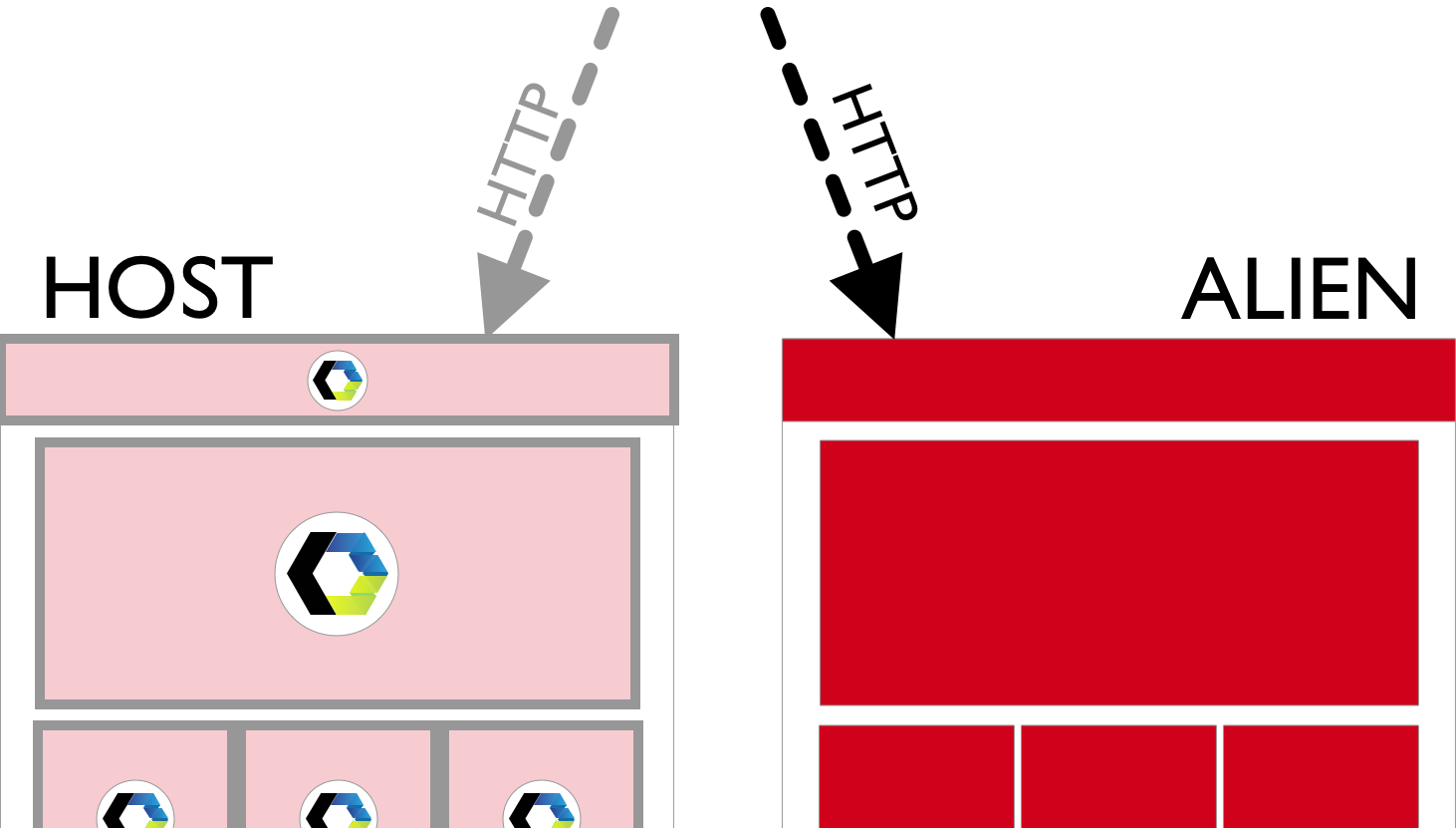
I assume you serve your Host with a configurable web server. By “configurable”, I mean that you have control over the configuration file of your server. It allows you to control routing to your site.
If this assumption is correct, you should be able to switch your server to serve requests from your Alien’s folder instead of Host for all incoming HTTP requests. For example, in your Apache’s httpd.conf, if you used git submodule for adding a React application to your Host, you should be able to update DocumentRoot.
For example, the default setting:
DocumentRoot "/var/www/html"becomes something like:
DocumentRoot "/var/www/html/react/dist"That’s it! From now on, we’re directing HTTP traffic to our React subfolder.
When this configuration is confirmed to be working and your users are served your fully migrated Alien application instead of your Host, your Alien becomes your new Host. Now, the old Host and all of its Frankenstein parts (including the Web Component wrappers) are not needed anymore and can be safely thrown away! Your migration is over.
Conclusion
All in all, Frankenstein Migration — is an attempt to combine “good” and “fast” migration types in which we get high-quality results such as the complete re-write that is combined with the delivery speed of gradual migration. This way, we’re able to deliver migrated services to the end-users as soon as the services are ready.
I realize that the ideas in this article may feel provoking for some readers. Others may feel like we’re overdoing things. Keep in mind that this type of migration still needs testing with as many possible frameworks, libraries, and their combinations. The next part of this article is going to show practical examples of this approach along with code examples and git repositories for you to play with at your own pace. We wouldn’t want people to form a false opinion by claiming that it’s not going to work without even trying, would we?


