How to Repeat Text as a Background Image in CSS Using element()

There’s a design trend I’ve seen popping up all over the place. Maybe you’ve seen it too. It’s this sort of thing where text is repeated over and over. A good example is the price comparison website, GoCompare, who used it in a major multi-channel advertising campaign.
Nike has used it as well, like in this advertisement:

I couldn’t help but wonder how I would implement this sort of design for the web. I mean, we could obviously just repeat the text in markup. We could also export the design as an image using something like Photoshop, but putting text in images is bad for both SEO and accessibility. Then there’s the fact that, even if we did use actual text, it’s not like we’d want a screen reader speak it out.
Versatility
Versatility
Versatility
Versatility
OK, stop already!
These considerations make it seem unrealistic to do something like this on the web. Then I found myself pining for the long-existing, yet badly supported, element() feature in CSS. It enables the use of any HTML element as a background image, whether it be a single button element, or an entire
According to the spec:
The element() function only reproduces the appearance of the referenced element, not the actual content and its structure. Authors should only use this for decorative purposes.
For our purposes, we’d be referencing a text element to get that repeating effect.
Let’s define an ID we can apply to the text element we want to repeat. Let’s call it #thingy. Note that when we use #thingy, we’ve got to prefix the element() value with -moz-. While element() has been supported in Firefox since 2010, it sadly hasn’t landed in any other browser since.
.element {
  background-image: -moz-element(#thingy);
}
Here’s a somewhat loose recreation of the Nike advertisement we saw earlier. Again, Firefox is required to see the demo as intended.
See how that works conceptually? I placed an element (#versatility) on the page, hid it by giving it zero height, set it as the background-image on the body, then used the background-repeat property to duplicate it vertically down the page.
The element() background is live. That means the background-image appearance on the thing using it will change if the referenced HTML element changes. It’s the same sort of deal when working with custom properties: change the variable and it updates everywhere it’s used.
There are, of course, other use cases for this property. Check out how Preethi used it to make in-page scrolling navigation for an article. You could also use a HTML canvas element as a background if you want to get fancy. One way I’ve used it is to show screenshots of pages in a table of contents. Vincent De Oliveira, has documented some wildly creative examples. Here’s an image-reflection effect, if you’re into retro web design:
Pretty neat, right? Again, I wish I could say this is a production-ready approach to get that neat design effect, but things are what they are at the moment. Actually, that’s a good reminder to make your voice heard for features you’d like to see implemented in browsers. There are open tickets in WebKit and Chromium where you can do that. Hopefully we’ll eventually get this feature in Safari-world and Chrome-world browsers.
The post How to Repeat Text as a Background Image in CSS Using element() appeared first on CSS-Tricks.
Add Beautiful Images with the Unsplash API
Perhaps you know Unsplash? I’d wager it’s the most popular stock photography site out there for two big reasons:
- Every photo on there is pretty darn nice
- Every photo is entirely free even for commercial use. You don’t have to ask permission or even credit it (although that’s appreciated).
Here’s something you might not know though: Unsplash has an API, and it’s unlimited and free. Brass tacks: it’s exactly what you hope it’s going to be. A really clean, well documented, well-performing, JSON API that gives you URLs to photos with metadata.
What would you use the Unsplash API for?
There are lots of examples on Unsplash’s developer area, from Medium to Squarespace to Trello, but here is another one of my favorites!
I use Notion every day. It’s a great app for note-taking, planning, and all sorts of stuff. One of the features it has is giving every document you create within it a custom image header. These give the documents some great personality. Notion has a handful you can choose from or you can upload your own. Or, you can search Unsplash for them!
How does that work? Lemme show you first:
They use the Unsplash API to do it and here’s an article about that. There is a search endpoint as part of the API that makes this quite easy to do.
For example, you’d hit a URL like:
https://api.unsplash.com/search/photos?page=1&query=SEARCH_QUERYAnd you’ll get JSON back like:
{
  "total": 133,
  "total_pages": 7,
  "results": [
    {
      "id": "eOLpJytrbsQ",
      "created_at": "2014-11-18T14:35:36-05:00",
      "width": 4000,
      "height": 3000,
      "color": "#A7A2A1",
      "likes": 286,
      "liked_by_user": false,
      "description": "A man drinking a coffee.",
      "user": {
        "id": "Ul0QVz12Goo",
        "username": "ugmonk",
        "name": "Jeff Sheldon",
        "first_name": "Jeff",
        "last_name": "Sheldon",
        "instagram_username": "instantgrammer",
        "twitter_username": "ugmonk",
        "portfolio_url": "http://ugmonk.com/",
        "profile_image": {
          "small": "https://images.unsplash.com/profile-1441298803695-accd94000cac?ixlib=rb-0.3.5&q=80&fm=jpg&crop=faces&cs=tinysrgb&fit=crop&h=32&w=32&s=7cfe3b93750cb0c93e2f7caec08b5a41",
          "medium": "https://images.unsplash.com/profile-1441298803695-accd94000cac?ixlib=rb-0.3.5&q=80&fm=jpg&crop=faces&cs=tinysrgb&fit=crop&h=64&w=64&s=5a9dc749c43ce5bd60870b129a40902f",
          "large": "https://images.unsplash.com/profile-1441298803695-accd94000cac?ixlib=rb-0.3.5&q=80&fm=jpg&crop=faces&cs=tinysrgb&fit=crop&h=128&w=128&s=32085a077889586df88bfbe406692202"
        },
        "links": {
          "self": "https://api.unsplash.com/users/ugmonk",
          "html": "http://unsplash.com/@ugmonk",
          "photos": "https://api.unsplash.com/users/ugmonk/photos",
          "likes": "https://api.unsplash.com/users/ugmonk/likes"
        }
      },
      "current_user_collections": [],
      "urls": {
        "raw": "https://images.unsplash.com/photo-1416339306562-f3d12fefd36f",
        "full": "https://hd.unsplash.com/photo-1416339306562-f3d12fefd36f",
        "regular": "https://images.unsplash.com/photo-1416339306562-f3d12fefd36f?ixlib=rb-0.3.5&q=80&fm=jpg&crop=entropy&cs=tinysrgb&w=1080&fit=max&s=92f3e02f63678acc8416d044e189f515",
        "small": "https://images.unsplash.com/photo-1416339306562-f3d12fefd36f?ixlib=rb-0.3.5&q=80&fm=jpg&crop=entropy&cs=tinysrgb&w=400&fit=max&s=263af33585f9d32af39d165b000845eb",
        "thumb": "https://images.unsplash.com/photo-1416339306562-f3d12fefd36f?ixlib=rb-0.3.5&q=80&fm=jpg&crop=entropy&cs=tinysrgb&w=200&fit=max&s=8aae34cf35df31a592f0bef16e6342ef"
      },
      "links": {
        "self": "https://api.unsplash.com/photos/eOLpJytrbsQ",
        "html": "http://unsplash.com/photos/eOLpJytrbsQ",
        "download": "http://unsplash.com/photos/eOLpJytrbsQ/download"
      }
    },
    // more photos ...
  ]
}
So to offer a search experience inside an app like Notion, you’d have a little search form and when users submit that search query, you’d hit the API with the value they entered, then loop over response.results using the response.results.urls.thumb to show the images returned. If the user picks one, you can use a higher-res URL to do something with and have access to all that photos metadata.
Hot tip! The URLs to photos are dynamic in that you can resize them, crop them, serve them in different formats, and even change the compression quality all from URL parameters. For example, changing size is like &w=200.
That is exactly what we do on CodePen
The purpose of CodePen Pen Editor is to provide an online code editor that makes it tremendously easy to code something up for the web, save it, and share it. Images are a big part of the web, so it’s very possible that you might want to use a gorgeous image in a Pen. We have Asset Hosting ourselves on CodePen as a PRO feature, but we also offer Unsplash images to everyone for free!
Check out how it works:
A basic example in React
- Let’s make a search
, when submitted, it hits the Unsplash API and returns a bunch of photos. - We’ll use Superagent for the Ajax just to make a smidge easier.
- We’ll track the current search query and returned data in state.
Here is that working!
How might you use that in your own app?
- Does your app allow users to create anything? If so, could those things be enhanced by great photos? For example, cover images, background images, images for blog posts, etc. Check out existing partners for more ideas.
- Could this be part of an avatar-choosing experience?
- Maybe you could build a plugin that enhances some existing app by allowing quicker access to photos.
Feel free to leave comments with more ideas or how you have used the API. And if you haven’t, try it out.
The post Add Beautiful Images with the Unsplash API appeared first on CSS-Tricks.
Top 6 Mobile Marketing Channels to Increase Brand Awareness in 2020

Mobile marketing is currently (boosting/rising) as one of the strongest directions of digital marketing. Smartphones are an inseparable part of people’s daily routine. This serves as an advantage for companies to promote their services through mobile devices by any possible means.
Mobile marketing is everywhere in the mobile platform, from applications all the way through the news that users read. Mobile marketing tools develop hand in hand with the advancement of mobile devices and their applications. Hence, newer trends come with each new innovation that mobile devices bring about.
Some of the mobile marketing trends in 2020 are video ads, voice searching tools, in-app ads as well as augmented reality and artificial intelligence. These tools showed higher demand in the previous years, therefore, mobile marketing is likely to lean on them this year. However, there are more proven and trusted tools than just those. Here are seven of them.
Influencer Marketing
Influencer marketing is much like celebrity endorsement in marketing. It includes an influential person—whether it is a critic or just a well-known blogger—teaming up with a company to promote their products/services.
The influential person may be a celebrity, an athlete, a social media blogger, etc. The latest example is Keanu Reeves appearing as a video game character in Cyberpunk 2077, which was a pretty hot topic for the last couple of weeks.
The most common way of influencer marketing is cooperating with a social media blogger. There are thousands of social media personalities that run blogs of different niches. One way or another, they have a reputation among their audience and can help increase your brand awareness.
SEO (Search Engine Optimization)
It is a well-known fact that most people doing a Google search don’t bother going further than the first page of search results. Thus, it is crucial to do a proper SEO so that your company appears in the first page of search engine results.
SEO is developing quite rapidly, which means that you always need to keep an eye on the trends not to fall back from your competition. Your SEO endeavour needs to include each and every word combination and keyword that the user may logically search for. Hence, always do your keyword research thoroughly so that you don’t miss a spot.
With the advancement of technologies, there are simple programs like SEMRush or Yoast Seo, which automate the process for the SEO specialists. Those applications filter the keywords used in search results and simply report how the viewers search for information.
Social Media
Social media now combines everything together, whether it is news, games, connection with friends and pop-culture. With this, it is a place where people spend a lot of time. Therefore, it is a very solid platform to advertise anything the company needs through any means of social media.
Since most people are on social media just for fun, it is important for the advertisement to be short and catchy. In that way, it will smoothly go with the social media content flow and reach the target audience.
Besides, social media ads are now so sophisticated with AI personalization tools that they target a specific audience very precisely. Hence, the ad messages reach the users that actually need the product. They work based on the preferences of people, what they like, share, comment on, and so on.
Google Ads
Google ads is one of the most effective ways to promote a product or service through YouTube, Facebook, Instagram or simply any other website. It even allows the advertisers to set a target audience demographically or just by the preference of content.
Just like social media ads, Google Ads are also equipped with sophisticated targeting tools. They tend to show the advertising messages only for the users who have shown any interest in the product.
Google ads show decent growth and it definitely is one of the most practical ways for mobile marketing. Google ads spread short advertisements in the middle of blog posts, Instagram stories, YouTube videos and it is nearly impossible to miss.
Email Marketing
Nearly all smartphones have default mail applications, which makes email more accessible and easier to use. Of course, this is something that marketing specialists would never ignore. There are dozens of email software to help you reach your target audience. To choose the best one for you, you can just do a quick email marketing software comparison. At the end of the day, most of them will benefit you one way or another.
Mail subscriptions are pretty handy both for the customer and for the seller. It is easy to filter customers with groups and send them whatever marketing messages the companies need for their customers.
Another alternative for email is SMS marketing, again, if you want to create a more personal connection with your customers. SMS marketing providers like SendSMS.Global can help you here to achieve what you want with their services.
Affiliate Marketing
Affiliate marketing is just what its term presumes. A mutually beneficial affiliation with a partner for a commission from each sale. One of the most common ways of affiliate marketing is having an agreement with a famous blogger to advertise a product in their blog. This refers back to the influencer marketing tactic as well. An example of this may be promo codes that users can use to get a discount for following the blogger.
Affiliate marketing is a commonly practiced promotional channel that works great. Just a simple google search can show hundreds of affiliate marketing companies that are worth cooperating with. Besides, there are many affiliate conferences that you can use to make new connections and productive cooperations.
Final Thoughts
Getting to stand out among the competition is a critical task for any business. Indeed, there is almost no industry where competition is not a problem. One of the best ways to do so is being able to utilize the most practical tools to stand out in the pack.
Value Bubbles for Range Inputs

Range inputs in HTML are like this:
<input type="range" name="quantity" min="1" max="10">In browsers that support them, they look like this:
Now that’s great and all. You could use it for anything where you want to collect a number from a user that has an enforced minimum and maximum value.
But notice anything weird? All by itself, that range input doesn’t communicate to the user what number they will actually be submitting. Now if your input is something like “How are you feeling? Left for sad, right for happy.” – then fine, you probably don’t need to show the user a number. But I would wager it’s more common that you’ll need to show the number than not show it.
To be fair, the spec says:
The input element represents a control for setting the element’s value to a string representing a number, but with the caveat that the exact value is not important, letting UAs provide a simpler interface than they do for the Number state.
But c’mon, just because we want a cool slider doesn’t automatically mean we should prevent the user from knowing the submitted value. I wouldn’t necessarily say browsers should alter their UI control to show that number. I am saying we should build that ourselves!
This is the perfect use case for the tag, which is specifically for values calculated by form elements. Here is a super simple implementation of how you might use it:
<input type="range" name="foo">
<output for="foo" onforminput="value = foo.valueAsNumber;"></output>
Update! New version with Vanilla JavaScript that also works better.
Our goal here is to display a “bubble” that shows the current value of a range input.

Setting the value of our “bubble” from the value of the input is a matter of pulling the range value and plopping it in the bubble:
range.addEventListener("input", () => {
  bubble.innerHTML = rangel.value;
});
The trick is positioning the bubble along the range input so it slides alongside the “thumb”. To do that, we’ll need to calculate what % the bubble needs to be scooted to the left. So let’s make a function to do that to keep things a smidge cleaner:
range.addEventListener("input", () => {
  setBubble(range, bubble);
});

function setBubble(range, bubble) {
  const val = range.value;
  const min = range.min ? range.min : 0;
  const max = range.max ? range.max : 100;
  const newVal = Number(((val - min) * 100) / (max - min));
  bubble.innerHTML = val;

  // Sorta magic numbers based on size of the native UI thumb
  bubble.style.left = newVal = "%";
}
Here we’re making sure we account for the range inputs min and max attributes and calculating a % position between 0-100 based on the current value in that range. Not all ranges are the default 0-100 numbers, so say a range was at value 50 in a range of 0 to 200, that would be 25% of the way. This accounts for that.
But it has one annoying flaw: the bubble is too far to the left at the start and too far to the right at the end. On range inputs, the thumb doesn’t hang off the left edge so it’s center is at the start, and same at the end. Like a scrollbar, the edges of the thumb stop within the track.
We can use some magic numbers there that seem to work decently well across browsers:
// Sorta magic numbers based on size of the native UI thumb
  bubble.style.left = `calc(${newVal}% + (${8 - newVal * 0.15}px))`;
Here’s that final demo:
I was inspired to poke around with this because reader Max Globa wrote in with their version which I’ll post here:
A cool aspect of Max’s version is that the range input is CSS-styled, so the exact size of the thumb is known. There are some numbers that feel rather magic in the JavaScript math, but at least they are based on real numbers set in the CSS about the size of the thumb.
Other Versions
Dave Olsen ported the (original) idea to not have a dependency on jQuery. Here’s that version:
Sean Stopnik:
simurai:
Vincent Durand:
Don’t forget range input can have datalists which put little notches on them which is kinda cool.
Ana Tudor has a massive collection, many of which indicate the current value through their design.
? Old Version from Original Version of this Post (jQuery, plus doesn’t work as well)
Just leaving this in here for historical reasons.
Let’s pull in our friend jQuery and get our CSS on. This goal is below. Any range input, any time, any min/max/step – we put a bubble above it showing the current value.

Let’s style the output element first. We’ll absolutely position it above the input. That gives us the ability to adjust the left value as well, once we figure out with JavaScript what it should be. We’ll fancy it up with gradients and border-radius, and even add a little pointer triangle with a pseudo-element.
output {
  position: absolute;
  background-image: linear-gradient(top, #444444, #999999);
  width: 40px;
  height: 30px;
  text-align: center;
  color: white;
  border-radius: 10px;
  display: inline-block;
  font: bold 15px/30px Georgia;
  bottom: 175%;
  left: 0;
  margin-left: -1%;
}
output:after {
  content: "";
  position: absolute;
  width: 0;
  height: 0;
  border-top: 10px solid #999999;
  border-left: 5px solid transparent;
  border-right: 5px solid transparent;
  top: 100%;
  left: 50%;
  margin-left: -5px;
  margin-top: -1px;
}
Now what we need to do is watch all range inputs for a change in their value. Our goal is to shift the left position of the bubble in pace with the slider. That’s not the simplest thing in the world, being that sliders can be of any width and any minimum or maximum value. We’re going to have to do a little math. Here’s all the jQuery JavaScript, commented up:
// DOM Ready
$(function() {
 var el, newPoint, newPlace, offset;

 // Select all range inputs, watch for change
 $("input[type='range']").change(function() {

   // Cache this for efficiency
   el = $(this);

   // Measure width of range input
   width = el.width();

   // Figure out placement percentage between left and right of input
   newPoint = (el.val() - el.attr("min")) / (el.attr("max") - el.attr("min"));

   // Janky value to get pointer to line up better
   offset = -1.3;

   // Prevent bubble from going beyond left or right (unsupported browsers)
   if (newPoint < 0) { newPlace = 0; }
   else if (newPoint > 1) { newPlace = width; }
   else { newPlace = width * newPoint + offset; offset -= newPoint; }

   // Move bubble
   el
     .next("output")
     .css({
       left: newPlace,
       marginLeft: offset + "%"
     })
     .text(el.val());
 })
 // Fake a change to position bubble at page load
 .trigger('change');
});
The one gross part in there is that 1.3 value. I was trying to line up the tip of the bubble’s triangle with the center of the slider. It’s not easy, because the slider’s center is never 100% left or right. That value isn’t perfect, nor perfectly implemented, but it’s better than not having it.
As a bonus, browsers that don’t support the range input still get the bubble action.

The above code depends on the range inputs having a specified min and max value. If they don’t it kinda breaks. I think it would be weird to use a range input without specifying these things, although if you don’t it seems they default to 0 and 100. To bulletproof this, you’d grab each attribute, test it, and if it didn’t look right fix it. Something like:
var minValue, maxValue;
if (!el.attr("min")) { minValue = 0; } else { minValue = el.attr("min"); }
…then use the minValue variable in the math. And do similar for max. Anyway, here’s the live demo:
The post Value Bubbles for Range Inputs appeared first on CSS-Tricks.
How To Increase Mobile Conversions With Category Page Design
How To Increase Mobile Conversions With Category Page Design
Suzanne Scacca2020-03-26T12:30:00+00:002020-03-27T11:56:41+00:00
For e-commerce designers, it’s easy to focus on designing the home page, individual product pages as well as the checkout experience because they’re obvious stepping stones along the mobile shoppers’ journey. Based on the following data, though, category pages also have a role to play — as the intermediary between search engines and e-commerce websites.
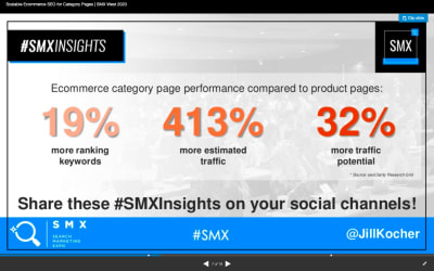
Jill Kocher Brown, the SEO Director of JumpFly, shared the following research at SMX West 2020:

After evaluating the top 30 ecommerce websites, Brown found that product category pages outperform product pages in terms of ranking keywords and traffic.
Considering how many top of funnel customers use mobile search to find what they’re looking for online, we need to put a greater focus on designing ecommerce category pages for mobile.
Today, I’m going to provide you with some tips for designing mobile e-commerce category pages that will get you more visits from search (and, consequently, conversions on-site).
How To Design Ecommerce Category Pages For Mobile
Let’s jump right in:
1. Only Include Essential Elements on the Page
This is more or less what we should aim for when designing e-commerce category pages for mobile:

The elements we need to include above the fold are:
- The navigation bar (it can disappear upon scrolling or stick to the top of the page),
- A descriptive category page title,
- The total number of products in the category,
- Filter options,
- Sort settings,
- At least one or two matching products.
As for why these elements need to be above the fold, let me show you an example.
According to SEMrush (and Google), “kong dog toys” is a popular search term that dog toy shoppers are looking for:

One of the top matching results for the search term is this category/brand page on the PetSmart website:
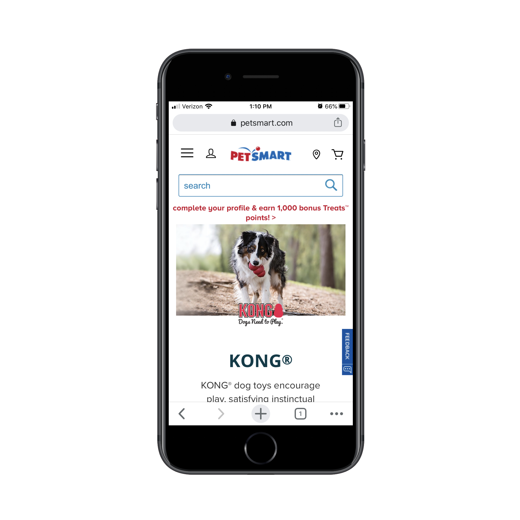
The next four swipes on the page take shoppers through informational sections, videos and subcategories like this:
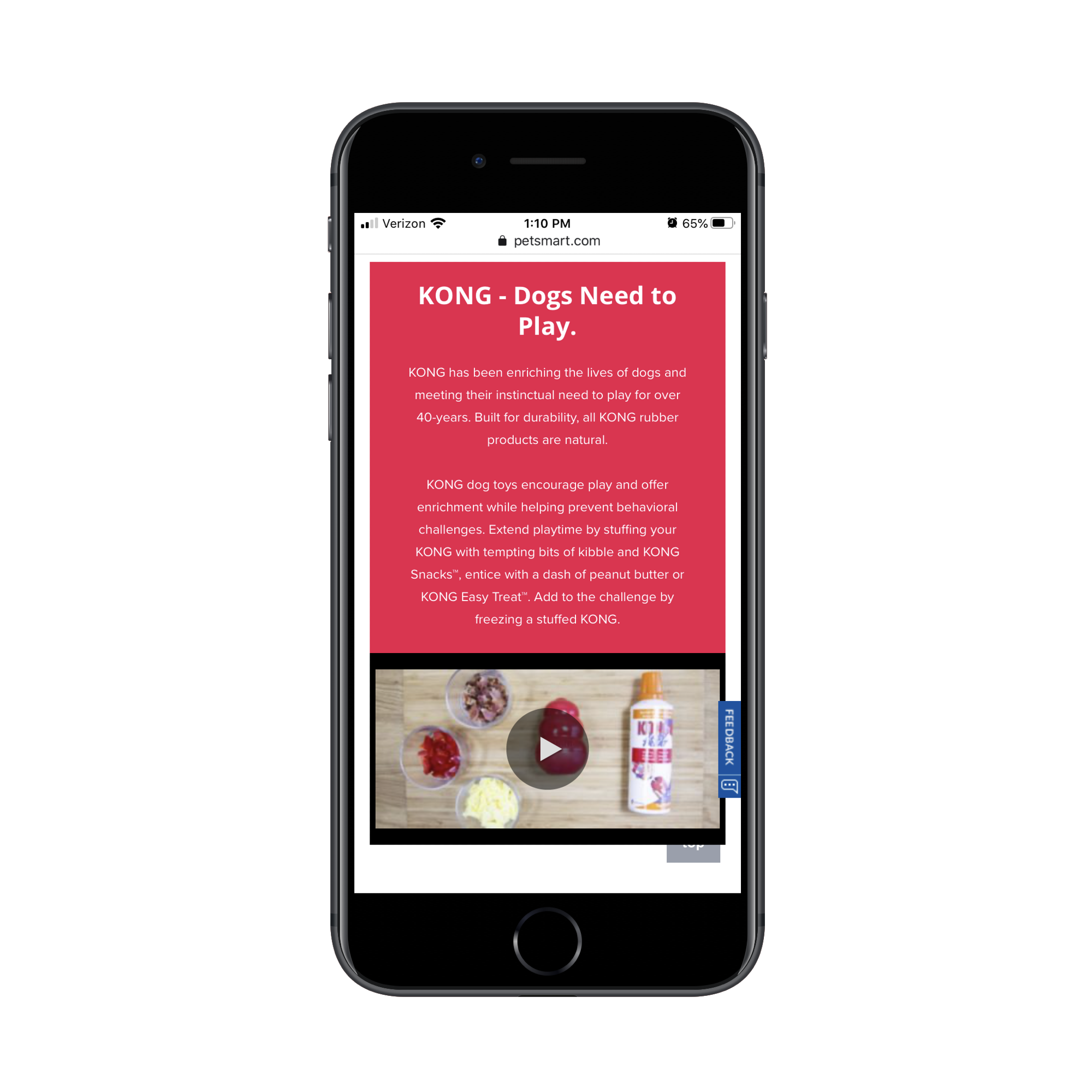
Here’s the problem with this:
For visitors on the website exploring pet products, this information is great as it educates them on the very popular Kong brand. However, for visitors that went out of their way to search for “kong dog toys” in Google, they don’t need all of this information. It’s just getting in the way of the shopping experience.
While I’m not a fan of Best Buy‘s inclusion of an ad above the header or a sponsored product as the first shown, the concise layout for the top of the category page is well done:
What’s more, Best Buy includes additional category information (just as PetSmart did). However, it wisely places this information below search results:
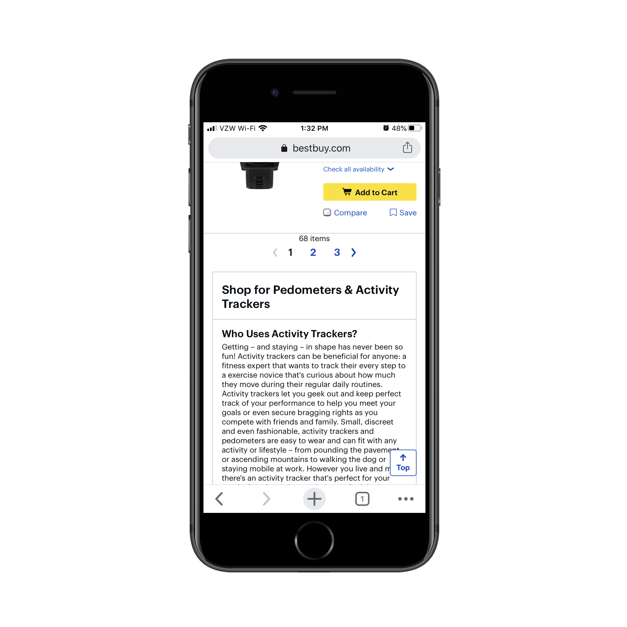
Why does Best Buy do this and why should you?
For one, you want shoppers who are new to a product category or brand to still have this information available to them. And considering how well-trained consumers are to look below-the-fold for more information (thanks, Amazon), this works on mobile.
In addition, this is useful for SEO. Without this category description, you’d have to leave it to your meta title and description to influence the rankability of the page. With a search-optimized informational section like this, you can improve the chances of your category page getting to the top of search.
2. Show the Most Convincing Product Details
As you can see, we don’t have a lot of room on these mobile e-commerce category pages. So, when shoppers finally get to the matching product results, you want to make it as painless as possible for them to find the ones looking for.
Here are the details that should be included with each product listing:
- A crystal-clear and attractive product image,
- The product name (along with a short description if the name/brand doesn’t spell out what it is),
- The price,
- The star rating and number of reviews.
The only one of the elements above that’s optional is the rating/reviews and that’s only the case if your site is new and you don’t want a lack of reviews to turn people off.
As for adding other elements to the product listings, be careful with this. If it doesn’t add any value (in other words, it doesn’t make it easier to choose one product from another), leave it out.
Take, for instance, this “kong dog toy” category page from Chewy:
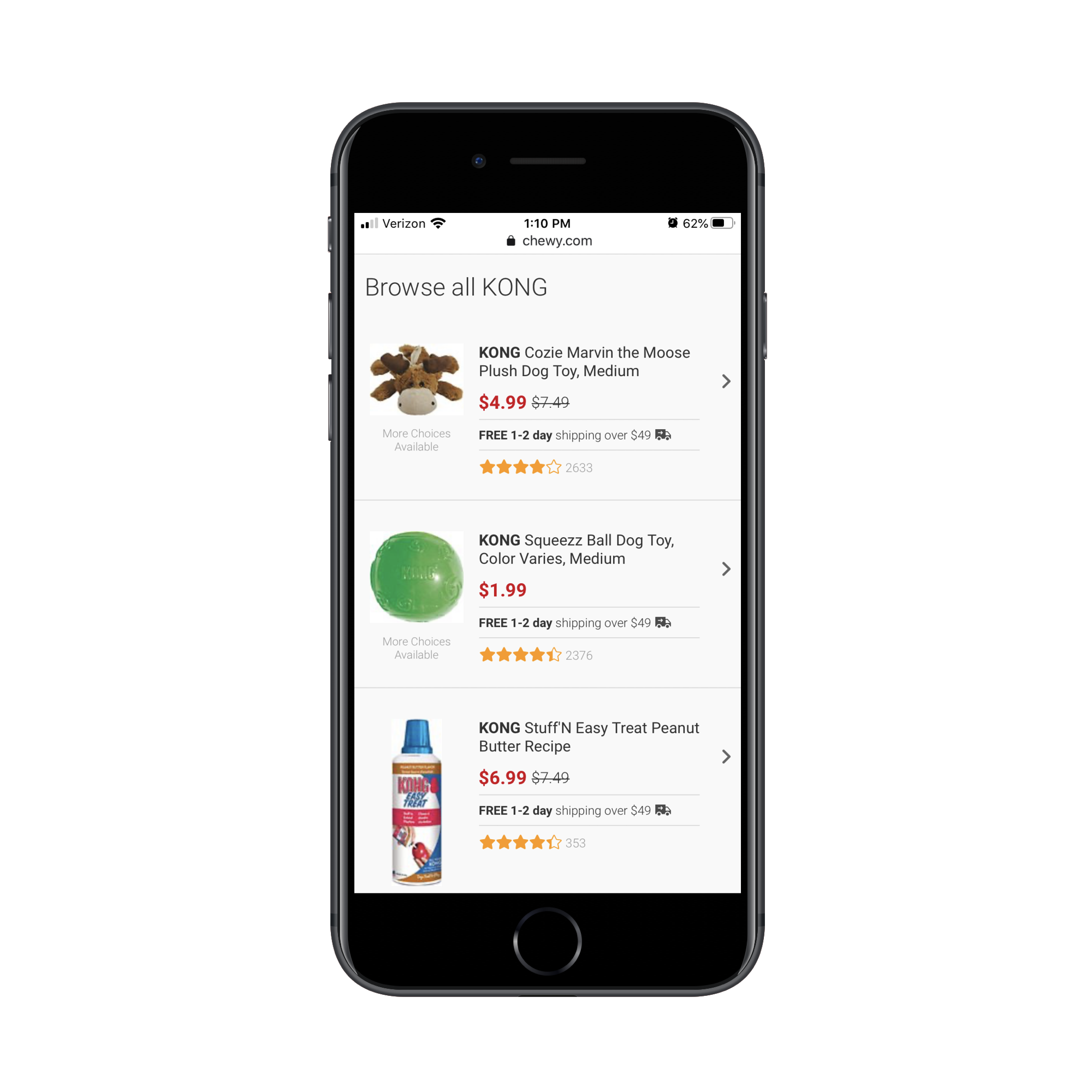
This category page design as a whole is much more concise than how competitor PetSmart handles theirs. However, there’s quite a bit of waste here. Namely, there are two repetitive strings of text that need to go:
- “More Choices Available” under the product images;
- “Free 1-2 day shipping over $49 ?” between the price and rating.
The free shipping notice could easily appear as a dismissable sticky bar at the top of the site. And “More Choices Available” doesn’t need to be here at all. By tightening up the product details, mobile shoppers can more quickly get through the search results that are available.
Here’s an example from BH Cosmetics of product listings that could stand to be trimmed back:

The “Add to Bag” buttons all need to go. Unless shoppers can look at a single product image and know that’s what they need, these buttons are useless on this page.
I also think the “XX% OFF” is unnecessary. There’s no reason to overcomplicate this. The scratched-out original price and new lower price in pink should be enough to call attention to the offer.
This isn’t the only way to display inventory/options on an e-commerce website, so you’ll have to evaluate each product element based on your specific case.
So you can see what I’m talking about, here’s what a search for “Santorini Greece hotels” shows on Expedia:

And on Booking.com:

Both include the essential details needed for each listing. However, they include additional details to help users make a decision.
However, there’s a big difference in how this extra information is displayed. On Expedia, users can see that “Breakfast included” is a top feature and that there are only two rooms left at the special price. This is useful information. On Booking.com, however, there’s a mess of details in green displayed directly below the price. It’s difficult to read and I’m not sure all of the details are necessary.
If in doubt, start with the bare minimum. Then, use A/B testing to confirm whether or not other details improve click-through and conversion rates.
3. Manage Your Mobile Category Page Sizes
There are two reasons why we need to be careful about page sizes when designing e-commerce category pages:
- With as many images and data that appears on these kinds of pages, it can severely hurt loading times.
- The more products you display at once, the more analysis paralysis your shoppers will experience.
So, the first thing to do is create a limit on how long the page can get.
While you might be tempted to use infinite scroll or an auto-load that reveals more product images as visitors scroll down the page, it’s better for performance if you use pagination links like Walmart does:

Another tip you can take from Walmart is its product view setting. By default, products appear in a grid on its category pages:

By clicking the button to the left of “Sort & Filter”, users can change the alignment to list view:

While this is more a matter of personal taste, you can see that the list layout does actually display more products at once, so users might find this choice of layout quite useful in speeding up their shopping experience.
One last thing to think about:
You can’t assume that your default sorting method is what all customers automatically prefer. For example, Sephora‘s default sort is by “Bestselling”:

As we know, consumers have other things they’re concerned about when shopping for things online. Affordability is one of them, so sorting by “Price Low to High” might make more sense. Reviews and ratings are something else they look for, so “Top Rated” might be their preferred sorting method:

And when it comes to filters, don’t be stingy.
Sephora, for instance, only allows customers to filter by two factors:

This assumes that customers are familiar with beauty brands. For those that aren’t, this can significantly impair their ability to find the products they’re looking for as it’ll take more time to consider all the options available.
Instead, what you should do is use your own product categories and tags to provide users with more comprehensive filtering options. After all, if that data helps you better organize and sell your inventory, it should do the same for your customers.
Ulta does a good job of this:

This isn’t just beneficial in terms of user-friendliness either (though that’s a big part of it). By empowering shoppers to create smaller lists of products to peruse, you’re also enabling them to speed up their shopping experience as options are reduced and page loading times improve.
Wrapping Up
In sum, be mindful of how you design your mobile e-commerce category pages. Even though the research shows that these pages enjoy higher click-through rates and visits from search engines than individual product pages, bad design choices will make your website the exception to the rule.
How to Manage Your Freelance Finances During a Crisis

Have you ever heard of disaster recovery and business continuity? Basically, they’re processes that enable businesses to survive a crisis — no matter what it’s caused by: a natural disaster, economic downturn, personal emergency, or something else.
There’s a lot involved, but one of the most important parts of recovery is how the company manages their finances before and during a crisis. This isn’t just for large corporations, mind you. These practices are really useful for businesses of all sizes, from solo freelancers to enterprises.
If you’re reading this, then you’re probably wondering what you can do to manage your freelance finances when you’re in the midst of a crisis. That’s what I’m going to lay out for you today.
Step 1: Contact Your Clients
Before you start crunching the numbers, you need to figure out how your business has actually been impacted. Plus, by getting in contact with your clients before you look at your finances, you can go into the conversation with a clear head and without the pressure of, “I really need this money right now.”
If the current crisis only impacts you, do the following:
- Take care of yourself first;
- When you’re recovered or in a safe place, email each of your clients;
- Inform them of your status and if anything has changed with your availability to work for them.
If the current crisis impacts your clients or the globe as a whole, do the following:
- Take care of yourself first, if you’re impacted;
- Email each of your clients;
- Wish them well, briefly and professionally address the crisis, and let them know that you’re still here to help if they need it (and if you’re available for it).
Here’s a sample of a “Checking in” message you might send:
Hi [client name],
I hope you and your family are doing well and are staying safe.
I realize that this is an uncertain time for everyone, so I just wanted to let you know that my schedule is flexible and I can accommodate whatever changes you might need. If you need to hit the pause button on our project or adjust the timeline or scope until things have gone back to normal, please let me know what I can do to help.
[Your Name]
Not only will this touchpoint help you maintain relationships with clients during a crisis, it’ll give you immediate insight into how your incoming revenue is going to change. The same goes for your clients — by reaching out in this manner, you can help them plan their own budget for the coming months or locate another source of help if you become unavailable.
Step 2: Take Stock of Your Cash
One of the things web designers should do to manage their freelance finances is to make regular deposits into a rainy day fund. You might hear some people say that you need three months’ of rent saved while others suggest having at least $1000 to cover basic expenses.
If you’re curious to see how much you actually need to cover expenses and how long it’ll take to get back up and running, run your numbers through Money Under 30’s Emergency Fund Calculator:

If you don’t have a rainy day fund, then you’re going to have to look at the rest of your cash and assets to see how it can help you recover during this crisis. Here are some things to look for:
- Money in a checking or savings account meant strictly for expenses (business or personal);
- Food in your house that can hold you over for awhile and keep you from grocery shopping as frequently as normal;
- Gift cards, frequent flyer miles, free hotel nights, credit card points, and anything else that can cover some of your expenses until things return to normal.
This is not the time to dip into your retirement savings or to pull your money out of investments. When you get through this crisis — and you will — you’re not going to want to start all over again replenishing these accounts. Nor will you want to pay the fees for early withdrawal when the next tax season rolls around.
It’s probably not a good idea to take out loans either. You don’t want to be stuck with an additional expense when this is all over.
If you’re light on cash, keep reading.
Step 3: Cut Down on All Your Expenses Immediately
Once you have an idea of how your incoming revenue is going to change, it’s time to cut back on both professional and personal spending.
If business has stopped, shut off as many business expenses as possible. Or look for ways to downgrade your plans (e.g. web hosting, app subscriptions, wifi, etc.) until you need them running on high again.
If business is operating but at a slower pace, you probably won’t be able to dig much into your professional expenses since you’ll need most things to keep going. If you absolutely need to make cuts, make a list of priorities. What can’t you operate without? Then, reduce or remove the rest.
As far as personal expenses are concerned, this is where you’re going to cut deep. Identify areas where you could start spending less ASAP. For example:
- Dining out or ordering in vs. cooking the food you have;
- Emotional spending splurges on Amazon vs. using what you already have;
- Date nights out vs. staying in together;
- Buying brand name products vs. buying generics;
- Watching TV on cable vs. using cheaper streaming services;
- Paying for a gym membership vs. using workout streaming programs or apps;
- Going to a cowork space vs. working from home.
The one thing you might be tempted to ditch or cut back on that you shouldn’t is health insurance. Even if this crisis isn’t one that affects you physically or emotionally, you don’t want to be left without that safety net in case something happens while you get your business back on its feet.
For everything else, make your cuts and go deep. Then, use that to create your budget until the crisis resolves and things stabilize.
Step 4: Negotiate with Your Lenders
There are so many reasons why experiencing a personal, professional, or global crisis sucks. But watching your bills pile up while you already feel so helpless amidst the chaos has got to be one of the worst.
Thankfully, many lenders (e.g. credit card companies, loan providers, mortgage companies) will cut you some slack during this time. You just have to be willing to ask for it.
In some cases, you may be able to negotiate a lower monthly payment until you get back on your feet. This’ll give you some breathing room in case your revenue takes a dive.
In other cases, you may be able to ask for a lower interest rate or to freeze it altogether. While you’ll still owe normal monthly payments, the interest fees that stack up won’t be as devastating to deal with later on.
Another thing you can do is only pay the minimum owed each month. It’s not ideal, but it’ll at least provide you with a buffer in case you need that extra cash. And if you don’t, then you can put it towards your debt at the end of the month.
Step 5: Look for Other Ways to Make Money
If your business or your clients’ businesses are impacted by the crisis, you need a way to make money until things go back to normal.
As a web designer, there are other things you can do in the meantime to support yourself:
Enter a New Niche
Contact business owners in niches that are thriving during the crisis and need a website built or maintained. For example, health crises tend to keep medical equipment suppliers and pharma companies busy. If you’re comfortable building sites for companies outside your niche, it’s worth reaching out.
Become a Tutor
While you could create design or coding courses and sell them through a site like Udemy or Skillshare, it takes time to build up an audience and make good money on those platforms. Instead, use something like Tutors.com or Wyzant to share your skills with others right away.
Work as a VA
There are tons of people who need help with the technical aspects of getting online and using cloud-based services. While virtual assistant work is usually associated with doing random business support tasks, you could adapt this to your particular set of skills and become an IT assistant.
For instance, if a crisis forces people to work from home or take classes remotely, you could help get organizations set up with shared cloud workspaces, virtual conferencing software, collaboration apps, and so on.
Even if you have rainy day funds to cover you during a crisis, it might be a good idea to get another gig anyway. That way, you’ll stay busy and won’t obsess about the crisis or the impact it’s having on you and everyone else.
Wrap-Up
There are a lot of big decisions and compromises you’ll have to make during a crisis, but it is possible for you and your freelance business to get through it in one piece.
If you want to make it easier on yourself next time, manage your freelance finances on a regular basis — not just during a crisis. Keep costs low, income high, and your cash reserves growing at all times.
Featured image via Unsplash.
Impact of Abuse Emails on your Business Reputation
A typical day at work starts with a cup of your favourite beverage as you check your emails. You scan the emails quickly and notice many spam emails.
Your way to handle them is to delete them instantly, but some people take it a step further and mark them as spam. While marking emails as spam is a great tool for the recipients, from the sender’s perspective, it can have serious repercussions.
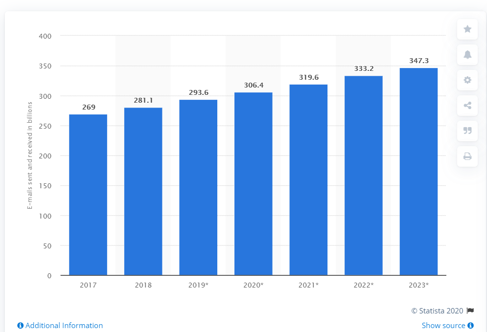
According to Statista, the number of emails sent and received each day in 2020 is 306.4 and this number is likely to increase to 347.3 by 2023.
This does more than just overcrowd inboxes; it becomes a source of constant stress. In an attempt to save time, people mark some emails as spam. This has a serious impact on your deliverability, which ultimately tarnishes your reputation.
Now that’s a conundrum! As a business, you have to send out emails to prospective clients to inform them of the services your business has to offer. You probably have an email template that you circulate in your prospective client pool for convenience. However, once your emails and newsletters are marked as spam, inbox providers are informed that your business isn’t following the best practices of email marketing.
If your emails keep landing in the spam folder, the inbox providers will take strict action against you. If it happens, all your hard work will prove to be in vain. Your emails will automatically land in the spam folder of the recipient or even worse, never reach the subscribers.
So what should be your next course of action?
There are two major strategies you can follow to ensure your meticulously designed HTML emails don’t land in the spam folder and your subscribers find your content valuable. Let’s take a look at the tried and tested methods that can ensure your words reach the recipients.
Stop Email Abuse
As a sender, the first step is to figure out who the complainer is and the best course of action is to remove the abuse emails and complainers from your list. You’ll have to use an email validation tool, which will scan your contacts to help identify the abuse emails. When you use such a system, you gain the upper hand. The tool will help you identify the email addresses that have marked several emails as spam and will likely do the same to yours.
Here’s an image explaining how the tool works. You just have to mention the email address in the box and the tool will let you know whether the subscriber is a valid user or has marked several emails as spam.
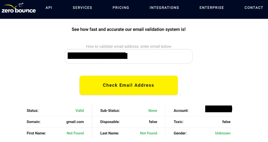
In case the result shows the status as “abuse”, you should immediately remove the subscriber from your list.
The industry standard for the average complaint rate of a sender should be below 0.1 percent. If you don’t want to face the repercussions of being reported, it’s the safest bet to check your email list with a validator and remove the trouble seekers as soon as possible.
You must also use this opportunity to take a look at your email hygiene. The complaint rate gives you insight into the quality of your content, too. Pay heed to the feedback and use it to devise your next plan of action.
Take Preventive Measures
The previous section talked about damage control and how you can recover from it. Here, we are going to discuss some preventive measures so your business’s reputation doesn’t take a hit. The process takes time, so you’ll need to be patient. If you follow the steps carefully, you’ll be able to avoid being in this situation ever again.
- Purge your email list and make sure no invalid emails or non-responders escape the cleanup. Do this at regular intervals so that your reputation score can remain high.
- When you go for an opt-in policy, you ask the recipients how they want to receive your emails and what content they expect from your business. It is a great idea to have a double opt-in method that urges your subscribers to confirm the email address before subscribing. Doing so ensures that the user is genuinely interested in hearing from you.
Here’s a nice example of a double opt-in email that thanks the user for signing up and asks them to verify their email address.
- Refrain from purchasing an email list because it’ll set you down the wrong path and can completely ruin your sender reputation.
- Keep an eye on your bounce rate. If you ever get a hard bounce, all you need to do is add the email to your suppression list. You can even get tools that can do the job automatically for you.
- Give up your aggressive marketing ways and the recipients will be kind to you. Take a moment to put yourself in the recipients’ shoes and focus on how you would expect a business to approach you. Take inspiration from this experience and instead of pushing your ideas across with a salesy pitch, try and convince the subscribers with meaningful content.
- Make it an exciting experience for the subscribers to read your emails, by incorporating visuals. However, make sure you maintain the text to image ratio at 80:20. Sending an image-only email is a strict no-no, when it comes to bypassing spam filters.
- Businesses make it hard for people to leave the subscription list, which is why they resort to marking the emails as spam. In order to avoid tarnishing your reputation, make sure it’s easy for the subscribers to opt-out whenever they want. The best approach is to include the unsubscribe link in every email.
Conclusion
These strategies can help save the reputation of your business and also ensure you stay on good terms with the inbox provider. As long as you work to keep the average rate within the set standard, your business will do just fine. If you’re still having issues with your email abuse and its recurring implications, it’s best to get external help. An email marketing agency would have all the tools and resources that are required to validate the status of your emails.
5 Tips for Marketing your First WordPress Product
WordPress is one of the most widely used tools on the internet. Initially, when the open-source project started, WordPress was mostly used for blogs. It is free and open-source for content management.
WordPress is opened up to a huge audience because of its sturdy and strong plugin structure and the ability to virtually create any kind of theme you could imagine. WordPress now is so large that around 32 percent of websites are run by WordPress.
There are many different types of plugins and templates in WordPress and the most important thing is that it does not ask the user for prior authorization to make changes to the theme. One of the main features of WordPress is customization. That’s what makes all business owners make WordPress the perfect CMS For My Business.
WordPress is preferred by many for creating a product based website. There are many ways by which you can market your first WordPress product. The following are the different ways of marketing your first WordPress product:
1. Offer premium and free versions
The users are always afraid to buy new products. They have the fear of the unknown and are sceptical about the features and usability of the new product. Offering free trials is one of the best ways to market your new product. If you are selling a service or software, giving a free or trial version of your product is a great way to give a huge number of customers a feel of your product. It usually happens that the purchased product does not match the specifications mentioned in it, that’s the reason customers don’t want to take risks with new products.
Giving free trials acts as a gateway to attract your prospective customers to your website. Through the free trial, you can not only promote the premium version of your product but you can also advertise the upcoming software releases.
Make sure that the free trial is at the forefront of your website so that it is the first thing in sight as the customers visit your website. This will ensure the maximum number of downloads of the free trial. The conversion rate from the free version to the premium version is very high. This strategy will help to increase the conversion rate to 90 percent. It is one of the best WordPress Development tools available!
2. Try split testing
Also known as A/B testing, it involves testing the product in different ways. The main goal is to conduct controlled experiments or tests. This is to improve a website’s metrics such as clicks, visits, form completion and purchases. It involves risk, but you will not achieve higher sales if you are not willing to take risks.
Split testing works by creating two different pages, advertisements or platforms where your product can be found. The main idea is to split the leads and demographic list on social media and let the advertisement work its way into their social media. Then with the help of google analytics or any other data monitoring software, you can track the results of your split test. The result will help you to understand which advertisement outperformed the other.
You will have to do multiple split tests throughout the year and select the advertisements that do well with the customer base. After completing a number of split tests, you will find an advertisement that’s the best and most popular amongst the customers.
3. Try to create connected products
While it is important for you to optimize your plugins so that they work in accordance with all themes, it will be beneficial if you also make a special theme that can complement the products you are selling. Your idea over here is to create a new product which also showcases all the additional functionalities that are not available anywhere online.
To make this happen, you can also create WordPress plugins which are linked with one another. Take this for instance: you can easily attach a standalone plugin that you can download from the WordPress plugin directory. In fact, you can also use it as an add-on for that particular plugin.
Here’s an example you can follow:
The Profile Builder plugin will allow you to create several different user profiles and user registration protocols in a consistent and streamlined way. If you want to take this process a notch ahead, you can also incorporate the Client Portal – Private User Pages and Login plugin. This is an add-on portal for the Profile Builder, which allows the users to create private pages for all their website users.
4. Use SEO and link building techniques
Search engine optimization is the king when it comes to getting more traffic to your website. No matter what product or service you are offering, SEO is the best way to make your product visible to your customers. SEO is used to rank your website to the top of the various search engines. Well placed links and proper SEO can help you build a reputable and strong face in the market.
The best way to develop your SEO is to identify your keywords with the help of tools like Google keyword planner. Once the keywords are ready, you can begin with developing and writing content which gives the customer information about your products and also includes the keywords. The best way to distinguish your product or service is to make customers aware and provide them information about how your product will make their life easier. Just talking about your product won’t help you, you also need to talk about how your product is different from the competition and what added benefits it is going to provide.
Your website will get a better response if you are doing proper quality link building. Link building strategy plays a very important role. Link building is the process of getting your links to other websites which helps in getting more traffic. It does not mean that you link to any website, it is very important to link to reputed sources. This will eventually increase your domain authority and your reputation.
5. You can advertise your products and your websites using the WordPress newsletter
Although the online market has various different options to get this process started, we strongly recommend you to take a look at the wpMail.me. We are suggesting this because it is a free weekly newsletter. The best part about it is that since it is a weekly, it focuses on fresh WordPress news. It also mentions information on different WordPress-related blog posts that can be helpful.
What’s particularly interesting about this option is that it allows the user to advertise their products on it as well. Not just this, as an entrepreneur, you also have the option to sponsor an entire edition. If you sponsor the entire edition, you will have more space in your newsletter to feature your products prominently to the audience. An add on is that you can also have a banner of your own.
This is a distinguished approach to take because other similar kinds of newsletters do not really allow this kind of promotion. You have the option to reach out to them via email. Then, you can ask if they are willing to feature your latest blog. You can also ask if they would like to feature your plugin or theme that you have recently launched.
The only thing you need to consider is that your newsletter should be relevant to your industry. This way you will ensure you both are targeting the same set of viewers.
Awesome Tools and Services that You Should Check Out

There certainly isn’t a lack of tools and services you could put to use to improve your website design, beef up your business, increase your productivity, or save time and money.
There are so many in fact, that finding something that will satisfy your most urgent and essential needs can sometimes be a seemingly insurmountable problem. Many of the tools or services you use today may have served you well, but in today’s hyper-competitive world there’s no guarantee they’ll continue to do so.
If you are to remain competitive, you have to keep up with the latest design trends. That may require switching over to new or more powerful tools and value-added services that will make it possible for you to do so.
We have assembled this list of top tools and services for 2020 to help you stay on top of your game and increase your productivity.
Happy hunting!
UXPin is a state-of-the-art prototyping and collaborative tool for UX and UI design teams. It has two versions available, a browser-based version and a desktop app. UXPin also provides features powerful and efficient real-time collaboration functionalities that allow teams to work in real time and in context from anywhere.
It allows you to preview designs, leave and get contextual feedback through comments, and provide prototyping and test and analysis results for team leader or stakeholder information and approvals.
Working in UXPin is similar to sharing data in Google Docs, except UXPin is obviously a great deal more powerful because of its multiplicity of prototyping and collaborative features that include:
- Fully interactive text fields, checkboxes, radio buttons, and other form elements
- Design components that can be used and reused to avoid repetitive prototype-building tasks.
- iOS, Material Design, and Bootstrap design element libraries
- Vector drawing tools that allow users to create anything from imaginative icons to stunning illustrations.
- Web page and web page content importing that assist in getting prototyping off to a flying start.
Click on the banner to find out more.

BeTheme is one of the safest choices you could ever make; not only because it’s the biggest WordPress theme of them all, and there are times when size really does matter, but because the 40+ core features it places at your disposal.
BeTheme is fast and super-flexible. It’s an ideal choice for both beginners and advanced website designers. You can create an award-winning website on your first try if you’re a novice or use it to completely satisfy the demands of multiple clients if you’ve been around the block a few times.
- The highlight is Be’s 500+ pre-built websites. They are professionally crafted, responsive, and customizable with built-in UX features, and they address 30 industry sectors and every major website type.
- The Muffin Builder 3 page builder is another highlight, and together with Be’s powerful Admin Panel gives you all the flexibility you need.
Click on the banner to check out the remaining core features.

Its users will be the first to tell you that there’s an awful lot to love about Mobirise. Not only is Mobirise an offline tool, it’s arguably the #1 offline builder on the market today. Since everything is offline:
- You can download Mobirise and start building an awesome website right away.
- No coding is required. Everything you need comes with the package.
- Thanks to Bootstrap 4 and Google AMP your site will be 100% mobile friendly and lightning-fast to boot. Mobirise is Google-friendly as well.
- Design aids include 2,500+ website blocks, 75+ HTMS themes, and 200+ home page templates.
- Other goodies include Google Maps, data and pricing tables, counters and countdowns and more, an everything is customizable.
Mobirise is free for both commercial and personal uses with no strings attached.
Uncode is a creative top-seller multiuse theme for freelancers, agencies, bloggers, and just about anyone having an itch to get creative.
- Design in real-time with a frontend editor on steroids
- 70 inspirational pixel-perfect concepts to get your project underway
- WooCommerce and WPML compatibility
The highlight is Uncode’s must-see showcase of user-built website that tells you at a glance what this creative theme could do for you.
Click on the banner and browse the showcase to learn more.

LayerSlider makes it possible for millions of website owners to create unique sliders and special effects for their sites. It’s a full-fledged animation builder rather than a just slider tool with features like:
- Drag and drop visual builder without any need for coding experience.
- A Popup feature to display important messages such as store offers, newsletter subscriptions or adverts.
- Animated page blocks, which you can even build a complete website with.
Plus, LayerSlider is SEO friendly, and its dedicated support team stands ready to help you if and when needed.

Dr. Link Check tracks down broken and malicious website links.
- This useful tool crawls through your site’s entire code and thoroughly examines each link for URL formatting, blacklisted links, server response time, and more.
- You can check the results to identify necessary changes to your website.
- You can also schedule automatic checks on a monthly, weekly, or daily basis, and be notified about problems via email.
8b is a new website builder with a futuristic, super-simple interface. 8b is also free and yours to download and host anywhere you like.
- You can build a website on your desktop, on a mobile device, or both
- Google AMP guarantees your site will be crazy-fast and 100% mobile friendly
- 250+ website sections, and 16 starter templates give you a quick start capability
There’s more; but be sure to take advantage of the free download offer. It might not last.

Three things to look for in a stock photo service are inventory size, product quality, and friendly service. Stockfresh excels in all three areas.
- Stockfresh offers millions of photos and vectors
- The offerings are top quality, plus the pricing is competitive.
- You can expect friendly service and the inventory is skillfully categorized to make your search as easy as possible.
In the not-to-distant future templates, fonts, themes, and other goodies will be added to the inventory.
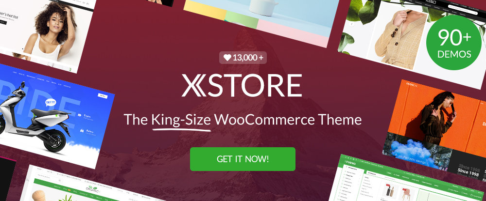
This “King-Size” WooCommerce theme has more than you’ll ever need to create an online store, or quite a number of them for that matter.
- For starters, there are 90+ good-to-go stores you can customize to get exactly what you want.
- XStores’s single product page builder should more than come in handy.
- There’s a page importer for the WPBakery page builder.
- The package also includes live themes, 200+ PSDs and $300+ worth of premium plugins
- Powerful header builder

Version 6.0 of Slider Revolution is more than a slider builder. It’s a new way to create rich, dynamic website content.
- With its visual editor, you can create Sliders, headers, content modules, and even complete websites.
- There are 200+ beautiful and ready-to-go templates to work with.
- A library of 20+ powerful addons is included
- A library of 200+ design elements is also included
Slider Revolution has 7 million+ users around the globe.
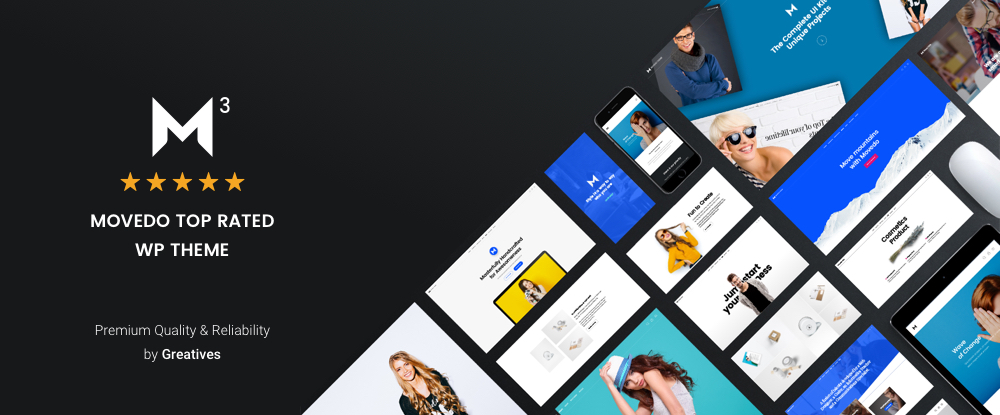
Movedo rocks! Movedo, with its clean and modern design is a joy to work with, and the websites you can create with this top-rated WordPress theme can be a joy to behold. Created by a top-rated author who wasn’t shy about straying outside the box, this theme offers among other features:
- Out-of-this world parallax effects
- Special animations
- Mouse, scrolling, and column movement
- A knowledge base featuring a quick search option
Click on the banner and see for yourself.
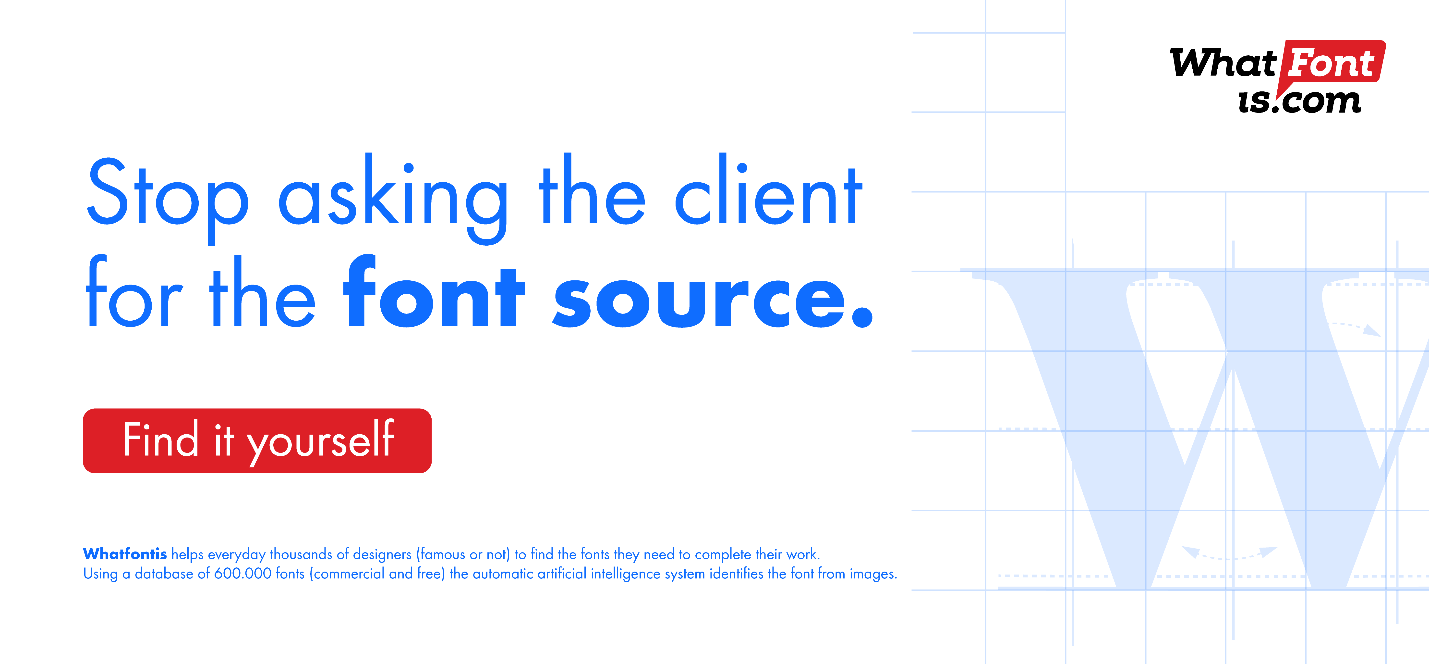
WhatFontis.com is the #1 font identification service designers can look to for a quick response to their font identification needs.
- Download a sample (letters or a line of text) of the font in question
- Expect an answer in less than a minute
- Obtain a close match if the font cannot be located
- Be presented with alternatives if the cost of the font is an issue
Simple, powerful, and worth checking out.

Goodiewebsite is a WordPress frontend development platform that connects you directly with a web developer who is also an employee of a software house that was established in 2005.
Goodiewebsite is ideal for:
- Small business owners looking to amplify their online presence
- Designers looking for a reliable web development partner
- Startups looking to test their business ideas and concepts
Goodiewebsite specializes in smaller WordPress websites and simple WooCommerce websites.

The ability to offer a speedy and informative response to a question is something every customer service operation should strive for. A FAQ page is one approach, but not always a very good one. Put the Heroic Knowledge Base plugin to work and you can:
- Give your customers knowledgeable answers to their questions
- Provide rapid responses 24/7
- Help customers find related or supporting information
In addition, you will profit from Heroic KB’s feedback and analyses.
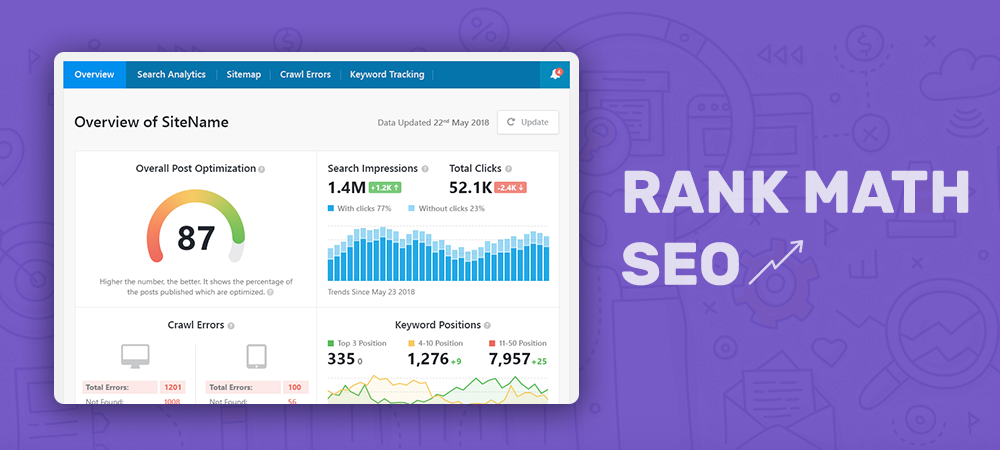
Rank Math is the Swiss Army Knife of WordPress SEO tools and the only SEO plugin you need for WordPress. This plugin’s clean and simple UI makes it easy to work with in spite of the many features that can be used to make a site search engine friendly, including:
- Elementor, Automated Image, and Local SEO tools and analysis
- WooCommerce SEO
- Sitemap and Redirections checking
- 404 Monitoring
You can check the plugin for yourself and see what it is all about.
*****
There’s a whole host of tools and services available that not only help to keep costs down, but also save you time and help your business operate smoothly. The more useful these tools are, the more time you have to focus on your key priorities
The basis for choosing the above top 15 tools and services is that individually or collectively they can help you work faster, more efficiently, and even more intelligently.
Read More at Awesome Tools and Services that You Should Check Out
How to Animate Text with SVG and CSS

The other day I was helping my pal Jez work Dept. of Enthusiasm, the site for his newsletter, and I had a thought. What if we made the word “enthusiasm” in the title animate a little bit? Like, what if each of the letters in the word bopped up and down enthusiastically?
Like this:
Neat, huh? To build this thing I knew we could use SVG for the text and then animate things with CSS. Each letter is a path with its own class, which makes it possible to select each one. That said, there’s nothing really stopping us from doing this with HTML and CSS. Using SVG is just one approach that felt right to me at the time.
To get started we headed over to Figma and typed out the text in separate text boxes. We did this so that when we click on the “Outline stroke” menu item here…
…we have individual vectors of each letter. This will help us when we export the SVG so that we can add the correct CSS classes to each element. Once we’ve outlined the strokes of each letter we can then edit the points in the vector (but we don’t need to for what we’re about to do):

If we added all the text in one box and clicked “Outline Stroke” then it would’ve created a single vector with all these letters combined. That would then make a single path with the coordinates and that’s pretty difficult for me to style or even understand what the heck is going on in there.
Next up, I put all these letters in a Frame (Sketch calls this an Artboard) and placed each word into a Group. This way, when they’re exported as an SVG, each word will be in it’s own g tag which also helps us style the letters:

From there, I exported the SVG — but! — I had to make sure to include the id option when doing it.

If we don’t do this we’ll get a bunch of path elements for each letter but they won’t have an id attributes.
This is what we get after the export:
I’m not sure how much of this weirdness is me and how much is Figma’s SVG export, but I deleted that element because it’s unecessary. Then I gave the body element a background so I could see the text and remove those inline height and width attributes on the SVG itself:
Neato! Now we can get to the fun part: animating each letter in the word.
If you look at the HTML of that example above you’ll notice there’s a g element which with an id with the same name of the Frame in Figma.There are also g elements for each word and every path that makes up the word will have an individual id. (This is why naming our Frames and Groups properly, as well as keeping things organized in any design application, is important.)
One thing that surprised me was the order in which each path is exported though: it’s in the opposite order than the one I’d expect, with M being the first letter in the “ENTHUSIASM” group. So I cleaned that up a bit and made sure each letter is in the correct order.
To get the animation working we first bump down each letter by 2px:
g path {
  transform: translateY(2px);
}
That’s because I want each letter to make a 2px hop which we’ll get to in a bit. I also noticed with this change I’d need to update the SVG viewbox too. Otherwise, the bottom of each letter will be cut off:
<svg class="header" viewBox="0 0 146 13" fill="none" xmlns="http://www.w3.org/2000/svg">I probably should’ve have just repositioned the text within the frame in Figma and exported it again, but this is fine for what I needed.
Now I can target the third group in the SVG (the word “enthusiasm”) and set the animation-count to infinite:
/* targets the word "enthusiasm" */
g:nth-child(3) path {
  animation-name: wiggleWiggle;
  animation-duration: 2.5s;
  animation-iteration-count: infinite;
}
The code above then calls the wiggleWiggle animation below:
@keyframes wiggleWiggle {
  20%,
  100% {
    transform: translate(0, 2px); /* stay on the baseline for most of the animation duration */
  }

  0% {
    transform: translate(0, 0px); /* hop up */
  }
  10% {
    transform: translate(0, 2px); /* return to baseline */
  }
}
See the beginning of that keyframe — the 20%, 100% bit? What that’s saying is “keep all the text on the baseline for the majority of the animation.” That’s what gives us a nice delay between each bounce:
I learnt this trick from this really good post about animation timing by Geoff and I would highly recommend you check it out if you’re about to start learning about animation in CSS.
Now for the fun bit: with the animation-delay property, we can make each letter hop just after the one before it. There’s definitely a smarter way I could be doing this, but I just used the id of each letter like so:
#E {
  animation-delay: 0s;
}

#N {
  animation-delay: 0.1s;
}

#T {
  animation-delay: 0.15s;
}

#H {
  animation-delay: 0.2s;
}

#U {
  animation-delay: 0.25s;
}

#S_2 {
  animation-delay: 0.3s;
}

#I {
  animation-delay: 0.35s;
}

#A {
  animation-delay: 0.4s;
}

#S {
  animation-delay: 0.45s;
}

#M {
  animation-delay: 0.5s;
}
It sure is messy, but writing the loop wouldn’t save me that much time and I won’t need to update it in the future, so I think it’s fine enough. And with that we’re pretty much done!
We now have a bouncy, enthusiastic title to say hello. Yay for wiggly text!
The post How to Animate Text with SVG and CSS appeared first on CSS-Tricks.
