Oh hey! A brand new property that affects how a box is sized! That’s a big deal. There are lots of ways already to make an aspect-ratio sized box (and I’d say this custom properties based solution is the best), but none of them are particularly intuitive and certainly not as straightforward as declaring a single property.
So, with the impending arrival of aspect-ratio (MDN, and not to be confused with the media query version), I thought I’d take a look at how it works and try to wrap my mind around it.
Shout out to Una where I first saw this. Boy howdy did it strike interest in folks:
? Aspect Ratio just landed in Chrome Canary! ?
??Check it out by enabling the experimental web platform features flag in version 84.0.4145.0 or later
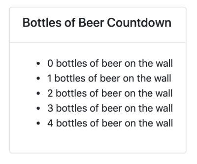
Just dropping aspect-ratio on an element alone will calculate a height based on the auto width.
Without setting a width, an element will still have a natural auto width. So the height can be calculated from the aspect ratio and the rendered width.
.el {
  aspect-ratio: 16 / 9;
}
If the content breaks out of the aspect ratio, the element will still expand.
The aspect ratio becomes ignored in that situation, which is actually nice. Better to avoid potential data loss. If you prefer it doesn’t do this, you can always use the padding hack style.
If the element has either a height or width, the other is calculated from the aspect ratio.
So aspect-ratio is basically a way of seeing the other direction when you only have one (demo).
If the element has both a height and width, aspect-ratio is ignored.
The combination of an explicit height and width is “stronger” than the aspect ratio.
Factoring in min-* and max-*
There is always a little tension between width, min-width, and max-width (or the height versions). One of them always “wins.” It’s generally pretty intuitive.
If you set width: 100px; and min-width: 200px; then min-width will win. So, min-width is either ignored because you’re already over it, or wins. Same deal with max-width: if you set width: 100px; and max-width: 50px; then max-width will win. So, max-width is either ignored because you’re already under it, or wins.
It looks like that general intuitiveness carries on here: the min-* and max-* properties will either win or are irrelevant. And if they win, they break the aspect-ratio.
.el {
  aspect-ratio: 1 / 4;
  height: 500px;

  /* Ignored, because width is calculated to be 125px */
  /* min-width: 100px; */

  /* Wins, making the aspect ratio 1 / 2 */
  /* min-width: 250px; */
}
With value functions
Aspect ratios are always most useful in fluid situations, or anytime you essentially don’t know one of the dimensions ahead of time. But even when you don’t know, you’re often putting constraints on things. Say 50% wide is cool, but you only want it to shrink as far as 200px. You might do width: max(50%, 200px);. Or constrain on both sides with clamp(200px, 50%, 400px);.
But say you run into that minimum 200px, and then apply a min-width of 300px? The min-width wins. It’s still intuitive, but it gets brain-bending because of how many properties, functions, and values can be involved.
Maybe it’s helpful to think of aspect-ratio as the weakest way to size an element?
It will never beat any other sizing information out, but it will always do its sizing if there is no other information available for that dimension.
After careful consideration, we settled on rearchitecting our platform to use $FLASHY_LANGUAGE and $HYPED_TECHNOLOGY. Not only is $FLASHY_LANGUAGE popular according to the Stack Overflow developer survey, it’s also cross platform; we’re using it to reimplement our mobile apps as well. Rewriting our core infrastructure was fairly straightforward: as we have more engineers than we could possibly ever need or even know what to do with, we simply put a freeze on handling bug reports and shifted our effort to $HYPED_TECHNOLOGY instead. We originally had some trouble with adapting to some of $FLASHY_LANGUAGE’s quirks, and ran into a couple of bugs with $HYPED_TECHNOLOGY, but overall their powerful new features let us remove some of the complexity that our previous solution had to handle.
There is absolutely no way Saagar Jha is poking at this or this.
Mobile devices have tip-toed into our day to day lives as a form of convenience and entertainment and now have made a permanent, indispensable place for themselves in our personal as well as professional lives.
Enterprises who haven’t yet adopted mobile devices for business optimization and using conventional means of operation are practically losing it to their competitors who have embraced mobile technology for streamlining its processes, employee efficiency and customer experience.
One of the biggest concerns for adopting mobile technology in a conventionally operating enterprise is data security. Mobile devices and their notoriously infamous susceptibility for exposing critical security data via unauthorized apps prevents enterprises from adopting mobility and rightly so.
Mobile threat defense- MTD helps enterprises in overcoming these security concerns while improving the overall security profile. We’ve consolidated interesting facts and stats about MTD that can help enterprises make the right decision while embracing mobility.
Diana Smith with another mind-bending all HTML & CSS painting.
I love that these occupy a special place on the “Should I draw this in CSS?” curve. Things like simple shapes are definitely on the “yes” side of the curve. Then there’s a large valley where things get a little too impractical to draw that way, and using some other image format (e.g. SVG) makes way more sense.
Diana’s work pulls the curve back up to the “yes” side. Not only because it’s proof that CSS can be an amazing expressionistic art tool, but also from a performance standpoint — it’s only 2 KB of HTML and 10 KB of CSS.
For those who have missed the big news, Firefox now supports conic gradients!
Starting with Firefox 75, released on the April 7, we can go to about:config, look for the layout.css.conic-gradient.enabled flag and set its value to true (it’s false by default and all it takes to switch is double-clicking it).
Enabling conic gradients in Firefox 75+
With that enabled, now we can test our CSS including conic gradients in Firefox as well.
While some of the demos in this article work just fine when using a polyfill, some use CSS variables inside the conic gradient and therefore require native support for this feature.
One thing I particularly like about conic gradients is just how much they can simplify background patterns. So let’s take a few linear-gradient() patterns from the gallery created by Lea Verou about a decade ago and see how we can now simplify them with conic-gradient!
That’s quite a bit of CSS and perhaps even a bit intimidating. It’s not easy to just look at this and understand how it all adds up to give us the pyramid pattern. I certainly couldn’t do it. It took me a while to get it, even though gradients are one of the CSS features I’m most comfortable with. So don’t worry if you don’t understand how those gradients manage to create the pyramid pattern because, one, it is complicated and, two, you don’t even need to understand that!
Using conic-gradient(), we can now get the same result in a much simpler manner, with a single background layer instead of four!
What I like to do when coding repeating patterns is draw equidistant vertical and horizontal lines delimiting the rectangular boxes defined by the background-size. In this case, it’s pretty obvious we have square boxes and where their limits are, but it’s a really useful technique for more complex patterns.
Highlighting the pattern’s cells
By default, conic gradients start from 12 o’clock and go clockwise. However, in our case, we want to offset the start of the gradient by 45° in the clockwise direction and afterwards make every one of the four shades occupy a quarter (25%) of the available space around the midpoint of our square box.
A pattern cell with a conic gradient’s hard stops at every 25% starting from 45° w.r.t. the vertical axis (live).
Not only does the code look simpler, but we’ve also gone from 260 bytes to 103 bytes, reducing the code needed to get this pattern by more than half.
We’re using the double position syntax as that’s also well supported these days.
We can see it in action in the Pen below:
CodePen Embed Fallback
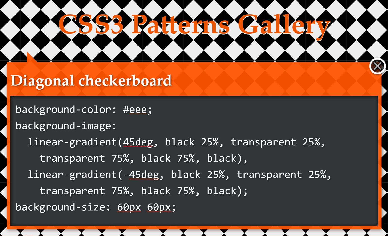
Checkerboard
The checkerboard pattern
This pattern above is created with two linear gradients:
background-color: #eee;
background-image:
  linear-gradient(45deg, black 25%, transparent 25%,
    transparent 75%, black 75%, black),
  linear-gradient(45deg, black 25%, transparent 25%,
    transparent 75%, black 75%, black);
background-size: 60px 60px;
background-position: 0 0, 30px 30px;
Let’s see how we can simplify this CSS when replacing these linear gradients with a conic one!
Just like in the previous case, we draw vertical and horizontal lines in order to better see the rectangles defined by the background-size.
Highlighting the pattern’s cells
Looking at the square highlighted in deeppink in the illustration above, we see that, in this case, our conic gradient starts from the default position at 12 o’clock. A quarter of it is black, the next quarter is dirty white and then we have repetition (the same black and then dirty white quarter slices once more).
A pattern cell with a conic gradient’s hard stops at every 25%, starting from the default at 12 o’clock and repeating after 50% (demo).
This repetition in the second half of the [0%, 100%] interval means we can use a repeating-conic-gradient(), which gives us the following code (bringing the compiled CSS from 263 bytes down to only 73 bytes – that’s reducing it by over 70%):
Again, we have a pattern created with two linear gradients:
background-color: #eee;
background-image:
  linear-gradient(45deg, black 25%, transparent 25%,
    transparent 75%, black 75%, black),
  linear-gradient(-45deg, black 25%, transparent 25%,
    transparent 75%, black 75%, black);
background-size: 60px 60px;
We draw horizontal and vertical lines to split this pattern into identical rectangles:
Highlighting the pattern’s cells
What we now have is pretty much the same checkerbox pattern as before, with the sole difference that we don’t start from the default position at 12 o’clock, but from 45° in the clockwise direction.
If you’re having trouble visualising how simply changing the start angle can make us go from the previous pattern to this one, you can play with it in the interactive demo below:
CodePen Embed Fallback
Note that this demo does not work in browsers that have no native support for conic gradients.
Again, not only is the code simpler to understand, but we’ve also gone from 229 bytes to only 83 bytes in the compiled CSS, reducing it by almost two-thirds!
Half-Rombes
The half-rombes pattern
This pattern was created with four linear gradients:
Just like in the previous cases, we draw equidistant vertical and horizontal lines in order to better see the repeating unit:
Highlighting the pattern’s cells.
What we have here is a pattern that’s made up of congruent isosceles triangles (the angled edges are equal and the dark blue triangles are a reflection of the light blue ones) formed by the intersection of equidistant parallel lines that are either horizontal, angled clockwise, or the other way. Each of these three types of parallel lines is highlighted in the illustration below:
Parallel guides
Every pattern cell contains a full triangle and two adjacent triangle halves in the upper part, then a reflection of this upper part in the lower part. This means we can identify a bunch of congruent right triangles that will help us get the angles we need for our conic-gradient():
A pattern cell with a conic gradient’s hard stops such that they’re either horizontal or go through the cell corners, all starting from ? w.r.t. the vertical axis (demo)
This illustration shows us that the gradient starts from an angle, ?, away from the default conic gradient start point at 12 o’clock. The first conic slice (the top right half triangle) goes up to ?, the second one (the bottom right dark triangle) up to 2·?, and the third one (the bottom light triangle) goes halfway around the circle from the start (that’s 180°, or 50%). The fourth one (the bottom left dark triangle) goes to 180° + ? and the fifth one (the top left light triangle) goes to 180° + 2·?, while the sixth one covers the rest.
This means going from 343 bytes to only 157 bytes in the compiled CSS. The result can be seen below:
CodePen Embed Fallback
You can tweak the pattern width ($w) and height ($h) in the Sass code in order to see how the pattern gets squished and stretched for different aspect ratios.
In the particular case where the angle between 2*$a and 50% (or 180deg) is also $a, it results that $a is 60deg, our isosceles triangles are equilateral, and our gradient can be reduced to a repeating one (and under 100 bytes in the compiled CSS):
While these are not repeating patterns, they’re examples of a situation where a single conic gradient achieves an effect that would have previously needed a bunch of linear ones.
What we have here is a conic-gradient() created starting from two straight lines intersecting within the rectangular box where we set the background.
The gradient goes around the point of coordinates, x,y, where the two straight lines intersect. It starts from an angle, ?, which is the angle of the line segment that’s closest to the top-right corner, then has hard stops at ?, 50% (or 180°) and 180° + ?.
If we want to have multiple elements with similar such patterns created with the help of different intersecting lines and different palettes, we have the perfect use case for CSS variables:
All we have to do is set the position (--xy), the start angle (--b), the first angle (--a) and the palette (--c0 through --c3).
.panel {
  /* same as before */

  &:nth-child(1) {
    --xy: 80% 65%;
    --b: 31deg;
    --a: 121deg;
    --c0: #be5128;
    --c1: #ce9248;
    --c2: #e4c060;
    --c3: #db9c4e
  }

  /* similarly for the other panels */
}
Instead of hardcoding, we could also generate these values randomly or extract them from a data object with the help of a CSS or HTML preprocessor. In this second case, we’d set these custom properties inline, which is precisely what I did in the Pen below:
CodePen Embed Fallback
Since we’re using custom properties inside the conic gradients, this demo does not work in browsers that don’t support them natively.
Well, that’s it! I hope you’ve enjoyed this article and that it gives you some ideas about how conic gradients can make your life easier.
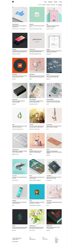
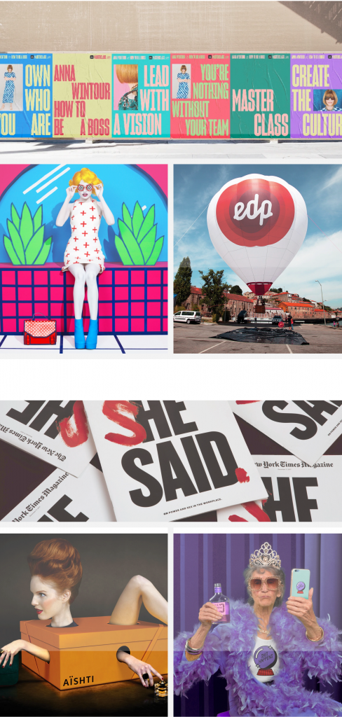
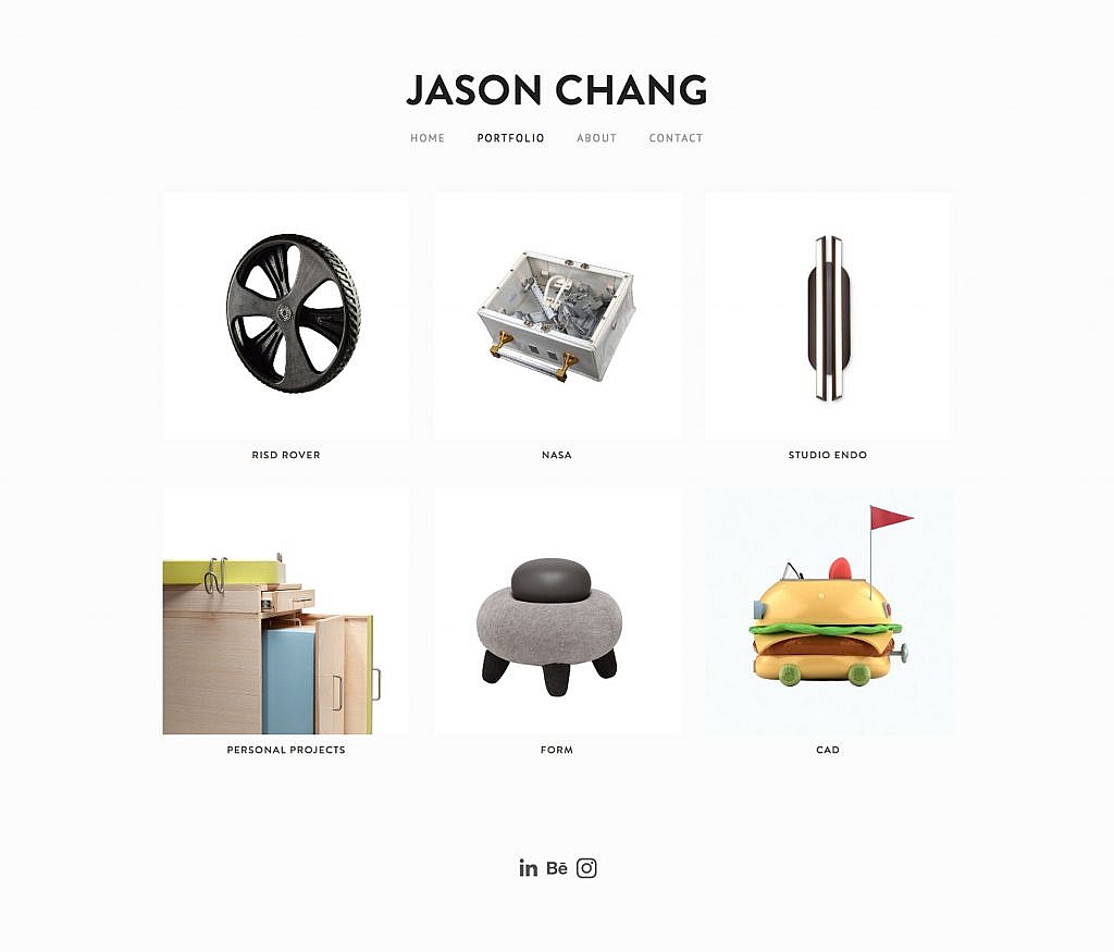
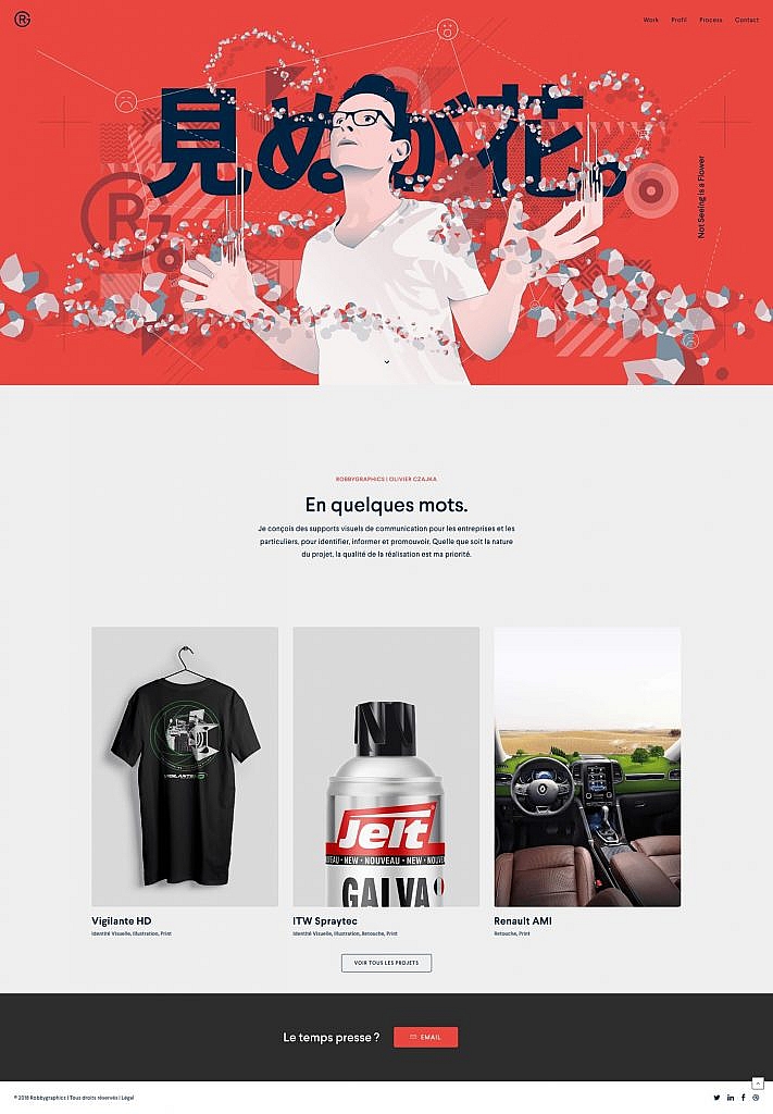
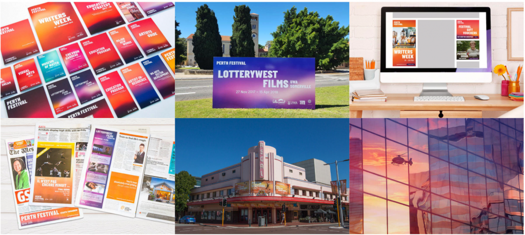
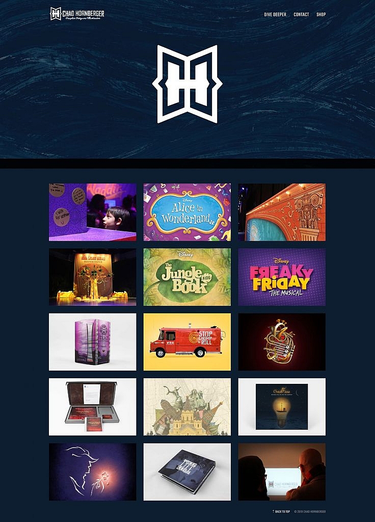
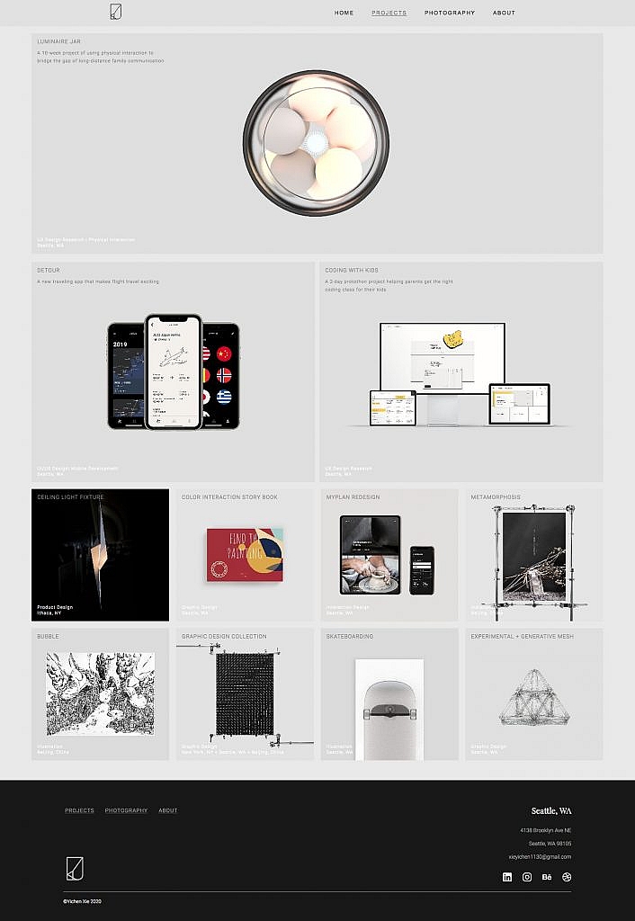
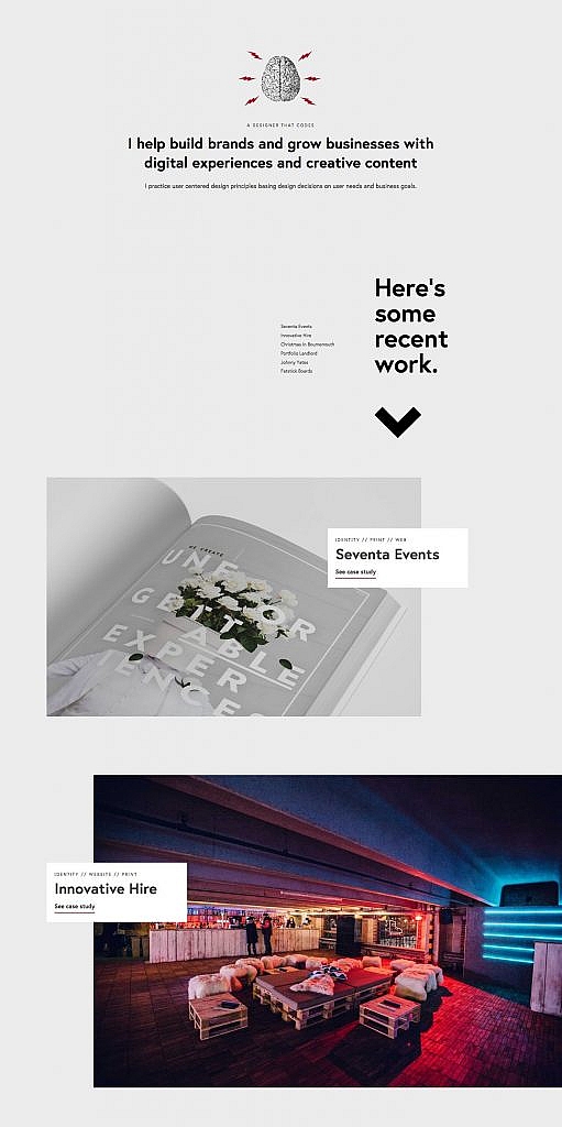
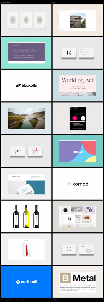
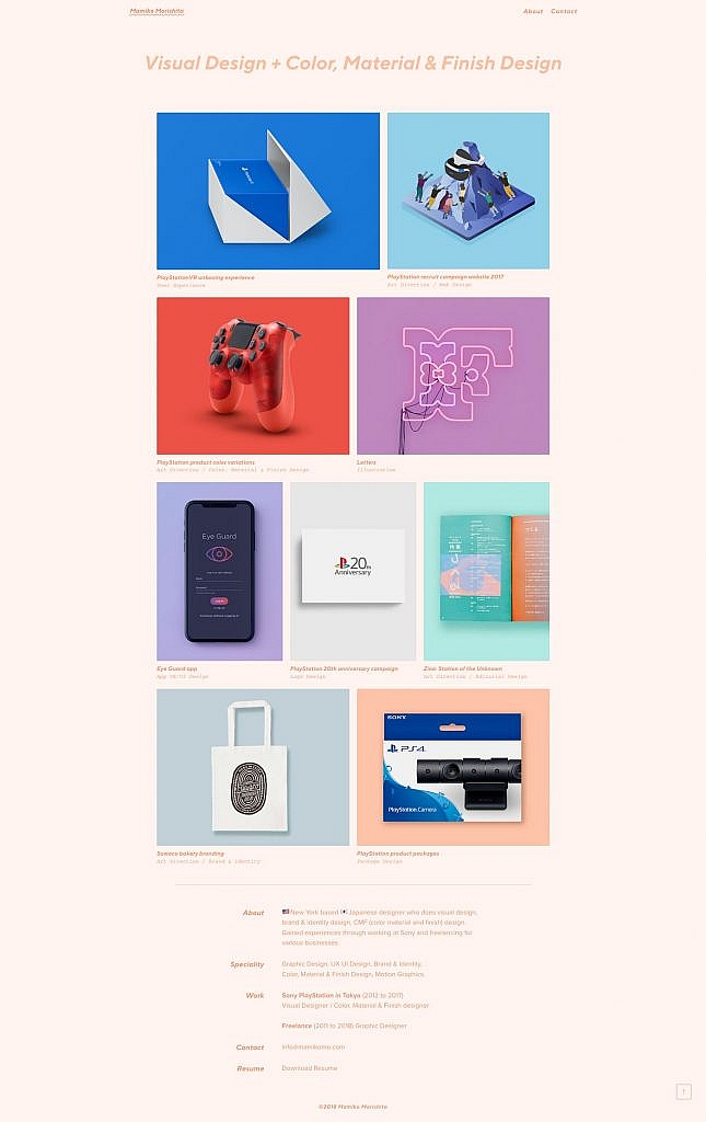
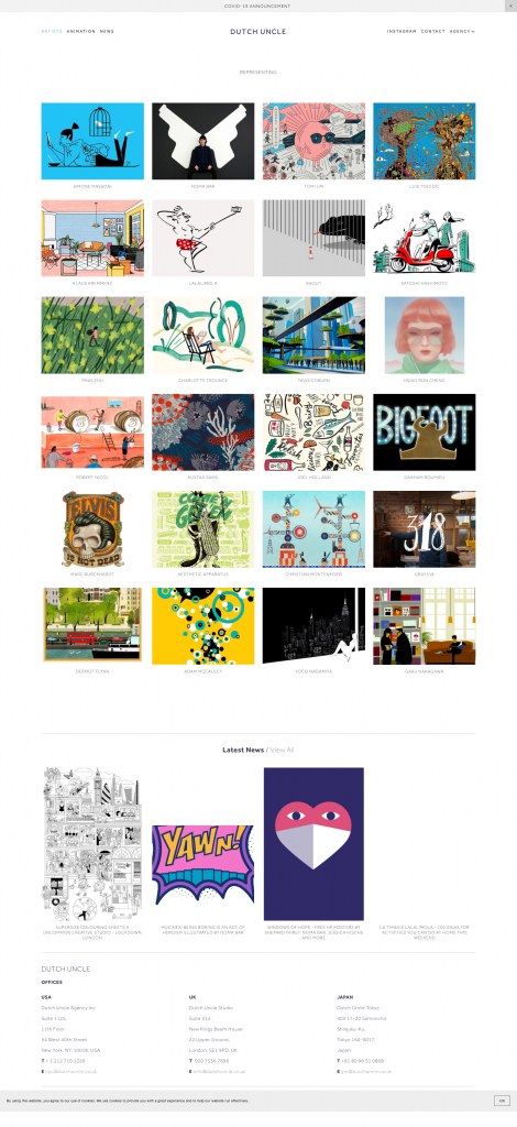
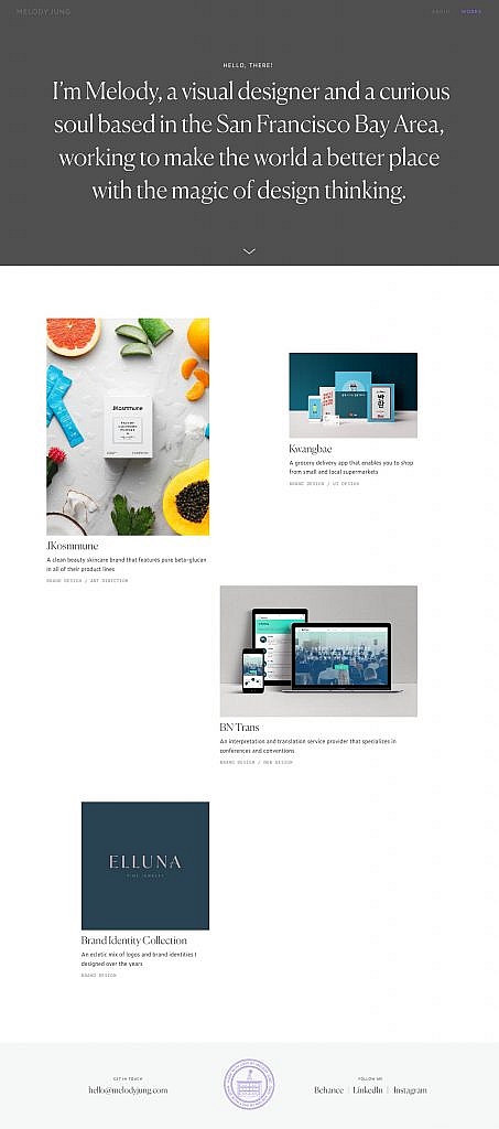
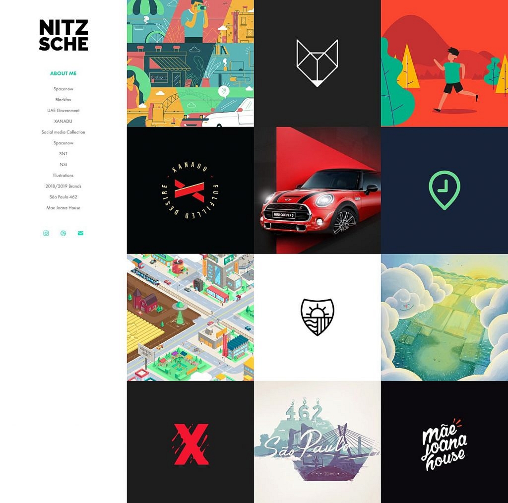
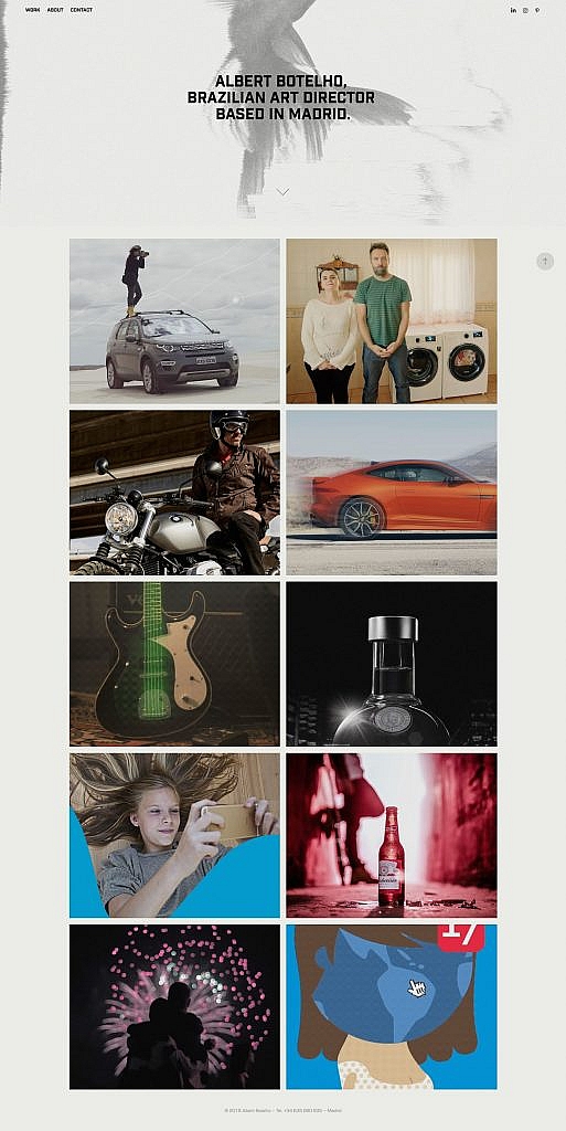
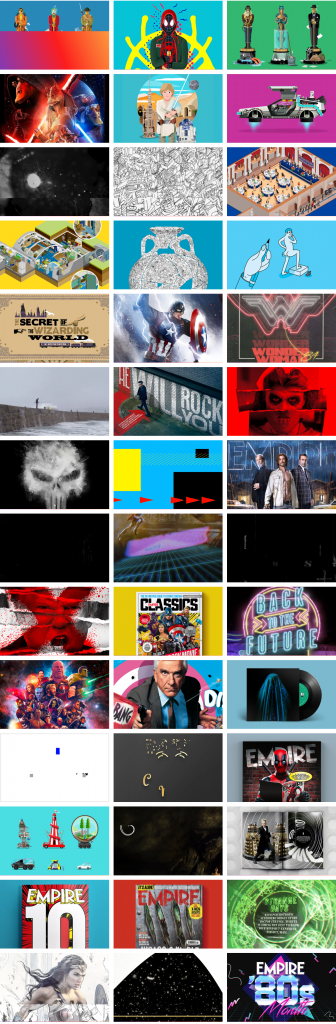
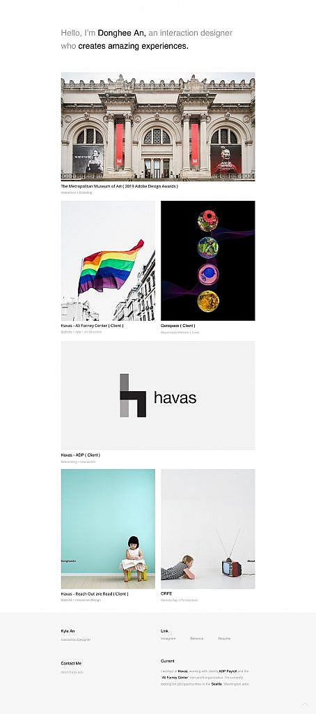
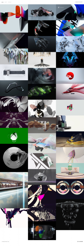
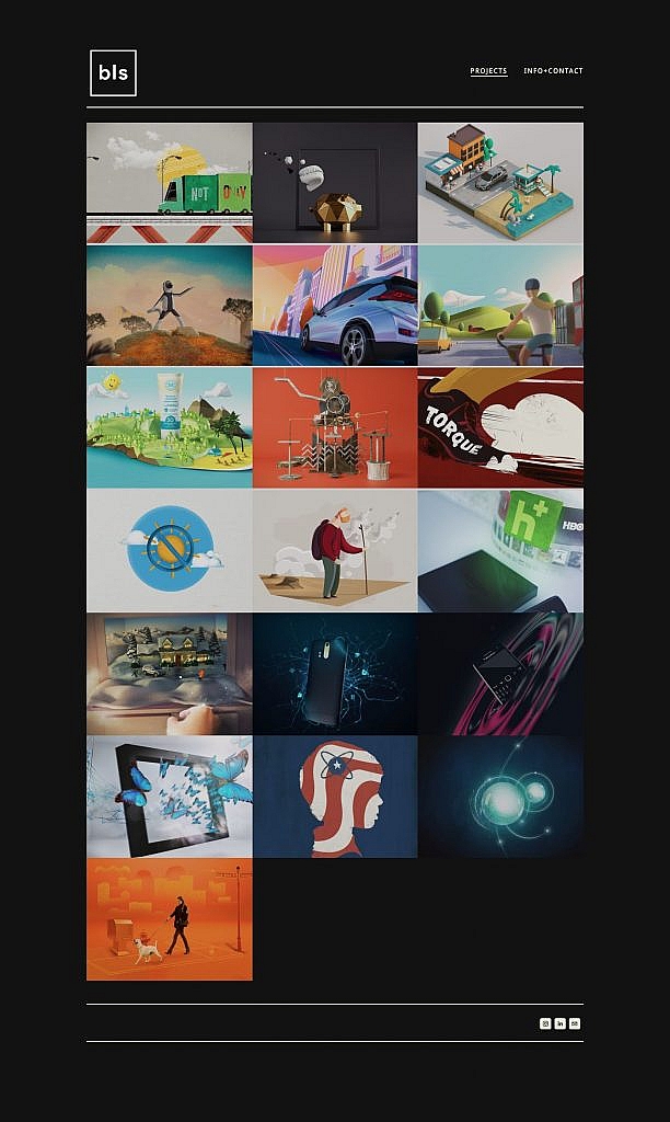
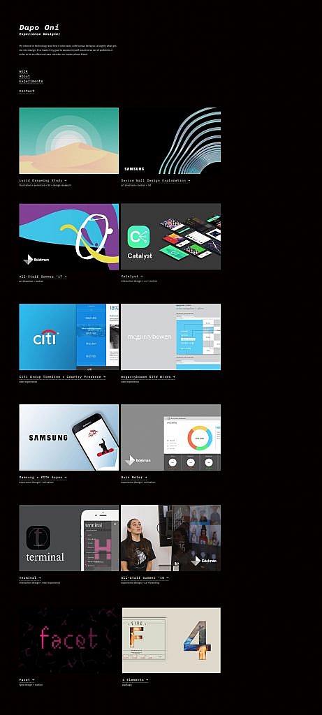
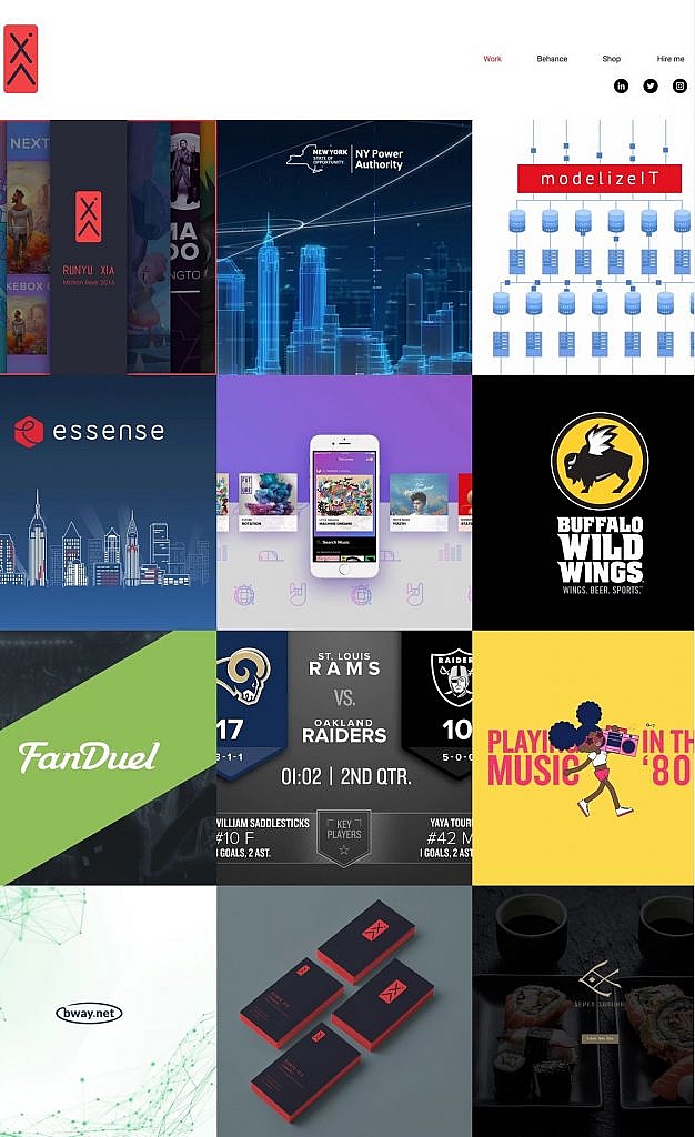
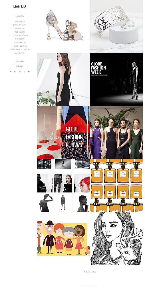
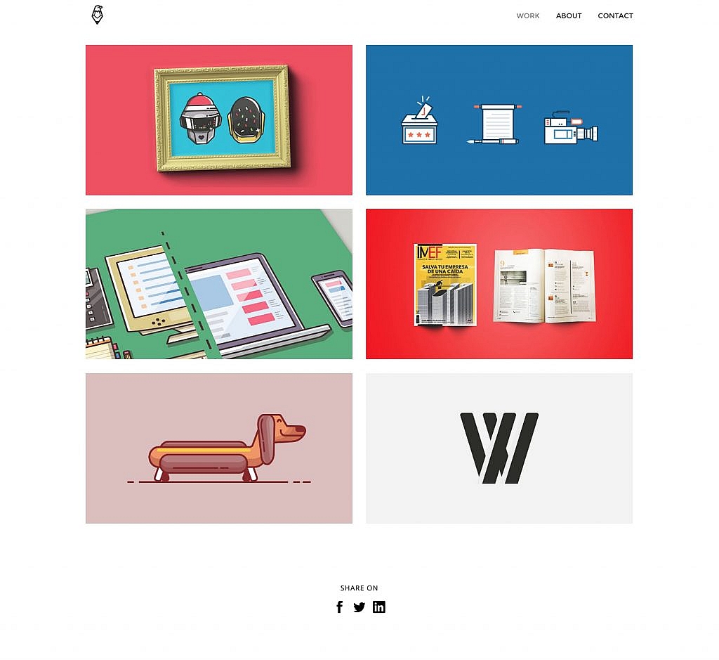
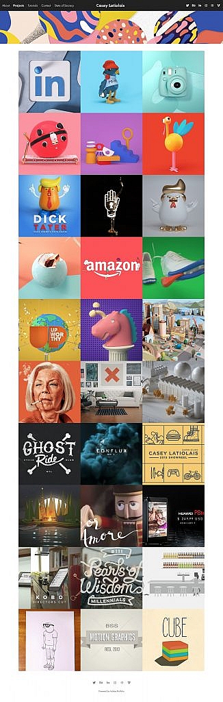
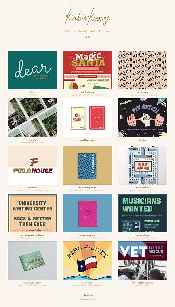
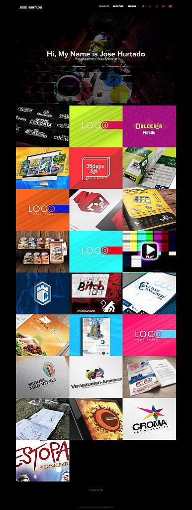
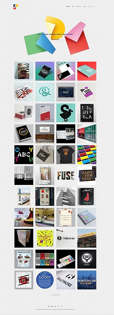
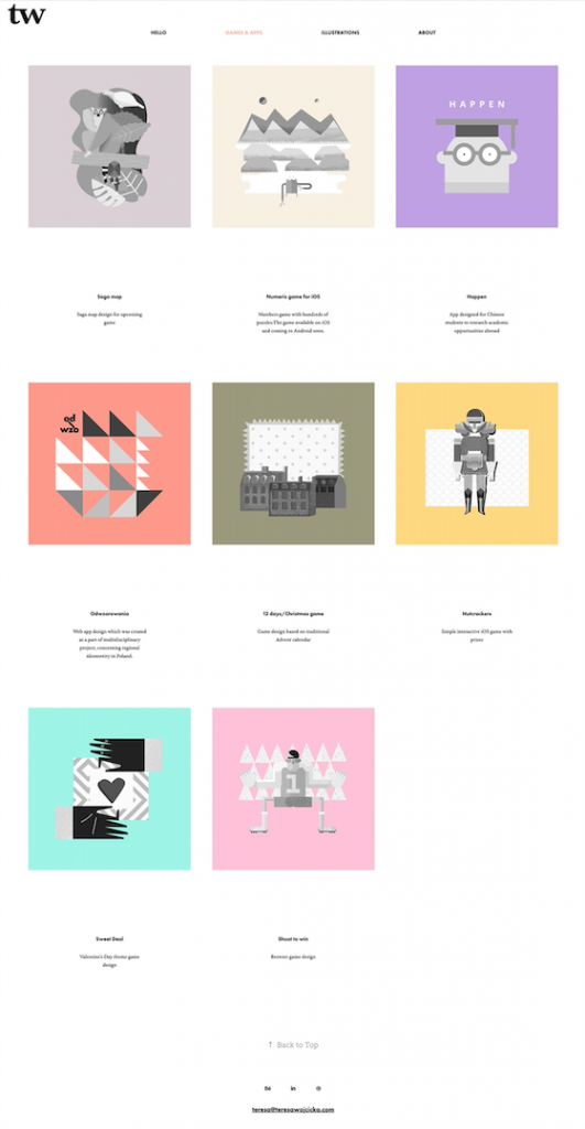
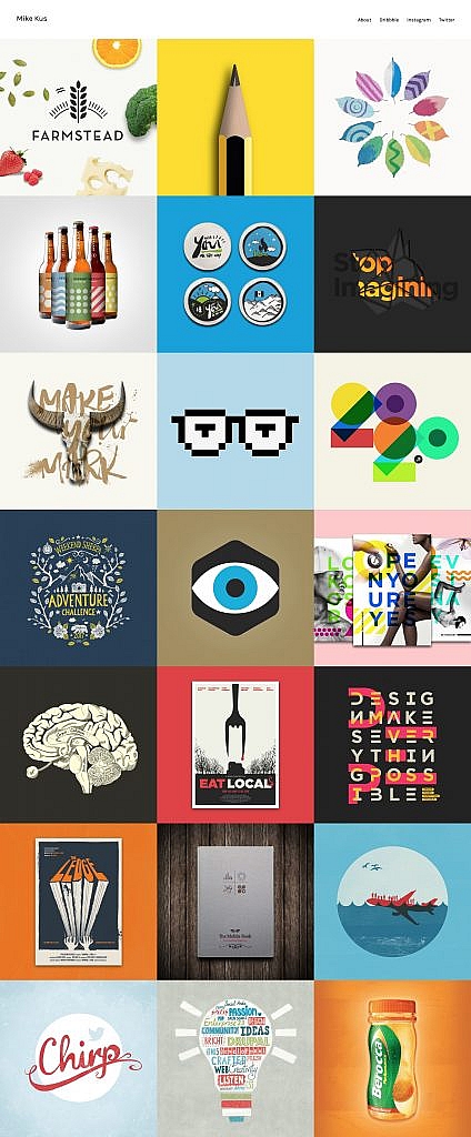
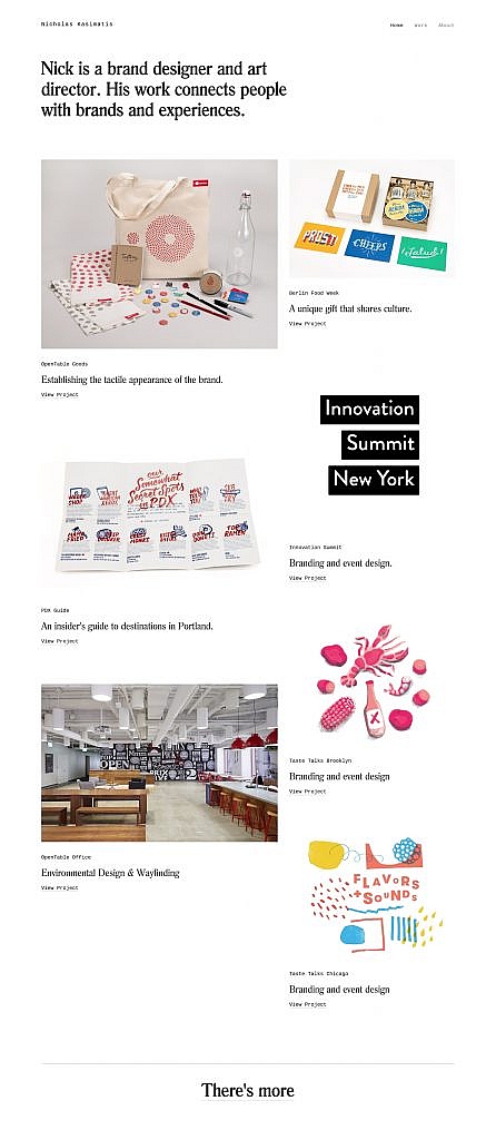
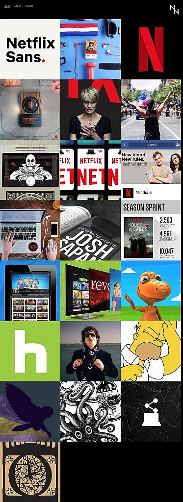
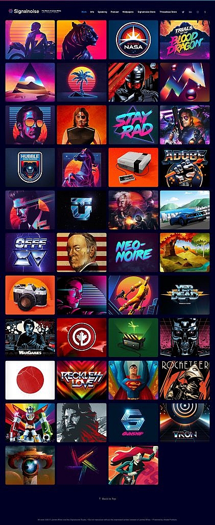
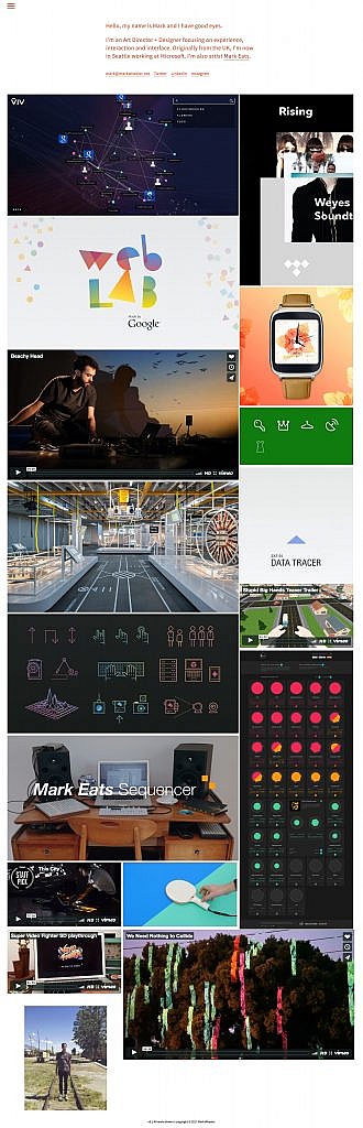
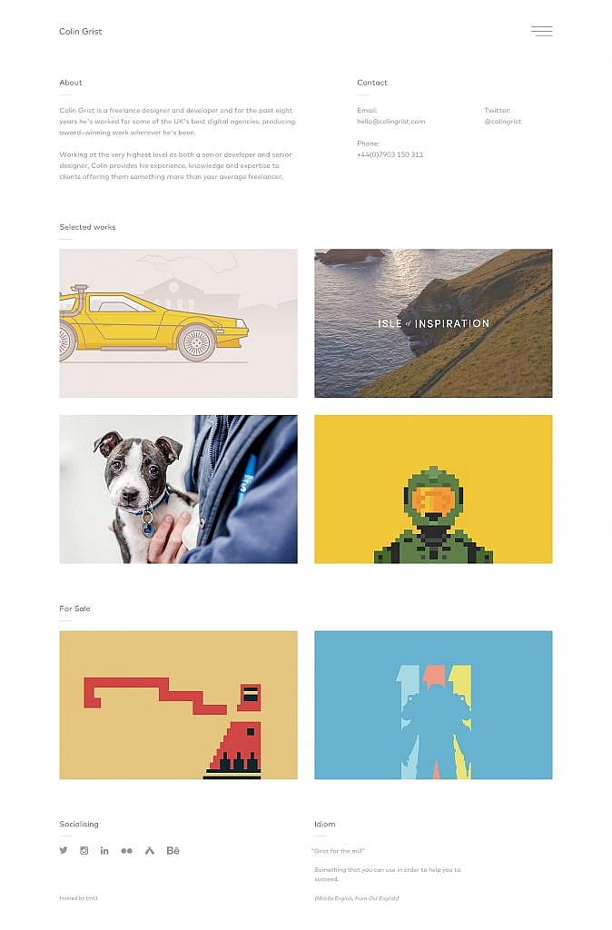
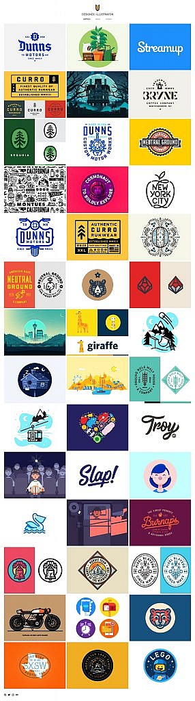
Working hard on your design portfolio never goes to waste. Having a stellar graphic design portfolio is the first step into your career as a graphic designer. It is the perfect opportunity to showcase your work and introduce potential clients and employers to your vision.
Since the best way to represent yourself as a graphic designer is to share the best of your work, you need to curate outstanding examples of your previous successes. Getting some exposure as well as showing you’re a constantly evolving designer is the way to stand out in the crowd in such a competitive market.
If you are looking for some inspiration to improve your portfolio, we have selected the best ones for you with tips on how to build your own.
Graphic Design Portfolio Tips
1. Keep it simple
The last thing you would want is to drown your potential clients by showing too much of your work. Here you should focus on showcasing your best designs avoiding cluttered images.
2. Try not to talk too much about your work
People tend to get bored very quickly when they’re focused on the result. So it’s best not to describe too much about your designs and let them express themselves.
3. Show different styles
Even if you have a certain established style, try to show different projects avoiding the same pattern for each example.
4. Reveal the process along with your end results
Including your work in progress like sketches shows how you handle challenges and how exactly you get there.
5. Don’t be afraid to reveal your personality
People love to see your personality when they’re deciding whether or not you’re the right choice for a project. Show who you are and the way you design with your own personal style.
Let’s dive into inspiring graphic design portfolio examples:
Now that you’ve seen them all, tell us your favorite graphic design portfolio in the comments and explain how it may help you with your portfolio! Remember, it is always valuable to get insights from other designers’ works. We hope that these graphic design portfolios will inspire you before you start improving yours and show the best of your work.
If you are also curious about web developers and would like to see the differences between web developer portfolios and graphic design portfolio examples we suggest you check out our article about best web developer portfolio examples.
As a developer, I appreciate how Angular apps are structured and the many options the Angular CLI makes available to configure them. Components provide an amazing means to structure views, facilitate code reusability, interpolation, data binding, and other business logic for views.
Angular CLI supports multiple built-in CSS preprocessor options for component styling like Sass/SCSS, LESS, and Stylus. However, when it comes to templates, only two options are available: HTML and SVG. This is in spite of many more efficient options such as Pug, Slim, HAML among others being in existence.
In this article, I’ll cover how you — as an Angular developer — can use Pug to write better templates more efficiently. You’ll learn how to install Pug in your Angular apps and transition existing apps that use HTML to use Pug.
Managing Image Breakpoints
A built-in Angular feature called BreakPoint Observer gives us a powerful interface for dealing with responsive images. Read more about a service that allows us to serve, transform and manage images in the cloud. Learn more ?
Pug (formerly known as Jade) is a template engine. This means it’s a tool that generates documents from templates that integrate some specified data. In this case, Pug is used to write templates that are compiled into functions that take in data and render HTML documents.
In addition to providing a more streamlined way to write templates, it offers a number of valuable features that go beyond just template writing like mixins that facilitate code reusability, enable embedding of JavaScript code, provide iterators, conditionals, and so on.
Although HTML is universally used by many and works adequately in templates, it is not DRY and can get pretty difficult to read, write, and maintain especially with larger component templates. That’s where Pug comes in. With Pug, your templates become simpler to write and read and you can extend the functionality of your template as an added bonus. In the rest of this article, I’ll walk you through how to use Pug in your Angular component templates.
Why You Should Use Pug
HTML is fundamentally repetitive. For most elements you have to have an opening and closing tag which is not DRY. Not only do you have to write more with HTML, but you also have to read more. With Pug, there are no opening and closing angle brackets and no closing tags. You are therefore writing and reading a lot less code.
table
 thead
   tr
     th Country
     th Capital(s)
     th Population
     th Currency
 tbody
   tr
     td Canada
     td Ottawa
     td 37.59 million
     td Canadian Dollar
   tr
     td South Africa
     td Cape Town, Pretoria, Bloemfontein
     td 57.78 million
     td South African Rand
   tr
     td United Kingdom
     td London
     td 66.65 million
     td Pound Sterling
Comparing the two versions of the table, Pug looks a lot cleaner than HTML and has better code readability. Although negligible in this small example, you write seven fewer lines in the Pug table than in the HTML table. As you create more templates over time for a project, you end up cumulatively writing less code with Pug.
Beyond the functionality provided by the Angular template language, Pug extends what you can achieve in your templates. With features (such as mixins, text and attribute interpolation, conditionals, iterators, and so on), you can use Pug to solve problems more simply in contrast to writing whole separate components or import dependencies and set up directives to fulfill a requirement.
Some Features Of Pug
Pug offers a wide range of features but what features you can use depends on how you integrate Pug into your project. Here are a few features you might find useful.
Adding external Pug files to a template using include.
Let’s say, for example, that you’d like to have a more succinct template but do not feel the need to create additional components. You can take out sections from a template and put them in partial templates then include them back into the original template.
For example, in this home page component, the ‘About’ and ‘Services’ section are in external files and are included in the home page component.
//- home.component.pug
h1 Leone and Sons
h2 Photography Studio

include partials/about.partial.pug
include partials/services.partial.pug
//- about.partial.pug
h2 About our business
p Lorem ipsum dolor sit amet, consectetur adipiscing elit, sed do eiusmod tempor incididunt ut labore et dolore magna aliqua. Ut enim ad minim veniam, quis nostrud exercitation ullamco laboris nisi ut aliquip ex ea commodo consequat.
//- services.partial.pug
h2 Services we offer
P Our services include:
ul
    li Headshots
    li Corporate Event Photography
HTML render of included partial templates example (Large preview)
Reusing code blocks using mixins.
For example, let’s say you wanted to reuse a code block to create some buttons. You’d reuse that block of code using a mixin.
HTML render of menu buttons mixin example (Large preview)
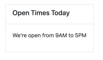
Conditionals make it easy to display code blocks and comments based on whether a condition is met or not.
- var day = (new Date()).getDay()

if day == 0
   p We're closed on Sundays
else if  day == 6
   p We're open from 9AM to 1PM
else
   p We're open from 9AM to 5PM
Inline JavaScript can be written in Pug templates as demonstrated in the examples above.
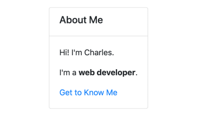
Interpolation is possible and extends to tags and attributes.
- var name = 'Charles'
p Hi! I'm #{name}.

p I'm a #[strong web developer].

a(href='https://about.me/${name}') Get to Know Me
HTML render of interpolation example (Large preview)
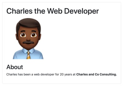
Filters enable the use of other languages in Pug templates.
For example, you can use Markdown in your Pug templates after installing a JSTransformer Markdown module.
:markdown-it
# Charles the Web Developer

## About
Charles has been a web developer for 20 years at **Charles and Co Consulting.**
These are just a few features offered by Pug. You can find a more expansive list of features in Pug’s documentation.
How To Use Pug In An Angular App
For both new and pre-existing apps using Angular CLI 6 and above, you will need to install ng-cli-pug-loader. It’s an Angular CLI loader for Pug templates.
For New Components And Projects
Install ng-cli-pug-loader.
ng add ng-cli-pug-loader
Generate your component according to your preferences.
For example, let’s say we’re generating a home page component:
ng g c home --style css -m app
Change the HTML file extension, .html to a Pug extension, .pug. Since the initial generated file contains HTML, you may choose to delete its contents and start anew with Pug instead. However, HTML can still function in Pug templates so you can leave it as is.
Change the extension of the template to .pug in the component decorator.
Install the html2pug CLI tool. This tool will help you convert your HTML templates to Pug.
npm install -g html2pug
To convert a HTML file to Pug, run:
html2pug -f -c [Pug file path]
Since we’re working with HTML templates and not complete HTML files, we need to pass the -f to indicate to html2pug that it should not wrap the templates it generates in html and body tags. The -c flag lets html2pug know that attributes of elements should be separated with commas during conversion. I will cover why this is important below.
Change the extension of the template to .pug in the component decorator as described in the For New Components and Projects section.
Run the server to check that there are no problems with how the Pug template is rendered.
If there are problems, use the HTML template as a reference to figure out what could have caused the problem. This could sometimes be an indenting issue or an unquoted attribute, although rare. Once you are satisfied with how the Pug template is rendered, delete the HTML file.
Things To Consider When Migrating From HTML To Pug Templates
You won’t be able to use inline Pug templates with ng-cli-pug-loader. This only renders Pug files and does not render inline templates defined in component decorators. So all existing templates need to be external files. If you have any inline HTML templates, create external HTML files for them and convert them to Pug using html2pug.
Once converted, you may need to fix templates that use binding and attribute directives. ng-cli-pug-loader requires that bound attribute names in Angular be enclosed in single or double quotes or separated by commas. The easiest way to go about this would be to use the -c flag with html2pug. However, this only fixes the issues with elements that have multiple attributes. For elements with single attributes just use quotes.
A lot of the setup described here can be automated using a task runner or a script or a custom Angular schematic for large scale conversions if you choose to create one. If you have a few templates and would like to do an incremental conversion, it would be better to just convert one file at a time.
Angular Template Language Syntax In Pug Templates
For the most part, Angular template language syntax remains unchanged in a Pug template, however, when it comes to binding and some directives (as described above), you need to use quotes and commas since (), [], and [()] interfere with the compilation of Pug templates. Here are a few examples:
//- [src], an attribute binding and [style.border], a style binding are separated using a comma. Use this approach when you have multiple attributes for the element, where one or more is using binding.
img([src]='itemImageUrl', [style.border]='imageBorder')

//- (click), an event binding needs to be enclosed in either single or double quotes. Use this approach for elements with just one attribute.
button('(click)'='onSave($event)') Save
Attribute directives like ngClass, ngStyle, and ngModel must be put in quotes. Structural directives like *ngIf, *ngFor, *ngSwitchCase, and *ngSwitchDefault also need to be put in quotes or used with commas. Template reference variables ( e.g. #var ) do not interfere with Pug template compilation and hence do not need quotes or commas. Template expressions surrounded in {{ }} remain unaffected.
Drawbacks And Trade-offs Of Using Pug In Angular Templates
Even though Pug is convenient and improves workflows, there are some drawbacks to using it and some trade-offs that need to be considered when using ng-cli-pug-loader.
Files cannot be included in templates using include unless they end in .partial.pug or .include.pug or are called mixins.pug. In addition to this, template inheritance does not work with ng-cli-pug-loader and as a result, using blocks, prepending, and appending Pug code is not possible despite this being a useful Pug feature.
Pug files have to be created manually as Angular CLI only generates components with HTML templates. You will need to delete the generated HTML file and create a Pug file or just change the HTML file extension, then change the templateUrl in the component decorator. Although this can be automated using a script, a schematic, or a Task Runner, you have to implement the solution.
In larger pre-existing Angular projects, switching from HTML templates to Pug ones involves a lot of work and complexity in some cases. Making the switch will lead to a lot of breaking code that needs to be fixed file by file or automatically using a custom tool. Bindings and some Angular directives in elements need to be quoted or separated with commas.
Developers unfamiliar with Pug have to learn the syntax first before incorporating it into a project. Pug is not just HTML without angle brackets and closing tags and involves a learning curve.
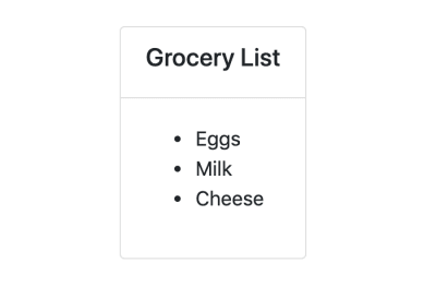
When writing Pug and using its features in Angular templates ng-cli-pug-loader does not give Pug templates access to the component’s properties. As a result, these properties cannot be used as variables, in conditionals, in iterators, and in inline code. Angular directives and template expressions also do not have access to Pug variables. For example, with Pug variables:
//- app.component.pug
- var shoppingList = ['Eggs', 'Milk', 'Flour']

//- will work
ul
   each item in shoppingList
       li= item

//- will not work because shoppingList is a Pug variable
ul
   li(*ngFor="let item of shoppingList") {{item}}
//- app.component.pug

//- will not work because shoppingList is a component property and not a Pug variable
ul
   each item in shoppingList
       li= item

//- will work because shoppingList is a property of the component
ul
   li(*ngFor="let item of shoppingList") {{item}}
Lastly, index.html cannot be a Pug template. ng-cli-pug-loader does not support this.
Conclusion
Pug can be an amazing resource to use in Angular apps but it does require some investment to learn and integrate into a new or pre-existing project. If you’re up for the challenge, you can take a look at Pug’s documentation to learn more about its syntax and add it to your projects. Although ng-cli-pug-loader is a great tool, it can be lacking in some areas. To tailor how Pug will work in your project consider creating an Angular schematic that will meet your project’s requirements.
Taking a stab in the dark is taking on a new meaning with the rise of dark mode design. One of the most requested features over the past few years, both Apple and Google have made a dark theme an essential part of their UI. But why is this? What are the benefits? Are there any pitfalls? These are the top things to consider when designing for dark mode…
Why Use Dark Mode At All?
We are on our phones almost constantly. The average person spends over four hours a day on their device and scrolls the height of mount Everest every year. These stats aren’t particularly shocking, and it only takes a walk down the high street or a journey on public transport to see almost everyone with their necks bent, staring intently at screens. We use phones for everything from phone tickets to entertainment, meaning we need them at all times. This is where dark mode can help…
The average person…scrolls the height of mount Everest every year
It Can Reduce Eye Strain
Apart from the aching neck and slight cramp of the thumb, being on our phones so often is also bad for our eyes and it’s predicted 2 in 3 will experience eye strain caused by excessive phone use. Dark mode is here to help with this, making the screen easier to see in low lighting such as in the night or early morning. It can be a lot easier on the eyes, causing less strain and is better in the long run.
It Can Save Battery
Dark mode has also been found to improve battery life. According to a recent test conducted by PhoneBuff, iPhone batteries can be extended by up to 30%. This is only true, however, if users have an OLED screen. This is where the pixels that are black draw no power, whereas the LCD counterparts draw the same amount of power no matter the color they are displaying.
You Can Play Around More With Designs
By implementing dark mode to a site, you can have a play around with different features. It’s about a lot more than just inverting white to black. You can play around with the colors and the look side by side and see which looks better. It could mean you are inspired for certain changes with the light site too.
Things to Consider
Switching to dark mode isn’t a magic fix, and it isn’t right for every project. It’s important that you consider the use of dark mode carefully.
Focus on Your Content
Dark mode puts more of an emphasis on the content areas of your interface, allowing certain content to stand out, while the surrounding areas fade more to background. It’s important to remember this when designing for dark mode and ensure the content which will be at the forefront has a strong focus.
Test Your Design in Both Light and Dark Mode
We’ve already established you can’t just invert your colors to make a site work in dark mode. But you can’t forget to test your sites in both modes too — after all, you don’t want the two interfaces to be so aesthetically different you can’t tell they are the same site, or that users get confused.
Work Out Your Color Palette
Ensure your default color palette is defined by function and not by color — don’t be afraid to add in new colors that work better. In dark mode you will be working with a color palette that has lighter foreground colors and darker background colors. Find a soft color scheme that works well and doesn’t have too many colors to it — it’s best to keep it simple. If you need a white background, ensure it is a slightly darker and softer white, so it prevents the background from glowing against surrounding dark content. Best practices recommend using a contrast level of at least 15.8.1 between the text and background.
Light text on a dark background can appear bolder…use a lighter weight for dark mode
Don’t Forget The Text
You need to ensure the text is still legible if the user turns the screen brightness to its lowest. After all, you want it to be dark, but still usable. Check if it has enough contrast and certain elements that are meant to be distinguishable from each other, are. Ensure the primary and secondary colors are separate from each other and easy to separate. Light text on a dark background can appear bolder than the other way around, so you may want to use a lighter weight for dark mode — experiment and see what looks best.
Ensure Users Can Switch Between Regular and Dark Mode
Some companies have adopted the approach of letting the system decide when to turn off and on the dark and regular theme, switching between the two when it thinks is best. This can be frustrating for the user and leave them not wanting to use the site or programme anymore. While it may be designed for optimum usage at certain times, let users make up their own minds and have control. Some may prefer to use dark or light mode all the time and not want to switch around; allow users to turn the dark theme on or off easily and based on their needs. Make the switch easy to find or users may get frustrated and close the site.
Ensure the Target Audience Are Kept in Mind
Before jumping straight into re-building an interface to the new dark-mode, it’s important to consider who the users are. If they are a younger and more chic audience who are on their phones more during the day and evening, dark mode is probably a good idea, however if they are older and more traditional, they will probably prefer the more “paper-like” interface. Do some research and figure out who uses the site and what for. Dark modes tend to decrease readability so is less likely to do well if the site in question is a blog or news piece. If it has simple content or is focused heavily on images or video, dark mode works well – Netflix is one of the best examples of this.
Pitfalls of Dark Mode
Dark Mode Doesn’t Work Well For All Sites
If the site you are designing is a very text-heavy or data-heavy or contains a vast variety of elements such as text, images, data and dropdowns etc. it can be a challenge to design. The main reason for this is trying to maintain a sufficient contrast which works well for all elements. Generally, all colors (except the palest, which are hard to see) work on a white background, whereas a dark background greatly eliminates the amount you can use.
Dark Mode Isn’t Always Better Eyes
While it can be better for those using regular mode in situations were light is softer (such as when you are going to bed or waking up), it has been found dark mode doesn’t always fix the problem. In bright light conditions the text can appear washed out which actually increases eye strain.
Dark Mode Might Not Align With Existing Branding
Due to the fact you need a more restricted color palette and many logos are designed with a white background in mind, dark mode might not align with a company’s existing branding. When the platform has many elements, this can be challenging, and the site may seem very inconsistent when switching modes.
Dark Mode Doubles Your Workload
As a designer, there is already plenty to be done when it comes to designing a site in normal mode, without the addition of a whole new site too. While yes, core elements are the same, it will still need to be re-worked and altered to sufficiently adapt to dark mode. This is a whole extra segment to the job which might not have been accounted for.
CSS was introduced to the web all the way back in 1996. At the time, most computer monitors were pretty terrible. The colors of CSS — whether defined with the RGB, HSL, or hexadecimal format — catered to the monitors of the time, all within the sRGB colorspace.
Most newer devices have a wide-gamut display. A gamut is the range of colors that can be displayed. A wide-gamut display is capable of showing more colors than sRGB. They use the Display P3 colorspace. (There’s also Rec.2020, an even larger colorspace, but that’s pretty rare and not currently worth thinking about.) As Lea Verou of the CSS working group put it, “Our websites are washed out because screens advanced faster than CSS Color did.” If we want to make full use of the range of colors that the majority of screens are capable of displaying, we need to use new CSS colors formats: lab, lch or display-p3.
Examples in the wild can be found on the website of Panic (creators of the once popular Coda text editor and the still very popular Untitled Goose Game) or the marketing site for a product called Playdate. They both make use of strikingly vibrant and intense colors that are uniquely vivid by making use of display-p3.
To get some idea of the range of colors that are missing from sRGB, check out the following Pen. The inner boxes contain a color beyond the sRGB gamut. The outer boxes show that color clamped to the sRGB color gamut (meaning the nearest equivalent color that a browser is capable of showing without using display-p3, lab, or lch). (Note that support is currently limited to Safari users.)
CodePen Embed Fallback
The color picker in Safari Technology Preview helpfully shows which colors lie outside of the sRGB color gamut.
Any color above or to the right of the white line lie outside of the sRGB gamut
A tale of new syntaxes
Before jumping into the syntax for lab(), lch(), and the color() function, let’s take a look at the new rgb() and hsl() syntaxes (which are supported in all web browsers, minus Internet Explorer).
In the older syntax, each number is comma separated: rgb(200, 100, 20);. Commas are no longer necessary, so the space separated value rgb(200 100 20); is valid. To specify transparency, we can now use rgb(200 100 20 / 50%) rather than using rgba() or hsla(). There’s no real benefit to the newer syntaxes but it’s worth looking at because they match the syntax for lch(), lab() and color().
lab(), lch() and color() always use space separated numbers (no commas allowed) and a forward slash followed by a percentage to specify transparency. Let’s take a look at how they work.
The CSS color() function and display-p3 colorspace
The color() function allows a color to be specified in a particular colorspace (rather than using the sRGB colorspace used by rgb(), hsl(), or hex). The colorspace we need to specify in order to use wide-gamut color is display-p3, which uses three numeric values, representing the red, green, and blue channels of the color: 1 0 0 is total red, 0 0 1 is total blue, and 0 1 0 is total green.
background-color: color(display-p3 1 0 0.331); /* vibrant pink color */
At the time of writing, display-p3 is the only way to access high-gamut colors, having been supported in Safari since 2017. However, lab() and lch() will be better options once they are implemented (Chrome and Safari are currently working on it). Here’s a take from Lea Verou:
display-p3 is not perceptually uniform, and is difficult to create variants (lighter or darker, more or less vivid etc) by tweaking its parameters. Furthermore, it’s a short-term solution. It works now, because screens that can display a wider gamut than P3 are rare. Once hardware advances again, color(display-p3 ...) will have the same problem as sRGB colors have today. LCH and Lab are device independent, and can represent the entire gamut of human vision so they will work regardless of how hardware advances.
A better lightness: Lab and LCH
You may have seen articles around the web arguing that HSL is easier to reason about than RGB or Hexadecimal values.
The real appeal of HSLa is that it makes more intuitive sense what changing the values will do to the color. Increasing the second value will increase the saturation of that color. Decreasing the third value will decrease the lightness of that color. That makes creating your own color variations on the fly way easier.
While HSL might be easier to understand than hexadecimal or RGB, it’s far from perfect. The way it calculates lightness simply doesn’t match human perception. According to HSL, hsl(240deg 100% 50%) and hsl(60deg 100% 50%) have the same lightness, 50%. Let’s compare the two.
CodePen Embed Fallback
To the human eye, the blue looks darker. As Brian Kardell puts it:
Doing things like mixing colors, lightening, darkening, can be done well only if they include a sense of how our eyes really work rather than how machines like to think about storing and displaying.
A trick for aesthetically pleasing gradients of the same color at different lightnesses is to convert to Lab, vary the L instead, and then convert back to HSL/RGB.
“The perceived brightness of all of the hues in a spectrum with the same saturation and lightness. […] It’s quite clear they’re different.” —Brian Kardell (Image: Rob Waychert)
Lab and LCH both use the CIELAB colorspace which is designed to align with human vision. If you give two colors the same lightness value, they appear to the human eye to have the same lightness, regardless of their hue.
Lab
background-color: lab(40% 83 -104); /* a shade of purple */
The L in lab() stands for lightness and is written as a percentage (which can go up to 400% for extra bright white, but will generally be between 0% and 100% ). A and B don’t stand for anything — they’re color channels. A is a numerical value between green (negative values) and red (positive values) while B is a numerical value between blue (negative values) and yellow (positive values). Lightness is pretty easy for us to understand. The red/green value and blue/yellow value, however, aren’t exactly intuitive. LCH is probably a better alternative.
LCH
background-color: lch(69% 56 244); /* a shade of blue */
lch() is the most human-readable of the new color values. L again stand for lightness (and works in exactly the same way), C is for chroma, and H is for hue. Chroma is largely analogous to saturation, but it can also be thought of as the color intensity or vibrancy. Unlike the other new color formats, you can actually predict the sort of effect changing these individual values will have — its similar to HSL in this way. The best way to get your head around it is to try out this LCH color picker.
Defining fallbacks
We have two kinds of support to think about: browser support for the new CSS color values and the ability of screens to display these colors.
Falling back to the closest matching sRGB value for browsers that don’t support color functions is easy and exactly like we’re used to defining fallback properties:
.pink-text {
  color: rgb(255, 0, 79); /* Will be used as a fallback */
  color: color(display-p3 1 0 0.331); /* Will be used if supported */
}
The second line of code in the example above will be ignored if the browser doesn’t understand it and the rgb() value will be used instead, thanks to the cascade. It would be laborious to type out two lines of CSS every time you want to specify a color. CSS variables are a great way to deal with this. In this example we’ll use @supports to tell if the browser has support for color functions in CSS:
There is a PostCSS plugin that converts lab() and lch() functions to rgb(). If you’re into Sass there is a tool from Miriam Suzanne called Blend.
A media query for color
@supports tells us whether the browser supports the relevant CSS syntax. What it doesn’t tell us is whether a user’s monitor can actually display certain color values. If a monitor doesn’t support high-gamut color, the screen will display the nearest equivalent sRGB color. This means all monitors are catered for without writing any extra code.
However, if you’d rather choose the fallback color manually yourself rather than let the browser calculate one for you, you can pass a second color value to the color() function. This would, however, require browser support for the color function (but support for the second argument hasn’t landed in any browser yet).
Should you need greater control to do something fancy, the Media Queries Level 4 spec brings a new color-gamut media query that can help us here.
@media (color-gamut: p3) {
  /* Code to run only on hardware that supports P3 color */
}
In this example, we are obviously checking for P3 support, but we could also check for the rec-2020 colorspace we alluded to earlier, which has an even wider gamut than P3. The number of screens supporting rec-2020 is currently minimal and only include high-definition televisions, meaning they won’t be a common target for developers in the near future. You can also check for sRGB support, but that is almost all monitors nowadays. The color-gamut query, on the other hand, has reasonably good browser support at the time of writing.
Sidenote: dynamic-range media query
In the Safari 13.1 release notes, the dynamic-range media query is is used to conditionally apply a P3 color. Apparently, that’s not a good use case. According to Florian Rivoal (editor of the Media Queries specification), this query is designed to be used for video:
[S]ome screen can show ultra-bright lights for brief amounts of times, that are used in videos for things like sparks, direct sunlight, etc. This is much brighter than white, and isn’t meant to be used with static images. It would be uncomfortable, and would also damage the screen.
One more sidenote: Design tool support
Unfortunately popular web design tools like Figma, Sketch and XD do not currently support Lab, LCH or P3 colorspaces. Photoshop, however, does have a Lab color picker.
There we have it! CSS colors are expanding at a time when screens support more colors than ever. It’s an exciting time for color nerds out there!
Artificial Intelligence (AI) is an addition to human intelligence, based on learning algorithms and neural networks as strategies for data selection, analysis and predictions.
It’s mostly used for replacement of manual work and as an alternative to finding new ways of solving issues. Due to the focus on computer science, AI has found its purpose in every field and industry. So, experts and businesses have been trying to use AI in places where processes depend on its application.
One of the industries where AI systems have been majorly employed is health care, aiming at providing a better quality of life to individuals and extending the lifespan of humanity. That’s the reason why many hospitals are relying on machine intelligence since it can be a replacement for performing specific tasks that would otherwise seek extensive manual work.
AI and Public Health
Through the implementation of AI technology, health care professionals are doing their jobs with more precision, especially when it comes to surgeries. In such cases, robots play a vital role as a helping hand to human doctors. However, despite the immense application of AI into the healthcare system, a particular AI program has also been deployed for disease control and prevention. Its role is to preserve public health.
Nowadays, we’re all concerned about the public health that has been put at risk due to the novel coronavirus. Also, about its effect on our lives, taking our freedom away. Even though AI development has helped the healthcare industry in the fight against the latest pandemic, it only refers to finding ways to cure and handle already infected patients.
So, the next imposed question is: How can strong AI help us take care of public health in addition to the techniques that we have been incorporating now?
And, the answer is – by relying on the use of AI surveillance and contact tracking systems.
Even though public health has always depended on AI surveillance, now in the current coronavirus pandemic, it has found more application than usual. For that purpose, in this article, we’ll go over the current AI-enabled surveillance systems that are used to handle the pandemic we’re all combating against – COVID-19. What is more, the AI practices can be further applied for any upcoming health programs to deal with new infectious disease outbreaks.
What Kind of Surveillance Practices Are Involved?
Even the cholera outbreak in the past has been controlled, thanks to the epidemiologic data gathered manually by experts. Over the years, the process of gathering the information and the techniques have changed and upgraded. However, the main goal remained the same – to track disease outbreaks and preserve public health.
Public health surveillance includes the process of detecting, tracking, as well as responding to infections that can have a devastating effect on the overall population. The monitoring can be local or global, depending on the situation. Even though much of the surveillance methods that are available nowadays include time series analysis along with the knowledge of public health professionals, a significant shift is expected due to the availability of new information sources.
Nowadays, most of the surveillance data come from sources such as data streams from mobile phones, apps, electronic medical records, location-related devices, as well as user-generated content, and Internet search queries.
How Are Different Countries Dealing with Infection Outbreaks?
The employment of AI-enabled surveillance systems has been evident even from the outbreak of COVID-19 in Wuhan, China. It included surveillance tools to monitor the movement and temperature of individuals and also tracking of travel data through the flights and mobile phones.
China went that far by accessing the credit card data of individuals and making this information available for hospitals, just so they are aware of their patients’ movement or travels. The AI research and core digital changes have created a new way of functioning for residents of East Asian countries. Sometimes these countries went that far by revealing the names of the infected people, just so the chain of reinfections was cut in the very core.
While it’s evident that East Asian countries have included surveillance in every possible way, Western countries have been more reserved in “disrupting” the privacy of individuals. However, the results of the massive AI-enabled monitoring have shown results, since China has put an end to the pandemic, compared to the democratic approach in the European countries and the US where the number of cases is still on the rise. So, is there an option to use AI-surveillance without sacrificing privacy?
The truth is that even though European and American citizens might feel that this is intrusion and violation of their human rights, the examples from the countries that have deployed strict AI surveillance measures show a success.
Some of the regulations that most countries have conformed to are the stay at home recommendations and avoidance of social gathering. The measurements by the centers for disease control include social distancing, social isolation and quarantine that can be monitored by apps tracking the location of smartphones.
What is the Outcome?
We believe that through enhanced surveillance, and the AI features – deep learning and computer vision, countries will eventually keep a step ahead of the invisible virus. Besides, it’s a fact that even after COVID-19, there will be heightened surveillance. Moreover, it’s up to the government and people to use it in their favour.
Even though some of us might have doubts concerning AI, we should all welcome the benefits it offers. Why not consider AI-enabled surveillance as a tool that can keep us all safe, rather than something that will affect our privacy?
In the end, the future of technology and AI isn’t a science fiction project, but something that we can all see right in front of our eyes and take advantage of.