Twitter is known and recognized as one of the best social networking sites throughout the world. It is a good medium for any serious blogger to get loads of quality traffic to his blog, if that person knows how to go well about it.
But, it is unfortunate that twitter doesn’t allow users to post more than 280 words per update, and that gave bloggers the challenge of trying to make their messages as short as possible. Though, that teaches most of the bloggers the ability to make their tweet as short and informative.
But, do you know that even, as short as your tweet is, it can make or break your online business? Yes, you can ruin your blog’s reputation with your tweets. And that is why you need to be more personal with your followers while posting updates, and follow the simple guide to Twitter’s effectiveness as explained in this post. And you shall reap the true benefits of using Twitter for your online business branding.
To become Uber-successful in life as a blogger, you need to know the act of doing what you love to do most at all times. Twitter is a platform where you post latest tweets about your blog posts or other resourceful links on other websites for your followers to read and learn from.
It isn’t more than sharing the latest and useful information with the group of people who are very much interested in whatever you are willing to share with them – they are called followers on Twitter, unlike Facebook where they are called friends.
I have listed below seven twitter imperative steps you must take to enjoy staying on Twitter to the fullest while building your business, and creating a remarkable name for yourself with a large follower-base.
So these seven steps are in the form of advice for anyone who wants to build a large following on Twitter within a short possible time, and have them be loyal to all the information that you are offering them.
1. Watch your Speech & Grammar
When you are updating your Twitter profile, you must make sure that you check all the sentences in your tweet. As tiny as the message is, just 280 words, it could go way along to help you drive more people to your business page or blog.
And likewise, those short sentences could also convince people to have bad impressions about your business, which could lead to them having no respect for your brand anymore as they used to do before.
You need to check your grammar and the way you build your sentences before hitting the update button. Never use grammar mistakes that would need people to check the dictionary before they can understand your messages. Until you aren’t teaching linguistics on your blog. Say what you have to say in simple and plain English.
2. Don’t ever engage in insulting others, always stay calm
Never show any sign of attacking people with your tweets. Always behave yourself with those tiny tweets. Don’t ever engage in ad hominem attacks on other Twitter users as this could make people lose the trust in you and it could also lose your reputation.
And in case the person you were tackling the issue with was later found not guilty of the claims levelled against him, how would you want people to see you in the industry?
Taking issues too personal won’t help you anyway as a blogger. So you must learn to think straight, think about your follower’s trust in you, and never allow anything to defraud you of those trusts.
3. Don’t always respond to critics
Critics exist everywhere and you must disregard them if you want to move ahead in your industry. There are many trolls out there whose jobs are mainly to see what is good and refers to them as something too bad. So you must know that this group of people exists from the onset.
Knowing this will help you a lot in avoiding them in case they came on board, attacking you via Twitter. As a blogger, one person I can point to who could show you exactly how to deal with internet trolls is Pat Flynn; he had dealt with many internet trolls before, and you can learn a lot from him in dealing with them to attain your top position in life as a blogger while using twitter.
4. Focus on just the real fact
Your blog should contain the real information about what you’re about to introduce to your audience on Twitter while the link has to contain the description of the information only – not the whole thing due to space. Never waste time and spaces in trying to fake it for your followers in order to click-through.
You must not try to share everything in that short post, but the catching description of the post or content of the link. With this technique, they will surely click through with the hope of reading the real information embedded in that link either on your blog or someone else’s blog on the internet.
Sharing useful tips and guides with your followers’ everyday could land you great loads of traffic more than what you’re currently getting from that same medium.
Say the fact only and leave the rest for them to click through if they found the information useful to their daily living needs.
5. Stay Unbiased at all the times
You must know that whenever twitter influencers in your industry are making claims of an amount of money they are able to earn online within a particular period of time, they aren’t doing this to make you feel bad about your inability to do likewise.
They are either proclaiming it to encourage you to work extra hard in order to get similar results, or to show you their progress along the line in their respective businesses. And those actions don’t need to bother or irritate you in anyway.
So, stay unbiased and balanced, and never allow those claims to destroy your reputation by believing they’re after your downfall when they are progressing.
6. Stay in touch within your reach, don’t do politics on Twitter
Don’t jump into all conversations on twitter if it is a diverse conversation to what your readers are more familiar with. Always remain in your niche and share what your readers want – and not what the industry you are interested in are saying.
For example, if you aren’t blogging about politics, you shouldn’t engage yourself in tweeting links and information related to such an industry onto your Twitter followers (doing this occasionally is OK but don’t do too much of this).
Stop dilly-dallying here and there on social media websites, especially on Twitter. Face one niche and stay active in tweeting information, news, guides that are related to that niche with the right subject matter. Because as you know your followers are interested to learn about those topics.
Unless political matters are about to affect your niche (area of interest or expertise); positive or negative things never engage in joining the political train. In a situation like anything which could touch every industry on the internet if it was truly implemented, you could share information as such since it is going to affect the whole internet users – including you and your readers.
7. Never Make Jest of Others in Your Tweets
You should know that mistakes done by others shouldn’t be repeated by you as a blogger. You must learn to stay balanced and never engage yourself in laughing someone off on Twitter because of its consequences on the long run.
Final Words to Twitter Success
Following these seven steps will certainly help you become more successful as a blogger while using Twitter to market your blog and business.
You need to understand that, the people who are visiting Twitter everyday are real people just as you are, and they must be treated as you want to be treated by others.
Manuel Matuzovi? details 10 bad HTML patterns for a close button. You know, stuff like this:
<a class="close" onclick="close()">×</a>
Why is that bad? There is no href there, so it really isn’t a link (close buttons aren’t links). Not to mention the missing href makes this “placeholder link” unfocusable. Plus, that symbol will be read as “multiplication” or “times”, which is not helpful (an “x” isn’t either).
What do you use instead?
There are plenty of good patterns too. If you prefer the visual look of a ×, then…
Today at Jamstack_Conf, Netlify announced Build Plugins. What it does is allow you to have particular hooks for events within your build, like when the build starts or ends. What’s nice about them is that they’re just a plain ‘ol JavaScript object, so you can insert some logic or kick off a library just the way you typically would within your application.
A “Build” is when you give your site to Netlify either via GitHub/GitLab/etc., or by literally just dropping the directory into the interface, Netlify will process all the assets, download and install packages, and generate a static version of the site to deploy to CDNs all around the world.
What the Build Plugin does is give you access to key points in time during that process, for instance, onPreBuild, onPostBuild, onSuccess, and so forth. You can execute some logic at those specific points in time, like this:
module.exports = {
  onPreBuild: () => {
    console.log('Hello world from onPreBuild event!')
  },
}
You don’t only have to build them yourself, either! You can use build plugins that have been made by the community. There are very interesting ones, such as a11y, Cypress for testing, Inline Critical CSS, and my personal favorite, Subfont, which optimizes fonts for you in a really incredible way (you can watch a video about that).
Enable them through the dashboard through a few button clicks:
Ethan on the thinking and research that inspired the term:
Around that time, my partner Elizabeth visited the High Line in New York City shortly after it opened. When she got back, she told me about these wheeled lounge chairs she saw in one section, and how people would move them apart for a bit of solitude, or push a few chairs together to sit closer to friends. We got to excitedly chatting about them. I thought there was something really compelling about that image: a space that could be controlled, reshaped, and redesigned by the people who moved through it.
I remember spending that evening reading more about those chairs and, from there, about more dynamic forms of architecture. I read about concepts for walls built with tensile materials and embedded sensors, and how those walls could bend and flex as people drew near to them. I read about glass walls that could become opaque at the flip of a switch, or when movement was detected. I even bought a rather wonderful book on the subject, Interactive Architecture, which described these new spaces as “a conversation” between physical objects or spaces, and the people who interacted with them.
After a few days of research, I found some articles that alternated between two different terms for the same concept. They’d call it interactive architecture, sure, but then they’d refer to it with a different name: responsive architecture.
Fascinating.
Responsive web design is so locked in now a decade later it’s just an assumption. I would have called it an assumption in half that time. My answer in an interview…
Is responsive something that you have to sell in any more or does everyone get it now?
I think that responsive design was an assumption in 2015. Even then, if you delivered a website to a client that was just a zoomed out “desktop” website they would assume it’s broken and that you didn’t really do your job. Today, even more so. It’s just not done.
The technical side of responsive design is fascinating to me of course. Even Google has guides on the subject and highly encourages this approach. But the core technical implementation isn’t particularly complex. Stay fluid; use some @media queries to restyle things as needed.
The bigger deal in the last decade was the impact on businesses. Adjusting workflows to accommodate this style of thinking. Combining teams of developers who used to work on entirely different codebases now working on a single codebase. The impact at organizations wasn’t nearly as straightforward as the technology of it all.
There is a resonance between that and more recent shifts in the world of building websites, like the astounding rise of design systems and, even more so, the Coup d’état of JavaScript.
If you spend enough time interacting with digital accessibility practitioners, you may encounter the phrase “equivalent experience.” This saying concisely sums up a lot of the philosophy behind accessibility work.
Our industry tends to place a lot of focus on how, often at the expense of why. For accessibility-related concerns, it is vital to learn about the history, and lived experiences of disabled people as a context for understanding the need for design and code created with access in mind.
This is the first of two articles on the topic of equivalency, and how it relates to digital accessibility. It will help us define what an equivalent experience is. Once we have a common understanding established, I’ll then discuss how to go about implementing equivalent experiences for common accessibility-related issues.
The State Of Things
The truth of the matter is that even though we live in a multi-device world full of smartphones, augmented reality, voice assistants, and IoT smart sensors, our default is still predominately:
Visual,
large screen,
fast connection,
powerful computer and display,
male,
white,
wealthy,
young,
Western,
technologically-literate,
and abled.
This is reflective of the biases that are inherent in how we design, develop and grow products.
The previous list may not be the most comfortable thing to read. If you haven’t closed the browser tab already, take a moment to consider your daily workflows, as well as who your coworkers are, and you’ll begin to understand what I’m getting at.
At its core, delivering an equivalent experience is ultimately about preserving intent — with the intent being the motivating force behind creating a website or web app and all the content and features it contains.
This translates to making the meaning behind every interaction, every component, every photo or illustration, every line of code being understandable by the widest range of people, regardless of their device or ability.
If you’re the kind of person who is into podcasts, his A11y Rules has a wonderful series called Soundbites. It features “short discussions with people with disabilities about the barriers they encounter on the web.” These insightful interviews also touch on what this article discusses.
What Isn’t An Equivalent Experience?
Showing examples of what something is not can be a way to help define it. For equivalent experiences, an example would be a web app geared towards use by the general public not having a mobile breakpoint.
It’s not difficult to imagine a situation where I’d want to adjust my work benefits while on the go. (Large preview)
With this example, everyone using a device with a small display is forced to pinch, pan, and zoom to get what they need. Here, the burden is placed on anyone whose only crime was using a smartphone.
Most likely, whoever conceived of, designed, and developed this didn’t stop to think about circumstances other than their own. In this sort of (unfortunately still all too common) scenario, I all but guarantee that the web app looks great on the laptops or desktops of the designers and developers who made it.
A designer saying, “it has enough contrast for me and my ‘old’ eyes” is the same as when a dev says, “works on my machine.”
The thing is though, we don’t design or develop for ourselves.
So, are we really ok with saying, “you don’t matter” to folks who are not like us? #a11y
People using a smartphone to access this website are victims of circumstance. The extra effort someone needs to do to get it to work indirectly communicates that they weren’t a priority, and therefore not valued. If you’ve used the web for any significant portion of time, I’m willing to bet this, or a similar experience has happened to you.
This example is also a hop, skip, and a jump away from another common, yet serious accessibility issue we often don’t consider: screen zooming:
Screen Zooming
Screen zooming is when someone is prevented from being able to zoom their displays and make text larger—many native mobile apps are guilty of this. When you disallow this sort of behavior, you’re telling prospective users that unless they have vision similar to you, you aren’t interested in them being able to use your app.
For this scenario, a gentle reminder that we will all get older, and with aging comes a whole host of vision-related concerns. A question you should be asking yourself is if your future self will be capable of using the things your present self is making. A follow-up question is if you’re also asking the people you’re managing this.
I just had my eyes dilated, so I can’t read any text that isn’t comically large. I don’t know how to use a screen reader. I’ll be fine in a few hours, but this has been a fascinating journey into how well third-party iOS apps respect text size accessibility settings!
This might be a little difficult of a concept to grasp at first. Let’s use this Rube Goldberg machine made by Joseph Herscher to pass the pepper to his dinner guest to compare:
To pass the pepper, the machine, sends it through an elaborate system of weights, counterweights, ramps, rolling objects, catapults, guillotines, burners, timers, carousels, etc. — all constructed from commonly found kitchen items. While this setup will technically ensure the pepper is passed, it is an annoying, overwrought, time-intensive process.
Many digital experiences are a lot like a Rube Goldberg machine when it comes to accessibility. Since accessibility issues are so prevalent, many forms of assistive technology provide a large suite of features to allow their user to work around common obstacles.
Unfortunately, discovering obstacles, and then figuring out and activating the appropriate combination of features to overcome them can take a disproportionate amount of time and effort.
To say it another way: A simple click on a button for an abled person may take far more time and effort for a disabled person, depending on how the button has been made.
Chilling Effects
Frustratingly, the extra time and effort a disabled person has to put into operating a technically accessible experience may feed back into their disability condition(s). For example, the presence of a motor control disability such as arthritis may make the overall experience even more taxing.
Cognitive accessibility concerns are also another important thing to consider. What may seem easy to understand or intuitive to use for one person may not be for another. This is especially prevalent in situations where there is:
Cognitive accessibility isn’t an abstract concern, either. Poor user interface design that ignores the circumstances of the end user and dumps too much cognitive load onto them can have very real, very serious consequences.
The military is full of examples of poor interfaces being forced on people who don’t have a choice in the matter. It’s also one of the origins of Inclusive Design thinking. (Large preview)
Compounding Effects
These factors are not mutually exclusive. Proponents of Spoon Theory know that inaccessible experiences conspire to sap a person’s mental and physical energy, leaving them exhausted and demotivated. Worse, these sorts of scenarios are often more than just a person perpetually operating at a diminished capacity.
Frustrating digital experiences can lead to a person abandoning them outright, internalizing the system’s fault as their own personal failure. This abandonment may also translate to a person’s willingness and ability to operate other digital interfaces. In other words: the more we turn people away, the more they’ll stop trying to show up.
“Nobody has complained before” is a silly excuse for not caring about accessibility. You’re right, they didn’t complain. They left.
The way the web is built — its foundational principles and behaviors — make it extraordinarily adaptable. It’s us, the people who build on and for the web, who break that. By failing to consider these devices and methods of interacting with web content, we implicitly drift further away from equivalency.
Consistency
For some, assistive technology can mean specialized browser extensions. These micro-apps are used to enhance, augment, and customize a browsing experience to better suit someone’s needs.
Damien Senger, digital designer, uses a browser extension called Midnight Lizard to enforce a similar experience across multiple websites. This helps them “to focus on the content directly and to limit having too big differences between websites. It is also helping me to avoid too harsh color contrasts that are really uncomfortable.“
Damien also writes, “Often websites are really difficult to read for me because either of the lack of consistency in the layout, too narrow lines or just not enough balance between font size and line height. Related to that, color can create a lot of unhelpful distraction and I am struggling when too harsh contrast is nearby text.”
Consistent application of color can also help communicate what elements can be interacted with, so long as it is not just the color alone that indicates interactivity.
Ensure that text content is written using text (not presented as an image), allowing it to be read aloud, restyled, and reformatted.
Understand that branding includes how something behaves, responds, and reacts in addition to how it looks.
In addition, Damien also augments their browsing experience by using ad blocking technology “not only for ads but to block animations or content that are too distracting for my ADHD.”
It’s not too difficult to imagine why distracting and annoying your users is a bad idea. In the case of ads, the industry is unregulated, meaning that rules to prohibit ADHD, migraine, and/or seizure-triggering animations aren’t honored. Through this lens, an ad blocker is a form of consumer self-defense.
I’ll say it again: Telling users their access isn’t as important as your bottom line is a BAD take. Ads are fine as long as they don’t create a barrier by moving! #ADHD#A11y#PSH#WCAGhttps://t.co/i6mifI0JRE
Kenny Hitt also chimes in about ads: “…regardless of the platform, the thing that annoys me most are websites with ads that essentially cause the site to constantly auto update. This prevents me as a screen reader user from reading the content of those websites.”
Again, a lack of regulation means the user must take measures into their own hands to keep the experience equivalent.
A lack of an equivalent experience translates directly to lost opportunity. Many individuals I spoke with mentioned that they’d abandon a digital experience that was inaccessible more often than not.
Brian Moore mentions, “there are web sites where I like their products a lot but won’t buy them because the site itself is such a struggle, and attempts to reach out have met with either silence or resistance to taking any action.”
Brian cites the Fluance website as the most recent example. The bugs present in its shopping user flows prevents him from buying high-end consumer audio equipment.
Fluance’s entire web presence exists to sell products. While updating a website or web app to be accessible can be an effort-intensive process, it would definitely be in Fluance’s best interest to make sure its checkout user flow is as robust as it could be.
Opportunity isn’t limited to just e-commerce, either. As more and more services digitize, we paradoxically push more people out of being to live in the society that relies on these digitized services—people with protected rights. Again, this shift away from an equivalent experience is the culprit.
Justin Yarbrough was “applying for an accessibility-related job with the Arizona Department of Economic Security over the summer, where they wanted me to take an assessment. The button to start the assessment was a clickable div. They wound up waving the assessment requirement for the position.”
Jim Kiely tells me about his brother, who “has stopped paying his water bill online because the city water website [doesn’t] work well with a screen reader and high contrast.”
Personally, I have friends who have been prevented from submitting résumés to multiple sites because their job application portals were inaccessible.
How To Maintain Equivalency
Use semantic markup (the button element for buttons, the anchor element for links, input and label elements for forms, etc.).
Soren Hamby, product marketing manager and design advocate, writes of their experiences using screen magnification software and screen reading capabilities. Soren has “varying levels of vision so [they] tend to not always need the same level of accommodation.”
Of note, Soren mentions their struggles with grocery delivery apps, specifically “the carts often only read the quantities rather than the item name. It’s much easier to order with a sighted person.”
There are three things to consider here:
First is the surface-level acknowledgment that the app operates differently for different people, the main point this article is driving at.
Second is the fact that Soren uses multiple forms of assistive technology, with the mix a shifting combination depending on a combination of their task at hand and how well the digital interface meets their access needs.
Avoid using fixed and sticky-scrolling components, especially larger-sized ones.
Test your layouts by zooming and/or increasing your default type size to make sure that content does not get obscured.
This brings us to our third and most important point:
Autonomy
Having to rely on the help of a sighted person to order groceries is not ideal. For many, the acquiring, preparation, and consuming of food can be highly personal acts. Being forced to incorporate outside assistance into this process is far different than willingly inviting someone in to share an experience. The same notion applies to every other digital product, as well.
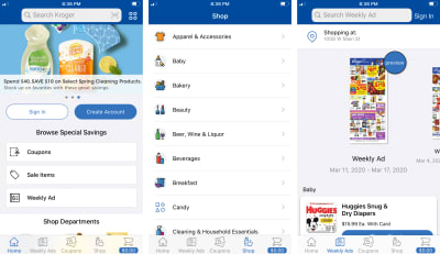
Kenny also mentions grocery apps: “…my local Kroger grocery store has started an app redesign in June 2019 that is breaking accessibility with their app.” In discussing this regression, he goes on to elaborate, “Because I can’t financially change to another business, I won’t let it drop. Kroger is going to discover that I don’t stop with a problem. Persistence in solving problems is a requirement for any disabled person if you want to succeed in the world.”
This app looks great, provided you can see it. (Large preview)
Another recent case involves the Domino’s Pizza franchise. Taken all the way to the Supreme Court, the ruling clearly and unambiguously states that preventing someone from using a website or app, simply because they used screen reading software, is unconstitutional.
For both cases, the cost to implement fixes were far cheaper than going to court—something to think about the next time you’re deciding where to order pizza.
Despite some ugly misconceptions about the ruling, the evidence is clear: in the United States, there is now legal precedent for private companies to be sued for violating civil rights via an inaccessible digital experience. Europe and some parts of Asia have similar laws, as well.
How To Maintain Equivalency
Understand that technical decisions can have legal consequences.
Honor the law and don’t create circumstances that lead to discrimination.
Add manual and automated accessibility checks to your design and development workflows.
Reactivity
Another way to maintain an equivalent experience — one that is often not thought about — is to give reports about accessibility issues the same weight and concern as other software bugs.
Reported accessibility issues are oftentimes downplayed and ignored, or are sent to someone ignorant of the issue and/or powerless to fix it.
Kenny, who started using a computer with a screen reader in 1984 says, “When I run into accessibility issues nowadays, I’ll try reporting it, when I get the usual response from the feedback of the person not caring, I just give up and walk away. If [the response] comes from somebody in marketing who doesn’t understand accessibility, I just give up and go away. There’s no point in trying to teach these people about accessibility.”
Kenny’s view is shared by many others in the disability community. Remember what I said about compounding effects earlier.
Brian reports that,
“If I find significant issues with a site, I do report it. Depending on who I talk to it ranges from ‘here’s what doesn’t work’ to all kinds of technical detail about why if I can get to the right people.”
Getting it to the right people is key. Another part of equivalent experience is handling feedback in a timely and constructive way, much as how you would with any other issue with your product or service.
Responding to an accessibility issue is easy:
Thank the person for taking the time and effort to report the issue.
Acknowledge the issue and identify what person or team will be handling it.
Ask clarifying questions as needed.
Offer potential workarounds, with the understanding that they’re only temporary until the underlying issue is addressed.
Offer to involve them in the process, including notifying them when the issue has been fixed.
Being open, honest, and transparent about your bug fixing process goes a long way to establishing trust in a population that has historically and routinely been overlooked.
Also know that assigning someone to mind an email address to conduct tasks on behalf of an assistive technology user is not an appropriate, effective, or sustainable solution. Remember the concerns surrounding autonomy discussed earlier.
How To Maintain Equivalency
Create an accessibility statement, including known issues, a tentative timeline for their fixes, and easy to discover contact information.
Ensure that anyone customer-facing (quality assurance, customer support, marketing, etc.) are trained on protocol for accessibility-related issue reporting.
Quantify accessibility-related issues, both internal and reported.
Be on the lookout for patterns and trends with discovered accessibility issues, as they represent learning opportunities.
Understand that not all platforms to collect feedback are created equal.
Motivation
We’ve covered actual people’s everyday frustrations, as well as civil rights and the current legal landscape. If these don’t motivate you, allow me to present another factor to consider: profit.
There are two provoking studies I’d like to call attention to, but they are by no means the only studies performed in this space.
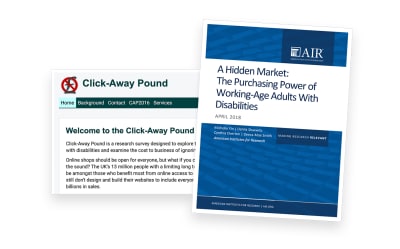
First is the Click Away Pound Survey, a survey conducted in both 2016 and 2019 to “explore the online shopping experience of people with disabilities and examine the cost to business of ignoring disabled shoppers.”
The survey discovered that more than 4 million people abandoned a retail website because of the access barriers they found. These people represent 17.1 billion pounds (~$21.1 billion USD) in lost potential revenue.
Second is the The Purchasing Power of Working-Age Adults With Disabilities (PDF), conducted in 2018 by the American Institutes for Research. This study discovered that there is an estimated $490 billion in disposable income amongst disabled working-age adults. That’s billion with a capital B.
There are two of the (many) takeaways from these studies I’d like to highlight:
First is that from a historical perspective, the web is still very much new. On top of that, its ubiquity is even more recent, meaning that use by the general population is a small sliver of the amount of time it’s been around.
Second is that the general population contains many people who are disabled, and that their needs are not being met. These unmet needs represent billions of dollars of potential revenue.
This is a gigantic market that we, as an industry, are only now becoming aware of. Rather than approaching accessibility with a mindset of risk aversion, why not use this learning as a great way to view your current and future business opportunities?
Complying with the ADA is by definition the legally required minimum for accessibility. It doesn’t account for a good user experience, usability, and innovation. Unless you strive for the minimum all the time, compliance is not enough.https://t.co/qOYw6ji23u
Too often we think of accessibility as a problem to be solved, rather than a way of looking at the world. Equivalent experiences necessitate that we question our assumptions and biases and think about experiences outside of our own. It can be an uncomfortable thing to think about at first, but it’s all in the service of making things usable for all.
As web professionals, it is our job, and our privilege to ensure that the experiences we deliver are equivalent. In the second part, we’ll investigate how to do just that.
Want to learn how to increase your content marketing ROI? Are you looking for content marketing tips that will boost your return on investments? This article will show you how in a moment.
Content marketing is a profitable business undertaking. But you need to produce insightful materials that connect with your ideal reader frequently. However, you may also use existing blog content to boost your ROI.
It all depends on your content marketing objectives. For example, your goal could be to:
Achieving these goals takes time and effort, but the outcome is all that matters. So, with a viable marketing approach, you can increase your ROI faster than you imagine.
But before we go further, let us define content marketing ROI.
What Is Content Marketing ROI?
Content marketing ROI is a primary aspect of your content marketing campaign. It highlights the benefits you obtain from investing time, effort, including money into creating, distributing, and promoting your materials.
Thus, content marketing ROI is the ratio that reveals the profit you generated from your content marketing effort as against the amount you spent. So, it is a vital marketing metric of a successful content marketing campaign.
However, you should know how to quantify your return on investments (ROIs) to identify the gains and losses you made. Your ROI helps you to see how well you performed, or the effectiveness of your content marketing activities over time.
So, let us look at the most natural way to calculate content marketing ROI.
How to Calculate Content Marketing ROI
There are several ways of calculating ROIs and still arrive at the same result. But, the simple formula for estimating your content marketing ROI is; net earning/profit – total investment / total investment x 100. See the screenshot below:
Graphic by the author.
For example, let’s say you invested a total of $400 into your content marketing program, and generate total revenue of $2,000. Your net profit is 400%. How is that so?
Here is how to do it;
Total return $2,000 — $400 total investment = $1,600 net income.
Therefore, $1,600 net income / $400 total investment x 100 = 400%.
So, from the calculation, you can see that your content marketing ROI is worth your effort with a 400% profit after expenses. Nonetheless, I stated earlier that your content marketing success is not always monetary gains.
It is about the goals you want to achieve, as outlined in the introduction of this article. But understanding your ROI is essential as it helps you know whether you’re reaching your goals or not.
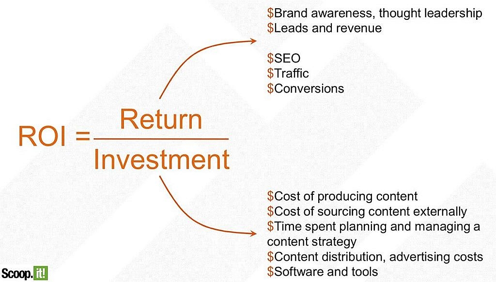
Here’s a graphic by Scoop.it that shows content marketing objectives and possible investment. For more on how to measure your ROI and the metrics to evaluate, read this post by Optinmonster.
Graphic via Scoop.it
Why You Need to Understand Your Content Marketing ROI
As stated earlier, understanding the ROI of your content marketing effort is crucial because it lets you know whether your marketing activities are paying off or not. Else you may be wasting your energy without knowing it.
For instance, content engagement and brand discovery are vital factors that determine your content marketing success. But your content objective may not be the dollar but other marketing goals, such as:
Social media shares
Increased engagement
Backlinks
Conversions
Thus, publishing tons of blog posts regularly is not sufficient to make you a success. But you will have success if the blogs you publish harmonize with your targets.
So, if you do not understand your ROI, you won’t be able to measure those metrics. As a result, determining your content marketing ROI becomes impossible. That is why you need to understand your content marketing ROI to help you measure and improve your campaign based on the results.
How to Improve Your Content Marketing ROI In 7 Simple Steps
While there are different ways to boost content ROI, I have put together the top six content tips that are proven to work.
1. Improve Your Website User Experience (UX)
While publishing quality content is vital, the platform where you serve your blog posts is also critical. So, do NOT neglect it. If users find your blog or website unattractive, they will bounce.
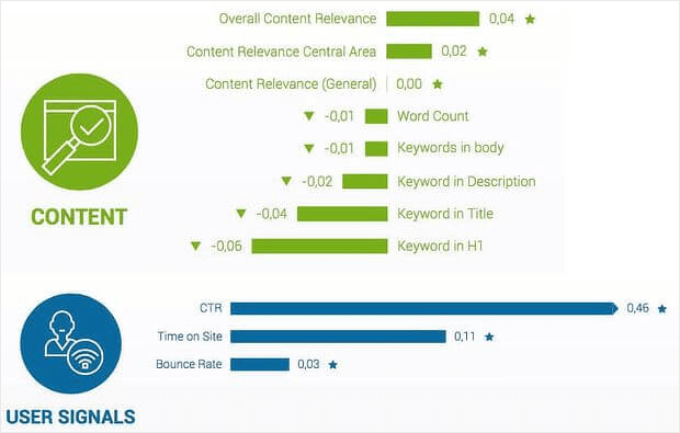
But an engaging and attractive blog will draw in more readers. Moreover, as part of Google ranking factors, it will increase your Google search ranking. Google has been using user signals via AI (RankBrain) to rank web pages.
Source graphic via Optinmonster.
The user signals it employs include:
Click-through rate
Time on page
Bounce rate
Google also uses the overall content relevance to determine your page rank. It means that if searchers from Google land on your page and interact with your content without returning instantly to the search page, Google will think your content is relevant to the user’s needs.
But if a searcher lands on your page and returns to Google search immediately, Google will conclude that your content is not relevant to the search query. And if more users should bounce without any interaction with your page, Google deems your blog posts irrelevant.
In consequence, it becomes a challenge to rank your site. Users must be able to access your blog and find value. So, to improve UX, your website must be accessible to users. It should load fast and easy to navigate.
Also, your blog posts should be:
Valuable
Useful
Credible
Accessible
Google utilizes these indicators to rank your blog or website. So, if you’re not sure about your site, evaluate it, and make necessary adjustments to enhance website UX. You may want to look at the factors that impact the user experience.
2. Create a Content Marketing Strategy and Document It
Content marketing helps you connect with your target buyer; that is why it is the most crucial asset that should be in your digital marketing toolbox. It helps you:
Educate your audience
Build trust
Nurture subscribers
Encourage leads, and
Convert prospects to loyal customers.
But for your content marketing campaign to be effective, you need to create a content marketing strategy. A viable content strategy is a system or framework that guides you in all touchpoints of the content marketing processes, including:
Planning
Development
Creation
Promotion
Delivery, and
Content management.
The intended goal of a content strategy is to aid you in managing and creating valuable materials that will help you achieve your marketing goals.
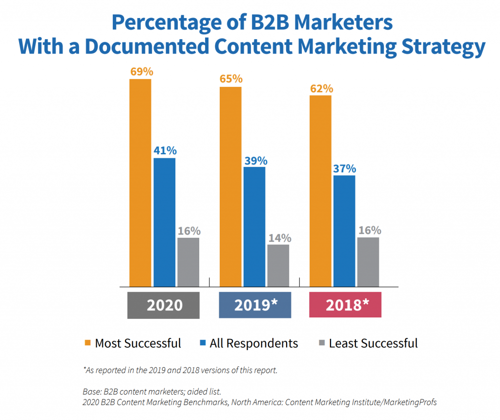
Moreover, creating a content strategy is not all there is; you should document it as well. Writing your system of content marketing approach will help boost your content marketing success. Research reveals interesting facts about having a documented content strategy.
Source graphic via Content Marketing Institute.
The survey indicates a steady increase in brands that are documenting their content marketing strategy. You can see the numbers have grown from 37% in 2018 to over 40% in 2020. But the best part is that almost 70% of successful marketers documented their content strategy.
The idea is, if you want to improve your content marketing ROI significantly, you should develop a content strategy and make a record of it.
3. Work With Industry Experts and Influencers
There are several reasons/benefits to working with experts and influencers in your industry. But I will highlight three-pointers why you should partner with experts:
Industry Knowledge: Working with industry experts is ideal because they have years of proven track record and vast knowledge of your industry. So, taking advantage of their experience will boost your capability, decision making, and eventually grow your ROIs.
Marketing/Historical Viewpoint: Based on marketing and historical insights, industry experts can rapidly evaluate the market and predict positive marketing trends that will benefit your business. They listen to the market and react accordingly with positive outcomes.
360-Degree View: Experts use both internal and external data to help you succeed. They make decisions based on comprehensive knowledge on the industry, and NOT on speculations.
Also, niche influencers already have a massive follower base?the exact audience you want on your website. These are people who view influencers as experts and are willing to buy what they offer.
In other words, influencers control consumers buying behavior. And since your marketing activities are online, you can analyze the effectiveness of your collaboration. Influencers utilize SEO copywriters to produce informative content for humans and search engines.
They create content tailored to your marketing persona that helps to:
Improves brand awareness
Drive organic traffic
Increase site engagement and
Ultimately convert leads.
Put simply, influencers help you expand your brand reach and increase ROI.
4. Produce Evergreen Blog Content Frequently
A content marketing strategy without quality content will fail. Users want the information to solve their problems, and if you can’t give them that, they will bounce and embrace your competitors. But if you are giving them blog content that connects with them—materials they can always go back to, you’ll become their go-to solution.
Evergreen blog posts are significant because they remain relevant and fresh for the longest. Because this type of content is not seasonal or produced based on news and trends, users will benefit from it for many years.
The core characteristics of evergreen blog posts are that it touches the primary problem your target audience is trying to solve and offers a solution. Consumers will always come back to it and also refer to others.
For this reason, it drives consistent traffic, attracts quality backlinks, and leads. So, creating evergreen blog content will, without fail, increase your content marketing ROI.
You can have a look at this post at the Copyblogger blog by Aaron Orendorff for inspiration on evergreen content types you can write for your blog or client. However, to create sustainable evergreen content, you must choose the right topics that connect with your loyal readers.
5. Frequently Update Your Old Content
Creating evergreen content is fantastic for long term gain. But some blog posts on your site may not be performing well in terms of traffic and engagement. That is because they may contain outdated strategies, statistics, and or tips that are not useful to your ideal reader.
It means that the post is out of date, and no one is reading the content. As time goes by, new statistics and trends replace old numbers, which calls for an update.
Also, updating your content offers you the opportunity to add more relevant keywords for SEO best practices. This blogging approach helps keep your posts fresh and relevant to the reader.
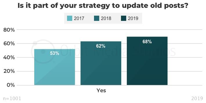
As a result, Google crawlers will boost its visibility and search ranking by pushing it to the top of search engine results pages (SERPs). This process is a win for your content marketing strategy, particularly now that almost 70% of bloggers update their older articles.
Graphic via Orbit Media.
You can see steady growth in the ratio of bloggers who update their posts. According to Andy Cretodina of Orbit Media, bloggers who do keyword research and those who publish original research are more likely to edit old blog posts.
The blogging expert also noted that it is a powerful way to improve search rankings and increase web traffic. So, to improve your content strategy ROI, make it a habit to update old blog posts regularly with new relevant data.
6. Know Your Core Metrics
In all marketing processes, without analyzing your metrics, you will be at a loss. It is important to understand the metrics that matter most to your marketing campaign so that you can better optimize your content to accomplish your targets.
This step is essential because knowing what pages drive the most traffic will help you optimize other pages to convert more leads. For example, if your product sale is taking a nosedive, your sales metric will enable you to analyze performance and make the right adjustments to improve sales.
The same procedure applies to content marketing strategy. Bear in mind that all traffic is not the same. Why is that so? Because not all traffic converts visitors to leads. So, understanding the traffic that converts the most will aid you in knowing your marketing persona better.
Indeed, knowing your core metrics will show you the consumer buying pattern, as well as trends and keywords that are driving your conversion. It enables you to determine what is working for your content marketing strategy and what is not.
You can use your desired content marketing tool to evaluate your performance. But the most popular among marketers is Google Analytics. This free analytics software lets you analyze all your data and make better marketing decisions.
Wrapping Up How to Increase Your Content Marketing ROI
Improving your content marketing return on investments is not as hard as it may seem. A combination of content tactics and actionable steps will help you boost your content marketing ROI.
There are six-pointers in this article, and all of them are linked together. Apply them in your marketing mix and keep testing your results to define what works best for you.
Here is a summary of the pointers to take home:
Improve your website user experience
Develop a content marketing strategy and document your strategy
Partner with influencers and industry experts
Write evergreen blog posts regularly.
Update old content frequently.
Understand core marketing metrics
Would you like to add more tips and insights to this article? Tell us about it in the comments!
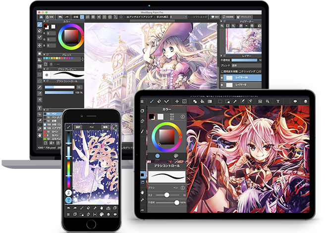
Drawing is a great way to express yourself. It’s therapy for your mind, and it’s relaxing for your soul.
You don’t need to spend all your money on different tools for drawing either, all you need is a digital sketchbook. You can even use your Android or iPad tablets for drawing and creating real art.
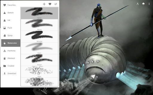
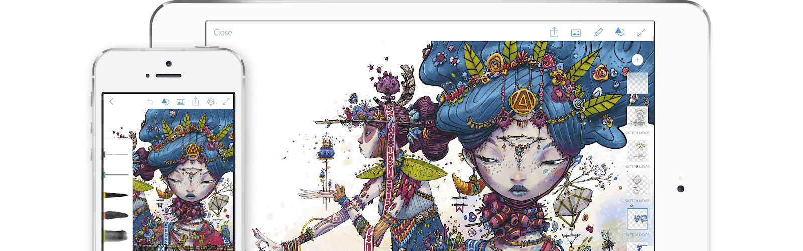
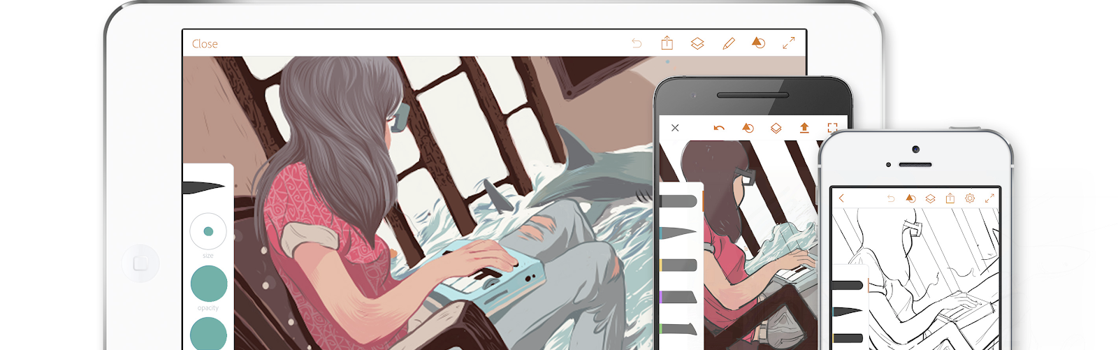
iPad and an Apple Pencil is a great combo for drawing, if you have these two you won’t be needing any other tools other than iPad drawing apps. There are many drawing apps for iPad, and if you are looking for the best drawing app for iPad that fits your needs, here’s the list for you to choose from!
Procreate is one of the first iPad drawing apps that comes to mind, in fact it’s a feature-packed digital studio. It comes with a library of brushes ranging from pencils to charcoals, and each brush is customizable. And if you don’t think that’s not enough for you, you can create your own brushes from scratch. With the help of Color Companion you’ll have complete control of color and you’ll be able to paint and draw with any color you want or imagine. It’s an iOS exclusive, meaning that it’s only created for Apple devices and iOS so it’s optimization is pretty good performance-wise.
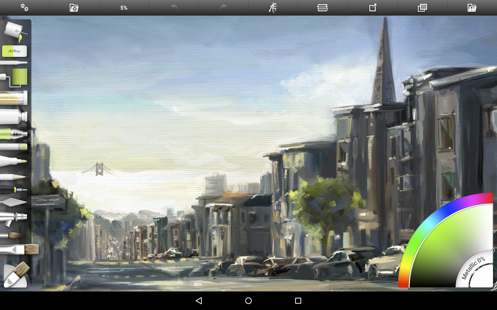
ArtRage is great for drawing, and you can also use it on your PC and Mac. It provides great mimicking tools for real-world paintings with tools ranging from watercolor to roller and paper options. Just like Procreate, you can create your custom brushes for your specific needs as well. It provides a great natural touch.
Affinity Designer works great with iPad and Apple pencil. It might be a bit pricey for people who are just looking for an iOS drawing app to just doodle. It runs real smooth on iPads. You can export your work in various formats. If you are looking to work with vector graphics, Affinity Designer is a perfect choice for you.
MediBang Paint is great for creating comics, it comes with over 800 premade templates that are ready to use, you also get 20 fonts and 50 brushes for free. If you are just starting out you don’t have to worry, MediBang Paint has an active community that you can ask your questions to and there are many tutorials that will help you throughout your learning journey.
Autodesk Sketchbook’s full version is now completely free! It’s a great app that features over 190 customizable brushes and types of ink, pencils, and markers. Copic® Color Library is also accessible, with it you can get the most out of your colorwork. You can also export your work in various formats. Autodesk Sketchbook is easy to use and the interface is quite user-friendly, give it a try!
An android exclusive at first, Infinite Painter is now available for use on iPads as well. Infinite Painter has a different approach to payment, once your 7-day free trial period is over, you can use the premium features with in-app purchases. There are over 160 brushes that are available to be used and you can create your own custom brushes. It’s possible to transform multiple layers simultaneously and export your images as JPG, PNG, PSD, or ZIP.
Adobe Photoshop Sketch enables you to draw with tools ranging from various types of pencils to thick acrylic paint. With Capture, you can create your custom brushes. The plus side is if you are using the Adobe Creative Cloud, you can access many other services. Adobe Creative Cloud might be a bit expensive if you are not a professional.
Adobe Illustrator Draw is a vector drawing application. Again, it can be enhanced with the Adobe Creative Cloud. There are 5 customizable pens, and there’s stylus support for many popular devices. The great thing about it is that Adobe Illustrator is also available on desktop devices as well, so you can start a new job on your mobile device, save it, and can keep working on your desktop later. It syncs with Adobe Photoshop through exporting the PNG files. And you can import various assets from Shape CC and Color CC, making you mobile while doing your work.
These are our picks of the best iPad drawing apps, there are many other apps that you can utilize for your drawing and painting works. Apple Drawing is quite easy, iPad is a great device for drawing, and if you are using an Android device, there are great drawing apps on Android as well, be sure to check out Procreate for Android to find the best one that suits your needs. If you are rocking the Android mobile device and Windows desktop PC combo, make sure you check out Procreate for Windows.
You can draw and paint from anywhere, from any device. What are you waiting for, start drawing!
This guide is about the HTML syntax for responsive images (and a little bit of CSS for good measure). The responsive images syntax is about serving one image from multiple options based on rules and circumstances. There are two forms of responsive images, and they’re for two different things:
If your only goal is…
Increased Performance
Then what you need is…
<img
  srcset=""
  src=""
  alt=""
>
There is a lot of performance gain to be had by using responsive images. Image weight has a huge impact on pages’ overall performance, and responsive images are one of the best things that you can do to cut image weight. Imagine the browser being able to choose between a 300×300 image or a 600×600. If the browser only needs the 300×300, that’s potentially a 4× bytes-over-the-wire savings! Savings generally go up as the display resolution and viewport size go down; on the smallest screens, a couple of case studies have shown byte savings of 70–90%.
Another perfectly legit goal with responsive images is not just to serve different sizes of the same image, but to serve different images. For example, cropping an image differently depending on the size of the screen and differences in the layout. This is referred to as “art direction.”
The element is also used for fallback image types and any other sort of media query switching (e.g. different images for dark mode). You get greater control of what browsers display.
There is a lot to talk about here, so let’s go through both syntaxes, all of the related attributes and values, and talk about a few related subjects along the way, like tooling and browsers.
The syntax is for serving differently-sized versions of the same image. You could try to serve entirely different images using this syntax, but browsers assume that everything in a srcset is visually-identical and will choose whichever size they think is best, in impossible-for-you-to-predict ways. So I wouldn’t reccomend it.
Perhaps the easiest-possible responsive images syntax is adding a srcset attribute with x descriptors on the images to label them for use on displays with different pixel-densities.
<img
  alt="A baby smiling with a yellow headband."
  src="baby-lowres.jpg"
  srcset="baby-highres.jpg 2x"
>
Here, we’ve made the default (the src) the “low res” (1×) copy of the image. Defaulting to the smallest/fastest resources is usually the smart choice:. We also provide a 2× version. If the browser knows it is on a higher pixel-density display (the 2x part), it will use that image instead.
You can do as many pixel-density variants as you like.
While this is cool and useful, x descriptors only account for a small percentage of responsive images usage. Why? They only let browsers adapt based on one thing: display pixel-density. A lot of times, though, our responsive images are on responsive layouts, and the image’s layout size is shrinking and stretching right along with the viewport. In those situations, the browser needs to make decisions based on two things: the pixel-density of the screen, and the layout size of the image. That’s where w descriptors and the sizes attribute come in, which we’ll look at in the next section.
<img
  alt="A baby smiling with a yellow headband."
  srcset="
    baby-s.jpg  300w,
    baby-m.jpg  600w,
    baby-l.jpg  1200w,
    baby-xl.jpg 2000w
  "
  sizes="70vmin"
>
We’re still providing multiple copies of the same image and letting the browser pick the most appropriate one. But instead of labeling them with a pixel density (x) we’re labelling them with their resource width, using w descriptors. So if baby-s.jpg is 300×450, we label it as 300w.
Using srcset with width (w) descriptors like this means that it will need to be paired with the sizes attribute so that the browser will know how large of a space the image will be displaying in. Without this information, browsers can’t make smart choices.
Creating sizes attributes can get tricky. The sizes attribute describes the width that the image will display within the layout of your specific site, meaning it is closely tied to your CSS. The width that images render at is layout-dependent rather than just viewport dependent!
Let’s take a look at a fairly simple layout with three breakpoints. Here’s a video demonstrating this:
The image is sized differently at each breakpoint. Here’s a breakdown of all of the bits and pieces that affect the image’s layout width at the largest breakpoint (when the viewport is wider than 700px):
The image is as wide as 100vw minus all that explicitly sized margin, padding, column widths, and gap.
At the largest size: there is 9rem of explicit spacing, so the image is calc(100vw - 9rem - 200px) wide. If that column used a fr unit instead of 200px, we’d kinda be screwed here.
At the medium size: the sidebar is dropped below, so there is less spacing to consider. Still, we can do calc(100vw - 6rem) to account for the margins and padding.
At the smallest size: the body margin is removed, so just calc(100vw - 2rem) will do the trick.
Phew! To be honest, I found that a little challenging to think out, and made a bunch of mistakes as I was creating this. In the end, I had this:
A sizes attribute that gives the browser the width of the image across all three breakpoints, factoring in the layout grid, and all of the surrounding gap, margin, and padding that end up impacting the image’s width.
Now wait! Drumroll! ???That’s still wrong. I don’t understand why exactly, because to me that looks like it 100% describes what is happening in the CSS layout. But it’s wrong because Martin Auswöger’s RespImageLint says so. Running that tool over the isolated demo reports no problems except the fact that the sizes attribute is wrong for some viewport sizes, and should be:
I don’t know how that’s calculated and it’s entirely unmaintainable by hand, but, it’s accurate. Martin’s tool programmatically resizes the page a bunch and writes out a sizes attribute that describes the actual, observed width of the image over a wide range of viewport sizes. It’s computers, doing math, so it’s right. So, if you want a super-accurate sizes attribute, I’d recommend just putting a wrong one on at first, running this tool, and copying out the correct one.
Another option is use the Horseshoes & Hand Grenades Method™ of sizes (or, in other words, close counts).
For example, sizes="96vw" says, “This image is going to be pretty big on the page — almost the full width — but there will always be a little padding around the edges, so not quite. Or sizes="(min-width: 1000px) 33vw, 96vw" says, “This image is in a three-column layout on large screens and close to full-width otherwise.” Practicality-wise, this can be a sane solution.
You might find that some automated responsive image solutions, which have no way of knowing your layout, make a guess — something like sizes="(max-width: 1000px) 100vw, 1000px". This is just saying, “Hey we don’t really know much about this layout, but we’re gonna take a stab and say, worst case, the image is full-width, and let’s hope it never renders larger than 1000px”.
Abstracting sizes
I’m sure you can imagine how easy it is to not only get sizes wrong, but also have it become wrong over time as layouts change on your site. It may be smart for you to abstract it using a templating language or content filter so that you can change the value across all of your images more easily.
I’m essentially talking about setting a sizes value in a variable once, and using that variable in a bunch of different elements across your site. Native HTML doesn’t offer that, but any back end language does; for instance, PHP constants, Rails config variables, the React context API used for a global state variable, or variables within a templating language like Liquid can all be used to abstract sizes.
Now that we have a sizes attribute in place, the browser knows what size (or close to it) the image will render at and can work its magic. That is, it can do some math that factors in the pixel density of the screen, and the size that the image will render at, then pick the most appropriately-sized image.
The math is fairly straightforward at first. Say you’re about to show an image that is 40vw wide on a viewport that is 1200px wide, on a 2x pixel-density screen. The perfect image would be 960 pixels wide, so the browser is going to look for the closest thing it’s got. The browser will always calculate a target size that it would prefer based on the viewport and pixel-density situations, and what it knows from sizes, and compare that target to what it’s got to pick from in srcset. How browsers do the picking, though, can get a little weird.
A browser might factor more things into this equation if it chooses to. For example, it could consider the user’s current network speeds, or whether or not the user has flipped on some sort of “data saver” preference. I’m not sure if any browsers actually do this sort of thing, but they are free to if they wish as that’s how the spec was written. What some browsers sometimes choose to do is pull from cache. If the math shows they should be using a 300px image, but they already have a 600px in local cache, they will just use that. Smart. Room for this sort of thing is a strength of the srcset/sizes syntax. It’s also why you always use different sizes of the same image, within srcset: you’ve got no way to know which image is going to be selected. It’s the browser’s choice.
This is weird. Doesn’t the browser already know this stuff?
You might be thinking, “Uhm why do I have to tell the browser how big the image will render, doesn’t it know that?” Well, it does, but only after it’s downloaded your HTML and CSS and laid everything out. The sizes attribute is about speed. It gives the browser enough information to make a smart choice as soon as it sees your .
Now you might be thinking, “But what about lazy-loaded images?” (as in, by the time a lazy-loaded image is requested, layout’s already been done and the browser already knows the image’s render size). Well, good thinking! Alexander Farkas’ lazysizes library writes out sizes attributes automatically on lazyload, and there’s an ongoing discussion about how to do auto-sizes for lazy-loaded images, natively.
sizes can be bigger than the viewport
Quick note on sizes. Say you have an effect on your site so that an image “zooms in” when it’s clicked. Maybe it expands to fill the whole viewport, or maybe it zooms even more, so that you can see more detail. In the past, we might have had to swap out the src on click in order to switch to a higher-res version. But now, assuming a higher-res source is already in the srcset, you can just change the sizes attribute to something huge, like 200vw or 300vw, and the browser should download the super-high-res source automatically for you. Here’s an article by Scott Jehl on this technique.
Hopefully, we’ve beaten it into the ground that is for serving differently-sized versions of the same image. The syntax can do that too, but the difference here is that the browser must respect the rules that you set. That’s useful when you want to change more than just the resolution of the loaded image to fit the user’s situation. This intentional changing of the image is usually called “art direction.”
This code block is an example of what it might look like to have three stages of an “art directed” image.
On large screens, show a zoomed-out photo.
On medium screens, show that same photo, zoomed in a bit.
On small screens, zoom in even more.
The browser must respect our media queries and will swap images at our exact breakpoints. That way, we can be absolutely sure that nobody on a small screen will see a tiny, zoomed-out image, which might not have the same impact as one of the zoomed-in versions.
Here’s a demo, written in Pug to abstract out some of the repetitive nature of .
CodePen Embed Fallback
Art direction can do a lot more than just cropping
Although cropping and zooming like this is the most common form of art direction by far, you can do a lot more with it. For instance, you can:
Because also uses the srcset syntax, they can be combined. This means that you can still reap the performance benefits of srcset even while swapping out visually-different images with . It gets pretty verbose though!
The more variations you create and the more resized versions you create per variation, the more verbose this code has to get.
Fallbacks for modern image formats
The element is uniquely suited to being able to handle “fallbacks.” That is, images in cutting-edge formats that not all browsers might be able to handle, with alternative formats for browsers that can’t load the preferred, fancy one. For example, let’s say you want to use an image in the WebP format. It’s a pretty great image format, often being the most performant choice, and it’s supported everywhere that the element is, except Safari. You can handle that situation yourself, like:
<picture>
  <source srcset="party.webp">
  <img src="party.jpg" alt="A huge party with cakes.">
</picture>
This succeeds in serving a WebP image to browsers that support it, and falls back to a JPEG image, which is definitely supported by all browsers.
Here’s an example of a photograph (of me) at the exact same size where the WebP version is about 10% (!!!) of the size of the JPEG.
CodePen Embed Fallback
How do you create a WebP image? Well, it’s more of a pain in the butt than you’d like it to be, that’s for sure. There are online converters, command line tools, and some modern design software, like Sketch, helps you export in that format. My preference is to use an image hosting CDN service that automatically sends images in the perfect format for the requesting browser, which makes all this unnecessary (because you can just use img/srcset).
WebP isn’t the only player like this. Safari doesn’t support WebP, but does support a format called JPG 2000 which has some advantages over JPEG. Internet Explorer 11 happens to support an image format called JPEG-XR which has different advantages. So to hit all three, that could look like:
This syntax (borrowed form a blog post by Josh Comeau) supports all three of the “next-gen” image formats in one go. IE 11 doesn’t support the syntax, but it doesn’t matter because it will get the fallback which is in the JPEG-XR format it understands.
Estelle Weyl also covered this idea in a 2016 blog post on image optimization.
You can make them yourself. Heck, even the free Preview app on my Mac can resize an image and “Save As.”
The Mac Preview app resizing an image, which is something that literally any image editing application (including Photoshop, Affinity Designer, Acorn, etc.) can also do. Plus, they often help by exporting the variations all at once.
But that’s work. It’s more likely that the creation of variations of these images is automated somehow (see the section below) or you use a service that allows you to create variations just by manipulating the URL to the image. That’s a super common feature of any image hosting/image CDN service. To name a few:
Not only do these services offer on-the-fly image resizing, they also often offer additional stuff, like cropping, filtering, adding text, and all kinds of useful features, not to mention serving assets efficiently from a CDN and automatically in next-gen formats. That makes them a really strong choice for just about any website, I’d say.
Here’s Glen Maddern in a really great screencast talking about how useful Image CDNs can be:
Design software is booming more aware that we often need multiple copies of images. The exporting interface from Figma is pretty nice, where any given selection can be exported. It allows multiple exports at once (in different sizes and formats) and remembers what you dod the last time you exported.
Exporting in Figma
Automated responsive images
The syntax of responsive images is complex to the point that doing it by hand is often out of the question. I’d highly recommend automating and abstracting as much of this away as possible. Fortunately, a lot of tooling that helps you build websites knows this and includes some sort of support for it. I think that’s great because that’s what software should be doing for us, particularly when it is something that is entirely programmatic and can be done better by code than by humans. Here are some examples…
Cloudinary has this responsive breakpoints tool including an API for generating the perfect breakpoints.
WordPress generates multiple versions of images and outputs in the responsive images syntax by default.
Gatsby has a grab-bag of plugins for transforming and implementing images on your site. You ultimately implement them with gatsby-image, which is a whole fancy thing for implementing responsive images and other image loading optimizations. Speaking of React, it has component abstractions like “An Almost Ideal React Image Component” that also does cool stuff.
Nicolas Hoizey’s Images Responsiver Node module (and it’s Eleventy plugin) makes a ton of smart markup choices for you, and pairs nicely with a CDN that can handle the on-the-fly resizing bits.
These are just a few examples! Literally anything you can do to make this process easier or automatic is worth doing.
Here’s me inspecting an image in a WordPress blog post and seeing a beefy srcset with a healthy amount of pre-generated size options and a sizes attribute tailored to this theme.A landing page for gatsby-image explaining all of the additional image loading stuff it can do.
I’m sure there are many more CMSs and other software products that help automate away the complexities of creating the responsive images syntax. While I love that all this syntax exists, I find it all entirely too cumbersome to author by hand. Still, I think it’s worth knowing all this syntax so that we can build our own abstractions, or check in on the abstractions we’re using to make sure they are doing things correctly.
Related concepts
The object-fit property in CSS controls how an image will behave in its own box. For example, an image will normally “squish” if you change the dimensions to something different than its natural aspect ratio, but object-fit can be used to crop it or contain it instead.
The object-position property in CSS allows you to nudge an image around within its box.
What about responsive images in CSS with background images?
With this CSS syntax, depending on the browser conditions, the browser will only download one of the two images, which achieves the same performance goal that the responsive images syntax in HTML does. If it helps, think of the above as the CSS equivalent of the syntax: the browser must follow your rules and display what matches.
If you’re looking to let the browser choose the best option, like srcset/sizes, but in CSS, the solution is ultimately going to be the image-set() function. There’s two problems with image-set(), today, though:
Support for it isn’t there yet. Safari’s implementation leads the pack, but image-set() has been prefixed in Chrome for eight years, and it’s not there at all in Firefox.
Even the spec itself seems behind the times. For example, it only supports x descriptors (no w, yet).
Best to just use media queries for now.
Do you need to polyfill?
I’m pretty meh on pollyfilling any of this right this moment. There is a great polyfill though, called Picturefill, which will buy you full IE 9-11 support if you need that. Remember, though, that none of this stuff breaks to the point of not displaying any image at all in non-supporting browsers, assuming you have an in there somewhere. If you make the (fairly safe) assumption that IE 11 is running on a low-pixel-density desktop display, you can make your image sources reflect that by default and build out from there.
Other important image considerations
Optimizing quality: The point of responsive images is loading the smallest, most impactful resource that you can. You can’t achieve that without effectively compressing your image. You’re aiming for a “sweet spot” for every image, between looking good and being light. I like to let image hosting services solve this problem for me, but Etsy has a really great writeup of what they’ve been able to accomplish with infrastructure that they built themselves.
Serving from CDNs: Speaking of image hosting services, speed comes in many forms. Fast servers that are geographically close to the user are an important speed factor as well.
Caching: What’s better than loading less data over the network? Loading no data at all! That’s what HTTP caching is for. Using the Cache-Control header, you can tell the browser to hang on to images so that if the same image is needed again, the browser doesn’t have to go over the network to get it, which is a massive performance boost for repeat viewings.
Lazy loading: This is another way to avoid loading images entirely. Lazy loading means waiting to download an image until it is in or near the viewport. So, for example, an image way far down the page won’t load if the user never scrolls there.
It’s not a good idea to fix shortcomings in your HTML with CSS. Fix your HTML first!
And…
You can change CSS right in your browser’s DevTools (to open them, right-click the browser window and choose “inspect” or “inspect element”). The great thing is, none of the styles will be saved so you can experiment here! Another great thing about the DevTools is the “computed styles” tab, because this shows you exactly what styles are currently applied to an element. This can be really helpful when it comes to debugging your CSS!
There are 24 tips there. I “counted” by using DevTools to change the