Want to get better at code? Teach someone CSS.

A friend of mine recently asked me to teach her to code. She was an absolute beginner, having no idea what coding really involves. I decided to start where I started: HTML and CSS. Using CodePen, we started forking Pens and altering them. Soon, a learning path started to unravel.
The aim of this article is not to teach basic CSS to those who already know it but rather to highlight the things that inspired a newcomer and hopefully inspire you to pass on some knowledge to others if the opportunity arises. It felt good to help someone out and, in turn, I learned some really valuable lessons that have changed the way I think about my code. Win win!
So, here we go: five lessons I learned from teaching someone CSS.
Lesson 1: Don’t start from scratch
When I starting coding for the web 12 years ago, I began with layout — positioning with floats, margins, padding and position declarations. It might seem outdated these days, but still, this is where I went right away with my new coding buddy.
It didn’t go that well.
As you might guess, starting with something like, “Here is how to position an empty box in the middle of the screen,” was a mistake. How uninspiring! And even though I was impressed with my own ability to demonstrate how Flexbox can position an element in the center of the screen (more on that later), I was immediately faced with lots of additional, non-positional questions.
“So how do you change the colors?”
“Can it change shape when hovered over?”
“What fonts can you use on the web?”
I thought we were weeks away from all that.
So, my plans of teaching the 12-column grid went out the window and we pulled up Chris’ named color chart alongside a couple of forked Pens and started playing around. First off, we changed the colors of Cassidy Williams Netflix/Netlify logo. Wow! Instant hit.
<a class="container" href="https://netlify.com" target="_blank">
  <div class="logo">
    <div class="uno"></div>
    <div class="dos"></div>
    <div class="tres"></div>
  </div>
  <div class="name">Prettier</div>
</a>
Then a few simple tweaks to the CSS:
body {
  background: #F9F2DB;
  color: #092935;
  font-size: 50px;
}


a {
  color: #092935;
}


.logo .uno, .dos, .tres {
  background: #C61561;
}

.logo .dos {
  box-shadow: 0 0 20px #F9F2DB;
}

.logo::before {
  background: #F9F2DB;
}


.name {
  letter-spacing: 8px;
}
Within minutes, my friend was hooked! There was no boring positioning to worry about, just a clear example of how a few simple lines of code can change something so familiar into something entirely different.
Then it kicked in that you can change the color of anything! We loaded up a couple of well known sites in the browser and changed the colors of some text and backgrounds with DevTools, all in a couple of minutes. Mission accomplished! My friend was hooked.
Lesson learned: Don’t worry about trying to build something from scratch. Have a play with what’s already out there!
Lesson 2: Comments
This isn’t where I had planned to go with my planned class, but the question of why some parts of CSS start with /* and end with */ came up, so we went with it.
This one really had me thinking about my own work. I really do not comment my code enough. Watching a new coder comment everything (and I mean everything) reminded me just how helpful comments are, not only for yourself, but also to a wider team, or even future you. (Sarah Drasner has a great talk on this topic).
And here is the thing: until then, I thought I was commenting pretty diligently. However, watching someone else do it made me realize how many times I look at a piece of code (particularly JavaScript) and wish I had put a line or two in there to remind myself what I was doing. A ten-second task might have saved me five (or perhaps even more) minutes down the road. That adds up and is now something I am working on.
Lesson learned: Comment more.
Lesson 3: Positioning
We started with some basic HTML, and honestly, I saw my friend’s eyes glazing over almost immediately. It just looks so dull when you can’t see it doing anything right away (unlike editing pre-written CSS). However, we stuck with it, and got results.
Take my word for it, don’t start by positioning empty
We then turned to Flexbox. We actually found CSS Grid a bit too much at the start. We looked briefly at CSS Grid, but when reading lots of articles about it, it’s clear that many assume the reader already has familiarity with CSS, Flexbox in particular. My friend decided to start with Flexbox.
An admission on my part: I am so used to using UI frameworks (especially Bootstrap) that I very rarely position anything in Flexbox by writing the CSS myself. I know how it works and (most of) the declarations, but I still very rarely write it out myself, even in situations where it would be relatively easy. Teaching made me think about my reliance on UI frameworks as a whole. Yes, they are undoubtedly amazing and save us tons of time on projects, but I recalled using Bootstrap on a recent project that was essentially two pages and probably didn’t need it!
Lesson learned: If the project is something small with a minimal number of elements to position, then consider ditching the framework and code from scratch! The end result will be lightweight, fast, and way more satisfying!
Lesson 4: Typography
I love typography. I’ve been lucky enough to work with great designers over the past few years and that has really helped me dial in on the nuances of type. It’s amazing how changes to things like line-height and letter-spacing can really help lift a design from average to amazing. This was something I was keen to impress upon my eager new student. Well, I needn’t have bothered, as the only thing of interest (initially) was changing the fonts and then, crucially for me, the sheer number of fonts available for us to use. The choices are almost limitless and the services and foundries offering web fonts have exploded in the past few years to a point where anything is possible, at speed with little impact on load times.
But here is the thing about designers (and front-end developers like myself): we can be a bit narrow-minded in our font choices. Designs tend to stick to the same fonts from the same services (Roboto and Open Sans anyone?) because we know they are easy to implement and that they work. Exploring fonts with someone new to the trade forced me to look beyond the old staples and try a few new things. I’m now looking for new pairings that work together and dialing in on how they work on screen and impact the whole look and feel of a design. In short, teaching someone else about type has improved my own journey with type, which was probably stuck in something like 2017.
Lesson learned: Keep up to date with type.
Lesson 5. :hover makes everything fun
Things were going OK up to this point, but as you can probably imagine, things were still pretty static. Without really planning, we stumbling into adding a hover effect on on an element and it was an instant hook, just like it was changing colors for the first time!
Hovers add interaction and easily impress, which makes them great for a newcomer to play around with. Scaling objects, changing a box from square to round, hiding content — these are the types of thing that can all be done so easily that hovers are an ideal way for a new coder to get instant results. And here’s the thing: “‘playing” around like this opens other doors. “What if I just do this?” is something many us rarely get to ask ourselves in our day-to-day jobs. With defined designs to work from, there is often little chance to play and equally less chance to experiment.
So, here is the final lesson: Make time to play. Just by being asked, “How do you make this thing do that?” has forced me to learn new things, see what’s new in CSS, and see what I can take back into my day-to-day work. Experimenting (or better yet, playing) has made me a better designer, and I’ll be doing more.
Lesson learned: Make time to play.
Conclusion
If my time teaching CSS to a newbie has taught me anything, it’s that I rarely write code from scratch anymore. Code snippets and autocomplete save me hours, but it’s those same conveniences that let me forget about some really basic stuff. Stuff I should know. By teaching someone else, even if just for 15 minutes now and then, my coding has generally improved and my eyes are open to new ideas and techniques that I may not have otherwise considered.
And as for my friend? Well, she was so taken by CSS in our short time together that she is now doing an online course that includes HTML, which doesn’t seem so dull now that she knows what it is capable of doing!
The post Want to get better at code? Teach someone CSS. appeared first on CSS-Tricks.
You can support CSS-Tricks by being an MVP Supporter.
Showcase: 74 Greatest Examples of Robot Art

Robots are everywhere. In media, in our lives, in our future. And you know what? Robots are cool. Advancement in technology has made robots enter even our household and they are represented widely in media as well.
Video games, books, movies all have different approaches at robots and some iterations have caused us to even question our humanity by making us ask the dreaded question, “what does it mean to be human”. As with anything, when there’s such a great concept that is both realistic and open for imagination, there are great pieces of art of it. So, we went on a quest to find the best robot art that we could find and prepared this article to share with you and to give the talented artists behind these a little more visibility.
We have found various different types of robot art. From pieces of killer robots to cute mechs that prove that a machine can be adored. So, without much delay, let’s get into it.
Top 74 Robot Art Examples

A cute and deadly skater robot. This small guy is rolling towards an explosive exit.

It’s a horse, it’s a robot. What more could we ask for? It looks fantastic and seems like you could ride it as well.

Her name is Sheeba. She’s a cute and clumsy robot that only wants some sunshine in her city.

Although he is small and far from deadly, he’s still commanding. Perfect robot for a furnace or a barbeque.

What’s better than an owl robot as a sentry? Probably nothing. Immaculate design and great 3d modeling.

The artwork of the Mechwarper card in Blizzard’s trading card game Hearthstone. It’s one of the most hated cards of its time. But the artwork is incredible!

He’s fast but not furious. An ideal skating partner. You shouldn’t offer a race though.

AzTech. What’s more to say? It’s Aztec and it’s a robot. Great combination.

A block-type robot. It has wheels, a happy face, and probably can be used to move or store goods.

The artwork of a Longneck from the PlayStation hit Horizon Zero Dawn. They are gigantic, peaceful, and you can climb on top of their heads!

We probably don’t need to tell its name. A good artwork of the famous R2D2, this article would probably be incomplete without mentioning the most famous robot.

The Mother Robot from the Netflix exclusive I am Mother. One of the best depictions of a robot in movies. Great 3d modeling as always too.

A guardian robot probably inspired by a raptor. There’s not too much explanation of it but the design is quite unique and excellently done.

A robot probably doesn’t get cold so the hood is added for the fashion value. Great style, great design, and an overall great portrait.

Nature claims almost everything. A great piece of art depicting even something as artificial as a killer robot will end up as a part of nature.

A man and his robot companion walking through a desert. We really liked this one.

If her face hadn’t fallen off, we wouldn’t know that she was a robot. A perfect piece of robot art.

Not all transformers have to be cool cars and killer robots. Hiding in plain sight is almost always better. A great take on the concept of robots that transform into cars.

A robot that spews fire. Approach with caution. It looks cute-ish until you see the skull painted on its head.

A very creative way to design a robot inspired by a gorilla. The only explanation the artist has written is “I see bananas.”

A sentry robot that probably would serve best as a cop. The artist has designed some fantastic robot art examples as a part of an ArtStation event named March of Robots.

She’s beautiful and scary at the same time. The real question is that can this fairy robot can fly?

The juggernaut golem is a giant robot in heavy armor. With huge. Fists. We definitely don’t want to meet this guy.

Unlike most robot art we found, this one does not look remotely like a human, and that makes it scary, scary is good. Imagine this guy slithering in some hallways zapping around. Creepy.

A more realistic robot art that is stuck with a permanent frown. But they mean good. Really.

A robot medic that is thinking who he should be healing when everyone is a robot.

A wonderful piece of robot art created in the unreal engine. Seriously, this is unreal, look at how realistic it looks.

The benign but deadly robot lady Echo. The latest hero added to the video game Overwatch.

A tiny little devil robot that is after who knows what kind of mischief. Devious little mech.

Different color palettes for some cool robots. Our favorite is the blue one.

If robots could have nobility, this guy would probably be a duke or something.

It’s big, it’s clunky but sturdy. A great look at the concept of a robot in a setting that is less technologically advanced.

Is it a box or is it a camera? Oh nevermind, it’s a robot. Great design!

A robot that is inspired by a rabbit. The style is quite interesting and unique. Overall great piece of robot art.

A cowboy robot that had the potential for the perfect name. The CowBot.

We love fractal geometry. We love robots. We love this piece of art.

The sharkdog robot is a tracker that can catch any scent.

P4Ng0L1 is a robot pangolin. We love these types of artwork that can be a bit more creative than just designing robots in the human form.

A robot scientist with its own work station. Looks like it has jumped out of a sci-fi cartoon.

Another humanoid robot art. This one was called neglected.

A titanic robot art. You wouldn’t want to upset this guy,

Cyborgs are technically not robots. And this piece of art is called “Cyborg Girl” but this piece deserved a spot in our article.

Another unique style creating a great piece of robot art. The Manta Black is a great fusion of a robot, a human, and a panther.

The best part of being a robot is you can easily upgrade yourself.

Amaterasu is the Japanese goddess of the Sun. This robot art is heavily inspired by her original depictions.

This piece is called Lil Betsy. But Betsy isn’t the big robot we see. Actually she’s the small robot that is controlling the larger mech. Sweet!

A robot cop with its hammer and shield. Looks swift and strong. Please don’t make them real.

One of the most popular types of robot art is samurai robots or robots that wield a katana. We’ll see a few more on the way.

Spikes, a skull, and a dark background. Nothing looks more menacing.

Another great piece of robot art. This time it’s an Egyptian themed robot with a sword. The illustration and the background all blend together perfectly.

The Goliath MK 3 is designed for effectiveness. This is another great example of robot art done right in the Unreal Engine.

A ronin is a samurai without a master. This piece is called ronin 21. So, it’s a robot samurai without a master, a program maybe?

Melee weapons are quite popular in robot art. This piece is a perfect demonstration of that.

The Rage Reaper is another great example of a warrior robot art.

The classic Gundam theme. The best representative of the style we found.

She’s cute, she’s deadly. A Japanese Anime inspired piece of robot art.

The unreal engine is truly unreal.

We were hesitant to add the space rabbit because we were unsure if it’s a robot or an exo-suit. But then we checked the feet. Definitely a robot.

Ever vigilant with its spear. This robot guard is an excellent interpretation of a traditional warrior.

The following pieces of art are created by the same artist and are our favorite ones.

Our second favorite of this series of artwork. The robot monk is perfect. That’s it.

This is our favorite piece of art. Period. The robot priest is majestic, commanding, and brilliantly designed.

The robot shaman is great. That headdress, that stance. Did we mention that we love this artist???

We warned you about Japanese robot warriors. There was a lot. All of them were great and we had to pick the very best.

An excellent interpretation of the Game of Thrones character Oberyn Martel.

Again, lots of Japanese inspired robot art. A robot ninja in an excellent pose.

Shredder, Darth Vader, and a Samurai enter a bar. The result? Perfect robot art.

Those who were into Lego in the early 2000s, probably know Bionicles. This piece of art is a wonderful depiction of how a Bionicle would look.

Shadow is a robot sniper with a bi-pedal configuration and a quadrupedal configuration. The design and artwork are both great.

A geisha robot who looks both elegant and deadly at the same time.

Zenyatta is an omnic monk from the Overwatch video game. Omnics are basically robots with consciousness. Zenyatta is a spiritual leader to both robots and humans. Neat.

Another piece of robot art from the artist who designed the robot Oberyn Martel. This one is an excellent depiction of how Tyrion Lannister would look like if he was a robot.

Bastion is another robot from the Overwatch universe. He’s an old killer robot that has gained his own free will and has made friend with a hummingbird.
That’s all from us for now. We’ve searched through thousands of artworks to find the best examples of robot art to include in our showcase. This article is not set in stone and we’ll keep updating it as we come by even greater robot art examples. If you think we’ve missed some or if you want to get your artwork featured, let us know in the comments!
Enterprise Resource Planning Systems: A Comprehensive Guide

According to United States Census Bureau statistics, large enterprises (500+ employees according to this study) employ more than 51 percent of the working population. In other words, at least half of Americans work for an enterprise and have hundreds, if not thousands, of coworkers.
At such a large organization, there are inherent challenges to overcome simply due to size, volume, stature in the industry, and other factors. In this guide, we’ll take a look at the main systems and frameworks that enterprises use to operate in order to overcome those challenges.

Chapter synopsis
This guide consists of seven chapters:
- Chapter 1: Introduction.
- Chapter 2: What is an enterprise? What is an enterprise, and what are the common challenges they face?
- Chapter 3: Enterprise resource planning (ERP). What is the history of ERP software, who uses ERP today, and what are the main benefits?
- Chapter 4: Enterprise risk management (ERM). What is risk management, and what are the available frameworks for mitigating risk?
- Chapter 5: Data security for enterprises. How much does a data breach cost an enterprise, and what steps can they take to improve information security?
- Chapter 6: The future of the enterprise is mobile. How are large organizations using mobile applications? Is mobility the key to future success?
- Chapter 7: Enterprise value and calculations. What are the common ways to calculate the value of an enterprise?
- Chapter 8: How can enterprises use online forms? Online forms are one of the primary ways enterprises gather information. How can companies improve the data collection process?
What is an enterprise?
Merriam-Webster‘s first definition of enterprise is “a project or undertaking that is especially difficult, complicated, or risky.” The second definition provides a completely different meaning: “a unit of economic organization or activity.”
When someone says “enterprise” in today’s business world, it’s the combination of those two definitions that best describes what they mean. An enterprise is a large (more on that next) business with difficult or complicated challenges to overcome that are inherent to their size.

How big is an enterprise?
Businesses are categorized differently depending on the country or industry in which they operate. The two most common measures of business size are the number of employees and head count.
Here’s how Gartner defines business size:
- Small and medium-sized businesses (SMB): fewer than 100 employees
- Small and medium-sized enterprises (SME, or mid-market): 100 to 999 employee
- Large enterprises: more than 1,000 employees
The European Union defines medium-sized enterprises as having fewer than 250 employees (making large enterprises greater than 250 employees), and the U.S. Small Business Administration defines sizes based on industry.
What challenges do enterprises face?
With so many conflicting size definitions for enterprise-level businesses, the common challenges they face may paint a clearer picture. The bigger an enterprise gets, the more likely they are to face these inherent challenges:
- Complex internal processes. Plug-and-play software is less likely to work.
- Multiple departments, offices, and types of facilities. Communication flows differently than in one-office companies.
- Sales across multiple states and countries. Compliance and taxes are more complicated.
- Competition from all sides. Startups and established competitors seek to provide a better solution.
- Cybersecurity risks. Multiple systems and locations can lead to increased points of failure.
Since just about every large enterprise faces these challenges, a number of technology solutions have been built to help combat the issues. These technology solutions make up what is now known as “enterprise software.”
What are the most common enterprise software solutions?
If you look at a list of the biggest enterprise software companies, you’ll get a sense for the types of products enterprises demand. From the Microsofts, Adobes, and SAPs of the world, you’ll find these types of tools running behind every enterprise:
- Enterprise resource planning (ERP)
- Cloud services and storage
- Information technology (IT) solutions
- Database management
- Customer relationship management (CRM)
- Big data and analytics
- Data and cybersecurity
- Risk management and business continuity
- Financial services and payment processing
- Mobile applications and tools
In the following chapters, we’ll look behind the scenes of a typical enterprise: the software systems they run on, the risks they face, how they’re valued, and where enterprise technology is heading. First up, a deeper look at enterprise resource planning, or ERP.
Enterprise resource planning (ERP)
ERP definiton
Enterprise resource planning describes a category of software that manages and integrates the entire organization, everything from customer relationships, sales, and engineering to production, procurement, inventory, and finance.
Jack Shannon, President at Visual South, has worked with ERP in the manufacturing industry for over 30 years. From his perspective, ERP software helps manage the points where people and processes at a company intersect. ERP software is a single database that holds critical data from across the business, including customer information, vendor information, product information, bills of materials, etc. ERP systems connect a number of disparate systems in one central place.

ERP systems are complex and reach across an entire organization. But that wasn’t always the case. The idea started about 50 years ago, as a simple way to better manage the manufacturing process.
History of ERP
According to ERP and More!, ERP was born in the 1960s when J.I. Case, a construction equipment manufacturer, partnered with IBM to build a software application to plan and schedule the material requirements for its products. This type of tool — now known as materials requirements planning, or MRP — helped companies manage the supply of raw materials and finished goods, reducing both shortages and overstocking of inventory. Its functionality expanded through the years, forging a path of development toward modern-day ERP.
From that starting point in the 1960s, here’s how ERP progressed:
- 1970s: SAP is founded to build an ERP product that works in real time rather than on delay. (SAP is now the biggest ERP vendor in the world.)
- 1980s: MRP-II came about to expand capabilities within manufacturing, particularly around capacity requirements.
- 1990s: The Gartner Group coined the term “enterprise resource planning” for the first time, as systems had progressed beyond materials and planning to enterprise-wide functions like accounting and human resources.
- 2000s: A number of mergers and acquisitions take place, shaping the modern ERP landscape, which consists of a small number of major players like Microsoft, Oracle, SAP, and Infor.
- 2010s: The transition from on-premises to cloud-based ERP software begins — and takes off.
Today, ERP is the central operating system for many enterprises, particularly in manufacturing. ERP systems run through the cloud and on mobile devices across many different facilities, pulling all necessary information into one central database.
What are the primary business benefits of an ERP system?
Through years of working with ERP directly and implementing it for clients, Jack Shannon has learned that the benefits of ERP can be so broad, it would be impossible to come up with a complete list of benefits. “Creating an environment where data replaces guesses opens up doors beyond the obvious list of benefits. How well an organization replaces guesses with facts has a direct impact on the benefits that organization will achieve as a result,” he says.
If set up and maintained correctly, an ERP system will provide facts where guesses used to be required. If that transformation happens, here are some higher-level benefits of an ERP:
- It eliminates the pain points from multiple systems that don’t talk to one another.
- It reduces the time lost to repetitive data entry.
- It enables better management of your team’s capacity and production capabilities.
- It provides better data about how your business is functioning.
- It helps improve business performance by giving you access to better data.
- It helps to accurately predict which materials are needed, when in your manufacturing process.
- It standardizes your processes so they don’t change with each product, manufacturing plant, or employee.
- It helps you better forecast what’s required for customer support, cash flow, hiring, or capital expenditures.
- It improves customer service because all data and interactions are tracked in one place.
- It improves data security because data is housed in one secure system rather than a number of different places.
Why should you use ERP?
In the previous section, we talked about the main benefits of an ERP system. To answer this question, we’ll look at the reverse: the challenges you may be facing that could be addressed with enterprise resource planning software.
Here are the main reasons a company would decide to implement an ERP system:
- You have multiple systems that don’t communicate, leaving an incomplete picture across the business.
- You have too many time-consuming processes, like accounting, supply chain, and customer service.
- Your people are making guesses at metrics, like time to delivery, rather than using data to accurately predict them.
- You don’t know how much it costs to make specific products.
- Your people in the field or at different plants can’t access a central system and, therefore, have built their own processes.
- When someone wants you to pull a report, you export to Excel to manually build the numbers.
- You rely too much on knowledge held by certain people at the company.
Who uses ERP systems?
To select and implement a new ERP system effectively, Shannon’s team recommends filling the following roles:
- Project owner: a company executive (or board) responsible for selecting and implementing the new ERP system
- Project manager: a person who manages the time line, demos, parties involved, and budget
- Super user: a person who will learn the new solution across all departments and become the internal expert post-implementation
- Functional team members: these are representatives from different departments the new ERP system will affect — one person each from accounting, IT, production, etc.
- Report writer: the person tasked with building the reports within the ERP system
After implementation, a number of users will need to be trained on the new procedures. Once implemented, ERP is a fully integrated system that touches all areas of a company: sales, manufacturing, engineering, procurement, quality control, shipping and receiving, IT, accounting, and finance. At a large enterprise (1,000+ employees), there will likely be hundreds to thousands of users. From the delivery person marking that a shipment has been delivered to the executive suite reviewing reports built in the ERP system, virtually any employee can use the system.
Moving through the enterprise
If enterprise resource planning (ERP) is the main engine that your company runs on, enterprise risk management (ERM) is the way to surface all of the threats your company faces. We’ll discuss ERM in the next chapter.
Enterprise risk management (ERM)
What is enterprise risk management?
Michael Herrera, CEO of the business continuity consulting firm MHA Consulting and founder of BCMMETRICS, defines enterprise risk management (ERM) as “a plan to identify and mitigate internal and external risks that face your business.”
He compares ERM to reducing risk at your home. Sure, you have locks on the doors. But you also need to consider the neighborhood, taking into account crime data and natural threats that occur in your area.

You then choose strategies to mitigate the biggest risks, such as buying additional insurance, installing a security system, etc. When it comes to our homes, we do all of this naturally. But most of us need to take a more systematic approach to managing risk at a business.
7 components of a sound enterprise risk management program
So what exactly goes into building a risk management program? According to Herrera, below are some of the major areas to consider. If you can answer all of these questions easily, take it as a sign that your enterprise risk management program is sound.
- Risk inventory. What are the five to 10 main risks our company faces?
- Risk committee. Who will sit on a cross-functional team to help analyze all risks across departments and externally?
- ERM team. Who is our head of enterprise risk (or chief risk officer), and which roles does that person need in place to perform this function?
- Common risk language. What terms do we use to define certain aspects of our risk management program, and how can we maintain consistency?
- Risk appetite. How much quantifiable risk do we face with each inventory item, and how much will we live with?
- Action plans. Exactly which steps will we take to mitigate risk, how much will we invest, and who is responsible?
- Reporting. Which metrics will we measure to assess our enterprise risk, and how will we track those metrics?
How can enterprises manage risk?
Herrera says there are four generally accepted ways to manage risk. Each action plan you put in place will fall under one of these broad solutions:
- Avoid the risk. Should we stop the activities that bring on this type of risk?
- Reduce the risk. What actions can I take to reduce the likelihood of a negative event occurring?
- Share the risk. Can we get insurance to help us cover this risk?
- Accept the risk. If we can’t afford to mitigate the risk or don’t have options to do so, should we simply live with the risk?
Each path comes with other considerations like budget, available resources, time, how to measure the risk, and who’s responsible.
Enterprise risk management frameworks
There are a handful of official risk management frameworks that companies can choose from for their enterprise risk program. Below, Herrera breaks down the four main framework options as provided by these organizations:
- Casualty Actuarial Society (CAS)
- Committee of Sponsoring Organizations (COSO) of the Treadway Commission
- International Organization for Standardization’s ISO 31000
- The Risk Management Society (RIMS)
When it comes to selecting a framework, Herrera notes that it’s important to pick a simple one. He’s seen many companies pick complex frameworks and become paralyzed by the amount of information they try to track and influence.
The few companies that manage enterprise risk well use a simple framework that helps them see the big picture. Companies that don’t manage it well have either picked a framework that’s too complex or ignore the issue altogether.
Here’s a quick overview of each of the four main frameworks:
- Casualty Actuarial Society (CAS): This framework was released in 2003 and includes seven steps, from understanding the company’s current environment to measuring and reviewing the program. Herrera notes that this framework is less frequently used than some of the others.
- Committee of Sponsoring Organizations (COSO): This framework, published in 2004, is built around four objectives — strategy, operations, financial reporting, and compliance. According to Herrera, this framework has seen increased use in recent years.
- International Organization for Standardization’s ISO 31000: This framework was created in 2009 and provides seven ways to manage risk (expanding on the four ways covered by the COSO framework).
- Risk Maturity Model from the Risk Management Society (RIMS): Written in 2006, this framework provides seven steps, from managing risk appetite to business sustainability and resilience. This is Herrera’s recommended framework and the one he uses.
Learn more about each framework in this blog post.
Every enterprise risk management program prioritizes information and data security. In chapter four, we’ll take a closer look at the challenges and various approaches to enterprise data security.
Data security for enterprises
In a 2019 survey done by the World Economic Forum, executives in North America listed cyber attacks and data fraud or theft as the top two risks of doing business, in that order, with cyber attacks far out ahead.
Data security is clearly the biggest risk facing enterprises today. The frequency and cost of data breaches have increased in recent years, and the threat of one constantly looms over large companies.

In this chapter, we’ll take a look at enterprise data security, the cost of a data breach, and the risk areas to manage.
What is enterprise data security?
Enterprise data security is an umbrella term used to define any kind of information (received, sent, or stored) protection across an organization. A number of different strategies, software tools, frameworks, and compliance considerations fall under this broad definition.
Every large enterprise has a data security team and plan — each plan has varying degrees of success. Sometimes, even the biggest companies in the world fall victim to security breaches due to breakdowns in basic fundamentals, from a lack of network hygiene to deprioritizing or outright ignoring certain areas of risk.
When breaches occur, the fallout is damaging.
What’s the cost of a data breach?
IBM’s 2019 Cost of a Data Breach Report analyzed “data breach costs reported by 507 organizations across 16 geographies and 17 industries.”
Here are the key findings:
- The average cost of a data breach is $3.92 million USD.
- The average cost for American companies is $8.19 million USD (the most expensive in the world).
- It takes, on average, 314 days to contain a malicious attack from the time of the breach.
A different study, “2019 MidYear QuickView Data Breach Report,” revealed how many breaches occurred and how many total records were exposed in the first half of the year alone.
Here are the key findings, according to Forbes:
- 3,800+ data breaches were reported in the first half of 2019.
- Over 4 billion records were compromised.
- Both of these numbers increased by over 50 percent from the first half of 2018.
The average cost of a data breach is nearly $4 million, over 600 breaches occur every month, and that number is increasing steadily.
What are the primary risk categories to manage?
Tyler Murphy is the lead cyber security analyst for DeadBolt Data Security. He helps large enterprises employ innovative security strategies to avoid data breaches.
According to Murphy, the key to a sound data security strategy is to “think proactively about your company’s information security, yet have a reactive plan in place for when things happen.” Smart companies are prepared on both fronts.
Murphy points out four main areas where you can identify risk in your data security plan. (The National Institute of Standards and Technology, NIST, and the International Organization for Standardization, ISO, both follow these general categories of risk.)
What threats do you face within each category? What are your risk appetites for each? How do you prioritize resources and budget for one category over another? To evaluate your organization’s level of risk in each area, answer the questions posed in the sections below.
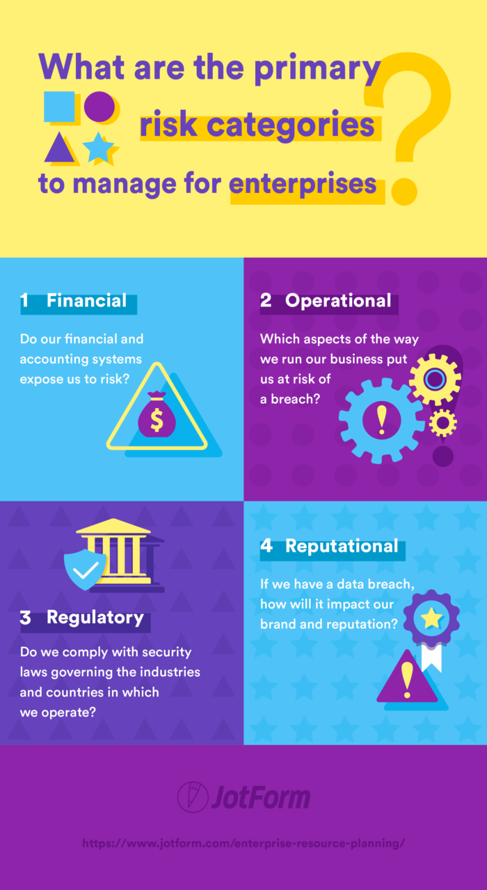
1. Financial
Do our financial and accounting systems expose us to risk?
If your accounting system could be accessed by hackers, for example, critical information could be leaked about the financial performance of the company. So even if your third-party payment processor is up to par with its security, your clients’ personal and financial data could still be exposed.
In recent years, the SEC has strongly encouraged publicly traded companies to communicate risks and incidents to investors in a timely fashion. Those companies face cyber threats on the front end and the SEC on the back.
2. Operational
Which aspects of the way we run our business put us at risk of a breach?
A number of concepts fall under this category:
- Third-party risk. How do our outside partners and vendors impact our security?
- Business processes. Do our procedures make us vulnerable to a breach?
- Technology. Do our servers and software systems expose us?
- Availability. If our software systems or product shut down, how will this impact our business?
Murphy highlights two scenarios where “availability” could be an area of risk to prioritize:
- At a hospital, if the systems were to go down for even a few minutes, doctors could be locked out from accessing critical information during surgery.
- At a streaming content provider like Netflix, availability or uptime is a must. If Netflix went down for one hour, what would be the impact?
3. Regulatory
Do we comply with security laws governing the industries and countries in which we operate?
New data security regulations are constantly going into effect. In May 2018, the European Union enacted the General Data Protection Regulation (GDPR). In a survey done in late 2018, only 29 percent of EU-based organizations had fully implemented the procedures required by GDPR, leaving them susceptible to major fines.
For example, Facebook’s business model conflicts with GDPR’s right to be forgotten. As a result, Facebook will likely face billions of dollars in fines over the coming years.
4. Reputational
If we have a data breach, how will it impact our brand and reputation?
Apple has started incorporating privacy and security messaging into their advertisements. By doing so, they’ve taken on more reputational risk than a company that doesn’t put those principles at the core of its brand. If Apple were to have a security breach, the reputational risk would be significant.
Steps to ensure proper data storage, backup, and security
Check out our guide on data security. You’ll find information about common threats, best practices, regulations, and some solutions.
Next up: Is “mobile” the future for enterprises?
Technology has helped enterprises move faster as a way to stay ahead of the competition, but it’s also opened up massive data security risks. Companies that benefit from the advancements in technology and mitigate the associated risks are positioned for success.
In recent years, the biggest technological push has been around mobility. In the next chapter, we’ll take a closer look at the mobile enterprise.
The future of the enterprise is mobile
What does “mobile enterprise” mean?
We established in chapter one that a generally accepted definition for enterprise is a company with 1,000+ employees. The term mobile relates to any device that can be used on the go. If you combine the two definitions, a mobile enterprise is a large company that uses wireless devices to carry out critical business tasks and functions.
At the simplest level, a mobile enterprise offers a way for employees to access their work email from their phones. Mobile enterprises with the most advanced capabilities may run entire warehouses on mobile devices. Their sales teams have wireless access to the customer relationship management (CRM) system, and their delivery fleets can track each package from cell phones.

Mobile enterprise statistics
To see how much the mobile device has impacted the way large companies operate, let’s start with the data.
According to Gartner, demand for enterprise mobile applications will outpace development capacity five to one from 2019 onward. In other words, enterprises have so many mobile application needs that there aren’t enough developers to keep up.
- According to a 2014 study from Salesforce, mobile apps boost U.K. worker productivity by more than 34 percent.
- In the same study, 59 percent of respondents said that their organization has been too slow in developing workplace apps.
- In a 2016 Harris Poll, 90 percent of IT decision makers polled saw enterprise mobility as the critical function for customer engagement, competitiveness, and operational productivity.
- In a 2018 study from Mobile World Live, 44 percent of respondents ranked the smartphone as their chosen device for conference calls, with nearly 60 percent saying their use of desk phones for conference calls has changed drastically over the past five years.
The benefits of mobility are clear for enterprises: increased productivity, improved customer engagement, and better processes. The demand for and increased usage of mobile apps at work have followed the benefits.
The main challenge for enterprise mobility is fulfilling the demand with quality applications. But along with the opportunities mobile devices provide, there are a number of new challenges.
Challenges with enterprise mobility
- Development. As mentioned in the previous section, there simply isn’t enough development talent out there to keep up with the demand for mobile apps.
- Customization. Many popular enterprise mobile apps are provided by third parties like Slack and Gmail, limiting the way they can be customized. The lack of customization options may make it hard for a company to fit the app into existing processes.
- Support and upkeep. To maximize customization, many enterprises develop their own applications. This not only requires planning, development, and deployment, but also maintenance and updating after it goes live. Companies fail in mobile app development when they think of the launch as the finish line. It’s actually the starting line for ongoing improvements and management.
- Device selection. Should a company develop apps for all types of operating systems (iOS, Android) and devices (tablets, phones, and wearable technology), or just one? Should the organization provide employees with devices or expect them to access the application on their own devices?
- Application vs web. Should companies build a native application or mobile website for people to access via a browser? That decision should be based on how the mobile tool will be used.
- Integration. Whether a company builds their own application or chooses a third-party app, they need to figure out how that application will integrate with backend systems. For example, if a company builds an app for delivery personnel to track shipment deliveries, how is that tied back into the ERP system?
- Security. Mobile devices are out in the field, whereas desktop devices stay at the office. Mobility opens up the company to security issues if devices that have access to private company information are lost. Third-party mobile apps also expose companies to cybersecurity threats.
- User adoption. Your company has built a great app; now you have to transition thousands of employees onto it. Changing the way people work is always a challenge.
Enterprise mobile application solutions
The uses for enterprise mobile apps are virtually endless. Anything that’s currently done at a computer or on paper (and could benefit from a wireless element) could be turned into a mobile application. Here are a few of the common ways enterprises are using mobile apps:
- Email. Access your work email from your mobile device (through a Gmail app, for example).
- Sales. Offer a mobile CRM system to your sales team so they can track key information while visiting prospects (like Salesforce Mobile).
- Meeting conferencing. Host and attend audio or video meetings from a mobile application (like Zoom).
- Time tracking. Give employees a way to track hours on their phones (like Harvest).
- Delivery management. Plan routes and track orders on a mobile device (like Mendix).
- Manufacturing. Manage the shop floor on a wireless device (like Infor VISUAL Shop Floor).
- Field service. Manage every aspect of customer support that happens onsite (like Housecall Pro).
- Data collection. Use your mobile device to collect contact info from prospective customers at trade shows, to fill out digital inspection forms, and more (JotForm Mobile Forms).
Is mobility the future?
In 2018, mobile access to the internet surpassed desktop access for the first time. Enterprises are taking note of this change in behavior. It’s likely that companies will continue to try to meet both their employees and their customers where they are: on a mobile device. So far, we’ve only scratched the surface.
Next up: How do you value an enterprise?
Companies that embrace and adopt mobility will arguably be the most valuable businesses in the world over the next few years. In the next chapter, we’ll look more closely at exactly how enterprises are valued.
Enterprise value and calculations
In this chapter, we’ll introduce a number of concepts related to valuing an enterprise. At the end of each section, you’ll find links to more detailed articles on each topic.
What is enterprise value?
Enterprise value is a measure of how much you’d have to spend to buy a publicly traded company. In other words, it’s the total worth of a company.
Another common formula for valuing publicly traded companies is market capitalization, or market cap. But where market cap simply looks at the total value of the stock (share price multiplied by all outstanding shares), enterprise value expands on that by adding what the company owes in net debt.

How to calculate enterprise value
Enterprise Value = Market Capitalization + Total Debt – Cash
Here’s a simple breakdown of each part of the formula:
- Market capitalization: the share price of the company’s stock multiplied by the number of shares that are currently owned (i.e., outstanding shares)
- Total debt: the amount of a company’s short- and long-term current liabilities (what it owes)
- Cash (and cash equivalents): the amount of money (cash) and short-term investments the company currently possesses that could be turned into cash quickly (cash equivalents)
When you put it all together, you’re adding the value of the stock (market cap) to what the company owes (debt), then subtracting what it has (cash). If another company wanted to make an offer to buy 100 percent of a publicly traded enterprise, enterprise value would be the price tag.
Learn more: How to calculate enterprise value
Enterprise value vs other valuation formulas
Enterprise value is just one perspective on the value of a company. There are other ways to value companies and their assets. Here are two examples.
1. Market capitalization (or equity value)
Market cap and equity value can be used interchangeably, according to the Corporate Finance Institute. For simplicity, we’ll refer to it only as market cap.
Market Capitalization = Current share price ? total number of outstanding shares
Brian DeChesare, founder of Mergers & Inquisitions, explains the different uses for enterprise value and market cap:
- Enterprise value is the value to all investors (shareholders, debt investors, and preferred investors).
- Market cap is the value of the company’s assets but only to equity investors (shareholders).
As mentioned in the section above, enterprise value factors in debt minus cash holdings to get a full picture of a publicly traded company’s worth. But market cap simply looks at the share price multiplied by all outstanding shares.
2. Private enterprise valuation
The valuation of a publicly traded company is straightforward. Enterprise value and market capitalization are simple formulas calculated from publicly available and standardized data.
Valuing a private company is tricky because
- Private companies aren’t required to publicly report on their financial performance, so the data isn’t readily available
- Financial metrics may differ from one private company to another because private companies operate under less strict accounting standards than public companies
- The owners of private companies are usually the founders and their families, as well as early investors, which makes valuation more of a personal process than with public companies
Mark Gartner from ClearLight Partners definese four ways to value a private company:
- Public comps. Use public company valuations from your industry as guidance.
- Precedent transactions. Gather any data available (purchase price or EBITDA multiples) from other private sales in your industry.
- Returns modeling. Forecast future performance to find the present value.
- Perception of value. Use intuition and past experience to value the company.
In the next chapter, we’ll discuss how enterprises gather information through online forms.
How can enterprises use online forms?
Massive amounts of data flow throughout an enterprise on a daily basis. As we’ve discussed, how that information is captured, stored, and used is critical to a company’s success:
- An ERP system centralizes the data so that it can be used for various company processes, like inventory management, accounting, etc.
- Mobile applications give employees access to data from any location.
- Data security systems and frameworks ensure critical information is protected and backed up.
In addition to tools like the ones above, which help with managing and storing data, enterprises also need tools to collect data:
- How does your website collect information about marketing leads?
- How does your sales team collect data from prospects?
- How does your HR team collect personal data and surveys from employees?

The answer: online forms.
Most likely, each department uses their own survey tool, or tools, depending on the task. The marketing team may use HubSpot forms on the website, while the support team uses SurveyMonkey to gather feedback, and the accounting team gathers client information via email. That data sits in separate systems and can’t be used by other departments that would benefit from it.
JotForm has built a tool to solve this data collection and distribution challenge: JotForm Enterprise.
What can you do with JotForm Enterprise?
With JotForm Enterprise, companies can collect all the data they need through one easy-to-use online form builder. All of the collected information is stored in one place, and can then be distributed through 400+ integrations to a number of other tools your company relies on.
Companies like Adobe and Ford use JotForm Enterprise for these reasons:
- It brings all data into one tool.
- It offers single sign-on so employees can access all approved applications with a single set of login credentials.
- It includes an access management feature, so the marketing team can access only marketing forms, for example, and personal employee information is only accessible to HR.
- It can pass the collected information securely to 400+ other applications.
- It simplifies data collection on mobile devices.
- It runs on a dedicated server to guarantee uptime and performance.
- It ensures your data is secure. (JotForm is encrypted with 256-bit SSL and is PCI DSS Level I and HIPAA compliant.)
What tools does JotForm Enterprise integrate with?
JotForm easily fits into your processes, because it’s easy to automatically send the information you collect through JotForm to 150+ integrations and 400 widgets commonly used by businesses.
A few of the most-used types of integrations are
- Cloud storage. JotForm has integrations with several cloud storage services, including Google Drive, Box, and Dropbox. Using Google Drive as an example, new files — like job applications, contracts, etc. — submitted through a form can be automatically added to specific Drive folders.
- Communication. JotForm’s communication integrations keep your team up to date. For instance, information submitted through a form can be automatically sent to a Slack channel so your marketing, sales, or support team can handle the response.
- CRM. Integrations with CRM systems, such as Salesforce, Zoho, and HubSpot, enable sales teams to gather information from leads through forms and automatically populate that lead’s record.
If you need to send data to a tool that isn’t on our list of common integrations, you can use the JotForm API to build that integration. If you’d like to learn more about JotForm Enterprise, watch this 12-minute webinar.
Inspired Design Decisions With Emmett McBain: Art Direction As Social Equity

Inspired Design Decisions With Emmett McBain: Art Direction As Social Equity
Andrew Clarke 2020-07-28T09:30:00+00:00
2020-07-28T13:41:46+00:00
Along with advertising, selling is a skill that people often frown on. It’s true: no one likes someone coercing or misleading them, and nobody enjoys being interrupted.
But being sold to well — by a salesperson who understands your aspirations, motivations, and needs — can be an experience that benefits buyers and sellers.
Learning how to sell was one of the best things I did early on in my working life. Back then, I sold photographic equipment, and although I never enjoyed the stress which came from meeting sales targets, I always enjoyed meeting with photographers.
Finding new customers often meant cold-calling, knocking on a studio door, and frequently being rejected. I spent time talking about someone’s work before I mentioned the products my company paid me to sell. I was genuinely interested in photography, but also I’d learned that understanding someone’s problems was as crucial as explaining how my products could help solve them.
What I learned has served me immeasurably well since I stopped selling cameras and started selling my talent. It’s helped me deal with people, not least in presenting (read: selling) my ideas to clients.
It’s a fact of life that not always the best idea or the best execution wins a pitch or presentation. It’s often the idea which is being sold by the best salesperson.
Selling ideas should become one of your best skills, so learn to sell. Learn how to talk about your work so that the person you’re selling to understands your ideas and why they should buy them from you. Learn to inspire people with your words as well as your work. Make them feel like they’re so much a part of your ideas that they simply must buy from you.
As a Black American graphic designer who worked in advertising during the 1950s, ’60s, and ’70s, Emmett McBain not only had incredible talent, he also understood how to sell to other African Americans.
He knew that to sell his clients’ products, his designs needed to resonate with Black audiences, by showing images they related to and language which was familiar to them.
As a grey-bearded Englishman, it’s not easy for me to understand cultural perspectives which are different from mine. But, I’ve learned the value of making designs that speak to people whatever they look like and wherever they live. Not only to sell my clients’ products to them but so that everyone feels their needs are being listened to and their importance understood.
Born in Chicago in 1935, Emmett McBain was an African American graphic designer whose work had a remarkable impact on the representation of African Americans in advertising.
McBain studied at several art schools and graduated after studying commercial art at the American Academy of Art in Chicago.
Vince Cullers and Associates—the first African American-owned full-service advertising agency in the USA was founded in 1958. Cullers believed that “selling Black” needed “thinking Black” if advertisers were to reach African American consumers. He not only sold to African Americans but helped to educate them in advertising and employ them at his agency. One of those employees was the newly graduated Emmett McBain.
With two years of commercial experience behind him, McBain left Vince Cullers and moved to Playboy Records as an assistant art editor. But, he didn’t stay in a junior role for long and quickly became Playboy’s promotion art director. McBain carved out a niche as a cover artist, and in 1958 his Playboy Jazz All-Stars album art was named Billboard Magazine’s Album Cover of the Week.
In 1959, McBain moved on from Playboy, but he didn’t leave behind his work on album covers. His newly-founded design studio McBain Associates regularly worked with Mercury Records, and he designed over 75 album covers by the time he was 24.
McBain returned to Vince Cullers Advertising as its creative director in 1968 and made some of his most important contributions to advertising for Black Americans.
Before the 1960s, Black consumers were largely ignored by brand-name manufacturers and the mainstream advertising industry which served them. Advertising to African Americans was limited mainly to newspapers specific to Black audiences.
White clients were reticent to spend money selling to African Americans as advertisers saw black consumers as having little disposable income. In the politically charged atmosphere of the time, companies were also afraid to associate their brands with African Americans.
African Americans were unrepresented in the advertising industry too, and the number of Black people working in advertising was tiny. But, in the mid-1960s, advertising agencies began to recruit African Americans. These agencies hoped their experiences would make clients’ messages more relatable to African American audiences who, by then, spent almost $30 billion each year.

McBain’s work featured positive messages for African Americans and the Black community. He used images of everyday people in usual surroundings for clients who included Newport’s menthol cigarettes, Philip Morris’ Marlboro, and SkinFood Cosmetics’ beauty products specifically for Black skin. Like Vince Cullers, McBain knew that selling to Black consumers meant understanding their different needs. He understood that — as his future partner, copywriter Thomas Burrell said — “Black people are not dark-skinned white people.”
In 1971, Emmett McBain partnered with Burrell to form Burrell-McBain Inc., which they described in an advertisement as “An Advertising Agency for the Black Commercial Market.” Rather than exploit Black Americans, Burrell and McBain aimed to form authentic and respectful relationships with Black audiences.
Before Burrell and McBain, the iconic white cowboy was the face of Marlboro cigarettes. But, McBain’s Marlboro man was more relatable to African American smokers. Whereas Marlboro’s cowboy was shown in an idealized version of the American West, McBain’s Black characters were seen smoking in everyday surroundings.
Their Marlboro campaign was a huge success and Burrell and McBain went on to win Coca-Cola and McDonald’s as clients, helping them become the largest Black-owned advertising agency in America.
McBain left the agency he co-founded in 1974 and set out on a career as an artist. He opened his art gallery, The Black Eye, and formed a consultancy — also called The Black Eye — which helped agencies to better connect with the African American community.
Emmett McBain died of cancer in 2012 and since then has been recognized by AIGA, the Society of Typographic Arts, and the Art Directors Clubs of Chicago and Detroit.
Sadly, there hasn’t been a book published about Emmett McBain and his contribution to advertising and design. I haven’t heard his name mentioned at design conferences or seen him referenced in articles relating to modern-day design and particularly the web.
McBain’s later work had a profound impact on advertising from the 1960s onwards, but I’m especially fond of his record cover designs. The burst with energy which reflects the jazz music McBain loved. His colors are exciting and vibrant. His choice of typefaces and the ways he deconstructed and rebuilt type are inspiring. There’s plenty to inspire us in the work of Emmett McBain.
Aligning Vertical Content
Whichever graphic style I choose, the HTML needed to implement this first McBain-inspired design is identical. I need three structural elements; a header which contains my SVG logo and headlines, main, and an aside which includes a table of Citroën DS production numbers:
<header>
  <svg>…</svg>

  <div>
    <svg>…</svg>
    <svg>…</svg>
  </div>
</header>

<main>
  <p>…</p>
</main>

<aside>
  <table>…</table>
</aside> 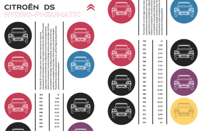
For scalability across screen sizes, I use SVGs for the two headlines in my header. Using SVG provides an extra degree of consistency for the second headline’s stroked text, but I mustn’t forget accessibility.
In issue 8, I explained how to help people who use assistive technology using adding ARIA to SVGs. I add an ARIA role attribute, plus a level attribute which replaces the missing semantics. Adding a title element also helps assistive technology understand the difference between several blocks of SVG, but browsers won’t display this title:
<svg role="heading" aria-level="1" aria-label="Citroën DS">
  <title>Citroën DS</title>
  <path>…</path>
</svg> 
To begin this design, I add basic foundation styles for every screen size starting with foreground and background colours:
body {
background-color: #fff;
color: #262626; }
I add pixel precise dimensions to the SVG elements in my header, then use auto horizontal margins to centre the Citroën logo:
header > svg {
margin: 0 auto;
width: 80px; }

header div svg {
max-height: 80px; }
In his inspiring design, Emmet McBain included vertical black stripes to add structure to his layout. To achieve a similar effect without adding extra elements to my HTML, I add dark borders to both the left and right sides of my main paragraph:
main p {
padding: .75rem 0;
border-right: 5px solid #262626;
border-left: 5px solid #262626; }
The same technique adds a similar effect to my table of Citroën DS production numbers. I add the two outer borders to my table:
aside table {
width: 100%;
border-right: 5px solid #262626;
border-left: 5px solid #262626;
border-collapse: collapse; }
Then, I add a third rule to the right of my table headers:
aside th {
padding-right: .75rem;
padding-left: .75rem;
border-right: 5px solid #262626; }
By ensuring every cell fills half the width of my table, this vertical stripe runs down the centre, from top to bottom:
aside th,
aside td {
width: 50%;
box-sizing: border-box; }
When someone reads numerical tabular data like these pairs of years and production numbers, their eyes scan down the year column. Then, they follow across to see how many cars Citroën manufactured during that year. People might also compare production numbers looking for either high or low numbers.
To make their comparisons easier, I align production numbers to the right:
aside td {
text-align: right; }
Depending on the OpenType features available in the font you’ve chosen, you can also improve tabular data readability by specifying lining rather than old-style numerals. Some old-style numerals—including 3, 4, 7, and 9 — have descenders which can drop below the baseline. These make longer strings of numbers more difficult to read. Lining numerals, on the other hand, include numbers that sit on the baseline.

OpenType features also control the width of numerals which makes comparing strings of numbers in a table easier. Whereas proportional numbers can be different sizes, tabular numerals are all the same width so tens, hundreds, and thousands will be more precisely aligned:
aside td {
font-variant-numeric: lining-nums tabular-nums; } 
Finally, I introduce the circle motif to the bottom of this small screen design. I don’t want to include these circular images in my HTML, so I use a CSS generated content data URI where the image file is encoded into a string:
aside:after {
content: url("data:image/svg+xml…"); }
I’m frequently surprised at how few changes I need to make to develop designs for multiple screen sizes. Switching from small screens to medium-size designs often requires no more than minor changes to type sizes and introducing simple layout styles.
I start by horizontally aligning the Citroën logo and SVG headlines in my header. On medium and large screens, this logo comes first in my HTML, and the headlines come second. But visually the elements are reversed. Flexbox is the ideal tool for making this switch, simply by changing the default flex-direction value from row to flex-direction: row-reverse:
@media (min-width: 48em) {

header {
display: flex;
flex-direction: row-reverse;
align-items: flex-start; }
}
Earlier, I gave my logo a precise width. But, I want the headlines to fill all the remaining horizontal space, so I give their parent division a flex-grow value of 1. Then, I add a viewport-based margin to keep the headlines and logo apart:
header div {
flex-grow: 1;
margin-right: 2vw; }
For this medium-size design, I developed the layout using a symmetrical three-column grid, which I apply to both main and aside elements:
main,
aside {
display: grid;
grid-template-columns: repeat(3, 1fr);
gap: 1rem; }
Then, using the same technique I used for the aside element previously, I generate two images for the main element and place them into the first and third columns in my grid:
main:before {
grid-column: 1;
content: url("data:image/svg+xml…"); }

main:after {
grid-column: 3;
content: url("data:image/svg+xml…"); }
I repeat the process for the aside element, with this new :after content replacing the generated image I added for small screens:
aside:before {
grid-column: 1;
content: url("data:image/svg+xml…"); }

aside:after {
grid-column: 3;
content: url("data:image/svg+xml…"); }
The extra space available on medium-size screens allows me to introduce more of the vertical stripe motif, which is inspired by Emmett McBain’s original design. The vertical borders on the left and right of the main paragraph are already in place, so all that remains is for me to change its writing-mode to vertical-rl and rotate it by 180 degrees:
main p {
justify-self: center;
writing-mode: vertical-rl;
transform: rotate(180deg); }
Some browsers respect grid properties and will stretch a table to the full height of the grid row without help. Others need a little help, so for them, I give my production numbers table an explicit height which adds an even amount of space between its rows:
aside table {
height: 100%; }
The full effect of this McBain-inspired design comes when screens are wide enough to display main and aside elements side-by-side. I apply a simple two-column symmetrical grid:
@media (min-width: 64em) {

body {
display: grid;
grid-template-columns: 1fr 1fr;
gap: 1rem; }
}
Then, I place the main and aside elements using line numbers, with the header spanning the full-width of my layout:
header {
grid-column: 1 / -1; }

main {
grid-column: 1; }

aside {
grid-column: 2; } 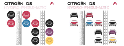
Looking Unstructured
The bright colours and irregular shapes of blocks in this next design are as unexpected as the jazz which inspired Emmett McBain’s original. While the arrangement of these layout might look unstructured, the code I need to develop it certainly isn’t. In fact, there are just two structural elements, header and main:
<header>
  <svg id="logo">…</svg>
  <h1>…</h1>
  <p>…</p>
  <svg>…</svg>
</header>

<main>
  <small>…</small>
  <h2>…</h2>
  <p>…</p>
</main> 
I start by applying background and foreground colours, plus a generous amount of padding to allows someone’s eyes to roam around and through spaces in the design:
body {
padding: 2rem;
background-color: #fff;
color: #262626; }
Those brightly coloured blocks would dominate the limited space available on a small screen. Instead, I add the same bright colours to my header:
header {
padding: 2rem 2rem 4rem;
background-color: #262626; }

header h1 {
color: #c2ce46; }

header p {
color: #fc88dc; }
Irregular shapes are an aspect of this design which I want visible at every screen size, so I use a polygon path to clip the header. Only areas inside the clip area remain visible, everything else turns transparent:
header {
-webkit-clip-path: polygon(…);
clip-path: polygon(…); }
Attention to even the smallest details of typography lets people know that every aspect of a design has been carefully considered. A horizontal line in the small element at the start of my main content changes length alongside the text.
I don’t want to add a presentational horizontal rule to my HTML, and instead opt for a combination of Flexbox and pseudo-elements in my CSS. First, I style the small element’s text:
main small {
font-size: .8em;
letter-spacing: .15em;
line-height: .8;
text-transform: uppercase; }
Then, I add an :after pseudo-element with a thin bottom border which matches the colour of my text:
main small:after {
content: "";
display: block;
margin-left: .75rem;
border-bottom: 1px solid #262626; } 
Adding flex properties aligns the text and my pseudo-element to the bottom of the small element. By giving the pseudo-element a flex-grow value of 1 allows it to change its width to compliment longer and shorter strings of text:
main small {
display: flex;
align-items: flex-end; }

main small:after {
flex-grow: 1; }
I enjoy surprises, and there’s more to my second-level “Champion de France” headline than meets the eye.
Almost ten years ago, Dave Rupert released Lettering.js, a jQuery plugin which uses Javascript to wrap individual letters, lines, and words text with span elements. Those separate elements can then be styled in any number of ways. With just one multi-coloured element in this design, I apply the same technique without serving a script:
<h2>Champion <span>d</span><span>e</span> <span>F</span><span>r</span><span>a</span><span>n</span><span>c</span><span>e</span></h2>Then, I give each selected letter its own colour:
h2 span:nth-of-type(1) {
color: #c43d56; }

h2 span:nth-of-type(2) {
color: #905dd8; }

h2 span:nth-of-type(3) {
color: #377dab; }
I’ve always viewed the challenge of responsive design as an opportunity to be creative and to make the most of every screen size. The extra space available on medium and large screens allows me to introduce the large, irregularly shaped blocks of color, which makes this design unexpected.
First, I apply grid properties and an eight-column symmetrical grid to the body element:
@media (min-width: 48em) {

body {
display: grid;
grid-template-columns: repeat(8, 1fr); }
}
Then, I place my header into three of those columns. With the coloured blocks now visible, I change the header’s background colour to a dark grey:
header {
grid-column: 4 / 7;
background-color: #262626; }
Centring content both horizontally and vertically was a challenge before Flexbox, but now aligning and justifying my header content is simple:
header {
display: flex;
flex-direction: column;
align-items: center;
justify-content: center; }
I change the colour of my header’s text elements:
header h1 {
color: #fed36e; }

header p {
color: #fff; }
Then, I apply negative horizontal margins, so my header overlaps elements close to it:
header {
margin-right: 1.5vw;
margin-left: -1.5vw; }
My main element needs no extra styling, and I place it onto my grid using line numbers:
main {
grid-column: 7 / -1; }
Elements needed to develop a design needn’t be in HTML. Pseudo-elements created in CSS can take their place, which keeps HTML free from any presentation. I use a :before pseudo-element applied to the body:
body:before {
display: block;
content: ""; }
Then, I add a data URI background image which will cover the entire pseudo-element regardless of its size:
body:before {
background-image: url("data:image/svg+xml…");
background-position: 0 0;
background-repeat: no-repeat;
background-size: cover; }
CSS Grid treats pseudo-elements just like any other, allowing me to place those colourful blocks into my grid using line numbers:
body:before {
grid-column: 1 / 4; }
Whereas developers mostly use media query breakpoints to introduce significant changes to a layout, sometimes, only minor changes are needed to tweak a design. Jeremy Keith calls these moments “tweakpoints.”
This medium-size McBain-inspired design works well at larger sizes, but I want to tweak its layout and add more detail to the very largest screens. I start by adding four extra columns to my grid:
@media (min-width: 82em) {

body {
grid-template-columns: repeat(12, 1fr); }
}
Then I reposition the generated colour blocks, header, and main elements using new line numbers:
body:before {
grid-column: 1 / 8; }

header {
grid-column: 7 / 10; }

main {
grid-column: 9 / -1; }
These elements now overlap, so to prevent them from forming new rows in my grid, I give them all the same grid-row value:
body:before,
header,
main {
grid-row: 1; }
This tweak to my design adds another block of colour between the header and main. To preserve the semantics of my HTML, I add a pseudo-element and a data URI image before my main content:
main:before {
display: block;
content: url("data:image/svg+xml…");
float: left;
margin-right: 2vw;
width: 10vw; } 
Deconstructing Type-images
Early in his career, Emmett McBain’s record cover designs showed he had a flair for typography. He was often playful with type, deconstructing, and rebuilding it to form unexpected shapes. This control over type has never been easy online, but SVG makes almost everything possible.
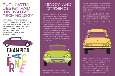
This next McBain-inspired design relies on SVG and just two structural HTML elements; a header which contains the large type-based graphic, a main element for my content:
<header>
  <h1>…</h1>
  <p>…</p>
  <svg>…</svg>
</header>

<main>
  <h2>…<h2>
  <div>…</div>
  <svg>…</svg>
</main>
I need very few foundation styles to start developing this design. First, I add background and foreground colours and padding inside my two elements:
body {
background-color: #fff;
color: #262626; }

header,
main {
padding: 2rem; }
Second, I define styles for my type which includes both headings and the paragraph of text which follows them:
h1,
h2,
h1 + p {
letter-spacing: .05em;
line-height: 1.4;
text-transform: uppercase; }
I give my main content a rich purple background which matches the Citroën’s colour in the panel opposite:
main {
background-color: #814672;
color: #fff; }
This design is dominated by a large graphic that includes a profile of the Citroën DS and a stylized type-image of the words “Champion de France.” The arrangement of its letters would be tricky to accomplish using CSS positioning and transforms, making SVG the perfect choice.
This SVG contains three groups of paths. The first includes outlines of the words “Champion de:”
<svg>

<g id="champion-de">
  <path>…</path>
</g>

</svg>
The next group includes paths for the brightly coloured arrangement of letters. I give each letter a unique id attribute to make it possible to style them individually:
<g id="france">
  <path id="letter-f">…</path>
  <path id="letter-r">…</path>
  <path id="letter-a">…</path>
  <path id="letter-n">…</path>
  <path id="letter-c">…</path>
  <path id="letter-e">…</path>
</g> 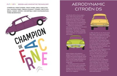
Then, I add class attributes to group of paths which make up the Citroën DS profile. With these attributes in place, I can adjust the car’s colours to complement different colour themes and even change them across media query breakpoints:
<g id="citroen">
  <path class="car-paint">…</path>
  <path class="car-tyres">…</path>
  <path class="car-wheels">…</path>
  <path class="car-shadow">…</path>
  <path class="car-lights">…</path>
  <path class="car-stroke">…</path>
</g>
Medium-size screens allow me to tweak the positions of my Citroën DS profile and type-image:
@media (min-width: 48em) {

header svg {
margin-bottom: -6rem;
transform: scale(.85) translateY(-4rem) rotate(-20deg); }
}
The order of these transforms is important, as various combinations of rotate, scale, and translate give subtly different results. Then, I add columns to my main content:
main div {
column-width: 14em;
column-gap: 2rem; }
Until now, this main content comes after my header in the document flow. For larger screens, I want those elements to sit side-by-side, so I apply grid properties and twelve columns to the body:
@media (min-width: 48em) {

body {
display: grid;
grid-template-columns: repeat(12, 1fr); }
}
I place the header and main into my grid using line numbers. The header spans seven columns, while the main content spans only five, producing an asymmetrical layout from a symmetrical grid:
header {
grid-column: 1 / 8; }

main {
grid-column: 8 / -1; } 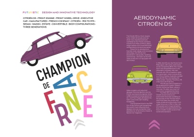
Scaling Graphical Text
The distinction between SVG and HTML has become blurred, the more I use SVG into my work. SVG is an XML-based format and is entirely at home when it’s incorporated into HTML. This final McBain-inspired design relies on SVG in HTML not just for its striking imagery, but also for text.
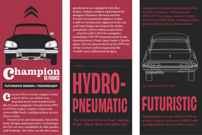
To develop this striking red and black design, I need four structural HTML elements. A header contains an image of the iconic Citroën DS. The banner division includes a large headline developed using SVG text. The main element includes my running text, and finally an aside for supplementary content:
<svg>…</svg>

<header>
  <svg>…</svg>
</header>

<div id="banner">
  <svg>…</svg>
</div>

<main>
  <div id="heading">
    <svg role="heading" aria-level="1">…</svg>
  </div>

  <div class="content">
    <p class="dropcap">…</p>
    <p>…</p>
  </div>
</main>

<aside>
  <small>…</small>
  <svg role="heading" aria-level="2">…</svg>
  <p>…</p>
  <figure>…</figure>

  <svg role="heading" aria-level="2">…</svg>
  <p>…</p>
</aside>
I used to think using SVG to render text was as inappropriate as setting text within images but having used SVG more, I realize I was wrong.
In issue 8, I explained how like HTML text, SVG text is accessible and selectable. It also has the advantage of being infinitely style-able using clipping paths, gradient fills, filters, masks, and strokes.
The banner division’s headline includes two text elements. The first contains the large word “Champion,” the second contains “de France.” Pairs of x and y coordinates on each tspan element place those words precisely where I want them to develop a solid slab of text:
<svg xmlns="http://www.w3.org/2000/svg" viewBox="0 0 850 360">

<title>Champion de France</title>

<g fill="#ff" fill-rule="evenodd">

<text>
  <tspan class="title__dropcap" x="0" y="240">C</tspan>
  <tspan class="title" x="180" y="160">hampion</tspan>
</text>

<text>
  <tspan class="title__small" x="600" y="260">de France</tspan>
</text>

</g>
</svg>
Whether I choose to incorporate this SVG into my HTML or link to it as an external image, I can use CSS to define its style. This headline is a linked image, so I add my styles to the SVG file:
<svg>

<style type="text/css">
<![CDATA[

text {
color: #fff; }

.title {
font-family: Clarendon URW;
font-size: 150px; }

.title__dropcap {
font-family: Clarendon URW;
font-size: 300px;
text-transform: lowercase; }

.title__small {
font-family: Obviously;
font-size: 85px;
text-transform: uppercase; }

]]>
</style>

</svg>
I start by adding foundation colour and typography styles. I’ve chosen to indent the start of each new paragraph, so I remove all bottom margins and add a 2ch wide indent to every subsequent paragraph:
body {
background-color: #a73448;
color: #fff; }

.content p {
margin-bottom: 0; }

.content p + p {
text-indent: 2ch; }
The dark grey background and red text of my aside element are opposite to those elsewhere in my design. Increasing lightness and saturation makes colours appear more vibrant against dark backgrounds:
aside {
background-color: #262626;
color: #d33c56; } 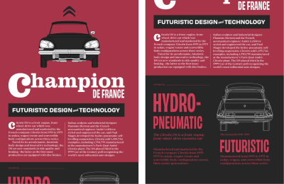
Medium-size screens allow me to tweak the design of my content to get the most from the extra space available. I use two different multiple-column layout properties. First, specifying two columns of variable widths for my content division. Then, any number of columns which will all have a width of 16em:
@media (min-width: 48em) {

.content {
column-count: 2;
column-gap: 2rem; }

aside {
column-width: 16em;
column-gap: 2rem; }
} 
Most of my styling is visible to people who use even the smallest screens, so developing a large-screen layout involves applying grid properties and twelve columns to the body element:
@media (min-width: 64em) {

body {
display: grid;
grid-template-columns: repeat(12, 1fr); }
}
I place the Citroën logo into the first column:
body > svg {
grid-column: 1; }
Then, the header which contains an image of the iconic DS spans four columns:
header {
grid-column: 3 / span 4; }
Both the banner division with its stylish SVG headline and my main content’s running text occupy eight columns:
#banner,
main {
grid-column: 1 / span 8; }
And finally, the reversed-theme aside element occupies three columns on the right of my design. To ensure this content spans every row from the top to bottom of my layout, I place it using row line numbers:
aside {
grid-column: 10 / -1;
grid-row: 1 / 6; } 
Read More From The Series
- Inspired Design Decisions: Avaunt Magazine
- Inspired Design Decisions: Pressing Matters
- Inspired Design Decisions: Ernest Journal
- Inspired Design Decisions: Alexey Brodovitch
- Inspired Design Decisions: Bea Feitler
- Inspired Design Decisions: Neville Brody
- Inspired Design Decisions: Otto Storch
- Inspired Design Decisions: Herb Lubalin
- Inspired Design Decisions: Max Huber
- Inspired Design Decisions: Giovanni Pintori
NB: Smashing members have access to a beautifully designed PDF of Andy’s Inspired Design Decisions magazine and full code examples from this article. You can also buy the PDF and examples from this, and every issue from Andy’s website.
(ra, yk, il)
Smashing Podcast Episode 21 With Chris Ferdinandi: Are Modern Best Practices Bad For The Web?

Smashing Podcast Episode 21 With Chris Ferdinandi: Are Modern Best Practices Bad For The Web?
Drew McLellan 2020-07-28T05:00:00+00:00
2020-07-28T13:41:46+00:00
Today, we’re asking if modern best practices are bad for the web? Are modern frameworks taking us down the wrong path? I speak to Lean Web expert Chris Ferdinandi to find out.
Show Notes
- Chris’ page with links and notes for the podcast
- The Lean Web book
- Chris Ferdinandi on the web
- Chris on Twitter
- The Vanilla JavaScript Podcast
Weekly Update
- “Translating Design Wireframes Into Accessible HTML/CSS”
by Harris Schneiderman - “Building Desktop Apps With Electron And Vue”
by Timi Omoyeni - “Modern CSS Techniques To Improve Legibility”
by Edoardo Cavazza - “How To Use Styled-Components In React”
by Adebiyi Adedotun Lukman - “How To Create A Porsche 911 With Sketch”
by Nikola Lazarevi?
Transcript
Drew McLellan: He’s the author of Vanilla JS Pocket Guide Series, creator of the Vanilla JS Academy Training Program, and host of the Vanilla JS Podcast. He’s developed a Tips newsletter, it’s read by nearly 10,000 developers each weekday. He’s taught developers at organizations like Chobani and The Boston Globe. And his JavaScript plugins have been used by organizations like Apple and Harvard Business School. Most of all, he loves to help people learn Vanilla JavaScript. So we know he’d rather pick Vanilla JavaScript over a framework, but did you know he was once picked out in a police lineup as being the person least likely to have committed the crime? My Smashing friends, please welcome Chris Ferdinandi. Hello, Chris. How are you?
Chris Ferdinandi: Oh, I’m smashing. Thanks for having me.
Drew: I wanted to talk to you today about this concept of a Lean Web, which something of a passion for you, isn’t it?
Chris: Yes, very much so.
Drew: Why don’t you set the scene for us? When we talk about a Lean Web, what is the problem we are trying to solve?
Chris: Yeah, great question. Just as a caveat for all the listeners, this episode might get a little old man yells at cloud. I’m going to try to avoid that. When I look at the way we build for the web today, it feels a little bit like a bloated over-engineered mess. I’ve come to believe that a lot of what we think of as best practices today might actually be making the web worse.
Chris: The Lean Web is an approach to web development that is focused on simplicity, on performance, and the developer experience over… I’m sorry, not the developer experience. The user experience rather, over the developer experience, and the ease of building things from a team perspective, which is what I think where we put a lot of focus today and as we’ll probably get into in our conversation.
Chris: I’ve actually come to find that a lot of these things we think of as improving the developer experience do so for a subset of developers, but not necessarily everybody who’s working on the thing you’re building. So there’s a whole bunch of issues with that too, that we can dig into. But really, the Lean Web is about focusing on simplicity and performance for the user and really prioritizing or putting the focus on the people who use the things we make rather than us, the people who are making it.
Drew: As the web matures as a development platform, there seems to be this ever increasing drive towards specialization.
Chris: Yes.
Drew: People who used to cover Full Stack, and then we split into front-end and back-end. And then that front-end split into people who do CSS or JavaScript development. And then increasingly within JavaScript, it becomes more specialized. Somebody might consider themselves and market themselves as a React developer or an Angular developer, and their entire identity and outlook is based around a particular framework that they are highly skilled in. Is this dependency on frameworks, the core of our work on the web, a bad thing?
Chris: It’s nuanced. I used to be very strongly in the yes, always camp. I think broadly, I still feel like yes, our obsession as an industry with frameworks and tools in general really, is potentially a little bit to our detriment. I don’t think frameworks are inherently bad. I think they’re useful for a very narrow subset of use cases. And we end up using them for almost everything, including lots of situations where they’re really not necessarily the best choice for you or for the project.
Chris: When I think about a lot of the issues that we have on the web today, the core of those issues really starts with our over-reliance on frameworks. Everything else that comes after that is in many ways, because we throw so much not just frameworks which is JavaScript in general, at the web. I say that as someone who professionally teaches people how to write and use JavaScript. That’s how I make my money. And I’m here saying that I think we use too much JavaScript, which is sometimes a little bit of an odd thing.
Drew: In the time before the big frameworks sprouted up, we used to build user interfaces and things with jQuery or whatever. And then frameworks came along and they gave us more of this concept of a state-based UI.
Chris: Yes.
Drew: Now, that’s a fairly complex bit of engineering that you’re required to get in place. Does working with less JavaScript exclude using something like that, or do you have to re-implement it yourself? Are you just creating a loaded boilerplate?
Chris: A lot of it depends on what you’re doing. If you have a non-changing interface, you can build a state-based UI with… I don’t know, maybe a dozen or so lines of code. If you have a non-changing interface, I would honestly probably say state-based UI. It’s not necessarily the right approach. There’s probably other things you can do instead. Think of static site generators, some pre-rendered markup, even an old-school WordPress or PHP driven site.
Chris: But where this starts to get interesting is when you get into more dynamic and interactive interfaces. Not just apps. I know people love to draw this line between websites and apps, and I think there’s this weird blend between the two of them and the line is not always as clear. When you start to get into more the user does stuff, something changes. State-based UI becomes a little bit more important. But you still don’t need tons of code to make that happen.
Chris: I look at something like React or Vue, which are absolutely amazing pieces of engineering. I don’t want to take away from the people who work on those. I ended up as a learning exercise, building my own mini-framework just to get a better sense for how these things work under the hood. It is really hard to account for all of the different moving pieces. So I have tremendous respect for the people who build and work on these tools. But React and Vue are both about 30 kilobytes after minifying and gzipping. So once you unpack them, they’re substantially bigger than that.
Chris: Not all of it, but a good chunk of that weight is devoted to this thing called the virtual DOM. There are alternatives that use similar APIs or approaches. For React, you have Preact, which is 2.5 kilobytes or about 3 kilobytes instead of 30. It’s a tenth of the size. For Vue, you have Alpine JS instead, which is about 7 kilobytes. Still, substantially smaller. The big difference between those and their big brother counterparts, is that they’ve shed the virtual DOM. They may drop a method or two. But generally, it’s the same approach and the same kind of API in the way of working with code, and they’re substantially smaller.
Chris: I think a lot of the tools we use are potentially overpowered for the things we’re trying to do. If you need a state-based UI and you need reactive data and these dynamic interfaces, that’s great. I think one of the big things I try and talk about today is not… never use tools. For me, Vanilla JS is not you’re handwriting every single line of code and every single project you do. That’s madness. I couldn’t do that, I don’t do that. But it’s being more selective about the tools we use. We always go for the multi-tool, the Swiss Army knife that has all these things in it. And sometimes, all you really need is a pair of scissors. You don’t need all the other stuff, but we have it anyways.
Chris: Which is a really long way to… I’m sorry, of answering your question. Which is sometimes it’s more code than you could or would want to write yourself, but it’s not nearly as much code as I think we think it requires. When I say you don’t need a framework, I get a lot of push-back around this idea that, “Well, if you don’t use a framework, you’re basically writing your own.” Then that comes with its own problems. I think there’s a place in between using React or Vue and writing your own framework, and it’s maybe picking something that’s a little bit smaller. There are sometimes reasons where writing your own framework might actually be the right call, depending on what you’re trying to do. It’s all very fluid and subjective.
Drew: It’s quite interesting that as a learning exercise, you implemented your own state-based framework. I remember in the past, I used to think that every time I reached for a library or something, I liked to think that I could implement it myself.
Chris: Sure, sure.
Drew: But reaching for the library saved me the hassle of doing that. I knew if I had to write this code myself, I knew what approach I’d take to do it. And that was true all the way up to using things like jQuery and things. These days, I think if I had to write my own version of Vue or React, I have almost no idea what’s happening now in that library, in all that code.
Drew: For those of us who are not familiar, when you say something like Preact drops the virtual DOM and makes everything a lot smaller, what’s that virtual DOM giving us?
Chris: To answer that question, I want to take just a slight step back. One of the nicest things that frameworks and other state-based libraries give you is DOM diffing. If you’re not really updating the UI that much, you could get by with saying, “Here’s a string of what the markup is supposed to look like. In HTML, I’ll just put all this markup in this element.” When you need to change something, you do it again. That is a little expensive for browsers, because it triggers a repaint.
Chris: But I think potentially more importantly than that, one of the issues with doing that is that you have any sort of interactive element in there, a form-field, a link that someone has focused on. That focus is lost because the element… even though you have a new thing that looks similar, it’s not the same literal element. So if focus is lost, it can create confusion for people using screen readers. There’s just a whole bunch of problems with that.
Chris: Any state-based UI thing worth its weight is going to implement some for of DOM diffing, where they say, “Here’s what the UI should look like. Here’s what it looks like right now in the DOM. What’s different?” And it’s going to go and change those things. It’s effectively doing the stuff you would do just manually updating the UI yourself, but it’s doing it for you under the hood. So you can just say, “Here’s what I want it to look like.” And then the library or framework figures it out.
Chris: The smaller things like Preact or Alpine, they’re actually doing that directly. They’re converting the string you provide them of what the UI should look like into HTML elements. And then they’re comparing each element to its corresponding piece in the literal DOM. As you end up with UIs that get bigger and bigger and bigger, that can have a performance implication because querying the DOM over and over again becomes expensive. If you want to get a sense for the type of interface where this becomes a problem, right-click and inspect element on the “Favorite” button on Twitter, or the “Like” button on Facebook. And take a look at the nesting of divs that gets you to that element. It’s very, very deep. It’s like a dozen or so divs, nested one inside the other just for that single tweet.
Chris: When you start going that many layers down, it starts to really impact performance. What the virtual DOM does is instead of checking the real DOM every time, it creates an object-based map of what the UI looks like in JavaScript. And then does the same thing for the UI you want to replace the existing one with, and it compares those two. That’s a lot more performance in theory, than doing that in the real DOM. Once it gets a list of the things it needs to change, it just runs off and makes those changes. But it only has to attack the DOM once. It’s not checking every single element, every single time. If you have interfaces like Twitters or Facebooks or QuickBooks or something like that, virtual DOM probably makes a lot of sense.
Chris: The challenge with it is… the difference between Preact and React is 27 kilobytes before you unpack the whole thing into its actual codewave. The raw download and unpacking and compiling time on that alone can add quite a bit of latency to the initial load on a UI. That becomes even more pronounced if your users are on not the latest devices from Apple. Even an Android device from a couple of years ago or a feature phone, or if you have people in developing countries, it’s just really… the time to get going is slower. And then on top of that, the actual interactive time is slower because of the extra abstraction.
Chris: So it’s not just you load it and they’re comparable in speed. Each micro interaction that someone makes and the changes that need to happen can also be slightly slower just because of all that extra code in there. If you have a really, really complex UI with lots of nested elements and lots of data, then the virtual DOM’s performance gains outweigh that extra code weight. But any typical UI for a typical app that most of what I see developers using React or Vue for, the benefit you get from the virtual DOM just isn’t there and they’d be better off. Even if you want to keep the same convenience of React, use Preact. It’s a fraction of the size, it’ll work exactly the same way, and it’ll more performing. This is the kind of thing that I tend to argue for.
Chris: We need to be better about picking the right tool for the job. If you go with an approach like that, if you get to a point where a virtual DOM actually makes sense, it’s much easier to port Preact into React than if you rolled your own. That’s the situation. If you’re really worried about that, you get some future-proofing built in too.
Drew: Some might say, they might make the argument that these frameworks, things like Vue, React are so highly optimized for performance that you get so much benefit there that surely just pairing that with a package manager in a bundler to make sure you’re only sending down the code that you want to. Surely, you are way ahead already just by doing that?
Chris: Yeah. I don’t agree. I don’t really have much more to elaborate on that other than… I guess maybe, but not really. Even with a bundler, you still need that React core. Even with the bundling, that’s still going to be bigger than using something like Preact.
Chris: Drew, I really appreciate you leading the question on this. Because one of the other things I do talk about in my book, The Lean Web, and my talk of the same name, is how these tools… You mentioned the bundling, for example. One of the things we do to get around the performance hit that we take from using all this JavaScript is we throw even more JavaScript at the front-end to account for it. One of the ways we do that is package managers and module bundlers.
Chris: As you alluded to… for those of you who don’t know, these are tools that will… they will compile all of your little individual JavaScript bits into one big file. The newer ones and the more… I don’t want to call them thoughtful. But the newer ones will use a feature called tree shaking, where they get rid of any code that isn’t actually needed. If that code has some dependencies that aren’t used for the thing you’ve actually done, they’ll drop some of that stuff out to make your packages as small as possible. It’s actually not a terrible idea, but it results in this thing I typically call dependency health where you have this really delicate house of cards of dependencies on top of dependencies on top of dependencies.
Chris: Getting your process set up takes time. And anybody who has ever run an NPM install and then discovered that a bunch of dependencies were out of date and had to spend an hour trying to figure out which ones needed to be fixed and oh, it’s actually a dependency in a dependency and you don’t have the ability to go fix it yourself. It’s a whole thing. Maybe it works for you, but I’d rather spend my time not messing around trying to get my dependencies together.
Chris: I’ve started collecting tweets from people where they complain about time wasted on their workflow. One of my favorites, Brad Frost a couple year ago, was talking about the depressing realization that the thing you’ve been slogging through in modern JS could have taken you 10 minutes in jQuery. I’m not really a jQuery fan, but I feel that pain when it comes to working with frameworks.
Chris: The other issue with a lot of these tools is they start to become gatekeepers. I don’t know how much you really want to dive into this or not, Drew. But one of my big push-backs against JS, all the things in a workflow. Especially when you start to then say, “Well, if we’re already using JS for the HTML, why not use it for CSS too?” You start to exclude a lot of really talented people from the development process. It’s just a really big loss for the project for the community as a whole.
Drew: Well, I certainly am… I started picking up React at the beginning of 2020, adding that to my skillset. I’ve been doing it now for nearly seven months. I’ve got to say one part I’m least confident in is setting up the tooling around getting a project started.
Drew: It seems like there’s an awful lot of work to get something to Hello World, and there’s even more that you’ve got to know to get it to be production ready. That has to make development more difficult to get started with if this is being put forward as what you should be doing in 2020 to learn to be a web developer. Somebody coming in new to it is going to have a real problem. It’s going to be a real barrier to entry, isn’t it?
Chris: Absolutely. The other piece here is that JavaScript developers aren’t always the only people working on a code base or contributing in a meaningful way to that code base. The more we make knowing JavaScript a requirement for working with a code base, the less likely those people are to be able to actually participate in the project.
Chris: An example of that, that I like to talk about is WordPress, who has been recently… I shouldn’t say recently at this point. It’s been a couple of years now. But they’ve been shifting their back-end stack more and more to JavaScript, away from PHP, which is not inherently a bad thing. Their new editor, Gutenburg, is built on React.
Chris: In 2018, WordPress’s lead accessibility consultant, Rian Rietveld, whose name I almost certainly butchered… she very publicly resigned from her positioned and documented why in a really detailed article. The core of the problem was that her and her team were tasked with auditing this editor to make sure that it was going to be accessible. WordPress comprises now 30% of the web. Their goal is to democratize publishing, so accessibility is a really important part of that. It should be an important part of any web project. But for them in particular, it is acutely important. Her team’s whole job is to make sure… her team’s whole job was to make sure that this editor would be accessible. But because neither she nor anyone on her team had React experience and because they couldn’t find volunteers in the accessibility community with that experience, it made it really difficult for her and her team to do their work.
Chris: Historically, they could identify errors and then go in and fix them. But with the new React based workflow, they were reduced to identifying bugs and then filing tickets. They got added to a backlog along with all the other feature development requests that the JavaScript developers were working on. A lot of stuff that could have been easily fixed didn’t make it into the first release.
Chris: In May of 2019, about a year after Rian resigned, there was a detailed accessibility audit done on Gutenburg. The full report was 329 pages. The executive summary alone was 34 pages. It documented 91 accessibility related bugs in quite a bit of detail. Many of these were really… I don’t want to call them simple low-hanging fruit, but a lot of them were basic things that Rian’s team could have fixed and it would have freed up the developers to focus on feature development. That’s ultimately what it seems like they ended up doing, was spending a lot of time on feature development and pushing this stuff off til later. But that team is super important to the project, and they suddenly got locked out of the process because of a technical choice.
Chris: Alex Russell is a developer on the Chrome team. He wrote this article a couple of years ago called The Developer Bait and Switch, where he talked about the straw man argument of frameworks. This idea that these tools let you move faster and because of that, you can iterate faster and deliver better experiences. It’s this idea that a better developer experience means a better user experience. I think this is a very clear example of how that argument doesn’t always play out the way people believe it does. It’s a better experience for maybe some people, not for everyone.
Chris: CSS developers, people working on design systems, their ability to create tools that others can use sometimes gets limited by these tool choices too. In my experience, I used to be better at CSS. It’s changed a lot in the last few years and I am nowhere near as good as I used to be. In my experience, the people who are really advanced CSS developers… and I do mean that in the truest sense. People who work on CSS are proper web developers working on a programming language. It’s a very special, or can be a very specialized thing. The people who are exceptionally good at it, in my experience, are not always also very good at JavaScript because you end up diving really deep into one thing and you slide a little bit on some other stuff. Their ability to work with these technologies gets hindered as well, which is too bad because it used to not be the case.
Chris: When the stack was simpler, it was easier for people from multiple disciplines to participate in the development process. I think that’s to the detriment of both the things we build and the community at large, when that’s no longer the case.
Drew: I found recently in a project researching ways to deal with some of the CSS problems, workflow problems, we’re having multiple working on the project and the bundle size increasing and the old CSS never getting removed. It was a React project, so we were looking at some of these CSS in JavaScript approaches to see what would be best for us to use to solve the problems that we had. What became very quickly apparent is there’s not only one solution to do this. There are dozens of different ways you could do this.
Drew: CSS in JS is a general approach, but you might go from one project to the next and it’s completely influenced in a completely different way. Even if you’re a CSS person and you learn a particular approach on a project, those skills may not be transferrable anyway. It’s very difficult to see how somebody should investment too much time in learning that if they’re not particularly comfortable with JavaScript.
Chris: Yeah. The other interesting thing that I think you just got out a little bit is when I talk about this, one of the biggest pieces of push-back I get is that frameworks enforce conventions. You’re going with Vanilla JavaScript, you’ve got this green field-blue sky, you can do anything you want kind of project. With React, there’s a React way to do things.
Chris: But one of the things I have found is that there are Reacty approaches, but there’s not a strict one right way to do things with React. It’s one of the things people love about it. It’s a little bit more flexible, you can do things a couple of different ways if you want. Same with Vue. You can use that HTML based thing where you’ve got your properties right in the HTML and Vue replaces them, but you can also use a more JSX-like templating kind of syntax if you’d prefer.
Chris: I’ve heard multiple folks complain about when they’re learning React, one of the big problems is you Google how to do X in React and you get a dozen articles telling you a dozen different ways that you could do that thing. That’s not to say they don’t put some guardrails on a project. I don’t think it’s as clearcut as, “I’ve chosen a framework. Now this is the way I build with it.” To be honest, I don’t know that that’s necessarily something I’d want either. I don’t think you’d want those tightly confined… some people do, maybe. But if you’re touting that as a benefit, I don’t think it’s quite as pronounced as people sometimes make it out to be.
Chris: You got into an interesting thing though just there, where you were mentioning the CSS that is no longer needed. I think that is one of the legitimately interesting things that something like CSS and JS… or tying your CSS to JavaScript components in some way can get you is if that component drops out, the CSS also in theory, goes away with it. A lot of this to me feels like throwing engineering at people problems. Invariably, you’re still dependent on people somewhere along the line. That’s not to say never use those approaches, but they’re certainly not the only way to get at this problem.
Chris: There are tools you can use to audit your HTML and pull out the styles that aren’t being used even without using CSS and JavaScript. You can write CSS “the old-fashioned way” and still do the linting of unused styles. There are authoring approaches to CSS that give you a CSS in JS-like output and keep your style sheet small without spitting out these gibberish human unreadable class names that you get with CSS and JS sometimes. Like X2354ABC, or just these nonsense words that get spit out.
Chris: This is where I start to get really into the old man yells at cloud kind of thing. I’m really showing my developer age here. But yeah, it’s not necessarily that these things are bad, and they’re built to solve legitimate problems. I sometimes feel like there’s a little bit of a… if it’s good enough for Facebook, it’s good enough for us kind of thing that happens with these. Well, Facebook uses this tool. If we’re a real engineering program… team, department, organization, we should too. I don’t necessarily think that’s the right way to think about it. It’s because Facebook deals with problems that you don’t, and vice-versa. The size and scale of what they work on is just different, and that’s okay.
Drew: Exactly. I see some of these things like CSS and JavaScript to be almost like a polyfill. We’ve got legitimate problems, we need a way to solve it. The technology isn’t providing us a way to solve it yet. Maybe whilst we wait for the web platform to evolve and to get around to addressing that problem, this thing that we do right now with JavaScript kind of will see us through and we’ll be okay. We know it’s bad. We know it’s not a great solution, but it helps us right now. And hopefully in the while we can pull it out and use the native solution.
Chris: It’s really funny you bring this up. Because literally last night, I was watching a talk from Jeremy Keith from last year about progressive web apps. But he was talking about how a couple of decades ago, he was trying to convince people to use JavaScript. Which seems ridiculous at the time, but JavaScript was this new thing. He showed people how you could do cool things like change the color of a link on hover with this new… It seems absurd that you would need JavaScript for that now, because that’s what CSS does for you. But things like the focus attribute or property just didn’t exist at the time.
Chris: One of the things he said in the talk that I think really resonated with me is that JavaScript in many ways, paves those cow paths. It’s this very flexible and open language that we can use to create or bolt in features that don’t exist yet. And then eventually, browsers catch up and implement these features in a more native way. But it takes time. I completely understand what you’re saying about this. It’s not the perfect solution, but it’s what we have right now.
Chris: I think for me, the biggest difference between polyfills and some of these solutions is polyfills are designed to be ripped out. If I have a feature I want to implement that the browser doesn’t support yet, but there’s some sort of specification for it and I write a polyfill… once browsers catch up, I can rip that polyfill out and I don’t have to change anything. But when you go down the path of using some of these tools, ripping them up out means rewriting your whole code base. That’s really expensive and problematic. That’s not to say never use them, but I feel really strongly that we should be giving thought to picking tools that can easily be pulled out later. If we no longer need them or the platform catches up, it doesn’t require a huge rewrite to pull them out.
Chris: So getting to that we have a whole bunch of styles we don’t use anymore thing, that’s why I would personally favor a build tool technology that audits your CSS against the rendered markup and pulls out the things you don’t need. Because down the road if a platform catches up, you can pull that piece of the build tool out without having to change everything. It’s just augmenting what you already have, whereas CSS and JS doesn’t give you that same kind of benefit. I’m just picking on that one, but I think about a lot of these technologies more broadly.
Chris: I do feel things like React or Vue are probably paving some cow paths that browsers will eventually catch up with and probably use similar approaches if not the same, so there may be less rewriting involved there. A lot of the ecosystem stuff that gets plugged in around that may be less so.
Drew: I think it’s right, isn’t it, that the web platform moves slowly and carefully. You think if five years ago, we were all putting JavaScript Carousels on our pages. They were everywhere. Everyone was implementing JavaScript Carousels. If the web platform had jumped and implemented a Carousel solution to satisfy that need, it would not be sat there with nobody using it because people aren’t doing that with Carousels anymore. Because it was just a fad, a design trend. To counteract that and stop the platform itself becoming bloated and becoming a problem that needs solving, it does have to move at a lot steadier pace. The upshot of that is HTML that I wrote in 1999 still works today because of that slow process.
Drew: One of the other areas where things seem to be bloating out on the web is… I guess it’s related to the framework conversation. But it’s the concept of a single-page app. I feel like that a lot of promises are made around single-page apps as to their performance, like you’re getting all this benefit because you’re not reloading the entire page framework. I feel like they don’t always make good on those performance promises. Would you agree with that?
Chris: Yes. Although I will confess, despite having a very lengthy chapter in my book on this and talking about that a lot in talks and conversations with people, I don’t think single-page apps are always a terrible thing. But I do think this idea that you need one for performance is overstated. You can oftentimes get that same level of performance with different approaches.
Chris: I think one of the bigger challenges with single-page apps is… For anybody who’s unfamiliar with those. When a single-page app, instead of having separate HTML files or if you’re using something like a database driven site like WordPress, even though you don’t have actual physical HTML files for each page in your WordPress site, WordPress is creating HTML files on the fly and sending them back to browsers when URLs are requested. For purposes of this conversation, instead of having separate HTML files for every view in your app, a single-page app has a single HTML file. That’s what makes it a single-page app. JavaScript handles everything. Rendering the content, routing to different URL paths, fetching new content if it needs to from an API or something like that.
Chris: One of the spoken benefits of these or stated benefits of these is that only the content on the page changes. You don’t have to re-download all the JS and the CSS. Oh, and you can do those fancy page transitions that designers sometimes love. In theory, this is more performant than having to reload the whole page.
Chris: The problem with this approach from my perspective is that it also breaks a bunch of stuff that the browser just gives you for free out-of-the-box, and then you need to recreate it with more JS. You have an app that’s slow because it has a lot of JS. So you throw even more JavaScript at it to improve that performance and in doing so, you break a bunch of browser features and then have to re-implement those with even more JS too.
Chris: For example, some things that the browser will do for free with a traditional website that you need to recreate with JavaScript when you go the single-page app. You need to intercept clicks on links and suppress them from actually firing, with your JavaScript. You then need to figure out what you actually need to show based on that URL, which is normally something that would get handled on the server or based on the file that goes with that URL path. You need to actually update the URL in the address bar without triggering a page reload. You need to listen for forward and back clicks on the browser and update content again, just like you would with clicks on links. You need to update the document title.
Chris: You also need to shift focus in a way that announces the change in page to people who are using screen readers and other devices so that they’re not confused about where they are or what’s going on. Because they can’t see the change that’s happening, they’re hearing it announced. If you don’t actually shift focus anywhere, that announcement doesn’t happen. These are all things that the browser would do for you that get broken with single-page apps.
Chris: On top of that, because you have all this extra JavaScript, this is complicated. So most people use frameworks and libraries to handle this sort of thing. Because of all this extra JavaScript to support this approach, you end up with potentially slower initial page load than you would have otherwise. Depending on the content you have, this approach I think sometimes can make sense. If you have an app that is driven by API data where you don’t necessarily know what those URL paths are going to look like ahead of time.
Chris: Just an example here. You have an animal rescue where you have some adoptable animals, and that data comes from Petfinder, the animal adoption website. You have a bunch of animals there. Petfinder manages that, but you want to display them on your site with the Petfinder API. When your website’s being built, it doesn’t always necessarily have visibility to what pets are available in this exact moment and what kind of URL paths you’re going to need. A single-page app can help you there because it can dynamically on the fly, create these nice URLs that map with each dog or cat.
Chris: Something like Instagram with lots of user created content, maybe that also makes sense. But for a lot of things, we do know where those URLs are going to be ahead of time. Creating an HTML file that has the content on it already is going to be just as fast as… sometimes even faster than the JavaScript based single-page app approach, especially if you use some other techniques to keep your overall CSS and JavaScript size down. I use this approach on a course portal that I have. The page loads feel instantaneous because HTML is so easy for browsers to render compared to other parts of the stack. It feels like a single-page app, but it’s not.
Drew: Especially when you consider hosting solutions like a Jamstack approach of putting HTML files out in a CDN so it’s being served somewhere physically close to the user.
Chris: Yep.
Drew: Loading those pages can just be so, so quick.
Chris: Yes. Absolutely. Absolutely. One of the other arguments I think people used to make in favor of single-page apps is offline access. If someone loads it and then their network goes down, the app is already up and all the routes are handled just with the file that’s already there. So there’s no reloading, they don’t lose any work. That was true for a long time. Now with service workers and progressive web apps, that is I think less of a compelling argument, especially since service workers can fetch full HTML files and cache them ahead of time if needed.
Chris: You can literally have your whole app available offline before someone has even visited those pages if you want. It just happens in the background without the user having to do anything. It’s again, one of those technologies that maybe made sense for certain use cases a few years ago a little less compelling now.
Drew: It reminds me slightly of when we used to build websites in Flash.
Chris: Yes.
Drew: And you’d have just a rectangle embedded in an HTML page which is your Flash Player, and you’d build your entire site in that. You had to reimplement absolutely everything. There was no back button. If you wanted a back button, you had to create a back button, and then you had to create what the concept of a page was. You were writing code upon code, upon code to reimplement just as you are saying things that the browser already does for you. Does all this JavaScript that we’re putting into our pages to create this functionality… is this going to cause fragility in our front-ends?
Chris: Yes. This is almost certainly from my mind, one of the biggest issues with our over-reliance on JavaScript. JavaScript is just by its nature, is a scripting language, the most fragile part of the front-end stack.
Chris: For example, if I write an HTML element that doesn’t exist, I spell article like arcitle instead of article and the browser runs across that, it’s going to be like, “Oh, I don’t know what this is. Whatever, I’ll just treat it like a div.” And it keeps going. If I mistype a CSS property… Let’s say I forget the B in bold, so I write old instead, font way old. The browser’s going to be, “I don’t know what this is. Whatever, we’ll just keep going.” Your thing won’t be bold, but it will still be there.
Chris: With JavaScript, if you mistype a variable name or you try to use a property, you try to call a variable that doesn’t exist or a myriad of other things happen… your minifier messes up and pulls one line of code to the one before it without a semicolon where it needs one, the whole app crashes. Everything from that line on stop working. Sometimes even stuff that happens before that doesn’t complete, depending on how your app is set up. You can very quickly end up with an app that in a different approach, one where you rely a lot more on HTML and CSS, it would work. It might not look exactly right, but it would still work… to one that doesn’t work at all.
Chris: There’s an argument to be made that in 2020, JavaScript is an integral and important part of the web and most people don’t disable it and most people are using devices that can actually handle modern JavaScript. That’s true, but that’s not the only reason why JavaScript doesn’t work right, even if you have a linter there for example and you catch bugs ahead of time and things. There’s plenty of reasons why JavaScript can go horribly awry on you. CDNs fail.
Chris: Back in July of last, a year ago this month… at least, when we’re recording this… a bad deploy took down Cloudflare. Interestingly as we’re recording this, I think a week or two ago, Cloudflare had another massive outage that broke a whole bunch of things, which is not a knock on Cloudflare. They’re an incredibly important service that powers a ton of the web. But CDNs do sometimes go down. They are a provider used by 10% of Fortune 1,000 companies. If your JS is served by that CDN and it breaks, the JavaScript file never loads. And if your content is dependent on that JS, your users get nothing instead of getting something just not styled the way you’d like.
Chris: Firewalls and ad blockers get overly aggressive with what they block. I used to work at a company that had a JavaScript white list because they were extremely security conscious, they worked with some government contract stuff. They had a list of allowed JavaScript, and if your site or if your URL wasn’t part of that, no JavaScript. You have these sites. I remember going to a site where it had one of the hamburger kind of style menus on every view whether it was desktop or mobile, and I could not access any page other than the homepage because no JavaScript, no hamburger, that was it.
Chris: Sometimes connections just timeout for reasons. Either the file takes a while or someone’s in a spotty or slow connection. Ian Feather, an engineer at BuzzFeed, shared that about 1% of requests for JavaScript on the site fail which is 13 million requests a month. Or it was last year, it’s probably even more now. That’s a lot of failed JavaScript. People commuting go through tunnels and lose the internet. There’s just all sorts of reasons why JavaScript can fail and when it does, it’s so catastrophic.
Chris: And so we built this web that should be faster than ever. It’s 2020, 5G is starting to become a thing. I thought 4G was amazing. 4G is about as fast as my home wifi network. 5G is even faster, which is just bonkers. Yet somehow, we have websites that are slower and less performant than they were 5 or 10 years ago, and that makes no sense to me. It doesn’t have to be that way.
Drew: How do we get out of this mess, Chris?
Chris: Great question. I want to be really clear. I know I’ve hammered on this a couple times. I’m not saying all the new stuff is bad, never use it. But what I do want to encourage is a little bit more thoughtfulness about how we build for the web.
Chris: I think the overlying theme here is that old doesn’t mean obsolete. It doesn’t mean never embrace new stuff, but don’t be so quick to just jump on all the shiny new stuff just because it’s there. I know it’s one of the things that keeps this industry really exciting and makes it fun to work in, there’s always something new to learn. But when you pick these new things, do it because it’s the right tool for the job and not just because it’s the shiny new thing.
Chris: One of the other things we didn’t get into as much as I would have liked, but I think is really important, is that the platform has caught up in a really big way in the last few years. Embracing that as much as possible is going to result in a web experience for people that is faster, that is less fragile, that is easier for you to build and maintain because it requires fewer dependencies such as using what the browser gives you out-of-the-box. We used to need jQuery to select things like classes. Now browsers have native ways to do that. People like JSX because it allows you to write HTML in JavaScript in a more seamless way. But we also have template literals in Vanilla JavaScript that give you that same level of ease without the additional dependency. HTML itself can now replace a lot of things that used to require JavaScript, which is absolutely amazing.
Chris: We talked a little bit about… this is a CSS thing, but hovers over links and how that used to require JavaScript. But using things like the details and summary elements, you can create disclosure, like expand and collapse or accordion elements natively with no scripting needed. You can do auto complete inputs using just a… I shouldn’t say just, I hate that word. But using a humble input element and then a data list element that gets associated with it, with some options. If you’re curious about how any of this stuff works over at vanillajstoolkit.com, I have a bunch of JavaScript stuff that the platform gives you. But I also have some used to require JavaScript and now doesn’t kind of things that might be interesting too if you want some code samples to go along with this.
Chris: On the CSS side of things, my most popular Vanilla JS plugin ever is this library that lets you animate scrolling down to anchor links. It is very big. It’s the hardest piece of code I’ve ever had to write. And it now is completely replaced with a single line of CSS, scroll behavior smooth. It’s more performant. It’s easier to write. It’s easier to modify its behavior. It’s just a better overall solution.
Chris: One of the other things that I wish we did more is leaning on multi-page apps. I feel a little bit vindicated here, because I recently saw an article from someone at Google that actually pushes for this approach now too. I thought that was pretty interesting, given this huge angular and then framework… all the things, boom, that Google started a few years back. Kind of cool to see them come back around to this. Using things like static site generators and awesome services like Netlify and CDN caching, you can create incredibly fast web experiences for people using individual HTML files for all of your different views. So kind of leaning on some of this out-of-the-box stuff.
Chris: In situations where that’s not realistic for you, where you do need more JavaScript, you do need some sort of library, maybe taking a look at the smaller and more modular approaches first instead of just going for the behemoths of the industry. Instead of React, would Preact work? Instead of angular… I mean, instead of Vue rather, would Alpine JS work? There’s also this really interesting pre-compiler out there now called Svelt, that gives you a framework-like experience and then compiles all your code into Vanilla JavaScript. So you get these really tiny bundles that have just what you need and nothing else. Instead of CSS and JavaScript, could you bolt in some third party CSS linter that will compare your HTML to your CSS and pull out the stuff that got left in there by accident? Would a different way of authoring your CSS, like object oriented CSS by Nicole Sullivan, work instead? We didn’t really get to talk about that, but it’s a really cool thing people should check out.
Chris: And then I think maybe the third and most important piece here, even though it’s less of a specific approach and more just a thing I wish more people kept in mind, is that the web is for everyone. A lot of the tools that we use today work for people who have good internet connections and powerful devices. But they don’t work for people who are on older devices, have spotty internet connections. This is not just people in developing areas. This is also people in the U.K., in certain parts of the U.S. where we have absolutely abysmal internet connections. The middle of our country has very slow internet. I know there’s places in part of London where they can’t wire a new broadband in for historical reasons, so you’re left with these old internet connections that are really bad. There’s places like that all over the world. Last time I was in Italy, same thing. The internet there was horrible. I don’t know if it’s changed since then.
Chris: The things we build today don’t always work for everyone, and that’s too bad. Because the vision of the web, the thing I love about it, is that it is a platform for absolutely everyone.
Drew: If listeners want to find out more about this approach, you’ve gone into loads of detail to it in your book, The Lean Web. And that’s available online. Is it a physical book or a digital book?
Chris: It’s a little bit of both. Well, no. It’s definitely not a physical book. You go to leanweb.dev. You can read the whole thing for free online. You can also if you want, there’s EPUB and PDF versions available for a really small amount of money, I forget how much now. I haven’t looked at it in a while. The whole thing is free online if you want it. You can also watch a talk on this topic where I go into more details if you want.
Chris: But I’ve also put together a special page just for listeners of Smashing Podcast at gomakethings.com/smashingpodcast, because I’m very creative with naming things. That includes a bunch of resources in addition to the book, around things that we talked about today. It links to a lot of the different techniques that we covered, other articles I’ve written that go deeper into some of these topics and expand on my thinking a little bit. If folks want to learn more, that would probably be the best place to start.
Drew: That’s terrific. Thank you. I’ve been learning all about the Lean Web. What have you been learning about lately, Chris?
Chris: Yeah, a couple of things. I alluded to this a little bit earlier with watching Jeremy’s video on progressive web apps. I have been putting off learning how to actually write my own progressive web app for a couple of years because I didn’t have a specific need on anything I was working with. I recently learned from one of my students who is in South Africa, that they have been dealing with rolling blackouts because of some stuff they have going on down there. As a result, she is not able to work on some of the projects we’ve been doing together regularly, because the power goes out and she can’t access the learning portal and follow along.
Chris: For me, now building an experience where it works even if someone doesn’t have internet has become a higher priority than… I realized that maybe it was before, so I just started digging into that and hope to get that put together in the next few weeks. We’ll see. Jeremy Keith’s resources on this have been an absolute lifesaver though. I’m glad they exist.
Chris: I know, Drew, you mentioned one of the reasons you like to ask this question is to show that people no matter how seasoned they are, are always learning. Just a little related anecdote. I have been a web developer for I think, about eight years now. I still have to Google the CSS property to use for making things italic, literally every single time I use it. For some reason, my brain defaults to text decoration even though that’s not the right one. I’ll try a couple of combinations of different things, and I always have one word wrong every time. I also sometimes write italics instead of italic. Yeah. If anybody ever there is ever feeling like, oh, I’m never going to learn this stuff… just know that no matter how seasoned you are, there’s always some really basic thing that you Google over and over again.
Drew: I’ve been a web developer for 22, 23 years, and I have to Google the different properties for Flexbox still, every time. Although I’ve been using that for 23 years. But yeah, some things just… there’s probably going to more of those as I get older.
Chris: Yeah. Honestly, I ended up building a whole website of stuff I Google over and over again, just to have an easier copy-paste reference because that was easier than Googling.
Drew: That’s not a bad idea.
Chris: That’s the kind of lazy I am. I’ll build a whole website to save myself like three seconds of Googling.
Drew: If you the listener would like to hear more from Chris, you can find his book on the web at leanweb.dev, and his developer Tips newsletter and more at gomakethings.com. Chris is on Twitter at Chris Ferdinandi. And you can check out his podcast at vanillajspodcast.com or wherever you usually get your podcasts. Thanks for joining us today, Chris. Do you have any parting words?
Chris: No. Thank you so much for having me, Drew. I had an absolutely smashing time. This was heaps of fun. I really appreciate the opportunity to come chat.
(il)
The GitHub Profile Trick
Monica Powell shared a really cool trick the other day:
The profile README is created by creating a new repository that’s the same name as your username. For example, my GitHub username is m0nica so I created a new repository with the name m0nica.
Now the README.md from that repo is essentially the homepage of her profile. Above the usual list of popular repos, you can see the rendered version of that README on her profile:
Lemme do a lame version for myself real quick just to try it out…
OK, I start like this:
Then I’ll to go repo.new (hey, CodePen has one of those cool domains too!) and make a repo on my personal account that is exactly the same as my username:
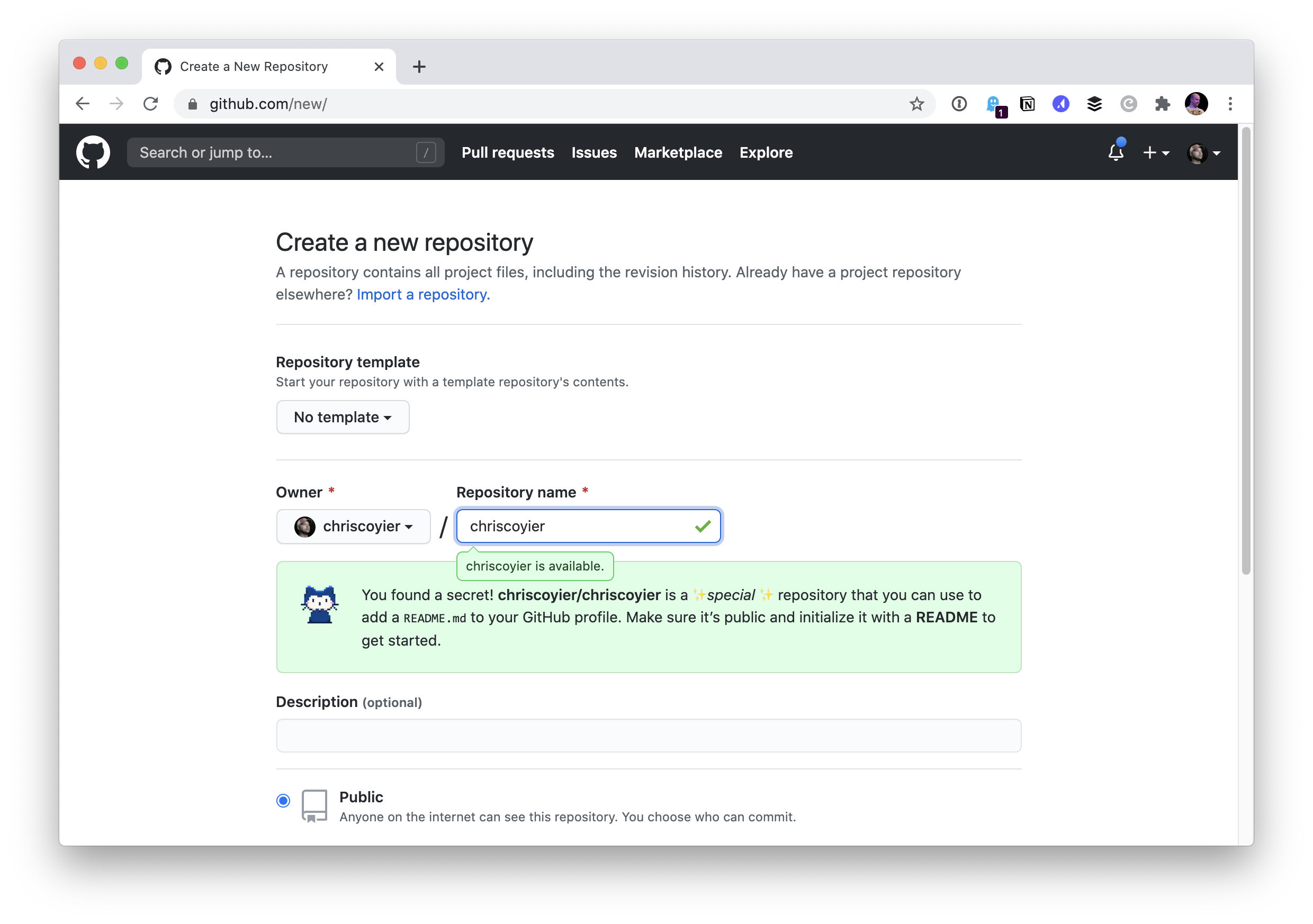
I chose to initialize the repo with a README file and nothing else. So immediately I get:
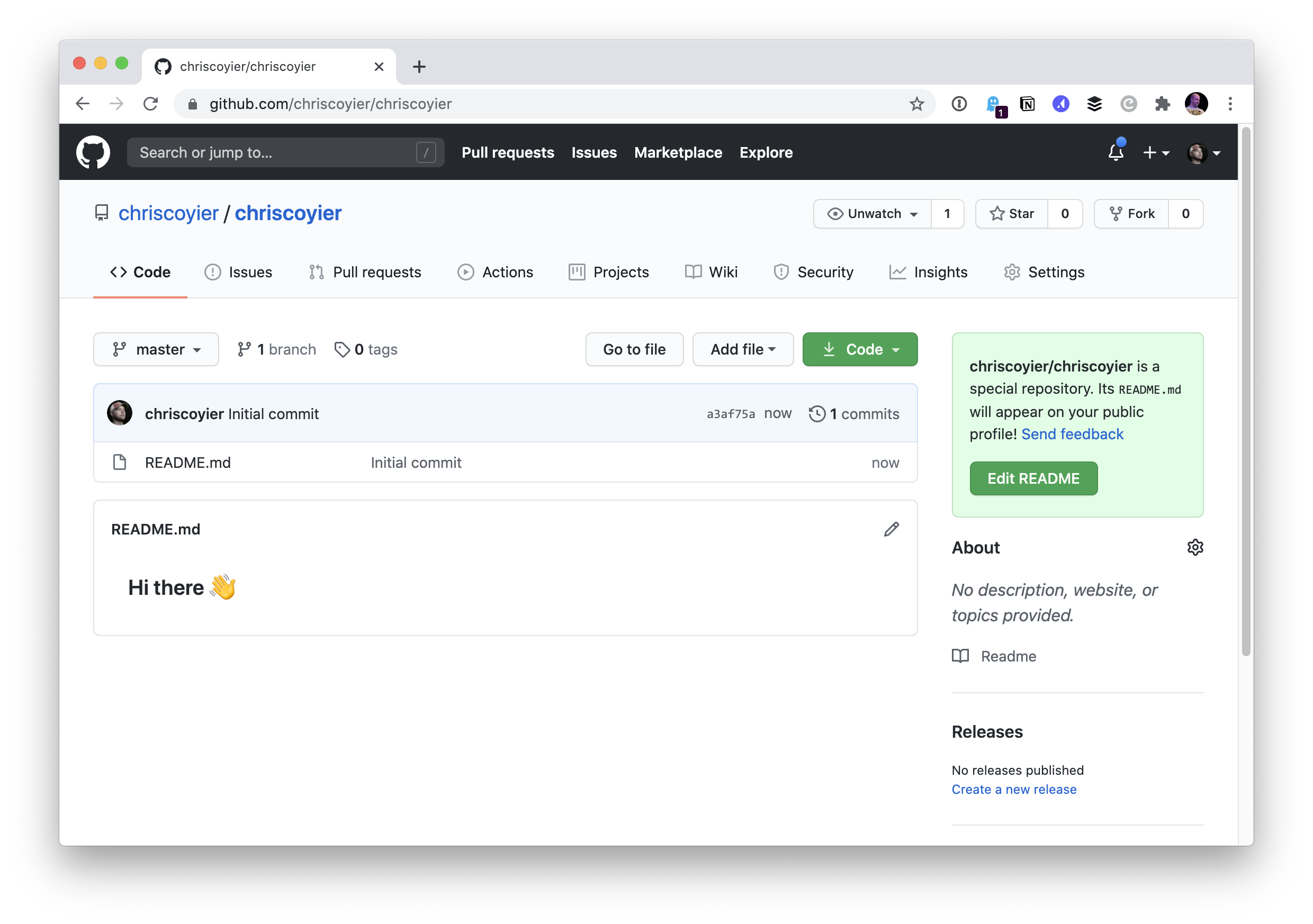
I can edit this directly on the web, and if I do, I see more helpful stuff:
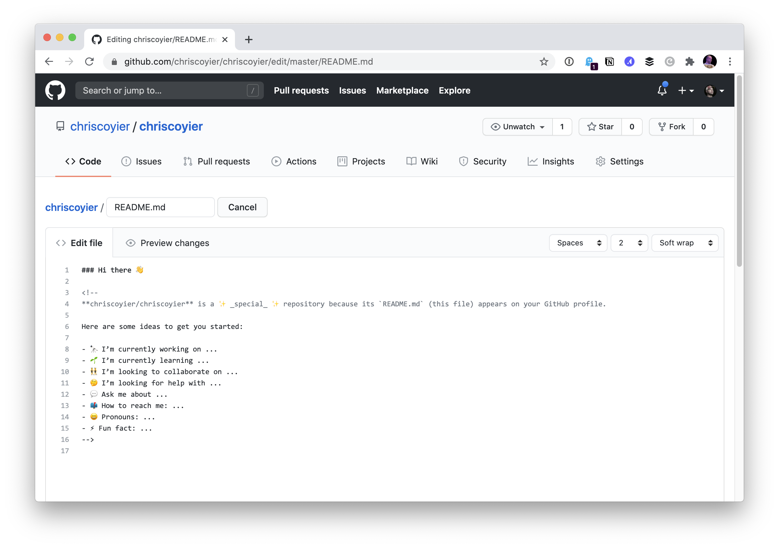
Fortunately, my personal website has a Markdown bio ready to use!
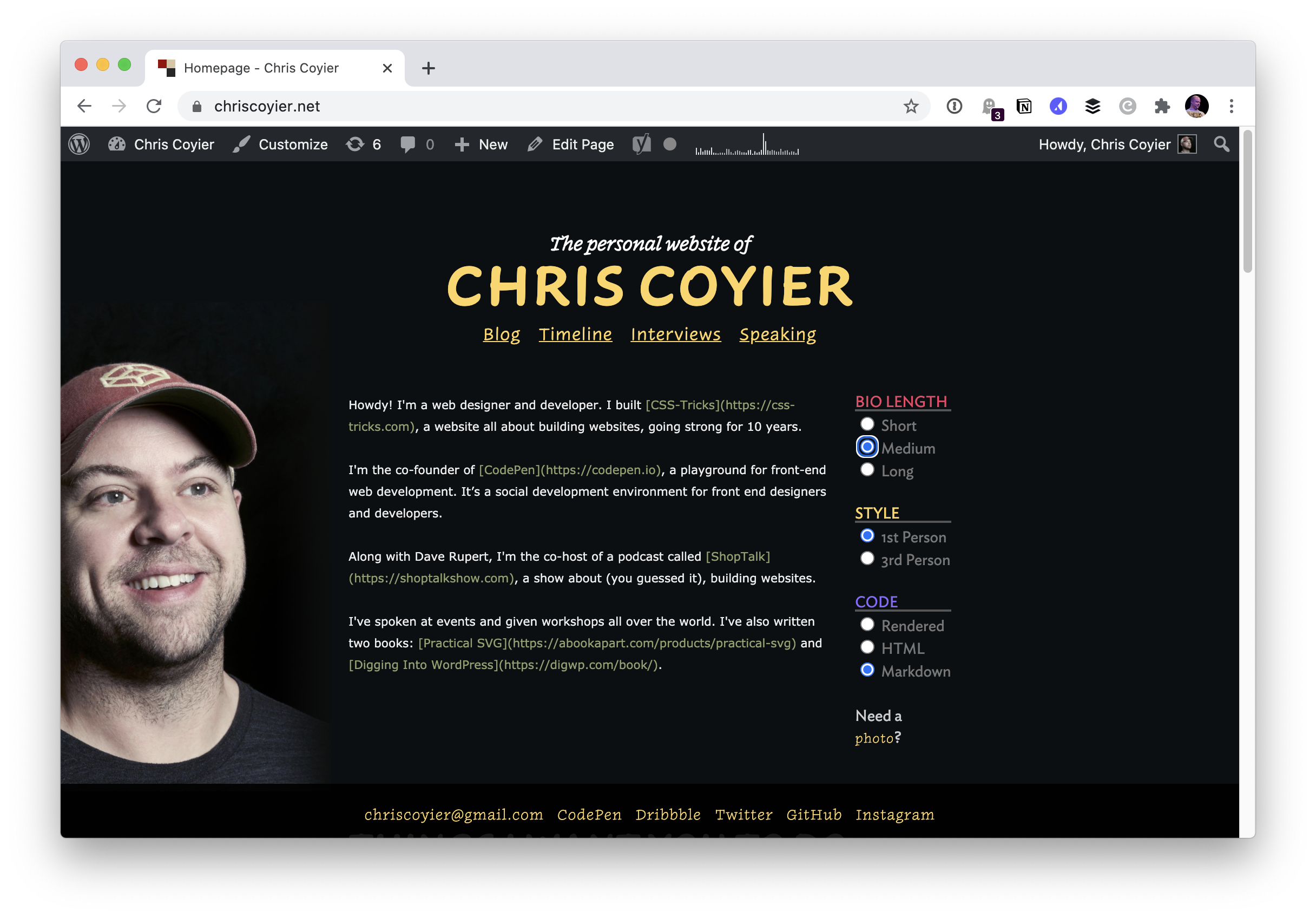
I’ll copy and paste that over.
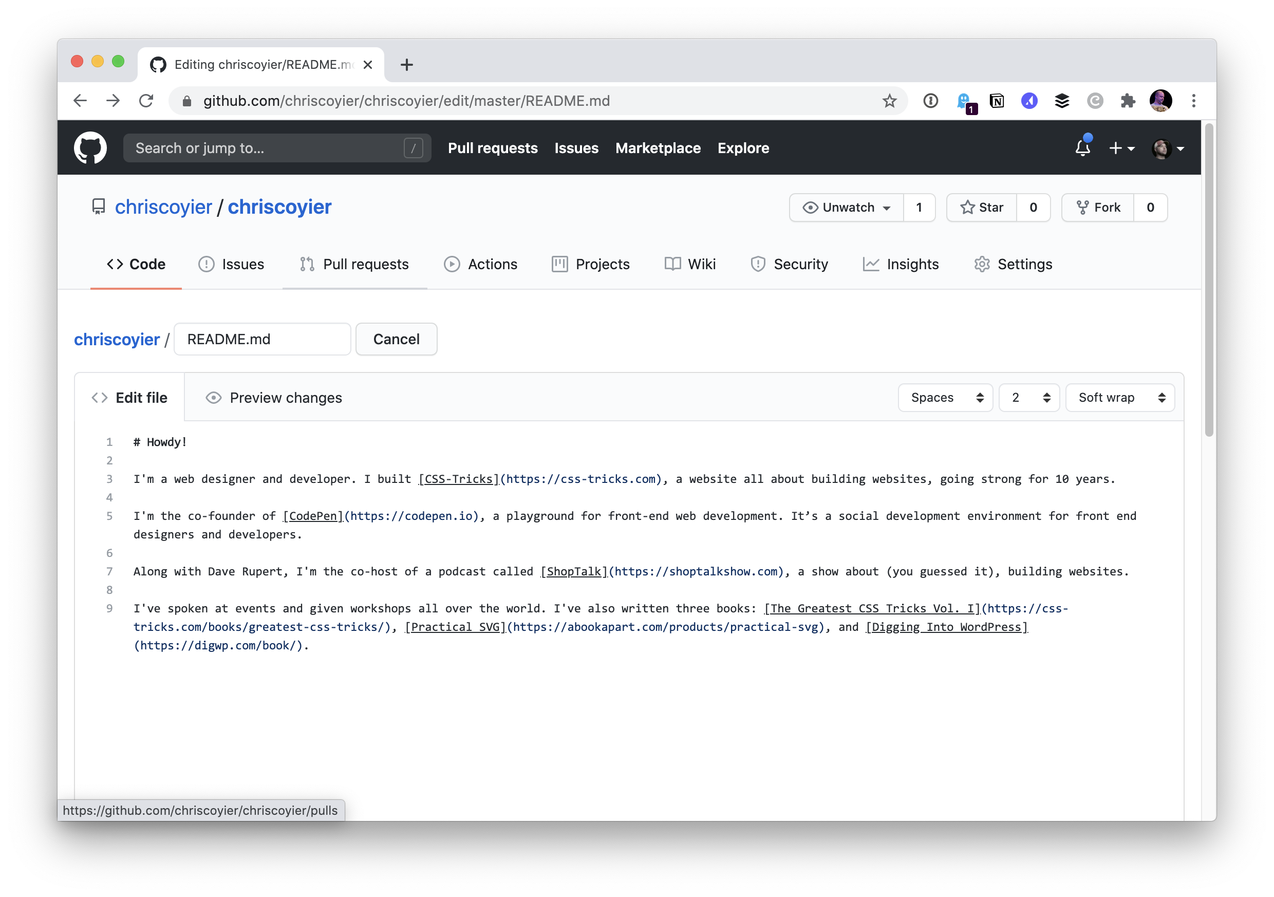
After committing that change, my own profile shows it!
Maybe I’ll get around to doing something more fun with it someday. Monica’s post has a bunch of fun examples in it. My favorite is Kaya Thomas’ profile, which I saw Jina Anne share:
Inspired by @waterproofheart, I created a README for my @github profile! Illustrations by the amazing @yess_esse ?
Really like that we can personalize our profiles like this now! pic.twitter.com/uOTheewnK9
— Kaya Thomas (@kthomas901) July 20, 2020
You can’t use CSS in there (because GitHub strips it out), so I love the ingenuity of using old school
The post The GitHub Profile Trick appeared first on CSS-Tricks.
You can support CSS-Tricks by being an MVP Supporter.
CSS Vocabulary
This is a neat interactive page by Ville V. Vanninen to reference the names of things in the CSS syntax. I feel like the easy ones to remember are “selector,” “property,” and “value,” but even as a person who writes about CSS a lot, I forget some of the others. Like the property and value together (with the colon) is called a declaration. And all the declarations together, including the curly brackets (but not the selector)? That’s a declaration block, which is slightly more specific than a block, because a block might be inside an at-rule and thus contain other complete rule-sets.
Direct Link to Article — Permalink
The post CSS Vocabulary appeared first on CSS-Tricks.
You can support CSS-Tricks by being an MVP Supporter.
Using Trello as a Super Simple CMS
Sometimes our sites need a little sprinkling of content management. Not always. Not a lot. But a bit. The CMS market is thriving with affordable, approachable products, so we’re not short of options. Thankfully, it is a very different world to the one that used to force companies to splash out a ga-jillionty-one dollars (not an exact cost: I rounded to the nearest bazillion) for an all-singing, all-dancing, all-integrating, all-personalizing, big-enterprise-certified™ CMS platform.
Sometimes, though, it’s nice to use a really simple tool that anyone updating content on the site is already familiar with, rather than getting to grips with a new CMS.
I like Trello a lot for managing ideas and tasks. And it has an API. Why not use it as a content source for a web site? I mean, hey, if we can do it with Google Sheets, then what’s to stop us from trying other things?
Hello, Trello
Here’s a simple site to explore. It gets its content from this Trello board and that content is displayed in sections. Each section is populated by the title and description fields of a card in our Trello board.
Trello uses Markdown, which comes in handy here. Anyone editing content in a Trello card is able to apply basic text formatting and have the same Markdown flow into the site and transformed into HTML by a build process.
Building blocks
I’m a big fan of this model of running a build which pulls content from various feeds and sources, and then mashes them together with a template to generate the HTML of a website. It decouples the presentation from the management of the content (which is where the term “decoupled” comes from in popular modern CMS products). And it means that we are free to craft the website just the way we want with all of the wizzy tricks and techniques we’ve learned here on CSS-Tricks.
Since we pull in the content at build time, we don’t need to worry about the usage quotas or the performance of our data sources if our sites get popular and bring in loads of traffic. And why wouldn’t they? Look how pretty we made them!
I wanna play!
Fine. You can grab a copy of this site’s code and tinker around to your heart’s content. This version includes information on how to create your own Trello board and use it as the source for content for the build.
- Example site code repository on GitHub
- Demo site
- Clone and deploy your own copy in a couple of clicks
If you want to walk through how this works first rather than diving right into it yourself, read on.
Discovering the API
Trello has a well-documented API and set of developer resources. There is also a handy Node module to simplify the task of authenticating and interacting with the API. But you can also explore the API by tinkering with the URLs when you are exploring your Trello boards.
For example, the URL for the Trello board above is:
https://trello.com/b/Zzc0USwZ/hellotrelloIf we add .json to that URL, Trello shows us the content represented as JSON. Take a look.
We can use this technique to inspect the underlying data throughout Trello. Here is the URL for one card in particular:
https://trello.com/c/YVxlSEzy/4-sections-from-cardsIf we use this little trick and add .json to the URL we’ll see the data which describes that card.
We’ll find interesting things — unique IDs for the board, the list, and the card. We can see the card’s content, and lots of metadata.
I love doing this! Look at all the lovely data! How shall we use it?
Deciding how to use a board
For this example, let’s assume that we have a site with just one page of manageable content. A list or column in our board would be ideal for controlling the sections on that page. An editor could give them titles and content, and drag them around into the order they want.
We’ll need the ID of the list so that we can access it via the API. Luckily, we’ve already seen how to discover that — take a look at the data for any of the cards in the list in question. Each one has an idBoard property. Bingo!
Generating the site
The plan is to fetch the data from Trello and apply it to some templates to populate our site. Most static site generators (SSG) would do the job. That’s what they are good at. I’ll use Eleventy because I think it has the simplest concepts to understand. Plus, it is very efficient at getting data and generating clean HTML with Nunjucks (a popular templating language).
We’ll want to be able to use an expression lin our template that outputs a section element for each item found in a JavaScript object called trello:
<!-- index.njk -->
{% for card in trello %}
<section>
  <h2>{{ card.name }}</h2>
  <div>
    {% markdown %}
      {{- card.desc | safe }}
    {% endmarkdown %}
  </div>
</section>
{% endfor %}
Fetching the data for the build
A popular technique with Jamstack sites like this is to run a build with Gulp, Grunt or [insert latest new build script hotness here] which goes and fetches data from various APIs and feeds, stashes the data in a suitable format for the SSG, and then runs the SSG to generate the HTML. This works rather nicely.
Eleventy simplifies things here by supporting the execution of JavaScript in its data files. In other words, rather than only leveraging data stored as JSON or YAML, it can use whatever gets returned by JavaScript, opening the door to making requests directly to APIs when the Eleventy build runs. We won’t need a separate build step to go off to fetch data first. Eleventy will do it for us.
Let’s use that to get the data for our trello object in the templates.
We could use the Trello Node client to query the API, but as it turns out all the data we want is right there in the JSON for the board. Everything! In one request! We can just fetch it in one go!
// trello.js
module.exports = () => {
  const TRELLO_JSON_URL='https://trello.com/b/Zzc0USwZ/hellotrello.json';

  // Use node-fetch to get the JSON data about this board
  const fetch = require('node-fetch');
  return fetch(TRELLO_JSON_URL)
    .then(res => res.json())
    .then(json => console.log(json));
};
However, we don’t want to show all the data from that board. It includes cards on other lists, cards which have been closed and deleted, and so on. But we can filter the cards to only include the ones of interest thanks to JavaScript’s filter method.
// trello.js
module.exports = () => {
   const TRELLO_JSON_URL='https://trello.com/b/Zzc0USwZ/hellotrello.json'
   const TRELLO_LIST_ID='5e98325d6d6bd120f2b7395f',

   // Use node-fetch to get the JSON data about this board
   const fetch = require('node-fetch');
   return fetch(TRELLO_JSON_URL)
   .then(res => res.json())
   .then(json => {

     // Just focus on the cards which are in the list we want
     // and do not have a closed status
     let contentCards = json.cards.filter(card => {
       return card.idList == TRELLO_LIST_ID && !card.closed;
     });

     return contentCards;
 });
};
That’ll do it! With this saved in a file called trello.js in Eleventy’s data directory, we’ll have this data ready to use in our templates in an object called trello.
Done-zo! ?
But we can do better. Let’s also handle attached images, and also add a way to have content staged for review before it goes live.
Image attachments
It’s possible to attach files to cards in Trello. When you attach an image, it shows up right there in the card with the source URL of the asset described in the data. We can make use of that!
If a card has an image attachment, we’ll want to get its source URL, and add it as an image tag to what our template inserts into the page at build time. That means adding the Markdown for an image to the Markdown in the description property of our JSON (card.desc).
Then we can let Eleventy turn that into HTML for us along with everything else. This code looks for cards in our JSON and massages the data into the shape that we’ll need.
// trello.js
// If a card has an attachment, add it as an image
// in the description markdown
contentCards.forEach(card => {
if(card.attachments.length) {
card.desc = card.desc + `n`;
}
});Now we can move images around in our content too. Handy!
Staging content
Let’s add one more flourish to how we can use Trello to manage our site’s content.
There are a few ways that we might want to preview content before launching it to the world. Our Trello board could have one list for staging and one list for production content. But that would make it hard to visualize how new content lives alongside that which is already published.
A better idea would be to use Trello’s labels to signify which cards are published live, and which should only be included on a staged version of the site. This will give us a nice workflow. We can add more content by adding a new card in the right place. Label it with “stage” and filter it out from the cards appearing on our production branch.
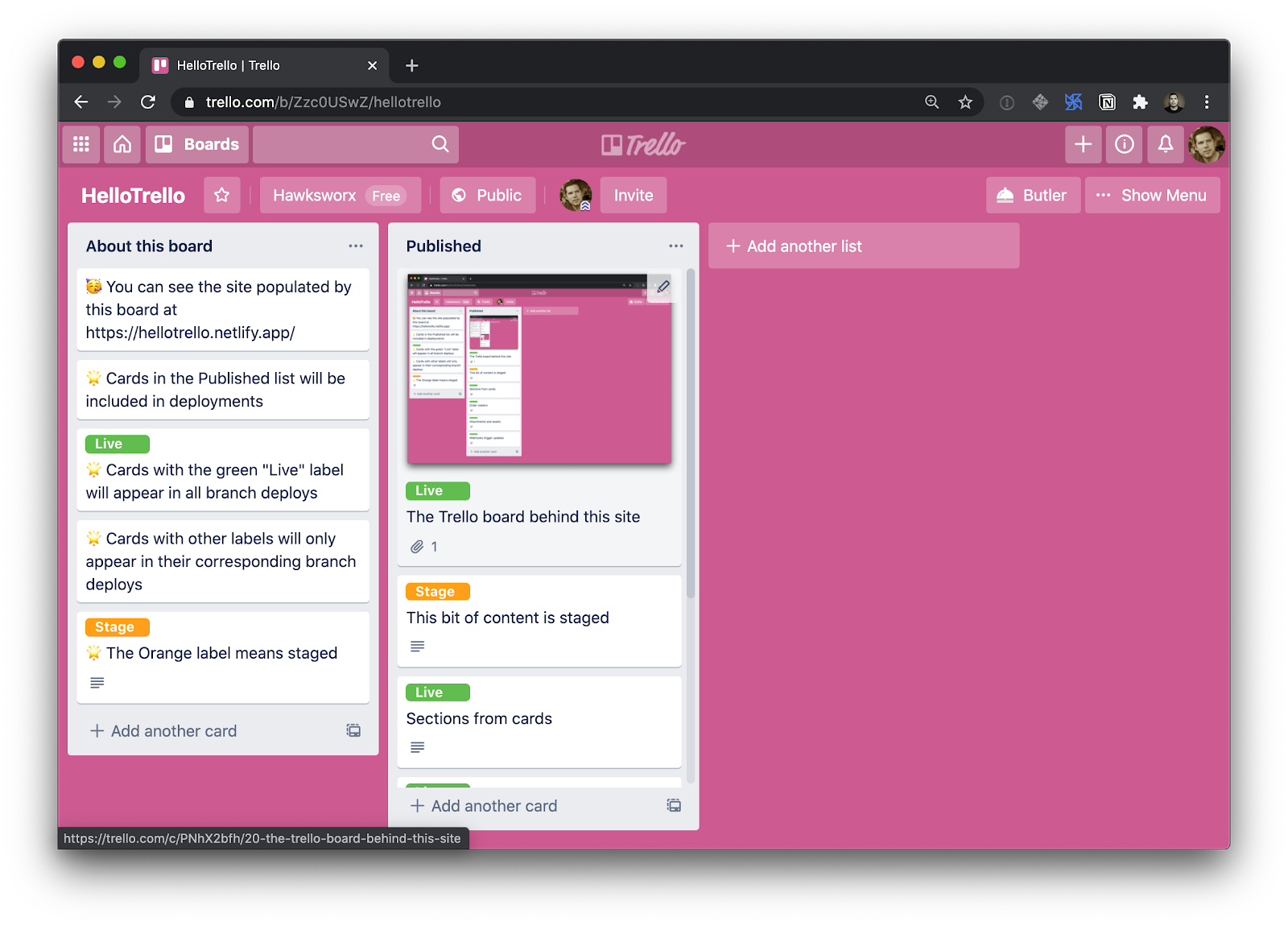
A little more filtering of our JavaScript object is called for:
// trello.js

// only include cards labelled with "live" or with
// the name of the branch we are in
contentCards = contentCards.filter(card => {
  return card.labels.filter(label => (
    label.name.toLowerCase() == 'live' ||
    label.name.toLowerCase() == BRANCH
   )).length;
 });
We want the content labelled ‘live’ to show up on every version of the build, staging or not. In addition we’ll look to include cards which have a label matching a variable called “BRANCH”.
How come? What’s that?
This is where we get crafty! I’ve chosen to host this site on Netlify (disclaimer: I work there). This means that I can run the build from Netlify’s CI/CD environment. This redeploys the site whenever I push changes to its git repository, and also gives access to a couple of other things which are really handy for this site.
One is Branch deploys. If you want a new environment for a site, you can create one by making a new branch in the Git repository. The build will run in that context, and your site will be published on a subdomain which includes the branch name. Like this.
Take a look and you’ll see all the cards from our list, including the one which has the orange “stage” label. We included it in this build because its label matched the branch name for the build context. BRANCH was an environment variable which contained whichever branch the build ran in.
label.name.toLowerCase() == BRANCHIn theory, we could make as many branches and labels as we like, and have all sorts of staging and testing environments. Ready to promote something from “stage” to “live”? Swap the labels and you’re good to go!
But how does it update though?
The second perk we get from running the site build in a CI/CD such as Netlify’s is that we can trigger a build to run whenever we like. Netlify lets us create build hooks. These are webhooks which initiate a new deployment when you send an HTTP POST to them.
If Trello supports webhooks too, then we could stitch these services together and refresh the site automatically whenever the Trello board changes. And guess what… they do! Hoorah!
To create a Netlify build hook, you’ll need to visit your site’s admin panel. (You can bootstrap this demo site into a new Netlify site in a couple of clicks if you want to try it out.)
Now, armed with a new build hook URL, we’ll need to register a new Trello webhook which calls it when content changes. The method for creating webhooks in Trello is via Trello’s API.
The repo for this site includes a little utility to call the Trello API and create the webhook for you. But you’ll need to have a Trello developer token and key. Thankfully, it is easy to create those for free by visiting the Trello Developer portal and following the instructions under “Authorizing a client.”
Got ‘em? Great! If you save them in a .env file in your project, you can run this command to set up the Trello webhook:
npm run hook --url https://api.netlify.com/build_hooks/XXXXXAnd with that, we’ve created a nice little flow for managing content on a simple site. We can craft our frontend just the way we want it, and have updates to the content happen on a Trello board which automatically updates the site whenever changes are made.
Could I really use this though?
This is a simplistic example. That’s by design. I really wanted to demonstrate the concepts of decoupling, and of using the API of an external service to drive the content for a site.
This won’t replace a full-featured decoupled CMS for more involved projects. But the principles are totally applicable to more complex sites.
This model, however, could be a great match for the types of websites we see for businesses such as independent shops, bars and restaurants. Imagine a Trello board that has one list for managing a restaurant’s home page, and one for managing their menu items. Very approachable for the restaurant staff to manage, and far nicer than uploading a new PDF of the menu whenever it changes.
Ready to explore an example and experiment with your own board and content? Try this:
- Clone and deploy the example from above, and start making your changes.
- Learn more about Netlify what you can do with Netlify branch builds
- Dig deeper into the Trello developer resources.
The post Using Trello as a Super Simple CMS appeared first on CSS-Tricks.
You can support CSS-Tricks by being an MVP Supporter.
Bold on Hover… Without the Layout Shift
When you change the font-weight of a font, the text will typically cause a bit of a layout shift. That’s because bold text is often larger and takes up more space. Sometimes that doesn’t matter, like a vertical stack of links where the wider/bolder text doesn’t push anything anyway. Sometimes it does matter, like a horizontal row where the wider/bolder text pushes other elements away a smidge.
Bolding text on mouse hover causes a layout shift that’s especially noticeable when elements start wrapping. Here’s a nifty trick: add a hidden pseudo element with the same text string but set it to the bold font size ?
See it on @CodePen: https://t.co/kBzZXqqtmi pic.twitter.com/kdZBTLQ0RD
— Ryan Mulligan (@hexagoncircle) July 20, 2020
Ryan’s technique is very clever. Each item in the list has a pseudo-element on it with the exact text in the link. That pseudo-element is visually hidden, but pre-bolded and still occupies width. So when the actual link text is bolded, it won’t take up any additional width.
It also sorta depends on how you’re doing the layout. Here, if I force four columns with CSS grid and text that doesn’t really challenge the width, the bolding doesn’t affect the layout either:
But if I were to, say, let those links flow into automatic columns, we would have the shifting problem.
The post Bold on Hover… Without the Layout Shift appeared first on CSS-Tricks.
You can support CSS-Tricks by being an MVP Supporter.
17 Tools I Can’t Design Without
I think of a creative practice as a combination of an approach (a design philosophy) and a series of techniques (craft skills); a good tool facilitates a technique, which in turn supports an approach.
It wasn’t until I sat down to write a list of tools I can’t design without, that I realized just how many tools I rely on as an integral part of my creative process. The danger of tools is that they promote certain techniques, and that bias can alter your approach.
First and foremost a good tool does no harm, it does not dictate, or obstruct your approach. Secondly, a good tool offers flexibility in the techniques you choose. Thirdly a good tool is invisible, it leaves no marks on the end product.
If I’d written this post a year ago the list would have been different, and I hope that in a year it will be different again. These are the tools that I currently find enabling, that have contributed to my craft, and supported my approach.
Affinity Designer
I’ve always used Adobe products. Photoshop and Illustrator were the de facto graphic tools for half my life. I’ve never had an issue with the subscription licensing of Creative Cloud, which I think is proportionate for a professional set of tools. Then, around 18 months ago I got very frustrated with how sluggish Illustrator had become.
I’d written an early review of Affinity Designer, I’d been impressed at the time, so I decided to give it another try expecting the sojourn to last an hour or two before I gravitated back to Illustrator. Running the latest version of Affinity Designer was a revelation, I’ve simply never wanted to switch back.
Why not Sketch? Well, I do occasionally jump into Sketch, especially for pure vector wireframing. I was an early adopter of Sketch, but the reliability issues (long since resolved) poisoned my relationship with it. Why not Figma? Well, Figma’s real strength is in collaboration, something that I get with Sketch, and personally I find some of Figma’s features unintuitive.
Affinity Designer isn‘t perfect. I dislike the color tools, especially the gradient tool, which I find clunky. But it’s the first design app I’ve used in years that syncs closely with my creative process.
Affinity Photo
I don’t do a lot of photo manipulation, so when I switched away from Creative Cloud for design work, I was relaxed about switching from Photoshop to Affinity Photo.
In my experience, Affinity Photo is stronger than Photoshop in some areas, and weaker in others. Affinity Photo’s bitmap scaling is much better than Photoshop’s, largely due to Lanczos 3 sampling.
Affinity Photo also solves a lot of little irritations that Adobe has chosen not to address for legacy or philosophical reasons, such as the toggleable ratio setting when resizing the canvas — I’ve lost track of the hours I’ve spent in Photoshop manually calculating vertical whitespace so that it’s proportionate to the horizontal.

TinyPng
Both Affinity Photo and Photoshop are poor at web format optimizations. Photoshop perhaps has the edge, but its output certainly isn’t acceptable for production.
I run bitmaps through TinyPng, which on average halves the size of the file without any appreciable loss of quality. (It stripped 66% off the images for this post.)
Fontstand
When I started to drift away from Creative Cloud, the one service that delayed me was Adobe Fonts (née Typekit). Not so much for the webfonts — which are faster and more reliable self-hosted — but for the ability to sync desktop fonts into my design apps.
I tried Fontstand when it was first released, and I loved the concept, but was worried about the small library. When I took a second look and discovered the library is now substantial for both workhorses and experimental typefaces, it was an easy decision to switch.
Fontstand is a desktop font rental service. Once you’ve found a typeface you’re interested in, you can activate an hour-long trial, then choose to rent the font for a small fee. You can auto-renew the rental if you need to, and if you rent the font for 12 months it’s yours forever.
If there’s one tool on this list I genuinely could not design without it’s this one. Fontstand makes working with fonts from independent foundries affordable for freelancers, and it’s enriched the typographic palette available to me.
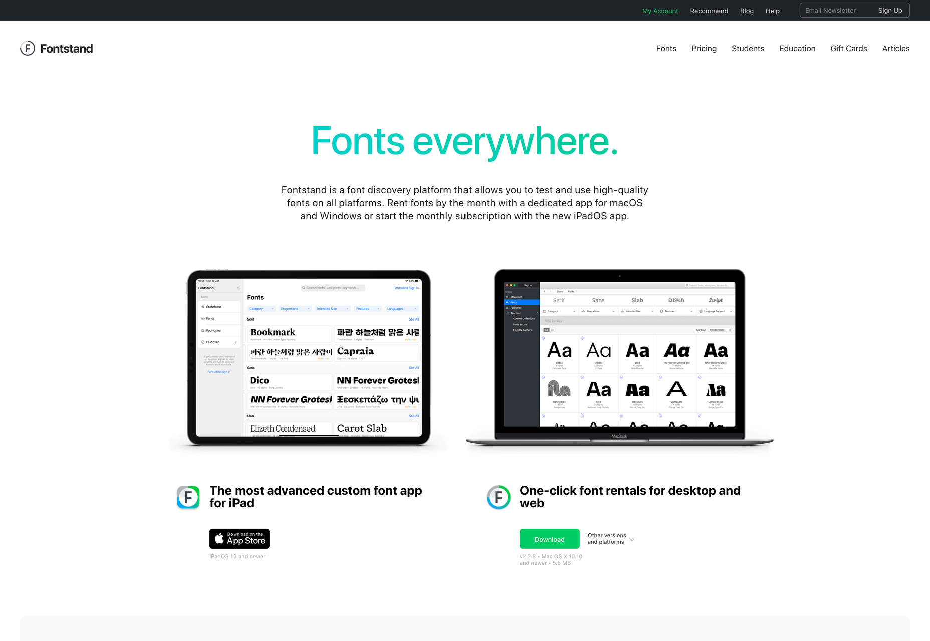
Khroma
Every designer has strengths and weaknesses. Since day one of art school, my weakness has been color. It just doesn’t come naturally to me, and I have to work quite hard at it.
An incredibly helpful tool that I’ve been using for a few months is Khroma. It helps my eyes warm up before approaching color, and helps me find a starting point that I can then refine. Comparing my design work before, and after Khroma, the latter color choices are cleaner, more vibrant, and more interesting.

Atom
A good code editor is essential, and I’ve never found one that I’m completely happy with. For years I’ve flitted back and forth between Brackets, Sublime Text, and BBEdit. I think that probably reflects the changes in the type of coding I’m doing.
For now, I’ve settled on Atom. It’s fast, reliable, and it’s not biased to front or back-end code.
CodeKit
I held out on compilers longer than I should have, using apps like Minify to minify CSS and JavaScript, and the command line to process Sass (see below). Then I found CodeKit and it’s been essential to my workflow ever since.
What I like best about CodeKit is that it’s a GUI. Which means I can change settings while coding, like toggling off the JavaScript linting, without switching mental gears into another language.
MAMP
MAMP is a tool that allows you to run a local server environment, meaning I can run PHP and MySQL without the tedious process of FTPing to a server to test a change. Mac comes with Apache, so this isn’t strictly necessary, but it’s simple to use and works well with both CodeKit and Craft (see below).
There’s a pro version of MAMP, which allows you to switch seamlessly between projects, but it’s heavily geared towards WordPress. I’m still trying to find the time to evaluate Laravel Valet.
Dash
When you first start coding you try and memorize the entire language. It’s very possible to become fluent in the core of a language, but there are always nuances, defaults, and gotchas that you miss. As you grow more experienced, you realize that all professional coders Google the answer at least once per day.
When I got tired of Googling I started using Dash which is a superb app that combines the docs of numerous different languages into a searchable window. I use it daily for everything from SVG to Twig.
LambdaTest
It doesn’t really matter what you’re building, even the indy-web needs to be tested. Ideally you’ll test on real devices, but if you can’t afford a device library — and who but the largest agencies can — you need a live testing solution.
There are a few upstarts, but your choice is basically between BrowserStack and LambdaTest. I went for LambdaTest because I prefer the style of the UI, but that’s entirely subjective. If you’re not sure, toss a coin, you’ll get the same results with both.
Sass
I can’t write CSS without Sass — and I mean that literally. If I try and write vanilla CSS I guarantee I’ll nest something with @at-root and it will throw an error.
Craft CMS
Stating any preference for a CMS online that is not WordPress inevitably invites impassioned protests from developers whose career is built on the WordPress platform. So let me say preface this by saying: if WordPress works for you, and more importantly for your clients, then more power to you; I think it’s a dog.
Shopping around for a CMS is challenging, and I’ve gone through the process several times. A good CMS needs to be in sync with your mindset, and it needs to be appropriate for your clients — all of them, because unless you’re in a large agency with multiple coders, you need to commit to a single solution in order to master it.
I have looked and looked, and finally settled on Craft CMS. Craft makes it easy to build and maintain complex, high-performance sites. It has a shallow learning curve that grows exponentially steeper, making it easy to get started with plenty of room to grow.
Vue.js
Way back when Flash went kaput I switched to jQuery, and that was a really easy route into JavaScript — ignore the people who tell you to master the core language first, do whatever it takes to start using a language, that’s how you learn. But jQuery is heavy, and I found I needed it less and less.
These days 90% of the JavaScript I write is progressive enhancements in vanilla JavaScript to keep the dependencies low. Occasionally I encounter a job that requires complex state management, and then I fall back on Vue.js. JavaScript developers are as partisan as CMS aficionados, so let’s just say I favor Vue.js because it’s not controlled by a mega-corp and leave it at that.
Ulysses
As editor at WDD, I cannot emphasize enough that the right way to write copy for the web is markdown.
Markdown is faster to write so you don’t lose the thread of your thought process, and it doesn’t impose formatting so you can easily migrate to a CMS. If you’ve ever spent 20 minutes stripping the class, id, and style tags out of a file created in Word, Pages, or (by far the worst offender) Google Docs, then you don’t need to be sold on this point.
There are a few markdown-based writing apps available, I tested half a dozen, and the one I settled on was Ulysses. I like its distraction-free mode, I love its clean exports. Everything I write, I write in Ulysses.
Screenshot Plus
Much like markdown editors, there’s no shortage of screenshot apps. My current favorite is Screenshot Plus.
Screenshot Plus has one feature that makes it standout for me, and that is its Workflows. It sounds like a small problem, but when you’re taking screenshots of a dozen sites, the extra clicks to save, switch to your editor, and open the file are laborious. I have several workflows setup in Screenshot Plus that allow me to take a screenshot, save it to a specified folder on my local machine, and then open it in Affinity Photo, all with a single click.
Spark
I get a lot of email, a lot. At one point the influx was so bad I was using multiple email apps to segment it. Yes, I use Slack daily, but it doesn’t eliminate the need for email.
I‘ve been using Spark for around six months and it’s radically sped up my workflow. I’m a big fan of the smart inbox that allows me to compartmentalize email like newsletters, and email that warrants a reply. I like that I can switch to a chronological list if I’m looking for something specific. I love the ability to pin, or snooze messages, which helps me triage my inbox.
Todoist
I’m one of those people who can’t make it through the day without being organized. I need lists and sublists, and I need something native that opens automatically when I boot my Mac, and something that sits on the home screen of my Android.
There are as many to-do apps as there are things to do. When I’m working in a team I’ll use whichever task-tracking system it prefers. But by choice I always use Todoist thanks to its balance of simplicity and power. At this point it’s something of a meta-tool, and the app I open first every morning.