Archive

Archive for October, 2020

WordPress and Jamstack

October 26th, 2020 No comments

I recently moderated a panel at Netlify’s virtual Jamstack Conf that included Netlify CEO Matt Biilman and Automattic founder Matt Mullenweg. The whole thing was built up — at least to some — as a “Jamstack vs. WordPress” showdown.

I have lots of thoughts of my own on this and think I’m more useful as a pundit than a moderator. This is one of my favorite conversations in tech right now! So allow me to blog.

Disclosure: both Automattic and Netlify are active sponsors of this site. I have production sites that use both, and honestly, I’m a fan of both, which is an overarching point I’ll try to make. I also happen to be writing and publishing this on a WordPress site.

History

  1. Richard MacManus published “WordPress Co-Founder Matt Mullenweg Is Not a Fan of JAMstack” with quotes from an email conversation between them a line from Matt saying, “JAMstack is a regression for the vast majority of the people adopting it.”
  2. Matt Biilmann published a response “On Mullenweg and the Jamstack – Regression or Future?” with a whole section titled “The end of the WordPress era.”
  3. People chimed in along the way. Netlify board member Ohad Eder-Pressman wrote an open letter. Sarah Gooding rounded up some of the activity on WP Tavern (which is owned by Matt Mullenweg). I chimed in as well.
  4. Matt Mullenweg clarified remarks with some new zingers.

The debate was on October 6th at Jamstack Conf Virtual 2020. There is no public video of it (sorry).

The Stack

Comparing Jamstack to WordPress is a bit weird. What is comparable is the fact that they are both roads you might travel when building a website. Much of this post will keep that in mind and compare the two that way. Why they aren’t directly comparable is because:

  • Jamstack is a loose descriptor of an architectural philosophy that encourages static files on CDNs and JavaScript-accessed services for any dynamic needs.
  • WordPress is a CMS on the LAMP stack.

Those things are not apples to apples.

If we stick just with the stack for a moment, the comparison would be between:

  • Static Hosting + Services
  • LAMP

An example of Static + Services is using Netlify for hosting (which is static) and using services to do anything dynamic you need to do. Maybe you use Netlify’s own forms and auth functionality and Hasura for data storage.

On a LAMP stack, you have MySQL to store data in, so you aren’t reaching for an outside service there. You also have PHP available. So with those (in addition to open-source software), you have what you need for auth. It doesn’t mean that you never reach for services; you just do so less often as you have more technology at your fingertips from the server you already have.

Jamstack: Static Hosting as the hub, reaching out to services for everything else.

LAMP: Server that does a bunch of work as the hub, reaching out to a few services if needed.

Matt B. called the LAMP stack a “monolith.” Matt M. objected to that term and called it an “integrated approach.” I’m not a computer scientist, but I could see this going either way. Here’s Wikipedia:

[…] a monolithic application describes a single-tiered software application in which the user interface and data access code are combined into a single program.

Defined that way, yes, WordPress does appear to be a monolith, and yet the Wikipedia article continues:

[…] a monolithic application describes a software application that is designed without modularity.

Seen that way, appears to disqualify WordPress as a monolith. WordPress’ hook and plugin architecture is modular. ????

It would be interesting to hear these two guys dig into the nuance there, but the software is what it is. A self-hosted WordPress site runs on a server with a full stack of technology available to it. It makes sense to ask as much of that server as you can (i.e. integrated). In a Jamstack approach, the server is abstracted from you. Everything else you need to do is split into different services (i.e. not integrated).

The WordPress approach, doesn’t mean that you never reach for outside services. In both stacks, you’d likely use something like Stripe for eCommerce APIs. You might reach for something like Cloudinary for robust media storage and serving. Even WordPress’ Jetpack service (which I use and like) brings a lot of power to a self-hosted WordPress site by behaving like a third-party service and moving things like asset-hosting and search technology off your own servers by moving them over to cloud servers. Both stacks are conglomerations of technologies.

Neither stack is any more “house of cards” or prone than the other. All websites can have that “only as strong as its weakest link” metaphor apply to them. If a WordPress plugin ships a borked version or somehow is corrupted on upload, it may screw up my site until I fix it. If my API keys become invalid for my serverless database, my Jamstack site might be hosed until I fix it. If Stripe is down, I’m not selling any products on any kind of site until they are back up.

A missing semicolon can sink any site.

Pricing

WordPress.com has a free plan, and that’s absolutely a place you can build a site. (I have several.) But you don’t really have developer-style access to it until you’re on the business plan at $25 per month. Self-hosted WordPress itself is open-source and free, but you’re not going to find a place to spin up a self-hosted WordPress site for free. It starts cheap and scales up. You need LAMP hosting to run WordPress. Here’s a look around at fairly inexpensive hosting plans:

There is money involved right off the bat.

Starting free is much more common with Jamstack, then you incur costs at different points. Jamstack being newer, it feels like a market that’s still figuring itself out.

  • Vercel is free until you need team members or features like password protected sites. A single password-protected site is $150/month. You can toss basic auth on any server with Apache for no additional cost.
  • Netlify is very similar, unlocking features on higher plans, and offering ala-carte per-site features, like analytics ($9/month) and auth (5,000 active users is $99/month).
  • AWS Amplify starts free, but like everything on AWS, your usage is metered on lots of levels, like build minutes, storage, and bandwidth. They have an example calculation of a web app has 10,000 daily active users and is updated two times per month, which costs $65.98/month.
  • Azure Static Web Apps hasn’t released pricing yet, but will almost certainly have a free tier or free usage or some kind.

All of this is a good reminder that Netlify isn’t the only one in the Jamstack game. Jamstack just means static hosting plus services.

You can’t make blanket statements like Jamstack is cheaper. It’s far too dependent on the site’s usage and needs. With high usage and a bunch of premium services, Jamstack (much like Serverless in general) can get super expensive. Jamstack says their enterprise pricing starts at $3,000/month, and while you get things like auth, forms, and media handling, you don’t get a CMS or any data storage, that is likely to kick you up much higher.

While this WordPress site isn’t enterprise, I can tell you it requires a server in the vicinity of a $1,000/month, and that assumes Cloudflare is in front of it to help reduce bandwidth directly to the host and Jetpack handling things like media hosting and search functionality. Mailchimp sends our newsletter. Wufoo powers our forms. We also have paid plugins, like Advanced Custom Fields Pro and a few WooCommerce add-ons. That’s not all of it. It’s probably a few thousand per month, all told. This isn’t unique to any integrated approach, but helps illustrate that the cost of a WordPress site can be quite high as well. They don’t publish prices (a common enterprise tactic), but Automattic’s own WordPress VIP hosting service surely starts at mid-4-figures before you start adding third-party stuff.

Bottom line: there is no sea change in pricing happening here.

Performance

80% of web performance is a front-end concern.

That’s a true story, but it’s also built on the foundation of the server (accounting for the first 20%). The speediest front-end in the world doesn’t feel speedy at all if the first request back from the server takes multiple seconds. You’ve gotta make sure that first request is smoking fast if you want a fast site.

The first rectangle is the first server response, and the second is the entire front-end. Even with a fast front end, it can’t save you from a slow back end.

You know what’s super fast? Global CDNs serving static files. That’s what you want to make happen on any website, regardless of the stack. While that’s the foundation of Jamstack (static CDN-backed hosting), it doesn’t mean WordPress can’t do it.

You take an index.html file with static content, put that on Netlify, and it’s gonna be smoking fast. Maybe your static site generator makes that file (which, it’s worth pointing out, could very well get content from WordPress). There is something very nice about the robustness and steady foundation of that.

By default, WordPress isn’t making static files that are catchable on a global CDN. WordPress responds to requests from a single origin, runs PHP, which asks the database for stuff, before a response is assembled, and then, finally, the page is returned. That can be pretty fast, but it’s far less sturdy than a static file on a global CDN and it’s far easier to overwhelm with requests.

WordPress hosts know this, and they try to solve the problem at the hosting level. Just look at WP Engine’s approach. Without you doing anything, they use a page cache so that the site can essentially return a static asset rather than needing to run PHP or hit a database. They employ all sorts of other caching as well, including partnering with Cloudflare to do the best possible caching. As I’m writing this, my shoptalkshow.com site literally went down. I wrote to the host, Flywheel, to see what was up. Turns out that when I went in there to turn on a staging site, I flipped a wrong switch and turned off their caching. The site couldn’t handle the traffic and just died. Flipping the caching switch back on instantly solved it. I didn’t have Cloudflare in front of the site, but I should have.

Cloudflare is part of the magic sauce of making WordPress fast. Just putting it in front of your self-hosted WordPress site is going to do a ton of work in making it fast and reliable. One of the missing pieces has been great caching of the HTML itself, which they literally dealt with this month and now that can be cached as well. There is kind of a funny irony in that caching WordPress means caching requests as static HTML and static assets, and serving them from a global CDN, which is essentially what Jamstack is at the end of the day.

Matt M. mentioned that WordPress.com employs global CDNs that kick in at certain levels of traffic. I’m not sure if that’s Cloudflare or not, but I wouldn’t doubt it.

With Cloudflare in front of a WordPress site, I see the same first-response numbers as I do on Netlify sites without Cloudflare (because the do not recommend using Cloudflare in front of Netlify-hosted sites). That’s mid-2-digit millisecond numbers, which is very, very good.

First request on WordPress site css-tricks.com, hosted by Flywheel with Cloudflare in front. Very fast.
First request on my Jamstack site, conferences.css-tricks.com, hosted by Netlify. Very fast.

From that foundation, any discussion about performance becomes front-end specific. Front-end tactics for speed are the same no matter what the server, hosting, or CMS situation is on the back end.

Security

There are far more stories about WordPress sites getting hacked than Jamstack sites. But is it fair to say that WordPress is less secure? WordPress is going on a couple of decades of history and has a couple orders of magnitude more sites built on it than Jamstack does. Security aside, you’re going to get more stories from WordPress with those numbers.

Matt M brought up that whitehouse.gov is on WordPress, which is obviously a site that needs the highest levels of security. It’s not that WordPress itself is insecure software. It’s what you do with it. Do you have insecure passwords? That’s insecure no matter what platform you’re using. Is the server itself insecure via file permissions or access levels? That’s not exactly the software’s fault, but you may be in that position because of the software. Are you running the latest version of WordPress? Usage is fragmented, at best, and the older the version, the less secure it’s going to be. Tricky.

It may be more interesting to think about security vectors. That is, at what points it is possible to get hacked. If you have a static file sitting on static hosting, I think it’s safe to say there are fairly few attack vectors. But still, there are some:

  • Your hosting account could be hacked
  • Your Git repo could be hacked
  • Your Cloudflare account could be hacked
  • Your domain name could be stolen (it happens)

That’s all true of a WordPress site, too, only there are additional attack vectors like:

  • Server-side code: XSS, bad plugins, remote execution, etc.
  • Database vulnerabilities
  • Running an older, outdated version of WordPress
  • The login system is right on the site itself, e.g. bad guys can hammer /wp-login.php

I think it’s fair to say there are more attack vectors on a WordPress site, but there are plenty of vectors on any site. The hosting account of any site is a big vector. Anyting that sits in the DNS chain. Any third-party services with logins. Anything with an API key.

Personal experience: this site is on WordPress and has never been hacked, but not for lack of trying. I do feel like I need to think more about security on my WordPress sites than my sites that are only built from static site generators.

Scaling

Scaling either approach costs money. This WordPress site isn’t massively scaled, but does require some decent scaling up from entry-level server requirements. I serve all traffic through Cloudflare, so a peak at the last 30 days tells me I serve 5 TB of bandwidth a month.

On a Netlify Business plan (600 GB of traffic for $99, then $20 per additional 100 GB) that math works out to $979. Remember when I said this site requires about a server that costs about $1,000/month? I wrote that before I ran these numbers, so I was super close (go me). Jamstack versus WordPress at the scale of this site is pretty neck-and-neck. All hosts are going to charge for bandwidth and have caps with overage charges. Amplify charges $0.15/GB over a 15 GB monthly cap. Flywheel (my WordPress host) charges based on a monthly visitor cap and, over that, it’s $1 per 1000.

The story with WordPress scaling is:

  • Use a host that can handle it and that has their own proven caching strategy.
  • CDN everything (which usually means putting Cloudflare in front of it).
  • Ultimately, you’re going to pay for it.

The story with Jamstack scaling is:

  • The host and services are built to scale.
  • You have to think about scaling less in terms of can this service handle this, or do I have to move?
  • You have to think about scaling more in terms of the fact that every aspect of every service will have pricing you need to keep an eye on.
  • Ultimately, you’re going to pay for it.

I’ve had to move around a bit with my WordPress hosting, finding hosts that are in-line with the current needs of the site. Moving a WordPress site is non-trivial, but it’s far easier than moving to another CMS. For example, if you build a Jamstack site on a headless CMS that becomes too pricey, the cost of moving is a bigger job than switching hosts.

I like what Dave Rupert wrote the other day (in a Slack conversation) about comparing performance between the two:

Jamstack: Use whatever thing to build your thing, there’s addons to help you, and use our thing to deploy it out to a CDN so it won’t fall over.

WordPress: Use our thing to build your thing, there’s addons to help you, and you have to use certain hosts to get it to not fall over.

There are other kinds of “scaling” as well. I think of something like number of users. That’s something that all sorts of services use for pricing tiers, which is an understandable metric. But that’s free in WordPress. You can have as many users with as many nuanced permissions as you like. That’s just the CMS, so adding on other services might still charge you by the head. Vercel or Netlify charge you by the head for team accounts. Contentful (a popular headless CMS) starts at $489/month for teams. Even GitHub’s Team tier is $4 per user if you need anything the free account can’t do.

Splitting the Front and Back

This is one of the big things that gets people excited about building with Jamstack. If all of my site’s functionality and content are behind APIs, that frees up the front end to build however it wants to.

  • Wanna build an all-static site? OK, hit that API during the build process and do that.
  • Wanna build a client-rendered site with React or Vue or whatever? Fine, hit the API client-side.
  • Wanna split the middle, pre-rendering some, client-rendering some, and server-rendering some? Cool, it’s an API, you can hit it however you want.

That flexibility is neat on green-field builds, but people are just as excited about theoretical future flexibility. If all functionality and content is API-driven, you’ve entirely split the front and back, meaning you can change either in the future with more flexibility.

  • As long as your APIs keep spitting out what the front end expects, you can re-architect the back end without troubling the front end.
  • As long as you’re getting the data you need, you can re-architect the front end without troubling the back end.

This kind of split feels “future safe” for sites at a certain size and scale. I can’t quite put my finger on what those scale numbers are, but they are there.

If you’ve ever done any major site re-architecture just to accommodate one side or the other, moving to a system where you’ve split the back end and front surely feels like a smart move.

Once we’ve split, as long as the expectations are maintained, back (B) and front (F) are free to evolve independently.

You can split a WordPress site (we’ll get to that in the “Using Both” section), but by default, WordPress is very much an integrated approach where the front end is built from themes in PHP using very WordPress-specific APIs. Not split at all.

Developer Experience

Jamstack has done a good job of heavily prioritizing developer experience (DX). I’ve heard someone call it “a local optimum,” meaning Jamstack is designed around local development (and local developer) experience.

  • You’re expected to work locally. You work in your own comfortable (local, fast, customized) development environment.
  • Git is a first-class citizen. You push to your production branch (e.g. master or main), then your build process runs, and your site is deployed. You even get a preview URL of what the production site will be for every pull request, which is an impressively great feature.
  • Use whatever tooling you like. You wanna pre-build a site in Hugo? Go for it. You learned create-react-app in school? Use that. Wanna experiment with the cool new framework de jour? Have at it. There is a lot of freedom to build however you want, leveraging the fact that you can run a build and deploy whatever folder in your repo you want.
  • What you don’t have to do is important, too. You don’t have to deal with HTTPS, you don’t have to deal with caching, you don’t have to worry about file permissions, you don’t have to configure a CDN. Even advanced developers appreciate having to do less.

It’s not that WordPress doesn’t consider developer experience (for example, they have a CLI and it can do helpful things, like scaffold blocks), but the DX doesn’t feel as to-the-core of the project to me.

  • Running WordPress locally is tricky, requiring you to run a (X)AMP stack somehow, which involves notoriously finicky third-party software. Thank god for Local by Flywheel. There is some guidance but it doesn’t feel like a priority.
  • What should go in Git? To this day, I don’t really know, but I’ve largely settled on the entire /wp-content folder. It feels weird to me there is no guidance or obvious best practices.
  • You’re totally on your own for deployment. Even WordPress-specific hosts don’t really nail it here. It’s largely just: here’s your SFTP credentials.
  • Even if you have a nice local development and deployment pipeline set up (I’m happy with mine), that doesn’t really help deal with moving the database around, so you’re on own your own there as well.

These are all solvable things, and the WordPress community is so big that you’ll find plenty of information on it, but I think it’s fair to say that WordPress doesn’t have DX down to the core. It’s a little wild-west-y even after all these years.

In fact, I’ve found that because the encouragement of a healthy local development environment is so sidelined, a lot of people just don’t have one at all. This is anecdotal, but now twice is as many years have I found myself involved in other people’s sites that work entirely production-only. That would be one thing if they were very simple sites with largely default behavior, but these have been anything but. They’re very complicated (much more so than this site) involving public user logins, paid memberships and permissions, page builders, custom shortcodes, custom CSS, and just a heck of a lot of moving parts. It scared me to death. I didn’t want to touch anything. They were live-editing PHP to make things work — cowboy coding, as people jokingly call that. One syntax error and the site is hosed, maybe even the very page you’re looking at.

The fact that WordPress powers such a huge swath of the web without particularly good DX is very interesting. There is no Jamstack without DX. It’s an entirely developer-focused thing. With WordPress, there probably isn’t a developer at all on most sites. It’s installed (or just activated, in the case of WordPress.com) and the site owner takes it from there. The site owner is like a developer in that they have lots of power, but perhaps doesn’t write any code at all.

To that end, I’d say WordPress has far more focus on UX than DX, which is a huge part of all this…

CMS and End User UX

WordPress is a damn fine CMS. Even if you don’t like it, there are a hell of a lot of people that do, and the numbers speak for themselves. What you get, when you decide to build a site with WordPress, is a heaping helping of ability to build just about any kind of site you want. It’s unlikely that you’ll have that oops, painted myself into a corner here situation with WordPress.

That’s a big deal. Jenn put her finger on this, noting that the people who use WordPress are a bigger story than a developer’s needs.

WordPress can do an absolute ton of things:

  • Blog (or be any type of content-driven CMS-style site)…
    • With content previews, which is possible-but-tricky on Jamstack
  • Deal with users/permissions…
  • eCommerce
  • Process forms
  • Handle plugins to the moon and back

Jamstack can absolutely do all these things too, but now it is Jamstack that is in Wild West territory. When you look at tutorials about how to store data, they often involve explaining how to write individual CRUD functions for a cloud database. That’s down to the metal stuff which can be very powerful, but it’s a far cry from clicking a few buttons, which is what WordPress feels like a lot of the time.

I bet I could probably cobble together a basic Jamstack eCommerce setup with Stripe APIs, which is very cool. But then I’d get nervous when I need to start thinking about inventory management, shipping zones, product variations, and who knows what else that gets complicated in eCommerce-land, making me wish I had something super robust that did it all for me.

Sometimes, we developers are building sites just for us (I do more than my fair share of that), but I’d say developers are mostly building sites for other people. So the most important question is: am I building something that is empowering for the people I’m building it for?

You can pull off a good site manager experience no matter what, but WordPress has surely proven that it delivers in that department without asking terribly much in terms of custom development.

Jamstack has some tricks that I wish I would pull off on WordPress, though. Here’s a big one for me: user-submitted content and updates. I literally have three websites now that benefit from this. A site about conferences, a site about serverless, and an upcoming site about coding fonts. WordPress could have absolutely done a great job at all three of those sites. But, what I really want is for people to be able to update and submit content in a way that I can be like: Yep, looks good, merge. By having gone with a Jamstack approach, the content is in public GitHub repos, and anyone can participate.

I think that’s super great. It doesn’t even necessarily require someone from the public knowing or understanding Git or GitHub, as Netlify CMS has this concept of Open Authoring, which keeps the whole contribution experience in the browser with UI for the editing.

Using Both

This is a big one that I see brought up a lot. Even Netlify themselves say “There is no Versus.”

Here’s the deal:

  • The “A” in “Jam” means APIs. Use APIs to build your site either at build time or client-side.
  • WordPress sites, by default, have a REST API (and can have a GraphQL API as well).
  • So, hit that API for CMS data on your Jamstack site.

Yep, totally. This works and people do it. I think it’s pretty cool.

But…

  • Running a WordPress site somewhere in addition to your Jamstack site means… you’re running a WordPress site in addition to your Jamstack site. There is cost and technical debt to that.
  • You often aren’t getting all the value of WordPress. Hitting an API for data might be all you need, but this is a super, very different approach to building a site than building a WordPress theme. You’re getting none of the other value of WordPress. I think of situations like this: you find a neat plugin that adds a fancy Gutenberg block to your site. That’ll “just work” on a WordPress site, but it likely has some special front-end behavior that won’t work if all you’re doing is sucking the HTML from an API. It probably enqueues some additional scripts and styles that you’ll be on your own to figure out how to incorporate where your front-end is hosted, and on your own to maintain updates.

Here’s some players that all have a unique approach to “using both”:

  • Frontity: A React framework for WordPress. Looks like you can run it with a Node server so the pages are server-side rendered, or as a static site generator. Either way, WordPress is the CMS but you’re building the front end with React and getting data from the REST API.
  • WP2Static: A WordPress plugin that builds a static version of your site and can auto-deploy it when changes are made.
  • Strattic: They host the dynamic WordPress site for you (which they refer to as “staging”) and you work with WordPress normally there. Then you choose to deploy, and they also host a static version of your site for you.

There are loads of other ways to integrate both. Here’s our own Geoff and Sarah talking about using WordPress and Jamstack together by using Vue/Nuxt with the REST API and hosting on Netlify.

Using Neither

Just in case this isn’t clear, there are absolutely loads of ways to build websites. If you’re building a Ruby on Rails site, that’s not Jamstack or WordPress. You could argue it’s more like a WordPress site in that it requires a server and you’ll be using that server to do as much as you can. You could also argue it’s more like Jamstack in that, even though it’s not static hosting, it encourages using APIs and piecing together services.

The web is a big place, gang, and this isn’t a zero-sum game. I fully expect WordPress to continue to grow and Jamstack to continue to grow because the web itself is growing. Even if we’re only considering the percentage of market share, I’d still bet that both will grow, pushing whatever else into smaller slices.

Choosing

I’m not even going to go here. Not because I’m avoiding playing favorites, but because it isn’t necessary. I don’t see developers out there biting their fingernails trying to decide between a WordPress or Jamstack approach to building a website. We’re at the point where the technologies are well-understood enough that the process goes like:

  1. Put adult pants on
  2. Evaluate needs and outcomes
  3. Pick technologies

The post WordPress and Jamstack appeared first on CSS-Tricks.

You can support CSS-Tricks by being an MVP Supporter.

Categories: Designing, Others Tags:

The 7 Most Common Ruby on Rails Programming Mistakes To Avoid

October 26th, 2020 No comments

Ruby on Rails is one of the most popular and widely used web development frameworks. It is a relatively easy and powerful web development framework for building scalable and enterprise-ready applications.

It heavily emphasizes convention over configuration and allows new Rails applications to be running in a fraction of time. In this blog, we will list those common mistakes in Rails development and see how to avoid them. So without further ado, let’s get started!


Most Ruby developers love the RubyGems that can reduce the development time and write excess code. Ruby’s best and easiest thing on Rails development like MVC pattern for highly-functional apps and convention over configuration makes it reliable and scalable. There are some pitfalls of Ruby on Rails development that can be overcome by experience.

The 7 Most Common Mistakes in Ruby On Rails Development

Common Mistake #1: Do You Check N + 1 Query Rail

If you’re checking the N + 1 Query, it generally won’t address any issue in your application. Still, sometimes it may affect your application and slow down the performance, which is the most common mistake by Ruby developers.

Eg:

users = User.where(is_active:true)
names = users.map { |user| user.profile.name }

Avoid N + 1 query when querying associated records.

Eg:

users = User.where(is_active:true).includes(:profile)
names = users.map { |user| user.profile.name }

You can use a bullet gem to improve your app’s performance by reducing the number of queries and adding eager loading where required.

Common Mistake #2: Not using memoization:

Memoization is a process that is used to improve your assessor’s speed during Ruby on Rails development by caching the results of methods that are time-consuming or variables initializing.

Memoization uses the ||= operator for some value in parameters and then initializes the cache variables.

Eg:

Def google_calendar_event
                @event||=GoogleCalendarEvent.fing_by(event_id:params[:event_id]}

End

Common Mistake #3: Improper Predicate Method Usage

Using an improper predicate method is another common mistake done during Rails development. You should be aware of the predicate method, which ends with a question mark and returns a boolean value(true/false). But it is important to understand that the slight difference between the potential values in Ruby development.

When you’re creating your own predicate methods, understand their purpose before altering any data. For instance, the predicate method determines if your favorite book is currently available in the library or not; if not, it will change the book. library property to true:

Eg:

def favorite_book_in_library?
  book = favorite_book
  unless book.library
    # If not, add a library.
    book.library = true
    true
  end
end

To examine your existing data that returns a boolean value using the predicate method, avoid using direct data manipulation. Because in such cases, you’ll have to remove the assignment value of the property check with a single line that is:

# Check if your favorite book is in the library.
def favorite_book_in_library?
  return favorite_book.library
end

Common Mistake #4: Avoid Blocking on Calls

It is easy to integrate APIs using the 3rd party providers of Rails applications, but sometimes you may run slow. To avoid blocking on calls, move some part of code to the background job, instead of calling services from your Rails application.

Delayed Job and Sidekiq are the two most popular Rubygems used for application development for this purpose.

For instance, when a new user creates an account and provides the phone number, your application may use a third-party service to authenticate the multi-factor confirmation code.

Here is the code snippet when you’re using the send_authentication_code method:

def send_authentication_code(number, code)
  account_sid = "ACXXXXXXXXXXXXXXXXXXXXXXXXXXXXXXXX" # Your Account SID from www.twilio.com/console
  auth_token = "your_auth_token"   # Your Auth Token from www.twilio.com/console

  @client = Twilio::REST::Client.new account_sid, auth_token
  message = @client.messages.create(
    body: code,
    to: number,
    from: ENV['TWILIO_NUMBER'])

  puts message.sid
end

Code


If you call send_authentication_code in your application, you risk your application when the third-party service request is executed.

To avoid such risk, integrate a job system that can store and implement work BTS in your main application threads.

You may also like: Most Common Mistakes in Ruby on Rails Development (And How to Avoid Making Them)

Common Mistake #5: Lack of automated tests

Ruby on Rails is a powerful web application framework with automated test capabilities by default. Rails developers write practical tests using different styles, such as BDD and TDD, to make it even more powerful test frameworks.

There are various debates on how comprehensive your testing should be, and it shows the importance of automated testing for every application.

Your application must consist of at least one high-level integration test written for your controllers to edit and modify the code of your Ruby on Rails version with a clear delineation of the Ruby application’s full collection of functionality.

Common Mistake #6: Follow Proper Naming Convention

While developing Rails projects, keep a few points in your mind to avoid future issues:

  • The model name should be in the singular.
  • To map your model and table automatically, make sure that all the available tables are in a plural format.
  • Do not reserve names for your class.
  • Always follow the default restful routes to avoid the complexity.

Ruby on Rails is a feature-rich web application framework with some limitations and common mistakes that should be avoided while developing an application.

Common Mistake #7: Keep Your Configurations Safe

While developing Rails applications, your application might be using external services such as Google Calendar, AWS, and its API keys stored in credentials. yml.

The repository files may be checked into the source code using the rest of your application when accessing the storage becomes easy for all users of your application.

Final Thoughts

Rail is a powerful framework for building web applications that hide many ugly details necessary to develop a robust web application. To make your development process faster, you should pay attention to the potential design and coding errors that make your application easily maintainable and extensible as they grow.

You should be aware of such issues that can make your application less secure, less reliable, and reduce application performance. Study the full framework architecture and make sure that you’re aware of the coding tradeoffs throughout the development process and then start building your Ruby on Rails project.

If you avoid such common mistakes, you can develop top-notch and high-quality Ruby on Rails web applications. If you’re planning to develop such web applications, Hire Ruby on Rails Developers who have already learned from these mistakes to avoid halting your project’s development and have error-free development.


Photo by Emile Perron on Unsplash

Categories: Others Tags:

20 Freshest Web Designs, October 2020

October 26th, 2020 No comments

We have become so used to using web sites just to buy stuff that it is easy to forget that the web has more to offer. So this month we’ve included some because-it’s-interesting sites, some micro-sites and some just-for-the-sake-of-it projects.

Many of these are about selling or promoting products and services too, but in a more oblique way that is frequently more engaging than a straightforward sales site.

Micro sites can be a great way of including content that doesn’t fit in neatly with the rest of the main site, or is temporary, or to show a lighter, more fun side of a brand. And a well thought out micro site can act as a gateway to pull in even more visitors to its ‘parent’ site.

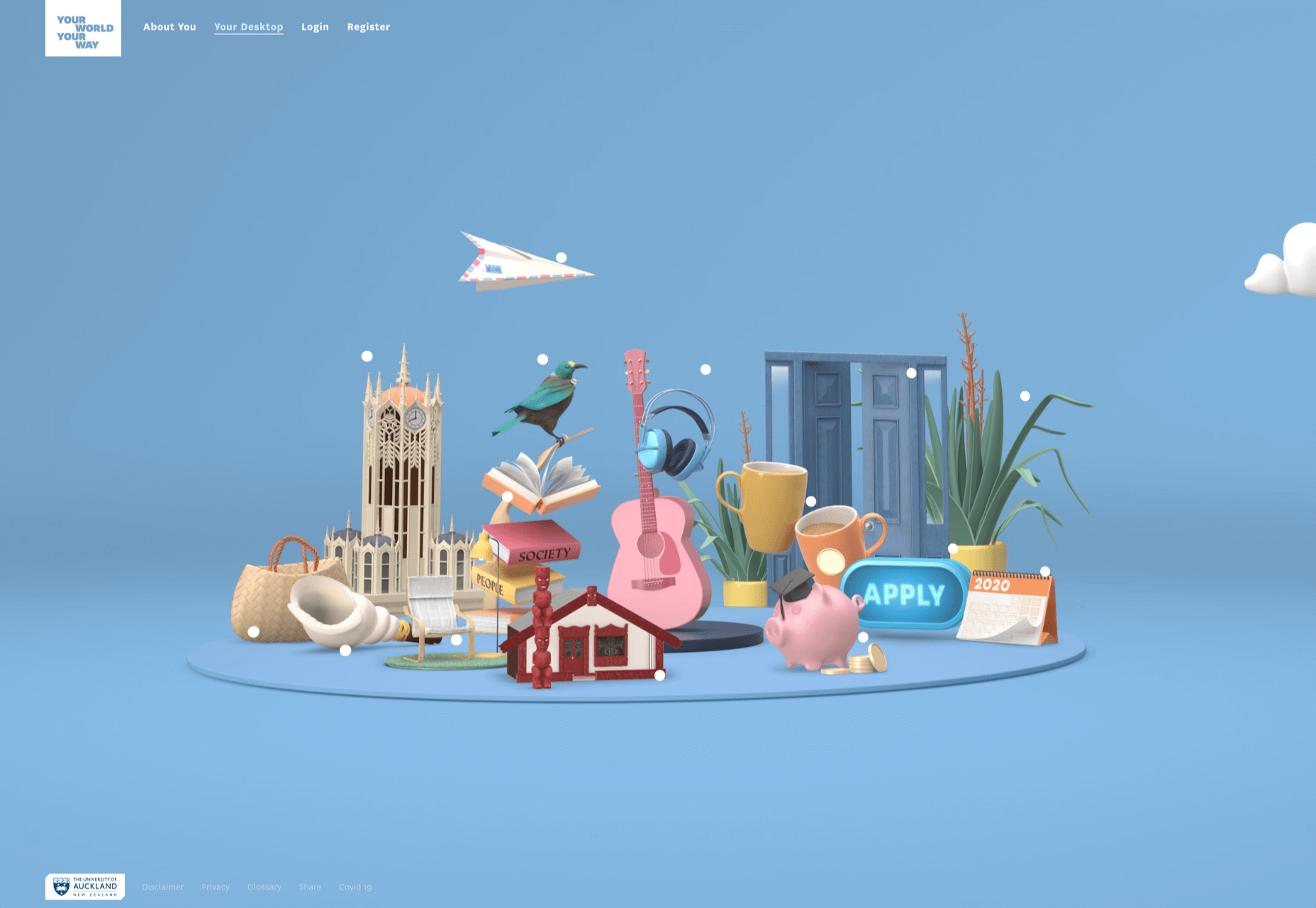
Your World Your Way

Your World Your Way is an interactive portal for the University of Auckland. An optional questionnaire customizes the experience, and clearly a lot of effort has gone into this in terms of the questions and possible answers, and the presentation. It is engaging and enjoyable to use, and the information provides links to the main University of Auckland website.

Blind Barber

This micro site is to celebrate 10 years of barber shop chain Blind Barber, which started as one shop with a bar in the back room, in New York’s East Village. An entirely black and white design provides a clean backdrop for color photos and videos, and some great scrolling animations give a pleasing flow to the content.

Brews & Grooves

Brews & Grooves pairs records with different beer. Although a ‘fun’ project, it is still a well designed piece of work with some vintage style typography and some pleasing rollover animation effects. It is an effective advert for those involved in creating it, as listed in on its ‘credits’ page.

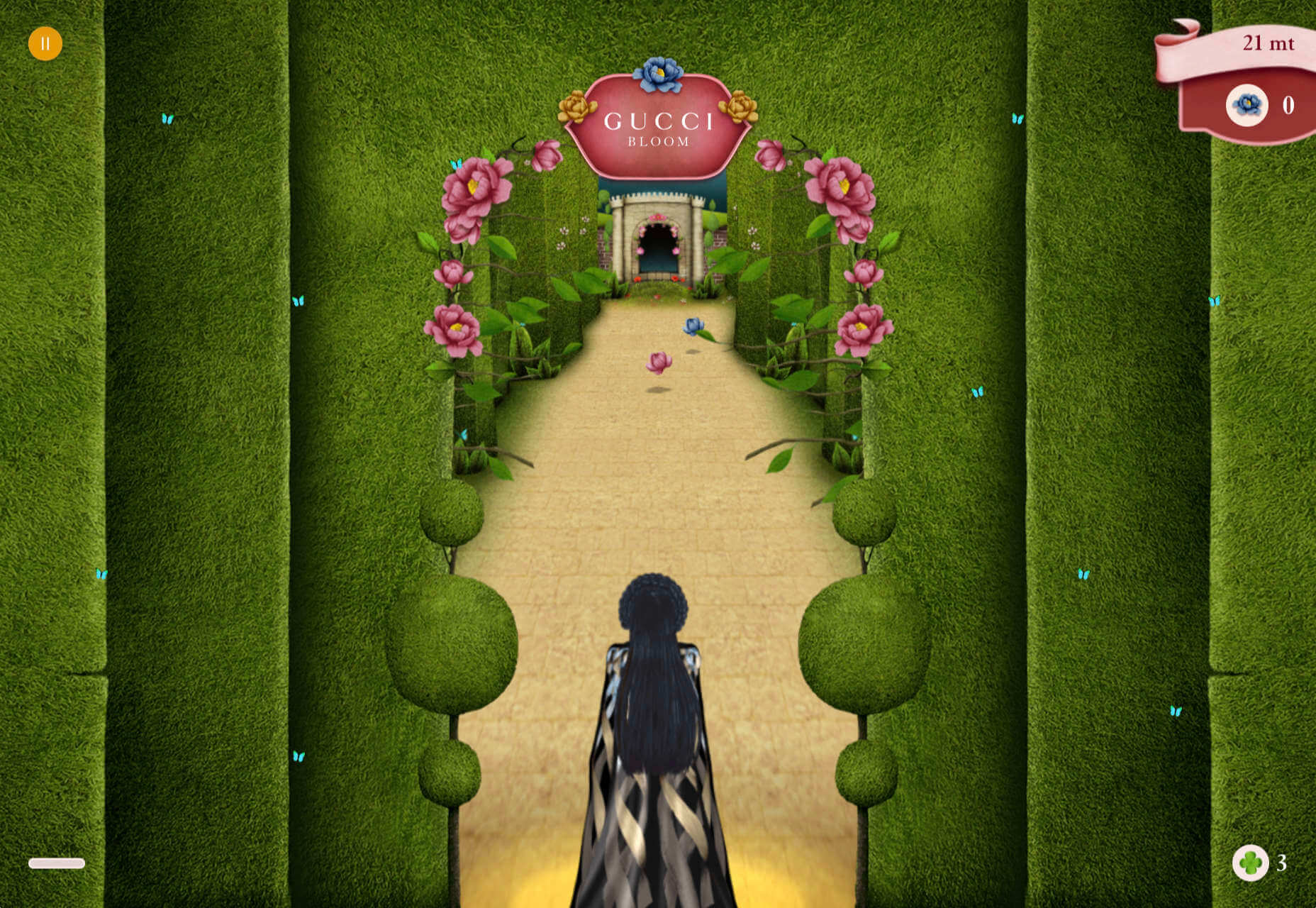
Gucci Bloom

As part of a new campaign to promote it’s ‘Bloom’ perfumes, Gucci have created a Gucci Bloom game. The player has to pick up flowers and perfume bottles, but miss a flower and the vines get in your way.

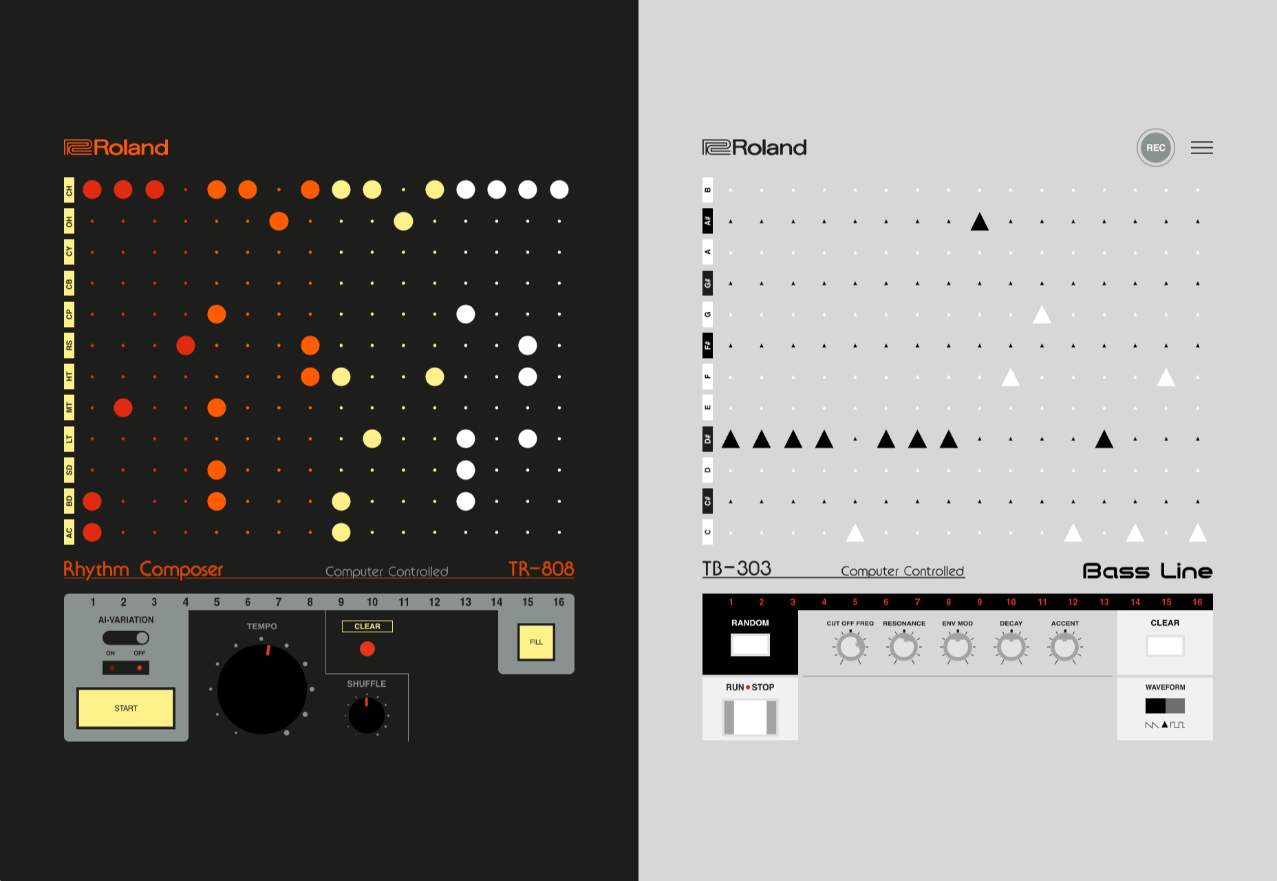
808303Studio

808303Studio is a digital musical instrument that emulates a Roland TR-808 drum machine and TB-303 bass synthesizer, created in conjunction with the Design Museum (London). It’s fully programmable and there is even short video tutorial with A Guy Called Gerald on how to use it.

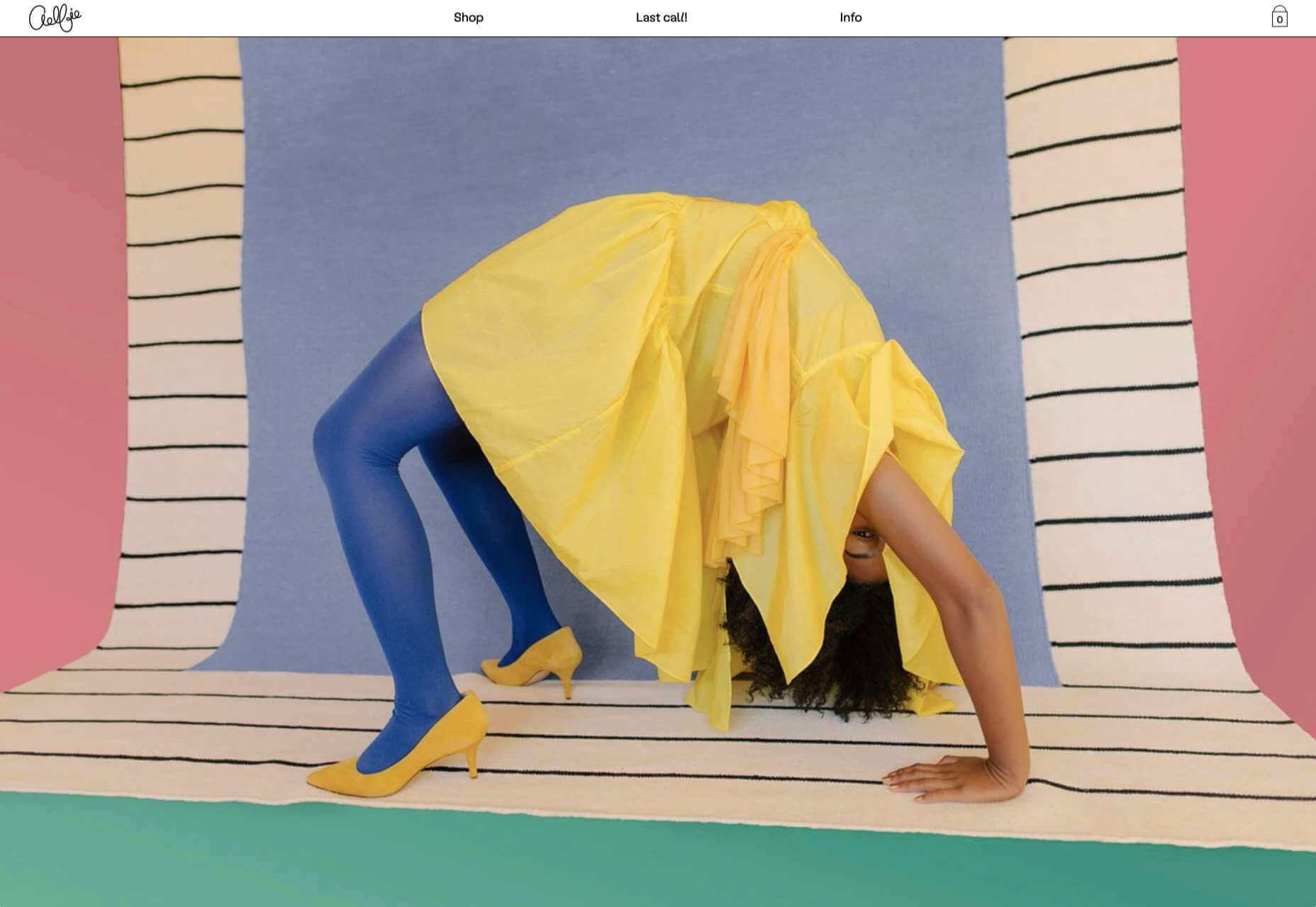
Aelfie

Aelfie is a home furnishings brand with a focus on bold patterns and bright color. Their site reflects this with its use of block color, irregular grid, drawings, and type that feels a little off-kilter. It creates a hand-made feel that embodies the brand aesthetic rather well.

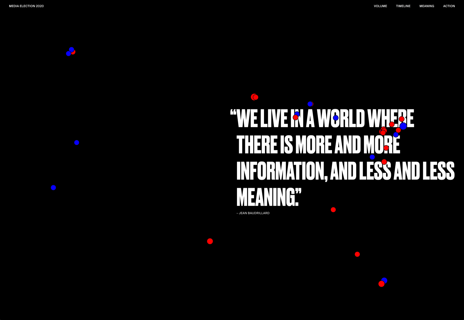
Media Election 2020

As we approach one of the most significant, not to mention acrimonious, elections in US history, Media Election 2020 uses AI to analyze the volume of media attention each candidate receives, in real time.

Curbed

Magazine website Curbed has now become a part of New York magazine, and had a redesign in the process. It follows a discernible grid, but distorts it just enough to create an edge. The highlighter color frames, and underlines on rollover, add movement and ‘cool’.

WFN

The WFN (Women’s Funding Network) is an alliance of funds and foundations working to promote gender equity and social change internationally. The site is clean, with strong typography and a sophisticated color palette.

The Fabric of America

Internet, telephone and TV service provider Xfinity is behind the Fabric of America project. It is a collection of voice recordings, the idea being that each voice, and each person’s story, is a thread that makes up the flag that we see on the screen.

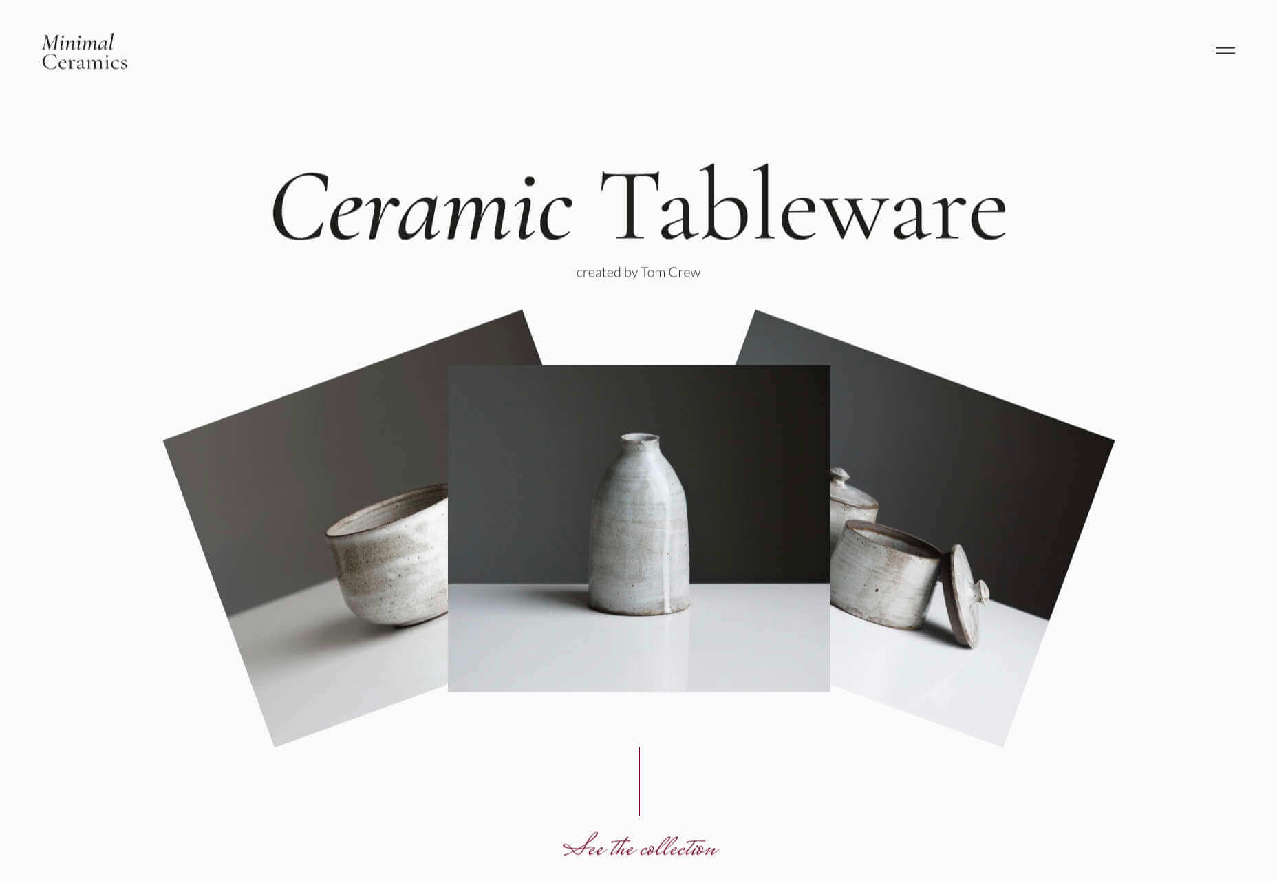
Minimal Ceramics

Minimal Ceramics is a concept site, showcasing the work of London based potter, Tom Crew. The design of the site reflects the simplicity of the showcased work, using great photography and simple typography.

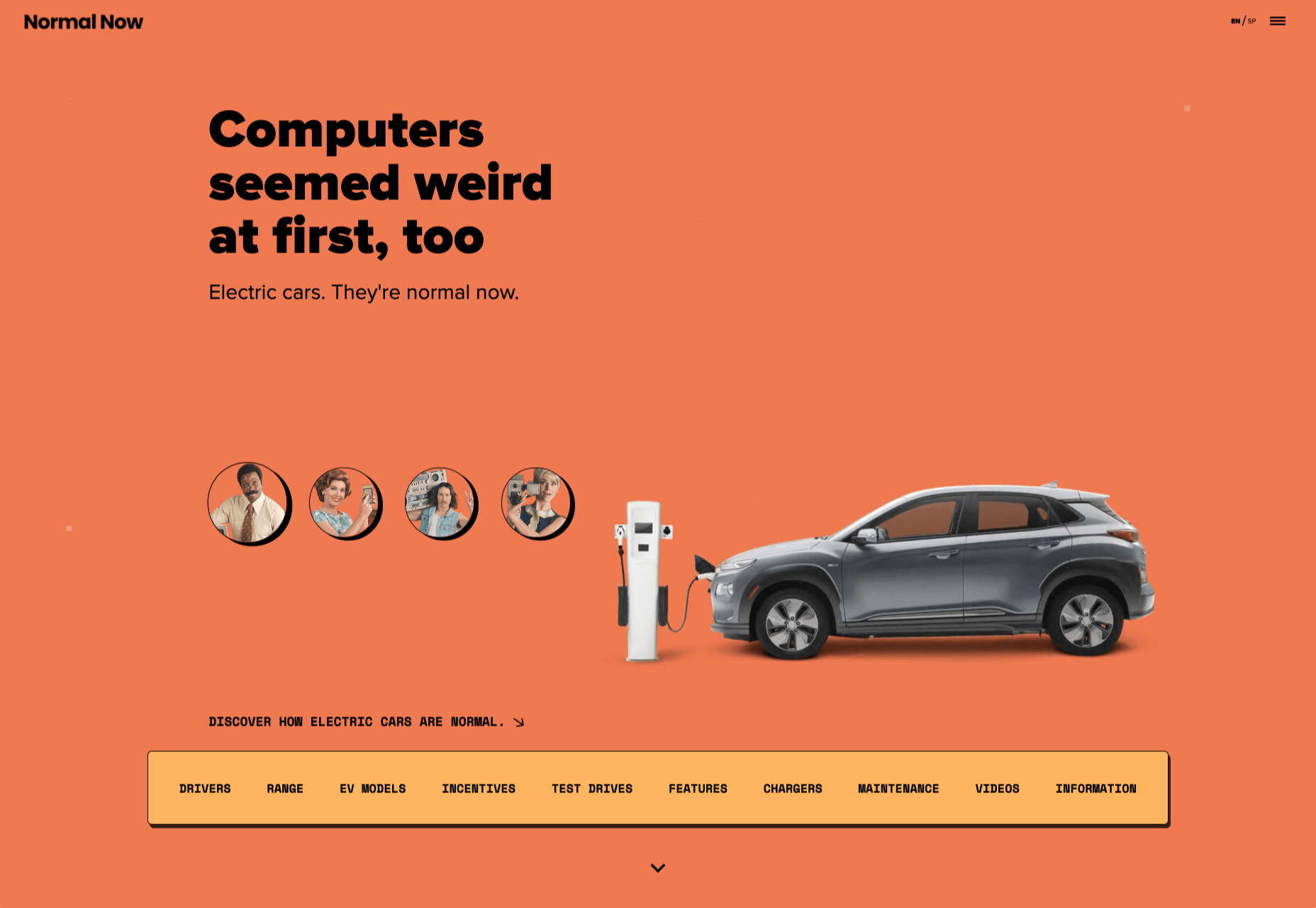
Normal Now

Normal Now is part of an awareness campaign to highlight to consumers the positives of electric cars. Taking a fun approach to engage consumers in a serious subject, it uses a fake retro tech style.

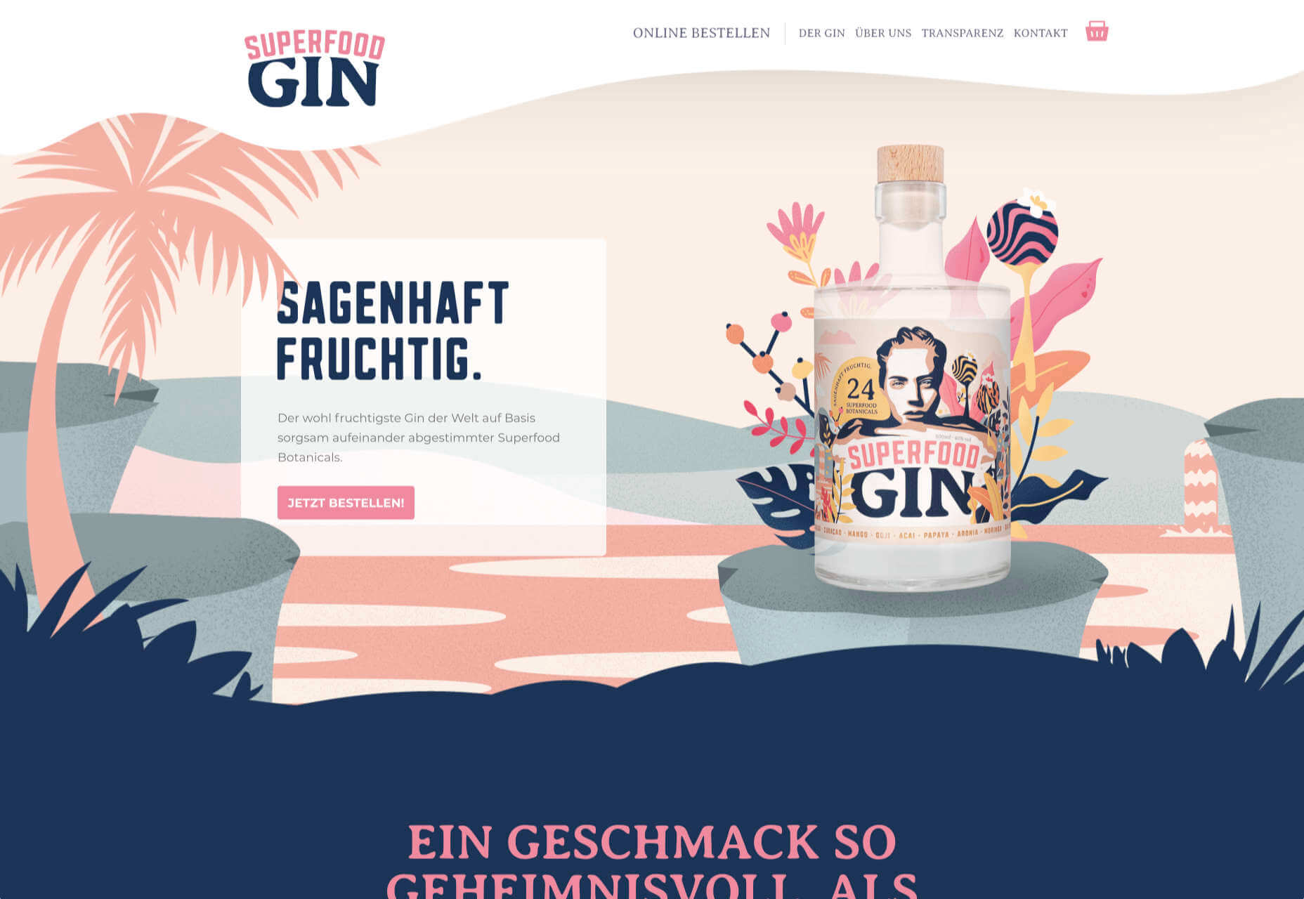
Superfood Gin

Superfood Gin is a gin made using superfood botanicals, that claims to be fruity and fresh rather than crisp and peppery. The soft color palette, along with the soft lines and curves in the background illustrations, reflect this well.

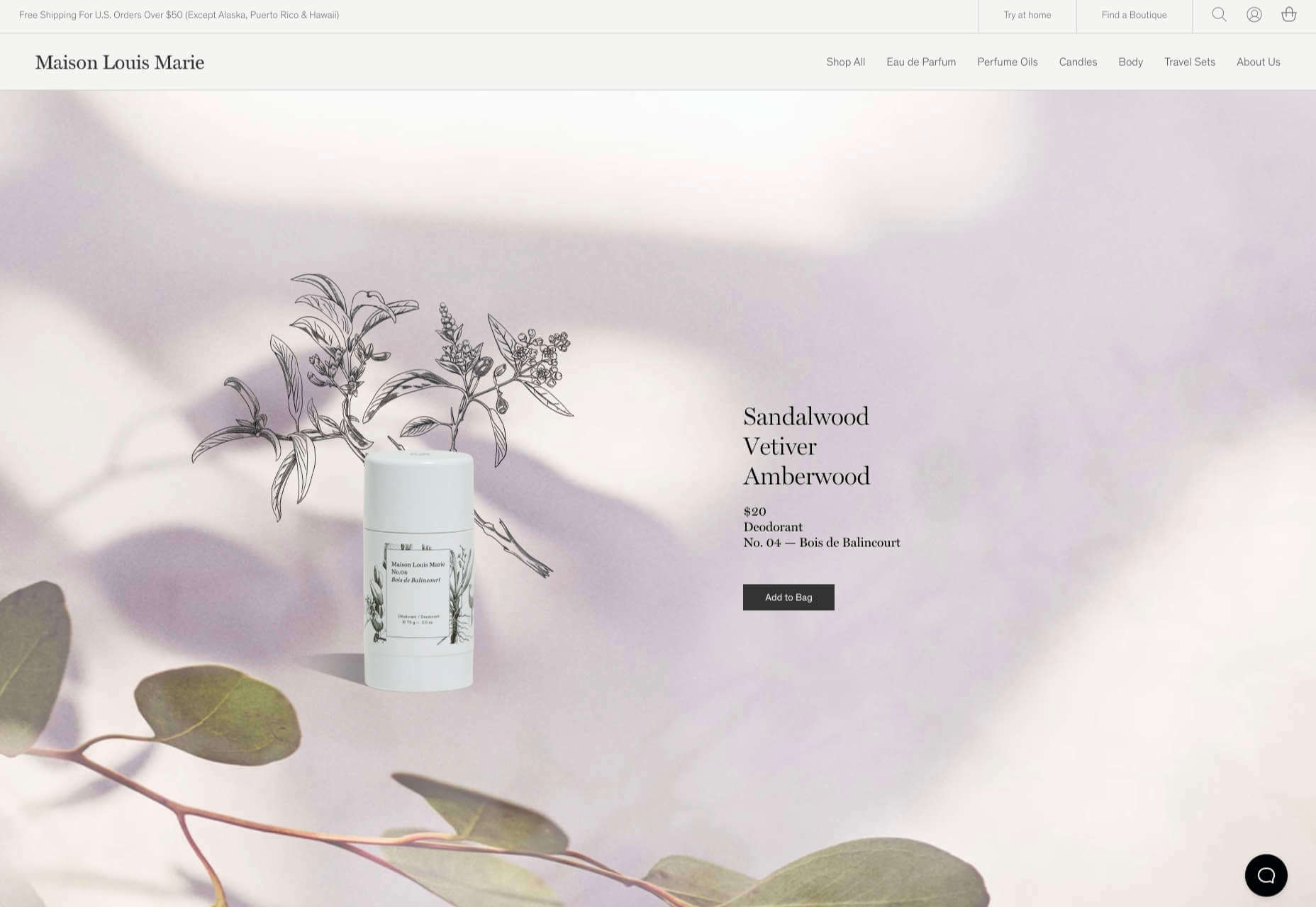
Maison Louis Marie

Maison Louis Marie is a natural fragrance company. While this site does nothing really groundbreaking, it does it well. Botanical drawings on a white background, along with clean typography, help create a refined, luxury feel.

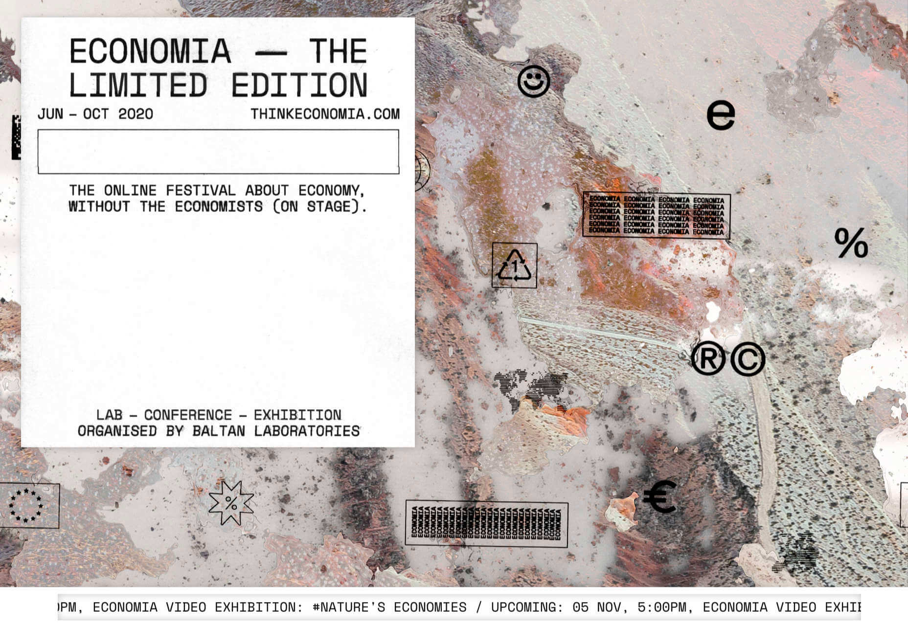
Think Economia

Think Economia is a platform taking a fresh look at economics and the future of economic growth. It doesn’t sound like the most exciting subject, but it is presented here in a playful and intriguing way.

Chernobyl

From Uprock, a Russian design studio that also offers courses in web design, Chernobyl is a thought provoking exposition of the Chernobyl disaster. The design aesthetic is muted, allowing the images their deserved impact, and the brief sections of text to be absorbed.

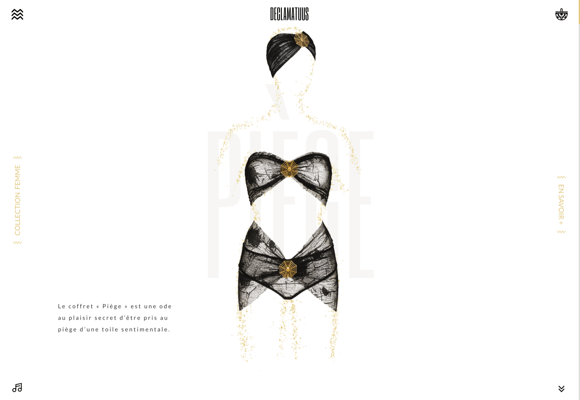
Declamatuus

Declamatuus is a lingerie company selling gift sets. What stands out here is what you don’t see — live models in underwear. Instead the outline of the body is created with animated particles.

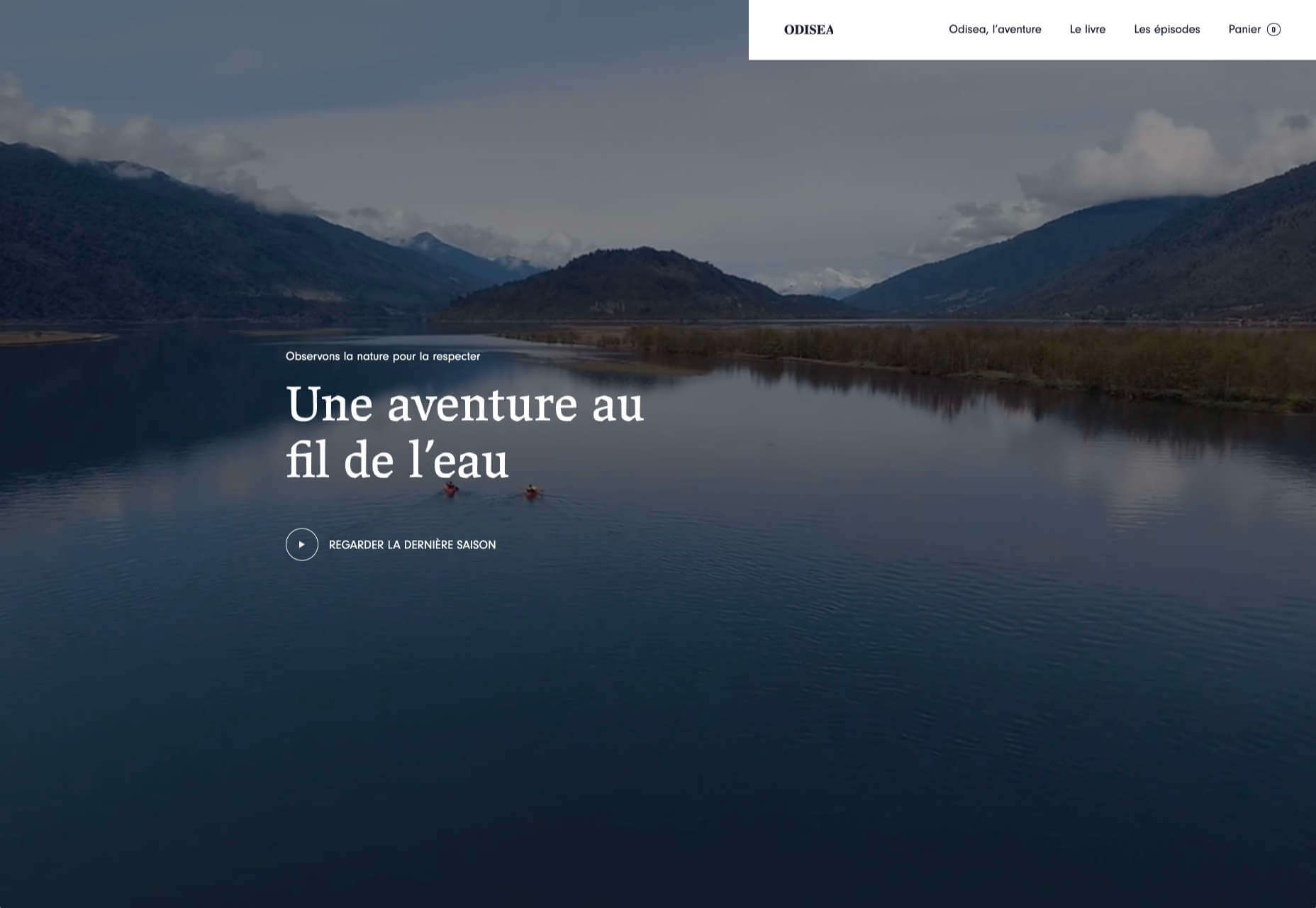
Odisea

Odisea Expedition is a documentary series following two friends, a surfer and a snowboarder, as they explore remote parts of the world. The photographs and video are everything here, and all other elements are kept minimal to avoid detracting from them.

Riffyn

Riffyn Nexus is a ‘Process Data System’ for storing and analyzing scientific data for laboratories. It is a very corporate site and yet it is put together in such a way that doesn’t feel dull.

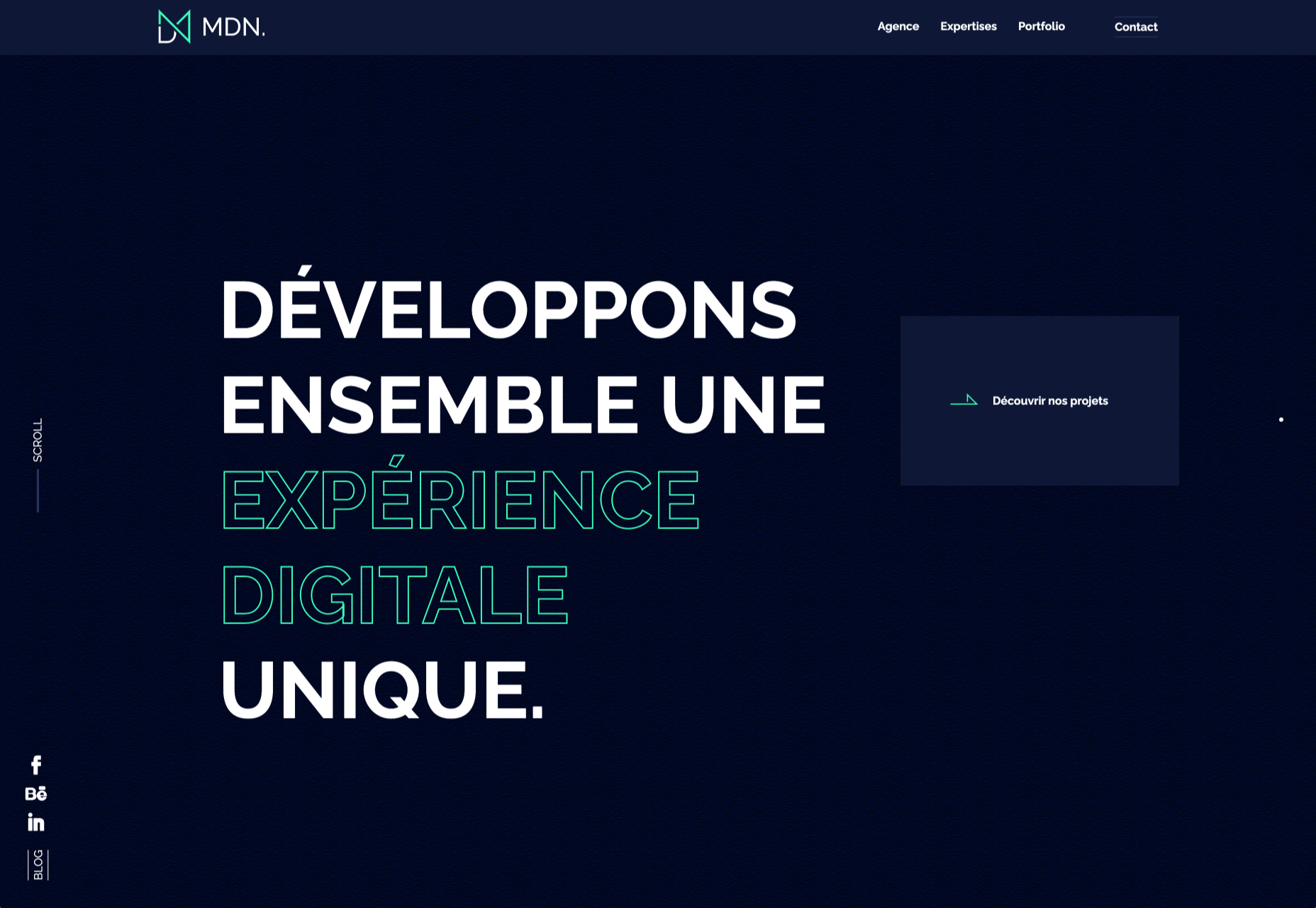
Maison du Net

This site for digital design agency Maison du Net takes a risk mixing corporate with cutesy, but it works. Offset frames and underlines create interest without overdoing it, and the very bright green is used sparingly enough to liven things up without being overwhelming.

Source

Categories: Designing, Others Tags:

8 Ways to Improve PPC Landing Page Conversions Using Color Psychology

October 26th, 2020 No comments

Creating a compelling website ad copy is just the beginning. To create an effective and long-lasting relationship with your prospects, you need to use the right colors.

85% of shoppers place color as a primary reason for why they buy a particular product. Besides, color increases brand recognition by 80%.

Before I start discussing the options, here are two things to keep in mind:

Use a cloud storage to store all your files: PPC marketers have a lot of files that have to be shared with clients, team members, and peers for discussion or approvals. For example, there are files like the client’s brand logo, content file, and design samples. The entire process has to be hassle-free. Hence, there are different cloud storage options that can help you eliminate the struggles and time taken in the process.

Always A/B test your landing pages: Before you apply the changes across your entire campaign, you should always test the selected color combinations. It is crucial to test what works best for you. Does the color change on your landing page have the expected effect on the conversion rate? If not, is there any other color you would like to experiment with. It’s always best to create a few different color palettes, just in case, for backup.

That’s it! Now, we are ready to start!

Here are the top eight ways to improve your PPC landing page conversions using color psychology.

1. Find Your Primary Color

If you have already created your brand logo, chances are you have already decided on one color. If that color reflects your brand’s personality, you can use the same color on your PPC landing page.

However, if you’re looking to change the color of an existing logo, you can browse through a list of hex code palettes to get some ideas. It contains a collection of official color codes of the world’s most known codes.

If you haven’t decided on your color, you can take this color quiz to determine which colors are right for your company.

Additionally, you can browse through Dribble or Behance to get ideas for your PPC landing page.

If you come across a visually appealing image or design, you can use tools like ColorZilla to analyze the color palettes of the page and paste it into your program.

When you choose colors that reflect your brand value, more specifically, the product you’re advertising, it increases the chances of conversion.

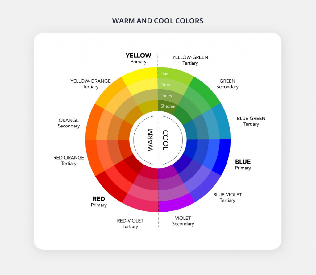
2. Understand The Difference Between Warm and Cool Colors

Both warm and cool colors have a different impact on our visual perception of objects. For example, warm colors such as red, orange, and yellow can ignite a range of emotions such as comfort and warmth. Cool colors such as blue, green, and purple can provide a sense of calmness and relaxation.

Source

To make your page stand out, you can also use a combination of warm and cool colors, along with various shades and tones. Remember, the general rule of thumb is to use 80% of one color (either warm or cool) and 20% of the other.

For example, if your landing page is composed mostly of cool colors, you can use a warm tone in the CTA button to make it more eye-catching and effective.

3. Discern The Common Psychological Effects of Universal Colors

Each color has a different psychological effect on the human mind. Using the right color, along with the appropriate text, can help you instantly boost the PPC landing page conversion rate.

Here are some common psychological effects of the universal colors.

White

  • Purity.
  • Innocence.
  • Cleanliness.
  • Sense of space.

Black

  • Authority.
  • Power.
  • Strength.
  • Evil.
  • Intelligence.

Gray

  • Neutral.
  • Timeless.
  • Practical.

Brown

  • Reliability.
  • Stability.
  • Warmth.
  • Comfort.
  • Security.
  • Natural.
  • Organic.

The colors you choose on your landing page must align with your brand’s value and personality. This will not only help you boost the conversion rate, but it will also enable you to build trust with your audience.

4. Use Different Colors For Different Age and Gender

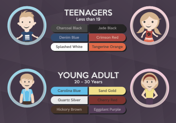
If you’re targeting a specific age group, then you need to choose the colors carefully to drive conversions.

Red, blue, and yellow are the three primary colors. Mix all of them, and you will get secondary colors, i.e., orange, green, and purple.

As per DesignMantic, teenagers (less than 19 years of age) are drawn more towards high-contrast colors, with darker tones and bright hues. While men prefer charcoal black, denim blue, and splashed white, women prefer jade black, crimson red, and tangerine orange.

Young adults (between the ages of 20 and 30) are more attracted to lighter tones. While men prefer Carolina blue, quartz silver, and hickory brown, women prefer sand gold, cherry red, and eggplant purple.

Source

As we age, the color spectrum gets lighter with pinks and teal drawing more attention.

Men between the ages of 30 and 40 years prefer oxford blue, powder blue, and earl grey while women prefer dull magenta, emerald green, and heather purple.

Middle-aged men between the ages of 40 and 55 years prefer pebble black, misty grey, and smokey teal, while women prefer apricot pink, pine green, and Pantone plum.

Senior citizens (55 years and above) men prefer suave mauve, pale beige, and snow blue while women prefer frosty lime, crepe pink, and candle white.

Depending on what age group you’re targeting via paid ads, use a good mix and match of different colors on your PPC landing page to increase the chances of conversion.

5. Use Universal Colors For Your Advantage

Colors such as blue, pink, yellow, orange, and purple are universal. No matter where you live or what language you speak, these colors have some effect on you.

Yellow

The color yellow is a symbol of happiness and warmth in almost all cultures. Besides, this is the color that the human eye processes first. The color is associated with optimism, enlightenment, and creativity.

Blue

Blue symbolizes trust, integrity, and communication. However, there are various shades of blue, and each has a different meaning.

  • Dark Blue: Symbolizes trust, dignity, intelligence, and authority.
  • Bright Blue: Symbolizes cleanliness, strength, dependability, and coolness.
  • Light Blue: Symbolizes peace, serenity, ethereal, spiritual, and infinity.

Brands like Tiffany & Co. use the blue color in their branding.

Orange

The orange color symbolizes playfulness and social interaction. It also adds a sense of comfort and warmth. However, using too much orange on a single page will make it too frivolous.

Brands like Nickelodeon use the orange color in their branding.

Pink

The color pink is associated with femininity and love. If you’re serving a female audience, using pink color on your landing page can help you boost conversions.

Brands like Victoria Secret use pink as their primary color.

Purple

The purple color symbolizes quality, luxury, and royalty. It is associated with high-end products and expensive properties.

Brands like Asprey London and Cadbury use purple for their branding.

The color you choose must reflect your brand’s value and personality.

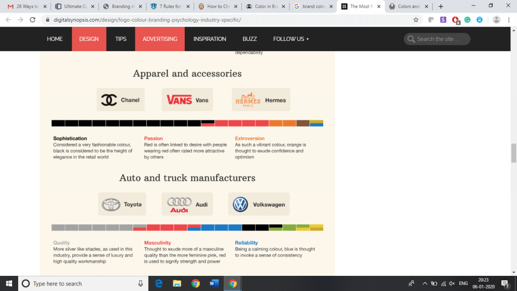
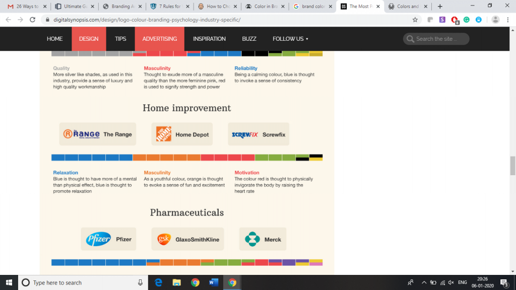
6. Don’t Ignore Industry Favored Colors

Every industry has its own preferred colors. For example, most food companies have red color on their landing pages, while luxury product brands have purple spread throughout their website.

The most prominent color in the automobile industry is silver. It provides a sense of luxury and high-quality craftsmanship. Other popular colors in the auto sector are blue and red. Blue symbolizes reliability, while red is associated with masculinity. If you’re into the auto sector, use a good combination of silver, blue, and red on your landing page to increase the chances of conversion.

Most top fashion brands use black in their branding. Colors like dark blue and chocolate brown will help you be more influential and persuasive.

People buying home improvement products are influenced by blue, orange, and red. Blue promotes relaxation. Orange evokes a sense of fun and excitement, while red raises the heart rate.

A little market research about your industry will help you find the most preferred colors. Using these colors in your landing page will help you boost trust with your visitors and increase the likelihood of conversion.

7 – Choose a Contrasting CTA Color

Contrasting color on the landing page will help you draw the visitor’s attention to a CTA button.

Contrasting button colors not only increases processing fluency, but it also influences the visitor into clicking. This increases the chances of conversion.

Here is an example from Spotify that shows contrasting CTA color. The CTA button is easy to locate and invites action.

8. Limit The Numbers of Colors On a Page

Using too many colors can distract and confuse your visitors and will reduce the chances of conversions.

It’s recommended to use a maximum of three colors on one page. There’s also a 60/30/10 rule that can come in handy when designing your PPC landing page.

The 60/30/10 rule recommends using 60% of one color, 30% of the other, and 10% of the third one on one page. This will help you keep your visitors engaged while highlighting the important elements of the page.

Landing Page Examples

Until now, we saw various ways to improve PPC landing page conversions using color psychology. Let’s have a look at some of the practical examples of these theories.

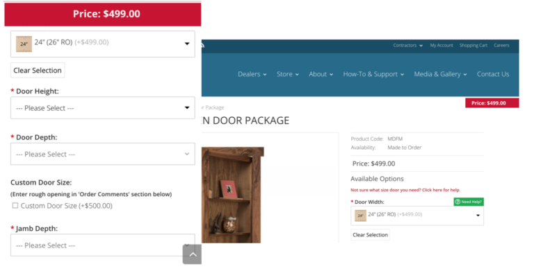
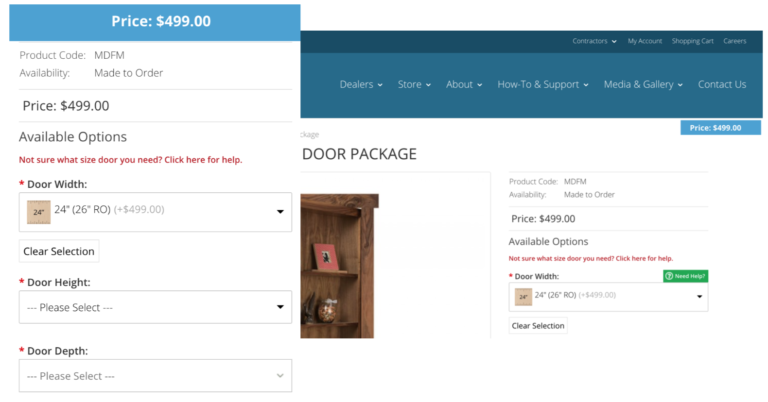
An ecommerce company that sells high-end doors for homes gained $21,000 more revenue by changing the color to blue from red in the pricing calculator page. They also noticed a 12% decrease in the bounce rate and a 10.29% increase in average order value.

Source

Mercedes-Benz uses black color on its website to demonstrate professionalism, power, and luxury.

Source

Apple uses white color on their landing page to demonstrate innocence, purity, cleanliness, and peace. It also helps them to communicate modernity.

Source

Final Thoughts

Colors play a vital role in the buying process. Right colors can help you boost the conversion rate while the wrong ones can leave a negative impression on your potential customers.

It’s important to understand what impact each color on your landing page will have on your prospects. Also, it is crucial to test the combination of various colors on your landing page to figure out what works best for you.


Photo by Robert Katzki on Unsplash

Categories: Others Tags:

Popular Design News of the Week: October 19, 2020 – October 25, 2020

October 25th, 2020 No comments

Every week users submit a lot of interesting stuff on our sister site Webdesigner News, highlighting great content from around the web that can be of interest to web designers.

The best way to keep track of all the great stories and news being posted is simply to check out the Webdesigner News site, however, in case you missed some here’s a quick and useful compilation of the most popular designer news that we curated from the past week.

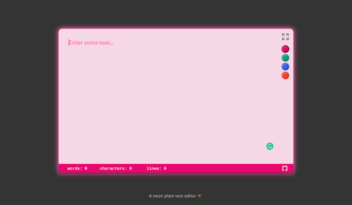
Neonpad.io – A Neon Plain Text Editor in the Browser

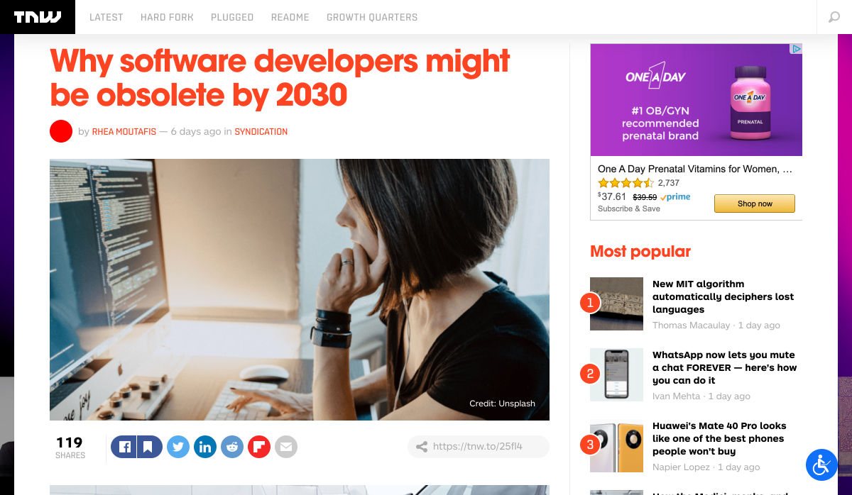
Why Software Developers Might Be Obsolete by 2030

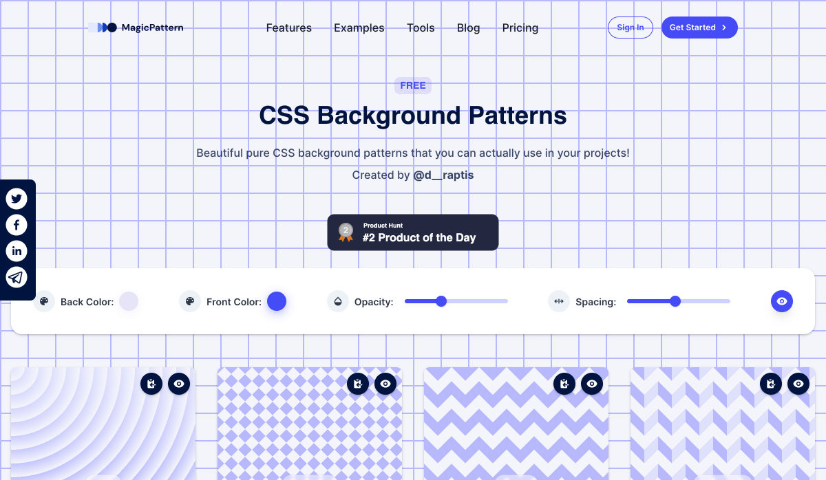
CSS Background Patterns by MagicPattern

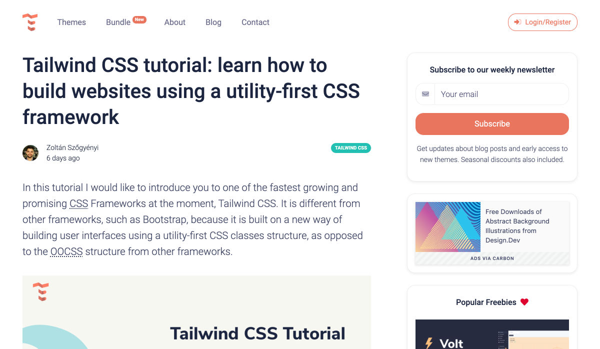
Tailwind CSS: How to Build Websites Using a Utility-First CSS Framework

5 Landing Page Optimization Techniques You Haven’t Tried

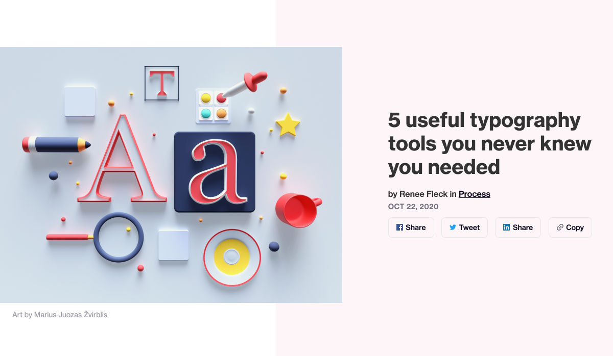
5 Useful Typography Tools You Never Knew You Needed

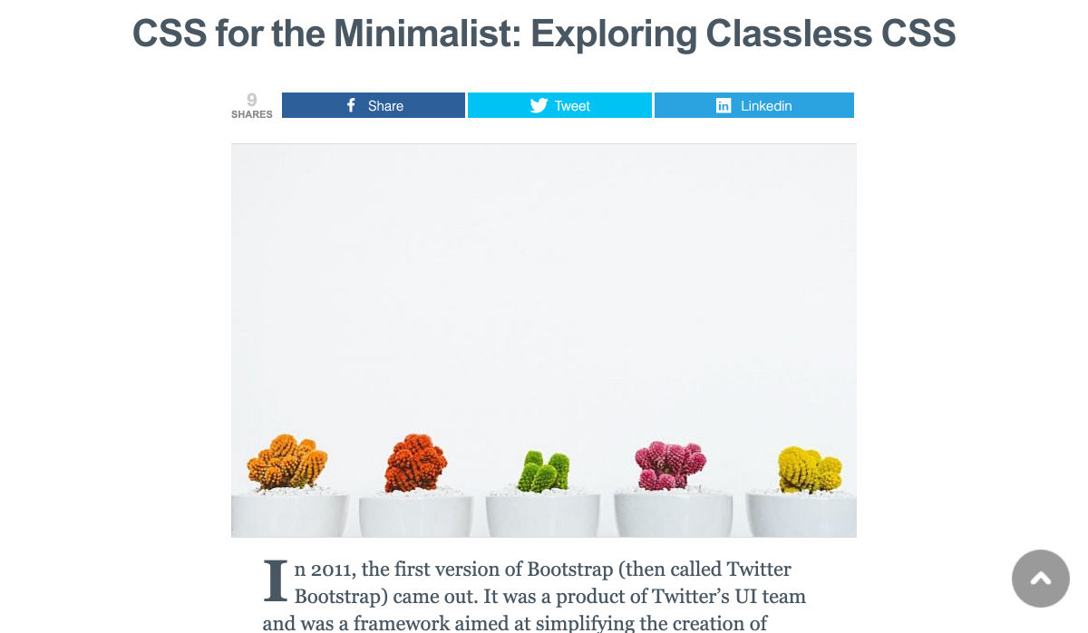
CSS for the Minimalist: Exploring Classless CSS

Technical SEO: A Complete Step-by-step on How to Leverage your Website

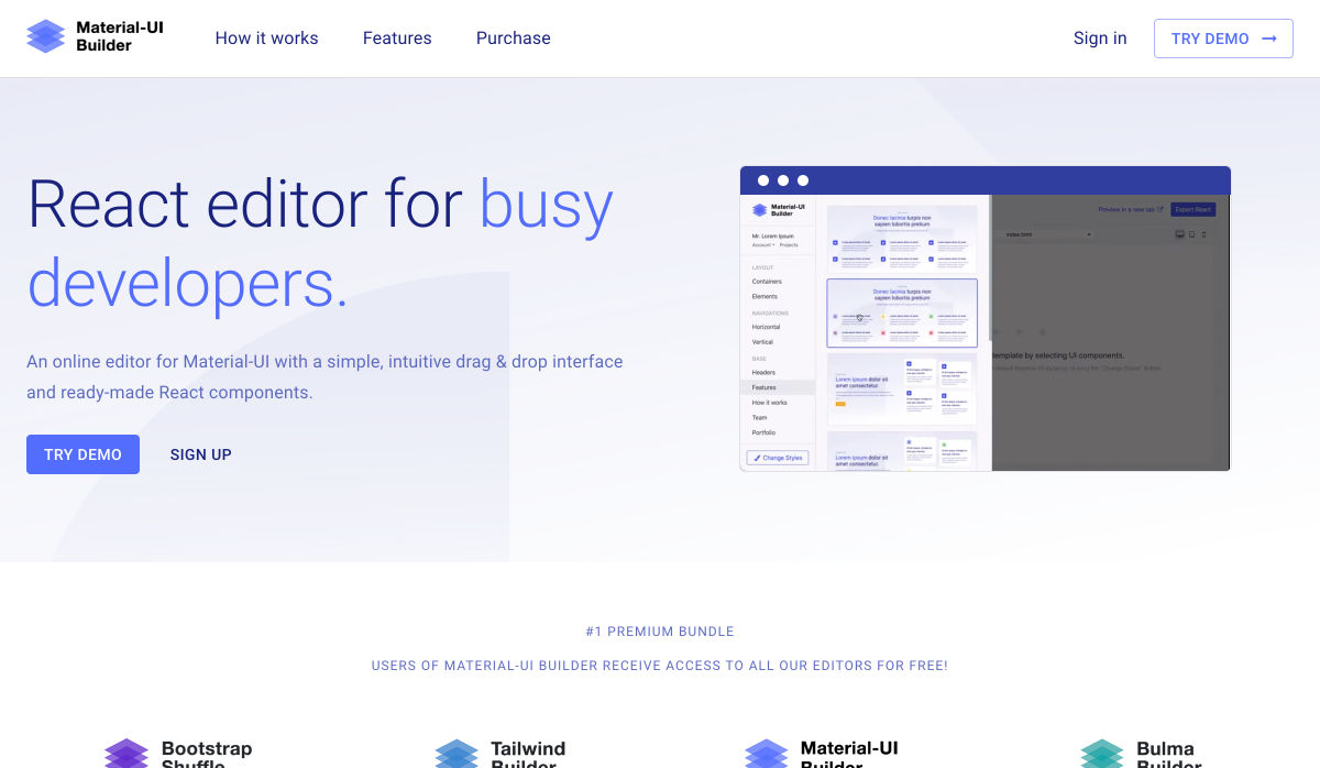
Material-UI Builder – React Editor for Busy Developers

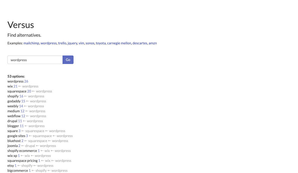
Versus – Find Alternatives to a Product or Service

StellarX – Create Collaborative Spaces & Rich Simulations Without Code

Project Scheduling 101: What it is + How to do it

3 Ways to Know if your Design is Good

My Chatbot is Dead – Why Yours Should Probably Be Too

How to Make a Memorable Freelance Portfolio

The Grumpy Designer’s WordPress Plugin Pet Peeves

The Difference Between Information Architecture and UX Design

How to Secure Sites for 2020 Holiday Shopping

Finding Logo Fonts that Fit your Brand

How to Create a Web App Manifest

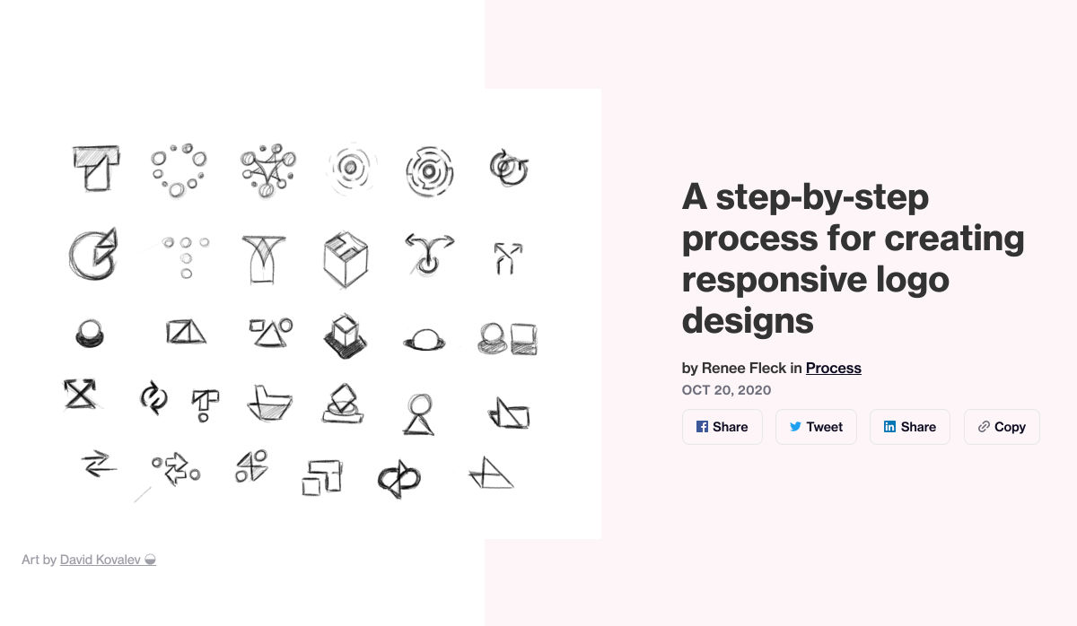
A Step-by-step Process for Creating Responsive Logo Designs

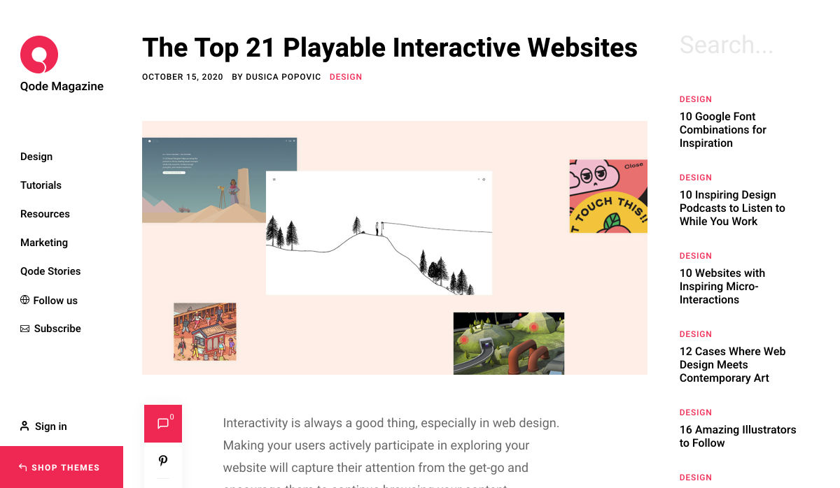
The Top 21 Playable Interactive Websites

How to Become a Design Mentor

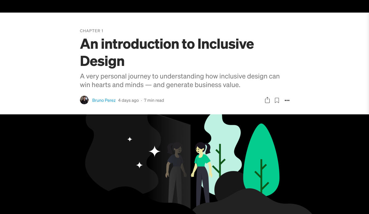
An Introduction to Inclusive Design

5 Design Lessons from Great Writers

Want more? No problem! Keep track of top design news from around the web with Webdesigner News.

Source

Categories: Designing, Others Tags:

Creating CSS Shapes with Emoji

October 23rd, 2020 No comments

CSS Shapes is a standard that lets us create geometric shapes over floated elements that cause the inline contents — usually text — around those elements to wrap along the specified shapes.

Such a shaped flow of text looks good in editorial designs or designs that work with text-heavy contents to add some visual relief from the chunks of text.

Here’s an example of CSS Shape in use:

CodePen Embed Fallback

The shape-outside property specifies the shape of a float area using either one of the basic shape functions — circle(), ellipse(), polygon() or inset() — or an image, like this:

CodePen Embed Fallback

Inline content wraps along the right side of a left-floated element, and the left side of a right-floated element.

In this post, we’ll use the concept of CSS Shapes with emoji to create interesting text-wrapping effects. Images are rectangles. Many of the shapes we draw in CSS are also boxy or at least limited to standard shapes. Emoji, on the other hand, offers neat opportunities to break out of the box!

Here’s how we’ll do it: We’ll first create an image out of an emoji, and then float it and apply a CSS Shape to it.

I’ve already covered multiple ways to convert emojis to images in this post on creative background patterns. In that I said I wasn’t able to figure out how to use SVG to do the conversion, but I’ve figured it out now and will show you how in this post. You don’t need to have read that article for this one to make sense, but it’s there if you want to see it.

Let’s make an emoji image

The three steps we’re using to create an emoji image are:

  • Create an emoji-shaped cutout in SVG
  • Convert the SVG code to a DataURL by URL encoding and prefixing it with data:image/svg+xml
  • Use the DataURL as the url() value of an element’s background-image.

Here’s the SVG code that creates the emoji shaped cutout:

<svg width='150px' height='150px' xmlns='http://www.w3.org/2000/svg'> 
  <clipPath id='emojiClipPath'> 
    <text x='0' y='130px' font-size='130px'>🦕</text> 
  </clipPath> 
  <text x='0' y='130px' font-size='130px' clip-path='url(#emojiClipPath)'>🦕</text>
</svg>

What’s happening here is we’re providing a element with an emoji character for a . A clip path is an outline of a region to be kept visible when that clip path is applied to an element. In our code, that outline is the shape of the emoji character.

Then the emoji’s clip path is referenced by a element carrying the same emoji character, using its clip-path property, creating a cutout in the shape of the emoji.

Now, we convert the SVG code to a DataURL. You can URL encode it by hand or use online tools (like this one!) that can do it for you.

Here’s the resulted DataURL, used as the url() value for the background image of an .emoji element in CSS:

.emoji {
  background: url("data:image/svg+xml,<svg width='150px' height='150px' xmlns='http://www.w3.org/2000/svg'> <clipPath id='emojiClipPath'> <text x='0' y='130px'  font-size='130px'>🦕</text> </clipPath> <text x='0' y='130px' font-size='130px' clip-path='url(%23emojiClipPath)'>🦕</text></svg>");
}

If we were to stop here and give the .emoji element dimensions, we’d see our character displayed as a background image:

CodePen Embed Fallback

Now let’s turn this into a CSS Shape

We can do this in two steps:

  • Float the element with the emoji background
  • Use the DataURL as the url() value for the element’s shape-outside property
.emoji {
  --image-url: url("data:image/svg+xml,<svg width='150px' height='150px' xmlns='http://www.w3.org/2000/svg'> <clipPath id='emojiClipPath'> <text x='0' y='130px'  font-size='130px'>🦕</text> </clipPath> <text x='0' y='130px'  font-size='130px' clip-path='url(#emojiClipPath)'>🦕</text></svg>");
  background: var(--image-url);
  float: left;
  height: 150px;
  shape-outside: var(--image-url);
  width: 150px;
  margin-left: -6px; 
}

We placed the DataURL in a custom property, --image-url, so we can easily refer it in both the background and the shape-outside properties without repeating that big ol’ string of encoded SVG multiple times.

Now, any inline content near the floated .emoji element will flow in the shape of the emoji. We can adjust things even further with margin or shape-margin to add space around the shape.

CodePen Embed Fallback

If you want a color-blocked emoji shape, you can do that by applying the clip path to a element in the SVG:

<svg width='150px' height='150px' xmlns='http://www.w3.org/2000/svg'> 
    <clipPath id='emojiClipPath'> 
        <text x='0' y='130px' font-size='130px'>🦕</text> 
    </clipPath> 
    <rect x='0' y='0' fill='green' width='150px' height='150px' clip-path='url(#emojiClipPath)'/> 
</svg>
CodePen Embed Fallback

The same technique will work with letters!

CodePen Embed Fallback

Just note that Firefox doesn’t always render the emoji shape. We can work around that by updating the SVG code.

<svg xmlns='http://www.w3.org/2000/svg' width='150px' height='150px'>
  <foreignObject width='150px' height='150px'>
    <div xmlns='http://www.w3.org/1999/xhtml' style='width:150px;height:150px;line-height:150px;text-align:center;color:transparent;text-shadow: 0 0 black;font-size:130px;'>🧗</div>
  </foreignObject>
</svg>

This creates a block-colored emoji shape by making the emoji transparent and giving it text-shadow with inline CSS. The

containing the emoji and inline CSS style is then inserted into a element of SVG so the HTML

code can be used inside the SVG namespace. The rest of the code in this technique is same as the last one.

CodePen Embed Fallback

Now we need to center the shape

Since CSS Shapes can only be applied to floated elements, the text flows either to the right or left of the element depending on which side it’s floated. To center the element and the shape, we’ll do the following:

  • Split the emoji in half
  • Float the left-half of the emoji to the right, and the right-half to the left
  • Put both sides together!

One caveat to this strategy: if you’re using running sentences in the design, you’ll need to manually align the letters on both sides.

Here’s what we’re aiming to make:

CodePen Embed Fallback

First, we see the HTML for the left and right sides of the design. They are identical.

<div id="design">
  <p id="leftSide">A C G T A <!-- more characters --> C G T A C G T A C G T <span class="emoji"></span>A C G <!-- more characters --> C G T </p>
  <p id="rightSide">A C G T A <!-- more characters --> C G T A C G T A C G T <span class="emoji"></span>A C G <!-- more characters --> C G T </p>
</div>

p#leftSide and p#rightSide inside #design are arranged side-by-side in a grid.

#design {
  border-radius: 50%; /* A circle */
  box-shadow: 6px 6px 20px silver;
  display: grid; 
  grid: "1fr 1fr"; /* A grid with two columns */
  overflow: hidden;
  width: 400px; height: 400px;
}

Here’s the CSS for the emoji:

span.emoji {
  filter: drop-shadow(15px 15px 5px green);
  shape-margin: 10px;
  width: 75px; 
  height: 150px;
}

/* Left half of the emoji */
p#leftSide>span.emoji {
  --image-url:url("data:image/svg+xml,<svg width='150px' height='150px' xmlns='http://www.w3.org/2000/svg'> <clipPath id='emojiClipPath'> <text x='0' y='130px'  font-size='130px'>🦎</text> </clipPath> <rect x='0' y='0' width='150px' height='150px' clip-path='url(%23emojiClipPath)'/></svg>");
  background-image: var(--image-url);
  float: right;
  shape-outside: var(--image-url);
}

/* Right half of the emoji */
p#rightSide>span.emoji {
  --image-url:url("data:image/svg+xml,<svg width='150px' height='150px' xmlns='http://www.w3.org/2000/svg'> <clipPath id='emojiClipPath'> <text x='-75px' y='130px'  font-size='130px'>🦎</text> </clipPath> <rect x='0' y='0' width='150px' height='150px' clip-path='url(%23emojiClipPath)'/></svg>");
  background-image: var(--image-url);
  float: left;
  shape-outside: var(--image-url);
}

The width of the elements that hold the emoji images (span.emoji) is 75px whereas the width of the SVG emoji images is 150px. This automatically crops the image in half when displayed inside the spans.

On the right side of the design, with the left-floated emoji (p#rightSide>span.emoji), we need to move the emoji halfway to the left to show the right-half, so the x value in the in the DataURL is changed to 75px. That’s the only difference in the DataURLs from the left and right sides of the design.

Here’s that result once again:


That’s it! You can try the above method to center any CSS Shape as long as you can split the element up into two and put the halves back together with CSS.


The post Creating CSS Shapes with Emoji appeared first on CSS-Tricks.

You can support CSS-Tricks by being an MVP Supporter.
Categories: Designing, Others Tags:

CSS in 3D: Learning to Think in Cubes Instead of Boxes

October 23rd, 2020 No comments

My path to learning CSS was a little unorthodox. I didn’t start as a front-end developer. I was a Java developer. In fact, my earliest recollections of CSS were picking colors for things in Visual Studio.

It wasn’t until later that I got to tackle and find my love for the front end. And exploring CSS came later. When it did, it was around the time CSS3 was taking off. 3D and animation were the cool kids on the block. They almost shaped my learning of CSS. They drew me in and shaped (pun intended) my understanding of CSS more than other things, like layout, color, etc.

What I’m getting at is I’ve been doing the whole 3D CSS thing a minute. And as with anything you spend a lot of time with, you end up refining your process over the years as you hone that skill. This article is a look at how I’m currently approaching 3D CSS and goes over some tips and tricks that might help you!

<iframe title="Pure CSS drawers using

&

??? #CodePenChallenge” src=”https://codepen.io/jh3y/embed/preview/mLaXRe?height=300&slug-hash=mLaXRe&default-tabs=css,result&host=https://codepen.io” scrolling=”no” frameborder=”0″ height=”300″ allowtransparency=”true”>

Everything’s a cuboid

For most things, we can use a cuboid. We can create more complex shapes, for sure but they usually take a little more consideration. Curves are particularly hard and there are some tricks for handling them (but more on that later).

We aren’t going to walk through how to make a cuboid in CSS. We can reference Ana Tudor’s post for that, or check out this screencast of me making one:

At its core, we use one element to wrap our cuboid and then transform six elements within. Each element acts as a side to our cuboid. It’s important that we apply transform-style: preserve-3d. And it’s not a bad idea to apply it everywhere. It’s likely we’ll deal with nested cuboids when things get more complex. Trying to debug a missing transform-style while hopping between browsers can be painful.

* { transform-style: preserve-3d; }

For your 3D creations that are more than a few faces, try and imagine the whole scene built from cuboids. For a real example, consider this demo of a 3D book. It’s four cuboids. One for each cover, one for the spine, and one for the pages. The use of background-image does the rest for us.

Setting a scene

We’re going to use cuboids like LEGO pieces. But, we can make our lives a little easier by setting a scene and creating a plane. That plane is where our creation will sit and makes it easier for us to rotate and move the whole creation.

For me, when I create a scene, I like to rotate it on the X and Y axis first. Then I lay it flat with rotateX(90deg). That way, when I want to add a new cuboid to the scene, I add it inside the plane element. Another thing I will do here is to set position: absolute on all cuboids.

.plane {
  transform: rotateX(calc(var(--rotate-x, -24) * 1deg)) rotateY(calc(var(--rotate-y, -24) * 1deg)) rotateX(90deg) translate3d(0, 0, 0);
}

Start with a boilerplate

Creating cuboids of various sizes and across a plane makes for a lot of repetition for each creation. For this reason, I use Pug to create my cuboids via a mixin. If you’re not familiar with Pug, I wrote a 5-minute intro.

A typical scene looks like this:

//- Front
//- Back
//- Right
//- Left
//- Top
//- Bottom
mixin cuboid(className)
  .cuboid(class=className)
    - let s = 0
    while s < 6
      .cuboid__side
      - s++
.scene
  //- Plane that all the 3D stuff sits on
  .plane
    +cuboid('first-cuboid')

As for the CSS. My cuboid class is currently looking like this:

.cuboid {
  // Defaults
  --width: 15;
  --height: 10;
  --depth: 4;
  height: calc(var(--depth) * 1vmin);
  width: calc(var(--width) * 1vmin);
  transform-style: preserve-3d;
  position: absolute;
  font-size: 1rem;
  transform: translate3d(0, 0, 5vmin);
}
.cuboid > div:nth-of-type(1) {
  height: calc(var(--height) * 1vmin);
  width: 100%;
  transform-origin: 50% 50%;
  position: absolute;
  top: 50%;
  left: 50%;
  transform: translate(-50%, -50%) rotateX(-90deg) translate3d(0, 0, calc((var(--depth) / 2) * 1vmin));
}
.cuboid > div:nth-of-type(2) {
  height: calc(var(--height) * 1vmin);
  width: 100%;
  transform-origin: 50% 50%;
  transform: translate(-50%, -50%) rotateX(-90deg) rotateY(180deg) translate3d(0, 0, calc((var(--depth) / 2) * 1vmin));
  position: absolute;
  top: 50%;
  left: 50%;
}
.cuboid > div:nth-of-type(3) {
  height: calc(var(--height) * 1vmin);
  width: calc(var(--depth) * 1vmin);
  transform: translate(-50%, -50%) rotateX(-90deg) rotateY(90deg) translate3d(0, 0, calc((var(--width) / 2) * 1vmin));
  position: absolute;
  top: 50%;
  left: 50%;
}
.cuboid > div:nth-of-type(4) {
  height: calc(var(--height) * 1vmin);
  width: calc(var(--depth) * 1vmin);
  transform: translate(-50%, -50%) rotateX(-90deg) rotateY(-90deg) translate3d(0, 0, calc((var(--width) / 2) * 1vmin));
  position: absolute;
  top: 50%;
  left: 50%;
}
.cuboid > div:nth-of-type(5) {
  height: calc(var(--depth) * 1vmin);
  width: calc(var(--width) * 1vmin);
  transform: translate(-50%, -50%) translate3d(0, 0, calc((var(--height) / 2) * 1vmin));
  position: absolute;
  top: 50%;
  left: 50%;
}
.cuboid > div:nth-of-type(6) {
  height: calc(var(--depth) * 1vmin);
  width: calc(var(--width) * 1vmin);
  transform: translate(-50%, -50%) translate3d(0, 0, calc((var(--height) / 2) * -1vmin)) rotateX(180deg);
  position: absolute;
  top: 50%;
  left: 50%;
}

Which, by default, gives me something like this:

Powered by CSS variables

You may have noticed a fair few CSS variables (aka custom properties) in there. This is a big time-saver. I’m powering my cuboids with CSS variables.

  • --width: The width of a cuboid on the plane
  • --height: The height of a cuboid on the plane
  • --depth: The depth of a cuboid on the plane
  • --x: The X position on the plane
  • --y: The Y position on the plane

I use vmin mostly as my sizing unit to keep everything responsive. If I’m creating something to scale, I might create a responsive unit. We mentioned this technique in a previous article. Again, I lay the plane down flat. Now I can refer to my cuboids as having height, width, and depth. This demo shows how we can move a cuboid around the plane changing its dimensions.

CodePen Embed Fallback

Debugging with dat.GUI

You might have noticed that little panel in the top right for some of the demos we’ve covered. That’s dat.GUI. It’s a lightweight controller library for JavaScript that super useful for debugging 3D CSS. With not much code, we can set up a panel that allows us to change CSS variables at runtime. One thing I like to do is use the panel to rotate the plane on the X and Y-axis. That way, it’s possible to see how things are lining up or work on a part that you might not see at first.


const {
  dat: { GUI },
} = window
const CONTROLLER = new GUI()
const CONFIG = {
  'cuboid-height': 10,
  'cuboid-width': 10,
  'cuboid-depth': 10,
  x: 5,
  y: 5,
  z: 5,
  'rotate-cuboid-x': 0,
  'rotate-cuboid-y': 0,
  'rotate-cuboid-z': 0,
}
const UPDATE = () => {
  Object.entries(CONFIG).forEach(([key, value]) => {
    document.documentElement.style.setProperty(`--${key}`, value)
  })
}
const CUBOID_FOLDER = CONTROLLER.addFolder('Cuboid')
CUBOID_FOLDER.add(CONFIG, 'cuboid-height', 1, 20, 0.1)
  .name('Height (vmin)')
  .onChange(UPDATE)
CUBOID_FOLDER.add(CONFIG, 'cuboid-width', 1, 20, 0.1)
  .name('Width (vmin)')
  .onChange(UPDATE)
CUBOID_FOLDER.add(CONFIG, 'cuboid-depth', 1, 20, 0.1)
  .name('Depth (vmin)')
  .onChange(UPDATE)
// You have a choice at this point. Use x||y on the plane
// Or, use standard transform with vmin.
CUBOID_FOLDER.add(CONFIG, 'x', 0, 40, 0.1)
  .name('X (vmin)')
  .onChange(UPDATE)
CUBOID_FOLDER.add(CONFIG, 'y', 0, 40, 0.1)
  .name('Y (vmin)')
  .onChange(UPDATE)
CUBOID_FOLDER.add(CONFIG, 'z', -25, 25, 0.1)
  .name('Z (vmin)')
  .onChange(UPDATE)
CUBOID_FOLDER.add(CONFIG, 'rotate-cuboid-x', 0, 360, 1)
  .name('Rotate X (deg)')
  .onChange(UPDATE)
CUBOID_FOLDER.add(CONFIG, 'rotate-cuboid-y', 0, 360, 1)
  .name('Rotate Y (deg)')
  .onChange(UPDATE)
CUBOID_FOLDER.add(CONFIG, 'rotate-cuboid-z', 0, 360, 1)
  .name('Rotate Z (deg)')
  .onChange(UPDATE)
UPDATE()

If you watch the timelapse video in this tweet. You’ll notice that I rotate the plane a lot as I build up the scene.

Wondering how it looked like to make that CSS house? ?

I wondered why the Mac was using more CPU than expected ?

Then I remembered. OBS was recording a timelapse for you! ?

Here’s a timelapse of creating the house from “Up” in CSS ?

? https://t.co/tYroGaZ5mH via @CodePen pic.twitter.com/6HZwLjjzfI

— Jhey Tompumpkins ?? (@jh3yy) October 2, 2020

That dat.GUI code is a little repetitive. We can create functions that will take a configuration and generate the controller. It takes a little tinkering to cater to your needs. I started playing with dynamically generated controllers in this demo.

Centering

You may have noticed that by default each cuboid is half under and half above the plane. That’s intentional. It’s also something I only recently started to do. Why? Because we want to use the containing element of our cuboids as the center of the cuboid. This makes animation easier. Especially, if we’re considering rotating around the Z-axis. I found this out when creating “CSS is Cake”. After making the cake, I then decided I wanted each slice to be interactive. I then had to go back and change my implementation to fix the rotation center of the flipping slice.

Here I’ve broken that demo down to show the centers and how having an offset center would affect the demo.

Positioning

If we are working with a scene that’s more complex, we may split it up into different sections. This is where the concept of sub-planes comes in handy. Consider this demo where I’ve recreated my personal workspace.

CSS 3D Studio Room ?

It’s done! ? A CSS recreation of my workspace ?

? https://t.co/OGUfmPfGJH via @CodePen pic.twitter.com/hxYBSbUVJZ

— Jhey Tompumpkins ?? (@jh3yy) September 28, 2020

There’s quite a bit going on here and it’s hard to keep track of all the cuboids. For that, we can introduce sub-planes. Let’s break down that demo. The chair has its own sub-plane. This makes it easier to move it around the scene and rotate it — among other things — without affecting anything else. In fact, we can even spin the top without moving the feet!

Aesthetics

Once we’ve got a structure, it’s time to work on the aesthetics. This all depends on what you’re making. But you can get some quick wins from using certain techniques. I tend to start by making things “ugly” then go back and make CSS variables for all the colors and apply them. Three shades for a certain thing allows us to differentiate the sides of a cuboid visually. Consider this toaster example. Three shades cover the sides of the toaster:

Our Pug mixin from earlier allows us to define class names for a cuboid. Applying color to a side usually looks something like this:

/* The front face uses a linear-gradient to apply the shimmer effect */
.toaster__body > div:nth-of-type(1) {
  background: linear-gradient(120deg, transparent 10%, var(--shine) 10% 20%, transparent 20% 25%, var(--shine) 25% 30%, transparent 30%), var(--shade-one);
}
.toaster__body > div:nth-of-type(2) {
  background: var(--shade-one);
}
.toaster__body > div:nth-of-type(3),
.toaster__body > div:nth-of-type(4) {
  background: var(--shade-three);
}
.toaster__body > div:nth-of-type(5),
.toaster__body > div:nth-of-type(6) {
  background: var(--shade-two);
}

It’s a little tricky to include extra elements with our Pug mixin. But let’s not forget, every side to our cuboid offers two pseudo-elements. We can use these for various details. For example, the toaster slot and the slot for the handle on the side are pseudo-elements.

Another trick is to use background-image for adding details. For example, consider the 3D workspace. We can use background layers to create shading. We can use actual images to create textured surfaces. The flooring and the rug are a repeating background-image. In fact, using a pseudo-element for textures is great because then we can transform them if needed, like rotating a tiled image. I’ve also found that I get flickering in some cases working directly with a cuboid side.

One issue with using an image for texture is how we create different shades. We need shades to differentiate the different sides. That’s where the filter property can help. Applying a brightness``() filter to the different sides of a cuboid can lighten or darken them. Consider this CSS flipping table. All the surfaces are using a texture image. But to differentiate the sides, brightness filters are applied.

<iframe title="Pure CSS

flip toggle! ?? #CodePenChallenge” src=”https://codepen.io/jh3y/embed/preview/xJXvjP?height=300&slug-hash=xJXvjP&default-tabs=css,result&host=https://codepen.io” scrolling=”no” frameborder=”0″ height=”300″ allowtransparency=”true”>

Smoke and mirrors perspective

How about shapes — or features we want to create that seem impossible — using a finite set of elements? Sometimes we can trick the eye with a little smoke and mirrors. We can provide a “faux” like sense of 3D. The Zdog library does this well and is a good example of this.

Consider this bundle of balloons. The strings holding them use the correct perspective and each has its own rotation, tilt, etc. But the balloons themselves are flat. If we rotate the plane, the balloons maintain the counter plane rotation. And this gives that “faux” 3D impression. Try out the demo and switch off the countering.

Sometimes it takes a little out-of-the-box thinking. I had a house plant suggested to me as I built the 3D workspace. I have a few in the room. My initial thought was, “No, I can make a square pot, and how would I make all the leaves?” Well actually, we can use some eye tricks on this one too. Grab a stock image of some leaves or a plant. Remove the background with a tool like remove.bg. Then position many images in the same spot but rotate them each a certain amount. Now, when they’re rotated, we get the impression of a 3D plant.

Tackling awkward shapes

Awkward shapes are tough to cover in a generic way. Every creation has its own hurdles. But, there is a couple of examples that could help give you ideas for tackling things. I recently read an article about the UX of LEGO interface panels. In fact, approaching 3D CSS work like it’s a LEGO set isn’t a bad idea. But the LEGO interface panel is a shape we could make with CSS (minus the studs — I only recently learned this is what they are called). It’s a cuboid to start with. Then we can clip the top face, make the end face transparent, and rotate a pseudo-element to join it up. We can use the pseudo-element for adding the details with some background layers. Try turning the wireframe on and off in the demo below. If we want the exact heights and angles for the faces, we can use some math to workout the hypoteneuse etc.

Another awkward thing to cover is curves. Spherical shapes are not in the CSS wheelhouse. We have various options at this point. One option is to embrace that fact and create polygons with a finite number of sides. Another is to create rounded shapes and use the rotation method we mentioned with the plant. Each of these options could work. But again, it’s on a use case basis. Each has pros and cons. With the polygon, we surrender the curves or use so many elements that we get an almost curve. The latter could result in performance issues. With the perspective trick, we may also end up with performance issues depending. We also surrender being able to style the “sides” of the shape as there aren’t any.

Z fighting

Last, but not least, it’s worth mentioning “Z-fighting.” This is where certain elements on a plane may overlap or cause an undesirable flicker. It’s hard to give good examples of this. There’s not a generic solution for it. It’s something to tackle on a case-by-case basis. The main strategy is to order things in the DOM as appropriate. But sometimes that’s not the only issue.

Being accurate can sometimes cause issues. Let’s refer to the 3D workspace again. Consider the canvas on the wall. The shadow is a pseudo-element. If we place the canvas exactly against the wall, we are going to hit issues. If we do that, the shadow and the wall are going to fight for the front position. To combat this, we can translate things by a slight amount. That will solve the issue and declare what should sit in front.

Try resizing this demo with the “Canvas offset” on and off. Notice how the shadow flickers when there is no offset? That’s because the shadow and the wall are fighting for view. The offset sets the --x to a fraction of 1vmin that we’ve named --cm. That’s a responsive unit being used for that creation.

That’s “it”!

Take your CSS to another dimension. Use some of my tips, create your own, share them, and share your 3D creations! Yes, making 3D things in CSS can be tough and is definitely a process that we can refine as we go along. Different approaches work for different people and patience is a required ingredient. I’m interested to see where you take your approach!

The most important thing? Have fun with it!


The post CSS in 3D: Learning to Think in Cubes Instead of Boxes appeared first on CSS-Tricks.

You can support CSS-Tricks by being an MVP Supporter.
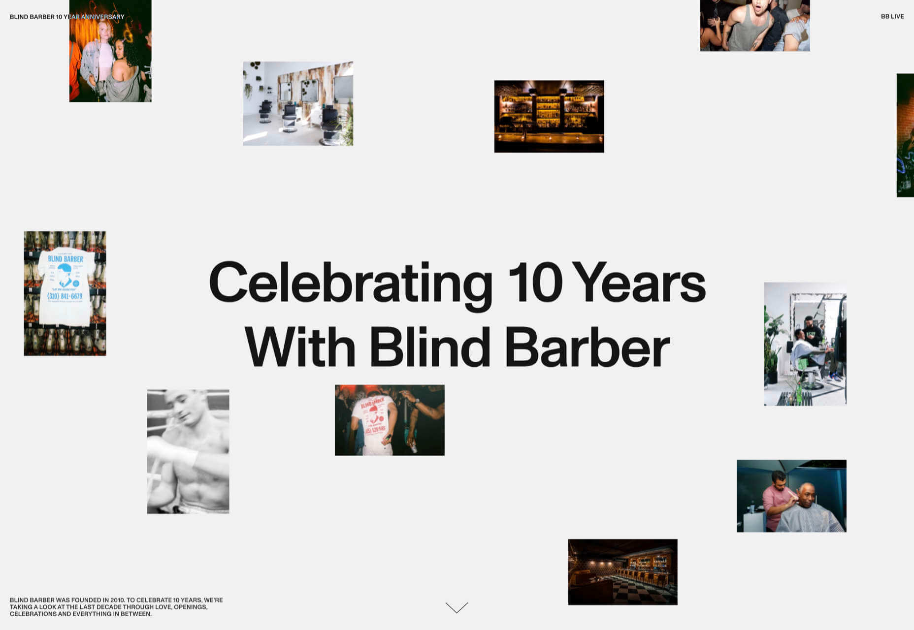
Categories: Designing, Others Tags:

9 Essential Graphic Design Pointers for Non-Designers

October 23rd, 2020 No comments

Graphic design is probably one of the essential skills most people need nowadays, whether for your business, Facebook page, or beautifying your Instagram account. However, for those who are not skilled, paying for a graphic designer can be costly.

So, if you’re one of those who want to take advantage of this skill but not an expert, here are some pointers you can use to improve your designs:

Research before designing

Before you should even start designing, you should do your research first. Things such as who you are targeting, the design’s goal, and how your competitors do it are things you’d like to find out.

Gather all these pieces of information and try to get some ideas from those. Most designers come up with a rough idea, which eventually turns into a big concept. From that, you can start your design.

If you’re working with a team, you can do some brainstorming to ensure that your ideas align with each other.

Choose a great color scheme

When selecting a great color scheme, you would need to start with the basics:

  • Color Wheel
  • Color Properties
  • Warm vs Cool Colors
  • Color Meaning
  • Color Relationships

These five are essential so that you can create the best theme for your design. For example, you’re making a poster for valentines. Naturally, you would want something red as it represents love. Then, find the colors that would work well with red with the use of the color wheel and find out their relationships.

If this doesn’t help, you can check out different color palettes to suit the design you want. Draw some inspiration from that and the things around you to create your own. You can also use color palette generators available online to help.

Don’t go overboard with fonts

Going overboard with fonts is another common mistake non-designers make. Some think that the more stylish or more fonts there is, the more noticeable the design is. Well, that’s where you’re wrong.

Think about your brand and the purpose of your design, then try to align the fonts you’ll use with that. You should also make sure your fonts are readable to ensure you’ll convey the message to your audience.

To be safe, you can use some font pairing tools to find the best font combinations. And as much as possible, use up to 3 fonts on one design.

Use a grid system

Another trick you can use is the grid system. This is what you would use to organize your layout. So, how do you use this?

  • Start by setting up your grids. If you need several grid types in your design, feel free to use that.
  • Then, design the grid you’ve planned.
  • As you put your elements, make sure they are in the grid field.
  • Finally, make sure to have a consistent baseline for harmonization.

Using a grid system will make it easier for you to organize and tidy up your lay-outs. Plus, you can ensure that the designs coordinate well with each other.

Create a visual hierarchy

Try to be aware of the visual hierarchy or organize the elements in your design based on importance. Here are a few things that would influence visual hierarchy:

  • Size and scale
  • Color and contrast
  • Typography
  • Spacing
  • Proximity
  • Alignment
  • Perspective

The better you can incorporate these things into your design, the better it would look like. These would all influence in what order your audience should see things. It’s also a way for you to create designs that are aesthetically pleasing to see.

Incorporate icons

Try incorporating icons, too, which are very useful in creating some interactions with your audience. These may be small, but they can do a lot in overall visual appeal. What may have looked to be flat design can really spark with the effective use of icons.

  • You can use it for animations.
  • You can form icon clusters to create a whole new visual.
  • You can combine it with trendy elements.
  • You can use it to create custom sketches.

These are only a few things you can do with icons. You can do more in-depth research to get more ideas and start creating more polished designs.

Create contrast in your design

Contrast is more than just showing the difference between light and darker colors. It involves more things, such as shapes, sizes, types, and textures. If putting contrasts in your design is quite a challenge for you, here are a few rules you can follow:

  • Make sure that your design has different shapes.
  • Choose different font types.
  • Element sizes matter a lot.
  • Colors should complement each other.
  • Adding textures will help.

Showing contrasts in your design will make it stand out more. But you should use it effectively, or else your design might stand out in the wrong way.

Try to keep it simple

Remember how people always say less is more? This is definitely applicable to graphic design.

By minimizing your elements and focusing on what matters, your design will stand out the most. It helps your audience understand it more compared to putting lots of elements in one frame.

Make use of what you’ve learned above. Then, create harmony with all your elements without overdoing it. The better you can convey your message with lesser elements, the more your audience would think that you have a smart design.

Use white space

Last but not least, use white space. This will help your whole design look less crowded and better for the eyes of your viewers. It would make reading easier, your design would have great balance and symmetry, and you can create contrast with it.

As you layout your design, make sure that you create a gap in your elements. Emphasize your headline, buttons, services, forms, and badges by putting some spaces in between.

Over to You

All the pointers above will be even more effective if you use the best drawing apps as they have certain features where you can make use of these pointers well. Start with that, and you’ll be amazed at what you can do.

Don’t be afraid to try out these pointers when creating your future designs. Yes, experts might be able to do it better, but everyone starts as a beginner, right?


Photo by Tranmautritam from Pexels

Categories: Others Tags:

5 Biggest Challenges Web Design Agencies Face

October 23rd, 2020 No comments

With billions of internet users worldwide spending several hours online each day, the online presence of brands is now a necessary avenue for building, boosting, and maintaining positive value and attracting and interacting with customers.

This has created increasing pressure for web design agencies when creating and managing websites. This pressure is multiplied by all the projects that web design agencies have to handle at one time. This is because different clients demand different things for their websites, whether it’s a signature feature or specialized functionality.

Hence, it’s vital that the tools the agencies use to work are simple enough and suited to the tasks they have to accomplish in order to build and maintain these projects. Having the right tools can increase efficiency and effectiveness in managing websites.

Challenges in Modern Web Design

Building a website with all the essentials in mind is always easier said than done. Websites have to be both functional and easy on the eyes to invite traffic, disseminate information, or appeal a product or service to a target audience, and all while having an attractive and convenient interface.

The good news is that it’s perfectly possible to design a quality website and without spending a fortune to do so. Below are some of the challenges that web design agencies face when trying to deliver and reconcile efficient user experience and effective user interface in web design.

1. Appealing User Experience

Designing a good website means ensuring that the user experience is appealing to a general audience, but this is one of the most difficult parts of web design. Agencies must be careful not to turn off users with a confusing user experience. For instance, making important information difficult to find on web pages, using technical jargon that ordinary users wouldn’t understand, and focusing too much on the design rather than the overall experience are a few big mistakes that no designer should ever commit.

Instead, web design agencies should focus not only on making the design look good but also on making the experience smooth and fast for the regular site visitor. This includes improving design elements to make navigation easier as well as optimizing webpage load speeds.

2. Working With a Budget

It’s common for the client and the web design agency’s budgets to not line up at all times. Either the client will find the project quote too high, or the designer will find the client’s budget too low. The cost of a web design project can vary greatly, depending on what needs to be done.

Although having to build a good website on a budget may be difficult, it’s important for both parties to come up with a set amount before the project even starts. The client should always specify what they want to achieve and how much they’re willing to pay to get it, and the agency should let the client know beforehand if this is possible.

3. Integrating Third-Party Functionality

Sometimes, clients may make requests for third-party functions that may not be easily integrated into the site. To prevent this, web design agencies should always consider integration when building a site. Most businesses and companies now have at least one social media account, so it doesn’t make sense for their site to remain disconnected.

When a website visitor shares an excerpt on a social media site like Facebook, Pinterest, or Twitter, other people who can see their posts may become interested in visiting the original post on the website. Properly integrating third-party applications and functions into a website can get it more online presence and popularity.

4. Suitability to Different Devices

There are many devices that people can use to access the web. From smartphones to desktop computers, from cars to game consoles, and even wristwatches and digital cameras, all of these can be web-enabled as long as there’s an available internet connection.

Websites nowadays should always be compatible with any of the devices people might use to go to the website. They should look pleasing and load fast regardless of what device a visitor is using.

5. Security of Personal Information

Most websites require personal or financial information, whether for account verification, for website subscription, or something else. Websites should be designed with personal security in mind, which is even more important since hacking has been on the rise since the coronavirus hit.

One of the biggest threats that websites face today is phishing, or when an attacker will pretend to be a trusted contact and attempt to compel you to click a malicious link. Another is ransomware, or where cybercriminals hold customer data for ransom and attempt to extort online business owners. Yet one more is SQL injections, or where hackers will attempt to execute malicious SQL commands in your website’s database.

The best practices in regards to web design to mitigate these risks include third-party plugins and themes, keeping all of your software up to date, setting your web applications so they run the fewest privileges possible, and utilizing SSL certificates and HTTPS protocols.

Adopting Site-Building Platforms

Gone are the days where you had to be technologically gifted to design a website from scratch, usually through manual HTML codes. Back then, you had to know your way around the web if you wanted to set-up and manage a site of your own.

Now, there are a lot of good website builders that allow you to create websites in a faster period of time. Even web design agencies now make use of such builders in order to make the job easier and more convenient. Not to mention, it allows agencies to focus on the design alone.

Although these platforms offer predesigned templates based on the most common purposes of websites, they normally allow the user to white label the website into the branding specific to the business or agenda of the website owner. The text styles, colors, and sizes coordinated to the website’s theme, and colors can be designed specifically to match the business or organization’s image and identity.

Simply put, creating websites through a web builder platform can provide web design agencies with easy-to-understand tools that their teams and members can all uniformly use to more effectively and more efficiently handle all their projects.

With services that allow mobile optimization, site management, and even drag-and-drop editing, web design agencies can now better manage their projects and finish with their tasks more quickly.

Not only that, by using white labelling, services can conserve their time and energy into focusing on creating the best website for their client. With all the website builders currently available on the market today, just picking the right one can give web design agencies the best tools to use when creating, designing, and maintaining websites.

Featured image via Pexels.

Source

Categories: Designing, Others Tags:

Create an FAQ Slack app with Netlify functions and FaunaDB

October 22nd, 2020 No comments

Sometimes, when you’re looking for a quick answer, it’s really useful to have an FAQ system in place, rather than waiting for someone to respond to a question. Wouldn’t it be great if Slack could just answer these FAQs for us? In this tutorial, we’re going to be making just that: a slash command for Slack that will answer user FAQs. We’ll be storing our answers in FaunaDB, using FQL to search the database, and utilising a Netlify function to provide a serverless endpoint to connect Slack and FaunaDB.

Prerequisites

This tutorial assumes you have the following requirements:

  • Github account, used to log in to Netlify and Fauna, as well as storing our code
  • Slack workspace with permission to create and install new apps
  • Node.js v12

Create npm package

To get started, create a new folder and initialise a npm package by using your package manager of choice and run npm init -y from inside the folder. After the package has been created, we have a few npm packages to install.

Run this to install all the packages we will need for this tutorial:

npm install express body-parser faunadb encoding serverless-http netlify-lambda

These packages are explained below, but if you are already familiar with them, feel free to skip ahead.

Encoding has been installed due to a plugin error occurring in @netlify/plugin-functions-core at the time of writing and may not be needed when you follow this tutorial.

Packages

Express is a web application framework that will allow us to simplify writing multiple endpoints for our function. Netlify functions require handlers for each endpoint, but express combined with serverless-http will allow us to write the endpoints all in one place.

Body-parser is an express middleware which will take care of the application/x-www-form-urlencoded data Slack will be sending to our function.

Faunadb is an npm module that allows us to interact with the database through the FaunaDB Javascript driver. It allows us to pass queries from our function to the database, in order to get the answers

Serverless-http is a module that wraps Express applications to the format expected by Netlify functions, meaning we won’t have to rewrite our code when we shift from local development to Netlify.

Netlify-lambda is a tool which will allow us to build and serve our functions locally, in the same way they will be built and deployed on Netlify. This means we can develop locally before pushing our code to Netlify, increasing the speed of our workflow.

Create a function

With our npm packages installed, it’s time to begin work on the function. We’ll be using serverless to wrap an express app, which will allow us to deploy it to Netlify later. To get started, create a file called netlify.toml, and add the following into it:

[build]
  functions = "functions"

We will use a .gitignore file, to prevent our node_modules and functions folders from being added to git later. Create a file called .gitignore, and add the following:

functions/

node_modules/

We will also need a folder called src, and a file inside it called server.js. Your final file structure should look like:

With this in place, create a basic express app by inserting the code below into server.js:

const express = require("express");
const bodyParser = require("body-parser");
const fauna = require("faunadb");
const serverless = require("serverless-http");
 
const app = express();
 
module.exports.handler = serverless(app);

Check out the final line; it looks a little different to a regular express app. Rather than listening on a port, we’re passing our app into serverless and using this as our handler, so that Netlify can invoke our function.

Let’s set up our body parser to use application/x-www-form-urlencoded data, as well as putting a router in place. Add the following to server.js after defining app:

const router = express.Router();
app.use(bodyParser.json());
app.use(bodyParser.urlencoded({ extended: true }));
app.use("/.netlify/functions/server", router);

Notice that the router is using /.netlify/functions/server as an endpoint. This is so that Netlify will be able to correctly deploy the function later in the tutorial. This means we will need to add this to any base URLs, in order to invoke the function.

Create a test route

With a basic app in place, let’s create a test route to check everything is working. Insert the following code to create a simple GET route, that returns a simple json object:

router.get("/test", (req, res) => {
 res.json({ hello: "world" });
});

With this route in place, let’s spin up our function on localhost, and check that we get a response. We’ll be using netlify-lambda to serve our app, so that we can imitate a Netlify function locally on port 9000. In our package.json, add the following lines into the scripts section:

"start": "./node_modules/.bin/netlify-lambda serve src",
   "build": "./node_modules/.bin/netlify-lambda build src"

With this in place, after saving the file, we can run npm start to begin netlify-lambda on port 9000.

The build command will be used when we deploy to Netlify later.

Once it is up and running, we can visit http://localhost:9000/.netlify/functions/server/test to check our function is working as expected.

The great thing about netlify-lambda is it will listen for changes to our code, and automatically recompile whenever we update something, so we can leave it running for the duration of this tutorial.

Start ngrok URL

Now we have a test route working on our local machine, let’s make it available online. To do this, we’ll be using ngrok, a npm package that provides a public URL for our function. If you don’t have ngrok installed already, first run npm install -g ngrok to globally install it on your machine. Then run ngrok http 9000 which will automatically direct traffic to our function running on port 9000.

After starting ngrok, you should see a forwarding URL in the terminal, which we can visit to confirm our server is available online. Copy this base URL to your browser, and follow it with /.netlify/functions/server/test. You should see the same result as when we made our calls on localhost, which means we can now use this URL as an endpoint for Slack!

Each time you restart ngrok, it creates a new URL, so if you need to stop it at any point, you will need to update your URL endpoint in Slack.

Setting up Slack

Now that we have a function in place, it’s time to move to Slack to create the app and slash command. We will have to deploy this app to our workspace, as well as making a few updates to our code to connect our function. For a more in depth set of instructions on how to create a new slash command, you can follow the official Slack documentation. For a streamlined set of instructions, follow along below:

Create a new Slack app

First off, let’s create our new Slack app for these FAQs. Visit https://api.slack.com/apps and select Create New App to begin. Give your app a name (I used Fauna FAQ), and select a development workspace for the app.

Create a slash command

After creating the app, we need to add a slash command to it, so that we can interact with the app. Select slash commands from the menu after the app has been created, then create a new command. Fill in the following form with the name of your command (I used /faq) as well as providing the URL from ngrok. Don’t forget to add /.netlify/functions/server/ to the end!

Install app to workspace

Once you have created your slash command, click on basic information in the sidebar on the left to return to the app’s main page. From here, select the dropdown “Install app to your workspace” and click the button to install it.

Once you have allowed access, the app will be installed, and you’ll be able to start using the slash command in your workspace.

Update the function

With our new app in place, we’ll need to create a new endpoint for Slack to send the requests to. For this, we’ll use the root endpoint for simplicity. The endpoint will need to be able to take a post request with application/x-www-form-urlencoded data, then return a 200 status response with a message. To do this, let’s create a new post route at the root by adding the following code to server.js:

router.post("/", async (req, res) => {
 
});

Now that we have our endpoint, we can also extract and view the text that has been sent by slack by adding the following line before we set the status:

const text = req.body.text;
console.log(`Input text: ${text}`);

For now, we’ll just pass this text into the response and send it back instantly, to ensure the slack app and function are communicating.

res.status(200);
res.send(text);

Now, when you type /faq on a slack channel, you should get back the same message from the slack slash command.

Formatting the response

Rather than just sending back plaintext, we can make use of Slack’s Block Kit to use specialised UI elements to improve the look of our answers. If you want to create a more complex layout, Slack provides a Block Kit builder to visually design your layout.

For now, we’re going to keep things simple, and just provide a response where each answer is separated by a divider. Add the following function to your server.js file after the post route:

const format = (answers) => {
 if (answers.length == 0) {
   answers = ["No answers found"];
 }
 
 let formatted = {
   blocks: [],
 };
 
 for (answer of answers) {
   formatted["blocks"].push({
     type: "divider",
   });
   formatted["blocks"].push({
     type: "section",
     text: {
       type: "mrkdwn",
       text: answer,
     },
   });
 }
 
 return formatted;
};

With this in place, we now need to pass our answers into this function, to format the answers before returning them to Slack. Update the following in the root post route:

let answers = text;
const formattedAnswers = format(answers);

Now when we enter the same command to the slash app, we should get back the same message, but this time in a formatted version!

Setting up Fauna

With our slack app in place, and a function to connect to it, we now need to start working on the database to store our answers. If you’ve never set up a database with FaunaDB before, there is some great documentation on how to quickly get started. A brief step-by-step overview for the database and collection is included below:

Create database

First, we’ll need to create a new database. After logging into the Fauna dashboard online, click New Database. Give your new database a name you’ll remember (I used “slack-faq”) and save the database.

Create collection

With this database in place, we now need a collection. Click the “New Collection” button that should appear on your dashboard, and give your collection a name (I used “faq”). The history days and TTL values can be left as their defaults, but you should ensure you don’t add a value to the TTL field, as we don’t want our documents to be removed automatically after a certain time.

Add question / answer documents

Now we have a database and collection in place, we can start adding some documents to it. Each document should follow the structure:

{
   question: "a question string",
   answer: "an answer string",
   qTokens: [
       "first token",
       "second token",
       "third token"
   ]
}

The qToken values should be key terms in the question, as we will use them for a tokenized search when we can’t match a question exactly. You can add as many qTokens as you like for each question. The more relevant the tokens are, the more accurate results will be. For example, if our question is “where are the bathrooms”, we should include the qTokens “bathroom”, “bathrooms”, “toilet”, “toilets” and any other terms you may think people will search for when trying to find information about a bathroom.

The questions I used to develop a proof of concept are as follows:

{
  question: "where is the lobby",
  answer: "On the third floor",
  qTokens: ["lobby", "reception"],
},
{
  question: "when is payday",
  answer: "On the first Monday of each month",
  qTokens: ["payday", "pay", "paid"],
},
{
  question: "when is lunch",
  answer: "Lunch break is *12 - 1pm*",
  qTokens: ["lunch", "break", "eat"],
},
{
  question: "where are the bathrooms",
  answer: "Next to the elevators on each floor",
  qTokens: ["toilet", "bathroom", "toilets", "bathrooms"],
},
{
  question: "when are my breaks",
  answer: "You can take a break whenever you want",
  qTokens: ["break", "breaks"],
}

Feel free to take this time to add as many documents as you like, and as many qTokens as you think each question needs, then we’ll move on to the next step.

Creating Indexes

With these questions in place, we will create two indexes to allow us to search the database. First, create an index called “answers_by_question”, selecting question as the term and answer as the value. This will allow us to search all answers by their associated question.

Then, create an index called “answers_by_qTokens”, selecting qTokens as the term and answer as the value. We will use this index to allow us to search through the qTokens of all items in the database.

Searching the database

To run a search in our database, we will do two things. First, we’ll run a search for an exact match to the question, so we can provide a single answer to the user. Second, if this search doesn’t find a result, we’ll do a search on the qTokens each answer has, returning any results that provide a match. We’ll use Fauna’s online shell to demonstrate and explain these queries, before using them in our function.

Exact Match

Before searching the tokens, we’ll test whether we can match the input question exactly, as this will allow for the best answer to what the user has asked. To search our questions, we will match against the “answers_by_question” index, then paginate our answers. Copy the following code into the online Fauna shell to see this in action:

q.Paginate(q.Match(q.Index("answers_by_question"), "where is the lobby"))

If you have a question matching the “where is the lobby” example above, you should see the expected answer of “On the third floor” as a result.

Searching the tokens

For cases where there is no exact match on the database, we will have to use our qTokens to find any relevant answers. For this, we will match against the “answers_by_qTokens” index we created and again paginate our answers. Copy the following into the online shell to see how this works:

q.Paginate(q.Match(q.Index("answers_by_qTokens"), "break"))

If you have any questions with the qToken “break” from the example questions, you should see all answers returned as a result.

Connect function to Fauna

We have our searches figured out, but currently we can only run them from the online shell. To use these in our function, there is some configuration required, as well as an update to our function’s code.

Function configuration

To connect to Fauna from our function, we will need to create a server key. From your database’s dashboard, select security in the left hand sidebar, and create a new key. Give your new key a name you will recognise, and ensure that the dropdown has Server selected, not Admin. Finally, once the key has been created, add the following code to server.js before the test route, replacing the value with the secret provided by Fauna.

const q = fauna.query;
const client = new fauna.Client({
 secret: "<secretKey>",
});

It would be preferred to store this key in an environment variable in Netlify, rather than directly in the code, but that is beyond the scope of this tutorial. If you would like to use environment variables, this Netlify post explains how to do so.

Update function code

To include our new search queries in the function, copy the following code into server.js after the post route:

const searchText = async (text) => {
 console.log("Beginning searchText");
 const answer = await client.query(
   q.Paginate(q.Match(q.Index("answers_by_question"), text))
 );
 console.log(`searchText response: ${answer.data}`);
 return answer.data;
};
 
const getTokenResponse = async (text) => {
 console.log("Beginning getTokenResponse");
 let answers = [];
 const questionTokens = text.split(/[ ]+/);
 console.log(`Tokens: ${questionTokens}`);
 for (token of questionTokens) {
   const tokenResponse = await client.query(
     q.Paginate(q.Match(q.Index("answers_by_qTokens"), text))
   );
   answers = [...answers, ...tokenResponse.data];
 }
 console.log(`Token answers: ${answers}`);
 return answers;
};

These functions replicate the same functionality as the queries we previously ran in the online Fauna shell, but now we can utilise them from our function.

Deploy to Netlify

Now the function is searching the database, the only thing left to do is put it on the cloud, rather than a local machine. To do this, we’ll be making use of a Netlify function deployed from a GitHub repository.

First things first, add a new repo on Github, and push your code to it. Once the code is there, go to Netlify and either sign up or log in using your Github profile. From the home page of Netlify, select “New site from git” to deploy a new site, using the repo you’ve just created in Github.

If you have never deployed a site in Netlify before, this post explains the process to deploy from git.

Ensure while you are creating the new site, that your build command is set to npm run build, to have Netlify build the function before deployment. The publish directory can be left blank, as we are only deploying a function, rather than any pages.

Netlify will now build and deploy your repo, generating a unique URL for the site deployment. We can use this base URL to access the test endpoint of our function from earlier, to ensure things are working.

The last thing to do is update the Slack endpoint to our new URL! Navigate to your app, then select ‘slash commands’ in the left sidebar. Click on the pencil icon to edit the slash command and paste in the new URL for the function. Finally, you can use your new slash command in any authorised Slack channels!

Conclusion

There you have it, an entirely serverless, functional slack slash command. We have used FaunaDB to store our answers and connected to it through a Netlify function. Also, by using Express, we have the flexibility to add further endpoints to the function for adding new questions, or anything else you can think up to further extend this project! Hopefully now, instead of waiting around for someone to answer your questions, you can just use /faq and get the answer instantly!


Matthew Williams is a software engineer from Melbourne, Australia who believes the future of technology is serverless. If you’re interested in more from him, check out his Medium articles, or his GitHub repos.


The post Create an FAQ Slack app with Netlify functions and FaunaDB appeared first on CSS-Tricks.

You can support CSS-Tricks by being an MVP Supporter.

Categories: Designing, Others Tags: