Archive

Archive for October, 2020

What Should eCommerce Brands Include In Their Digital Marketing Strategy in 2021?

October 22nd, 2020 No comments

The list of the best digital marketing strategies is changing all the time. As the world changes around us, so too do the ways in which we need to market our brands. Strategies that were popular 5 years ago may no longer be effective, while new strategies exist that weren’t even possible back then.

To best market your brand, you need to utilize some of the latest and most effective marketing strategies. With that in mind, here are some things your brand should include in its digital marketing strategy heading into 2021.

Killer Content

A great foundation on which you can build your digital marketing strategy is some killer content. If you put out strong content that your audience will find useful, it will not only drive traffic to your website in its own right, but it will help to power your other marketing efforts. When producing content, there are two types, in particular, you should focus on in 2021.

The first is a written copy. This includes things like blog posts, eBooks, or articles. If your website doesn’t have an active blog section on it already, now is the perfect time to start building one. You can also produce an eBook for your audience or have articles published on other sites.

The other thing to focus on is video production. Some people would prefer to watch a video rather than read a long article, so by producing a high-quality video, you open yourself up to a wider audience. You can also share these videos on sites like YouTube, giving your videos more reach.

To create this content, you can either hire an outside source to produce it for you or you can do it yourself. If you plan to do it on your own, be sure that each piece of content you create is focused on the needs of your audience. Use these tips to help you create content that your audience will love.

By producing more high-quality content, you’ll have a better chance of getting discovered through search engines and you’ll have something you can share on your social media channels. You’ll also be able to demonstrate your expertise, making you an authority within your niche. Both of these things combined will help to take your digital marketing strategy to new heights in the upcoming years.

An Optimized eCommerce Experience

Finally, you should look to optimize your eCommerce experience. No matter how great your other marketing elements are, they all fall apart if customers have a hard time buying products online. By providing a better eCommerce experience, you are more likely to generate word-of-mouth promotions because happy customers share their experiences in online reviews and in social media.

So, how can you optimize your eCommerce experience? Start by considering your overall design. If your website isn’t built on a reliable eCommerce platform, consider switching over to something like a BigCommerce design. After that, you should focus mostly on your checkout process. Is it easy for customers to add products to their cart? How long does it take them to check out? How many payment options do you offer?
The smoother your eCommerce experience, the better results you’ll see in 2021. For more tips on how to improve your eCommerce site, you can check out this article.

A Mobile App

Photo by freestocks.org from Pexels

About half of all web traffic now comes through mobile devices. To provide their customers with a good online experience, many brands have created websites that are optimized for smaller screens. However, there is another option that could provide even more benefits – developing a mobile app.

A mobile app offers several advantages. For starters, if people have your app saved on their phone, they are more likely to return to it. Mobile apps also allow you to do things like sending notifications to your customers, so you can contact them right on their phone. Finally, you have more freedom with a mobile app, which will allow you to provide features that might not be available through your website.

Developing a mobile app for your brand isn’t as complicated or as expensive as it used to be. If you want to do it yourself, you can visit this guide on how to design an app. Your other option is to hire a third-party app development service. Think about what type of features you want your app to have and how much money you can afford to spend on its creation. This will help you decide whether to do it on your own or to hire someone else.

Promotions via Influencers

Another great way to promote your brand in 2021 is through social media influencers. Influencers are people with sizable or engaged audiences on social media who will promote your brand for you. By leveraging the audience of these influencers you can greatly expand your own marketing reach, typically for a relatively small investment.

For example, let’s say you are a women’s clothing designer. To promote your new Spring clothing, you could work with a few Instagram influencers who have some sway in the fashion industry. You could then send them a few of your new items and pay them to post pictures of themselves wearing them.

People are more likely to buy a product if it comes recommended from someone they trust, which is what makes influencer marketing so effective. To learn more about how you can get started with influencer marketing, you can check out this guide.

Always Keep an Eye on the Latest Trends

If you include the above items in your digital marketing strategy, you should be well set heading into 2021. However, the key thing to remember is that your strategy needs to change over time. While these tactics are effective now, that may not always be the case. The best thing you can do is always be on the lookout for the best ways to market your brand and adapt your strategies as necessary. This will help you market your brand not only in 2021 but for years to come.


Featured Image by Startup Stock Photos from Pexels

Categories: Others Tags:

Nutella Spreads Its Brand New Jar Designs And We Are Loving It

October 22nd, 2020 No comments

Italy is responsible for some of the world’s greatest creations.

While not everyone may appreciate all of the fine arts produced by Italy, one thing nearly everyone can agree upon is that Nutella is one of the greatest gifts Italy has brought into the world.

Nutella’s marketing team has decided to design 30 new casings for their creamy jars of goodness. They are designed to show off Italy’s beautiful scenery.

And boy is Italy beautiful. Not only does Italy have some of the most notable natural landmarks in the world, but it also contains some of the greatest marvels of the ancient world.

Nutella’s parent company, Ferrero, created these new designs to increase awareness of tourism in their county. Working together with Italy’s board of tourism, the team is attempting to spark interest in tourism one travel restrictions are lifted.

Because a certain virus has crippled much of the countries tourism industry, Nutella is offering a new way to visit these historic landmarks.

If you simply scan the QR codes on the newly designed jar of Nutella, your mobile device will take you on a virtual tour of these landmarks.

The CEO of Ferrero said, “In this difficult moment for [the] tourism sector of our economy, Nutella and ENIT [will] showcase to Italians their greatest national wealth: the beauty of Italy itself, the true and real one, made of nature and art, cities and villages, seas and mountains, the envy of the world.”

We look forward to the day when we can go see these landmarks in person. Until then, we will just have to enjoy the great taste of Nutella and look forward to that day!

Read More at Nutella Spreads Its Brand New Jar Designs And We Are Loving It

Categories: Designing, Others Tags:

4 Ways Online Course Materials Benefit Students

October 22nd, 2020 No comments

At all levels of education, many instructors are implementing modern practices and innovative technology into their lesson plans. In both the K-12 and higher education sectors, the rise of educational technology (often referred to as EdTech) has been impossible to miss.

In 2020, the need for digital tools has been more pressing and sudden than ever before. Due to the COVID-19 pandemic, teachers and professors had to adapt to online learning with little advance notice. Now, online and hybrid classrooms are commonplace as social distancing recommendations continue.

Even when typical in-person learning is possible, EdTech is still central to effective teaching and learning. Different EdTech tools can address the various challenges faced by educators each day.

One such challenge is choosing a textbook. The historical textbook publishing industry created a market that is expensive and inflexible. But now, options for digital course materials are new and useful alternatives to the traditional landscape of educational resources.

Online course materials are beneficial to instructors, but they have many advantages that are specific to the needs of students, including:

  1. Online course materials are usually more affordable.
  2. Online course materials are convenient and easy to use.
  3. Online course materials are engaging and interactive.
  4. Online course materials can be tailored to meet student needs.

All of these benefits may convince you to break up with traditional textbooks in favor of online course materials—your students will probably thank you!

1. Online course materials are usually more affordable.

It’s no secret that textbooks are expensive. Between 1977 and 2015, college textbook costs increased by an astounding 1041%. And since new editions are frequently released, these pricey books can quickly become outdated. Some communities may even need to hold fundraisers to combat the rising costs of materials. As Re:Charity discusses, just coming up with ideas for school fundraisers is a massive undertaking for already busy parents and teachers, let alone executing the entire campaign.

In response to this landscape, there’s been a strong push for more affordable textbooks, especially in higher education. And corresponding with the popularization of EdTech, people are looking to online tools to solve the problem.

Generally, online course materials are any kind of instructional material that can be accessed from a computer or mobile device.

This broad definition encompasses a few major types of digital course materials at different price points, including:

  • E-textbooks. E-textbooks are digitized versions of physical course materials, and they may include additional interactive elements like quizzes. But despite being digital, e-textbooks aren’t usually much more affordable than traditional textbooks. Typically, these e-textbooks are still part of the traditional publishing landscape, and the price tags reflect that. The access codes for these are often nearly as expensive as the textbooks themselves!
  • Open educational resources (OERs). These educational materials are openly licensed to be freely used and modified by instructors and their students. An OER can be something as simple as an individual image or as extensive as an entire online course. However, since these materials are completely free (hence “open”), they can vary widely in quality. Cobbling together enough trustworthy OERs to align with your entire syllabus can be a time-consuming process.
  • Custom course materials. As this guide to digital course materials discusses, some professors are opting for instructional design teams to curate a selection of peer-reviewed resources that meet their course objectives. Customized digital course materials can be provided to students at a much lower price point than traditional textbooks but with more confidence than an OER.

In order to choose course materials that are a good fit for your school, you’ll need to consider factors like availability, price, and trustworthiness of the source.

2. Online course materials are convenient and easy to use.

Physical textbooks can be difficult to acquire, cumbersome to carry around, or otherwise difficult to manage. Technology makes it easier for students to learn in an environment that best suits their needs.

Online course materials are more convenient for students because they are:

  • Centralized. With a set of digital course materials, all the right information is in one place, in the right order. There’s no need to jump around from chapter to chapter or sort through PDF files to find the week’s reading assignments.
  • Immediately available. Physical textbooks can be challenging to secure at the beginning of the semester. Between lines at campus bookstores and online vendor shipping times, it can be days or even weeks before students can start the reading. Opting for online course materials means students can get day-one access to their required content.
  • Multi-platform. Online course materials can be accessed on various devices including laptops, smartphones, and tablets, so students can easily access content while on-the-go.
  • Accessible. Online materials typically have built-in features to meet accessibility standards for the use of assistive technologies like screen readers.

If students are working from home in online classrooms, it’s not as critical to worry about them carrying around heavy textbooks in backpacks, but convenience is still a major benefit of online course materials.

Plus, at the end of the semester, students using online materials won’t need to return rentals or resell books. If they need to reference the material for a later course or as a resource in their career down-the-line, they will still have access to the information.

3. Online course materials are engaging and interactive.

A physical textbook offers limited options for interactivity. Printed words and images are useful for conveying material, but EdTech enables learning through a wider range of activities.

With online course materials, students can learn through interactive and multimedia resources to enrich their experience.

Digital materials often include:

  • Embedded assessments. Students can evaluate their learning during the learning process—without needing to flip through the back of a textbook to find an answer. Integrating online quizzes and assignments within the course materials also helps instructors to see which topics students are struggling to understand.
  • Interactive content. Gamified or drag-and-drop elements allow kinesthetic learners to engage with the material effectively.
  • Multimedia elements. In addition to traditional images and charts, content like audio clips, videos, and animation can be incorporated alongside written material for greater learner engagement.

These elements can more effectively connect with students of different learning styles. Additionally, interactive materials are much more engaging and interesting for students than a plain textbook!

4. Online course materials can be tailored to meet student needs.

One of the most notable benefits of online course materials is their adaptability.

After all, every group of students is different, from commuter campuses to intro-level lectures to complex graduate seminars. Unlike a traditional textbook, digital materials can be curated to fit a professor’s course objectives and meet the needs of specific groups of students.

This still holds true even as the needs of students might change over time or between semesters. Digital course materials can be continuously improved and updated to reflect student feedback and performance.

To explore this concept further, let’s take a look at Skyepack’s curriculum development process:

This is an iterative process for designing course materials based on Agile methodology. The point of this cycle is to make improvements that continue to benefit students.

The six steps of the cycle are:

  • Analyze. Instructional designers evaluate the needs of students and instructors.
  • Research. The design team explores available resources to meet those needs.
  • Design. The layout and flow of the course are developed for optimum student engagement.
  • Curate. Peer-reviewed open-source content and other resources are collected to create a comprehensive set of materials.
  • Build. The Skyepack team builds the course materials in a collaborative process with the instructor.
  • Launch. Students get day-one access to course materials that are built to prioritize their learning needs.
  • Revise. The digital course materials can be adjusted as circumstances change.

While not all digital course materials must be created with these six steps, it’s still a helpful framework for thinking about how online material can be tailored to fit the needs of students.


Instructors are always looking for new ways to improve their teaching and enhance the learning experience for their students. Traditional textbooks are expensive, inconvenient, and one-size-fits-all, creating a negative or inaccessible learning environment for K-12 and college students. Digital course materials are the answer to many of these challenges and offer powerful advantages for students.

Categories: Others Tags:

CSS for the Minimalist: Exploring Classless CSS

October 22nd, 2020 No comments

In 2011, the first version of Bootstrap (then called Twitter Bootstrap) came out. It was a product of Twitter’s UI team and was a framework aimed at simplifying the creation of professional looking applications across the Web.

It’s release revolutionized how developers used CSS – it took what was often a bespoke, unruly approach to Web stylization and gave developers the tools to easily make professional looking websites with standard components and minimal effort.

As more and more developers began using Bootstrap, other CSS frameworks sprouted, as developer and application requirements multiplied.

Now on version 4, Bootstrap is a 160kb (in minified form) library that offers developers an everything-but-the-kitchen-sink set of utilities. One can easily generate tags that look like this:

In other words, “class bloat.” By addressing the multitude of requirements that applications need, Bootstrap and its brethren have created a plethora of nested HTML components, utility classes, complex themes, and javascript interactions.

While newer approaches, like Tailwind.CSS, attempt to minimize class bloat by integrating deeper into the developer toolchain, the learning curve can be steep.

Recently at Solitaired, we’ve been exploring the direct opposite. We want to get rid of class bloat and go “classless.” We think it will allow our solitaire games to run smoother and improve the user experience for our players.

Classless means just what it says – building sites that minimize, or ideally eliminate, the need for classes to make a sharp-looking website.

In other words, all you need to do is use standard HTML and slap a classless stylizer up top to get a cleanly formatted, responsive, and easy to manage a website.

While going classless may not be realistic for many web applications, it can absolutely be an approach for static sites, portfolio sites, personal blogs, or even small-ish applications.

What are the top classless libraries of 2020?

Water.css

Water is my preferred CSS library – responsive and pretty, and 2.67kb compressed. One of the more interesting aspects of Water is that has light and dark modes. You can choose to use one, or it will automatically adjust based on a user’s preferences. Who knew you could pack so much power in such a small library?

If you need themes, Water includes documentation on how to do it. The default approach relies on CSS custom variables, which are supported by all browsers except Internet Explorer. Despite that incompatibility, custom variables make it incredibly easy to change the default water.css theme. For sites that require IE support, you can still customize using yarn.

Water has 5.3K stars as of this writing, making it arguably the most popular classless library out there. On our end, we’ll be migrating our word unscrambler to this in the next couple of months.

How to use:

Add to your the tag.

Tufte CSS

Named after noted professor and pioneer of data visualization Edward Tufte, this CSS library attempts to implement his suggestions in an easy to implement CSS library. Tufte CSS may be the preferable choice for longer articles, academia, or personal projects, because it uses a serif, and has an emphasis on supporting graphs, charts, and side notes.

Tufte is 7.71kb compressed and has been starred 4.5K times.

How to use:

Download the library at the Github link above, and add to your the tag.

New.css

At 4.8kb compressed, new.css is in the middle of the pack of classless CSS library sizes. Similar to Water, new.css creates clean, responsive pages easily. New.css also comes with a couple of additional themes if you have a hankering for additional styles.

New.css also uses CSS custom variables to make theming easy.

How to use:

Add to your the tag. They also recommend adding the Inter font, using .

Sakura

Sakura’s default theme aims for a calm, clean style. In the GitHub repository are also a number of themes that can be utilized right out of the box. At 2.8K stars, it’s one of the more popular Classless CSS options.

Sakura suggests using normalize.css, which will add a few more kb to its main payload of ~2kb compressed. Their theming methodology is slightly more complicated than Water’s, relying on SCSS to update variables in the main CSS. One upside with this approach, however, is compatibility, as native CSS variables are not supported in any version of Internet Explorer.

How to use:

Add to your the tag.

Marx

With a tagline of “The classless CSS reset (perfect for Communists),” Marx would be on this list no matter what – but it also happens to be very popular, with over 1.4K Github stars.

Marx is also easily themeable with SCSS and the documentation has some handy instructions on how to use this with Jekyll. That’s nice, because static websites would be a common and great use case for classless frameworks.

How to use:

Add to your the tag.

As you can easily see above, the nice thing with classless CSS is that there’s just not too much to them. One line converts an ugly webpage into something nice. Additionally, most of these frameworks clock in at far smaller than 10kb, making them at least 16 times smaller than Bootstrap.

Obviously, one of the big downsides with classless is that you don’t get the kinds of complex components and javascript-ready interactions as you would with Bootstrap, Foundation, or some of the other libraries out there. However, there’s a silver lining here. Since you’re relying mostly on tags for formatting, it’ll push you to be more semantic on your page – which is better for SEO and accessibility.


Featured image by Scott Webb on Unsplash


I hope that classless becomes more of a movement and that the default library people add to their applications is no longer Bootstrap, but something smaller, cleaner, and simpler.

Categories: Others Tags:

A Primer on the Different Types of Browser Storage

October 21st, 2020 No comments

In back-end development, storage is a common part of the job. Application data is stored in databases, files in object storage, transient data in caches… there are seemingly endless possibilities for storing any sort of data. But data storage isn’t limited only to the back end. The front end (the browser) is equipped with many options to store data as well. We can boost our application performance, save user preferences, keep the application state across multiple sessions, or even different computers, by utilizing this storage.

In this article, we will go through the different possibilities to store data in the browser. We will cover three use cases for each method to grasp the pros and cons. In the end, you will be able to decide what storage is the best fit for your use case. So let’s start!

The localStorage API

localStorage is one of the most popular storage options in the browser and the go-to for many developers. The data is stored across sessions, never shared with the server, and is available for all pages under the same protocol and domain. Storage is limited to ~5MB.

Surprisingly, the Google Chrome team doesn’t recommend using this option as it blocks the main thread and is not accessible to web workers and service workers. They launched an experiment, KV Storage, as a better version, but it was just a trial that doesn’t seem to have gone anywhere just yet.

The localStorage API is available as window.localStorage and can save only UTF-16 strings. We must make sure to convert data to strings before saving it into localStorage. The main three functions are:

  • setItem('key', 'value')
  • getItem('key')
  • removeItem('key')

They’re all synchronous, which makes it simple to work with, but they block the main thread.

It’s worth mentioning that localStorage has a twin called sessionStorage. The only difference is that data stored in sessionStorage will last only for the current session, but the API is the same.

Let’s see it in action. The first example demonstrates how to use localStorage for storing the user’s preferences. In our case, it’s a boolean property that turns on or off the dark theme of our site.

CodePen Embed Fallback

You can check the checkbox and refresh the page to see that the state is saved across sessions. Take a look at the save and load functions to see how I convert the value to string and how I parse it. It’s important to remember that we can store only strings.

This second example loads Pokémon names from the PokéAPI.

CodePen Embed Fallback

We send a GET request using fetch and list all the names in a ul element. Upon getting the response, we cache it in the localStorage so our next visit can be much faster or even work offline. We have to use JSON.stringify to convert the data to string and JSON.parse to read it from the cache.

In this last example, I demonstrate a use case where the user can browse through different Pokémon pages, and the current page is saved for the next visits.

CodePen Embed Fallback

The issue with localStorage, in this case, is that the state is saved locally. This behavior doesn’t allow us to share the desired page with our friends. Later, we will see how to overcome this issue.

We will use these three examples in the next storage options as well. I forked the Pens and just changed the relevant functions. The overall skeleton is the same for all methods.

The IndexedDB API

IndexedDB is a modern storage solution in the browser. It can store a significant amount of structured data — even files, and blobs. Like every database, IndexedDB indexes the data for running queries efficiently. It’s more complex to use IndexedDB. We have to create a database, tables, and use transactions.

Compared to localStorage , IndexedDB requires a lot more code. In the examples, I use the native API with a Promise wrapper, but I highly recommend using third-party libraries to help you out. My recommendation is localForage because it uses the same localStorage API but implements it in a progressive enhancement manner, meaning if your browser supports IndexedDB, it will use it; and if not, it will fall back to localStorage.

Let’s code, and head over to our user preferences example!

CodePen Embed Fallback

idb is the Promise wrapper that we use instead of working with a low-level events-based API. They’re almost identical, so don’t worry. The first thing to notice is that every access to the database is async, meaning we don’t block the main thread. Compared to localStorage, this is a major advantage.

We need to open a connection to our database so it will be available throughout the app for reading and writing. We give our database a name, my-db, a schema version, 1, and an update function to apply changes between versions. This is very similar to database migrations. Our database schema is simple: only one object store, preferences. An object store is the equivalent of an SQL table. To write or read from the database, we must use transactions. This is the tedious part of using IndexedDB. Have a look at the new save and load functions in the demo.

No doubt that IndexedDB has much more overhead and the learning curve is steeper compared to localStorage. For the key value cases, it might make more sense to use localStorage or a third-party library that will help us be more productive.

CodePen Embed Fallback

Application data, such as in our Pokémon example, is the forte of IndexedDB. You can store hundreds of megabytes and even more in this database. You can store all the Pokémon in IndexedDB and have them available offline and even indexed! This is definitely the one to choose for storing app data.

I skipped the implementation of the third example, as IndexedDB doesn’t introduce any difference in this case compared to localStorage. Even with IndexedDB, the user will still not share the selected page with others or bookmark it for future use. They’re both not the right fit for this use case.

Cookies

Using cookies is a unique storage option. It’s the only storage that is also shared with the server. Cookies are sent as part of every request. It can be when the user browses through pages in our app or when the user sends Ajax requests. This allows us to create a shared state between the client and the server, and also share state between multiple applications in different subdomains. This is not possible by other storage options that are described in this article. One caveat: cookies are sent with every request, which means that we have to keep our cookies small to maintain a decent request size.

The most common use for cookies is authentication, which is out of the scope of this article. Just like the localStorage, cookies can store only strings. The cookies are concatenated into one semicolon-separated string, and they are sent in the cookie header of the request. You can set many attributes for every cookie, such as expiration, allowed domains, allowed pages, and many more.

In the examples, I show how to manipulate the cookies through the client-side, but it’s also possible to change them in your server-side application.

CodePen Embed Fallback

Saving the user’s preferences in a cookie can be a good fit if the server can utilize it somehow. For example, in the theme use case, the server can deliver the relevant CSS file and reduce potential bundle size (in case we’re doing server-side-rendering). Another use case might be to share these preferences across multiple subdomain apps without a database.

Reading and writing cookies with JavaScript is not as straightforward as you might think. To save a new cookie, you need to set document.cookie — check out the save function in the example above. I set the dark_theme cookie and add it a max-age attribute to make sure it will not expire when the tab is closed. Also, I add the SameSite and Secure attributes. These are necessary because CodePen uses iframe to run the examples, but you will not need them in most cases. Reading a cookie requires parsing the cookie string.

A cookie string looks like this:

key1=value1;key2=value2;key3=value3

So, first, we have to split the string by semicolon. Now, we have an array of cookies in the form of key1=value1, so we need to find the right element in the array. In the end, we split by the equal sign and get the last element in the new array. A bit tedious, but once you implement the getCookie function (or copy it from my example :P) you can forget it.

Saving application data in a cookie can be a bad idea! It will drastically increase the request size and will reduce application performance. Also, the server cannot benefit from this information as it’s a stale version of the information it already has in its database. If you use cookies, make sure to keep them small.

The pagination example is also not a good fit for cookies, just like localStorage and IndexedDB. The current page is a temporary state that we would like to share with others, and any of these methods do not achieve it.

URL storage

URL is not a storage, per se, but it’s a great way to create a shareable state. In practice, it means adding query parameters to the current URL that can be used to recreate the current state. The best example would be search queries and filters. If we search the term flexbox on CSS-Tricks, the URL will be updated to https://css-tricks.com/?s=flexbox. See how easy it is to share a search query once we use the URL? Another advantage is that you can simply hit the refresh button to get newer results of your query or even bookmark it.

We can save only strings in the URL, and its maximum length is limited, so we don’t have so much space. We will have to keep our state small. No one likes long and intimidating URLs.

Again, CodePen uses iframe to run the examples, so you cannot see the URL actually changing. Worry not, because all the bits and pieces are there so you can use it wherever you want.

CodePen Embed Fallback

We can access the query string through window.location.search and, lucky us, it can be parsed using the URLSearchParams class. No need to apply any complex string parsing anymore. When we want to read the current value, we can use the get function. When we want to write, we can use set. It’s not enough to only set the value; we also need to update the URL. This can be done using history.pushState or history.replaceState, depending on the behavior we want to accomplish.

I wouldn’t recommend saving a user’s preferences in the URL as we will have to add this state to every URL the user visits, and we cannot guarantee it; for example, if the user clicks on a link from Google Search.

Just like cookies, we cannot save application data in the URL as we have minimal space. And even if we did manage to store it, the URL will be long and not inviting to click. Might look like a phishing attack of sorts.

CodePen Embed Fallback

Just like our pagination example, the temporary application state is the best fit for the URL query string. Again, you cannot see the URL changes, but the URL updates with the ?page=x query parameter every time you click on a page. When the web page loads, it looks for this query parameter and fetches the right page accordingly. Now we can share this URL with our friends so they can enjoy our favorite Pokémon.

Cache API

Cache API is a storage for the network level. It is used to cache network requests and their responses. The Cache API fits perfectly with service workers. A service worker can intercept every network request, and using the Cache API, it can easily cache both the requests. The service worker can also return an existing cache item as a network response instead of fetching it from the server. By doing so, you can reduce network load times and make your application work even when offline. Originally, it was created for service workers but in modern browsers the Cache API is available also in window, iframe, and worker contexts as-well. It’s a very powerful API that can improve drastically the application user experience.

Just like IndexedDB the Cache API storage is not limited and you can store hundreds of megabytes and even more if you need to. The API is asynchronous so it will not block your main thread. And it’s accessible through the global property caches.

To read more about the Cache API, the Google Chrome team has made a great tutorial.

Chris created an awesome Pen with a practical example of combining service workers and the Cache API.

Bonus: Browser extension

If you build a browser extension, you have another option to store your data. I discovered it while working on my extension, daily.dev. It’s available via chrome.storage or browser.storage, if you use Mozilla’s polyfill. Make sure to request a storage permission in your manifest to get access.

There are two types of storage options, local and sync. The local storage is self-explanatory; it means it isn’t shared and kept locally. The sync storage is synced as part of the Google account and anywhere you install the extension with the same account this storage will be synced. Pretty cool feature if you ask me. Both have the same API so it’s super easy to switch back-and-forth, if needed. It’s async storage so it doesn’t block the main thread like localStorage. Unfortunately, I cannot create a demo for this storage option as it requires a browser extension but it’s pretty simple to use, and almost like localStorage. For more information about the exact implementation, refer to Chrome docs.

Conclusion

The browser has many options we can utilize to store our data. Following the Chrome team’s advice, our go-to storage should be IndexedDB. It’s async storage with enough space to store anything we want. localStorage is not encouraged, but is easier to use than IndexedDB. Cookies are a great way to share the client state with the server but are mostly used for authentication.

If you want to create pages with a shareable state such as a search page, use the URL’s query string to store this information. Lastly, if you build an extension, make sure to read about chrome.storage.


The post A Primer on the Different Types of Browser Storage appeared first on CSS-Tricks.

You can support CSS-Tricks by being an MVP Supporter.

Categories: Designing, Others Tags:

xm

October 21st, 2020 No comments

This is a neat little HTML preprocessor from Giuseppe Gurgone. It has very few features, but one of them is HTML includes, which is something I continue to be baffled that HTML doesn’t support natively. There are loads of ways to handle it. I think it’s silly that it’s been consistent needed for decades and it seems like HTML could evolve to support it. So anyway, enter another option for handling it.pro

? Today I am open sourcing ? ? xm ? a tiny compiler for HTML that adds support for

imports
slots & fills
a portal to markdown

? https://t.co/mhrlVGg3Wp
?? npm i -g xm && xm dev pic.twitter.com/pYN9RpodsW

— Giuseppe (@giuseppegurgone) September 15, 2020

What is extra neat is that it’s not just includes, but templating with includes in a really clean way. If this was Nunjucks, they solve that by creating a template.njk like…

{% block header %}
  This is the default (overridable) header.
{% endblock %}

<footer>
  {% block footer %}
    This is the default (overridable) footer.
  {% endblock %}
</footer>

And then your actual pages use that template like…

{% extends "parent.html" %}

{% block footer %}
  Special footer for this page.
{% endblock %}

In xm, the syntax stays HTML-y, which is nice. So this template.html

<slot name="header"></slot>

<footer>
  <slot name="footer"></slot>
</footer>

…gets used on a page like this:

<import src="template.html">
  <fill name="header">Custom Header</fill>
  <fill name="main">
    <p>Custom footer</p>
  </fill>
</import>

Very clean. The additional fact that you can arbitrarily chuck a tag anywhere you want and use Markdown within it is extra handy.


The post xm appeared first on CSS-Tricks.

You can support CSS-Tricks by being an MVP Supporter.

Categories: Designing, Others Tags:

5 Steps to Protect Your Brand Online

October 21st, 2020 No comments

Few things have been so beneficial and transformative for small businesses as the internet. Within a click, you can connect to global audiences, do product research, find new employees, and much more.

Unfortunately, the internet isn’t all great. While it may take years to build up a good reputation in the digital world, it only takes seconds for it to come crashing down. Bad reviews, hacks, and website hacking are just a few of the things that can go wrong.

That’s why we’ve put together this guide of the five essential steps you need to follow to protect your brand. Read on to learn everything you need to know.

Why Protecting Your Brand Is Vital

You don’t have to think too long about all the things that can go wrong. As business people, we all know it’s just a matter of time.

But it’s important to stress just how sensitive businesses are to these things. Let’s take one of the most damaging events that could happen—a cyber-attack. Did know that 60% of businesses fail within six months of a cyber-attack.

There are many reasons for this. First and foremost is the reputational damage that occurs. If you’re lucky, the cybercriminals didn’t directly do anything to damage your brand name like a post inappropriate. But you still have to deal with the huge blow to your customer trust.

It’s not fair the businesses should be blamed for being victims, but, at the same time, everybody knows the risks of the digital world. That’s why even huge names like Marriot and Equifax are still having a difficult time recovering from the damage. They are the lucky ones, however. They have billions at their disposal and built-in customer bases, so they’ll be fine.

On the other hand, small businesses are the ones who struggle in the aftermath of one of these attacks.

Even though you know it’s important to protect your brand, don’t delay any longer. There’s too much to lose.

1. Get Serious About Account Security

Admit it. You recycle some of your account passwords. Everybody does it. In a personal setting, this is already dangerous. You’re putting your email, social, and other accounts at risk.

But in the business world, it gets even more damaging. Hackers are clever. It doesn’t take much for them to figure out ways to break into your network or devices. It’s easy enough for them to guess that if you have a password in one place, you might use it or a variation of it elsewhere.

With brute force techniques, they can guess thousands of password combinations in seconds and crack into account. The worst part is, you don’t know when your original password might become exposed.

Hackers generally aren’t lurking behind you watching what you type. Although that is possible, they generally obtain login credentials by hacking insecure websites and databases.

That’s why you need a unique, lengthy, and secure password for each of your online accounts. It cannot be anything somebody would guess like “I Like Pizza.” Instead, it should be a unique combination of numbers, letters, special characters, and upper and lower case like “FpTsB@44xEHF.”

Naturally, you might be thinking, “how on earth would I ever remember that?” This is where a password manager comes in. Password managers help you create, manage, and store passwords in a highly secure digital vault. Best of all, however, you can use them to make logging into your accounts even easier. It’s a total win-win.

With a password manager combined with biometrics and 2FA, you can rest assured your accounts are much safer. While you’re at it, invest in other cybersecurity tools like VPNs, antimalware, firewalls, and everything else you need to stay safe.

2. Keep A (Digital) Eye Out

The average business might be listed on Google, Yelp, Facebook, Instagram, and so many other places. This is all-important for increasing your visibility. But you also need to pay attention to these platforms since they’re among the first things people see when searching for your company.

This is why you need Brand Monitoring software. There are tons of great options out there. They all share an overlapping ability to monitor the web and social media for any mention of your company so you can react accordingly.

This might be responding to a negative review, answering feedback, or even finding a new backlinking opportunity.

Quickness is key, so be ready to respond at a moment’s notice. As a bonus, you can also use these tools to keep an eye out on your competitors.

3. Trademark Your Brand

Trademarking seems like something only the biggest companies would do. You don’t want a hacker or competitor to get a hold of your brand. And here’s the thing—trademarking isn’t very expensive.

You can get the whole process done for a few hundred dollars. That’s not much to pay for protection. You don’t want to be like Google, which couldn’t even use “Gmail ” for its name in the UK since somebody already owned it. Ouch!

The same also goes for web presence. You’ve got to secure it .com, .net, and other variants of your domain. If your business is really starting to scale, you should also consider the naming variants. One example where Google got it right was purchasing domain names like “Gooogle.com and “Gogle.com.”

4. Get Serious About Rankings

As a business, you probably know a thing or two about SEO. While you definitely want your site to be optimized and want you to rank for your keywords, don’t forget about your business itself.

Many people will interact with your site through direct URL input but via Google search. If you’re not on the top listing or worse on the front page of results, then it not only will be difficult to find you but will also look suspicious.

You also need to pay attention to your competitor’s PPC strategies. It’s extremely common to bid for other company’s names so their ads will show up above your organic listings. Imagine somebody wants to go to your page only to get swept away by one of your rivals.

Work hard to include your brand name throughout your site and keep an eye on PPC ads. It may be worth it to spend a few bucks to keep your brand intact.

5. Be Proactive and Responsive to Threats

The worst thing you can do is nothing. If somebody is threatening your brand, it is unlikely they will go away. Naturally, prevention is the best medicine. If you’ve followed the first four steps, then you should already be in pretty good shape.

But there are also cracks in the armor that fraudsters know how to exploit. You’ll have to assess risks on an individual basis. But you do need to respond to all of them.

The biggest question is whether you pay to have something stop. Reporting these bad actors to the authorities likely won’t too much. You’re on your own.

In general, it’s not a good idea to pay. Once you do, you’ve opened yourself up to even more attacks and may even become complicit indirectly in illicit activity.

The best bet is to work through the channels available. It will take time to undo the damage, but it can be done. But be transparent with your customers and partners. They should find quickly so they can take steps to protect themselves. In fact, if you do fail to disclose this information, you may eventually be liable for any damages that occur.

Protecting Your Brand in The Digital World

We’re not here to scare you, but the threat is real. SMEs are the most common target for cybercriminals often because they have so much to lose.

That’s why you need to get serious about brand management. Own your digital channels, invest in security, be proactive. This is how you ensure the safety of your brand now and in the future.


Photo by Maxim Zhgulev on Unsplash

Categories: Others Tags:

Making Minimalism Functional in Web Design

October 21st, 2020 No comments

Today, great design isn’t just about conveying the right amount of information in a certain number of pages.

There’s more to creating the perfect website than experimenting with visuals and sound. Designers need to think carefully about how each element of their site impacts the overall user experience.

After all, with billions of websites available to explore, it takes something truly immersive to convince your client’s audience that they should stay on their pages. The more convenient and attractive your websites are, the more likely it is that visitors will want to stick around.

Minimalism, one of the more popular styles of web design from the last few years, can sometimes assist designers in making attractive and effective websites more functional.

The less clutter and confusion there is on a page, the easier it is to navigate.

So, how do you embrace the benefits of functional minimalism?

Understanding Functional Minimalism

Many webs designers are convinced that minimalism is all about aesthetics.

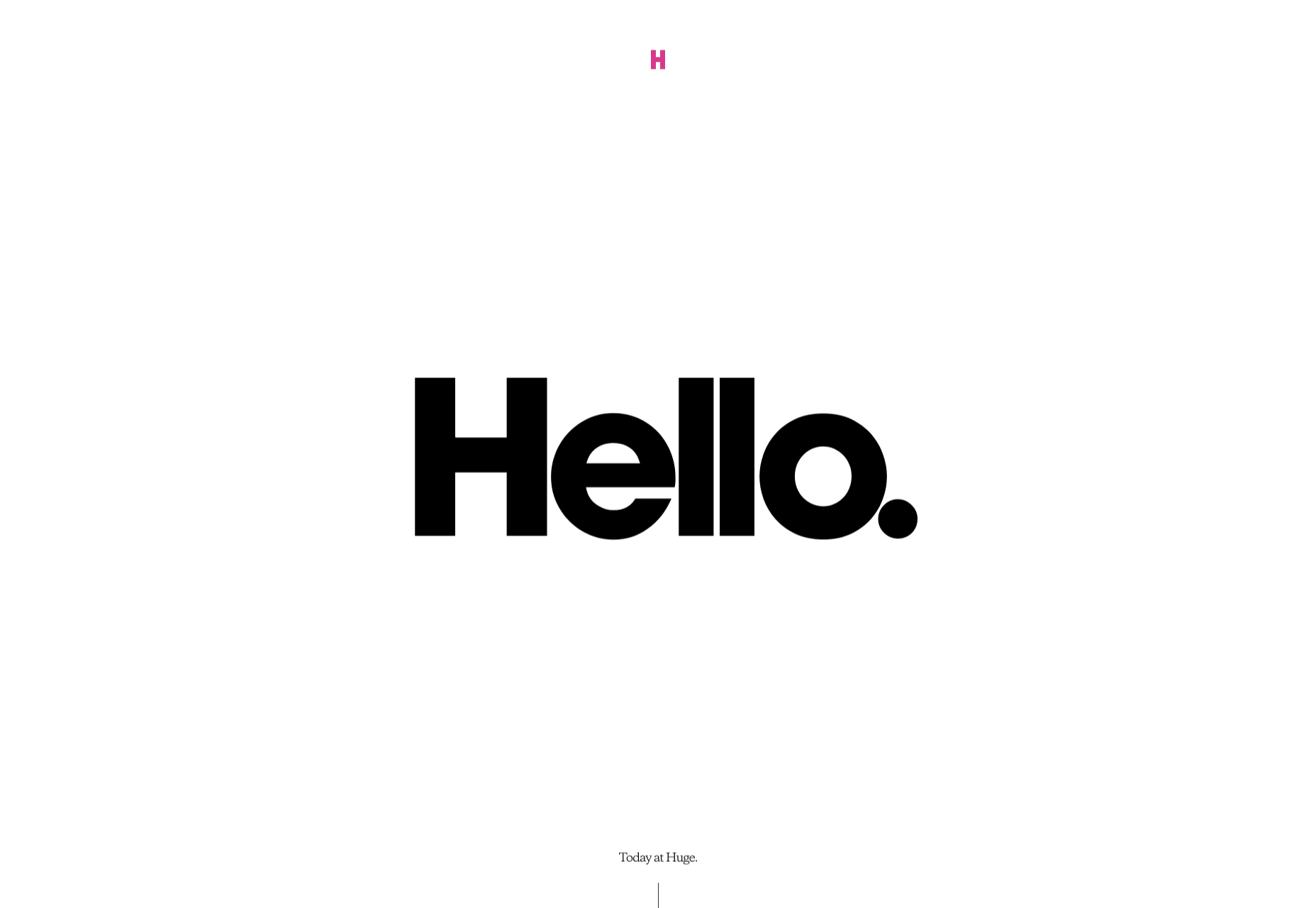
They see a website like Hugeinc.com and assume that the minimalist appearance is all about making the website as attractive as possible.

However, the underlying ideas of minimalism in web design go much deeper than this. The history of minimalist design begins with Japanese culture. Japan has long focused on balancing simplicity and beauty with its architecture, interior design, and even graphic design. In the Western world, minimalism got its day in the sun in the web design environment, after customers endured years of cluttered and complicated web pages with difficult navigation, overwhelming information and clashing graphics.

Designers began to experiment with the idea that less really could be more — particularly when it came to the digital landscape.

The Functional Rules of Minimalist Web Design

For a while, minimalism was the most popular style for a website. During 2018, in particular, minimalist web design soared to the top of the designer demand list, as companies fell in love with a combination of white space, simple navigation and bold text.

While now, there are other design trends stepping into the industry, designers can still benefit from exploring some of the essential rules of functional minimalism. After all, visual complexity has been proven to damage a person’s perception of a website.

Additionally, a study conducted by the EyeQuant group found that a clean and simple design can lead to a lower bounce rate. Minimalism gives viewers less to contend with on a page, which can allow for a simpler and more straightforward experience. Additionally, a clean website can also drive additional benefits, including faster loading times, better responsivity between screen sizes and more.

Because you’re only using a few images and well-spaced text, you can even experiment with different strategies, like graphics and dynamic fonts. Look at the Manuel Rueda website, for instance, it’s a great example of how a minimalist design can be brimming with activity.

So, how can any designer use the principles of functional minimalism?

1. Focus on the Essentials

First, just like when designing a landing page, designers need to ensure that they’re concentrating only on the elements in the page that really need to be there.

This means removing anything on the website that doesn’t support the end-goals of the specific page that the viewer is using. Any pictures, background noise, buttons, or even navigation features that aren’t going to support the initial experience that the visitor needs, must go.

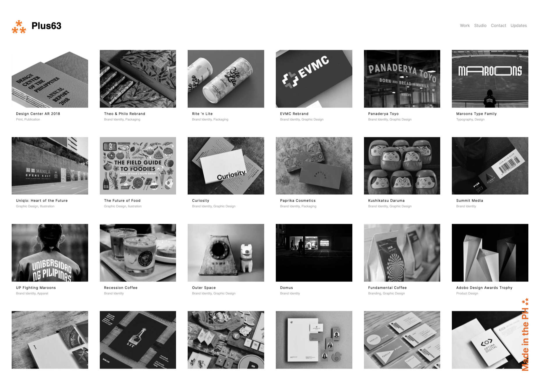
Think about what’s going to distract your visitors from the things that are important and concentrate on giving everything a purpose. For instance, the Plus63.org website instantly introduces the visitors to the purpose of the website, then allows users to scroll down to get more information. The data is spread clearly through the home page, pulling the viewer into a story.

2. Embrace the Positives of Negative Space

Negative space is one of the fundamental components of good minimalist web design.

Every part of a good website doesn’t need to be filled with noise to make a difference. White, or negative space can help to give your viewer the room they need to fully understand the experience that they’re getting.

From a functional perspective, it’s the difference between placing someone in an overflowing storage container and asking them to find what they need or placing them in a room where items are carefully spaced out, labelled, and waiting for discovery.

The Hatchinc.co website uses negative space to ensure that information is easy to consume. You can find the different pages of the site easily, the social media buttons, and the newsletter subscription tool. Plus, you get a chance to see some of the work behind the site.

3. Make it Obvious

One of the biggest problems that consumers have encountered in recent years, is the concept of “choice overload”.

Whether you’re in a store, or on a website, you’re never sure what to do first. Do you check out the blog posts on the site to learn more about the authority of the company? Do you visit the “About” page, to see where the brand come from? Do you head to their product pages?

As a designer, functional minimalism can help you to make it obvious what your audience should do next. As soon as you arrive on the AYR.com website, you’re not overwhelmed with choice. You can either head to your bag, “shop now”, or check the menu.

Since the “Shop Now” CTA is the biggest and most compelling, the chances are that most visitors will click that first, increasing the company’s chance of conversions.

4. Simplify the Navigation (But Don’t Hide It)

The AYR.com example above brings us to another concept of functional minimalism.

While minimalism and simplicity aren’t always the same thing, they should go hand-in-hand. When you’re designing for functional minimalism, you should be concentrating on helping visitors to accomplish tasks as quickly and easily as possible, without distraction.

That means that rather than overwhelming your audience with a huge selection of pages that they can visit at the top or side of the screen, it may be worth looking into simpler navigation options. A single menu icon that expands into a full list of items remains a popular design choice – particularly in the era of mobile web design.

For instance, look at the simple menu on newvision-opticien.com.

With this basic approach, designers can ensure that visitors are more likely to click through to the pages that their clients want their customers to visit. They can still find what they need in the menu, but it’s not taking up space on the page, or distracting them.

5. Set Great Expectations with the Top of the Screen

Functional minimalism can also help today’s designers to more quickly capture the attention of their visitors from the moment they click into a website.

The content that’s visible at the top of the page for your visitors is what will encourage them to take the next step in their online experience. Make sure that you’re providing something that keeps your audience interested and gives them the information they need.

That way, you’ll lower the risk of high bounce rates for your clients, while also taking advantage of minimalism’s ability to deliver quick access to information for your audience.

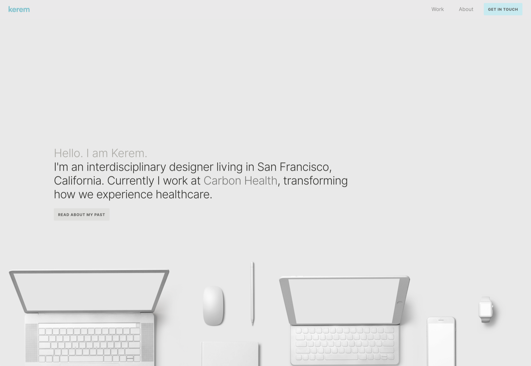
At the top of the page, the Kerem.co website instantly introduces the visitor into what the website is all about, and what they should do next.

You can even deliver more information in one chunk at the top of the page, without cluttering the environment, by using good UI animation.

Consider implementing a slideshow of pictures that flip from one image to the next, or a font section that dynamically changes as your audience has chance to read each sentence.

6. Use Functional Minimalism in the Right Spaces

Remember, functional minimalism isn’t just for home pages.

Depending on what you want to accomplish for your client, you could also embed the components of minimalism into landing pages, portfolios, and squeeze pages too.

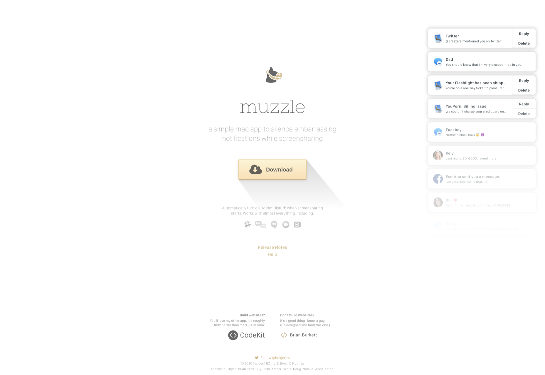
After all, when there’s less clutter and confusion on a page to distract a potential audience, there’s a greater chance that your visitors will scroll to the bottom of the page and complete a conversion. For instance, look at how simple and attractive the Muzzleapp.com landing page is.

The page provides useful information and tells customers exactly what they need to do next. There’s no confusion, no complexity, and nothing to hold visitors back.

Just be careful. While functional minimalism can be very useful, it won’t be right for every website. A lack of elements can be harmful to websites that rely heavily on content. That’s because low information density will force your user to scroll excessively for the content that they need. Using functional minimalism correctly requires a careful evaluation of where this technique will be the most suitable.

Minimalism Can be Functional

A minimalist design isn’t just an aesthetic choice. The right aspects of minimalism can simplify interfaces on the web by eliminating unnecessary elements and reducing content that doesn’t support an end goal.

The key is to ensure that you’re focusing on a combination of aesthetics and usability when creating the right design. An easy-to-navigate and beautiful website can be a powerful tool for any business.

Source

Categories: Designing, Others Tags:

How to Think Like a Front-End Developer

October 20th, 2020 No comments

This is an extended version of my essay “When front-end means full-stack” which was published in the wonderful Increment magazine put out by Stripe. It’s also something of an evolution of a couple other of my essays, “The Great Divide” and “Ooops, I guess we’re full-stack developers now.”

The moment I fell in love with front-end development was when I discovered the style.css file in WordPress themes. That’s where all the magic was (is!) to me. I could (can!) change a handful of lines in there and totally change the look and feel of a website. It’s an incredible game to play.

Back when I was cowboy-coding over FTP. Although I definitely wasn’t using CSS grid!

By fiddling with HTML and CSS, I can change the way you feel about a bit of writing. I can make you feel more comfortable about buying tickets to an event. I can increase the chances you share something with your friends.

That was well before anybody paid me money to be a front-end developer, but even then I felt the intoxicating mix of stimuli that the job offers. Front-end development is this expressive art form, but often constrained by things like the need to directly communicate messaging and accomplish business goals.

Front-end development is at the intersection of art and logic. A cross of business and expression. Both left and right brain. A cocktail of design and nerdery.

I love it.

Looking back at the courses I chose from middle school through college, I bounced back and forth between computer-focused classes and art-focused classes, so I suppose it’s no surprise I found a way to do both as a career.

The term “Front-End Developer” is fairly well-defined and understood. For one, it’s a job title. I’ll bet some of you literally have business cards that say it on there, or some variation like: “Front-End Designer,” “UX Developer,” or “UI Engineer.” The debate around what those mean isn’t particularly interesting to me. I find that the roles are so varied from job-to-job and company-to-company that job titles will never be enough to describe things. Getting this job is more about demonstrating you know what you’re doing more than anything else¹.

Chris Coyier
Front-End Developer

The title variations are just nuance. The bigger picture is that as long as the job is building websites, front-enders are focused on the browser. Quite literally:

  • front-end = browsers
  • back-end = servers

Even as the job has changed over the decades, that distinction still largely holds.

As “browser people,” there are certain truths that come along for the ride. One is that there is a whole landscape of different browsers and, despite the best efforts of standards bodies, they still behave somewhat differently. Just today, as I write, I dealt with a bug where a date string I had from an API was in a format such that Firefox threw an error when I tried to use the .toISOString() JavaScript API on it, but was fine in Chrome. That’s just life as a front-end developer. That’s the job.

Even across that landscape of browsers, just on desktop computers, there is variance in how users use that browser. How big do they have the window open? Do they have dark mode activated on their operating system? How’s the color gamut on that monitor? What is the pixel density? How’s the bandwidth situation? Do they use a keyboard and mouse? One or the other? Neither? All those same questions apply to mobile devices too, where there is an equally if not more complicated browser landscape. And just wait until you take a hard look at HTML emails.

That’s a lot of unknowns, and the answers to developing for that unknown landscape is firmly in the hands of front-end developers.

Into the unknoooooowwwn. – Elsa

The most important aspect of the job? The people that use these browsers. That’s why we’re building things at all. These are the people I’m trying to impress with my mad CSS skills. These are the people I’m trying to get to buy my widget. Who all my business charts hinge upon. Who’s reaction can sway my emotions like yarn in the breeze. These users, who we put on a pedestal for good reason, have a much wider landscape than the browsers do. They speak different languages. They want different things. They are trying to solve different problems. They have different physical abilities. They have different levels of urgency. Again, helping them is firmly in the hands of front-end developers. There is very little in between the characters we type into our text editors and the users for whom we wish to serve.

Being a front-end developer puts us on the front lines between the thing we’re building and the people we’re building it for, and that’s a place some of us really enjoy being.

That’s some weighty stuff, isn’t it? I haven’t even mentioned React yet.

The “we care about the users” thing might feel a little precious. I’d think in a high functioning company, everyone would care about the users, from the CEO on down. It’s different, though. When we code a

Smarter Ways to Generate a Deep Nested HTML Structure

October 20th, 2020 No comments

Let’s say we want to have the following HTML structure:

<div class='boo'>
  <div class='boo'>
    <div class='boo'>
      <div class='boo'>
        <div class='boo'></div>
      </div>
    </div>
  </div>
</div>

That’s real a pain to write manually. And the reason why this post was born was being horrified on seeing it generated with Haml like this:

.boo
  .boo
    .boo
      .boo
        .boo

There were actually about twenty levels of nesting in the code I saw, but maybe some people are reading thing on a mobile phone, so let’s not fill the entire viewport with boos, even if Halloween is near.

As you can probably tell, manually writing out every level is far from ideal, especially when the HTML is generated by a preprocessor (or from JavaScript, or even a back-end language like PHP). I’m personally not a fan of deep nesting and I don’t use it much myself, but if you’re going for it anyway, then I think it’s worth doing in a manner that scales well and is easily maintainable.

So let’s first take a look at some better solutions for this base case and variations on it and then see some fun stuff done with this kind of deep nesting!

The base solution

What we need here is a recursive approach. For example, with Haml, the following bit of code does the trick:

- def nest(cls, n);
-  return '' unless n > 0;
-  "<div class='#{cls}'>#{nest(cls, n - 1)}</div>"; end

= nest('👻', 5)

There’s an emoji class in there because we can and because this is just a fun little example. I definitely wouldn’t use emoji classes on an actual website, but in other situations, I like to have a bit of fun with the code I write.

We can also generate the HTML with Pug:

mixin nest(cls, n)
  div(class=cls)
    if --n
      +nest(cls, n)

+nest('👻', 5)

Then there’s also the JavaScript option:

function nest(_parent, cls, n) {
  let _el = document.createElement('div');
	
  if(--n) nest(_el, cls, n);

  _el.classList.add(cls);
  _parent.appendChild(_el)
};

nest(document.body, '👻', 5)

With PHP, we can use something like this:

<?php
function nest($cls, $n) {
  echo "<div class='$cls'>";
  if(--$n > 0) nest($cls, $n);
  echo "</div>";
}

nest('👻', 5);
?>

Note that the main difference between what each of these produce is related to formatting and white space. This means that targeting the innermost “boo” with .?:empty is going to work for the Haml, JavaScript and PHP-generated HTML, but will fail for the Pug-generated one.

Adding level indicators

Let’s say we want each of our boos to have a level indicator as a custom property --i, which could then be used to give each of them a different background, for example.

You may be thinking that, if all we want is to change the hue, then we can do that with filter: hue-rotate() and do without level indicators. However, hue-rotate() doesn’t only affect the hue, but also the saturation and lightness. It also doesn’t provide the same level of control as using our own custom functions that depend on a level indicator, --i.

For example, this is something I used in a recent project in order to make background components smoothly change from level to level (the $c values are polynomial coefficients):

--sq: calc(var(--i)*var(--i)); /* square */
--cb: calc(var(--sq)*var(--i)); /* cube */
--hue: calc(#{$ch0} + #{$ch1}*var(--i) + #{$ch2}*var(--sq) + #{$ch3}*var(--cb));
--sat: calc((#{$cs0} + #{$cs1}*var(--i) + #{$cs2}*var(--sq) + #{$cs3}*var(--cb))*1%);
--lum: calc((#{$cl0} + #{$cl1}*var(--i) + #{$cl2}*var(--sq) + #{$cl3}*var(--cb))*1%);

background: hsl(var(--hue), var(--sat), var(--lum));

Tweaking the Pug to add level indicators looks as follows:

mixin nest(cls, n, i = 0)
  div(class=cls style=`--i: ${i}`)
    if ++i < n
      +nest(cls, n, i)

+nest('👻', 5)

The Haml version is not too different either:

- def nest(cls, n, i = 0);
-   return '' unless i < n;
-   "<div class='#{cls}' style='--i: #{i}'>#{nest(cls, n, i + 1)}</div>"; end

= nest('👻', 5)

With JavaScript, we have:

function nest(_parent, cls, n, i = 0) {
  let _el = document.createElement('div');

  _el.style.setProperty('--i', i);
	
  if(++i < n) nest(_el, cls, n, i);

  _el.classList.add(cls);
  _parent.appendChild(_el)
};

nest(document.body, '👻', 5)

And with PHP, the code looks like this:

<?php
function nest($cls, $n, $i = 0) {
  echo "<div class='$cls' style='--i: $i'>";
  if(++$i < $n) nest($cls, $n, $i);
  echo "</div>";
}

nest('👻', 5);
?>

A more tree-like structure

Let’s say we want each of our boos to have two boo children, for a structure that looks like this:

.boo
  .boo
    .boo
      .boo
      .boo
    .boo
      .boo
      .boo
  .boo
    .boo
      .boo
      .boo
    .boo
      .boo
      .boo

Fortunately, we don’t have to change our base Pug mixin much to get this (demo):

mixin nest(cls, n)
  div(class=cls)
    if --n
      +nest(cls, n)
      +nest(cls, n)

+nest('👻', 5)

The same goes for the Haml version:

- def nest(cls, n);
-   return '' unless n > 0;
-   "<div class='#{cls}'>#{nest(cls, n - 1)}#{nest(cls, n - 1)}</div>"; end

= nest('👻', 5)

The JavaScript version requires a bit more effort, but not too much:

function nest(_parent, cls, n) {
  let _el = document.createElement('div');
  
  if(n > 1) {
    nest(_el, cls, n);
    nest(_el, cls, n)
  }

  _el.classList.add(cls);
  _parent.appendChild(_el)
};

nest(document.body, '👻', 5)

With PHP, we only need to call the nest() function once more in the if block:

<?php
function nest($cls, $n) {
  echo "<div class='$cls'>";
  if(--$n > 0) {
    nest($cls, $n);
    nest($cls, $n);
  }
  echo "</div>";
}

nest('👻', 5);
?>

Styling the top level element differently

We could of course add a special .top (or .root or anything similar) class only for the top level, but I prefer leaving this to the CSS:

:not(.👻) > .👻 {
  /* Top-level styles*/
}

Watch out!

Some properties, such as transform, filter, clip-path, mask or opacity don’t only affect an element, but also also all of its descendants. Sometimes this is the desired effect and precisely the reason why nesting these elements is preferred to them being siblings.

However, other times it may not be what we want, and while it is possible to reverse the effects of transform and sometimes even filter, there’s nothing we can do about the others. We cannot, for example, set opacity: 1.25 on an element to compensate for its parent having opacity: .8.

Examples!

First off, we have this pure CSS dot loader I recently made for a CodePen challenge:

CodePen Embed Fallback

Here, the effects of the scaling transforms and of the animated rotations add up on the inner elements, as do the opacities.

Next up is this yin and yang dance, which uses the tree-like structure:

CodePen Embed Fallback

For every item, except the outermost one (:not(.??) > .??), the diameter is equal to half of that of its parent. For the innermost items (.??:empty, which I guess we can call the tree leaves), the background has two extra radial-gradient() layers. And just like the first demo, the effects of the animated rotations add up on the inner elements.

Another example would be these spinning candy tentacles:

CodePen Embed Fallback

Each of the concentric rings represents a level of nesting and combines the effects of the animated rotations from all of its ancestors with its own.

Finally, we have this triangular openings demo (note that it’s using individual transform properties like rotate and scale so the Experimental Web Platform features flag needs to be enabled in chrome://flags in order to see it working in Chromium browsers):

Triangular openings (live demo).

This uses a slightly modified version of the basic nesting mixin in order to also set a color on each level:

- let c = ['#b05574', '#f87e7b', '#fab87f', '#dcd1b4', '#5e9fa3'];
- let n = c.length;

mixin nest(cls, n)
  div(class=cls style=`color: ${c[--n]}`)
    if n
      +nest(cls, n)

body(style=`background: ${c[0]}`)
  +nest('🔺', n)

What gets animated here are the individual transform properties scale and rotate. This is done so that we can set different timing functions for them.


The post Smarter Ways to Generate a Deep Nested HTML Structure appeared first on CSS-Tricks.

You can support CSS-Tricks by being an MVP Supporter.

Categories: Designing, Others Tags: