my excitement for Core Web Vitals is tempered with a healthy skepticism. I’m not yet convinced that Largest Contentful Paint (LCP), First Input Delay (FID), and Cumulative Layout Shift (CLS) are the right metrics that all sites should be measuring themselves against. I worry that the outsized emphasis placed on Core Web Vitals by including them in SEO scoring will result in developers focusing solely on those three numbers without truly understanding what they mean and, more importantly, what they don’t mean.
Katie is pro-Web Core Vitals because of their correlation with real user experiences, but there is a lot more to think about. If we focus only on these metrics (because we have now an extremely strong incentive to do so) we’re missing out on a lot. They may not be the analytics that matter most to us or that correlate with business goals.
The horse’s mouth says the SEO implications don’t start until May 2021.
I admit I’ve been on the hype train myself a little bit. I like all of Katie’s points but I think I’ll still call it a step forward for web analytics. Robin also mentioned Sentry could do the tracking the other day.
Personally, my beef with core web vitals is that they introduce even more uneccessary initialisms (see, for example, Harry’s recent post where he uses CWV metrics like LCP, FID, and CLS—alongside TTFB and SI—to look at PLPs, PDPs, and SRPs. I mean, WTF?).
If you’re interested in a sneak peek of this year’s best Black Friday deals, stick around. You’ll find a few web designers’ favorites, including a stellar deal or two.
This year, more than a few of the popular retail outlets are shifting away from the traditional “camp out all night and bust open the doors when the store opens” shopping model. You might just prefer this less chaotic, ecommerce approach.
All of us are trying to adjust to what may eventually become a “new normal”. We may not like some aspects of this new normal, but there are bright spots as well.
More shoppers are likely going to shop online because of the coronavirus. That means you don’t have to fight the crowds while desperately attempting to socially distance. The shelves aren’t as apt to go bare, and shopping is easy, convenient, and safe.
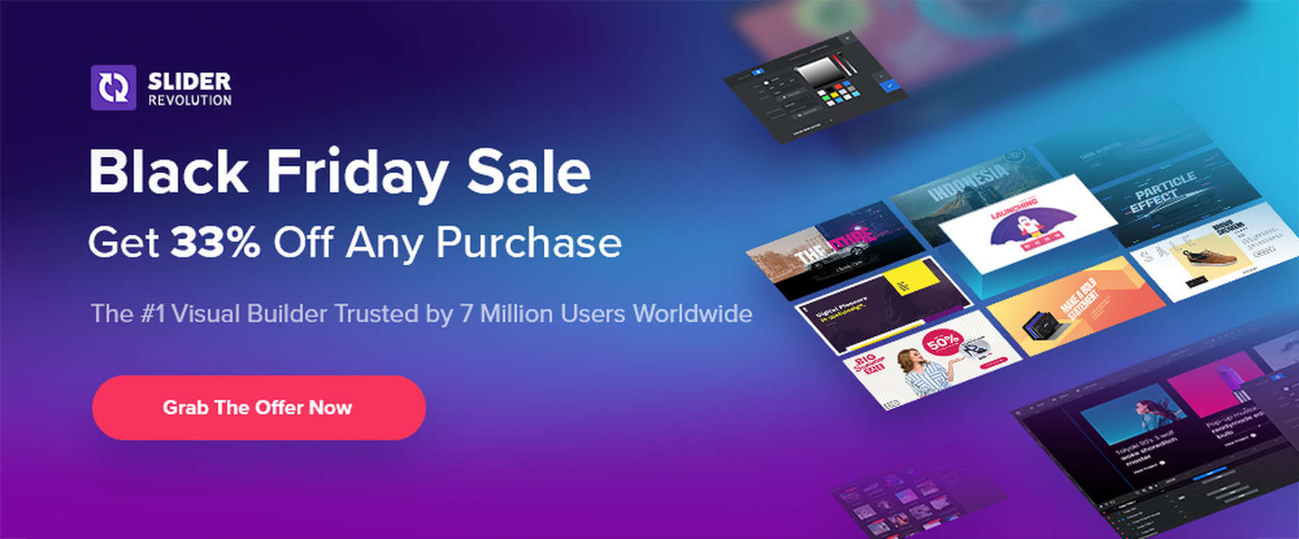
1. Slider Revolution
You will find the Slider Revolution plugin incorporated in a host of WordPress theme tools and products. This premium plugin can in fact boast of more than 7 million users around the globe.
What you may not be aware of is that it is much more than just a WordPress slider. With it in your web design toolbox, you can in fact create just about anything you can imagine.
Expect to find:
A stunning selection of elements including sliders and carousels;
Attention-getting hero sections designed to make your home pages really stand out;
Single-page websites with layouts unlike anything you’ve seen before;
Modular structuring that allows you to rearrange and reuse sections however you choose and the ability to mix and match modules with any WordPress content;
Add-ons whose cutting edge features push the boundaries of web design possibilities.
There’s more of course. To celebrate Black Friday and Cyber Monday you can NOW get any Slider Revolution subscription plan or one-time payment at a 33% discount.
Just click on the banner and use the BLACKFRIDAY code at checkout.
2. Amelia
When done manually, booking and managing appointments can be tedious and subject to mistakes and errors. Amelia provides an automated booking process that is oh-so easy to work with and is error free; just what you need to help you acquire more happy customers.
Key features of Amelia’s fully responsive design include:
A dashboard system that enables you to track approved and pending appointments, booking changes, and revenue;
Zoom Integration, Google Calendar, and Outlook Calendar sync;
The ability to accept and easily manage recurring appointments that customers can schedule;
Front-end customer and employee appointment and event managing and backend appointment adding, editing, and rescheduling;
Email notifications for pending and approved appointments and events.
And much more that will save you loads of energy and a ton of time. Give Amelia a try, and if you like what you see (and you will), take advantage of the 30% Black Friday discount.
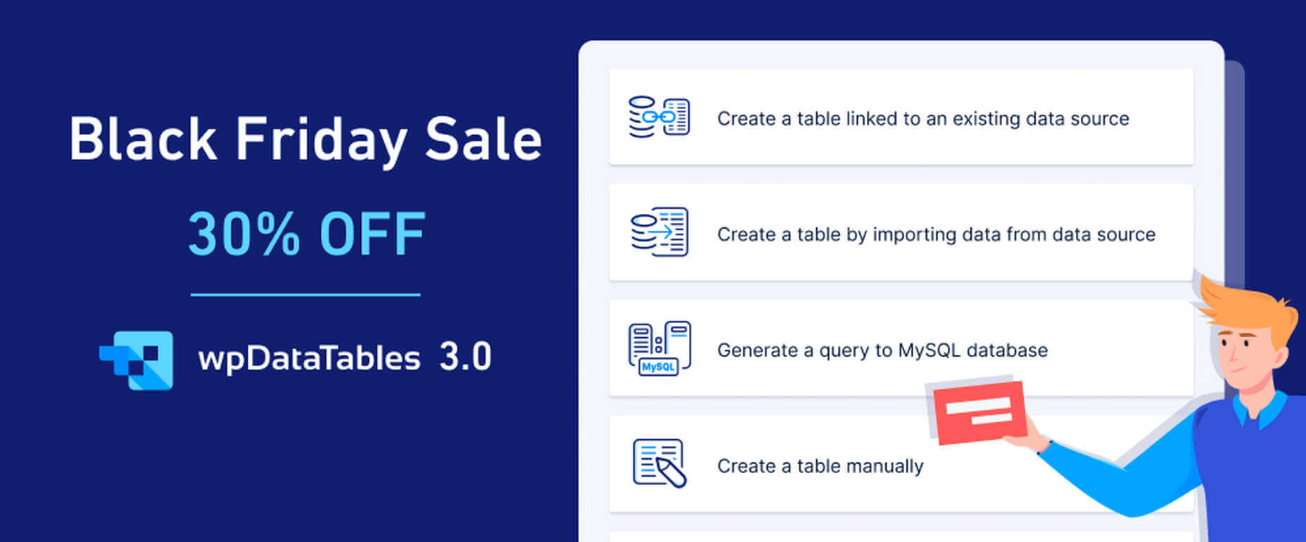
3. wpDataTables
wpDataTables 3.0, with its fresh, new look, gives you a host of different ways to generate attractive, customizable, and responsive tables and charts, and a host of different ways to present them.
Tables can be created from most data sources, the most common being MySQL query, PHP array, Google Spreadsheet, Excel files CSV files, and JSON and XML inputs;
A working knowledge of SQL is not required!
Addons include Gravity Forms, Formidable Forms, Report Builder, and Powerful Filter;
wpDataTables users can generate Tables and Charts quickly from massive amounts of data (saving hours of effort);
Tables and charts are customizable and maintainable (editable once placed in use);
Tables can be created manually if you wish.
Click on the banner now and take advantage of wpDataTables 30% Black Friday discount on all licenses and addons.
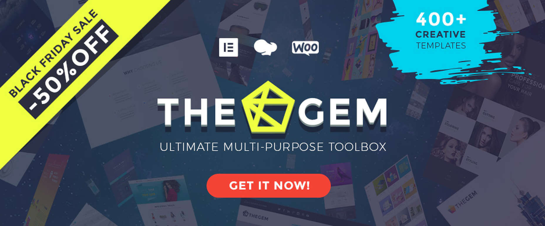
In TheGem, the ultimate WordPress multipurpose toolbox, you will find:
A rich selection of 400+ premium pre-built multi-page and one-page websites, all available for Elementor and WPBakery page builders;
The ability to mix and match any of this demos, layouts and page sections to create your own unique look;
Extended WooCommerce layouts & tools for making online shops, which convert better;
TheGem Blocks: an ultimate tool for building webpages at the speed of light.
And much more. Just click on the banner and check this 5-star product out.
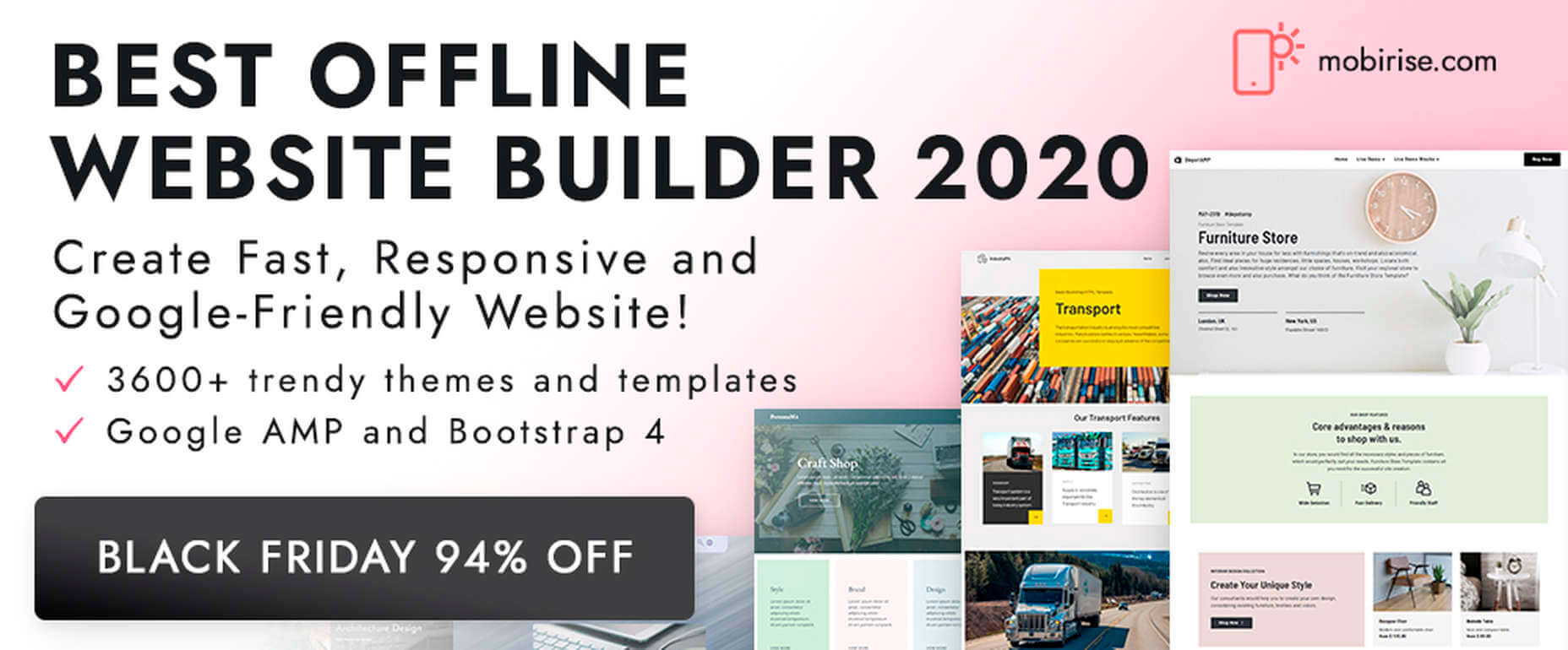
5. Mobirise Website Builder
Creating a Google-friendly can take time, unless you have Mobirise at your fingertips, in which case you have a number of helpful tools to speed things up.
No coding, it’s all drag and drop;
3,600+ website templates are at your disposal plus sliders, popups, forms, and more;
Many eCommerce features, including a shopping cart;
Latest Google Amp and Bootstrap4;
You can download Mobirise for free.
And, because it’s Black Friday, everything is yours at a 94% discount!
6. Get Illustrations
Get Illustrations offers royalty free and landing page Illustrations ready to drag and drop into your web design. You’ll have access to:
An extensive library of 4000+ illustrations with more added every week;
A wealth of design formats, including AI, PNG, SVG, Figma, Adobe XD, and Sketch;
Free updates and new illustrations weekly (included in the bundle).
Click on the banner and use the Coupon Code BLACKDEAL for your 30% discount.
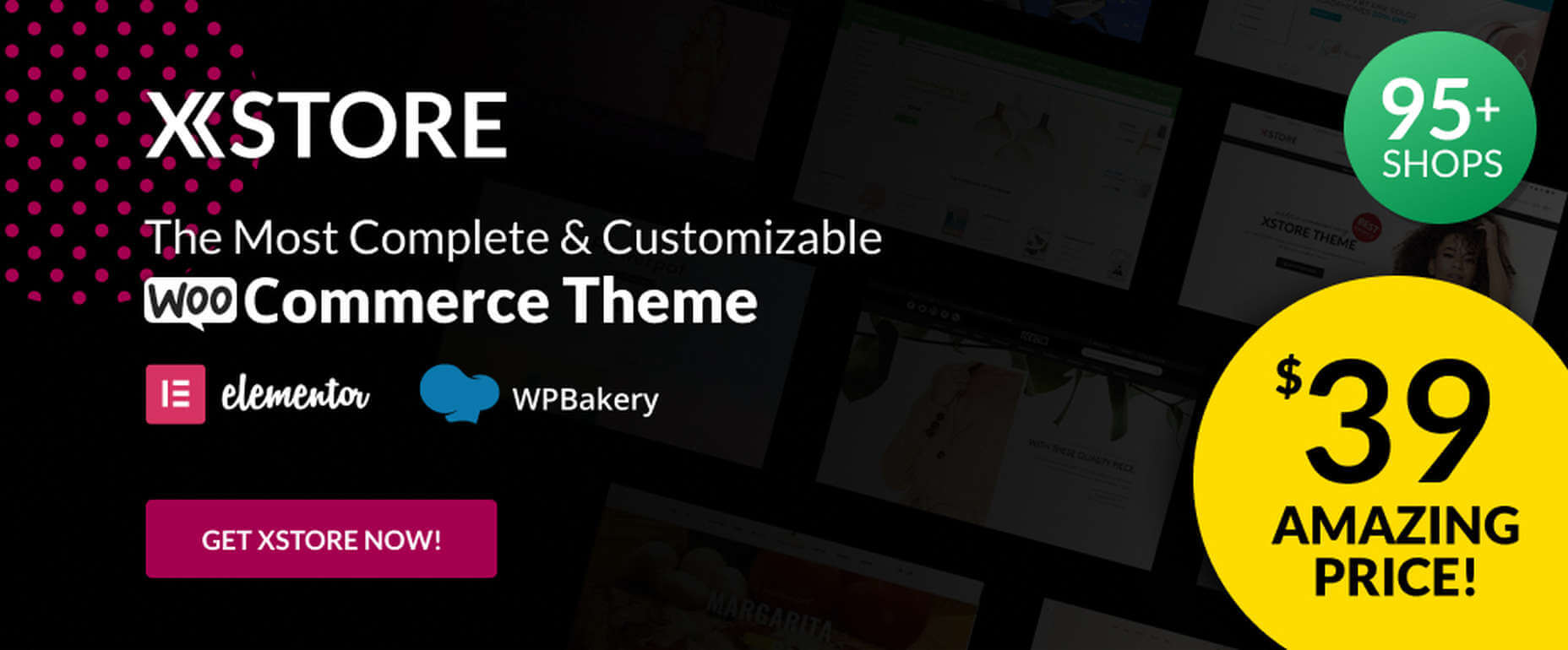
For anyone planning on creating an eCommerce store, the XStore name says it all. Key features you’ll find in this powerful and flexible WooCommerce theme include:
More than 95 good-to-go-shops plus a full AJAX shop to get you started;
300+ pre-defined shop/page sections, a header builder, and a single product page builder;
Elementor, WPBakery and $510+ worth of premium plugins.
Click on the banner and sign up to become one of XStore’s 55,000+ happy customers.
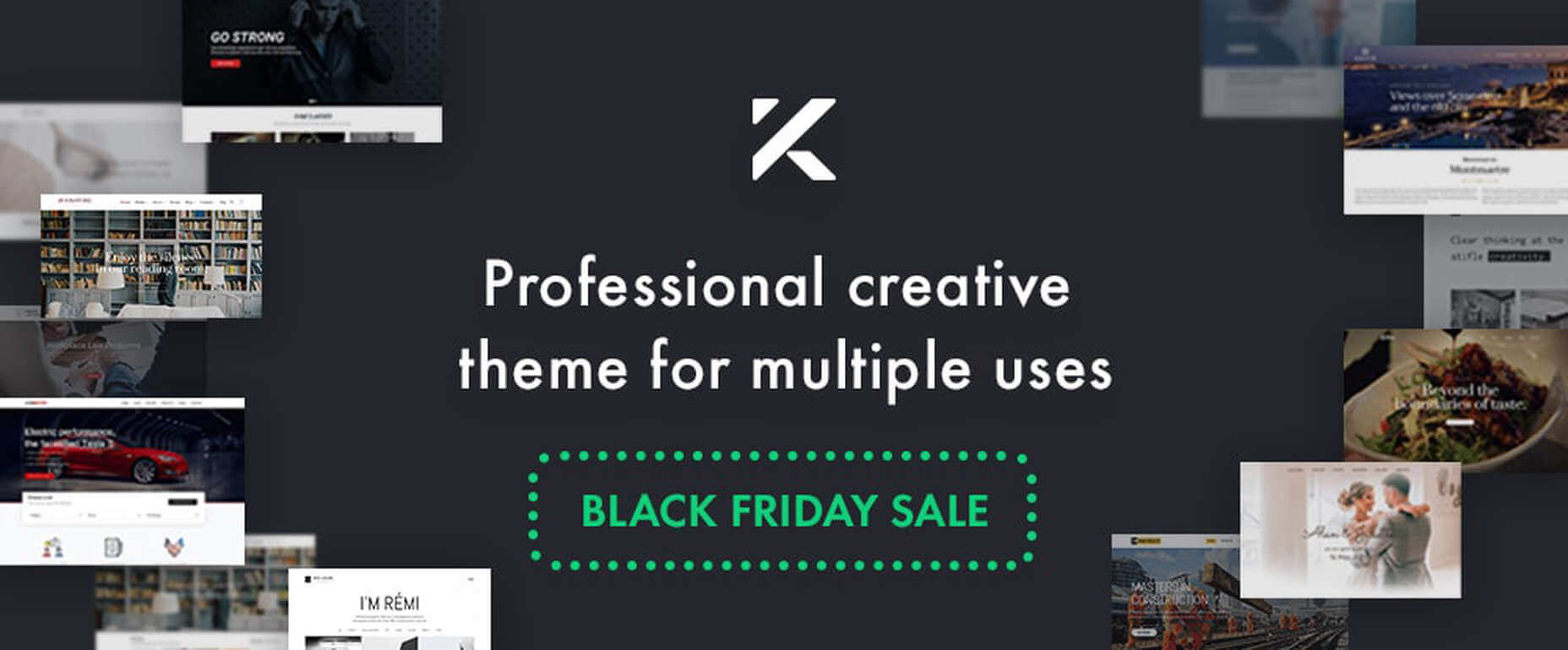
8. Kalium – Creative Theme For Multiple Uses
Kalium is an easy-to-use, easily maintainable multipurpose theme for WordPress users that is always updated to use the latest WordPress standards.
Kalium provides its users with a host of professionally-designed pre-built demos and elements;
Many plugins such as: Slider Revolution, WPBakery, Elementor, Layer Slider, Advanced Custom Fields PRO, Product Filter for WooCommerce, Product Size Guide,WooCommerce and other premium plugins are included.
Kalium is responsive, GDPR compliant, and gives you full eCommerce and top-quality customer support. It has a 5-star rating after 36k sales on ThemeForest – seriously impressive!
*****
If you hit the retail stores remember to social distance.
Or, if you would rather take a brief break from the demands of Covid-19, take advantage of one or more of the above ecommerce sales. As you can see, there are some excellent ones!
Despite what some may think, brand awareness and brand equity aren’t the same. While brand awareness is how aware customers are of a brand, brand equity refers to customers’ perceived worth of the brand.
We often see the terms “brand awareness” and “brand equity” used interchangeably in the branding space, as if they’re one and the same. But they actually refer to rather different things and knowing the difference has the power to improve your bottom line and bring your business to a whole new level.
This article will walk you through the basics of brand awareness and brand equity, defining exactly what each one is, why they are important, and how you can build them to grow your brand.
Brand Awareness
Brand awareness appears as a goal so often in digital marketing campaigns that it is a hot buzzword in the space. Sadly, not all marketers understand exactly what it is, why it’s important, how to build and measure it.
What is brand awareness?
Brand awareness plays a main role in customers’ decision making. It refers to whether customers can recall or recognize your brand, or simply whether or not they know about you.
Imagine being at a bar with some friends and they ask you what you would like to drink. What comes to your mind first? Coca Cola or Pepsi? Budweiser or Coors Light?
What a certain brand immediately pops into your head, that’s brand awareness. Or at least it is unaided brand awareness, as you haven’t been prompted. There is also aided brand awareness where you recognize brand names and logos from a list.
According to Kevin Lane Keller, Professor of Marketing at the Tuck School of Business at Dartmouth College and the author of the best-selling textbook Strategic Brand Management, brand awareness includes two elements:
Brand recall indicates customers’ ability to retrieve the brand from memory when given a product category, purchase order, or usage as a cue. For example, customers’ recall of KFC will depend on their ability to retrieve the brand when they think of fried chickens or of what they should eat for lunch.
Brand recognition indicates customers’ ability to confirm prior exposure to a brand when given the brand as a cue. In other words, when they go to a store, can they recognize the brand as one to which they’ve already been exposed?
Benefits of brand awareness
Brand awareness brings many benefits to your business:
Brand awareness creates associations: Brand awareness helps register your brand in customers’ minds. It associates actions and products with a brand, subconsciously encouraging customers to replace common words with branded terms. (Think: if someone has a pressing question, you tell them to Google it, right?)
Brand awareness puts a brand into the consideration set: Before buying something, customers often consider some options. Netflix or Amazon Prime? Coca Cola or Pepsi? Improving brand awareness can help a brand receive serious consideration for purchase.
Brand awareness affects choices: The more familiar customers are with a brand, the higher chance they choose it to purchase, and the more they trust it.
How to build brand awareness
Brand awareness doesn’t happen from a simple advertisement or marketing campaign. But increased exposure also doesn’t necessarily equate to increased brand awareness. There’s no quick fix or the best practices for becoming a household name.
That said, there are some effective brand awareness strategies you can try.
Referral programs: For example, offer 10% off on the next order if a customer invites their friend to shop with your brand. The friend also gets 10% off on their first purchase. Creating a trustworthy referral program can be extremely rewarding when you set your tone on the right audience.
Guest blogging: Create memorable, valuable content, and share it on other blogs. Remember to find the blogs that have the same target audience as yours and to focus on sharing valuable insights that relate to that audience. Here’s a great example of a type of perfect blog post and to keep most of these guidelines throughout your blogging.
Local partnerships: Partner with local organizations to hold seminars, festivals, or donation programs. This strategy proves effective for local small businesses by implementing better online business advice.
Social media contests: For example, ask followers to submit a Christmas photo or video, with other users voting for their favorites. Participants will share the link with their friends and family to get more votes, which helps increase awareness about your brand.
A worthy note is that strong brand awareness results from consistent efforts that extend beyond trying to get paying customers.
How to measure brand awareness
To know if your brand awareness efforts are working, you need to measure it. Here are a few metrics you should keep in mind:
Search volume: How many people intentionally search for your brand on search engines like Google. This tells whether people out there know your brand’s existence.
Total site traffic: How many visitors come to your website from all kinds of places like search engines, forums, social media, etc.
Social engagement: Followers, likes, shares, comments, retweets, etc., on all your social media accounts.
Brand tracking software: how aware your target audience is of your brand using data collected from surveys.
Overview of brand equity
Brand equity refers to a brand’s perceived value according to its customers. It’s a combination of customer perception, experience, and opinion about your brand.
Because of that, brand equity can be positive or negative. If customers think positively about a brand based on their previous experience with it, it’s positive brand equity. But if they have bad impressions or experience unpleasant customer services, they’re less likely to buy from the brand again and tell their friends to do so. This is an example of negative brand equity.
Benefits of brand equity
Brand equity is important because it allows you to:
Gain greater market share: Brand equity gives you a strong competitive advantage, making you stand out from competitors and appeal to customers. Thanks to this, you get a higher chance of successfully selling your products.
Set premium prices: When you have better brand equity, you can charge more for your products and increase your price percentage over the market average. Customers still stick with you because of your unique selling point and your distinct value propositions, which will impact positively on conversion rate optimization.
Extend your products or services easily: Brand equity helps you gain customers’ trust and loyalty. Hence, they’ll be more likely to try your latest products and share them with others.
Grow your business: Brand equity has a direct impact on your company’s growth and reputation. With your increased revenue and market dominance, you may find yourself in a powerful situation. That helps you easily form new partner programs, get better supplier rates, and more.
How to build brand equity
Follow this instruction to start establishing your brand equity:
Develop a strong brand story and brand personality: A brand story aligns itself to trigger customers’ emotional responses. Brand personality means your brand’s style or unique voice for the product or service you’re selling. You should first build these elements to ensure your customers see you the way you want to be seen.
Build brand awareness: Once you have a strong brand story and brand personality, follow the tactics above to gain awareness around your brand and your offer.
Communicate with customers: To do this, you can enlist a team of customer service representatives, conduct surveys, etc. The goal is to build trust and acquire returning customers.
Build a strong bond with customers: For example, sending out weekly newsletters, implementing Facebook Live Q&A sessions, Instagram Stories, personalizing a live chat system to build a better relationship with your customers, or hosting an event.
How to measure brand equity
Like brand awareness, you need to measure brand equity as well. Here are some ways to do it:
Measure brand awareness: Take note of how you’re handling brand awareness by applying the tactics above.
Survey customers or ask for their reviews: This way, you can understand how much they know about your brand and how they feel after purchasing your products.
Analyze your financial situation: Pay attention to metrics like market share, transactional value, growth rate, and sustainability.
Final thoughts
Brand awareness is the foundation of brand equity. As Keller emphasized in an article published in Harvard Business Review, “A firm foundation for brand equity requires that consumers have the proper depth and breadth of awareness and strong, favorable, and unique associations with the brand in their memory.” This definition means that sometimes brand awareness and brand equity are used interchangeably. However, as this article has shown, they are not the same. Both need to be worked on separately but will come together to form a strong brand.
Remember, once a person is strongly aware of your brand, they start on a path to recognize you without assistance, buy from you, and prefer you over other similar brands. They’re probably loyal to you and recommend you to their family and friends. That’s the way you’ll create brand equity.
I’m thoroughly convinced that SVG unlocks a whole entire world of building interfaces on the web. It might seem daunting to learn SVG at first, but you have a spec that was designed to create shapes and yet, still has elements, like text, links, and aria labels available to you. You can accomplish some of the same effects in CSS, but it’s a little more particular to get positioning just right, especially across viewports and for responsive development.
What’s special about SVG is that all the positioning is based on a coordinate system, a little like the game Battleship. That means deciding where everything goes and how it’s drawn, as well as how it’s relative to each other, can be really straightforward to reason about. CSS positioning is for layout, which is great because you have things that correspond to one another in terms of the flow of the document. This otherwise positive trait is harder to work with if you’re making a component that’s very particular, with overlapping and precisely placed elements.
Truly, once you learn SVG, you can draw anything, and have it scale on any device. Even this very site uses SVG for custom UI elements, such as my avatar, above (meta!).
That little half circle below the author image is just SVG markup.
We won’t cover everything about SVGs in this post (you can learn some of those fundamentals here, here, here and here), but in order to illustrate the possibilities that SVG opens up for UI component development, let’s talk through one particular use case and break down how we would think about building something custom.
The timeline task list component
Recently, I was working on a project with my team at Netlify. We wanted to show the viewer which video in a series of videos in a course they were currently watching. In other words, we wanted to make some sort of thing that’s like a todo list, but shows overall progress as items are completed. (We made a free space-themed learning platform and it’s hella cool. Yes, I said hella.)
Here’s how that looks:
So how would we go about this? I’ll show an example in both Vue and React so that you can see how it might work in both frameworks.
The Vue version
We decided to make the platform in Next.js for dogfooding purposes (i.e. trying out our own Next on Netlify build plugin), but I’m more fluent in Vue so I wrote the initial prototype in Vue and ported it over to React.
Here is the full CodePen demo:
CodePen Embed Fallback
Let’s walk through this code a bit. First off, this is a single file component (SFC), so the template HTML, reactive script, and scoped styles are all encapsulated in this one file.
We’ll store some dummy tasks in data, including whether each task is completed or not. We’ll also make a method we can call on a click directive so that we can toggle whether the state is done or not.
Now, what we want to do is create an SVG that has a flexible viewBox depending on the amount of elements. We also want to tell screen readers that this a presentational element and that we will provide a title with a unique id of timeline. (Get more information on creating accessible SVGs.)
The stroke is set to currentColor to allow for some flexibility — if we want to reuse the component in multiple places, it will inherit whatever color is used on the encapsulating div.
Next, inside the SVG, we want to create a vertical line that’s the length of the task list. Lines are fairly straightforward. We have x1 and x2 values (where the line is plotted on the x-axis), and similarly, y1 and y2.
The x-axis stays consistently at 10 because we’re drawing a line downward rather than left-to-right. We’ll store two numbers in data: the amount we want our spacing to be, which will be num1, and the amount we want our margin to be, which will be num2.
data() {
  return {
    num1: 32,
    num2: 15,
    // ...
  }
}
The y-axis starts with num2, which is subtracted from the end, as well as the margin. The tasks.length is multiplied by the spacing, which is num1.
Now, we’ll need the circles that lie on the line. Each circle is an indicator for whether a task has been completed or not. We’ll need one circle for each task, so we’ll use v-for with a unique key, which is the index (and is safe to use here as they will never reorder). We’ll connect the click directive with our method and pass in the index as a param as well.
CIrcles in SVG are made up of three attributes. The middle of the circle is plotted at cx and cy, and then we draw a radius with r. Like the line, cx starts at 10. The radius is 4 because that’s what’s readable at this scale. cy will be spaced like the line: index times the spacing (num1), plus the margin (num2).
Finally, we’ll put use a ternary to set the fill. If the task is done, it will be filled with currentColor. If not, it will be filled with white (or whatever the background is). This could be filled with a prop that gets passed in the background, for instance, where you have light and dark circles.
Finally, we are using CSS grid to align a div with the names of tasks. This is laid out much in the same way, where we’re looping through the tasks, and are also tied to that same click event to toggle the done state.
Here is where we ended up with the React version. We’re working towards open sourcing this so that you can see the full code and its history. Here are a few modifications:
We’re using CSS modules rather than the SCFs in Vue
We’re importing the Next.js link, so that rather than toggling a “done” state, we’re taking a user to a dynamic page in Next.js
The tasks we’re using are actually stages of the course —or “Mission” as we call them — which are passed in here rather than held by the component.
This component is flexible enough to accommodate lists small and large, multiple browsers, and responsive sizing. It also allows the user to have better understanding of where they are in their progress in the course.
But this is just one component. You can make any number of UI elements: knobs, controls, progress indicators, loaders… the sky’s the limit. You can style them with CSS, or inline styles, you can have them update based on props, on context, on reactive data, the sky’s the limit! I hope this opens some doors on how you yourself can develop more engaging UI elements for the web.
I’ve compared SVG and Canvas before. If you’re trying to decide between them, read that. I’d say the #1 difference between them is vector (SVG) versus raster (Canvas). But the #2 difference is how you work with them. SVG is declarative, as in, literal elements that express what they are through attributes and content. Canvas […]
To access this post, you must purchase MVP Supporter.
I like working with styled-components. They allow you write CSS in your JavaScript, keeping your CSS in very close proximity to your JavaScript for a single component. As a front-end developer who loves to dissect a web page and break it down into reusable components, the idea of styled-components brings me joy. The approach is clean and modular and I don’t have to go digging in some gigantic CSS file to see if a class I need already exists. I also don’t have to add a class to that never-ending CSS file and feel guilty for making that already gigantic file even bigger.
However, as I continue down the path of using styled-components, I have started to realize that, while it is great to separate out CSS styles to be specific to singular components, I am starting to repeat myself a lot for the sake of organizing my styles on a per component basis. I’ve been creating new CSS declarations, and thus, new styled-components, for every component, and am seeing a great deal of duplication in my CSS. No, the styled-components aren’t always exactly the same, but two of the three lines of CSS would match two of the three lines of CSS in another component. Do I really need to repeat this code every place I need these styles?
Take flexbox, for example. Flexbox is great for responsive layouts. It will align items a certain way, and with minimal changes, can be tweaked to look good across different screen sizes. So, more often than not, I find myself writing:
display: flex;
flex-direction: row; /* the default; in react native, column is the default */
Almost as often, I found myself writing:
display: flex;
flex-direction: column;
The two code snippets above are fairly common: the first takes all of the child elements and positions them next to each other — from left to right — in a row. The second takes all of the child elements and positions them above and below each other — from top to bottom -— in a column. Each of these code snippets can be made more specific; however, we can add different properties to further specify how we want the child elements laid out on the page. If we want the elements spaced evenly across the available screen width, for example, we can add the following line to each code snippet:
justify-content: space-evenly;
Additionally, there are other properties, like align-items that we can add to further customize the layout of these elements. So, if we have three different components that all require a flexbox layout, but have additional differing properties, how can we use styled-components in a non-repetitive way?
Initially, it makes sense to create three sets of styles for each component, like this:
The styles listed above will do the job. All three components have child elements laid out in a row — positioned from left to right — with different spacing between each child element. However, having the same two lines of code repeated three times adds CSS bloat.
To avoid repeating ourselves, we can extend a base component to each of the other components and then add the additional styes we need to those components:
That feels much better. Not only does this version — where we extend off of the component — remove repetitive code, but it also keeps the code related to displaying items in a row in one spot. If we needed to update that code related to the direction of the items to a column, we can do that in one spot instead of three.
Important note: When you’re extending styles off of another component, the styles that inherit from that base component need to be listed after the base component like in the example above. Placing above would cause an error that reads: Uncaught ReferenceError: Cannot access ‘ExampleFlex’ before initialization.
To take this idea one step further, the following demo shows a situation where you might need similar styles on two different UI elements on the page, but those elements each have their slight differences.
CodePen Embed Fallback
As you can see, both the navigation that lives at the top of the page and the footer that lives at the bottom of the page need to be laid out in a row direction on larger screens and then shift to a column layout on mobile devices. The two elements differ, however, in that the navigation at the top of the page needs to be aligned to the left to leave room for the logo on the right while the footer links need to be aligned right. Because of these differences, it makes sense to create two different styled components for each of these elements; the element for the top navigation and the component for the bottom of the page navigation.
The only difference in those two elements? The justify-content property. Additionally, the component uses display: flex with the same media query.
Outside of these three components sharing a lot of the same CSS, the component and are very similar link components with slight differences. So how do we DRY this up?
Looking at the example below you’ll see that CSS that is reused across multiple components can be pulled out into its own component that we extend off of to make the specific changes we might need for more specific components.
CodePen Embed Fallback
With the changes put in place, our JavaScript file that holds all of the styled-components is 10 lines shorter than the previous version. While that may seem like a small difference, as applications grow, these changes could help minimize the CSS that is shipped with an application as styles continue to be added.
There’s also the “as” polymorphic prop!
In addition to extending styles from one component into another, styled-components also gives us a polymorphic prop called “as” that applies styles from a given component to another element as long as that new element is specified. This is helpful in situations where the user interface for two elements might look the same, but the underlying HTML functionality behind those two elements is different.
Take buttons and links styled as buttons as an example. While they seem to have similar functionality at first glance — they both can be clicked to trigger an action — the two serve functionally different purposes. A button is great for submitting a form or changing the layout of the the current page you’re on, but a link will take you to a resource.
I’ve created a Pen below that illustrates this. At first glance, the two buttons look the same. However, the one on the right, is actually an element styled like a button, while the one on the left is an actual element. These two buttons could be part of a site navigation down the line, with one needing to link to an external site. At a first attempt in building out these two elements, it makes sense to see code for each component like in the first example we looked at.
CodePen Embed Fallback
If we know that these two elements will have the exact same styles, we can style each one as a , grouping the styled-component with the JavaScript that goes along for the button we are creating. Then we apply those same exact styles to a component that we specify:
CodePen Embed Fallback
Looking at the pen above, you can see that we have removed all duplicate CSS related to the styling of these two elements. Rather than repeat the CSS for the button to use on the link component, we can apply pass in a value to the as prop like so:
<Button as="a" href="#" ... >I am a Link!</Button>
This gives us the ability to change the element to an HTML tag while keeping the styles that we have already defined for the Button.
Extending baseline styles — and perhaps even keeping some them together in a single globalStyles.js file — is an effective way to DRY our styled-components code, making it much more manageable. Keeping CSS to a minimum not only enhances the performance of a website, but it can also save developers from having to dig through lines of CSS in the future.
As we approach our first winter holiday season since the pandemic set in, the world could feel like a very scary place; there is a great deal of uncertainty about the future for businesses, for young people in education, for jobs, for travel. Celebrations are certainly going to be a lot quieter this year.
And yet, the web is far from showing doom and gloom. We’re seeing confidence and positivity in designs across the board. As businesses and people adapt to the demands of social distancing and WFH, we’re seeing a focus on simplifying, appreciating quality over quantity, taking better care of ourselves and our world, and making the most of our time. And this is reflected through design in a variety of ways: visually minimal style, pared down content, fresh colors, statement type, great photography, illustration.
There is confidence in abundance on the web. Enjoy…
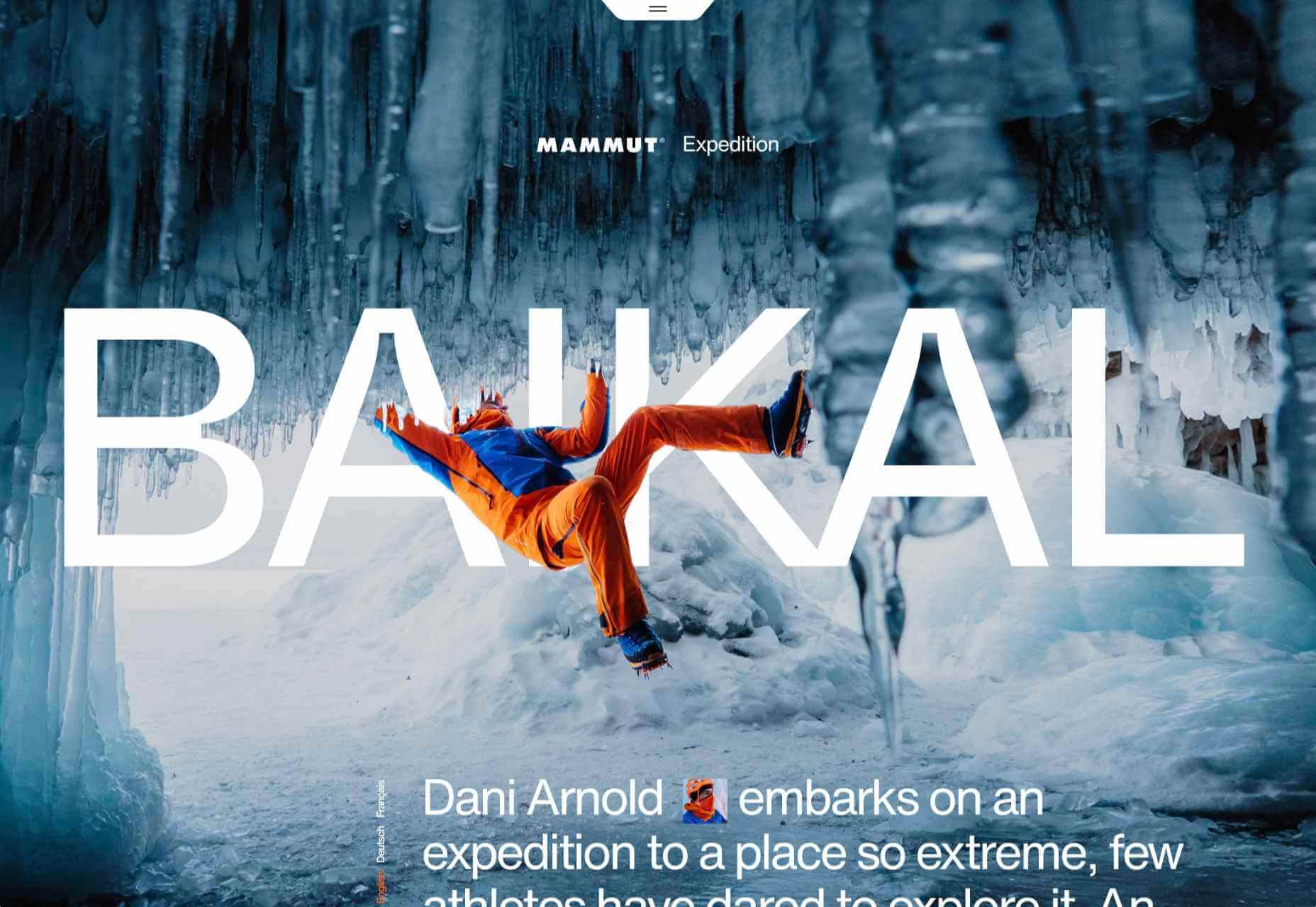
Mammut Expedition Baikal
Mammut make outdoor clothing and equipment, and this microsite is for its Eiger Extreme collection. Stunning photographs of Swiss speed climber Dani Arnold climbing at Lake Baikal in Siberia are cleverly interspersed with details of the company’s products he can be seen wearing, along with links to buy. It feels natural, rather than forced.
Wavering Stripes
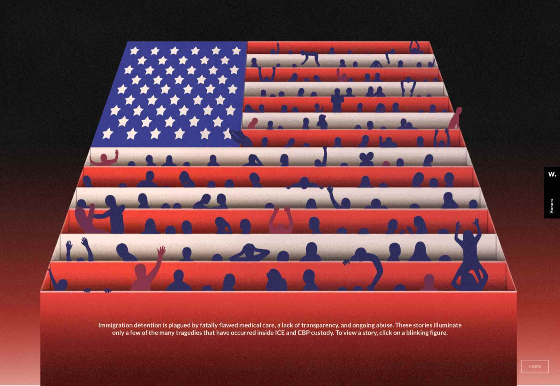
This a beautifully made site highlighting the experiences of people held in immigration detention centers in the US. The illustrations belie the grimness of the stories told — on the landing page there is a warning as to the nature of the content.
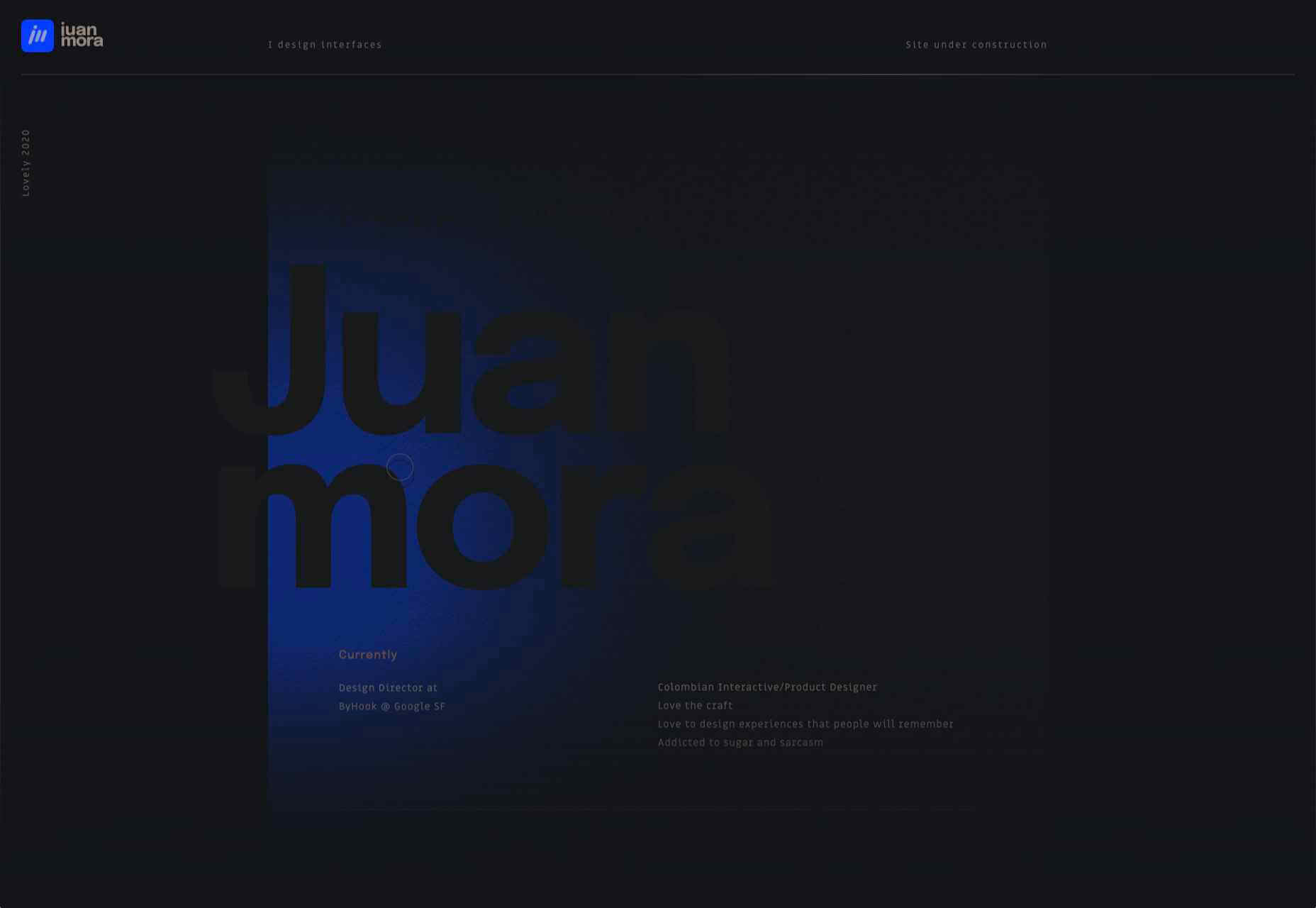
Juan Mora
Proof that holding pages don’t have to be boring, this ‘under construction’ site for interface designer Juan Mora is a far cry from the warning-barrier and stick-figures-at-work gifs of the web’s early days.
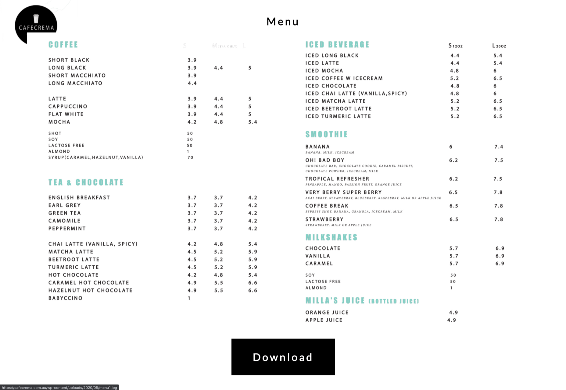
Cafecrema
Cafecrema’s simple, one page site creates the atmosphere of 1950s coffee shops through its illustration style, a jazz soundtrack, and a very mid-century modern color palette.
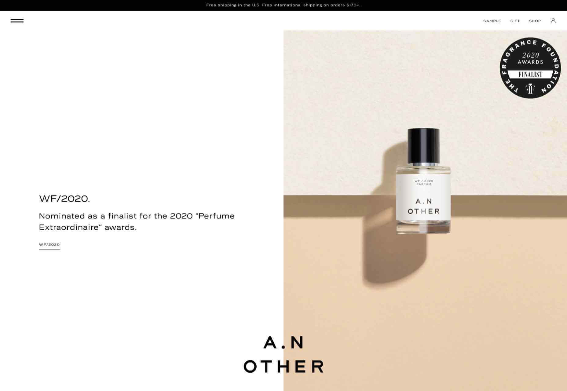
A N Other
Perfume brand A. N Other prioritises quality ingredients and materials, simplicity, craftsmanship, and the environment. Its website captures this perfectly, and invokes a sense of luxury as the result.
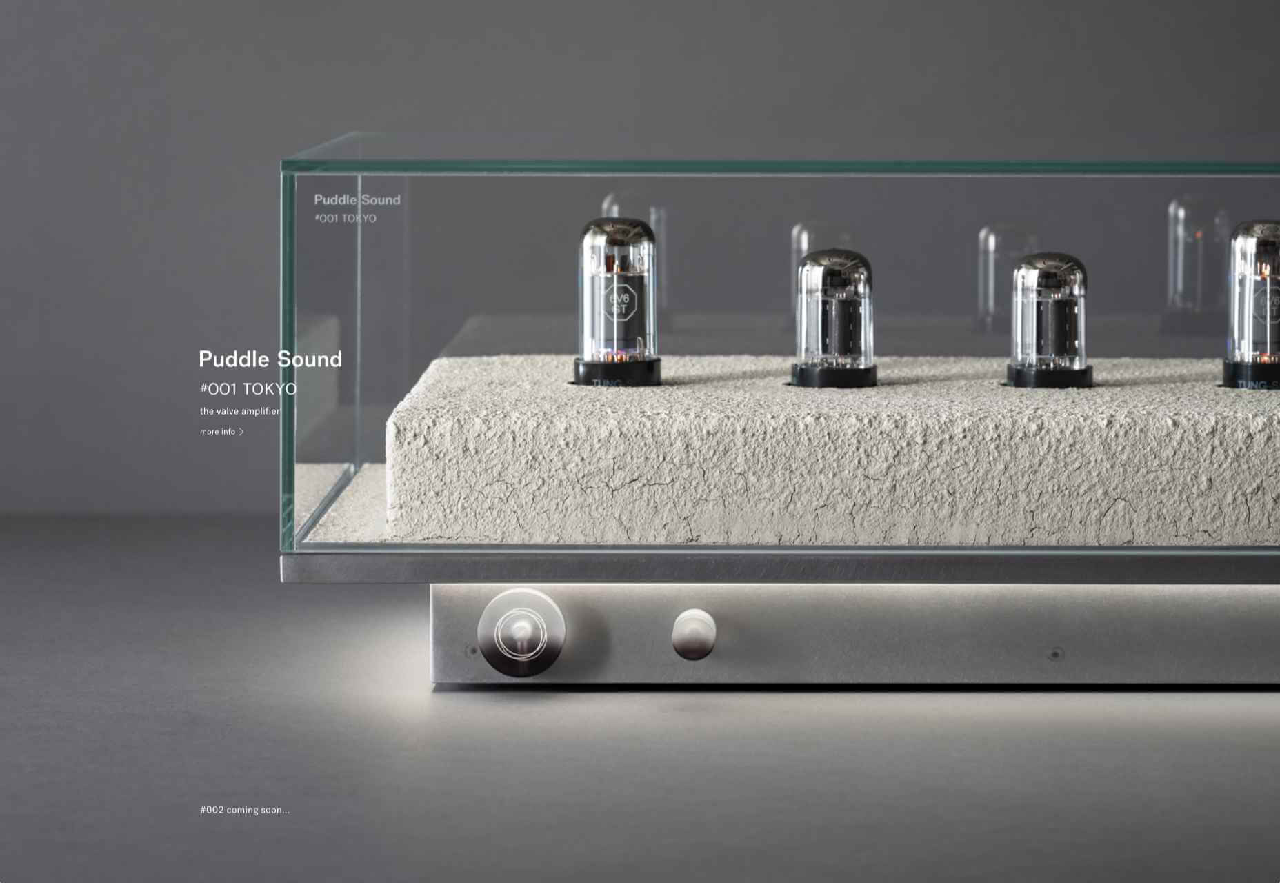
Puddle Sound
Puddle is an architectural and interior design company, who also do product and furniture design. For a Tokyo hotel project they created a vacuum tube amplifier, that is the subject of this site. It is as simple as can be with only the barest essential information, and with all attention focused on the product shots.
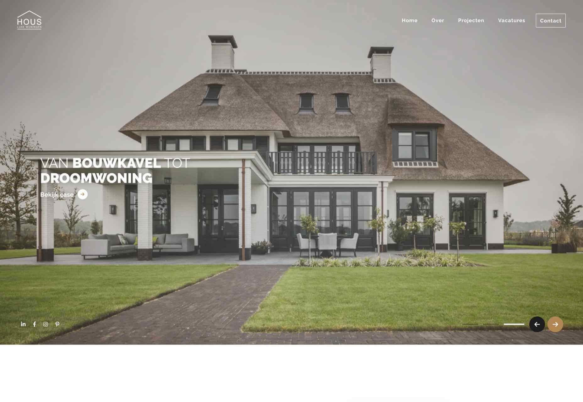
Hous
Hous Luxe Woningen are a Dutch company who build luxury homes. The high quality images, muted color scheme and generous use of white space in its website reflects this sense of luxury perfectly.
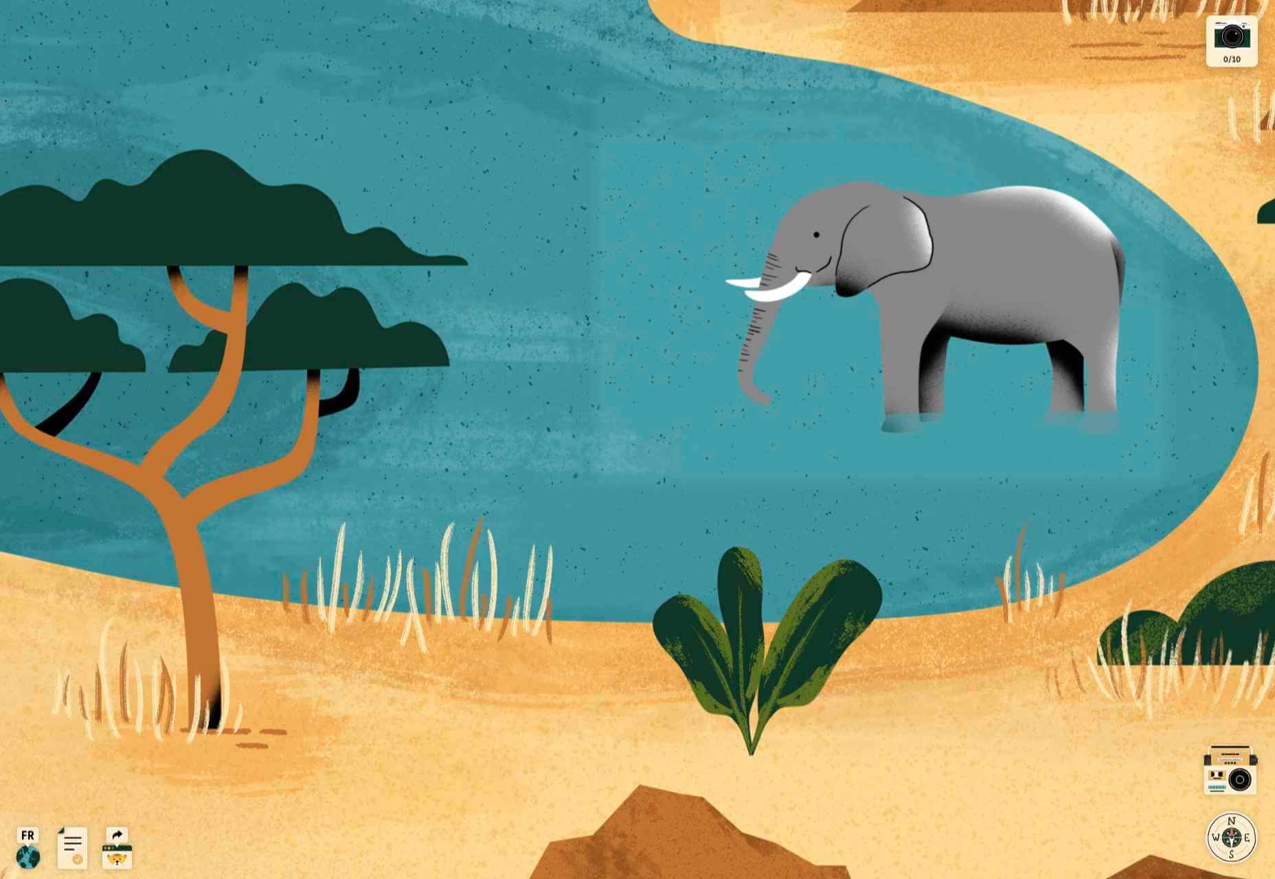
Who Cares?
Who Cares? is an interactive game designed to raise public awareness of endangered animal species. The illustration style is very pleasing, and there are some lovely little details in the animation and sound.
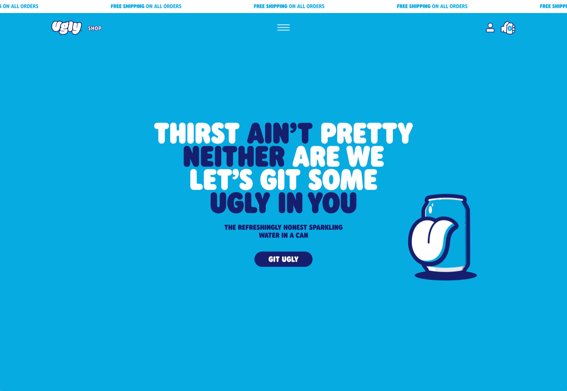
Ugly
This site for sparkling water company Ugly, uses bold, cartoonish typography and illustrated characters to add a lot of character to, well, water.
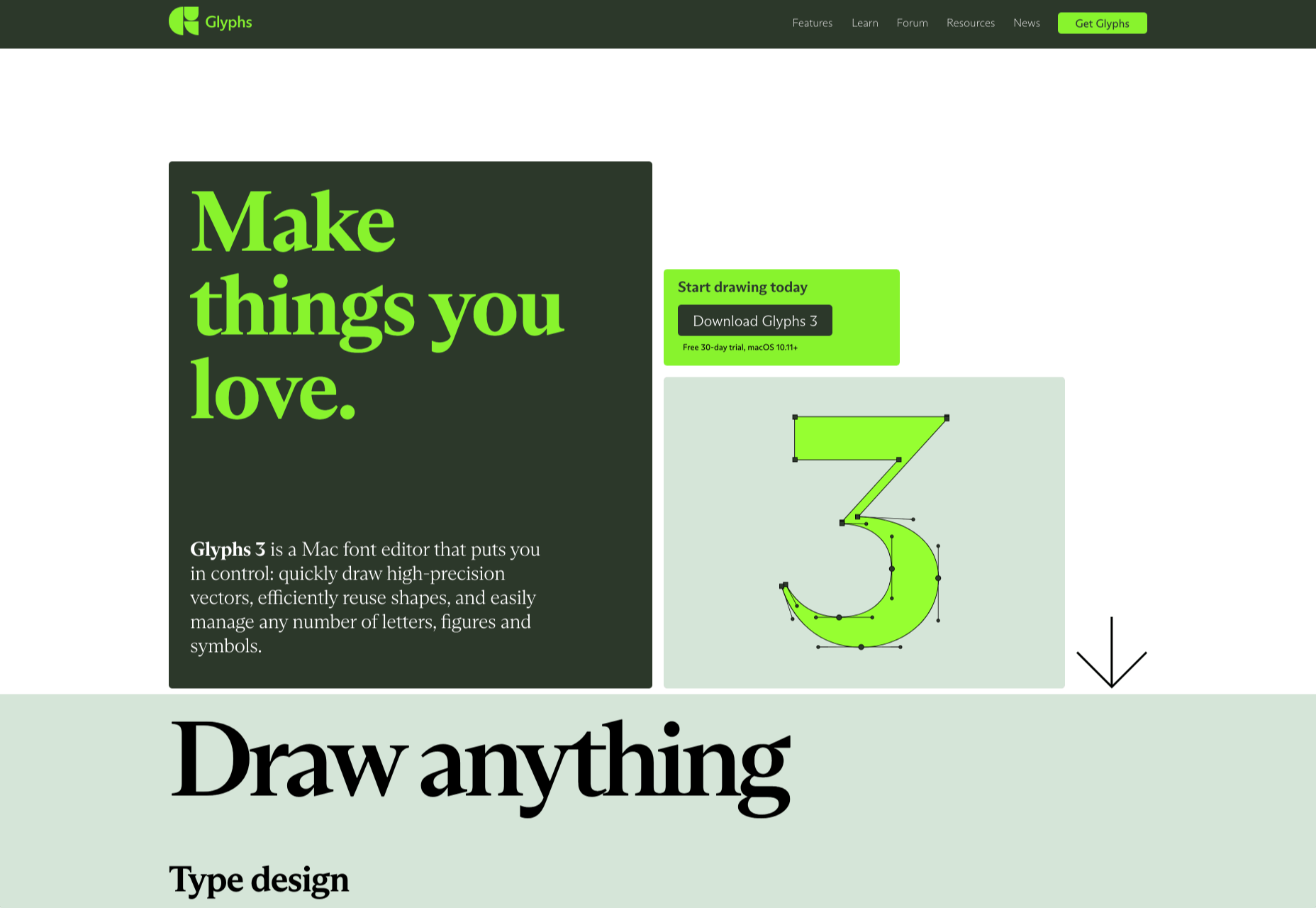
Glyphs
Glyphs font editor version 3 was released on 16th November. The accompanying site has a fresh feel, mainly due to its striking color scheme. The on scroll animation showcasing variable fonts is a nice touch.
Ruler Agency
Ruler Digital Agency uses color only in the images of work on its own site. Everything else is grayscale, even the images, which can be a really effective technique when it is used well, as it is here.
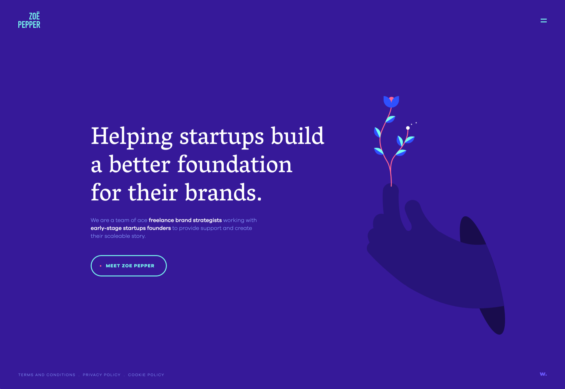
Zoë Pepper
Zoë Pepper is a collective of freelance brand strategists who work with early stage startups. The site is minimal without feeling empty, and utilises quirky illustration and scrolling animation to good effect.
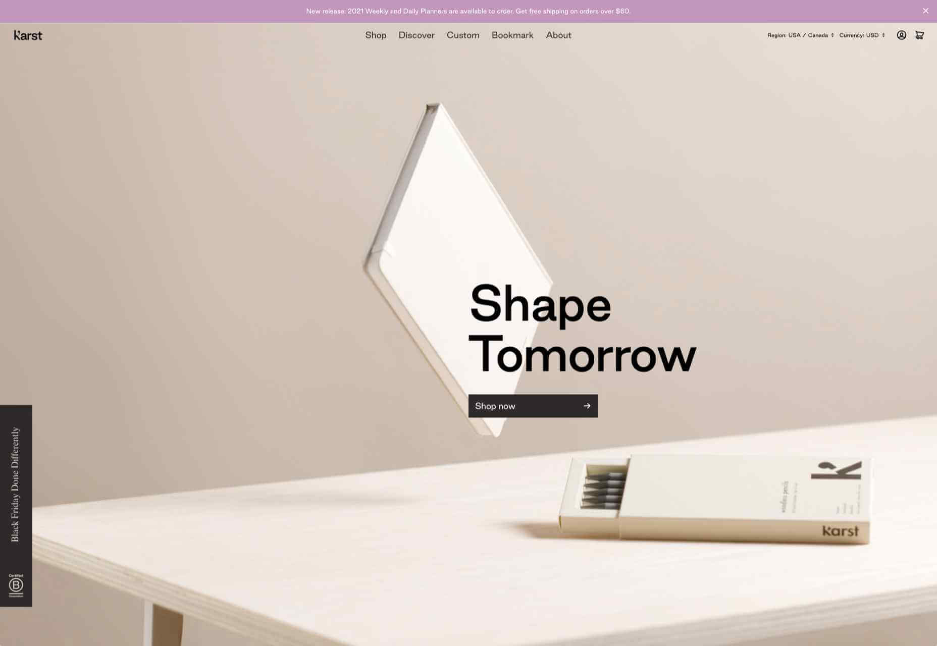
Karst
Karst make notebooks using paper made from stone, and woodless pencils. Its site has a simple, clean feel with a muted, neutral color scheme that complements the colors of its notebook covers.
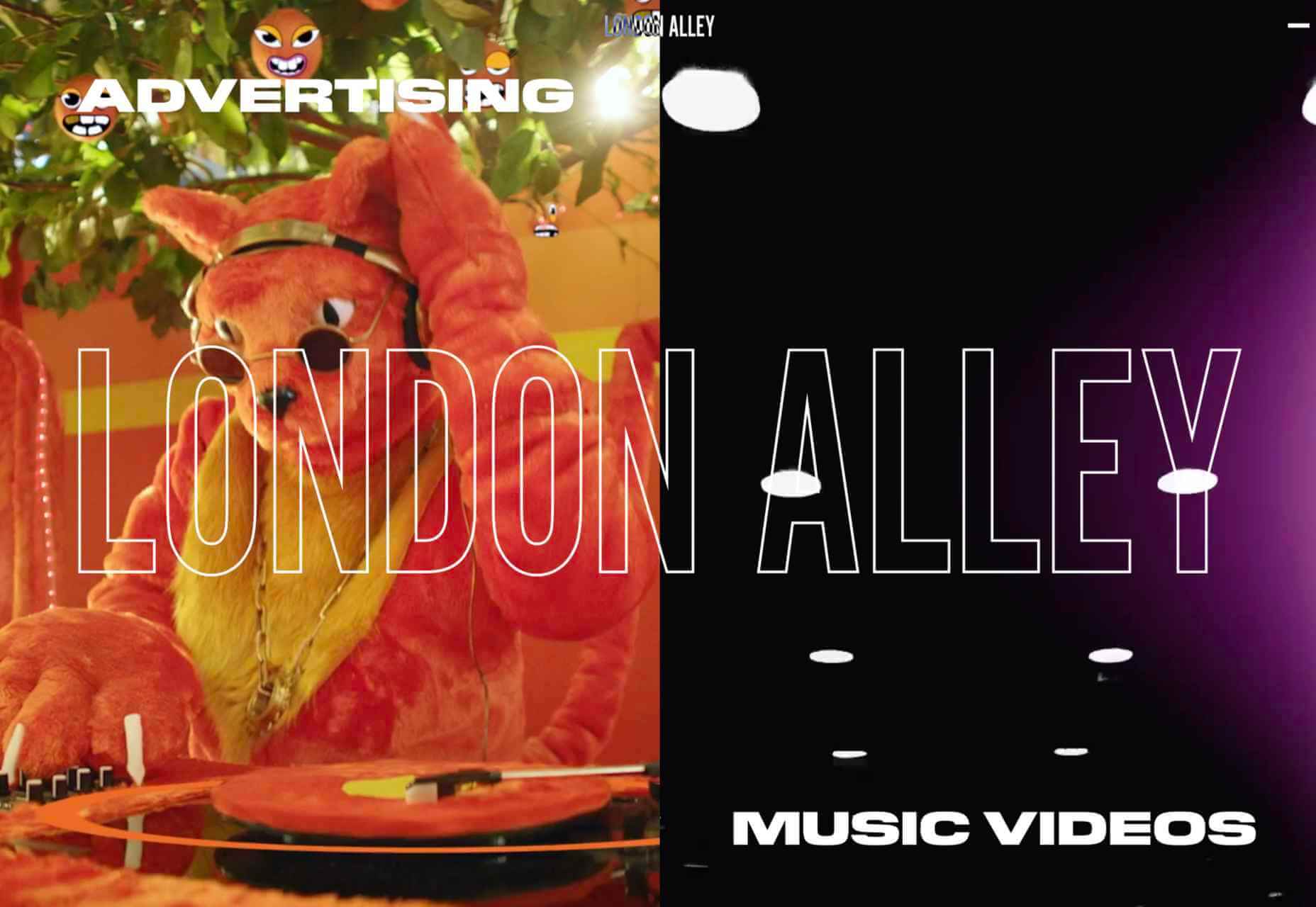
London Alley
London Alley is a production company who concentrate on music videos and advertising. Its site is simple and striking with plenty of video, and effective use of split screen.
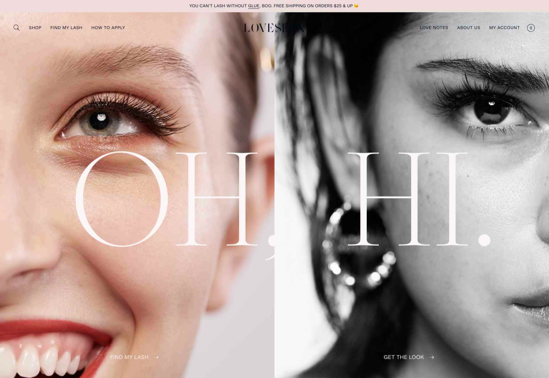
LoveSeen
LoveSeen makes false eyelashes, and nothing else. The site has a fun, inclusive feel — more girl(and boy)friends together than glossy, high fashion magazine. It’s appealing and persuasive.
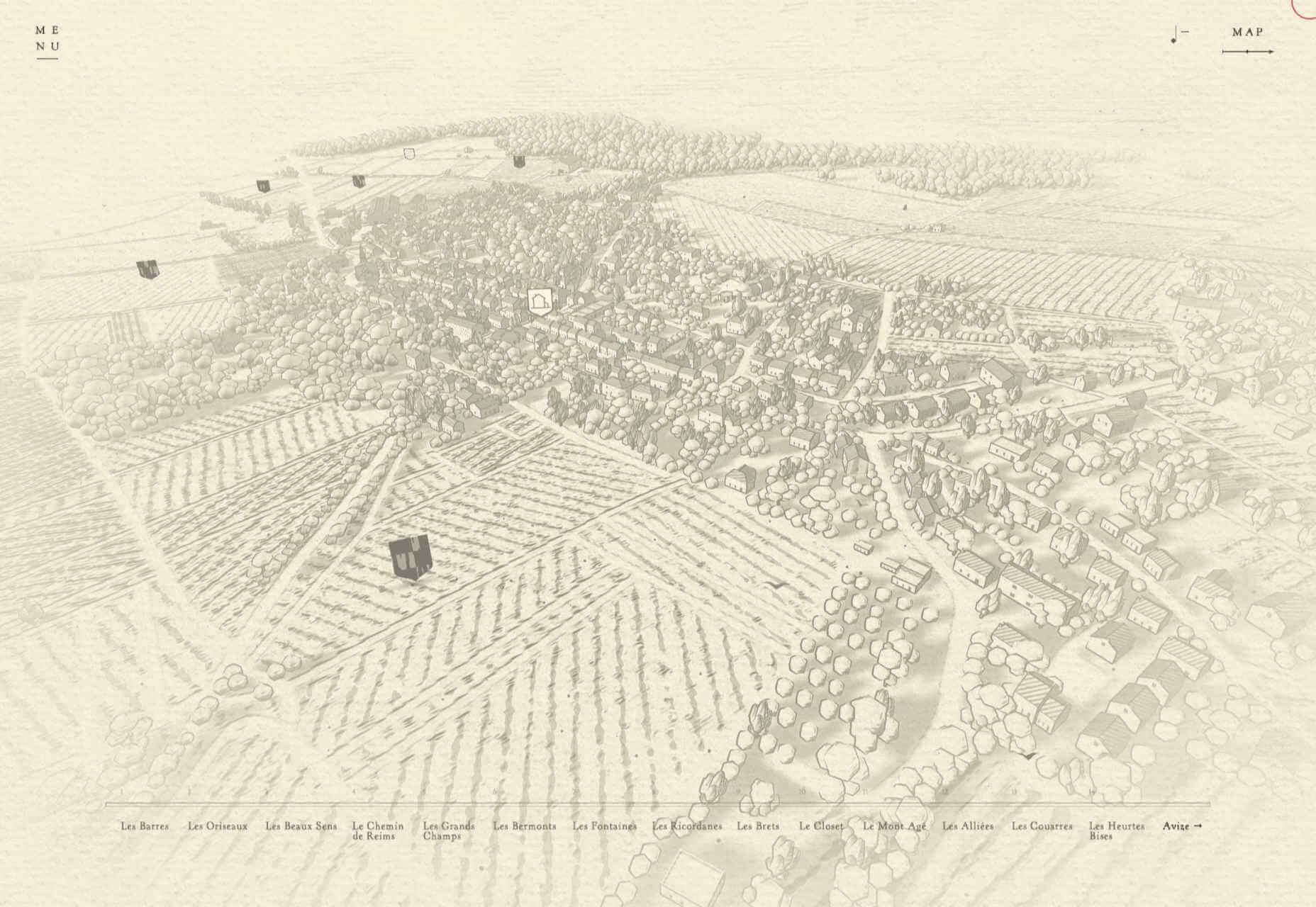
Chartogne-Taillet
This site for wine-growers Chartogne-Taillet uses illustration and an animated, ‘hand’ drawn map to create a sense of heritage, appropriate for a family with a long history of making wine in the Champagne region. It is reminiscent of a label on a good bottle of wine.
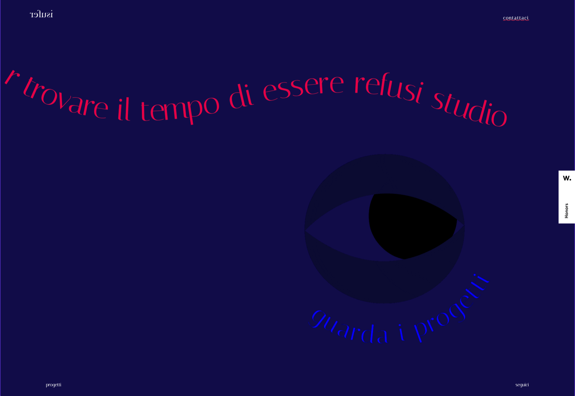
Refusi Studio
Refusi Studio is a design agency from Italy. This portfolio site is simple, with strong colors and big, statement typography. And a giant cartoon eye.
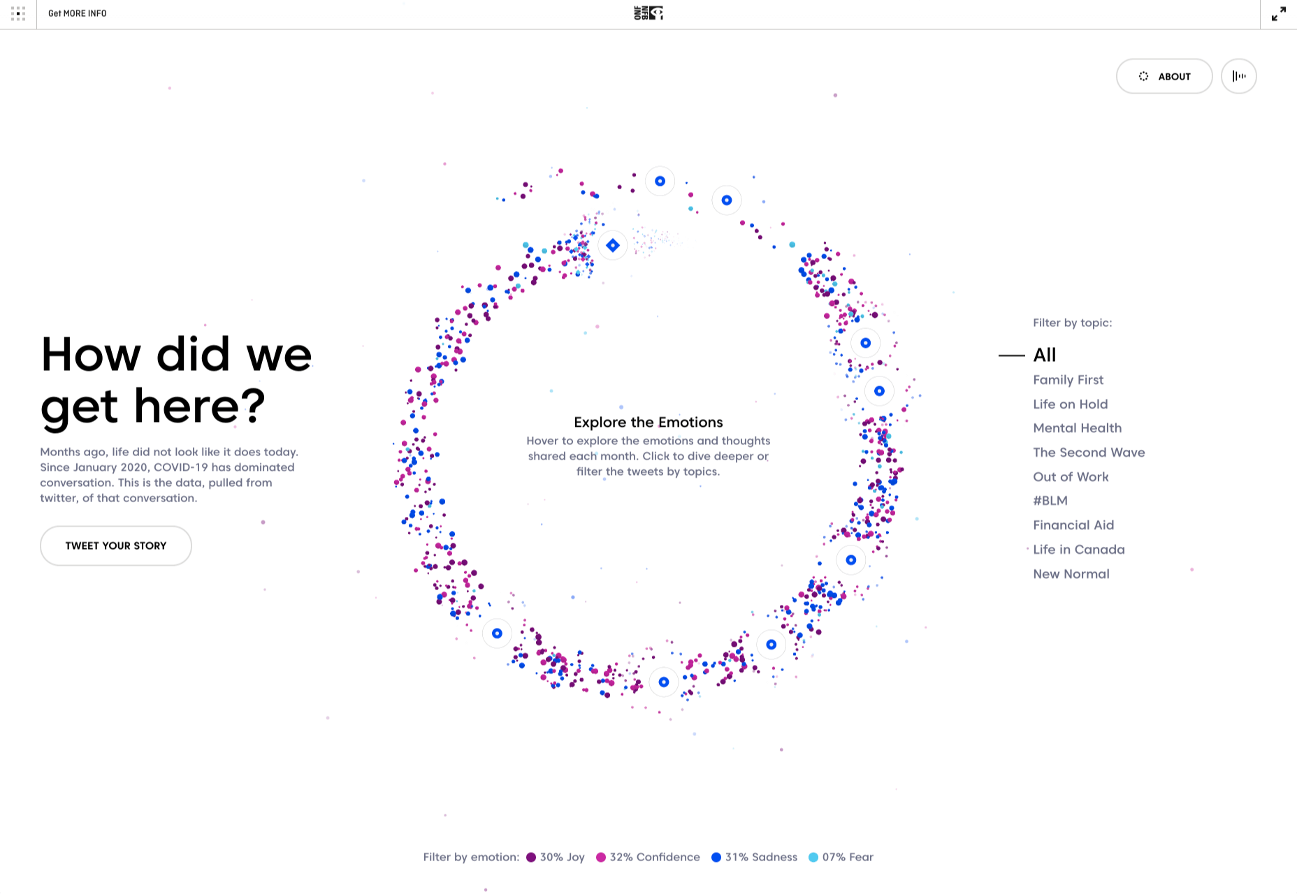
Yesterday, Today, Tomorrow
Yesterday, Today, Tomorrow is an interactive project from the National Film Board of Canada. It uses tweets to trace emotional ‘waves’ throughout the Covid-19 pandemic.
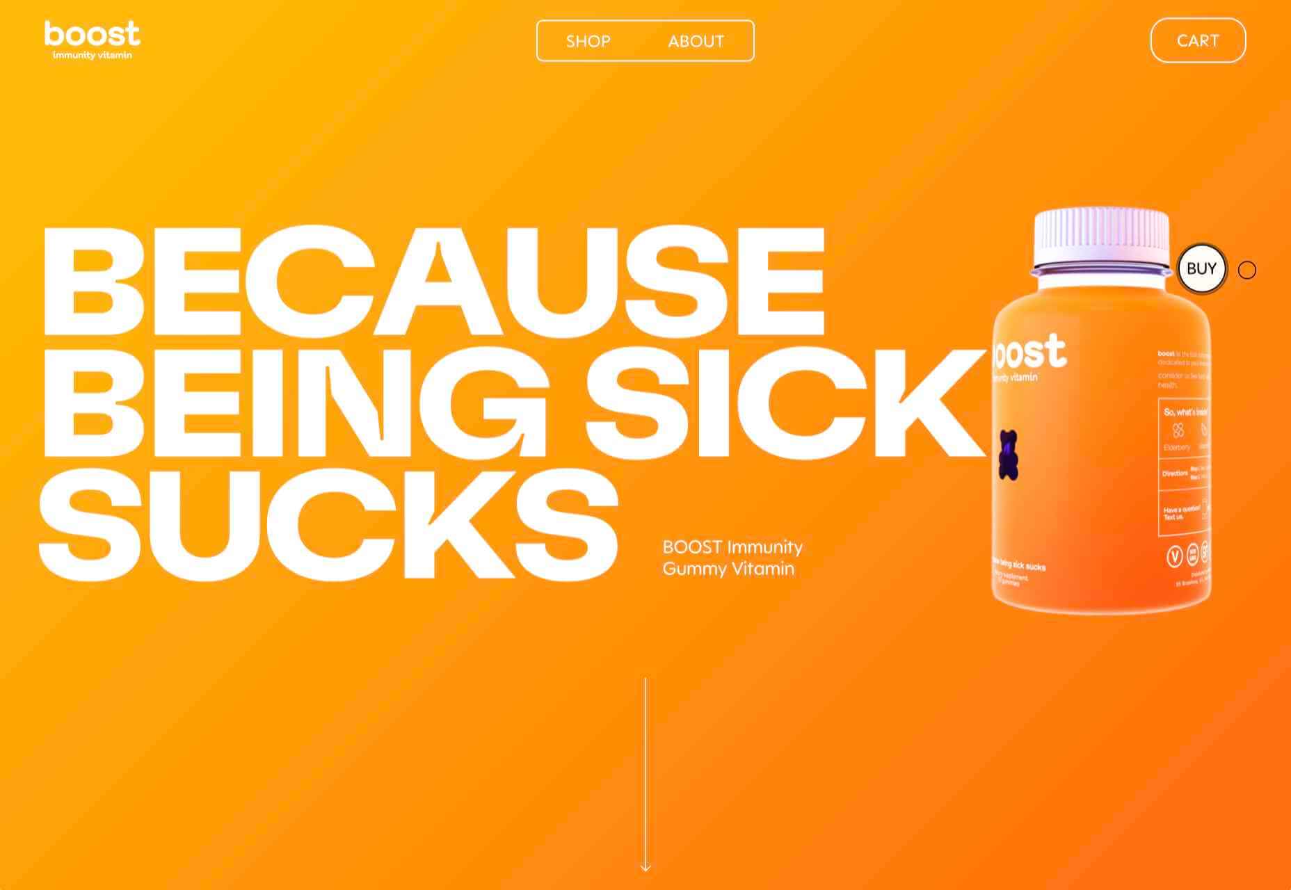
Boost
Boost is a gummy (chew) vitamin supplement for the immune system. Big type, big graphics and lots of orange and purple — the colors associated with vitamin C and antioxidants — make vitamins cool.
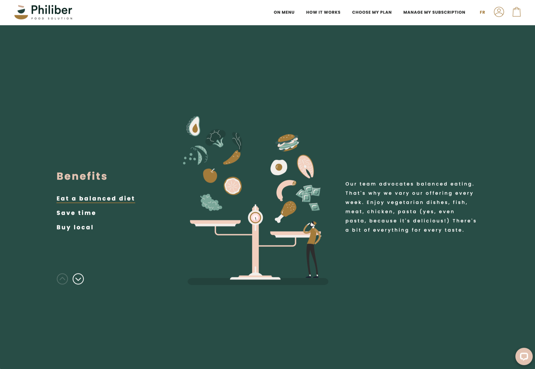
Philiber
Philiber is a meal delivery subscription service, available in urban centers in Quebec. The site is clean and modern, with a comforting color scheme and a nice mix of photography and flat style illustrations.
Starting November 20th and going until December 2nd, TemplateMonster is slashing prices on all retail products and one subscription web development kits by 70%. TemplateMonster’s vast digital marketplace has always attracted web designers, web developers, marketing specialists, and other creatives with a huge collection of products available for all purposes and topics. Take advantage of this unique opportunity to save big on preferred premium web designs!
70% OFF on Retail Items
As part of the promotion this year, there will be a 70% discount to all retail items. This will include web themes, graphics, audio, and video files. This even includes our best-selling products and new releases! No promo codes are needed to claim these offers and prices are already cut. Simply pick the items you would like and proceed to checkout.
40% OFF on ONE Membership
ONE Membership features an impressive collection of web themes, plugins, graphics, and other premium-quality web design assets that you can purchase a yearly or even lifetime subscription for.
As part of the sale, you can get the following discounts:
Yearly subscription – 30% off – get for $159 instead of $229
Lifetime subscription – 41% – $499 instead of the regular price of $849
Creative subscription – 22% off – $69 instead of $89
All discounts are valid until December 2. Save up to 40% on TemplateMonster’s special offers. Go ahead and see what’s on sale. It’s time to save big!
Every week users submit a lot of interesting stuff on our sister site Webdesigner News, highlighting great content from around the web that can be of interest to web designers.
The best way to keep track of all the great stories and news being posted is simply to check out the Webdesigner News site, however, in case you missed some here’s a quick and useful compilation of the most popular designer news that we curated from the past week.
15 Best Illustration Tools in 2020
Slidepage 1.0 – Create Engaging and Swipeable Stories-on-the-Web, for Free
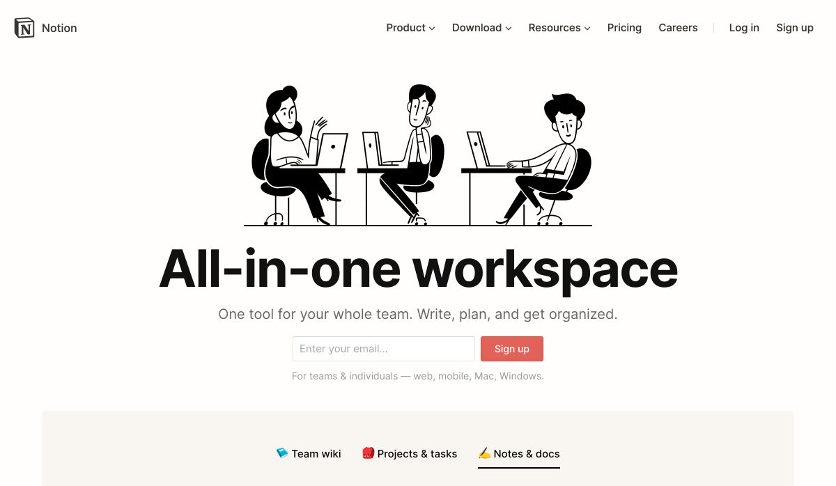
Notion Timeline – More than Gantt, for all your Projects
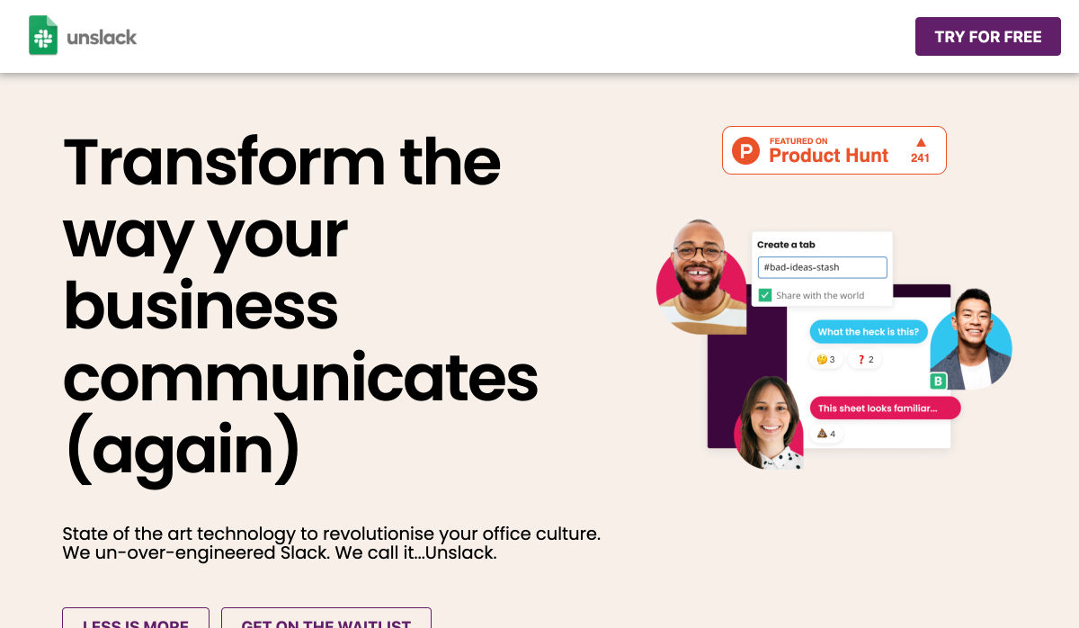
Unslack
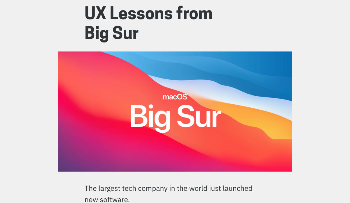
UX Lessons from Big Sur
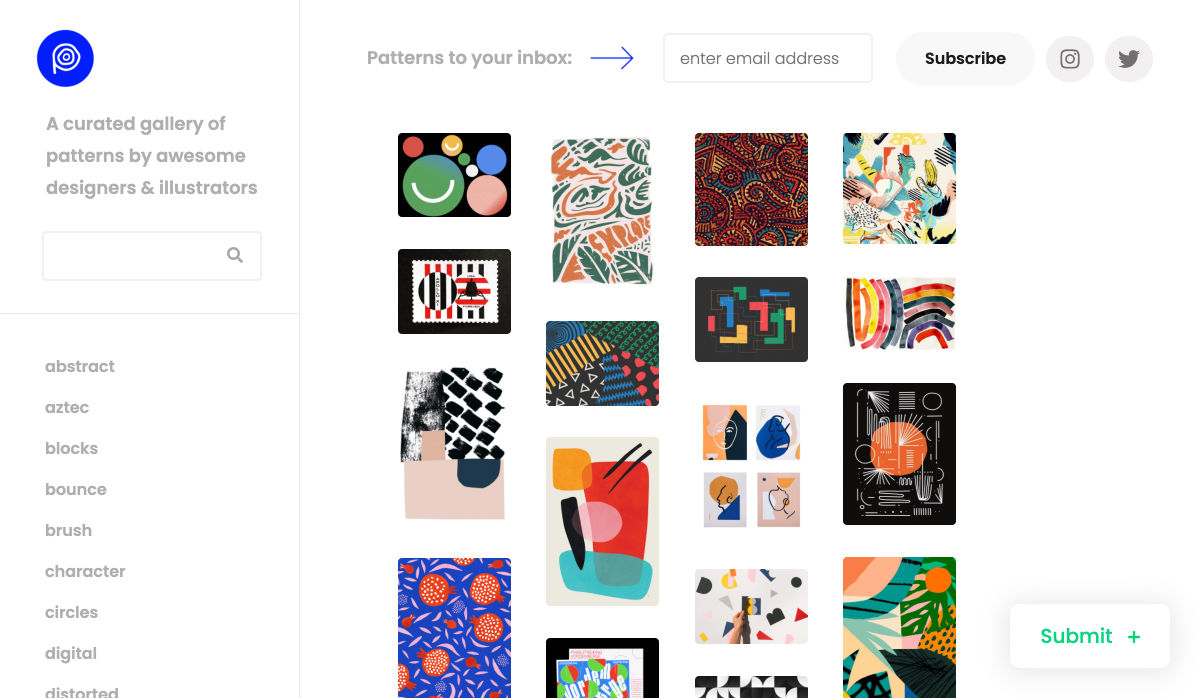
Pattern Collect
Apple Silicon M1 Chips and Docker
Difference Between UI and UX Design
How Many WordPress Plugins Should You Install?
5 Things I Wish I’d Known Before Starting a Design System at Spotify
8 Pure CSS Games You Can Play in your Browser
We Can do Better than DuckDuckGo
Fulljar – Simple and Privacy Focused Analytics
Accessibility in User Experience: How to Include People with Disabilities
9 Common WordPress Myths Debunked and Explained
Impressive Pure CSS Drawings
I Took 21 Online Courses, Here’s What I Learned
User Experience: Insights into Consistency in Design
How to Use Emotion to Make your Brand’s Content More Compelling
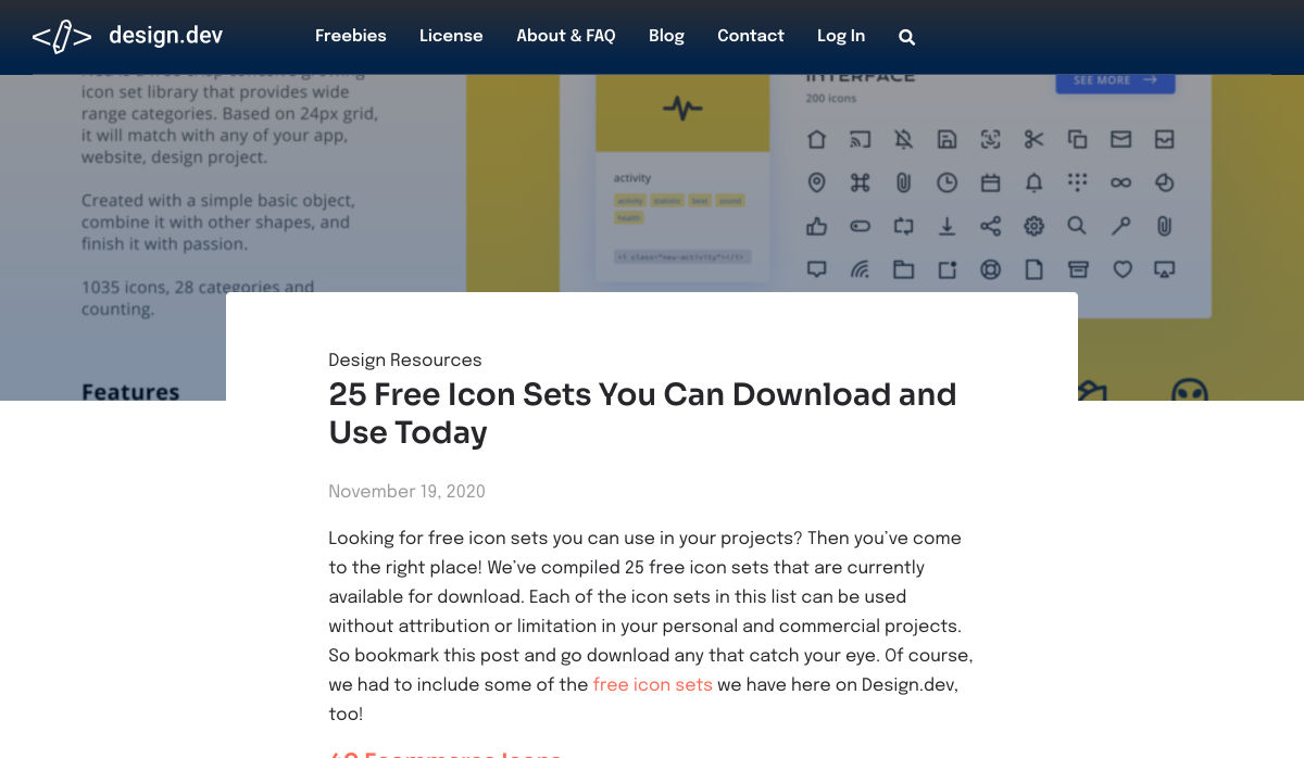
25 Free Icon Sets You Can Download and Use Today
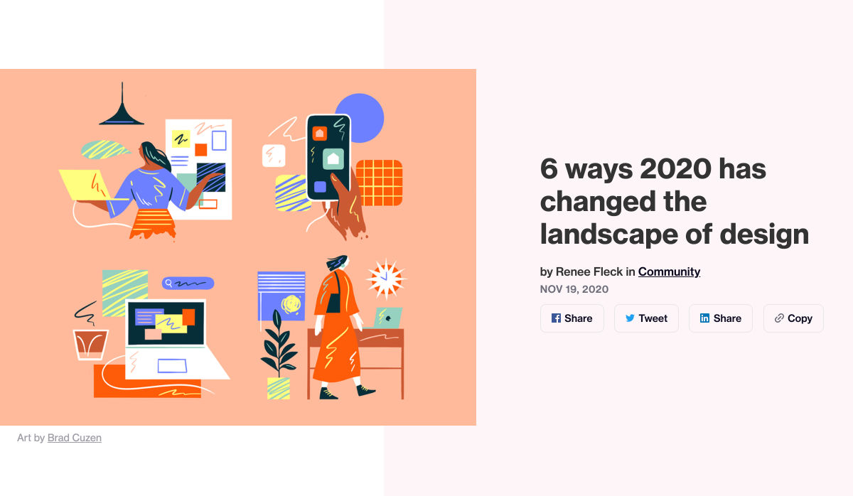
6 Ways 2020 has Changed the Landscape of Design
25 Inspirational Quotes for Web Designers
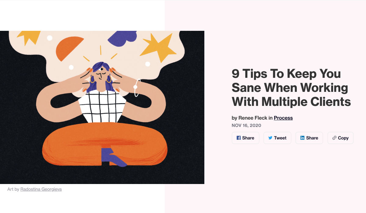
9 Tips to Keep You Sane When Working with Multiple Clients
Write Code like You Write a Recipe
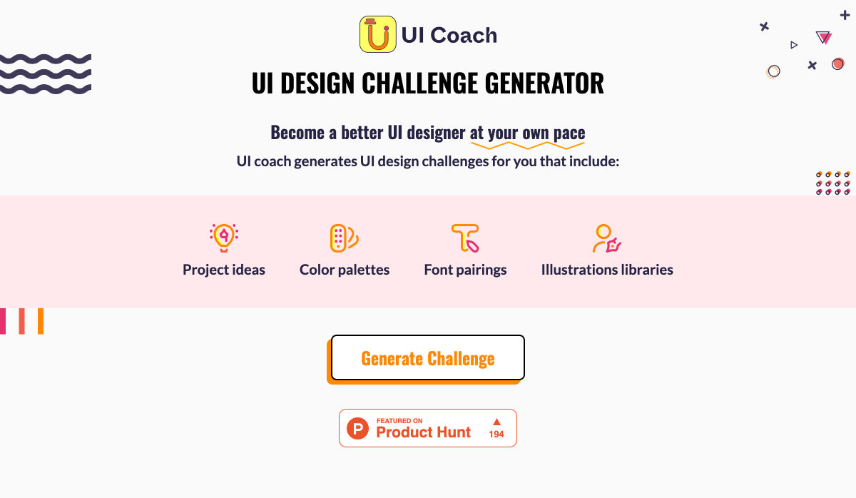
UI Coach – UI Design Challenge Generator
Want more? No problem! Keep track of top design news from around the web with Webdesigner News.


