The other day, Florens Verschelde asked about defining dark mode styles for both a class and a media query, without repeat CSS custom properties declarations. I had run into this issue in the past but hadn’t come up with a proper solution.
What we want is to avoid redefining—and thus repeating—custom properties when switching between light and dark modes. That’s the goal of DRY (Don’t Repeat Yourself) programming, but the typical pattern for switching themes is usually something like this:
See what I mean? Sure, it might not seem like a big deal in an abbreviated example like this, but imagine juggling dozens of custom properties at a time—that’s a lot of duplication!
Then I remembered Lea Verou’s trick using --var: ;, and while it didn’t hit me at first, I found a way to make it work: not with var(--light-value, var(--dark-value)) or some nested combination like that, but by using both side by side!
Certainly, someone smarter must have discovered this before me, but I haven‘t heard of leveraging (or rather abusing) CSS custom properties to achieve this. Without further ado, here’s the idea:
If the --light value is set to initial, the fallback will be used (orchid), which means --dark should be set to a whitespace character (which is a valid value), making the final computed value look like this:
--color: orchid ; /* Note the additional whitespace */
Conversely, if --light is set to a whitespace and --dark to initial, we end up with a computed value of:
--color: rebeccapurple; /* Again, note the whitespace */
Now, this is great but we do need to define the --light and --dark custom properties, based on the context. The user can have a system preference in place (either light or dark), or can have toggled the website‘s theme with some UI element. Just like Florens‘s example, we’ll define these three cases, with some minor readability enhancement that Lea proposed using “on” and “off” constants to make it easier to understand at a glance:
:root {
  /* Thanks Lea Verou! */
  --ON: initial;
  --OFF: ;
}

/* Light theme is on by default */
.theme-default,
.theme-light {
  --light: var(--ON);
  --dark: var(--OFF);
}

/* Dark theme is off by default */
.theme-dark {
  --light: var(--OFF);
  --dark: var(--ON);
}

/* If user prefers dark, then that's what they'll get */
@media (prefers-color-scheme: dark) {
  .theme-default {
    --light: var(--OFF);
    --dark: var(--ON);
  }
}
We can then set up all of our theme variables in a single declaration, without repetition. In this example, the theme-* classes are set to the html element, so we can use :root as a selector, as many people like to do, but you could set them on the body, if the cascading nature of the custom properties makes more sense that way:
And to use them, we use var() with built-in fallbacks, because we like being careful:
body {
  color: var(--text, navy);
  background-color: var(--bg, lightgray);
}
Hopefully you’re already starting to see the benefit here. Instead of defining and switching armloads of custom properties, we’re dealing with two and setting all the others just once on :root. That’s a huge improvement from where we started.
Even DRYer with pre-processors
If you were to show me this following line of code out of context, I’d certainly be confused because a color is a single value, not two!
--text: var(--light, black) var(--dark, white);
That’s why I prefer to abstract things a bit. We can set up a function with our favorite pre-processor, which is Sass in my case. If we keep our code above defining our --light and --dark values in various contexts, we need to make a change only on the actual custom property declaration. Let’s create a light-dark function that returns the CSS syntax for us:
You’ll notice there are interpolation delimiters #{ … } around the function call. Without these, Sass would output the code as is (like a vanilla CSS function). You can play around with various implementations of this but the syntax complexity is up to your tastes.
How’s that for a much DRYer codebase?
More than one theme? No problem!
You could potentially do this with more than two modes. The more themes you add, the more complex it becomes to manage, but the point is that it is possible! We add another theme set of ON or OFF variables, and set an extra variable in the list of values.
.theme-pride {
  --light: var(--OFF);
  --dark: var(--OFF);
  --pride: var(--ON);
}

:root {
  --text:
    var(--light, black)
    var(--dark, white)
    var(--pride, #ff8c00)
  ; /* Line breaks are absolutely valid */

  /* Other variables to declare… */
}
Is this hacky? Yes, it absolutely is. Is this a great use case for potential, not-yet-existing CSS booleans? Well, that’s the dream.
How about you? Is this something you’ve figured out with a different approach? Share it in the comments!
A wonderful collection of little layout-related CSS snippets from Stephanie Eckles that serves both as a quick reference and a reminder of how straightforward and powerful CSS has become.
Random things to note!
The resizeable containers aren’t some JavaScript library. They are just
s with resize: horizontal; and overflow: auto; (although there is a nice little lib for that that displays current width output).
Each demo can be opened on CodePen, which is the prefill API at work.
CSS custom properties are tastefully sprinkled throughout in a way that makes it more understandable instead of less understandable.
The dark mode doesn’t go super duper dark, but fairly dark blues and purples. That’s a good reminder that dark mode isn’t gray/black mode. It remembers your setting, but does have flash-of-light-mode, which is the boss-mode problem with color preferences. I think you need server-side tech to really get it perfect.
There are many reasons you might be wanting to improve your design skills this year. Perhaps you have extra time on your hands and want to put it to good use. Or maybe you’re new to web design and finding that there’s a lot you still don’t know how to do. It could also be that you recognize that the web is changing, and your skills could use some refreshing to keep up.
Whatever the reason, there are many ways to level up your web design skills in 2021. Here are 12 ideas to get you started:
Tip 1: Niche Down If You Haven’t Already
Jack-of-all-trades designers might be able to say “yes” to everyone. However, they’re going to be stretched very thin as they attempt to strengthen every skill needed to keep up with demand.
It’s much easier to become a trusted designer and to improve your skills if you have a smaller and more specific skill set to develop.
Just keep in mind that niching down doesn’t necessarily mean focusing on a particular industry. For instance, you might choose to be a UX designer instead of a web designer. Or you might specialize in designing ecommerce websites instead of monetized blogs. Just find something that you’re passionate about and will be good at doing, and zero-in on the skills needed for it.
Tip 2: Play Around in the Sandbox
Local development environments are useful for staging websites, doing redesigns, and testing updates safely away from live sites. But you can also use them for experimenting with new design techniques, trends, templates, plugins, and more.
Take a website you like — something you’ve looked at in awe and couldn’t imagine ever building on your own. Then, put yourself to the test. See if you can recreate it in your sandbox.
Don’t be hard on yourself if you don’t figure it out right away. Consult your resources and give yourself time to make sense of what’s going on and implement it with the available skills and tools.
Tip 3: Redesign One of Your First Projects
There’s always a clear evolution in a designer’s skill set, from the day they begin designing to the present day. And that’s a good thing. If your work doesn’t improve or change with time, then you’re going to have a lot of catching up to do when the stagnation begins to hurt your business.
Want to see how much progress you’ve made so far? Revisit one of your first projects and look at it with fresh eyes. I bet you’ll see a big change in how you design today from how you designed that site then.
Now, ask yourself what you would do differently. And then, go to your sandbox and do the redesign.
Tip 4: Work on a Passion Project
A friend of mine is taking a UX design course and needed some users to run through a prototype he created for the class. He could create anything he wanted, so he designed an app related to his other love: Music.
While he could’ve easily thrown together some carbon copy of Spotify or SoundCloud, he came up with a completely new concept. And it was really impressive, to the point where I urged him to put it into production and see if he could list it in the app stores.
I think it’s when we’re really passionate about something that we’re willing to push past our limits. So, carve out some time to tackle that passion project you’ve been toying around with and see where it takes you.
Tip 5: Share Your Designs on Dribbble and Ask for Feedback
One of the reasons UX designers do user testing is how valuable users’ raw input is. While it would be nice to think that design is a completely subjective matter, that isn’t really the case when usability becomes compromised due to design choices.
Understanding what users like and dislike is an important part of taking your design skills to the next level. And a good way to do that is to share your designs on Dribbble.
I’m a huge fan of automation and shortcuts powering things behind the scenes in business.
After all, one of the reasons you become a web designer is so you can design, right? When you’re bogged down with administrative and logistical tasks, that’s time spent away from doing what you enjoy.
One way in which you can streamline your backend processes is by putting together a design toolbox. Your preferred CMS. Flexible templates or apps you use from project to project. Website testing tools. And so on.
As you do this, it’ll force you to examine how you build websites. Are you really working as efficiently as possible? Are there newer apps or systems that’ll help you design better sites? And as you improve your design toolbox, you’ll improve your design skills.
Tip 7: Subscribe to Your Favorite Blogs
I have a hard time recommending this one, only because I’m reluctant to sign up for yet another newsletter. That said, I do see the value in subscribing to some blog newsletters as I don’t always remember to revisit their websites and check out the latest content.
What I’d suggest you do is pick one or two design blogs that have a good variety of content and publish regularly. And then pick one small business or freelance blog.
WebdesignerDepot, of course, is a good one to start with as it comes at a good frequency, recommends great reads from all around the web, and is fluff-free:
I’d also recommend signing up for one that’s focused on your niche as well as one for business.
As a freelancer, I’d vote for the Freelancers’ Union newsletter. There’s always something timely and useful in there.
Tip 8: Listen to a Podcast
I just adopted a second dog, so I’ve spent a lot more time on walks while house-training her. At first, I was stressed about it because it was time spent away from work. However, I started to fill that time with podcasts and found that it helped me work better for the rest of the day.
One reason is that I’ve been listening to work-related podcasts, which are always chock full of helpful tips. Another reason is that it gives my eyes a rest from looking at the screen so that when I come back 15 or so minutes later, I feel refreshed and ready to go.
There’s an overabundance of information online. If you want to brush up on CSS, there are hundreds of YouTube courses that cover it. If you want to learn how to use a new WordPress plugin, you’ll find dozens of great tutorials across various online course platforms, YouTube channels, and even people’s blogs.
There’s no need to go back to school to become a better designer. Here are five places where you’re bound to find free courses for web designers.
Tip 10: Read a Book on Design Principles or Theory
It’s easy to lose sight of design principles when your clients are clamoring for a website that will make them a lot of money, get them a lot of readers, and so on. Sure, you can design a UI and UX that works, but do you remember why the design choices you made are effective?
Choose a book — just one to start — that’ll help you reconnect with the roots of good web design. Not only will you get a good refresher on web design principles or design theory, but you might learn something brand new.
Here are some of my favorite books for web designers:
Now more than ever, finding a community of like-minded web designers, developers, or freelancers is important. It’s not just about having a group of people to vent to when clients drive you nuts (though that’s great, too).
It’s about finding a group that brings something new to the table and enriches your understanding of web design and what it means to be a web designer.
If you’re on Facebook or LinkedIn, start there. There are tons of web design and freelance groups that have productive discussions every day. If you prefer to meet up with local designers and developers, check out Meetup.
You may be surprised by how many groups there are and the kinds of meetups they have planned.
Tip 12: Attend a Virtual Conference
Did any of you attend a design conference last year? I did. I virtually attended Adobe MAX — from the comfort of my home, in my pajamas, for three days.
I scheduled my assignments around the sessions I wanted to attend and didn’t have to pick one over the other (i.e., “Do I make money or do I learn something new?”).
Some of the sessions showed us how to do more with Adobe’s tools, while some of them featured design and business leaders who shared personal insights on how to work more effectively. It was a great way to shake up my normal routine and to get a ton of information about the future of web design in a short period of time.
Which of These Tips Will You Use to Improve Your Design Skills?
Like I said before, there’s a lot you can do to improve your design skills. Just be careful not to overdo it.
Pick one or two things on this list to start with. If you have more time in your schedule and you’re excited about what you’ve learned so far, add a couple more.
Just take it slowly. Your brain will only be able to absorb so much at once. Plus, the last thing you want is to burn yourself out on skills training and not have the energy to complete your work.
We’ve covered the idea of hiding things in CSS many times here, the most recent post being Marko Ilic’s “Comparing Various Ways to Hide Things in CSS” which did a nice job of comparing different techniques which you’d use in different situations. Hugo “Kitty” Giraudel has done something similar in “Hiding Content Responsibly” which looks at 10 methods—and even those, you could say, aren’t totally comprehensive.
Does this mean CSS is messy and incomprehensible? Nah. I feel like all the methods are logical, have good use cases, and result in good outcomes. Allow me to do a have a pretend conversation walking through my thought process here.
I need to hide this thing completely. For everyone.
No problem, that’s what the aria-hidden attribute is for.
I need to hide this thing, but only hide it for screen readers, not visually. (For example, an icon that has no additional meaning for screen readers, as there is an accessible label nearby.)
No problem, use display: none;.
I need to hide this thing, but only visually, not for screen readers. (For example, the contents of non-active tabs.)
No problem, use a .sr-only class. That leaves it accessible but hides it visually until you remove that class.
Oops, I actually want to hide this thing visually, but I still want it to take up physical space, not collapse. (For example, say a button has a loading spinner icon that is only needed when performing an action. The size of the button should factor in the size of that icon all the time, not just when the spinner is visible. That way, there’s no layout shifting when that icon comes and goes.)
No problem, use transform: scale(0) which will visually collapse it, but the original space will remain, and will leave it accessible to screen readers.
Oh nice, I could transition the transform, too, I suppose. But actually, that transition doesn’t fit my site well. I just want something I can fade out and fade in.
The opacity property is transitional, so transition that between 0 and 1 for fades. The good news is that visibility is also transitional. When fading out, use visibility: hidden, and when fading in, use visibility: visible to hide and unhide the thing from screen readers.
That’s not entirely comprehensive, but I find that covers 95% of hiding cases.
React component tests should be interesting, straightforward, and easy for a human to build and maintain.
Yet, the current state of the testing library ecosystem is not sufficient to motivate developers to write consistent JavaScript tests for React components. Testing React components—and the DOM in general—often require some kind of higher-level wrapper around popular testing frameworks like Jest or Mocha.
Here’s the problem
Writing component tests with the tools available today is boring, and even when you get to writing them, it takes lots of hassle. Expressing test logic following a jQuery-like style (chaining) is confusing. It doesn’t jive with how React components are usually built.
The Enzyme code below is readable, but a bit too bulky because it uses too many words to express something that is ultimately simple markup.
What if you need to test heavier components? While the syntax is still bearable, it doesn’t help your brain grasp the structure and logic. Reading and writing several tests like this is bound to wear you out—it certainly wears me out. That’s because React components follow certain principles to generate HTML code at the end. Tests that express the same principles, on the other hand, are not straightforward. Simply using JavaScript chaining won’t help in the long run.
There are two main issues with testing in React:
How to even approach writing tests specifically for components
How to avoid all the unnecessary noise
Let’s further expand those before jumping into the real examples.
Approaching React component tests
A simple React component may look like this:
function Welcome(props) {
  return <h1>Hello, {props.name}</h1>;
}
This is a function that accepts a props object and returns a DOM node using the JSX syntax.
Since a component can be represented by a function, it is all about testing functions. We need to account for arguments and how they influence the returned result. Applying that logic to React components, the focus in the tests should be on setting up props and testing for the DOM rendered in the UI. Since user actions like mouseover, click, typing, etc. may also lead to UI changes, you will need to find a way to programmatically trigger those too.
Hiding the unnecessary noise in tests
Tests require a certain level of readability achieved by both slimming the wording down and following a certain pattern to describe each scenario.
Component tests flow through three phases:
Preparation (setup): The component props are prepared.
Render (action): The component needs to render its DOM to the UI before either triggering any actions on it or testing for certain texts and attributes. That’s when actions can be programmatically triggered.
Validation (verify): The expectations are set, verifying certain side effects over the component markup.
Here is an example:
it("should click a large button", () => {
  // 1️⃣ Preparation
  // Prepare component props
  props.size = "large";

  // 2️⃣ Render
  // Render the Button's DOM and click on it
  const component = mount(<Button {...props}>Send</Button>);
  simulate(component, { type: "click" });

  // 3️⃣ Validation
  // Verify a .clicked class is added
  expect(component, "to have class", "clicked");
});
For simpler tests, the phases can merge:
it("should render with a custom text", () => {
  // Mixing up all three phases into a single expect() call
  expect(
    // 1️⃣ Preparation
    <Button>Send</Button>,
    // 2️⃣ Render
    "when mounted",
    // 3️⃣ Validation
    "to have text",
    "Send"
  );
});
Writing component tests today
Those two examples above look logical but are anything but trivial. Most of the testing tools do not provide such a level of abstraction, so we have to handle it ourselves. Perhaps the code below looks more familiar.
It does look much better. Less code, obvious flow, and more DOM instead of JavaScript. This is not a fiction test, but something you can achieve with UnexpectedJS today.
The following section is a deep dive into testing React components without getting too deep into UnexpectedJS. Its documentation more than does the job. Instead, we’ll focus on usage, examples, and possibilities.
Writing React Tests with UnexpectedJS
UnexpectedJS is an extensible assertion toolkit compatible with all test frameworks. It can be extended with plugins, and some of those plugins are used in the test project below. Probably the best thing about this library is the handy syntax it provides to describe component test cases in React.
The example: A Profile Card component
The subject of the tests is a Profile card component.
And here is the full component code of ProfileCard.js:
We will work with the component’s desktop version. You can read more about device-driven code split in React but note that testing mobile components is still pretty straightforward.
Setting up the example project
Not all tests are covered in this article, but we will certainly look at the most interesting ones. If you want to follow along, view this component in the browser, or check all its tests, go ahead and clone the GitHub repo.
## 1. Clone the project:
git clone git@github.com:moubi/profile-card.git

## 2. Navigate to the project folder:
cd profile-card

## 3. Install the dependencies:
yarn

## 4. Start and view the component in the browser:
yarn start

## 5. Run the tests:
yarn test
Here’s how the component and UnexpectedJS tests are structured once the project has spun up:
Let’s take a look at some of the component tests. These are located in src/components/ProfileCard/ProfileCard.test.js. Note how each test is organized by the three phases we covered earlier.
Setting up required component props for each test.
Now we check if the profile renders with the “online” status icon.
And the test case for that:
it("should display online icon", () => {
  // Set the isOnline prop
  props.data.isOnline = true;

  // The minimum to test for is the presence of the .online class
  expect(
    <ProfileCard {...props} />,
    "when mounted",
    "queried for first",
    ".status",
    "to have class",
    "online"
  );
});
Render with bio text.
accepts any arbitrary string for its bio.
So, let’s write a test case for that:
it("should display online icon", () => {
  // Set the isOnline prop
  props.data.isOnline = true;

  // The minimum to test for is the presence of the .online class
  expect(
    <ProfileCard {...props} />,
    "when mounted",
    "queried for first",
    ".status",
    "to have class",
    "online"
  );
});
Render “Technologies” view with an empty list.
Clicking on the “View Skills” link should switch to a list of technologies for this user. If no data is passed, then the list should be empty.
Here’s that test case:
it("should display the technologies view", () => {
  // Mount <ProfileCard /> and obtain a ref
  const component = mount(<ProfileCard {...props} />);

  // Simulate a click on the button element ("View Skills" link)
  simulate(component, {
    type: "click",
    target: "button",
  });

  // Check if the .details element contains the technologies view
  expect(
    component,
    "queried for first",
    ".details",
    "to exhaustively satisfy",
    <div className="details technologies">
      <h3>Technologies</h3>
      <div>
        <button>View Bio</button>
      </div>
    </div>
  );
});
Render a list of technologies.
If a list of technologies is passed, it will display in the UI when clicking on the “View Skills” link.
Yep, another test case:
it("should display list of technologies", () => {
  // Set the list of technologies
  props.data.technologies = ["JavaScript", "React", "NodeJs"];

  // Mount ProfileCard and obtain a ref
  const component = mount(<ProfileCard {...props} />);

  // Simulate a click on the button element ("View Skills" link)
  simulate(component, {
    type: "click",
    target: "button",
  });

  // Check if the list of technologies is present and matches prop values
  expect(
    component,
    "queried for first",
    ".technologies ul",
    "to exhaustively satisfy",
    <ul>
      <li>JavaScript</li>
      <li>React</li>
      <li>NodeJs</li>
    </ul>
  );
});
Render a user location.
That information should render in the DOM only if it was provided as a prop.
The test case:
it("should display location", () => {
  // Set the location
  props.data.location = "Copenhagen, Denmark";

  // Mount <ProfileCard /> and obtain a ref
  const component = mount(<ProfileCard {...props} />);

  // Simulate a click on the button element ("View Skills" link)
  // Location render only as part of the Technologies view
  simulate(component, {
    type: "click",
    target: "button",
  });

  // Check if the location string matches the prop value
  expect(
    component,
    "queried for first",
    ".location",
    "to have text",
    "Location: Copenhagen, Denmark"
  );
});
Calling a callback when switching views.
This test does not compare DOM nodes but does check if a function prop passed to is executed with the correct argument when switching between the Bio and Technologies views.
it("should call onViewChange prop", () => {
  // Create a function stub (dummy)
  props.data.onViewChange = sinon.stub();

  // Mount ProfileCard and obtain a ref
  const component = mount(<ProfileCard {...props} />);

  // Simulate a click on the button element ("View Skills" link)
  simulate(component, {
    type: "click",
    target: "button",
  });

  // Check if the stub function prop is called with false value for isBioVisible
  // isBioVisible is part of the component's local state
  expect(
    props.data.onViewChange,
    "to have a call exhaustively satisfying",
    [false]
  );
});
Running all the tests
Now, all of the tests for can be executed with a simple command:
yarn test
Notice that tests are grouped. There are two independent tests and two groups of tests for each of the views—bio and technologies. Grouping makes test suites easier to follow and is a nice way to organize logically-related UI units.
Some final words
Again, this is meant to be a fairly simple example of how to approach React component tests. The essence is to look at components as simple functions that accept props and return a DOM. From that point on, choosing a testing library should be based on the usefulness of the tools it provides for handling component renders and DOM comparisons. UnexpectedJS happens to be very good at that in my experience.
What should be your next steps? Look at the GitHub project and give it a try if you haven’t already! Check all the tests in ProfileCard.test.js and perhaps try to write a few of your own. You can also look at src/test-utils/unexpected-react.js which is a simple helper function exporting features from the third-party testing libraries.
And lastly, here are a few additional resources I’d suggest checking out to dig even deeper into React component testing:
UnexpectedJS – The official page and docs for UnexpectedJS. See the Plugins section as well.
UnexpectedJS Gitter room – Perfect for when you need help or have a specific question for the maintainers.
Testing Overview – You can test React components similar to testing other JavaScript code.
React Testing Library – The recommended tooling for writing component tests in React.
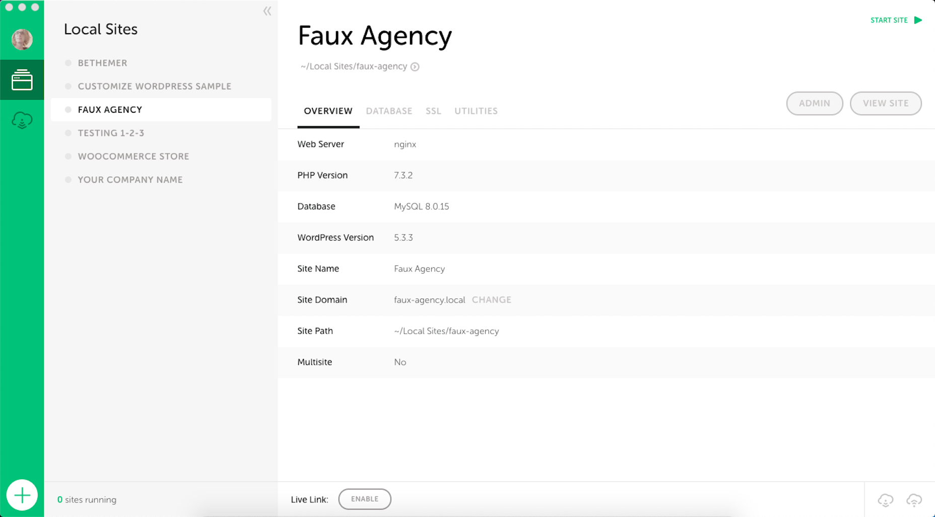
Of all the reasons we love and use Jetpack for CSS-Tricks—a poster child WordPress site—is that we can sleep easy at night knowing we have real-time backups running with Jetpack Backup. That way, no matter what, everything that makes this site tick, from all the template files to every single word we’ve ever typed, is always a click away from being restored if we need it for any reason at all.
There’s really no question whether or not you should be backing up your WordPress site. You absolutely should. It’s sort of like being prepared for an earthquake: you know it could happen at any time, so you want to make sure you’ve got all the tooling in place to keep things safe, not if, but when it happens.
What’s your backup plan? For us, it’s logging into WordPress.com, locating which backup to use, and clicking a button to restore things to that point in time. That’s all the files of course, like WordPress itself, the theme, and plugins, but also the entire database and all the media files.
Another reason we love Jetpack Backup? It provides a complete activity log of all the changes that happen on the site. It’s one thing to have your site backed up and be able to restore it. It’s another to know what caused the issue in the first place.
Jetpack Backup offers two plans one for daily backups and the other for real-time backups. We’ve got real-time running around here and that’s a great option for large sites that are updated often, like e-commerce. Most sites can probably get away with daily backups instead.
That leads to another wonderful thing: Jetpack Backup is sold à la carte. That means you can just get backups if that’s all you want from Jetpack. And, hey, if you find yourself needing more from Jetpack, like all the stuff we use it for here, then that rich feature set is just a couple of clicks away.
Not sure what your WordPress backup plan is? You really ought to check out Jetpack Backup. It works extremely well for us and we can’t recommend it enough.
While working on a bit of content for @css across team members, I noticed some of what I had written had disappeared. It got saved over by accident. I forgot to turn on “Revisions” for this Custom Post Type (it was a newsletter, which we write in WordPress).
It was tempting to be like, “Oh well, I’m a dummy, I’ll just have to remember and re-write it.” But no! I have Jetpack real-time backups on this site. I was able to find the exact moment I made my changes and download a copy of the site at that moment.
I didn’t need to restore the site to that point, just what I had written. So, I loaded up the wp_posts table from the SQL dump in that backup, plucked out my writing, and put it back in place.
And of course, I enabled revisions for that Custom Post Type so it won’t happen again.
If you like to build websites with WordPress, then you’re in for a treat.
Now, for the first time, you don’t need to know how to code to use Google’s popular Material Design system on your WordPress website; the web giant has released a WordPress plugin and theme to import its colors, icons, UI elements, and typography straight into your CMS.
Google already provided a set of tools for generating Material Design themes, but until now you needed to know how to copy that code across to your site files. With this latest plugin and theme, all you need to do is click and go.
You need to install both the plugin and theme to take advantage of Material Design for WordPress. Using the add-ons, you can tweak your typography via Google Fonts, add-in MD color, and even choose your own icons. If even that’s too much, pick one of the pre-built themes. One of the best features is that the plugin warns you if your customizations break accessibility guidelines, saving you a do-over when you discover it later on.
Google calls it “an experimental plugin and theme,” which means it’s subject to change. And Google has been quick to emphasize that the plugin is very much a work in progress, asking for feedback to help them direct future development efforts.
It’s a really great option for anyone who’s starting on the web, building their first site, or who really wants a nice reliable design system that they can build on in the future.
It’s yet another automation tool that has driven WordPress to the top of the technology pile and made it the CMS of choice for 40% of the web. As tech hots up and AI continues to develop, it’s hard to dismiss the idea that one day soon, our only contribution to websites will be paying the hosting bill!
Are you one of those tech-savvy business owners exposed to social media and desiring to get recognition by enhancing your digital presence?
Well, there are many things you need to keep in mind while carrying out social media marketing, knowledge of the different types of social media is one of them.
Blogging networks can be the best places to write and express all outstanding facts about your business. If it’s a small business and you manage the brand all by yourself, try to write all the alluring points about your brand. Hiring a marketing team can be an easier job, but you need to invest quite a lot in it.
Blogging networks can provide you with some outstanding business benefits like:
Audience engagement: If you publish regular blogs about your brand on the blogging networks, expect more audience to know about it. Attaching your website’s link is a must in your blogs so the audience can visit your website. The chances of sales always rise if there is enough audience visit on your website.
Looking at the competitors: No matter which product you deal with, you can always observe your competitors’ blog writing and publishing style. This can act as a reference source and help you develop a unique style to create a blog.
Once you find a unique way to present a blog, you can see more audience viewing it. However, giving a specific product to the right target audience is very important.
E-shopping networks
The E-shopping network is the place where you can expect to find several individuals who are frequent shoppers. The primary habit of these shoppers is to share their best shopping experiences on the e-shopping social networks.
Most clever shoppers always refer to the social networks of e-shopping to find a trendy product or a brand. Making a presence on such a platform can be the best you can do as a business person yourself.
The main business benefits are given here in details:
Brand positioning: The social networks (media) for e-shopping can be the right place for you to position your brand. The results of brand positioning will depend on the approach you follow to promote your product.
The more you make your product relatable to the target audience, the more you can expect sales to come in. Always consider it as a promotional strategy.
Availability of channels: You can get several channels on social media platforms for e-shopping. These channels can help you sell your products conveniently. Moreover, you can get more audience engagement as these channels can promote your brand (or product) on their behalf.
However, if you are dealing with a unique product and have not been sold earlier in the market, make sure to go for copyright and add a trademark to it before launching on the e-shopping social networks. Initially, you can choose the free channels but can invest later on paid media to quickly churn greater profits.
Social networks for Customer Reviews
As per the social networks for uploading the customer reviews, most of them deal with the lifestyle sections like food, fashion, and traveling. You can get a huge target audience there. The best part of this type of social media platform is that you can not only launch your brand and services but also the communication with the audience become lucid.
Here are the business benefits of customer review platforms (social media):
Educate the audience: On social media for customer reviews, you can take the initiative to let the customer know about the service or product you deal with.
For example, if you run a restaurant, you can let people know about the cuisines that are available at your place. Similarly, if your business belongs to the tourism industry, you can present the conveniences and comforts you give them. You can also publish the destinations and their itineraries.
Convince the customers: Like social networking sites, the platforms for consumer reviews allow you to influence the target audience and then convert them into the leads and finally the customers.
Handle issues with customers: In business, it is obvious to have dissatisfied customers. You can resolve their problems tactically on social media in no time. This can save your business from developing a bad reputation in the digital world.
Social networks are one of the most used types of social media. A huge heterogeneous mass is present on the leading social networking sites. Generally, all business people carry out social media marketing on social networking sites.
The most alluring characteristic of social networking sites is that it allows the marketer to publish a creative post about the brand and attract random prospects.
Here are a few business benefits that you can get from social networking sites:
Carrying out market research: Targeting the audience on the basis of their behaviour on social networking sites is much easier. So, you can imagine how these things can benefit your business.
Customer communication: Customer communication can be carried out excellently when it comes to social networking sites. You can communicate with a wider audience more swiftly on social media networks.
Generating lead: The pace of lead generation is the highest on any social networking site if the marketing is done with full dedication.
Share Economy Social Platforms
While running a modern business, you might face certain situations where the best thing to do is to collaborate. It directly relates to the business sector, and as a businessperson, you can look for other entities that can collaborate with you.
The business benefits that you can get from marketing on the sharing economy social media platform are:
Business support: As it is evident by the name, you can get the best business support from the most genuine sources (other business entities) in terms of the economy. If you have started a business recently, make sure you are present in the ‘share economy’ platforms. It can help you in case of the services.
Lesser investments: You need to make much lesser investments in running a business as you might not be investing in the delivery directly. For example, if you run a restaurant, you can collaborate with a taxi service to take care of your delivery.
However, to get this opportunity to collaborate, you must be present in the ‘share economy’ social media platform. Other professionals like a pet sitter or nanny can benefit from the same type of social media.
Interest-Based Networks
If you deal with the service or product for a specific mass of people who shows interest in it, then the interest-based networks are for you. As a social media platform, choosing the interest-based network can help you select the appropriate audience.
It is now time to check the business benefits:
Getting leads quickly: You can get leads easily as you choose the right community to execute your social media marketing while choosing the internet-based network. For example: If you are into the furniture business, your presence on Houzz can help you find the leads. Similarly, if you are an author, GoodReads can be the best platform for you to choose.
Getting repute: When you choose a social media platform based on your product or service, you can earn a good reputation in the market. People who are already there can relate to your work and may become your customers.
Build cultural awareness: Apart from brand awareness, interest-based social media can help you build cultural awareness among the viewers. This can be another business benefit as you can make your identity.
The image-sharing social sites are now the trendiest social media platforms present in the market. It is mainly famous among the youngsters as they look for the photos rather than the written content.
Moreover, most of the Image-sharing social sites give the users a chance to produce video clips and present them on their platforms. As a brand, you can make a video clip and upload it on the forum too. The only thing you need to make sure that the product is relatable to the target audience.
The business benefits of image-sharing social sites are as follows:
Audience engagement: You can easily engage the audience with your posts on image-sharing social media as they can contain information and a touch of entertainment. Always remember that infotainment actively plays a role in attracting leads to your social media page and finally to your website.
Create product awareness: Nowadays, the leading image-sharing platforms of social media like Instagram provide people with some of the best features like Reel and Guide features. This can be used for product awareness.
Furthermore, as you create product awareness, it will be easier for you to communicate with the customer. The best you can do on the image-sharing platform is to feature your customers and even random leads to develop their bonding with the brand.
Networks for Bookmarking
Making a digital presence of the business can be a time-consuming process. It can be one giant maze where finding the right audience base can be a difficult task. In such a situation, bookmarking social networking sites can be the best for you to communicate with the customers and show them the products.
The business benefits are although quite obvious, here it follows:
Highly effective network: The bookmarking channels’ networks can be very strong, and it can yield you several channels with the support of which running a business can be effortless for you.
Increasing traffic on the site: You can increase the traffic on the website with the help of bookmarking social media accounts as you can easily add links to the content. Moreover, you can get collaborators too.
Brand awareness: Like most other social media types, you can improve your brand awareness of bookmarking platforms of esteem like Pinterest and Flipboard.
All social media types enable self-broadcasting. However, there are platforms like Youtube, where you can upload self-made audiovisual content. Youtube is nothing but a self-broadcasting social media platform. To make a glittering impression on Youtube, you need to be precise about what you present to your customers and how you present it.
The business benefits of the self-broadcasting network are diverse. Some of them are mentioned here:
Improved audience engagement: If you are presenting a brand with audiovisual content, you can expect many prospects to get attracted and approach you with an intent to make a purchase
Earning through social media: By publishing videos on the self- broadcasting networks, you can find the number of views and subscribers increase with time. A reputed platform can give you a decent sum of money for the content you publish there. You can consider it to be an extra profit.
Online Discussion Platforms
Online discussion platforms are the best type of social media to project yourself as the brand owner. As per the business benefits, you can do the following things:
Informing the customers: You can tell the customers about different products you deal with and how they can be relevant to their lives.
Convincing the customers: You can convince the customers about the best product in the market and tactically promote your products while resolving their queries. This can improve sales.
Final Words
All these ten types of social media platforms present on the internet can benefit your business in one way another. However, it might be difficult for you to go into that depth of social media marketing.
Moreover, hiring a marketing team such as big can lead you to high expenses. Instead, you can choose five or six types of social media platforms and market your product there.
Let’s talk shadows in web design. Shadows add texture, perspective, and emphasize the dimensions of objects. In web design, using light and shadow can add physical realism and can be used to make rich, tactile interfaces.
Take the landing page below. It is for cycling tours in Iceland. Notice the embellished drop shadow of the cyclist and how it creates the perception that they are flying above not only the content on the page, but the page itself, as though they are “popping” over the screen. It feels dynamic and immediate, which is perfect for the theme of adventure.
Compare that with this next example. It’s a “flat” design, sans shadows. In this case, the bike itself is the focal point. The absence of depth and realism allows the bike to stand out on its own.
You can appreciate the differences between these approaches. Using shadows and depth is a design choice; they should support the theme and the message you want the content to convey.
Light and shadows
As we just saw, depth can enhance content. And what exactly makes a shadow? Light!
It’s impossible to talk about shadow without getting into light. It controls the direction of a shadow as well as how deep or shallow the shadow appears. You can’t have one without the other.
Google’s Material Design design system is a good example of employing light and shadows effectively. You’ve certainly encountered Material Design’s aesthetics because Google employs it on nearly all of its products.
The design system takes cues from the physical world and expresses interfaces in three-dimensional space using light, surfaces, and cast shadows. Their guidelines on using light and shadows covers this in great detail.
In the Material Design environment, virtual lights illuminate the UI. Key lights create sharper, directional shadows, called key shadows. Ambient light appears from all angles to create diffused, soft shadows, called ambient shadows.
Shadows are a core component of Material Design. Compare that with Apple’s Human Interface Guidelines for macOS, where translucency and blurring is more of a driving factor for evoking depth.
In this case, light is still an influential factor, as it allows elements to either blend into the desktop, or even into other panels in the UI. Again, it’s is a design choice to employ this in your interface. Either way, you can see how light influences the visual perception of depth.
Light sources and color
Now that we understand the relationship between light and shadows, we ought to dig in a little deeper to see how light affects shadows. We’ve already seen how the strength of light produces shadows at different depths. But there’s a lot to say about the way light affects the direction and color of shadows.
There are two kinds of shadows that occur when a light shines on an object, a drop shadow and a form shadow.
Drop shadows
A drop shadow is cast when an object blocks a light source. A drop shadow can vary in tone and value. Color terminology can be dense and confusing, so let’s talk about tone and value for a moment.
Tone is a hue blended with grey. Value describes the overall lightness or darkness of a color. Value is a big deal in painting as it is how the artist translates light and object relationships to color.
In the web design world, these facets of color are intrinsic to the color picker UI.
Form shadows
A form shadow, on the other hand, is the side of an object facing away from the light source. A form shadow has softer, less defined edges than a drop shadow. Form shadows illustrate the volume and depth of an object.
The appearance of a shadow depends on the direction of light, the intensity of light, and the distance between the object and the surface where the shadow is cast. The stronger the light, the darker and sharper the shadow is. The softer the light, the fainter and softer the shadow is. In some cases, we get two distinct shadows for directional light. The umbra is where light is obstructed and penumbra is where light is cast off.
If a surface is close to an object, the shadow will be sharper. If a surface is further away, the shadow will be fainter. This is not some abstract scientific stuff. This is stuff we encounter every day, whether you realize it or not.
Light may also be reflected from sides of an object or another surface. Bright surfaces reflect light, dark surfaces absorb light.
These are the most valuable facets of light to understand for web design. The physics behind light is a complex topic, I have just lightly touched on some of it here. If you’d like to see explicit examples of what shadows are cast based on different light sources, this guide to drawing shadows for comics is instructive.
Positioning light sources
Remember, shadows go hand-in-hand with light, so defining a light source — even though there technically isn’t one — is the way to create impressive shadow effects. The trick is to consistently add shadows relative to the light source. A light source positioned above an element will cast a shadow below the element. Placing a light source to the left of an element will cast a shadow to the right. Placing multiple light sources to the top, bottom, left and right of an element actually casts no shadow at all!
A light source can be projected in any direction you choose. Just make sure it’s used consistently in your design, so the shadow on one element matches other shadows on the page.
Elevation
Shadows can also convey elevation. Once again, Material Design is a good example because it demonstrates how shadows are used to create perceived separation between elements.
Speaking of elevation, the box-shadow property is the only property that can create inner shadows for a sunken effect. So, instead of elevating up, the element appears to be pressed in. That’s thanks to the inset keyword.
That good for something like an effect where clicking a button appears to physically press it.
CodePen Embed Fallback
It’s also possible to “fake” an inner text shadow with a little trickery that’s mostly supported across browsers:
CodePen Embed Fallback
Layering shadows
We’re not limited to a single shadow per element! For example, we can provide a comma-separated list of shadows on the box-shadow property. Why would we want to do that? Smoother shadows, for one.
CodePen Embed Fallback
Interesting effects is another.
CodePen Embed Fallback
Layering shadows can even enhance typography using the text-shadow property.
CodePen Embed Fallback
Just know that layering shadows is a little different for filter: drop-shadow() It’s syntax also takes a list, but it’s space-separated instead of comma-separated.
Here’s something for you to chew on: shadows can help improve accessibility.
Google conducted a study with low-vision participants to better understand how shadows and outlines impact an individual’s ability to identify and interact with a component. They found that using shadows and outlines:
increases the ease and speed of finding a component when scanning pages, and
improves one’s ability to determine whether or not a component is interactive.
That wasn’t a wide-ranging scientific study or anything, so let’s turn around and see what the W3C says in it’s guidelines for WCAG 2.0 standards:
[…] the designer might darken the background behind the letter, or add a thin black outline (at least one pixel wide) around the letter in order to keep the contrast ratio between the letter and the background above 4.5:1.
That’s talking about light text on a light background. WCAG recommends a contrast ratio that’s at least 4.5:1 between text and images. You can use text shadows to add a stronger contrast between them.
Before diving into shadows and adding them on all the things, it’s worth calling out that they do affect performance.
For example, filter: drop-shadow is hardware-accelerated by some browsers. A new compositor layer may be created for that element, and offloaded to the GPU. You don’t want to have too many layers, as it takes up limited GPU memory, and will eventually degrade performance. You can assess this in your browser’s DevTools.
Blurring is an expensive operation, so use it sparingly. When you blur something, it mixes the colors from pixels all around the output pixel to generate a blurred result. For example, if your parameter is 2px, then the filter needs to look at two pixels in every direction around each output pixel to generate the mixed color. This happens for each output pixel, so that means a lot of calculations that grow exponentially. So, shadows with a large blur radius are generally slower to render than other shadows.
Did you know?
Did you know that shadows don’t influence the document layout?
A shadow is the same size as the element it targets. You can modify the size of a box-shadow (through the spread radius parameter), but other properties cannot modify the shadow size.
And did you know that a shadow implicitly has a lower z-index than elements? That’s why shadows sit below other elements.
And what about clipping and masking? If an element with a box-shadow is clipped (with clip-path) or uses a mask (with mask), the shadow isn’t shown. Conversely, if an element with text-shadow or filter: drop-shadow() is clipped, a shadow is shown, as long as it is within the clip region.
Here’s another: We can’t create oblique shadows (with diagonal lines) with shadow properties. That requires creating a shadow element and use a transform:skew() on it.
CodePen Embed Fallback
Oh, and one more: box-shadow follows border-radius. If an element has rounded corners, the shadow is rounded as well. In other words, the shadow mirrors the shape of the box. On the other hand, filter: drop-shadow() can create an irregular shape because it respects transparency and follows the shape of the content.
Best use cases for different types of shadows
Practically anything on the web can have a shadow and there are multiple CSS properties and functions that create shadows. But choosing the right type of shadow is what makes a shadow effective.
Let’s evaluate the options:
box-shadow: This CSS property creates shadows that conform to the elements bounding box. It’s versatile and can be used on anything from cards to buttons to just about anything where the shadow simply needs to follow the element’s box.
text-shadow: This is a CSS property that creates shadows specifically for text elements.
filter: drop-shadow(): The CSS property here is filter, but what create the shadow is the drop-shadow function it accepts. What makes this type of shadow different from, say box-shadow, is that it follows the rendered shape of any element (including pseudos).
: This is actually an SVG element, whereas the rest are CSS properties. So, you would use this to create drop shadows directly in SVG markup.
Once you get the hang of the different types of shadows and each one’s unique shadow-creating powers, the possibilities for shadow effects feels endless. From simple drop shadows to floating elements, and even inner shadows, we can create interesting visuals that add extra meaning or value to UI.
CodePen Embed Fallback
The same goes for text shadows.
CodePen Embed Fallback
Shadows in the wild
Shadows are ubiquitous. We’re seeing them used in new and interesting ways all the time.
Have you heard the buzzword “neumorphism” floating around lately? That’s all about shadows. Here’s an implementation by Maria Muñoz:
CSS relies on existing DOM structure in the browser. It’s not possible to generate new elements other than ::before and ::after. Sometimes I really wish CSS had the ability to do so straightforwardly.
Yet, we can partially make up for this by creating various shadows and gradients entirely in CSS.
That’s why having drop-shadow is so exciting. Together with text-shadow and box-shadow we can do a lot more.
Just check out how he uses drop shadows to create intricate patterns.
CodePen Embed Fallback
Yes, that’s pretty crazy. And speaking of crazy, it’s worth mentioning that going too crazy can result in poor performance, so tread carefully.
What about pseudo-elements?
Oh yes, shadow properties are supported by the ::before and ::after pseudo-elements.
Other pseudos that respect shadows? The ::first-letter pseudo-element accepts box-shadow and text-shadow. The ::first-line pseudo-element accepts text-shadow.
Look at how Jhey Tompkins got all creative using box-shadow on pseudo elements to create animated loaders.
CodePen Embed Fallback
Animating shadows
Yes, we can make them move! The properties and function we’ve covered here are totally compatible with CSS animations and transitions. That means we can move shadows, blur shadows, expand/shrink shadows (with box-shadow), and alter the color.
Animating a shadow can provide a user with a cue that an element is interactive, or that an action has taken place. We saw earlier with our button example that an inset shadow showed that the button had been pressed. Another common animation pattern is elevating a card on hover.
CodePen Embed Fallback
If you want to optimize the animation performance, avoid animating box-shadow! It is more performant to animate drop-shadow(). But if you want the smoothest animation, a hack is the best option! Add an ::after pseudo-element with a bigger box-shadow, and animate its opacity instead.
CodePen Embed Fallback
Of course, there is a lot more you can animate. I will leave that exploration up to you!
Wrapping up
Phew, who knew there was so much to something as seemingly “simple” as CSS shadows! There’s the light source and how shadows are cast. The different types of shadows and their color. There’s using shadows for evoking depth, elevating elements and insetting them. There’s the fact that we can layer shadows on top of other shadows. And that we have a selection of CSS properties that we can use for different use cases. Then, there are the accessibility and performance implications that come with them. And, hey, animation is thing! That’s a heckuva lot!
Anyway, hopefully this broad overview gave you something new to chew on, or at the very least, helped you brush up on some concepts.
One of the things I do when teaching beginning front-end development is ask students to describe what it’s like to read HTML. I give them pretty basic markup for a long-form article, and ask them to read it twice: first in the code, then on the front end.
The #1 common response I hear? It’s like learning a new language.
Of course it is, I tell them. It’s in the name: Hypertext Markup Language. So, I advise them to start treating the materials in the course like they’re learning French, Spanish, or any other language.
Then I wake up this morning and see this MIT study that reading computer code is not the same as reading language, even though they share similarities.
In spite of those similarities, MIT neuroscientists have found that reading computer code does not activate the regions of the brain that are involved in language processing. Instead, it activates a distributed network called the multiple demand network, which is also recruited for complex cognitive tasks such as solving math problems or crossword puzzles.
Duh, you might say. But wait, reading code actually appears to activate additional parts of the multiple demand network that make the task more or a near-match to mathematical reasoning than the exact same thing.
The MIT team found that reading computer code appears to activate both the left and right sides of the multiple demand network […]. This finding goes against the hypothesis that math and coding rely on the same brain mechanisms.
So, back to my HTML reading assignment. Is it better to teach code as a language for recognizing symbols that communicate to the browser what to do, or as a math skill that’s based on solving problems?
The answer is ????.
The most interesting thing about the study to me is not how to teach code, but rather how how I work with it. Chris always says a front-end developer is aware, and the fact that reading code taps on a region of the brain that’s responsible for handling multi-tasking and holding lots of information only supports that. It also explains why I personally get annoyed when I’m pulled away from my code or distracted from it—it’s like my brain has to drop all the plates it was balancing to pay attention to something else, then pick up and reassemble all the pieces before I can jump back in to what I was doing.