It’s February, and the spring sun is finally starting to peep through the winter clouds. While many of us are still largely restricted to our homes, the web has kept on growing.
We see a shift in attitude towards natural health, wellbeing, and sustainability, and these are now being branded less often as outliers and increasingly mainstream. We’re also seeing more and more color all the time, ranging from an emotional signifier in the background to being a functional element in its own right.
GOOD Meat
Gorgeous color in the background image and the scrolling narrative pull the user in on this site for lab ‘grown’ meat.
Hanwag 100 Years
This page celebrating 100 years of outdoor footwear company Hanweg uses a mix of illustrations and photographs to create a timeline marking the company’s highlights alongside what else was happening at the time. Any excuse to get Yoda in.
Gaffer
Gaffer describes itself as bridging the gap between football, music, fashion, and culture. The site has a glossy feel, with strong art direction and an easily navigable architecture.
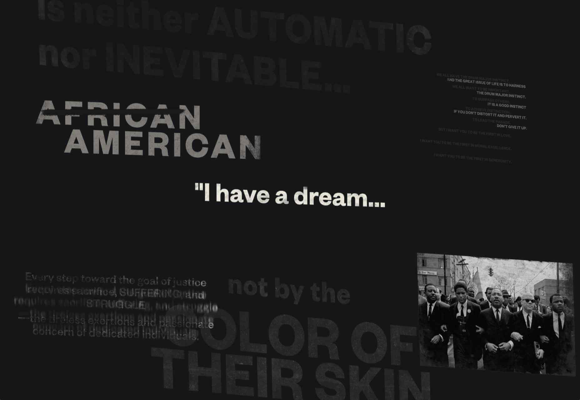
Remember MLK
This rather beautifully made tribute to Martin Luther King uses some great typographic effects, and the variations, in contrast, create a layering of the different content elements.
Bonjour Agency
The home page for design agency Bonjour Paris uses sideways scrolling to give an overview of the whole site. There is a lot of content, but it doesn’t feel like waffle, and exploring the site is a pleasant experience in itself.
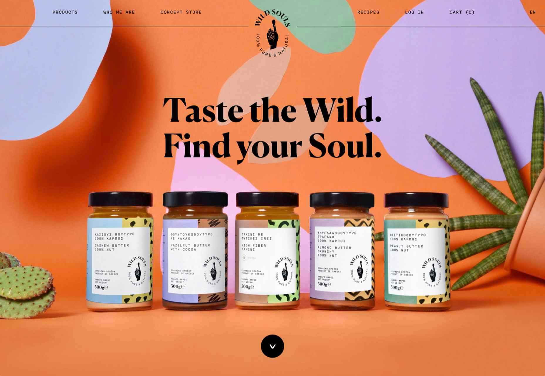
Wild Souls
Wild Souls is a Greek company that principally makes nut butters, tahini, and halva. The site is very colorful but warm, and the display type — Canela — has a slight softness to it that is appealing.
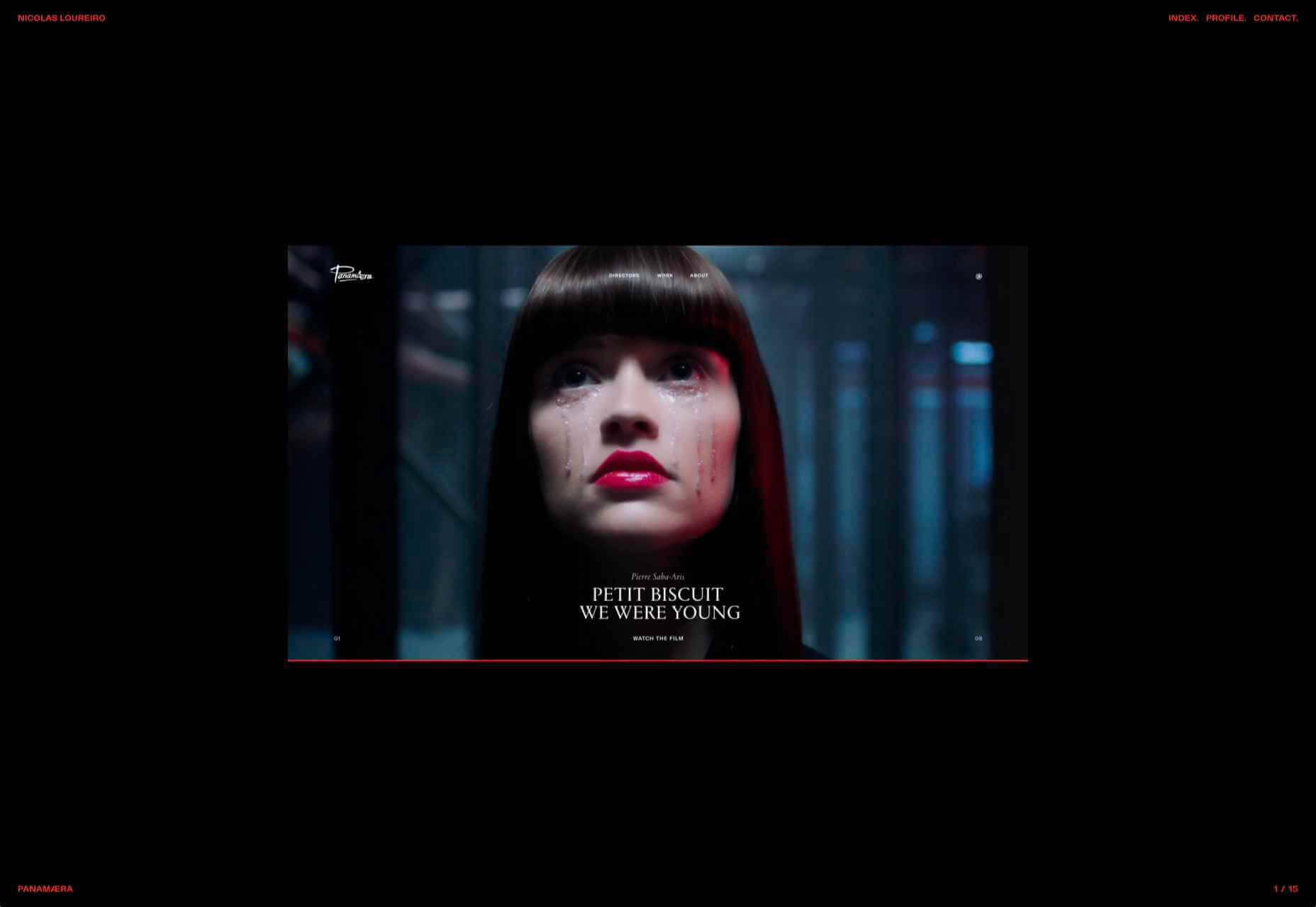
Nicolas Loureiro
This is a strong portfolio site for interactive and graphic designer Nicolas Loureiro. The work is front and center, and the navigation is pleasing.
Studio Nanna Lagerman
Studio Nanna Lagermann is a small interior design studio that works on private homes, public spaces, and set design. The site creates a feeling of space and calm. Colors are soft and neutral, and the type, although massive in places, is clean and sophisticated.
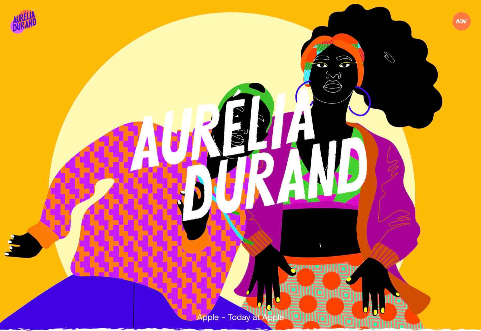
Aurelia Durand
Illustrator Aurelia Durand created her own typeface that she uses in her work, and it is used as the main display font here too. This site has a sense of joy about it that is hard to resist.
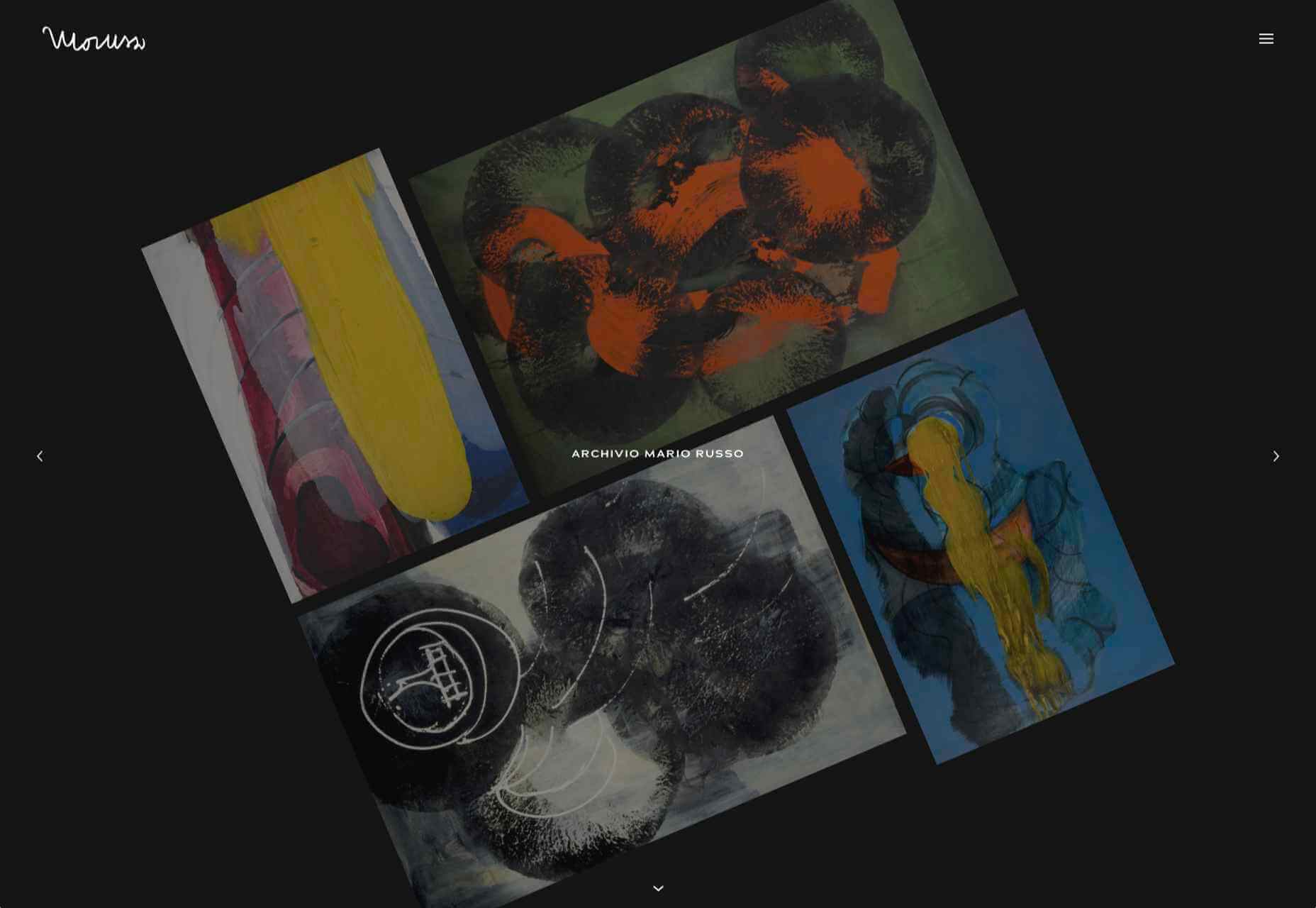
Archivio Mario Russo
This site documents the life and work of 20th-century Italian artist Mario Russo. The layout is thoughtful, and the text, while informative, doesn’t detract from the work being shown.
Gigantic Candy
Gigantic Candy makes vegan chocolate candy bars. The site is big, bold and lo-fi, and has a sense of fun to it.
dBodhi
dBodhi sells handcrafted furniture from Java, made from reclaimed teak and locally grown plant materials. The clean layout combined with a slight sepia tone on all the photography creates a feeling of quietness and nature.
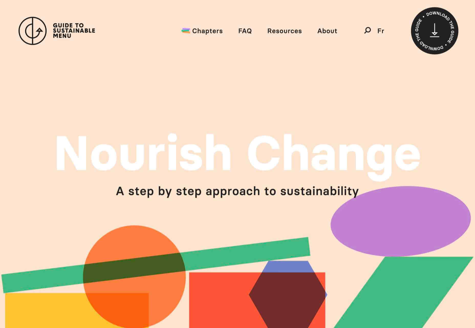
Menu Durable
Menu Durable is a guide to creating healthier, sustainable food menus in Canadian healthcare facilities. There is a lot of information here, and it is well written and attractively presented with clear color coding.
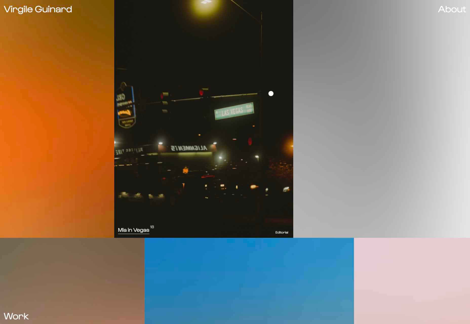
Virgile Guinard
This is a lovely, simple portfolio site for photographer Virgile Guinard. By using blocks of color pulled from each photograph’s predominant color and only revealing each photograph on rollover, each image is allowed to stand out.
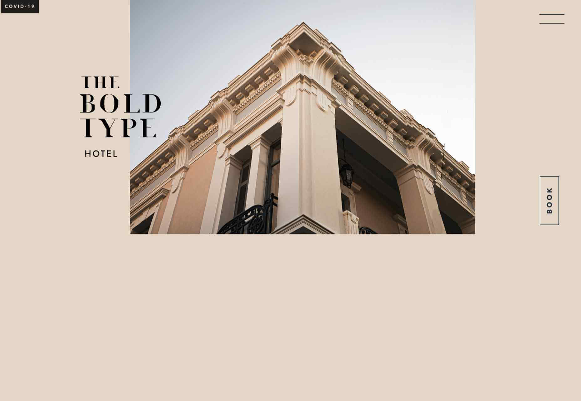
The Bold Type
This site for The Bold Type Hotel in Patra, Greece, is a boutique hotel website archetype, but it is done well. The pinky sand background color is a good choice, and the photographs are excellent.
NOR NORM
Nor Norm provide an office furniture subscription service. The site is clean with a feeling of light and space. There is a good balance between an overview of the process and details of the individual items available.
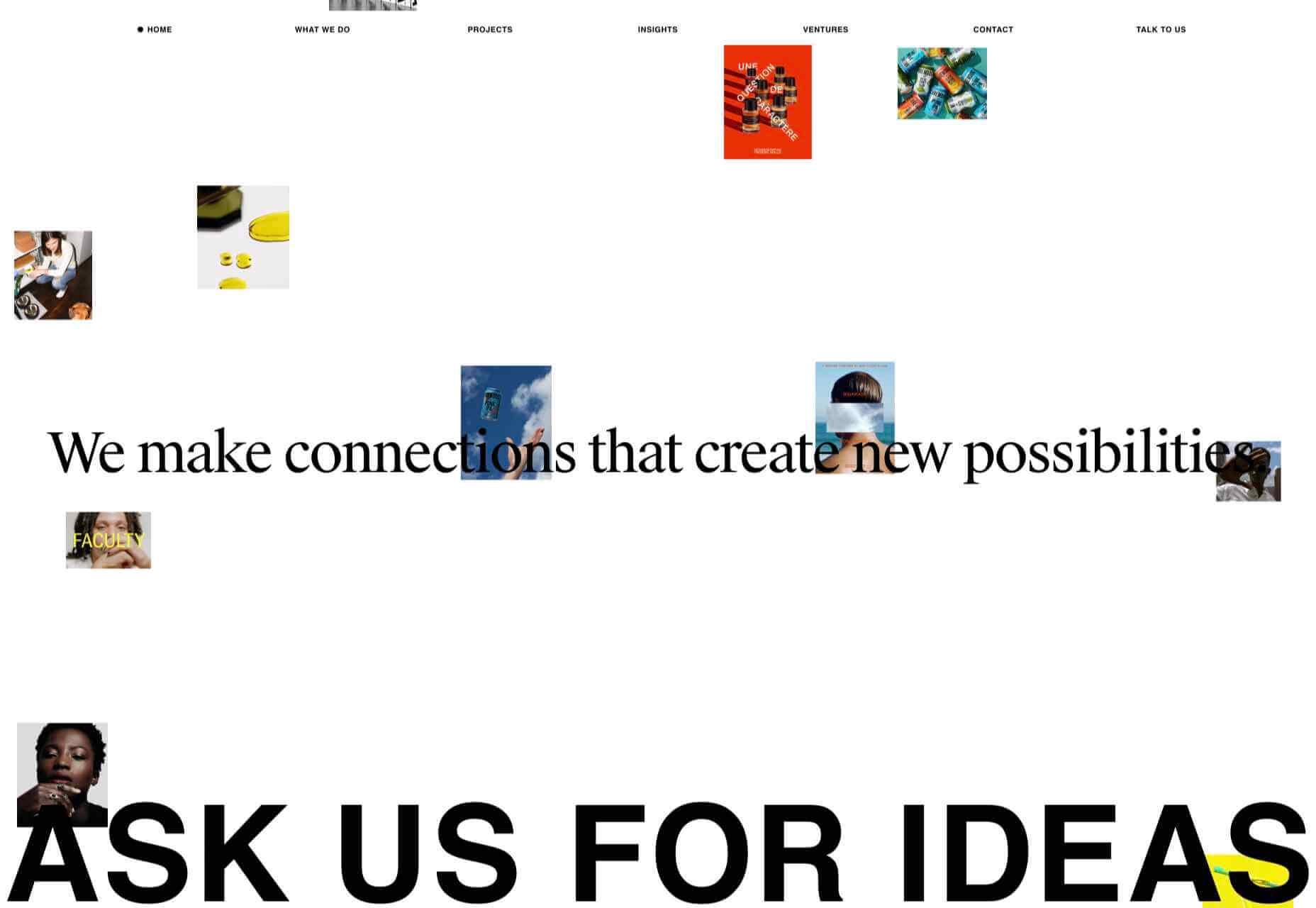
Ask Us For Ideas
At first glance, Ask Us For Ideas looks like a creative agency, but it is actually a creative broker, matching clients with agencies.
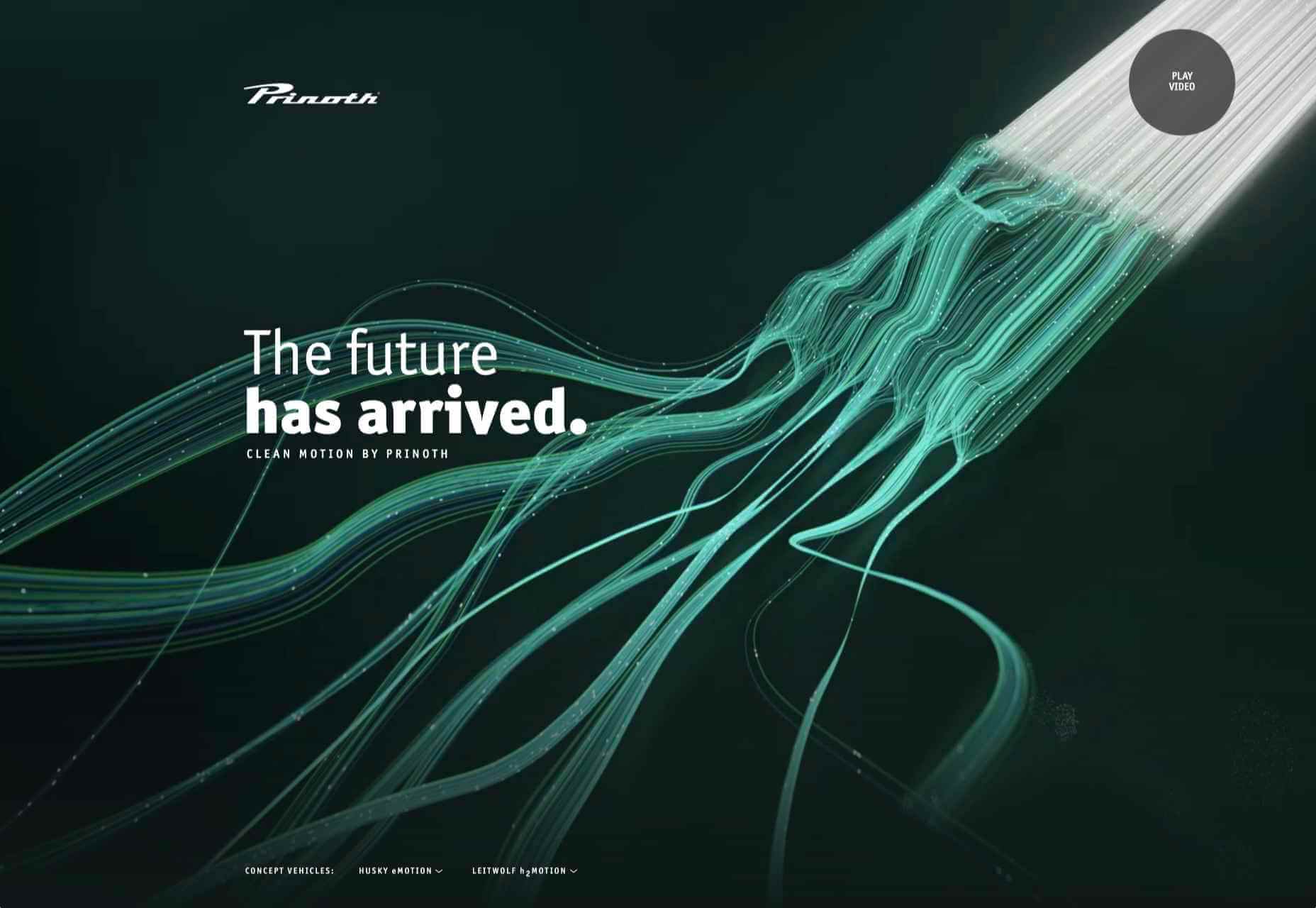
Prinoth Clean Motion
Prinoth has been making snow groomers since the 1960s, and this microsite is to mark the launch of their new hydrogen and electric versions. It is as slick and glossy as any luxury car website. And now I know what a snow groomer is.
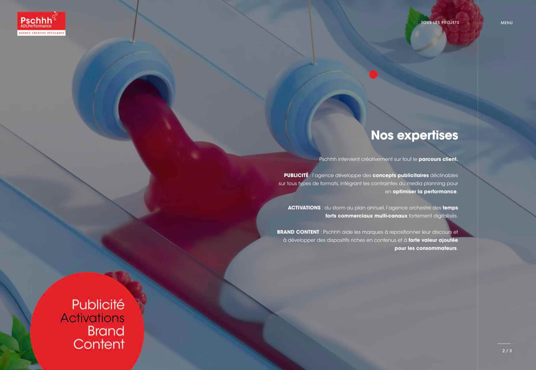
Pschhh
Design agency Pschhh has embraced the use of circles, reflecting the sound of bubbles their name suggests.
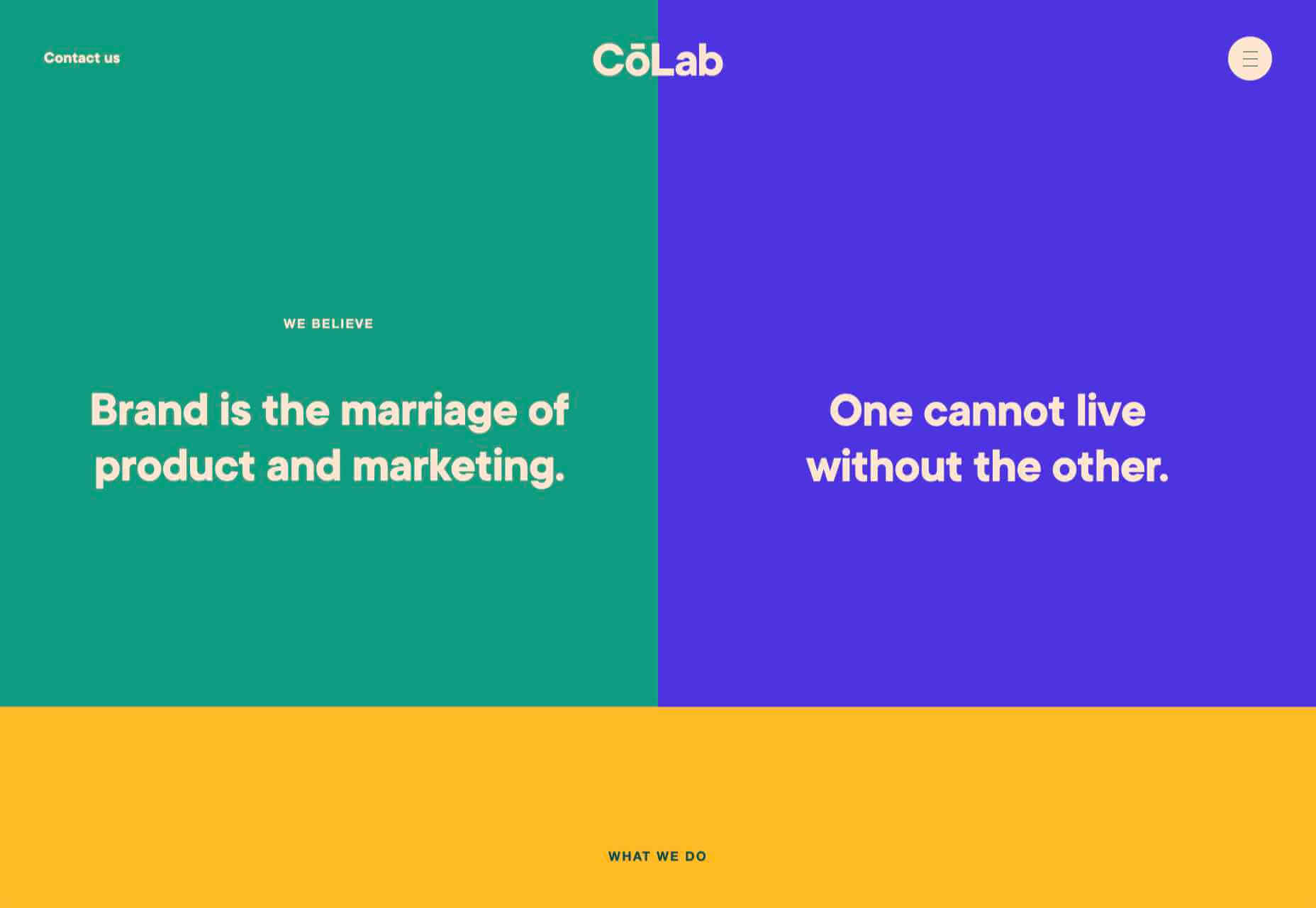
C?Lab
C?Lab is a design and marketing firm. There is a great use of color and movement here, and you don’t really notice initially that there is no actual work on show.
Dark Mode compatibility in emails is transcending from its definition as a “trend” and growing to be a best practice.
Owing to its immense popularity, you can conveniently name it as the fastest-growing trend that has cast a magic spell on apps, browsers, and of course email inboxes. It has enhanced the subscriber experience and taken it to the next level.
Let’s first understand the definition of Dark Mode:
As the name suggests, Dark Mode represents a reversed color scheme in which white font is used in a dark background.
This brings us to the next question: Why do people prefer to access their emails and other things in the Dark Mode theme?
The answer is in these four advantages that Dark Mode presents to its users.
Dark Mode theme is less stressful for the eyes, especially when the rooms are not that illuminated.
It helps to save battery life with minimum screen brightness.
Your content becomes more legible so that more people will be able to read and consume it.
It imparts a classy look and feels to the email.
Despite these advantages, there are some challenges that come while rendering emails in Dark Mode.
1. Depending on the email client, Dark Mode emails get rendered in three different ways.
The email remains unchanged
When you access an email in desktop, web, and legacy email clients, it will remain unchanged irrespective of the mode you open it in. If you have maximum subscribers using these email clients, you can heave a sigh of relief as you will not have to make any additional coding changes in the emails.
The colors get inverted
This is the most challenging part when it comes to Dark Mode emails. Email clients will make an attempt to invert the colors in your email to support the Dark Mode settings.
In this type of setup, light colors will become darker and darker colors will turn lighter.
Consequently, your emails might not be displayed the way you want them to.
This color inversion can either be partial or full.
Partial color inversion, thankfully, will not create much problem for the email developers or readers. In stark contrast with that, full-color inversion will affect renderability to a huge extent.
Outlook.com, Outlook 2019 for Mac and Windows, Outlook apps on iOS and Android, and Gmail App on Android and iOS are the email clients that invert the colors in Dark Mode settings.
The Custom Dark Mode
Apple has always been ahead of its competitors and Dark Mode is no different. Apple Mail on macOS and iOS will give you an opportunity to code custom emails for light and Dark Mode with the help of CSS. You will be able to change the visuals, background, and font colors through CSS, HTML meta tags, and other properties.
2. If you fail to design a Dark Mode compatible email, it will negatively impact the deliverability due to rendering issues.
3. When it comes to accessibility, Dark Mode settings might cause problems to some readers and the readability gets hampered.
4. Not every brand personality will be aligned to Dark Mode email.
If you are curious to know the coding mantras and compatibility of Dark Mode in email clients with details on its high rate of early adoption and some Dark Mode design and coding tips, just head to this insightful infographic by Email Uplers: In the Limelight: Dark Mode in Emails.
It will surely enlighten you and clear all the haze around Dark Mode in emails.
Everyday design fans submit incredible industry stories to our sister-site, Webdesigner News. Our colleagues sift through it, selecting the very best stories from the design, UX, tech, and development worlds and posting them live on the site.
The best way to keep up with the most important stories for web professionals is to subscribe to Webdesigner News or check out the site regularly. However, in case you missed a day this week, here’s a handy compilation of the top curated stories from the last seven days. Enjoy!
On a default left-to-right web page, “hanging” an element off the right side of the page (e.g. position: absolute; right: -100px;) triggers a horizontal scrollbar that scrolls as far as needed to make that whole element visible. But if you hang an element of the left side of the page, it’s just hidden (no scrollbar is triggered). That’s called “data loss” in CSS terms, if you’re fancy. The same is true for the top edge of the page (hidden) and bottom of the page (scrolling happens).
Ahmad puts a point on this. It’s just one of those CSS things that you just need to know. I love how Ahmad uses logical directions like inline-start direction (and block-start direction) to describe the issue because those directions change when the direction or writing mode of the page changes. If the page is right-to-left (RTL) like , then horizontal edges where the data loss occurs are flipped (except in Firefox ????).
Blobs are the smooth, random, jelly-like shapes that have a whimsical quality and are just plain fun. They can be used as illustration elements and background effects on the web.
So, how are they made? Just crack open an illustration app and go for it, right? Sure, that’s cool. But we’re in a post here on CSS-Tricks, and it would be much more fun to look at the possibilities we have to do this with CSS and SVG — two of our favorite ingredients!
We actually have a few ways to go about blobs. Let’s check them out.
Drawing circles in SVG
Let’s start easy. We can draw SVG in something like Illustrator, Sketch, Figma or whatever, but we’re going to draw in SVG code instead.
SVG makes it pretty trivial to draw a circle, thanks to the appropriately named element:
<circle cx="100" cy="100" r="40" fill="red" />
Those funky attributes? They make sense once you break them down:
cx defines the x-coordinate of center of circle.
cy defines the y-coordinate.
r is the radius.
fill is used to fill the shape with color.
That snippet creates a circle with a 40px radius with its center at 100px on the x-axis and 100px on the y-axis. The coordinates start from the upper-left corner of the parent container.
Let’s create multiple overlapping circles like this:
acts as the art board where all the different shapes and figures are drawn. So, its height and width indicates the size in which the whole drawing needs to be enclosed. If some part of figure is out of bounds of the SVG’s size, then that part will be truncated.
CodePen Embed Fallback
But blobs aren’t always so perfectly… round. We can mix things up by using instead of :
This is nearly identical to the circle except the change in tag name and two radii values to define the horizontal (rx) and vertical (ry) radii separately. The funny thing is that we can still get a perfect circle if we want if the radii values are the same. So, in a sense, is a little more versatile.
And, if all you need is a circle, we could probably lean on CSS without SVG at all. Any box element can become a circle or ellipse with border-radius.
Thanks to SVG’s tag, we can create any kind of shape. It is like drawing with a pencil or pen. You start from a point and draw lines, curves, shapes and close the loop.
There are many data parameters in path for different tasks like:
M – Moving to the point
L – Drawing line
C – Drawing a curve
Q – Bézier curve
Z – Closing the path
Chris has a super thorough guide that explains these parameters in great detail.
We just need the curve (C) parameter for the actual drawing. But we’ll also be moving the starting point and closing the path, so we’ll reach for the M and Z parameters as well.
This is a random blobby shape I put together using SVG’s element.
Ready to break this down? Coordinates play a big role in so what we’re about to look at will look like Google Maps data barfed inside our code. But it makes a lot more sense when we know what they’re doing.
Here, the d attribute stores the path data. It holds information containing where the drawing starts, what direction it moves, what shape it follows, and where it ends. For example:
It shows that our path starts from coordinates 10 10, indicated by the M that precedes them. Then, it establishes a Cubic Bézier curve (C) with two control points. Bézier curves are like handles on the both ends of a path that control the curviness between them. We have two Bézier “handles”: one for starting position (20 20) of the curve and another for ending position (40 20).
Let’s use this knowledge to design our blob. The blob I drew is actually a bit complex, with a number of curves and control points. It doesn’t help that many of the coordinates aren’t full integers. But, still, now that we know what the ‘s d parameter does and the attributes it uses to draw points along the path, it doesn’t look quite as scary.
SVG path is complex. Right? What if I present you a way to convert many custom shapes (which you can create through divs) into gooey blobs? Here’s the idea. We’re going to create two rectangles that intersect. They’re the same color, but have a little transparency to darken where they intersect.
CodePen Embed Fallback
Then we’re going to leverage SVG’s blurring features to smudge the rectangles, creating an extra gooey blob with softer edges. The two intersecting rectangles will turn into this –
Let’s first understand how filters work in SVG. They are declared using on HTML elements or other SVG elements, like circle.
circle {
  filter: url("#id_of_filter");
}
is basically a wrapper for the actual filter effects, that include:
Our blob is blurred and colored, so that’s why we’re going to put and to use.
takes multiple attributes, but we are only interested in two of them: how much blur we want and where we want it. The standard deviation (stdDeviation) and in properties align with those needs, respectively.
in accepts one of two values:
SourceGraphic – Blurs the entire shape
SourceAlpha – Blurs the alpha value, and is used to create shadow effects
After playing around a bit, here’s where I landed on the effect:
This isn’t done just yet. The blur is scattered and the element’s shape lost its boundary and color. We need a bulging effect with blur on the boundaries and a solid color to fill the shape. This is where our next SVG filter, , comes into play.
There are two attributes we want:
in – Indicates where the effect is applied, just like .
values – A matrix of four rows and five columns.
The values attribute bears a little more nuance. It holds a matrix that gets multiplied with the color and alpha values of each pixel and generates a new color value for that pixel. Mathematically speaking:
new pixel color value = ( values matrix ) × ( current pixel color value )
Let’s get a little numbers nerdy here. In that equation, values matrix is equal to:
Here, F-red means a fraction of red in pixels, with a value ranging from 0 to 1. F-constant is some constant value to add (or subtract) from color value.
Breaking this down further… We have a color pixel with an RGBA value of rgba(214, 232, 250, 1). To convert it into a new color, we will multiply it with our values matrix.
The pixel value didn’t change because we multiplied it by the identity matrix, but if you change the values of the matrix, then its pixel value will change too. Learn more about values matrix from MDN documentation.
In our case, these values seem to work pretty well:
I’ve added few more styles in the blob to stretch it from the corner.
CodePen Embed Fallback
Try to use these filter values in other shapes and let me know how they work out for you in the comments.
Using CSS border-radius
We teased this earlier, but now let’s get to the CSS border-radius property. It can also create blob-like shape, thanks to it’s ability to smooth out the corners of an element. This is possible because each corner radius is divided into two radii, one for each edge. That’s why we can have more shapes apart from circle and ellipse.
You might be used to using border-radius as a shorthand for all four corners of an element:
.rounded {
  border-radius: 25%;
}
That’s a nice way to get uniformity for all of the corners. But blobs aren’t so uniform. We want some corners to be rounder than others to get some that looks gooey. That’s why we go for the constituent properties of border-radius, like:
And see how each properties takes two values? That’s one for each edge of the corner, giving us a lot of flexibility to curve an element into interesting shapes. Then we can drop in a background color, fill it up with a gradient, or even set a box-shadow on it to get a neat effect.
Turns out you can use several different libraries to pass color information around components. Or, you could use custom properties, built right into CSS, have no decline in your own developer experience, and deliver a faster experience to your users. Kent proves it here, with demos.
For the record, you could go a step further than Kent has here and not use CSS-in-JS at all, but still be updating CSS custom properties from button clicks in React and managing the state there and such. I’m telling ya, one of the main jobs of a UI component library like React is managing state, and CSS might as well know about that state so you can use it to do any styling you need to do.
Wait, not use CSS-in-JS? Kent:
I’ve never been so productive working with CSS than when I added a real programming language to it.
Extreme side eye, Kent.
We should be calling it CSS-in-React, also, since React is the only major framework that doesn’t have a blessed solution for styling.
UX principles guide many of our decisions when we design and build sites and apps. Understanding UX principles doesn’t mean you can dodge your own testing, but they do give you a head start.
Often named for the researcher who identified a particular truth, or pattern, these laws are the product of hundreds, and sometimes thousands of hours of lab and field-based research.
How well do you know these UX laws? We’ll start you off with an easy one…
Today, any brand’s reputation and perception vastly depend on the relationships they have with their customers.
It’s easy to create competent products and spend money on advertising. But the brands that put in special efforts in creating meaningful customer relationships are the ones that stand out.
Social media is one of the best platforms for starting conversations and nurturing them into long-lasting customer relationships.
This makes sense because consumers spend hours each day scrolling through their social media feed. So, why not make the best use out of it and cultivate relationships with consumers?!
Another reason why social media acts as an excellent medium for building customer relationships is that it helps you bring together a community rather than connecting with your customers one-on-one, as in emails or phone calls.
Community helps users to have a sense of belonging and acts as social proof. This helps you strengthen your relationships more and bring in new people into the community.
If you are looking for some practical and actionable tips that can help you use social media to build lasting customer relationships, then read on to learn exactly that. Let’s dive deep into some of these strategies.
1. Pick the Right Social Media Channels
Picking the right social media platform is the 101 of building customer relationships. If you want to get the maximum ROI out of your efforts, then start by picking the right channel.
If you already have a good social media presence, reevaluate your options, and develop new strategies. You don’t want to waste time on social media platforms that do not predominantly consist of your customers.
Finding the most used social media channels is not difficult. Just put out a quick survey and research your competitors to figure this out.
2. Leverage User-Generated Content
User-generated content is a brilliant way to strike the right chord with your customers on social media. User-generated content is when users essentially create content for your brand.
This can be done in various ways. For example, you can create a user-generated content campaign with a specific hashtag and ask your customers to post on social media using this hashtag. You can then reward them by featuring them on your social media or even send them some goodies.
Using user-generated content strategies, your customers feel more valued and satisfied. This will have a massive positive impact on your customer retention and loyalty.
Another added perk would be the steady stream of referral customers and increased brand awareness due to your user-generated content campaign.
3. Use a Customer Relationship Management Tool
Using a Customer Relationship Management or CRM tool is a great way to manage your entire customer base with ease.
This is necessary because your customers will have multiple touchpoints with your brand across various channels. These may be emails, phone calls, and different social media platforms.
A CRM tool will hold all this customer information at a commonplace. This will help you have meaningful interactions with customers leading to long-lasting customer relationships and increased customer retention rates.
4. Personalize and Humanize every Conversation
Just being a brand won’t work in your favor as much as showing your human side would. Consumers today don’t connect with brands. They connect with the faces behind the brand. This is why it is super-important that you show this face behind the brand on social media.
You can do this by personalizing every conversation you have on social media, be it the comments or the private DM conversations.
Use first names, and address the specific concerns of each customer. This one step will go a long way in improving your brand affinity.
Even if you have your team managing your social media, ensure that they use their first names, and customize each conversation. Have a social media customer experience strategy in place as this will make a vast difference to strengthen your customer relationship.
5. Frequently Reward your Customers
Rewarding your customers is a super-effective way to increase their affinity towards your brand and even earn new customers through referrals. Rewarding your customers makes them feel extra special. And when they have a community to share their wins, the reward becomes even more special.
You can reward your customers by holding contests and giveaways. Contests are a fun way to grab the attention of your customers and increase brand awareness while doing so. You can also hold special events and giveaways.
Ensure that the rewards that you offer are precious for your customers. Otherwise, this strategy wouldn’t work. You can also feature your contests and giveaway winners on your social media feed and stories to further strengthen your relationship.
6. Be Quick with your Responses
Consumers today are highly impatient and wouldn’t bother waiting for your answer. So, the brand that offers quick responses gains brownie points.
Quick responses make the customers feel important and valued. Your customers will start perceiving your brand as reliable and trustworthy because you are always there for them.
While quickly responding can have a significant positive impact, failing to respond soon can upset many customers. They might even leave your brand. This might lead to increased customer churn, and your brand’s online reputation might also be tarnished.
7. Go Live on Social Media
Social media lives are one of the best ways to connect with your customers and build fail-proof relationships with them. Social media lives enable you to have personalized interactions with your customers in real-time.
This establishes a special connection between you and your customers. You can go live on a relevant topic or even host a Ask Me Anything (AMA) session with your social media followers.
Start Building Long-Lasting Customer Relationships Through Social Media
So, over to you now! Start implementing these strategies right away. Personalize your conversations, go live often, offer quick responses to your customers, hold contests and giveaways, and leverage user-generated content.
Over time, you’ll find yourself surrounded by customers who truly value your brand and remain loyal for life.
I’ve been a manager for many years at companies of different scale. Through these experiences, I’ve done my share of learning, and made some mistakes along that way that were important lessons for me. I want to share those with you.
But before diving in, I want to mention a strong caveat that my advice may be unique to my situation because I’m white and a woman in tech. My experiences may be relevant to that point of view, but your mileage may vary.
Another huge caveat: I’m sharing mistakes I’ve made so far in the interest of helping others, but I’m sure I’m not done making mistakes, either. I don’t have it all figured it out, I’m still on this journey.
Mistake 1: Thinking people give feedback the way they want to receive it
Feedback is one of the most important tools you have as a manager, but it can also be incredibly disruptive with poor execution. One of the hardest things I’ve had to learn is that humans aren’t pure functions: you can put a form input in front of them one day and get one result, then again another day and get an entirely different result.
The same is true of how people give and receive feedback: someone may give you feedback in a particular way, but they prefer to receive much differently when it comes to themselves.
How do you get around this? Asking helps. I’ve started doing an exercise with my team where I ask the group as a whole how they would like to get feedback. Not only does it open up ideas, but it also helps that each individual has to think for themselves how they prefer to receive feedback. Normalizing this type of vulnerability and self-reflection can help us all feel like partners, instead of some top-down edict.
Another thing that’s helped? Asking folks directly in a one-on-one meeting if they have feedback for me as a manager, and following up with an anonymous survey. Again, it makes things feel less one-sided and provides everyone the opportunity to say things that they might not want to say directly to my face, which I know can be tough.
And lastly, if something comes up, addressing it immediately can be helpful. There’s nothing worse than your manager having an issue with something you did and only finding out about it three months later, especially if it’s tied to a performance review that you could have impacted had they been transparent earlier.
The truth is that even my advice here is imperfect. Feedback is tough. Being honest and improving together as a team is awkward. It’s incredibly worth it, though. That’s where the real growth is. That said, no two people are alike, no two groups are alike, and you may have to use your best judgement given the situation at hand.
Mistake 2: Trying to do everything yourself as a manager is the best way to help
Years ago, I managed a woman who was bright, talented, capable, and an all around pleasure. She was sort of new to the industry and could come across as timid, so I did my best to be a poop umbrella for her, fighting battles behind the scenes to set her up for success. She was on a steady track to land a senior role. Even after I decided to leave the company, I let the next manager know this person is track for a senior position in the next few months.
Then I moved to another city. Years later, I met up with the woman and was shocked to learn she never got the position.
Here’s what I learned: her promotion wasn’t the same high priority for the capable hands I left her in as it was for me. The team was challenged with a million other things that took center stage to the extent that her promotion fell off the radar. But even more than that, what became very clear to me was that all of that “protection” I thought I had set up for her didn’t really serve her well for the long haul. For example, I didn’t teach her how to advocate for herself or how to navigate the system. I vowed never to make that mistake again.
This is tough! If you’re strong and care about your team as people, it can feel very unnatural to teach someone to advocate instead of moving things out of their way themselves. And the point is not to throw that person into the fire. The point is to care. Are you teaching the things they need to learn? Are they really growing under you? Feeling like you’re protecting someone at all costs also lead to your own ego trip, too, which threatens progress.
Try to think through what skills someone needs to succeed without you. Teach those things incrementally. Sure, this is easy advice to say, but it’s really hard to do in the thick of things. Spend some time with it, and think through ways you can inject that learning into everyday work and interactions.
Mistake 3: Communicating something one time is enough
No one likes to feel like they’re repeating themselves. It’s annoying to say someone more than once, and it’s annoying to hear something over and again. But if you have a big enough group and there’s enough going on, things are going to slip through the cracks, so repetition becomes an important tool to make things stick. The trick is to say the same things, but in different ways.
There was a time last year when I asked my team to do something and none of them did it. What happened there? Given that it’s a team of highly efficient, strong collaborators, do you think they just all table-flipped and didn’t take action? Not a chance. I was the one who wasn’t clear. In fact, you can probably guess that if a whole group of people don’t understand or take action, the chance is that you, the manager are the common denominator for why something is blocked. Not only did I not repeat myself enough to be clear, I didn’t align anyone with the why of the purpose of the task. It’s pretty easy to forget or not prioritize doing something if you have no clue why you’re doing it. Repeat yourself and align the group with the importance of the task and you’ll likely have a better result.
Think of all the ways we have to communicate these days: chats, emails, video meetings, texts, document comments, and so much more. And because some people communicate better in one medium than another, using all of the platforms have in various mediums becomes a strategy for repetition without nagging.
I’ve found that what work best is allowing everyone to own the information themselves. For example, if your team practices career laddering, each person they read the ladders aloud in a one-on-one and then talk you through their responses to each item. That way, you’re not lecturing — they are owning where they are and what the next steps are as you guide them along.
Mistake 4: You have to have everything together all the time
Some folks think that management looks like a steel fortress of preparedness and authority. I’m not so sure about that.
If something goes wrong, are you more likely to tell the manager acts as though they have everything together all the time, or the manager owns their mistakes? The truth is that your team needs to know you’re human. You can’t fix problems if you don’t know about them, and no one will tell you about them unless you make space for that.
One time, the night before a big release, someone on the team pushed a change that created thousands upon thousands of calls to a service that, in turn, thought it was the target of a DDoS attack, which then shut down our access. Here’s a moment when a lot of folks could have panicked and blamed one another. Instead, we giggled wildly, jumped into chat and on calls, fixed it, and kept going.
I couldn’t have been more proud of the team that day. Their response was wonderful. And it makes all the difference in how we work together, recover, and iterate.
You’re the manager. You have to be show your vulnerability first. You can try this by admitting you’re having a bad day, that you don’t understand something, or made a mistake.
Being a manager is tough. Your mistakes impact people. I’ve made all of the mistakes above and more. I feel that it’s critical to share and learn from one another, so when we encounter pitfalls, we don’t feel alone and know a path forward.
No math. Swap between units and adjust servings on-the-fly.
Offer alternative ingredients.
Re-list the ingredient amounts when they’re referenced in the instructions.
I totally agree, especially on that last one:
Of all our improvements I think this is my favourite.
A typical recipe layout contains ingredients with amounts at the start. Then, a bullet point list of instructions to perform the method.
The method though typically does not reference those amounts again, so if you don’t prepare all your amounts ahead of time (which is what you’re probably supposed to do but come on who does that) you’ll have to keep scanning back and forward.
Part of what makes this stuff possible is how you set up the data model. For example, an ingredient might be an Array instead of a String so that you’re set up for offering alternatives right out of the gate.