Archive

Archive for June, 2021

7 Best Browsers for Developers in 2021

June 22nd, 2021 No comments

With the widespread acceptance of web standards, and the resulting deprecation of browser prefixes, there has been a noticeable change in the browser market. Where once browser manufacturers would try to lure users in with promises of feature support, now the focus is on privacy, speed, and developer tools.

When it comes to web development, you should really be testing on every browser and device you can lay your hands on; you’re probably already doing so using an app like LambdaTest, or BrowserStack.

When quality assurance testing, you probably work by market share: starting with Safari on mobile, Chrome on desktop, and working your way down to Opera and (if you’re a glutton for punishment) Yandax; naturally, when testing, it’s the largest number of users that concerns us the most.

But before you reach the QA stage, there are a number of browsers designed to assist development. Browsers that offer tools, especially for front-end developers, that assist with code and speed up development. Here are the best browsers for web development in 2021:

1. LT Browser

LT Browser is an app for web developers from LambdaTest. Like many of the apps in this class, it offers side-by-side comparisons of a site in different viewports. Additionally, LT Browser has a number of features that make it stand out.

As well as previewing web pages, LT Browser offers developer tools to rival Chrome, which is handy if you want to see how changes across different devices affect your Lighthouse scores. LT Browser also supports hot-reloading, which means when you make a change to your code, you don’t have to hit ‘refresh,’ the viewports simply reload — it’s surprising how much of a time-saver that simple addition is.

LT Browser requires a LambdaTest account, there is a free plan, and paid plans start at $15/month.

2. Firefox Developer

The best conventional browser for web development in 2021 is the developer edition of Mozilla’s Firefox.

The standard edition of Firefox is an excellent browser, packed with features, and privacy-focused. The developer edition adds to this with a suite of tools aimed at developers. The CSS and JavaScript debugging tools are superb, and the Grid tools are unparalleled for coding layouts with CSS Grid.

Firefox Developer is free to download.

3. Polypane

Polypane is one of the new generation of web browsers that are firmly intended as development aids rather than browsers. Polypane allows you to compare different viewports and platforms by placing them side by side. Interactions like scrolling are synced.

Polypane takes a step further than many browser apps in this class by showing social media previews. It even has a suite of accessibility tools, including some handy color blindness simulators.

Polypane has a 14-day free trial, and plans start at $8/month.
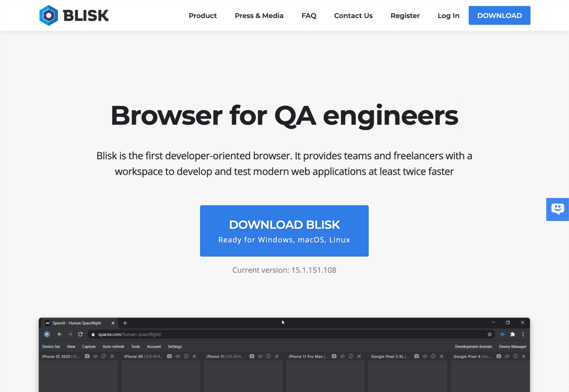
4. Blisk

Blisk is another browser for developers that allows you to line up a collection of viewports in a single app. URL and scrolling are synced, making testing interactions and animations effortless.

Blisk is awesome fun to play with and delivers a great preview of a responsive design. But be warned, synced viewports can be addictive, and it’s easy to line up browsers and become hypnotized by the synchronized movement; you’ll need a very large screen to get the most out of Blisk.

Blisk plans start at $9.99/month.

5. Sizzy

Sizzy is another app that allows you to view multiple viewports at once. It also has synchronized interactions, and like many competing apps, Sizzy allows you to screenshot different views.

Sizzy also includes a very clever synchronized inspect tool, so you can focus on individual elements across different viewports. It’s an excellent option for debugging, particularly if you’re digging into someone else’s code.

Sizzy has a 14-day free trial, and paid plans start at $7.15/month.
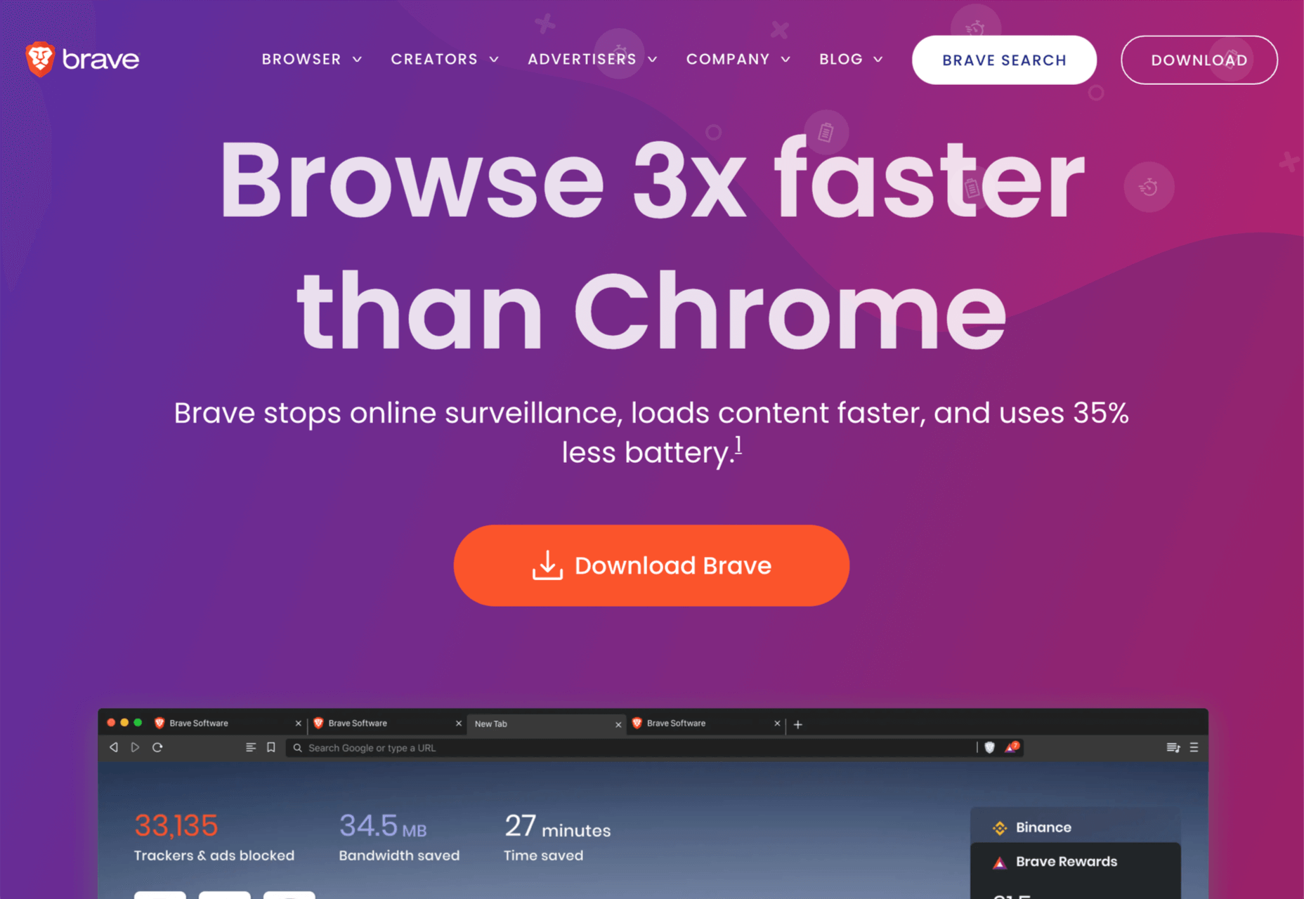
6. Brave

Brave is a privacy-focused browser that runs up to three times faster than Chrome. If you’re someone who balks at rendering speeds on most sites, Brave could be for you.

Brave’s main benefit for developers is that it supports Chrome extensions while maintaining privacy — it can even access the Web using Tor if simple privacy mode isn’t enough for you. There are hundreds of useful Chrome extensions, and if you avoid Chrome due to privacy concerns, then Brave solves your problem.

Brave is also pioneering a new system for monetizing site revenue, allowing viewers to tip sites, and soon, to control how advertising revenue is distributed.

Brave is free to download.

7. Chrome

Boring it may be, but Chrome is still the world’s most popular browser from the US to mainland China. Where once sites were “best viewed in IE,” Chrome is now the Web’s default.

No matter the site you’re designing, it has to work well in Chrome, and no simulator is as good as the real thing.

In addition to being the benchmark for page rendering, Chrome developer tools are the simplest way to access your Lighthouse scores, which helps you track down issues that may be holding you back in Google’s search results.

Chrome is free to download.

Source

The post 7 Best Browsers for Developers in 2021 first appeared on Webdesigner Depot.

Categories: Designing, Others Tags:

If we’re gonna criticize utility-class frameworks, let’s be fair about it

June 22nd, 2021 No comments

I’m not here to raise a shield protecting CSS utility frameworks. I don’t even particularly like the approach, myself, and nothing is above fair criticism. But fair is a key word there. I can’t tell you how many times I’ve seen utility styles compared to inline styles. Sarah Dayan is weary of it:

[…] despite numerous attempts at debunking common fallacies, utility-first enthusiasts keep on having to reply to a staggering amount of misconceptions. And by far, the most tired, overused cliché is that utility classes are just inline styles.

I think this comparison will make it clear:

<div style="color: #3ea8ca;"></div>

<div class="color-blue"></div>

The first div has a color set directly in the HTML that is an extremely specific blue color value. The second has a color that is set outside of the HTML, using class name you can use to configure the shade of blue in CSS. Sure, that second one is a fairly limited class name in that, as the name suggests, does one job, but it still offers some abstraction in that the blue color can be changed without changing the markup. It’s the same story with a sizing utility class, say size-xl. That’s also an abstraction we could use to define the padding of an element in CSS using that class name as a selector. But if we were to use style="padding: 10px;" directly on the element in the HTML, that is an absolute that requires changing the value in the markup.

To be fair though (which is what we’re after), there are quite a few classes in utility frameworks that are named in such a way that they are extremely close acting like inline styles. For example, top-0 in Tailwind means top: 0 and there is no configuration or abstraction about it. It’s not like that class will be updated in the CSS with any value other than zero because it’s in the name. “Utility” is a good way to describe that. It is very much like an inline style.

All that configurable-with-smart-defaults stuff puts utility-based frameworks in a different category. Inline styles offer no constraints on how you style things (other than hard limitations, like no pseudo selectors or media queries), while a limited set of utility classes offer quite a lot of styling constraints. Those constraints are often desirable in that they lead to a design that looks consistent and nice instead of inconsistent and sloppy.

To borrow a metaphor I heard in a slightly different context one time: Utility-class frameworks are like bumper bowling for styling. Use the classes and it’ll work out fine. You might not get a strike, but you won’t get a gutter ball either.

Another unfair criticism I hear in conversation about utility frameworks is that you ship way more CSS with them. If you are, then you’re definitely screwing up. In my mind, the main point of this approach is shipping less CSS (only the classes you use). I’m the first to tell you that a build process that accurately and perfectly does this is tricky and could lead to an unhealthy amount of technical debt, but I’ll cede that if you do it right, shipping less CSS is good for performance. Tailwind in particular highly encourages and helps you do this.

So all that said, I think there is all sorts of stuff to criticize about the approach. For example, I personally don’t like looking at all those classes. I just don’t. I’m not an absolutist about perfectly abstract classes, but seeing 10-20 classes on div after div gets in the way of what I’m trying to do when I’m templating HTML. It feels harder to refactor. It feels harder to see what’s going on semantically. It’s harder to parse that list for other classes that I need to do non-styling things. Some of the advantages that I would get from utilities, like scoping styles to exactly where I need them, I often get through other tooling.

I also think utility-frameworks work best in JavaScript component setups where you have Hot Module Reloading. Otherwise, HTML changes tend to trigger entire page refreshes. For example, a tool like Browsersync is pretty darn nice. It does CSS injection when your CSS changes. But it can’t do new-HTML injection; it just refreshes the page. So without Hot Module Reloading, which generally ain’t for your generic HTML site or Static Site Generator, you get worse DX while authoring.


The post If we’re gonna criticize utility-class frameworks, let’s be fair about it appeared first on CSS-Tricks. You can support CSS-Tricks by being an MVP Supporter.

Categories: Designing, Others Tags:

Are we in a new era of web design? What do we call it?

June 21st, 2021 No comments

Una is calling it the new responsive. A nod to the era we were most certainly in, the era of responsive design. Where responsive design was fluid grids, flexible media, and media queries, the new responsive is those things too, but slotted into a wider scope: user preference queries, viewport and form factor, macro layouts, and container styles.

I like the thinking and grouping here and I kinda like the name. It eludes to an evolution and extension of responsive web design rather than a rejection and replacement.

This isn’t the first crack at identifying and naming a shift between eras. Back in 2018, Jen Simmons was doing a talked called “Everything You Know About Web Design Just Changed” where she identified that responsive design was a major shift in how we did layout on the web. And yet, it was firmly defined in an era where layout tools like flexbox and grid didn’t even exit. Now, they do exist, and with them a bevy of other new features that bring more capable graphic design to the web. She called it Intrinsic Design.

I almost like Intrinsic Design more now than I did in 2018, because now, if we attempt to lump in @container queries, the name makes more intuitive sense. We (hopefully will soon) make styling choices based on the intrinsic size of elements. We make styling choices based on the intrinsic nature of the individual users we serve. We make styling choices off the intrinsic qualities of the browser.

I wouldn’t say either of the terms have really caught on though. It’s hard to make a name stick. That little burst of ideating around CSS4 sure didn’t go anywhere.

Direct Link to ArticlePermalink


The post Are we in a new era of web design? What do we call it? appeared first on CSS-Tricks.

You can support CSS-Tricks by being an MVP Supporter.

Categories: Designing, Others Tags:

20 Best New Fonts, June 2021

June 21st, 2021 No comments

Welcome to a new series of articles, in which we round up the best new fonts released from some of the top designers on the Web.

In this inaugural edition, the collection includes fonts released or expanded over the last few months. Many of the fonts have free weights available. If you use any of them in your work, be sure to let us know!

Cedar

Cedar is a unique angular serif built by wrapping vector shapes around calligraphic structures. It has its roots in woodblock printing but creates a very modern aesthetic.

Tome Sans

Tome Sans is a very usable business-like type family of ten weights, plus italics. It features some awesome ligatures that you don’t often find in a sans-serif.

Midnight Sans

Midnight Sans is a chunky sans serif, suitable for display sizes. There’s a rounded variation for added warmth and dozens of OpenType features. It’s a good alternative to Impact.

Nouvelle Grotesk

Nouvelle Grotesk is a workhorse sans serif that you’ll come back to all the time. The humanist forms are a little more considered for digital usage than Akzidenz Grotesque or Helvetica.

Glaser Babyfat

Glaser Babyfat is the first typeface designed by the late, great Milton Glaser. It has been released posthumously by P22 alongside three other fonts based on Glaser’s designs.

Kristal

Kristal is a flexible and highly readable serif, suitable for large blocks of text in small sizes. It has some beautiful details, including a selection of ligatures and a fine set of italics.

Lightbox 21

Lightbox 21 is a redesigned version of Lightbox; the original made use of the golden ratio for its geometry, the redesign completely abandons that resulting in a more readable typeface.

Irregardless

Irregardless is a tall sans serif with organic shapes that feels almost like lettering. Unusually for this style of typeface it has upper and lowercase letters. It’s perfect for a retro design.

Futura Now

Futura Now is Monotype’s redrawn version of Paul Renner’s classic Futura. As well as being massaged for screens and expanded to cover more languages, it’s also now available as a variable font.

Granite

Granite is a slab serif with high-contrast strokes, giving it the feeling of an Old West woodblock font. There’s a stencil alternate set that adds to the rustic aesthetic.

Magnet

Magnet is a sans-serif with heaps of character. There is a condensed headline variation that’s perfect for display purposes, but the real standout feature is the quirky ear on the lowercase g.

Bowdon

Bowdon is a warm serif in the Bodoni tradition. The contrast between serif and stroke creates a sense of luxury. It’s available in three weights: regular, narrow, and wide.

Euclid Mono

Euclid Mono is an attempt to design a monospaced font that doesn’t fit the traditional mold. The extended shapes create a dance-like composition with plenty of movement.

Fave Set

Fave Set is a collection of marker pen scripts that are always handy to have in your toolbox. There are ten fonts included in total, with condensed and extra casual styles adding to the number.

Saison

Saison is a wonderfully energetic outline font. It only works as a display option, but it’s perfect for editorial work or even branding.

Hernandez Niu

Hernandez Niu is a slab serif that takes lots of character from its exaggerated ink traps in weightier sizes.

Gomme Sans

Gomme Sans is a typeface with 12 weights. The extended style creates a modern feel, and it’s suitable for display or short to medium amounts of text.

Dobb

Dobb is an Arabic typeface designed to offer a playful and expressive option for pairing with illustrations. It has a graphic novel feel in extended text blocks.

Hatch

Hatch is a slab serif that has drawn inspiration from reverse stress typefaces of the nineteenth century. It has some quirky details that make it distinctly modern and a beautiful italic.

Sculpin

Sculpin is a sans serif with sharp strokes and corners, inspired by the sharp edges of tools like chisels. It comes in five weights with matching italics, and there is a variable font available.

Source

The post 20 Best New Fonts, June 2021 first appeared on Webdesigner Depot.

Categories: Designing, Others Tags:

Popular Design News of the Week: June 14 2021 – June 20, 2021

June 20th, 2021 No comments

Every day design fans submit incredible industry stories to our sister-site, Webdesigner News. Our colleagues sift through it, selecting the very best stories from the design, UX, tech, and development worlds and posting them live on the site.

The best way to keep up with the most important stories for web professionals is to subscribe to Webdesigner News or check out the site regularly. However, in case you missed a day this week, here’s a handy compilation of the top curated stories from the last seven days. Enjoy!

22 Exciting New Tools for Designers, June 2021

7.css

Does the Hamburger Menu Make Mincemeat of UX Design?

Top 15 Tools and Resources for Designers and Agencies

Loaf Animation SVG Library

WordPress 5.8 Introduces Support for WebP Images

Star Trek + Design

11 Landing Page Design Tips You Should Follow Today

Isometrica 3D Constructor

HTML Semantic Tags Cheat Sheet

What is a Design System?

Source

The post Popular Design News of the Week: June 14 2021 – June 20, 2021 first appeared on Webdesigner Depot.

Categories: Designing, Others Tags:

Links on Typography

June 18th, 2021 No comments
  • I studied the fonts of the top 1000 websites. Here’s what I learned. — Michael Li brings the data. San-serif has total dominance. “[…] it is rare to go below 10px or above 24px.” And poor
    always being the same size as

    . Makes me feel extra sad for

    , are you destined to be smaller than body copy?
  • How tracking and kerning improves all caps text — Oliver Schöndorfer gets into why ALL CAPS text generally looks better when spaced out (i.e. letter-spacing in CSS). I’m not exactly a renowned typographer, but this tracks with what I’ve always felt. All-caps looks good spaced out (sometimes quite a bit), and conversely, it almost never looks good to track out lowercase. Like the PG version of the famous quote.
  • Leveraging System Fonts on the Web — Jim Nielsen shared some of my confusion with “system fonts” in CSS. Like we have system-ui now, which I use pretty often because it actually works in Chrome and Safari for selecting the system font (i.e. getting to use San Francisco on macOS). Before that was a thing, to leverage the same kind of thing, you’d do a big long stack. But we kinda still need the stack for real production sites, since system-ui isn’t universally supported. There is a nice world going forward though, because we’re getting ui-sans-serif, ui-sans-serif, ui-monospace, and ui-rounded. Browser support is quite limited, but it’s gonna be nice.
  • Simpler Font Licensing: Introducing V2 — “The core of V2 is this: you buy a font, and then you can use it.” God bless ’em. As the owner of several sites that get a lot of page views but don’t have waterfalls of cash as a budget, I need web font pricing that is sane.
  • 5 steps to faster web fonts — Iain Bean goes through the biggies: WOFF2, font-display, , Subsetting, and self-hosting. And never forget about the holy bible.
  • A New Way To Reduce Font Loading Impact: CSS Font Descriptors — Barry Pollard looks at new CSS descriptors (not just regular properties as they only work within @font-face blocks) like size-adjust and ascent-override. YES. THIS IS AWESOME. I declared perfect font fallbacks one of the all-time great CSS tricks, but alas, it required a smidge of JavaScript and hackery. This brings it all into CSS perfectly.
  • Why You Should Stop Using Times New Roman — Vanessa Hill was asked to reformat a research paper into Times New Roman. She was told it’s because it’s so readable and researches the truth: it’s not. Personally, I can’t stand the look of it because it looks like your font-stack failed in CSS.
  • Pixel font converter! — Looks like an ancient tool (via Remy Sharp) but I love it as it opens up the idea of creating a font to anyone who knows how to draw some letters and save a static image.

The post Links on Typography appeared first on CSS-Tricks.

You can support CSS-Tricks by being an MVP Supporter.

Categories: Designing, Others Tags:

Start Serving Optimized Images in Vue

June 17th, 2021 No comments

Images have become extremely important to the effectiveness of websites. They speak a 1000 words, attract attention, and stimulate emotions.

However, web performance is also a growing problem for most websites. And images are at the heart of many web performance issues. According to HTTP Archive, images are at least 50% of total website payloads.

If you have ever tried to lower the size of the images, then you know how painful the process is. Poorly optimized images can end up blurry or pixelated.

Thankfully, today we have a large number of external services just for this purpose. We will talk about the ImageEngine image CDN and how to implement it using Vue.js. But first, let’s learn about CDNs and ImageEngine.

What is an Image CDN?

A content delivery network (CDN) is a global network of servers that optimizes web performance by using the node closest to the user for faster delivery of assets. An Image CDN adds real-time image optimization prior to delivering images from the CDN. An Image CDN decreases image payload, and instantly sends images from the edge of the network. The result is faster page loading that drives higher SEO ranking and better user experience.

What is ImageEngine?

ImageEngine is an image CDN with automatic, real-time image optimization. What makes ImageEngine stand out from the crowd is the way ImageEngine analyses the request to dynamically provide a visually high-quality image at the lowest possible byte size based on the device or browser’s capabilities. ImageEngine is the only image CDN utilizing mobile device detection to specifically optimize images according to the requesting device or browsers capabilities.

With ImageEngine, You don’t need to worry about URL parameters with quirky syntax or JavaScript libraries. Instead, you can just prefix the image URL with an ImageEngine Delivery Address, and the service will automatically detect the mobile device, optimize the image appropriately, and deliver the most efficient image with good quality possible.

We will show you how to use ImageEngine CDN inside our Vue.js application to deliver optimized images. What’s great is that you don’t need to re-upload images to use the service. You only need to point ImageEngine service at the existing storage location of images (or, as ImageEngine calls this an “Origin”).

Integrating ImageEngine Into Your Website for Better Web Performance

If you’d like to follow along, sign up for a free trial account before moving on. After signing up for a trial account, you’ll get access to a control panel where you can further configure ImageEngine for your website or app.

I’ve built a demo app to demonstrate how effortless the integration is at the app level. It takes only a few easy steps to get rolling.

Step 1 – Point ImageEngine at Original Images

Before we get into the code, you will need to point ImageEngine’s “Engine” at the host where the images are stored. This can be your website, Amazon S3, or Google Cloud Storage.

As you can see in the above screenshot of the Dashboard configuration. We added the origin (named “default”) with host pointing to our demo sandbox Vue application https://4fzq3.csb.app/

We don’t need to re-upload images to the CDN or anywhere else. If you take a look at the demo project’s structure, you’ll see that all the pictures sit inside the public/images folder:

ImageEngine will automatically take these pictures in the public/images folder, optimize them, and serve the optimized images from its own CDN. And with the Vue component we will show you, we don’t need to change URLs inside our code either.

Step 2 – Proxy Image Requests inside Vue application

Let’s start with Vue.js implementation. You have two implementation options. Both involve adding the Delivery Address ImageEngine provided. Your Delivery Address should end in .imgeng.in, so have it copied and ready for use.

Once you have your Delivery Address we can proceed with code implementation. Our Example Delivery Address is https://c4ltipq2.cdn.imgeng.in/

Option 1: Prefix Image Tags

To send image requests to ImageEngine, you will need to prepend the existing image src path with the new Delivery Address found in your account’s dashboard.

<img :src="imgengHostConst + '/images/pic_2.jpg'" />
Option 2: Use ImageEngine Vue Component (Recommended)

We need to install the npm package @imageengine/vue and add it as a dependency.

In the terminal, write:

npm i @imageengine/vue

You have everything set, we are ready to do some coding.

You will need to import the ImageEngineProvider component from the npm package and pass the Delivery Address as the property deliveryAddress, and wrap it around your application or image components.

<ImageEngineProvider deliveryAddress="https://c4ltipq2.cdn.imgeng.in/">
  …APP…
</ImageEngineProvider>

Replace all HTML image elements with ImageComponent components.

For example:

<img src="/images/pic_2.jpg"/>

<!-- Changes to -->
<ImageComponent src="/images/pic_2.jpg" />

The image component requires only the src property to be passed in. Optionally, you can pass the srcSet and directives properties which give you more control of your image optimization. Using directives, you can set output format, width, height, compression and more.

After using the ImageEngineProvider component, your images are optimized and delivered through the ImageEngine CDN.

You can see all image directives, properties and formats that you can pass that impact compression and optimization on the npm package documentation page.

Below is a table that shows the image format conversion and image payload reduction that ImageEngine provided for our sample app

Image Name Original Format Format With ImageEngine Original Size Size after ImageEngine Payload Reduction
pic_2.jpg JPEG WebP 4.8 MB 570 kB 88%
pic_2.jpg JPEG WebP 3.3 MB 141 kB 96%
pic_1_variation_1.jpg JPEG WebP 2.8 MB 72 kB 97%

Step 3 (optional). Best Practices And Customization

To get the most out of ImageEngine, consider going through their list of best practices. In case you need to tweak your images (resizing, cropping, etc.), ImageEngine lets you apply manipulations via directives.

Code example using directives:

<ImageComponent
  src="images/pic_2.jpg"
  :directives="{
    outputFormat: 'webp',
    rotate: 45
  }"
/>

Using directives attributes, we specified an outputFormat of WebP and rotated the image 45 degrees. You can combine directives, use when you need, and where you need. It is fully dynamic.

In most cases, ImageEngine’s automatic default settings generate impressive results, so directives are usually not needed except for some customized requirements.

Conclusion

When you look at the effort invested vs. the web performance gains, ImageEngine is one of the few examples where the quality of service really gets what you want. You no longer need to worry about image size, format, resolution, etc… We made a separate package for Vue.js developers because we know how important it is to have good CDN support for the Vue.js framework. You can start using our service inside Vue.js applications in just a few steps.

Give your web/app visitors the best experience they deserve.


The post Start Serving Optimized Images in Vue appeared first on CSS-Tricks.

You can support CSS-Tricks by being an MVP Supporter.

Categories: Designing, Others Tags:

Inline Styles as Classes (lol)

June 16th, 2021 No comments

If you’re abhorred by using inline styles, just move that style to the class attribute! And then make sure you have CSS in place that, ya know, does what it says on the box.

OK lemme dig in and totally ruin the joke.

  • First off, it’s a joke, so don’t actually do this. I don’t even mind the occasional inline style for one-off stuff, but this is not that.
  • To me the weirdest part is that period (.) character. Escaping the more unusual characters with a backslash () feels normal, but what is that period about?
  • The little period trick there doesn’t work when the following character is a number (e.g. .padding:.1rem;).
  • You can avoid the escaping and trickery if you go with an attribute selector like [class*="display: flex;"].
  • This reminds me of Mathias Bynens’ research: CSS character escape sequences. But… that doesn’t seem to work anymore? I wonder if browsers changed or if the tool broke and doesn’t output what it should anymore (e.g. does .color3a #bada55; look right?).

Here’s all that playing around:

CodePen Embed Fallback

The post Inline Styles as Classes (lol) appeared first on CSS-Tricks.

You can support CSS-Tricks by being an MVP Supporter.

Categories: Designing, Others Tags:

Useful and Useless Code Comments

June 16th, 2021 No comments

Jim Nielsen:

If somebody says a comment isn’t adding any value, I would ask: to whom?

Personally, I’ve never liked the advice that writing obvious comments is bad practice—probably because I write obvious comments all the time.

Jim showed off some examples of “code comments that are at the same level of fidelity as the code itself.” Those are the hardest calls with code comments.

// this function adds two numbers
function add(a, b) {
  return a + b;
}

Easy to point at that and call it not useful. I tend not to leave this type of comment, but it’s fair play for Jim to question that. Comments can be used for a wide swath of people whom may at some point interact with that code, so why gate-keep it?

[…] comments can serve a very different purpose when they’re being read vs. when they’re being written. Those are almost two different kinds of activities.

I’d add they serve a different purpose when re-visiting old code vs actively working. Also different when you’re trying to code review versus directly contribute.

Direct Link to ArticlePermalink


The post Useful and Useless Code Comments appeared first on CSS-Tricks.

You can support CSS-Tricks by being an MVP Supporter.

Categories: Designing, Others Tags:

3 Ways to Design More Inclusively

June 16th, 2021 No comments

Inclusive design is often mistaken for accessibility, or even used as an interchangeable term, which is a good indication that most designers don’t know what it means.

Accessibility is a process that seeks to mitigate issues in a design that is not sufficiently universal; inclusive design increases the universality of the design. In real-world terms, an accessible building may replace its front steps with a ramp; an inclusive building is constructed at the same level as the sidewalk.

Accessibility is concerned with objective, measurable improvements. It’s a UI concern. Inclusive design is subjective, more difficult to measure, and is a UX concern. By designing inclusively, we extend our designs to the widest possible user group and contribute to a better society. Here are three ways to get started.

1. You’re the Edge Case

When designing, it’s normal to assume that we are normal. After all, we are the center of our experience of the world. Everything from our preferences to our empathy stems from our individual place in time and space.

When we use the term “edge case,” what we’re referring to is a minority experience, a way of using our design that is uncommon or distinct from our own expectations.

But what would happen if we treat ourselves as the edge case? What if all of the experiences that we deem to be minority experiences are actually the core, common user experience of our design?

If we start from the position that we are the one out-of-step with the design, that most people will not think or act as we do, then we’re eliminating thousands of biased decisions about how our design should be.

Draw From Life

It has always surprised me that in Europe’s dark ages — ranging from the decline of the Roman empire to the Proto-Renaissance — it didn’t occur to anyone to draw from life. Artists drew things the way they thought they should look, which is why so many Byzantine icons of the infant Jesus look like a middle-aged blonde man that has been shrunk.

It’s important to draw from real life as much as possible. That means abandoning personas — which are by definition under-representative and frequently loaded with bias — and engaging with actual users. Most of all, it means taking a step back and opening your eyes.

2. Stop Making Inclusive Design Part of Your Practice

Inclusive design cannot be a part of your practice; it’s an all-encompassing attitude. Your design practice must be inclusive. At least, it should aspire to be…

As human beings, we are biased—all of us. The reason for that is that bias — be it racism, misogyny, nationalism, homophobia, or anything else — is cultural. And we all exist within society. We’re all bombarded with information that reinforces those biases every day.

Accept that you have biases and that your biases will pull your design work away from the inclusive solution you aspire to. But equally, accept that by acknowledging your biases you’re limiting the influence they have over your decision-making.

Do Not Require Users to Self-Identify

It’s divisive and abusive to partition users into groups, especially when the act of doing so perpetuates bias.

One of the most encouraging developments of the last decade has been the introduction of the answer “prefer not to say” in response to personal questions about race, gender, status, and so forth. But if “prefer not to say” is a valid option, in other words if you don’t actually need to know, then why ask at all?

Beware Occam’s Razor

Occam’s Razor is an often misquoted idea that (to paraphrase) states that when making a decision, the one with the least assumptions is the correct choice.

The problem is that Occam’s Razor implies that there is a ‘correct’ decision. But in fact, inclusive design benefits most from a flexible UI and a high tolerance for deviation.

If you can identify the assumptions in a design decision sufficiently to count them, then you’re best served by testing, not comparing, those assumptions.

3. Design Flexibility Into Everything

There is no such thing as a “natural normal,” but there is “perceived normal.” Much of our behavior is governed by the experiences we’ve had since we were very young. Despite existing somewhere on a scale of ability and preference, most of us have inched towards what we have been told is a “normal” range all our lives.

However, it is a physiological fact that every characteristic exists somewhere on a spectrum. There are no black and whites; it’s all grey.

When we design a site or app, we tend to silo certain characteristics into one. Someone who is visually impaired is treated to the same ‘solution’ as someone who is blind, even though visual impairment can range from screen reflections on a sunny day to someone who was born without optic nerves.

There are people who have lost their sight through degeneration or accident and will be able to make visual connections based on remembered visuals. Other people have never seen anything and their conscious mental process isn’t figurative at all.

To accommodate the full gamut of possible interactions with our design, we need to design to a scale, not with absolute values. This means thinking less about set colors and sizes and more in terms of contrast and scale.

Avoid Communicating in Color

Few areas are more indicative of a spectrum of experiences than color.

Color is instantly problematic for designers because quite apart from color blindness, color has deeply personal associations.

Over the last couple of decades, it’s been repeatedly proven that it is contrast, not hue, that increases engagement. Green does not always mean go; red does not always mean stop.

Color involves so many biases and assumptions that it’s simply better to work with contrast than select the ‘right’ hue.

Bigger Typography (Sometimes)

In the first draft of this article, I wrote that increasing the scale of your typography was always good.

My rationale was that some users will benefit from larger type, and zero users will be hindered by it. But that’s not true. Larger type means fewer lines per viewport, which means more scrolling; not a problem for some users, but potentially an issue for those with motor control issues.

That was one of my biases right there.

Congratulations, You’re Now An Inclusive Designer

Good design is self-aware in origin and unselfconscious in execution.

Inclusive design isn’t about enabling access for everyone; it’s about designing for a user experience that is welcoming and respectful. Every one of your users should feel not just enabled but validated.

Inclusive design isn’t a series of items on a checklist; it’s an ideal, like harmony or beauty, that we may struggle to achieve but that we should strive for nonetheless.


Image via Pexels.

Source

The post 3 Ways to Design More Inclusively first appeared on Webdesigner Depot.

Categories: Designing, Others Tags: