It’s not every day you see a new processor for building websites that reinvents the syntax for HTML and CSS and JavaScript. That’s what imba is doing.
That’s an awful lot of vendor lock-in, but I guess if you get over the learning curve and it helps you build performant websites quickly, then it’s no different than picking any other stack of processing languages.
I would hope their ultimate goal is to compile to native apps across platforms, but if not, if a developer wants to learn an entirely new way to craft an app, they might as well pick Flutter. As far as I understand it, the Flutter syntax is also quite a learning curve, but if you build your app that way, it makes good on the promise that it runs natively across all the major native mobile and desktop platforms, including the web.
Google Fonts may be the single most significant contribution Google has made to the evolution of the web — yes, more significant than search, advertising, or analytics.
Google Fonts gives every business access to a visual voice with which to distinguish itself. Fonts can be downloaded for use in design software and then embedded using best practices for a consistent experience on the web.
If there’s anything wrong with Google Fonts, it’s that its default listings are based on “Trending,” a self-fulfilling criterion that keeps Noto Sans high up the list, destined to be over-used.
But if you spend a little time lower down the listings, you’ll find some exceptional typefaces that are hardly used. Yes, some of them are highly stylized, but there are also usable sans, serifs, and display fonts worthy of your consideration.
All you have to do is scroll; here’s a selection of some of the treasures you’ll find if you do…
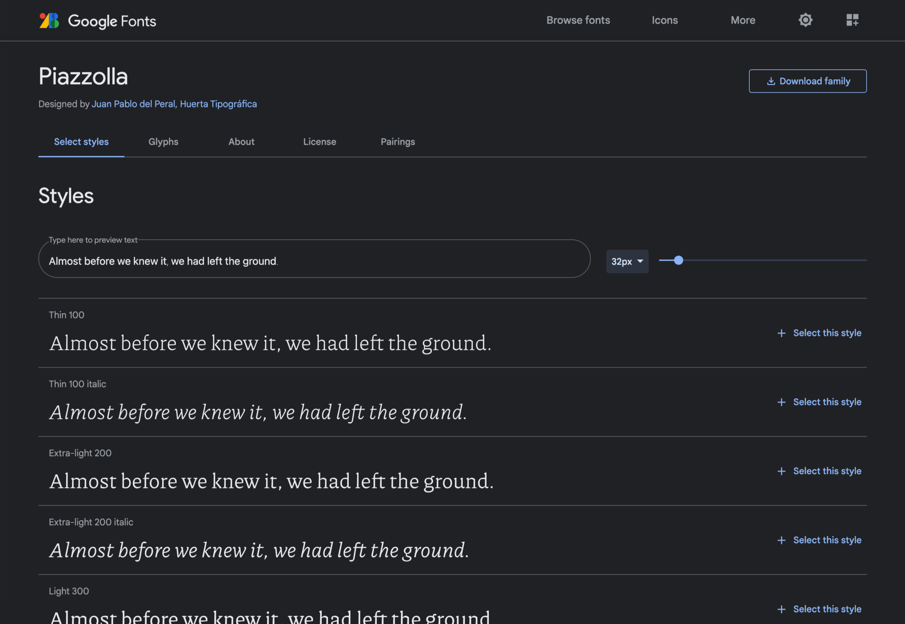
Piazzolla
Piazzolla features dramatic and expressive angular shapes when previewed in large sizes, but its real strength is in setting large amounts of body text.
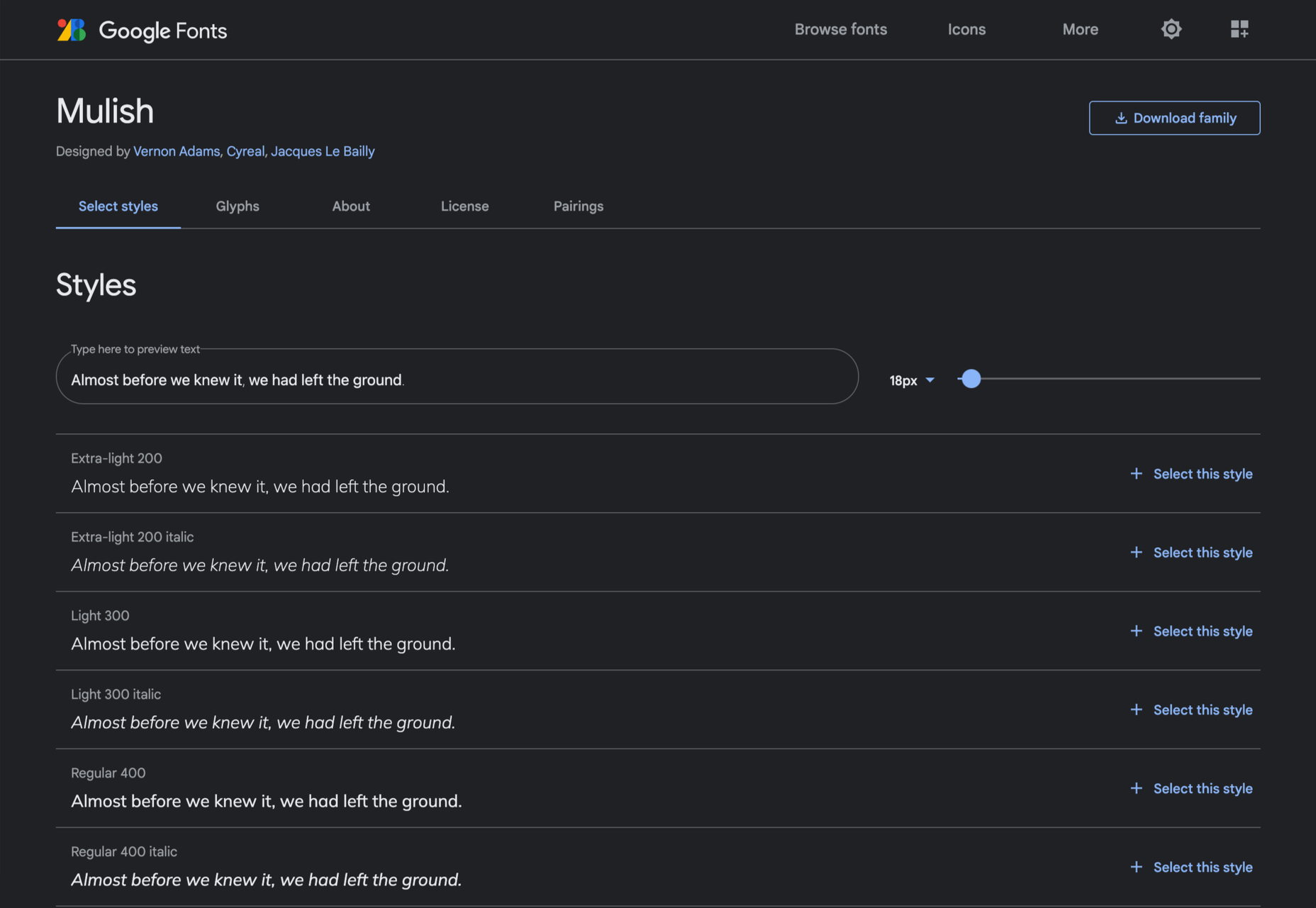
Mulish
If you’re looking for a solid workhorse sans, look no further than Mulish. Halfway between a humanist and geometric sans, there’s even a variable font version.
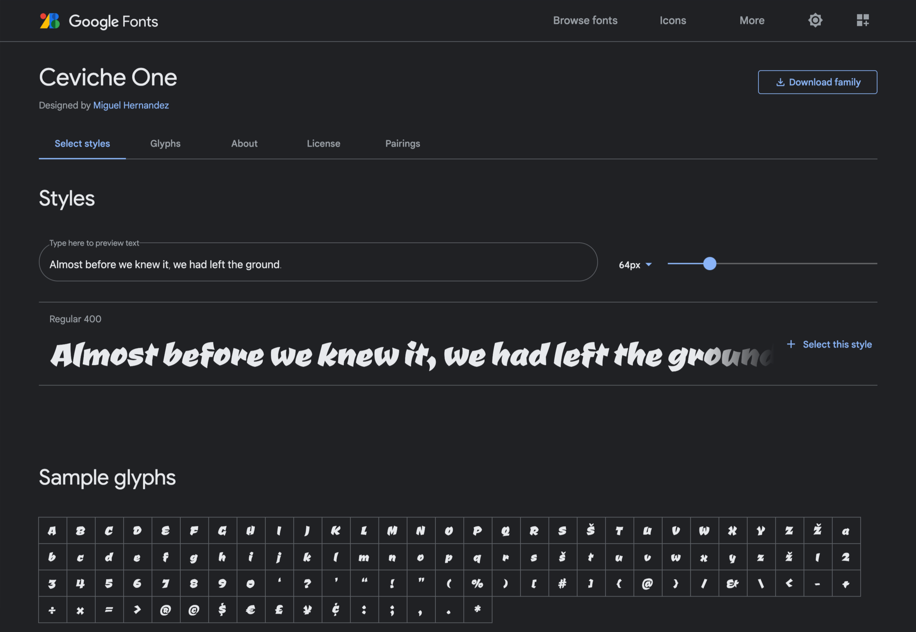
Ceviche One
Reminiscent of the cool lettering of 60s advertising, Ceviche One is packed with energy, thanks to the dramatic zig-zag formed along its baseline.
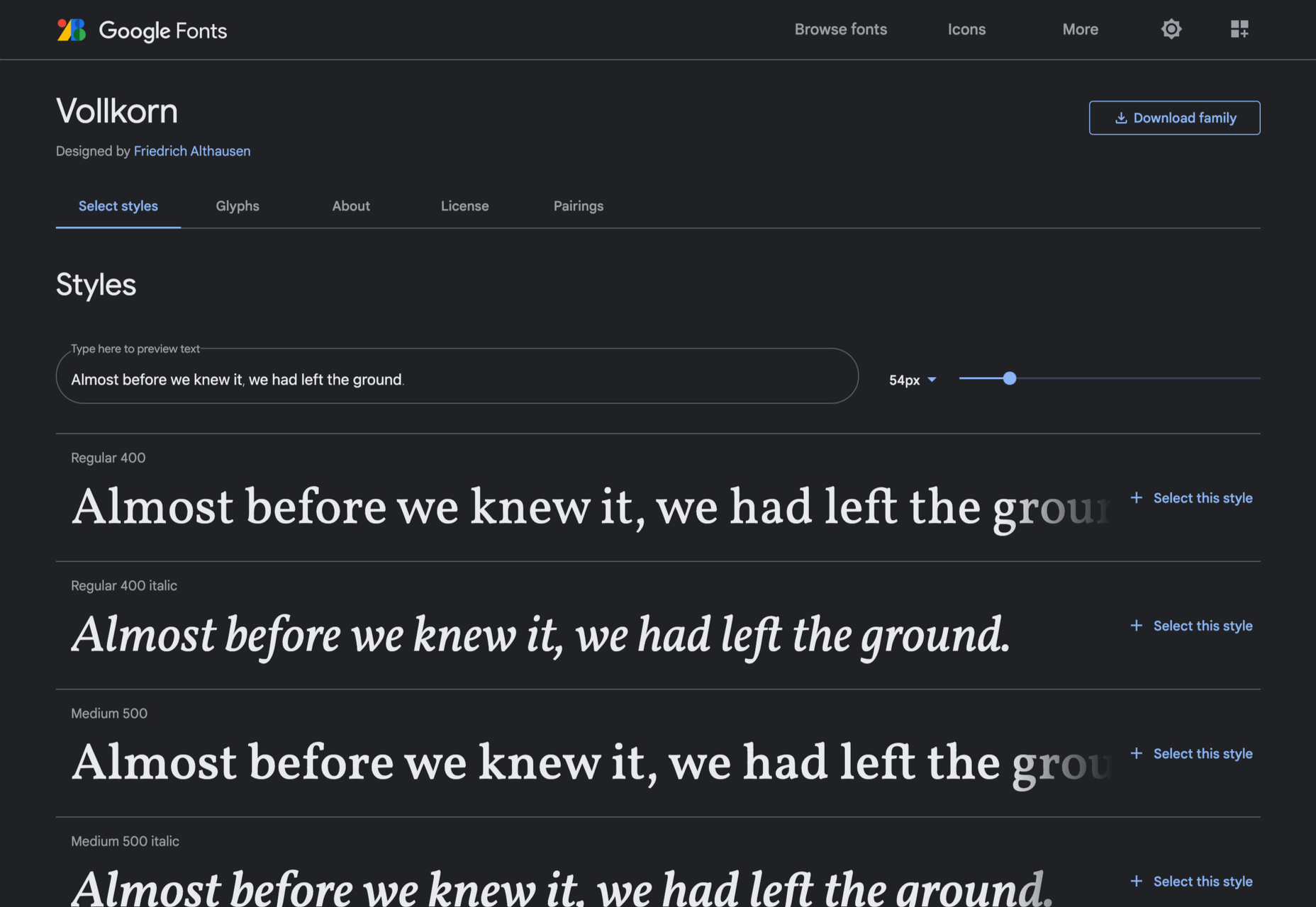
Vollkorn
Released by Friedrich Althausen in 2005, Vollkorn is an excellent typeface for body copy, excelling at small sizes. It now boasts a variable font option.
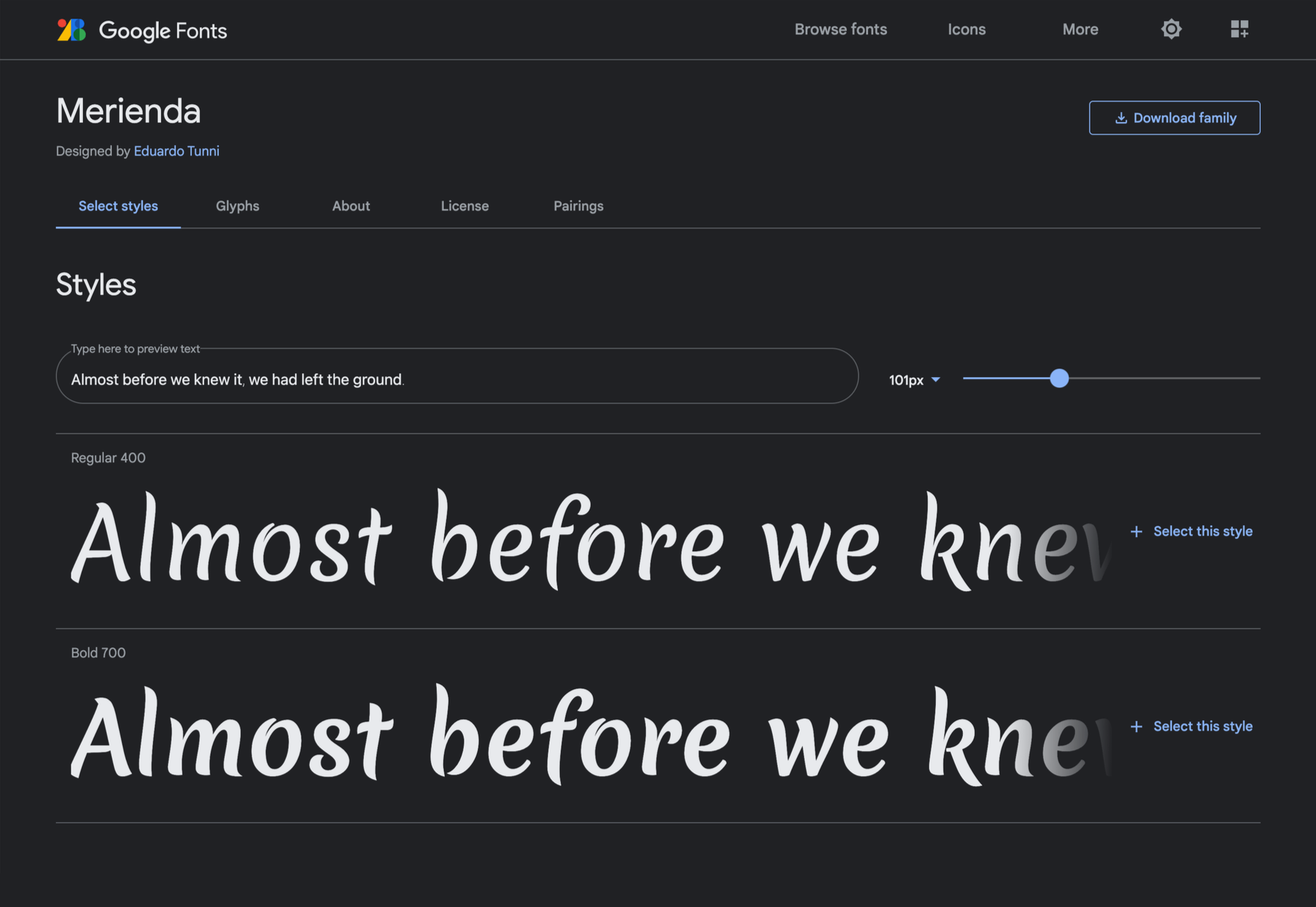
Merienda
Merienda is a delightfully energetic display script. The bold weight feels more confident, but both weights have a dancing rhythm that brings the page alive.
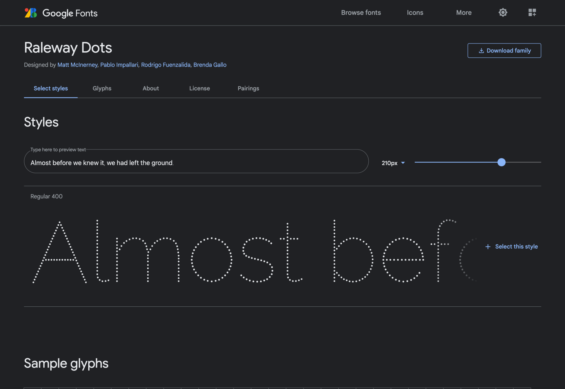
Raleway Dots
Raleway is a hugely popular — and perhaps overused font — but this dotted version is less known. It’s a simple geometric sans that functions as a display face.
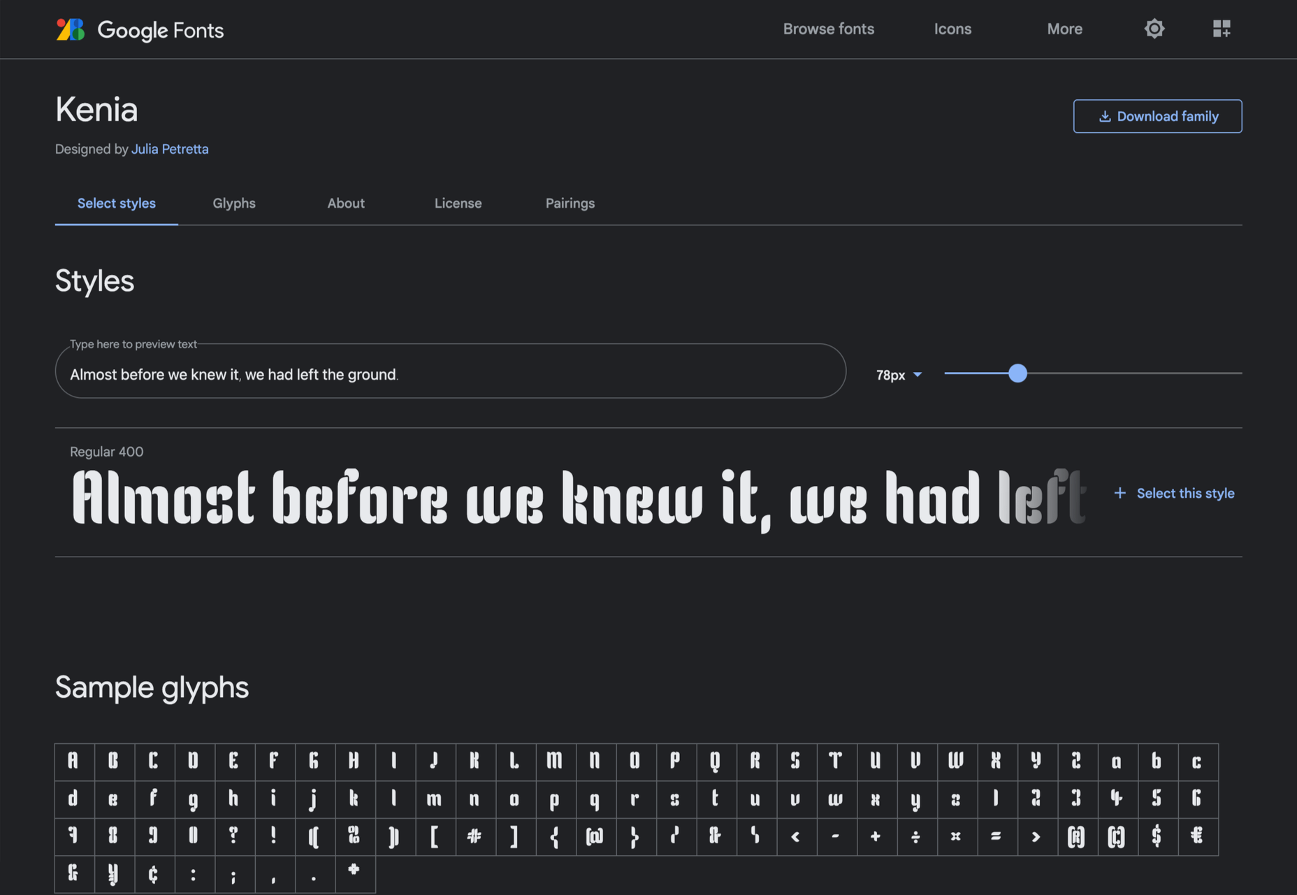
Kenia
Kenia is a wonderful, uncategorizable typeface. The stencil forms result in entirely original letter constructions, and the lowercase s is magnificent.
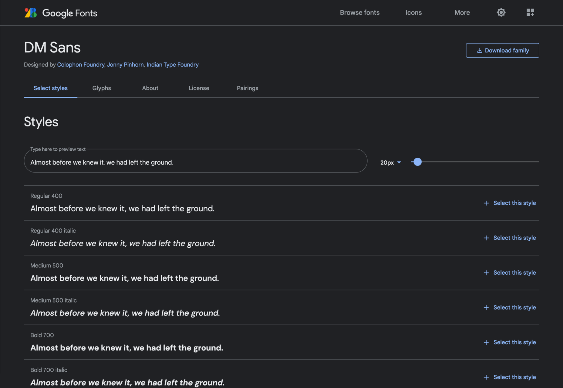
DM Sans
DM Sans is a low-contrast geometric sans-serif that performs wonderfully well at smaller sizes. It only has three weights, but each comes with a matching italic.
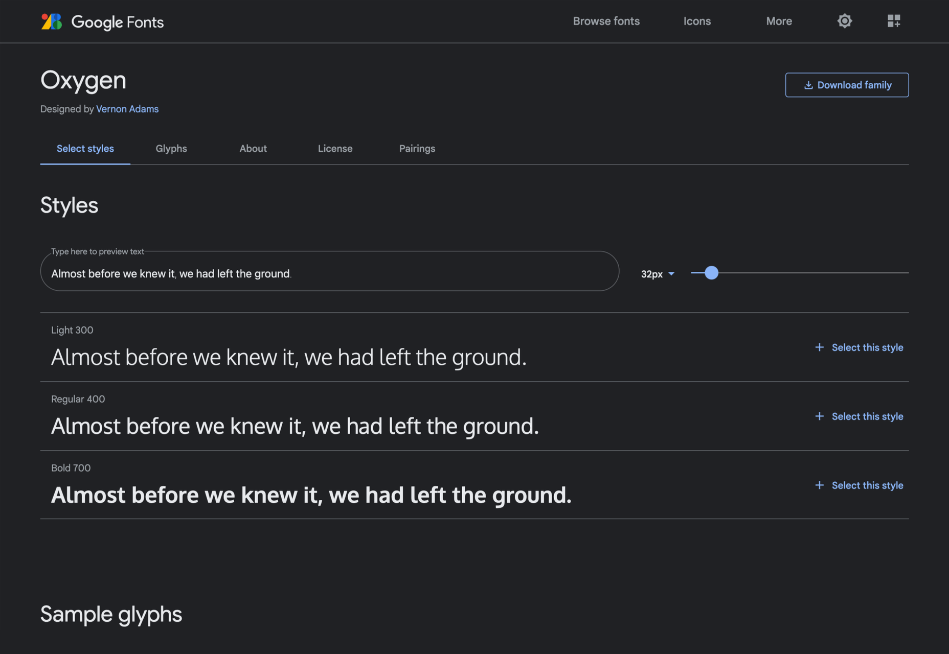
Oxygen
Designed by Vernon Adams as part of the KDE project for GNU+Linux, Oxygen is a very readable sans-serif, with a generous x-height and a hint of pen stroke.
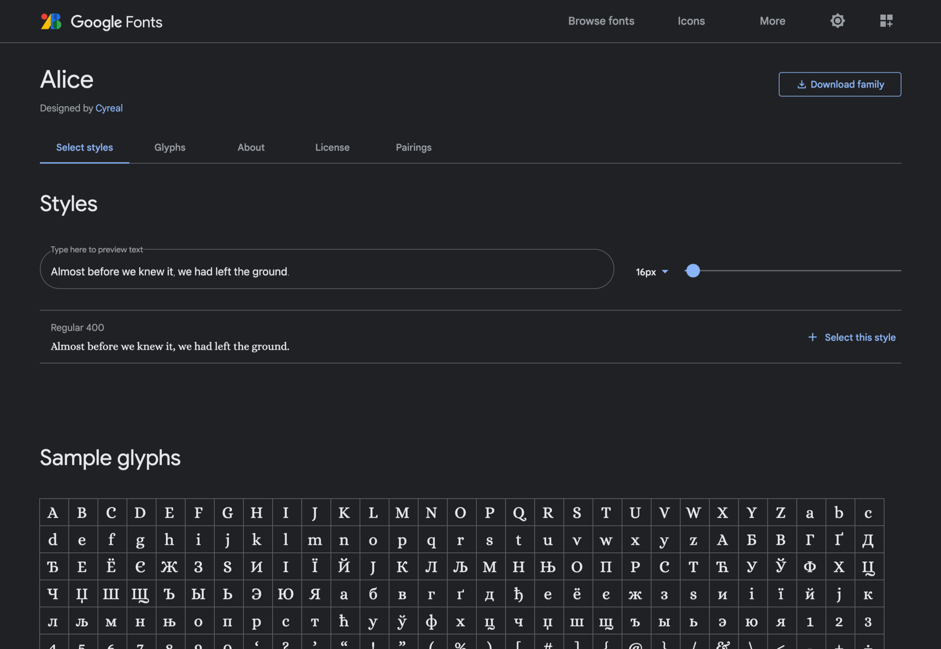
Alice
Ksenia Erulevich’s Alice was inspired by Lewis Carrol’s novel Alice’s Adventures in Wonderland. It presents itself as an Edwardian serif with fanciful flourishes.
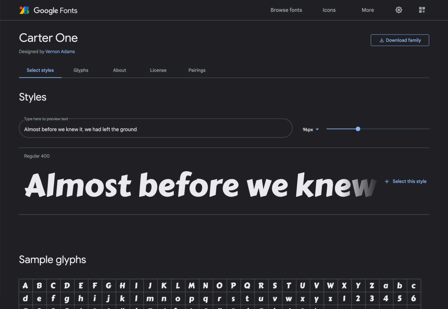
Carter One
Carter One uses bold strokes, with a medium amount of contrast, to create a sans-style script. It has dozens of beautiful details like the notch on the lowercase o.
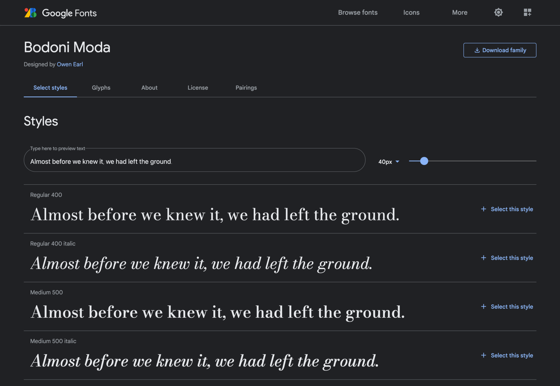
Bodoni Moda
Bodoni Moda is a didone-style serif with strong vertical strokes and high-contrast slab-like serifs. It’s the best variable font in this genre that I’ve found.
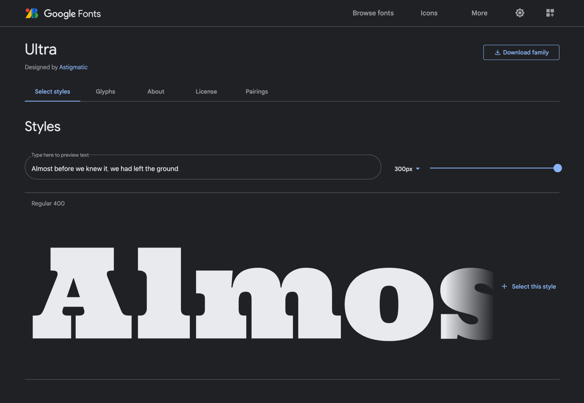
Ultra
Ultra is a slab-serif that you won’t even consider for body text. Its sculptural shapes are almost American-western. The counter on the lowercase n is charming.
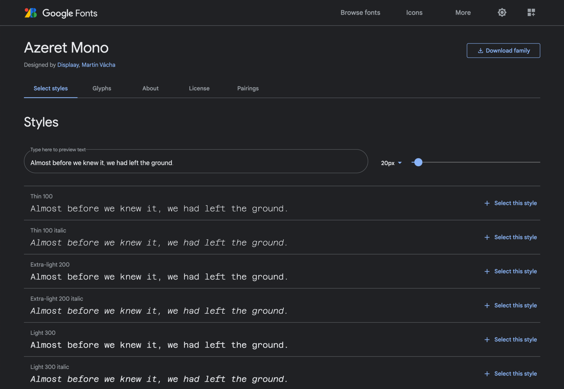
Azeret Mono
Most mono-spaced fonts fail to inspire; practical they can be, charming they are not. But Azeret Mono bucks that trend, its bold weights being particularly fantastic.
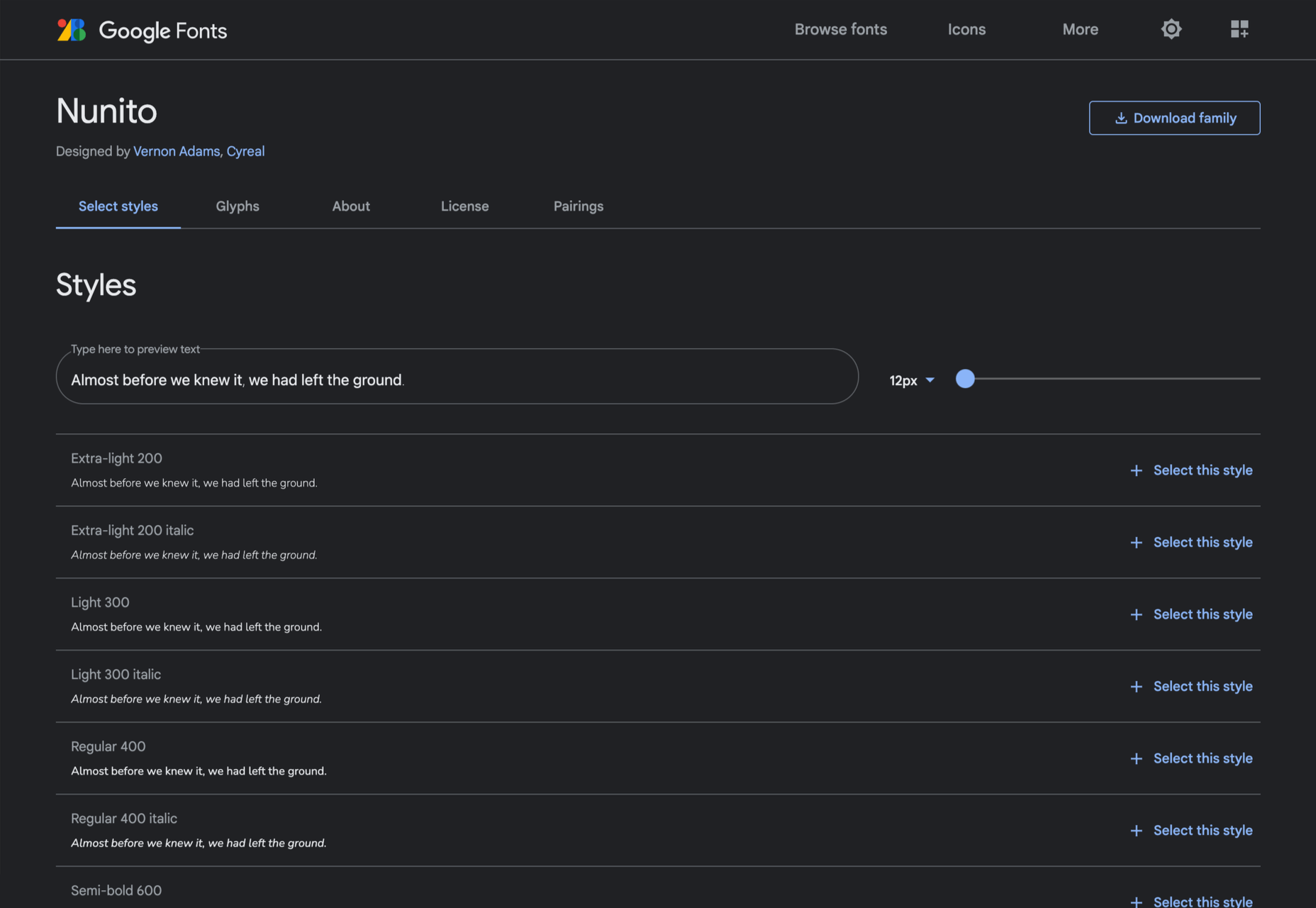
Nunito
It’s tough to find a serious sans-serif with rounded terminals, but Nunito is it. There’s also a Nunito Sans with square terminals, but I love the rounded tips.
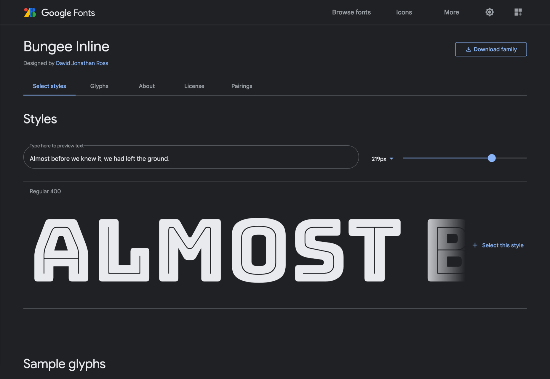
Bungee Inline
Designed for signage, Bungee is great for display sizes and works well vertically. There are several versions, but my favorite is this classy inline version.
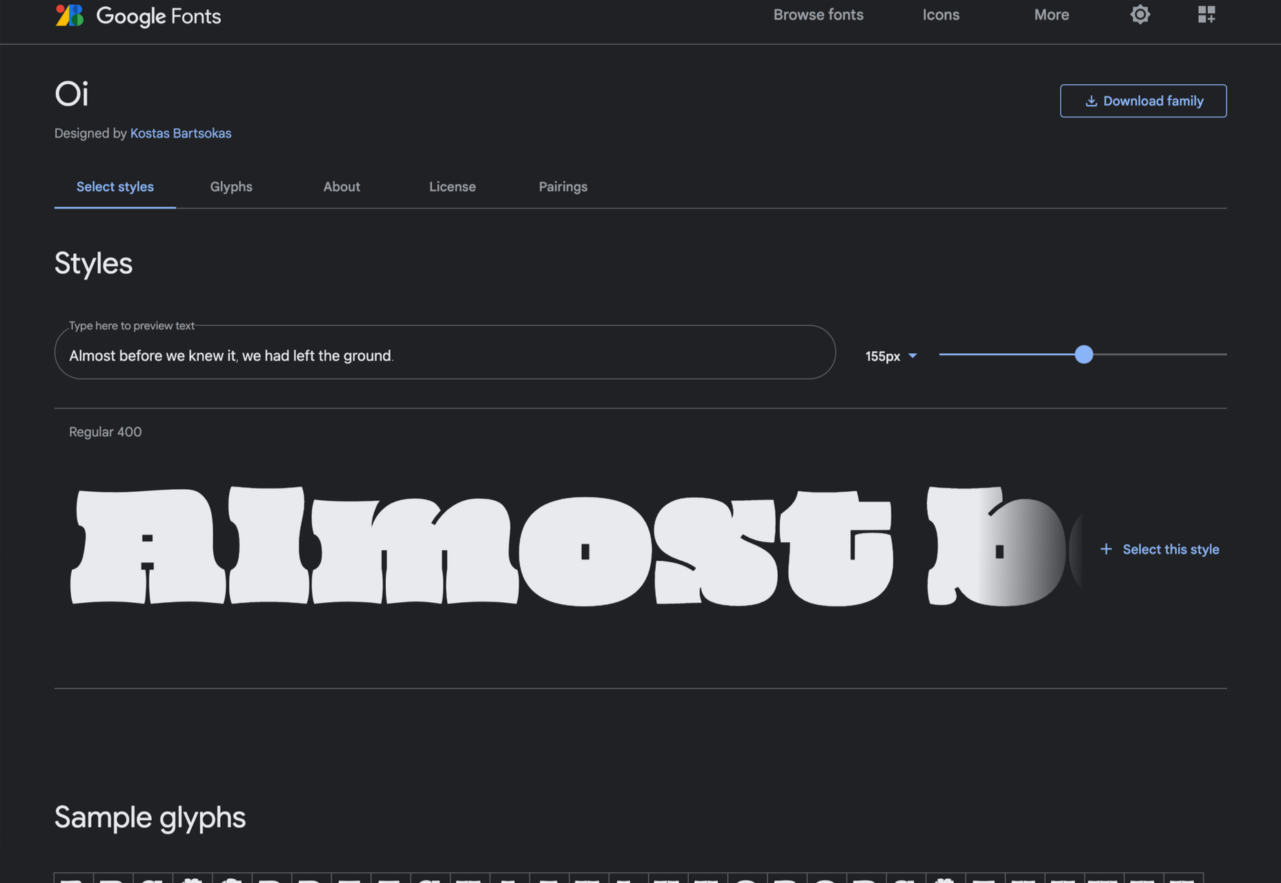
Oi
Oi is unapologetically loud. A slab-serif that swallows its own detail, the counters and ink traps give it a 3D quality, and the curves feel almost nautical.
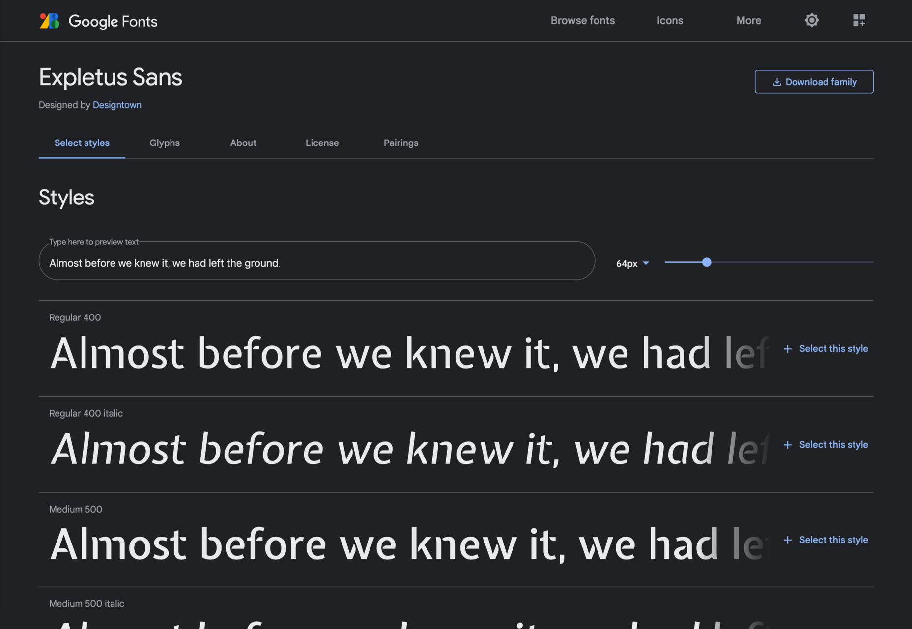
Expletus Sans
One of the significant trends in typography is the angled clip of adjoining strokes, creating the effect of shadow. This effect is brilliantly achieved in Expletus Sans.
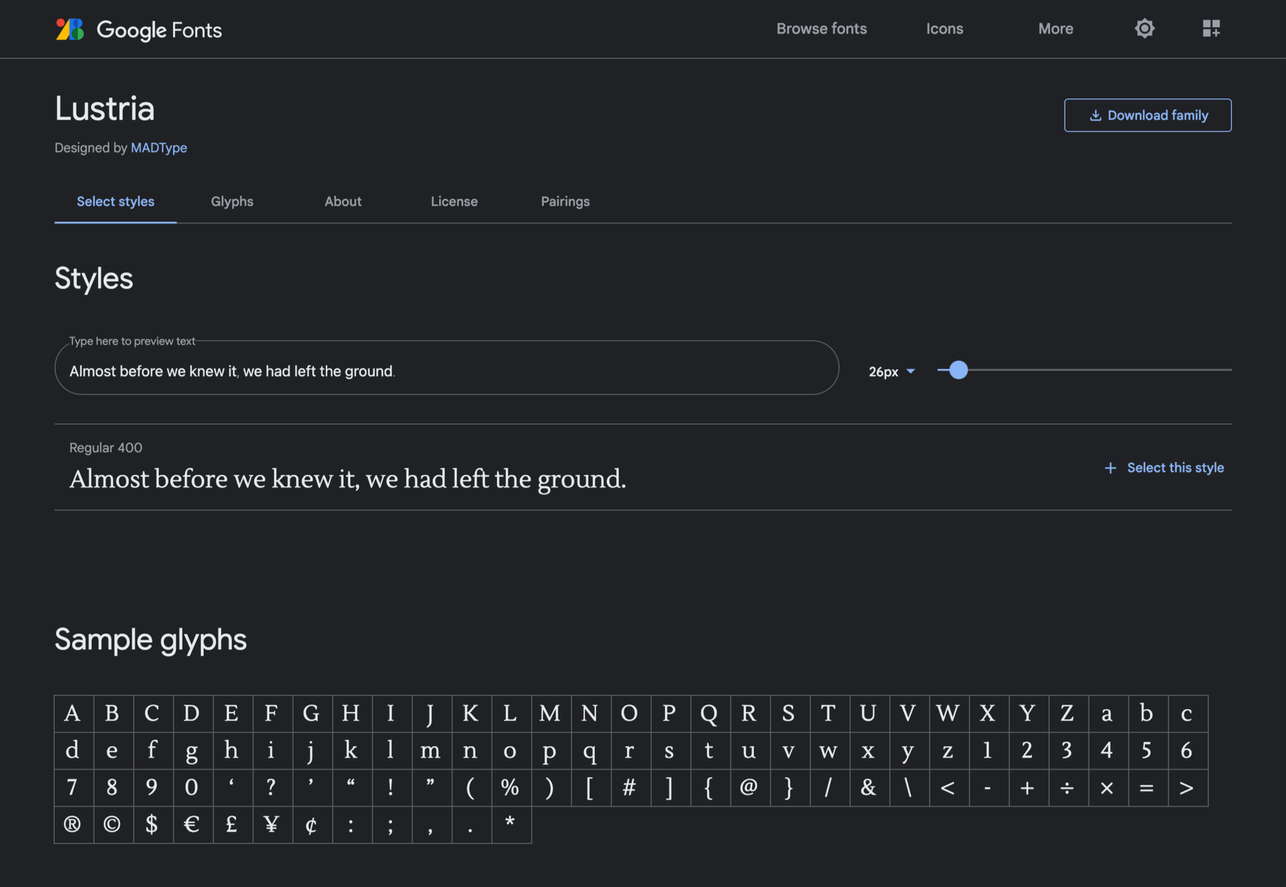
Lustria
It’s comparatively unusual to find a serif face designed to work well at display sizes. At large sizes, Lustria’s rounded terminals evoke ink spread delightfully.
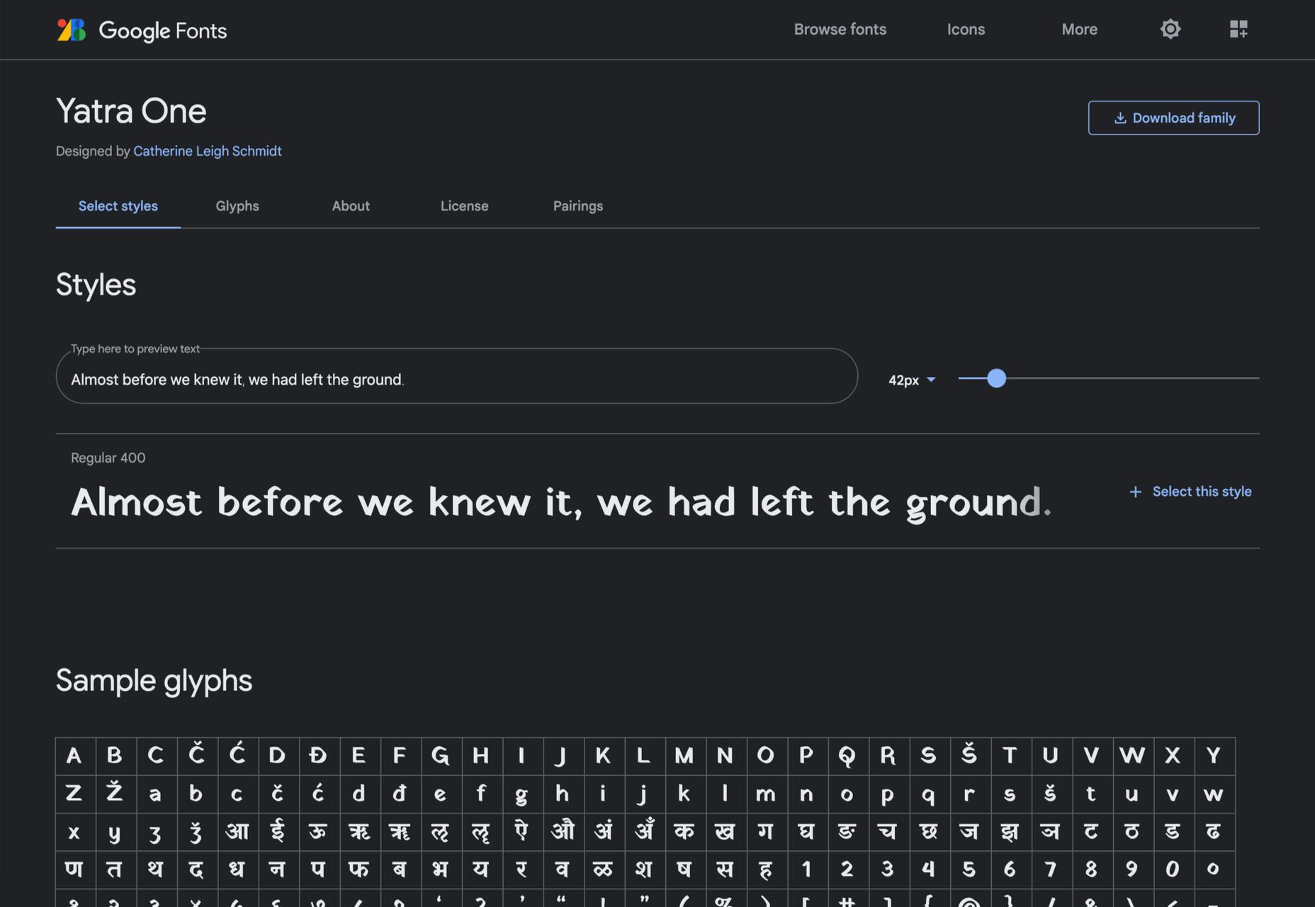
Yatra One
Yatra One is a Devanagari and Latin typeface that uses the Devanagari brush angle for its strokes, giving the Latin text an unusually slanted, stand-out character.
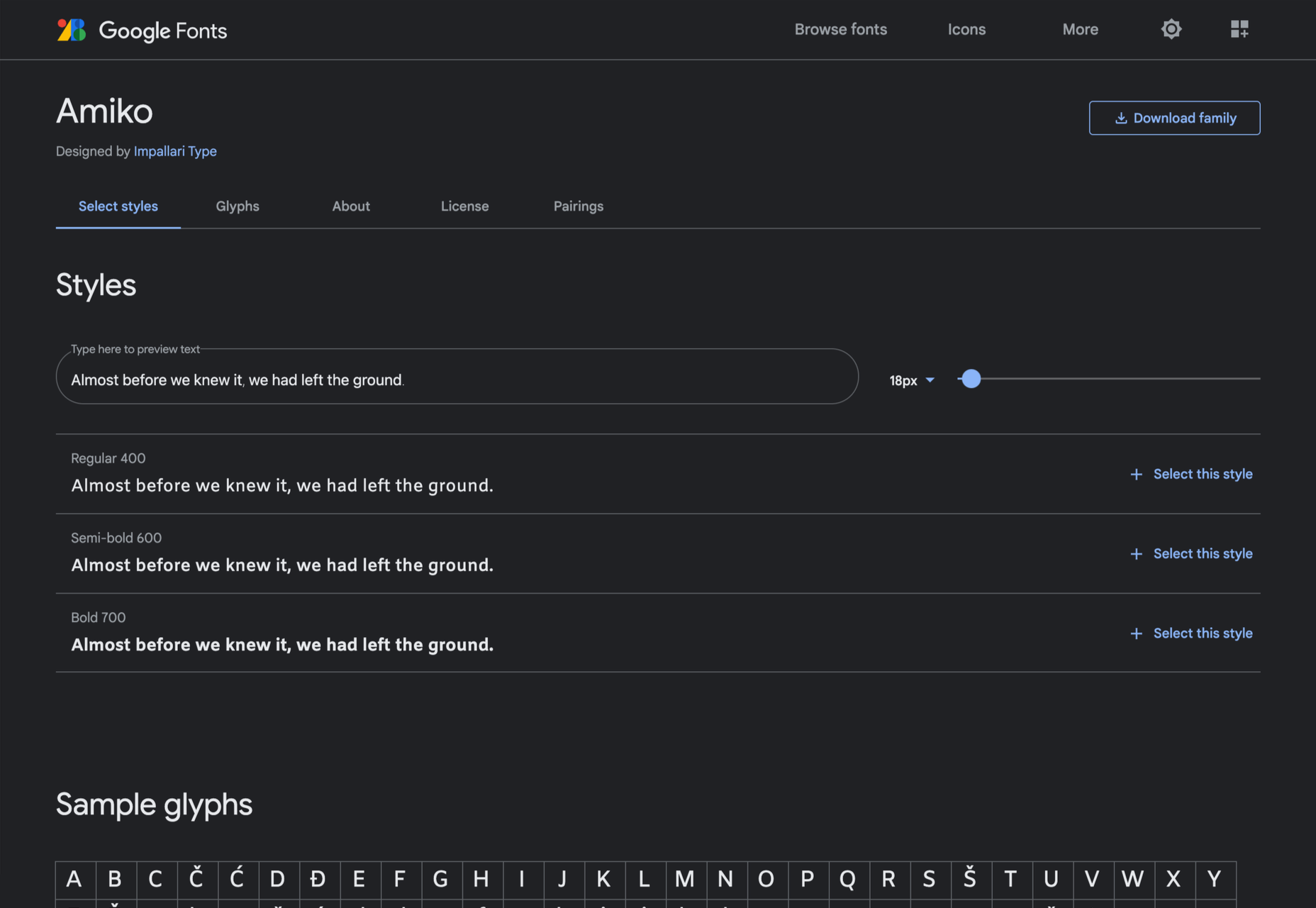
Amiko
Amiko is a highly legible typeface and excellent at tiny font sizes. It’s perfect as a secondary font if your main font is too fancy for elements like legal notices.
Keep Scrolling
It’s always tempting to leap at the first typeface you find that meets your needs, but if you dig a little deeper into Google Fonts, you’ll find a vast range of typefaces that offer both practicality and character.
Nowadays, creating complex shapes is an easy task using clip-path, but adding a border to the shapes is always a pain. There is no robust CSS solution and we always need to produce specific “hacky” code for each particular case. In this article, I will show you how to solve this problem using the CSS Paint API.
Before we dig into this third experimentation, Here is a small overview of what we are building. And, please note that everything we’re doing here is only supported in Chromium-based browsers so you’ll want to view the demos in Chrome, Edge, or Opera. See caniuse for the latest support.
You will find no complex CSS code there but rather a generic code where we only adjust a few variables to control the shape.
The main idea
In order to achieve the polygon border, I am going to rely on a combination of the CSS clip-path property and a custom mask created with the Paint API.
Nothing complex so far but note the use of the CSS variable --path. The entire trick relies on that single variable. Since I will be using a clip-path and a mask, both need to use the same parameters, hence the --path variable. And, yes, the Paint API will use that same variable to create the custom mask.
In addition to the clip-path, we apply the custom mask, plus we add an extra variable, --border, to control the thickness of the border. As you can see, everything is still pretty basic and generic CSS so far. After all, this is one of the things that makes the CSS Paint API so great to work with.
The JavaScript setup
I highly recommend reading the first part of my previous article to understand the structure of the Paint API.
Now, let’s see what is happening inside the paint() function as we jump into JavaScript:
const points = properties.get('--path').toString().split(',');
const b = parseFloat(properties.get('--border').value);
const w = size.width;
const h = size.height;

const cc = function(x,y) {
  // ...
}

var p = points[0].trim().split(" ");
p = cc(p[0],p[1]);

ctx.beginPath();
ctx.moveTo(p[0],p[1]);
for (var i = 1; i < points.length; i++) {
  p = points[i].trim().split(" ");
  p = cc(p[0],p[1]);
  ctx.lineTo(p[0],p[1]);
}
ctx.closePath();

ctx.lineWidth = 2*b;
ctx.strokeStyle = '#000';
ctx.stroke();
The ability to get and set CSS custom properties is one of the reasons they’re so great. We can reach for JavaScript to first read the value of the --path variable, then convert it into an array of points (seen on the very first line above). So, that means 50% 0,100% 100%,0 100% become the points for the mask, i.e. points = ["50% 0","100% 100%","0 100%"].
Then we loop through the points to draw a polygon using moveTo and lineTo. This polygon is exactly the same as the one drawn in CSS with the clip-path property.
Finally, and after drawing the shape, I add a stroke to it. I define the thickness of the stroke using lineWidth and I set a solid color using strokeStyle. In other words, only the stroke of the shape is visible since I am not filling the shape with any color (i.e. it’s transparent).
Now all we have to do is to update the path and the thickness to create any polygon border. It’s worth noting that we are not limited to solid color here since we are using the CSS background property. We can consider gradients or images.
In case we need to add content, we have to consider a pseudo-element. Otherwise, the content gets clipped in the process. It’s not incredibly tough to support content. We move the mask property to the pseudo-element. We can keep the clip-path declaration on the main element.
CodePen Embed Fallback
Questions so far?
I know you probably have some burning questions you want to ask after looking over that last script. Allow me to preemptively answer a couple things I bet you have in mind.
What is that cc() function?
I am using that function to convert the value of each point into pixel values. For each point, I get both x and y coordinates — using points[i].trim().split(" ") — and then I convert those coordinates to make them usable inside the canvas element that allows us to draw with those points.
const cc = function(x,y) {
  var fx=0,fy=0;
  if (x.indexOf('%') > -1) {
    fx = (parseFloat(x)/100)*w;
  } else if(x.indexOf('px') > -1) {
    fx = parseFloat(x);
  }
  if (y.indexOf('%') > -1) {
     fy = (parseFloat(y)/100)*h;
  } else if(y.indexOf('px') > -1) {
    fy = parseFloat(y);
  }
  return [fx,fy];
}
The logic is simple: if it’s a percentage value, I use the width (or the height) to find the final value. If it’s a pixel value, I simply get the value without the unit. If, for, example we have [50% 20%] where the width is equal to 200px and the height is equal to 100px, then we get [100 20]. If it’s [20px 50px], then we get [20 50]. And so on.
Why are you using CSS clip-path if the mask is already clipping the element to the stroke of the shape?
Using only the mask was the first idea I had in mind, but I stumbled upon two major issues with that approach. The first is related to how stroke() works. From MDN:
Strokes are aligned to the center of a path; in other words, half of the stroke is drawn on the inner side, and half on the outer side.
That “half inner side, half outer side” gave me a lot of headaches, and I always end up with a strange overflow when putting everything together. That’s where CSS clip-path helps; it clips the outer part and only keeps the inner side — no more overflow!
You will notice the use of ctx.lineWidth = 2*b. I am adding double the border thickness because I will clip half of it to end with the right thickness needed around the entire shape.
The second issue is related to the shape’s hover-able area. It’s known that masking does not affect that area and we can still hover/interact with the whole rectangle. Again, reaching for clip-path fixes the issue, plus we limit the interaction just to the shape itself.
The following demo illustrates these two issues. The first element has both a mask and clip-path, while the second only has the mask. We can clearly see the overflow issue. Try to hover the second one to see that we can change the color even if the cursor is outside the triangle.
CodePen Embed Fallback
Why are you using @property with the border value?
This is an interesting — and pretty tricky — part. By default, custom properties (like --border) are considered a “CSSUnparsedValue” which means they are treated as strings. From the CSS spec:
‘CSSUnparsedValue’ objects represent property values that reference custom properties. They are comprised of a list of string fragments and variable references.
With @property, we can register the custom property and give it a type so that it can be recognized by the browser and handled as a valid type instead of a string. In our case, we are registering the border as a type so later it becomes a CSSUnitValue. What this also does is allow us to use any length unit (px, em, ch,vh, etc.) for the border value.
This may sound a bit complex but let me try to illustrate the difference with a DevTools screenshot.
I am using console.log() on a variable where I defined 5em. The first one is registered but the second one is not.
In the first case, the browser recognizes the type and makes the conversion into a pixel value, which is useful since we only need pixel values inside the paint() function. In the second case, we get the variable as a string which is not very useful since we cannot convert em units into px units inside the paint() function.
Try all the units. It will always results with the computed pixel value inside the paint() function.
What about the --path variable?
I wanted to use the same approach with the --path variable but, unfortunately, I think I pushed CSS right up to the limits of what it can do here. Using @property, we can register complex types, even multi-value variables. But that’s still not enough for the path we need.
We can use the + and # symbols to define a space-separated or comma-separated list of values, but our path is a comma-separated list of space-separated percentage (or length) values. I would use something like [+]#, but it doesn’t exist.
For the path, I am obliged to manipulate it as a string value. That limits us just to percentage and pixel values for now. For this reason, I defined the cc() function to convert the string values into pixel values.
The internal grammar of the syntax strings is a subset of the CSS Value Definition Syntax. Future levels of the specification are expected to expand the complexity of the allowed grammar, allowing custom properties that more closely resemble the full breadth of what CSS properties allow.
Even if the grammar is extend to be able to register the path, we will still face issue in case we need to include calc() inside our path:
In the above, calc(100% - 40px) is a value that the browser considers a , but the browser cannot compute that value until it knows the reference for the percentage. In other words, we cannot get the equivalent pixel value inside the paint() function since the reference can only be known when the value gets used within var().
To overcome this, we can can extend the cc() function to do the conversion. We did the conversion of a percentage value and a pixel value, so let’s combine those into one conversion. We will consider 2 cases: calc(P% - Xpx) and calc(P% + Xpx). Our script becomes:
const cc = function(x,y) {
  var fx=0,fy=0;
  if (x.indexOf('calc') > -1) {
    var tmp = x.replace('calc(','').replace(')','');
    if (tmp.indexOf('+') > -1) {
      tmp = tmp.split('+');
      fx = (parseFloat(tmp[0])/100)*w + parseFloat(tmp[1]);
    } else {
      tmp = tmp.split('-');
      fx = (parseFloat(tmp[0])/100)*w - parseFloat(tmp[1]);
    }
   } else if (x.indexOf('%') > -1) {
      fx = (parseFloat(x)/100)*w;
   } else if(x.indexOf('px') > -1) {
      fx = parseFloat(x);
   }

   if (y.indexOf('calc') > -1) {
    var tmp = y.replace('calc(','').replace(')','');
    if (tmp.indexOf('+') > -1) {
       tmp = tmp.split('+');
       fy = (parseFloat(tmp[0])/100)*h + parseFloat(tmp[1]);
     } else {
       tmp = tmp.split('-');
       fy = (parseFloat(tmp[0])/100)*h - parseFloat(tmp[1]);
     }
    } else if (y.indexOf('%') > -1) {
      fy = (parseFloat(y)/100)*h;
    } else if(y.indexOf('px') > -1) {
      fy = parseFloat(y);
    }
  return [fx,fy];
}
We’re using indexOf() to test the existence of calc, then, with some string manipulation, we extract both values and find the final pixel value.
And, as a result, we also need to update this line:
p = points[i].trim().split(" ");
…to:
p = points[i].trim().split(/(?!(.*)s(?![^(]*?))/g);
Since we need to consider calc(), using the space character won’t work for splitting. That’s because calc() also contains spaces. So we need a regex. Don’t ask me about it — it’s the one that worked after trying a lot from Stack Overflow.
Here is basic demo to illustrate the update we did so far to support calc()
CodePen Embed Fallback
Notice that we have stored the calc() expression within the variable --v that we registered as a . This is also a part of the trick because if we do this, the browser uses the correct format. Whatever the complexity of the calc() expression, the browser always converts it to the format calc(P% +/- Xpx). For this reason, we only have to deal with that format inside the paint() function.
Below different examples where we are using a different calc() expression for each one:
CodePen Embed Fallback
If you inspect the code of each box and see the computed value of --v, you will always find the same format which is super useful because we can have any kind of calculation we want.
It should be noted that using the variable --v is not mandatory. We can include the calc() directly inside the path. We simply need to make sure we insert the correct format since the browser will not handle it for us (remember that we cannot register the path variable so it’s a string for the browser). This can be useful when we need to have many calc() inside the path and creating a variable for each one will make the code too lengthy. We will see a few examples at the end.
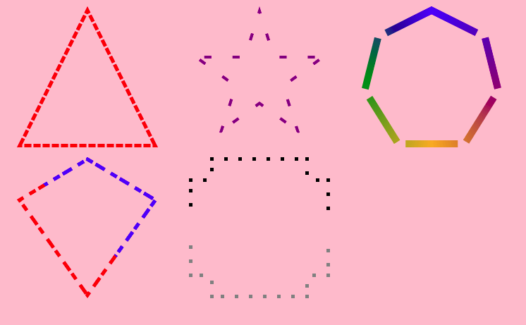
Can we have dashed border?
We can! And it only takes one instruction. The element already has a built-in function to draw dashed stroke setLineDash():
The setLineDash() method of the Canvas 2D API’s CanvasRenderingContext2D interface sets the line dash pattern used when stroking lines. It uses an array of values that specify alternating lengths of lines and gaps which describe the pattern.
All we have to do is to introduce another variable to define our dash pattern.
In the CSS, we simply added a CSS variable, --dash, and within the mask is the following:
// ...
const d = properties.get('--dash').toString().split(',');
// ...
ctx.setLineDash(d);
We can also control the offset using lineDashOffset. We will see later how controlling the offset can help us reach some cool animations.
Why not use @property instead to register the dash variable?
Technically, we can register the dash variable as a # since it’s a comma-separated list of length values. It does work, but I wasn’t able to retrieve the values inside the paint() function. I don’t know if it’s a bug, a lack of support, or I’m just missing a piece of the puzzle.
If we inspect the element, we can see that the browser is handling the variable correctly since the computed values are pixel ones
But we only get the first value inside the paint() function
Until I find the a fix for this, I am stuck using the --dash variable as a string, like the --path. Not a big deal in this case as I don’t think we will need more than pixel values.
Use cases!
After exploring the behind the scene of this technique, let’s now focus on the CSS part and check out a few uses cases for our polygon border.
A collection of buttons
We can easily generate custom shape buttons having cool hover effect.
CodePen Embed Fallback
Notice how calc() is used inside the path of the last button the way we described it earlier. It works fine since I am following the correct format.
Breadcrumbs
No more headaches when creating a breadcrumb system! Below, you will find no “hacky” or complex CSS code, but rather something that’s pretty generic and easy to understand where all we have to do is to adjust a few variables.
CodePen Embed Fallback
Card reveal animation
If we apply some animation to the thickness, we can get some fancy hover effect
CodePen Embed Fallback
We can use that same idea to create an animation that reveals the card:
CodePen Embed Fallback
Callout & speech bubble
“How the hell we can add border to that small arrow???” I think everyone has stumbled on this issue when dealing with either a callout or speech bubble sort of design. The Paint API makes this trivial.
CodePen Embed Fallback
In that demo, you will find a few examples that you can extend. You only need to find the path for your speech bubble, then adjust some variables to control the border thickness and the size/position of the arrow.
Animating dashes
A last one before we end. This time we will focus on the dashed border to create more animations. We already did one in the button collection where we transform a dashed border into a solid one. Let’s tackle two others.
Hover the below and see the nice effect we get:
CodePen Embed Fallback
Those who have worked with SVG for some time are likely familiar with the sort effect that we achieve by animating stroke-dasharray. Chris even tackled the concept a while back. Thanks to the Paint API, we can do this directly in CSS. The idea is almost the same one we use with SVG. We define the dash variable:
--dash: var(--a),1000;
The variable --a starts at 0, so our pattern is a solid line (where the length equals 0) with a gap (where length 1000); hence no border. We animate --a to a big value to draw our border.
We also talked about using lineDashOffset, which we can use for another kind of animation. Hover the below and see the result:
CodePen Embed Fallback
Finally, a CSS solution to animate the position of dashes that works with any kind of shape!
What I did is pretty simple. I added an extra variable, --offset, to which I apply a transition from 0 to N. Then, inside the paint() function, I do the following:
const o = properties.get('--offset');
ctx.lineDashOffset=o;
As simple as that! Let’s not forget an infinite animation using keyframes:
CodePen Embed Fallback
We can make the animation run continuously by offsetting 0 to N where N is the sum of the values used in the dash variable (which, in our case, is 10+15=25). We use a negative value to have the opposite direction direction.
I have probably missed a lot of use cases that I let you discover!
Every day design fans submit incredible industry stories to our sister-site, Webdesigner News. Our colleagues sift through it, selecting the very best stories from the design, UX, tech, and development worlds and posting them live on the site.
The best way to keep up with the most important stories for web professionals is to subscribe to Webdesigner News or check out the site regularly. However, in case you missed a day this week, here’s a handy compilation of the top curated stories from the last seven days. Enjoy!
My favorite kind of blog post is when someone takes a subject that I’ve spent all of five minutes considering and then says—no!—this is an enormous topic worthy of a dissertation. Look at all the things you can do with this tiny CSS property!
I was reminded of this when I spotted this post by Josh Comeau about designing beautiful shadows in CSS:
In my humble opinion, the best websites and web applications have a tangible “real” quality to them. There are lots of factors involved to achieve this quality, but shadows are a critical ingredient.
When I look around the web, though, it’s clear that most shadows aren’t as rich as they could be. The web is covered in fuzzy grey boxes that don’t really look much like shadows.
Josh shows the regular old boring shadow approaches and then explores all the ways to improve and optimize them into shadows with real depth. It all comes down to taking a closer look color and exploring the box-shadow CSS property. And speaking of depth, Rob O’Leary’s “Getting Deep Into Shadows” is another comprehensive look at shadows.
I had also completely forgotten about filter: drop-shadow; which is particularly useful on adding shadows to images that you want to throw onto a page. Great stuff all round.
element, as documented here by Kitty Guiraudel. It’s obscure enough that you might never run into it, but if you do, I could see it being very confusing (it would confuse me, at least).
Perhaps you’re aware of the shadow DOM? It’s talked about a lot in terms of web components and comes up when thinking in terms of and . But
has a shadow DOM too:
<details>
  #shadow-root (user-agent)
  <slot name="user-agent-custom-assign-slot" id="details-summary">
    <!-- <summary> reveal -->
  </slot>
  <slot name="user-agent-default-slot" id="details-content">
    <!-- <p> reveal -->
  </slot>

  <summary>System Requirements</summary>
  <p>
    Requires a computer running an operating system. The computer must have some
    memory and ideally some kind of long-term storage. An input device as well
    as some form of output device is recommended.
  </p>
</details>
is inserted in the first shadow root slot, while the rest of the content (called “light DOM”, or the tag in our case) is inserted in the second slot.
The thing is, none of these slots or the shadow root are matched by the universal selector *, which only matches elements from the light DOM.
So the is kind of “in the way” there. That
is actually a child of the , in the end. It’s extra weird, because a selector like details > p will still select it just fine. Presumably, that selector gets resolved in the light DOM and then continues to work after it gets slotted in.
But if you tell a property to inherit, things break down. If you did something like…
<div>
  <p></p>
</div>
div {
  border-radius: 8px;
}
div p {
  border-radius: inherit;
}
is going to be square as a square doorknob. I guess that’s either because you can’t force inheritance through the shadow DOM, or the inherit only happens from the parent which is a ? Whatever the case, it doesn’t work.
Content is the king of the digital world. This is an undisputed fact among marketers and business owners alike.
However, not all content is created equal. Interactive content is a more immersive form of marketing specifically intended for the digital age. Great for companies that need to develop deeper relationships with their audience.
There are various kinds of interactive content for brands to explore these days. For example, you can create a poll where your customers vote for certain answers to questions. In addition, some companies hire developers to build immersive gaming experiences with prizes and rewards.
Even standard content like blogs and articles can become more interactive with things like animations, buttons, and elements that ask visitors to do something.
One of the most valuable forms of interactive content is the quiz. So, how can companies use quizzes to engage their audience effectively? Let’s find out…
The Benefits of Quizzes in Interactive Content
According to studies, 93% of marketers believe interactive content is extremely effective for educating and entertaining customers. Interactive content is meaningful because it’s engaging, and many marketers state that creating engaging content is one of their toughest challenges.
In an environment where the average attention span is constantly dwindling, interactive content reduces the risk that your customer will end up being distracted by something else before they have a chance to convert on your website.
Quizzes are an excellent form of interactive content, but many marketers don’t take full advantage of them yet. Quizzes, like some other forms of interactive content, can come in different styles. For example, you could have a personality quiz that tells your customer what kind of vegetable they would be. That might sound odd, but it helps to give your customer a sense of belonging, gives them a feeling of being understood, and offers entertainment.
Some quizzes can answer questions for your customer.
For instance, a quiz on “what to buy your dad for father’s day” is an excellent way to solve a customer’s problem while guiding them towards potential products that you sell.
Z Gallerie, a retail company, launched a quiz called “What is your Z Gallerie Style personality?” The quiz offers a personalized recommendation experience on what to purchase for every current and potential customer.
The personality quiz became a great way of bringing product recommendations to leads without being pushy. Z Gallerie could, therefore, consistently provide a unique experience to each customer based on their results.
So, how do you make a quiz that’s really effective for your content marketing plan?
Step 1: Creating the Quiz
Quizzes are a kind of interactive content that can almost feel like a conversation with a brand. They’re an opportunity for you to show your audience how well you understand them.
According to TryInteract, people take quizzes because they want to know themselves better or want to confirm what they think they already know about themselves. These content solutions solve problems, even if they’re handling a person’s curiosity about what kind of celebrity they’re most like.
Before you start making your quiz, you need to know your goal and what you’re trying to do for your audience. If your goal is to get more people to feel more attuned to your company, you might need to create something that demonstrates how well you know your visitors.
The goal for the company is to demonstrate a deep knowledge of the industry and target market. If the quiz is helpful and informative, it adds to the brand’s credibility and makes it more likely that customers will want to continue purchasing.
Before you build your quiz, ask yourself:
What do you want to get out of your audience taking this quiz? (More conversions, better brand loyalty, improved engagement?)
Why would your audience want to take the quiz? (Is it relevant to their interests, will it give them some vital information?)
Knowing exactly what you and your audience should accomplish with the quiz will give you a good platform to begin building on.
Step 2: Choose the Title and Quiz Type
Titles are important in any content marketing. 80% of readers decide whether to check out an article based on its title. The same process is common for people who want to decide whether they should take a quiz or not.
There are a lot of great ways to pique your visitor’s attention with a quiz title. For instance, you could challenge your audience to prove their knowledge with the word “actually.” For instance, “How much do you actually know about Kale?” That kind of title immediately appeals to the competitive nature of the human being.
Another great example of a challenging title is to tell your audience that they can’t do something. Buzzfeed did that with its millennial quiz. The great thing about this quiz title is that it speaks to the competitive nature of the reader but also gives that reader a chance to show that they belong to a specific community.
Another option could be to ask a question and hope that curiosity will do the rest of the work for you. For instance, “Which celebrity chef are you most like?” The key to success here is understanding your audience and knowing exactly what they most want to know.
Once you’ve figured out the title, choosing the kind of quiz you want to create is the next step. For instance, you can try:
Personality quizzes: People like hearing good things about themselves because of a psychological phenomenon called self-serving bias. A personality quiz that recognizes the features your customers like about themselves will make them feel happier and more connected to your brand.
The knowledge test: Commonly found on social media, these quizzes challenge a person’s knowledge on a specific subject. The benefit here is that your audience can learn something and share their knowledge with their friends for social points. This quiz from Unicef is an excellent example of the “knowledge” style quiz.
Step 3: Crafting Quiz Questions
Once you have a good idea of the kind of quiz you want to create and the title you’re going to put alongside it, you’ll need to begin bringing your interactive content to life. That means designing the right questions.
Writing questions for a quiz is just like creating any excellent content. First, you need to keep your target audience in mind. Next, think about the kind of personality you’re trying to appeal to. Breathing some life into your quiz by injecting your unique sense of personality into it will be an excellent way to strengthen your bond with your customers.
Other tips for making the most of your quiz questions include:
Use visuals in your questions: Having text-only questions is fine in some cases, but it’s worth looking into images too. Using pictures helps to keep things relevant and interesting and makes your quiz feel a lot more immersive.
Don’t make questions too long: In-depth and complicated questions will only scare your audience away. Remember that they’re looking for something fun and lighthearted to do. This means that your questions should be as short as possible.
Make it interesting: Don’t just ask basic questions like “what’s your favorite color” try to go beyond what your customers usually see on quizzes and make it relevant to the quiz topic. Again, this is your chance to show your audience how much you know.
Step 4: Creating Results That People Want to Share
If you want to design a quiz that really blows your audience away, then the results are one of the most important things to focus on. The results you offer your customers dictate whether they enjoy your quiz so much that they want to share it with other people. Creating share-worthy results is how you boost your chances of finding new customers and even going viral.
So, how do you design results that people want to share? Start by helping your customers to feel positive about themselves. The results should make them feel like a better person or confirm the good things they already believe about themselves. Research tells us that positive emotions are more likely to promote sharing.
For instance, this quiz from the PBS company makes people feel good by demonstrating that they know their books. This confirms a customer’s idea that they are well-read.
Using share-worthy images is another way to improve your chances of designing results that people want to share. You’ll need to use interesting pictures here that speak to your audience. Bright and entertaining pictures will make results more eye-catching on a social media feed.
Don’t forget to include a call-to-action on your results page too. It’s always helpful to give your audience a nudge in the direction you want them to move in. Providing a call-to-action that asks your customers to share their results increases your chances of positive sharing behavior.
Step 5: Know How to Distribute Your Quiz
Once you’ve put all of the essential components of your quiz together, the next step is ensuring you can distribute that quiz and share it with as many people as possible. For instance, you can promote your quiz on social media to reach more possible customers. Twitter and Facebook are always great places to get started but don’t be afraid to experiment elsewhere.
Sharing snippets of the quiz experience in an Instagram Story could be a great way to generate engagement or posting a picture on your Instagram feed.
When promoting your interactive content on social media, use an attractive image to highlight the experience and ensure you make that captivating headline stand out. Share both the caption and image with a shortened link to measure results. Shorter links are more likely to attract audience attention and encourage sharing later. If your links are too long, they can end up looking spammy or unprofessional. That’s not the image you want to build with your quiz content.
If you need an extra boost for your quiz, promoting through Facebook advertising could be the ideal solution. Paid ads are a great way to get extra attention, but you need to choose your target audience carefully. Select your audience according to demographics, behaviors, connections, and locations.
Remember that Facebook gives you plenty of opportunities to track down the kind of customers you want to speak to. Creating a custom audience could be a handy step too. This is always useful if you have a lot of information from an email list or a collection of contacts you’ve generated over time.
Step 6: Following Up on Your Quiz
Once you’ve successfully attracted people to your quiz experience, the next step is to follow up on the leads you’ve hopefully collected. When designing a quiz, it’s always a good idea to ask your customer for their email addresses before you give their results. This ensures that you can collect plenty of leads in the long term for nurturing purposes.
Marketing company, The Foundation, designed a quiz that asked customers whether they had an entrepreneurial mindset. The quiz was based on an existing eBook offered by the company. The quiz, combined with a Facebook ad campaign, helped the business collect new leads to advertise their ebook. The Foundation managed to reduce its cost per lead from $6 to $3.80 using this method.
When following up on your quiz experience, make sure that you get the tone right. The first thing you need to do is thank your audience for taking the quiz in the first place. After someone opts in and offers their email address, send a quick email that shares their results and says “thanks.”
After a couple of days, you can follow up on your thank you email by asking your audience to retake the quiz or take a new one. Encourage these repeat customers to share their testimonials and gradually introduce more interesting content you have that’s connected to your quiz. For instance, if you create a quiz to determine whether someone has an entrepreneurial mind, you could advertise articles that cover similar topics.
Finally, after regular engagement from your audience, you can begin to implement strategies that might convince your audience to purchase your products. This could mean showing off your entrepreneurial eBook, asking someone to sign up for a webinar, or something else entirely.
Don’t forget to track the performance of every quiz too. Examining metrics like click-through rates for your quiz advertisements and conversion rates will help you see which quizzes generate the most attention and action from your intended audience.
Time to Add Quizzes to Your Interactive Content Strategy?
A content marketing strategy is one of the best ways to engage with your audience and strengthen your position in any industry. The right content demonstrates your knowledge, develops trust, and helps you to attract new customers. With interactive content, you can take the relationship you build with your audience to the next level. It’s your chance to engage with your customers and create an emotional relationship.
Quizzes are one of the most effective forms of interactive content, and they’re also one of the easiest to implement into your existing strategy. It doesn’t take a lot of time or money to create a good quiz, and you can usually find tools online to help you with things like structure and formatting. You could even hire a professional to design a quiz for you.
Once you’ve got the kind of quiz that’s really going to interest your target audience, the next step is distributing it in a way that generates as much attention as possible. Remember, you can advertise on social media and various other channels. However, it’s also helpful to pay attention to your options for helping do your promotion for you. For example, many customers will be more than happy to share quiz results that confirm the identity they’re trying to build online.
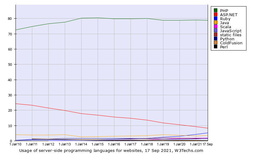
Many developers love working with static site generators like Gatsby and Hugo. These powerful yet flexible systems help create beautiful websites using familiar tools like Markdown and React. Nearly every popular modern programming language has at least one actively developed, fully-featured static site generator.
Static site generators boast a number of advantages, including fast page loads. Quickly rendering web pages isn’t just a technical feat, it improves audience attraction, retention, and conversion. But as much as developers love these tools, marketers and other less technical end users may struggle with unfamiliar workflows and unclear processes.
The templates, easy automatic deploys, and convenient asset management provided by static site generators all free up developers to focus on creating more for their audiences to enjoy. However, while developers take the time to build and maintain static sites, it is the marketing teams that use them daily, creating and updating content. Unfortunately, many of the features that make static site generators awesome for developers make them frustrating to marketers.
Let’s explore some of the disadvantages of using a static site generator. Then, see how switching to a dynamic content management system (CMS) — especially one powered by a CRM (customer relationship management) platform — can make everyone happy, from developers to marketers to customers.
Static Site Generator Disadvantages
Developers and marketers typically thrive using different workflows. Marketers don’t usually want to learn Markdown just to write a blog post or update site copy — and they shouldn’t need to.
Frankly, it isn’t reasonable to expect marketers to learn complex systems for everyday tasks like embedding graphs or adjusting image sizes just to complete simple tasks. Marketers should have tools that make it easier to create and circulate content, not more complicated.
Developers tend to dedicate most of their first week on a project to setting up a development environment and getting their local and staging tooling up and running. When a development team decides that a static site generator is the right tool, they also commit to either configuring and maintaining local development environments for each member of the marketing team or providing a build server to preview changes.
Both approaches have major downsides. When marketers change the site, they want to see their updates instantly. They don’t want to commit their changes to a Git repository then wait for a CI/CD pipeline to rebuild and redeploy the site every time. Local tooling enabling instant updates tends to be CLI-based and therefore inaccessible for less technical users.
This does not have to devolve into a prototypical development-versus-marketing power struggle. A dynamic website created with a next-generation tool like HubSpot’s CMS Hub can make everyone happy.
A New Generation of Content Management Systems
One reason developers hold static site generators in such high regard is the deficiency of the systems they replaced. Content management systems of the past were notorious for slow performance, security flaws, and poor user experiences for both developers and content creators. However, some of today’s CMS platforms have learned from these mistakes and deficiencies and incorporated the best static site generator features while developing their own key advantages.
A modern, CMS-based website gives developers the control they need to build the features their users demand while saving implementation time. Meanwhile, marketing teams can create content with familiar, web-based, what-you-see-is-what-you-get tools that integrate directly with existing data and software.
For further advantages, consider a CRM-powered solution, like HubSpot’s CMS Hub. Directly tied to your customer data, a CRM-powered site builder allows you to create unique and highly personalized user experiences, while also giving you greater visibility into the customer journey.
Content Management Systems Can Solve for Developers
Modern content management systems like CMS Hub allow developers to build sites locally with the tools and frameworks they prefer, then easily deploy to them their online accounts. Once deployed, marketers can create and edit content using drag-and-drop and visual design tools within the guardrails set by the developers. This gives both teams the flexibility they need and streamlines workflows.
Solutions like CMS Hub also replace the need for unreliable plugins with powerful serverless functions. Serverless functions, which are written in JavaScript and use the NodeJS runtime, allow for more complex user interactions and dynamic experiences. Using these tools, developers can build out light web applications without ever configuring or managing a server. This elevates websites from static flyers to a modern, personalized customer experience without piling on excess developer work.
While every content management system will have its advantages, CMS Hub also includes a built-in relational database, multi-language support, and the ability to build dynamic content and login pages based on CRM data. All features designed to make life easier for developers.
Modern CMS-Based Websites Make Marketers Happy, Too
Marketing teams can immediately take advantage of CMS features, especially when using a CRM-powered solution. They can add pages, edit copy, and even alter styling using a drag-and-drop editor, without needing help from a busy developer. This empowers the marketing team and reduces friction when making updates. It also reduces the volume of support requests that developers have to manage.
Marketers can also benefit from built-in tools for search engine optimization (SEO), A/B testing, and specialized analytics. In addition to standard information like page views, a CRM-powered website offers contact attribution reporting. This end-to-end measurement reveals which initiatives generate actual leads via the website. These leads then flow seamlessly into the CRM for the sales team to close deals.
CRM-powered websites also support highly customized experiences for site users. The CRM behind the website already holds the customer data. This data automatically synchronizes because it lives within one system as a single source of truth for both marketing pages and sales workflows. This default integration saves development teams time that they would otherwise spend building data pipelines.
Next Steps
Every situation is unique, and in some cases, a static site generator is the right decision. But if you are building a site for an organization and solving for the needs of developers and marketers, a modern CMS may be the way to go.
Options like CMS Hub offer all the benefits of a content management system while coming close to matching static site generators’ marquee features: page load speed, simple deployment, and stout reliability. But don’t take my word for it. Create a free CMS Hub developer test account and take it for a test drive.
Here’s a common thought and question: how do browsers prioritize what they work on? We get little glimpses of it sometimes. We’re told to “star issues” in bug trackers to signal interest. We’re told to get involved in GitHub threads for spec issues. We’re told they do read the blog posts. And, sometimes, we get to see the results of surveys. Chrome ran a survey about scrolling on the web back in April and has published the results with an accompanying a blog post.
“Scrolling” is a big landscape:
From our research, these difficulties come from the multitude of use cases for scroll. When we talk about scrolling, that might include:
According to the results, dang near half of developers are dissatisfied with scrolling on the web, so this is a metric Google devs want to change and they will prioritize it.
To add to the list above, I think even smooth scrolling is a little frustrating in how you can’t control the speed or other behaviors of it. For example, you can’t say “smooth scroll an on-page jump-down link, but don’t smooth scroll a find-on-page jump.”
And that’s not to mention scroll snapping, which is another whole thing with the occasional bug. Speaking of which, Dave had an idea on the show the other day that was pretty interesting. Now that scroll snapping is largely supported, even on desktop, and feels pretty smooth for the most part, should we start using it more liberally, like on whole page sections? Maybe even like…
I’ve certainly seen scroll snapping in more places. Like this example from Scott Jehl where he was playing with scroll snapping on fixed table headers and columns. It’s a very nice touch:
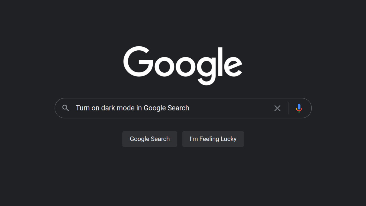
It’s not every day that a new pattern emerges across the web, but I think cmd + k is here to stay. It’s a keyboard shortcut that usually pops open a search UI and it lets you toggle settings on or off, such as dark mode. And lots of apps support it now—Slack, Notion, Linear, and Sentry (my current gig) are the ones that I’ve noticed lately, but I’m sure tons of others have started picking up on this pattern.
kbar is a fully extensible command+k interface for your site
My only hope is that more websites and applications start to support it in the future—with kbar being a great tool to help spread the good word about this shortcut.