Archive

Archive for September, 2022

Making a Real-Time Clock With a Conic Gradient Face

September 19th, 2022 No comments
Black Apple Watch on a person's wrist showing a deep purple conic gradient face.

Gradients have been a part of the CSS spectrum for quite some time now. We see a lot of radial and linear gradients in a lot of projects, but there is one type of gradient that seems to be a bit lonely: the conic gradient. We’re going to make a watch face using this type of gradient.

Working with conic gradients

What we’re making consists of a gradient with color transitions rotated around a center point and can have multiple color values. For this clock to work, we will also be using the angle value of a conic gradient which defines the rotation or starting point. The angle is defined by using a from value.

background-image: conic-gradient(from 45deg, #6e7dab, #5762d5);

What is interesting about this, is that a starting angle can have a negative value in CSS, which will come in handy later.

A simple elegant example of a conical gradient:

CodePen Embed Fallback

Building our basic clock

Let’s start by adding some HTML for the clock and the hands:

Let’s create some default styling for our clock. For this to work properly, we will update CSS variables with JavaScript later on, so let’s scope these variables inside our .clock selector. For easy tweaking, let’s add the colors of the hands as well.

.clock {
  /* general clock vars */
  --hour-hand-color: #000;
  --hour-hand-degrees: 0deg;
  --minute-hand-color: #000;
  --minute-hand-degrees: 0deg;
  --second-hand-color: hotpink;
  --second-hand-degrees: 0deg;

  position: relative;
  min-width: 320px;
  width: 25vw;
  height: 25vw;
  min-height: 320px;
  border-radius: 50%;
  margin: 0 auto;
  border: 7px solid #000;
}

/* clock hands */
.hand {
  position: absolute;
  left: 50%;
  bottom: 50%;
  height: 45%;
  width: 4px;
  margin-left: -2px;
  background: var(--second-hand-color);
  border-radius: 6px;
  transform-origin: bottom center;
  transition-timing-function: cubic-bezier(0.1, 2.7, 0.58, 1);
}
.second-hand {
  transform: rotate(var(--second-hand-degrees));
}
.hour-hand {
  height: 35%;
  border-radius: 40px;
  background-color: var(--hour-hand-color);
  transform: rotate(var(--hour-hand-degrees));
}
.minute-hand {
  height: 50%;
  background: var(--minute-hand-color);
  transform: rotate(var(--minute-hand-degrees));
}

This sets us up with the general styling we need for the clock. We’ve set transform-origin on the hands so that they properly rotate around the face of the clock. There are also a few custom properties in there to set angles on the hands that we’ll update with JavaScript to get the timing just right so that each hand maps to seconds, minutes, and hours accordingly.

Here’s what we have so far:

CodePen Embed Fallback

Alright, let’s move on to updating those custom properties!

Adding the JavaScript for our basic clock

First off, we’re going to target our clock and create a function:

const clock = document.getElementById("clock");
function setDate() {
  // Code to set the current time and hand angles.
}
setDate();

Inside of our function we’re going to fetch the current time using the Date() function to calculate the correct angle of the hands:

const now = new Date();
const secondsAngle = now.getSeconds() * 6; 
const minsAngle = now.getMinutes() * 6 + secondsAngle / 60;
const hourAngle = ((now.getHours() % 12) / 12) * 360 + minsAngle / 12;

Here is how this calculation works:

  • Seconds: We take 60 seconds and multiply it by 6, which happens to be 360, the perfect number of angles in a full circle.
  • Minutes: Same as seconds, but now we add the seconds angle and divide it by 60 to increase the angle just a little bit within the minute for a more accurate result.
  • Hours: First, we calculate the remainder of the hour and divide it by 12. Then we divide that remainder by 12 again to get a decimal value we can multiply by 360. For example, when we’re at the 23rd hour, 23 / 12 = remain 11. Divide this by 12 and we get 0.916 which then gets multiplied by 360 for a grand total of 330. Here, we will do the same thing we did with the minutes and add the minutes angle, divided by 12, for a more accurate result.

Now that we have our angles, the only thing left to do is to update the variables of our clock by adding the following at the end of our function:

clock.style.setProperty("--second-hand-degrees", secondsAngle + "deg");
clock.style.setProperty("--minute-hand-degrees", minsAngle + "deg");
clock.style.setProperty("--hour-hand-degrees", hourAngle + "deg");

Last, but not least, we will trigger the function with an interval of a second to get a working clock:

const clock = document.getElementById("clock");
function setDate() {
  // etc.
}
// Tick tick tick
setInterval(setDate, 1000);
setDate();

See the working demo of our basic clock:

CodePen Embed Fallback

Applying this to a conical gradient

OK, so the hands of our clock are working. What we really want is to map them to a conical gradient that updates as the time changes. You may have seen the same effect if you have an Apple Watch with the “Gradient” face active:

Credit: Macworld

To do this, let’s start by updating our .clock element with a conic gradient and two custom properties that control the starting and ending angles :

.clock {
  /* same as before */

  /* conic gradient vars */
  --start: 0deg;
  --end: 0deg;

  /* same as before */

  background: 
    conic-gradient(
      from var(--start),
      rgb(255 255 255) 2deg,
      rgb(0 0 0 / 0.5) var(--end),
      rgb(255 255 255) 2deg,
      rgb(0 0 0 / 0.7)
  );
}

You can play around with this a bit to style it just the way you like it. I added some extra colors in the gradient to my liking, but as long as you have a starting point and an ending point, you’re good to go.

CodePen Embed Fallback

Next up, we will update our setDate() function so that it updates the variables for our starting and ending points on the conic gradient. The starting point will be our seconds hand, which is easy to find because it will be the same as the angle of our minutes. To make this end at the hours hand, we should make our ending point the same as the hourAngle variable in the script, but subtract our starting point from it.

let startPosition = minsAngle;
let endPosition = hourAngle - minsAngle;

Now we can update our variables with JavaScript again:

clock.style.setProperty("--start", startPosition + "deg");
clock.style.setProperty("--end", endPosition + "deg");

It looks like we could be done at this point, but there is a catch! This calculation works fine as long as the minutes hand has a smaller angle than the hours hand. Our conic gradient will get messy the moment when the minutes hand has moved past it. To fix this, we will use a negative value as a starting point. Luckily, it’s easy to spot when this happens. Before updating our variables we’ll add the following:

if (minsAngle > hourAngle) {
  startPosition = minsAngle - 360;
  endPosition = hourAngle - startPosition;
}

By subtracting 360 from our minutes angle, we are able to set a negative value for our startposition variable. Because of this negative starting point, our end position should be updated by the hour angle, subtracted by the starting position.

There we go — now the hour and minute hands are set to gradient angles:

CodePen Embed Fallback

That’s it! But don’t let that stop you from taking this even further. Create your own styles and share them with me in the comments so I can check them out.. Here is a little inspiration to get you going:

CodePen Embed Fallback

Making a Real-Time Clock With a Conic Gradient Face originally published on CSS-Tricks, which is part of the DigitalOcean family. You should get the newsletter.

Categories: Designing, Others Tags:

How AI and ML are Helping to Build Next-Generation Software Products?

September 19th, 2022 No comments

Artificial intelligence (AI) and machine learning (ML) have emerged as powerful technologies for building next-generation software products. Businesses are harnessing the power of AI and ML, from startups to tech giants, to create more innovative and efficient software products. Also, as predicted by Forbes, approximately 80% of businesses invest in AI technology.

However, it won’t be surprising to know that various companies are still in the early stages of their adoption journey. For many, it’s about understanding how these AI and ML can be integrated into their businesses to get the most out of them. 

And without a doubt, business owners still want to know about software development costs to make better ROI decisions. Not only will this help them understand how much it would cost to develop their own AI and ML-based software solution, but it will also give them some insights into the potential benefits of these technologies.

In this article, we’ll take a look at how AI and ML are helping to build next-generation software products. So let’s get started.

Automated Software Testing

Automated software testing is essential for any organization that relies on software to run its business. By automating the testing process, organizations can speed up their development cycles and release new features and products more quickly. 

In addition, automated testing can help improve software quality by identifying errors and defects more quickly and efficiently than manual testing methods. These technologies play a crucial role in automating software testing. By using machine learning algorithms, the software product can be tested automatically and effectively.

For example, ML can be used to generate test cases based on code changes automatically. In addition, AI can help identify areas of the code that are most likely to contain errors. By using AI and ML in automated testing, organizations that provide software development services can improve the efficiency and effectiveness of their software development process.

Smarter User Interfaces

AI and ML are being used to create more intelligent user interfaces for software products. By understanding the user’s needs and preferences, businesses can create more personalized and relevant user experiences. In addition, AI can help users find the right information more quickly and easily.

For example, many software products now use chatbots to provide customer support. By using natural language processing (NLP), chatbots can understand a user’s question or request and provide an appropriate response. In addition, chatbots can learn from each interaction and become more effective over time.

Additionally, AI-powered voice assistants, such as Amazon Alexa and Google Assistant, are becoming more popular. These voice assistants can help users with tasks such as setting alarms, adding items to a shopping list, and playing music. Voice assistants are also being used to provide customer support and answer questions about products and services.

Process Automation

Process automation is the use of technology to automate repetitive and tedious tasks. By automating processes, businesses can improve efficiency and productivity. Moreover, process automation can help reduce errors and improve the quality of software products and services.

These next-generation technologies can play a significant role in process automation. For example, businesses can use machine learning algorithms to generate code automatically from templates. In addition, AI can be used to identify and correct errors in code. By using process automation, businesses can improve the efficiency of their software development process and release better quality products.

AI-Managed Code Compilers

Artificial intelligence (AI) and machine learning (ML) are playing an increasingly important role in code compiling, which is the process of transforming source code into executable files that can be run on a computer. Using AI and ML, bugs or errors in the code can be targeted more accurately and efficiently. This can help identify potential optimizations and automatically generate faster and more reliable code.

Also, AI and ML can help improve the quality of software products by providing businesses with better insights into how users interact with their products. By monitoring user behavior, AI and ML can help to identify areas where products need to be improved or updated. In this way, AI and ML are not only making software development more efficient but also helping to create better outcomes.

Sentiment Analysis

Sentiment analysis is a technique used to analyze the emotions expressed in text. By understanding the sentiment of text, businesses can gain insights into how customers feel about their products and services. Moreover, sentiment analysis can monitor social media for early negative customer sentiment.

AI and ML can be used to perform sentiment analysis. For example, businesses train machine learning algorithms to classify text as positive, negative, or neutral. Also, AI can analyze the sentiment of social media posts in real time. By using sentiment analysis, businesses can gain insights into customer opinion and take action to address negative sentiment before it becomes a problem.

Security and Fraud Detection

Security is a critical concern for any business that relies on software. By using AI and ML, companies can improve the security of their software products and services. For example, machine learning algorithms can be used to detect anomalies in data that may indicate a security breach. In addition, AI can identify patterns of behavior that may indicate fraud.

Organizations that offer software development services can use AI and ML to improve the security of their products and services. By using these technologies, businesses can detect potential security threats and take steps to prevent them. In addition, AI and ML can help businesses to respond more quickly and effectively to security breaches.

Conclusion

AI and ML are transformational technologies that are reshaping the software development landscape. By using AI and ML, businesses can improve the quality of their products and services, reduce errors, and automate repetitive tasks. In addition, AI and ML can help companies to enhance security and detect fraud. As these technologies mature, we can expect to see even more innovative applications in the software development space.

The post How AI and ML are Helping to Build Next-Generation Software Products? appeared first on noupe.

Categories: Others Tags:

How to Find Product Market Fit

September 19th, 2022 No comments

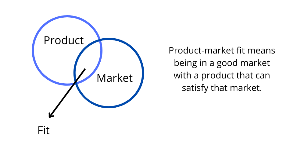
Let’s imagine the situation. You came up with a brilliant idea, you think it will make a revolution in the tech world and now you want to bring it to life. But the truth is even when you think that your product is condemned to success, it might not attract the audience. Product-market fit can reduce the chance of failure. 

What Is Product-Market Fit?

The product-market fit definition speaks to the idea that a company has delivered an excellent quality product in line with what consumers want. In this case, it indicates when customers are purchasing and using your products which leads them into recommending others as well; thus forming sustainable growth for both parties involved.

Product-market fit is a process that should happen early on in the life cycle of your product. It’s all about finding out whether there are enough people who would want what you’re selling and when they might be able to buy it, as this will determine if your idea has any chance at success or not before wasting time with development. 

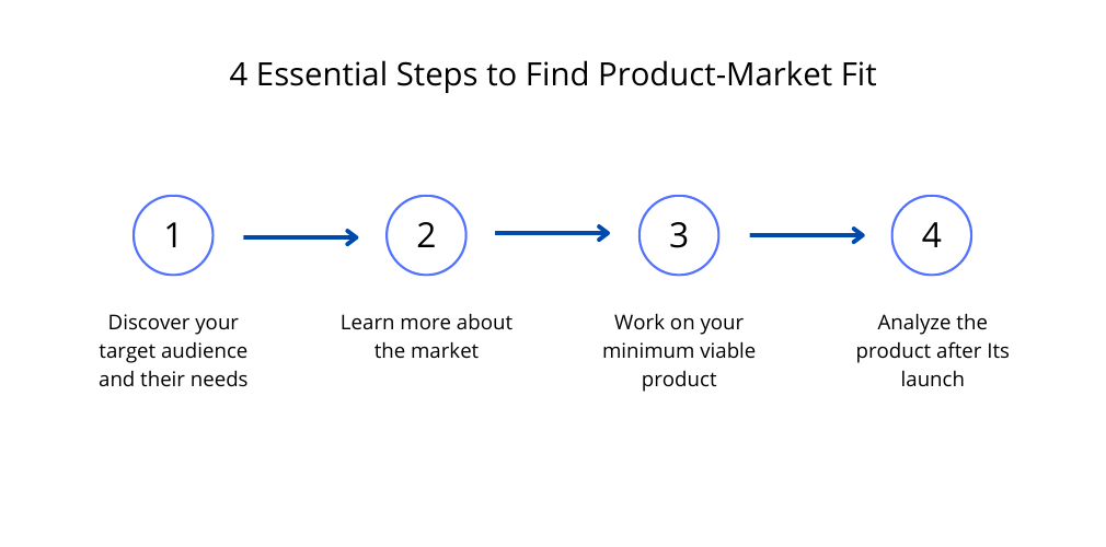
4 Essential Steps to Find Product-Market Fit

The question of how to find product-market fit is somewhat similar to the “the chicken and the egg” dilemma. On the one hand, it makes no sense to launch a product if you’re not sure there’s market demand for it and enough people who’ll be interested in buying it. On the other hand, you won’t know for sure whether you have product-market fit or not if you don’t launch the product.

So, where do you start? 

Step 1. Discover Your Target Audience and Their Needs

Research is the key to success here. Before jumping on to molding the product details, it is crucial to understand who the buyers are and what their needs are. If you manage to figure out their pain points and what they expect from the product, this will give a solid foundation for basing the product.

Step 2. Learn More About the Market

You have to know the market state. Your product can be really awesome, have the best design and you can use it for yourself but you need to make sure that there is a demand for it. Is there room for your product, or are there many competitors? If the market is already full of similar solutions, your product should provide its customers with additional value by providing unique features or an emotional component. 

Step 3. Work on Your Minimum Viable Product

Now when you define an initial vision of the pilot version of your product, start working on the MVP. Prioritize features and leave only those that will solve the user’s pain points. Show your MVP to the world when it’s ready and start collecting feedback. Based on the findings, consider how to amend the product and make further conclusions. This will help you on the way to determine product-market fit further on.

Step 4. Analyze the Product After Its Launch

Continue testing your MVP and molding further on. It is the beta version of your product you show to real buyers. Collect feedback, monitor user behavior, and analyze findings after actual users give it their first run-then prioritize changes or features that need work in order for you to succeed.

Finding Product-Market Fit: Pre-PMF Tips

Described steps may seem quite frustrating, especially for an early-stage startup. What if you have a limited budget and aren’t sure your product idea is worth it in the first place? You can still test the water by doing something preliminary called “Product-market fit determination.”

A lot of people feel overwhelmed when they hear about startups because there’s so much that needs to be done. What should we do at this point, though? There are other ways for you to get started. 

One way to test product-market fit is by engaging with your potential customers through social media. You can start an Instagram page and send direct messages or surveys, but these methods may not provide enough information for firm conclusions about the success of marketing strategies. 

You can also run paid ads on Facebook or other social media that are relevant to your audience. If people click the ad, then this might be a sign they’re interested in what you offer and want more information about it. However, keep in mind there’s no guarantee how many of these clicks come from mistakes while some may actually fall under curiosity categories too-so just because someone visits one page doesn’t necessarily mean they will purchase anything else off our site. But, again, one tactic may not be enough to determine what is product-market fit for you.

Final Thoughts on How to Get Product-Market Fit

We all know that finding product-market fit is incredibly difficult. This difficulty means it’s not always clear whether a startup will succeed in building its business or fail before they even get off the ground. It can be tempting to focus only on attracting investment but if you don’t have an idea of what people want then your company won’t thrive long-term anyway. So make sure this comes first by doing research into customer needs, studying the market, building an MVP, and analyzing the results before anything else.

You can’t really know if your solution achieved product-market fit until you start analyzing data like conversions, retention, etc. This may be more expensive or time-consuming than just launching but it’s worth doing in order to make sure that there are no major flaws before going ahead with production. The alternatives for finding out if your idea has mass market appeal is running surveys and using ads. This could be quicker than waiting to see if there’s demand with the pre-product market fit, but it might not bring you an answer about what needs to be improved or added in order to make the product more appealing; so this is another tradeoff that should arise early on when exploring different ideas — you need both quick feedback as well as thorough research before committing too much time/money onto any one course of action.

The post How to Find Product Market Fit appeared first on noupe.

Categories: Others Tags:

Rethinking Star Ratings For Readers

September 16th, 2022 No comments

Product ratings and reviews should provide clarity about a product’s qualities. Unfortunately, the nearly ubiquitous star rating scale can foster assumptions; it often lacks clearly defined measurements and fails to encourage written reviews. Context is important, and in this article, we will discuss a solution to improve communication among readers for finding and sharing literature.

The Setting: Ratings And Reviews

There is no shortage of articles criticizing star ratings. Many, myself included, have considered reimagining the ubiquitous star rating system. I might have continued ignoring those thoughts, disregarding the inconsistent and often bewildering star ratings that I encountered on apps until my frustrations mounted with Goodreads.

I love literature, and I believe it deserves better than a grading scale that elicits confusion and degrades communication among readers. In this article, we’ll imagine a better one to practice thinking and building more satisfying experiences.

The Inciting Incident: User Dissonance

The rating and review that inspired me to dig deeper into the star rating system can be paraphrased like this:

“The author’s writing is lyrical, and the story is lovely and haunting. However, this is not a genre I typically enjoy. Three stars.”

My brain stuttered when I read this comment. Had I written the review, even if I preferred other genres, I would have rated the book five stars. I expected anyone who said a book was lyrical, lovely, and haunting would feel the same; I expected that the original reviewer and I would share an understanding of what makes a book three stars versus five stars. The rating seemed at odds with the review, and I kept wondering how the original reviewer and I could be on such different pages.

Rising Action: Surmounting Problems

The reason users can have different definitions of star ratings is that the current rating system affords individual interpretations. The system inherently lacks clarity because it is based on glyphs, pictures representing words and ideas, but representations require interpretations. These idiosyncratic definitions can vary based on how someone’s experiences tell them to decipher a depiction — as shown in the aforementioned rating example, as mentioned by the Nielsen Norman Group, or as seen in the clown face emoji.

The system’s vagueness allows it to be applied to every disparate thing, from books to bras to brooms. Said another way, star ratings are not optimized for any one thing.

In an attempt to prevent individual interpretations, many companies uniquely define what each star category means on their sites. However, with a widely used glyph scale, this puts an unreasonable onus on users to learn the differences between every site to ensure correct usage—the equivalent of learning a homonym with hundreds of definitions. As there are few reasons to think one five-star scale broadly differs from another, companies reusing the system should anticipate that:

  • Individuals have acquired their own understanding of the scale;
  • Individuals will use their loose translation of the scale across the web.

Unfortunately, this creates countless little inconsistencies among user ratings that add up.

You can notice some of these inconsistencies if you scroll through ratings and reviews on a site like Goodreads, where there are a variety of interpretations of each star category. For instance:

  • One-star reviews ranging from DNF (Did Not Finish) to extortion scams;
  • Two-stars reviews ranging from unwilling to read more of the author’s work to being okay;
  • Three-star reviews ranging from a genre not typically enjoyed to being recommendation worthy.

The only way to understand the intention behind most ratings is to read a corresponding review, which brings another problem to light. After gathering and averaging data from a mix of 100 popular classic and modern books on Goodreads — 50 of these are based on their most reviewed from the past five years — I learned that less than 5% of people who give a star rating write a review. We have to guess what the rest mean.

The inherent impreciseness and guesswork attributed to the system can hinder the overall goal of people using a social literature app. That goal can be summarized from Goodreads’ own mission statement:

“For readers to find and share books that they can fall in love with.”

Without speaking a common language through standardized rating definitions, readers relying on one another to discuss and discover meaningful literature becomes exceedingly difficult.

Additional Rising Action: Counter Arguments

However, let’s pretend everyone using a site like Goodreads agrees on what each star category means. The problem remains that a rating still tells us nothing about what a reader liked or disliked. Without personalized context, well-defined star ratings mainly act as a filtering system. People can choose to disregard books below a specific number of stars, but even they need to learn more about the books within their read-worthy range to decide what to read. On a social literature site, users should be able to depend on others for insight.

You might argue that algorithms can learn what everyone’s ratings mean and dispense recommendations. Let’s ignore the red flags from Goodreads oddly suggesting that I read a collected speech about compassion and a biography about The Who’s bassist, because I read a superhero novel, and let’s agree that this could work. People do trust algorithms more these days to accomplish tasks, but there is a tradeoff: socialization declines. If you overemphasize a machine finding and sharing books, users have fewer reasons to interact to achieve that goal as well. That is counterproductive to creating a social literature site.

In a world where quarantines are easily imagined possibilities and remote work spreads, the social aspect is becoming increasingly important. Studies show us that connection between people is more of a basic need than previously thought, and the improvements mentioned in this article will keep human interaction in mind.

The Climax: A Contextual Solution In Three Parts

What follows is one solution, among many, that addresses the aforementioned issues by observing three guiding principles:

  • Building trust,
  • Respecting time,
  • Creating clarity.

The focus will be on a social literature app, but you can imagine some of these concepts applied anywhere star ratings are used. Let’s discuss each part of the solution.

Part One: Building Trust

The first piece of our solution primarily centers on trust, although it is not novel: readers are required to “Shelve” a book as “Read” before writing a review.

This feature is a step toward assuring readers that reviews are genuine. It also builds reviewers’ confidence that they will contribute to a credible conversation. Although users can lie to bypass the gate, honesty has more incentives on an app to find and share literature. A liar has little use for the former, and for the latter, if their intent is to gain attention for a book, they risk getting caught in a discussion that uncovers them, per the upcoming suggestions.

Part Two: Respecting Time and Creating Clarity

Simple and familiar, being mindful of people’s time, and contributing to clearness: once a reader shelves a book as “Read,” they can “Favorite” it.

Because this is a straightforward input, it requires less effort than deciphering the differences within anyone’s five-point star scale. Not favoriting a book does not indicate that you disliked it, and that is not the purpose. Favoriting tells people this is a noteworthy book for you, which may inspire them to learn why, read reviews, and interact with others. The number of times a book is favorited can be tallied to rank it in lists and garner extra attention.

In addition, vastly improving on our principle of clarity, once readers shelve a book as “Read,” the app also prompts them to mention what they enjoyed.

Respecting a reader’s time and developing a common language for users, the prompt provides a list of predefined answers to choose from. The options are mostly based on conventional literary characteristics, such as “Fast-paced plot,” “Lyrical language,” “Quirky characters,” and dozens of others.

Every quality a reader chooses gets added to traits others have chosen. On a book’s overview page, the selected qualities are ranked in descending order, equipping prospective readers with a clearer sense of if they might like a text based on top traits. The number of qualities a reviewer can choose is limited to encourage thoughtful selections and discourage abuse by selecting every trait on the list.

Similarly, there could also be a “Wished” list that follows the same structure as the “Enjoyed” list. “Wished” would create opportunities for people to mention what else they would have liked from a book, and the collective traits of reviewers could further assist in someone’s decision to read a work.

Part Three: Building Trust, Respecting Time, And Creating Clarity

Every feature mentioned so far is enhanced by the final piece of our solution: written reviews. Allowing users to explain their thoughts, such as why they chose the qualities they enjoyed, gives potential readers a deeper understanding of the book they are considering.

However, remember the aforementioned stat that, on average, less than 5% of raters write reviews on Goodreads. That number becomes easier to understand when you consider that imparting meaningful feedback is a learned skill—you can find popular lessons on sites like Udemy, MasterClass, and others. Plus, add to that the fact that writing reviews can be more time-consuming than choosing ratings. Despite these hurdles, a site can offer guidance that motivates people to provide additional context about their thoughts.

In our solution, users are not merely given a blank text box and asked to write a review. The users are prompted to share their thoughts and receive suggestions to hone their feedback. The suggestions range dynamically, depending on a reader’s earlier choices. If they favorited a book, the prompt might ask why. If they chose the “Well-developed characters” option from the Enjoyed list, the prompt might ask how the characters are well developed. The prompt might also nudge users to read other people’s reviews for ideas.

The dynamic suggestions will particularly benefit books with sobering subject matter. For instance, only 1% of raters have written reviews for Anne Frank’s The Diary of a Young Girl on Goodreads. This is unsurprising when you consider the devastating historical context surrounding the book.

Commenting on typical story elements like pacing feels disingenuous to a book like Anne Frank’s — like giving a star rating to a friend telling you a story about themselves — but we should not shy away from talking about difficult literature, because discussing art can lessen our prejudices and expand our empathy. Prompts for these types of books might supply tips for close-reading a passage, mentioning what a story means to a reader, or asking how a book made a reader feel.

Finally, these features require regular usage to benefit readers. Growing an active community around them can be accomplished by building healthy communal habits, which hinge on voices having the capacity to be heard. Thankfully, one of the oldest features of the Internet can do a lot of the heavy lifting to solve this: commenting. Many sites offer the ability to comment on reviews, but several also employ a “Like” feature — the ability to press a button that “Likes” a review or comment — and liking comments can weaken the voices of a community.

Scammers can abuse the feature with bots to garner large amounts of likes and attention, people can waste time and emotional energy chasing likes, and the feature discourages people from using their words: all issues that fail our guiding principles, and even the ex-Twitter CEO admitted the like button compromises dialogue. Generating trust, meaningful usage of time, and clarity among users builds a safer environment for genuine conversation to spread, so comments should be protected from elements that detract from them.

Falling Action And Resolution: Let’s Be Thoughtful

Why any company utilizes a star rating system is a question for them. Reflecting on how easy to use and almost expected the scale has become, it’s likely companies simply copied a system that they believe is “good enough.” Maybe they were enthralled by the original Michelin Guide or Mariana Starke using exclamations points to denote special places of interest in guidebooks, but mimicry often flatters the originator more than the mimicker. Either way, the perks of ubiquity do not outweigh the vagueness that engenders numerous problems. At the forefront of those is stunting stronger connections between people trying to speak a shared language.

This article shows one solution for those problems, but there are others. Companies like The StoryGraph already provide alternatives to achieve thoughtful interactions around discussing literature, and people have additional ideas. Thoughtfulness can take a little longer to solve, but:

If we encourage people to not solely judge a book by its cover, we should extend that advice to its star ratings.

Let’s look beneath the surface of things and use our hearts — just as Antoine de Saint-Exupéry’s eponymous Little Prince had to learn to do — to discover meaningful new territories in books and elsewhere. A good place to start would be reading or rereading that story, marveling at the stars dotting its illustrated skies, and writing a review to share what we each found buried within the pages.

Epilogue: What Readers Can Do Today

While the recommendations throughout this article are focused on how a company can change its rating and review system, companies can be slow to change. Fortunately, there are steps readers can take to be more thoughtful when reviewing the literature. A simple process today might look like this:

  • Leave a star rating.
    • Both users and algorithms pay attention to these ratings. If you ignore leaving a rating, you lessen the chance of readers discovering books they may love.
  • Write a review. Consider some of these elements to streamline the process:
    • Explain why you chose your rating.
    • List common story qualities you enjoyed—these can vary depending on genre, but here is a starter list. Even better, write a sentence to say why you enjoyed specific qualities.
    • Discuss a passage (or several) from the book that you found important.
    • Mention what you wish you had known before reading a book and mark the review with “Spoilers” at the start if you include any.
    • Link to other reviews that you think best sum up your perspective.
  • Share your review.
    • Not only will this help people find new literature, but it will also encourage them to write and share reviews.

You can use variations of this process to review other products, too. Remember that the most important part is that we use our words. This helps reduce confusion that might come from a lone star rating, and it helps us build stronger connections.

Categories: Others Tags:

Accessibility In Times Of Headless

September 15th, 2022 No comments

This article is a sponsored by Storyblok

We should all care more about web accessibility. It’s the best tool to make the web a more inclusive, equal space — and, in my opinion, it’s our responsibility as developers, UX specialists, and designers to support this mission. While the CMS might, at first glance, seem like a small piece of the puzzle, it’s really the baseline to set your project up for success.

Let’s have a closer look at the basics of web accessibility, the difference between monolithic and headless content management systems, and how to make the most of your CMS in terms of accessibility.

What Is Web Accessibility?

Web accessibility means, in short, that we design and implement our projects in a way that people with disabilities can use them and participate as equally as possible. There are many different kinds of disabilities like physical, auditory, cognitive, speech, neurological, or visual disabilities. In the World Report on Disabilities by the WHO from 2011, it was found that over 15% of the global population experiences some form of disability throughout their lifetime — that’s 1 billion people in total; and with the global population generally growing older, it will only continue to rise.

But the applications for web accessibility are even broader: making your website accessible benefits not only people with permanent disabilities but also those with situational or temporary impairments, like folks with a broken arm or new parents holding their baby (and only having one hand free to use a device). Looking at your phone in bright sunlight, you probably rely on sufficient color contrast, and captions enable you to watch videos without turning to volume up in a quiet environment.

In short: Web Accessibility benefits all of us.

But What Does That Mean In Practice?

Web Accessibility takes many shapes and forms, but it could mean, for example, including alternative texts for your images, adding captions to videos, and ensuring enough contrast between background and foreground for texts. Keyboard navigation is also essential in making your website more accessible, as many users rely on their keyboard or assistive technology to navigate the web. The same is true for writing semantic code — making sure you are using the right HTML elements and structure gives assistive tech lots of valuable context — while simultaneously improving your code.

While the whole task of making your website accessible may seem daunting at first, there are many good resources out there, like the Web Content Accessibility Guidelines (WCAG) for instance. These guidelines were developed to promote a unified, international standard for web accessibility. They include three different levels of accessibility (A, AA & AAA), A being the least and AAA the most inclusive.

Why Does The CMS Matter?

Ideally, your content management system is where it all comes together, right? And having the right tool for the job will make it much easier for everyone involved to create an accessible website. In short: once you have found the ‘right’ CMS, you have plenty more headspace to take care of overarching issues. Your content management system should not hinder you in developing accessible content, it should support you in doing so.

What Are Your Options?

In the world of CMSes, there are two big categories: monolithic and headless CMS. While radically different in their approach and architecture, they both have a lot of things going for them — it’s basically a matter of finding the right fit.

Monolithic CMS

Monolithic CMS, sometimes also called ‘traditional’ or ‘coupled’ content management systems, are ‘where it all started.’ In the early 2000s, open-source platforms like WordPress, Drupal and Joomla emerged — providing an easy way for people to create websites or personal blogs quickly.

The idea of a monolithic CMS is a ‘one-stop shop’ — usually, you have a database where the content is stored, an admin interface, and the frontend that combines the data from the database with the styling and logic — you don’t have to worry about hosting or writing code.

This might mean a few compromises: Since you are buying into the ‘package deal’ for all these solutions, your solution might not excel at every task. There are likely some features in the mix that really suit your approach (which is probably why you chose it in the first place) and others that are not really a good match or which you simply don’t need but which are just part of the whole package.

In terms of the tech stack, you probably highly depend on the CMS’ default — not much flexibility here. What attracts many people to platforms like WordPress, for example, are the ready-made templates and plugins to choose from — these tools make it relatively easy to extend your website’s functionality or change the styling.

All in all, not a terrible solution if you are looking to get started quickly and have little experience in setting up your own website from scratch.

The New Kid On The Block: Headless CMS

With the rise of mobile devices, the demands on the CMS ecosystem changed as well — an omnichannel approach became the new norm, and traditional systems weren’t fit to cope, at least not effectively. Out of this need, headless systems were born:

A headless content management system means decoupling the ‘head’ (aka ‘frontend’) from the ‘body’ (backend or content repository). The focus of a headless CMS is solely on storing and delivering structured content. Due to this approach, omnichannel becomes second nature: through an API, you can access your data and distribute it wherever you like — be it in a mobile app, on a website, or in an e-commerce store.

Headless follows the best-of-breed approach: connect the tools and services that fit your needs through the API but don’t worry about unnecessary baggage. And as a developer, headless gives you the freedom to choose any kind of tech stack that you would like for the frontend. Even if you need to change frameworks in the future, it won’t affect your headless CMS in the slightest.

Headless vs. Monolithic: What’s The Best Fit For You?

So, in the end, as always — it comes down to your needs. There is no definite answer. A headless CMS might likely be an excellent fit for you, especially if you are working with multiple output channels and are experienced with creating your own frontend. There has been a massive shift in the last couple of years towards headless — with good reason. If you prefer an out-of-the-box solution with little programming effort on the other hand and don’t mind working with templates, a monolithic approach could be the solution for you.

What’s More Accessible: Monolithic Or Headless CMSs?

The short answer is again: it depends.

Both monolithic and headless solutions are not inherently accessible, unfortunately. Many platforms make some effort to meet minimum requirements when it comes to web accessibility, but there is still a long way to go.

How Accessible Is A Monolithic CMS?

When it comes to monolithic platforms, generally speaking, your frontend can only be as accessible as your least accessible plugin. Let me expand a little here, using WordPress as an example:

How accessible or inaccessible your site is largely depends on what data is stored and how it is displayed. This is massively affected by the themes and plugins you may use. And while there are many themes that claim to be ‘accessibility ready’, not all of them are. And even if you manage to select an accessibility theme, it can become inaccessible if you install an inaccessible plugin. So it’s not impossible, but there are definitely some obstacles in your way.

One thing to keep in mind: when working with a monolithic CMS, you are generally limited to the accessibility features provided by the CMS (or plugins) itself — customizing the editing experience will be a lot more challenging than when working with a headless CMS.

Creating Your Own Themes

If you want to be in more control, it might be feasible to create your own themes — you could even use a base theme for the underlying HTML structure. By creating your own theme, you can ensure sufficient color contrast and solid keyboard navigation, make sure there aren’t exclusively visual cues to alert the user to changes, test for screen reader users, and implement things like motion control.

Plugins: Curse Or Blessing?

The beauty (and the danger) of plugins is, that you can choose from over 55.000 plugins in WordPress and install them at the click of a button. Each gives new functionality to your site — many being interactive. Especially these interactive plugins are full of potential accessibility pitfalls and need to be tested thoroughly.

Accessibility Plugins

There are also plugins that claim to make your website accessible. And while it’s tempting to fix your accessibility needs just by quickly installing a plugin, don’t be fooled. These tools promise you to fix issues like color contrast, enable zoom or add alt text to images — all good ideas in theory. But in most cases, trying to solve accessibility issues with quick fixes like plugins creates more issues than it solves. These tools usually create an overlay of your website, not actually fixing the issues but — well, painting over them.

While there have been significant advances in technology, automatically generated (alt) texts still need to be checked manually and are not always accurate, causing confusion for the users. Another big issue is that these automated tools often clash with the assistive technologies people might already be using. Before using an accessibility plugin in production, make sure to test it thoroughly — if it seems too good to be true, it usually is.

“I will recommend staying away from any plug-in that claims or implies that it will fix your site to help you meet accessibility guidelines—no plug-in is going to be able to seriously achieve that goal.”

— Joe Dolson

Accessibility In Times Of Headless CMS

Now you might wonder: is a headless CMS the answer? Well, again: it depends.

A headless CMS will give you a lot more freedom than a traditional CMS. You’ll have a lot more flexibility when it comes to:

  • Choosing the best tools for the job
  • Working with a tech stack you’re comfortable with
  • Set up your project in ways that help all team members create accessible content

That being said, it is also not inherently accessible — and not every headless CMS gives you the same degree of freedom — so choose wisely. Luckily, there are things you can do to make your content more accessible and set your team up for success.

How Can I Make My CMS As Accessible As Possible?

As always, there is no one-size-fits-all approach here. But there are many things you can do, both when working with a headless CMS as well as when working with a custom theme in a monolithic approach. Let’s have a closer look at how you can implement more accessibility in your project:

Education Is Key

Make accessibility part of every discussion and educate each other on an ongoing basis. The more we talk about the things we learn, we can improve as a team. Provide resources and time to make sure web accessibility is not an afterthought in your project.

Semantic HTML

Start by ensuring semantic structure in your components — double check the HTML elements you are using and whether there might be more suitable ones that can give (screen reader) users context. Also, extend this to your CMS: when creating new Content Types or Pages, keep the HTML structure in mind when allowing specific components to these pages. Ensure you have only one

element, watch out for the headline hierarchy and ensure the right use of landmarks, for example.

In a headless CMS, the idea is to fully decouple the frontend from the content structure. That’s also why it’s strongly advisable to prevent people from writing markup in the content fields — it’s prone to error and difficult to maintain, making it less accessible in the long run. All your code should live in your codebase — where it can easily be tested and maintained.

Visual Context

Provide as much context as you can for people who are visually impaired. This could mean, for example:

  • Making alternative texts a requirement for image fields
  • Including an option for increasing Zoom to up to 200%
  • Work with an accessible color palette and limit the use of colors to predefined brand colors with sufficient contrast.

Also, make sure to alert users to changes not only by color cues (e.g., when hovering or clicking a button, not only the color changes but the size changes, or there is another effect).

Create A Coherent Structure

Having consistency not only enforces your brand’s visual identity across your page but it also helps people navigate it — especially folks who are neurodivergent. This could, for example, mean using dedicated styles for specific CTAs or improving your UI to make it as easy as possible to find information in different ways. Reflect on the importance of topics in style and size, and stay away from flashy or very distracting animations.

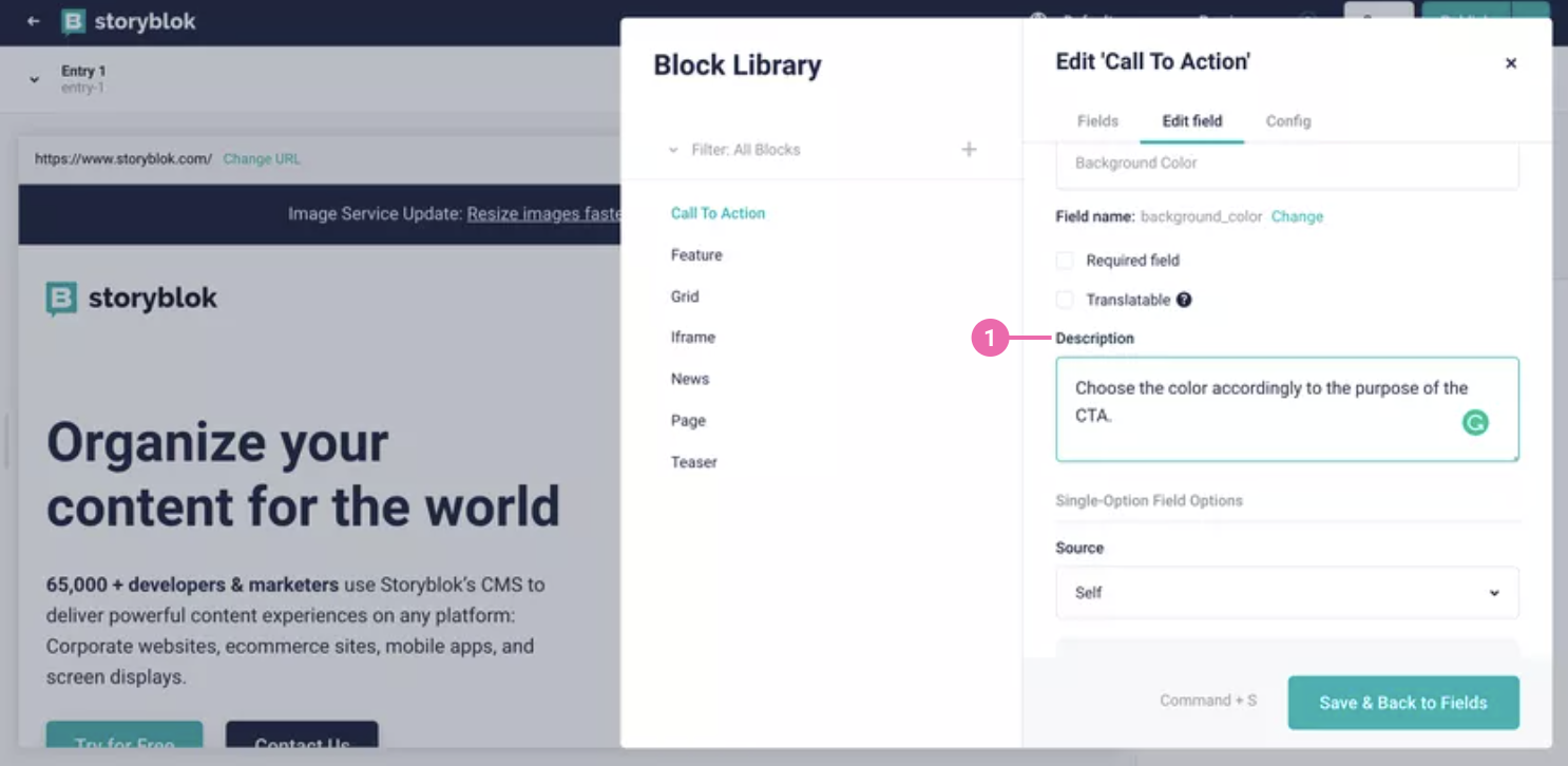
To ensure everybody keeps these brand guidelines in mind, include descriptions and notes for editors. These friendly reminders will help people comply with accessibility requirements and understand why it’s important.

Extend Your Experience

In many headless systems, you are able to add any kind of field you need — and you can make these fields a requirement for accessibility purposes. Like in this example showing how to set up an accessible iframe with a required title field. Setting fields as ‘required’ will make it a lot easier to ensure that they will not be forgotten when things get hectic in day-to-day life.

Besides creating your own field types, you can also easily extend the content management system by connecting any kind of tool you need to your headless architecture or even creating your own extensions and plugins. This could also include your own solutions to specific accessibility needs. One example could be an extension to run an accessibility check to flag any issues before publication. While it will be difficult to cover all potential issues, it might be a good addition to automated and manual testing.

Wrapping Up

When it comes to finding the right CMS, there is no cookie cutter answer — as always, it depends. It depends on your requirements, the accessibility needs you are aiming to fulfill, and how much time and resources you have. Neither a monolithic nor a headless system are inherently 100% accessible — but there are many things you can do to improve that.

While there might be some already predefined tools in monolithic CMS’ to help you out, you also heavily rely on other people not making false claims. With headless CMS, on the other hand, there is a lot more freedom and flexibility in setting your project up to be as accessible as possible. And that’s exactly how a content management system should be, right? Enabling you to focus on the tasks at hand and making it as easy as possible to meet your accessibility goals.

Feeling adventurous?Give it a go and see how quickly you can put together a headless project with your favorite tech stack.

Regardless of which system you choose, always remember: 10% done is better than nothing in the case of accessibility — every little step towards a more inclusive web counts.

Useful Resources

Categories: Others Tags:

How to Navigate Group Scheduling Hassles?

September 15th, 2022 No comments

The only thing worse than attending long meetings is scheduling one. And it becomes even more chaotic when a group gets involved.

Scanning everyone’s calendar, confirming their availability, and then calling them a hundred times only to reschedule and cancel the call. This constant back and forth in organizing a meeting takes over 15% of an employee’s time. 

Surely, what seems like a never-ending hassle can be turned into a smooth ride with some mindful changes. 

Here are 6 practical tips for scheduling group meetings that can save not just your time but money too.

Why Is Effective Calendar Management Necessary?

Scheduling group meetings effectively is a skill in today’s digital transformation. And below are some solid reasons why you need to invest in it.

To Make Collaboration Easy

The secret to mastering remote working is adequate communication and efficient collaboration among team members.

Since meetings are a primary mode of interaction, one must strive to make it least resistant. It will empower your team to reach out without hesitation and get work done efficiently. It also builds camaraderie as communicating with each other won’t feel like a chore.

To Achieve Goals

Endless texts and emails can’t do what a single call can. It allows all parties to discuss the concerns and conclude right there and then, saving everyone’s precious time. 

But to win the day with such calls, you first need to schedule it. And if even the thought of this gives you a headache, there is a problem you must solve.

Ineffective group collaboration can delay the most critical of tasks, with its effects trickling down to customer relationships too. 

To Bring in Order & Structure 

Order and structure separate a regular business from a growing one since growth isn’t sustainable without thoughtful organization. 

And meetings are a good place to start bringing in that order. 

If scheduling group meetings is uncomplicated, it will automatically improve and expedite the rest of the process.

To Boost Efficiency

Companies are paying a huge cost because of inefficient meetings, annually $37 billion in the US alone.

It’s a grave problem that can drown your balance and waste your minutes.

An efficient team should spend their time attending meetings and working on solutions instead of worrying about getting the team together.

And once you crack the code to schedule group meetings, you will never have to worry about your team’s efficiency.

6 Tips to Schedule Group Meetings Effortlessly

Set Your Priorities Right

Just because you can isn’t a good enough reason for scheduling meetings. It will only increase the workload and act as a distraction to deep work.

That’s why it’s crucial to understand that not everything has to be a meeting.

  • Instead, think about whether the matter really demands a call or can be handled over alternates like email or chat.
  • If it’s necessary, add only the essential stakeholders to the invite. You can even mark some attendees as optional to allow them a choice of declining the invite.
  • Introduce an index matrix that details some basic scenarios and how to deal with them, whether over textual channels or a call.
  • For example- if approval is required for a request, drop an email instead of scheduling a call right away.

Too many meetings can overwhelm you and your team. So, educating them on meeting etiquette is important to avoid employee burnout in the long run.

Update Your Availability in the Calendar

People calling you to check your accessibility sounds a little ironic, doesn’t it?

It also means you haven’t put your calendar to the correct use. Here is how you can avoid those needless calls.

  • Use your calendar actively. Mark your calls there to keep track of your availability during the day.
  • Keep your calendar public so others can choose a suitable time for their meeting. You can hide the details of your meeting to maintain confidentiality. 
  • Don’t let your whole day turn into back-to-back meetings. Block at least 3 hours of your day for uninterrupted work.
  • Mark your vacations in the calendar, so people know when you are out of the office and plan their meetings accordingly.

A calendar overflowing with meetings isn’t cool, contrary to what hustle culture has taught us. If you spend your whole day in meetings, when are you planning to finish the actual work?

Avoid Sending a Dry Invite

An invite without the agenda is like offering someone a job without telling what they will actually be doing.

  • Always accompany your group meeting invite with an agenda that details the points to be discussed.
  • Also, mention if you want your attendees to come prepared with some data or information.
  • Mention the channel you will be using for the meeting.
  • Check your invite link before sending it to the group.

Be Mindful of Global Time Zones

In remote culture, your team might be spread across the world. Though virtual work has opened the doors to global talent, it has also challenged our collaboration methods.

Now, while planning a group meeting, you can’t shuffle various time zones to come up with a suitable time. So, what’s the solution?

  • Be aware of your team’s time zones. Collect that information if you don’t have that already.
  • You can even use calendars to make this information public.
  • Ensure to only schedule the most critical agenda as the group meeting.

Document Each Meeting

How would you feel spending an hour on a call and receiving an invite two weeks later because someone wants to refresh their memory?

Presumably, not much excitement.

      Source
  • Share these with the rest of the attendees after the call for better record keeping.
  • You can also record the group meeting with permission from each attendee. 

Power Up With the Right Tools

While all of the above tips are promising, they still require at least some manual intervention.

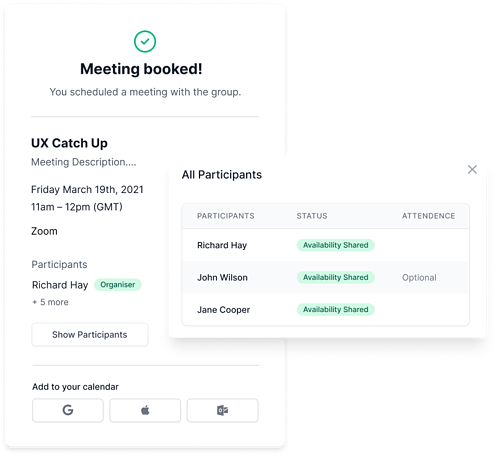
However, the right group scheduling tool will take away that pain too. Implement a tool that can

  • Integrate with your existing calendar to sync the meetings without fancy technicalities.
  • Manage global time zones to schedule a group meeting with ease of joining to everyone.
  • Sync your contacts to send quick invites.
  • Send automated meeting follow-ups and reminders.

Get Ready to Excel Group Scheduling

There’s no end to the meetings. You will have to connect with your peers, customers, and managers. 

Source

So, it’s clear you can’t escape it. But there’s always a way to make meetings less boring– scheduling or attending. 

And introducing the right tools to your setup is a reliable shortcut you must take.

Start with the one that lets you set up a free trial for you to explore all the features. Connect your calendars and sync your contacts so that it can schedule group meetings automatically based on attendees’ availability. Also, ensure that the tool can do its job irrespective of whether others are using it or not. 

Investing in a tool that lets you manage single and group scheduling will boost your productivity and revenue.

The post How to Navigate Group Scheduling Hassles? appeared first on noupe.

Categories: Others Tags:

7 Ways to Engage and Educate Your Target Audience

September 15th, 2022 No comments

In today’s competitive marketing landscape, quality content is more important than ever. Your target audience has thousands of brands to pick from. If you want them to choose you over the competition, you need to find ways to engage them online. 

Educational content is one of the most effective ways to improve audience engagement, drive sales, and ultimately grow your business. Outlined below are seven methods to educate and engage your target audience through content. 

1. Optimize Your Blog for SEO 

Blogging is one of the most popular forms of content marketing. Blog posts help drive high-quality traffic to your website and build trust with prospective buyers. 

Typical business blog content covers topics that interest your clients and provides answers to commonly asked questions. To make the most of your blogging efforts, it’s important to follow a few best practices for search engine optimization. These SEO tactics will help drive more traffic to your website. 

When creating content, include relevant keywords that your target audience is searching for. Avoid “keyword stuffing,” though — it’s off-putting to the reader, and it won’t fool Google. Rather, strive to incorporate keywords in the most organic way possible. To help keep people on your site and increase the chances of turning readers into leads, incorporate internal linking into every blog post. 

2. Provide Guides 

Think of guides as longer, more in-depth blog posts. Guides provide your readers with a detailed description of a product-related topic. For example, Gabb Wireless, a wireless communications company that developed a safe phone for kids, has created detailed guides for its site. These guides focus on the topic of phone safety and offer advice for parents on how they can set tech boundaries with their kids. 

When creating a guide, you must first understand your audience’s concerns and challenges. If you’re unsure what these pain points are, reach out to your sales team and ask what questions they hear most from prospects. These questions are all potential topic ideas for your next onsite guide. 

3. Offer White Papers 

White papers and guides are often discussed interchangeably. However, there are some key differences that make white papers their own thing. While guides provide a detailed overview of a topic, white papers spend more time focusing on research and data. If your company has conducted primary research, white papers give you the opportunity to establish yourself as a thought leader within your field. 

Since white papers are data-focused, they can sometimes get the reputation of coming across as boring. But they don’t have to be. Use colorful charts to display data and avoid using a stuffy tone. Instead, keep the vibe conversational, as if you were presenting findings to a work colleague. 

4. Create Infographics 

Many people are visual learners and struggle to understand topics from blog posts alone. Infographics can be helpful tools that cater to different learning styles and provide information in an easily digestible format. An infographic is a visual representation of information designed to be understood quickly. This information may be represented in the form of graphics, pictures, charts, or a combination of the three. 

Because infographics are visually appealing, they lend themselves well to social media. But since many infographics contain a hefty amount of information, you don’t want to post the entire thing at once. Instead, break your infographic down into chunks. This makes it easier for social media users to consume and provides your social media team with more content for their content calendar. 

5. Send Newsletters 

Having a comprehensive collection of onsite content is great. But what’s the point if no one ever sees it? 

To help make sure your blog content doesn’t go unread, consider adding newsletters to your content strategy. Email newsletters help you get content to interested prospects and customers. This allows you to build credibility and authority with your target audience. 

One of the keys to a successful newsletter is keeping it simple. Your audience doesn’t have 10 minutes to spend reading your newsletter, so make it easy to skim. Check out The Hustle as an example. This daily newsletter provides readers with quick updates from a variety of industries, including tech, business, and finance. Most of the newsletters include a few short features that take less than a couple of minutes to read. 

6. Partner With Influencers 

In today’s digital age, your company’s social media presence is essential. But almost as important is who is using your product. Partnering with social media celebrities (aka influencers) can help expose your brand to new audiences. Influencers are naturally charismatic and engaging — that’s why they have huge followings. Working with these professionals aligns your brand with theirs, building a positive reputation. 

When seeking influencers to partner with, it’s important to look beyond their follower count. Scroll through their page and see if they’re engaging in meaningful conversations your company wants to participate in. Both parties’ brand values should align before you begin creating content together. 

Once you’ve chosen which influencers you’d like to work with, it’s time to make your pitch. To increase your chances of nailing a partnership, create a customized pitch for each influencer you contact. 

7. Go Live on Social Media 

Onsite content like blog posts and guides are an essential component of a successful content strategy. But your customers also want to see your products in action. 

Since COVID-19 flipped the world on its head in 2020, live streaming has risen in popularity. Research by Livestream and New York Magazine found that 80% of consumers prefer watching a company’s live video over reading a blog post. This is because live streaming gives customers the feeling of participating in an event or conversation. Pre-recorded videos don’t have that same effect. 

One simple way companies can incorporate live streaming into their content marketing strategy is by hosting weekly Instagram live videos. When creating an Instagram live video, the goal is to both educate and entertain your audience. Live Q&As lend themselves well to this format. 

Creating quality content isn’t optional. It’s essential. If you want your company to thrive, you need to look for unique ways to educate and engage your target audience. If you’re not sure where to start, try implementing the strategies listed above.

The post 7 Ways to Engage and Educate Your Target Audience appeared first on noupe.

Categories: Others Tags:

Exciting New Features in Safari 16

September 14th, 2022 No comments

Apple has released an OS update. Packaged in with it is the latest version of Safari, 16.

Expected to be released ahead of next month’s macOS 13, Safari 16 is packed with updates, making it one of the most capable browsers available.

For web designers, the significance is the forward momentum in web technologies that enable freer design work and fewer hacks to achieve complex layouts. Little by little, CSS recommendations are being implemented to the point that using JavaScript for layout is rapidly becoming as unnecessary as it is disliked.

Some of this was announced in June in the Safari 16 beta. But a lot has been added in the last couple of months. So here’s what’s new in Safari 16 today.

CSS Container Queries

The most exciting addition to Safari 16 is CSS Container Queries.

It is hard to understate how in-demand this feature has been; if you imagine an edit button on Twitter that gifted you crypto every time you corrected a typo, you’d be getting close to how popular this feature is.

Until now, media queries have detected the whole viewport. And so, if you have an element like a card, for example, that needs to change at smaller viewports, you need to calculate the available space and adapt the element’s design accordingly. Unfortunately, this frequently gets out of sync with edge cases causing more than a few headaches for front-end developers.

Media queries are severely restrictive to modern layout methods like Grid that wrap elements automatically because there is no way to detect how the elements are laid out.

Container Queries solve this by allowing you to define styles based on the size of the actual containing element; if a div is 300px wide, the contents can have one design, and if it’s 400px wide, they can have a different design—all without caring what size the whole viewport is.

This is dangerously close to OOP (Object Orientated Programming) principles and almost elevates CSS to an actual programming language. (All we need is conditional logic, and we’re there.)

The latest versions of Chrome, Edge, and now Safari (including mobile) support CSS Grid. Even discounting the rapid decline of Twitter, this is way more exciting than any edit button.

CSS Subgrid

Speaking of Grid, if you’ve built a site with it (and if you haven’t, where have you been?), you’ll know that matching elements in complex HTML structures often results in nesting grids. Matching those grids requires careful management, CSS variables, or both. With CSS Subgrid, grids can inherit grid definitions from a grid defined higher up the hierarchy.

CSS Subgrid has been supported by Firefox for a while but is not yet part of Chrome or Edge. Until there’s wider support, it’s not a practical solution, and using a fallback negates any benefit of using Subgrid. However, its introduction in Safari will surely herald rapid adoption by Google and Microsoft and moves the web forward considerably.

CSS Subgrid is likely to be a practical solution within 18 months.

AVIF Support

AVIF is an exceptionally compact image format that beats even WebP in many instances. It even allows for sequences, creating what is essentially an animated GIF but smaller, and for bitmaps.

AVIF is already supported by Chrome, with partial support in Firefox. Safari now joins them.

AVIF support is one of the more valuable additions to Safari 16 because you’re probably already serving different images inside a picture element. If so, your Safari 16 users will begin receiving a smaller payload automatically, speeding up your site and boosting UX and SEO.

Enhanced Animation

Safari 16 introduces some significant improvements in animation, but the one that catches the eye is that you can now animate CSS Grid.

Yes, let that sink in. Combine Container Queries and animation. The possibilities for hover states on elements are tantalizing.

Safari 16 also supports CSS Offset Path — known initially as CSS Motion Path — which allows you to animate elements along any defined path. This enables the kind of animated effect that previously needed JavaScript (or Flash!) to accomplish.

Chrome, Edge, and Firefox all support CSS Offset Path; the addition of Safari means it’s now a practical solution that can be deployed in the wild.

Web Inspector Extensions

Announced as part of the beta release, Web Inspector Extensions allow web developers to create extensions for Safari, just as they would for Chrome.

Web Inspector Extensions — or Safari Extensions as they’re destined to be known — can be built in HTML, CSS, and JS, so the learning curve is shallow. It’s a good route into app development for web designers.

Because the underlying technology is the same as other browser extensions, anyone who has made a Chrome, Edge, or Firefox extension will be able to port it to Safari 16+ relatively easily. As a result, there should be a rapid expansion of the available extensions.

Improved Accessibility

Accessibility is key to an effective and inclusive web. Be like Bosch: everybody counts, or nobody counts.

When testing a design for accessibility, emulators don’t cut it. In my experience, Safari has some of the most reliable accessibility settings, especially when it comes to Media Queries like prefers-reduced-movement.

Further gains in this field mean that Safari continues to be an essential tool for QA tests.

Reduced Resets

Finally, I want to throw up my hands to celebrate the reduced number of non-standard CSS appearance settings.

For years we’ve been prefacing our style sheets with elaborate resets like Normalize, designed to undo all the assumptions browser developers make about design and the UI preferences of their engineers.

Safari 16 has reportedly “Removed most non-standard CSS appearance values.” How effective this is and how much we can rely on it given the other browsers on the market remains to be seen. However, like many of Safari 16’s changes, it’s a step towards a browser that’s on the developers’ side instead of an obstacle to overcome.

Source

The post Exciting New Features in Safari 16 first appeared on Webdesigner Depot.

Categories: Designing, Others Tags:

JavaScript APIs You Don’t Know About

September 14th, 2022 No comments

A couple of days ago, I revisited the awesome 2021 State of JS Survey. The state of JS is an online survey that collects data from developers around the world to see the most recent and upcoming trends in the JavaScript community. Among the data it collects, a section is dedicated to the native features JavaScript provides, listed by their usage and awareness. As you can imagine, among the most used features are popular ones like Optional chaining, Nullish coalescing, Websockets, and so on.

However, I wasn’t interested in the most used or known APIs. Instead, I was looking for the least known ones. I wanted to know which APIs we aren’t talking about enough, and among them, I found four pretty different APIs that are extremely useful:

In this article, we will see what they are, where we should use them, and how to use them.

Note: These APIs are all available in this demo.

Page Visibility API

This is a little-known web API that rates last fourth in awareness in the State of JS Survey. It lets you know when a user has left the page. To be precise, the API triggers an event whenever the page visibility status changes, either when the user minimizes or maximizes the window or switches the tab.

In the past, you had to use gimmicks to know if a user had switched tabs or minimized the window. The most popular was using the blur and focus browser events. Using these events would result in something like the following:

window.addEventListener("focus", function () {
    // User is back on the page
    // Do Something
});

window.addEventListener("blur", function () {
    // User left the page
    // Do Something
});

The previous code works but not as intended. Since the blur event is triggered when the page loses focus, it can be triggered when the user clicks the search bar, an alert dialog, the console, or the window border. So, blur and focus only tell us if the page is active but not if the content of the page is hidden or visible.

Use Cases

In general, we want to use the Page Visibility API to stop unnecessary processes when the user doesn’t see the page or, on the other hand, to perform background actions. Some specific cases can be:

  • to pause videos, image carousels, or animations when the user leaves the page;
  • if the page displays live data from an API, stop this behavior temporarily while the user is away;
  • to send user analytics.

How To Use It?

The Page Visibility API brings two properties and an event to access the page visibility status:

  • document.hidden
    It is globally available and read-only. Try to avoid it since it is now deprecated, but when accessed, it returns true if the page is hidden and false if it is visible.
  • document.visibilityState
    It is the updated version of document.hidden, but when accessed, it returns four possible values depending on the page visibility status: – visible
    The page is visible, or to be exact, it isn’t minimized nor in another tab. – hidden
    The page isn’t visible; it is minimized or in another tab. – prerender
    This is the initial state of a visible page when it is prerendering. A page’s visibility status may start at prerender and then change to another state, but it can’t change from another state to prerender. – unloaded
    The page is being unloaded from memory.
  • visibilitychange
    It’s an event provided by the document object that is triggered when the page visibilityState changes.
document.addEventListener("visibilitychange", () => {
    if (document.visibilityState === "visible") {
        // page is visible
    } else {
        // page is hidden
    }
});

To see how to use the Page Visibility API, let’s use it to pause a video and stop fetching resources from an API when the user leaves the page. To start, I will be using vite.js, which is an amazing tool to start a new project quickly:

npm create vite@latest unknown-web-apis

When asked to select a framework, select vanilla to create a vanilla javascript project. And once finished, go to the new folder, install the necessary npm packages and start the developer server:

  cd unknown-web-apis
  npm install
  npm run dev

Go to localhost:3000/, and you will see your Vite project up and running!

Firstly, we will direct to the /main.js file and delete all the boilerplate. Secondly, we will open /index.html, and inside the #app div tag, we will add a video element with any video file you want. I used a dancing Yoshi one. 🙂

<div id="app">
    <video controls id="video">
        <source src="./yoshi.mp4" />
    </video>
</div>

Back to /main.js, we will add an event listener to the document object listening to the visibilitychange event. We then can access the document.visibilityState property to see when the page is visible or hidden.

document.addEventListener("visibilitychange", () => {
    console.log(document.visibilityState);
});

You can go to the page’s console and see the page visibility status change when you minimize the window or switch to another tab. Now, inside the event listener, we can check the document.visibilityState property, pause the video when it is hidden, and play it when visible. (Of course, we first select the video element using document.querySelector().)

const video = document.querySelector("#video");

document.addEventListener("visibilitychange", () => {
    if (document.visibilityState === "visible") {
        video.play();
    } else {
        video.pause();
    }
});

Now the video stops whenever the user leaves the page. Another use of the Page Visibility API is to stop fetching unnecessary resources when the user doesn’t see the page. To see this, we will write a function to constantly fetch a random quote from the quotable.io API and pause this behavior when the page is hidden. Firstly, we will create a new div tag to store the quote in /index.html.

<div id="app">
    <video controls id="video">
        <source src="./yoshi.mp4" />
    </video>
    <div id="quote"></div>
</div>

Back in /main.js, we will use the Fetch API to make a call to the quotable.io endpoint https://api.quotable.io/random and then insert it into the quote div.

const quote = document.querySelector("#quote");

const getQuote = async () => {
try {
const response = await fetch("https://api.quotable.io/random");
const {content, author, dateAdded} = await response.json();
const parsedQuote = &lt;q&gt;${content}&lt;/q&gt; &lt;br&gt; &lt;p&gt;- ${author}&lt;/p&gt;&lt;br&gt; &lt;p&gt;Added on ${dateAdded}&lt;/p&gt;;
quote.innerHTML = parsedQuote;
} catch (error) {
console.error(error);
}
};

getQuote();

Let’s shortly explain what is happening right here. We first select the quote element from the DOM. We then declare the getQuote function, which is an async function that allows us to use the await keyword to wait until we fetch the data from the API. The data fetched is in JSON format, so we use the await keyword one more time to wait until the data is parsed into a JavaScript object. The quotable.io API gives us—among other things—the content, author, and dateAdded properties that we will inject and display into the quote div. This works, but the quote is only fetched once, so we can use setInterval() to call the function every 10 seconds.

const quote = document.querySelector("#quote");

const getQuote = async () => {
try {
const response = await fetch("https://api.quotable.io/random");
const {content, author, dateAdded} = await response.json();
const parsedQuote = &lt;q&gt;${content}&lt;/q&gt; &lt;br&gt; &lt;p&gt;- ${author}&lt;/p&gt;&lt;br&gt; &lt;p&gt;Added on ${dateAdded}&lt;/p&gt;;
quote.innerHTML = parsedQuote;
} catch (error) {
console.error(error);
}
};

getQuote();

setInterval(getQuote, 10000);

If the user minimizes the window or switches the tab, the page would still fetch the quotes, creating an unnecessary network load. To solve this, we can check if the page is visible before fetching a quote.

const getQuote = async () => {
    if (document.visibilityState === "visible") {
        try {
            const response = await fetch("https://api.quotable.io/random");
            const {content, author, dateAdded} = await response.json();
            const parsedQuote = &lt;q&gt;${content}&lt;/q&gt; &lt;br&gt; 
            &lt;p&gt;- ${author}&lt;/p&gt;&lt;br&gt; 
            &lt;p&gt;Added on ${dateAdded}&lt;/p&gt;;
            quote.innerHTML = parsedQuote;
        } catch (error) {
            console.error(error);
        }
    }
};

getQuote();

setInterval(getQuote, 10000);

Now, we will only fetch the quote if the page is visible to the user.

Support

Widely supported

Web Share API

What Is It?

The Web Share API is also among the least-known APIs but is extremely useful. It lets you access the operative system’s native sharing mechanism, which is especially useful to mobile users. With this API, you can share text, links, and files without the need to create your own sharing mechanisms or use third-party ones.

Use Cases

They are pretty self-explanatory. You can use it to share content from your page to social media or copy it to the user’s clipboard.

How To Use It?

The Web Share API gives us two interfaces to access the user’s sharing system:

  1. navigator.canShare()
    Accepts the data you want to share as an argument and returns a boolean argument depending on whether it is shareable.
  2. navigator.share()
    Returns a promise that will resolve if the sharing is successful. It invokes the native sharing mechanism and accepts the data you want to share as an argument. Note that it can only be called if a user has pressed a link or button, i.e., it requires transient activation. The share data is an object that can have the following properties:
-   `url`: URL to be shared,
-   `text`: text to be shared,
-   `title`: title to be shared,
-   `files`: array of `File` objects representing files to be shared.

To see how to use this API, we will recycle our prior example and make an option to share our quotes using the Web Sharing API. To start, we first have to make a share button in /index.html:

<div id="app">
    <video controls id="video">
        <source src="./yoshi.mp4" />
    </video>
    <div id="quote"></div>
    <button type="button" id="share-button">Share Quote</button>
</div>

We direct to /main.js and select the share button from the DOM. Then, we create an async function to share the data we want.

const shareButton = document.querySelector("#share-button");

const shareQuote = async (shareData) => {
    try {
        await navigator.share(shareData);
    } catch (error) {
        console.error(error);
    }
};

Now, we can add a click event listener to the shareButton element to callback the shareQuote function. Our shareData.text value will be the quote.textContent property and the shareData.url will be the page URL i.e the location.href property.

const shareButton = document.querySelector("#share-button");

const shareQuote = async (shareData) => {
    try {
        await navigator.share(shareData);
    } catch (error) {
        console.error(error);
    }
};

shareButton.addEventListener("click", () => {
    let shareData = {
        title: "A Beautiful Quote",
        text: quote.textContent,
        url: location.href,
    };

    shareQuote(shareData);
});

Now you can share your quotes with anyone through your native operative system. However, it is important to note that the Web Share API will only work if the context is secure, i.e., if the page is served over https:// or wss:// URLs.

Support

Poorly supported

Broadcast Channel API

What Is It?

Another API I want to talk about is the Broadcast Channel API. It allows browsing contexts to send and receive basic data from each other. Browsing contexts are elements like a tab, window, iframe, or anywhere a page can be displayed. Due to security reasons, communication between browsing contexts isn’t allowed unless they are of the same origin and use the Broadcast Channel API. For two browsing contexts to be of the same origin, they must share in their URL the same protocol (e.g. http/https), domain (e.g. example.com), and port (e.g. :8080).

Use Cases

The Broadcast Channel API is generally used to keep a page’s state synced across different tabs and windows to enhance user experience or for security reasons. It can also be used to know when a service is finished in another tab or window. Some examples are:

  • Log a user in or out across all tabs.
  • Detect when an asset is uploaded and show it across all pages.
  • Instruct a service worker to do some background work.

How To Use It?

The Broadcast Channel API involves a BroadcastChannel object that can be used to send messages to other contexts. Its constructor has only one argument: a string that will work as an identifier to connect to the channel from other contexts.

const broadcast = new BroadcastChannel("new_channel");

Once we have created a BroadcastChannel object with the same identifier across two contexts, the new BroadcastChannel object will have two available methods to start communicating:

  • BroadcastChannel.postMessage() to send a message across all connected contexts. It takes any kind of object as its only argument so that you can send a wide variety of data.
broadcast.postMessage("Example message");
  • BroadcastChannel.close() to close the channel and indicate to the browser that it won’t receive any more messages so it can collect them into the garbage.

To receive a message, the BroadcastChannel has a message event that we can listen to using an addEventListener or its onmessage property. The message event has a data property with the data sent and other properties to identify the context that sent the message, such as origin, lastEventId, source, and ports.

broadcast.onmessage = ({data, origin}) => {
    console.log(`${origin} says ${data}`);
};

Let’s see how to use the Broadcast Channel API by using our prior example. Our goal would be to make another browsing context with the same origin and display the same quote in both contexts. To do this, we will create a new folder named new-origin with a new /index.html and /main.js files inside.

The /new-origin/index.html will be a new HTML boilerplate with a #quote div inside:

<!DOCTYPE html>
<html lang="en">
    <head>
        <meta charset="UTF-8" />
        <link rel="icon" type="image/svg+xml" href="../favicon.svg" />
        <meta name="viewport" content="width=device-width, initial-scale=1.0" />
        <title>Vite App</title>
    </head>
    <body>
        <div id="quote"></div>
        <script type="module" src="./main.js"></script>
    </body>
</html>

In the /new-origin/main.js file, we will create a new broadcast channel and select the #quote element from the DOM:

const broadcast = new BroadcastChannel("quote_channel");
const quote = document.querySelector("#quote");

And in our prior /main.js file, we will create a new BroadcastChannel object and connect it to the "quote_channel". We will also modify the getQuote function to send the quote as a message to other contexts.

const broadcast = new BroadcastChannel("quote_channel");

//...

const getQuote = async () => {
try {
const response = await fetch("https://api.quotable.io/random");
const {content, author, dateAdded} = await response.json();
const parsedQuote = &lt;q&gt;${content}&lt;/q&gt; &lt;br&gt; &lt;p&gt;- ${author}&lt;/p&gt;&lt;br&gt; &lt;p&gt;Added on ${dateAdded}&lt;/p&gt;;
quote.innerHTML = parsedQuote;
broadcast.postMessage(parsedQuote);
} catch (error) {
console.error(error);
}
};

Back in the /new-origin/main.js file, we will listen to the message event and change the quote.innerHTML each time a new quote is sent.

const broadcast = new BroadcastChannel("quote_channel");
const quote = document.querySelector("#quote");

broadcast.onmessage = ({data}) => {
    quote.innerHTML = data;
};

Now you can see how the quote in http://localhost:3000/new-origin/ changes to the quote in http://localhost:3000. You can also notice how the quote doesn’t change when the http://localhost:3000 tab is hidden since it only fetches a quote when its page visibility status is visible.

Support

Widely supported

Internationalization API

What It Ss?

When developing a web page or app, it’s extremely common to need to translate its content across other languages to reach a wider audience. However, just translating your page’s text to whichever language you need isn’t enough to make your content available to speakers of that language since things like dates, numbers, units, and so on are different across countries and may cause confusion to your users.

Let’s say you want to display the date “November 8, 2022” on your webpage like “11/8/22”. This data can be read in three distinct ways depending on the reader’s country:

  • “November 8, 2022” or MM/DD/YY by people from the US.
  • “August 11, 2022” or DD/MM/YY by people from Europe and Latam.
  • “August 22, 2011” or YY/MM/DD by people from Japan, China, and Canada.

This is where the Internationalization API (Or I18n API) comes to solve formatting issues across different languages and regions. The I18n API is an amazing tool that has several uses, but we won’t delve into them to not overcomplicate this article.

How To Use It?

The I18n API uses locale identifiers to work. A locale identifier is a string that expresses the user’s language, country, region, dialect, and other preferences. To be precise, a locale identifier is a string that consists of subtags separated by hyphens. Subtags represent user preferences like language, country, region, or script and are formatted in the following way:

  1. “zh”: Chinese (language);
  2. “zh-Hant”: Chinese (language) written in traditional characters (script);
  3. “zh-Hant-TW”: Chinese (language) written in traditional characters (script) as used in Taiwan (region).

There are more subtags to address more users’ preferences (if you want to learn more, you can check the RFC definition of language tags), but to keep it short, the I18n API uses these locale identifiers to know how to format all the language-sensitive data.

To be more precise, the I18n API provides an Intl object that brings a bunch of specialized constructors to work with language-sensitive data. In my opinion, some of the most useful Intl constructors for internationalization are:

  • Intl.DateTimeFormat()
    Used to format dates and times.
  • Intl.DisplayNames()
    Used to format language, region, and script display names.
  • Intl.Locale()
    Used to construct and manipulate locale identifier tags.
  • Intl.NumberFormat()
    Used to format numbers.
  • Intl.RelativeTimeFormat()
    Used to format relative time descriptions.

For our example, we will focus on the Intl.DateTimeFormat() constructor to format the quote’s dateAdded property depending on the user locale. The Intl.DateTimeFormat() constructor takes two arguments: the locale string that defines the date formatting convention and the options objects to customize how to format the dates.

The Intl.DateTimeFormat() created object has a format() method that takes two arguments: the Date object we want to format and the options object to customize how to display the formatted date.

const logDate = (locale) => {
    const newDate = new Date("2022-10-24"); // YY/MM/DD
    const dateTime = new Intl.DateTimeFormat(locale, {timeZone: "UTC"});
    const formatedDate = dateTime.format(newDate);
    console.log(formatedDate);
};

logDate("en-US"); // 10/24/2022
logDate("de-DE"); // 24.10.2022
logDate("zh-TW"); // 2022/10/24

Note: On the Intl.DateTimeFormat constructor’s options argument, we set the timeZone property to "UTC" so the date isn’t formatted to the user’s local time. In my case, the date is parsed to “10/23/2022” without the timeZone option.

As you can see, the dateTime.format() changes the date depending on the locale’s date formatting convention. We can implement this behavior on the quotes’ date using the navigator.language global property, which holds the user’s preferred locale. To do this, we will create a new function that takes a date string (in YYYY-MM-DD format) and returns the date formatted depending on the user’s locale.

const formatDate = (dateString) => {
    const date = new Date(dateString);
    const locale = navigator.language;
    const dateTimeFormat = new Intl.DateTimeFormat(locale, {timeZone: "UTC"});

    return dateTimeFormat.format(date);

};

We can add this function inside the getQuote() function to parse the dateAdded date.

const getQuote = async () => {
    if (document.visibilityState === "visible") {
        try {
            const response = await fetch("https://api.quotable.io/random");
            const {content, author, dateAdded} = await response.json();
            const parsedQuote = &lt;q&gt;${content}&lt;/q&gt; &lt;br&gt; 
            &lt;p&gt;- ${author}&lt;/p&gt;&lt;br&gt; 
            &lt;p&gt;Added on ${formatDate(dateAdded)}&lt;/p&gt;;
            quote.innerHTML = parsedQuote;
            broadcast.postMessage(parsedQuote);
        } catch (error) {
            console.error(error);
        }
    }
};

With this, our quotes are localized to the user’s preferred language! In my case, my navigator.language value is "en", so my dates are formatted to MM/DD/YY.

Support

Widely supported

Conclusion

After reading this article, you can now flex about knowing the existence of these APIs and how to use them. Even though they were ranked last in awareness in the State of JS Survey, they are extremely useful, and knowing how to use them will definitely enhance your developing experience. The fact that these powerful APIs aren’t very known means that there are still useful APIs you and I still don’t know about, so it’s the perfect time to explore and find that API that will simplify your code and save you a ton of time developing.

I hope you liked this article and until the next time!

Categories: Others Tags:

WebKit Features in Safari 16.0

September 13th, 2022 No comments
A list of new WebKit features.

Whew boy, Safari 16 is officially out in the wild and it packs in a bunch of features, some new and exciting (Subgrid! Container Queries! Font Palettes!) and others we’ve been waiting on for better cross-browser support (Motion Path! Overscroll Behavior! AVIF!). I imagine Jen Simmons typing cheerfully writing out all of the new goodies in the roundup announcement.

Source: WebKit.org

Just gonna drop in the new CSS features from the release notes:

  • Added size queries support for Container Queries. Chrome started supporting it in Version 105, so all we need is Firefox to join the party to get The Big Three™ covered.
  • Added support for Container Query Units. These units go hand-in-hand with Container Queries. Once again, we need Firefox.
  • Added support for Subgrid. Now it’s Safari and Firefox with support coverage. The good news is that Chrome is currently developing it as well.
  • Added support for animatable Grids. Very cool! Chrome has always had some implementation of this and Firefox started supporting it back in 2019.
  • Added support for Offset Path. This is also known as Motion Path, and we’ve had broad browser support since 2020. It’s nice to see Safari on board.
  • Added support for Overscroll Behavior. Now we can modify “scroll chaining” and overflow affordances with the overscroll-behavior property.
  • Added support for text-align-last. Now we’re all set with cross-browser support for this property!
  • Added support for the resolution media query. All set here as well!

There are quite a few nice updates to Safari’s developer tools, too. We’ve got a Flexbox inspector, a Timelines tab (with an experimental screenshots timeline), and Container Queries info, to name a few. There’s a full 32-minute video that walks through everything, too.

I thought Safari 15 was a pretty killer release, but 16 is pretty epic in comparison. I know there’s a “Safari is the new Internet Explorer” vibe in some circles, but I’m happy to see big jumps like this and appreciate all the forward momentum. Go Safari Team!

To Shared LinkPermalink on CSS-Tricks


WebKit Features in Safari 16.0 originally published on CSS-Tricks, which is part of the DigitalOcean family. You should get the newsletter.

Categories: Designing, Others Tags: