Making Sense Of WAI-ARIA: A Comprehensive Guide

This article is a sponsored by Fable
The Web Accessibility Initiative — Accessible Rich Internet Applications (WAI-ARIA) is a technical specification that provides direction on how to improve the accessibility of web applications. Where the Web Content Accessibility Guidelines (WCAG) focus more on static web content, WAI-ARIA focuses on making interactions more accessible.
Interactions on the web are notorious for being inaccessible and are often part of the most critical functions such as:
- submitting a job application,
- purchasing from an online store, or
- booking a healthcare appointment.
I’m currently the Head of Accessibility Innovation at Fable, a company that connects organizations to people with disabilities for user research and accessibility testing and provides custom training for digital teams to gain the skills to build inclusive products.
As an instructor for accessible web development, I spend a lot of time examining the source code of websites and web apps and ARIA is one of the things I see developers misusing the most.
HTML
When you use HTML elements like input, select, and button, there are two things you’ll get for accessibility: information about the element is passed to the DOM (Document Object Model) and into an Accessibility Tree. Assistive technologies can access the nodes of the accessibility tree to understand:
- what kind of element it is by checking its role, e.g., checkbox;
- what state the element is in, e.g., checked/not checked;
- the name of the element, e.g., “Sign up for our newsletter.”
The other thing you get when using HTML elements is keyboard interactivity. For example, a checkbox can be focused using the tab key and selected using the spacebar (specific interactions can vary by browser and operating system, but the point is they are available and standardized across all websites when you use HTML elements).
When you don’t use HTML, for example, if you build your own custom select using
ARIA
Accessible Rich Internet Applications (ARIA) include a set of roles and attributes that define ways to make web content and web applications more accessible to people with disabilities.
You can use ARIA to pass information to the accessibility tree. ARIA roles and attributes don’t include any keyboard interactivity. Adding role="button” to a
Roles
Let’s start with roles. What the heck is this thing in the code below?
<div className="dd-wrapper">
  <div className="dd-header">
    <div className="dd-header-title"></div>
  </div>
  <div className="dd-list">
    <button className="dd-list-item"></button>
    <button className="dd-list-item"></button>
    <button className="dd-list-item"></button>
  </div>
</div>
This is actually a snippet of code I found online from a select element for React. The fact that the element is completely unrecognizable from the code is exactly the issue that any assistive technology would have — it can’t tell the user what it is or how to interact with it because there’s no ARIA role.
Watch what we can do here:
<div className="dd-wrapper" role="listbox">
You might not be familiar with a listbox, but it’s a type of select that a screen reader user could recognize and know how to interact with. Now you could just use , and you wouldn’t have to give it a role because it’s already got one that the DOM and accessibility tree will recognize, but I know that’s not always a feasible option.
A role tells an assistive technology user what the thing is, so make sure you use the correct role. A button is very different from a banner. Choose a role that matches the function of the component you’re building.
Another thing you should know about ARIA roles is that they override an HTML element’s inherent role.
<img role="button">
This is no longer an image but a button. There are very few reasons to do this, and unless you exactly knew what you’re doing and why, I’d stay away from overriding existing HTML roles. There are many other ways to achieve this that make more sense from accessibility and a code robustness perspective:
<button><img src="image.png" alt="Print" /></button>
<input type="image" src="image.png" alt="Print" />
<button style="background: url(image.png)" />Print</button>
If you’re building a component, you can look up the pattern for that component in the ARIA Authoring Practices Guide which includes information on which role(s) to use. You can also look up all available roles in the mdn web docs.
In summary, if you’re building something that doesn’t have a semantic HTML tag that describes it (i.e., anything interactive built using
States And Properties (Aka ARIA Attributes)
In addition to knowing what an element is, if it has a state (e.g., hidden, disabled, invalid, readonly, selected, and so on) or changes state (e.g., checked/not checked, open/closed, and so on), you need to tell assistive technology users what its current state is and its new state whenever it changes. You can also share certain properties of an element. The difference between states and properties isn’t really clear or important, so let’s just call them attributes.
Here are some of the most common ARIA attributes you might need to use:
aria-checked
It’s used with="true"or="false"to indicate if checkboxes and radio buttons are currently checked or not.aria-current
It’s used with="true"or="false"to indicate the current page within breadcrumbs or pagination.aria-describedby
It’s used with the id of an element to add more information to a form field in addition to its label.aria-describedbycan be used to give examples of the required format for a field, for example, a date, or to add an error message to a form field.
<label for="birthday">Birthday</label>
<input type="text" id="birthday" aria-describedby="date-format">
<span id="date-format">MM-DD-YYYY</span>
aria-expanded
It’s used with="true"or="false"to indicate if pressing a button will show more content. Examples include accordions and navigation items with submenus.
<button aria-expanded="false">Products</button>
This indicates that the Products menu will open a submenu (for example, of different product categories). If you were to code it like this:
<a href="/products/">Products</a>
You’re setting the expectation that it’s a link, and clicking it will go to a new page. If it’s not going to go to a new page, but it actually stays on the same page but opens a submenu, that’s what button plus aria-expanded says to an assistive technology user. That simple difference between and and the addition of aria-expanded communicates so much about how to interact with elements and what will happen when you do.
aria-hidden
It’s used with="true"or="false"to hide something that is visible, but you don’t want assistive technology users to know about it. Use it with extreme caution as there are very few cases where you don’t want equivalent information to be presented.
One interesting use case I’ve seen is a card with both an image and the text title of the card linking to the same page but structured as two separate links. Imagine many of these cards on a page. For a screen reader user, they’d hear every link read out twice. So the image links used aria-hidden="true". The ideal way to solve this is to combine the links into one that has both an image and the text title, but real-life coding isn’t always ideal, and you don’t always have that level of control.
Note that this breaks the fourth rule of ARIA (which we’ll get to in a bit), but it does it in a way that doesn’t break accessibility. Use it with extreme caution when there are no better workarounds, and you’ve tested it with assistive technology users.
aria-required
It’s used with="true"or="false"to indicate if a form element has to be filled out before the form can be submitted.
If you’re building a component, you can look up the attributes for that component on the ARIA Authoring Practices Guide. The mdn web docs covers states and properties as well as ARIA roles.
Keep in mind that all these ARIA attributes tell a user something, but you still have to code the thing you’re telling them. aria-checked="true" doesn’t actually check a checkbox; it just tells the user the checkbox is checked, so that better be true or you’ll make things worse and not better for accessibility. The exception would be aria-hidden="true" which removes an element from the accessibility tree, effectively hiding it from anyone using assistive technology who can’t see.
So now we know how to use ARIA to explain what something is, what state it’s in, and what properties it has. The last thing I’ll cover is focus management.
Focus Management
Anything interactive on a website or web app must be able to receive focus. Not everyone will use a mouse, trackpad, or touch screen to interact with sites. Many people use their keyboard or an assistive technology device that emulates a keyboard. This means that for everything you can click on, you should also be able to use the tab key or arrow keys to reach it and the Enter key, and sometimes the spacebar, to select it.
There are three concepts you’ll need to consider if you use
- You need to add
tabindex="0"so that a keyboard or emulator can focus on them. - For anything that accepts keyboard input, you need to add an event listener to listen for key presses.
- You need to add the appropriate role so that a screen reader user can identify what element you’ve built.
Remember that native HTML controls already accept keyboard focus and input and have inherent roles. This is just what you need to do when creating custom elements from non-semantic HTML.
Ben Myers does a deep dive into turning a div into a button, and I’ll share parts of his example here. Notice the tabindex and the role:
<div tabindex="0" role="button" onclick="doSomething();">
    Click me!
</div>
And you’ll need JavaScript to listen to the key presses:
const ENTER = 13;
const SPACE = 32;
// Select your button and store it in ‘myButton’
myButton.addEventListener('keydown', function(event) {
    if (event.keyCode === ENTER || event.keyCode === SPACE) {
        event.preventDefault(); // Prevents unintentional form submissions, page scrollings, the like
        doSomething(event);
    }
});
When it comes to figuring out which keys to listen for, I suggest looking up the component you’re building in the ARIA Authoring Practices Guide and following the keyboard interaction recommendations.
Common Mistakes
Having looked at a lot of code in my lifetime, I see some accessibility errors being made repeatedly. Here’s a list of the most common mistakes I find and how to avoid them:
Using An aria-labelledby Attribute That References An ID That Doesn’t Exist
For example, a modal that has a title in the modal but aria-labelledby is referencing something else that no longer exists. It’s probably something removed by another developer who didn’t realize the aria-labelledby connection was there. Instead, the modal title could’ve been an
and either aria-labelledby could reference the
or you could set the focus on the
when the modal opens and a screen reader user would know what’s going on as long as role="dialog” was also used. Try to avoid fragile structures that, if someone else came along and edited the code, would break easily.
Not Moving The Focus Into The Modal When It Opens
Countless times I’ve seen a screen reader user navigating the page behind the modal either unaware a modal has opened or confused because they can’t find the contents of the modal. There are several ways to trap focus within a modal, but one of the newer methods is to add inert to the landmark (and, of course, make sure the modal isn’t inside ). Inert is getting better support across browsers lately. To learn more, check out Lars Magnus Klavenes’ Accessible modal dialogs using inert.
Adding Roles That Duplicate HTML
In general, doing something like this is pointless. There is one case where it might make sense to do this. VoiceOver and Safari remove list element semantics when list-style: none is used. This was done on purpose because if there is no indication to a sighted user that the content is a list, why tell a screen reader user that it’s a list? If you want to override this, you can add an explicit ARIA role="list" to the
- .
Adrian Roselli says an unstyled list not being announced as a list “…may not be a big deal unless user testing says you really need a list.” I agree with him on that point, but I’m sharing the fix in case your user testing shows it’s beneficial.
Adding tabindex="0" To Every Element
Sometimes developers start using a screen reader and assume that tabbing is the only way to navigate; therefore, anything without tabindex isn’t accessible. This is NOT true. Remember, if you don’t know how to use a screen reader, you can’t troubleshoot usability issues. Meet with an everyday screen reader user to figure those out.
Using Child Roles Without Parent Roles
For example, role="option" must have a direct parent with role="listbox".
<div role="listbox">
    <ul>
      <li role="option">
The above code isn’t valid because there’s a
- between the parent and child elements. This can be fixed by adding a presentation role to essentially hide the
from the accessibility tree, like
.
Using role="menu" For Navigation
Website navigation is really a table of contents and not a menu. ARIA menus are not meant to be used for navigation but application behavior like the menus in a desktop application. Instead, use
Exciting New Tools for Designers, September 2022
The Summer’s over, and we’re back at our desks to discover that the web’s best app builders, font designers, asset creators, and developers have been hard at work to deliver this bumper collection of exciting new tools for designers and developers.
Below you’ll find productivity apps, icons, gradients, AI, and some awesome new fonts. Enjoy!
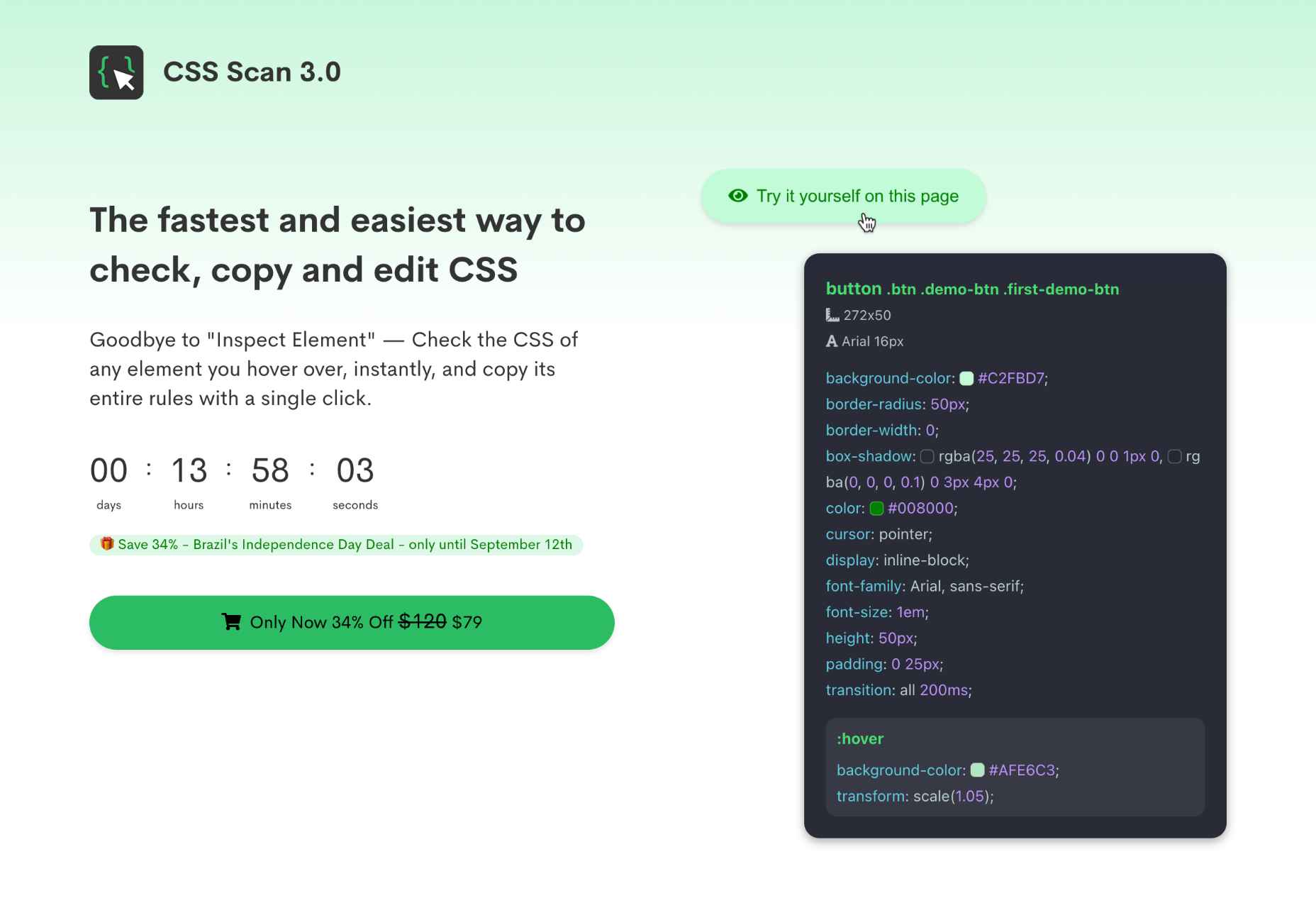
CSS Scan
Forget right-clicking on a website to see how it’s coded. CSS Scan is a browser extension that lets you view the CSS styles of any element and copy them to your clipboard.
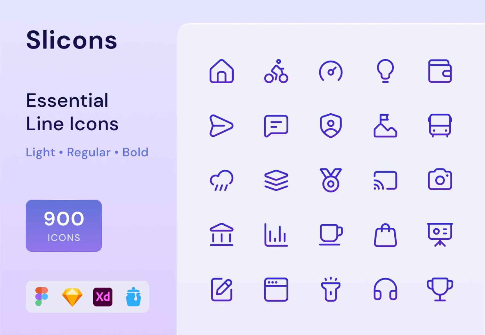
Slicons
Create stand-out UI designs with Slicons, a set of 300+ pixel-perfect icons. Light, regular, and bold versions match your typography and work with Figma, Sketch, XD, and Iconjar.
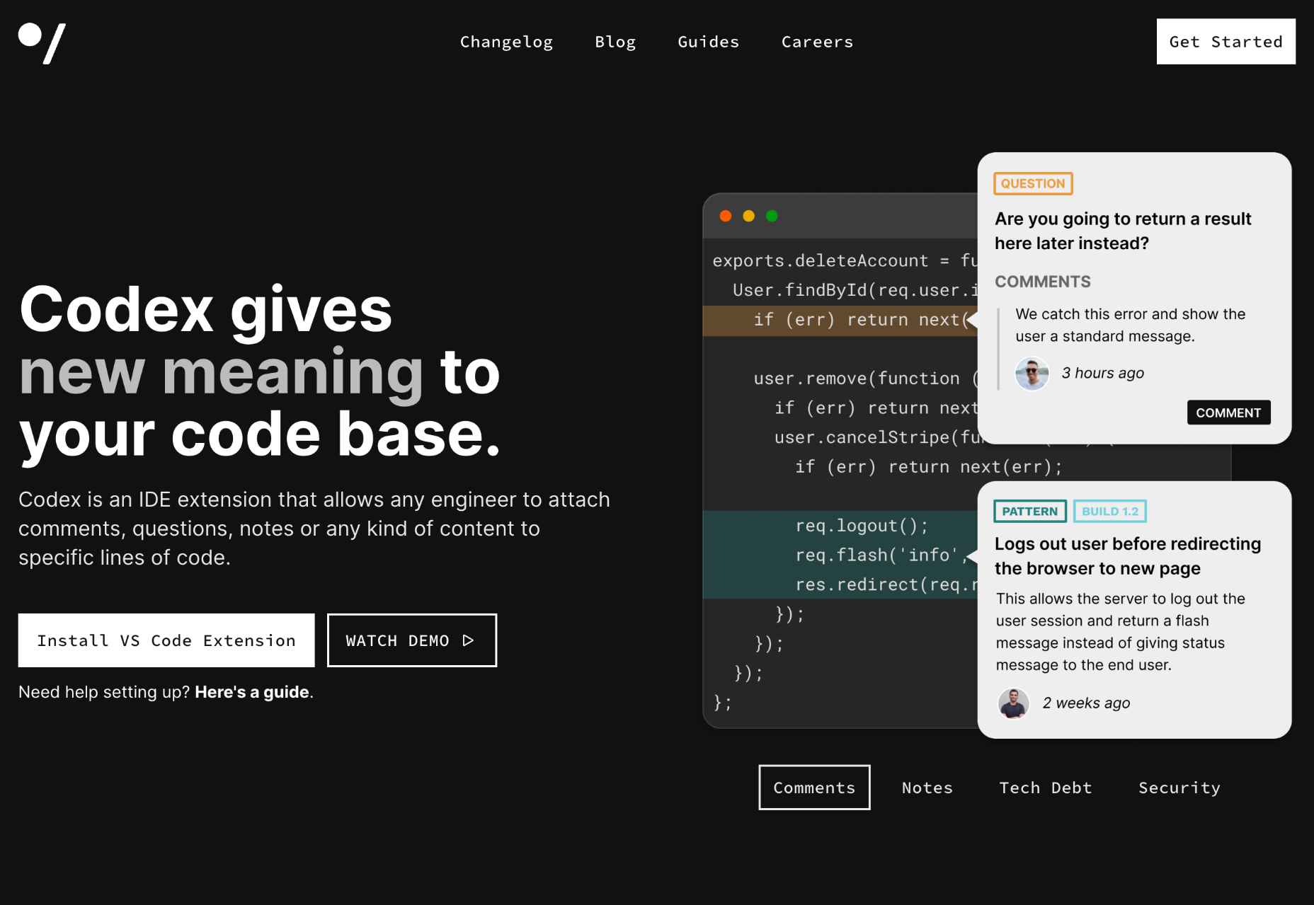
Codex
Codex is an IDE extension that lets you comment on your code like a pro. Anyone on your team can add comments, questions, or notes to any lines of code.
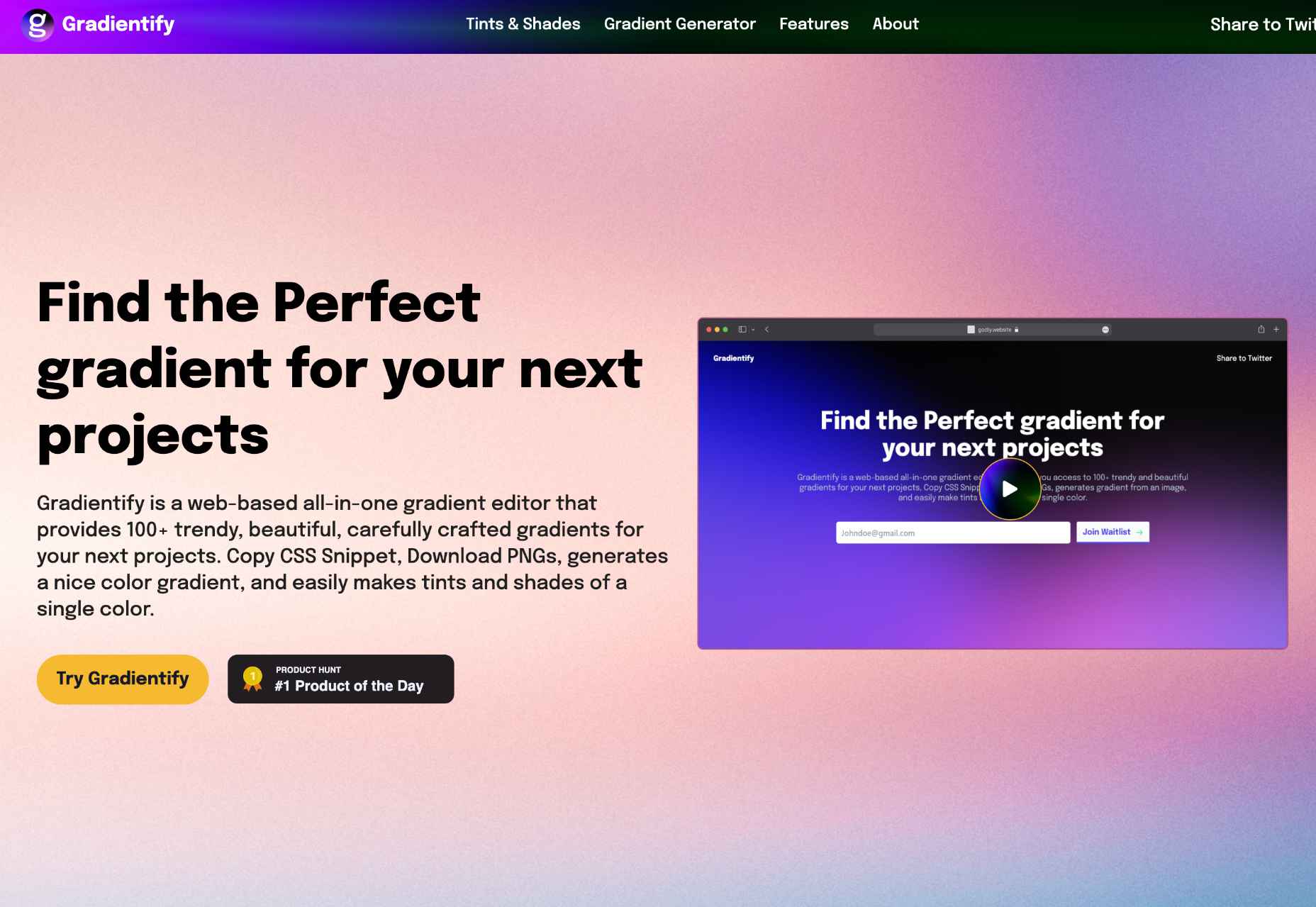
Gradientify
You too can leap aboard the gradient design trend using Gradientify, a collection of 100+ beautiful, human-designed gradients. Copy the CSS, or download PNGs for free.
90 Bitmap Shapes
Create unique logos, social media assets, apparel, and abstract icons using this editable set of 90 Bitmap Shapes in vector form for Photoshop, Sketch, and Figma.

BlockBee
Get paid in crypto using BlockBee. The Web 3.0 payments infrastructure integrates with the best ecommerce carts, including PrestaShop, Opencart, Magento, and WooCommerce.

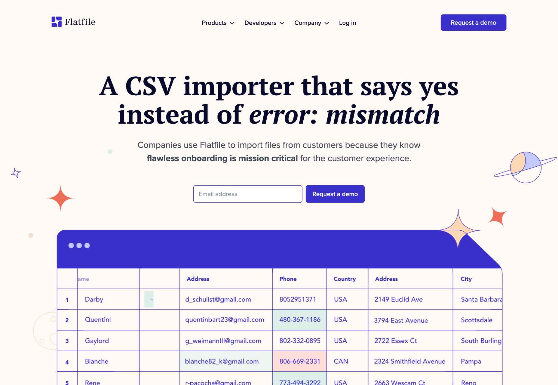
Flatfile
Banish the woes of importing CSV data with Flatfile, a CSV importer that formats human-edited data files to eliminate errors and speed up B2B onboarding.
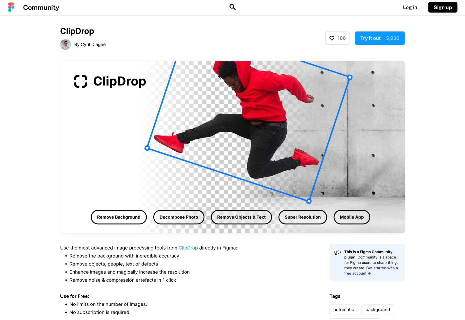
ClipDrop
Effortlessly clip the backgrounds from images in Figma with the ClipDrop plugin. One-click removes backgrounds, objects, people, text, or defects.
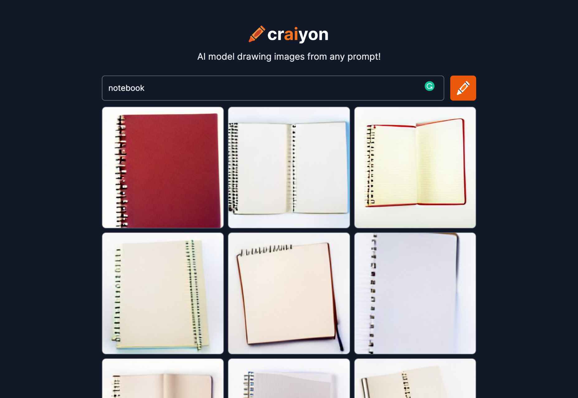
Craiyon
Craiyon is an AI drawing tool based on a stripped-down version of DALL-E. You can generate any image you like using a simple text prompt.
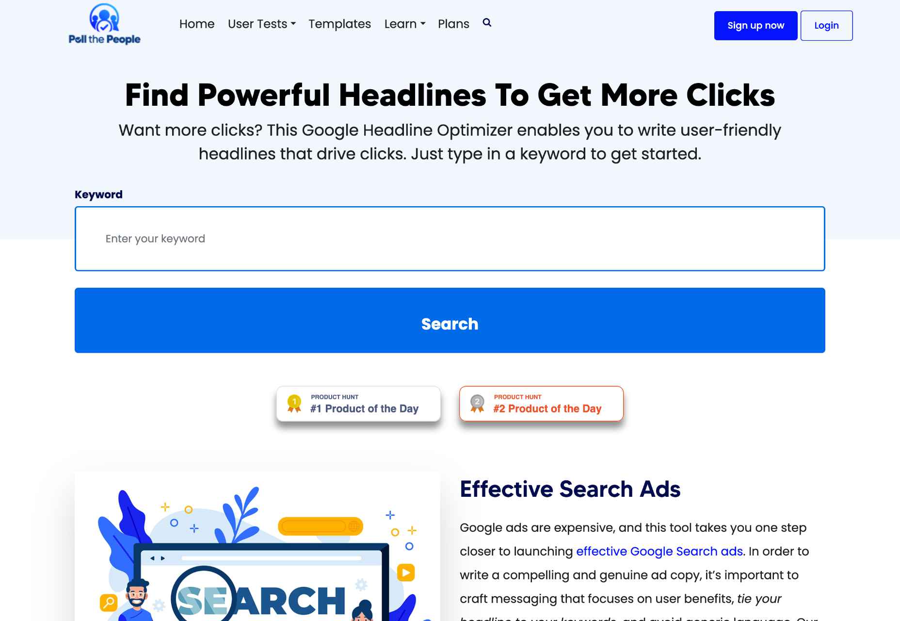
Google Headline Tool
Use Poll the People’s powerful Google Headline Tool to optimize your headlines for more effective search ads and clickable blog post titles.
Retro Postcard Effect
Embrace the trend for retro images using this Retro Postcard Effect for Adobe Photoshop. Easily drop your custom images into the placeholder layer for an instant vintage style.

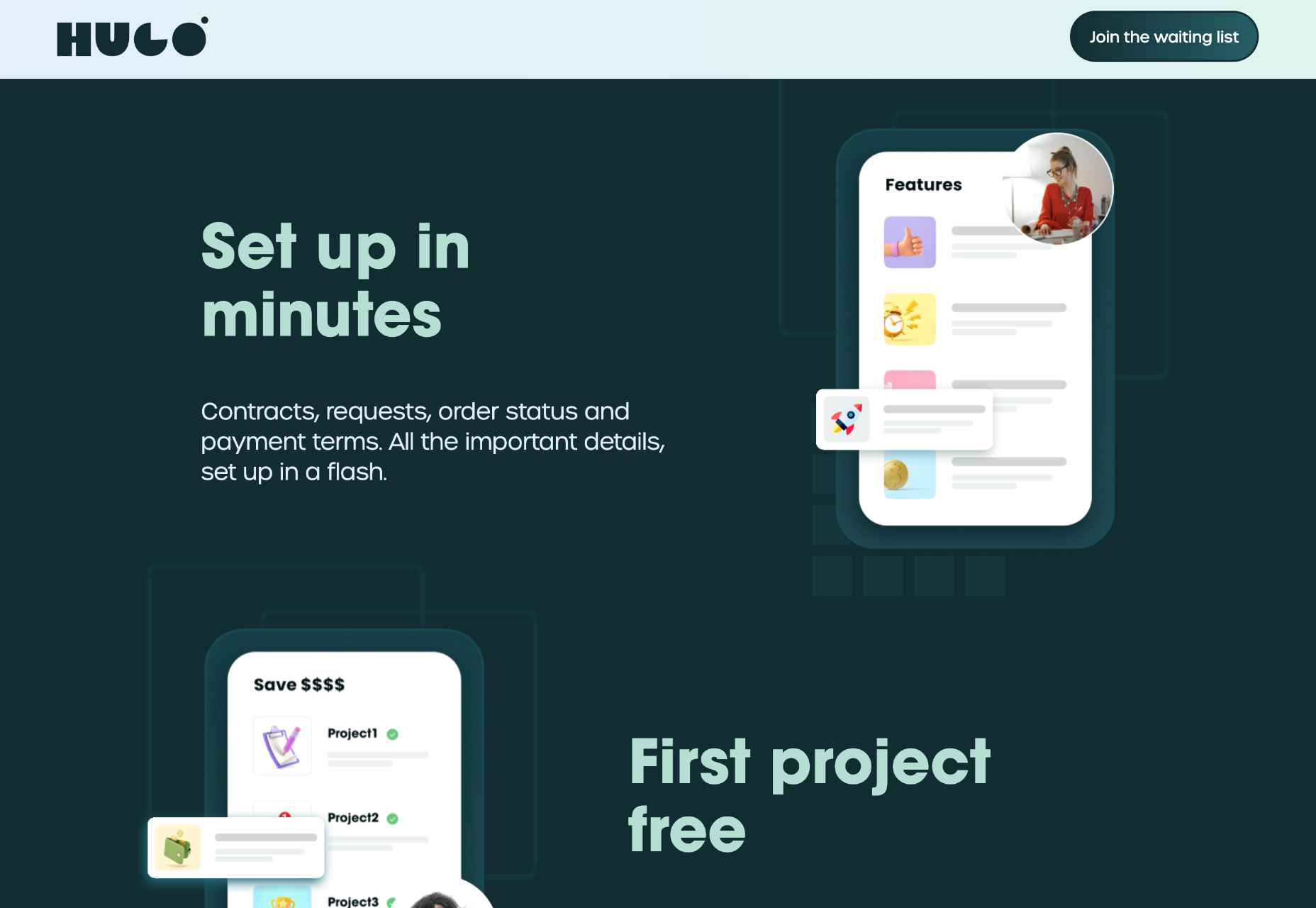
Hugo
Hugo is an admin suite for freelancers that takes care of business with intelligent contracts, audit trails, and an integrated wallet, so you can focus on being creative.
CTA Examples
CTA Examples is a database of call-to-action examples for every possible scenario. So no matter what you want to persuade your users to do, you’ll find the best prompt here.

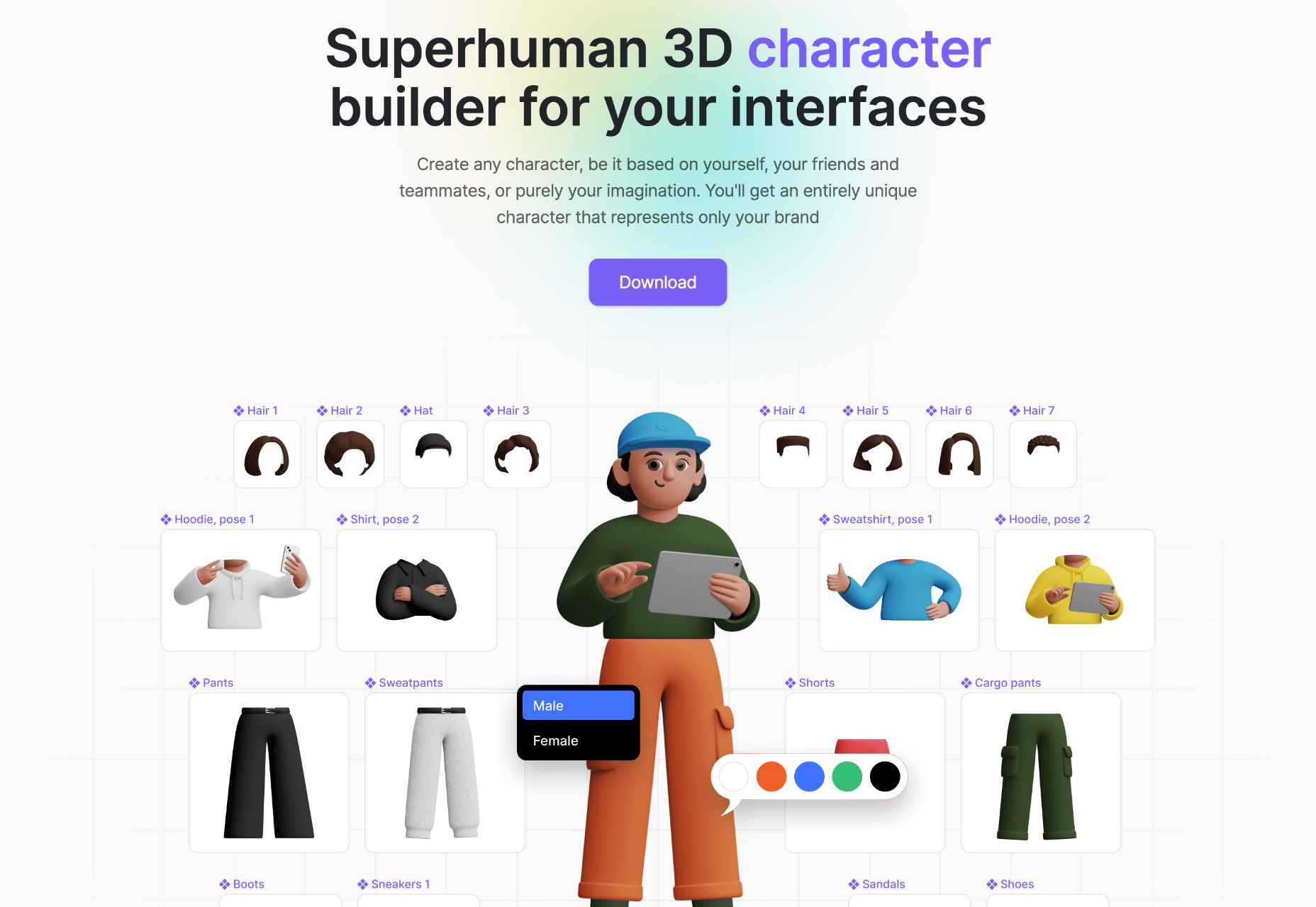
Superhuman
Create unique 3D characters to wow your customers using Superhuman. You can customize clothes, hair, and poses using 1500+ elements or choose from 500 pre-made characters.
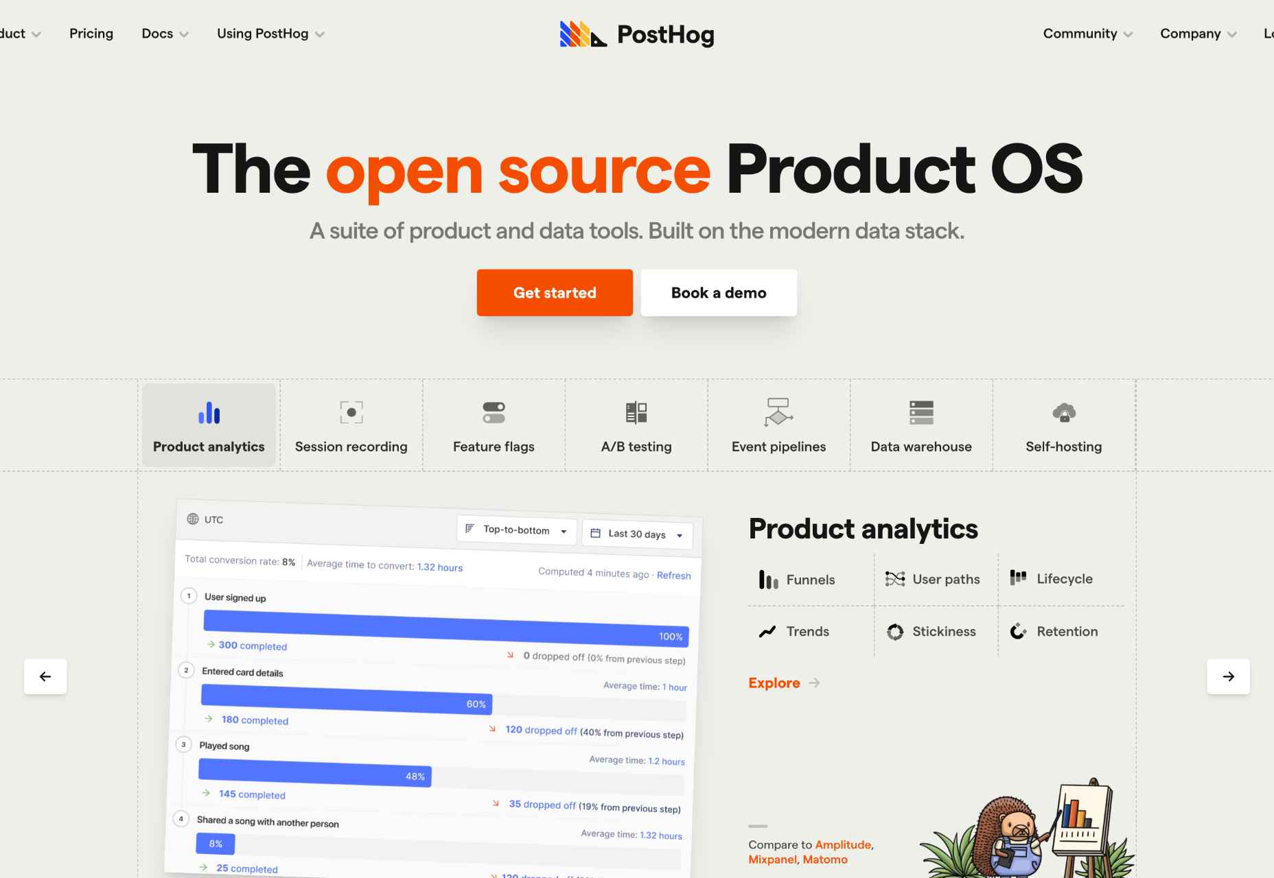
PostHog
PostHog is an extensive set of tools built on a modern data stack. You can do more with your data by creating your own app or using one of the 50+ that are included for free.
Radix UI
There’s no need to reinvent UI components for React when you can use Radix UI. The high-quality, accessible components are perfect for web apps and dashboards.

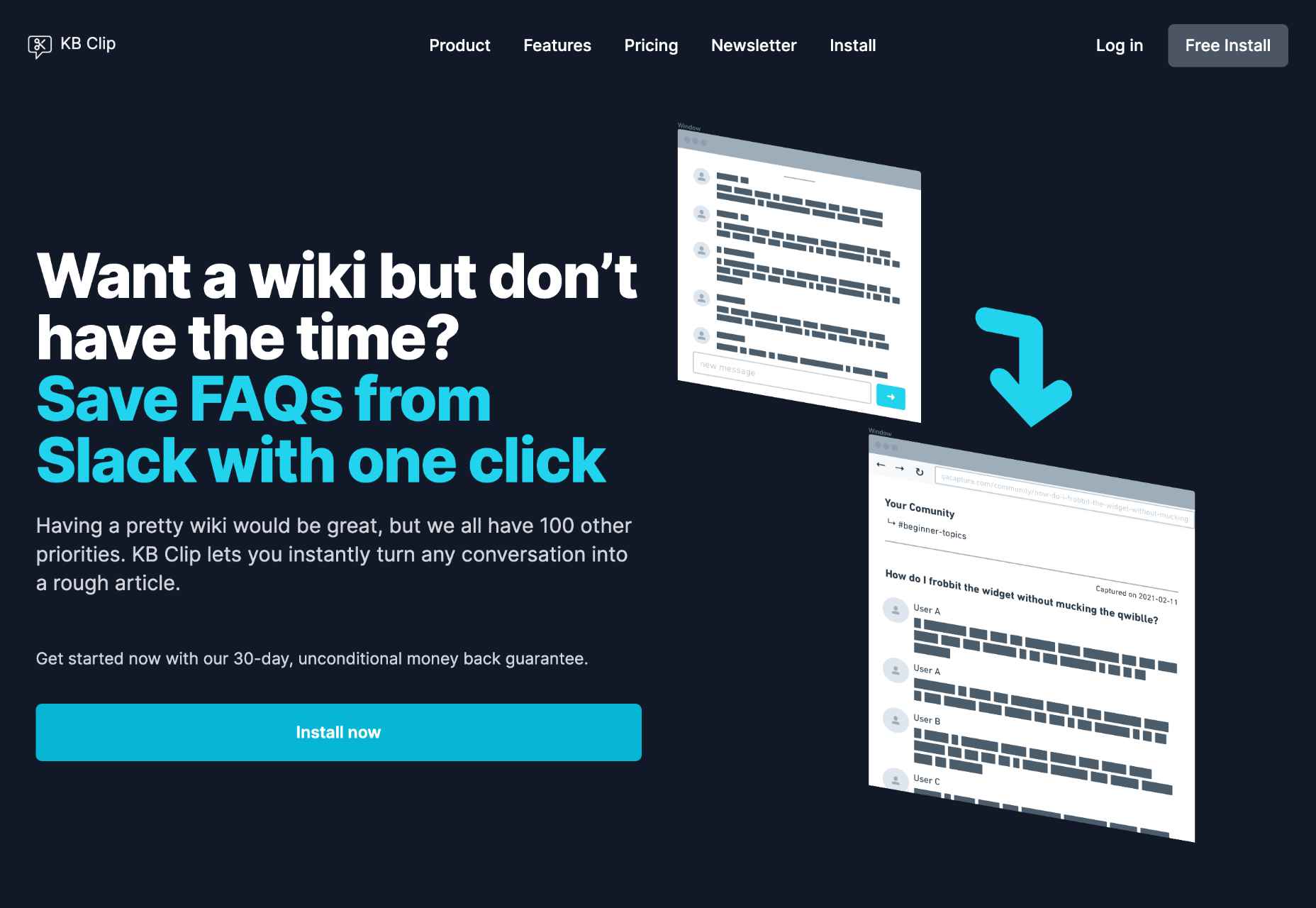
KB Clip
Now you can create a searchable wiki for your business with a fraction of the effort thanks to KB Clip. Just highlight a Slack conversation, and transform it into an article in one click.
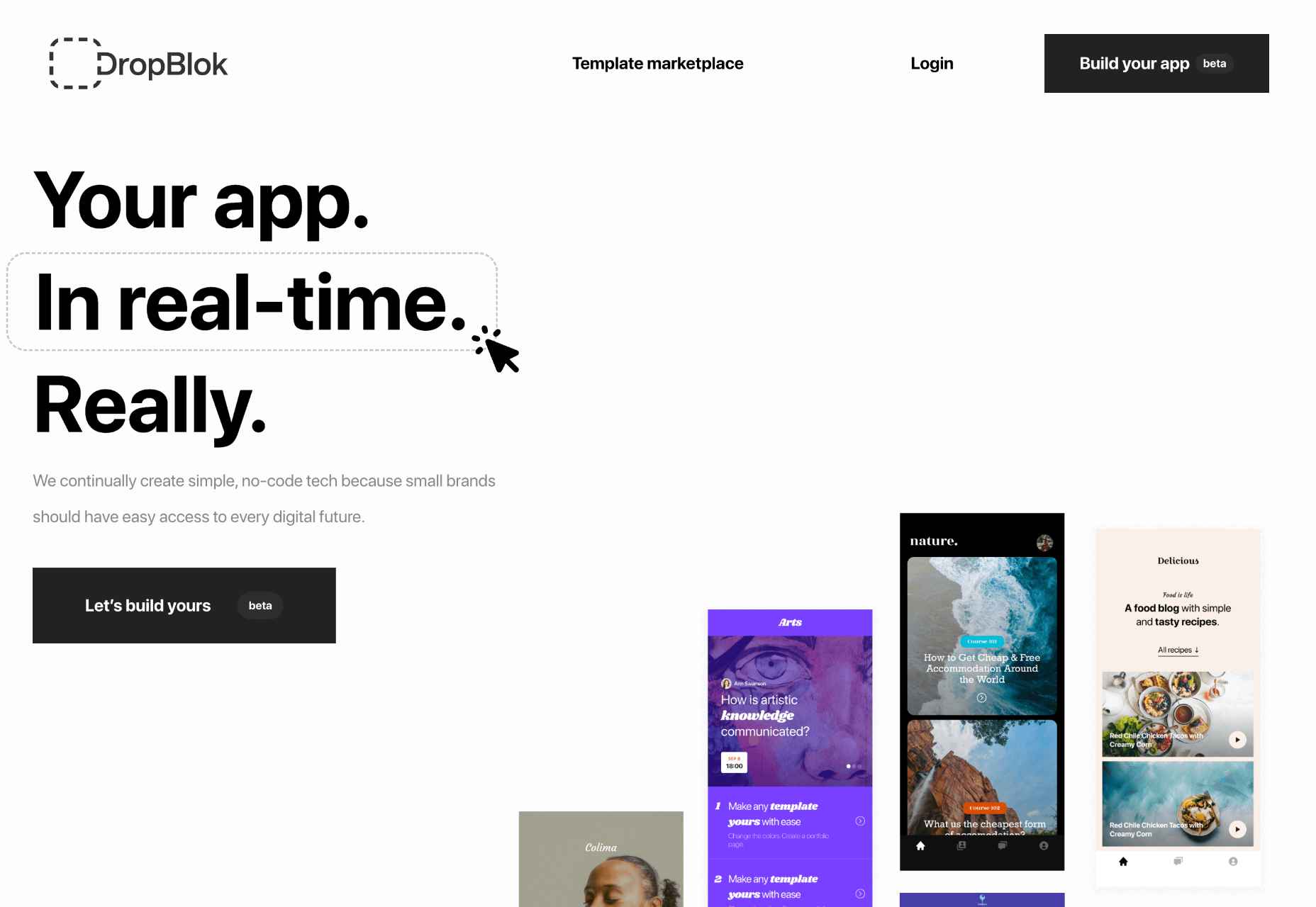
DropBlok
A great way to monetize your followers is with a custom app. DropBlok is a no-code tool that will build the app for you.
Blofishing Font
Blofishing is a gorgeous handwriting font that adds personality to your layouts. It’s ideal for wedding stationery, social media marketing, and anything that needs a personal touch.

Haratte Font
Haratte is an elegant font with graceful curves and a modern aesthetic. It’s perfect for logos, magazine design, social media assets, and more.

The post Exciting New Tools for Designers, September 2022 first appeared on Webdesigner Depot.
8 Interesting Ways Designers Are Using Photoshop in 2022

Introduction
Adobe Photoshop is a photo editing and manipulation software used by everyone from amateur photographers to graphic design professionals. It’s one of the most beloved programs in the Adobe design suite and can be harnessed for basic image retouching, all the way through to compositing digital art, creating mockups, adding effects to images, and even animation.
Keeping on top of software updates and new Photoshop features is essential for designers, as is looking at how other makers and creators are using the software. To set you up for success this year, we’ll explore the biggest Photoshop 2022 updates, including 8 of the most notable new Photoshop features 2022 and how designers are embracing and using the tool right now.
If you’re brand new to Photoshop, start with a Photoshop tutorial for beginners to discover Photoshop editing tips from the ground up. Or try an advanced Photoshop tutorial if you’re looking for Adobe photoshop tricks for experienced designers that extend beyond the basics.
What’s new in Photoshop?
As with most of Photoshop’s new releases, the most recent updates help to improve and evolve the program rather than giving it a complete overhaul. Once released, it doesn’t take too long for designers to identify the new Photoshop tips and tricks, honing in on creative Photoshop ideas and refining their techniques as they explore what’s possible and set new Photoshop trends.
So, what’s new in Photoshop in 2022? From brand new Neural Filters to improved communication with Illustrator, the focus in this update is around enhanced collaboration and more sophisticated finishes on existing tools. For those of us working in the creative industry, this is all very good news as the world forges ahead with increased flexibility and remote working.
How designers are using Photoshop: tricks, tips, and new features
So let’s get into it. We’ll briefly look at the key changes, the best Photoshop tricks, and more importantly, how designers are actually using them. So, what’s possible with Adobe Photoshop in 2022, and what new Photoshop techniques and editing tools should you be using this year?
1. Nailing compositing with Harmonization
First up is the new Harmonization Neural Filter. Essentially, this tool will match the colors and tones between the foreground and background. So when you go into your desired image, select your subject (in the foreground), then select the harmonization tool, you can use it to make your background match flawlessly. This works by allowing you to adjust the saturation, brightness, and overall color balance to find the best match with the background. Why is it so handy? It cuts down hugely on compositing time, which for many designers can be the most time-intensive part of image editing. To try out this tool straightaway, have a play-around using Photoshop add-ons.
2. Replicating color & tone with Color Transfer
On the subject of Photoshop’s Neural Filters, another one worth taking notice of in this update is the Color Transfer Neural Filter. Photographers can rejoice with this tool. Imagine, you’ve spent the day at a photo shoot, and have hundreds of images ready to use. But what if you have one location where the lighting is perfect, and some of the images you want to use aren’t taken in that same position? Enter: the Color Transfer tool. You can use it to bring all your photos in line with the same color and tone, creating a seamless set of photos for your designs.
3. Playing with gradients thanks to improved Interpolation options
Gradients are having a moment in design – just look at these key graphic design trends for 2022 – and now, happily, Photoshop has upgraded its gradient tool with two new Interpolation options to make creating and adjusting your gradients that much easier. In addition to the Classic Interpolation tool, you now have the Perceptual Interpolation and Linear Interpolation tools. Both tools are designed to create more natural-looking gradients, which are closer to the way the human eye perceives real-world gradients. You’ve got a hint from the names of these tools, but one is for the OKLab color space and one is for use in the linear color space.
4. Creating NFTs using Photoshop
A real buzzword of the last few years, NFTs, or non-fungible tokens are digital assets that are bought and sold online via the blockchain. To become an NFT a piece of artwork is ‘minted’, then as it’s bought and sold the transaction history is stored in the blockchain. Photoshop is supporting the growth of NFTs and helping to combat art theft, an increasing problem in the industry, with Content Credentials–currently in BETA. For a more detailed overview of preparing an NFT Adobe has a breakdown here, but essentially it means more insight for audiences and buyers on whether the person selling the art is the Photoshop user who exported it. To take advantage of this new development, you’ll need to enable Content Credentials.
5. Verifying content authenticity with Content Credentials
When you export your file, you now have the option to select to include Content Credentials. This means your jpeg (or chosen file format) will include details like your name, your adjustments, the assets used and their file names (backgrounds, subject, icons, etc.), and which version of Photoshop you created the image in. This functionality is super important for verification when submitting your work, where your client or editor can immediately check the authenticity. Bear in mind, though, that if someone makes adjustments and re-saves the image, your credentials won’t carry through.
6. Working more collaboratively with sharing & commenting
Another anticipated update is the addition of sharing and commenting capabilities. It works similarly to Google Workspace, where your Photoshop work will also appear as a Cloud file. You can then share your file with individuals via their email addresses, or get a shareable link so the file can be accessed by all those who receive it. You have the option to allow commenting, saving a copy, or both, meaning collaboration and feedback just got a whole lot quicker and easier – with no need for file downloading and minimized risk in version control.
7. Switching more effectively between Photoshop & Illustrator
Designers will rejoice at this next update: a better experience switching between Photoshop and Illustrator due to improved interoperability between the software. In practical terms, it’s now possible to paste vectors from Illustrator directly into Photoshop. You have the option to import with layers – meaning you can keep your Illustrator graphics stroke, fill, opacity, and other attributes. You can edit your Illustrator graphic directly in Photoshop, rather than going back into Illustrator, making your adjustments, and re-pasting into Photoshop. Hoorah!
8. Identifying subjects of an image with advanced machine learning
Last but certainly not least is an improvement to Photoshop’s use of artificial intelligence, via the new object finder tool, and an upgrade to the object selection tool. This tool analyses your image to find the main subjects (and even minor subjects), which you can then select automatically and with enhanced precision thanks to more powerful AI machine learning. You’ll save loads of time adjusting subjects quickly and easily, separate from your overall image. You can even prompt Photoshop to hone in on one part of the subject. For example, you might have a person identified as a subject, but you can highlight a particular detail (like a hat) by drawing a smaller box around it. The object finder tool also comes with its own new settings, for adjusting color, outline, and capacity.
Conclusion
So, as well as handy improvements to tools, Adobe Photoshop 2022 is looking to the future with practical means to address issues like content authenticity. It’s also taking advantage of AI, and keeping up with our everyday need for more seamless collaboration. For designers, it’s a solid update with truly useful enhancements as well as a few exciting new features to play with.
The post 8 Interesting Ways Designers Are Using Photoshop in 2022 appeared first on noupe.
Inbound SaaS Marketing: Everything You Should Know About It

It is critical to select the best digital marketing plan if you run a firm in the SaaS industry. That’s why an increasing number of businesses in the industry rely heavily on inbound strategies for customer acquisition and maintenance.
Instead of using traditional outbound marketing methods that force your firm upon consumers, inbound marketing is a better fit for a SaaS company because it is centered on drawing in and keeping the attention of customers.
Following the steps in this tutorial will get you up to speed on all you need to know to generate marketing-qualified leads and fill your inbound funnel.
What Is Inbound Marketing?
The goal of inbound marketing is to attract qualified leads and customers by creating and distributing information that is interesting, useful, or entertaining to them. Blog postings, search engine optimization (SEO), social media, and other strategies are utilized to reach a wide range of potential customers and convert them into leads.
What Is The Difference Between Inbound Marketing and Outbound Marketing?
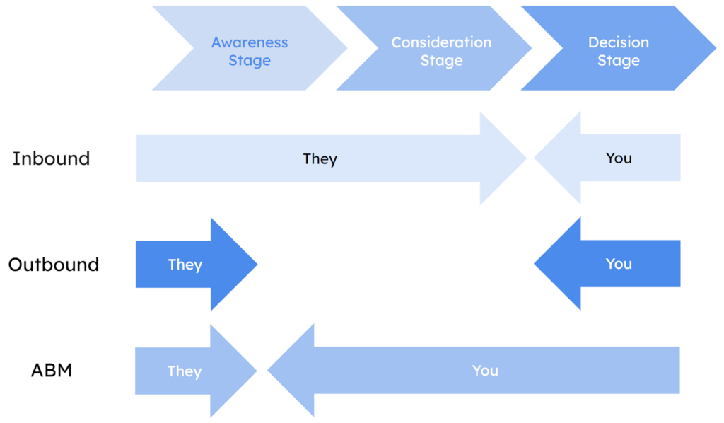
All forms of “intrusive” advertising that are not integrated into the customer’s journey are considered outbound marketing. Ads are positioned tactically in places where target audiences are likely to be present. Advertisements are a typical example of this, and they pop up during most of the videos you watch on Youtube.
There is more “empathy” in inbound marketing. It entails giving your customers a lot of value while encouraging them to interact with your business in a way that seems natural and not intrusive. The goal is to entice viewers. Blog entries, newsletters, and other similar formats are common examples.
Over time, we gained access to resources that allowed us to prevent unwanted commercial communications from reaching us (adblock, etc.). Because of this, the “annoying” advertising strategies have been phased out, and the outbound marketing conversion rate has plummeted. The influx of inbound traffic is gradually displacing the outbound.
Why Is Inbound SaaS Marketing Important?
In the SaaS marketing funnel, inbound marketing helps build credibility for the software company’s brand and produce leads at a cheap cost with high perceived value for the buyer.
Inbound marketing is less expensive than typical outbound tactics since it focuses on identifying and alleviating the problems your ideal customers are having.
Aligning your digital presence with what your target audience cares about can make your company a go-to resource on its path to “better,” generating buzz and generating leads that will increase your return on investment.
A superpower in today’s world is the ability to get people to click on stuff online. The ability to do this naturally (at no cost) is very valuable for a startup.
For this reason, inbound marketing methods are crucial for the modern marketer. Inbound is all about giving your customers more agency rather than the interruption-based marketing that gives enterprises all the power.
How Do You Put Inbound Marketing For SaaS Into Action?
In three steps, you set up SaaS inbound marketing.
- Content Creation
- Content promotion
- Content optimization.
At each of these stages, you can learn more about what you must do to make absolutely sure your inbound marketing works well. So, let’s get to the good stuff in this SaaS sandwich.
Content Creation
The first step in your growth-focused inbound SaaS content marketing strategy is to create the content that is so important. But it’s important not to make content based on what “feels” right and instead make content based on what is right.
You can do this by doing a lot of research to make sure you’re making content that people need and are looking for. This will give your content the best chance of getting in front of the right eyes.
User Research
Create user personas based on their responsibilities, jobs, needs, pain points, missions, values, and past experiences.
Once you know your user, you may tailor your material to them. Topics, types, language, media, distribution route, length, etc.
Search Keywords
Next, keywords. This helps your material be found, ranked, and clicked on, especially if you’re blogging or constructing landing pages.
Competitor Research
Use a SWOT analysis to conduct competitive research. Examine what your competitors are doing well with their content, what they’re not, the potential to beat them, and threats if you do.
Trend analysis
We’re almost done with the research. This is crucial to your niche. What channels may your material go viral? Your competitive analysis and user research will show you which channels to focus on, but developing channels may also offer opportunities.
Medium Research
What content fits your potential users? This relies on their demographics, which you’ll have researched before. This will direct your content creation and change your marketing team structure.
Content Development
After your research, you can finally now start creating content.
Promotion of Content
If you’ve done your research well, you should already know where your content will get the most attention. Instead of talking about what these promotion channels can do for you, we’ll show you how to get the most out of them. If you use these tips to promote your content, you’ll reach more people than ever before.
“Content is a 50:50 split between creation and distribution.”
—Kirsty quote.
SEO
SEO tops our content promotion list, naturally. We’re biased, though. It is said that if Content is Kind then SEO is Queen and there is no way you can promote your content without some proper search engine optimization techniques.

Social Networking
Social Media can help distribute B2B content. Make sure your social copy and posts speak to each channel’s demographics.
Email Marketing
Hyper-segmentation is email’s distribution secret. It’s pointless to send the same content to 1000+ people on a generic email list. Humans have likes, dislikes, and experiences that form their mailbox needs. That’s why getting your hands on some high-performing email marketing strategies is a need of the hour.
Marketing-by-referral
Who are your strongest advocates? Users!
They’ll gush about your business and product. Don’t abandon them. Create distinctive, shareable content. Consider email templates or Whatsapp snippets.
Influencers
Influence-related. Influencers are up next. Every specialty has influencers. No matter how niche your product is, there is a social media audience for it. Find out more about them. You can accomplish this by searching for individuals underneath keywords or hashtags, however, if you’re handling social well, there’s a strong chance you already recognize who all these folks are.
Content Optimization
Even though your content is great, it could always be better. Optimization is the last thing you need to think about for your inbound marketing playbook. Always look for ways to improve your content, like the ones we’ve talked about so far. This will bring in more leads and lower the number of people who drop out of the sales process.
What does an SEO strategy for content look like? WE are glad you asked. Here is what it consists of:
KPIs
KPIs show you’re on track to meet monthly, quarterly, and yearly goals. Benchmark those KPIs against past data sets to ensure you’re setting realistic targets for your content strategy.
Inbound marketing KPIs include:
| Primary | Secondary |
| MQLs or product activations | Qualified Lead generation or signups |
| New MRR / Pipeline generated | CTR |
| Newsletter Signups | |
| Impressions | |
| Social Media Growth | |
| Brand searches | |
| Time on page | |
| Exit rate | |
| New visits | |
| Visits by source | |
| Blog subscribers & views | |
| Inbound links | |
| Email opens and click-throughs | |
| Keyword rankings | |
| SaaS SEO KPIs |
Red Flags
Content optimization isn’t always measured. Instead, watch for red flags.
Set up tools and processes to inform you when content fails.
NPS/Polls
Ask your audience how they view your brand and content.NPS surveys evaluate how your brand is viewed and whether you’re improving.
5+ Inbound Marketing Tips for SaaS
Free Trials Boost Sales
For a SaaS company, free trials are often crucial to attracting new clients. Free trials can create new leads and convert shoppers quickly, like free returns.
For free trials, many SaaS marketing initiatives demand a credit card. After the trial, your company can instantly sell the product.
Your free trial can show potential clients your whole software. Your organization may lock certain features to attract customers.
Slow Isn’t Always Best
In a SaaS marketing effort, it’s more crucial to create leads quickly than to wait for results.
Inbound marketing offers reliable and consistent outcomes for SaaS companies. Outbound marketing delivers inconsistent and unpredictable results, reducing ROI (ROI).
Why does inbound work?
It offers customized targeted content. A subscriber to your email newsletter may receive communications about the software they investigated on your site.
SEO is vital
When selling software, your marketing methods should attract new consumers and persuade them why buying your products is a good investment.
You can’t demonstrate to prospective clients the value of your product if they don’t know your brand. That’s where SEO strategies come in. SEO helps your business get recognized on search engines.
Become an Industry leader
Selling software isn’t simple, especially with severe competition. Inbound marketing methods should highlight your competitive edge and USPs.
Increase Sales Through Social Media
Inbound marketing must include social media. LinkedIn, Facebook, and Twitter help you reach new clients and promote your brand and services. It is crucial for SaaS companies to know how to create efficient Social Media Funnels to expand beyond social media to reach their target market.
Make Your SaaS Sellable
Producing top-tier software that sells itself is the first and foremost thing you should focus on when developing SaaS inbound marketing strategies.
Your company’s departments must work together to thrive with inbound marketing. Try to prioritize fixing an irritating bug in your program with your development team.
Bottom Line
Making wise decisions is the general rule. When it comes to your SaaS marketing approach, don’t let anything cloud your judgment.
Your endeavors should lead to profitability and revenue-centricity. However, keep in mind that everything you do must be focused on your users.
SaaS marketing varies by the firm; what works for one may not work for another, and it’s all about trial and error.
The post Inbound SaaS Marketing: Everything You Should Know About It appeared first on noupe.
How I Made a Pure CSS Puzzle Game

If you look closely you’ll notice that we have nine different puzzle-piece shapes: the four corners, the four edges, and one for everything else.
The grid of puzzle pieces I made in the other article I referred to is a little more straightforward:
We can use the same technique that combines CSS masks and gradients to create the different shapes. In case you are unfamiliar with mask and gradients, I highly recommend checking
I recently discovered the joy of creating CSS-only games. It’s always fascinating how HTML and CSS are capable of handling the logic of an entire online game, so I had to try it! Such games usually rely on the ol’ Checkbox Hack where we combine the checked/unchecked state of a HTML input with the :checked pseudo-class in CSS. We can do a lot of magic with that one combination!
In fact, I challenged myself to build an entire game without Checkbox. I wasn’t sure if it would be possible, but it definitely is, and I’m going to show you how.
In addition to the puzzle game we will study in this article, I have made a collection of pure CSS games, most of them without the Checkbox Hack. (They are also available on CodePen.)
Want to play before we start?
I personally prefer playing the game in full screen mode, but you can play it below or open it up over here.
Cool right? I know, it’s not the Best Puzzle Game You Ever Saw™ but it’s also not bad at all for something that only uses CSS and a few lines of HTML. You can easily adjust the size of the grid, change the number of cells to control the difficulty level, and use whatever image you want!
We’re going to remake that demo together, then put a little extra sparkle in it at the end for some kicks.
The drag and drop functionality
While the structure of the puzzle is fairly straightforward with CSS Grid, the ability to drag and drop puzzle pieces is a bit trickier. I had to relying on a combination of transitions, hover effects, and sibling selectors to get it done.
If you hover over the empty box in that demo, the image moves inside of it and stays there even if you move the cursor out of the box. The trick is to add a big transition duration and delay — so big that the image takes lots of time to return to its initial position.
img {
  transform: translate(200%);
  transition: 999s 999s; /* very slow move on mouseout */
}
.box:hover img {
  transform: translate(0);
  transition: 0s; /* instant move on hover */
}
Specifying only the transition-delay is enough, but using big values on both the delay and the duration decreases the chance that a player ever sees the image move back. If you wait for 999s + 999s — which is approximately 30 minutes — then you will see the image move. But you won’t, right? I mean, no one’s going to take that long between turns unless they walk away from the game. So, I consider this a good trick for switching between two states.
Did you notice that hovering the image also triggers the changes? That’s because the image is part of the box element, which is not good for us. We can fix this by adding pointer-events: none to the image but we won’t be able to drag it later.
That means we have to introduce another element inside the .box:
That extra div (we’re using a class of .a) will take the same area as the image (thanks to CSS Grid and grid-area: 1 / 1) and will be the element that triggers the hover effect. And that is where the sibling selector comes into play:
.a {
  grid-area: 1 / 1;
}
img {
  grid-area: 1 / 1;
  transform: translate(200%);
  transition: 999s 999s;
}
.a:hover + img {
  transform: translate(0);
  transition: 0s;
}
Hovering on the .a element moves the image, and since it is taking up all space inside the box, it’s like we are hovering over the box instead! Hovering the image is no longer a problem!
Let’s drag and drop our image inside the box and see the result:
Did you see that? You first grab the image and move it to the box, nothing fancy. But once you release the image you trigger the hover effect that moves the image, and then we simulate a drag and drop feature. If you release the mouse outside the box, nothing happens.
Hmm, your simulation isn’t perfect because we can also hover the box and get the same effect.
True and we will rectify this. We need to disable the hover effect and allow it only if we release the image inside the box. We will play with the dimension of our .a element to make that happen.
Now, hovering the box does nothing. But if you start dragging the image, the .a element appears, and once released inside the box, we can trigger the hover effect and move the image.
Let’s dissect the code:
.a {
  width: 0%;
  transition: 0s .2s; /* add a small delay to make sure we catch the hover effect */
}
.box:active .a { /* on :active increase the width */
  width: 100%;
  transition: 0s; /* instant change */
}
img {
  transform: translate(200%);
  transition: 999s 999s;
}
.a:hover + img {
  transform: translate(0);
  transition: 0s;
}
Clicking on the image fires the :active pseudo-class that makes the .a element full-width (it is initially equal to 0). The active state will remain active until we release the image. If we release the image inside the box, the .a element goes back to width: 0, but we will trigger the hover effect before it happens and the image will fall inside the box! If you release it outside the box, nothing happens.
There is a little quirk: clicking the empty box also moves the image and breaks our feature. Currently, :active is linked to the .box element, so clicking on it or any of its children will activate it; and by doing this, we end up showing the .a element and triggering the hover effect.
We can fix that by playing with pointer-events. It allows us to disable any interaction with the .box while maintaining the interactions with the child elements.
.box {
  pointer-events: none;
}
.box * {
  pointer-events: initial;
}Now our drag and drop feature is perfect. Unless you can find how to hack it, the only way to move the image is to drag it and drop it inside the box.
Building the puzzle grid
Putting the puzzle together is going to feel easy peasy compared to what we just did for the drag and drop feature. We are going to rely on CSS grid and background tricks to create the puzzle.
Here’s our grid, written in Pug for convenience:
- let n = 4; /* number of columns/rows */
- let image = "https://picsum.photos/id/1015/800/800";

g(style=`--i:url(${image})`)
  - for(let i = 0; i < n*n; i++)
    z
      a
      b(draggable="true")
The code may look strange but it compiles into plain HTML:
<g style="--i: url(https://picsum.photos/id/1015/800/800)">
 <z>
   <a></a>
   <b draggable="true"></b>
 </z>
 <z>
   <a></a>
   <b draggable="true"></b>
 </z>
 <z>
   <a></a>
   <b draggable="true"></b>
 </z>
  <!-- etc. -->
</g>
I bet you’re wondering what’s up with those tags. None of these elements have any special meaning — I just find that the code is much easier to write using than a bunch of
This is how I’ve mapped them out:
is our grid container that containsN*Nelements.represents our grid items. It plays the role of the.boxelement we saw in the previous section.triggers the hover effect.represents a portion of our image. We apply thedraggableattribute on it because it cannot be dragged by default.
Alright, let’s register our grid container on . This is in Sass instead of CSS:
$n : 4; /* number of columns/rows */

g {
  --s: 300px; /* size of the puzzle */

  display: grid;
  max-width: var(--s);
  border: 1px solid;
  margin: auto;
  grid-template-columns: repeat($n, 1fr);
}
We’re actually going to make our grid children — the elements — grids as well and have both and within the same grid area:
z {
  aspect-ratio: 1;
  display: grid;
  outline: 1px dashed;
}
a {
  grid-area: 1/1;
}
b {
  grid-area: 1/1;
}
As you can see, nothing fancy — we created a grid with a specific size. The rest of the CSS we need is for the drag and drop feature, which requires us to randomly place the pieces around the board. I’m going to turn to Sass for this, again for the convenience of being able to loop through and style all the puzzle pieces with a function:
b {
  background: var(--i) 0/var(--s) var(--s);
}

@for $i from 1 to ($n * $n + 1) {
  $r: (random(180));
  $x: (($i - 1)%$n);
  $y: floor(($i - 0.001) / $n);
  z:nth-of-type(#{$i}) b{
    background-position: ($x / ($n - 1)) * 100% ($y / ($n - 1)) * 100%;
    transform:
      translate((($n - 1) / 2 - $x) * 100%, (($n - 1)/2 - $y) * 100%)
      rotate($r * 1deg)
      translate((random(100)*1% + ($n - 1) * 100%))
      rotate((random(20) - 10 - $r) * 1deg)
   }
}
You may have noticed that I’m using the Sass random() function. That’s how we get the randomized positions for the puzzle pieces. Remember that we will disable that position when hovering over the element after dragging and dropping its corresponding element inside the grid cell.
z a:hover ~ b {
  transform: translate(0);
  transition: 0s;
}
In that same loop, I am also defining the background configuration for each piece of the puzzle. All of them will logically share the same image as the background, and its size should be equal to the size of the whole grid (defined with the --s variable). Using the same background-image and some math, we update the background-position to show only a piece of the image.
That’s it! Our CSS-only puzzle game is technically done!
But we can always do better, right? I showed you how to make a grid of puzzle piece shapes in another article. Let’s take that same idea and apply it here, shall we?
Puzzle piece shapes
Here’s our new puzzle game. Same functionality but with more realistic shapes!
This is an illustration of the shapes on the grid:
If you look closely you’ll notice that we have nine different puzzle-piece shapes: the four corners, the four edges, and one for everything else.
The grid of puzzle pieces I made in the other article I referred to is a little more straightforward:
We can use the same technique that combines CSS masks and gradients to create the different shapes. In case you are unfamiliar with mask and gradients, I highly recommend checking that simplified case to better understand the technique before moving to the next part.
First, we need to use specific selectors to target each group of elements that shares the same shape. We have nine groups, so we will use eight selectors, plus a default selector that selects all of them.
z  /* 0 */

z:first-child  /* 1 */

z:nth-child(-n + 4):not(:first-child) /* 2 */

z:nth-child(5) /* 3 */

z:nth-child(5n + 1):not(:first-child):not(:nth-last-child(5)) /* 4 */

z:nth-last-child(5)  /* 5 */

z:nth-child(5n):not(:nth-child(5)):not(:last-child) /* 6 */

z:last-child /* 7 */

z:nth-last-child(-n + 4):not(:last-child) /* 8 */
Here is a figure that shows how that maps to our grid:

Now let’s tackle the shapes. Let’s focus on learning just one or two of the shapes because they all use the same technique — and that way, you have some homework to keep learning!
For the puzzle pieces in the center of the grid, 0:
mask:
  radial-gradient(var(--r) at calc(50% - var(--r) / 2) 0, #0000 98%, #000) var(--r)
    0 / 100% var(--r) no-repeat,
  radial-gradient(var(--r) at calc(100% - var(--r)) calc(50% - var(--r) / 2), #0000 98%, #000)
    var(--r) 50% / 100% calc(100% - 2 * var(--r)) no-repeat,
  radial-gradient(var(--r) at var(--r) calc(50% - var(--r) / 2), #000 98%, #0000),
  radial-gradient(var(--r) at calc(50% + var(--r) / 2) calc(100% - var(--r)), #000 98%, #0000);
The code may look complex, but let’s focus on one gradient at a time to see what’s happening:
Two gradients create two circles (marked green and purple in the demo), and two other gradients create the the slots that other pieces connect to (the one marked blue fills up most of the shape while the one marked red fills the top portion). A CSS variable, --r, sets the radius of the circular shapes.

The shape of the puzzle pieces in the center (marked 0 in the illustration) is the hardest to make as it uses four gradients and has four curvatures. All the others pieces juggle fewer gradients.
For example, the puzzle pieces along the top edge of the puzzle (marked 2 in the illustration) uses three gradients instead of four:
mask:
  radial-gradient(var(--r) at calc(100% - var(--r)) calc(50% + var(--r) / 2), #0000 98%, #000) var(--r) calc(-1 * var(--r)) no-repeat,
  radial-gradient(var(--r) at var(--r) calc(50% - var(--r) / 2), #000 98%, #0000),
radial-gradient(var(--r) at calc(50% + var(--r) / 2) calc(100% - var(--r)), #000 98%, #0000);We removed the first (top) gradient and adjusted the values of the second gradient so that it covers the space left behind. You won’t notice a big difference in the code if you compare the two examples. It should be noted that we can find different background configurations to create the same shape. If you start playing with gradients you will for sure come up with something different than what I did. You may even write something that’s more concise — if so, share it in the comments!
In addition to creating the shapes, you will also find that I am increasing the width and/or the height of the elements like below:
height: calc(100% + var(--r));
width: calc(100% + var(--r));
The pieces of the puzzle need to overflow their grid cell to connect.

Final demo
Here is the full demo again. If you compare it with the first version you will see the same code structure to create the grid and the drag-and-drop feature, plus the code to create the shapes.
Possible enhancements
The article ends here but we could keep enhancing our puzzle with even more features! How about a a timer? Or maybe some sort of congratulations when the player finishes the puzzle?
I may consider all these features in a future version, so keep an eye on my GitHub repo.
Wrapping up
And CSS ism’t a programming language, they say. Ha!
I’m not trying to spark some #HotDrama by that. I say it because we did some really tricky logic stuff and covered a lot of CSS properties and techniques along the way. We played with CSS Grid, transitions, masking, gradients, selectors, and background properties. Not to mention the few Sass tricks we used to make our code easy to adjust.
The goal was not to build the game, but to explore CSS and discover new properties and tricks that you can use in other projects. Creating an online game in CSS is a challenge that pushes you to explore CSS features in great detail and learn how to use them. Plus, it’s just a lot of fun that we get something to play with when all is said and done.
Whether CSS is a programming language or not, doesn’t change the fact that we always learn by building and creating innovative stuff.
How I Made a Pure CSS Puzzle Game originally published on CSS-Tricks, which is part of the DigitalOcean family. You should get the newsletter.
A Guide to Knowledge-Sharing Best Practices in the Outsourcing Industry

Introduction
Sharing relevant information is the foundation of any successful business process outsourcing (BPO) operation. A successful Knowledge sharing in the outsourcing industry will result in a smooth flow of company operations and maintain areas for standardization, optimization, and automation improvement.
Customers just starting their outsourcing journey are likely aware of the importance of knowledge transfer. Still, they may lack insight into the planning phase, the specifics of knowledge transfer procedures, or the potential payoffs of establishing a foundation for continuous business process optimization.
Companies can save considerable support costs through labor arbitrage by outsourcing a “lift and shift” business process in finance, accounting, and other operations (moving business from potentially high-cost to low-cost locations).
Though saving money is always welcome, optimizing and automating business operations is crucial to the company’s long-term success. Knowledge transfer planning is the key to achieving this.
What is Knowledge sharing?
The term “knowledge sharing” is used to describe the practice of communicating vital information about a company or a project among its participants. It’s a method of “packing” your team’s knowledge into readily accessible resources.
Here are multiple ways through which knowledge transfer happens:
- Manuals and Guides
- Code Repository
- Example-based research
- Anthology of Successful Methods
- References
- Decision Trees
- Flow charts
Businesses with knowledge-sharing capabilities can guarantee that their employees have access to the data required to perform at the highest level. In addition, effective information sharing allows businesses to safeguard themselves against unanticipated personnel turnover. This is especially important because it helps prevent information losses.
After all, if scientists didn’t share what they’d learned, they’d have to reinvent the wheel constantly. It was only via merging the findings of previous discoveries that they could make new progress.
Benefits of Knowledge Sharing in the outsourcing industry
The cohesiveness of your groups is an asset. Team members can share knowledge, learn from one another, and create synergy by being close. Things grow more difficult when you bring in new employees or onboard an entire team through an outsourced partner.
Relationships with your customer and your new specialists can be strengthened through proactive information sharing by:
- Help the team to understand the audience more efficiently and provide them with solutions to their problems as soon as possible.
- Careful documentation gives employees a repository of information they may mine for previously gained insights. In addition, since they won’t have to recreate the wheel each time, they’ll be able to save time and get more done.
- Inclusion for all team members, local and remote, is improved by centralizing information rather than relaying it verbally.
- Knowledge-sharing platforms simplify incorporating new data, ensuring that the information you have access to is always up-to-date. In this approach, we can be confident that everyone is always aware of the most recent developments and is using the most recent data.
5 best practices to create a Knowledge sharing culture
We can do more with less effort by combining resources and exchanging information. But, this activity calls for some thought. 75% of companies surveyed by Deloitte saw a positive correlation between knowledge preservation and future earnings. But only 9% of businesses say they’re prepared to make knowledge-sharing a central component of their company culture.
Following are the no. of ways knowledge management helps you to make the knowledge sharing smooth and effective:
1. Start making a Knowledge sharing strategy
The strategy has to outline the fundamentals of the outsourced business process and the steps that will be taken to put it into motion. Identifying these crucial operations and support services is necessary from a practical standpoint. In addition, the benefit lays the groundwork for a long-term partnership between the outsourcer and the customer. As a result, customers’ trust in the outsourcer’s competence is bolstered, and they gain insight into any weak spots that may need special attention during the actual knowledge transfer.
2. Select the right tools for Knowledge transfer
The project’s overarching objectives and the needs of each team or department should guide the process of knowledge sharing. You should start by answering the question, “How will you manage knowledge?” In what ways do you plan to expand your knowledge? How will you move your existing knowledge to the new platform, and where is it currently stored?
Following a thorough analysis of the problem, you can pick the appropriate tools. The following are a few critical features to look out for in a knowledge-sharing tool:
- Anyone can quickly and readily locate the desired data (e.g., there are clear categories, tags, descriptions, correct namings, etc.).
- While making knowledge-sharing assets, all workers can contribute to expanding and refining the body of project knowledge.
- It’s easy to make changes to the content without compromising readability, usability, or findability.
- Changes can be made to the system’s content, structure, and strategies with relative ease, making it suitable for use by various groups and individuals.
Knowledge management tools that are used for knowledge transfer enable staff members to share tacit information. The success of an organization depends on its capacity for knowledge transfer; hence the study analyses and reviews the best techniques for information transfer in knowledge-intensive organizations.
3. Eliminate knowledge hoarding
If employees are unwilling to share information, it won’t matter how well you manage knowledge. Specialists, groups, and companies engage in knowledge hoarding when they fail to share important information with other team or organization members.
Here are a few tips to eliminate the standard knowledge hoardings:
- Distribute product road maps so everyone working on the project is on the same page. This will assist your outsourcing teams and specialists hit the ground running once they’ve joined the project.
- Knowledge sharing in the outsourcing industry is more than just a resource for filling capacity gaps; the relationship is mutually beneficial. Maintaining open communication with your outsourcing partner is essential for achieving optimal results. Unless you want to wait longer than necessary for responses to your new requests, knowledge sharing can better grow your teams or deal with the “slowdown” phase if we know your plans in advance.
- You should recognize team members who contribute information and share it with others by rewarding them. Create a leaderboard to track who has shared the most knowledge to increase engagement.
4. Gather relevant knowledge and organize it in one place
To avoid knowledge hoarding and ensure adequate knowledge is shared among employees, it is essential to organize the information correctly. This includes adding categories and subcategories to content pieces, relevant keywords for each knowledge piece, and meta tags with content pieces to ensure they are readily available and accessible to employees.
Organizations must ensure the availability of relevant information in one place to avoid employees spending their precious time on information search. By interlinking different content pieces that an employee may need to solve a particular problem, companies can ensure that employees do not toggle between screens to gather relevant information. Knowledge sharing becomes simpler when information is accessible to employees in a suitable knowledge base.
5. Continue to share knowledge and communicate proactively
Communication that is timely, open, and proactive is what information sharing is all about.
The in-house and outsourced staff should be included in all discussions that pertain to them. However, outsourcing teams/specialists may feel left out of communication due to distance and time issues, inclusion later in the project, and a lack of available knowledge about the processes.
Here are some tips to encourage knowledge sharing in your organization:
- Give staff members a variety of channels for knowledge sharing. Each employee will thus have the freedom to decide which approach best suits their personality and talents.
- Reserve time weekly for staff members to share and offer expertise; this will help it become a habit.
- Have a weekly team gathering to discuss the previous week’s learning and any noteworthy resources discovered.
- Hold regular retrospective sessions so staff members can discuss the potential areas for growth.
- Implement a knowledge management platform for intelligence that can give users access to knowledge and skills in real-time.
- Consider holding meetings and events away from the office to inspire your coworkers.
Conclusion
People are typically hesitant to make an extra effort to impart their knowledge to others. Therefore, it takes time and hard work to establish a culture of Knowledge sharing in the outsourcing industry. With the help of an efficient system to manage and share knowledge, you may recover the time wasted on pointless meetings, “requests for information,” and waiting for responses, which results in better team performance, customer experience, and enhanced ROI.
The post A Guide to Knowledge-Sharing Best Practices in the Outsourcing Industry appeared first on noupe.
Best Ways to Improve your Retail Industry

The idea of enticing customers to step into your establishment or restaurant to have a closer look at your establishment is the top goal of any small-scale business owner.
Suppose you’re using a captivating window display, a humorous message on signage on the outside, or the inviting scent of freshly-brewed coffee. In that case, likely, you’re already taking steps to draw attention.
Once these potential customers have entered, how do you stop them from going home empty-handed? Learn how to boost sales for your little company.
Here are 11 ways to improve your retail industry:
- Let the customers test before purchasing.
- Learn to understand the movement of customers.
- Create an inviting environment.
- Encourage suggestions.
- Buy up what is on sale.
- Share your knowledge.
- Make your counters more efficient.
- Be sure that your business is easy to find on the internet.
- Create a simple brand story.
- Organize an event.
- Request feedback.
Let the customers test before purchasing.
Allowing customers to try before buying is an effective method of up-selling and getting feedback about a new product.
A suggestion from her is to offer clients a taste of something upon entering your doors. It will immediately improve their spirits and earn great points. It can cause customers to feel they must repay the favor by making an order or a favorable review.
Whether you’re an ice cream shop, cosmetics shop, or even a store that sells specialty hot sauce, Start giving away samples! With very little expenditure and time, you can assess customer opinions, solicit them, and convince them to purchase the item they have just tasted.
Learn to understand the movement of customers.
It is essential to know how your customers will navigate through your shop. If you’ve just opened your company, observe the route customers travel through your premises and make any necessary adjustments.
The layout and the distribution of items may seem to make sense to you, but you’ll be able to tell the design of your store efficiently when you observe customers moving around the shop and interacting with the stock.
If they cannot locate the item they’re looking for; they’ll never buy it. Don’t be afraid to ask your customers to provide feedback on the design of your store and how items are displayed.
Gathering this feedback can help create a welcoming and relaxing environment that makes customers feel comfortable.
Create an inviting environment.
Your shop must be one where customers are comfortable with how they feel, whether through lighting, music, or even smell. Kate suggests using warm and dim lighting within your store, or this can stimulate the customers’ desire and lead to impulsive spending.
If you run a brick-and-mortar company, Kate also suggests choosing an aroma that is distinctive to your premises.
Using the same scent throughout your shop (and even spraying it on postcards and brochures!) will boost sales in retailing software by 32 percent. It will create a lasting connection with your client and aid them in remembering your company.
Suppose you’d like to take this fragrance experience to the next level. If you burn the same scent of candle or incense you sell in your store, offer it for clients to purchase, complete with custom packaging naturally! You can also work with a company specializing in candle manufacturing or scent design to make your scent.
Encourage suggestions.
Another method to bring new customers to your door is to enlist the help of your existing customers by offering them referral rewards in exchange for them telling their friends and family members about your company.
The concept of referral programs is becoming more popular and works particularly well when the customer and the person you are referring have something give a benefit.
As a business owner, you might want to establish a loyalty program that rewards frequent purchases and gives shoppers incentives to refer friends and family members to your company.
It could do via social media or by using and sharing with a buddy’s loyalty card or a coupon code for your online store.
Make sure you have what’s on sale.
Always make sure to keep your top-selling items in stock, even if it means having more of the same type of size, color, or even on your shelves.
Make sure that customers know you’ve got additional sizes and colors in the storeroom or online by displaying a tabletop display.
Are you unable to find the item that you’re looking for? Please take this opportunity to get an email address or telephone number to notify them in the future when the item is available.
Offer customers a discount if they purchase the article today, and then you will ship it out once it is received.
Share your knowledge.
If you are selling products like gifts and clothing that aren’t exclusive to your business, you should consider your store a showroom. Many customers have grown accustomed to visiting stores in person for a thorough look at a product before comparing prices on the internet.
Although many might consider this an unfair advantage to online stores, it gives you the chance to present yourself as an authority and score sales in stores.
If you are selling niche products, there is a good chance that customers visiting your shop are well known before visiting your store.
Nothing says “professional” more than having a thorough understanding of your product’s range and the benefits compared to similar items and buyers will be delighted by the fact that you’ve got the answers to all their queries.
Suppose you can show an added value by offering professional assistance to customers browsing your store. In that case, you’ll be far more likely to turn them into buyers and more likely not to be lost to competitors on the internet.
Improve the counter space.
What’s a good impulse purchase in your shop? A cookie with a design that you can take to cafes, trendy scarfs at a boutique, or optical lens cleaning items in a shop for sunglasses is a few examples.
If just 20% of your customers buy an additional item, in the end, it is all adding to your bottom revenue. Look at products complementing your most popular items and help solve the issue.
Most importantly, it would help if you made sure the prices are lower for these products, so customers don’t have to think twice about buying them.
Make sure that your company is easily accessible on the internet.
Customers must locate you on the internet whether you operate an offline brick-and-mortar company or an online store.
Ensure that your company’s information is current (think about the hours of operation, shipping policies, contact information, and information).
Create a simple brand story.
For a small business owner, you must ensure that your brand’s story is what differentiates you and allows customers to gain a better understanding of your business and the work you do.
Suppose they know more about you and your business’s story, feel an emotional connection to your company, and will be more likely to purchase.
Event organizers.
What better way to bring customers through the door (and improve sales!) than through an event? What if you held a special deal or workshop in your studio to make people feel excited by the possibility of the promise of a special occasion?
Make it more attractive by offering raffles, giveaways, or other giveaways. Perhaps you can reward your customers with an entry into a raffle for every sale they purchase.
Once you’ve settled on the kind of event you’re planning to hold, promote it through your social media channels. Make an event that people can sign up for on Facebook or post a film on TikTok to make people more excited, or post a message on Instagram.
Be sure to capture pictures during the event so you can post a recap afterward and generate excitement for the next event.
Request feedback.
You can use a printed comment card or even send out an email survey to gather thoughts and opinions about everything from store design to the selection of products to customer service.
Beyond gathering valuable information as well, you’ll be able to let your customers know that you appreciate their opinions and are determined to please them.
The post Best Ways to Improve your Retail Industry appeared first on noupe.
Simple Logos – Why They are More Attractive?

Introduction
A fantastic logo is created from a variety of distinct components. But you must watch out that you don’t overdo it with the colors, fonts, shapes, etc. The end result is a logo that appears to have not been created by a little child or an inexperienced designer.
The reality is that a simple logo may cut through the clutter and showcase your brand’s actual core, which is crucial for the expansion of your company.
Even if they are not aware of it, individuals are interacting with companies more often than ever before nowadays. Brands are present everywhere, whether it is on social media platforms, television, radio, or email inboxes. Because of this, maintaining a strong brand is essential if you want to succeed. You can stand out from the competition by having a beautiful, simple logo design that connects with your audience.
Because they can convey clear ideas more rapidly than more complicated ones, simple logos frequently have a greater effect. There are several methods to make a simple logo, despite how simple it may seem in its design. For your inspiration, we’ve gathered some very outstanding examples from the internet.
Science tells us why we love simple logos
Recent research support what several businesses have previously found. People are naturally drawn to simplicity. It is derived from the idea of cognitive fluency. According to the hypothesis, our brains are programmed to look for information that is simple to digest. Our brains don’t appear to want to work very hard. Clean and straightforward logos appeal to our minds like sweets.
How It Works
Our eyes process visual data from an image into an electrical signal that is then sent to our brain. The brain receives the color and light information from this signal.
Our brains have to work harder to comprehend and recall information when processing complex logos with more colors and light changes. It takes longer and is more difficult for us to remember the image as a result. On the other hand, When you see a straightforward logo, you might assume that it was simple to make; however, there is a lengthy process of brainstorming, trial and error, revision, and sometimes even starting over to find the ideal logo for your brand. You may seek assistance from a skilled designer that specializes in basic design to make a distinctive, eye-catching logo that will help you connect with your target market.
Here there are some examples of simple logos
Typography Logos
Businesses whose brands lend themselves to form, shapes, or art may find simple typography advantageous. Its minimalism makes other design elements stand out.
It’s crucial to maintain your brand values and the message you want to convey to your audience in mind while designing your own typographic logo. Your logo should be concentrated on telling your story and invoking the feelings you want to convey the key message of your business.
Then, make sure your logo is simple and straightforward to understand. You won’t have much success making an impact if your logo is difficult for your audience to understand at a glance.


Geometric Logos
Simple geometry has been used in many different types of logos over many years. The main reason why geometry can be used in simple logo designs is that it contains mathematical resolutions. Although simple geometric shapes such as triangles and rectangles are generally used, asymmetrical geometric shapes are also commonly used in simple logo design.
If you think you need a stronger logo design with more catchy, sharp lines, you can turn to geometric logos by using the power of mathematics.
Symbols or Icons
When used well, such logos can represent the company in a simple and bold way. In many cases, the design is abstract and aims to arouse interest. Although such logos are basically simple, they can be used as a product in many different designs, so they should be preferred primarily by large companies or companies that plan to grow.

Wordmarks
Wordmark logos are uniquely styled text that spells out the brand’s name, as opposed to symbols and icons. In order for such logos to be unique, a logo-specific font design is required. Since using the Wordmark logo makes the company’s name stand out much more, it contributes greatly to increasing the company’s name awareness. Since it is a type that provides simplicity, elegance, and usefulness at the same time, it is a type that is widely used by many companies.
Line Drawing Logos
Another way to simplify logo design is to use line drawings. Line drawings form the basis of typographic and geometric logos.
By integrating line drawing into their other designs, designers can obtain more elegant products while maintaining simplicity. Another advantage of line drawing is that it adds a more fluid and luxurious air to the design it is used in.

Looking more accessible
In the business world where everything is complicated, you can change your perception in people’s eyes by simplifying your logo, that is, your first impression in people’s eyes. Being simple and appearing that way will also help you become a more successful company in the long run, as it will make you look more accessible outside of people.
The post Simple Logos – Why They are More Attractive? appeared first on noupe.
How to Draw an Anime: Best Anime Drawing Tips

Anime is a particular type of cartoon created or influenced by Japanese animation. The best-known qualifications of this special type of art are large eyes, tiny noses, wild hairs, and long limbs.
With these features, one can easily recognize anime style. For many, it is fun, but not that easy to draw anime. Here you can find the best tips to create an anime drawing step by step.
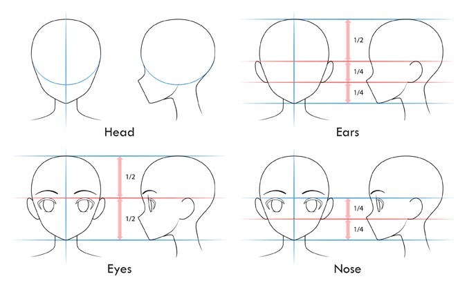
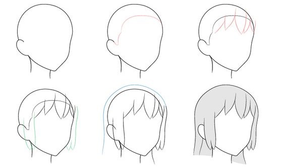
STEP 1: Drawing an Anime Head and Face
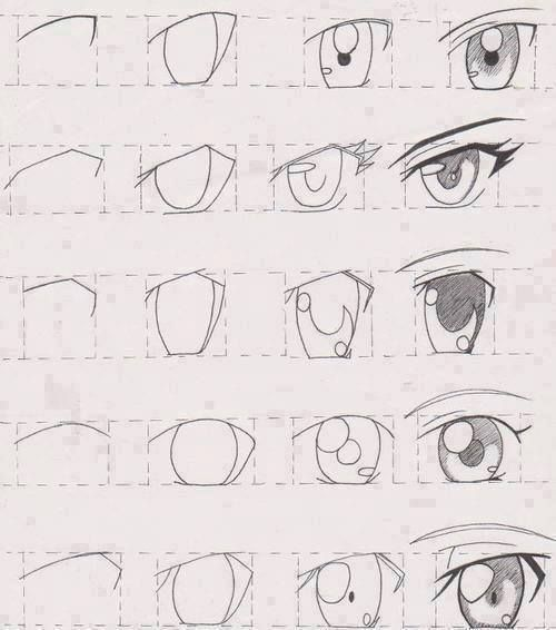
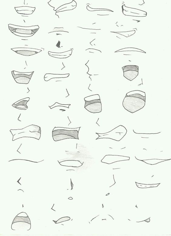
Before diving into details, first, you should create a structure. The basic principle for this is drawing a circle and extending the chin below the circle. Then you need to draw two lines, one horizontal and one vertical, passing through the circle’s center. Now, you can add ears and eyes symmetrically right under the horizontal line and eyebrows above the eyes. You can use simple curves for eyebrows, a little thicker in the middle. The mouth can be placed at the bottom, and the nose -a tiny vertical dash- between the eyes and mouth.
After finishing the facial details, you can start drawing the hair. Anime hair consists of different small parts instead of one direct line. Therefore it is better to divide it into pieces. Splitting into three parts may be the easiest way—basically, the front, the back, and the sides.
Adding several tufts from the front is a good starting point. Then you can draw sides, again separating the hair into clumps. Instead of drawing a straight line, you should add a slight curve to make it more real. Lastly, add relatively straight lines for the back. You can extend it under the shoulders for long hair. If you want to add a bun, you can do it right after this step. You can add one to the middle or two to each side. For the best bun, the starting point is a circle. After, it can be turned into natural hair by adding curved lines in it.
STEP 2: Sketching an Anime Body
Again, you should start with a structure to create a perfect body. Generally, there is a rectangle for the chest, small circles for showing shoulders, leg, and arm joints, and finally, an oval for the hips. After completing that step, you are ready to connect these shapes. Draw curved lines from chest to hips and from neck to shoulders. In the end, the body should look like an hourglass. Then you can add legs narrowing from top to bottom and arms in any position. Here you can use small circles to help you when you are separating the upper part of the limb and the lower part of the limb.
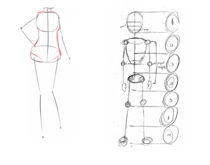
After completing the big parts, you can start adding details like hands and shoes. For the hands, the first step is drawing two widening lines and adding a rectangle starting from the left side. The next step is drawing another line to show the knuckles. After that, divide the shape slightly symmetrical for the fingers and curve the straight lines. Now, it is time to connect all the lines you put before and create fingers. You can use different hand positions, but the fundamental principle is always the same: creating an outline and connecting the points.
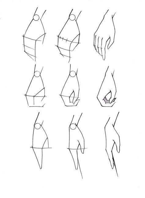
Drawing shoes are easier than drawing hands. After drawing the feet in the desired position, create an outline for the shoes relatively wider than the feet. Erase the feet line. Then, add some details, such as shoelaces and designs on the shoes.
STEP 3: Adding Clothes
For an anime character, there are lots of options when it comes to clothes. However, for a beginner, the simplest option is a combination of a shirt and jeans or a shirt and skirt, depending on gender.
To draw a shirt/t-shirt, firstly, create a sketch as in the other parts. Draw loose lines around the arms and body. If you are having trouble doing it directly, you can use basic geometric shapes like a rectangle for a shirt. If you do so, you can curl the lines afterwards according to body shapes. Then add the collar if it is a shirt. Make sure to draw the collar’s outline far enough from the neck and body so that it appears to have some volume. After drawing the outside, keep going with the details. Add creases around the breast, armpit, waist, and elbow. Do not forget to add buttons to the shirt.
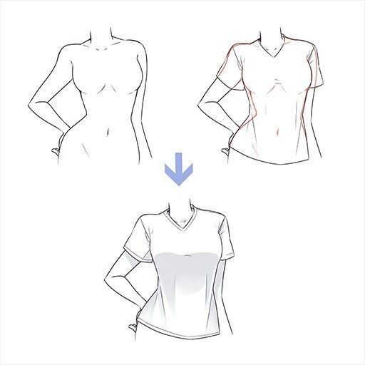
Drawing a jean might be seen as the simplest part. Since you already have the lines for the legs, all you need to do is to draw loose curved lines along the body lines. After finishing outlines, erase the leg lines and add creases, especially to the ankles. Finally, add the button and a small shape for the zip.
If you want to draw shorts, follow the same steps but instead of covering the whole part of the legs, make it shorter around the knees.
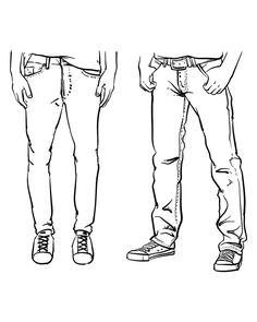

To draw a skirt, begin with the outline again. To show the folds’ dimensions, draw several vertical lines. It’s essential to remember that the folds in this specific pattern point in one way before gently curving in the opposite direction.
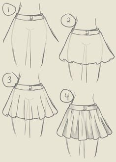
Last but not least, add some colors to your character to make it more real and attractive.
Here are some easy drawing examples:
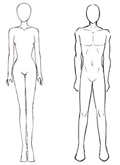
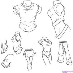


Some master arts


Knowing the body shapes of anime characters is an essential point in creating perfect drawings. When drawing a figure, always start with a scratch. In other words, do not forget to use a sketch as a starting point. Afterwards, you can add all of the details as you want. Also, remember that you will find your own technique over time; you just need to practice before becoming a master.
The post How to Draw an Anime: Best Anime Drawing Tips appeared first on noupe.
How to Draw an Anime: Best Anime Drawing Tips
Anime is a particular type of cartoon created or influenced by Japanese animation. The best-known qualifications of this special type of art are large eyes, tiny noses, wild hairs, and long limbs.
With these features, one can easily recognize anime style. For many, it is fun, but not that easy to draw anime. Here you can find the best tips to create an anime drawing step by step.
STEP 1: Drawing an Anime Head and Face
Before diving into details, first, you should create a structure. The basic principle for this is drawing a circle and extending the chin below the circle. Then you need to draw two lines, one horizontal and one vertical, passing through the circle’s center. Now, you can add ears and eyes symmetrically right under the horizontal line and eyebrows above the eyes. You can use simple curves for eyebrows, a little thicker in the middle. The mouth can be placed at the bottom, and the nose -a tiny vertical dash- between the eyes and mouth.
After finishing the facial details, you can start drawing the hair. Anime hair consists of different small parts instead of one direct line. Therefore it is better to divide it into pieces. Splitting into three parts may be the easiest way—basically, the front, the back, and the sides.
Adding several tufts from the front is a good starting point. Then you can draw sides, again separating the hair into clumps. Instead of drawing a straight line, you should add a slight curve to make it more real. Lastly, add relatively straight lines for the back. You can extend it under the shoulders for long hair. If you want to add a bun, you can do it right after this step. You can add one to the middle or two to each side. For the best bun, the starting point is a circle. After, it can be turned into natural hair by adding curved lines in it.
STEP 2: Sketching an Anime Body
Again, you should start with a structure to create a perfect body. Generally, there is a rectangle for the chest, small circles for showing shoulders, leg, and arm joints, and finally, an oval for the hips. After completing that step, you are ready to connect these shapes. Draw curved lines from chest to hips and from neck to shoulders. In the end, the body should look like an hourglass. Then you can add legs narrowing from top to bottom and arms in any position. Here you can use small circles to help you when you are separating the upper part of the limb and the lower part of the limb.
After completing the big parts, you can start adding details like hands and shoes. For the hands, the first step is drawing two widening lines and adding a rectangle starting from the left side. The next step is drawing another line to show the knuckles. After that, divide the shape slightly symmetrical for the fingers and curve the straight lines. Now, it is time to connect all the lines you put before and create fingers. You can use different hand positions, but the fundamental principle is always the same: creating an outline and connecting the points.
Drawing shoes are easier than drawing hands. After drawing the feet in the desired position, create an outline for the shoes relatively wider than the feet. Erase the feet line. Then, add some details, such as shoelaces and designs on the shoes.
STEP 3: Adding Clothes
For an anime character, there are lots of options when it comes to clothes. However, for a beginner, the simplest option is a combination of a shirt and jeans or a shirt and skirt, depending on gender.
To draw a shirt/t-shirt, firstly, create a sketch as in the other parts. Draw loose lines around the arms and body. If you are having trouble doing it directly, you can use basic geometric shapes like a rectangle for a shirt. If you do so, you can curl the lines afterwards according to body shapes. Then add the collar if it is a shirt. Make sure to draw the collar’s outline far enough from the neck and body so that it appears to have some volume. After drawing the outside, keep going with the details. Add creases around the breast, armpit, waist, and elbow. Do not forget to add buttons to the shirt.
Drawing a jean might be seen as the simplest part. Since you already have the lines for the legs, all you need to do is to draw loose curved lines along the body lines. After finishing outlines, erase the leg lines and add creases, especially to the ankles. Finally, add the button and a small shape for the zip.
If you want to draw shorts, follow the same steps but instead of covering the whole part of the legs, make it shorter around the knees.
To draw a skirt, begin with the outline again. To show the folds’ dimensions, draw several vertical lines. It’s essential to remember that the folds in this specific pattern point in one way before gently curving in the opposite direction.
Last but not least, add some colors to your character to make it more real and attractive.
Here are some easy drawing examples:
Some master arts
Knowing the body shapes of anime characters is an essential point in creating perfect drawings. When drawing a figure, always start with a scratch. In other words, do not forget to use a sketch as a starting point. Afterwards, you can add all of the details as you want. Also, remember that you will find your own technique over time; you just need to practice before becoming a master.
The post How to Draw an Anime: Best Anime Drawing Tips appeared first on noupe.
