Archive

Archive for September, 2016

ClickSend boost the marketing possibilities for your business

September 27th, 2016 No comments

ClickSend are well known for their online SMS capabilities, and have now expanded their service by adding a heap of new products including MMS, Email, Voice, Fax, and even physical Post, to anywhere in the world.

ClickSend has been operating since 2006 and now have thousands of customers worldwide, including some pretty big name clients: HP, Citrix, Red Cross, and AVG just to name a few.

With a brand new website and dashboard, the signup process for the service is quick and simple; the first screen you see once logged in is a dashboard, which gives you some vital stats on your recent messages.

Using ClickSend SMS

SMS is a fantastic tool for direct marketing and thanks to the portability and global use of mobile phones, a business can reach countless customers instantly and at any time. The engagement rate of SMS is also far greater than for any other marketing method, with more than ninety percent of SMS messages being opened and read within just a few minutes of receipt.

Sending an SMS with ClickSend is quick and easy. Simply enter the recipients, select the from option, compose the message and click Send. You can choose to send the message immediately or schedule it for a later date.

ClickSend MMS options

MMS is very similar, simply enter the recipients, select the from option, drag and drop the image, compose the message and click Send.

You can even purchase your own number for a few dollars a month. It’s not required, but it’s a nice touch.

ClickSend’s email marketing platform

Marketing via email works very effectively to build your business and attract and retain customers. Even though email is one of the oldest forms of digital marketing, it is still a very valuable tool to improve your business and to elicit results that are tangible—when you do it right, that is.

ClickSend provide an email marketing platform which lets you create your email using any of their free templates. It’s similar to MailChimp’s offering, but around half the price.

ClickSend integrate into almost any software and provide free API documentation and SDKs to developers. ClickSend have also recently partnered with Marketo and Zapier for easy integrations.

Using ClickSend

Overall, ClickSend is a great marketing and communication tool which makes it easy to communicate with your customers and clients.

With an increased offering covering a wider spectrum of marketing channels, if you’re involved in digital marketing, they should be on your radar.

They even offer a free trial, so you can try them out for yourself.

[– This is an advertorial post on behalf of ClickSend –]

108 Hi-Res Magazine Mockups from Zippy Pixels – only $17!

Source

Categories: Designing, Others Tags:

Workflow Tips For Web Designers & Frontend Developers

September 26th, 2016 No comments
dev workflows

There is no single right workflow to build a website. But there are ways to improve your workflow and make your job a little easier.

Whether you design or write code there’s usually some part to the process that can be streamlined. This can change depending whether you work solo or in a team environment. But if you know how to tweak your process you can get projects done faster with fewer manual tasks.

In the past we’ve covered responsive workflows and in this post I want to share common design & dev workflow optimization strategies. I’ll offer tips and resources for the creative process and help web designers & developers build their projects with more accuracy and precision.

Starting with a Wireframe

It’s a good idea to start with a wireframe on every single web project. This helps you flesh out ideas for the content, the layout style, and the organization of page elements like the logo, nav bar, and CTA buttons.

Your initial goal should be to construct a rough layout using lo-fi wireframes. Keep them quick and loose. You’ll save time on bad ideas and laser in on the good ones.

If you need some wireframe templates to get started I recommend Noupe’s gallery full of digital wireframes.

But I personally prefer working on paper with pencil for quick sketching. It’s my top recommendation for anyone who wants to rapidly prototype wireframes from scratch to get ideas down quickly. Erasing is much easier on paper and you have much more control over the whole sketching process.

Don’t be afraid to put down 10 or more different wireframe ideas. I never get it right the first time and I don’t think any other designers do either.

If possible try to get your final wireframe precise before moving onto a mockup.

This way you have less guesswork down the pipeline and each stage of development just further clarifies your original concepts.

Planning Copy & Behaviors

Once you roughly know how the site should look you can start getting into the details. This can start with a mockup but I prefer building a higher fidelity wireframe first.

This involves placing sample widgets and web copy into the wireframe that looks good and guides users down the page.

This is a difficult task and it’ll be slightly different for every project. But you should think about what your users want to do and keep this in mind the entire time.

Also consider usability and how your written copy can affect the user experience.

There is no single correct way to write content. But the writing should be compelling and guide users further into the site.

digital wireframes design

While planning high-fidelity wireframes it helps to add image placeholders along with written copy. This way you can see how the layout could eventually look without using filler content.

But also consider the value of large headings and custom styled page copy like bulleted lists. Your title text draws users into each section and you often have just a few seconds to capture their attention.

Always work around two concepts when designing page text: clear contrast and plenty of whitespace.

You don’t need to choose a font face or text color during this step. If your wireframe is easy to skim it should be obvious at a glance.

Understanding user behavior makes it easier to build copy that helps users get around the site. This high-fidelity/light mockup is probably the most important stage because once you get into the full mockup design you’ll already know the layout is readable and easy to use.

Trust Frontend Frameworks

There’s a lot of buzz surrounding frontend development frameworks. These mostly include libraries like React, Angular, and Ember.

All of these can save time when building a new site, assuming you know how to use your framework of choice. The goal isn’t just to streamline frontend development but to also architect your whole website. Check out this thread to learn a bit more.

The primary goal of any framework is to separate complex functions and help you build more with less code. Modern JS frameworks handle user input and control how data gets transferred from the backend to the frontend.

The new Angular 2 release does this well and has garnered a lot of attention.

But I’ve really grown to appreciate the detail in Ember.js which comes out of the box with features for routing and asynchronous behavior. The Ember learning curve is steep but with the right learning resources you can move quickly and might even enjoy the learning process.

The biggest upside of a framework is modularity when it comes to building a new project.

You’ll know exactly where to start, how to scale, and how to organize new files with the same structure. Architecture is just as important as how you write your code.

If you’re curious to learn more check out this guide to see how other devs implement frontend frameworks into modern web projects.

Testing & Debugging

I first started writing code when IE6 was still popular. If you don’t already know, web developers have some discontent for Internet Explorer.

Browser quirks are far less common these days but they do still exist. For this reason testing should still be a big part of your dev workflow.

Beyond major browser bugs you’ll often have minor differences between how certain browsers render margins, patterns, box sizing, and similar properties in browser engines like Gecko vs WebKit.

One way to test is to have all these browsers on your development computer. After you make big changes to your code just check your work in all browsers. However this can get annoying quickly.

Instead try using browser testing tools that’ll save time and frustration. Here are some of the most popular choices:

I’d also recommend that developers add responsive testing tools into their workflow.

This helps you test each major breakpoint in a responsive layout without needing to constantly resize and switch the browser.

My two favorite extensions are Responsive Web Design Tester and the Viewport Resizer. Both are completely free and work great for live testing.

Another tool I highly recommend is the in-browser debugging console. This is great for testing JavaScript code and looking for potential errors in your HTML/CSS code validation.

chrome console logging in browser

Google has an entire guide to the console window teaching how to get started and what each of the panels does.

All of these tools are incredibly valuable to the debugging process. But each developer will fall into their own workflow so it’s up to you to decide which tools offer the most value.

Wrapping Up

There is no single proper way to build a workflow on the web. But there are best practices and techniques that you can adopt to make the process smoother and easier to manage.

I hope these tips can help shape your workflow both on the design and development side. It’s now much easier to build and launch a new website, so if you’re constantly launching new projects these little tips can make a world of difference in the long run.

Read More at Workflow Tips For Web Designers & Frontend Developers

Categories: Designing, Others Tags:

Responsive Foundation Framer: Responsive Design Made Easy

September 26th, 2016 No comments
Festival Theme

There are a good number of front-end editors out there when it comes to responsive design. Some are based on Bootstrap, others on different frameworks, and so on. However, most of them suffer from the same problem — they lack absolute control and originality. As such, most responsive design webpages tend to look similar in nature.

If you have ever experienced the same problem, consider it solved. Meet Responsive Foundation Framer, a unique solution by CoffeeCup that gives you absolute control over your design and at the same time, helps you create intuitive and responsive design without coding.

Responsive Foundation Framer: Responsive Design Made Easy

What is Responsive Foundation Framer?

Responsive Foundation Framer is a visual front-end editor with a solid grid system and custom predefined styles. It is based on the Foundation 6 framework., therefore, Responsive Foundation Framer is minimal, modular and lets you combine elements and styles with ease.

Responsive Design

To begin with, Responsive Foundation Framer lets you harness the full power of CSS without having to deal with even a single line of code! You can specify the dimensions and run through the customization options and it will generate the required CSS code all by itself. Similarly, you can use the color picker to manage the color palette and the inline editor as well as the clickable controls to handle typography. Responsive Foundation Framer plays well with Google Fonts.

But what about content? Well, you can place your content wherever you want it, be it absolute positioning, float or using the Flexbox controls. You can layer multiple backgrounds and structure different layouts all in the matter of a few clicks! Plus, you can use the Picture element to serve different image sizes to your users on the basis of the device that they are using.

Considering the fact that Responsive Foundation Framer is based on Foundation 6 framework, it comes with the advantages of the Motion UI. You can, therefore, easily create animations and transitions with the help of data attributes.

That’s a rather strong list of features, isn’t it? But how does it fare on practice? Let’s put Responsive Foundation Framer to test and see what it can boast of.

Responsive Design: Responsive Foundation Framer Sneak Peak

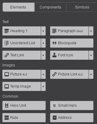
Most of the action in Responsive Foundation Framer happens by means of components. It comes with its own set of prebuilt and readymade components that you can make use of. Accordions, navigation menus, tab panels, modals, etc. are all there and you just need to click to insert. More importantly, you can create your own interactive components with the help of HTML elements and CSS mixins.

Also, Responsive Foundation Framer includes symbols for global content updates. What does that mean? It means you can save elements (say, a header or a footer) and then update them all from one spot.
componets

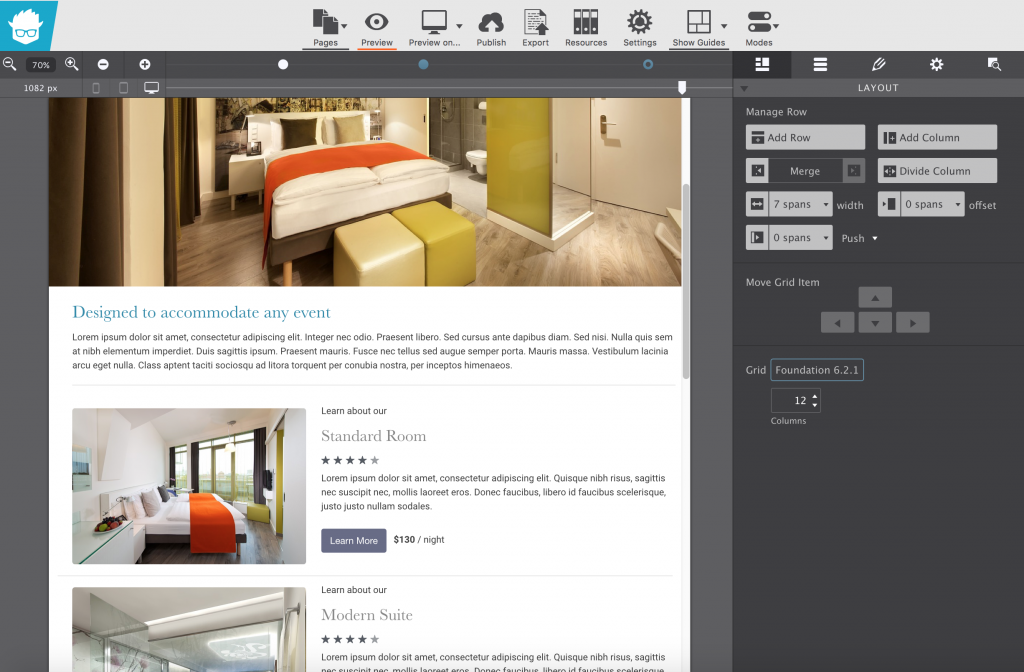
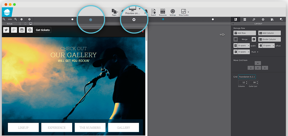
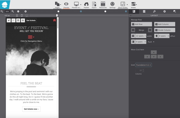
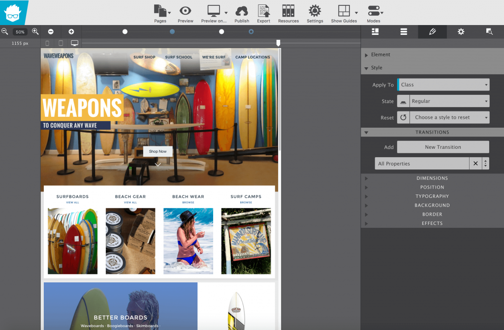
The interface is fairly straightforward. You can edit the rows and layouts as well as different elements on the basis of the right panel.

responsive design

Bear in mind that we are talking about responsive design here. Now since Responsive Foundation Framer is a visual tool, it allows you to click and drag to change, edit, add or delete breakpoints. We know that Foundation framework comes with two breakpoints, but you can add or delete breakpoints by dragging the slider in the tool.

responsive foundation framer

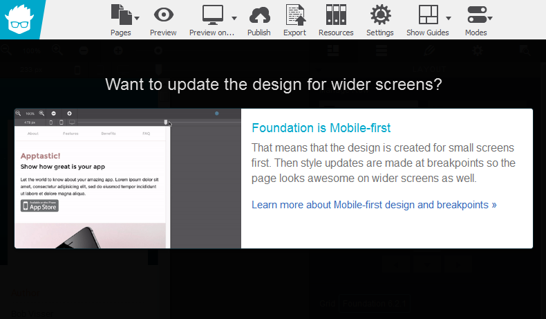
For instance, when the breakpoint value is reduced, Responsive Foundation Framer reacts accordingly:

when-breakpoint-is-reduced

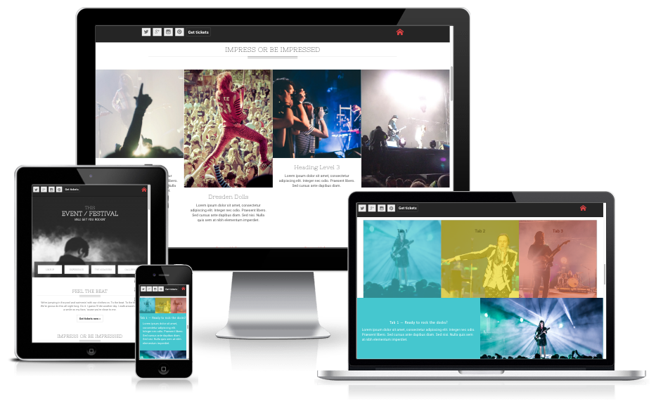
Since my screen was smaller, it allowed me to zoom in and out while fixing breakpoints, so that I can create designs that play well on larger screens too. This design and device agnostic approach is the back-bone of responsive design. It is refreshing to note that Responsive Foundation Framer is aware of this fact.

Once done, you can preview your work on the web browsers installed on your device.

Browsers

You can sync (“Publish”) to the cloud if you have a paid subscription, or you can “Export” and deploy to your website or server elsewhere.

Responsive Foundation Framer comes with various customizable themes.

Festival Theme

You can, of course, tweak every theme to suit your needs and requirements.

Wave Theme

Unit Switcher: Control Unit Measurements on the Fly!

Responsive Foundation Framer lets you control unit measurements on the fly. We know that not all units are created alike. For example, layout elements work great with percentages as they can adapt based on the available width. While working with margins and padding you may want to use EM so you can space out your elements relative to the size of your text. However, what if you wish to use fixed dimensions for the purpose?

Unit Switcher

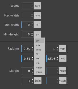
This is where the Unit Switcher proves useful. Visual designers will totally dig the VW option for fluid typography that resizes smoothly based on the device width and not just at a breakpoint. What to use when? It really depends on the design problem you’re addressing!

Pricing

Responsive Foundation Framer costs $79 for one license. It includes all of the features as well as premium quality support and access to documentation and tutorials.

There is a free trial option available as well. Responsive Foundation Framer runs on OSX and Windows devices.

Verdict

Responsive design is no longer a luxury. Everyone accesses the web via mobile devices at some point or the other during the day. Similarly, many people do use gigantic screens on their computers. All said and done, if your website is not responsive, it is of very little use.

As such, as a web designer, your designs should adhere to the principles of responsive design. Now, for the most part, most “responsive design” tools tend to repeat the same process over and over again. Either you are expected to code everything from the start, or you are given a severely crippled frontend editing functionality that offers a limited number of breakpoints and options for you to work with. In either case, your responsive design project does turn out responsive enough — but it lacks uniqueness and innovation that is expected from a web design concept.

Responsive Foundation Framer is an ideal tool for the job. By offering you granular control over each and every aspect related to your design, Responsive Foundation Framer makes it easy to create truly responsive design concepts. Similarly, several frontend visual editors tend to overlook the importance of web fonts; this one does not! Responsive Foundation Framer supports Google Fonts.

You also have the option to work with the back-end and export your stylesheets to the code editor of your choice. This makes it useful for folks who like to work with code rather than point and click all the time.

All said and done, Responsive Foundation Framer is a very useful solution when it comes to visual front-end editors for responsive design. By all means, you should consider giving it a spin right away!

Visit Responsive Foundation Framer

Read More at Responsive Foundation Framer: Responsive Design Made Easy

Categories: Designing, Others Tags:

Is mobile app UI design a complete waste of time and money?

September 26th, 2016 No comments

More and more companies are constantly chopping and changing their design direction and user interface in a battle to stand out. Many are employing large teams of user interface designers to work on pretty simple products. When it comes to mobile apps, user interface design is little more than a marketing gimmick.

As it stands, a typical workflow for creating an app would look something like this:

  1. Developing Concept
  2. Mapping App Screens
  3. Producing Wireframes
  4. Refining UX
  5. Designing UI
  6. Developing Product

Google Material Design Guidelines

The advanced and highly-detailed style guides that we now receive from Google and Apple lead me to question just why the user interface design phase requires a designer, or is even relevant at all. If the guidelines are there to be closely adhered to, is there really the need to add any significant creative input? The style and parameters are already defined by the guidelines. And sure, apps need assets such as icons, but why don’t all apps on a single platform just use the same set?

Apps across a platform would be far more consistent if the desire to visually differentiate from the next app was suppressed. As I see it, companies are viewing each app as a unique separate entity. I’d argue that it should simply be the operating system that is the entity. All apps within the system should be absolutely consistent.

There is a real lack of consistency across iOS and particularly Android?. ?Some apps use back arrows, some use hamburger menus, some use icons, and some use text navigation. Some even use the same navigation on Android as on iOS. Apps often try to come up with new and exciting ways to navigate, but it does little more than add to the confusion of the overall OS for the user. Then there’s the case of using a multitude of styles that are wholly inconsistent with one another.

Canopy for Android

I believe there’s too much creative input, and it’s getting in the way of experiencing a consistent experience across an entire system. If we look through Android Niceties, the scale of the issue with consistency becomes apparent.

The app user interface itself should be fairly mundane if usability is to be at its best. After all, it’s there as a way to view data and content, and navigate screens and elements. The differentiation should come in the branding — colors, icons, imagery — not through constantly switching up guideline styles, fonts, and layouts.

We’ll use Android to compare two examples

YouTube for Android

Google’s latest iteration of the YouTube app is a perfect example of using the style guide effectively. The icons are default, there is a single easy-to-use navigation, and the contrast and colors are on point. It avoids unnecessary gimmicks and additions to the user interface, and maintains an experience in line with the system itself.

Snapchat for Android

A poor example would be Snapchat. It does very little in the way of adhering to Material guidelines, and instead appears more interested in standing out visually, and applying their brand throughout the app. It is dissimilar to any other app and is entirely ill-fitting on the Android OS. There is very little to differentiate between this and the iOS counterpart. As much a UX issue as a UI issue, it’s a prime example of disregarding the guidelines and the user in the desire to be unique.

Unspecific to Snapchat, I’m intrigued when I see the size of design teams working on the simplest of apps. When you have 10, 20, 30+ user interface designers all working full-time on a mobile app with two or three main screens, the question has to be asked whether it’s healthy for the end user. This constant drifting away from system guidelines, and changing of styles, has little benefit and could be entirely avoided. It would reduce timescales, efficiency, and cost.

I believe many startups and established companies oversee this and it turns almost into a design popularity contest. The user interface becomes a marketing gimmick, which is far from its purpose.

User interface designers should be creating styles for systems as a whole, and limiting individual app creative input to branding, marketing, advertising, and landing pages. This way, mobile operating systems will become far more cohesive and in the end that will benefit the only person that matters: the user.

2350+ Graphic Design Elements and Patterns – only $21!

Source

Categories: Designing, Others Tags:

Methods for Controlling Spacing in Web Typography

September 26th, 2016 No comments

If you were developing sites in 2006, then you may have worked with a designer like me who was all up in your business about fonts not looking exactly the same in the browser as they did in mockups.

Then you may have tried explaining to me the pains of cross-browser compatibility and how different browsers render fonts differently from one another. In response, I likely would have sent you an image file that contains the content instead to make sure everything looked the same in all browsers. Yes, I was one of those designers.

Web fonts have come a very long way since then and we now have tools to tweak the way fonts render in browsers. Some have been around for quite a while. I remember my mind nearly bursting with excitement when I discovered FitText.js and Lettering.js way back when.

There are still plenty of situations today where adjusting fonts is needed to ensure the best legibility despite having all these fancy tools. We’re going to cover a few of those in this post along with methods for how to deal with them.

Getting one exact headline to look right

I often run into this one, especially when a design contains a highly customized web font that looks great in general, but might look funky when used in a certain context.

Take the following headline using Abril Fatface from Google Fonts:

It a lovely font! However, there are a couple of points I’m not loving with this particular headline, specifically the spacing between a couple of letters, which makes things a little crowded:

This is where kerning comes to the rescue! Kerning is literally defined as the spacing between letters. All font files, whether we know it or not, contain some degree of kerning and we have the CSS font-kerning property to remove it:

.no-kern-please {
  font-kerning: none;
}
<h1 class="no-kern-please">Rubber Baby Buggy Bumpers</h1>

Ah, that looks much better to me, even if it is a subtle difference.

See the Pen Kerning Toggle by CSS-Tricks (@css-tricks) on CodePen.

This browser support data is from Caniuse, which also reports this feature is in W3C Candidate Recommendation status.

Desktop

Google Chrome Mozilla Firefox Internet Explorer Opera Apple Safari
29* 34 No 16* 7*

Mobile / Tablet

iOS Safari Android Opera Mobile Android Chrome Android Firefox
8* 4.4* 37 51 48

Fixing poor letter-spacing across the board

If you’ve ever worked with a web font where the space between every single letter is either too wide or too narrow, then you know exactly how painful this situation is. Here’s an example using another beautiful Google web font called Dorsa:

That might make for a decent display font for headlines, but could you imagine trying to read that as a paragraph? No bueno.


Kinda hard to read that content!

The CSS letter-spacing property can help make a sweeping change to the paragraph content if we add a couple pixels between each letter:

.spaced-out {
  letter-spacing: 2px;
}

I wouldn’t go so far as to say this is still the best font for paragraph text, but it is much easier to read with that extra spacing:

See the Pen zKkPqK by CSS-Tricks (@css-tricks) on CodePen.

This browser support data is from Caniuse, which also reports this feature is in W3C Recommendation status.

Desktop

Google Chrome Mozilla Firefox Internet Explorer Opera Apple Safari
4 2 5.5 9 3.1

Mobile / Tablet

iOS Safari Android Opera Mobile Android Chrome Android Firefox
3.2 2.1 10 51 48

Too little or too much spacing between words

This is an offshoot of the last situation except that the spacing issues are between each word rather than individual characters.

This is where the CSS word-spacing property is great and universally accepted by all browsers. Here’s an example of a prose using the Prompt web font which is a little wider than many other fonts and would look nicer if it was dialed down a bit for this use case.

See the Pen GjJaaE by Geoff Graham (@geoffgraham) on CodePen.

Gnarly spacing between lines

Not all line heights are considered equal. Take the way some fonts look bigger than others, even though they have the same assigned font-size value.

See the Pen Difference in line height by font by CSS-Tricks (@css-tricks) on CodePen.

Setting the font-size sets the bounding box for which a font is allowed to take up space. If we set our font-size at 20px then that creates a box that takes up 20px of vertical space for each character to occupy.

Some fonts will take up more of the space than others and that will both give the appearance that one font is larger than the other but also that there is more or less vertical space between lines.

We can use the line-height property to help adjust that vertical space. A decent rule of thumb is something like font-size * 1.5 = line-height (or use a unitless line-height: 1.5;) for legibility but that will depend on the font being used and how it occupies vertical space. Check out molten leading.

Crispness and Legibility

Not all fonts are created equal across operating systems. That’s because each operating system, be it Windows, Mac OS or anything else, will have different process for how many pixels to use when displaying fonts.

Many of us web designers loathe the thought of being beholden to how a system interprets our typography decisions.


Image source: webtype.com

There are CSS properties at our disposal to increase the apparent resolution of how fonts are displayed on different systems. This process is more formally known as subpixel rendering because it instructs the browser to attempt to fill missing pixels where they might exist.

There is no shortage of #hotdrama over whether it is appropriate to play with the subpixel rendering of fonts. Despite being written a few years ago, Dmitry Fadeyev summed up his argument against the practice nicely.

The antialiasing mode is not a “fix” for subpixel rendering — in most cases it’s a handicap. Subpixel rendering is technically superior, clearer, and more readable than antialiasing because by utilizing every one of the subpixels it increases its effective resolution used for font smoothing by three times. Antialiasing is useful for certain circumstances, such as for light on dark text, but it is absolutely not a replacement for subpixel rendering, and certainly not a “fix”.

But let’s say we wanted to do it anyway. CSS gives us a certain level of control over the crispness and legibility by using font-smooth to fill in what operating systems might leave behind.

The font-smooth values include:

  • auto: Allows the browser to decide the best case for filling in pixels on fonts.
  • never: Disables the system from auto-smoothing fonts. This will display the font in its natural state, jagged edges and all.
  • always: Instructs the browser toll always add pixels to fonts where it sees the opportunity.

Note: The font-smooth property is considered an unofficial property at the time of this writing and is not recommended for use on a production site. There are vendor prefixes to achieve the effect in WebKit and Mozilla, though there is no standard implementation.

Given that note, the following vendor prefixes are currently available with their own values:

-webkit-font-smoothing

  • none: Disables font smoothing in WebKit browsers.
  • antialiased: Smooths the font on the same level as the pixels already provided by the system.
  • subpixel-antialiased: Smooths the font on a more micro level to give the sharpest text possible, particularly on high-resolution screens.

-moz-osx-font-smoothing

  • auto: Allows the browser to decide whether to optimize the font smoothness.
  • inherit: Takes the property value of the parent element.
  • unset: The same as specifying none in the WebKit prefix.
  • grayscale: Similar to the antialiased value in the WebKit prefix.

This browser support data is from Caniuse, which also reports this feature is in Unofficial or W3C “Note” status.

Desktop

Google Chrome Mozilla Firefox Internet Explorer Opera Apple Safari
5* 25* No 15* 4*

Mobile / Tablet

iOS Safari Android Opera Mobile Android Chrome Android Firefox
No No No No No

Oh, wait, you’re using SVG?!

SVG has its own level of support for the techniques we’ve been covering in this post. We’ve got kerning (not likely to do much) and the usual suspects letter-spacing and word-spacing. Interestingly, we also have a textLength attribute which can be used to explicitly set how wide the text should be rendered, and it will stretch/squish the text to accommodate. The lengthAdjust attribute controls whether that should happen to just the characters or the glyphs (like punctuation) too.

See the Pen SVG Text Spacing by CSS-Tricks (@css-tricks) on CodePen.

In Conclusion

Typography on the web is hard! Yes, we do have a ton of control over how type is displayed, rendered and positioned on the screen. But with great power comes great responsibility. At least you now have a few tools at your disposal to respond back to web designers who are stuck on the the precision of typographical design in the browser.


Methods for Controlling Spacing in Web Typography is a post from CSS-Tricks

Categories: Designing, Others Tags:

Coverr: Over 300 Free Videos for Your Website

September 26th, 2016 No comments
coverr-landing

A new video every day, or seven new videos every Monday, that’s what the operators of Coverr promise to provide. Since they have already added over 320 videos to their supply, there’s no reason to doubt this pledge. As the name says, the videos work best when used as covers, so-called hero videos, for a website’s background.

Veed.me and CodersClan Create the Video Platform Coverr

Coverr is operated by the teams of Veed.me and CodersClan. Veed.me is a platform in which customers get to search and book videographers for their needs. Veed.me lives off of a 15 percent share that the filmmaker pays. The platform is free for the customer. The prices are not getting dumped, and the platform doesn’t pretend to be a cheap supplier. To me, that makes it likable already.

I have similar feelings towards the CodersClan. They are a community of professional developers that don’t accept everyone. They are proud to say that they only take six of 100 applications. This serves the protection of quality and is bound to please the customer. With this preselection, I would not have any worries when asking for a commission.

Coverr: Finding and Downloading Videos Without Any Detours

The CodersClan maintains the website, while Veed.me provides the videos for Coverr. As expected, the result is well-rounded. By now, the website presents over 320 videos in an infinitely scrolling grid that can be further filtered using category tabs.

Coverr: Clear Presentation as a Thematic Grid (Screenshot: Dr. Web)

Coverr: Clear Presentation as a Thematic Grid (Screenshot: Dr. Web)

If you click on a video, it will open in a popup. Here, the video is started. It is also possible to download the video or to have it be displayed as a cover, a background. If you choose this option, the Coverr website’s background video is replaced with your current choice, so you can judge the suitability for yourself.

If you decide to download it, you’ll immediately download a zip to your disk. The zip contains three folders in which the video is included as an MP4, WEBM, and as a JPG screenshot.

You should use all three versions on your website. The operators of Coverr will also show you how to do that. Here you’ll find three snippets in HTML, CSS, and JS, which only need minor adjustments before you can use the respective video as your website’s Hero area.

Coverr is Public Domain; it Doesn’t Get More Free Than That

As I mentioned before, all short clips are free-to-use. The chosen license is the most liberal one possible, called CC Zero, better known as Public Domain. Assets with this license can be used by anyone for any purpose without restrictions or costs. This way, you’re on the very safe side.

Categories: Others Tags:

CoffeeCup Responsive Design Pack Giveaway

September 26th, 2016 No comments
coffeecup responsive design pack

coffeecup

Our friends at CoffeeCup are giving away a Responsive Design Pack for FREE (a $299 value) to FIVE very lucky designers!

Featuring their top eight apps, the Responsive Design Pack is perfect for visually designing stunning websites, show-stopping photo displays, fully functional web forms, and money-making newsletters.

The pack is also loaded with a ton of customizable responsive themes. With drag-n-drop interfaces and clickable styling controls, it’s a breeze to create a modern web presence.


No purchase required – Must confirm entry via email

Read More at CoffeeCup Responsive Design Pack Giveaway

Categories: Designing, Others Tags:

Developing For Virtual Reality: What We Learned

September 26th, 2016 No comments

With the tools getting more user-friendly and affordable, virtual reality (VR) development is easier to get involved in than ever before. Our team at Clearbridge Mobile recently jumped on the opportunity to develop immersive VR content for the Samsung Gear VR, using Samsung’s 360 camera.

The result is ClearVR, a mobile application demo that enables users to explore the features, pricing, interiors and exteriors of listed vehicles. Developing this demo project gave us a better understanding of VR development for our future projects, including scaling, stereoscopic display and motion-tracking practices. This article is an introductory guide to developing for VR, with the lessons we learned along the way.

The post Developing For Virtual Reality: What We Learned appeared first on Smashing Magazine.

Categories: Others Tags:

Popular design news of the week: September 19, 2016 – September 25, 2016

September 25th, 2016 No comments

Every week users submit a lot of interesting stuff on our sister site Webdesigner News, highlighting great content from around the web that can be of interest to web designers.

The best way to keep track of all the great stories and news being posted is simply to check out the Webdesigner News site, however, in case you missed some here’s a quick and useful compilation of the most popular designer news that we curated from the past week.

Note that this is only a very small selection of the links that were posted, so don’t miss out and subscribe to our newsletter and follow the site daily for all the news.

36 Brilliant User Interface Animations

Want to Get Better at Coding? Play this Game

Google Launches Allo

Oh S***, Git.

15 Must-have Chrome Extensions for Web Designers

CSS Grid Layout: Fluid Columns and Better Gutters

Reimagining Dreamweaver: Creating the Ultimate Modern UI for Web Design

WordPress Takes a Leap with Desktop Application, Calypso

Thimble by Mozilla: An Online Code Editor for Learners and Educators

Rob Janoff on his Logo for Apple

Designing Experience

Why your Client Needs a Responsive Website — not an App

CSS Grid Layout: A Quick Start Guide

21 Things that Won’t Help You Become a Better Designer

The Age of the Wordless Logo

BYOR – Upload your Resume and Have AI Analyze it

Simple Design is Making us Dumb

Inspirational Examples of UI Style Guides

Google Design – Making Motion Meaningful

Snapchat Releases First Hardware Product, Spectacles

What’s the Greatest Logo of all Time?

How to Think like a Hacker

Here’s your First Look at Tesla’s New Autopilot and UI

Site Design: Bricklane.com

5 Things I Wish Google Allo Could do

Want more? No problem! Keep track of top design news from around the web with Webdesigner News.

LAST DAY: FUNKYDORI – A Groovetastic ’70s Themed Font – only $17!

Source

Categories: Designing, Others Tags:

Comics of the week #358

September 24th, 2016 No comments

Every week we feature a set of comics created exclusively for WDD.

The content revolves around web design, blogging and funny situations that we encounter in our daily lives as designers.

These great cartoons are created by Jerry King, an award-winning cartoonist who’s one of the most published, prolific and versatile cartoonists in the world today.

So for a few moments, take a break from your daily routine, have a laugh and enjoy these funny cartoons.

Feel free to leave your comments and suggestions below as well as any related stories of your own…

In a manner of speaking

Appearance counts

Don’t confuse the two

Can you relate to these situations? Please share your funny stories and comments below…

Multipurpose UI Bundle of 230+ components, 18 Full Templates – only $19!

Source

Categories: Designing, Others Tags: