Hot on the heels of the acquisition of LinkedIn by Microsoft this year and the redesign of the company’s iOS and Android apps last year, LinkedIn will be debuting a new desktop experience. In a recent press event, the company also unveiled LinkedIn Learning, a platform designed to help its users discover and develop various skills by way of a data-driven and personalized learning experience.
In a recent blog post, LinkedIn’s VP of Product, Ryan Roslansky, established that LinkedIn’s redesigned desktop interface will take inspiration from its flagship mobile app that came out with a new design last December. The app’s redesign was met with a generally positive response, so it makes sense for the company to try and duplicate what it did right with its mobile app for its desktop, too.
The redesigned desktop experience will rely on minimalistic touches to bring users a cleaner, more intuitive, and simpler approach for users to efficiently access their jobs, insights and info that they require. As a result, the user experience should see a noticeable boon as well: Thanks to the redesign, professionals can go into their daily meetings with better preparation or, alternately, easily learn more about a new business skill that they’re interested in mastering.
the largest redesign since LinkedIn’s inception
Roslansky is calling this desktop redesign “the largest redesign since LinkedIn’s inception,” so it will be interesting to see just how far the company will go to give users a better UX while still staying faithful to the LinkedIn brand.
In tandem with this, the company’s messaging feature gets an upgrade as well as it gets more intelligent and gets more consistent with the experience offered on the company’s redesigned mobile apps. How does this look on desktop? The revamped Messaging approach bears a remarkable resemblance to Facebook’s chat feature. LinkedIn also revealed the integration of a bot platform that could conceivably be utilized for various purposes, such as scheduling meetings.
LinkedIn also revealed the integration of a bot platform
As for the new online platform, LinkedIn Learning will bring together content from Lynda.com, which LinkedIn owns, and the company’s own professional network and rich data. LinkedIn is uniquely positioned to provide its users with this service designed to appeal to their thirst for continuing education and knowledge.
LinkedIn says that it can leverage its own knowledge of how jobs and skills evolve over a period of time to identify various skills that its users require and then offer expert-led courses that allow them to acquire said skills.
LinkedIn Learning is envisioned as a freemium service, yet all of the company’s users will have the chance to try the new service free for one month. LinkedIn will also continue with its goal to constantly keep enhancing the content on Lynda.com as part of its broader ambition to create opportunities in the global workforce. In the end, the launch of LinkedIn Learning is consistent with Microsoft’s (LinkedIn’s new owner) mission to empower professionals, businesses and organizations to achieve and earn more.
With the company’s desktop redesign and debut of its new learning platform, it’ll be interesting to see how well-received LinkedIn’s new look and features will be.
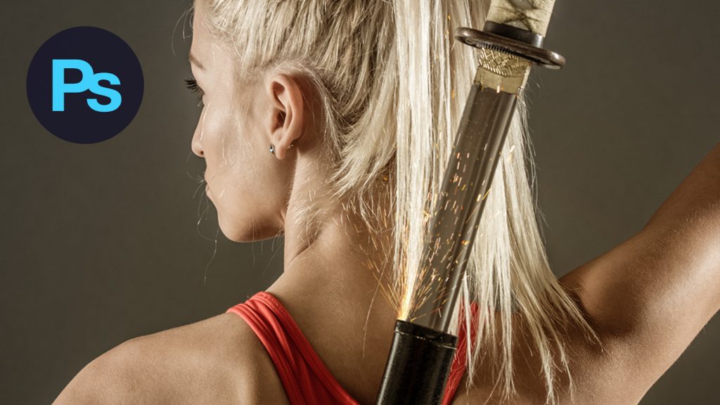
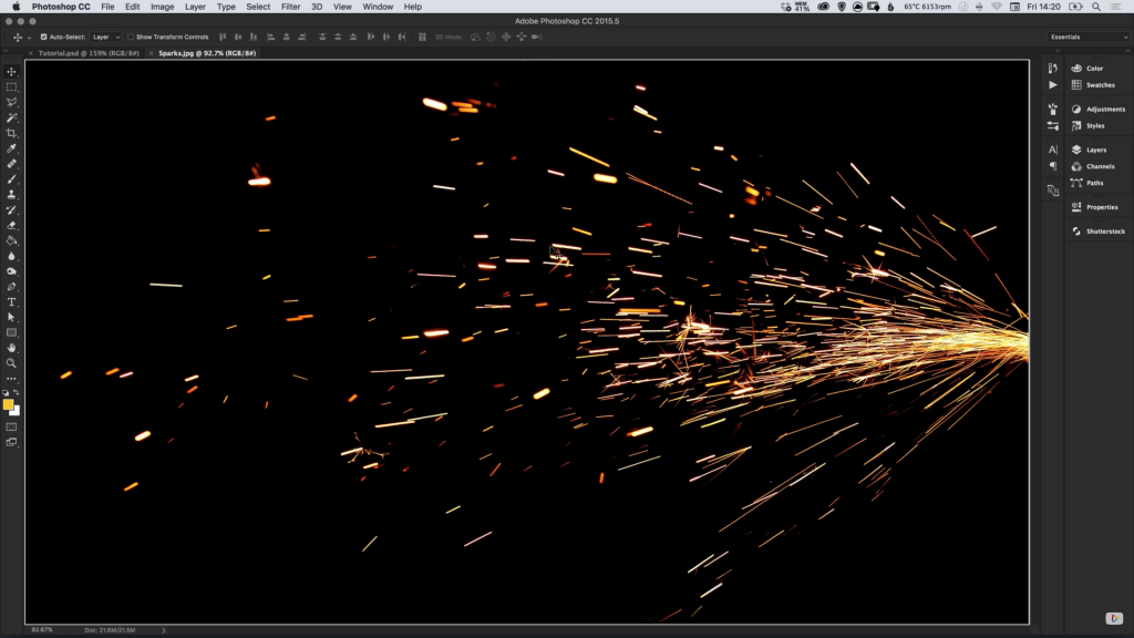
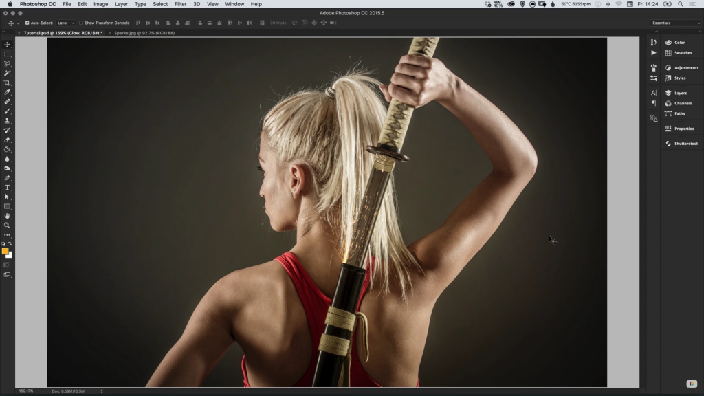
2. Source an image of some sparks on a dark background and open this image in Photoshop. Press Cmd/Ctrl + A to select the entire canvas, and go to Edit > Copy, to copy the sparks image to the clipboard. Switch over to your main image and go to Edit > Paste to add the sparks into the image on a new layer.
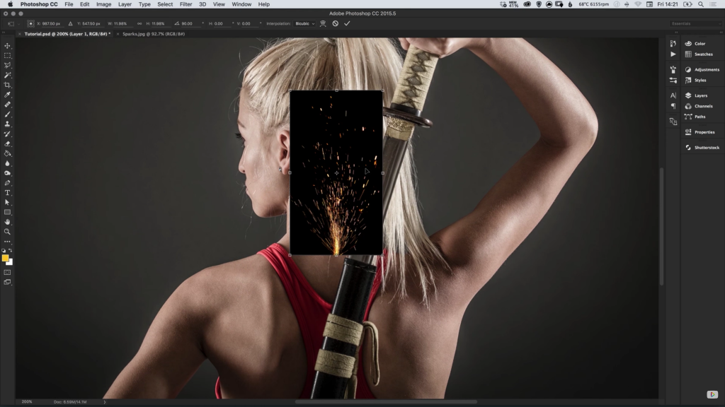
3. With the sparks selected, go to Edit > Transform > Free Transform to adjust the Size, Rotation and Position of the sparks in relation to where you would like them to appear within your main image.
4. Double-click the sparks layer, give it a name of your choice, and set the Blending Mode to Screen.
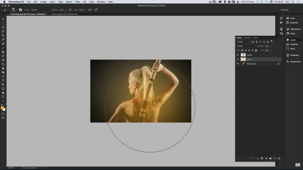
5. Create a New Layer and position this layer underneath the sparks layer. Next, select the Brush Tool and choose a large feathered brush with a Hardness of 0%.
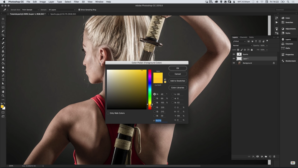
6. From the Colour Picker select a yellow/orange similar to the colour of your sparks, and Left-click to start adding the brush effect over your main image. Set the Blending Mode to Soft Light and adjust the Opacity as desired. This effect simulates a glow coming off of the sparks.
There was a time when the smart move in picking fonts for a website was to a font-family that was supported across as many platforms as possible. font-family: Tahoma; and whatnot. Or even better, a font stack that would fall back to as-similar-as possible stuff, like font-family: Tahoma, Verdana, Segoe, sans-serif;.
These days, an astonishing number of sites are using custom fonts. 60%!
No surprise, there is also a decent amount of pushback on custom fonts. They need to be downloaded, thus there are performance/bandwidth hits. There is loads of nuance on how you load them.
Also no surprise, there is some advocacy for the return to local fonts. Fast! Good enough! Let’s look at that for a sec, then also look at using them within SVG.
The trend isn’t just a return to local fonts but to what are being dubbed “system fonts”. The point isn’t so much a single font stack that looks consistent across browser/platform/version, but a single font stack that matches what that OS uses.
If the OS uses “San Francisco” in the UI, the font-stack should display San Francisco. If the OS uses Roboto, so it shall be. The actual font stack to do this is fairly thick. But that’s the point, just list a bunch of fonts in the order you want to use them and CSS will fall down the stack until it finds one it has.
The WordPress admin and Medium interface are currently using this:
body {
  font-family: -apple-system,BlinkMacSystemFont,"Segoe UI",Roboto,Oxygen-Sans,Ubuntu,Cantarell,"Helvetica Neue",sans-serif;
}
The title of this post is about using these font stacks in SVG. There is nothing special or different or particularly interesting about this. You can apply that font stack via CSS inside the SVG, or just put it right on a text element:
<text font-family='-apple-system, BlinkMacSystemFont, "Segoe UI", Roboto, Helvetica, Arial, sans-serif, "Apple Color Emoji", "Segoe UI Emoji", "Segoe UI Symbol"' font-size="18" font-weight="400" fill="black" x="50" y="50">
  Some Text
</text>
Setting text in SVG is kinda awesome, as it retains its accessibility and is ultra-flexible.
Again, the point of all this is to match the font used by the OS, so let’s take a look at that. OS X is particularly interesting as the system font has changed several times in the last few years.
OS 10.0 – 10.9 – Lucida Grande
OS 10.10 – 10.11 – Helvetica Neue
OS 10.12 – San Francisco
Chrome DevTools will not only show you the font stack when you inspect an element, but also the Rendered Fonts.
OS 10.7 Showing us Lucida Grande OS 10.10 showing us Helvetica Neue OS 10.12 showing us San Franscisco
Windows 7 – Firefox Windows 7 – Chrome Windows 7 – IE 9 Windows 10 – Chrome Windows 10 – Firefox Windows 10 – Edge Ubuntu 15 – Firefox Ubuntu 15 – Chrome
The metrics of the different fonts are a bit different. The text fits a little tighter and looser depending on what renders. But it’s not too far off. You might not set a typographic lockup with system fonts, but all in all, very usable.
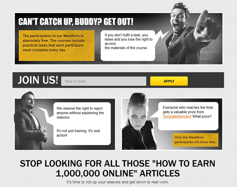
You know what? We have got a bit of great news for you. In fact, it’s just something sensational.
We have been planning for this day carefully, and finally this day has come. TemplateMonster welcomes everyone who wants to change their life for better to join our Marathon, called “Your Own Web Studio in 61 Days”.
Everybody is free to take part in this Marathon and start a successful business in the web design industry.
Ready For The Marathon?
If you want to get in, pay attention – the enrollment is open till the 25th of September.
What we need from you is the desire to learn and create something new, and the ambition to make more money. The Marathon is absolutely free, and it begins on the 26th of September.
What will you get? A free online course full of smart hints, tips, and tricks which will enable you to create your own web design studio.
Forget about all those “How to Make 1,000,000 Online” articles! What we offer you instead is an actionable step-by-step guide for those who are ready to work hard and achieve their goals. There is the only point we’d like to mention: it’s obligatory to follow and complete all practical tasks of the course.
In 61 days, we will reveal all of our hidden secrets which will help you set up a great website and learn how to sell it. As soon as all the necessary tasks are fulfilled, you will get your own web design studio, and, what’s more, you will gain an opportunity to work from any corner of the world.
The greatness of our Marathon will knock the socks off every participant, for sure. In addition to design and development, you will learn about creating budget plans that actually work.
Give it your best shot, follow the guidance of our experts, and complete all of the lessons on your way to building your private business.
One more thing, all the participants who reach the final will get a valuable prize from TemplateMonster. Great news, isn’t it?
So, are you ready for our Marathon? If the answer is a firm “yes”, join us in our quest to make the Web more beautiful. Determine what it is that you want to achieve and design your success with TemplateMonster.
There’s something about the world’s greatest cities that makes them instantly recognizable. Whether it’s a red double-decker bus or a yellow taxi cab, whether it’s an iconic opera house or a unique pastry; a simple glimpse and you know exactly where you are.
Citysets is a personal project by Bryn Taylor that tries to capture that essence by producing a unique set of icons tailored to each city experience.
The first four cities to be represented are London, New York, Paris, and Sydney. There are 79 icons in total, divided over the four cities. Some of our favorites include: From London, the Underground sign, St. Pauls, and a phone box; from New York, the pizza slice, the pretzel, and the Chrysler building; from Paris, the croissant, the chef’s hat, and the Eiffel tower; from Sydney, the cork hat, the shrimp, and the koala.
We can’t wait to see what Taylor comes up with next! Sure, these four are great cities, but what about New Orleans? Barcelona? Amsterdam? Tokyo? The possibilities are endless for this exciting project…
Each city’s icon set comes in .ai, .sketch, and .svg format. And they’re free for personal and commercial use. Download them all beneath the preview:
Please enter your email address below and click the download button. The download link will be sent to you by email, or if you have already subscribed, the download will begin immediately.
Designing with “big data” is a challenging task. Matan Stauber, however, took it to the next level. With an impressive outcome. Having studied Visual Communication at Bezalel Academy of Art and Design, Israel’s national school of art, Matan realized a very ambitious final project: an interactive timeline of our galaxy’s history — 14 billion years, from the Big Bang to today.
We talked to Matan about Histography, about the idea behind it, and how he managed to bring it to life. An interview about stretching the limits of what’s possible.
The two animation tools that I would like to introduce you to today are not of the run-of-the-mill kind. They are not animation generalists, but rather specialists for small application areas. The JavaScript Granim.js allows you to create animations with color gradients, while Radiobox.css is all about the looks of your radio buttons.
Granim.js: Simple Gradient Animations With a Large Impact
Granim.js is a fresh JavaScript penned by the Parisian developer Benjamin Blonde. This tiny script lets you animate gradients in, on, and around anything that can be displayed in a canvas element.
Granim.js Animates Color Gradients in Many Different Ways. (Screenshot: Dr. Web)
<!-- Create a <canvas> element --><canvas id="granim-canvas"></canvas><!-- Call the script --><script src="granim.min.js"></script><!-- Create a Granim instance --><script>var granimInstance =new Granim({
element:'#granim-canvas',
name:'granim',
opacity:[1,1],
states :{"default-state":{
gradients:[['#834D9B','#D04ED6'],['#1CD8D2','#93EDC7']]}}});</script>
As the JavaScript only weighs a meager 10kb, the overhead can be neglected. This also justifies the application in the smallest possible way, like animating a page logo with a color gradient, as it can be seen on the project’s demo page. Pay attention to the Granim.js logo in the top left.
This example also shows you that the JavaScript can not only create simple gradients but is also capable of working with image masks. Launching gradients works via click or event, which is shown in a very impressive way on this page. Just move the mouse over the ghost buttons and you’ll surely get to like Granim.js very quickly.
The script is available for free download on Github. It is equipped with the very liberal MIT license, so you also get to use it in commercial projects, like customer websites.
Radiobox.css: Animated Option Choice
720kb has created a small collection of CSS animations that are supposed to free radio buttons of all the boredom. There are 12 variants available in total. The effect is triggered when the respective radio button is clicked. Depending on the effect, the button will then start bouncing, rotating, growing, and so on.
Radiobox.css is a Collection of 12 Small Stylesheets for Radio Button Application. (Screenshot: Dr. Web)
Just try it. Radiobox.css provides interesting effects for one of these buttons that get ignored design-wise most of the time. Radiobox.css works with CSS3 and requires a modern browser to function.
Getting it to work is very easy. Just assign the class to your radio button that represents the desired effect, for example:
<input type="radio"class="radiobox-boing"/>
Radiobox.css comes, like the previously presented Granim.js, under the MIT license, and can thus be used commercially as well. Download it via Github.
Vectr is a brand-new graphic software from Taipeh. The founders have been secretly working on the ambitious project for almost two years. Two days ago, they ended the beta stage and released the software into the wild.
Vectr: Platform Independent, Free, Powerful
Vectr does not aim to be less than the Google Docs of vector processing, and a superior rival to Inkscape. In fact, the feature set is impressive. Vectr can be used as a web app, or as a downloadable app for Mac OS, Windows, and Linux. The functionality is identical. Under Chrome, the web app is capable of working offline.
The team is currently working on the creation of integrations with Slack and WordPress. Then, Slack can be used for visual communication. Via plugin, you’ll be able to edit graphics directly within WordPress.
Generally, Vectr is suitable for any 2D graphic, making it a rival to Canva, which we introduced you to here. Similar to Canva, you’ll find predefined layouts of the large social networks in Vectr, and all that’s left to do is fill them with content. However, Vectr is far more capable than Canva, which is impressive, especially considering that it’s free.
In contrast to Canva, Vectr does not only aim for the group of presenters, bloggers, and social media users. Vectr is even powerful enough to solve complex tasks.
Vectr’s UI Seems Familiar. (Illustration: Vectr)
For web design, the ability to directly implement Vectr graphics into your designs is fascinating. When you then edit it with Vectr, changes made are automatically updated on the website that uses the graphic. Handy, right?
As you probably already thought, the name lets you draw a conclusion regarding the used technology. Vectr works based on vectors, and not on pixels, putting it on the same line as Inkscape or Illustrator.
One of the nearly finished core features is the option to work on the graphics in teams. This is supposed to work in real time, just like Google Docs.
Vectr: Where is the Business Model?
Vectr wants to stay free forever. There is no way to know if there will be charged extras in the future. Vectr already successfully completed the first round of seed funding. This brings up the question about the business model sooner rather than later.
Thoughts on this are already coming up. Shortly, there will be a marketplace in which you get to share, sell, or buy designs. The marketplace will be fully integrated into the editing interface so that the buying process can run smoothly while editing a project.
Overall, the team behind Vectr is very ambitious, as you can tell from the massive roadmap, which lists 55 very demanding features, that will supposedly get taken care of anytime soon.
Mozilla’s rebranding project has been going on the entire Summer. Now, as we head into the Fall, the company’s rebranding objective is nearing the final stretch. It’s heading into the long-awaited design-development phase with four, potential designs being the final candidates for the company’s new image.
In a new article on the Johnson Banks’ website (the design consultancy working with Mozilla on the rebranding) the company revealed that only four designs are now in the running for the new Mozilla logo, down from seven in August. In the next couple of weeks, these four choices are going to be narrowed down further still until the final brand-identify recommendation—whatever shape and form that takes—is unveiled in October.
The final, four candidates were selected based upon three, main criteria. They are:
The principles of good design;
Mozilla community feedback for the seven concepts unveiled in August;
Mozilla’s overall branding strategy.
Without further ado, here’s a quick look at the four finalists…
Protocol 2.0
So named because it symbolizes Mozilla’s role at the center of the web, Protocol 2.0 is a logo that essentially places the Internet http:// protocol right into the logo type mark. The beauty of Protocol 2.0 is the flexibility it affords: Mozilla has been experimenting with swapping out certain characters in this proposed work mark, so that emoticons and font characters could suddenly appear in the new logo.
The Flame
Perhaps no symbol is as universally well-understood as fire. The company is considering a flame logo to represent its drive to remain the beacon for the ideal of the equal, open and accessible web for all. Community’s also important to Mozilla, and a flame would symbolize the warmth of community, too.
If you look closer, you’ll also see that this logo contender actually merges the “M” for “Mozilla” with the flame. The final iteration is a pixelated version that lends itself well to animation.
The Burst
The Burst sort of looks like a fireworks display going off, but there is heavy symbolism in this logo contender. It’s been influenced by two schools of thought. First, there’s a new narrative characterized by Mozilla’s advocacy for the health of the web. Second, there’s the visual aspect characterized by the company’s investigation of classic web imagery and data-led ideas.
The number five also figures into this logo, as Mozilla’s gathering data around five, vital measurements, and a capital “M” has five nodes. Hence, the five bursts.
Dino 2.0
Heavily inspired by a previous logo suggestion called “The Eye,” Dino 2.0 utilizes the reptile eye shape forged out of the “O” in the word “Mozilla”. Dino 2.0 sports a noticeable dinosaur’s head that features white type on a red chevron.
Plans call for this logo idea to bite, thanks to moving GIF animations, and showcase a slew of vibrant colors to demonstrate that Mozilla really is for everyone.
Stay tuned in the coming weeks as Mozilla moves closer to finalizing its new brand identity.
The following is a guest post by Eric Bailey. You know how people change settings sometimes to make it easier to use for them? For example, they bump up the default font size in their browser so it’s easier for them to read. As web designers, we like to accommodate that. We consider it good accessibility. The same goes here. Some people on Windows enable “High Contrast Mode” to make their computer screen easier for them to work with. Will our important SVG files hold up to the change? Let Eric show you.
Making your SVG accessible includes adding extra steps to your workflow, but is well-worth it. By embracing clean, semantic markup and taking advantage of some of the less well known features of CSS, you can create easily maintainable solutions that include considerations for low vision, a condition that affects a not-insignificant amount of the population.
Rather than writing and maintaining complicated and brittle state-managing Javascript, work with existing browser capabilities such as media queries to easily make the experience accommodate the widest range of browsing contexts, including High Contrast Mode.
SVG plays well with media queries, a feature of CSS that lets you describe how something should look under certain conditions, such as minimum applicable browser viewport size. For example, let’s take this cute SVG rocket:
Using the .rocket class, we can tell the SVG to flip around and change from red to blue when the browser’s viewport is more than 600px wide, much like styling any other HTML tag. Pretty neat, huh?
Media queries aren’t limited to just viewport size. Using a relatively obscure feature of CSS you can target Windows’ High Contrast Mode, an operating system setting that overrides properties like color and font size to make the computer easier to use for people with low-vision conditions. If you’re using Windows, try it out for yourself!
The code to target High Contrast Mode looks like this:
/* Targets displays using any of Windows' High Contrast Mode themes: */
@media screen and (-ms-high-contrast: active) { }

/* Targets displays using the Windows' "High Contrast Black" theme: */
@media screen and (-ms-high-contrast: white-on-black) { }

/* Targets displays using the Windows' "High Contrast White" theme: */
@media screen and (-ms-high-contrast: black-on-white) { }
There is a cascade of sorts with these media queries: active will override both black-on-white and white-on-black if declared last. Note that these are vendor prefixed values, so -ms signals that it will only work on Microsoft Windows (and even then, only with Internet Explorer versions 10 and higher and Microsoft Edge).
Interestingly, while Chrome for Windows does not support High Contrast Mode media queries out of the box, it will prompt you to install a high contrast extension, search for a dark theme, and link to this support article. It does not, however, honor the High Contrast Mode media query after either the extension or the theme has been installed.
Combining the things we’ve learned above, it is totally possible to create SVG images that dynamically respond to this special modes without having to rely on complicated Javascript logic.
“Why would you want to do this?” you may be asking. Well, a few reasons:
If you can’t see it, you can’t use it.
Most icons these days are made using SVGs because they’re flexible, high-resolution display-friendly, and have a small file size. We rely on these icons in most modern interfaces to communicate functionality. This can run the gamut from entertainment, where the person is only inconvenienced if the intent is unclear, to something as serious as a medical device, a vehicle, or even controls for a piece of infrastructure, where the stakes are much higher.
Unfortunately, a lot of designers and developers tend to not label their icons properly, making them difficult to use in suboptimal conditions. In modern web design, there has also been an unfortunate trend of using low contrast color palettes. These palettes are used throughout the app to convey a sense of unity, including styling icons. If these colors don’t work in anything other than perfect viewing conditions, they will impair every single screen.
You’re probably affected.
Vision disabilities, including low vision, are more common than you might realize—an estimated 246 million people are reported to have a low vision impairment. Let’s also not forget environmental factors such as night blindness and sudden exposure to direct sunlight, which can effectively render someone temporarily disabled (especially when operating a backlit device). Keep in mind that even if your vision isn’t affected now, it may be in the future.
The web isn’t always full color.
High contrast doesn’t mean low vision conditions are always present. High contrast displays are not always linked to low vision conditions. Plenty of devices that access the web use low- or no-color displays and they aren’t always “lower end” electronics, either.
Chances are pretty good that if you’re reading this article you’re a designer, a developer, or an otherwise technically-minded person, meaning there’s a good likelihood that you’re reading this on an Apple or Android device.
This is just a reminder that Windows is still an incredibly popular operating system, running on more than half of the total desktop operating system market share. Of the versions in the wild, ones that support High Contrast Mode media queries are dominant, occupying about 70 percent of the share at the time this article has been posted. Even if it’s a percentage of a percentage of a population, this is still not an insignificant number.
Soon it’ll be more than Windows.
Although Windows’ High Contrast Mode isn’t widely supported, the upcoming Luminosity Media Query is slated to be supported by every major browser. It will effectively allow developers to target the same conditions that High Contrast Mode does. Other devices, especially ones running an accessibility-friendly operating system such as iOS, will probably be quick to adopt.
Tried and true.
Since it is described in CSS, the contrast-adjusting capabilities will function even if Javascript does not work. Remember: every site starts without Javascript functionality until the browser has downloaded it!
Utilizing media queries also means that the presentational properties for content are kept in the CSS, where it belongs. It observes the separation of concerns; a one-stop solution for all styling-related development effort. This becomes especially easy to maintain if you’re using component partials with a CSS preprocessor such as Sass or Less.
It’s the right thing to do.
Far beyond bikeshedding, making accommodations for low vision ties into “true” responsive design. More than just making the design work on a phone, it ensures that the content of your site works on the widest possible range of devices and situations.
In addition to all the great benefits, there are also plenty of concrete gains to be had by embracing accessibility. That’s not even counting the warm fuzzies you’ll feel knowing you’re helping people!
“Sounds great! I’m totally convinced,” you now say. “I value my site and care a lot about the people viewing it. Now do I have to completely restyle my entire site so it looks good in High Contrast Mode?”
The answer is a very firm, “No.”
Some very smart engineers have made it so High Contrast Mode does a stellar job at managing this for you. So long as you’re using tried-and-true semantic HTML styled with CSS, it basically guarantees your content will be automatically converted to something that’s high contrast-friendly.
More importantly, it leaves the high contrast presentation predictable, something that is incredibly important to the people who rely on it for their day-to-day browsing. Messing with this predictability is akin to reversing all the letters on a webpage—an arbitrary and surprising adjustment that makes it more difficult to read for no practical reason. High Contrast Mode might look strange to you, but for thousands of people, it’s completely normal.
Images, including SVGs, are one of the types of content that do not automatically translate so well in High Contrast Mode—this is one of the many reasons why making your images accessible is so important.
Work with the grain of the technology and use High Contrast media queries to work around High Contrast Mode’s image-handling limitations. Write small, surgical tweaks to ensure that critical content is displayed properly for conditions where low vision isn’t severe enough to warrant the use of a screen reader.
In the following example, our rocket icon has been turned into a launch button:
Not a big stretch, and one that seems like it’s tied to a very important function. Let’s assume that, for some unfortunate reason, your site’s style guide uses a low-contrast color scheme and the design does not use labeled buttons. For the sake of this post, let’s also assume you have no negotiation power to challenge either issue in this scenario—an all-too-common situation, unfortunately.
Without the High Contrast Media Query for your launch button, it cannot be visually accessed. The button’s icon color has a contrast ratio of 2.2 when viewed in High Contrast Mode on a black background. This fails the WCAG 2.0 criteria for acceptable contrast:
Windows 10 with a high contrast theme, running Microsoft Edge 25.
Although the white crescent of the bottom edge has a high enough contrast ratio to be visually apparent, there is not enough supporting information to communicate that it is part of a button.
With just the slightest of tweaks, the button can be made visually apparent:
Theme screenshots, clockwise from the top left: High Contrast 1, High Contrast 2, High Contrast Black, High Contrast White
If you are working with an icon system, and your icons are simple enough that they can be reduced to one color without losing meaning, you may want to consider hooking all your high contrast tweaks to the same immutable class that controls all the other icon styling:
I’m using the value of #0074D9 here because it has a WCAG AA-compliant ratio of 4.7 on a white background, and a WCAG AA-compliant ratio of 4.5 on a black background—if you’re targeting WCAG AAA compliance, you’ll want to break the Media Query out into the two separate white-on-black and black-on-white options. The blue color also signals web-default affordance for interactivity, which is a nice assist for people with cognitive impairments or who are less technologically savvy.
More complicated icons and illustrations with multiple colors should be handled on a case-by-case basis, as blanket styling instructions might turn them into unrecognizable blobs, or communicate interactivity where there is none.
Another interesting notion for dealing with images in High Contrast Mode is the idea of using CSS filters to enhance what is already there. Although there isn’t perfect coverage, properties such as saturation(), brightness(), and contrast() could progressively enhance the content without destroying the original image:
@media screen and (-ms-high-contrast: active) {
  main .post-image {
    filter: brightness(1) contrast(1) saturate(1.5);
  }
}
“Well then, what about all the little images on my site? You know, the textures, flourishes and illustrations that I use to decorate it?”
Decorative imagery is just that—decorative. Eliminate these kinds of distractions by semantically negating ornamental elements using techniques such as CSS’s background-image property and the ARIA declaration of aria-hidden="true". It ensures that High Contrast Mode’s parser doesn’t get hung up on anything non-essential.
“Okay, I’m still with you. What about luminosity media queries? Will they be a thing I’ll need to consider soon?”
The simple answer is: don’t make things more difficult than they need to be. The fewer exceptions you have to juggle, the easier things are to maintain. By ensuring your design uses an sufficient contrast ratio for all its component pieces under default viewing conditions, as well as providing text labels where needed, you remove all the extra overhead that comes with juggling multiple versions. Plus, you get WCAG compliance for free. Nice!