Archive

Archive for November, 2018

Avoiding The Pitfalls Of Automatically Inlined Code

November 26th, 2018 No comments

Avoiding The Pitfalls Of Automatically Inlined Code

Avoiding The Pitfalls Of Automatically Inlined Code

Leonardo Losoviz

2018-11-26T14:00:08+01:002018-11-26T13:22:20+00:00

Inlining is the process of including the contents of files directly in the HTML document: CSS files can be inlined inside a style element, and JavaScript files can be inlined inside a script element:

<style>
/* CSS contents here */
</style>

<script>
/* JS contents here */
</script>

By printing the code already in the HTML output, inlining avoids render-blocking requests and executes the code before the page is rendered. As such, it is useful for improving the perceived performance of the site (i.e. the time it takes for a page to become usable.) For instance, we can use the buffer of data delivered immediately when loading the site (around 14kb) to inline the critical styles, including styles of above-the-fold content (as had been done on the previous Smashing Magazine site), and font sizes and layout widths and heights to avoid a jumpy layout re-rendering when the rest of the data is delivered.

However, when overdone, inlining code can also have negative effects on the performance of the site: Because the code is not cacheable, the same content is sent to the client repeatedly, and it can’t be pre-cached through Service Workers, or cached and accessed from a Content Delivery Network. In addition, inline scripts are considered not safe when implementing a Content Security Policy (CSP). Then, it makes a sensible strategy to inline those critical portions of CSS and JS that make the site load faster but avoided as much as possible otherwise.

With the objective of avoiding inlining, in this article we will explore how to convert inline code to static assets: Instead of printing the code in the HTML output, we save it to disk (effectively creating a static file) and add the corresponding or tag to load the file.

Let’s get started!

Recommended reading: WordPress Security As A Process

When To Avoid Inlining

There is no magic recipe to establish if some code must be inlined or not, however, it can be pretty evident when some code must not be inlined: when it involves a big chunk of code, and when it is not needed immediately.

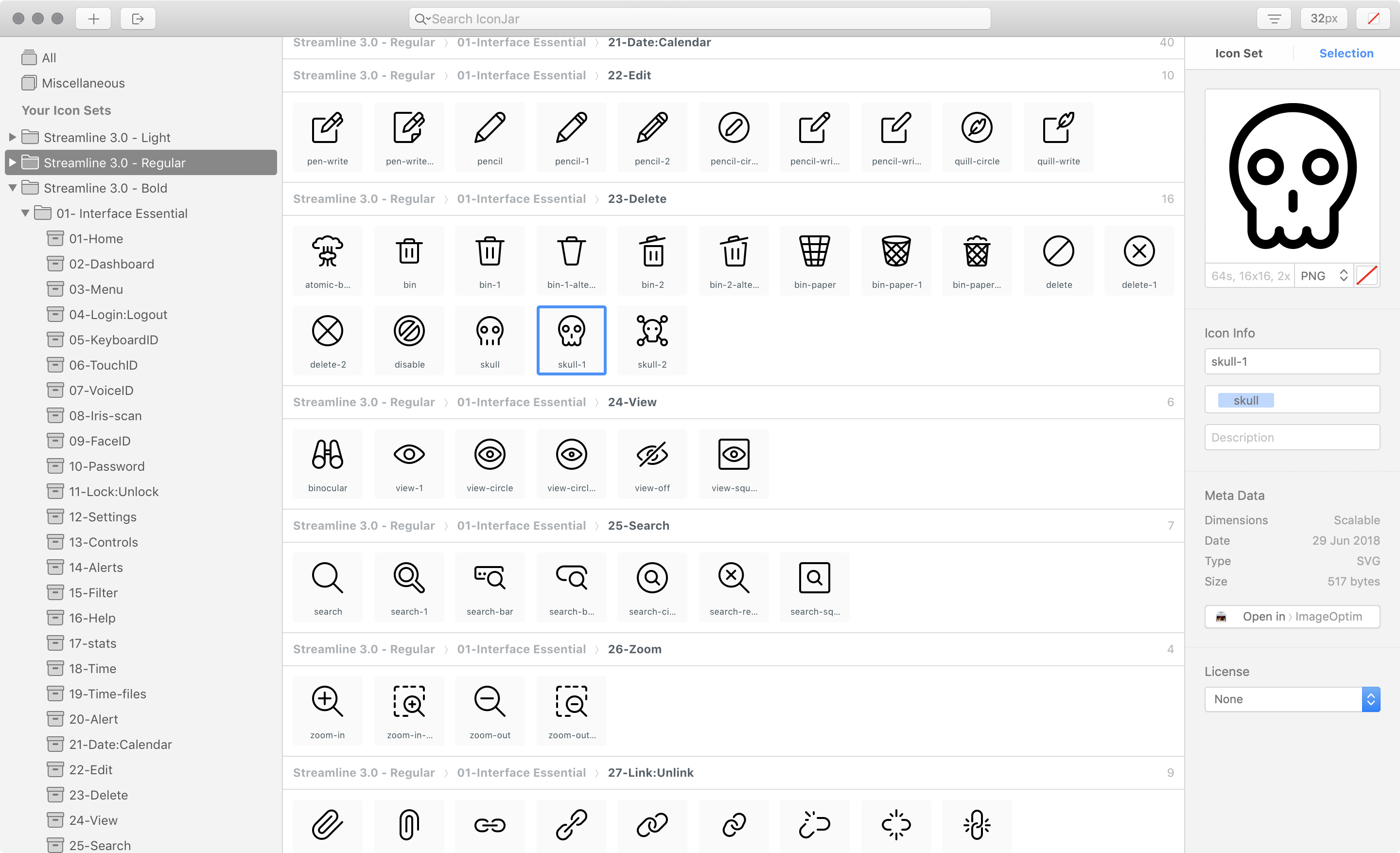
As an example, WordPress sites inline the JavaScript templates to render the Media Manager (accessible in the Media Library page under /wp-admin/upload.php), printing a sizable amount of code:

JavaScript templates inlined by the WordPress Media Manager.

Occupying a full 43kb, the size of this piece of code is not negligible, and since it sits at the bottom of the page it is not needed immediately. Hence, it would make plenty of sense to serve this code through static assets instead or printing it inside the HTML output.

Let’s see next how to transform inline code into static assets.

Triggering The Creation Of Static Files

If the contents (the ones to be inlined) come from a static file, then there is not much to do other than simply request that static file instead of inlining the code.

For dynamic code, though, we must plan how/when to generate the static file with its contents. For instance, if the site offers configuration options (such as changing the color scheme or the background image), when should the file containing the new values be generated? We have the following opportunities for creating the static files from the dynamic code:

  1. On request
    When a user accesses the content for the first time.
  2. On change
    When the source for the dynamic code (e.g. a configuration value) has changed.

Let’s consider on request first. The first time a user accesses the site, let’s say through /index.html, the static file (e.g. header-colors.css) doesn’t exist yet, so it must be generated then. The sequence of events is the following:

  1. The user requests /index.html;
  2. When processing the request, the server checks if the file header-colors.css exists. Since it does not, it obtains the source code and generates the file on disk;
  3. It returns a response to the client, including tag
  4. The browser fetches all the resources included in the page, including header-colors.css;
  5. By then this file exists, so it is served.

However, the sequence of events could also be different, leading to an unsatisfactory outcome. For instance:

  1. The user requests /index.html;
  2. This file is already cached by the browser (or some other proxy, or through Service Workers), so the request is never sent to the server;
  3. The browser fetches all the resources included in the page, including header-colors.css. This image is, however, not cached in the browser, so the request is sent to the server;
  4. The server hasn’t generated header-colors.css yet (e.g. it was just restarted);
  5. It will return a 404.

Alternatively, we could generate header-colors.css not when requesting /index.html, but when requesting /header-colors.css itself. However, since this file initially doesn’t exist, the request is already treated as a 404. Even though we could hack our way around it, altering the headers to change the status code to a 200, and returning the content of the image, this is a terrible way of doing things, so we will not entertain this possibility (we are much better than this!)

That leaves only one option: generating the static file after its source has changed.

Creating The Static File When The Source Changes

Please notice that we can create dynamic code from both user-dependant and site-dependant sources. For instance, if the theme enables to change the site’s background image and that option is configured by the site’s admin, then the static file can be generated as part of the deployment process. On the other hand, if the site allows its users to change the background image for their profiles, then the static file must be generated on runtime.

In a nutshell, we have these two cases:

  1. User Configuration
    The process must be triggered when the user updates a configuration.
  2. Site Configuration
    The process must be triggered when the admin updates a configuration for the site, or before deploying the site.

If we considered the two cases independently, for #2 we could design the process on any technology stack we wanted. However, we don’t want to implement two different solutions, but a unique solution which can tackle both cases. And because from #1 the process to generate the static file must be triggered on the running site, then it is compelling to design this process around the same technology stack the site runs on.

When designing the process, our code will need to handle the specific circumstances of both #1 and #2:

  • Versioning
    The static file must be accessed with a “version” parameter, in order to invalidate the previous file upon the creation of a new static file. While #2 could simply have the same versioning as the site, #1 needs to use a dynamic version for each user, possibly saved in the database.
  • Location of the generated file
    #2 generates a unique static file for the whole site (e.g. /staticfiles/header-colors.css), while #1 creates a static file for each user (e.g. /staticfiles/users/leo/header-colors.css).
  • Triggering event
    While for #1 the static file must be executed on runtime, for #2 it can also be executed as part of a build process in our staging environment.
  • Deployment and distribution
    Static files in #2 can be seamlessly integrated inside the site’s deployment bundle, presenting no challenges; static files in #1, however, cannot, so the process must handle additional concerns, such as multiple servers behind a load balancer (will the static files be created in 1 server only, or in all of them, and how?).

Let’s design and implement the process next. For each static file to be generated we must create an object containing the file’s metadata, calculate its content from the dynamic sources, and finally save the static file to disk. As a use case to guide the explanations below, we will generate the following static files:

  1. header-colors.css, with some style from values saved in the database
  2. welcomeuser-data.js, containing a JSON object with user data under some variable: window.welcomeUserData = {name: "Leo"};.

Below, I will describe the process to generate the static files for WordPress, for which we must base the stack on PHP and WordPress functions. The function to generate the static files before deployment can be triggered by loading a special page executing shortcode [create_static_files] as I have described in a previous article.

Further recommended reading: Making A Service Worker: A Case Study

Representing The File As An Object

We must model a file as a PHP object with all corresponding properties, so we can both save the file on disk on a specific location (e.g. either under /staticfiles/ or /staticfiles/users/leo/), and know how to request the file consequently. For this, we create an interface Resource returning both the file’s metadata (filename, dir, type: “css” or “js”, version, and dependencies on other resources) and its content.

interface Resource {
  
  function get_filename();
  function get_dir();
  function get_type();
  function get_version();
  function get_dependencies();
  function get_content();
}

In order to make the code maintainable and reusable we follow the SOLID principles, for which we set an object inheritance scheme for resources to gradually add properties, starting from the abstract class ResourceBase from which all our Resource implementations will inherit:

abstract class ResourceBase implements Resource {
  
  function get_dependencies() {

    // By default, a file has no dependencies
    return array();
  }
}

Following SOLID, we create subclasses whenever properties differ. As stated earlier, the location of the generated static file, and the versioning to request it will be different depending on the file being about the user or site configuration:

abstract class UserResourceBase extends ResourceBase {
  
  function get_dir() {
  
    // A different file and folder for each user
    $user = wp_get_current_user();
    return "/staticfiles/users/{$user->user_login}/";
  }

  function get_version() {
  
    // Save the resource version for the user under her meta data. 
    // When the file is regenerated, must execute `update_user_meta` to increase the version number
    $user_id = get_current_user_id();
    $meta_key = "resource_version_".$this->get_filename();
    return get_user_meta($user_id, $meta_key, true);
  }
}

abstract class SiteResourceBase extends ResourceBase {
  
  function get_dir() {
  
    // All files are placed in the same folder
    return "/staticfiles/";
  }

  function get_version() {
  
    // Same versioning as the site, assumed defined under a constant
    return SITE_VERSION;
  }
}

Finally, at the last level, we implement the objects for the files we want to generate, adding the filename, the type of file, and the dynamic code through function get_content:

class HeaderColorsSiteResource extends SiteResourceBase {
  
  function get_filename() {
  
    return "header-colors";
  }

  function get_type() {
  
    return "css";
  }

  function get_content() {
  
    return sprintf(
      "
        .site-title a {
          color: #%s;
        }
      ", esc_attr(get_header_textcolor())
    );
  }
}

class WelcomeUserDataUserResource extends UserResourceBase {
  
  function get_filename() {
  
    return "welcomeuser-data";
  }

  function get_type() {
  
    return "js";
  }

  function get_content() {
  
    $user = wp_get_current_user();
    return sprintf(
      "window.welcomeUserData = %s;",
      json_encode(
        array(
          "name" => $user->display_name
        )
      )
    );
  }
}

With this, we have modeled the file as a PHP object. Next, we need to save it to disk.

Saving The Static File To Disk

Saving a file to disk can be easily accomplished through the native functions provided by the language. In the case of PHP, this is accomplished through the function fwrite. In addition, we create a utility class ResourceUtils with functions providing the absolute path to the file on disk, and also its path relative to the site’s root:

class ResourceUtils {

  protected static function get_file_relative_path($fileObject) {

    return $fileObject->get_dir().$fileObject->get_filename().".".$fileObject->get_type();
  }

  static function get_file_path($fileObject) {

    // Notice that we must add constant WP_CONTENT_DIR to make the path absolute when saving the file
    return WP_CONTENT_DIR.self::get_file_relative_path($fileObject);
  }
}

class ResourceGenerator {
  
  static function save($fileObject) {

    $file_path = ResourceUtils::get_file_path($fileObject);
    $handle = fopen($file_path, "wb");
    $numbytes = fwrite($handle, $fileObject->get_content());
    fclose($handle);
  }
}

Then, whenever the source changes and the static file needs to be regenerated, we execute ResourceGenerator::save passing the object representing the file as a parameter. The code below regenerates, and saves on disk, files “header-colors.css” and “welcomeuser-data.js”:

// When need to regenerate header-colors.css, execute:
ResourceGenerator::save(new HeaderColorsSiteResource());

// When need to regenerate welcomeuser-data.js, execute:
ResourceGenerator::save(new WelcomeUserDataUserResource());

Once they exist, we can enqueue files to be loaded through the and tags.

Enqueuing The Static Files

Enqueuing the static files is no different than enqueuing any resource in WordPress: through functions wp_enqueue_script and wp_enqueue_style. Then, we simply iterate all the object instances and use one hook or the other depending on their get_type() value being either "js" or "css".

We first add utility functions to provide the file’s URL, and to tell the type being either JS or CSS:

class ResourceUtils {

  // Continued from above...

  static function get_file_url($fileObject) {

    // Add the site URL before the file path
    return get_site_url().self::get_file_relative_path($fileObject);
  }

  static function is_css($fileObject) {

    return $fileObject->get_type() == "css";
  }

  static function is_js($fileObject) {

    return $fileObject->get_type() == "js";
  }
}

An instance of class ResourceEnqueuer will contain all the files that must be loaded; when invoked, its functions enqueue_scripts and enqueue_styles will do the enqueuing, by executing the corresponding WordPress functions (wp_enqueue_script and wp_enqueue_style respectively):

class ResourceEnqueuer {

  protected $fileObjects;

  function __construct($fileObjects) {

    $this->fileObjects = $fileObjects;
  }

  protected function get_file_properties($fileObject) {

    $handle = $fileObject->get_filename();
    $url = ResourceUtils::get_file_url($fileObject);
    $dependencies = $fileObject->get_dependencies();
    $version = $fileObject->get_version();

    return array($handle, $url, $dependencies, $version);
  }

  function enqueue_scripts() {

    $jsFileObjects = array_map(array(ResourceUtils::class, 'is_js'), $this->fileObjects);
    foreach ($jsFileObjects as $fileObject) {
    
      list($handle, $url, $dependencies, $version) = $this->get_file_properties($fileObject);
      wp_register_script($handle, $url, $dependencies, $version);
      wp_enqueue_script($handle);
    }
  }

  function enqueue_styles() {

    $cssFileObjects = array_map(array(ResourceUtils::class, 'is_css'), $this->fileObjects);
    foreach ($cssFileObjects as $fileObject) {

      list($handle, $url, $dependencies, $version) = $this->get_file_properties($fileObject);
      wp_register_style($handle, $url, $dependencies, $version);
      wp_enqueue_style($handle);
    }
  }
}

Finally, we instantiate an object of class ResourceEnqueuer with a list of the PHP objects representing each file, and add a WordPress hook to execute the enqueuing:

// Initialize with the corresponding object instances for each file to enqueue
$fileEnqueuer = new ResourceEnqueuer(
  array(
    new HeaderColorsSiteResource(),
    new WelcomeUserDataUserResource()
  )
);

// Add the WordPress hooks to enqueue the resources
add_action('wp_enqueue_scripts', array($fileEnqueuer, 'enqueue_scripts'));
add_action('wp_print_styles', array($fileEnqueuer, 'enqueue_styles'));

That’s it: Being enqueued, the static files will be requested when loading the site in the client. We have succeeded to avoid printing inline code and loading static resources instead.

Next, we can apply several improvements for additional performance gains.

Recommended reading: An Introduction To Automated Testing Of WordPress Plugins With PHPUnit

Bundling Files Together

Even though HTTP/2 has reduced the need for bundling files, it still makes the site faster, because the compression of files (e.g. through GZip) will be more effective, and because browsers (such as Chrome) have a bigger overhead processing many resources.

By now, we have modeled a file as a PHP object, which allows us to treat this object as an input to other processes. In particular, we can repeat the same process above to bundle all files from the same type together and serve the bundled version instead of all the independent files. For this, we create a function get_content which simply extracts the content from every resource under $fileObjects, and prints it again, producing the aggregation of all content from all resources:

abstract class SiteBundleBase extends SiteResourceBase {

  protected $fileObjects;

  function __construct($fileObjects) {

    $this->fileObjects = $fileObjects;
  }

  function get_content() {

    $content = "";
    foreach ($this->fileObjects as $fileObject) {

      $content .= $fileObject->get_content().PHP_EOL;
    }
  
    return $content;
  }
}

We can bundle all files together into the file bundled-styles.css by creating a class for this file:

class StylesSiteBundle extends SiteBundleBase {

  function get_filename() {
  
    return "bundled-styles";
  }

  function get_type() {
  
    return "css";
  }
}

Finally, we simply enqueue these bundled files, as before, instead of all the independent resources. For CSS, we create a bundle containing files header-colors.css, background-image.css and font-sizes.css, for which we simply instantiate StylesSiteBundle with the PHP object for each of these files (and likewise we can create the JS bundle file):

$fileObjects = array(
  // CSS
  new HeaderColorsSiteResource(),
  new BackgroundImageSiteResource(),
  new FontSizesSiteResource(),
  // JS
  new WelcomeUserDataUserResource(),
  new UserShoppingItemsUserResource()
);
$cssFileObjects = array_map(array(ResourceUtils::class, 'is_css'), $fileObjects);
$jsFileObjects = array_map(array(ResourceUtils::class, 'is_js'), $fileObjects);

// Use this definition of $fileEnqueuer instead of the previous one
$fileEnqueuer = new ResourceEnqueuer(
  array(
    new StylesSiteBundle($cssFileObjects),
    new ScriptsSiteBundle($jsFileObjects)
  )
);

That’s it. Now we will be requesting only one JS file and one CSS file instead of many.

A final improvement for perceived performance involves prioritizing assets, by delaying loading those assets which are not needed immediately. Let’s tackle this next.

async/defer Attributes For JS Resources

We can add attributes async and defer to the tag, to alter when the JavaScript file is downloaded, parsed and executed, as to prioritize critical JavaScript and push everything non-critical for as late as possible, thus decreasing the site’s apparent loading time.

To implement this feature, following the SOLID principles, we should create a new interface JSResource (which inherits from Resource) containing functions is_async and is_defer. However, this would close the door to tags eventually supporting these attributes too. So, with adaptability in mind, we take a more open-ended approach: we simply add a generic method get_attributes to interface Resource as to keep it flexible to add to any attribute (either already existing ones or yet to be invented) for both and tags:

interface Resource {
  
  // Continued from above...

  function get_attributes();
}

abstract class ResourceBase implements Resource {

  // Continued from above...
  
  function get_attributes() {

    // By default, no extra attributes
    return '';
  }
}

WordPress doesn’t offer an easy way to add extra attributes to the enqueued resources, so we do it in a rather hacky way, adding a hook that replaces a string inside the tag through function add_script_tag_attributes:

class ResourceEnqueuerUtils {

  protected static tag_attributes = array();

  static function add_tag_attributes($handle, $attributes) {

    self::tag_attributes[$handle] = $attributes;
  }

  static function add_script_tag_attributes($tag, $handle, $src) {

    if ($attributes = self::tag_attributes[$handle]) {

      $tag = str_replace(
        " src='${src}'>",
        " src='${src}' ".$attributes.">",
        $tag
      );
    }

    return $tag;
  }
}

// Initize by connecting to the WordPress hook
add_filter(
  'script_loader_tag', 
  array(ResourceEnqueuerUtils::class, 'add_script_tag_attributes'), 
  PHP_INT_MAX, 
  3
);

We add the attributes for a resource when creating the corresponding object instance:

abstract class ResourceBase implements Resource {

  // Continued from above...
  
  function __construct() {

    ResourceEnqueuerUtils::add_tag_attributes($this->get_filename(), $this->get_attributes());
  }
}

Finally, if resource welcomeuser-data.js doesn’t need to be executed immediately, we can then set it as defer:

class WelcomeUserDataUserResource extends UserResourceBase {

  // Continued from above...
  
  function get_attributes() {
  
    return "defer='defer'";
  }
}

Because it is loaded as deferred, a script will load later, bringing forward the point in time in which the user can interact with the site. Concerning performance gains, we are all set now!

There is one issue left to resolve before we can relax: what happens when the site is hosted on multiple servers?

Dealing With Multiple Servers Behind A Load Balancer

If our site is hosted on several sites behind a load balancer, and a user-configuration dependant file is regenerated, the server handling the request must, somehow, upload the regenerated static file to all the other servers; otherwise, the other servers will serve a stale version of that file from that moment on. How do we do this? Having the servers communicate to each other is not just complex, but may ultimately prove unfeasible: What happens if the site runs on hundreds of servers, from different regions? Clearly, this is not an option.

The solution I came up with is to add a level of indirection: instead of requesting the static files from the site URL, they are requested from a location in the cloud, such as from an AWS S3 bucket. Then, upon regenerating the file, the server will immediately upload the new file to S3 and serve it from there. The implementation of this solution is explained in my previous article Sharing Data Among Multiple Servers Through AWS S3.

Conclusion

In this article, we have considered that inlining JS and CSS code is not always ideal, because the code must be sent repeatedly to the client, which can have a hit on performance if the amount of code is significant. We saw, as an example, how WordPress loads 43kb of scripts to print the Media Manager, which are pure JavaScript templates and could perfectly be loaded as static resources.

Hence, we have devised a way to make the website faster by transforming the dynamic JS and CSS inline code into static resources, which can enhance caching at several levels (in the client, Service Workers, CDN), allows to further bundle all files together into just one JS/CSS resource as to improve the ratio when compressing the output (such as through GZip) and to avoid an overhead in browsers from processing several resources concurrently (such as in Chrome), and additionally allows to add attributes async or defer to the tag to speed up the user interactivity, thus improving the site’s apparent loading time.

As a beneficial side effect, splitting the code into static resources also allows the code to be more legible, dealing with units of code instead of big blobs of HTML, which can lead to a better maintenance of the project.

The solution we developed was done in PHP and includes a few specific bits of code for WordPress, however, the code itself is extremely simple, barely a few interfaces defining properties and objects implementing those properties following the SOLID principles, and a function to save a file to disk. That’s pretty much it. The end result is clean and compact, straightforward to recreate for any other language and platform, and not difficult to introduce to an existing project — providing easy performance gains.

Smashing Editorial(rb, ra, yk, il)
Categories: Others Tags:

A Comprehensive Collection of 2018 Christmas Freebies

November 26th, 2018 No comments
Christmas Freebies

It’s just about that time of the year again. As Autumn winds down and comes to a close, people have only one thing on their mind.. Christmas! And what better way to spread the cheer with some christmas freebies? In this list, we’re going to go over not only some free Christmas fonts, but a few other goodies that’ll really have you feeling jolly. I can hear the sleigh bells now. Sit back, pour a nice glass of eggnog, and enjoy this comprehensive list of Christmas freebies!

Fonts

We’re going to start this list off with a very important feature to any project you mind find yourself working on. Fonts can say a lot about anything you put them on. Whether it be greeting cards, invitations, typography on your website, or even a casual email, the right font can get anyone is a festive mood! Here are a few of our favorites this year:

Grinched

Okay, I get that the Grinch isn’t exactly who you think about when you think of Christmas cheer, but he came around in the end. The Grinched font gives that classic Grinch look that we’re all so familiar with thanks to Dr. Suess.

Christmas Freebies

Santa’s Big Secret

Santa’s Big Secret font looks like the font Santa himself would use for the sign over his workshop. It’s fun and magical, perfect for Christmas.

Christmas Freebies

Christmas on Crack

Christmas on Crack may sound a little unorthodox, but it’s a great description nonetheless. This font reminds me of a more traditional, bohemian style christmas. It’s playful, yet not over the top.

Christmas Freebies

Frosty

I think we all know the jingle by now. Frosty the Snowman has had a place in many Christmas loves across the world for years, and the Frosty font takes direct inspiration from it. The big, bold lines in this font remind me of a snowman themselves, and the playful, curvy lettering remind me of trails through the snow.

Christmas Freebies

The Gingerbread House

The Gingerbread House font is wild and pointy. The swirls and curves remind me of the frosting and candy you might attach to a real gingerbread house.

Christmas Freebies

Festival

Festival font is a great way to grab someone’s attention this Christmas. It’s big, bold, and beautiful – perfect for greeting cards!

Christmas Freebies

Merry Christmas Color Font

The Merry Christmas Color Font is a very traditional look for any of your projects. The red coloring really helps it pop and it screams merry Christmas!

Christmas Freebies

Frozito

I can hear the piano starting to play now. Frozito is directly inspired by the popular disney movie “Frozen”. I’m sure you’ve all heard about it. No matter your age, the Frozito font is a great addition to your font collection.

Christmas Freebies

Nightmare Before Christmas

Although it may seem a little scary at first, The Nightmare Before Christmas has been a classic since its release. The Nightmare Before Christmas font pays great homage to the fan favorite.

Christmas Freebies

Christmas Miracle

The Christmas Miracle font is great for those moments when you want to be extra festive. The way the letters sparkle and come to life in front of your eyes remind me of a little Christmas magic.

Christmas Freebies

Icons

The category of icons is quite a big one. There are so many Christmas freebies out there, that it would be impossible not only for us to list them, but to choose favorites. So, what we’ll do instead is mention a few websites where you can browse and find the ones that fit your needs perfectly.

Flaticon

Flaticon ranks high on our list just because of the huge selection they have. In fact, there are over 14,000 free icons you can go and download right now!

Christmas Freebies

Freepik

Freepik, as the name suggests, is a great place to find free vector icons for your next Christmas project. They has thousands to choose from, and more are added all the time!

Christmas Freebies

Iconfinder

Christmas Freebies

If you’re ever in need of an icon, Christmas themed or not, Iconfinder is a great resource for doing just that. But, while we’re on the subject of Christmas icons, they have thousands and thousands of icons to choose from.

Wallpapers

What better way to set the Christmas mood than to have a festive background on your computer? Not everyone gets to travel for Christmas, so being able to get perfect views even from your desk is a must for this time of the year. With that in mind, here are a few of our favorites:

Merry & Bright

The Merry and Bright wallpaper was designed to be simple and festive. Because of the white outline, your focus immediately centers to the bright red ornament dangling in the middle.

Christmas Freebies

Christmas Volcano

Christmas is about giving. Although you should avoid exploding volcanoes at all costs, you should keep the spirit alive with this Christmas Volcano.

Christmas Freebies

Merry Christmas Ornaments

This Merry Christmas Ornaments wallpaper is the perfect blend of retro and Christmas! It’s both mysterious and colorful and would make any desktop pop with the Christmas spirit.

Christmas Freebies

Reindeer Love

The Reindeer love wallpaper is the perfect reminder to spend time with loved ones this season. It’s sweet and simple.

Christmas Freebies

We hope you enjoyed this list of Christmas freebies. If you enjoy lists like this, and want to stay up to date with everything in the design world, then be sure to check in with Webdesignledger daily for all the creative content you’ll ever need.

Read More at A Comprehensive Collection of 2018 Christmas Freebies

Categories: Designing, Others Tags:

3 Essential Design Trends, December 2018

November 26th, 2018 No comments

It can be hard to think about, and take on new design projects at this time of year. Maybe a little design inspiration is just the thing to pep you up and get you thinking about wrapping up those projects.

There’s a continued shift toward designs with more complex visual effects and these trends are no different with stacked text elements, glitchy video effects and artistic imagery.

Here’s what’s trending for the end of 2018:

1. Stacked Text

The days of the oversized, three-word homepage headline are numbered.

Designs are moving toward blocks of stacked text on the homepage. Visually, the weight of an oversized headline is still there. Informationally, there’s a lot more room for messaging. (Just don’t pack these headlines with unnecessary words.)

The key to making this design trend work is typeface selection. You need a font that’s easy to read and gives you plenty of room between lines (but not too much room). Typefaces with exceptionally long ascenders or descenders can be an issue here.

While designers are experimenting with all kinds of different typefaces, number of lines of stacked text, and alignments, there are plenty of all caps variations (that gets rid of the descender problem) and sans serifs. But don’t feel like this is a rule. Upper- and lowercase letters can look great in stacked blocks, as can serif typefaces.

When picking a typeface for this treatment, look for the following:

  • Standard or medium x-height without long or elaborate swatches or flourishes. These characters can cause readability concerns in blocks of text.
  • Regular shapes that aren’t too condensed or flattened. You know you are close when the bowls of each “o” is fairly round.
  • Lettering with a style that seems to take on the mood of its surroundings. A font with too much personality here could overpower the actual words.

Home

2. Glitchy Video

Wait…that video is glitchy…on purpose?

While it used to be that glitchy video was a result of a slow internet connection or page load speed, glitchy video is a trend. Maybe we can attribute it to things like TikTok, a growing social media platform that uses this technique. Maybe we can attribute it to the fact that it stops users and makes them look. (Even if they might ask if that’s supposed to happen or not.)

Either way, glitchy video effects are a definite web design trend.

They might happen in the form of background video with distortions or glitch effects, animations that are activated by a hover or click with the same jerky movements or can seem totally random in a full-screen video.

The evolution of glitch effects might also trace to the rise of brutalism. This “harsh” design technique has a similar feel as many of the brutalist designs that we’ve seen.

When planning to use video in a way that’s glitchy or distorted, it’s important to use the trend in a way that has some purpose or intent. If the video just looks poorly created or bad, users will be turned off rather than intrigued by the design.

It also takes a certain type of content for this effect to really have an impact. It is a gritty visual. It won’t mesh with soft content.

The effect is often paired with more minimalist design frameworks and often doesn’t include a while lot of color. (Probably because the “trick” in the design is the glitch effect. With too many other things going on, it could turn into a design disaster quickly.)

If you want to try a glitch effect, opt for a simple design pattern and use it in a way that matches content. (My favorite of the examples below is Studio Digital Creatif, which has a very old-school feel where the glitchy video seems like a television screen from decades past.)

3. Almost Abstract Art

Exercise your creative muscles with more artistic representations on website homepages. While these designs might seem best suited for art galleries, abstract art is finding its way into a number of projects. (And it’s a trend we can get onboard with.)

What’s nice about this trend–and concept–is that it can be accomplished in so many different ways. Each of the examples below takes a different approach to using almost abstract art in the design.

  • Montreal in Motion uses moving colored blobs to pull you into the design. It looks a little like water moving or maybe colors in the evening sky. Either way the artistic quality of the background draws users in.
  • Barkli Gallery uses an actual piece of art to draw users into the design. This is an appropriate use for a gallery, but what’s nice is that the art isn’t showed full-screen in its entirety. You only see a portion of the image, giving it an even more abstract feel.
  • Wildsmith Skin uses a split screen design with a person on the left and an abstract image for balance on the right. You might think the abstract image is a cellular-level view of skin or maybe a look at the product under a magnifying glass. Either way it creates a nice harmony with the main image and generates a lot of visual interest.

Conclusion

When in comes to design trends, do you like to be ahead of the curve or a little behind it? The examples above are pushing some of the boundaries of what has been popular visually for a while, with fresh takes on everyday ideas.

What trends are you loving (or hating) right now? I’d love to see some of the websites that you are fascinated with. Drop me a link on Twitter; I’d love to hear from you.

Add Realistic Chalk and Sketch Lettering Effects with Sketch’it – only $5!

Source

Categories: Designing, Others Tags:

Popular Design News of the Week: November 19, 2018 – November 25, 2018

November 25th, 2018 No comments

Every week users submit a lot of interesting stuff on our sister site Webdesigner News, highlighting great content from around the web that can be of interest to web designers.

The best way to keep track of all the great stories and news being posted is simply to check out the Webdesigner News site, however, in case you missed some here’s a quick and useful compilation of the most popular designer news that we curated from the past week.

Note that this is only a very small selection of the links that were posted, so don’t miss out and subscribe to our newsletter and follow the site daily for all the news.

10 Small Design Mistakes We Still Make

The State of JavaScript 2018

25 CSS Color Palettes Template Width Codes

Mute all Background Noise During your Calls

“The World’s Gone Flat!”?-? Evolutions in Interface Design

Sketch Vs. Sketch

23 Clever Typographic Logos

10 Skills that Make a Great Designer

Use Adobe Draw to Get your Illustrations, Art and Drawn Designs into 3D

Why are Micro-Experiences so Important to UX Design?

Site Design: Humen

21 of the Most Beautiful Objects and Designs in the World

How to Create Compelling Content for your Portfolio Site

New Storybook.js in the Browser

A Small French Privacy Ruling Could Remake Adtech

Armchair VGUX: No Man’s Sky

This is the Most Complex Generative Design Ever Made

9 Steps in the Lifecycle of a Design Trend

Less is More – Using Lean UX to Assess Product Viability

This is (almost) Everything I Learned in Design School

Editorial Layouts, Floats, and CSS Grid

How to Build a WordPress Theme from Scratch

The Most Complete Design Thinking Tools & Resource Collections

The Mystery Font that Took Over New York

The 6 Rules to own Design

Want more? No problem! Keep track of top design news from around the web with Webdesigner News.

Add Realistic Chalk and Sketch Lettering Effects with Sketch’it – only $5!

Source

Categories: Designing, Others Tags:

7 Tips for a Productive Morning Routine as a Designer

November 23rd, 2018 No comments

Let’s face it, sleep is sweeter in the morning. When you work as an independent designer, you have to be your own project manager. It comes naturally to be less strict with ourselves than we would be as someone else’s manager. It can take up to hours to actually start working on a project after you woke up. This is not the habit of a productive person. But even when you work in an office within an agency, everybody needs a motivation to start working on that project. If you are here, it means that you want to improve your productivity in the morning, by changing your routine. We are glad to share with you some of the best methods that would help you do so.

Before we get started, it is important to understand a few aspects of this journey you are starting off on. It takes 30 days for a person to stick to a new routine, 30 days in which you will struggle, it will be painful, but the result is totally worthy. The tips given below can be adapted to your routine, you don’t have to try to implement them all at once. Choose what suits you the best, and make sure you let us know in 30 days what it has been like. Off we go!

1. Set your mind on the change

At the beginning of any journey, you have to map out your way to the destination. In our case today, a productive morning routine. As a first step, write down the changes you want to make to your current morning routine. Consider these obstacles that prevent you from getting when you desire. Have you had enough of missed deadlines, angry clients, and unslept nights? These are all results of an inefficient morning routine. Decide that you want to end all these negative parts of your job, by setting your mind on the change. You might be very motivated now, but make sure you stay that way. Set reminders, write notes all over your home that you know would make you stay focused.

productive morning routine

2. Wake up early

You wake up. You don’t look at the clock. You take a shower, get some breakfast, read the mail, and when you are about to start working on a project you realize: it is 4:30 pm. Does it sound familiar? Unless you are a night owl, you start panicking at the thought that you won’t be able to finish work in time. It has been proven that people are much more productive in the morning than in any other part of the day. So why don’t take that fact and transform it into your morning routine? Set your alarm for 7 am the lastest. It will be hard at the beginning, but it will only take a couple of days until you are aware of the change. You’ll feel fresh, determined to finish work, and you will have a lot more spare time.

productive morning routine

Source: Pexels

3. Plan out your day

It only takes a few minutes to write down your schedule and the important activities of the day. Follow the example below:

  • Morning hygiene routine
  • A 30 minutes run
  • Healthy breakfast
  • A 60 minutes read
  • Check mail for any new projects
  • Start working on the current project
  • Take a 10 minutes break every hour
  • Enjoy the rest of the day off work
  • Go to bed relatively early

If you have a map of your day like the one above, it will make it much easier for you to actually do as you planned. A visual stimulus is much stronger than a mental one.

productive morning routine

4. Sleep

Not during your work program, of course. Sleep is vital for people who want to accomplish important things every day. It’s been estimated that an adult needs a 6 to 8 hours a sleep every night in order to function properly. The sooner you plan to wake up, the sooner you have to go to bed. The lack of sleep will lead to irritable moods, frustration, and incompetence to focus on your projects. As designers, our creativity can suffer majorly if we don’t rest enough for our brain to start over every morning. If you feel like you can’t fall asleep earlier than midnight, just put your phone down. The light of the screen will trick your brain into believing that it’s still daytime.

5. Help yourself by using technology

We are not robots, we can’t just switch a button and become productive in the morning. But we can for sure, use technology to our own benefit. Here are some devices/software created by talented designers.

  • Ruggie – a very smart alarm clock that won’t turn off until you stand up.

productive morning routine

  • Propeller – this device is perfect for those who love the snooze button too much. When your alarm goes off, a propeller bounces in the air around the room. The sound doesn’t stop until you catch the propeller and place it back in its base. By the time you manage to that, you won’t be sleepy anymore.

productive morning routine

6. Drink water

When you become more used to waking up early in the morning, you will notice that you don’t need to drink coffee anymore. In fact, when drinking coffee, you eliminate calcium, magnesium, and potassium which are vital for your energy. Drink water instead. Always have a glass of water next to you that you can sip from every now and then. Don’t keep it boring, but add some natural flavors to it. Get a water bottle like to one below, and have fun drinking water.

productive morning routine

7. Don’t

Ensure the success of your productive morning routine process by not doing the following things:

  • don’t tell about your decision to change your morning routine to everybody; you can share it with one person that already have a productive morning routine for encouragement, but stay away from negative opinions of the people who tried the same thing but failed.
  • don’t set unrealistic goals; wake up 30 minutes earlier, after 30 days of waking at 8, if you wish, but don’t try to wake up tomorrow at 5 o’clock. It won’t happen.
  • don’t give up when you fail; change means time, so don’t try to rush things.

We hope that these tips will work for you and that you will be willing to tell us how the change improved your productivity. Also, share with us other tips and ideas of how you managed to adopt a productive morning routine.

Read More at 7 Tips for a Productive Morning Routine as a Designer

Categories: Designing, Others Tags:

The Current State of Styling Scrollbars

November 23rd, 2018 No comments

If you need to style your scrollbars right now, one option is to use a collection of ::webkit prefixed CSS properties.

See the Pen CSS-Tricks Almanac: Scrollbars by Chris Coyier (@chriscoyier) on CodePen.

Sadly, that doesn’t help out much for Firefox or Edge, or the ecosystem of browsers around those.

But if that’s good enough for what you need, you can get rather classy with it:

See the Pen Custom Scrollbar styling by Devstreak (@devstreak) on CodePen.

There are loads of them on CodePen to browse. It’s a nice thing to abstract with a Sass @mixin as well.

There is good news on this front! The standards bodies that be have moved toward a standardizing methods to style scrollbars, starting with the gutter (or width) of them. The main property will be scrollbar-gutter and Geoff has written it up here. Hopefully Autoprefixer will help us as the spec is finalized and browsers start to implement it so we can start writing the standardized version and get any prefixed versions from that.

But what if we need cross-browser support?

Read more…

Categories: Designing, Others Tags:

Monthly Web Development Update 11/2018: Just-In-Time Design And Variable Font Fallbacks

November 23rd, 2018 No comments
Form Design Patterns — a practical guide for anyone who needs to design and code web forms

Monthly Web Development Update 11/2018: Just-In-Time Design And Variable Font Fallbacks

Monthly Web Development Update 11/2018: Just-In-Time Design And Variable Font Fallbacks

Anselm Hannemann

2018-11-23T14:00:24+01:002018-11-23T17:23:27+00:00

How much does design affect the perception of our products and the users who interact with them? To me, it’s getting clearer that design makes all the difference and that unifying designs to a standard model like the Google Material Design Kit doesn’t work well. By using it, you’ll get a decent design that works from a technical perspective, of course. But you won’t create a unique experience with it, an experience that lasts or that reaches people on a personal level.

Now think about which websites you visit and if you enjoy being there, reading or even contributing content to the service. In my opinion, that’s something that Instagram manages to do very well. Good design fits your company’s purpose and adjusts to what visitors expect, making them feel comfortable where they are and enabling them to connect with the product. Standard solutions, however, might be nice and convenient, but they’ll always have that anonymous feel to them which prevents people from really caring for your product. It’s in our hands to shape a better experience.

News

  • Yes, Firefox 63 is here, but what does it bring? Web Components support including Custom Elements with built-in extends and Shadow DOM. prefers-reduced-motion media query support is available now, too, Developer Tools have gotten a font editor to make playing with web typography easier, and the accessibility inspector is enabled by default. The img element now supports the decoding attribute which can get sync, async, or auto values to hint the preferred decoding timing to the browser. Flexbox got some improvements as well, now supporting gap (row-gap, column-gap) properties. And last but not least, the Media Capabilities API, Async Clipboard API, and the SecurityPolicyViolationEvent interface which allows us to send CSP violations have also been added. Wow, what a release!
  • React 16.6 is out — that doesn’t sound like big news, does it? Well, this minor update brings React.lazy(), a method you can use to do code-splitting by wrapping a dynamic import in a call to React.lazy(). A huge step for better performance. There are also a couple of other useful new things in the update.
  • The latest Safari Tech Preview 68 brings support and changes the default behavior of links that have target="_blank" to get the rel="noopener" as implied attribute. It also includes the new prefers-color-scheme media query which allows developers to adapt websites to the light or dark mode settings of macOS.
  • From now on, PageSpeed Insights, likely still the most commonly used performance analysis tool by Google, is now powered by project Lighthouse which many of you have already used additionally. A nice iteration of their tool that makes it way more accurate than before.

General

  • Explore structured learning paths to discover everything you need to know about building for the modern web. web.dev is the new resource by the Google Web team for developers.
  • No matter how you feel about Apple Maps (I guess most of us have experienced moments of frustration with it), but this comparison about the maps data they used until now and the data they currently gather for their revamped Maps is fascinating. I’m sure that the increased level of detail will help a lot of people around the world. Imagine how landscape architects could make use of this or how rescue helpers could profit from that level of detail after an earthquake, for example.

Web.dev
From fast load times to accessibility — web.dev helps you make your site better.

HTML & SVG

  • Andrea Giammarchi wrote a polyfill library for Custom Elements that allows us to extend built-in elements in Safari. This is super nice as it allows us to extend native elements with our own custom features — something that works in Chrome and Firefox already, and now there’s this little polyfill for other browsers as well.
  • Custom elements are still very new and browser support varies. That’s why this html-parsed-element project is useful as it provides a base custom element class with a reliable parsedCallback method.

JavaScript

UI/UX

  • How do you build a color palette? Steve Schoger from RefactoringUI shares a great approach that meets real-life needs.
  • Matthew Ström’s article “Just-in-time Design” mentions a solution to minimize the disconnection between product design and product engineering. It’s about adopting the Just-in-time method for design. Something that my current team was very excited about and I’m happy to give it a try.
  • HolaBrief looks promising. It’s a tool that improves how we create design briefs, keeping everyone on the same page during the process.
  • Mental models are explanations of how we see the world. Teresa Man wrote about how we can apply mental models to product design and why it matters.
  • Shelby Rogers shares how we can build better 404 error pages.

Building Your Color Palette
Steve Schoger looks into color palettes that really work. (Image credit)

Tooling

  • The color palette generator Palx lets you enter a base hex value and generates a full color palette based on it.

Security

  • This neat Python tool is a great XSS detection utility.
  • Svetlin Nakov wrote a book about Practical Cryptography for Developers which is available for free. If you ever wanted to understand or know more about how private/public keys, hashing, ciphers, or signatures work, this is a great place to start.
  • Facebook claimed that they’d reveal who pays for political ads. Now VICE researched this new feature and posed as every single of the current 100 U.S. senators to run ads ‘paid by them’. Pretty scary to see how one security failure that gives users more power as intented can change world politics.

Privacy

  • I don’t like linking to paid, restricted articles but this one made me think and you don’t need the full story to follow me. When Tesla announced that they’d ramp up model 3 production to 24?7, a lot of people wanted to verify this, and a company that makes money by providing geolocation data captured smartphone location data from the workers around the Tesla factories to confirm whether this could be true. Another sad story of how easy it is to track someone without consent, even though this is more a case of mass-surveillance than individual tracking.

Web Performance

  • Addy Osmani shares a performance case study of Netflix to improve Time-to-Interactive of the streaming service. This includes switching from React and other libraries to plain JavaScript, prefetching HTML, CSS, and (React) JavaScript and the usage of React.js on the server side. Quite interesting to see so many unconventional approaches and their benefits. But remember that what works for others doesn’t need to be the perfect approach for your project, so take it more as inspiration than blindly copying it.
  • Harry Roberts explains all the details that are important to know about CSS and Network Performance. A comprehensive collection that also provides some very interesting tips for when you have async scripts in your code.
  • I love the tiny ImageOptim app for batch optimizing my images for web distribution. But now there’s an impressive web app called “Squoosh” that lets you optimize images perfectly in your web browser and, as a bonus, you can also resize the image and choose which compression to use, including mozJPEG and WebP. Made by the Google Chrome team.

CSS


Redesigning your product and website for dark mode
How to design for dark mode while maintaining accessibility, readability, and a consistent feel for your brand? Andy Clarke shares some valuable tips. (Image credit)

Work & Life

Going Beyond…

  • Neil Stevenson on Steve Jobs, creativity and death and why this is a good story for life. Although copying Steve Jobs is likely not a good idea, Neil provides some different angles on how we might want to work, what to do with our lives, and why purpose matters for many of us.
  • Ryan Broderick reflects on what we did by inventing the internet. He concludes that all that radicalism in the world, those weird political views are all due to the invention of social media, chat software and the (not so sub-) culture of promoting and embracing all the bad things happening in our society. Remember 4chan, Reddit, and similar services, but also Facebook et al? They contribute and embrace not only good ideas but often stupid or even harmful ones. “This is how we radicalized the world” is a sad story to read but well-written and with a lot of inspiring thoughts about how we shape society through technology.
  • I’m sorry, this is another link about Bitcoin’s energy consumption, but it shows that Bitcoin mining alone could raise global temperatures above the critical limit (2°C) by 2033. It’s time to abandon this inefficient type of cryptocurrency. Now.
  • Wilderness is something special. And our planet has less and less of it, as this article describes. The map reveals that only very few countries have a lot of wilderness these days, giving rare animals and species a place to live, giving humans a way to explore nature, to relax, to go on adventures.
  • We definitely live in exciting times, but it makes me sad when I read that in the last forty years, wildlife population declined by 60%. That’s a pretty massive scale, and if this continues, the world will be another place when I’m old. Yes, when I am old, a lot of animals I knew and saw in nature will not exist anymore by then, and the next generation of humans will not be able to see them other than in a museum. It’s not entirely clear what the reasons are, but climate change might be one thing, and the ever-growing expansion of humans into wildlife areas probably contributes a lot to it, too.
Smashing Editorial(cm, il)
Categories: Others Tags:

5 Tips for Using Curation As a Content Strategy

November 23rd, 2018 No comments

Every day, thousands—if not millions—of people are all asking themselves the same, simple question: what do I post now? If you’ve been reading for a while, you know what I’m getting at. Regular content: It’s good for your website’s soul. Also its relevance.

But what if I told you that you didn’t have to write anything for yourself at all? What if I told you that there are thousands—if not millions—of hard-working people getting paid to write stuff every day? (Who really don’t need the competition, thank you very much.) Okay, that last bit was me (mostly) kidding. My point is that you don’t necessarily need to do a lot of writing to keep your site alive.

The alternatives are simple: outright plagiarism, and content curation. Guess which one I’m going to talk about today. Well, both…but I’m going to talk about plagiarism last; if I start now, I’ll go rabid, and I’ll never get around to the curation bit.

What Should You Post?

Well, the “what” is simple. You want to post links to things that other people have created that directly relate to your industry, product, and/or general subject matter. You want to go looking for the original source, and link to it. If the content is embeddable (like a YouTube video), then go ahead and embed it on your site.

Link to everything: tutorials, reviews, meme videos, discussion posts on forums, the works. If it’s relevant and/or makes you look good, link to it. Heck, link to content on your direct competitors’ sites, if they’ve made something good. That’s right, send traffic to competitors on occasion (not all the time). If you truly believe in your own product/service, that’s a hell of a power move. If your competitors respond in kind, that could be the start of some lovely cross-promotion.

Where Should You Post?

Well, on your website. That’s what this is all about, right? Look, it can help to post some things on your social media accounts as well. After all, it can help to keep your name in people’s social feeds. Don’t post everything, though. Post the best links, and invite people back to your own website to see more. Save some value for the people who make the trip.

Besides, if posting links is all you do on social media, people may quickly get bored. It’s called “social” media, after all. You’re supposed to actually interact with your followers, maybe even get to know them a bit. The more they like you as people, the more likely they are to like your business.

Organization and Format

Okay, so you’ve got the what and the where. How are you going to present all of these links? Well, first you need to decide how much of your content is going to be original, and how much is going to be curation. On a blog-style site like—for example—Web Designer Depot, we have a lot of both. In cases like this, embrace the listicle. God knows I have.

If you’re going to be posting nothing but links, then you need to ask yourself a few questions:

  • Is the subject matter primarily visual or text-based?
  • Do I want to add commentary to each entry?
  • Do I want to user-generated discussion on my site?

These questions will form the core of your design strategy. Visual content may require the Pinterest treatment…that is, thumbnails everywhere. Think of the old old CSS gallery format.

If it’s all about the text, you could try the Daring Fireball approach. Headlines link directly to external articles, but there’s room for quotes from the articles, and the curator’s own commentary.

If you want to post links, but don’t feel like writing down anything more than a headline, there’s the Digg/Reddit formula implemented our sister site Web Designer News. The voting systems really are optional.

Commentary & Comments

Deciding whether or not to add your own commentary should depend on a couple of things: Is your audience expecting you to provide an opinion? Sometimes, that’s what an audience will keep showing up for. How much time do you have? Do you just want to share stuff you thought was cool, or do you want to contribute to the conversation?

In the end, either approach is a perfectly valid choice.

The matter of user-generated comments is another thing that would largely be dictated by the amount of time you have. Ask the admins here at WDD. Moderating comments is a time-consuming and sometimes difficult job.

That is, of course, when you get any comments at all. It may be that your audience just wants to click links, and doesn’t necessarily feel like leaving comments. In cases like those, an empty comments section might seem more intimidating than inviting. When it comes right down to it, most of us Internet Users are consumers first and foremost. Feedback requires time and effort a lot of us don’t always feel we have.

For the Love of God, Do Not Copy and Paste the Whole Thing

There are some blogs out there that only kind of plagiarize content when they literally copy and paste the whole thing. By “kind of”, I mean that they do post a link back to the source. But why would anyone click that when it’s all right there? And then some don’t even do that, and pretend the article is theirs.

Now, I’m assuming you’re not a total jerk. You don’t want to claim these things as yours. Just keep in mind that for better or worse, people who get paid to make stuff on the Internet have their revenue directly and indirectly tied to their traffic. Do not copy and paste. Just link. Include a short quote at most. (The only exception is the previously-mentioned embeddable content.)

And that’s it! You’re on your way to building a web content empire! Probably! You still have to market it, just like any blog.

Add Realistic Chalk and Sketch Lettering Effects with Sketch’it – only $5!

Source

Categories: Designing, Others Tags:

State of Houdini (Chrome Dev Summit 2018)

November 22nd, 2018 No comments

Here’s a great talk by Das Surma where he looks into what Houdini is and how much of it is implemented in browsers. If you’re unfamiliar with that, Houdini is a series of technologies and APIs that gives developers low level access to how CSS properties work in a fundamental way. Check out Ana Tudor’s deep dive into its impact on animations for some incredible examples of it in practice.

What I particularly like about this video is the way Das mentions the CSS Paint API which lets you do a bunch of bizarre things with CSS, such as creating “squircle” shapes and changing how borders work. It looks wonderfully robust and it should give us super powers in the near future. Ruth John wrote up this extensive overview on the topic earlier this year and it’s worth a read as well.

Direct Link to ArticlePermalink

The post State of Houdini (Chrome Dev Summit 2018) appeared first on CSS-Tricks.

Categories: Designing, Others Tags:

Add Instant awesomeness to your interfaces with this insanely large icon set

November 22nd, 2018 No comments

(This is a sponsored post.)

When you need to add icons to your interface, the whole process can really suck. “Should I use all these default bootstrap icons? Maybe I’ll just use the same Google Material icons for the hundredth time?”

Some important yet often overlooked things to consider when choosing an icon set includes, the size of the icons, style, consistency, and quantity. It’s frustrating to find icons that only cover half of the use cases you need.

We constantly felt this frustration too and decided to do something about it. This ultimately led to creating Streamline icon set.

Now in version 3.0, Streamline contains a whopping 30,000 icons in three distinct weights, similar to a font family. There are tons of options to pick the perfect icon for any interface you’re working with, whether it’s a big web application, documentation, or a marketing site.

“I own several icon sets but the one that I return to over and over is the copious Streamline pack, which almost always seems to have just the pictogram I need when I dig into its catalog.”

—Khoi Vinh, Adobe

Easy to Use

Streamline has also been meticulously organized into easy-to-navigate categories. You can see all of the categories in our handy dandy web-based icon viewer.

If you’re an IconJar user, you can also search for icons by name and drag and drop them into your project folder. We’re currently under development on this functionality for our web viewer too.

Every Streamline Icon pack comes with the following file types: .svg, .iconjar, .sketch, .fig, .ai, .pdf, .png, .xd.

So now matter how you like to work with icons, you have the file types you need.

“Streamline 3.0 is one of the most versatile and detailed icon packs I’ve ever used. The structure and hierarchy make it super easy to work with. This is an amazing product. Bravo, Vincent.”

—Stephanie Walter, UX & UI Designer

Optimized SVG

The SVG versions of Streamline is already dev-ready with proper viewbox tags in place and currentColor set as the color properties for all strokes and fills. You can pop in Streamline using your favorite SVG technique and start changing the color of the icons with CSS right out of the gate.

See the Pen QJQjMm by Matt D. Smith (@mds) on CodePen.

Weights

Every weight—light, regular, and bold—was designed with a very consistent style to give you tons of consistency within your interface.

Light

The classic Streamline style with bits of detail here and there. Designed with 1px stroke on a 24px grid. The Light icons are great for interfaces that need lots of fun personality. They also work well scaled up to 48px as small illustrations.

Regular

A new minimal and geometric style. Designed with a 1.5px stroke on a 24px grid. These are perfect to use on clean and modern web interfaces.

Bold

A new solid style akin to the latest iOS guidelines. Designed with fills and a 2px stroke on a 24px grid. The bold style gives a little more punch for an iOS style interface.

Put Streamline to work for you

There are two different package types available—Essential and Ultimate.

Essential contains 14 categories all related to interfaces and web design, whereas the Ultimate pack contains all 53 categories, including things like Pets, Weather, Finance, Outdoors, Transportation, and so much more.

? Check out the Streamline site to soak in all of the icon glory.

“Vincent’s icons are unique, versatile, and easy to work with. I’ve found them to be super useful across a range of projects.”

—Daniel Burka, Resolve to Save Lives

? Some nerdy facts about the Streamline site:

  • Initials designs created in Figma
  • Coded from scratch with .pug, .sass, and .js
  • CodeKit for compiling all of the code
  • Grunt to create a sprite with all of the SVG assets
  • Animations created in After Effects, exported from AE with Lottie into an icon-animation.json format, and added to the site using bodymovin.js
  • Scrollmagic.js was used to manipulate the DOM based on scroll positions for the large icon parallax sections
  • jQuery.js was used to make our lives easier since we’re building a marketing site and not a full-scale application

Direct Link to ArticlePermalink

The post Add Instant awesomeness to your interfaces with this insanely large icon set appeared first on CSS-Tricks.

Categories: Designing, Others Tags: