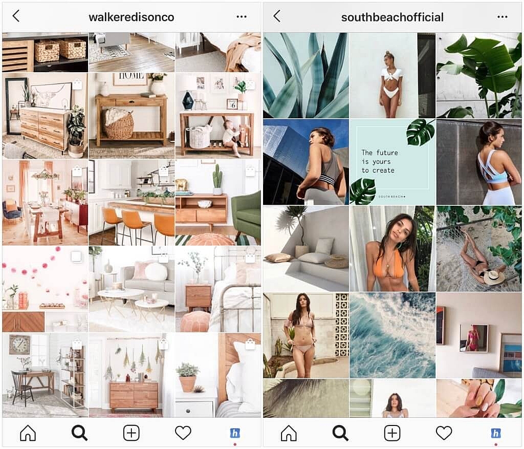
Every week users submit a lot of interesting stuff on our sister site Webdesigner News, highlighting great content from around the web that can be of interest to web designers.
The best way to keep track of all the great stories and news being posted is simply to check out the Webdesigner News site, however, in case you missed some here’s a quick and useful compilation of the most popular designer news that we curated from the past week.
Note that this is only a very small selection of the links that were posted, so don’t miss out and subscribe to our newsletter and follow the site daily for all the news.
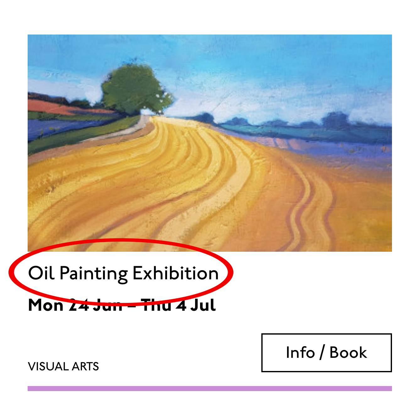
Top 19 Web Design Trends for 2019
Savee.it
32 Best Blog Design Examples in 2019
We Built a GDPR Compliant Website Analytics Platform Without Using Cookies
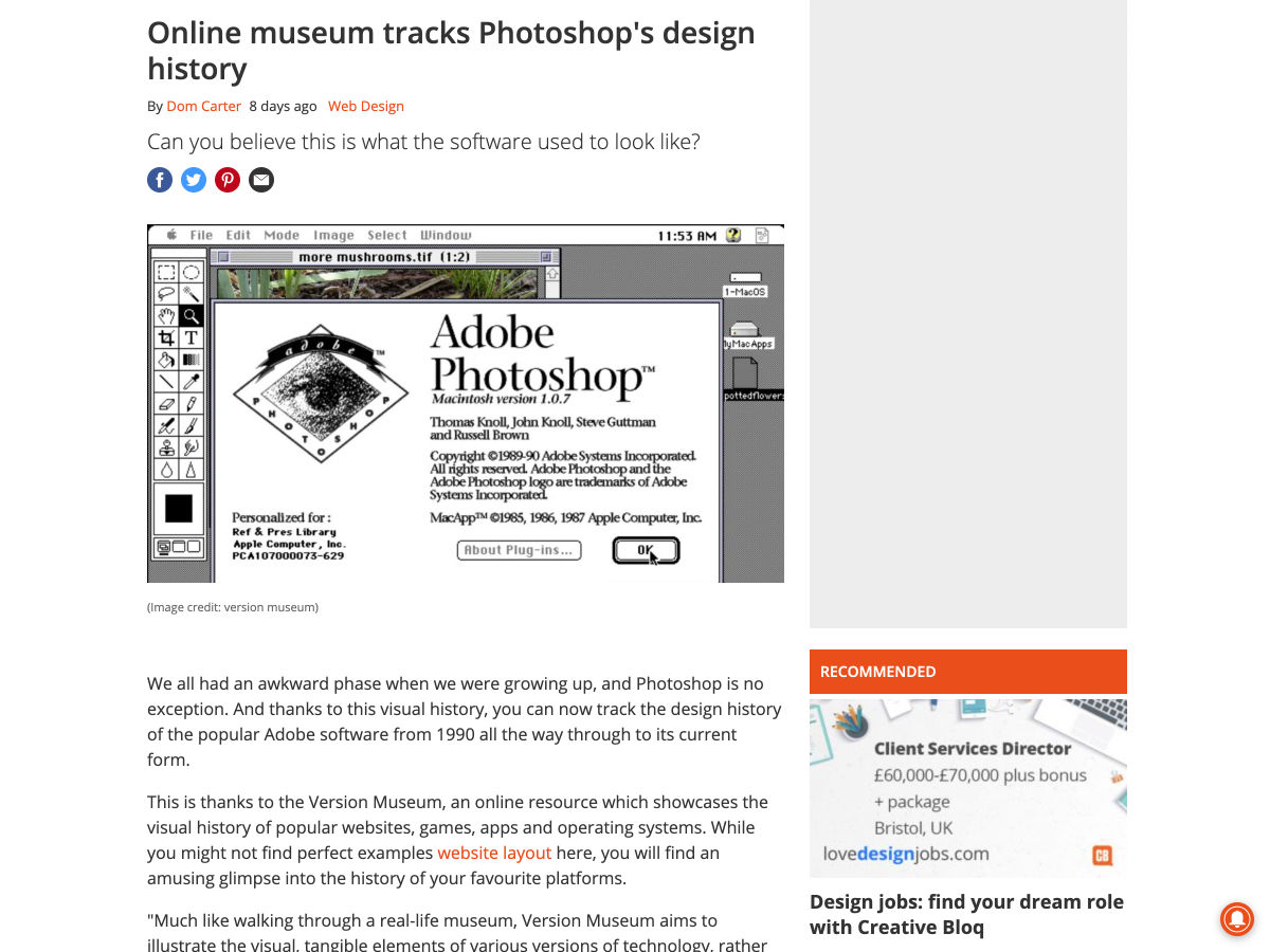
Online Museum Tracks Photoshop’s Design History
The History of Web Design
How to Build a Vue Front End for a Headless CMS
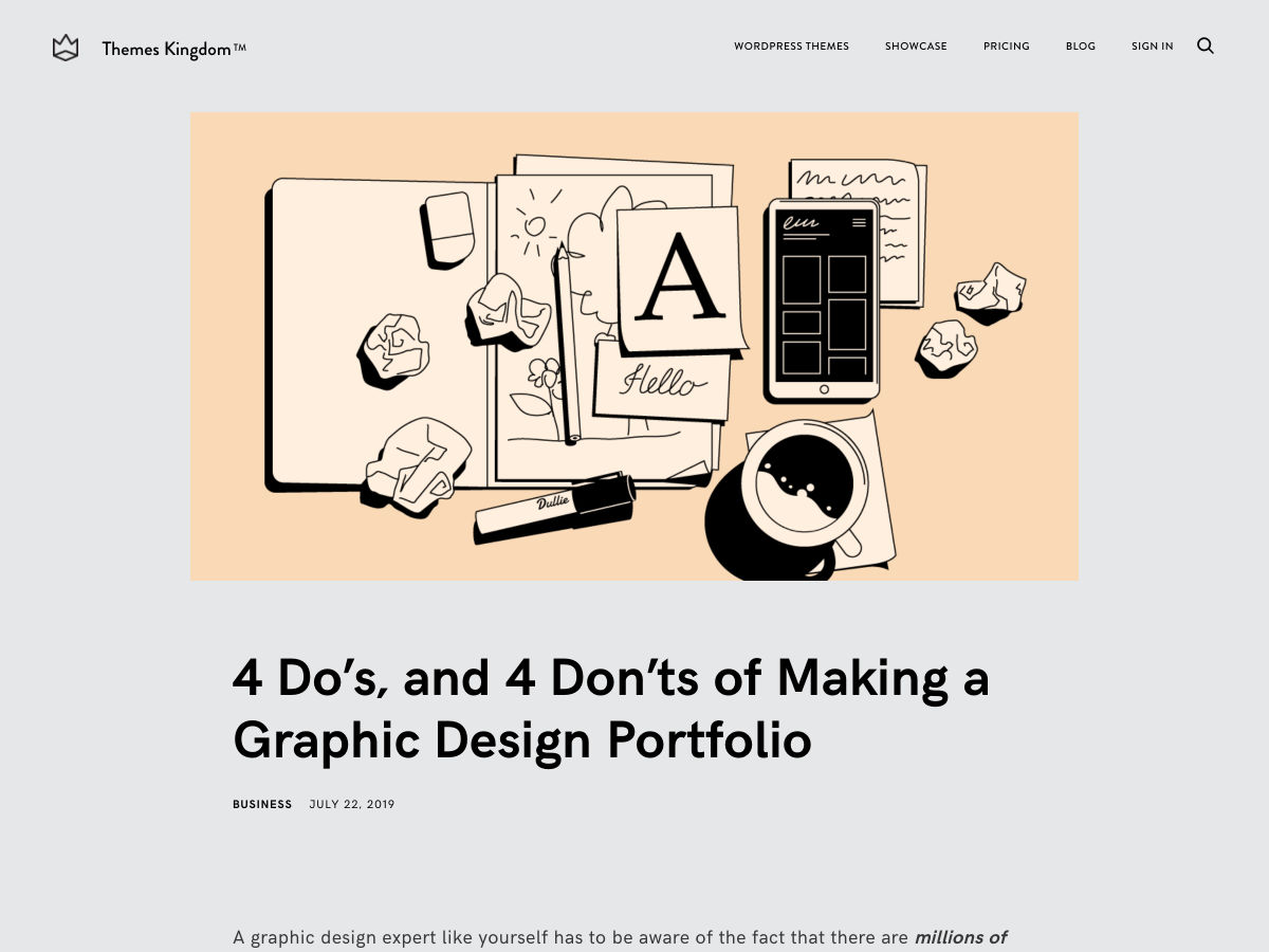
4 Do’s, and 4 Don’ts of Making a Graphic Design Portfolio
The Beginner’s Guide to CSS
Inspiring UX Designer Portfolio Examples
Output: HTML’s Native Live Region Element
11 Tips for Presenting your UI/UX Designs to Non-designers
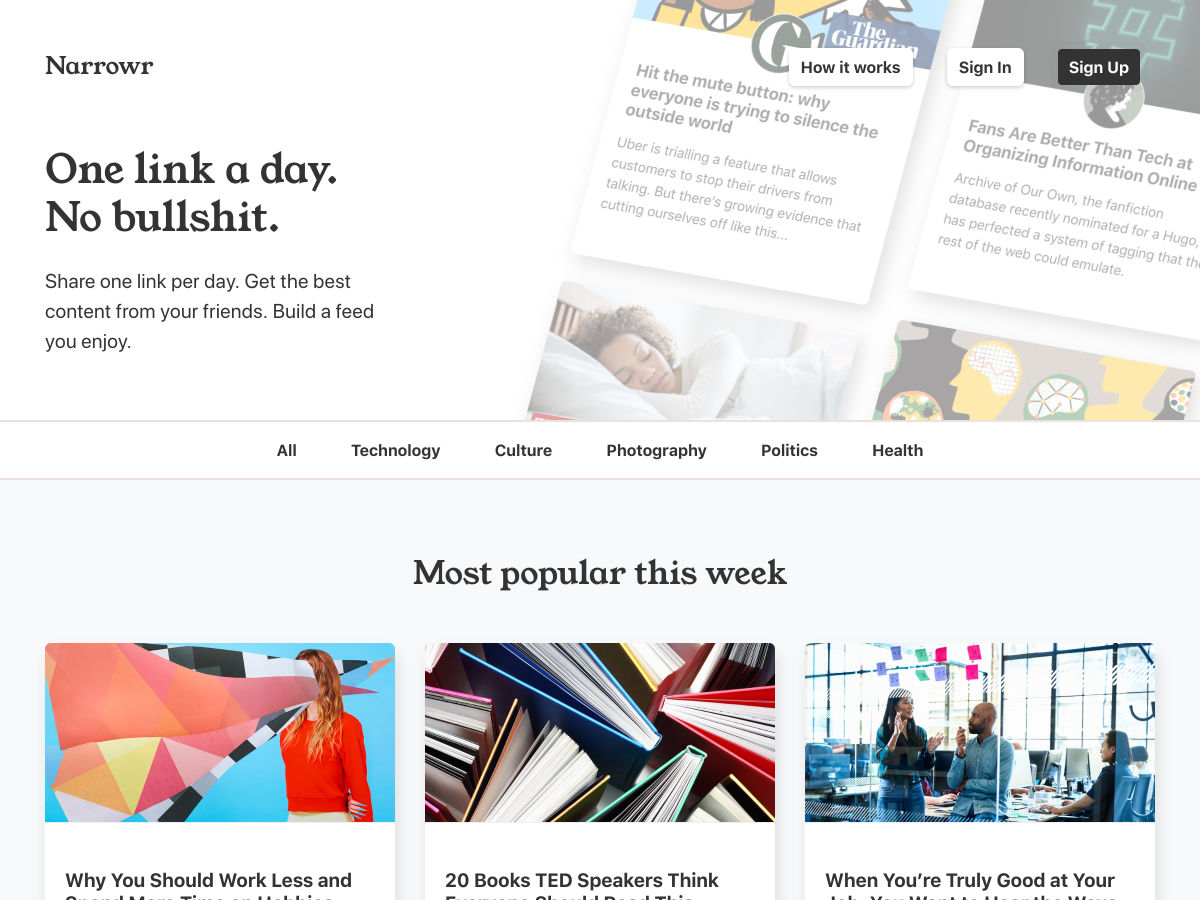
Narrowr – Share Just One Link Per Day
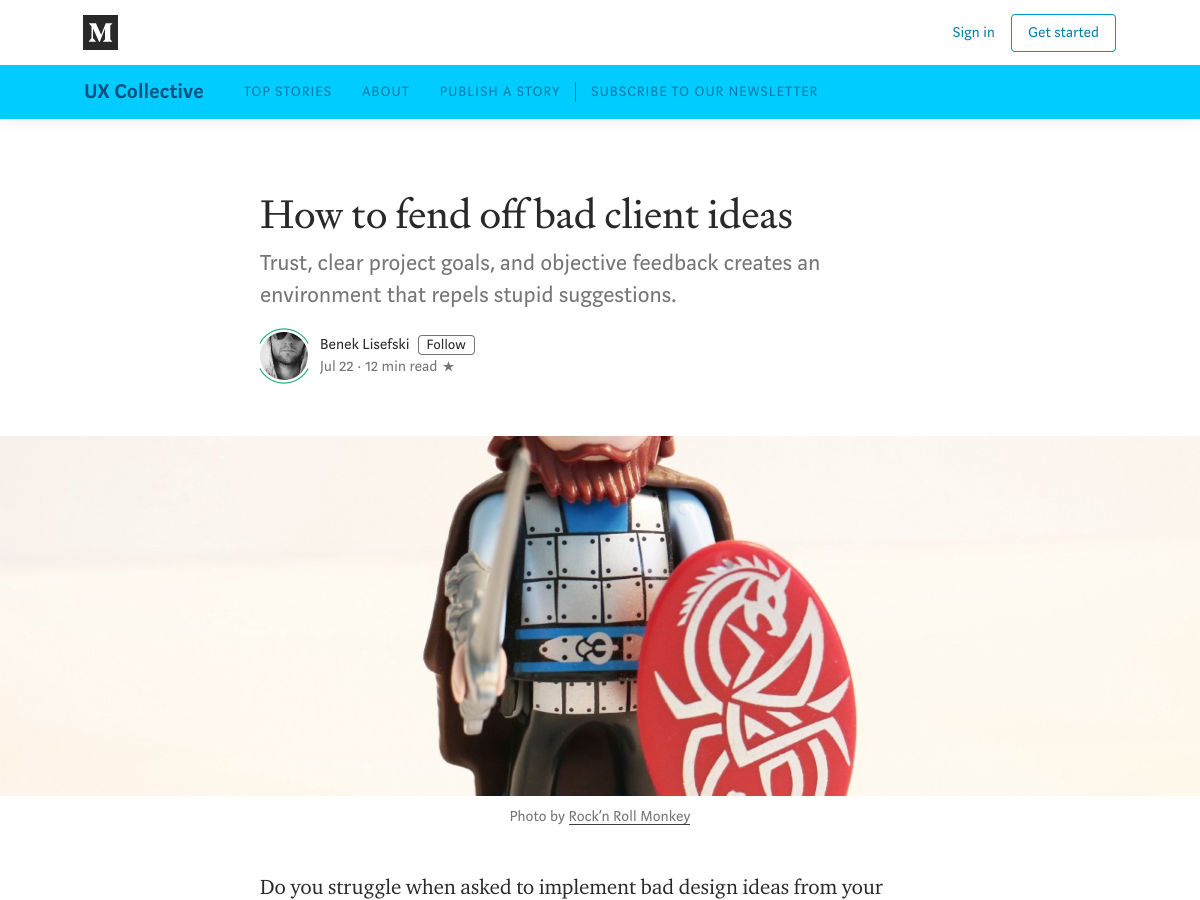
How to Fend Off Bad Client Ideas
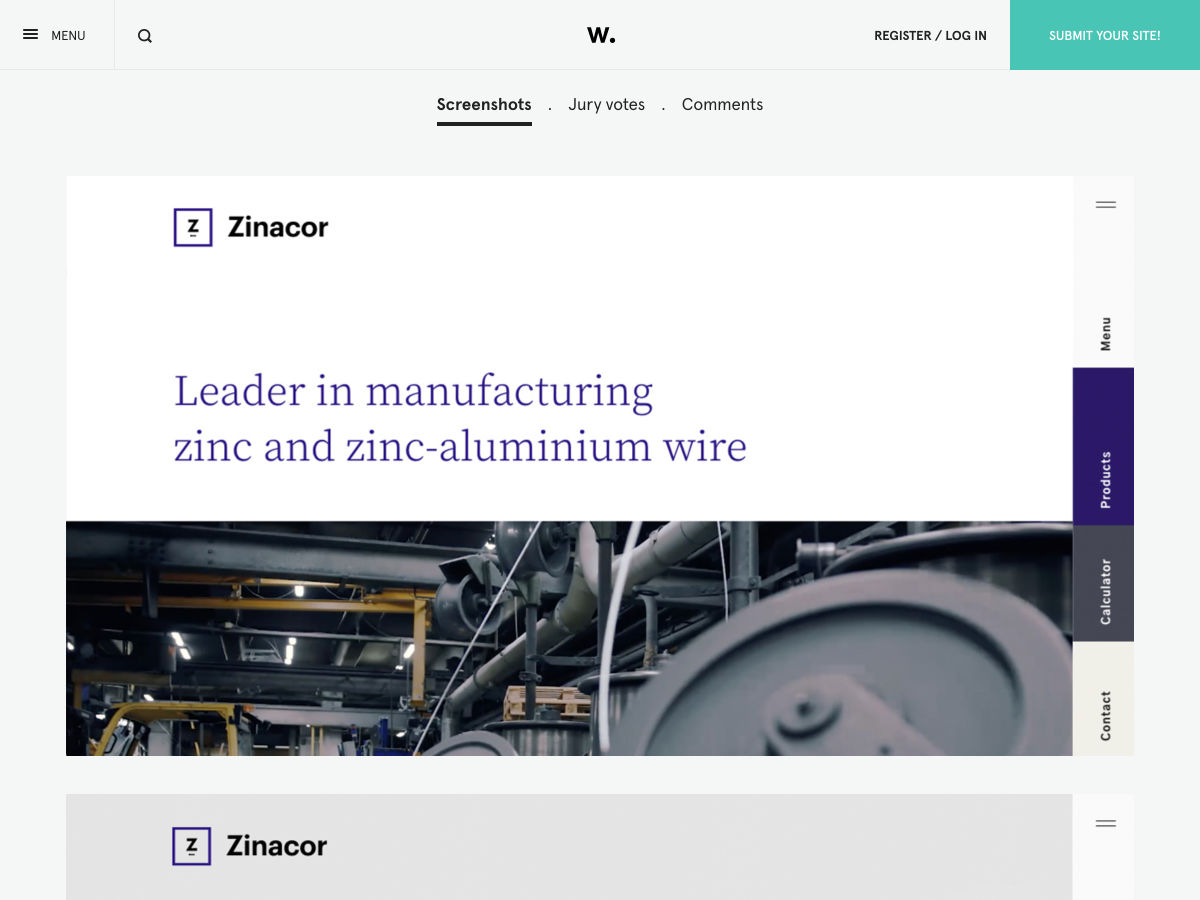
Site Design: Zinacor
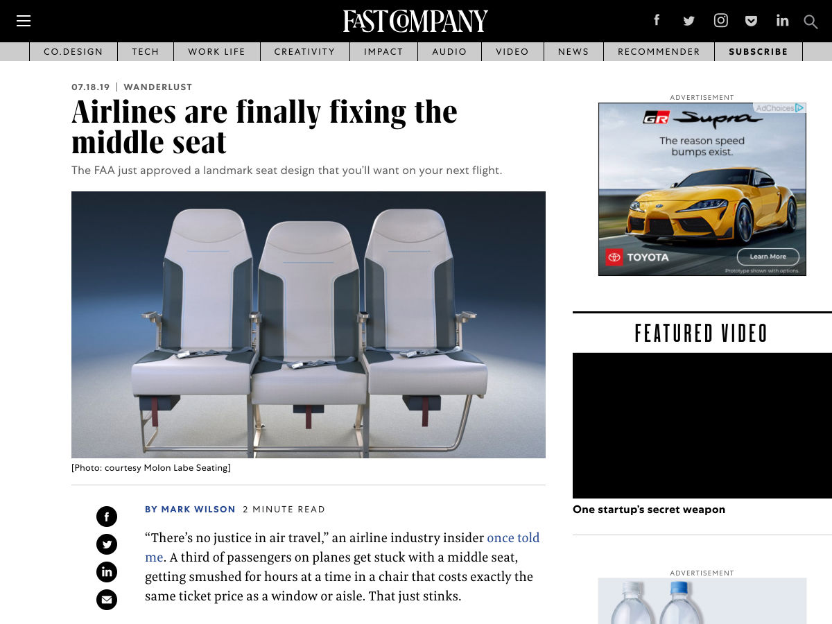
Airlines are Finally Fixing the Middle Seat
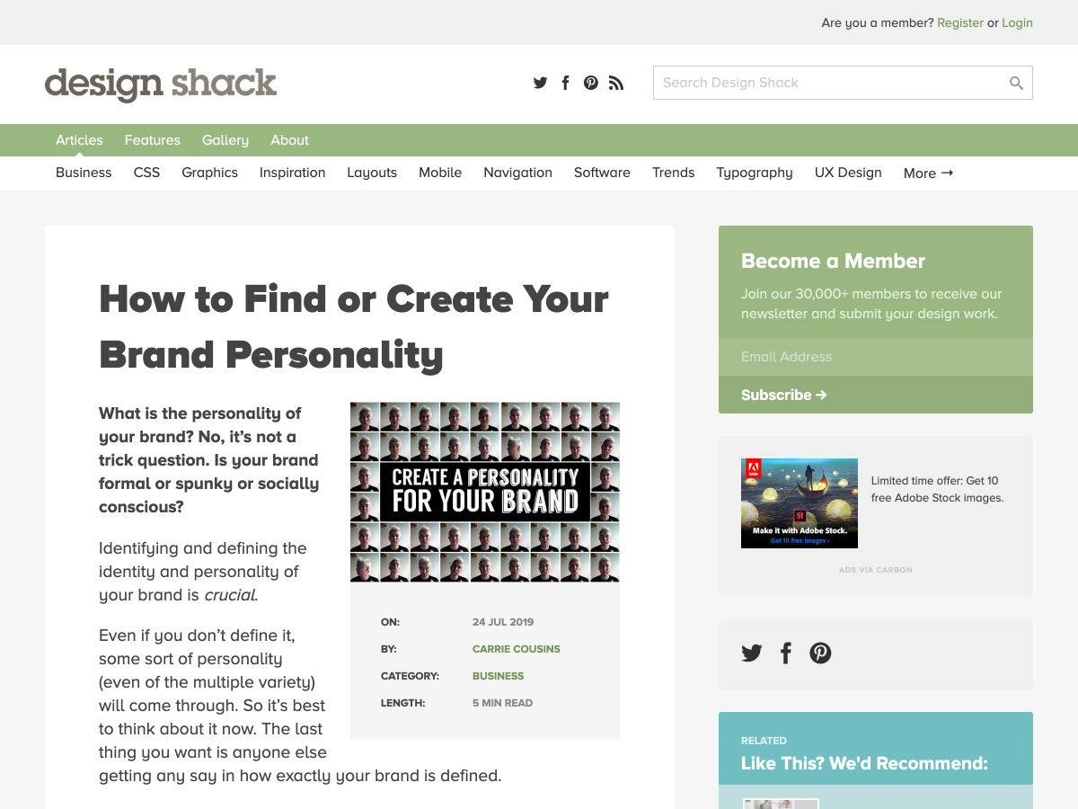
How to Find or Create your Brand Personality
Minimum Viable Design Process
A Tool to Create Printable UI Mockups and Wireframes Templates
29 Years of Adobe Photoshop Design History
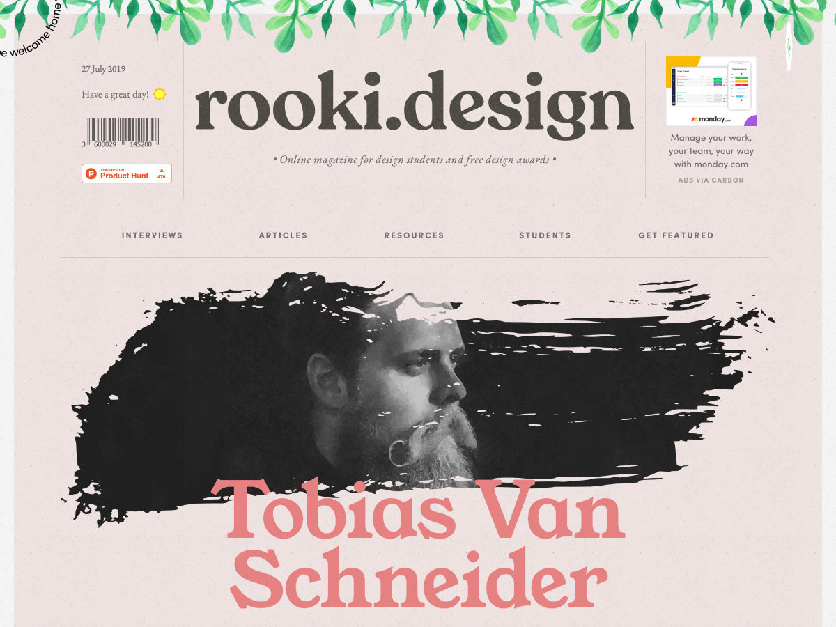
Rooki.design – The Online Magazine for Design Students
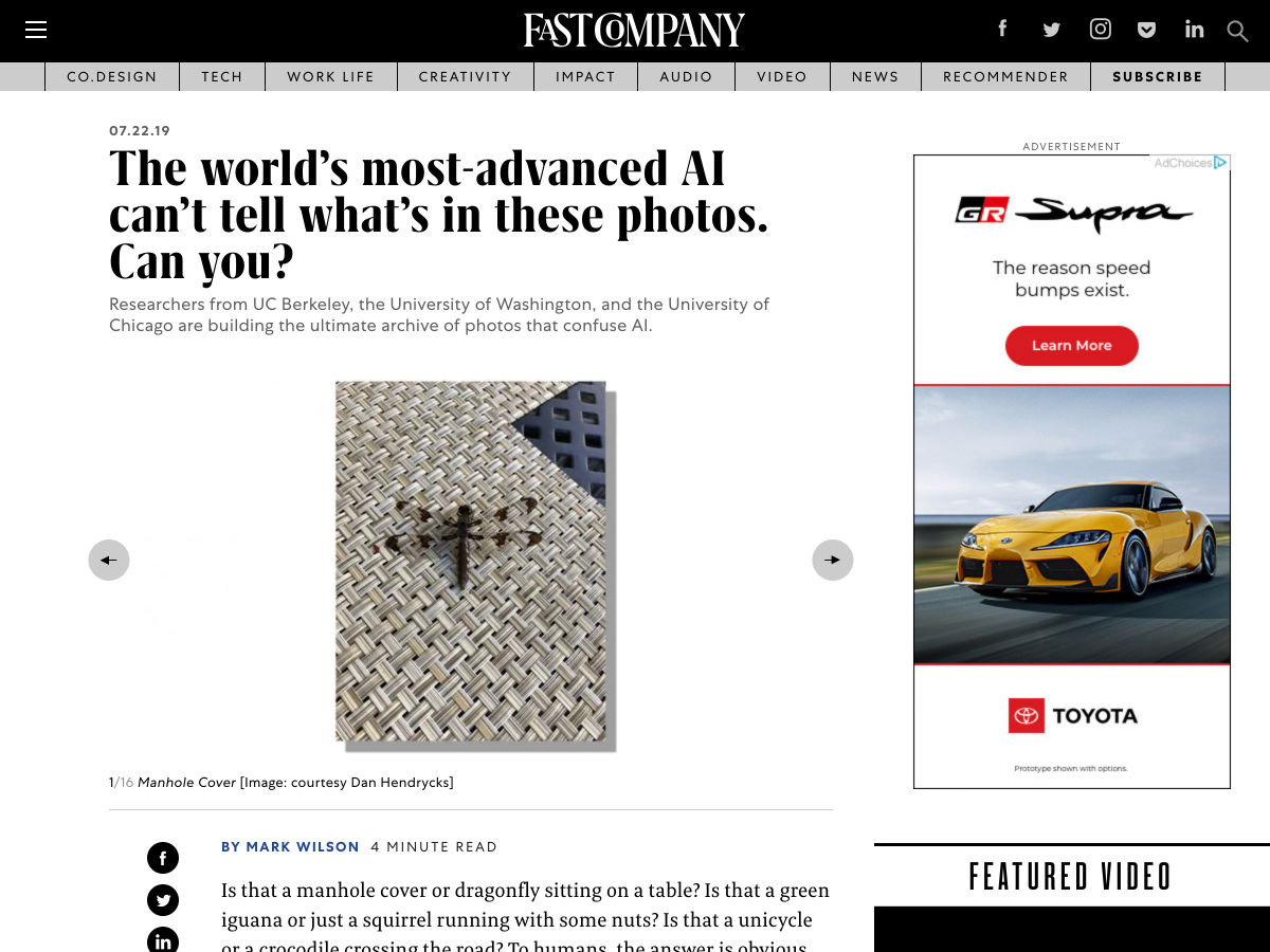
The World’s Most-advanced AI Can’t Tell What’s in these Photos. Can You?
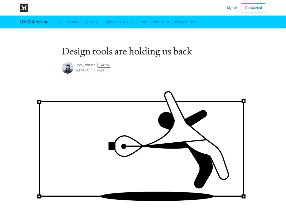
Design Tools are Holding Us Back
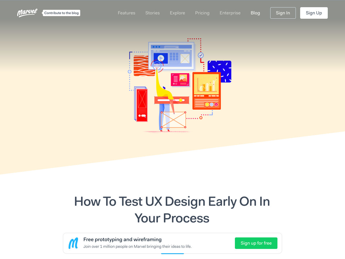
How to Test UX Design Early on in your Process
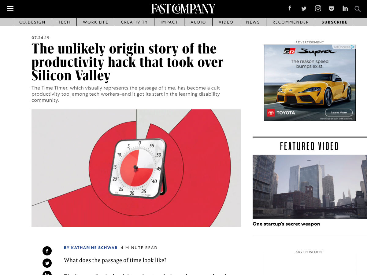
The Unlikely Origin Story of the Productivity Hack that Took Over Silicon Valley
Want more? No problem! Keep track of top design news from around the web with Webdesigner News.
Let me just frame this for you: we’re going to take a piece of production UI from a Sketch file, break it down into pieces of information and then build it up into a story we tell our friends. Our friends might be hearing, or seeing, or touching the story so we are going to interpret and translate the same information for different people. We’re going to interpret the colors and the typography and even the sizes, and express them in different ways. And we really want everyone to pay attention. This story mustn’t be boring or frustrating; it’s got to be easy to follow, understand and remember. And it’s got to, got to, make sense, from beginning to end.
I’ve asked my colleague Katie to choose a component she has designed in Sketch. I’ll go through and mark it up (we mainly use SCSS, Twig and Craft but the templating language is not very important), then she will respond briefly. Hopefully I’ll get most of it right, and then one or two things wrong, so we can look at how things get lost during handoff.
In white label or framework type front-end, the focus is on building pieces that are as flexible and adaptable as possible, as content and style-agnostic as possible (within the scope of the product), because you simply will never know where the code is going and for what, ultimately it is being used. But recently I moved to a web design agency, which has a complete inversion of this focus. It is particular. It is bespoke. It’s all about really deeply engaging with the particular client you have and the particular clients they have, and designing something that suits them, as a tailor would.
Working so closely with a graphic designer like Katie, with highly finished pixel-spaced UI, instead of directly from wireframes or stories is an adjustment and an education, but there are still lots of things I can bring to the table. Chiefly: document design.
Document design, which admittedly is just the old semantic web with an accessibility hat on, is really looking at graphic design, engaging with it as a system of communication, and translating the underlying purpose of the colors/type/layout into an accessible, linearizable, and traversable DOM. It’s HTML, kids. It’s just HTML. You’d think we all knew it by now… but look around you. You’d be wrong!
Katie has slung me a Sketch file chock full of artboards, and she’s pretty great at writing out what she wants so I don’t have to think too hard:
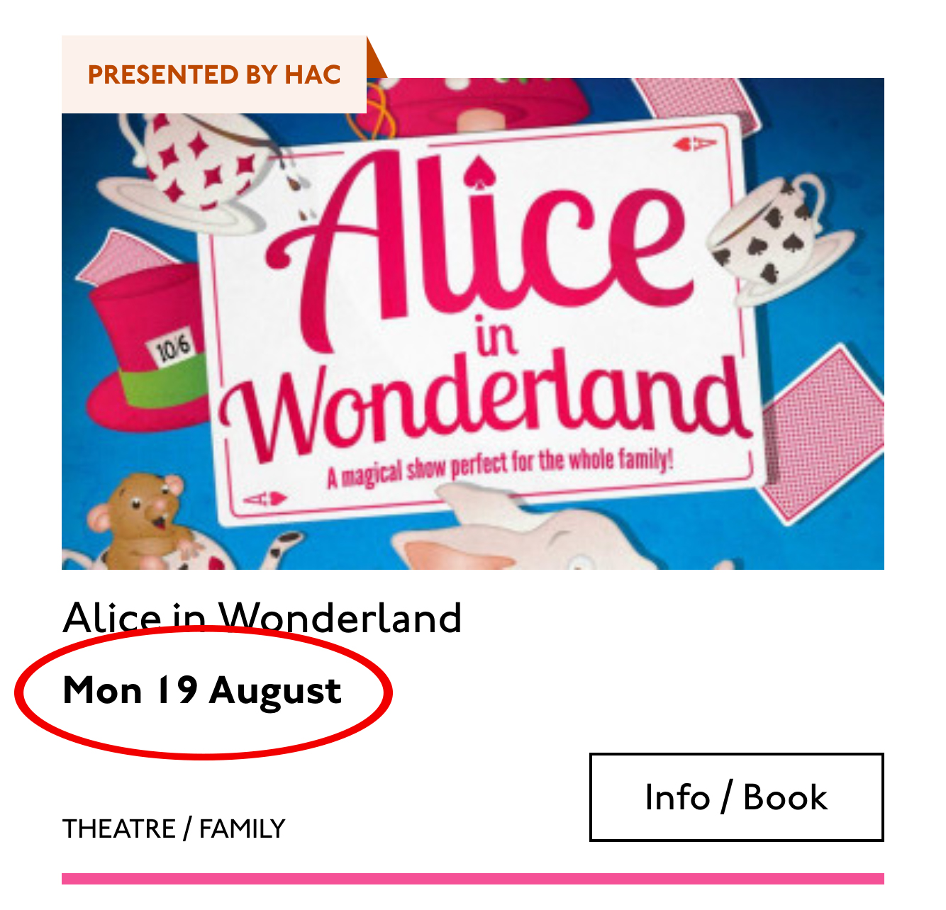
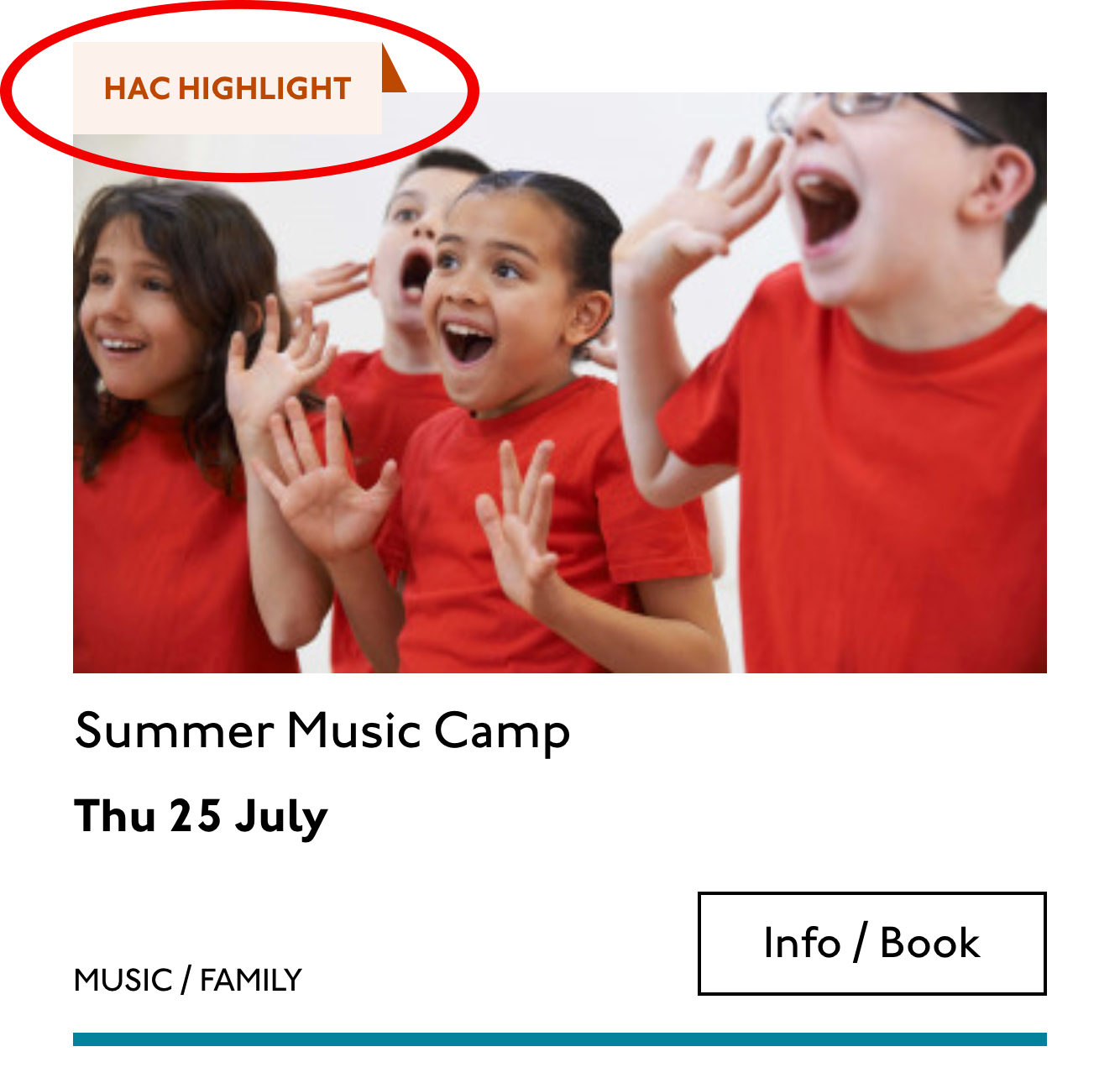
Event card
First I look through the whole UI file and figure out what is actually a card on this site — it turns out there are six or seven components that use this paradigm. Let’s make some observations:
Zoom out on section of artboardsAnother card, classes this time.
A card is a block of meta data about a page on the site.
It has an image/media and metadata — it’s a media object.
It’s shown in a group of objects.
That group is always typed (there’s no view where there are search results and news articles and classes are all mixed up).
Each object has a single link to a page and no other actions.
Each object has a call to action (Book, etc.).
Each object may have times, categories, badges, and calls to action.
Each object must have media, title, and link.
So a card is the major way my user is going to find their way around this site. They are going to be clicking through guided pathways where they get a set of cards they can choose from, based on top pages like “what’s on” or “classes.” They’re not getting options on this card. It’s not really an interactive element — it’s a guide, an index card, that sets her onto her path: in this case a purchase path where she books a ticket for a show at this arts centre.
Before going on, let me just frame this for you:
Imagine you were looking at a flyer for a show and discussing it on the phone. If you actually wanted to go to this show in real life. What would you do? You wouldn’t just read the flyer out, would you? That’s the text. And it might have all kinds of random stuff on it if you started literally at the top. You wouldn’t start with “Twentieth Century Fox” or “Buy Hot Dog Get Cola Free” or “Comedy Drama Musical Family Friendly.” (I would actually hang up on you if you did!) And you wouldn’t simply describe the color or fonts. That’s the CSS. You’d talk through the information on the flyer. You’d say, “It’s The Greatest Showman and it’s on Tuesday, starts at 7:30. It’s at the Odeon on Oxford Street by the tram.” Right?
This is the document. Keep that person on the phone in your mind.
Count, group, and name
So let’s say we’ll deliver a card as the inside of a list item. We want a group and that group should be countable. We’ve already named the page with an
so we’ll introduce and describe the group with a heading, an . First we’ll name it, then we’ll deliver it, so someone using a screen reader can:
Get the list signaled in the headings overview.
Get a count up front of the number of items on a page.
Know they can skip to the next list item to get the next card.
Know they can skip the group at any point and go to the next page — the pagination is the very next element and it will be labelled as a landmark.
In this particular case, I’m gonna wrap this whole card in an anchor element (). There’s only one link on the card and I want to front load that information so someone can click as soon as they know it’s the right card, instead of having to search forward for the action. A big clickable area is nice too, though of course that can be taken too far and make an interface a sort of booby trap! But these cards are not too enormous and I can see they have a nice gutter around them, so there’s a rest space that will reduce accidental clicking for people with more limited dexterity.
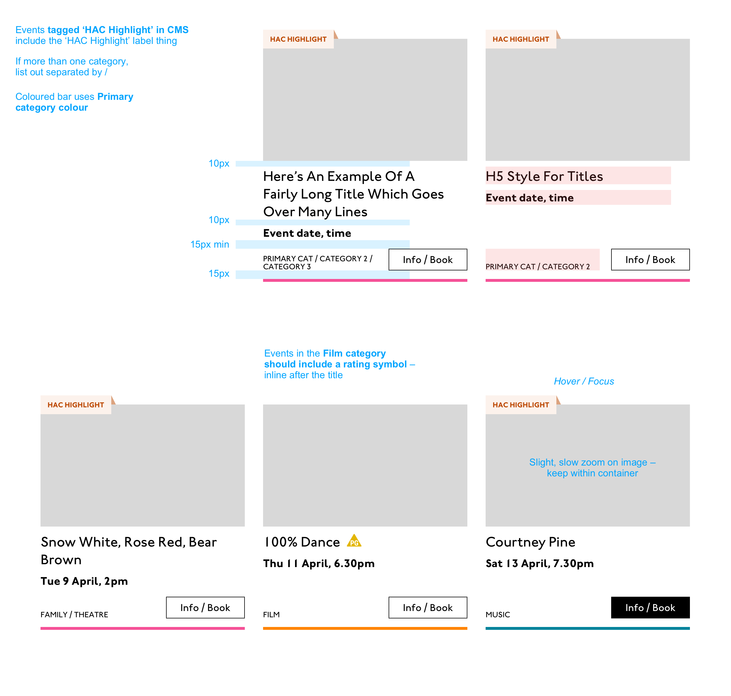
Title
Event card “title” element
Then we’ll jump down a heading level and mark up the name of each show as a heading, an
. The designer has made this type the focus and we will too. Some people browse super fast by jumping to the next heading, then next heading, so I’m not going to put any important information before the heading — they’ll jump right over it. I will put the image there, though, as I know in this case, I can’t get meaningful image descriptions from the API so those images are hidden and have empty alt attributes. Now the user can guess (correctly in my case) that the developer is actually describing the content in some meaningful way and might flip back to headings overview (list headings level 3) and just get a list of the shows.
Now let’s deliver our metadata. Let’s list it:
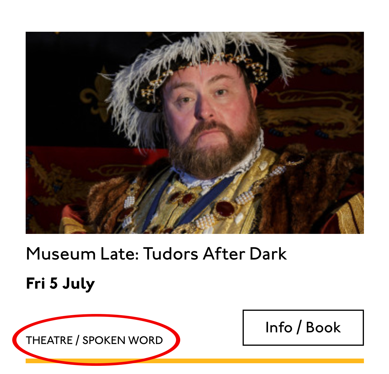
Badge
Date/Time
Categories
Badge
Event card “badge” element
This seems to be something the venue adds to a card to highlight it. As a developer, I can’t immediately see why a user would look for this, but it’s emphasized strongly by the designer, so I’ll make sure it stays in. Katie has moved the badge up out of the flow, but I know that with a headings jump our user could miss it. So I’ll just put the wording directly after the title, I think. I’ll either put it first or last, so make it easier to account for in a non-visual browse and not be too crazy paving in a tabbing, visual browse.
<p class="c-card__badge"><abbr title="Harrow Arts Centre">HAC</abbr> Highlight.</p>
…But on second thought, I won’t put an after all. It’s the brand color, so it’s really a statement of ownership by this venue, and we’ve already said HAC a million times by now, so the user knows where they are.
A quick aside: the ‘badging’ is very specific to this organisation. They want to show people clearly and quickly which events they’ve programmed themselves, and which are run by other organisations who’ve hired their venue.
Date/Time
Event card “date/time” element
Now date and time. Katie is keying me in to this decision point by styling the dates in bold. Dates are important. I’m going to pop it in an h4>, because I’m thinking it looks like someone might be quickly scanning a page of events looking for the matinee, for example, or looking for a news article published on a particular day. I don’t always put dates into headings, especially if there are millions on a page, but I do always make sure they’re in a element with a complete value so the Thu or Mon Katie has specified is read out as comprehensible English words “Thursday” instead of garblage. I could also have used hidden completion or with a title.
Categories/ Tags
Event card “categories/tags” element
Next come the categories, and I’m putting them after badge and date. This section is next in the visual order reading top-to-bottom, left-to-right, of course, but it also seems to be deprioritized: it’s been pushed down on the left and the type is smaller. This works for our linear storytelling. As a rule, we don’t want people to sit through repeated or more general content (cinema, cinema, cinema) to get to unique or more specific content (Monday, Tuesday, Wednesday). Remember, we are inside our card: we know it has already been sorted in a few general ways (news, show, class, etc), so it’s likely to have a lot of repeated pieces. We want to ensure that the user will go from specific to general if we can.
There is a primary category that is sorted first and then some other categories sometimes. I won’t deliver this as a countable list as there’s mostly just one category, and loads of lists of one item is not much use. But I will put a little tag beforehand because otherwise it’s a slightly impenetrable announcement. MOVEMENT! SPOKEN WORD! (I mean, you can work it out retrospectively, but we always try to name things first and then show them, in linear order. This isn’t Memento.) I used to use title="" fairly heavily but I’ve gotten complaints about the tooltip so I route around. Note the use of colon or full stop to give us a “breath.” That’s a nice bit of polish.
<p class="c-card__tags h-text--label>
  <span class="h-accessibility">Categories: </span>
{% for category in categories.all() %}
  <span class="c-card__tag c-tag">{{category}}{% if not loop.last %} / {% endif %}</span>
{% endfor %}</p>
Also I’m hard-coding in my spaces to make sure the categories never run together into complete garblage even with text compression or spaceless rendering turned on somewhere down the pipeline. (This can happen with screen readers and spans and it’s rather alarming!)
There’s a piece of this design I will do in the CSS but haven’t really pulled into the document design: the color coding on primary category. I am not describing the color to the reader as it seems arbitrary, not evocative. If there were some subtextual element to the color coding beyond tagging categories (if horticultural classes were green, say), then I might bring it through, but in this case it’s a non-verbal key to a category, so we don’t want it in our verbal key.
I’m sorting the primary category to the front of the category paragraph, but I’m not labelling it as primary. This is because there’s a sorting filter before this list that sorts on primary category, and it’s my surmise that it would be easier and less annoying to select a category from that dropdown than to read through each card saying Categories Primary Category Music Secondary Categories Dance. I could be wrong about that! Striking a balance between useful and too much labelling is sometimes a bit tricky. You have to consider the page context. We may be building components but our user is on a page.
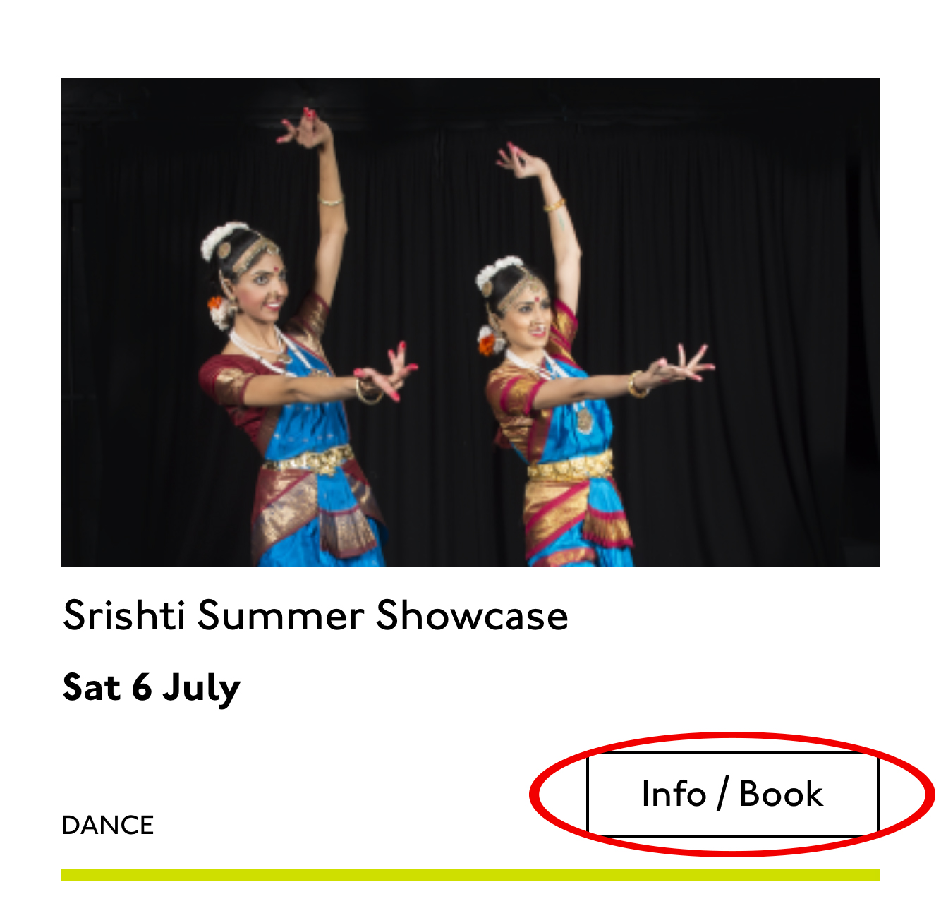
Last, the action. The direction to the user, to Book, or Learn More, or whatever it is, has been styled as a button. It’s not actually a button, it’s just a direction, so I’ll mark it up as a span in this case. I definitely want this to come last in the linear document. It’s a call to action and also a signal that we’ve reached the end of this card. The action is the exit point in both cases: if the user acts, we go to the target entry; if they do not, we go to the next card. We definitely never want any data to come after the action, as they might have left by then.
This markup, which counts, groups, and names data, delivers linear and non-linear interactions. The page makes sense if you read it top to bottom, makes sense if you read parts of it out of context, and helps you jump around.
Katie, over to you…
Katie Parry, designer
What an ace article! Really interesting. (I particularly like that “Mon,” “Tue,” etc. on cards are read as “Monday,” “Tuesday”… smart!)
One thing that struck me is that using assistive tech means users get information served to them in a “set” order that we’ve decided. So, unless there’s a filter, someone browsing for dance events, for example, has to sit/tab through a title, badge, dates, and maybe several other categories to find out whether an event’s for them or not. Bit tiresome. But that’s not something you’ve got wrong — it’s just how the internet works. Something for me to think about in the future.
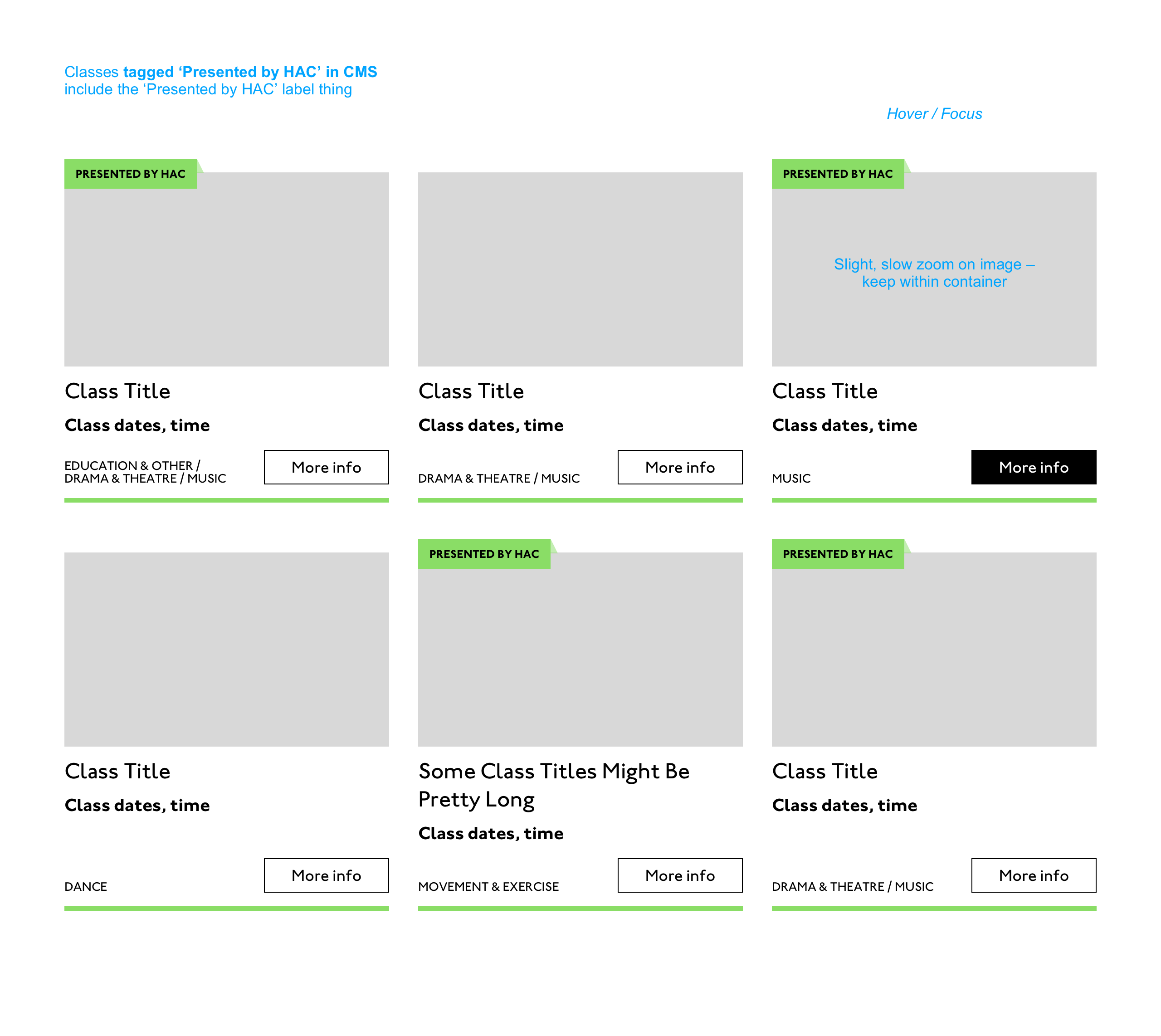
Most of our clients are arts and cultural venues that need to sell tickets for events so I design a lot of event cards. They’re one of the very first things I’ll work on when designing a site. (Before even settling on a type hierarchy for the rest of the site.)
Thinking visually, here’s how I’d describe the general conventions of an event card:
It must look like a list – so people understand how to use it.
It needs to provide enough information for folks to decide if they’re interested or not. (The minimum information is likely an image, title, date, and link.)
It needs to include a clear call to action — usually a link to find out more information.
It needs to be easily scannable, visually.
Making information visually scannable is a pretty straightforward case of ensuring every information type (e.g. image, title, date, category, link) is sitting in the same place on every card and follows a clear hierarchy.
I focus a lot on typography in my work anyway but clearly: titles are styled to be highly prominent; dates are styled the same as each other but are different from titles; categories look different again – so that folks can easily pick-out the information they’re interested in from simply scanning the page. I’m composing the card for the user, saying, “Hey, look here’s the event’s name, this is when it’s on — and here’s where you go to get your tickets!”
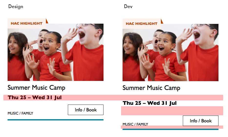
The type styles – and particularly the spacing between them – are doing a lot of work, so I will point out here that the spacings are not quite right in the code sample:
Spacing between the title and dates, dates and button, and button and piping don’t match the design.
This is important. Users need to be able to scan information quickly as they aren’t all looking for the same thing in order to make the decision to go to an event. Too much or too little space between elements can be distracting.
Some people just want a general mooch at what’s coming up at their local venue. Others may have seen an advert for a specific show that tickles their fancy, and want to buy tickets. There are people who love music but don’t care for theatre who just want a list of gigs; nothing else. And some folks who feel like going out at the weekend but aren’t that fussed about what it is they go to. So, I design cards to be easy to scan — because most users aren’t at all reading from top to bottom.
Despite the conventions I just laid out, cards certainly don’t all look the same — or work in the same way — across projects.
There is always a tension in web design between making an interface familiar to the user and original to the client. Custom typefaces and color palettes do a lot here, but the other piece of it is through discovery.
I spend time reading-up about a client, including who their audience is by reading what they say on review sites and social media, as well as working directly with the client. Listening to people talk through how they work, what feedback they get from their audience/users often uncovers some interesting little nuggets which influence a design. Developers aren’t typically involved much in discovery, which is something I’d like to change, but for now, I need to make it super-clear to Sally what’s special about this event card for each new project. I write many, many (many) notes on Sketch files, but find they can tend to get lost, so sometimes we have a spreadsheet defining particular functionality.
Have you ever had a form that needed to accept a short, arbitrary bit of text? Like a name or whatever. That’s exactly what is for. There are lots of different input types (and modes!), and picking the right one is a great idea.
But this little story is about something else and applies to any of them.
What if the text needs to be arbitrary (like “What’s your favorite color?”) so people can type in whatever, but you also want to be helpful. Perhaps there are a handful of really popular answers. Wouldn’t it be nice if people could just select one? Not a , but a hybrid between an input and a dropdown. Hold on though. Don’t make your own custom React element just yet.
That’s what is for. I just used it successfully the other day so I figured I’d blog it because blogging is cool.
One for a “flag” (an aribtrary string representing a permission)
I probably wouldn’t do a for every username in a database. I don’t think there is a limit, but this is sitting in your HTML, so I’d say it works best at maybe 100 options or less.
But for that second one, we only had maybe 3-4 unique flags we were dealing with at the time, so a datalist for those made perfect sense. You can type in whatever you want, but this UI helps you select the most common choices. So dang useful. Maybe this could be useful for something like a gender input, where there is a list of options you can choose, but it doesn’t enforce you actually choose one of them.
Even lesser known than the fact that exists? The fact that it works for all sorts of inputs besides just text, like date, range, and even color.
Can you afford to gamble on an idea for an app or on an assumption about how consumers will respond to it? I bet your clients aren’t too comfortable doing that either, especially when it’s their money and reputation on the line.
An app can be a risky investment for a business if it’s not approached with care. Even then, the most well-researched of app concepts can lead to disappointing user download and retention rates.
Whether you’re in the business of building mobile apps or SaaS products, have you thought about using minimum viable products (MVPs) to safeguard your clients’ investments?
Not only do MVPs allow you to get projects through your pipeline more quickly, but they enable developers to create stronger products overall for their clients.
Here’s what you need to know.
The Value Of MVPs In App Development
Frank Robinson was the first to define what an MVP was back in 2001. At its root, an MVP is a scaled-back version of a product that’s released to the public for the purposes of testing and validating the product’s concept and viability on the market.
Eric Ries, the author of The Lean Startup, was one of the early advocates of MVPs and he had some interesting things to say about why and how we should use them back in 2013:
The point isn’t to create leaner products. It’s to get the most basic version or concept of an app into the hands of adopters and evangelists. That way, the developer collects user feedback early on that, in turn, is used to properly shape the product into its final version.
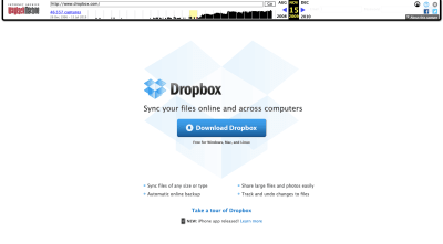
Take Dropbox, for example. This is what the product’s landing page looked like back in 2009:
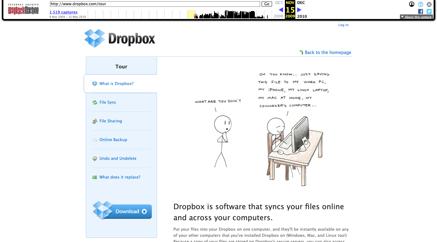
It’s a simple page that includes the company name, an explanation of the software and a link to download the desktop or mobile app. For users that want to know more about what they’re getting, the “tour” took them to a mini-site with more information:
Dropbox’s MVP provides basic details on its software. (Source: Dropbox) (Large preview)
That’s a far cry from the powerhouse storage, content creation and collaboration service that both consumers and businesses use today:
But that’s the beauty of the MVP. Essentially, it forces developers to build products with only the minimum — but absolutely essential — set of features.
Dropbox didn’t need to foresee the power of cloud storage services or to create something that wasn’t right for the market at the time. All it needed to do was launch a simple solution that users needed then and there. Users could then validate the product and provide the company with the direction it needed to take its product.
There are other benefits to creating an MVP:
You can get the product on the market much more quickly than if you were to wait for the full app to be developed.
You get a chance to test the viability of the concept before you commit too many man-hours to the job.
You give yourself more room (and maybe even a little forgiveness, too) to work out the kinks in your final product.
You save money with an MVP. First, because you only spend time building features that are absolutely needed. Second, because you might find that users are content with the scaled-back version and you won’t need to do much more work to finalize the product.
With a tested idea that’s been embraced by users, you have something to bring to investors which could make the rest of the development process go much more smoothly.
As Eric says in the video, an MVP is the best way to maximize your chances of success and to do so in a much shorter timeframe than complete product development allows for.
How To Build A Valuable MVP That Users Want to Test
Your MVP’s success rides on its ability to leverage insights and feedback provided by early adopters — the ones who are 100% on your side, believe in the product and want to help you fill in the gaps. So, don’t lose sight of that.
An MVP is not some half-assed app thrown together. It still needs to be valuable.
Here are some things you must do before you build and launch your MVP:
1. Decide the Product’s Purpose
If you want your app to succeed, it needs to uniquely solve a problem for a large segment of the consumer base. That means your MVP needs to clearly break down what the product does and why users need it.
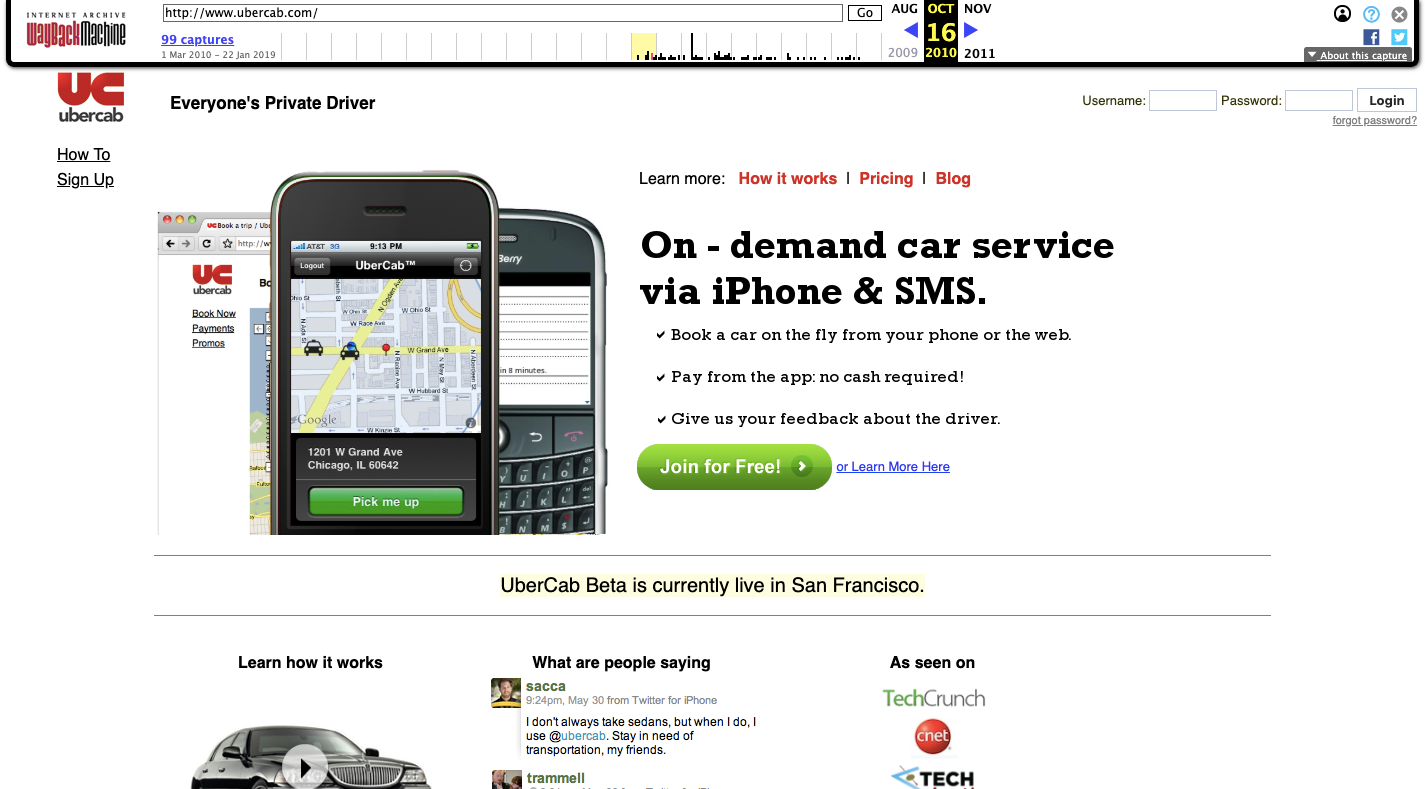
For example, this is how Uber (then UberCab) sold itself during its beta in 2010:
The website for Uber’s predecessor, UberCab, in 2010. (Source: Uber) (Large preview)
Like the Dropbox example earlier, it’s extremely simple in concept and no-frills in terms of explaining what it is or why it’s so valuable. But you still get the idea. It’s an app that lets people order and pay for a car from their phone. Essentially, it’s a convenient substitution for cabs.
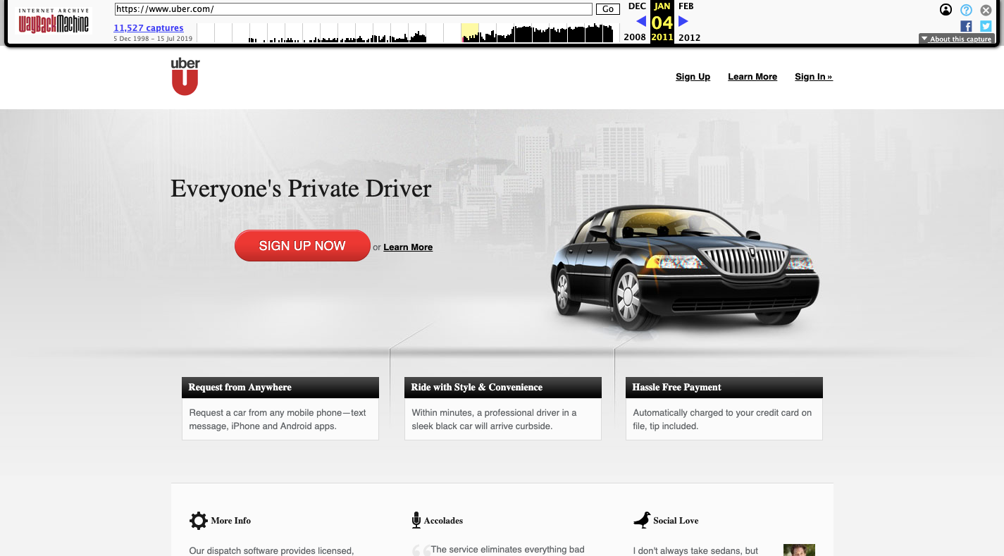
Jump ahead a year, you’ll see that Uber started to firm up its identity and value proposition with its official product launch:
Uber starts to refine its image in 2011 after beta testing completes. (Source: Uber) (Large preview)
This was back in 2011 when Uber dropped the “Cab” and labeled itself an on-call private driving service. It was a way to let consumers experience certain luxurious privileges they might not otherwise have been able to afford.
Although that’s not the final form Uber ended up taking, you can see how early user feedback helped the product developers decide which parts of the platform were really worth highlighting and building upon.
This is exactly the kind of thing that will happen when you build an MVP and start to gather valuable insights from users about what they want and which features they need. But, first, you have to start by getting clear on its general purpose and value. You can refine it later on.
2. Locate Your Ideal Users
You have your concept. Now, it’s time to figure out if consumers are going to want it. Even though an MVP is cheaper and faster to build doesn’t mean it won’t end up a complete waste of your time and resources. You have to at least confirm that the interest is there and then define, in clear terms, who your target user is.
Specifically, you need to think about location.
In the Uber example above, you can see that the beta product was only tested in San Francisco.
The initial version of Airbnb did something similar. Joe Gebbia, the co-founder of Airbnb, tells the story of his MVP on a 2017 episode of How I Built This.
Basically, he was low on cash and decided to rent out air mattresses in his San Francisco apartment for an upcoming conference. Knowing that hotels would be short on rooms, he figured he could make money off of it. But it wasn’t just rent money he made. He got an idea for a new business after a lot of people showed interest in renting space in his apartment.
So, he and his partner created a website called “AirBed & Breakfast”. Once it went live, though, it spread far beyond the original San Francisco test area.
An early version of the AirBnB concept from 2009. (Source: Airbnb) (Large preview)
In 2009, there were AirBnB rentals in 72 countries. Today, you practically have your pick of the litter in any town around the world. But it all started with San Francisco.
So, as you set about building your product, think about where the best places will be to test and get feedback on your app before you do a full release of it. You want the area to be a good representation of the population and demographics you aim to target. You also have to make sure there’s a demand for the product and that your target users can afford to use it (once you start monetizing).
3. Choose an MVP Format
The format of your MVP is another important thing to think about before you do any building.
In some cases, you’re going to have to build a workable product. For example, let’s say your goal is to build a new dating app. There are tons of dating apps on the market; with two apps, in particular, that continually dominate the pack. You know that building any sort of mobile dating app would be a huge and costly gamble, no matter how much you cut back on features. So, what do you do?
You could build a PWA dating app instead. The costs would be lower, the time-to-market significantly faster and it would be much easier to get your MVP in front of users than if you were to put something on the app store. You might even find that the PWA suffices in terms of product format in the end.
In other cases, the MVP won’t even need to be an actual product. It can just be a website announcing the product or providing a wireframe/prototype of the concept.
In 2018, Rand Fishkin announced that he was leaving Moz, the company he co-founded in 2004. Simultaneously, he announced a new product called SparkToro.
The SparkToro MVP landing page describes the upcoming product, but doesn’t provide access. (Source: SparkToro) (Large preview)
Now, Rand is someone who can launch a concept as an MVP and for it to still be successful. He has a long-standing history and solid reputation in this space, so, of course, users are going to gravitate to this new product despite it being unavailable for consumption.
For those of you building an MVP for a new brand, you probably won’t get so lucky. However, it’s really going to depend on what type of product you’re planning to build.
If there’s absolutely no way to create the product in a scaled-back version, then this could be an option worth exploring. It would also be a good idea if you or your client have absolutely no funds and need validated feedback to prove the viability of your concept to investors. That’s really the only way I see Joe Schmoes getting away with this.
If you do go this route, you’re going to need a really good explainer section, too. This is what SparkToro has on its What We’re Building page:
SparkToro’s website explains what it’s working on building. (Source: SparkToro) (Large preview)
I think for the kinds of users that would gravitate to a product like this — namely, advanced marketers that actually need this kind of solution — this way of testing the concept and viability of the features is good. It’s written in their language and with visuals they understand.
However, for users that aren’t familiar with your brand or aren’t as well-trained as Rand’s audience, a wireframe or prototype of the product’s dashboard would be a better idea. Even an explainer video from the founder would work well. It just needs to be something that convinces users to sign up and start providing feedback as early as possible.
4. Find Your Actual Minimum
If you watch the video of Eric Ries, you’ll see that he provides a formula for defining the minimum features of your MVP. It goes like this:
# of minimum features you think you need / 8 = The True Minimum
It makes sense if that formula makes you feel apprehensive. But think about it like this:
You build an MVP that is as simple as it can possibly be without it becoming useless. You ship it out to users and give them a chance to provide feedback.
A few things might happen as a result:
They absolutely hate it.
They complain to you about how Feature A sucks and how they wish it did something else or how Feature B was almost there, but then fell short of expectations. That’s perfect! Your test users will tell you exactly what they want from your product. Get enough consistent feedback and you’ll have a list of must-have features that need to appear in the next version of the app.
They’re okay with it, but don’t love it… yet.
Again, it’s okay if users aren’t 100% happy with it. You’ve given them an opportunity to try out a product that’s going to be awesome and they see the promise in it. Give them a chance to speak their mind and let you know what they loved and what they didn’t. Then, focus on strengthening those weak points and including the features that will make it a real game-changer.
They’ll love it as is.
Let’s be honest, this isn’t likely to happen. But wouldn’t it be great if feedback was so scarce that you could roll with the MVP as is? Plus, think of all that time you saved yourself and money you saved your client by cutting the product back so much. Sometimes simpler is better.
Don’t forget to thank these users for their feedback and support of the product. There’s no way you could create the solution they need without their insights and so it would be in your best interest to recognize the role they play in this. In return, they’ll continue to be your product’s evangelists long after launch.
5. Design Your Landing Page Early
Although I’m not too keen on a landing page or mini-website serving solely as the MVP (for the aforementioned reason), I do think it’s a good idea to get a mobile-first landing page up while the MVP is in the works.
Gaming apps and SaaS would be especially good choices to launch a beta signup page early. Here’s an example from Hytale:
Gaming app Hytale uses its landing page to educate users on the game and get beta users before launch. (Source: Hytale) (Large preview)
If you want your MVP to succeed, you should put some of that extra time you now have towards building out a strong landing page. Start by researching the early websites from the companies featured in this post. They all successfully explained their concepts, soft-marketed their products and convinced early users to sign up for testing.
While you’re at it, you should set up your blog, social media accounts and community features (with an active newsletter), too. You never know. Someone might find the announcement of your MVP somewhere other than Google search and decide they want to bookmark the site or sign up early to be a beta tester.
It’s never too soon to start getting buy-in from your user set!
6. Define Your Success Criteria
Last but not least, you have to decide how you’re going to measure the success of your MVP. Because it’s not just about the quality of feedback.
Consider the following:
How many visitors visited your landing page?
How many of those people signed up for the beta?
How many users did you retain over a set period (1 month, 3 months, etc.)?
How many people provided feedback and was it a substantial enough set to make solid decisions about the product design and features going forward?
Did the demographics of your user set match the audience you designed the app for? Why do you think that was?
How much time, on average, did users spend inside the app?
Which features did they spend the most time with? The least?
Which features received the most favorable feedback? The least?
Were there certain users who had a positive experience with the product? What made them different?
Take all of the information you gathered — from the original landing page, the beta testers, the usage data and so on — and really look over it all. What is it telling you about the MVP you’ve designed? And, now, what are you going to do with it?
Will you leave it as is or build it out to the full product it’s meant to be and that users want?
Will it be easy to attract and acquire customers based on the usage data you’ve collected? What’s more, will you be able to retain those users or is it more cost-effective to keep your app browser-side instead of in native app form?
And, finally, how much can and should you charge for access to the product? Will it ultimately make the company profitable or is there just not enough interest (at least in the monetization side of things) to make this a worthwhile venture?
I know I’m leaving you with a lot of questions, but there’s a lot you’re going to need to sort out once the tests begin. Plus, it’s the whole reason you created an MVP in the first place. This user feedback is invaluable to the process and is the only way you’re going to know if it’s a product worth pushing out to the market or taking back to the drawing board.
You’re going to have build your site in such a way that the eye is naturally drawn from one step to the next.
My sister used to accomplish controlling my focus by sternly, but calmly, telling me to “Get back to your schoolwork” anywhere from fifteen to forty times in a single day. But your users aren’t going to put on some music and “buckle down” to finish browsing your website, they need to be drawn in.
The Call to Action—that “Buy” button, for example—needs to look good.
1. Contrast
The first and easiest way to catch the eye is to use contrast. By “contrast”, I mean that the important elements of a design need to stand out from the rest in a meaningful way. See what I did there?
Now, there are several kinds of contrast to discuss:
Light/dark contrast
Color contrast
Size contrast
Contrasting styles
Most of these are fairly self explanatory, but let’s go over them.
Light/Dark
Light things stand out from dark things, and vice versa. Pretty simple, right? Well… that depends. If most of your site is pretty bright, then making your Call to Action big and dark (or at least a bit darker than everything else) makes sense.
However, there are lots of designs out there where high light/dark contrast is a feature of the entire layout, and that contrast is used to give everything a sense of structure. In that case, you’ll need to use another kind of contrast to direct people’s focus.
Color
Okay this one is self explanatory. A splash of color, or even just a different color, is enough to make things stand out. In this example, color is used to cut through a lot of typographical noise.
Size
Make the important buttons bigger than other buttons. Make your headline text bigger than other text. Size contrast can not only make things stand out, but also help to establish hierarchy in the page.
Style
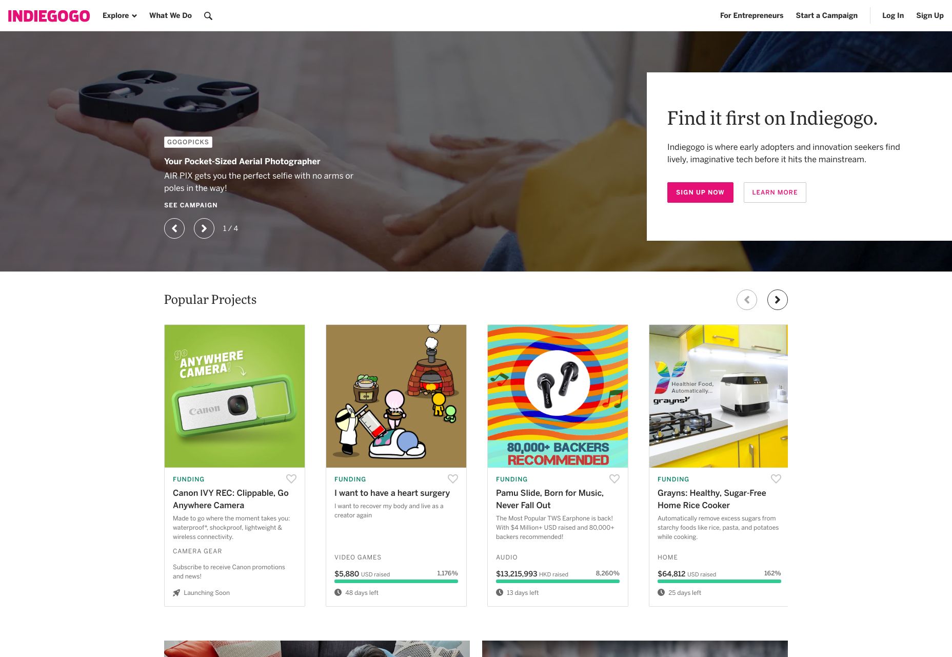
A difference in style can be illustrated by something as simple as the bold text joke I made earlier. But to look at a more UI-focused example, let’s talk about “Ghost buttons”. Ghost buttons are buttons with an outline, but no background color, and they’re often used in combination with regular buttons, like on the home page of IndieGoGo:
I bet you can tell which button they really want you to click on. The stylistic contrast makes this clear.
2. Images
Whether we’re talking about photography, illustration, painting, or 3D graphics, images grab eyeballs. You can redirect anyone’s attention easily enough with a picture. The only real exception to this would be pictures that are surrounded by other pictures.
You can use images as the objects of focus on their own, of course, but you can also use them to draw the eye to other things, such as text or buttons placed on top of them. You didn’t think those were just pretty backgrounds, did you? That may have been how things started, but everything is a lot more calculated these days.
If you really want to go all out, place your call to action in such a way that it looks like the picture is pointing to it. This is what your manager would call “synergy”, and it tends to work, despite sounding so very corporate.
3. Animation
And if you think we like pictures, let me tell you about moving pictures. No but seriously, if there’s nothing more interesting going on in a room, my eyes will inexorably be drawn to any TV that’s been left on, no matter what’s playing. It could be sports, daytime talk shows, or even a soap opera, and I’ll have trouble looking away. Most of us would.
Motion just catches the eye that way. It started out as a survival reflex, and now we just have to know if Brian will ever regain his memory and marry Patricia, or if she’ll remain forever trapped by his evil twin Drake. Use that reflex to your advantage, by incorporating some light animation into things like buttons, helpful tooltips, and any text you really want people to read first.
4. Convention
Lastly, take advantage of your user’s default behavior patterns. As web users, most of us have been trained to look for navigation near the top, Calls to Action right under that, and more CTAs at the bottom. Putting important bits of information and functionality where people expect to find them is a perfectly valid strategy.
Also keep in mind whether you’re designing for people who read right-to-left, or left-to-right. English speakers, for the most part, will look at the left side of their screen first, for example. While there is something to be said for breaking the mold, never underestimate the power of simple yet deeply-ingrained habits.
5. Use Emphasis Sparingly
When everything is bold, bold text just tends to blur together, rather than burning important information into the user’s brain. When there are many pictures on a page, and you’re not running a photography portfolio, users may just get distracted. And don’t get me started on the overuse of animation. When everything’s moving, how do you expect them to read any of your text that’s more than a sentence long?
To really draw and focus your user’s attention on one or two things, you need to eliminate, or at least deemphasize things that might compete for their attention. Compete with other sites, not your own content.
With over 1 billion monthly active users, Instagram is continuing to grow and maintains a powerhouse for brands and individuals to share their stories and content.
Instagram offers a platform for creatives and creators to share their work, build a community and make money. Many small businesses and freelancers have started out on the app and grown a brand by posting great content and growing a following.
It’s therefore a great place for photographers to showcase their work, promote upcoming shows, and connect with our artists. Those aiming to promote their services, such as wedding photographers, can use Instagram to reach potential clients and build their personal brand.
However, with more than 100 million photos and videos being uploaded to Instagram every day, and updates to the algorithm changing the way our posts are seen, it’s difficult to grow an Instagram account and stand out. As well as this, photographers and business owners running their Instagram accounts professionally have large volumes of content to manage, which gets increasingly cumbersome on mobile.
Here are 5 reasons why Instagram scheduling is a must for your social media strategy:
1- Post To Instagram From PC
One of the best things about scheduling to Instagram in advance is that you can post straight from the desktop without having to transfer files to and from your mobile. This is not only a huge time saver and efficiency enhancer, but is also good to reduce screen time on the Instagram app — particularly helpful for people who do not want to be on their phones at work.
A great perk for photographers is that most Instagram scheduling tools offer upload from a number of cloud services such as DropBox and Google Drive, so no matter where you store your content, you can easily share it to Instagram without hassle.
2- Organisation & Time Saving
When trying to manage multiple social media channels, large volumes of content, and follow a marketing strategy, it can be difficult to feel on top of everything.
At Hopper HQ, we spoke to social media managers at brands and agencies, and 60% of them said they struggle with time constraints.
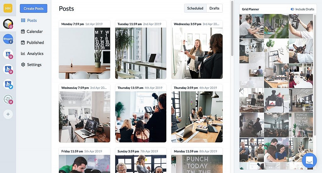
Managing and scheduling Instagram posts in advance reduces the amount of time spent switching between apps and folders. As well as this, you generally feel more organized as you have a visual way of seeing exactly what posts are going out when, for the weeks or months ahead.
3- Plan Your Feed
With the help of an Instagram scheduling tool, you can take your account to the next level by visually planning your feed.
An Instagram theme — or feed aesthetic — should be a crucial part of your social media marketing strategy, as it will contribute to the growth of your account.
When somebody lands on your Instagram profile, they see the grid as a whole, rather than individual images in isolation. It’s therefore important that your feed has a cohesive and aesthetically pleasing pattern, as people will be more likely to keep scrolling and follow.
Here are two great examples of brands maintaining a consistent color palette with their content, resulting in their feeds looking captivating and brilliant:
Scheduling tools offer you the ability to see what your Instagram feed will look like once your uploads have been published, and the effect they will have on your whole grid.
The grid planner on Hopper HQ for example, is drag and droppable, so you can see which images look best next to each other and avoid any clashes. Moving the posts around in your grid will automatically update the scheduled times, so you can ensure a beautiful and well-planned feed.
4- Post Consistently
One of the biggest spam triggers on Instagram is posting haphazardly. For example, if you publish 10 posts one day and then none for a week, your behavior is telling the Instagram algorithm that you’re an inconsistent user. This will mean your posts are likely to be de-prioritized in your followers’ feeds, and you run the risk of even getting shadowbanned.
An important factor in growing your Instagram account is therefore posting consistently, so both your audience and the algorithm because accustomed to seeing regular content from your account.
As already discussed, when posting to Instagram manually, this can be really hard to upkeep. Sending files between computer and mobile, writing captions on the spot, and simply forgetting to post are all factors that can affect the consistency of your Instagram activity.
Scheduling Instagram posts in advance prevents these factors. You can upload all your content for the weeks or months ahead, choose regular dates and times that you want them to be published, and take time crafting your captions and hashtags.
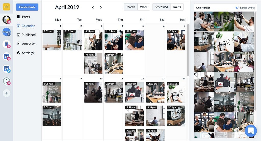
Calendar view enables you to visualize your content plan, and see if there are any posting gaps or too many posts going out on a certain day. You can easily drag and drop to move things around on the calendar and update the scheduled date or time.
5- Post When Your Audience Is Online
Our final benefit of scheduling Instagram posts is that you can make sure your posts are going out when your followers are online and active, even if you’re not!
This is so important for accounts with audiences in different timezones, and for businesses who don’t want to be on Instagram in the evenings and weekends posting manually.
Another big reason for posting at the right times is that it increases your engagement. Naturally, posts will get more likes if the people they are aimed towards are online, versus when they’re busy or asleep. The Instagram algorithm favours posts that get fast engagement, and so scheduling posts for the most engaged times of day will get you more likes and comments — great for photographers and business owners looking to grow their account. The best times of day to post completely vary on industry and audience demographic, however, you can connect your business Instagram account here to find the best time to post on Instagram for you and your followers!
There are just a few benefits to Instagram scheduling and how it can support you in your social media marketing. Most tools offer a free trial to test out before you subscribe, so give it a go and let us know any additional benefits you find!
In this week’s roundup, WebKit’s method for truncating multi-line text gets some love, a note on calculations using custom properties, and a new OpenType feature that prevents typographic logjams.
Truncating mutli-line text
The CSS -webkit-line-clamp property for truncating multi-line text is now widely supported (see my usage guide). If you use Autoprefixer, update it to the latest version (9.6.1). Previous versions would remove -webkit-box-orient: vertical, which caused this CSS feature to stop working.
Note that Autoprefixer doesn’t generate any prefixes for you in this case. You need to use the following four declarations exactly (all are required):
.line-clamp {
  overflow: hidden;
  display: -webkit-box;
  -webkit-box-orient: vertical;
  -webkit-line-clamp: 3; /* or any other integer */
}
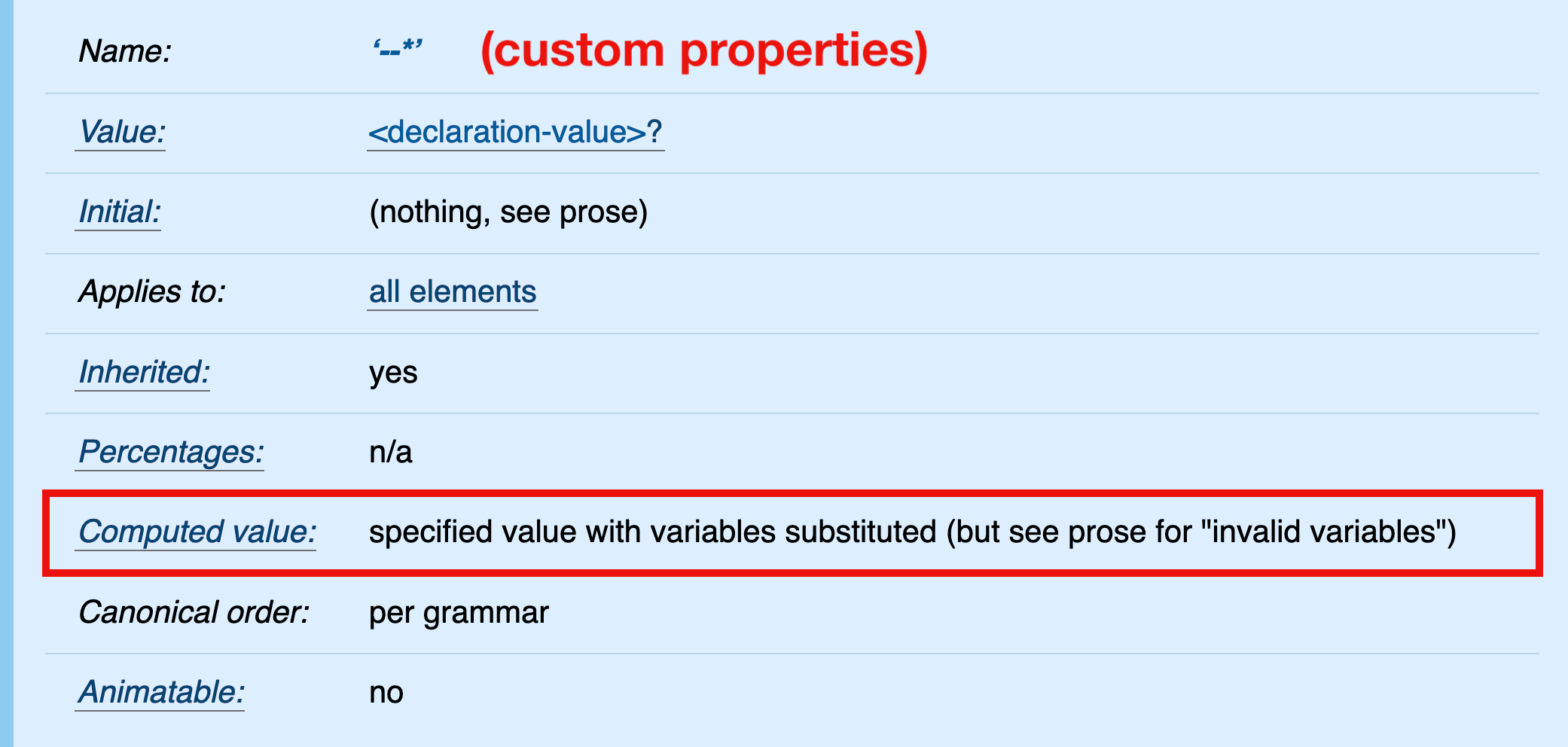
In CSS, it is currently not possible to pre-calculate custom property values (spec). The computed value of a custom property is its specified value (with variables substituted); therefore, relative values in calc() expressions are not “absolutized” (e.g., em values are not computed to pixel values).
It may appear that the calculation in the above example is performed on the root element, specifically that the relative value 1em is computed and added to the absolute value 10px. Under default conditions (where 1em equals 16px on the root element), the computed value of --large would be 26px.
But that’s not what’s happening here. The computed value of --large is its specified value, calc(1em + 10px). This value is inherited and substituted into the value of the font-size property on the
element.
blockquote {
  /* the declaration after variable substitution */
  font-size: calc(1em + 10px);
}
Finally, the calculation is performed and the relative 1em value absolute-ized in the scope of the
element — not the root element where the calc() expression is declared.
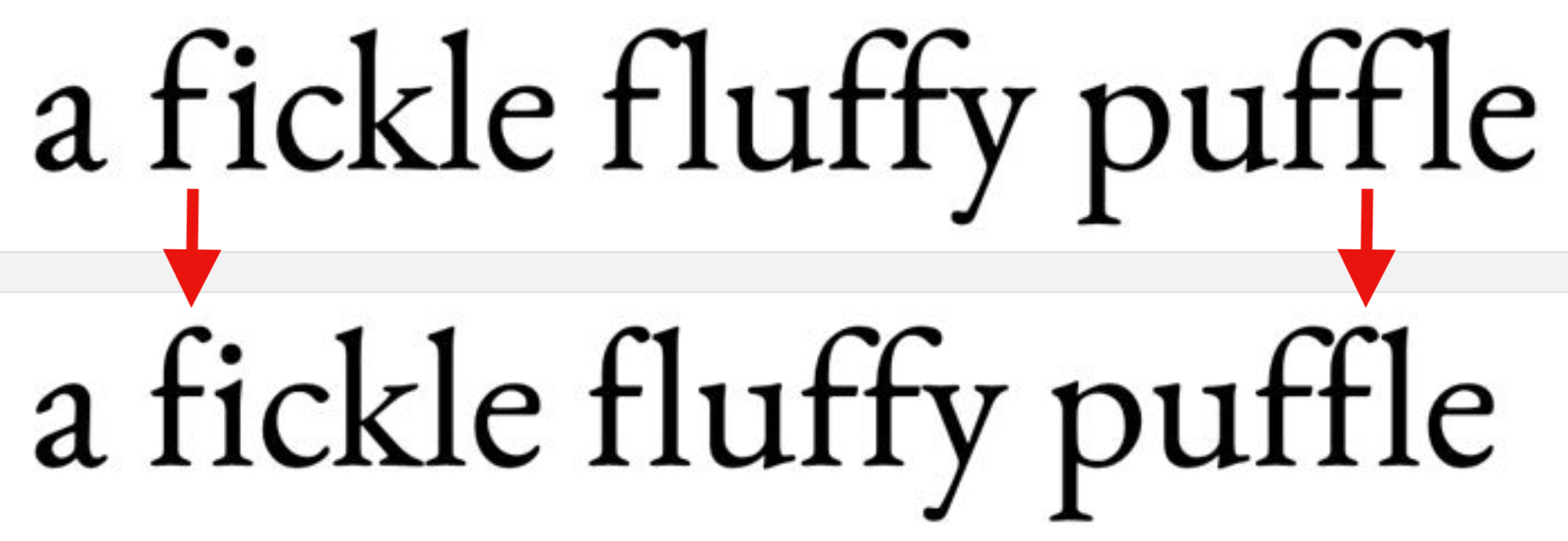
The “Contextual Alternates” OpenType feature ensures that characters don’t overlap or collide when ligatures are turned off. You can check if your font supports this feature on wakamaifondue.com and enable it (if necessary) via the CSS font-variant-ligatures: contextual declaration.
Say you wanted to put the CSS-Tricks website in an . You’d do that like this:
<iframe src="https://css-tricks.com"></iframe>
Without any other styling, you’d get a rectangle that is 300×150 pixels in size. That’s not even in the User Agent stylesheet, it’s just some magical thing about iframes (and objects). That’s almost certainly not what you want, so you’ll often see width and height attributes right on the iframe itself (YouTube does this).
Those attributes are good to have. It’s a start toward reserving some space for the iframe that is a lot closer to how it’s going to end up. Remember, layout jank is bad. But we’ve got more work to do since those are fixed numbers, rather than a responsive-friendly setup.
The best trick for responsive iframes, for now, is making an aspect ratio box. First you need a parent element with relative positioning. The iframe is the child element inside it, which you apply absolute positioning to in order to fill the area. The tricky part is that the parent element becomes the perfect height by creating a pseudo-element to push it to that height based on the aspect ratio. The whole point of it is that pushing the element to the correct size is a nicer system than forcing a certain height. In the scenario where the content inside is taller than what the aspect ratio accounts for, it can still grow rather than overflow.
I’ll just put a complete demo right here (that works for images too):
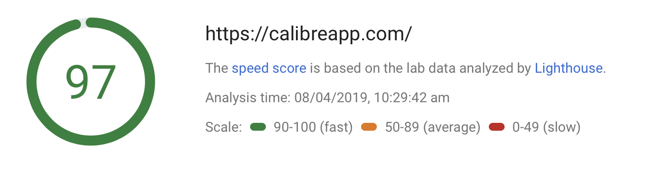
This article is from my friend Ben who runs Calibre, a tool for monitoring the performance of websites. We use Calibre here on CSS-Tricks to keep an eye on things. In fact, I just popped over there to take a look and was notified of some little mistakes that slipped by, and I fixed them. Recommended!
In this article, we uncover how PageSpeed calculates it’s critical speed score.
It’s no secret that speed has become a crucial factor in increasing revenue and lowering abandonment rates. Now that Google uses page speed as a ranking factor, many organizations have become laser-focused on performance.
Last year, Google made two significant changes to their search indexing and ranking algorithms:
The speed of your site on mobile will affect your overall SEO ranking.
If your pages load slowly, it will reduce your ad quality score, and ads will cost more.
Google wrote:
Faster sites don’t just improve user experience; recent data shows that improving site speed also reduces operating costs. Like us, our users place a lot of value in speed — that’s why we’ve decided to take site speed into account in our search rankings.
To understand how these changes affect us from a performance perspective, we need to grasp the underlying technology. PageSpeed 5.0 is a complete overhaul of previous editions. It’s now being powered by Lighthouse and CrUX (Chrome User Experience Report).
This upgrade also brings a new scoring algorithm that makes it far more challenging to receive a high PageSpeed score.
What changed in PageSpeed 5.0?
Before 5.0, PageSpeed ran a series of heuristics against a given page. If the page has large, uncompressed images, PageSpeed would suggest image compression. Cache-Headers missing? Add them.
These heuristics were coupled with a set of guidelines that would likely result in better performance, if followed, but were merely superficial and didn’t actually analyze the load and render experience that real visitors face.
In PageSpeed 5.0, pages are loaded in a real Chrome browser that is controlled by Lighthouse. Lighthouse records metrics from the browser, applies a scoring model to them, and presents an overall performance score. Guidelines for improvement are suggested based on how specific metrics score.
Like PageSpeed, Lighthouse also has a performance score. In PageSpeed 5.0, the performance score is taken from Lighthouse directly. PageSpeed’s speed score is now the same as Lighthouse’s Performance score.
Now that we know where the PageSpeed score comes from, let’s dive into how it’s calculated, and how we can make meaningful improvements.
What is Google Lighthouse?
Lighthouse is an open source project run by a dedicated team from Google Chrome. Over the past couple of years, it has become the go-to free performance analysis tool.
Lighthouse uses Chrome’s Remote Debugging Protocol to read network request information, measure JavaScript performance, observe accessibility standards and measure user-focused timing metrics like First Contentful Paint, Time to Interactive or Speed Index.
If you’re interested in a high-level overview of Lighthouse architecture, read this guide from the official repository.
How Lighthouse calculates the Performance Score
During performance tests, Lighthouse records many metrics focused on what a user sees and experiences. There are six metrics used to create the overall performance score. They are:
Time to Interactive (TTI)
Speed Index
First Contentful Paint (FCP)
First CPU Idle
First Meaningful Paint (FMP)
Estimated Input Latency
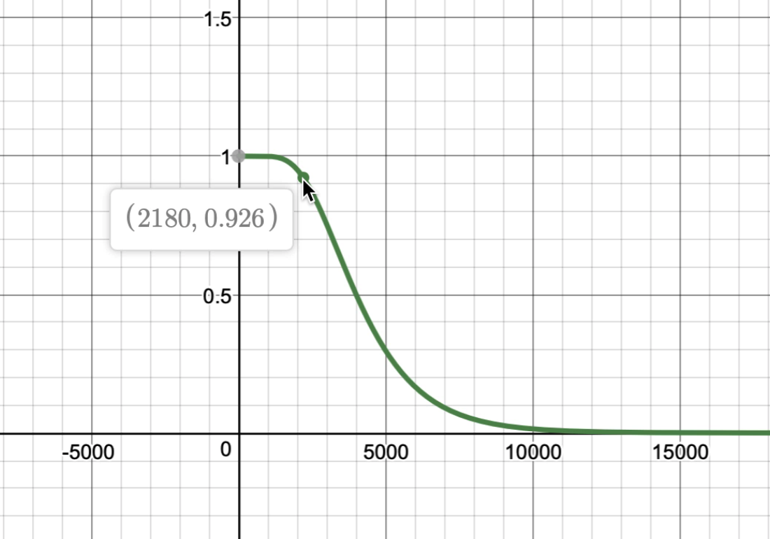
Lighthouse will apply a 0 – 100 scoring model to each of these metrics. This process works by obtaining mobile 75th and 95th percentiles from HTTP Archive, then applying a log normal function.
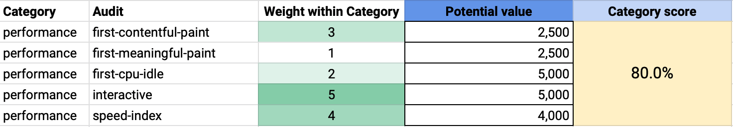
Once each metric is scored, it’s assigned a weighting which is used as a modifier in calculating the overall performance score. The weightings are as follows:
Metric
Weighting
Time to Interactive (TTI)
5
Speed Index
4
First Contentful Paint
3
First CPU Idle
2
First Meaningful Paint
1
Estimated Input Latency
0
These weightings refer to the impact of each metric in regards to mobile user experience.
In the future, this may also be enhanced by the inclusion of user-observed data from the Chrome User Experience Report dataset.
Using the example above, if we change (time to) interactive from 5 seconds to 17 seconds (the global average mobile TTI), our score drops to 56% (aka 56 out of 100).
Whereas, if we change First Contentful Paint to 17 seconds, we’d score 62%.
TTI is the most impactful metric to your performance score. Therefore, to receive a high PageSpeed score, you will need a speedy TTI measurement.
Moving the needle on TTI
At a high level, there are two significant factors that hugely influence TTI:
The amount of JavaScript delivered to the page
The run time of JavaScript tasks on the main thread
Our Time to Interactive guide explains how TTI works in great detail, but if you’re looking for some quick no-research wins, we’d suggest: Reducing the amount of JavaScript
Where possible, remove unused JavaScript code or focus on only delivering a script that will be run by the current page. That might mean removing old polyfills or replacing third-party libraries with smaller, more modern alternatives.
It’s important to remember that the cost of JavaScript is not only the time it takes to download it. The browser needs to decompress, parse, compile and eventually execute it, which takes non-trivial time, especially in mobile devices.
Effective measures for reducing the amount of scripts from your pages include:
Reviewing and removing polyfills that are no longer required for your audience.
Modern JavaScript tooling (like webpack) can break-up large JavaScript applications into a series of small bundles that are automatically loaded as a user navigates. This approach is known as code splitting and is extremely effective in improving TTI.
To successfully uncover significant differences in user experience, we suggest using a performance monitoring system (like Calibre!) that allows for testing a minimum of two devices; a fast desktop and a low-mid range mobile phone.
That way, you’ll have the data for both the best and worst case of what your customers experience. It’s time to come to terms that your customers aren’t using the same powerful hardware as you.
In-depth manual profiling
To get the best results in profiling JavaScript performance, test pages using intentionally slow mobile devices. If you have an old phone in a desk drawer, this is a great second-life for it.
An excellent substitute for using a real device is to use Chrome DevTools hardware emulation mode. We’ve written an extensive performance profiling guide to help you get started with runtime performance.
What about the other metrics?
Speed Index, First Contentful Paint and First Meaningful Paint are all browser-paint-based metrics. They’re influenced by similar factors and can often be improved at the same time.
It’s objectively easier to improve these metrics as they are calculated by how quickly a page renders. Following the Lighthouse Performance audit rules closely will result in these metrics improving.
If you aren’t already preloading your fonts or optimizing for critical requests, that is an excellent place to start a performance journey. Our article titled “The Critical Request” explains in great detail how the browser fetches and renders critical resources used to render your pages.
Tracking your progress and making meaningful improvements
Google’s newly updated search console, Lighthouse and PageSpeed Insights, are a great way to get initial visibility into the performance of your pages but fall short for teams that need to continuously track and improve the performance of their pages.
Continuous performance monitoring is essential to ensuring speed improvements last, and teams get instantly notified when regressions happen. Manual testing introduces unexpected variability in results and makes testing from different regions as well as on various devices nearly impossible without a dedicated lab environment.
Speed has become a crucial factor for SEO rankings, especially now that nearly 50% of web traffic comes from mobile devices.
To avoid losing your search positioning, ensure you’re using an up-to-date performance suite to track key pages. (Pssst, we built Calibre to be your performance companion. It has Lighthouse built-in. Hundreds of teams from around the globe are using it every day.)
Dave Rupert digs into some of his favorite Vue features and one particular issue that he has with React:
I’ve come to realize one thing I don’t particularly like about React is jumping into a file, reading the top for the state, jumping to the bottom to find the render function, then following the method calls up to a series other sub-rendering functions only to find the component I’m looking for is in another castle. That cognitive load is taxing for me.
I wrote about this very problem recently in our newsletter where I argued that finding my way around a React component is difficult. I feel like I have to spend more energy than necessary figuring out how a component works because React encourages me to write code in a certain way.
On the other hand, Dave, says that Vue matches his mental model when authoring components:
<template>
  // Start with a foundation of good HTML markup
</template>
<script>
  // Add interaction with JavaScript
</script>
<style>
  // Add styling as necessary.
</style>
And this certainly matches the way I think about things, too.
