Archive

Archive for October, 2022

Grow your Ecommerce Store with Customization

October 17th, 2022 No comments

The ecommerce sector experience considerable growth as millions of companies went online globally. 72% of local organizations began working remotely as soon as the outbreak started. In response to nationwide restrictions, 52% of people learned to buy their daily necessities online at the same time.

While the world gradually returns to some normality, ecommerce trends and numbers are anticipated to increase.

As interest in online buying activities develops, businesses must continue to match consumers’ rising expectations. This entails making investments in equipment and technology to enhance their service continuously.

You can choose which features and functionalities would enhance the online buying experience for your consumers by customizing your website.

Differentiating oneself from competitors in the ecommerce industry is one of the toughest challenges. Thus customization is very crucial. Below listed are the lists of how to grow an ecommerce store with customization:

Customize your ecommerce website:

With more business owners now seeing the online environment’s full potential, the ecommerce sector’s competition is still fierce.

Businesses must invest in the tools and technology necessary to serve their customers better to keep up with the expectations of their industry and target market.

You will be able better to please your clients with a personalized ecommerce solution, enhancing conversions and customer loyalty. A product design tool will help you to do perfect customization. 

The checkout process, payment choices, customer support, and other front-end and back-end requirements may be encountered by customers using an ecommerce platform.

Conduct competitive analysis:

Competitive analysis is a strategic research process that seeks to identify and assess your competitors’ development, products, and marketing tactics. 

The objective is to identify the traits your competitors share on the websites, product displays, and online shopping experiences.

These shared characteristics give you information about what customers want from a company like yours, providing suggestions for how and how not to design your website. 

Using a competitive study, you may also seek market gaps your company can fill. For instance, you may be the first to offer a mobile website option if most of your rivals aren’t.

Research well about your business industry:

You must conduct thorough research and investigation of your business sector before beginning the ecommerce web development process, which is one of the most important duties you must complete.

You need to be aware of the many loopholes and consider who your industry’s target market is. A product design tool plays a significant role in customizing your ecommerce store. 

Investigate your audience’s tastes, age, and other characteristics in-depth to build product categories, descriptions, payment gateways, product photos, and other elements successfully.

Set goals:

Your goals and key performance indicators will determine your compass for website development. These will decide the build’s vendors, user experience, features and functionalities, and other elements.

Let’s imagine, for instance, that your ecommerce website’s objective is to boost digital sales. Your website should include landing pages that provide a clear route to conversion and simplify online transactions.

Additionally, you require CTAs and features like discounts for in-store purchases that entice customers to visit your nearby location.

Determine your branding and plan your content strategy:

You will only be able to connect with many people with an effective branding and content strategy.

Consider the fantastic logos, product descriptions, reviews, product videos, visual pictures, emotional implications, wish lists, and other elements that have contributed to the success of many organizations. 

Likewise, it would be ideal if you gave these factors some thought, including creating an excellent logo, deciding on your company’s voice, and developing a growth and development strategy.

Select partners and vendors:

The proper technology and the right ecommerce providers and partners should be chosen. Verify that all of your service suppliers, including web developers, designers, couriers, payment partners, and others can perform the task you require of them.

For instance, you must select a payment gateway partner that enables you to accept numerous payment methods if you want your online store to get them.

Mind your business:

When your ecommerce store is still developing, it is simple to abuse your account. However, it would be beneficial if you diligently adhere to the allocated budget and use techniques. 

Bear in mind the competition:

To succeed in business, you must stand out from your rivals. As a result, you must use the appropriate catchphrases in a browser to assess their operational parts. 

Consider the numerous marketing strategies and characteristics other business owners use to draw clients. 

The technical aspect must be considered, including the hosting tool, domain name, content management system, and other add-ons they are employing.

Decide on the website feature and integration:

Make a list of the features you want for your website’s initial iteration and any future additions and enhancements. Magento product designer gives you professional customization. 

Most new ecommerce websites come standard with functionalities like user-friendly checkout, unique reporting tools, various payment alternatives, and the capacity to add additional ecommerce features.

Advanced SEO capabilities, email marketing integration, blogs, article sections, and content management tools are a few other aspects to consider.

Use an ecommerce platform that allows for simple integration with various third-party tools and software. By doing this, you may regularly update your website to match your user base’s constantly changing needs, priorities, and expectations.

Create a minimum viable product:

You must realize that selling products is an ecommerce store’s primary purpose. Conversely, an ecommerce MVP’s goal is to assess a business’s ability to convince customers to buy its goods and services. 

Your goal is to develop a unique and creative shopping platform with a high conversion rate supported by a unique algorithm designed to deliver the most excellent products and a fantastic user experience. You should then enlist the aid of a minimum viable product. 

User friendly:

Customer happiness and sales are directly correlated with usability. Ecommerce sites that are difficult to use risk losing potential clients to competitors with better-designed online storefronts. 

Think about adding tools that will simplify your clients’ online shopping experience. These include enhanced search capabilities, user-friendly registration processes, the positioning of the homepage button, and efficient navigation.

Train your team:

Dedicated SDRs are necessary if you want to improve volume and sales gradually. Make sure you have the right talent before investing in a project. 

You might occasionally run into issues with team productivity and efficiency. In that instance, you should spend money on team training and sales. 

Test and launch the website:

After taking care of all the details test your ecommerce website before going live. You and your team can identify and remove bugs, problems, and other barriers on your website by conducting website testing.

Functional, usability, security, performance, A/B, and mobile application testing are part of the process.

These quality control methods must be applied to every ecommerce website to prevent downtime, sluggish responses, and poor usability, which could be highly harmful to site performance and the company’s overall success.

Bottom line:

More business owners are scrambling to build their ecommerce websites as soon as possible as they recognize the benefits of doing so. 

By keeping these pointers in mind, you may expedite the development of your ecommerce website and guarantee functionality when it goes live.

The post Grow your Ecommerce Store with Customization appeared first on noupe.

Categories: Others Tags:

Why You Should Optimize for Both Mobile and Desktop When Developing Your Website

October 17th, 2022 No comments

When either starting your website from scratch or being online for many years, you have to consider many things when you are developing your website. One of the main problems developers encounter is optimizing for different devices.

Your traffic can come from several sources:

  • Desktop
  • Smartphone
  • Tablet
  • Smartwatch
  • Etc.

It is cardinal that your website provides the same experience everywhere. Let’s see what cross-device friendliness is all about!

What is Cross-Device Friendliness?

When you are developing your website, you have to make sure that no matter where people come from, they receive the exact same experience (or almost), and that’s what cross-device friendliness is all about.

Source: jambysam.com

Of course, you have to take into account many various aspects because each has its own different parameters and functionalities, but if you can adjust your website to these criteria smartly, you can be sure that your site will be a multi-device success.

Factors to consider on different devices

Cross-device optimization has gained more and more significance when we talk about website development. The popularity of mobile devices has skyrocketed in the previous years – there are over 5 billion unique mobile phone users all around the world. But when we are talking about website optimization for both mobile and desktop, many different aspects should be taken into account. That could be:

  • Traffic volume
  • Screen size
  • Cross-platform journeys
  • Content placement & interactions
  • Page load time

Traffic volume

Through the years, the age of desktop dominance has faded away. Of course, that doesn’t mean people are not searching the web from a PC, but since 2017 more than half of website traffic has come from mobile devices, and it’s constantly increasing.

Nowadays the linear “only desktop optimization” mindset is not enough. If you want to provide the ultimate experience for your visitors, mobile-friendliness is inevitable. On the other hand, you shouldn’t just head into making everything practical for mobile and ignore your desktop web development. Find the balance between these two mediums 

Screen size

When smartphones came into the spotlight, every website was only optimized for desktops and it caused a lot of inconvenience for mobile users – a full-size website was thrown to the mobile user’s tiny screen. Users had to constantly zoom in-zoom out to see the content they want, and because of the shortening attention span and patience, visitors leave way earlier with frustration (and might not return).

Source: webceo.com

Another problem that might occur in these situations is related to images. If you optimize images to desktop monitor screens and mobile visitors load your page, they won’t be able to see the whole picture normally. They might zoom in to see the content normally, but then the whole image might not be visible, and that constant resizing could be really uncomfortable.

Cross-device journeys

Visitors arriving to your website from different sources don’t necessarily mean that they are all new, unique users. People tend to make cross-device journeys before reaching the desired action, e.g. buying a product from your site. They usually browse your site through their smartphone, and if they find something interesting or want to fill out a form, they usually swap to a laptop or desktop for easier completion.

So as you can see, dividing visitors into separate groups might be misleading when it comes to conversion. Synchronizing the different events (e.g. checkout process, newsletter signup) for either singular or cross-device could be a key point to making your website the most suitable for your audience.

Content placement & interactions

The available space differs from device to device, so having a well-structured website is a crucial point. To reflect on our previous “Screen size” point, how people can see what’s on the site is quintessential. For example, you might have an article that is perfectly readable from the desktop’s monitors, but on the phone scrolling, a lot and resizing constantly to make every detail readable could be annoying for users.

Another pain point comes from CTA interactions. If the interactive buttons are too small or it is not clear where to press them, it can be difficult to execute certain actions, like closing a popup or signing up for a newsletter. One more problem that might occur with buttons is placing them right next to each other – if you can’t clearly separate them with e.g. borders, that could result in rage clicks, hence missing out on customers.

Page load time

In today’s rushing world, everyone wants to get access to all kinds of information immediately, and if they have to wait more than a few seconds, they will just leave your website behind. As with many other things, page loading time also differs from device to device.

While desktops have direct internet access via ethernet cables, mobiles only have a remote connection. It is important to have each of your pages on top speed everywhere – you can imagine how slow content loading must be on mobile if it’s already slow on the desktop.

Solution – Optimize User Experience

If you want to achieve the ultimate customer satisfaction on every device, then you should focus on optimizing user experience.

User experience is the overall experience of a user on your website – that could mean how they can navigate through your pages, how they can complete certain events (like visiting a product, then putting the item to their cart and completing a checkout), or how they felt during their session on your site.

Source: thisisglance.com

All of the previously mentioned points have an impact on the user experience of your site. If visitors don’t find it easy and clear to browse through your website, customers will leak out of your funnel. The good news is that with a few adjustments, you can make wonders on every medium.

Mobile-first perception

Kicking off your web development process with mobile development first could make your life much easier. It would be more time-consuming to figure out and then tailor all the functions that are not compatible with smartphones. Mobile designs usually require a more minimalist approach, so designing for a smaller screen and then filling up a bigger one with content can be a time-saver solution. 

Source: divante.com

In addition, mobile-friendly solutions usually turn out to be perfect for desktops. Take the famously used hamburger menu as an example – they worked out so well more websites started implementing it to desktop monitors, but minimalism has also started conquering the different types of computer screens too.

Accelerate page loading time

As we mentioned earlier, having a quick-loading page is a top priority factor when it comes to user experience. With a few clever tricks, you can save some extra seconds in your loading time.

Firstly, with CSS media queries you can set in what order your web page’s assets should load. This way, you can save up time by loading the text first so users can start reading the important content while images load later. Secondly, compressing images for mobiles can also save some quality time and you can also keep the same quality of your images. Also, optimizing your HTML-CSS-Javascript codes by tailoring the unnecessary part of your code out can decrease waiting time.

Source:blog.imagekit.io

Lastly, keeping your website’s plugins, themes and other add-ons up-to-date is another way to keep up with the pace. These tools are constantly under development to provide a better, more user-friendly experience, so doing a regular update on them can also have a positive impact on your site.

Responsive web design

For the ultimate multi-device success, responsivity is a quintessential factor for your website. Responsive web design means that your website automatically adjusts to different screen sizes and platforms. That involves scaling images and fonts on your site, but you can influence whitespace between contents too.

Source: searchenginejournal.com

You can use the earlier mentioned CSS media queries here as well to achieve overall device responsivity. With just a little knowledge, you can easily create a cross-device-friendly website. That not only means that it saves tons of time in your web development because you don’t have to optimize for every different screen one by one, but also keeps your website aesthetic on all platforms. 

Encourage cross-device usage

Sometimes having fewer functions on different devices isn’t necessarily a problem. We usually use different platforms for different purposes. We usually use our phones for browsing and accomplishing bigger tasks on desktops.

Finding how these different mediums can complement each other is the key to success. A well-optimized mobile interface can set up a later purchase when your visitor has more time to fill out the checkout form. Don’t compete for different devices against each other, ally the different forces!

Fitting your content on different devices

To provide nearly the same experience on both mobile and desktop, reorganizing the same content on different devices is a must. On desktops, the column-organized content placement works perfectly. For example, there’s a navigation bar on the top of the page, in the middle you can find the article, and on the right, there are related topics, articles, or other widgets. The main concept is to separate different contents clearly.

Source: themesinfo.com

For mobiles, it’s a bit tricky because you have much smaller space to work with. Organizing your content to a well-centralized column and placing texts and images alternately rather than putting pictures and fonts next to each other is a much more pleasant view. Interactive buttons, such as the navigation bar or search field can be placed on each side of the screen to prevent misclicks. This way you can provide the nearly-same experience on different mediums.

Forms & popups are in the same shoes. Although they might feel annoying sometimes, optimizing them well causes less trouble for users. Fitting them side-to-side and placing easily accessible CTA-s for different interactions can prevent visitor frustration (like zooming out and looking for the close button) and create a more fluent user experience.

Source: penningtoncreative.com

Conclusion

There are many factors to consider when it comes to cross-device development. It is a critical point to optimize your website for every medium – users come to your site from different sources, but a single visitor can find you in many ways. If there are bottlenecks on any of your interfaces, you may not reach one of your platform’s full potential. Stop traffic leakage now and make the best version of your website everywhere!

The post Why You Should Optimize for Both Mobile and Desktop When Developing Your Website appeared first on noupe.

Categories: Others Tags:

WordPress Full-Site Editing: A Deep Dive Into The New Feature

October 17th, 2022 No comments

Full-Site Editing is one of the main improvements added to the WordPress platform with version 5.9. It allows users to make sweeping changes to their website design and layout via a graphic interface, thus moving WordPress closer to the experience of a page builder. In addition, it offers new ways to create and customize themes.

These drastic changes have great consequences not only for the WordPress user experience but also for large parts of the platform’s ecosphere. For that reason, in this post, I am planning to take a deep dive into WordPress Full-Site Editing (or FSE for short, there are also discussions about changing the name because it’s a bit of a mouthful).

In the following, I will first talk about what Full-Site Editing is and provide a tutorial on how to use it to make changes to your site. I will also examine the tools it provides for theme development and close with a discussion of how the arrival of this feature will impact developers, theme authors, and existing page-builder plugins.

Table of Contents

Let’s get started.

Quick note: While FSE was first added to WordPress in version 5.9, it has since been further enhanced by WordPress 6.0. This post includes the latest changes.

What Is WordPress Full-Site Editing?

In a nutshell, Full-Site Editing means that WordPress now offers the ability to create and edit page templates and elements like headers and footers in a block-based graphic user interface.

This is part of phase two of the Gutenberg project and the preliminary culmination of a development that saw its beginning with the introduction of the WordPress block editor in WordPress 5.0. Since its initial release, the block workflow has branched out to other parts of the WordPress user interface. For example, you can now also use it for widget management.

One of the main goals of Full-Site Editing is to provide users with a singular workflow for making changes to their WordPress sites. In the past, you often needed to know several different systems to create a new menu, compose a page or post content, populate the sidebar, or adjust the color scheme. Even more complex changes required you to know how to edit page template files or write CSS. With Full-Site Editing, you can now make changes to everything in pretty much the same way (even if much of it still happens in different menus).

For everyday users, the benefit is reduced dependence on front-end developers. Site owners can now do a lot by themselves that, in the past, would require technical chops or professional help, such as making changes to page templates. Plus, those changes are now visible in the editor right away instead of having to go back and forth between the front end and back end of your site or even a code file.

At the same time, Full-Site Editing makes it easier for theme developers and designers to create markup and allows for quicker templating.

Main Features

Here are the main building blocks that Full-Site Editing consists of:

  • Page templates and template parts
    The central attractions are two new editor interfaces that allow you to customize page layouts similar to the normal content editor. You can move page elements around, change their design (colors, fonts, alignment, and so on), and add or remove them at will. The same is also possible for single template parts such as headers and footers. It’s even possible to edit them separately. Plus, you can export your templates to use and distribute them as themes.
  • Global styles and theme.json
    A common feature in WordPress page builder plugins, Full-Site Editing allows you to define global styling for your entire site, such as colors and typography, in a central place. In the past, you would have to change the styling in different locations (e.g., the Customizer and block editor). FSE also introduces the theme.json file, which acts as a nexus for different APIs and contains the majority of styling information in block-based themes.
  • Template blocks and block patterns
    Full-Site Editing adds new block types to WordPress and the WordPress editor. These include static blocks like the site logo but also dynamic elements such as blocks for navigation, post titles, and featured images. These change according to settings in other places. There is even a full-fledged query block that’s basically the WordPress PHP loop. It lets you display a list of posts anywhere on the page. Each block also comes with its own design and configuration options.

Sounds exciting? Then let’s dive into how to use this new WordPress feature practically.

How To Use Full-Site Editing To Customize WordPress

In the following, I will first go over how to take advantage of Full-Site Editing as a user. Later, we will also examine what makes this a useful feature for developers and theme designers.

Prerequisites For Using FSE

In order to take advantage of Full-Site Editing, the most important thing is that you have a WordPress site running at least version 5.9. You can also use a lower version, but then you need to have the Gutenberg plugin installed and up to date.

The second thing you require is a block theme. That’s a theme that can take advantage of the new feature. We will go over how these are different from classic themes later. For now, a good option is Twenty Twenty-Two, which also came out with WordPress 5.9. I will be using it for this Full-Site Editing tutorial. Refer to the resources section at the end for other options.

Finally, if you are giving WordPress Full-Site Editing a spin for the first time, I recommend using a staging site or local development environment for it. That way, you can make all the mistakes you want without anyone knowing.

Overview Of The User Interface

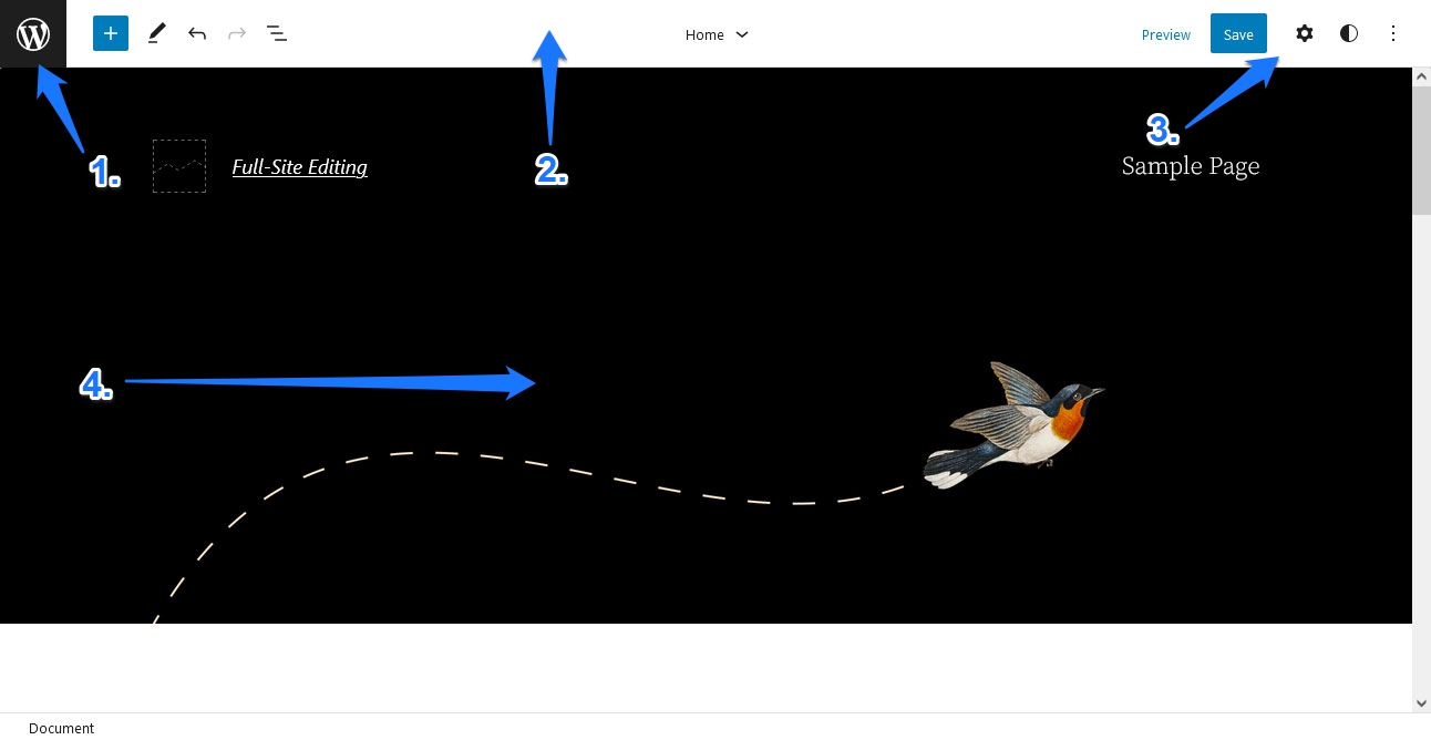
When you are logged into your test site, you can access Full-Site Editing via Appearance > Editor (also notice that the widget and Customizer options are missing).

An alternative way to get there is via the Edit Site link in the WordPress admin taskbar on the front end. Either will land you on the main editor interface.

Let’s walk through all the options available here:

  1. Top left corner: Let’s start here because it’s easy to overlook. A click on the WordPress logo opens up a menu to edit templates and template parts. It also has a link to return to the WordPress dashboard.
  2. Top bar: This should look familiar to anyone who has used the Gutenberg editor before. It contains the option to add blocks and block patterns, toggle between editing and selecting blocks, and undo/redo buttons. You can also open a list view of the current page, select different template parts, and jump directly to them.
  3. Top right corner: Contains the buttons to save changes and preview the design on different screen sizes. The gear icon opens up settings for templates as a whole and individual blocks. Besides, that is the option to customize Global Styles. The three-dot icon contains display options for the editor, the ability to export templates and template parts, and access to the welcome guide.
  4. Center: In the middle is the main editing screen. Here is where you will make changes to page templates and work with blocks. It is also an accurate representation of what your design will look like and contains some controls to add blocks and other elements to the page.

Most of these are togglable, so you can only have those options open that you really need and want.

Global Style Presets

As mentioned above, you can access this menu by clicking the half-black, half-white circle in the top right corner. It offers two types of styling options: for the entire website and for individual blocks. What exactly is available here depends on your theme.

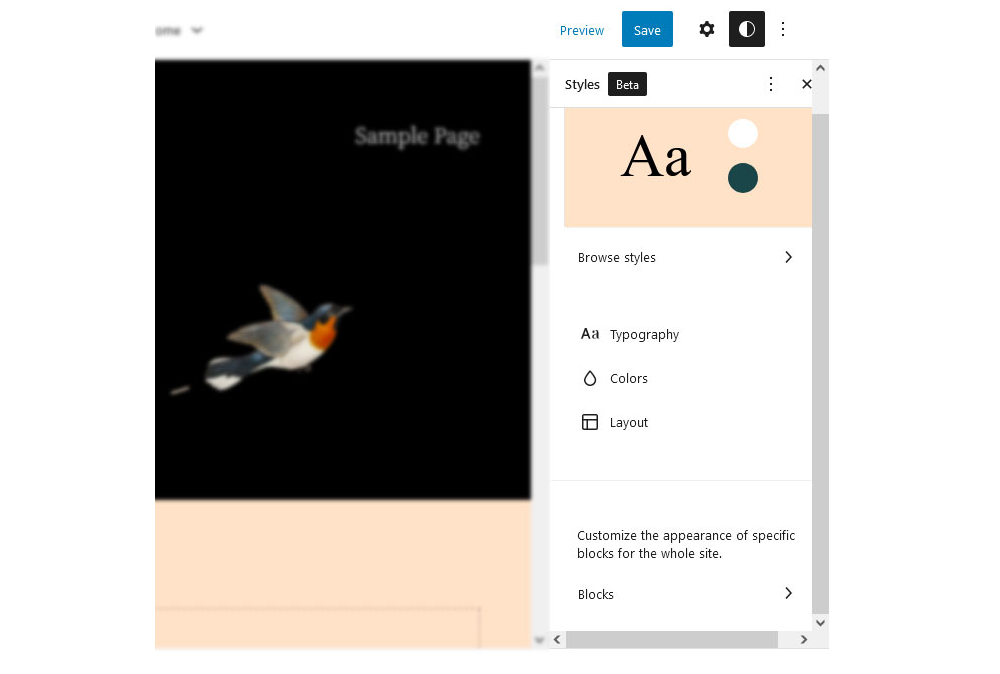
For Twenty Twenty-Two, you have options for typography, colors, and layout. We will get to those below. For now, let’s turn to the most exciting part of the Global Styles menu — the preset color themes. You can find them when you click on Browse styles.

In this menu, developers have the possibility to offer styling presets for the entire theme. Hover over one of the options to see a preview of its color and font scheme, and then adopt the look for your entire theme with a single click.

I really like this feature as it offers users different versions of the same theme that they can easily use as jump-off points for their own creations. It’s a bit like themes shipping together with a number of their own child themes. You can also go back to the previous state by clicking the three dots at the top and choosing Reset to defaults.

Global Styles: Typography

When you click on Typography, you get to a submenu where you can choose whether to customize the styling for general text or links.

Another click gets you to a subsection where you can make the actual changes.

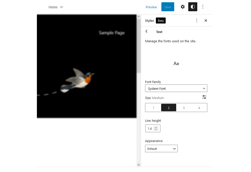
As you can see, it’s possible to customize the font family, size, line height, and appearance, meaning font-weight and slant. Options here depend on the theme as well. For example, under Font family, you can only choose System Font and Source Serif Pro as these are the only options Twenty Twenty-Two ships with.

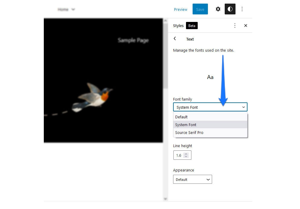
However, this is also due to the fact that full support for (local) web fonts only became available in WordPress 6.0, and this theme came out before that.

Likewise, the numbers under Size represent defaults set by the theme authors. You also have the option to click on the little icon in the upper right corner to set a custom value.

Line height should be self-explanatory. The Appearance drop-down menu lets you choose font variations from a list.

If you pick any of these options, changes will automatically become visible on the editing screen.

If you don’t like the modifications you have made, you can always reset to defaults, as mentioned above.

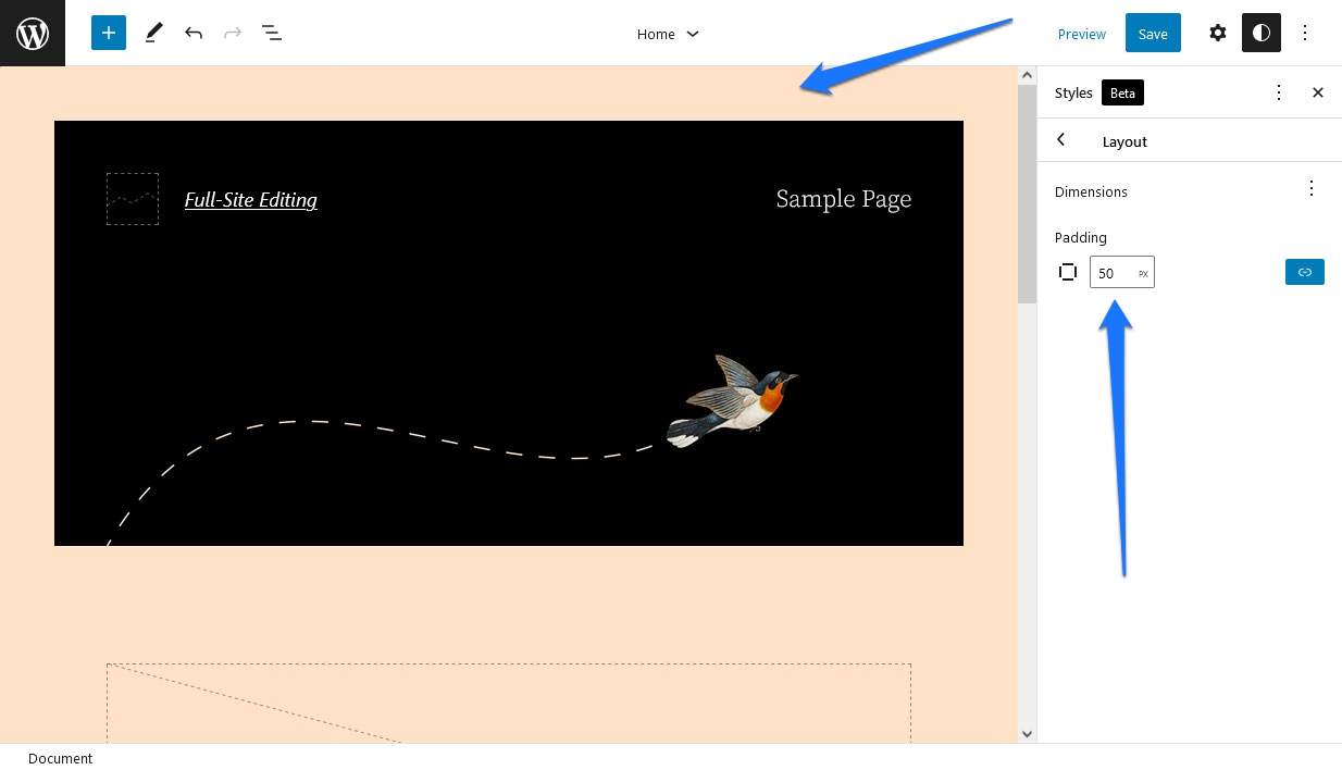
Global Colors And Layout

Under Colors, you can change the hue of different elements (duh!).

What’s interesting here is the Palette option, where the theme can provide its own color palette, including gradients. This is besides the default options Gutenberg offers and custom colors that users can create.

Besides that, just like for typography, the theme provides different options for elements for which you can change colors. In Twenty Twenty-Two, that’s Background, Text, and Links.

After choosing any of these, you get to a screen where you can easily pick a color or gradient from available options or create your own. When you do, your pick automatically translates to what you see on the editing screen.

There is even a color picker that lets you set custom hues or enter color codes in RGB, HSL, or HEX format.

Finally, in this theme, the Layout option only allows you to add padding around the homepage.

Changing Styles For Individual Blocks

Styling defaults are not only available for the website as a whole, but you can also set them for individual blocks. For that, you find an option in Global Styles at the bottom where it says Blocks.

When you click it, you find a list of all the WordPress default blocks.

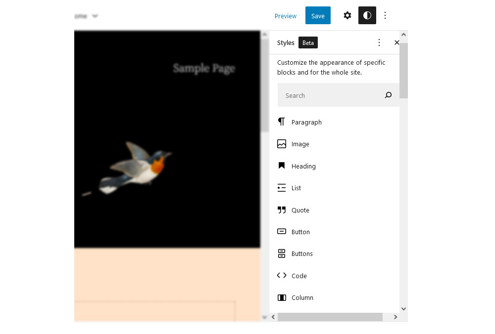
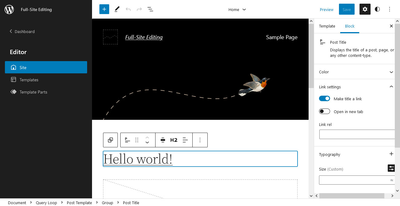
Click those in turn to find similar options to customize their design on a per-block basis. For example, below, I have set the link color globally to blue but set the color for the Post Title block (which is also a link) to orange. As a consequence, orange overwrites the initial value, and the title comes out in that color.

If you have ever worked with CSS, this principle should be very familiar. Set some site-wide standards at the top of the style sheet and then overwrite them with customizations further down in the cascade. It’s the same thing here.

Moving Blocks Around

Making layout changes works the same way as in the main WordPress block editor. Everything you see on the screen is made up of blocks. Some may be combined as groups or block patterns, but they are blocks nevertheless.

As such, you can move and customize them however you want. For example, the main part of the homepage is the Query Loop block, whose function is to serve up the latest blog posts. However, it, too, is made up of different blocks, namely Post Title, Post Featured Image, Post Excerpt, Post Date, Spacer, and Pagination.

If you want to change something about the way it looks, you can very easily do so. For example, you may click on the Post Featured Image block and then use the arrows in the toolbar to move it below or above the post title.

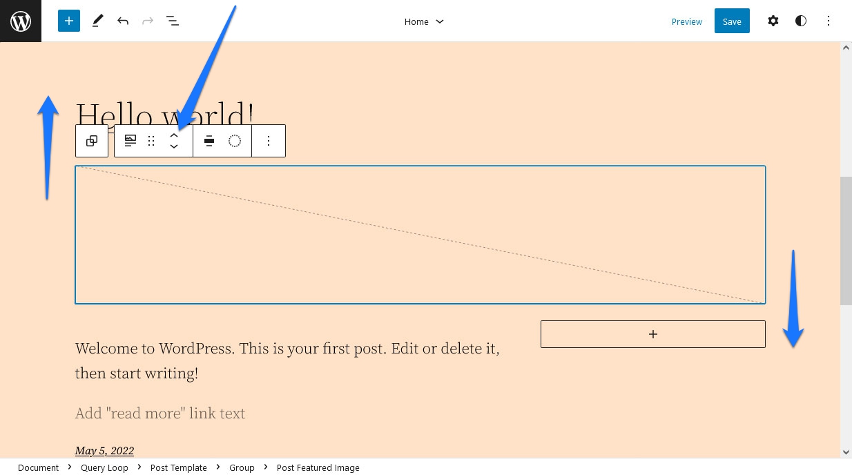
Alternatively, hover over the block and then use the Drag button (which looks like six dots) to move it to another position. If you hit Save after this, it will translate to the design on your site.

Using Block Options

In addition to the ability to move them around, every block also comes with its own settings. Like in the Gutenberg content editor, you can access those via the gear icon in the upper right corner. When a block is selected, you will see its customization options there.

What’s available in this place depends on the block you are working with. For example:

  • Post Featured Image: Has options to add the margin, padding, and configure image dimensions.
  • Pagination: Control the justification and orientation of its elements, wrapping, colors, and whether to show arrows, chevrons, or nothing as indicators.
  • Post Title: Besides setting colors, you can decide if the title should be a link, open in a new tab, or have a rel= attribute. You can also control colors and typography (including the ability to use Title Case) and add a margin.

You get the gist. Be aware that there are often more settings hidden that you can access via a plus or three-dot icon within the sections.

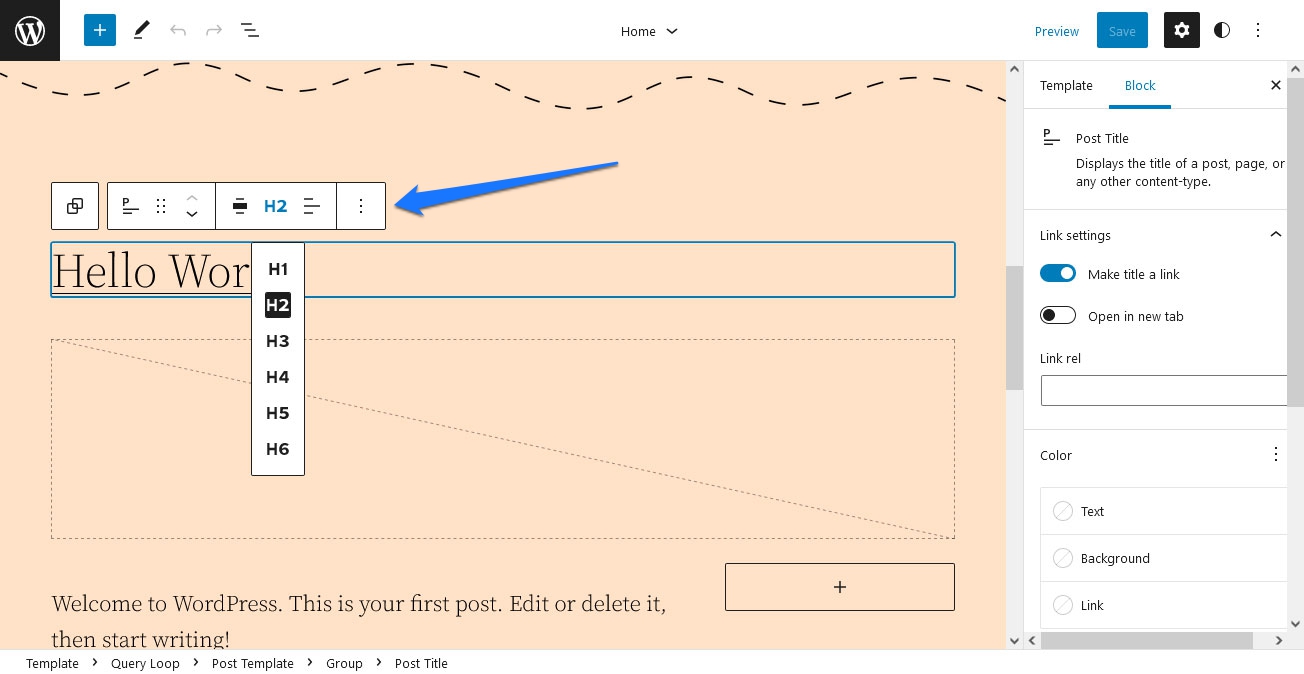
In addition, there are settings in the toolbar atop blocks when they are selected. You should not forget those as they can be decisive. For example, in the case of the Post Title block, it’s where you determine what order of heading (h1-h6) it takes, an important factor for SEO.

Adding And Removing Blocks

Of course, you can not just customize the available blocks, but you are also able to add your own. This works the same way as in the content editor and comes with different options:

  1. Hover over an empty space in the template until a plus button appears, and click it. Then search or choose what you want from a list of blocks.
  2. Click existing blocks and use the options button in the top bar to pick Insert before and Insert after.
  3. Use the plus button in the upper left corner to see and search the full list of available blocks, then drag and drop them where you want.

In some places and existing blocks, you will also find icons to add more blocks. Plus, you have the ability to add block patterns, but we will talk about this further below.

Leaves the question, how is any of this helpful?

Well, it means you can easily add both static and dynamic content to the homepage. An example would be a heading and paragraph above the Query Loop block as an introduction to your blog.

Naturally, you can also remove blocks you don’t want just as easily. Simply select one and hit the Del or backspace button on your keyboard, or remove it via the block options.

You also have the ability to open a list view at the top (the icon with three staggered lines) and navigate to blocks from there or choose to delete them right away.

This option also gives you a great overview of the block structure of whatever part of the site you are currently editing.

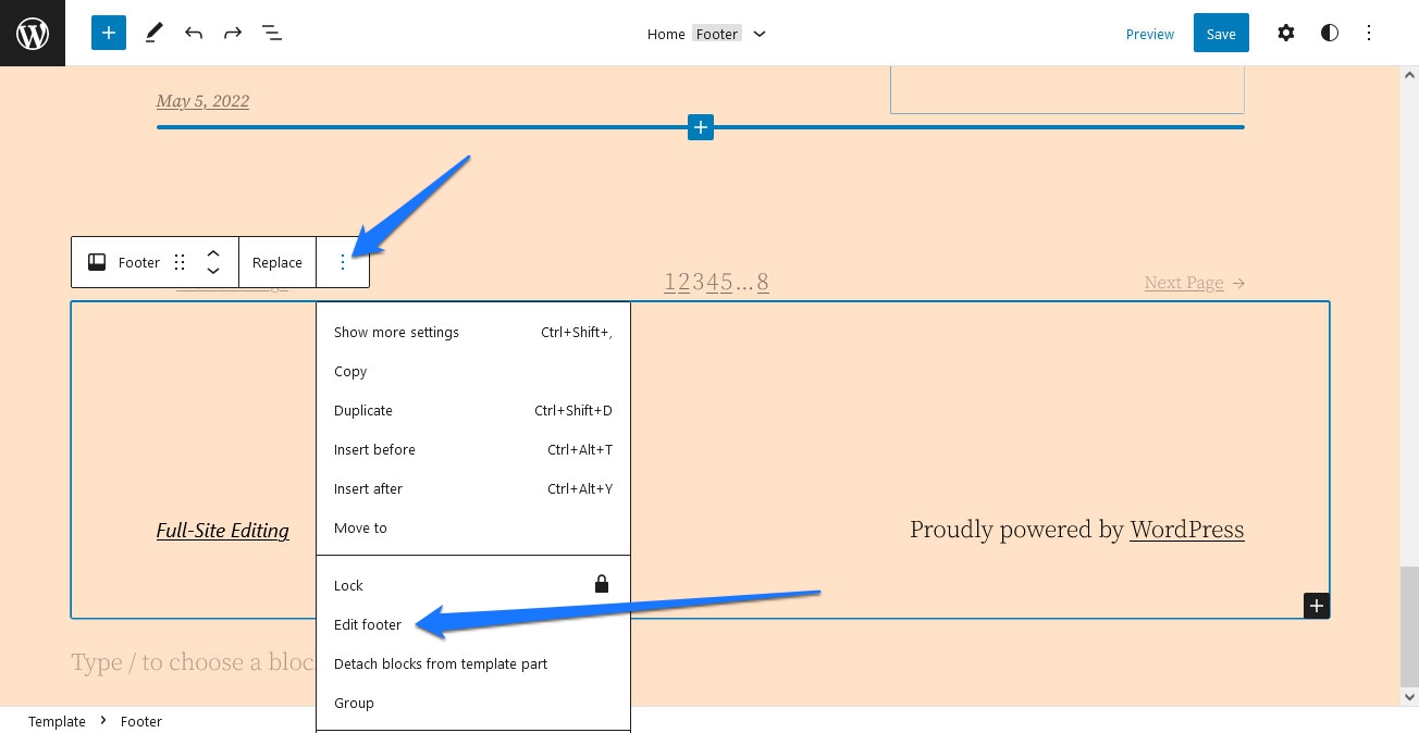
Exchanging And Editing Template Parts

Template parts are entire sections inside templates that you can exchange as a whole and modify separately. In the case of Twenty Twenty-Two, that is the header and footer. You can see this in the template options on the right or when you click the arrow in the top bar.

Template parts are just groups of blocks on the page, so you can edit them as described above. However, what’s special about them is that themes can offer variations that allow you to change the entire part with one click.

For example, when you select the header in the example, it will show a Replace option in the settings bar at the bottom.

When you click it, you can see the variations the theme offers for this template part, as well as fitting block patterns.

Twenty Twenty-Two has several default options to choose from. Click any of them, and Full-Site Editing will automatically replace the entire header with the new option.

The same works for the footer, of which Twenty Twenty-Two also has a few to offer.

Customizing And Creating Template Parts

To edit template parts separately, click on the WordPress logo in the upper left corner to open the following menu.

At the bottom, you will find a menu item called Template Parts. Click it to see a list of all available template parts on your site.

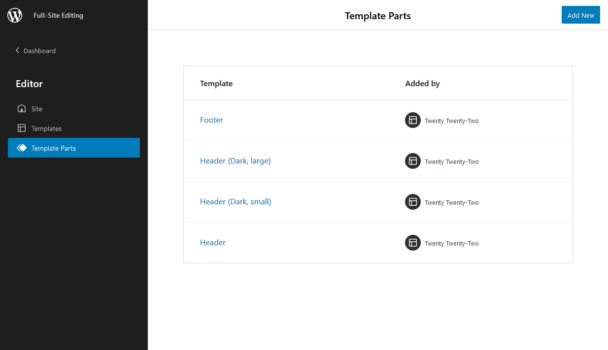
Alternatively, you can also select a template part and choose to edit it from its options.

In the Template Parts menu, click Add New in the upper right corner to create additional ones. This is useful if you want to make another version of the footer, for example. The cool thing is when you click it, besides asking for a name, WordPress automatically gives you templates for both header and footer, so you don’t have to start from scratch (unless you want to).

Besides that, you may also just click on existing parts in the list to edit them. This works the same way as in the main editor. The only thing that is different for template parts is that you have handles on the left and right that you can use to shrink and expand the size in order to check its behavior on smaller screens, i.e., mobile devices.

Just like a template file, anything you change and save here will translate to all pages and templates that use this part.

Finally, if you have set up a group of blocks on the main screen, you can turn them into a template part as well. Click the options in the main screen or in the list view and pick Make template part.

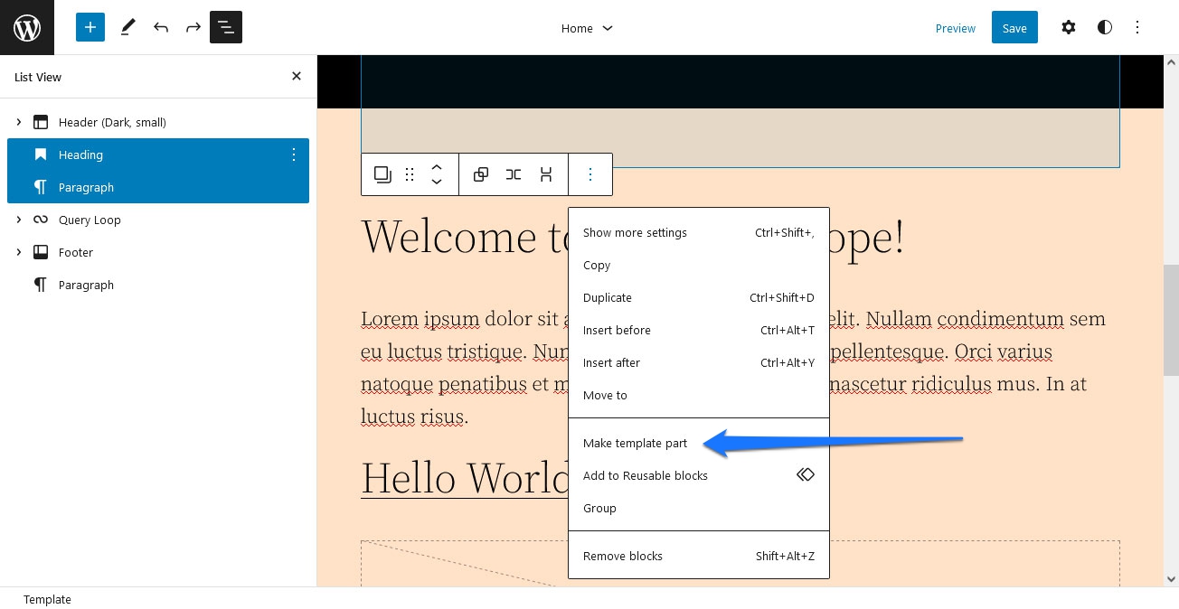
You need to give it a name and choose what area it belongs to. When you then save it, it is available as a template part.

Editing Page Templates

In the WordPress logo menu, there is also an item called Templates. Unsurprisingly, it contains a list of all page templates available on your site, from the 404-page over archives and single pages to single posts.

Page templates are usually files that control the basic layout of different types of content. If you change the template, all content of that type changes, too. With Full-Site Editing, you can edit existing templates and create your own in the user interface instead of a code editor.

Note, however, that FSE only lets you create standard page templates via Add New. More on that soon.

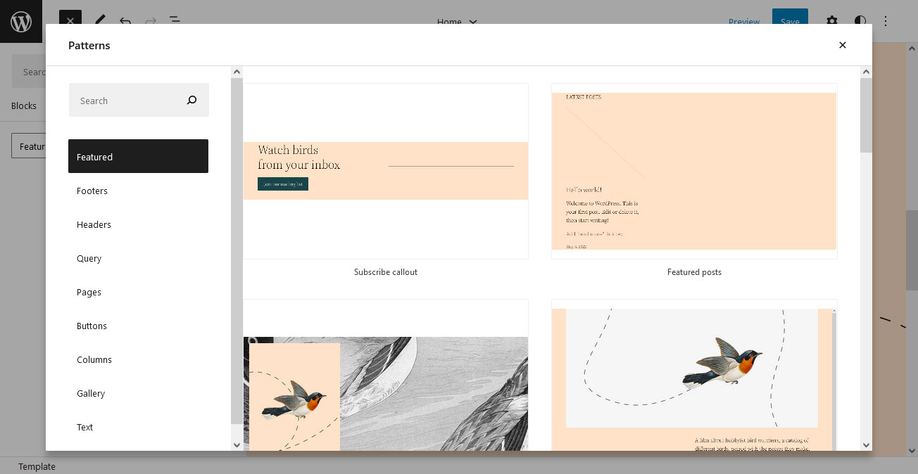
Something that comes especially handy here (and also for template parts) is block patterns. These are predesigned layouts consisting of several blocks you can add to website pages to instantly create entire sections. Examples include newsletter sign-up forms, pricing tables, and event lists, but also simple things like a styled divider or an image with a quote or caption.

Patterns allow you to put together entire designs quickly. They are easy to use, too! When editing a template, simply click the plus symbol in the upper left and go to the Patterns tab.

Filter the patterns via the drop-down menu at the top, e.g., by featured patterns, footers, pages, or buttons. If you find something you like, simply drag and drop it on the page. You can also search for something specific, like a “header” at the top, which will even show blocks from the WordPress block directory.

For a better overview, it helps to click on Explore to access the block pattern explorer.

This shows the block patterns in a larger window with the ability to search and filter them on the left. A click on a pattern you like automatically adds it to the template editor, where you can position and customize it as usual.

By the way, you can clear all customizations you have made for individual templates by clicking the three-dot icon in the Template menu and choosing so.

Adding New Block Patterns

Besides using what’s available, you also can add external block patterns from the pattern directory.

Search and filter to your needs. If you find something you like, simply use the Copy Pattern button on the pattern page to get it on your site.

After that, go back to the Full-Site Editing editor and paste it. The pattern will then show up there.

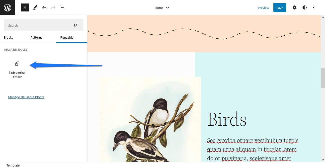
If you like it and likely want to use it again, click the three dots in the options bar and choose Add to Reusable blocks.

That way, it will, from now on, be available in the block menu under Reusable.

Using The Standalone Templates Editor

There is a second way to edit and create page templates, which happens in the normal Gutenberg content editor. It offers less complexity than the site editor interface (e.g., no access to other templates) but works similarly.

Simply create a new post or page, then, in the document settings sidebar, locate the Template panel below Status & visibility.

Here, it lists your current template and makes other options available in the drop-down menu. You can edit what’s already there via the Edit button or create a new template by selecting New. Each opens the more limited template editing experience.

Edit and save the template in the same way as in the site editor. Anything you create this way will also show up in the list of templates in the Full-Site Editing editor.

Available Blocks For Templating

To make templating in FSE possible, the developers have added a number of dynamic blocks that can pull content from the database depending on the following:

  • Site title, tagline, and logo;
  • Post title, featured image, content, excerpt, author, avatar, author biography, date, tags, categories, next and previous post, read more;
  • Post comments, single comment, comments query loop, author, date, content, count, comment form, and link;
  • Archive title and term description;
  • Query loop, post list, post template, pagination;
  • Template part.

These are also available in the normal WordPress editor. There are more to come in future versions, and you can get early access to them via the Gutenberg plugin.

Preview And Save Changes

When you have made all the changes you want, you have the option to preview them in different screen sizes by clicking Preview in the upper right corner.

If you are satisfied, a click on Save will make the modifications permanent. WordPress will also list which templates and template parts your changes will affect.

That way, if you want to discard them in one place but keep them elsewhere, you can do so. Simply uncheck those components where you don’t want to save your changes. Click Save again, and your choices will translate to the front end of your site.

Full-Site Editing For Developers And Designers

Full-Site Editing is also a useful tool for developers. You can use the interface to create templates and then export them as files to add to and publish as themes.

A Quick Primer On Block Theme Architecture

To take advantage of this, you need to be aware that FSE-ready block themes have a different architecture than classic WordPress themes. For one, the template and template-part files for Full-Site Editing no longer contain PHP but are HTML files with block markup.

Instead of style.css, styling is mostly taken over by theme.json. Here is where you set up styles for the block editor and individual blocks, styling presets, as well as CSS defaults (both for the front-end and backend editor). In fact, theme.json is so powerful that, by modifying it, you can change the style of an entire website.

Last week I created a quick demo of how the visual aesthetic of Twenty Twenty-Two can be drastically changed through its theme.json settings. This example swaps the default json file for one with different font, color, duotone, and spacing values. pic.twitter.com/ab9tyGwLOS

— kjellr (@kjellr) October 22, 2021

This also allows you to switch between different sets of global styles (i.e., theme.json files) in the same theme. It’s a feature that only arrived in WordPress 6.0.

Relying mostly on theme.json greatly reduces CSS in other places. For example, Twenty Twenty-Two’s style.css is only 148 lines long. For comparison, its predecessor Twenty Twenty-One has almost 6,000 lines in its style sheet.

In addition, theme.json uses a whole different kind of markup. Yet, you could write an entire article just on this one file, so you are better served to start with the documentation for details.

The minimum requirements for a block theme are to have an index.php, style.css, and an index.html file in a templates folder. The latter is what marks the theme as a block theme to WordPress.

If you want to add template parts, you will place those in a parts folder. Having a functions.php and theme.json files is optional. Finally, you can also include a styles folder for global style presets. For example, this can include different color schemes for the theme.

Besides the changed structure, you also have different ways of creating template files when using a block theme. While you can still do it manually, using the new WordPress interface is also possible.

Using FSE Or The Template Editor To Create Theme Files

If you want to use the page editors to create templates, the first step is to simply set up your templates as described in the first part of this article. One important option here is to know that you can use the Advanced settings for template-part blocks to change their type of HTML element.

When satisfied, you can download all your theme files at once. The option for that is available in the More tools & options menu, which you access by clicking the three dots in the upper right corner of the Full-Site Editing screen.

Here, locate the Export option. It will automatically download all template and template part files as a zip. Simply unpack them, and you can use them for your theme.

Manually Creating Block Theme Templates

Of course, it’s also possible to create template files by hand. For that, you just need to be familiar with block markup.

For the most part, these are just HTML comments that contain the name of a block prepended with wp:. Some of them are self-containing. For example, here’s how to add a site-title block to the template:

<!-- wp:site-title /-->

Others, like paragraphs, function like brackets:

<!-- wp:paragraph -->
<p>Lorem ipsum dolor sit amet, consectetur adipiscing elit.</p>
<!-- /wp:paragraph -->

You can also call template parts by stating the file name via slug. Here’s how to call footer.html:

<!-- wp:template-part {"slug":"footer"} /-->

You can even customize the HTML tag (default: div) via the tagName attribute:

<!-- wp:group {"tagName":"main"} -->

<!-- /wp:group -->

Here, too, it’s possible to use one of the editors above to create blocks and then simply copy the markup over if you are not sure. Plus, if you save a file and then add it to the respective location in the theme directory, it will also show up in the FSE editor.

For more details, refer to the resource list below.

Consequences Of Full-Site Editing For The WordPress Ecosphere

Besides providing a tutorial on how to use Full-Site Editing, I also want to talk about what its arrival means for the WordPress environment and those working there.

Job Opportunities For Developers And Designers

As is to be expected, an important question is whether this kind of feature will eliminate the need for professional developers and designers. Are they still needed when users can seemingly do everything themselves?

The short answer is “yes.”

Neither the emergence of WordPress itself nor page builders or page builder plugins, or any other technology that makes it easier for laypeople to build their own websites have eradicated the need for professional help. And it won’t happen this time, either.

While these days, users don’t need help for every little thing (like changing colors or fonts), there are still lots of tasks that non-technical site owners simply can not do with the available tools and where they need someone to do it for them. Plus, if you want a unique design and not rely on a template that hundreds or thousands of other people might also be using, you still need a designer and/or developer.

Plus, with great power also comes a great opportunity to screw things up (to loosely quote Spiderman). Just because everyone has the tools at their disposal to make a well-designed website, that doesn’t mean everyone can. Design is more than mere technical ability.

What’s more, not everyone actually wants to do the work. They’d rather hire someone with the skills than acquire them from scratch. Finally, there is so much more to a successful website than “just” design, such as SEO, performance, security, and maintenance.

So, even if there are fewer obstacles to building websites, there is no need to think that designers and developers are a dying breed. In contrast, the switch to new tools offers plenty of opportunities to build services and products around them.

What Does FSE Mean For The Theme Market And Theme Designers?

So what about theme creators? Does everyone have to switch to block themes now?

Here, it’s first important to keep in mind that many themes have not yet switched to the Gutenberg block editor and that there are still many users on the Classic Editor. The latter will also continue to work for a while as the plugin will still be supported until at least the end of 2022.

Also, all of the features described above are optional, not mandatory. Therefore, the switch does not have to be immediate. You can even build hybrid themes that are not complete block themes but are able to use block templates. This option exists by default unless you specifically switch it off.

Nevertheless, in the long run, it’s probably a good idea to move your existing themes over to FSE capabilities. It’s something that WordPress users will likely grow to expect as it gives them more flexibility and power to customize themes on their own.

At the same time, as described above, you can also use Full-Site Editing to create themes with less coding, which can speed up development time. Plus, it offers new economic opportunities. Besides themes, theme authors can now offer extensions like blocks and block patterns, opening up whole new business models and opportunities.

Full-Site Editing vs. Page Builder Plugins

The existing page builder plugins are probably one of the biggest question marks. Will the likes of Divi, Elementor, and Co survive when WordPress can do a lot of what they were created to provide?

First of all, it’s unlikely that everyone will immediately switch away from the tools they are used to working with, so page builder plugins will likely stay around for a while. Also, many of them are currently more powerful than what Full-Site Editing is capable of in its present form. Another reason to stay with what you have.

Overall, these types of plugins have become very established over the last years, to the point that they sometimes ship packaged with themes. For that reason, it’s improbable that they will suddenly lose all their market share. Despite that, Full-Site Editing will likely eat into it over time, especially with new users who get to know it as a normal part of WordPress.

Just like everyone else, page builder plugins will have to evolve so that they offer things that FSE doesn’t to stay competitive. One way would be to offer kind of hybrid plugins that extend WordPress’ native page editor. Similar things already exist for Gutenberg and for the Classic Editor.

Full-Site Editing: Further Resources

If you want to get even deeper into the topic of WordPress Full-Site Editing, I recommend you start with these resources:

Final Thoughts On WordPress Full-Site Editing

Full-Site Editing is an exciting new chapter in the evolution of WordPress. It makes the design process easier and more uniform across the entire platform, offering new opportunities for content creators and users to customize their pages.

At the same time, FSE comes with interesting challenges for developers and theme designers. It changes the architecture of themes as well as introduces new markups and workflows. However, the feature also offers rewards in terms of new opportunities and a faster way for prototyping and creating themes that require less coding.

Above, we have gone over everything FSE has to offer in detail. My personal impression is that it is a well-thought-out feature, and I am impressed by how much it can already do. I’d definitely recommend adding it to your WordPress skill set.

Sure, there is room for improvement. For example, I could not find an option to change the hover or active color for links and other elements. Also, it is not as powerful as existing page builder plugins though I am sure that new features will close the gap in the future. Yet, I really like its modularity and the ability to customize different theme parts in different ways. I’ll surely consider using it more in the future. How about you?

What are your thoughts on WordPress Full-Site Editing? How do you think it will impact users, developers, and the WordPress sphere as a whole? Please share your opinion in the comments!

Categories: Others Tags:

How to Create a Social Media Crisis Management Plan

October 14th, 2022 No comments

Every business – successful or struggling – needs a social media crisis management plan. The best social media crisis management starts long before any issue arises. 

The best social media crisis management starts long before a problem occurs. Any kind of crisis can hit your brand at any time. The last few years have been a wake-up call for many brands. According to PwC’s 2021 Global Crisis Survey, only 23% of US companies reported having a dedicated crisis response team at the start of the pandemic. Still, 62% of companies used a crisis response plan during the pandemic.

Even the trolliest of trolls can be withstood if you plan for the worst before it happens. Have a well-thought-out plan in place, including a list of important players, their roles, and the chain of command. If worst comes to worst, you’ll be prepared to salvage the reputation of your company. Moreover, you can also take the help of social media tools to solve the crisis. 

In this article, we’ll discuss how to handle the consequences when your good reputation is damaged. Let’s first begin with what is social media crisis.

What does Social Media Crisis Mean?

Any activity on social media platforms that might negatively affect the reputation of your brand is considered a social media crisis. A social media crisis occurs when there is a significant shift in the discussion about your brand on social media as a result of an event that has stoked widespread resentment, disappointment, or mistrust.

Let’s have a look at social media crisis examples:

Burger King posted an insensitive tweet on Women’s day

Although their campaign was designed to draw attention to the underrepresentation of women in the restaurant industry, it failed badly.

Red Bull had to pay $13 million to settle a false advertising class action suit

Source

Benefits of Social Media Crisis Management

Social media is a powerful tool that can help you in responding well to clients or detractors. It can help you manage the crisis by pursuing them. Let’s have a look at why crisis management is important:

  • You can communicate with almost all of your customer base using social media on one or more platforms. Around 90% of business marketers believe that their business has experienced good exposure because of social media. When a crisis arises, your business can quickly broadcast a message and move ahead. 
  • Using direct messaging or comments, you can communicate with customers on social media directly. Your customer service team can reply to a single customer’s concern instantly via a private or public message. An efficient response from your customer service team can serve as a good example of your team’s credibility if the customer posts publicly on your timeline.

How to Create an Effective Social Media Crisis Management Plan

A proper response strategy for your social media channels is essential for handling everything from backlashing comments to natural disasters. Let’s delve into the steps to create a crisis management plan:

Identify the source of the problem

Finding the issue and its source is the first step in creating a social media crisis response. Every social media crisis does not originate online. A social media uproar frequently follows a news event or popular culture phenomenon. Understanding the crisis’s root cause will help you choose the best course of action and distribution for your response.

Respond promptly 

Organizing your workflow is important. How you choose to respond makes all the difference. Quick social media responses help in creating long-lasting relationships. Impossibly, ignoring the issue won’t make it go away. And the better your reaction time, the faster. After all, even in the best of circumstances, over 75% of customers expect brands to respond to their complaints or negative comments within 24 hours. Being responsive is even more crucial when a crisis is present.

That might just entail promptly deleting the offending post, or it might entail making sincere repentance or apology. Whatever the solution, acting quickly is always preferable because delaying only gives the issue more time to worsen.

Burger king deleted its post within a few hours of posting it and issued an apology tweet.

Have a communication plan

Create a social media crisis communication plan if you don’t have one. This is something you should create when things are going well so you can respond rationally and practically in a social media emergency. Use the best social media marketing tools as a part of your communication strategy.

Practice social listening 

Know what to share and when to stop? We can’t carry on as if nothing is wrong during a crisis. As a social media professional, it’s essential that you are clued up about the operations, strategies, and policies of your organization so that you can communicate with your audience clearly and empathically even when circumstances change on an hourly basis.

Instead of debating how to handle things or waiting for senior managers to weigh in, you’ll be able to react quickly to any potential issue if you have this document ready to go.

Apologize if its the need of the hour 

It makes sense to want to return to “normal” as soon as possible if you find yourself in social media crisis management mode. An apology, however, is one aspect of a crisis that you should take your time with.

Many customers vowed to boycott Procter & Gamble (P&G) after the company shared a post saying that women’s feet smelled “five times worse than men’s.” P&G later deleted the message after issuing an apology for the remarks and admitting the consequences of their improper conduct.

Social Media Crisis Management Tips for Businesses and Brands

Social media crisis usually comes in the form of incessant customer Tweets over a service issue, or it could be a poorly timed or insensitive social media post from your brand. Use a small leadership team to triage the situation in the case of a crisis, carry out any necessary brand social media responses, and keep teams updated. Here are some tips that can cover you during the time of a crisis:

1. Get your team together

As each employee is vital, all of them can be on your crisis management team, depending upon your requirements. Yet, assemble a team of responsible first responders, each with a specific responsibility. To effectively implement decisions, management must coordinate, and content writers must carefully craft the desired message.

2. Keep the internal communication moving

Just like external communication, rumors and false information can spread quickly. Internal communication should be a part of your crisis communication strategy. This reduces stress and uncertainty and keeps everyone on the same page.

3. Put scheduled posts on pause

You must forget that you have a long social queue when a mad panic is breaking out all around you. You simply can’t afford to post “Happy #ThrowbackThursday — Have a beautiful day” accidentally after your product just generated a significant backlash.

4. Be sympathetic while speaking with commenters

Your initial response has been posted. You’re putting more thought into your messaging, and you plan to include a formal statement or video from the CEO. However, you must also work on this crisis’ front lines. and that entails reading through online mentions or entering the comment section. Don’t disregard the insults. Engaging the public is essential to demonstrate that you value their feedback and are attentive to their concerns. But keep it brief, and avoid arguing at all costs.

5. Monitor what people say about your company

You must head off every potential crisis before it grows and reaches entirely new audiences on social media. Take the help of social listening tools.

Start preparing now!

The good news is that a social media crisis may present an opportunity to strengthen your brand. You must be ready and maintain composure when a crisis arises in order to manage social media effectively.

Keep in mind the phase of crisis management before social media. You’ll gain some time in the initial stage if you’re ready for a social media crisis. This time can be used to get ready for the next stage of social media crisis management. Keep your composure during the crisis and interact with your supporters. Give your side of the story and make an effort to calm the tensest arguments in private communication.

The post How to Create a Social Media Crisis Management Plan appeared first on noupe.

Categories: Others Tags:

How To Make A Presentation Video Stand Out

October 14th, 2022 No comments

People adore watching videos. A study claims that videos engage viewers 75% more than papers, articles, and other simple media. This is the reason an increasing number of businesses are using them for their operations. 

A video presentation is one of the most often used presentation formats. In this post, we’ll define video presentations, discuss their applications, and provide some tips and tricks to work with them.

Here’s what a video presentation is

A video presentation is a typical kind of multimedia material with a runtime of a few seconds to a few minutes. It uses compelling visual imagery, brief text, and suitable narration to demonstrate the advantages of a service, product, or concept. 

There are several formats available for video presentations. They may be PowerPoint slides with a talking head narration, fully animated explainer videos, cartoons, invitation videos, screencasts, tutorials, video advertising, promo videos, marketing videos, product demonstrations, etc. In the end, you decide on the format.

The purpose of a Video Presentation

Video presentations are not only more attractive than straight information, but they are also:

Persuasive

Video presentations are better equipped to convince their target audience through audio-visual design, narrative, and incorporating emotions, ideas, and noises into the mix.

Better for retaining knowledge

According to reports, people recall 95% of a message when presented in a video as opposed to 10% when presented in the text. As a result, educators often employ video presentations while introducing new instructional materials or as part of the digital storytelling idea. 

Everywhere and at any time accessible

People prefer to explore movies on their phones and tablets, where they like spending a lot of time. We discovered that 75% of all videos are seen on tablets and mobile devices. Hence video presentation is an efficient way to grab mass audiences’ attention and time.

Efficient with time

The purpose of video presentations is to allow the creator to divide the information into manageable, more digestible portions. This makes it faster and simpler for visitors to discover more information.

Essential tips for working with Video Presentations

Tell uplifting tales

Your video material should always have a purpose. Creating a story for your films may foster a genuine relationship with your viewers. An in-depth discussion of your topic should be included in it. It ought to demonstrate your subject-matter knowledge. 

Creating a clear video that utilizes your subject expertise will greatly benefit your viewers. Only then will your audience respond more favorably to the presentation’s substance and you. The correct PowerPoint templates or Google Slides templates will maintain the presentation’s consistency and enable audience interaction with your video.

Describe trends

Stories make up 70% of the most popular and creative presentations. You have to make a film on the most recent developments in your sector and add it. The video needs to provide novel perspectives on the current and future of the subject matter’s field. 

Your audience will know the present market scenario if you discuss the broad market trends. This increases engagement since it gives the audience a feeling of control and drives them. 

The industry-trends-focused film will nudge viewers to chat about where they are now and what opportunities they are looking for. After the patterns are analyzed, any operational gaps can be filled, and modifications can be made.

Videos should be brief

Including short films in your presentations is the secret to hitting the appropriate buttons. You have a unique chance to quick-pitch with short video material. It needs to be instantly understandable, hard-hitting, and relevant videos. 

Like nothing else, brief and exciting video clips may draw viewers to your content. Not only that, but short movies are simple to share, reuse, and recall across several marketing platforms. Your little film needs to be direct and to the point. Treat your viewers like kings and offer them snippets of an engaging tale while making a little video.

Utilize emotional stimuli

It is important to first comprehend what emotional triggers are. These are the characteristics of the activities or characteristics seen in films that stimulate an emotional reaction. Video creation should begin with the establishment of a relevant persona. This will elicit a feeling and keep your audience’s attention for the duration of the presentation. 

Videos provide you with the unique option to enlarge and focus on certain parts of the screen. Your viewers will be more attentive to the main points of your topic if you use close-ups in the video.

Pick the appropriate path

Music is the literature of the heart, as someone once stated. You should choose and incorporate the music based on the presentation’s subject. If the video is a motivating presentation for your staff, the music should be upbeat and energizing. Subtle music may be effective if you’re attempting to convince your audience to pay attention to a serious subject. 

The video should include dramatic music if it is intended for sales or marketing campaigns. One should be aware of the genre that would be ideal for their industry. The greatest choice for business presentation films is to use warm, engaging, and subtle songs.

To Sum Up

With PowerPoint, you can broadcast your presentation live. As a plug-and-play presentation, the whole presentation may be created as a video. Video material in your presentation may instantly capture your audience’s attention. It is common for presenters to begin with a video. The ultimate goal is to express more with less. Your video should evoke a certain feeling in your viewers. Today’s audience wants diversity; only then can engagement be assured.

The post How To Make A Presentation Video Stand Out appeared first on noupe.

Categories: Others Tags:

Top 5 Must-Have Lead Nurturing Tools In 2022

October 13th, 2022 No comments

Half of your leads are not even ready to make a purchase while filling out your lead form. Over 80% of these leads don’t even convert, but hey, don’t fret. These results can be dramatically improved by working on lead nurturing after lead generation. In fact, businesses that implement a well-defined lead nurturing strategy bring 50% more sales at significantly lower costs!

If you haven’t focused on lead nurturing, continue reading this guide, as we will cover all you need to know about it.

Why Does My Business Need a Lead Nurturing Tool?

Lead nurturing, itself, is the process of developing relationships with your prospective buyers at every step of their sales journey – starting from product awareness to purchase. The end goal is to turn leads into repeat customers.

This process is crucial for your business because it allows you to build credibility and trust with your audience. Through lead nurturing, you can make a lasting impression on your client – which convinces them to make the purchase.

This process is time-consuming as you need to interact with customers, gather their data, recognize patterns, and develop your marketing strategies accordingly. But thanks to the technological advancements, automation tools are available in this area too. Let’s talk about the top 5 of them!

Here are some of the must-have lead nurturing tools that will cater to your business requirements:

HubSpot

Source

If you know SEO and Digital Marketing, it’s a safe bet you’ve heard about HubSpot. It has almost everything you need to run a cohesive campaign and ensure you convert your leads to hard cash. Their “Operations” software helps you acquire, curate, and store customer information. Their CRM is extremely mature and is backed by a long history of market-leading solutions. HubSpot has one of the most comprehensive suites of tools you can find for CRM and Lead Nurturing.

Pros and Cons:

Pros:

  • Good pedigree in the market
  • Comprehensive suite of tools
  • Cohesive Workflow

Cons:

  • The Starter plan has very limited tools.
  • Business and Enterprise plans are expensive.

Pricing:

  • Pricing starts at $45 per month.

ProxyCrawl

Source

ProxyCrawl is an all-in-one data crawling and scraping platform that helps businesses carry out data mining or SEO without worrying about worldwide infrastructure or proxies. This platform allows you to crawl and scrape websites in a matter of minutes. Even though it can be utilized differently through its range of products, we should stick to our motto: nurture leads.

Generating leads off any website can be as quick as toasting a bread. With the Leads API, you can get thousands of leads off anything on the internet.

With ProxyCrawl’s Crawler, you can put your mind at ease since you save costs and countless hours on system design and actual task processing. With close to zero failures at your end, you can be focused on getting enough leads in your pipeline.

This is why ProxyCrawl’s Crawler is popular amongst enterprises that want work done at scale, faster and better!

Pros and Cons:

Pros:

  • Offers a free trial
  • Does not charge for failed requests
  • Supports enterprise-grade, large-scale data scraping projects
  • Supports Cloud and On-site setup
  • Offers asynchronous queries to be run on the cloud
  • Allows to build data pipelines
  • Very low failed requests

Cons:

  • Limited video content for new users..

Pricing:

ProxyCrawl offers various packages for the tool suite it brings to boost your business. The pricing for ProxyCrawl starts as low as $29 per month for the Leads API.

Churnfree

churnfree.com.png

Whether you have an already successful business, one falling apart or starting a new one, you need to know how you can help them draw maximum value out of your product or service at every stage. For that, you need to know if they are stuck, need some help with setting up, or have no idea what to do next.

You don’t want to lose customers by letting them use your product or service without getting enough value out of it. Plus, you need to educate them and notify them of new features. Churnfree is a marketing automation and customer retention tool that helps you build customized flows to retain customers by keeping them engaged through real-time analytics of all flows, thus reducing churn.

Pros and Cons:

Pros:

  • Comprehensive Tool
  • Supports customized flows
  • Detailed Analytics
  • Quick Deployment

Cons:

  • No free trial

EasySendy

Source

With easy, drag and drop templates, an email campaign can be set up in a very short time. Grow your subscriber lists with customizable opt-in forms. With drip campaigns, you can keep your users and users engaged so that you give them the most value, make them make a life-changing decision and in turn, scale your business.

EasySendy can be integrated with Shopify, WooCommerce, Amazon SES, Zapier, and 20 other tools.

Pros and Cons:

Pros:

  • Customizable Design
  • Easy Integration
  • Simple User Experience For New Users
  • Email Verification
  • Free Version

Cons:

  • No A/B Testing

LeadBoxer

Source

LeadBoxer comes with lead scoring technology that allows marketing teams to estimate how likely a prospect is to purchase a product. In addition, this tool also lets you identify and track anonymous leads.

LeadBoxer is another beneficial marketing and sales strategy tool that brings more than just campaign management to the table. This tool offers detailed behavioral analytics and campaign personalization, which are crucial in lead nurturing.

Pros and Cons:

Pros:

  • Comes with a user-friendly interface.
  • Highly cost-efficient.

Cons:

  • Brings low-quality leads.

Pricing:

The pricing for LeadBoxer starts at $195 per month.

Ortto

Source

As one of the leading lead nurturing software, Ortto works with over 10,000 companies. Formerly known as Autopilot, this company allows businesses to segment their audience across the customer lifecycle. It also offers omnichannel experiences coupled with personalized communication automation.

The best part is that this tool works well for cross-channel campaign management by integrating multiple third-party apps such as Microsoft, Livechat, and Patreon.

Pros and Cons:

Pros:

  • Easy workflow.
  • Free 14-Day Trial
  • Covers all the necessary tools for a cohesive marketing campaign.

Cons:

  • Limited email customizations.
  • Complicated UI.

Pricing:

The pricing for Ortto starts at $29. This tool also offers a free plan for businesses that may want to run a trial first.

4 Most Highly Effective Lead Nurturing Tactics

You got the tools. You got the concepts. But to effectively implement these tools, you need tactics that bring better customer retention, increased revenue, and enhanced customer loyalty. Here are some of the tried and tested tactics you can couple with your chosen lead nurturing tool to extract optimized results:

  • Use multiple channels: You can reach a wider target audience through a multi-channel marketing approach. For this to work, you can use a combination of paid retargeting, marketing automation, and social media posting.
  • Create Targeted Content: One size does not fit all in the lead nurturing world. So make sure every single content piece is written with a unique buyer persona, specifically targeting their goals, interests, and objectives.
  • Focus on Personalized Emails: Again, a personalized email holds the power to trigger a response from the right people at the right time.
  • Follow-Up Timely: Follow up on each one of your emails promptly while keeping them engaged and interested in your particular brand.

These tactics will surely get your desired customers in your store and retain them for longer than usual. Just make sure you are being compassionate and realistic. Nobody wants to be dealing with bots.

Final Words

So there you have it; the top 5 must-have lead nurturing tools that your business needs to survive the market in 2022. As a bonus, we have also added some highly effective lead nurturing tactics. So what are you waiting for?

Get these tools and implement these tactics to get the most leads for your business.

The post Top 5 Must-Have Lead Nurturing Tools In 2022 appeared first on noupe.

Categories: Others Tags:

5 Best SMTP Plugins for WordPress

October 13th, 2022 No comments

If you have a website, it’s probably on WordPress!

Currently powering 43% of the web, WordPress is primarily popular because of its wide range of built-in features and incredibly active community. However, a common issue with WordPress is that it isn’t reliable when it comes to sending emails.

If you want to ensure reliable email deliverability from WordPress, you need to use an SMTP plugin. And in this article, we’ll discuss the best SMTP plugins for WordPress.

But before that, let’s understand what is an SMTP plugin and why you must have an SMTP plugin installed on your website.

What is a WordPress SMTP plugin and why do you need one?

WordPress comes with a wide array of powerful built-in features. This CMS lets you build excellent websites with many functionalities, including email sending. The email-sending feature helps you send vital notifications and transactional emails such as:

  • Sign-up confirmation emails
  • Password reset emails
  • Form submission notifications
  • purchase notifications and invoices

These emails are often vital for a website’s security and reputation, and failing to deliver such emails can cause serious issues.

Unfortunately, the default emailing functionality of WordPress isn’t reliable. Since WordPress is built using PHP, its email functionality also depends on a PHP function called wp_mail(). Whenever an email is triggered from WordPress, WordPress uses the wp_mail() PHP function to package the email and send it to your hosting server for authentication and delivery.

Most hosting servers aren’t optimized for emailing, and some don’t even offer email sending. Moreover, PHP isn’t a reliable method for authenticating emails. As a result, most hosting servers blocks PHP emails from sending, and email clients filter them to the junk folder.

This is where a WordPress SMTP plugin comes in. A WordPress SMTP plugin replaces the default mailing functionality of WordPress and authenticates WordPress emails via SMTP. You can also integrate a reliable email-sending service of your choice to ensure inbox placement.

5 Best SMTP Plugins to Fix WordPress Email Deliverability

An SMTP plugin can help you solve most of your WordPress email deliverability issues. You can choose any SMTP plugin if it supports integration with your preferred email hosting service. However, it’s ideal to choose a plugin that offers easy configuration and email logging.

Here are the 5 best WordPress SMTP plugins we’ve chosen depending on the integrations and features they offer:

FluentSMTP

FluentSMTP is undoubtedly the most powerful SMTP plugin for WordPress at this moment. It comes with the highest number of email service integrations and features. Moreover, the configuration process is easy for most email service platforms because it supports API integration.

Currently, FluentSMTP supports Amazon SES, SendGrid, Mailgun, Sendinblue, PepiPost, SparkPost, and Elastic Mail integration via API, and you can connect Gmail/Google Workspace and Microsoft 365 via OAuth. FluentSMTP also supports Zoho and other email services using SMTP credentials. 

The plugin comes with some of the most advanced features compared to any available SMTP plugin. Here’s what FluentSMTP is capable of:

  • Email logging: View logs of all emails sent from WordPress
  • Email test: Test email deliverability by sending a sample email
  • Email resending: Resend failed emails in bulk
  • Multiple SMTP connections: Use two or more email-sending services for different purposes
  • Email fallback: Route emails via a different service if your primary
  • Reporting dashboard: Get a visual report of all emails sent from WordPress
  • Auto-delete email logs: Keep your WordPress database clean by auto-deleting old email logs
  • Email Summary: Regular email summary notification to stay updated about WordPress email deliverability

Despite being a relatively new plugin, FluentSMTP offers way more features than any other plugin. And the best part? —FluentSMTP promises to remain free forever! No wonder why more than 100K users have adopted this plugin!

WP Mail SMTP

WP Mail SMTP is the most popular SMTP plugin for WordPress. More than 3 million websites are utilizing this plugin to send their WordPress emails. The plugin comes with all of the key SMTP features and has an excellent setup wizard to guide you through SMTP configuration.

WP Mail SMTP offers several built-in email service integrations, which include Gmail/Google Workspace, SMTP.com, SendLayer (#1 Recommended), Sendinblue, Mailgun SMTP, SendGrid SMTP, Postmark SMTP, SparkPost SMTP, Microsoft 365, Amazon SES, Zoho. And like FluentSMTP, WP Mail SMTP lets you connect many other email services via SMTP credentials.

Key features of WP Mail SMTP include:

  • Email logging: This Lets you view a log of all emails sent from WordPress
  • Email reporting: Get visual stats for WordPress emails
  • Open and click tracking: Track email opens and clicks for WordPress emails
  • Email failure alert: Instantly sends an email notification if a WordPress email fails to send
  • Email Summary: Get weekly WordPress email sending statistics notification
  • Notification control: Control which WordPress email notification to send and which not to send

As an Awesome Motive product, WP Mail SMTP is the most reliable SMTP solution available for WordPress. The base plugin is free however, crucial features such as email logging is only available in the premium version, which starts at $99/Year. You can also get hands-on assistance for setting up SMTP if you need it.

Post SMTP Mailer

Post SMTP Mailer is another reliable SMTP solution with excellent features and multiple email service integrations. With its intelligent setup assistant, you can set up any supported email-sending service and test email deliverability.

Unlike the aforementioned plugins, Post SMTP Mailer only supports API integrations. This means you can only integrate Post SMTP Mailer with the supported email-sending services. Post SMTP Mailer currently supports integration with Gmail or Google Workspace, Hotmail, Yahoo, Mandrill(MailChimp’s transactional email service), Mailgun, SendGrid, Sendinblue, Amazon SES, and Office 365.

Post SMTP Mailer offers better security for sending WordPress emails. Key features of this plugin are:

  • Email debugging: Test WordPress email deliverability for sent emails
  • Email logging: View logs for emails sent from WordPress
  • Email notification control: Control email notifications sent from WordPress
  • Email fallback: Use a secondary email service if the primary service fails to deliver WordPress emails
  • Security: SMTPS and STARTTLS (SSL/TLS) support for secure email delivery

Like WP Mail SMTP, Post SMTP Mailer also provides hands-on assistance for configuring your email service. Post SMTP Mailer is a great solution if you’re using any of the supported email services. However, a vital feature like email logging is only available as an extension. Membership prices start at $39.

Mail Bank

Mail Bank is a WordPress SMTP plugin that offers fewer email service integrations and features however, it does what it says on the tin. This plugin supports OAuth 2.0 integration with Gmail, Outlook, and Yahoo. Additionally, you can connect MailGun and SendGrid email services via API.

Feature-wise, Mail Bank is pretty basic. Here’s a feature overview:

  • Email logging: View email delivery status on email logs
  • Debug log: Shows which emails failed to deliver and why
  • Connectivity test: Helps you check the connectivity of the email service you’re using
  • Encryption: SSL, TSL, and no encryption
  • Role management: Determine which users will get to access SMTP settings

Mail Bank is a good SMTP plugin if you’re looking for a free core plugin. However, some features are locked behind the pro, which starts at $29.99/Year.

Easy WP SMTP

If you’re looking for the simplest SMTP plugin for your WordPress site’s email deliverability, Easy WP SMTP is the right tool for you. This plugin has no built-in email service integration however, you can connect any email service that allows integration via SMTP credentials.

Since this plugin supports SMTP credential integration, practically, it’s possible to integrate with any email service that supports SMTP authentication. Easy WP SMTP offers some unique features such as:

  • Email testing: Test and debug email deliverability
  • Domain check: Prevents using SMTP settings for additional domains

Easy WP SMTP is pretty easy to set up and delivers WordPress emails securely. It’s an excellent free option if you’re not looking for too many SMTP features. However, since this plugin doesn’t have any notification or logging feature, it can be hard to determine whether your WordPress emails are getting delivered or not.

Start sending WordPress emails the right way!

Some emails are simply too important for an authoritative website. So WordPress email deliverability failure is an alarming issue for most website owners.

Every WordPress site needs an SMTP plugin to deliver WordPress email reliably, and our list of the best WordPress SMTP plugins offers reliable email deliverability. Hopefully, now you’ll be able to choose a quality SMTP plugin and solve your WordPress email deliverability issue once and for all!

The post 5 Best SMTP Plugins for WordPress appeared first on noupe.

Categories: Others Tags:

A Pure CSS Gallery Focus Effect with :not

October 13th, 2022 No comments
Animated GIF of a mouse cursor hovering over elements. The element the mouse cursor enters remains visible and the other elements fade.

Oftentimes in the past, I needed to figure out how to add styles to all elements inside the container but not the hovered one.

Demo of the expected “fade-out” effect on siblings to let users “focus” on a particular element.

This effect requires selecting the siblings of a hovered element. I used to apply JavaScript for this, adding or removing the class that defined the proper CSS rules on mouseenter and mouseleave events, similar to this:

CodePen Embed Fallback

Although the code does the trick, my gut feeling always told me that there must be some pure-CSS way to achieve the same result. A few years ago, while working on a certain slider for my company, I came up with a solution similar to how Chris Geelhoed recreated the famous Netflix homepage animation and I understood that I didn’t need JavaScript for this anymore.

A couple of months ago I was trying to implement the same approach to a grid-based feed on my company website and — boom — it didn’t work because of the gap between the elements!

Luckily for me, it appeared that it doesn’t have to stay like this, and once again I didn’t need JavaScript for it.

Markup and base CSS

Let’s start coding by preparing the proper markup:

  • .grid is a grid-based
      list;
    • and .grid__child elements are
    • children that we want to interact with.

    The markup looks like this:

    <ul class="grid">
      <li class="grid__child"></li>
      <li class="grid__child"></li>
      <li class="grid__child"></li>
    </ul>

    The style should look like this:

    .grid {
      display: grid;
      grid-template-columns: repeat(auto-fit, 15rem);
      grid-gap: 1rem;
    }
    
    .grid__child {
      background: rgba(0, 0, 0, .1);
      border-radius: .5rem;
      aspect-ratio: 1/1;
    }

    This example code will create three list items occupying three columns in a grid.

    The power of CSS selectors

    Now, let’s add some interactivity. The approach that I initially applied was based on two steps:

    1. hovering on the container should change the styles of all elements inside…  
    2. …except the one that cursor is hovering at the moment.

    Let’s start with grabbing every child while the cursor is hovering over the container:

    .grid:hover .grid__child {
      /* ... */
    }

    Secondly, let’s exclude the currently hovered item and reduce the opacity of any other child:

    .grid:hover .grid__child:not(:hover) {
      opacity: 0.3;
    }

    And this would be perfectly enough for containers without gaps between the child elements:

    Animated GIF of a mouse cursor interacting with elements that are not separated by any gaps.
    Demo of a solution that works without gaps.

    However, in my case, I couldn’t remove these gaps:

    Animated GIF of a mouse cursor hovering over elements. However, when the mouse enters a gap between two elements, the effect ends as the mouse leaves the element.
    Demo of the problem encountered when gaps are introduced.

    When I was moving the mouse between the tiles all of the children elements were fading out.

    Ignoring the gaps

    We can assume that gaps are parts of the container that are not overlayed by its children. We don’t want to run the effect every time the cursor enters the container, but rather when it hovers over one of the elements inside. Can we ignore the cursor moving above the gaps then? 

    Yes, we can, using pointer-events: none on the .grid container and bringing them back with pointer-events: auto on its children:

    .grid {
      /* ... */
      pointer-events: none;
    }
    
    /* ... */
    
    .grid__child {
      /* ... */
      pointer-events: auto;
    }

    Let’s just add some cool transition on opacity and we have a ready component:

    CodePen Embed Fallback

    It’s probably even cooler when we add more tiles and create a 2-dimensional layout:

    CodePen Embed Fallback

    The final CSS looks like this:

    .grid {
      display: grid;
      grid-template-columns: repeat(auto-fit, 15rem);
      grid-gap: 3rem;
      pointer-events: none;
    }
    
    .grid:hover .grid__child:not(:hover) {
      opacity: 0.3;
    }
    
    .grid__child {
      background: rgba(0, 0, 0, .1);
      border-radius: .5rem;
      aspect-ratio: 1/1;
      pointer-events: auto;
      transition: opacity 300ms;
    }

    With only 2 additional lines of code we overcame the gap problem!

    Possible issues

    Although it’s a compact solution, there are some situations where it might require some workarounds.

    Unfortunately, this trick won’t work when you want the container to be scrollable, e.g., like in some kind of horizontal slider. The pointer-events: none style would ignore not only the hover event but all the others, too. In such situations, you can wrap the .grid in another container, like this:

    <div class="container">
      <ul class="grid">
        <li class="grid__child"></li>
        <li class="grid__child"></li>
        <li class="grid__child"></li>
        <li class="grid__child"></li>
        <li class="grid__child"></li>
        <li class="grid__child"></li>
        <li class="grid__child"></li>
      </ul>
    </div>

    Summary

    I strongly encourage you to experiment and try to find a simpler and more native approach for tasks that are usually expected to have some level of complexity. Web technologies, like CSS, are getting more and more powerful and by using out-of-the-box native solutions you can achieve great results without the need of maintaining your code and cede it to browser vendors.

    I hope that you liked this short tutorial and found it useful. Thanks!

    The author selected the Tech Education to receive a donation as part of the Write for DOnations program.


    A Pure CSS Gallery Focus Effect with :not originally published on CSS-Tricks, which is part of the DigitalOcean family. You should get the newsletter.

Categories: Designing, Others Tags:

5 Tips to Avoid Copyright Infringement as a Marketer

October 13th, 2022 No comments

Being a marketer means using a lot of innovation in order to get your brand’s message across, but you need to be careful about crossing the line between innovation and copyright infringement. In this article, we’ll share five tips for staying on the right side of copyright infringement law.

Marketing is a creative business, and proactive marketers are often required to think outside of the box when it comes to creating effective ads and messages while saving money. While this is necessary, copyright lawyers may be finding that marketers are either deliberately or inadvertently breaching copyright laws.

In this article, we’ll be sharing eight tips for avoiding copyright infringement as a marketer.

What is Copyright Infringement?

This is the term for when somebody uses or shares work that belongs to somebody else, and which is protected by copyright law. Copyright protects a person’s intellectual property, and unlawful use can result in legal action in some cases.

Tips to Avoid Copyright Infringement

Some examples of how to avoid copyright infringement in various media include:

1. Social media

Social media often makes up a sizable chunk of your overall marketing and, as such, it’s important to get to know the platforms that you’re using. Each platform, for example, Facebook, Twitter, and YouTube has its own set of rules and regulations when it comes to content. Familiarising yourself with these will help you to stay on the right side of the law.

2. Photographs and video

Source

No social media marketing campaign is complete without photographs and videos. Marketers will often make light work of searching the internet for appropriate images before quickly copying or downloading them for use in their campaigns. In many cases, a marketer will assume that, if a photograph is not watermarked then it’s up for grabs, however, this isn’t necessarily the case. 

Before copying and using any photograph or video, it’s the responsibility of the marketer to find out if copyright applies – in which case, they will need to contact the owner of the work to request permission. A safer option is to use a specific site that offers royalty-free photographs, such as Unsplash.

This can protect you against possible copyright infringement issues. However, you may find that the images that you use are also being used by a large number of other businesses.

3. Plagiarism

Creating content for marketing campaigns will often involve quoted content from other people and websites. Largely speaking, it’s absolutely fine to quote content from others.

However, you should always credit this as appropriate – for example, by crediting the owner by name or by linking to the original content. The latter can be done quickly and easily by creating a hyperlink.

4. Music

Source

Just like written content, photographs, and videos, music is classed as intellectual property and is, therefore, ‘owned’. Music can be a great way of adding depth to a marketing campaign, but it can also land you in legal hot water.

This month, Prime Minister, Liz Truss, caused a stir when she used a track by M People for a political event, without permission. In almost every case, a piece of music is subject to copyright and, therefore, you must gain permission from the owner to use it in your campaign.

Failing to do so, can result in your post or campaign being removed or, in some circumstances, legal action which can be costly for your brand in terms of finance and reputation. If in doubt, it’s best to use a site such as Stripe to secure music for your marketing efforts. 

5. Celebrities

A surprising number of marketers take part in the dishonest practice of claiming support for their brand from celebrities or high-profile persons. They often do this under the mistaken belief that it doesn’t do any harm and that nobody will find out.

In reality, celebrities employ teams of people whose job it is to scour the internet for mentions of their name in order to identify the use of that name without permission. Because of this, marketers rarely get away with doing this. 

This was the case with television personality Esther Rantzen, who discovered that a CBD company was claiming that she not only supported the brand but was actively involved with it. Ms. Rantzen was entirely unaware of this improper use of her name until a relative came across it whilst browsing the internet. 

Unlawful use of a person’s name can potentially damage their public reputation. Because of this, unlawful use of a celebrity’s name will result in legal action against you and your brand – something which can severely harm your brand’s own reputation. The only way a celebrity’s name should ever appear in your marketing is when you have that person’s express permission to do so. 

Staying on the right side of the law

As a marketer, there are plenty of ways in which you can add creativity to your campaigns without infringing copyright law. As well as keeping you out of trouble, using original photographs, videos and content will add a unique dimension to your brand and help you stand out from the crowd.

Should you wish to use intellectual property belonging to somebody else, it’s vital that you always acquire permission – and make the payment if necessary – to ensure that you are not putting your brand in harm’s way by infringing copyright laws.

The post 5 Tips to Avoid Copyright Infringement as a Marketer appeared first on noupe.

Categories: Others Tags:

Video Email Marketing Can Boost Sales for Real Estate Agents

October 13th, 2022 No comments

To attain success in any industry, you need to establish a personal connection with prospects. The same stands true for real estate agents who need to build strong relationships with their current and potential clients to stay in the business. A few years back, the most reliable and easiest way to create those connections was by phone calls or messages. However, most of those calls went unanswered. 

Fortunately, with the evolution in marketing strategies, real estate agents now have a more effective and result-driven tool- videos. Over 93% of agents prefer emails to communicate with their customers and promote their properties. However, only one-third of them use real estate video marketing to make their emails powerful and showcase their listings.

Sharing Videos in Emails Is a Good Idea

According to a study, for 97% of marketers, video marketing has increased user understanding of their goods and services. Moreover, 76% of them have agreed that videos surely increase sales by driving more traffic to the website and engaging prospects for longer. Hence, ensuring quality leads and improved sales. 

Yes, videos are simple to play, where users just have to click a button and they can enjoy a beautifully-shot clip of listings. But, the primary benefit is that it makes them feel connected to that brand. 

No wonder videos can generate 403% more inquiries and compel 85% of homebuyers to buy properties from the agents who share videos of their listings. Email marketing strategy supported by videos can make you stand apart from the crowd by adding a unique element to your promotional campaigns. 

Importance of Videos in Real Estate Business

Real estate is a business that purely works on your strengths and video campaigns give you that opportunity. You can showcase the best features of properties and highlight all the details in a video. Moreover, the videos attached to your email signify that you follow the latest marketing trends and are willing to put in your best efforts for your clients. 

You can use this clip of a few minutes to influence your prospects’ buying decisions by selling them directly. According to a survey, videos help real estate agents get 81% more replies, convert 68% more leads, and get 56% more referrals. Also, it increases the click-through rates of emails by 96%. 

Types of Videos to Include in Email Marketing

An effective video marketing strategy comprises different types of videos that target diverse customers. These videos include:

Listing Video 

Create a touring video of the property, highlighting all the features, rooms, amenities, and neighborhood. This is the perfect mode to show off the best listings. 

Educational Video

Prospects often face numerous challenges while buying a property. So, you can help them through videos that give them insights into key concepts, answer their queries, and educate them. 

Neighborhood Video

Nearby locations and surroundings play a critical part when deciding on a property to buy. Thus, share videos that give a sneak peek into the neighborhood, including restaurants, markets, schools, and community so that prospects know the potential area they are moving into. 

Customer Testimonial Video

There is no better way to build a brand image than successful client stories and word-of-mouth referrals. Create real estate listing videos with interviews of your existing clients and share their journeys to convince new customers that you are a reliable and driven real estate agent.

Open House Video

When prospects visit a property, make a video of their reactions and reviews. Also, show each feature of the listing and community to give that exclusive feeling to your leads.

Tips to Improve Your Video Email Marketing Strategy

Here are a few out-of-the-box ideas to ensure successful video marketing for real estate agents. 

Mention ‘Video’ in the Subject Line

Video is a powerful marketing strategy and it can generate excellent results when used the right way. A study revealed that 73% of buyers are likely to buy from real estate agents who include video content in their marketing campaigns. Videos are fun to watch and help prospects assess the property before they visit the place. Whether you are targeting renters, landlords, homeowners, or homebuyers, dropping a video in the inbox would grab their attention. 

Make sure to add the word ‘video’ to the subject line so prospects know it’s not a random marketing mail. The subject line is the first impression on recipients and it should compel them to check their mail. Moreover, you can inform them via a message to check their email, and once they open the video, it will tick another goal for you. 

Answer Frequent Questions from Prospects

Your property video marketing campaign should just aim at promoting your business but also focus on potential buyers and their needs. As an expert in the industry, you must try your best to resolve their doubts, no matter how bizarre or small they sound. You can host a Q&A session every two weeks to answer all the questions of your clients. This will also assure them of your proficiency, honesty, and credibility. Moreover, it will create a platform for you to directly interact with the target customers, educate them, and promote your listings. 

You can also mail them Q&A videos to understand if your potential clients prefer such content. This will pave the way for you to build stronger relationships with them. 

Create Follow-up Videos

Writing a follow-up email after every client meeting or discussion can be daunting and time-consuming. Hence, it’s time to switch from the traditional method to a modern and efficient one by creating videos. All you have to do is create a friendly video that sounds genuine and builds trust. Once they visit a property, send them the video within the next few days to show you care about their opinion and views. Also, it will assure them that you want them to find their dream home. If you can collect interesting information to personalize the follow-up videos, then this lead-generation real estate marketing technique can work wonders. 

Business Analytics

Analytics has become an integral part of every business across all industries. It shows companies who are interested in their emails when they opened their videos, and how did they react to them. So, integrate email analytics into your marketing campaign to get regular market updates. It will help you refine and redesign your marketing activities for better results. 

Conclusion

Video marketing is rapidly catching up with other marketing techniques and in no time, it will have an edge over others, especially in the real estate industry. The greatest news is it’s an economical promotional method that can generate excellent results. It provides a platform for you to reach a wider audience, talk about your listings, interact with prospects and answer their queries, and share your success stories.

The post Video Email Marketing Can Boost Sales for Real Estate Agents appeared first on noupe.

Categories: Others Tags: